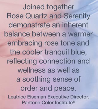
Ta Da! Pantone announces its color of the year for the coming 2017…drum roll please…and the color is Greenery!! Yay!!! Last year there were two – yes, imagine that – they couldn’t decide so they slurried Rose Quartz and Serenity resulting in a pale, cool, wimpy blend of soft rose and lavenderesque shades into a blended wispy pastel dream. Non-committal, in my opinion…lacking confidence. Last year the rationale was stated by Pantone’s Executive Director, Leatrice Eiseman as…
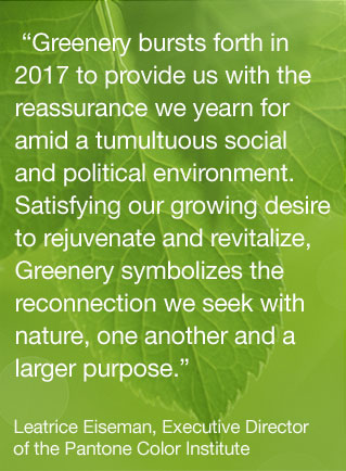
But this year they have it with this fresh organic hue in a yellow-ish shade primed for this year’s rationale from Ms. Eiseman which is:
I have always loved green. I grew up in a Virginia jungle of a suburban neighborhood inside the Beltway surrounding my hometown of Washington DC. where the first signs of spring were the tiny tips of dogwood leaves poking forth from the delicate branches of those beautiful under-growth trees. The dogwoods were the graceful, human-scale layer beneath the towering canopy of the immense, rigid, vertical tulip poplar and white oak trees that commanded the woods.
Soft mosses, lacey ferns and perky lily of the valley carpeted the hidden pockets of our backyard. New growth is that prediction of amazing renewal and promise of the start of summer. So it is a prime observation that as Eiseman states in her 2017 rationale “greenery…bursts forth…with a reassurance we yearn for…” although I do not feel this is peculiar to this year as winter always makes me yearn for greenery and the reassurance that spring and summer will return.
My mother also loved green and that probably influenced my childhood perception of comfort and context of it in interior design. She had and still has an eye for color. In 1959 she selected an amazing sculpted wool pile carpet in a warm, dark, neutral, taupe tone and built upon it a color scheme of pinks and greens that was subtle and relaxing, organic and contrasting, blending beautifully in our wooded setting of verdant lushness in which we were cozily situated.
That was upstairs where we felt like we lived in a flowering tree house amidst the dense collection of green leafy between the trees and surrounded by all shades of pink and white azaleas. Downstairs, where we retreated in the winter months, her greens were mixed with gold tones creating a warm interpretation of the greenery around us.
When so many in that era, between the 60s and 70s, were styling interiors with heavy oranges, browns and golds,

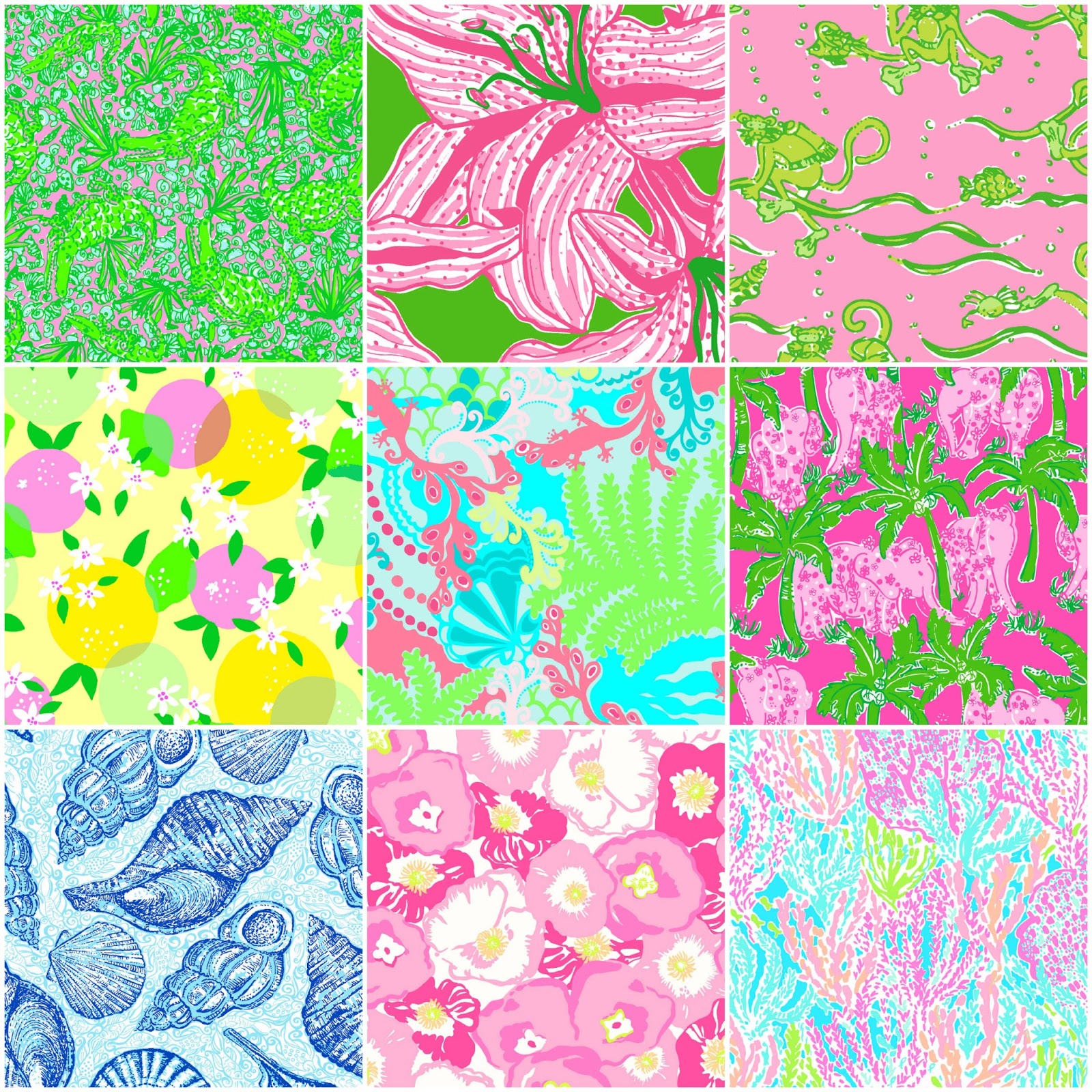
my mother gravitated toward Lily Pulitzer’s fresh, tropical palette of lime green and hot pinks, clean crisp turquoise and citrusy lemon yellow – both in her wardrobe and her interior accent colors.
Our beach house was turquoise and teal, navy and tan – the sea and the sand.
Following color trends is a slippery slope. I have blogged about it in the past. Adopting that which is often a combination of colors instantly records a place in time when everything from bath towels and shower curtains, bed dressings to draperies appears in the marketplace and inserts its predetermined obsolescent combinations into the lives of so many who would rather catch the wave – often behind the crest – to own and participate in what is conveyed by the market to be the “in” thing to do and to have.
It is best not to embrace and adopt the combinations that the market presents. It is better to select color and combinations that transcend the trends – skirt them so as not to fall into the trap of dated color schemes and tired combinations. Some avoid the trap by staying neutral. The safe, timeless colors of whites and grays mushrooms and taupes- but where is the risk and fun in that?
“Too bad for them” I often remark. It is such a missed opportunity…a limitation to select colors that you think you are supposed to like rather than those that truly bring you joy. I say “go for joy every time.” Color is such personality. It is a stage-setting element. It is a backdrop or foreground. It is a theme. It is an atmosphere.
With all that having been said, I for one am thrilled with this fresh selection for the new year. A bright beginning full of hope and new growth, fresh starts and positive forward movement – organic and life-affirming. So seek the colors that brings you joy and go forth with color in this new 2017 soon to arrive. My personal schemes will always have greenery!!!


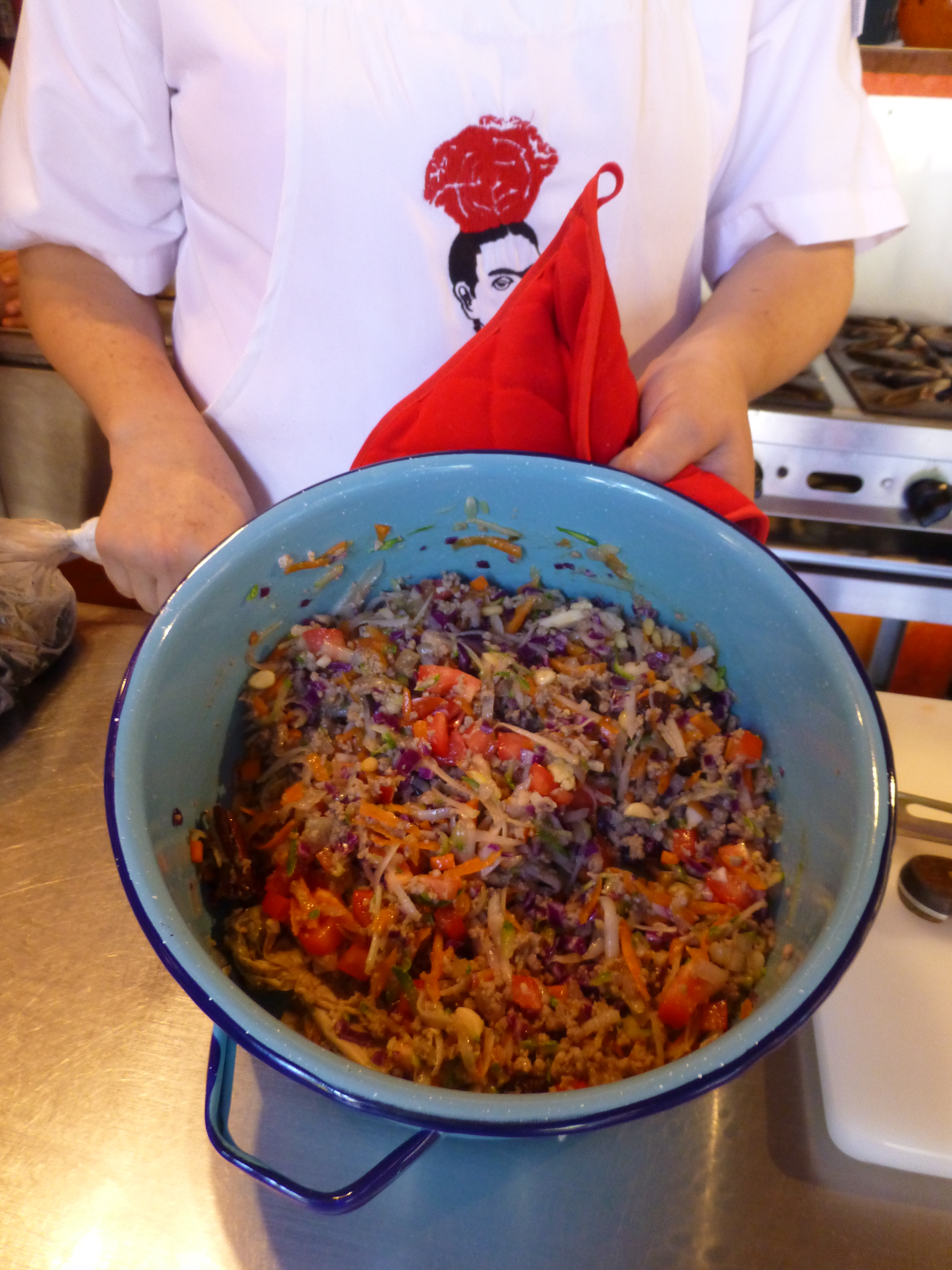
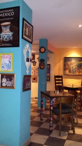 At night this place buzzes with animated conversations and is alive with color and funky memorabilia, art and posters, collages of collectibles all on brilliantly painted walls creating an eclectic artistic interior of fun and festivity. But on this morning, the room is dormant save the three other guests waiting to participate in the morning’s class.
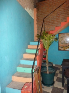 Daylight streams from above and we ascend past more brilliantly painted walls to a second floor open to the sky onto a patio rimmed with potted herbs and flowering plants.
 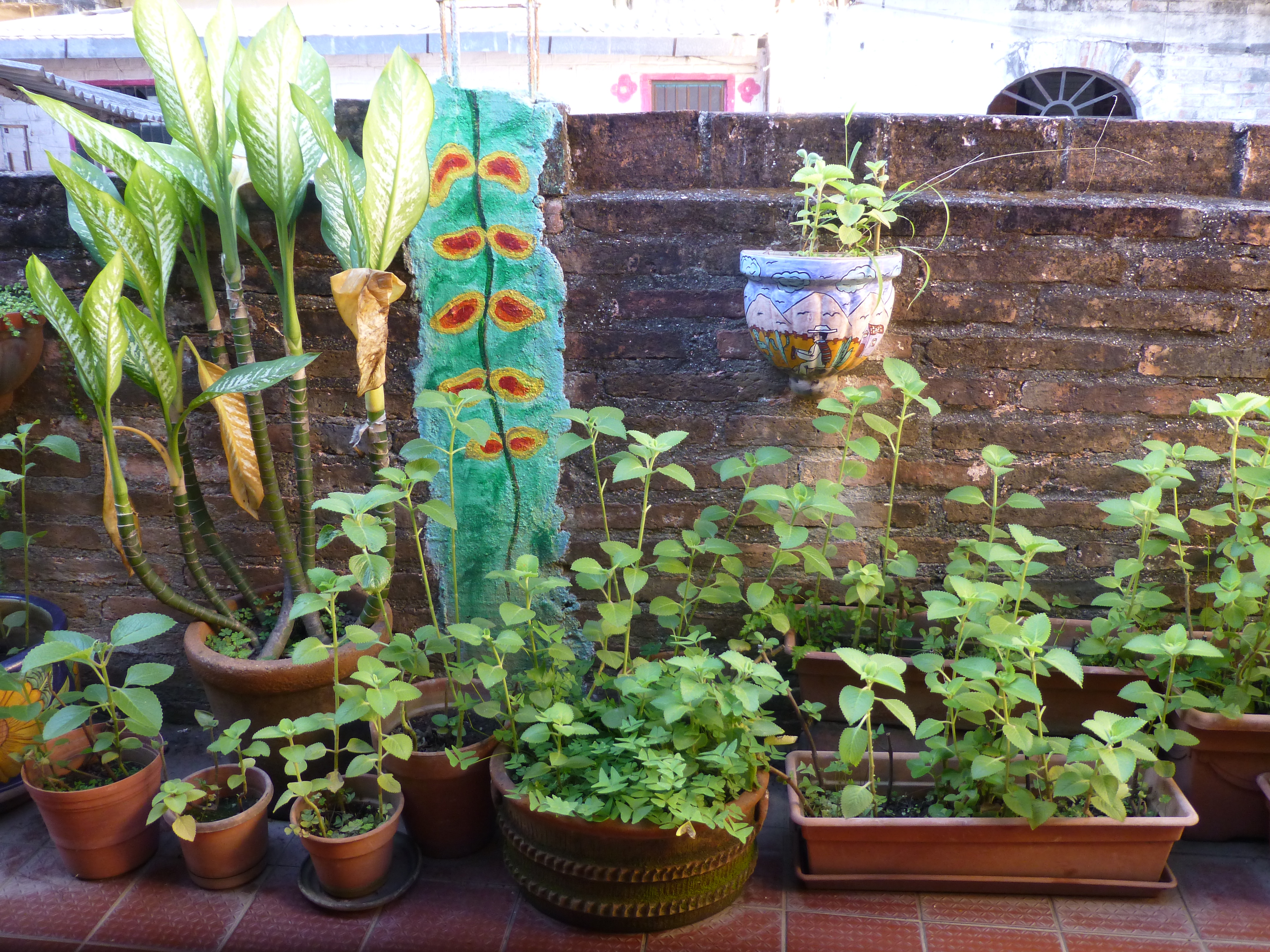 To the right we realize that the rest of the space is undercover, yet always exposed to the elements from that one open east-facing orientation.
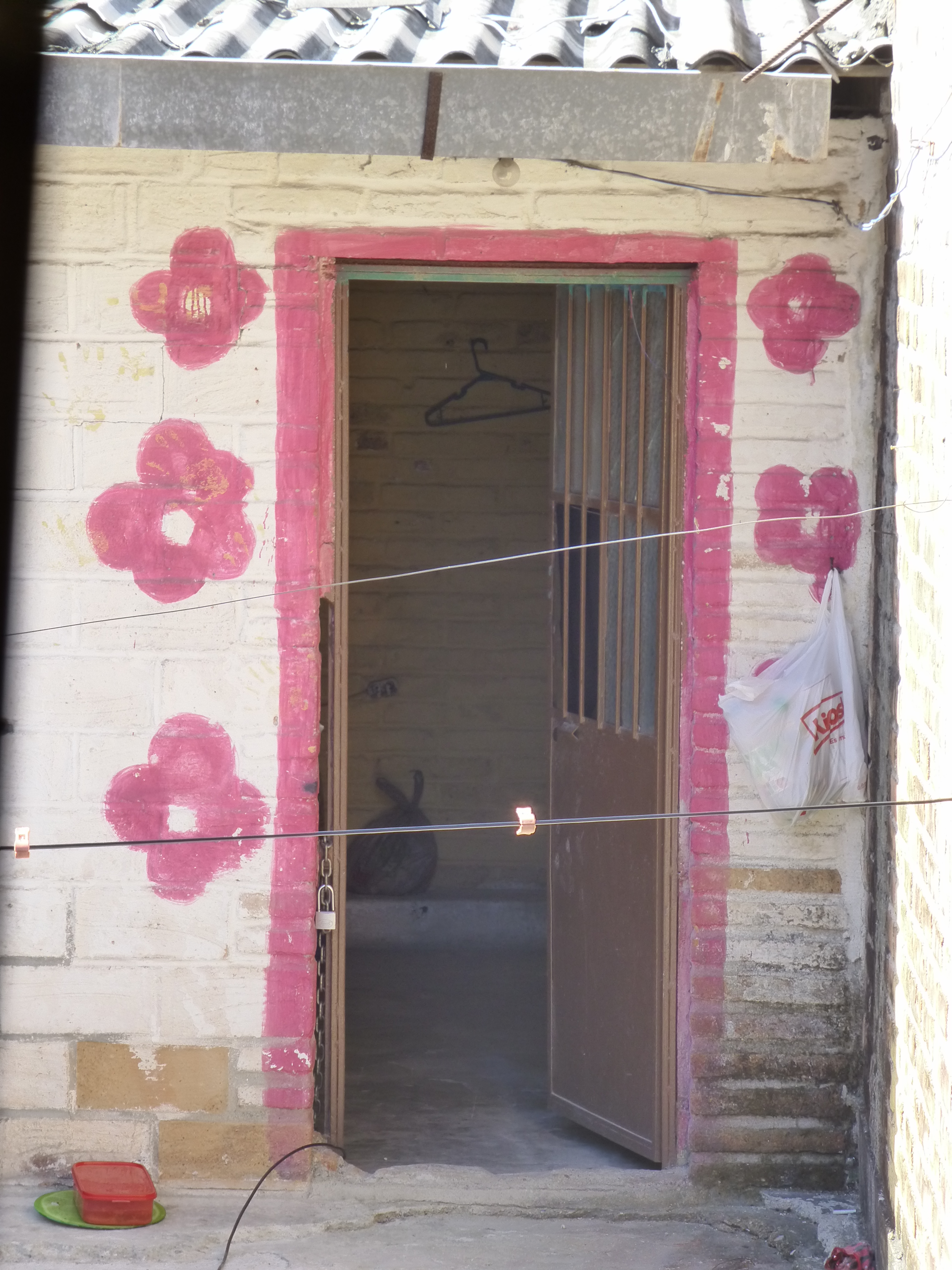 The surrounding area is quite run-down and depressed, yet this jewel of a creative kitchen space shines boldly amidst the impoverished surrounds.


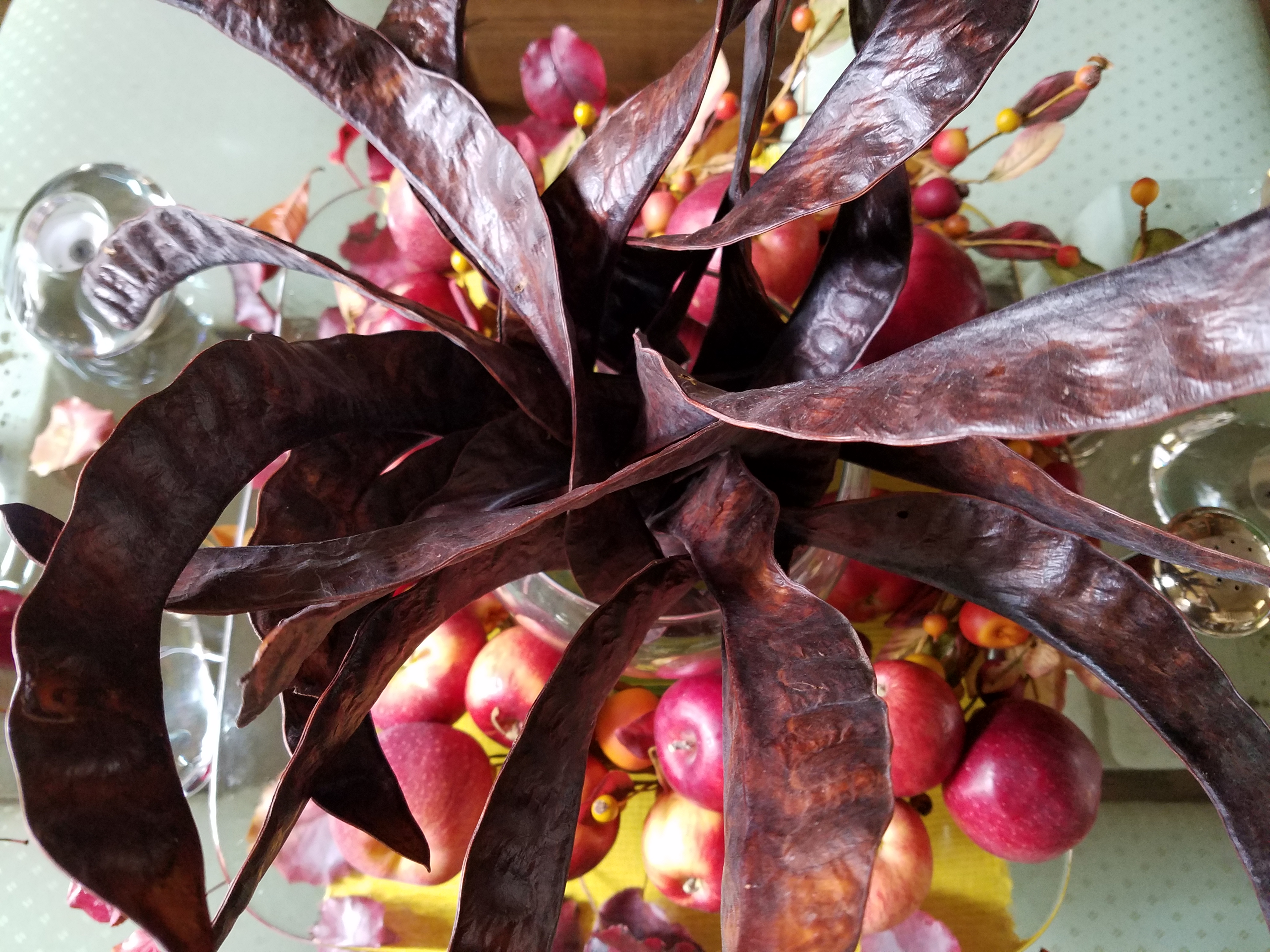
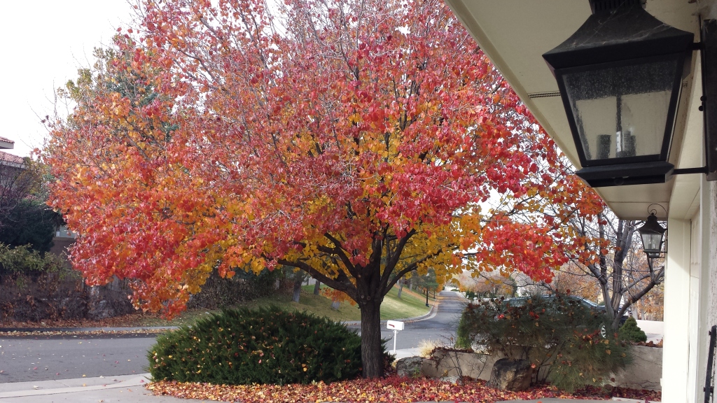 The rich maroons transitioning to corals and rosy tones into brilliant golds and even bright yellows were irresistible. It’s similar to a maple tree with its magnificent range of fall colors but with precious little round heart-shaped leaves.
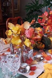 I created a tablescape using short-cut branches in a pair of squatty square glass vessels flanking a large square hand-blown glass platter. In the center on the platter, I gathered acorn squash which we will be enjoying baked with brown sugar and butter later this week, and added some ornamental gourds for their interesting shapes and colors.
 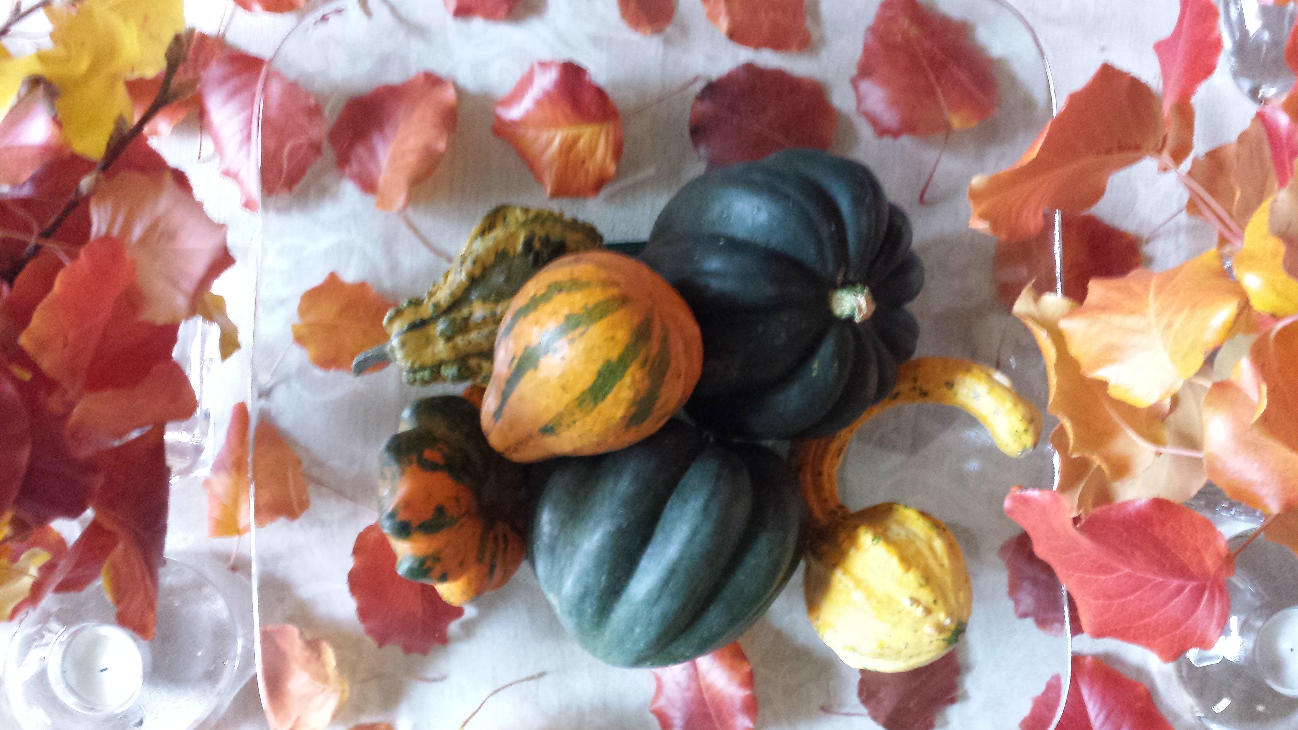 After scattering some of the leaves around the arrangement on the neutral linen table runner, the result was boldly colorful, organic and spicy scene bursting with autumnal warmth.
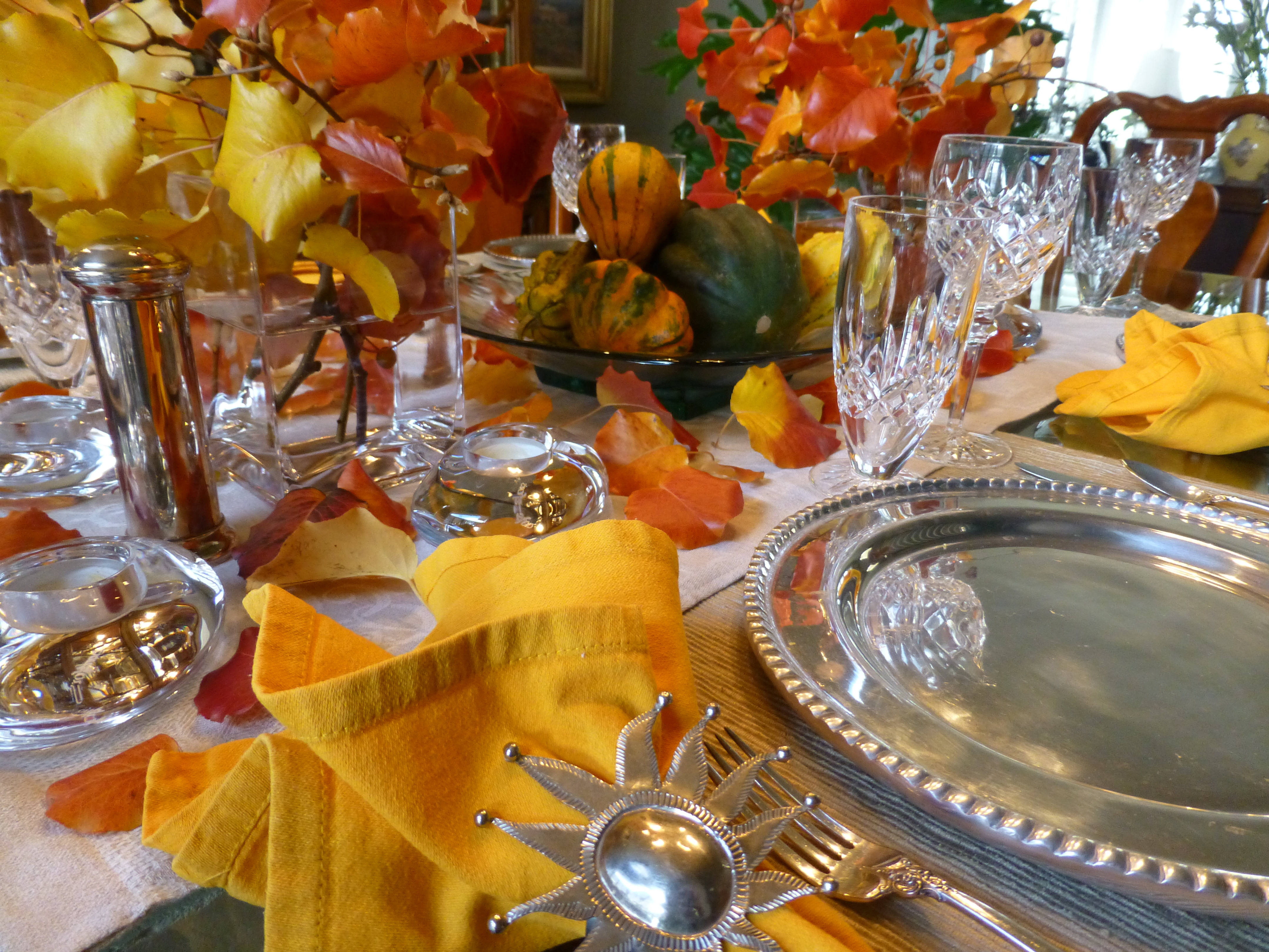 So as I pondered this setting this morning, two days later…the leaves on the table were getting crunchy, the branches were dropping leaves and the water in the containers was a bit cloudy…time to clean it up! Since it seems that everyone is already transitioning to Christmas themes, I thought why not do the same?! The alternative of merely cleaning it up and leaving it barren was a bit anticlimactic after enjoying the spectacular beauty of this recent holiday table. So here again nature was calling to venture forth and scour the yard for the next seasonal statement.
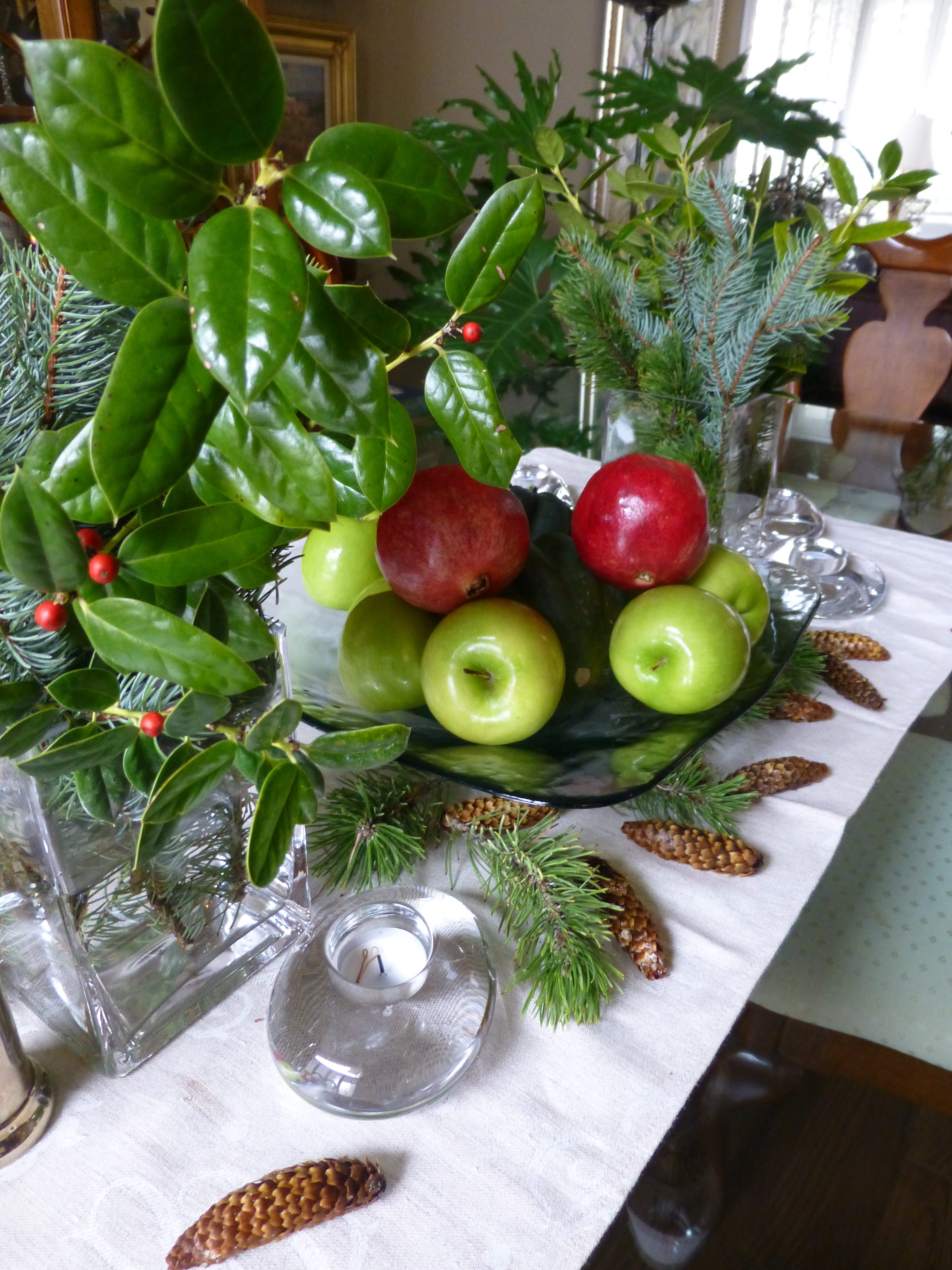
 a few holly sprigs from the bushes in front and jammed them into the same freshly refilled square glass vases. In the center, the neutral linen runner remained and on the glass platter I kept the acorn squash, traded the gourds for electric green granny smith apples and a couple of pomegranates ( I had bought three last week and had already picked my way through the many juicy morsels of one – leaving two to do the red thing in my centerpiece today).