10 Tips for Remodeling: To Improve and Enhance

I’m currently working on an urban loft apartment.  The criteria with which I was presented, upon our first meeting, consisted of three items: One – to enclose an open bedroom to provide privacy, Two  – to provide alternate access to the shared master bathroom. (There is also a powder room, but the shower and tub were only accessible through the master bedroom), Three – because it is a relatively small footprint with voluminous tall ceilings, he was hoping to create a small second tier for additional square-footage.  I understood these items to be his intended “improvements.”

While on-site, at the first meeting, it was (and is always) impossible to limit the observations to only those isolated areas of concern without seeing all else that is occurring around the space.  Therefore, I consider the extra comments that I offered for minor changes to be “enhancements.” These are things that have not had or do not have  priority in the eyes of the client and might have even gone unnoticed forever. Items such as adding a wing wall at the front entry to screen view from the door through the kitchen, concealing a new tall closet of matching cabinetry directly behind the wall to add storage to the kitchen,  add a clerestory window and bookcase with cabinets to the new wall between the master bedroom and living area for borrowed light and additional storage!

Occasionally these offerings are met with a shrug, hmmm or a “maybe” and not really considered to be of great value, but more often than not they are greeted with exclamations like ‘Oh, I never would have thought of that.”  “What a cool idea!”  “I would love to have that.”  And it is with this enthusiasm that my client responded.

So when considering remodeling or identifying the primary improvements needed, begin with the priorities then layer design details of additional enhancements and you will create a master plan that can be executed over time in phases in a preferred or practical order of priority.

1. Begin with your list to improve the function and enjoyment of your environment.

2.Prioritize the list and guesstimate costs to establish a starting conversation    regarding budget.

3. In addition to cost – consider pairing like-kinds of things together such as adding or removing a wall which involves framing, sheetrock, texture, paint – it might be cost-effective to do all items related to these trades even if they are not the same priority.

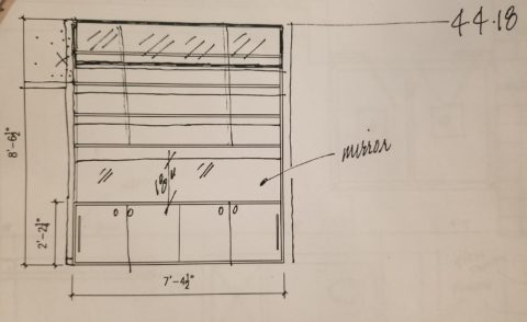
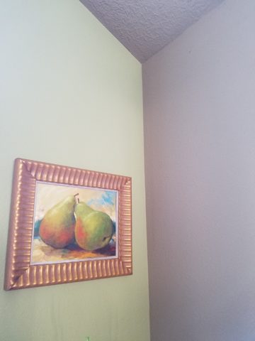
4. The distinction between improving and enhancing is a fine line because improving does enhance, however I consider improving more practical and enhancing with embellishments that are less critical, but make further improvements and enhance the quality of the space. Such as crown molding, improved base trim, unobtrusively installed mirrors, windows, updated hardware, etc… https://bit.ly/2HCYrU

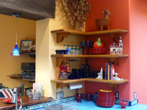
5. Storage is always welcome. Look for opportunities to add cabinets, vertical spaces to maximize your footprint, second-tier countertops, raise cabinet heights even furniture to provide additional storage. https://bit.ly/2GZglUa 

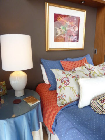
6. Passing daylight through to interior spaces is more common in offices than in residences, yet for the same reasons of “borrowing” light in commercial spaces, skylights, vertical slivers of glass, transoms and clerestories are valuable assets when it comes to bringing daylight into pockets of darkness. https://bit.ly/2HCddKU

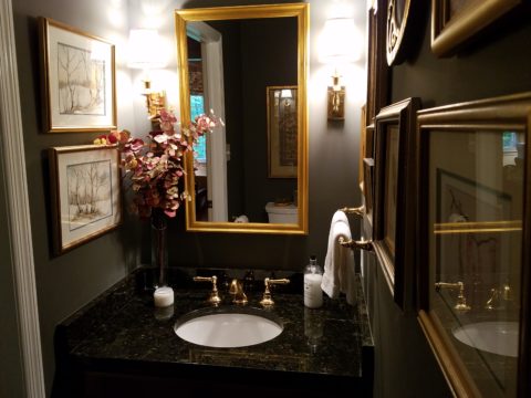
7.Evaluate your existing lighting. Adding dimmable ambient light to rooms to supplement existing down-lights such as pendants in kitchens, translucent lamps shades on table and floor lamps, even well-concealed under-cabinet lights will add control and mood enhancements. Spot light wall art and sculptural pieces, illuminate corners with up-lights (up through trees, behind chairs), and consider changing to LED lamping (bulbs) for longer-life, cost -effectiveness and a full range of colors!

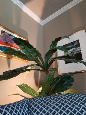
This up-light filters through the plant from behind the chair casting interesting shadows and illuminating an otherwise dark corner.

8. When considering new flooring know your needs as there are so many options for soft under-foot, freeze-proof to carry outside, ease of maintenance, durability, non-slip, and of course the many aesthetic preferences.

This interlocking vinyl floor has remarkable graining look, color and texture and provides soft “give” underfoot. These new luxury vinyls defy our early perceptions of faux finishes.

9. Stacking laundry machines have provided terrific opportunities for added space in laundry rooms, more cabinets, counter space, laundry sinks, craft areas and more! https://bit.ly/2HpkKih

10.Opening walls enlarges spaces – even a peek-through, but also create the interest of depth and layering of dimension, color and light.  https://bit.ly/2GZrMLj

Friends Don’t Let Friends Pick Paint Colors

WHY? It’s never as easy as it seems! You can track the trends. See what is relevant to today’s popular design concepts. But how do you really pick a paint color? Warm versus cool, safe versus bold…there are seemingly limitless choices and so many things affect the decision. HELP!!!!!!

Does it help to swipe a swath on a wall?

Not usually. The surrounding often white paint isolates the color in a small concentration and it cannot begin to give the full effect of an entire wall or more. The most telling is to paint an entire section of wall that you can frame in your field of vision without seeing anything else.  That or painting an entire wall, for the best test.

Here a frustrated color connoisseur tried several test patches before calling for HELP!!! But we LOVE the novelty of the effect! What a conversation  piece – a work of art in its own right!!

When is the ceiling painted other than white and why?

Some colors stand-out and are more imposing while others meld with their associates.  It depends upon your personal comfort level. For example a room painted a sunny yellow might be too bold or imposing if the ceiling were to be painted that same color – white would be customary and give relief and contrast to the yellow vertical surfaces.  A more mellow color (like a taupe) might work well on all surfaces creating a soft, unifying encapsulation.  Shades of the same color – lighter or darker – can also prove to be an effective treatment. Light reflectance – artificial versus natural, depth, the hue and value all play a part in determining what works in a given situation. Not to mention any existing furnishings that might direct a color direction/selection.

Should different walls be different colors?

Why not? Variety is the spice of fabulous interiors – but that doesn’t negate the beauty of an all white interior . Knowing when you want color, how much and from what source is part of the balance of design.

Remodeling this room was comprised of removing walls, adding a serpentine banco and hearth, stone wall surface, painting stained cabinets…We started this project with a new white on white texture and contrast of 3 different stone materials adjacent white walls and white wood trim.


We ultimately added coral punctuation in the recesses of the niches.

What is color layering with paint?

Planes of color seen over-lapping can provide a fantastic effect of colors literally layering over each other. Looking through an interior and reading a wall of one color and another wall behind it peeking out with a different color can add interest and contrast.

How do you stop colors from wall to wall?

I prefer stopping on an inside corner – always. But that’s me. I prefer to “read” the element (wall, monolith, enclosure, etc) as a structural unit. As though the wall were build of that material – the finish suggests the material rather than illustrating a surface application that quits. And I feel the same way about any surface application – tile, wall-covering – preferring to stop on an inside corner to define the element from beginning to end.

EXCEPTION: I have had several instances where we have a little  fun with transitions between colors – a zig-zag motif, for example, can provide a surface graphic and change colors on one surface!!

Wrapping a corner from a full wall of yellow to another – but not wanting the yellow on the entire following wall – intentional graphics are fun and allow for the change of color.

Semi-gloss versus flat?

Glossy finishes show more defects in the surface material. So a wall with imperfections such as texture flaws, repairs, any uneven detail will be enhanced. So to minimize defects, a flat paint is preferable. It also depends upon what you are trying to convey – a smooth plaster finish – might be better expressed with a semi-gloss but an earthen softness is better with a flat paint. Clean ability and durability might play into this decision – but not at the expense of the desired visual effect as there are many grades of paint to accomplish various levels of ease of maintenance – consult your paint products professional.

Contrasting a gloss against a flat on different adjacent elements is a nice contrast such as wood trim in a gloss against flat on the adjacent wall. Is the trim the same color as the wall or is it a contrasting color?

Do dark colors make small spaces smaller?

It is a deceptive misconception that this is the case. Dark colors recede and therefore can actually expand the illusion of space. A dark ceiling seems to recede into the void and creates the feeling that the surface is far much higher than it really is. Dark colors behind light colors does the same – recede as a back-drop. Do not fear dark colors – they contribute depth and drama.

Picking paint colors is like selecting the backdrop for your world. All your things are set against this plane.  Applying paint is having control of transformation. Like controlling when and how the sun washes the dawn or the night envelopes in darkness and all the amazing colors that occur in-between.  Visualizing the end result, creating the transformation that takes place beneath the brush, roller or spray gun as it alters the scene are magical powers.


Designing with Balance and the Creation of the Can Wall!

Given the opportunity to improve upon a recently completed taproom, we instantly realized that painting the entire interior would be the best quick-fix. But that instant gratification was not enough to give this needy/hungry interior some meat to get it off and running.

Atmosphere in interiors is so much a part of the brand, the identity, and the success of a business. Popularity is based upon a certain comfort level, the clientele who gravitate there and the product that they are effectively providing. Whether that is food or drink or both, the atmosphere, (including lively enjoyment by clientele), service and food/beverage – all contribute to a successful establishment.

This does not mean high-end, elegant, fancy or even simply hip – although the definition of hip can vary from spare unpretentious and un-self-conscious funky, to studied funky, to affected stylized, to trendy hip and happening,…but, it does NOT always have to represent expensive interior design.

Yet a strip center generally lacks pizzazz and to install a taproom into that generic scene takes some creativity. That does not mean money – it means just what I said, creativity.  And creative interior design is all about ingenuity and balance.

Balance in interior design is key. This interior was filled with hard, cold surfaces – concrete floors, silver-grey laminate table tops, brilliant silver table bases, grey chairs, polished white granite bar top, silver laminate bar face, silver metallic wall sconces, glistening silver under-scaled chandeliers, white walls with cobalt blue accent wall. Brrrrrrr….makes me chilly just recounting the scene. And this was summer! Imagine this setting with crisp cold wind blowing outside and snow blanketing the mountain – not the place you want to gather for a beer in the wintertime!!

20160901_160828

To instantly soften and add warmth, we painted all walls a dark taupe. The soft, mousy grey/brown color pulled from the existing slate wainscoting to tie the two wall parts into a unified “read.” It gave the silver elements (especially the sconces) a contrast – which results in “interest.”

20161103_091444

The back bar was bland even with the new paint color and to add dimension and animation we mirrored the rear center section. This illusion added depth and interest to carry the ceiling through and add a mirrored storefront and exterior reflection which created an illusion of space and character where there had been nothing.

But unlike most back-bars, this area was conspicuously naked. A couple of stainless shelves housing stemmed wine glasses, and growlers felt spare. Plus the right side of the back bar was closer to the bar and the patrons were a mere few feet from a plain, painted sheet-rock wall. Yes, there was a large format TV screen above, but straight ahead – it was just blank wall.

In the wee hours of the morning, as I tossed and turned for a variety of reasons, I jumped from thought to thought, project to project, and personal concerns pelting all the while in a seemingly endless stream of insomnia. Yet, it was during the angst that the idea of the taproom being named “Silver”…silver…beer cans are silver/aluminum…beer cans crushed and nailed to a wall…texture, silver (theme of the taproom) interest – maybe?- all converged into one of those light-bulb moments of revelation.

And yet you might say – “silver…aluminum…more cold and hard. Why would this be an asset to this interior?” I felt that the texture and dimension of the cans would add more interest than the perceived cold and hard of them. The pockets of folded shadows and the relief off from the wall, paired with the over-all massive full-wall of pattern, would all contribute a positive design element to the scene.

As I pictured the wall of circularly flattened aluminum cans in my in my  mind’s eye (a tool that I employ daily while envisioning concepts and finished products well in advance of their fruition), I furthered the concept to encompass possible bar games. Yes, derived from this perfect grid of circular aluminum discs, I began creating games in my head. A bar is often animated by bar games and this was just another opportunity to interact using this unique wall-scape. Since that initial concept, I have created 3 different versions of the animated interaction in the form of games, on this fantastic Can Wall.

So with great patience, Enrique planned the layout with literally laser precision in a perfect grid. We counted the expected number of cans vertically and horizontally aligning with the brilliant red light beams. The previously crushed cans were laid out on a table – well a handful of the 3,200 that we had prepared for the wall. It was determined that punching the nails into the cans prior to installation would expedite the process of affixing them to the Can Wall. Labor intensive from start to finish, this wall was a great accomplishment for a devoted few.

20161103_094518

As the cans were laid out on the table – initially upside down exposing the crinkly open side (devoid of tops), I instantly LOVED the complexity of the depth, texture and shadows. A tight, random application of them would have resulted in a fabulously complex matrix of design. But upon closer inspection, the “texture” was really raw, with sharp threatening edges that were not possibly reasonable within close contact with people brushing by. So, lacerating the staff was not an option – even for a really cool textural metallic wall treatment. Perhaps this application will surface in a more appropriate location away from human flesh in the not-too-distant-future!

Like hubcaps fastened to the broad side of a country barn at dusk, the reflective silver discs pop in the flanking darkness.

20161104_140152


The process is nearing completion and I will save for another blog sharing the fun and games emanating from the Can Wall,  and the entire finished project complete with new warm white pendant discs over the bar and soon-to-install enormous perforated drum light fixtures suspended from the ceiling, over-sized photo images of the brewery behind the scenes and tantalizing signature dishes in the unique category of the Nexus New Mexico Soul Food.


Meanwhile, the take-away here is…balance cold and rigid with warm and textural – along with all the other opposites that attract – when designing be balanced.


The Drama of Dark

It seems counter intuitive – and that is why so many people ask me about the effect of dark wall colors – “won’t it make it look small?” and I assure them – “no,” and they are still not so sure. The most recent example of this was in an expansive home  where we were talking about accent walls – not willy nilly mind you, but in an architectural recess behind the stately china cabinet in the dining room and a doorway recess in another room. In this case, using neutral, warm grey tones – shades of same hue – value shifts for depth and architectural enhancement. Not yet painted, check out our website in a few weeks for befores paired with afters to see this example. Here though is another example Corine-Maggio_La-Jolla-Shores_1.jpg.rend.hgtvcom.1280.1280

The above photograph for CM Natural Designs by Chipper Hatter.

If a dark color was to make anything look small – why would one want to paint it in a tiny space? There is the more specific, counterintuitive question. The answers is that there are illusions of space. A dark color in a small space can actually read as though there is more depth to the space. Where it can be close and cozy, it is also a subtle enhancer of depth and therefore size. dark-room-collage3_large_jpg

So in another example currently in a state of remodel, a petite powder room previously papered in a dark green patterned wall-covering, now was being refreshed. There are no rules – it could have been bright, light, bold or dark…flat, glossy, organic or metallic – the possibilities are endless. But the previous rendition of this space was pleasing for its dark tones and therefore a decision was made to select a deep-toned paint for the re-do.

Dark colors, contrasts and lighting all can have dramatic effects on the perception of a space. Dark colors actually recede. Therefore, in many situations, if  the application of a dark color will convey a sense of depth and additional space it’s an intriguing experiment. Black-Feature-Wall-for-Bedroom
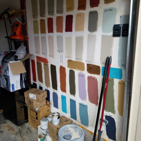
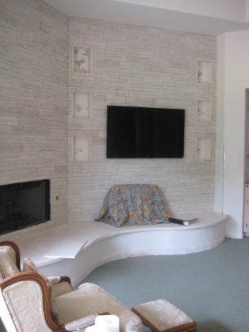
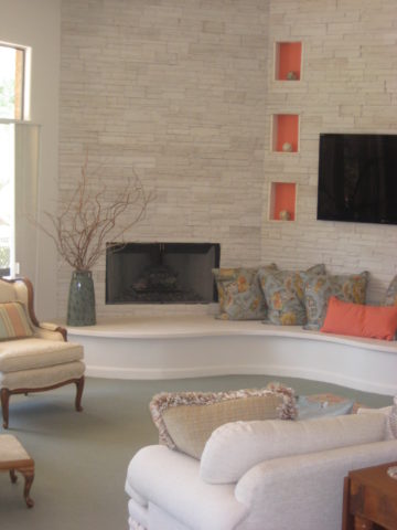
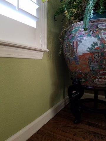
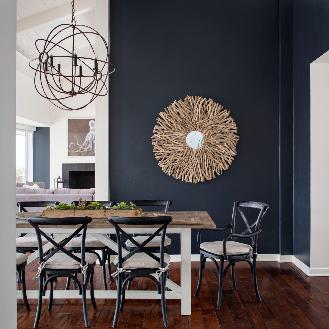
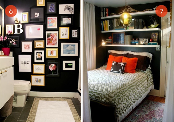
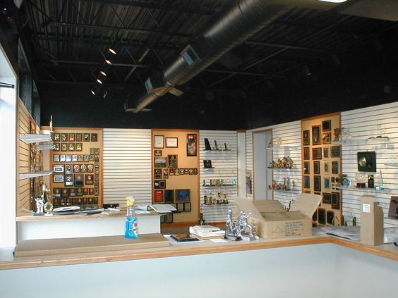
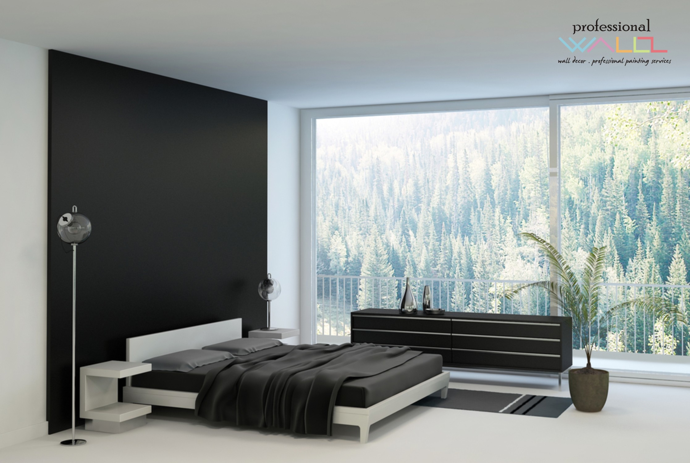
Like reaching into a hole or looking into space, and not seeing the boundaries well. It s a brain thing. If the brain reads dark, it suggests  a depth of space and therefore more than is really apparent. This is often used in ceiling treatments. Having a low ceiling appear higher, when painted dark, due to the illusion of depth.

OLYMPUS DIGITAL CAMERA

It is also effective to make something go away. An exposed mechanical or white lay-in acoustical ceiling can be institutional looking and not desirable in certain settings. Painting it black or another dark value of color, while sacrificing a bit of acoustical rating,  the ceiling will seem higher, less distinguishable and not as imposing upon the decor of the space.

So the petite powder room currently being re-floored with dark tile, re-painted with Benjamin Moore HC-166 Kendall Charcoal, new dark matrix granite vanity top and cabinet, new lighting and mirror…will soon be finished and we will post the drama of dark in before and after shots!