Commercial Finishes – What They Say – What They Convey

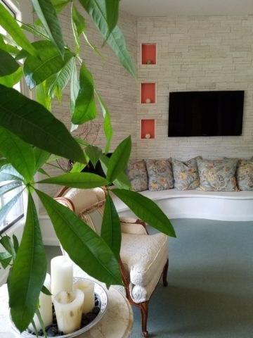
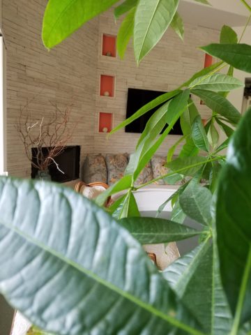
When planning a commercial project, how do you separate your personal taste from an objective view of the program for the business? This situation has occurred twice in the last year with my practice. Well, there can be blurred lines. There can be design elements that work in both environments. There certainly are offices that mimic residential living rooms – contemporary or traditional – modern or historic, but it should directly relate to the type of business and the brand of that business. What does the space say with regard to conveying the intent of the business?

The selection of materials comes first. The bones of the building – what’s exposed, what’s concealed, flooring, wall treatments, etc…The first project was a medical related business – corporate office for a product line. The neighboring space was a physician’s office and treatment suite. The common space had existing concrete floors. The woman leading the design decisions for the medical corporate offices wanted to continue the concrete into her waiting area and throughout the offices with area rugs in each room. A small-scaled water feature, in the form of a grey box, is located adjacent to the seating and a distressed chest and metal sculpture are also part of the scene. Her selection of chairs were heavy, gold tapestry, over-stuffed and tufted. They were placed around a round table in the center of the room. All I could see was a setting for a Victorian séance. It in no way reflected the clean, crisp, fashionable brand that they had established to represent their rejuvenating medical product line. Rugs invited tripping hazards and the look was in no way speaking the language, of the intent of the business or its brand. It spoke directly of the woman’s home, from which she replicated her eclectic taste in the office.

Next door, nearing completion, the physician’s group was being strong-armed into going the same route with the concrete floors. We love concrete floors in so many applications, but here – in these two spaces, they were existing, did not take the stain well and looked dark and dirty in the final polished presentation – NOT the fresh look of a sleek medical group. Not the finish to convey confidence and cleanliness. Treatment rooms had vinyl flooring for necessary maintenance, corridors and physician’s office had carpeting, but the docs rejected the contrasting finished product in the entry and restrooms and went back to the light tile flooring that was originally specified regaining the professional appearance of the intended design.

Faux wood porcelain boards are a fantastic contribution to the design offerings for both residential and commercial finish materials. Shown here on the exterior of a building by the ocean, the artsy peeled bark variegation of the pattern is striking and makes a commanding design statement.


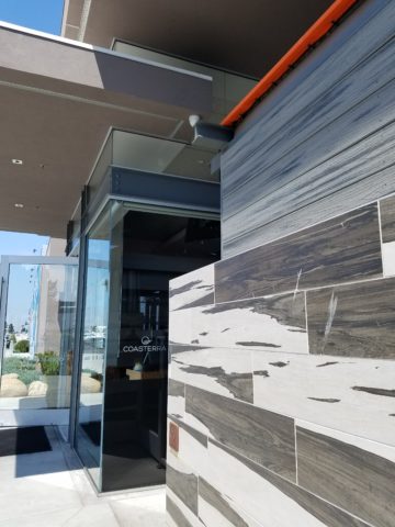
It is carried through into the interior and back outside on the rear dining patio.

The idea is that a wooden building by a seaside is traditional – this is a stunning twist on that which was once a customary building material revisited with an invincible, high-design version. The use of wood for such a place would have been historically accurate.

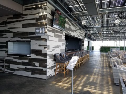
The same is true when faux porcelain planks are used on the floors in the produce section of a grocery store – replicating a produce market or barn where fresh produce is collected and sold. Some high-traffic food-service establishments, bars or breweries often want the look of wood floors – to convey a context or scene – but are not durable and therefore not advisable. A home – almost anywhere including the obvious – in the woods or by the shore, with wood flooring might not be practical, but by using the wood planking porcelain, the look is conveyed while the durability and maintenance is made effortless.

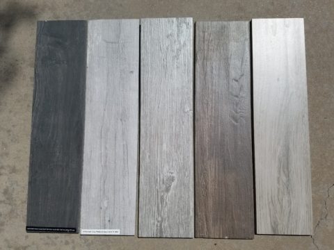
Recently an owner wanted the “look.” That sleek modern look of grey porcelain planking. His business was one that dealt with automotive repair and restoration. In evaluating his brand and the nature  of the business, real wood floors would never be the material of preference. So to use even a durable, invincible, porcelain version seemed out of place.

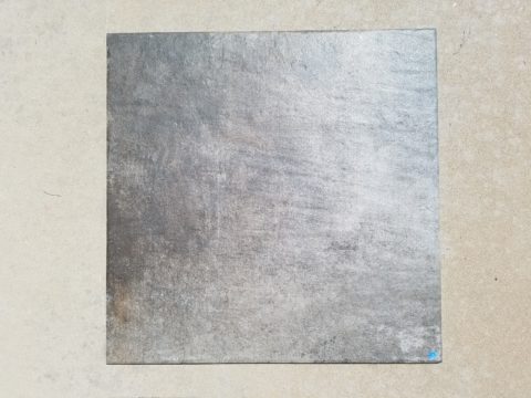
Concrete would be more the material of a garage environment. To make a corporate statement, concrete can be dressed-up. Porcelain tiles simulating concrete is an appropriate faux finish option – either way, preferable to creating an interior of grey weathered wooden planks. Watch for the completion of these projects in the coming months.

Adopting the use of materials merely because you like them or they are in vogue is not always the best approach. Consider the context, the intent, the statement materials make – how they “read,” what they say – what they convey.


Exterior Design – Celebrating Summer

As summer blazes on and we continue to enjoy the freedom offered by expanding our living spaces into the out-of-doors, I’m contemplating the variety of versions of outdoor living that are made possible by different climates. While friends in the tropics of coastal Mexico are complaining about the inescapable sweltering heat and humidity these summer months, the rest of the upper regions are rejoicing in the mere fact that the bitter cold is replaced by warm air and things are growing and green and flowering and alive!

Various water features come to life springing forth suggesting the refreshing sight and sound of a trickling brook,

bumble bees light on flowers that would be disintegrating clumps of dead growth in winter,

comfortable enjoyment of TVs on patios that become desolate, barren, outdoor rooms in winter.

The reverse is trending too however, where organic materials, (stone, woven reed rugs, plants, wood, bamboo) are used bringing nature inside the home.

This connecting nature indoors the home is a refreshing, rejuvenating  approach to design – in stark contrast to the crisp geometric inorganic feeling of other design trends. Taking it a step further is the seamless transition of the two.

Interior stone flooring flows out onto the patio…telescoping patio doors open allowing seamless transition between indoors and out.

“Transteriors” was coined by landscape designer Jamie Durie and his team who have enjoyed the broadening of his brand to link his exterior designs to the adjacent interior spaces with a celebration of sustainability and organic appeal. The brief mention in last month’s June 2017  edition of vmsd (Visual Merchandising + Store Design) was a validating article reinforcing my appreciation for the different climates and the design options and limitations we experience from zone to zone.

I’m returning this weekend to a project that I designed a few years ago in the Sonora Desert – it seems to have stood the test of time and is still referenced as a “Tangerine Dream” of indoor/outdoor living.

We didn’t have the luxury of telescoping doors opening glass walls to connect the inside with out, but we maximized the colors, materials, plants and design scheme to allow the transitional lifestyle flow. Stone and tropical plants inside speak to the same materials outside. Colors correlate and, in this case, the climate allows enjoyment outdoors all year around…with some minor limitations and yes, decided temperature changes.

But nothing like what occurs in the snowy climes where outdoor living – except some frigid winter sports – is all but closed for the season.

Advancements in technology and ideology have made transterior design much more viable –  allowing for amazing options for furniture, fabrics,

kitchens, fireplaces, flooring (take that same material from inside right out onto the patios – if its frost-proof), lighting and more from which designers can create exterior living spaces. These outdoor rooms so emulate the interiors that the transition is often difficult to see.  Not being able to discern the line between indoors and out is often the optimal effect – but not always…

Seasonal changes with interior/exterior design, like a change of clothes with the seasons, can also offer the expansion and exploration to entirely different spaces when the warm weather arrives that emphasize the design distinctions rather than trying to meld the two.

So venture out of your cozy bear’s lair the next time the crocuses begin to peek through the soil and the birds start to sing, whip out your rattan or faux wicker, teak lounges, hammocks, fabulous fabrics and potted palms and design your tropical summer retreat in your own backyard!


DIY – Inspiration is All Around!

DIY is so in vogue. Where it used to be chic to hire someone to do everything in your world, now practicality rules! The savings and fun of doing things yourself is huge. There are so many inspirations on-line. Ideas overflow-ith and the possibilities are endless.

Where do you get YOUR inspiration? It’s all around us. I had been contemplating a shower/wedding gift. I always prefer to find something unique rather than picking from a registry at Nordstrom’s or William Sonoma…but this one was a challenge.

Recently, my inspiration came from taking a morning walk through the desert.

The decorative graphic on the invitation was a floral arrangement of soft pastels and antlers. Yes, antlers. This bride-to-be is a hunter. A long, lanky, beautiful, feminine, crack shot! I’ve known her since she was a toddler. I had been picturing that graphic in my mind in an effort to divine some special gift that related to that theme…something uniquely memorable and lasting.

As I walked through the rough desert grasses and around piles of dead tumbleweeds I regarded them with a new-found appreciation. They had such an interesting structural framework that I realized that they clearly resembled antlers.

They became the springboard for a floral arrangement that would replicate the theme of the invitation and, with that, I began selecting them and carefully carrying their rotund prickly selves back to the car.

Next step – what else will make this a successful rendition of the theme I was trying to emulate? Off to the craft stores! I selected delicate, creamy-white wooden roses, soft pink mini silk roses and some fill from both Michael’s and Hobby Lobby. The PERFECT ceramic vessel presented itself in an soft, oval shape glazed in a powder blue, but with edges and character that offered attractive, desirable, intentional imperfection.

As I have mentioned in past stories, a successful designer has a good team. Building a team to realize your dreams is the key to that success and I called on my very special and exquisitely talented floral designer to assemble my gatherings into the image of my intent. Melba has made my dreams come true for years. She gets into my head and interprets my words and elements to create a finished product that has hit the nail on the head over and over again.

I pulled out the many materials that I had purchased. She evaluated each, talked to me about my concept, and studied the combinations that were laid out on the table.

This piece exceeded my expectations. The fine branches of the tumbleweeds were the delicate punctuation amidst the flowers.

When she actually ordered real, bleached deer antlers that became the statuary of the piece, I was thrilled! Not only was the finished arrangement perfection, I didn’t think it was realistic to expect to get real antlers and incorporate them into this design in such short notice. She had less than 2 weeks! It was spectacular.

DIY inspiration is all around – even in dead, dried tumbleweeds. Creativity begins with a concept and progresses with the fun of making it uniquely yours. Team DIY!


Patio Primavera- Fabrics and Finishes for Outdoor Living

Finally spring is settling in with more consistent warm weather, garden shops are abundant with flowers, leaves are maturing and all is getting green!! The out-of-doors is beckoning us to expand our living spaces and set-up patios and outdoor kitchens, gardens and play areas for the coming months! YAY – Patio Primavera!!!

Every season introduces more and more fabulous products and paraphernalia for making moving outside more and more inviting and comfortable. Leafing through catalogs that jam our mailboxes, cruising the home decor sites, strolling through the big box home improvement stores and the local nurseries, the multitude of possibilities get our summer juices going – chomping at the bit to plan this and buy that, plant this and arrange that…it’s  rejuvenating and freeing from the interior spaces that we love to be cozy in all winter, but long to escape the confines of, as the warm weather progresses.

Advanced methods and materials for outside area rugs and fabrics, of polyester and better yet – acrylic fabrics that will tolerate the exposure to the elements, allow freedom to leave things set-up without running out into the rain, or worrying about too much sun which might require we bring things safely inside and then back out again.

Some of these fabrics defy being so durable and practical. Here are some amazing examples of bold colors, exciting patterns, plush textures and complex weaves that are all 100% acrylic – the most UV tolerant and mildew resistant of all!! But be prepared, they come with a handsome price tag. It is an investment to know that you are creating a scene that will last – that does not have to be replaced every year or two.

Incredible colors – brilliant and fade-proof.

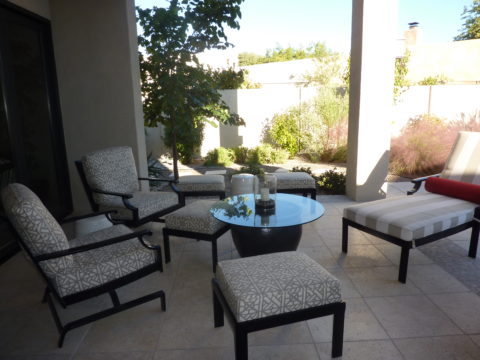
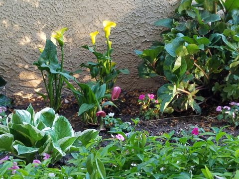
Lovely rich neutrals are stunning enough to be considered for indoor use too.

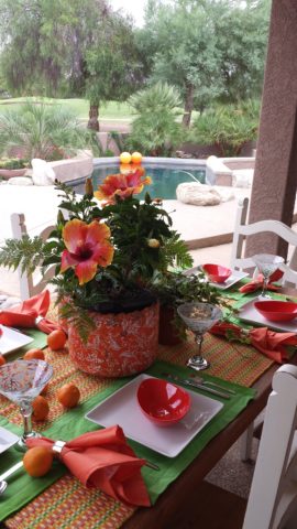
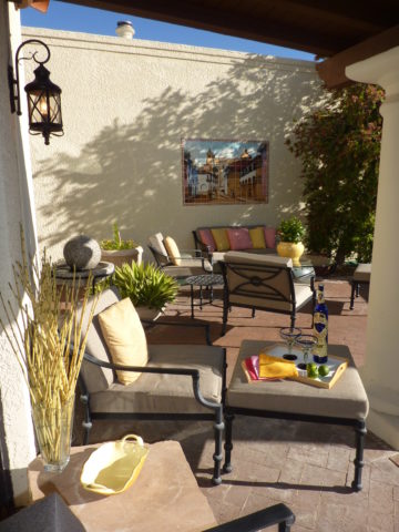
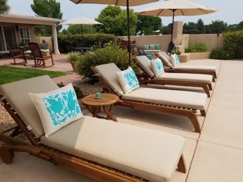
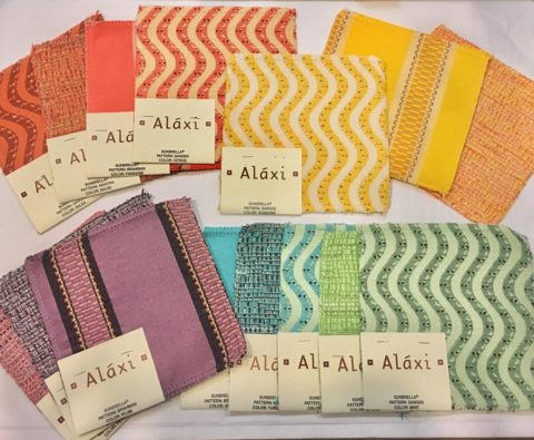
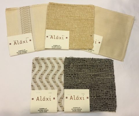
When shopping for outdoor materials – watch for that fiber content…it makes a difference. But know that there are thousands of incredible fabrics that you won’t find in the seasonal departments of local stores. We search the world to find these exceptional fabrics in order to present exclusive offerings to make outdoor spaces defy outdoor “exterior” design. IF only  for pillow accents (due to the precious prices), that can be THE show-stopper for your outdoor rooms. Find some that you LOVE and take the plunge.

Another investment for outdoor furnishings is powder-coating. Give new life to old pieces, salvage vintage pieces for new use! My grandmother’s white, bouncy metal chair was well used and rusty. Shown here, I powder-coated it 20 years ago this month and it has been sitting out in full high-desert sun and all the seasonal elements ever since – a testimonial to the durability of a good powder coat finish.

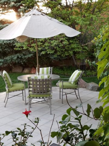
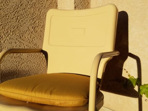
Discover garden elements that would surely rust if left out in the rain – these are perfect for powder-coating! Once treated, these fabulous “finds” will be durable exterior design features without a care – retaining their appearance and supporting your climbers for years in your garden!!!

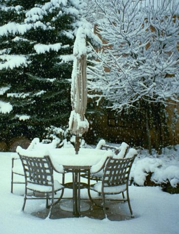
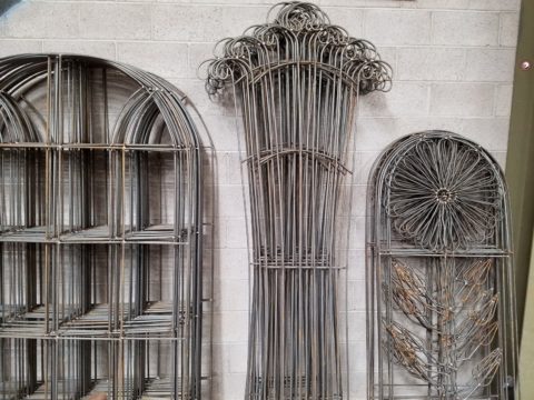
More durable than paint, this process for metal furniture (and more) usually starts with sandblasting the existing finish – rust and all – clean as a whistle – and provide a finish that will protect and preserve the appearance  for years of exposure to the elements – sun, wind, rain – no problem! Powder coatings are just that – a complex combination of materials that are combined and manipulated and ground into a soft powder. The application is done with electrostatic charge delivered via a spray gun. The powder-coated pieces are baked where the heat cures the coating. Powder-coatings come in so many colors! The resulting finish is extremely durable and will last for decades.

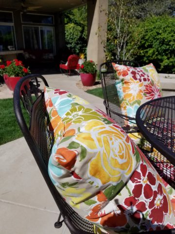
Other than furniture, it is also applicable for architectural detailing around your home and is certainly used in large-scale commercial applications. Powder-coating can be applied to other than metal pieces – but the technique differs slightly.

If you have pieces that you treasure or merely want to have around outside for a while without extra concern or maintenance, this is something worth investigating.

The take-away here is in recognizing the quality of life that is gained by utilizing and  celebrating your outdoor spaces. Whether a tiny balcony, intimate courtyard or an expansive patio area, decorate it! Explore the many design tricks, great materials, fabulous finishes and all the possibilities 
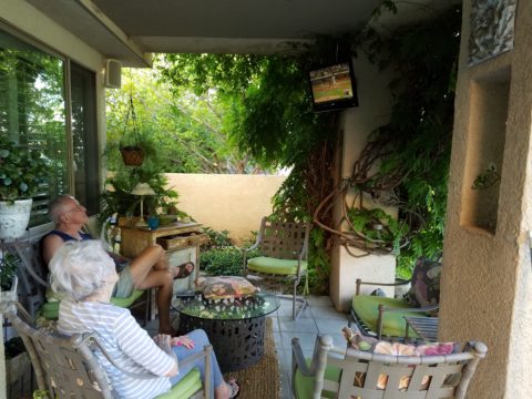
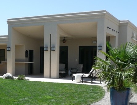
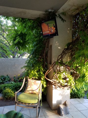
add a  TV,  fireplace,

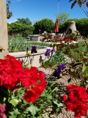
or chimenea, that will transform your exterior pockets into worry-free and priceless outdoor room additions for many months to come!!! You’ll want to LIVE out there!


Refresh Renew Replace – Custom Design Details

We LOVE custom challenges. When you have the right team, with the right talent – anything is possible. Part is luck the other is cultivation, but in my case – most was luck!!! They/we didn’t need cultivation – it was a perfect fit from the start! Thank you!

Your team is your strength – whatever your profession. Think about it. From aerobatics to orchestra conductor – those who count on others to make them look good – with or despite their efforts – the end result is what counts. – right?

I, and most people, LOVE before and after photos – it’s fun, it’s instantly comparative, it satisfies our desire to achieve that which we can’t have…except in a facsimile thereof.  It’s proof and validation that we can have it – a version of “it.”

We often miss opportunities of taking the before shot – rearranging a room is a prime example – because it happens on the spur of the moment and happens within minutes – the results are startling and instantly proving of “better” design.

We often replace existing with new.  New something…whether re-upholstery or new cabinets, no job too small – the results change lives. Of course, entire remodels are the bomb!

Respect any existing thing. Evaluate it for its merits. Consider its history and construction. Fragile or invincible – the history is of value. AND its replacement cost.

Then go about making it a better versions of its original self. Paint it, refinish it, cut it, re-cover it…NOTE – anything with genuine historic value must NOT be changed – must not be modified in any way in order to preserve its original condition and relative value. Here, we are talking about tired pieces that do not have any other historic value. Just time to refresh. Know the difference.

Photos to follow are from one project that is currently underway. Re-upholstery – who said you have to do it all with the same fabric? From blah to brilliant, the before versus after is awesome!

Other times it is about replacing for a better piece. Better for changing aesthetics, better or different function. Here we had existing dressers that served their purpose for several years. They did not go with the other furniture that the owners had collected over the years and the style of the home in a broader sense. It was time to replace them, and finding the right pieces was a challenge. Size and style were the two specific features and therefore a custom design/build was in order. The plain espresso stained veneer pieces were replaced with hand-crafted pieces using hardwood solids and fine veneers of character-filled knotty alder, custom trim details and hand rubbed glazing over many layers of stain and finish resulted in two exquisite pieces to complement their interior. Handsome, heavy solid pulls added to the rich, warm and  substantial feel of these exceptional pieces. Note – this was built by one person in a small one-room shop. It is not a multi-employee assembly-line woodworking company. Thank you Enrique, for once again making my dreams come true!!

This was delivery day – media and wire management are still underway – but this was the instant removal of one and replacement with  the new! I love the “happy dancer knot!” Like other designs in nature, granite geology, wood…so much beauty in the hidden details – wonderful! Take notice!

As designers, we solve problems, make improvements and assist with the ideas and the means by which to accomplish the mission. Custom fabrication is a unique way to create your signature design. The permutations are endless and an effective designer will make recommendations exclusively for you.


Nature’s Valentine’s Greeting!!!

So when you least expect it…nature speaks. On a silent coastline on a great lake in the wilds of Wisconsin the stones on the beach offered a hidden alphabet of opportunity. Upon making this discovery, I searched for and collected just the right pieces and sent a love note to my sweetheart. Wishing he were there to share in the wonderful adventure that was hiking through the enchanted woods to this lakeside hideaway, I did the next best thing and found an expression of LOVE , took a photo and messaged off to him…technology and instant gratification – well, across the miles…

20160809_182944-copy

The lovely white stones were amazing…I don’t know the geology…could probably Google it, but suffice it to say they were white and soft, angular but smooth, bleached and clean – massed in a thick bed for miles along the shoreline. I wish I could have taken buckets of them to do something…fill a large snifter, layer in the sink for the water to spill over and remind me of this scene, touch and fondle – they were so special, so uniform in size – such a natural phenomenon of raw beauty.

Paired with the rough, elegant, weathered, driftwood that was scattered along the rubble and upon which I carefully placed the stones, the composition was truly a work of art – inspired by  nature and assembled by my eager fascination with the media.

20160809_182212-copy

Take away…love is all around – OH! has that been said before? Well…love IS all around us and to find an actual, natural formation of alphabet letters that allowed the simplest expression of literal words, to be transported across the miles,  was magic.

Art…design…nature…find it!!! Happy almost Valentine’s Day!!!!

Color of the Year 2017 Greenery!!

Ta Da! Pantone announces its color of the year for the coming 2017…drum roll please…and the color is Greenery!! Yay!!! Last year there were two  – yes, imagine that – they couldn’t decide so they slurried Rose Quartz and Serenity resulting in a pale, cool, wimpy blend of soft rose and lavenderesque shades into a blended wispy pastel dream. Non-committal, in my opinion…lacking confidence.  Last year the rationale was stated by Pantone’s Executive Director, Leatrice Eiseman as…

pantone-color-of-the-year-lee-eiseman-quote-2016

But this year they have it with this fresh organic hue in a yellow-ish shade primed for this year’s rationale from Ms. Eiseman which is:

pantone-color-of-the-year-lee-eiseman-quote-2017

I have always loved green. I grew up in a Virginia jungle of a suburban neighborhood inside the Beltway surrounding my hometown of Washington DC. where the first signs of spring were the tiny tips of dogwood leaves poking forth from the delicate branches of those beautiful under-growth trees. The dogwoods were the graceful, human-scale layer beneath the towering canopy of the immense, rigid, vertical tulip poplar and white oak trees that commanded the woods.

Soft mosses, lacey ferns and perky lily of the valley carpeted the hidden pockets of our backyard. New growth is that prediction of amazing renewal and promise of the start of summer. So it is a prime observation that as Eiseman states in her 2017 rationale “greenery…bursts forth…with a reassurance we yearn for…” although I do not feel this is peculiar to this year as winter always makes me yearn for greenery and the reassurance  that spring and summer will return.

My mother also loved green and that probably influenced my childhood perception of comfort and context of it in interior design. She had and still has an eye for color. In 1959 she selected an amazing sculpted wool pile carpet in a warm, dark, neutral, taupe tone and built upon it a color scheme of pinks and greens that was subtle and relaxing, organic and contrasting, blending beautifully in our wooded setting of verdant lushness in which we were cozily situated.

That was upstairs where we felt like we lived in a flowering tree house amidst the dense collection of green leafy between the trees and surrounded by all shades of pink and white azaleas. Downstairs, where we retreated in the winter months, her greens were mixed with gold tones creating a warm interpretation of the greenery around us.

When so many in that era, between the 60s and 70s, were styling interiors with heavy oranges, browns and golds,

orange-and-brown-f934b00ae8a8aabb9fa7d7d8e3ccec30

my mother gravitated toward Lily Pulitzer’s fresh, tropical palette of lime green and hot pinks, clean crisp turquoise and citrusy lemon yellow – both in her wardrobe and her interior accent colors.

most-popular-lilly-pulitzer-prints-no-names

Our beach house was turquoise and teal, navy and tan – the sea and the sand.

Following color trends is a slippery slope. I have blogged about it in the past. Adopting that which is often a combination of colors instantly records a place in time when everything from bath towels and shower curtains, bed dressings to draperies appears in the marketplace and inserts its predetermined obsolescent combinations into the lives of so many who would rather catch the wave – often behind the crest – to own and participate in what is conveyed by the market to be the “in” thing to do and to have.

It is best not to embrace and adopt the combinations that the market presents. It is better to select color and combinations that transcend the trends – skirt them so as not to fall into the trap of dated color schemes and tired combinations. Some avoid the trap by staying neutral. The safe, timeless colors of whites and grays mushrooms and taupes- but where is the risk and fun in that?

“Too bad for them” I often remark. It is such a missed opportunity…a limitation to select colors that you think you are supposed to like rather than those that truly bring you joy. I say “go for joy every time.” Color is such personality. It is a stage-setting element. It is a backdrop or foreground. It is a theme. It is an atmosphere.

With all that having been said, I for one am thrilled with this fresh selection for the new year. A bright beginning full of hope and new growth, fresh starts and positive forward movement – organic and life-affirming. So seek the colors that brings you joy and go forth with color in this new 2017 soon to arrive. My personal schemes will always have greenery!!!

Oh the Faces! Spanish Market

The sky was grey and the air had a decidedly seasonal still-cool yesterday which called for a cozy indoor activity – offered this weekend in the handsome Hotel Albuquerque, host of the Winter Spanish Market. Yes, the decades old traditional Spanish Market held in Santa Fe outside around the Plaza, on warm summer days in July, has begun a new tradition in Albuquerque in the opposite season indoors. http://www.visitalbuquerque.org/abq365/events/detail/28th-Annual-Winter-Spanish-Market/31793/

The collection of world class artists’ booths beneath the enormous hand-tooled tin chandeliers suspended from the spacious ballroom sparkled with festive illumination and colorful creations.

20161126_151417

A variety of Mariachi bands played to the crowds as the curious and collectors wove in and out of the rows of talented exhibitors.

Fine tin-work, dyed and cut straw assemblies, weavings and jewelry presented an incredible variety of work. Fine crafted furniture and spectacular wall pieces were displayed by master carvers. It was a collection of world-class art and fine craft.

20161126_151517

Crazy interpretations of his beloved traditional retablos are Charlie Carillos commically contemporary interpretations of vintage cars with saints at the wheel. Humor that is received with mixed reviews. But his talent is undisputed. Here he entertains at his booth with his colorful delivery.

20161126_151446

By startling contrast, the rich warm colors and traditional reverence that Catherine Robles-Shaw displays in her incredible carvings and painting techniques, wonderful detail and soulfully expressive faces. Her rich hues are Old World in their sensitivity to tone on tone and dark earthen colors outlined and enhanced with ribbons of gold.

Daughter, Roxanne Shaw-Galindo, a respected santero in her own right has continued to carve her own niche in this exclusive world of bultos, retablos and other manner of fine carving and painting.

The mystic powders carefully sought and gathered from ancient land forms and mineral-rich geology diluted with water and even the precious red of the rare cochineal all contribute to the luminous, translucent colors that read so differently from other media.

And further contrast is Frank  L. Garcia with his primary colors of electric blue, yellow and  red shining off of his wood surfaces. Uplifting and extracting smiles from all who pass his booth.

20161127_085738

Oh the faces!! Each santero has his or her own style.  Like fingerprints, the santeros each have cultivated a unique “look” to their work and expressions of their subjects.  The eyes say so much. Mournful, cheerful, pensive or stony stares, the characters are exclusively their own. Despite the similarities bound by tradition, each artist presents a specifically unique style which conveys incredible personality. These signature expressions, as individual as fingerprints, represent so distinctly each  inimitable artist. Despite the similarities bound by tradition, the methods and materials, each shine with startling individuality!

Here santero Ruben Gallegos poses with Mary Anne Green an avid collector and fond owner of several of Gallegos’ work.

Lee Valdez hunches over his soon-to-be cross carefully carving the rope detail around the edges. Light pencil lines define the decoration that he follows with remarkable precision – and look – he is sporting two pair of glasses stacked atop one another – which he says works just fine.

Behind him displayed on the wall are several other crosses in all manner of carving and decorative woodwork. One piece in particular is a yellow pine cross that is riddled with dark cinnamon colored worm holes – splattered actually – creating a spectacularly natural design. And further marks of nature that Lee captures are a knot hole and adjacent burled wood that he places dead center in the intersection of the cross. The four end pieces are carved from a piece of butternut wood providing the perfect natural contrast to the yellow pine yet complimenting the dark flecks of the worm holes. Quite a find, in this amazing piece of wood he spied in a hardware store, and remarkable sensitivity to isolate and assemble the various pieces to create the whole.

20161126_145127

A striking woman caught my eye. Her thick curly black hair and handsome silver cross strung on a multi-strand necklace of turquoise made a big statement amidst all of the art and drama. Meet Vanessa Baca.

20161126_140328

As we visited briefly I learned that she is a fellow blogger and I am sure it was fate that we met as her foodinbooks.com is a wealth of observations centered around great books and fabulous food within described. She writes with great depth of description and observation AND she breaks it down and teaches you how to prepare that about what you have just read!

Sean Wells painting as we watched, represents her art in her own striking appearance. Dark hair whipped and twisted with a stylish flair and topped with screaming orange flowers.

Wells’ images are equally colorful, happy and festive. If not her fine retablos, You might recognize her Fanciful Day of the Dead wine bottles and famous, collectible Lottery Scratchers! Find her on Etsy!

It was an inspiring day of extraordinary art in a genre that is so historically and regionally rooted with original methods and patient execution paired with the artistic imaginative people who practice and study this fine work. Thanks so much Mary Ann for a rare treat!

20161126_155650-copy

Today YOU can go see this final day of  the 28th Annual Spanish Market 2016! Get over there!


Resourceful Creative Festive Fun

When it’s time sensitive and just can’t wait – what do you get? A BONUS BLOG!!!  Yes! A mid-week blog for the holidays! It began beneath a brilliant blue sky yesterday as the air, with a teeny bit of a  chill, was contrasted by the then warm sunshine glistening through a deciduous denuded Honey Locust making it’s lonely leftover pods look like birds silhouetted against the sky.

Scattered all over the ground were the same fallen wonderfully twisted mahogany-colored pods writhing amidst the dried leaves.

The color was so rich and warm it was irresistible. As I bent over to inspect one, I was captured by the unique quality of each pod and the amazing contours of their graceful, elongated shapes.

Almost as though they were varnished, they had a semi-gloss that was naturally beautiful. This is art in nature. This is inspiration. I can see this as a magnificent drapery fabric – a grand wall of these intertwined ribbons of organic seed pods.

20161120_140253

However, on a more current and immediate note – I saw a centerpiece or multiple centerpieces as it turned out. I gathered the pods in my fist as though a wonderfully wild bouquet. I then needed a bag (thank you Becky) as I kept dropping them, in an effort to force the ever growing collection.

Here is the quickie result of the awesome autumnal centerpiece. I had a faux wreath of berries and leaves, tossed in a few recently harvested local apples, (thank you Vigils), some leaves gathered from the driveway as the Bradford Pear – which, a little late this year due to our unseasonably warm Indian Summer this fall, has only started to drop its gloriously radiant leaves. And Voila!

I stood back and looked over my shoulder and saw the collapsed plastic bag still spilling pods out over the counter-top.

20161121_103710

I was about to call all my friends and ask “Do you want a piece of this fabulous, festive, fall, focus of attention? And I quickly realized I could expand the joy for those of you with grand tables  needing a longer statement down the center.

So flanking glass vases provided the extension I needed. Now this was quick – adding gravel, sand or moss in the vases would add interest and depth, maybe pheasant feathers, other dried flower pods and grasses – this was just a start based upon an irresistible inspiration scattered before me.

20161121_101825

So keep your eyes peeled for opportunities when you least expect them and make something out of nothing. Save unnecessary expense when you find your design accessories for free!!! Happy Thanksgiving!!!

pd-exteriors-logo

ART on the Curb

Silly little doodles in unlikely places. In some cases they might be considered undesirable graffiti, but I stepped over this beautiful little statement the other day and was compelled to take a photo as it made me smile.20160924_112705

Brush strokes now weathered and faded, chipped and primitive in their simplicity the colors were so pleasing and the floral motif quite nice.

It’s as though a child with a beginner’s eye took a single brush with bold steaks capturing the essence of a daisy. But then it looked like wind-swept clouds dancing in the suggestion of daisies floating across the sky above the sea.

Upon closer inspection, the aggregate stained blue is grounded by a collage of straw and leaf particles suggesting the beach’s detritus. This little composition has so much detail, so much suggestion, so much to offer if you take the time to look down…look closely…

20160924_112702


We often see things in clouds…they move slowly morphing from the identifiable image into others or nothing. This miniature fantasy freezes the floating image on the texture of the concrete to create the composition of this most amazing piece.

Inspiration comes from many avenues. It is sparked by a suggestion, ignited in a flash by something in passing – a word, a phrase, an image, a cloud…

I now will start a folder of art in unlikely places…little details…a future tapestry of observations. Take a moment to see these little studies as you step through the world.