A Dozen Tips for Planning a Kitchen Update

As we know, kitchens and bathrooms lead the features that often make or break a house sale. Investing in such improvements can not only enhance your living experience, but also serve you well when it comes time to sell. There are a few basic tips to follow as you embark on this could-be, (but need-not be) daunting project. Here are some important things to consider for all facets of the experience!

  1. To begin, note what things about your kitchen you would like to improve – both functional and aesthetic.
  2. Gather inspirations – make a hard-copy file or at least collect in a folder in your computer things that inspire you in your quest for your improved kitchen. Use kitchen design magazines, Pinterest posts or remodeled kitchen ideas that you Google-search. These ideas are a great springboard to narrowing your design direction and conveying your concept to your design professional.
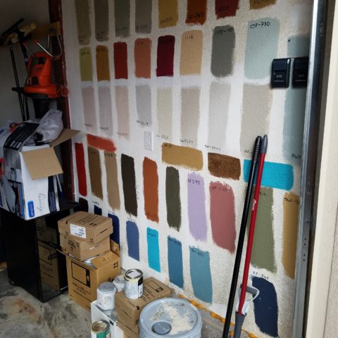
  3. Based upon your “inspirations” what is your color scheme? This direction will impact options and decisions for finish materials such as flooring, cabinets, countertops, back-splashes, wall finish and window treatments.
  4. Is it merely a facelift? New cabinet doors and drawer fronts? Perhaps new countertops and back-splash. Or is it a complete gut and replace?
  5. New appliances – replacements or additional components?
  6. Sketch the layout of your new kitchen, if applicable. Make sure the available space accomplishes what you are imagining.
  7. Imagine the finished product. Illustrations of the “after” design are the best way to accomplish this.
  8. When in this process should you consult with a design professional? Perhaps after number 3 once you have gathered examples of your preferences…I let the list continue beyond number 3 to give you an idea of where in the process you might feel the need to have some qualified assistance!! An experienced designer will see things you don’t, know things you might not have considered and ideally maximize your budget by avoiding costly mistakes or missed opportunities.
  9. For example, don’t miss opportunities for additional storage – this is a critically creative design detail that results, in great benefit, to the finished product.
  10. In fairness to you and your contractor, try to establish a budget. Do a little homework. Gather rough costs for lineal feet of cabinets, appliances, design consultation and construction costs (a good resource are the home-improvement stores). Give yourself some latitude as this cannot be a finite budget at this early stage of the planning.
  11. With your design pro, discuss contractors that fit the bill to what you are trying to accomplish. If you are only tackling cosmetic improvements, a general contractor might not be needed. For example, new wall finish, countertops and appliances or new cabinet fronts, a new light fixture…these are individual sub-contractor projects. But as soon as you get into moving plumbing and electric, adding or removing walls, puncturing the envelope with windows or skylights – you had better hire a general contractor to take responsibility for the scheduling, coordination, licensing and permitting of the work.
  12. Once your scope of work is determined, you might need to get familiar with great carry-out in your neighborhood!!! That and a few great restaurants too, as you might be without your kitchen during a portion, if not all, of the process once the work begins!!!

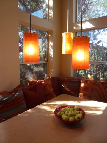
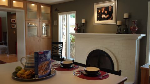
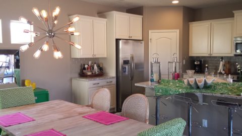
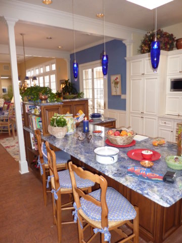
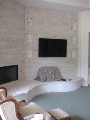
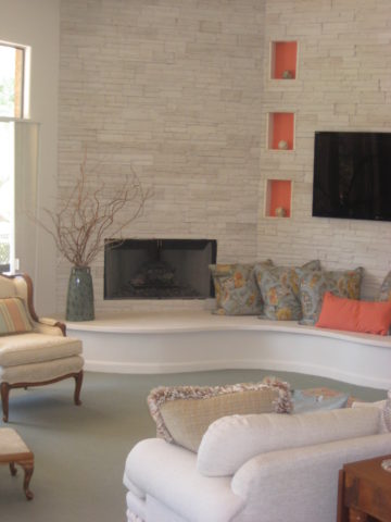
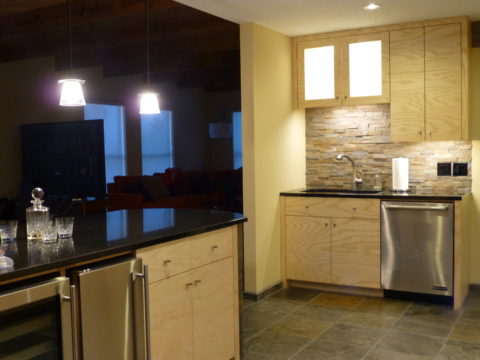
Here are a few projects that we have documented with pretty effective “before and afters” to help you consider some of the above referenced tips.

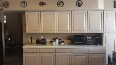
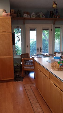
These peachy pickled white-washed red-oak cabinets had classic lines and were in excellent shape after 30 years! The original owners were ready for an update.


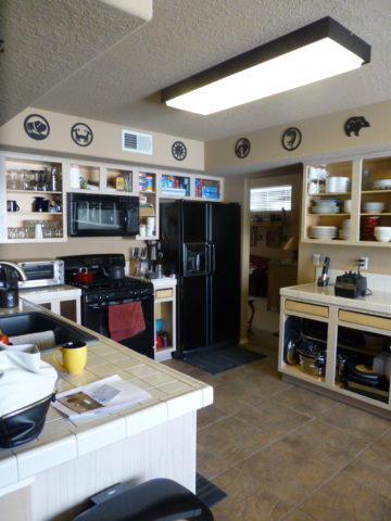
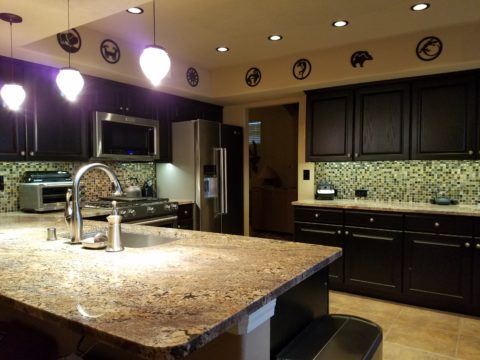
Purely cosmetic (except for replacing the lighting) we saved the cabinets in their entirety, painted the boxes, doors and drawers. By shooting the fronts remotely, quality control was insured and caused less imposition at the residence.


Black accent pieces were already in play. The new black finish was a dramatic transformation. Using a special tinted varnish, proper prep and several coats results in a very strong new finish. All other finishes were replaced with a conscientious effort to coordinate with the existing flooring. The result “reads” as though it was all done at the same time. The floor tile looks good as new!


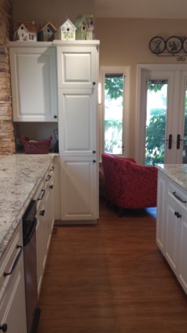
Similarly, we saved the cabinet boxes, but differently from the previous project, we added a few updated cabinet features and replaced the door and drawer fronts to a more classic raised panel detail.


Again the transformation was exciting, but by saving the perfectly good cabinets, we had far less disruption to the home-owners. Enhanced cabinet details for improved drawer glides, additional storage, new counter-tops, new lighting, and as is true with all of these projects “cabinet jewelry,” in the way of new door and drawer pulls and handles, adds the finishing touches.


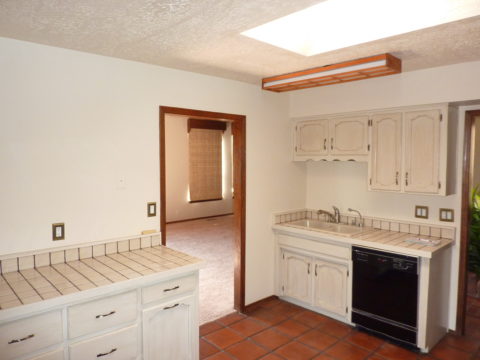
This very dated kitchen from the early 70s, had a new owner – a single man – and he definitely didn’t want this provincial look!


In this case, a general contractor was in order. We opened walls, re-designed all the lighting, replaced all cabinets with new custom cabinets, appliances, flooring, counter-tops and back-splashes. The transformation is astonishing!


TAKE NOTICE – Or You Might Just Miss Something Extraordinary!!

The world is becoming so fast. Decisions are “snap.” Instant  gratification abounds. And as we get caught-up in it all, more and more…there is a pendulum swinging. People are taking notice and longing for a reprieve. There is a clinging to values that if not grasped, might be lost.

Slow Food, farm-to-table proximity, support local, shop small…sound familiar? And does it appeal? Why do you think? As Amazon gobbles-up Whole Foods and everyone finds expeditious shopping satisfaction in cyber-space at the click of a finger – why?

Last night, as the sun set and the lights penetrated the darkness with their warm glow, I found myself strolling around, taking photos and breathing in the moist night air. Seaside, tucked in a quiet corner of a significant marina in Nuevo Vallarta, I recognized the magic. I was experiencing such magic.

It’s actually all around us, but it often takes a change of venue to realize it. In your world there is magic all around, but you have to take notice!

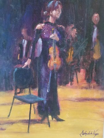
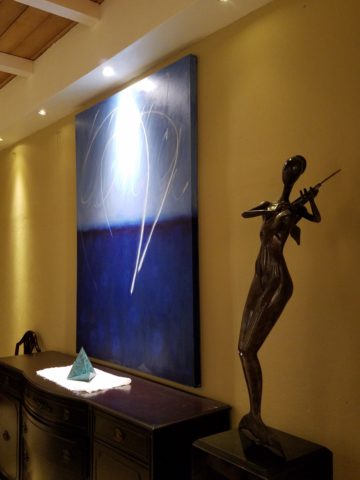
As I strolled, I came upon the painting recently completed by a dear friend. As I learned of the intent and while studying this painting of “The Violinist”, the sensitivity of the artist is revealed. And later confirmed by him.  Her tentative stance and demeanor begs the question he set the stage to ask: “Might this be her debut?”

The Violinist – a detail of the original oil painting by Federico Leon de la Vega

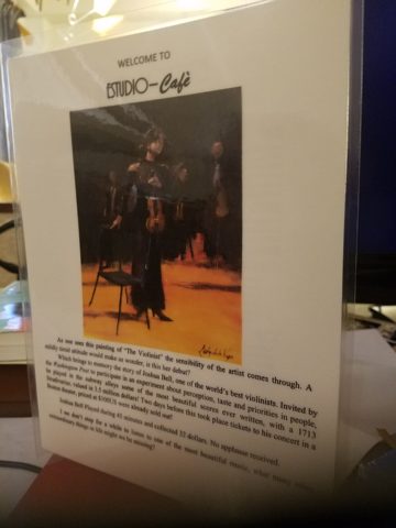
I then spoke to the sister-in-law of the artist, (chef/owner of the acclaimed Estudio-Cafe) and she reminded me about Joshua Bell.  Although I had forgotten his name, his enlightening story was quickly remembered. Have you heard of him? He’s the world-famous violinist who participated in a little experiment prompted by The Washington Post a few years ago. The idea was to have him play a $3 million dollar 1733 Stradivarius violin incognito, in the Washington METRO, to see if anyone noticed. Disguised as a street musician, with a baseball cap, he played for 45 minutes and collected a mere $32.00!! This is a man who, two days before, played to a sellout crowd of pricey ticket-holders in a Boston theater.  A world-class musician, with a priceless instrument, performing classical music of all of mankind and barely anyone notices!

Menu cover of Estudio-Cafe, Nuevo Vallarta

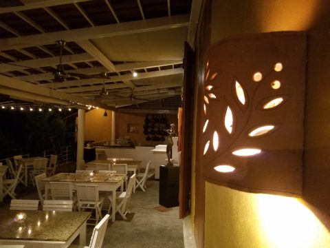
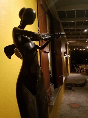
Coincidentally, I came upon another violinist-themed art piece last evening as I meandered through the patio among the quite varied artwork. Here a graceful bronze of a lithe, nude, mermaid projects imaginary sound wafting from her poised violin through the warm evening breeze.  I was enchanted. And my imagination was running wild!

Ready for evening to begin Estudio-Cafe Nuevo Vallarta, Mexico

Passersby seemed not to recognize the art beside them. As they walked slowly passing by the patio, unhurried, but caught-up in conversation, hopefully enjoying the incredible setting in which they found themselves. Yet they were oblivious to the outstanding collection of art displayed quietly, unpretentiously on the patio.

One of a captivating series of the mermaids in bronze by Octavio Gonzales

Back to powers of observation and taking time to absorb all the beauty and experiences around you…Joshua Bell admits, in retrospect, that it was terribly noisy and very fast-paced down in the METRO as better than 1,000 people rushed to their appointments. But regardless, it illuminates the concern that if we don’t pause to listen as we pass by the world’s most beautiful music, what other amazing things in this life might we be missing?

My husband continuously observes that I am NOT very observant. I know that this is true and I think it is because he and I observe differently. He takes in a wide swath of his surroundings – all sensory perceptions – 360. While I zero in on things and can be oblivious to something right in front of me, in favor of something nearby that has caught my eye. I would not make a very good Columbo as he  often points out! But I do enjoy the details as I encounter them!

From an interior design standpoint, I take in entire scenes and their context all the time. I “practice” this – I am practicing interior design. This is not spontaneity, it is the art of the study and evaluation of a scene. The challenging work of problem-solving. Until or unless something catches my eye that interrupts the study in favor of the unexpected!!!!

STOP and smell (or paint) the roses!!!!!

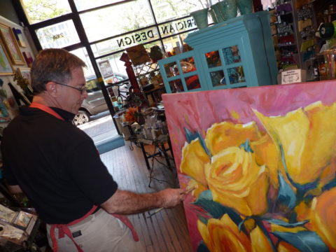
Federico Leon de la Vega with a previous commission of “Yellow Rose of Texas Bouquet” oil on canvas.

DIY…Do It Yourself Beachfront Getaways or DWI…Designing While Intoxicated!!

Not as the title suggests…tequila shots and all – but another kind of intoxication…an intoxication from unexpected beauty, sensory overload, inspiration as seen in the following photographs.

Those of you bundled up against the elements this time of year…freezing your booties off in the icy winter climes. Enjoy this escape into your unbridled imagination of design and lifestyle gone wild!

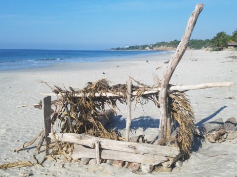
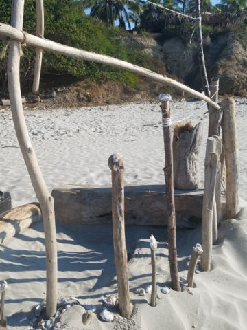
Thought a beachfront condo was out of reach? Think again. With all the DIY out there on the internet today, anything is possible. As evidenced by the inspiring framework of architecture that I have encountered just this week alone, consider the possibilities and have a little fun!!!

Very simple things trigger design concepts. Beyond the fascination I have had with these beach structures, this particular photo was bathed in late afternoon light. The glow of the orange towels was emitting a warmth that was so tropical, had it not been on a tropical beach, finding the same boldly colored and textured structure in a snow storm would have elicited a startling, contrasting feeling of the same tangible warmth.

This make-shift west-facing beachfront was so beautiful, in its simplicity, that it spurred ideas of bold fresh color, basic found-material furniture possibilities, fabric design and organic architectural solutions for patios both commercial and residential.

Imagine raw elements  incorporated  with concealed structural support to convey the feeling of spontaneous simplicity.

Then there’s that general calling that speaks to “the natural integrity of the materials.” You realize it is a grounding.  It is a starting point of reference to all the embellishments, layers, machinations and manipulations that are possible.

Wood is wood until it is stained, painted,  appliquéd…when does it lose its “natural integrity?”  Even raw, man-made cinder block – CMU – concrete masonry units have their own natural character. Then stained in the aggregate or applied color, thickly coated…it alters it’s state – losing its material’s natural integrity.

What ignites design thrills? The fireworks of ideas that burst onto the scene illuminating so much that was previously obscured. It doesn’t have to be a remote and seemingly inaccessible tropical beach…it’s everywhere. Look around. See texture and color, shape and frame. Urban, suburban and rural settings in any climate all offer inspiration that can be isolated and appreciated. Design inspiration can be intoxicating.

Why is designing so exciting? Why is it often such a rush? You never know when an idea will appear or from where.

The world around you is a constant stimulation of ideas, inspirations and possibilities. You are thirsty for  whatever is out there…whatever is waiting to be discovered, implemented… quench those longings.  It is all about the freedom to allow ideas to be spawned from anything around you or in intertwined with your own imagination.

What fun to have come upon these simple structures on a glorious and sparsely populated beach. What fanciful design ideas and story-lines were prompted by the imaginary occupants, their creativity, resourcefulness and problem-solving simplicity.  Lest you think they house the homeless adventurers, they are actually sun-shades for creative surfers and affluent sun-bathers seeking a primitive beach experience.

How might these primitive structural solutions play into a future project? Watch for design trends to incorporate more organic materials and nature’s inspirations!

I’m ready to explore the possibilities. Are YOU?

TRENDS DIE – What’s New for 2018?

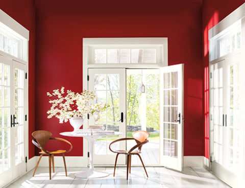
I was surfing for fodder about the new color trends to kick-off this first mindful missive for the New Year and the color trends were all over the place – no consistency at all. From Ben Moore selecting Caliente AF290,

“Caliente is the signature color of a modern architectural masterpiece; a lush carpet rolled out for a grand arrival; the assured backdrop for a book-lined library; a powerful first impression on a glossy front door. The eye can’t help but follow its bold strokes. Harness the vitality.” 

—Ellen O’Neill, Benjamin Moore & Co.

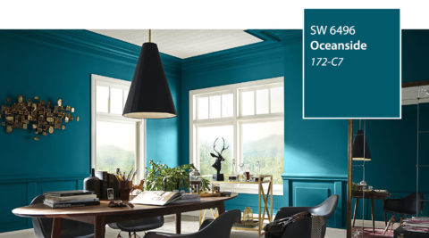
to Sherwin Williams in a totally opposite direction proclaiming Oceanside SW 6496 their color of the year.

“A collision of rich blue with jewel-toned green, a color that is both accessible and elusive… A complex, deep color that offers a sense of the familiar with a hint of the unknown, Oceanside, bridges together a harmonious balance of blues and greens that can be found in what’s old and new.”

What? Are we straddling now?  Do we have one foot in one color trend while the other stretches across the color wheel and causes us to nearly do the splits trying desperately to hang on?

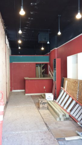
The walls of my east gallery space were a spicy version of Caliente for nearly 20 years! Bold at the time and unheard-of for  gallery walls – it was not to be changed for nearly 2 decades!!!

Whew – that was a run. I even named the retail space “Caliente.” And the color-band between the crown and picture molding at the back was a version of Oceanside – a lighter value of the blue-green hue.

The Grand Re-Opening July 2016 presented a dramatic transformation to a pale aqua resulting in a diametrically opposed feeling – a cleansing from what was crowded and hot to spare and cool.

But I digress…

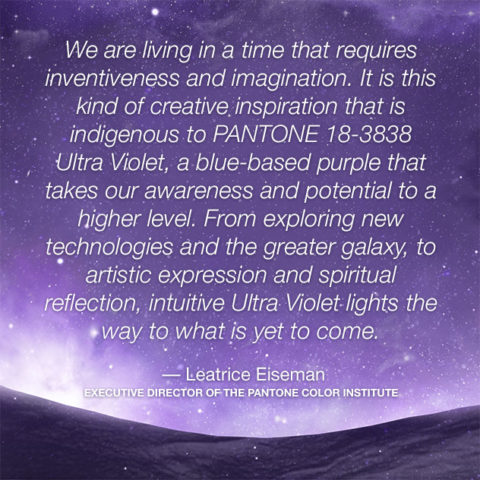
Annoyed by the seeming authority, but weak contrasting rationale that I encountered with the wide range of picks and opinions, I left the paint companies and clicked over to the Pantone site. There I encountered their authoritative, ethereal color forecast of the year – Ultra Violet!!!!!

Yikes – they were coming at me from every conceivable direction!!! How on earth is any eager apartment dwelling or home-owning individual supposed to know how to go forward in sprucing up their space without fear?

Then  I came upon a piece by Mehgan Nesmith Ugh, What’s With These Generational Color “Trends”? From observing the broad reaching trend surrounding millennial pink to snippets from other sources,  I scanned the paragraphs amused, but still not satisfied. Until I arrived at paragraph 6 and there it was – the true fact that keeps the world moving forward – for better or worse – TRENDS DIE.

Yes they do and for good reason. I’ve said it before, take care in making costly selections that will stay with you past their prime. Trends are there for a reason. Designers dabble in creativity every day of the year to come up with things to tantalize, inspire, evoke, and entertain – and most importantly, SELL. Some of these trends stick. Then they are no longer trends, they transition and become classics. But to transcend the fleeting status of trend, “it” must have something very solid about its being.

And when it comes to interior design, with all the style trends for furniture, fabrics, architectural elements, finishes and decorative accessories – colors race through history like no other design element has or will. Colors rule and when they are good, they are very very good, but when they are bad, they are horrid!!!!! Thank you Mr. Longfellow!!

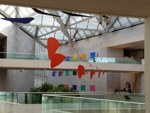
Take the massively graceful modern art piece suspended from the ceiling of the East Wing of the National Art Gallery in Washington, D.C. – classic – both in form and color. Red and black. Strong and simple. Bold and brilliant. Imagine if it were this year’s Pantone pick Ultra Violet  Aghhhh!!!!!!!

Actually, methinks I protest too much. The shade of purple picked, by Pantone, is heavy on the blue rather than the red.  The blue cast gives it a calm. Not whacky like Barney screaming purple – but, rather a royal shade.  Nonetheless, it is better served as an accent – don’t buy  wallpaper in it. Go ahead and paint the walls and have your fun – but know that you can change it without peeling off hundreds, if not thousands of dollars of wall-covering or re-upholstering your sofa like Meghan was tempted to do!!

It’s a color that stands alone – plays better by itself than with friends – like the child’s report card where the box that says “plays well with others” is not checked.  In my estimation, it will read well with clean, crisp white.  However, like Ms. Nesmith aptly says in her piece “if you are  still curious about that Gen Z yellow, buy a vase!”

That’s how we play with  colors and create a bit  of collision, unexpected off-key harmony, intrigue and suspense. But it is not for the faint of heart and the chance of tiring of it is paramount. Trends die and colors are tricky.

So Happy New Year and Happy New Colors in your world to refresh and renew!! Thank you Meghan, for your lively contribution to today’s story.


COMFORT & JOY with ART

A few years ago I gave a talk. The title was  something like “I Need a Piece of Art to Go with My Red Sofa.”  It was a defensive argument giving liberty to those who sought artwork for decorative purposes rather than an esoteric rationale. As an interior designer surrounded by artistic influences and drawn to the limitless styles, pieces, concepts and movements of the art world, I see and appreciate both sides of this controversial coin.

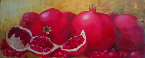
Federico Leon de la Vega’s Pomogranates

In my opinion art should bring joy. And that is not to discount art as a social commentary, honest statement of artistic philosophy, opinion, or personal expression. As an interior designer, my simple philosophy is that joy is a goal of interior habitats – function and joy simultaneously. For me, there is a synonym for beauty in there. Oh – and how apropos – it’s Christmas time and the carol God Rest Ye Merry Gentlemen specifically identifies bringing “tidings of comfort and joy.”

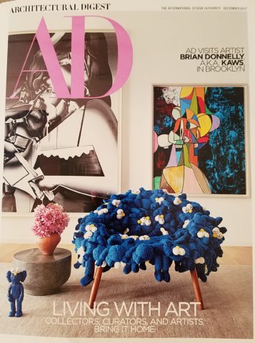
In this  month’s December 2017 issue of AD “Architectural Digest” Living with Art, architect Luis Laplace offers that he doesn’t really know about beauty in art. He sounds modest and self-effacing.  “I say I don’t know beauty. When I see that something works, then I see beauty.”  I say that is saying a lot about context. But inasmuch as I can see context being so perfect to showcase a piece that it validates it somehow, it seems lacking in the department of honest personal appreciation or criticism. Surely he must find beauty in art before it is placed.

I can see admitting that something having potential is a valid “wait and see” position to take when allowing a piece to be placed to its best advantage, prior to judging it too harshly – but that seems reserved for pieces about which one is trying to give them the benefit of the doubt! It sounds a bit like tap-dancing…making excuses. Excuses for not having an initial opinion or spontaneous reaction – much less appreciation – much less, joy.

Festive boat bringing JOY at the San Diego harbor parade last week.

Another comment that Laplace makes in this article “High Art” is that “We never use art as a decoration,” he declares. “We design for installation and rotation.” And I am sure in his world, that is exactly what he does. But let’s get down to earth and acknowledge that it’s a chicken and egg thing – the luxury to design expressly for the presentation of magnificent rotating works of art versus finding joy in a piece to decorate your world – with or without rotation. He makes decoration sound like a bad word. And perhaps he thinks it is – but why? Adornment, decoration, enhancement, emphasis – all superlatives, in my estimation.

Federico Leon de la Vega’s Script on Blue

In a completely opposite place on the planet both figuratively and physically, Robert Downey Jr, in this same issue of AD, expresses an explanation for their selections and design direction. “We didn’t set out to do something conspicuously whacky.” He obviously gets great joy and a kick in the pants out of his approach which he cements, with the following comment: “We just enjoy a bit of whimsy and fun.”  And then a negative nod to separate him from the more cerebral art enthusiasts – “We definitely don’t like boring.”

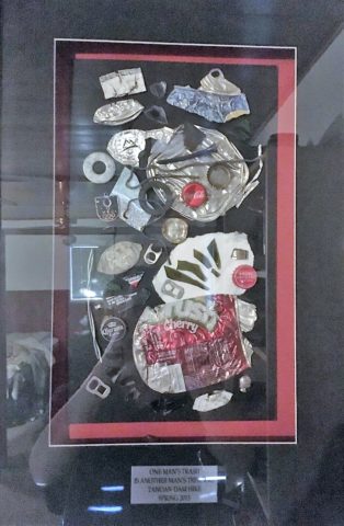
But that is a direct comment on the joy thing and one of my oft borrowed quotes “One man’s trash is another man’s treasure.” Here, a tangible example that I created for my grandson, Liam a few years ago. Debris he and I collected while on a walk one day, I assembled into a collage and had it framed for him with the plaque to remind him to look at things and regard things from all angles.

From what one person derives joy, another might find boring and uninteresting. And that oddly seems to return to the Luis Laplace comment about not seeing beauty until it is placed and then can be recognized. Hmmmm…Yet, I am saying that it might be of value to study things and  think about things differently than face value at a quick glance…spontaneity is valid and so is “love at first sight,” but often things are missed because their context s not serving them well. That space above your red sofa might be just the context and proper setting to showcase the “whatever it is” piece which might be far less interesting otherwise.

Which is why, in this time of international commerce delivering things from all over the planet with an almost instant gratification speed, we still have difficulty making decisions about what to chose to have in our world. Which fabric, which furniture, which art…the choices are at our fingertips and delivered to our doorsteps without leaving our living rooms, but fear of costly mistakes, second guessing trends and how to make good investments still remain the dilemma shared by most. Fear of trusting your own joy. Or, better yet, discovering and defining your personal joy.

Which brings me to the last quote I extracted from the December  2017 issue of AD by an artist, Brian Donnelly, speaking about his own residence and art collection, and that is  “I don’t buy art to put in specific places. I just collect what I love and hope to find a place for it.” Sounds like spontaneous joy to me!!

Closing with best wishes for a Merry Christmas and “tidings of comfort and joy.”


Value. What is an “Investment Piece” and Why?

In the design vernacular we keep hearing the term “investment piece.” What makes an investment piece? Is it that you spent more on it than most other purchases? You splurged? You made an unusual purchase that generally costs more than your norm. Sure, makes sense, I get this. Considered to be a focal piece, this seems to be the nod. However, I often feel entirely differently.


Investment. An investment in time, emotion, thoughts and beliefs…what type of unusual investment? An “investment piece” is usually a focal point or a piece placed in a position of prominence. It makes sense to identify an “investment piece” as something that is monetarily outside your usual comfort zone – but must it?

Consider that there is also the fact that a piece that hits a chord and is not easily replaced – if at all – is an investment. Seeing an objet d’art, on a folding table at a garage sale or amidst the throngs of a flea market, that catches your eye and is yours for a song – the bargain of the decade, or at least that day, is an emotional investment. It’s not about the money.

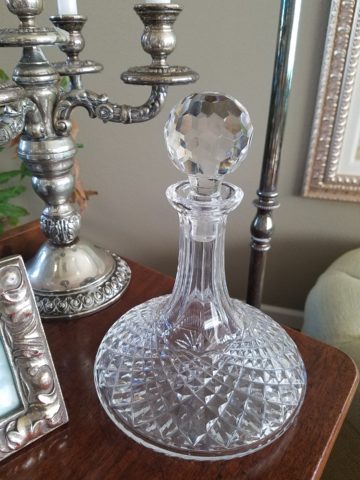
This “find” might actually have “cred” in a broad evaluation of appraisal. It might be a tiny Waterford crystal bud vase, like I found at a flea market for two dollars, about 35 years ago. I was just starting out, decorating my world, and it’s cut glistened and caught my eye from a cluttered table of garden tools, electric curlers and all manner of debris.  There was and still is a true value for this type of piece. It is replaceable – not one-of-a-kind, but a lovely piece. Similarly, at garage sale many years later, I spied a sparkle across many tables to discover a large Waterford ship’s decanter clustered with a few other unmarked pieces. Neighbors selling for a friend, they were cautiously asking twenty five dollars – the bargain of the day.

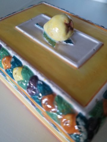
Once, in a consignment store, I came upon an ARS Italian ceramic box for five dollars that, although marked on the bottom, is not so published as to be easily priced. And I don’t care. Too me it is a one-of-a-kind find. It is old. I can’t replace it. I love the colors of the glazes and little pear top, it’s imperfections speak to it’s vintage and made-by-hand quality. It makes me smile.

When I hear people reference things by their monetary value, it strikes a sensitivity in me that is quite emotional. It annoys me. It frustrates me. Perhaps I am too sentimental, too attached to the enjoyment of “things,” but it’s what these things evoke, what they trigger in the form of memories or just spontaneous pleasure. What brings a smile, a tangible joy, is more to the point. It is a treasure.

Pieces with genuine sentimental value, because they have been inherited, reminding the current custodians of who preceded them and cared enough to preserve and pass down…and contrarily the ease with which some can unemotionally and easily part with something that has passed to them. It can be distilled to what one might find beautiful or not, and what speaks to the point – does this bring you joy or is it an onus?

It makes perfect sense that I am in this field. I see what clients have, ask them about what means what, and sometimes even argue in favor of keeping something that was destined for replacement or complete removal. I want to know what brings my clients joy. I want to make sure they don’t miss something they already have. It might just be the context that makes the difference.

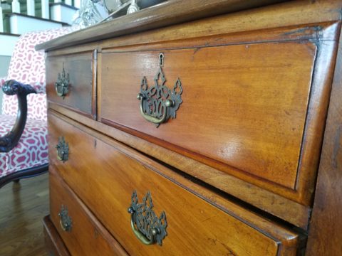
Sometimes my clients have a piece – usually large – that they just don’t know how to use. They would like to, but just can’t find the right place. This is when we might consider other uses than the obvious. A bedroom dresser, might become a dining buffet. We change the context and save the piece. It gives new life and appreciation. It is a combination, in some cases, of function and joy. Thinking outside the box.

To have a careless non-attachment to things, that have not cost a relatively unusual amount, frustrates me.  Yes, it can be a good thing, freeing actually. Whereas I am burdened by my sentimentality. The fact that something is disposable merely because it was a “find” or a “bargain” should not make it less valuable – in my estimation. It’s not always about an expense.

It is a similar, yet reverse, process as selecting an item because of its cost or brand as thought that validates it. As though it is the primary reason to make the decision. I prefer to encourage people to find confidence in what they like – not merely a perceived or recognizable value. The result is the uniqueness that makes their world more personal, more individual, more uniquely theirs. It’s a treasure hunt. What is the value?

An “investment piece” should be almost, if not, irreplaceable – not by its cost – but by its unique ability to bring you joy. Have confidence to know it when you see it. It will be the right decision.


COOK + PARTY: Set the Stage for Style with Art in Daily Life

Having art woven through the daily activities of your world is stimulating, satisfying and inspirational. It stimulates the imagination, satisfies with the knowledge that is was created by an individual artist and inspires to spur the creativity we each have to express – whether we know it or not. It encourages appreciation.

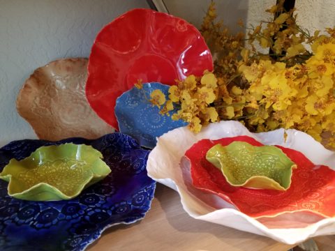
Functional art is a cornerstone of the work we offer at PATRICIAN DESIGN. As a novel promotion of the various artists who create and produce exciting food-safe serving pieces on display and for sale in our shop and affirmation, of the belief we have that art should set the stage for style in daily life, we began our series – Patti’s COOK + PARTY. We like to party and we love art – so we party with art at the  center of the  festivities!!!! Let’s get this party started!!!!!

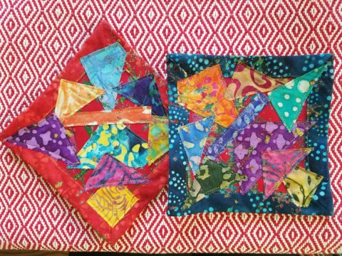
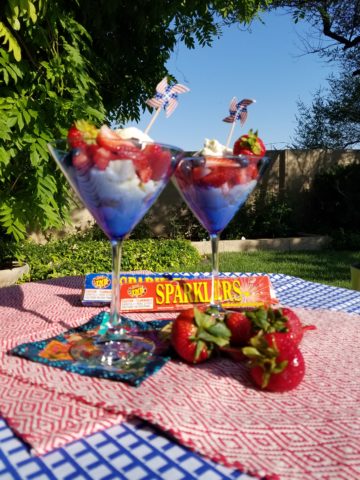
Six months ago, we began our series and followed the seasons as we progressed. By Fourth of July we featured festive party parfaits in expected red, white and blue! Our martini glasses were placed upon colorful cocktail coasters hand dyed and pieced into pretty patchwork squares by fiber artist, Rebecca Speakes!

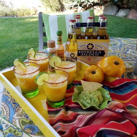
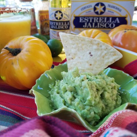
Micheladas were given a twist with plump yellow heirloom tomatoes! Alongside was a fresh guacamole featured in a rippled-edged undulating little piece of pottery by artist Anne Marie Werner Smith.

Her collection is wonderful and we continue to feature key pieces in our weekly recipe pairings.

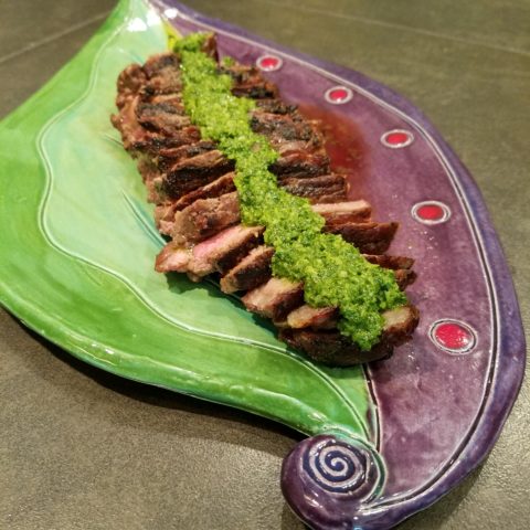
The pairing of recipes, with handmade art pieces on which to present and serve is inspiring. Here is a New York Strip steak bathed in a crazy fresh, from the garden, combination of pesto/chimichurri (yes, we created some crazy combinations of the two) sauce presented on a fanciful leaf platter by artist Robin Chlad!

Seeing examples of fun recipe ideas displayed on functional art creations is an unbeatable combination. Just tell Guy Fieri that for his Next Big Project!!! Rooting out artist’s studios in every pocket of the country and discovering great work and pairing it with great food – fantastic!

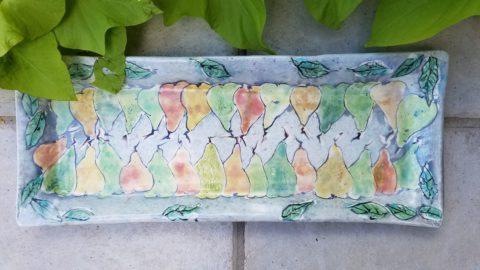
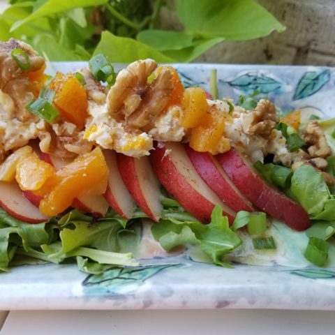
The colorful drawings and painterly style of Mariana Gasteyer’s pottery is whimsical and festive! Here a couple of examples and a fabulous featured recipe of a paired pear salad – half roasted and half freshly sliced – the combination was divine and the presentation on the platter was perfection!

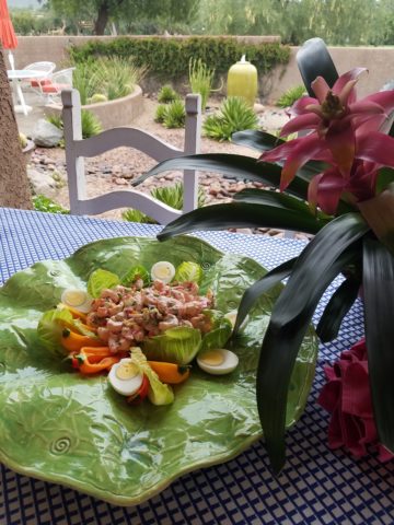
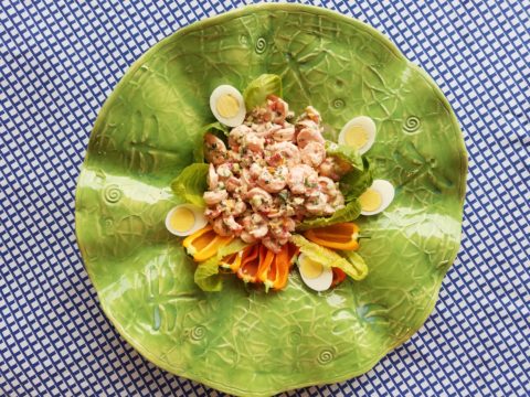
A summer road trip took us too Tucson where we featured a huge lotus platter by artist Penne Roberts. Here we featured a vintage Shrimp Louis Salad.


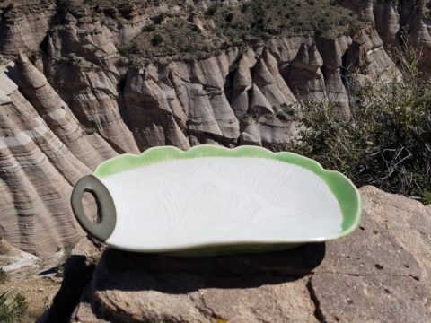
As fall progressed, we hiked Tent Rocks to photo this amazing platform piece by Jenn Dipaolo.

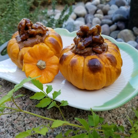
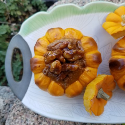
Upon the platform we placed a pair of sweet and savory mini pumpkin pots de creme.

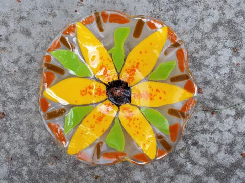
This past week we featured a dazzling, luminous glass sunflower bowl Margaret Hidalgo Vanderheyden.

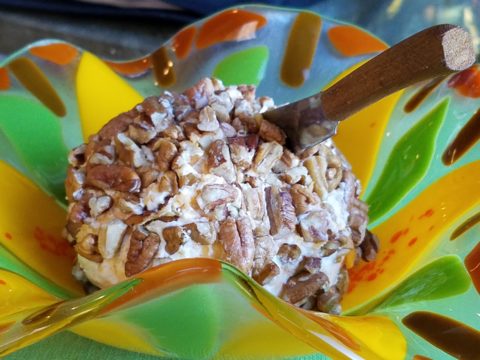
This spectacular fused glass assemblage frames our pecan crusted cheese ball perfectly.  Fall colors with holiday flair, this bowl makes a statement!!!

Supporting local artists, showcasing their pieces by pairing with food is the  bomb!

Start family traditions with signature art pieces, build collections and shop  small supporting local artists in your community!!!

If you would like to receive our weekly Patti’s COOK + PARTY recipes and pairings with our functional art finds, let us know what you think and sign-up with your email address!!

Adding Personality & Panache – Before & Afters

Everyone loves befores and afters. Last week we featured a project that received a dramatic transformation. The trick is, you have to think thoroughly about taking “befores” before you tear into it!!! Hindsight is so often 20/20 when delving into a remodel.

I dashed over to Phoenix last month to celebrate the Grand Opening of an exciting new clinic that we have recently completed. While there I visited great friends and re-visited a wonderful residential project that has stood the test of time.

Here we have two restrooms in that same project. Rich colors of warm coral, brick and golden tones with natural materials from stone floors to counter-tops and wall treatments. It is a Spanish theme – albeit eclectic with art and decorative accessories, of this well-traveled couple.

What was plain 80s’ vanilla receives a new-found richness and warmth, depth and interest. Do not be afraid of dark colors in small rooms – I’ve said that many times in the past. I’ll bet that you have seen spaces exactly like these “before” shots. Clean slates, but so uninteresting it is remarkable to think owners are content to live without personality in their anemic interior spaces. We added powerful personality and panache throughout this residence.


The master bath had dated surfaces and uninteresting configuration. We transformed the area by connecting, with a glass panel, the tub and shower areas. However, we elected to use a shower curtain instead of glass door. I often suggest this alternative. It is softening, less expensive, easy, minimal maintenance – less wiping!!! Watch for another new master bath with a shower curtain and glass combo.

Full wall treatments of stone or ceramic are wonderful, substantive ways to suggest architecture over mere decorative appliqué. The material suggests structural forms. It never should stop on an outside corner, lest it defeat the purpose. It is to be a mass.

So take those “befores” and enjoy the “afters.” Don’t be afraid of dark colors in small rooms, and use stone and ceramics generously without fear.

P.S. Last week and this today are of a fabulously enjoyable and successful remodel transformation done 12 years ago!!! Yes, revisiting a couple of weeks ago,  I took these afters of exactly the interior that we designed that long ago. It has been a virtually timeless project. The owners have enjoyed the spaces so well that they have maintained them without any modification. So we thought that you as readers would get a kick out of the long-term success of these design decisions.


SPANISH STYLE BRINGS INTERIOR SPICE

Fabulous clients – turned great friends – bought a good-sized townhome in Phoenix. It was plain vanilla inside with wall-to-wall broadloom and everything painted the same creamy neutral. They stood in the center of this bland slate and called me saying we think we want to clean this up and go with a mission-style simplicity.

They saw the ornate cream-painted wrought iron ascending the curved staircase and wanted it gone!

I flew over and saw for myself this dated interior with very good bones. Layout had great flow, nice lines, handsome coffered ceiling and other interesting features. I pondered the elements and the context of the exterior architecture. It was stucco with red clay tile roof, and iron railing details. Sure, we could slick it up, remove the embellishments…but should we?

The desert heat can be oppressive.  Some choose to embrace the glories of the sunshine and design bright airy interiors with plenty of refrigerated air to compensate for nature’s blistering temperatures.  This approach we were about to take was to be quite different, in that it offered a shady reprieve from the elements.

Therefore, despite the initial suggestion, for the style of the remodel, by my clients I offered another design direction . Why not spice it up with Spanish? Here we are in Phoenix, with architecture suggesting this genre. Knowing their bent for traditional interiors, from two past residences that we had designed together, and with a detailed discussion of the possibilities and evaluation of the elements, we agreed on the Spanish theme and began the transformation.

This is a perfect example of isolating the existing features and determining what to salvage and what to remove. Of the things to be salvaged, how can they be revitalized? So, with that in mind, the staircase was stripped of its carpeting and solid wood treads were added with custom-designed glazed ceramic tile, for the risers. A Moorish influence was the basis for the geometric motif.  The staircase’s semi-ornate railing  was  painted a dark, nearly black, charcoal. The result was startling.

Throughout the home, colors changed, stone columns and fireplace details were added, a wet bar was abandoned in favor of opening into the kitchen. Travertine stone floors were installed throughout the lower level with hardwood upstairs.

An open loft area was compartmentalized into a narrow gallery-bookcase with isolated and fully closed office beyond. Bold colors over-lap and contrast on layers of interior planes.


The result is a cozy retreat from the desert heat incorporating design elements suggestive of Spanish Colonial, transitioning to other modern elements complementing the overall design. To begin a remodel, look at the existing elements, the style of the architecture, the context of the structure and see if you can find a story.

This house now tells a story of intentional decisions, cohesive finishes, a directional theme and a finished product that represents the owners’ giving personal identity to their home.


Getting Smashed with Good Design!

Here I was walking along, on this sun-washed Sunday morning, when I came upon what appeared to be giant frog’s eggs in the middle of a field – like ET had laid enormous translucent eggs on earth – I looked up, I looked around and there they sat – tumbled on the grass…the scene was surreal and beautiful in the early morning’s light.

Upon closer inspection, guys were hauling many more of them from a remote truck, onto the field.

I started taking photos and was approached by a man who asked if I had ever seen them before. No, I certainly had not. And inasmuch as this is NOT intended to be an endorsement or advertisement – the bold name, on the side of each, stated KNOCKERBALL!

I was so excited to come upon this other-worldly landscape that I began to fantasize about the many effects of good design. I shot inside the transparent globes, along the edges, down the rows and with great mountain backdrops.


The shape, color and structural detail was fascinating and fun! The taught cords inside created another layer of interest.

The kind man who was coordinating this event explained that they set-up soccer-like goals and wear these globes crashing and smashing, running and rolling across the field – unfortunately, I had to leave before the action began. It must be a blast!

I have since learned that “bubble ball” and “bubble soccer” are other names for this new fangled game and related equipment. They are not always rented for game days, but are also purchased as singletons and used to roll down hills and other antics. So fun! Check out this site: https://knockerball.com/what-is-knockerball/

Play with good design. Get smashed with good design. Discover good design. Get excited about good  design – wherever you find it!!