Aside from tedious wills and other legal asset planning and consultation, the design decisions for aging in place are more than challenging. With the best laid plans available at the time, we look into the far distance to a time when we might not be getting around so well. It is with these faint thoughts sneaking into our reality that jars us a bit. Thoughts for the future about downsizing, getting rid of “things,” making modifications for accessibility and ease of maneuvering. This might mean re-redesigning a bathroom, moving to a lower level, selling a multi-story and settling into a single level. Yet, not everybody has the luxury of aging in place.
I’ve studied it through initial interior design courses, continuing education, and on to incorporating applicable features for clients and even family in homes and offices. It’s amazing how abstract anything can be until it touches you personally. In one class for example, we were asked to get into a wheelchair and ascend and descend a ramp – one of adequate slope and one not-to-standards which proved much more challenging. We were asked to access a restroom and navigate the space including making a side transfer to a toilet from the chair. We noticed heights of things difficult to reach from a seated position, angles of mirrors, and the strength required to do many basic actions. And shy having this actual challenge in real life, these exercises were sobering and valuable when it came to considering facilitating maneuverability and accessibility in life/design planning.
Whether an aging scenario, a progressive disease, a vital young person being impaired by an inconvenient injury, or worse a permanently debilitating catastrophe, the reality of those situations is enormous. Some injuries are temporary while others are life-changing, but all require consideration while they and related limitations exist.
Anticipation. We can maybe imagine and anticipate such scenarios, but it is easy to dismiss and put aside for another day. That day came a couple of weeks ago for me. My mother was hospitalized which, in hindsight, was over-kill that nearly killed her. The life-changing things that followed were remarkable and came on so quickly. No time to carefully plan – just figure out how to fix things, how to make due, how to work-around the issues. We had always intended for her to “age in place.” Her home was designed, by her, for her and took into consideration many things based on speculation 20+ years ahead.
Once this change of events unfolded, all of my senses were heightened. I saw everything differently. I was keenly aware of my surroundings even more than I am as a normal course of responding to my design instincts. I became critical and incensed. I wanted to assign criminal fault to such things as color choice and lighting.
I learned that not all situations are the same level of good or bad. They are dependent upon the eyes thoughts and reactions of the individual. Beauty, as we know, is in the eyes of the beholder. But many things I encountered transcend that very true phrase. Sensitivities are so very important. Aging in place is tough. It is not for sissies. But it exponentially worse with dementia. Being moved to an aging facility other than your own home is another story completely.
With all the professionals with whom I have spoken whether neurologists, gerontologists, physical therapists, occupational therapists, or home health nurses, each have common denominators on the subject that crosses between disciplines. But I can also see how individual’s design sensitivities, or seeming lack thereof, play a significant roll in their ability to thrive and even survive. I am not over-stating this imperative.
Dementia has triggers and although some may be similar among individuals, like “sundowners” (an anxious reaction to fatigue and end of the day dimming of light), or other confusing or anxious moments brought on by physical discomfort, change of environment or sleep deprivation – there are endless other triggers that are unique to that individual. Understanding what those unique triggers (and pleasures) are is key to affecting the quality of life that results from effective or ineffective design decisions.
In the past two weeks, I have seen hospital interiors that were so busy and confused of materials that it seemed impossible that they were selected in the first place and more so that they were approved, purchased and implemented as well as assisted living facilities that ran the gambit from dated and irresponsibly neglected to posh and resort-like.
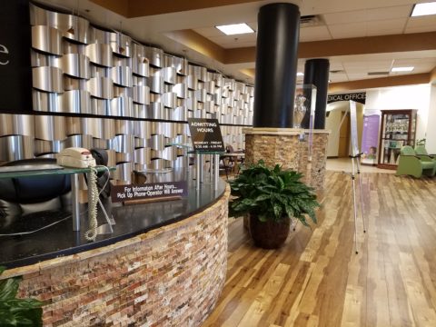
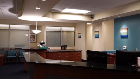
A hospital is supposed to take the curse off of the fears and trepidation that often accompany a visit while instilling confidence and comfort. Without identifying the facility I ask you: In the mainstream of our society, does this combination of materials evoke confidence and comfort? What words correlate to confidence and comfort…at the least, order and cleanliness. Those would begin to establish confidence and comfort. This scene at the lobby of a prominent local “Women’s” hospital is confused and harsh. Large black backdrop to the logo/signage (not shown) is heavy and reads more like a high-tech or machinery or mining facility – contrary to an uplifting, soothing, comforting, welcoming environment of healing finishes and colors. Sadly, other areas had similarly jarring effects.
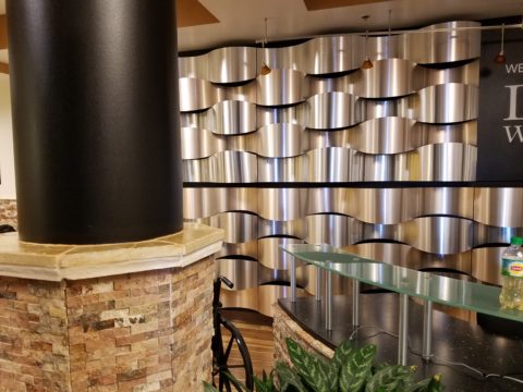
More interesting, by means of comparison, was the research that took me to a wide variety of well-regarded “upscale” assisted living facilities in the area. These were the facilities that were highly rated and referenced when asking around the community for recommendations.
This first one is managed by one of the world’s leading management companies. I will be contacting them regarding what we found when touring last week. The horror of this discovery was in being greeted by the point-of-arrival – newly remodeled to suggest upscale appointments, lovely living spaces, patio, dining room and even an attractive and believable bar area for cocktails and gatherings. Quite sophisticated and then…we were slapped in the face with the brutal reality that we soon discovered. The corridors of the rehab/healthcare and assisted living areas were dark and poorly lit. Colors were warm earth tones that further contributed to the drab, somber aura of depression. Not relaxing, uplifting or soothing – just plain dull, depressing and dark. Many more disturbing details were observed that are not applicable here.
By dramatic contrast was a light, sunny interior which benefitted from much natural light and even in the corridors which were reliant upon artificial lighting they read with a soft welcoming glow. The creamy walls and white trim paired with the soft light was easy, soft and comfortable. The over-all “read” was residential with enough hospitality to add interest but not to diminish the at-home feeling of the building and grounds. The interior and exterior spaces for both assisted living and memory care were clean, and pleasingly comfortable. The exterior spaces and were grand and inviting with lots of beautifully maintained grassy areas, planting beds and trees for shade. Exterior spaces mean a lot when you are retired to this limited world view.
A fairly new facility caught our attention with pleasing new finishes and color, light and spacious, residential, but also with a bit of hospitality flair – however, with all the very practical hard surfaces, in much of the living spaces, it lacked comfort. Crooked lampshades and missing outlet covers suggested that attention to details was being replaced with smoke and mirrors of the overall effect. We were initially thrilled and then a bit suspect of this facility after our tour.
If one wanted fresh and stimulating, a brand new gorgeous property sets the stage for a would-be modern resort. Bright bold colors and contemporary furnishings, wonderful spaces, stunning modern light fixtures and great finishes belie the true identity of this assisted living and memory care facility. Exterior spaces here also green and nourishing with juvenile plantings due to its new construction. It appears that the mature plan will be quite pleasing. A frail 90+ year old might feel too diminutive in this facility but the family would feel excited and uplifted. The questions is for whom is it designed? The upcoming generation of retirees perhaps – if not for sure – fabulous – or the current elders that come from a different age and era for whom it might likely be overwhelming with the modern approach, scale and finishes. Plan for the future though – it will be here before we know it!
A frightening comparison occurred when we visited a well-regarded faith-based retirement community of many facets and facilities. While a new structure of independent living apartments sports fine finishes, comfortable dining venue and an exceptional indoor pool, the assisted living wings were absolutely irresponsible in this observer’s opinion. Although these areas were decades old, poor color choices of spicy, yet muddy hues, drastically discolored plexi lenses over surface-mounted fluorescent lamps of many colors made for a freakish, scary interior that felt both institutional and garishly executed and neglected by those who should care to say the least – an insult to most peoples’ sensitivities. We could not fathom how this had for so long been unaddressed – paint alone would have gone a long way to improve the existing conditions. In no way could this interior be considered conducive to wellness or stimulating betterment. Even if you take personal opinion out of it, the lighting and colors did not feel fresh and clean. In the two previous examples, the first being quite traditional and the next being very contemporary, both had a freshness and quality of light and pleasing colors and finishes that were completely lacking in this last example. This interior to us was beyond our first accusation of the drab interior being criminal in its negligence of good design practices given the management and money to do MUCH better. This facility headed toward intentionally and dangerously derelict in its duty to provide an environment that promoted improved health and wellness.
Of the first and the last examples, it seems that they are just providing pockets of space, claustrophobic and dreary – if not down-right depressing – yes, true, the latter littered with disorganized debris on the walls, both with odors of tired food and other unpleasing combinations. We knew that if we had any fraction of sensitivity to light or colors or an awareness of order in our minds, that these two interiors would lead swiftly to our demise. While by stark contrast, the other examples were convincing enough to us that a fate being placed in either would be quite satisfactory even pleasingly uplifting. And all of this comes back to knowing the individual and their sensitivities, history, interests and likes and dislikes – and some human sensitivities that transcend all. Yet some facilities deny anything to those with even limited capacity and lower the bar to treat all – including staff – like it doesn’t matter – it doesn’t make a difference. That is NOT an environment in which I want to spend any of my precious, allotted time or assign that of a friend or loved one.
I went back with the intention of photographing all of these examples…but with residents parked in every applicable shot – I felt invasive and obviously not cut-out for this kind of investigative reporting…
Like the 3 bears…one was awful, one was over the top and the one in the middle was just right. A new facility just opened and presented this third, middle offering. A stereotypical palette of oranges, neutrals and browns, and faux stone was acceptably common. It was new and fresh, had white subway tile with dark charcoal grout in the bathrooms, and “friendly” faux stone detailing around the residentially inspired exhibition kitchen. The footprint of the facility was small and would be considered intimate and easy to navigate – but we thought, for our purposes, too small and the white subway tile with dark charcoal grout in the bathroom would not have been an asset – nor would the pedestal sinks – providing no surface in your private bathroom. So just when we thought it was just right – those interior disappointments along with the exterior living spaces of gravel and concrete pavement – it didn’t fit the bill.
Some facilities presented photos of the residents in their prime, back in the day – familiar nostalgia that was tastefully utilized. While others attempted a similar but disappointing effect with cluttered and disorganized paraphernalia of times gone by… Too much use of “cutes and quaints” craft store furnishings and decorative accessories looks like a cheap rendition of formality and refinement – missing the mark by miles. Theme areas invited some and completely turned off others making the percentage of the enjoyable spaces fragmented and limiting. Knowing this, it is apparent that designing for an individual’s personal environment is easier than designing to appease or please a group. Obvious differences are males versus females, age, lifestyle, interests, and over-all likes and dislikes. Due to the price tag on these units, the residents are well-heeled, have had decades of lifetime experiences circling the globe and collecting treasures either passed down or acquired over the years. A simple, tasteful balance between opulence and casual elegance, luxury and down-to-earth comfort would appeal to most in this bracket.
The recipe is pretty easy and loaded with common sense. Grand entries and intimate interior spaces, plenty of natural light, spacious common areas and visual and accessible connections to well landscaped exterior areas furnished for visiting and entertaining. Clean durable surfaces easy to maintain and being well maintained, soft neutral colors punctuated with fresh accents, excellent variety of artificial light, planned placement of postings, art and decorative accessories – policed for order and consistency.
For those with sharp minds and bright intellects it is more challenging to provide the convincing interiors that will satisfy their discriminating requirements. While dementia residents have hidden pockets of memory, clouded remembrances of comfortable familiar things and yet no less of a need to find a safe, pleasing place to call home.
I apologize for not having more photographs of the examples I reference, but I hope that my purpose and observations aid in the work to be done to place disabled individuals in environments that most satisfy their sensitivities and as a result promote the BEST quality of life. We are their advocates in many cases and must strive to view the world through their glasses.
Go on your own, in advance of the need – I encourage you. Know that interior designers and others involved with the interaction in or improvement of interior spaces will have epiphanies about what lies ahead for their clients, their own families or themselves – this is an important dialogue.
I might, with encouragement, provide more up close and personal critiques of specific areas of these facilities in an effort to offer further assistance and insight in emphasizing the positive and calling out the negative for improvement. Many of these residents are trapped to a certain extent – not having made this decision for themselves. It seems imperative that we raise the bar to insure safe, clean, sensitive, environments of dignity and comfort for all.


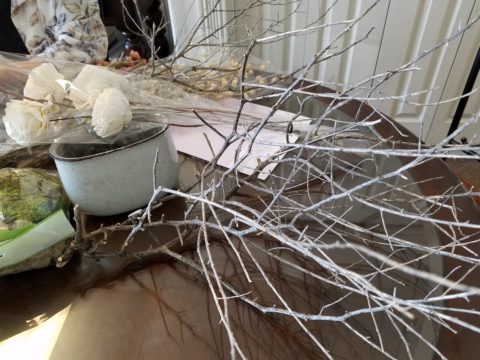
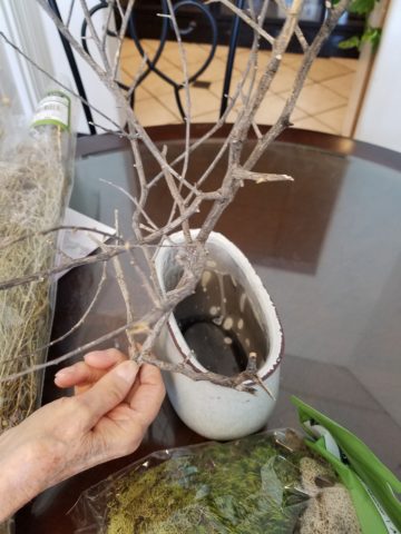

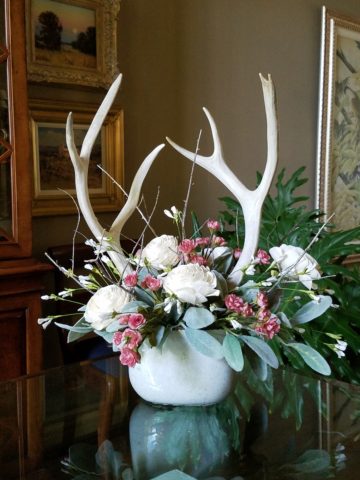


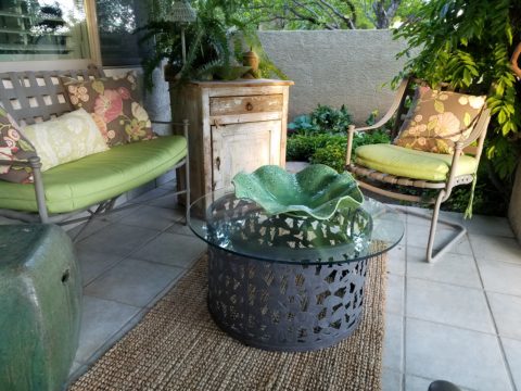
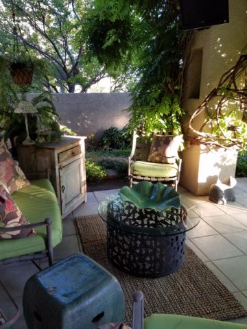
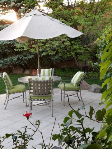

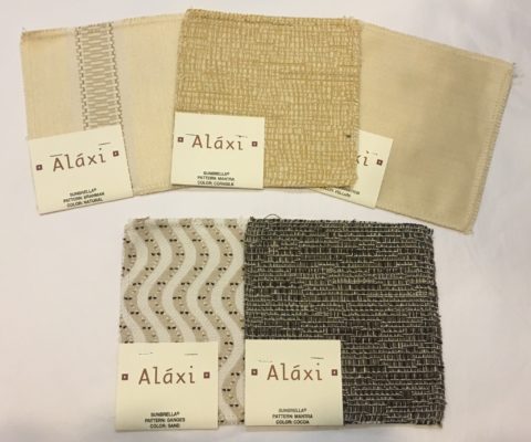
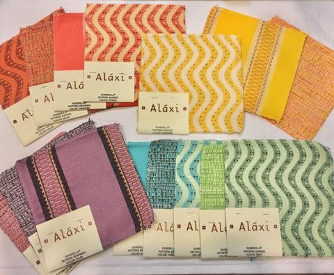 Lovely rich neutrals are stunning enough to be considered for indoor use too.
 When shopping for outdoor materials – watch for that fiber content…it makes a difference. But know that there are thousands of incredible fabrics that you won’t find in the seasonal departments of local stores. We search the world to find these exceptional fabrics in order to present exclusive offerings to make outdoor spaces defy outdoor “exterior” design. IF only for pillow accents (due to the precious prices), that can be THE show-stopper for your outdoor rooms. Find some that you LOVE and take the plunge.
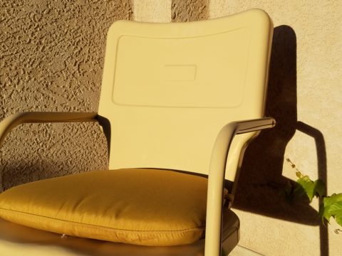 Discover garden elements that would surely rust if left out in the rain – these are perfect for powder-coating! Once treated, these fabulous “finds” will be durable exterior design features without a care – retaining their appearance and supporting your climbers for years in your garden!!!
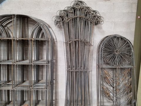 More durable than paint, this process for metal furniture (and more) usually starts with sandblasting the existing finish – rust and all – clean as a whistle – and provide a finish that will protect and preserve the appearance for years of exposure to the elements – sun, wind, rain – no problem! Powder coatings are just that – a complex combination of materials that are combined and manipulated and ground into a soft powder. The application is done with electrostatic charge delivered via a spray gun. The powder-coated pieces are baked where the heat cures the coating. Powder-coatings come in so many colors! The resulting finish is extremely durable and will last for decades.
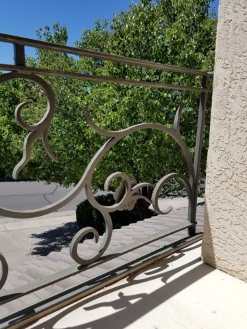
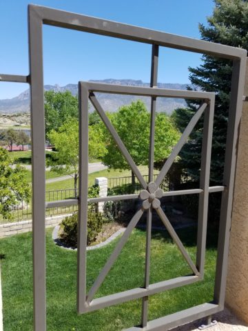
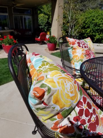 Other than furniture, it is also applicable for architectural detailing around your home and is certainly used in large-scale commercial applications. Powder-coating can be applied to other than metal pieces – but the technique differs slightly.
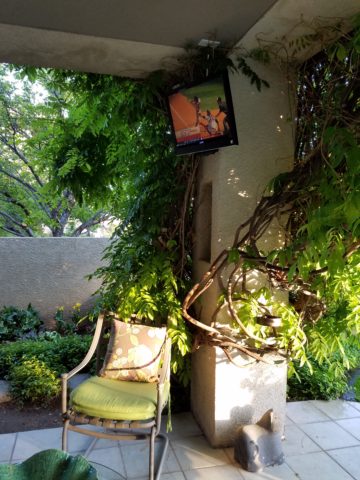 add a TV, fireplace,
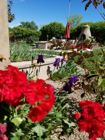 or chimenea, that will transform your exterior pockets into worry-free and priceless outdoor room additions for many months to come!!! You’ll want to LIVE out there!


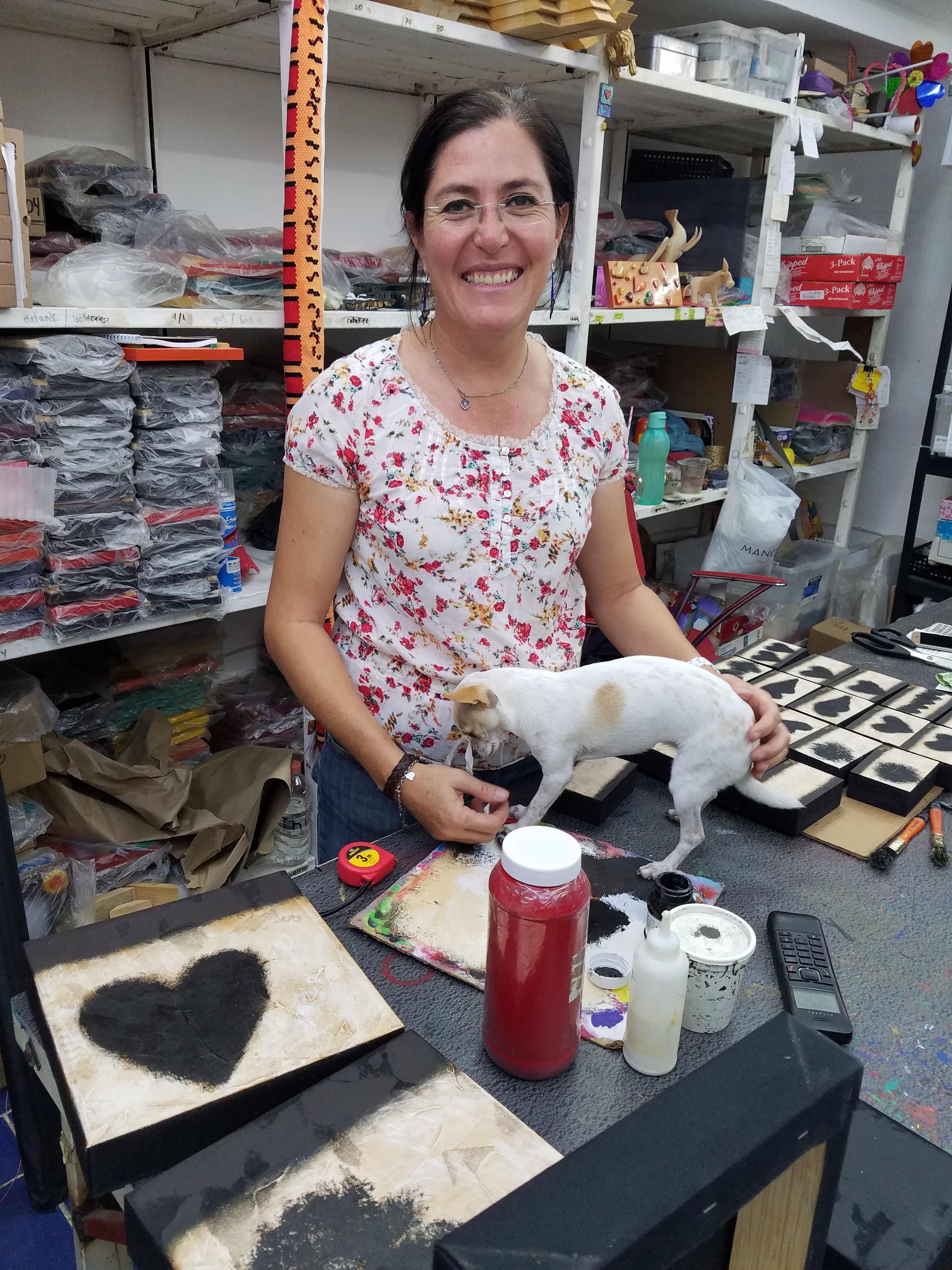













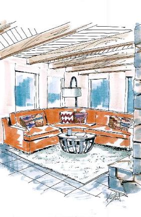
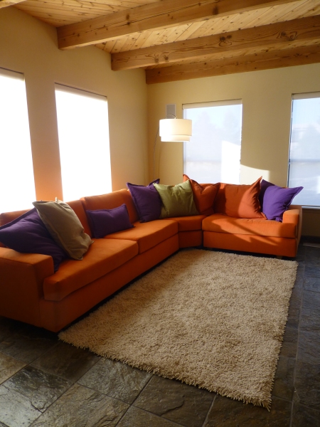 Selecting the interior furnishings and finishes for these edifices has always been similarly virtual. Until something is built and furnishing installed, the designs are all “virtual.”