
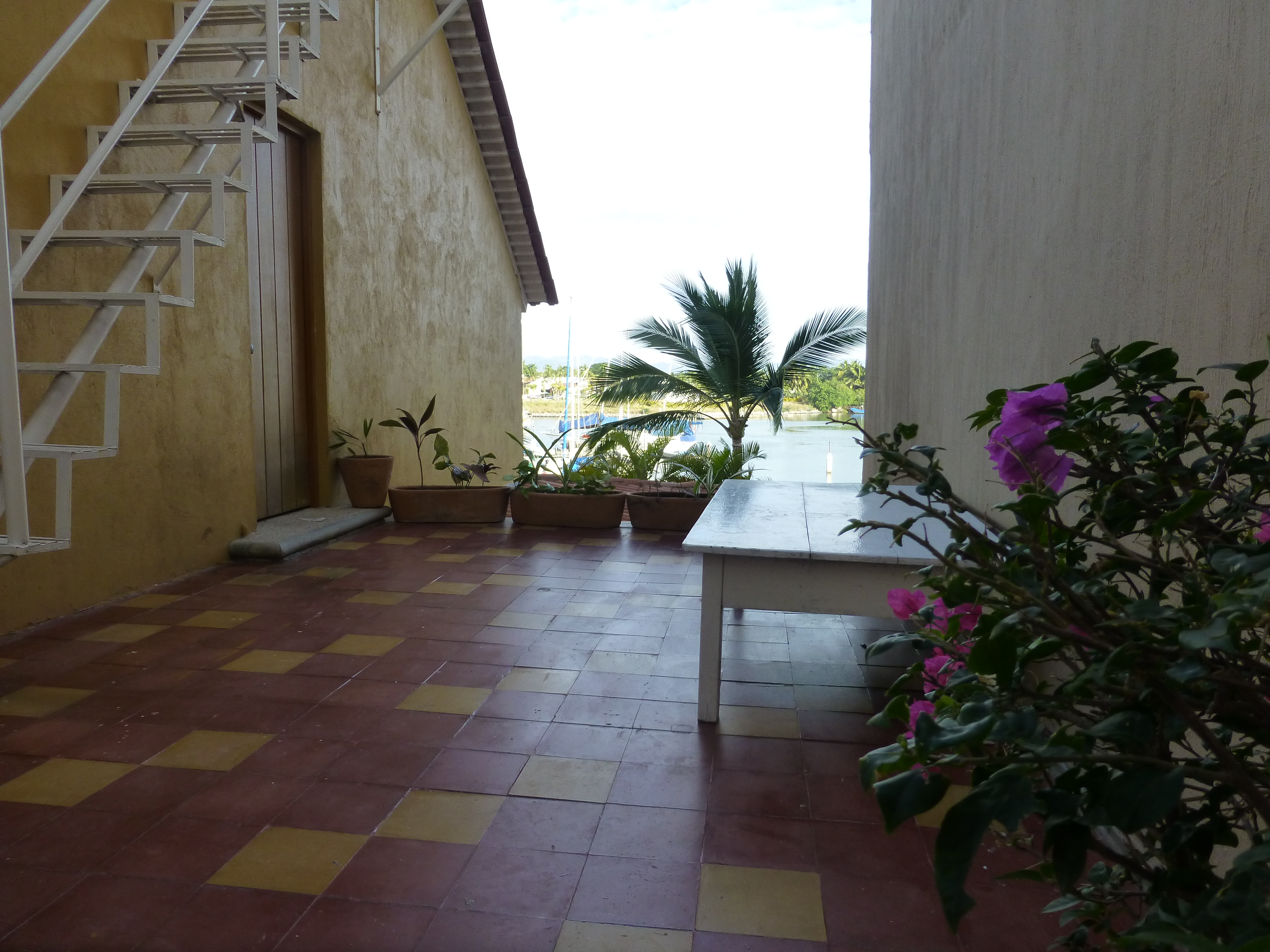
I would like to share a treat of a house in a magical setting along a quiet waterway in the lush rural lake community of Edgerton, Wisconsin. A most talented friend has created a riverside home from a modest rambler. What was a dated structure with limited interior appointments, low ceilings, tiny high windows, and ordinary fixtures is now a soft, sophisticated, space outfitted with treasures gathered in the countryside, filled with history, character and antique charm.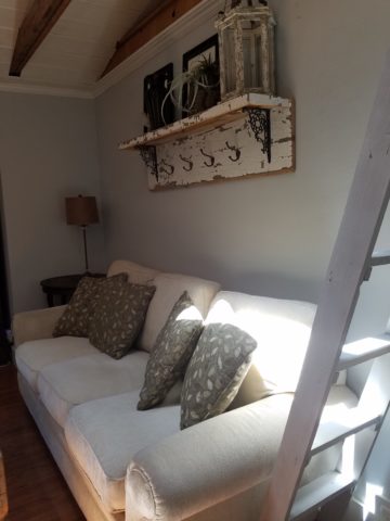
Hands on and knowing exactly what she wanted to achieve, she began collecting interesting fixtures and hardware, furniture pieces and finishes. She hired a remodeling contractor, but worked closely with him and his architect to detail every facet of this home. Unwilling to compromise certain features, she enlarged all window openings, reconfigured the entry, gutted the kitchen, redesigned the bathrooms, ripped out the ceiling exposing structure – increasing volume exponentially – and added a garage.
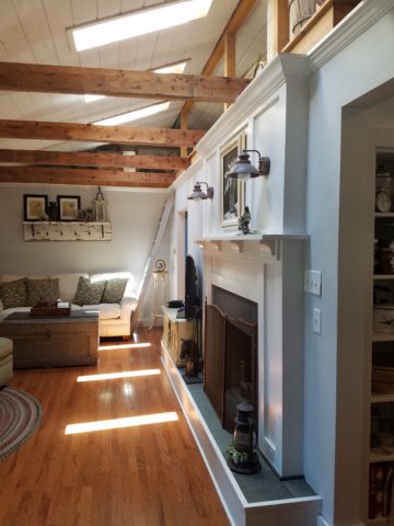
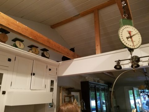
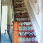
Exposed beams, new white-washed tongue and groove boards applied to raised ceiling, a found wooden column used for structural support, new crown molding, bead-board wainscoting, re-designed fireplace surround, and creatively concealed storage closets, have re-shaped the entire character of this interior so dramatically that all who entered, not having yet seen this incredible transformation, were awed.
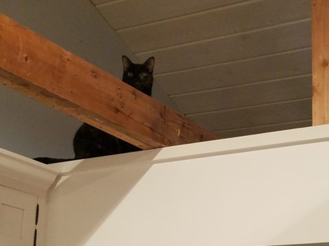
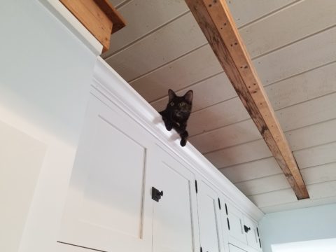
 Hearing their comments as they passed through the spaces was amusing in their commonality. Everyone was amazed at the amount of work done, creative elements incorporated, fun finds she had collected to transform this modest house into this cozy cottage. Her two cats have wonderful vantage points to watch the activities in the rooms below as guests gathered to celebrate the weekend’s family wedding festivities.
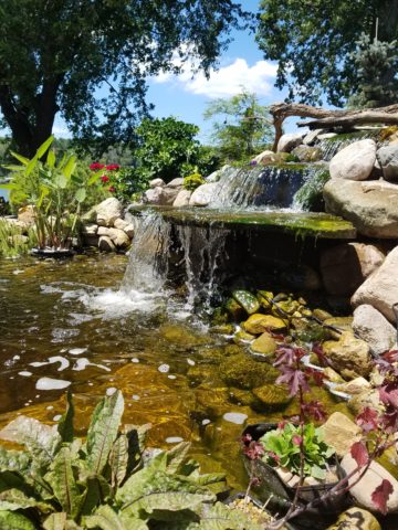
Daylight streams through windows and floribunda gardens around the house are now communing beautifully with the interior.
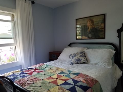
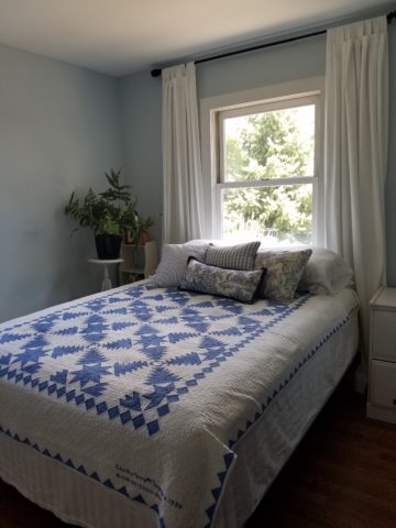
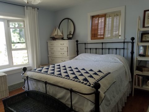
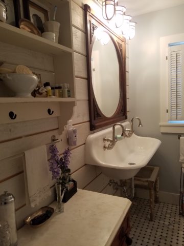
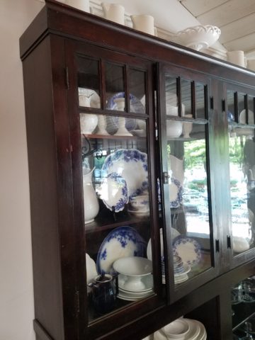
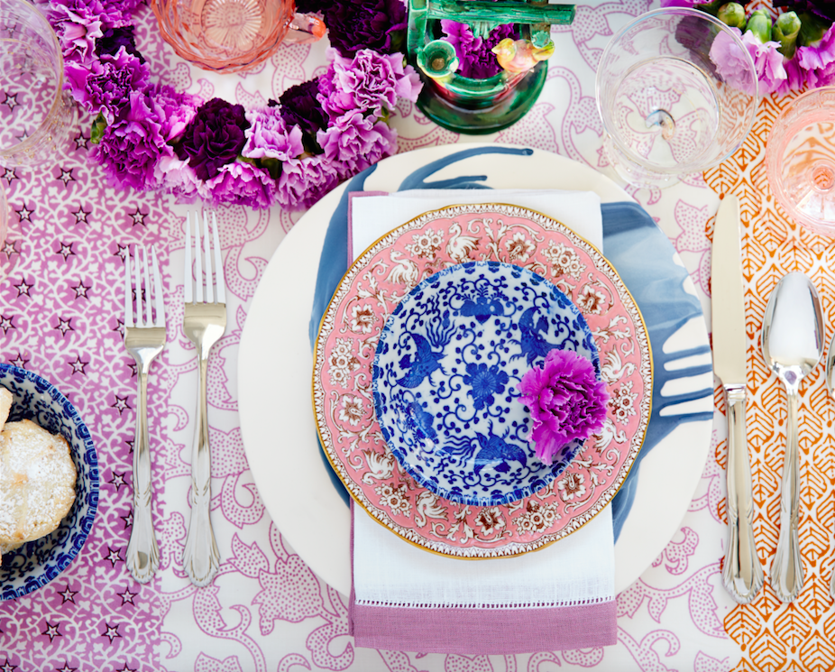
Ever-so-soft blues, with whites of every shade, create a soft backdrop to collections of fine china to vintage scales and myriad eclectic antiques.
Outside a recently completed multi-tiered pond emits soft trickling background sound which wafts inside through the many open windows. Not to be reticent about being hands-on, this tenacious designer personally packed 23 loads of boulders and large stones into her truck, off-loaded and placed around the periphery of the pond. She planted tiny creeping vegetation among the stones, water plants, multiple trees and perennials to establish instant-gratification landscaping in her expansive backyard, which is a lush verdant botanical expression that grows abundantly right down to meet the river.
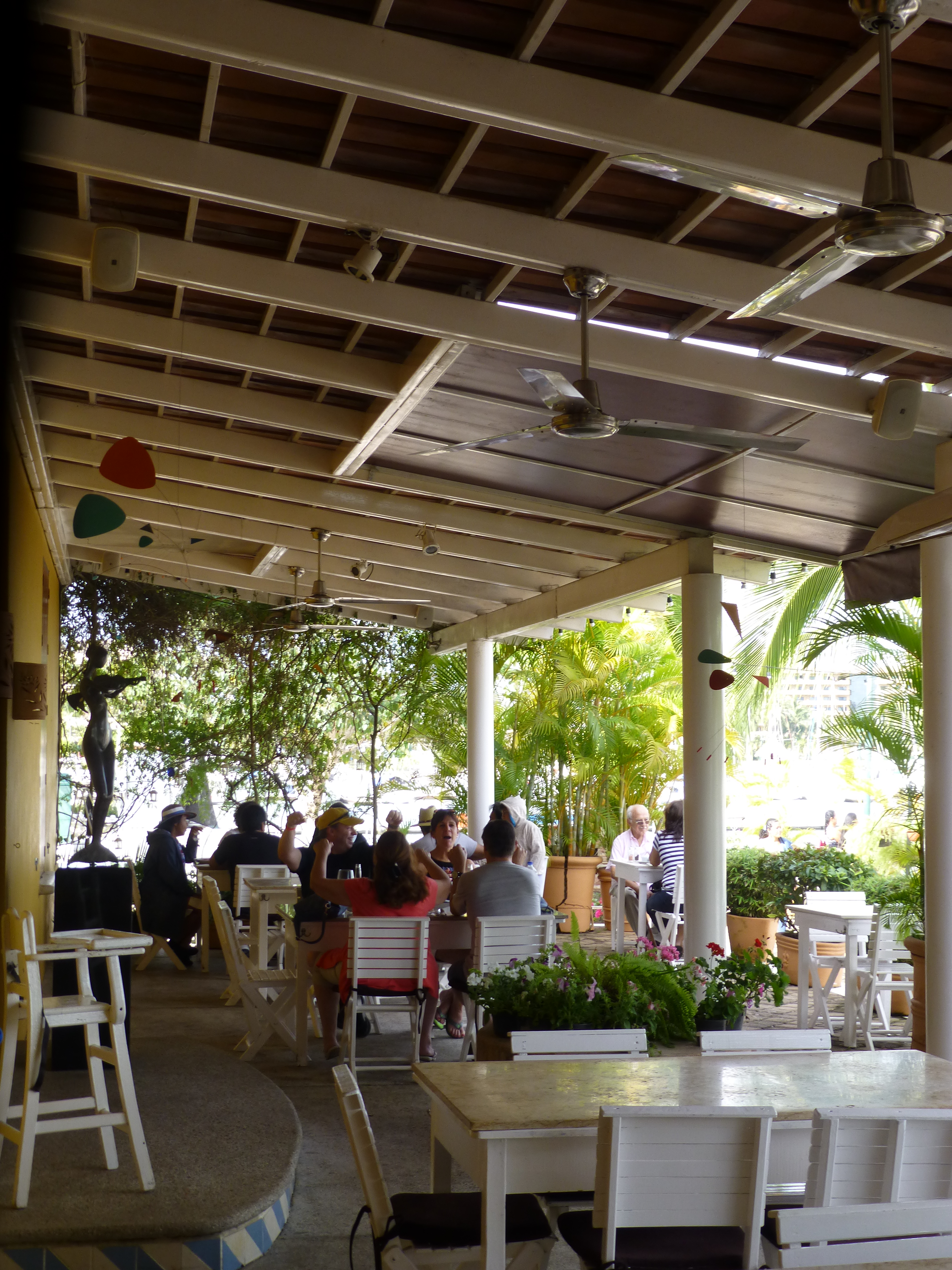
A great get-acquainted bonding of disparate family and friends occurred when we collected buckets of roadside flowers to make arrangements for the reception venue.
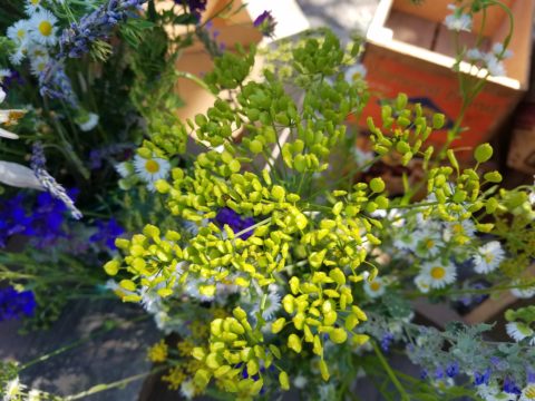
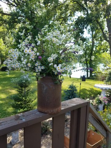
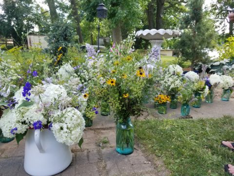
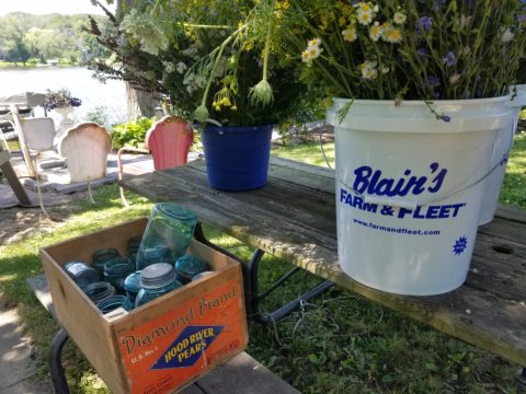
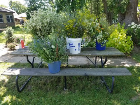
Wild bouquets punctuated with spectacular domestic flowers from the gardens surrounding the cottage provided fun activity and contributed to the charm of the scene.
Everyone needs a little country sometime.


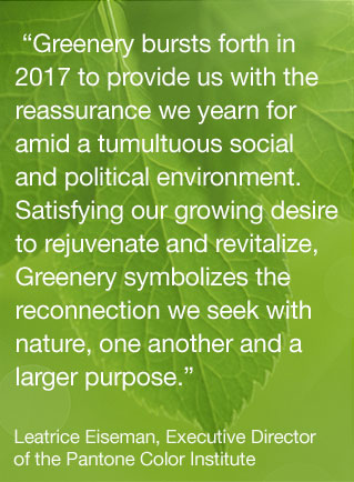


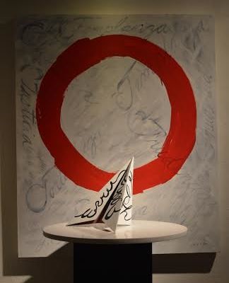
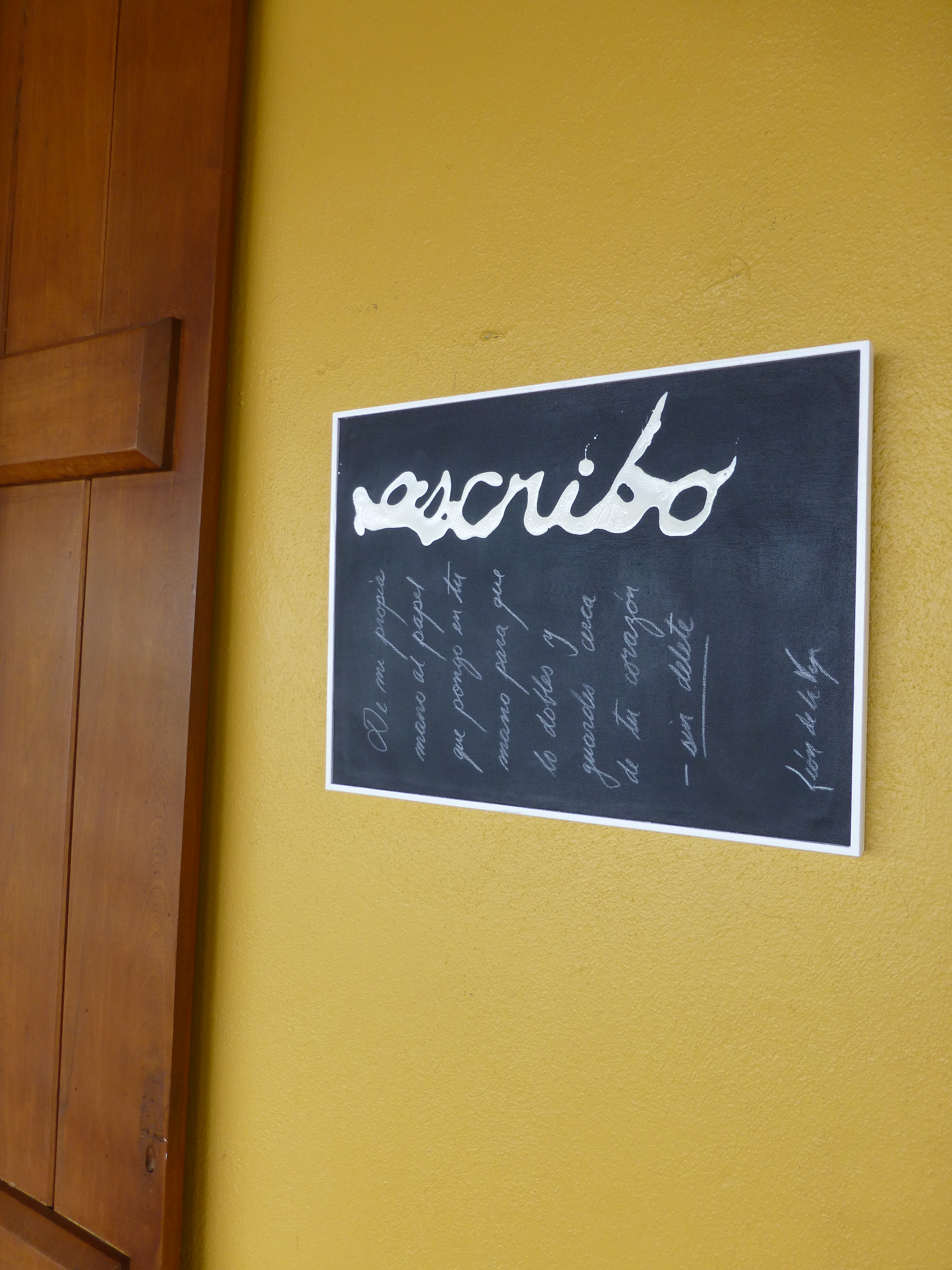
 Today the primary focus was a topic with which everyone seemed to view from the same perspective. All were in avid agreement as they discussed the recent exhibit in Mexico City from where the artist, Leon de la Vega, has recentlyjust returned. This significant event was an important auction where part of the proceeds were to benefit the Mexican Institute of Neonatology toward research on children’s learning and therapy and no less to benefit the artist expressing his concerns for the current state of affairs with the lost art of writing by hand.
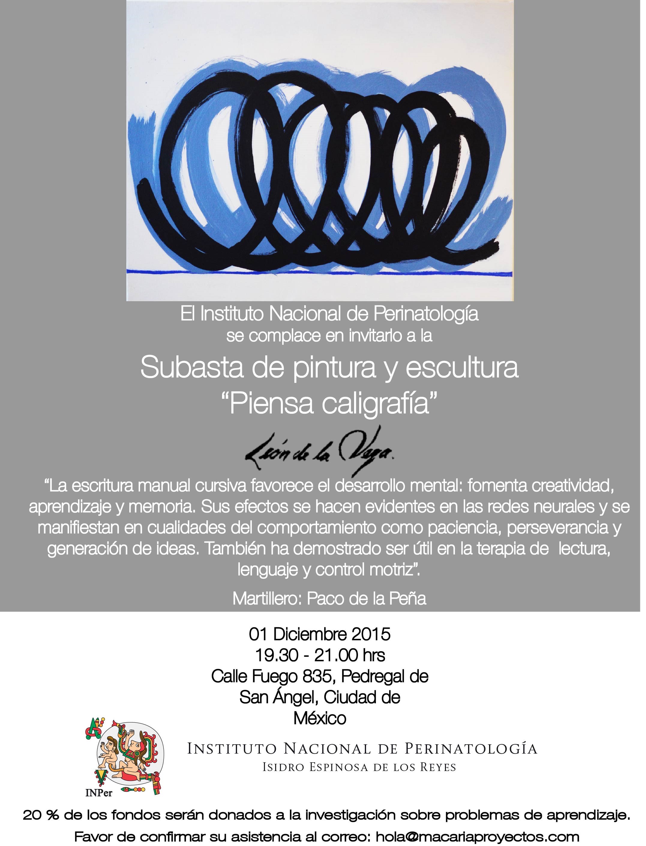
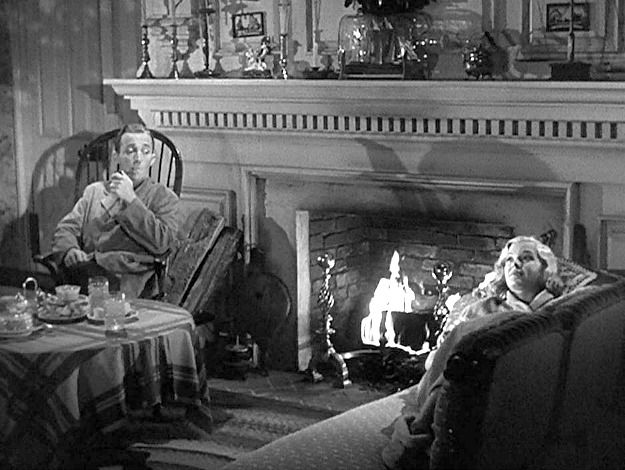 Try it with this still shot from the movie…imagine the colors…it’s fun!

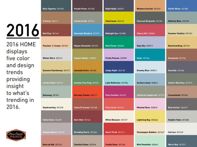
 to which I have added many various colors and textures that I enjoy using throughout the year. Christmas is notoriously red and green accented with the bling of silvers and golds. Chanukah is blue and white…but I enjoy all of the colors to celebrate every occasion! So the many hues of the season can be found in the collection of colorful containers and serving pieces, accents and textiles that I often meld to create the festive celebration of the seasons.
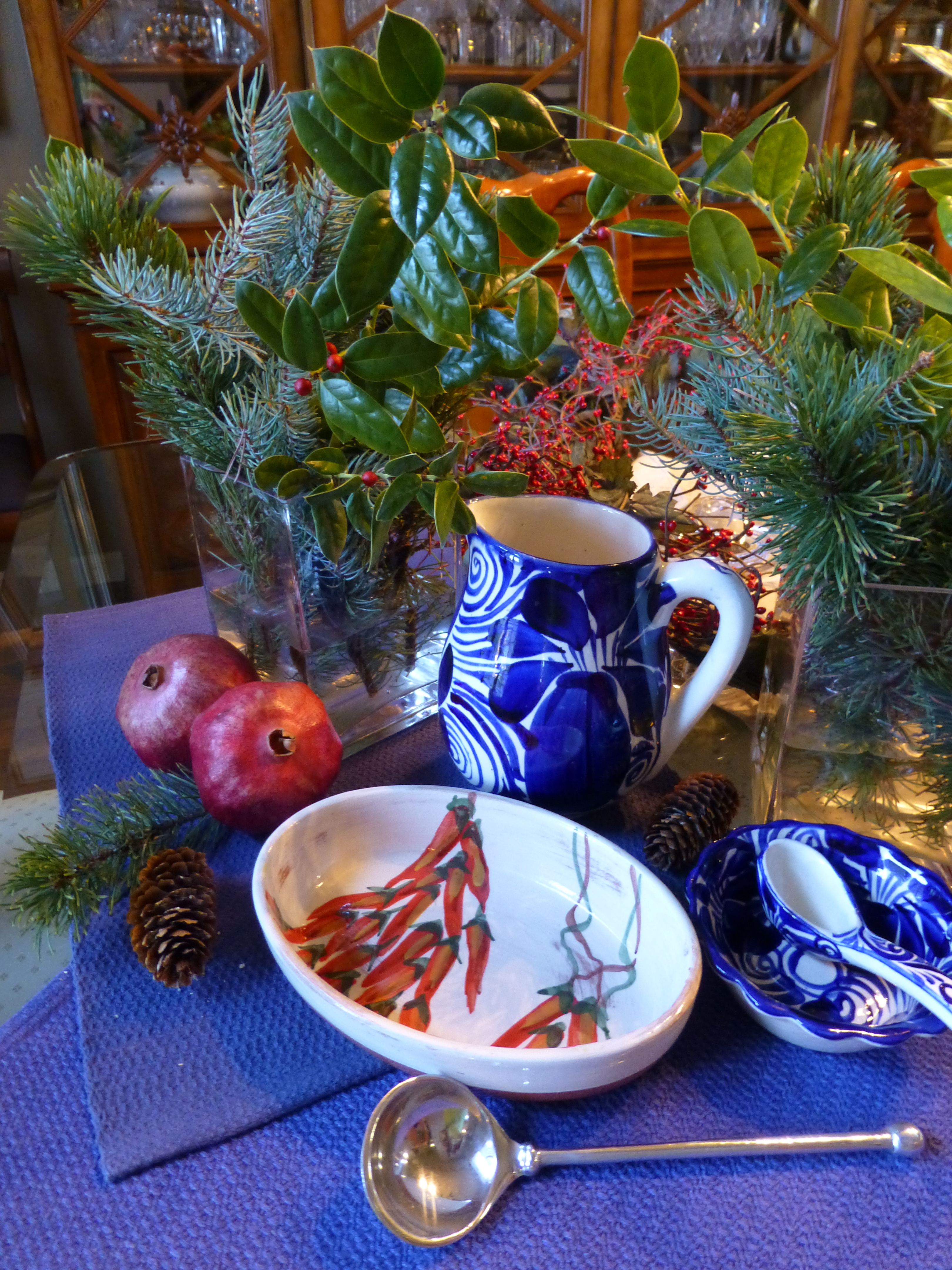
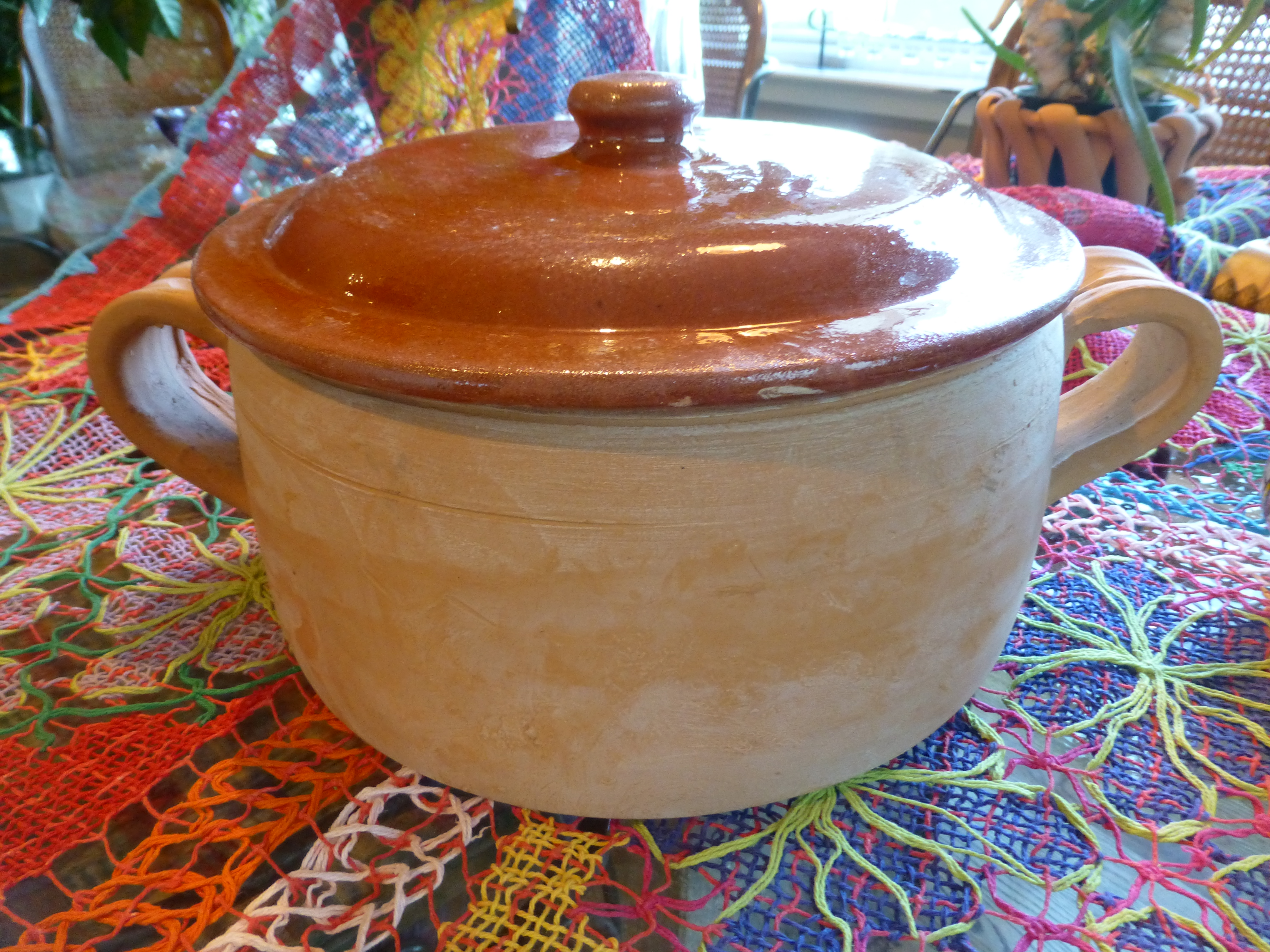
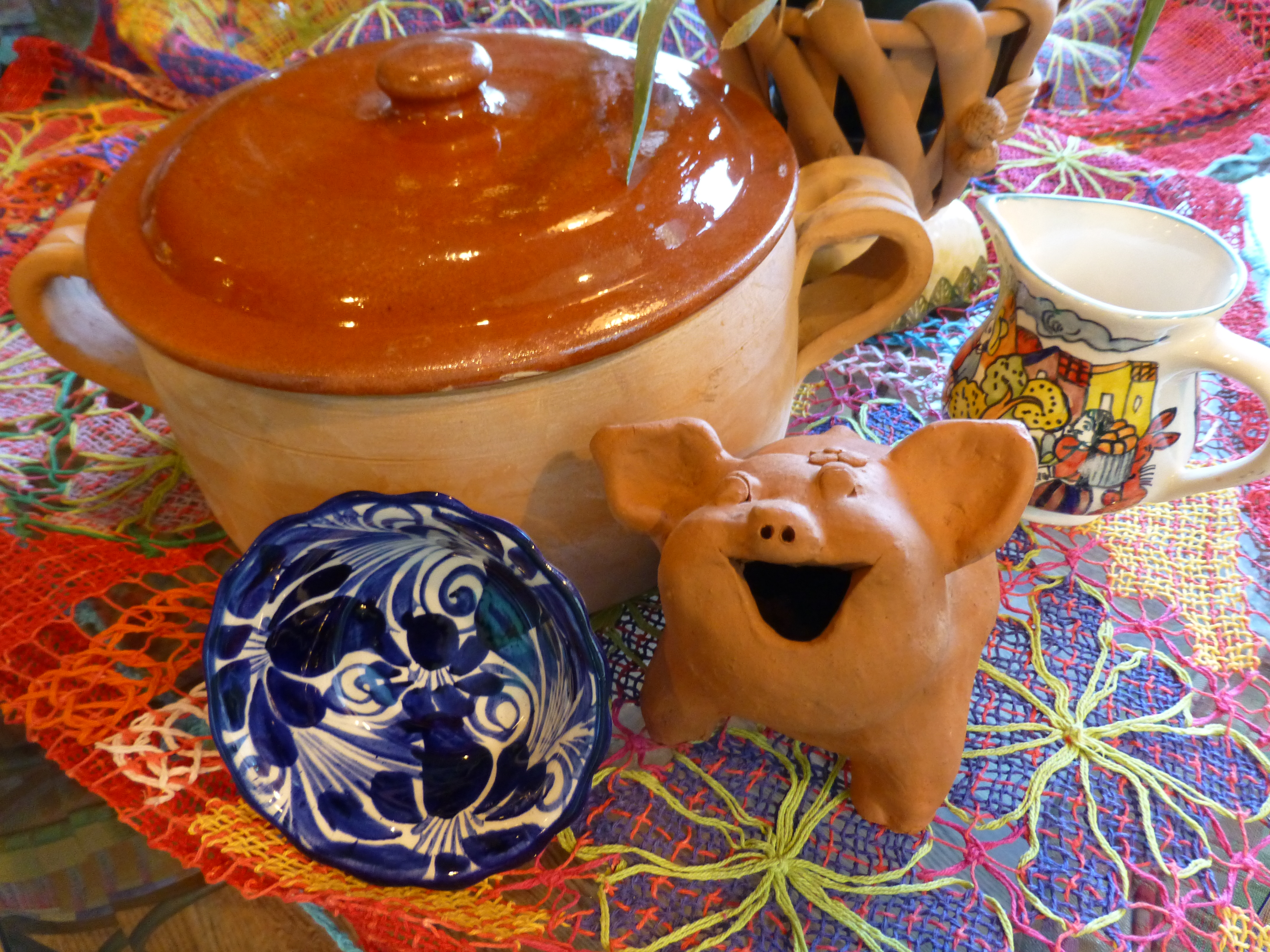 Notice here, the brilliant colors and intricate open-weaving of the Brazilian lace.