What is Custom and Why Do You Care?

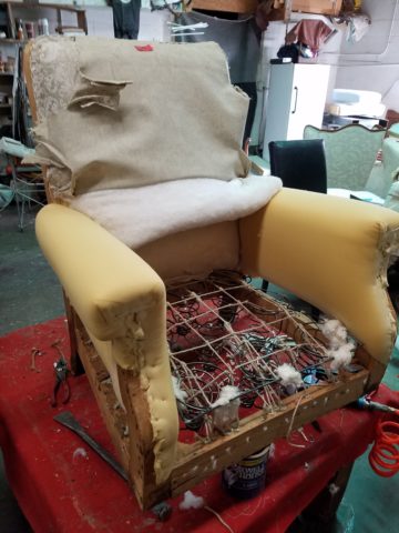
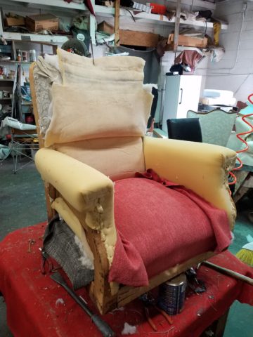
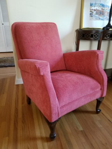
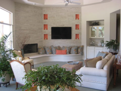
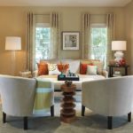
A client and I had a discussion the other day about “custom” design. What is custom and why do you care?  As we regarded her newly reupholstered furniture that had been delivered and placed in the living room, we began remarking about the “custom” nature of it all. A specifically designed audio/visual cabinet is currently being “custom” fabricated to add to this scene. Unique pieces of furniture with specifically selected fabrics to create an exclusive, personal scene. This “custom” collection/combination of existing pieces, recent “finds,” new pieces and designer fabrics doesn’t occur anywhere else on the planet. How personal can you get?

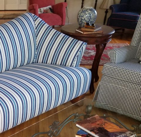
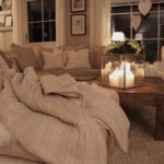
Here’s a peek…the beginning of the assembly of this “custom” scene. Crisp Scalamandre stripe on a fabulous find, paired with a rich navy and cream hounds tooth woven…rugs, lamps, pillows all still to come…

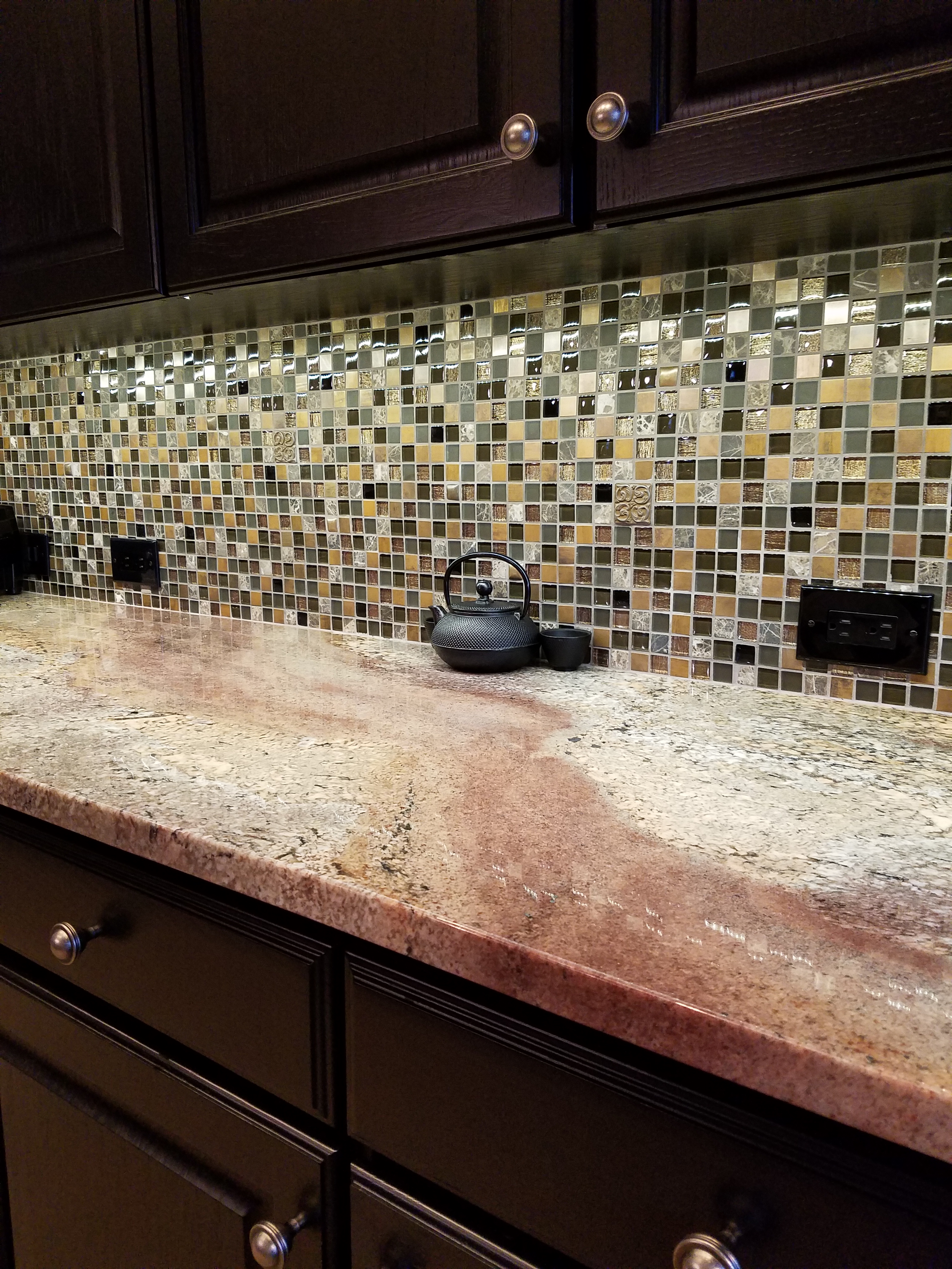
Creating a custom scene is like composing music or a painting. It is an art-form of balance. Balancing scale, color, texture, form…the many nuances…details….is the art of it all.

With all of the options on-line and in furniture stores, how do you begin to compose your scene? Where do you start? What do you keep and what do you replace? Why might you want to engage an interior designer?

Perhaps you need assistance getting started. A professional interior designer can help. So can several talented friends – but there is never only one way to do anything (too many chefs) and the right guidance can simplify the process and make the decisions much easier.

Too many chefs?

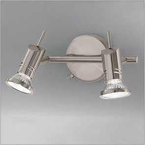
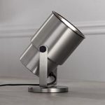
You need someone you trust, with whom to consult on the many design decisions. From floor finishes to ceiling treatments, window coverings to upholstery, furniture pieces and placement to decorative and functional accessories, lighting to audio/visual – a professional designer has the tools, colleagues and experience to assist you to realize your “custom” scene.

However, if you don’t have the desire or the patience with the creative process, you need not participate – you can go on an extended vacay while all is designed and completed. Voila! Or, you can expeditiously go on-line and buy what you like and hope it works well together and that it fits, that it wears well and results in the scene you want and need to bring you comfort and joy. Or not.

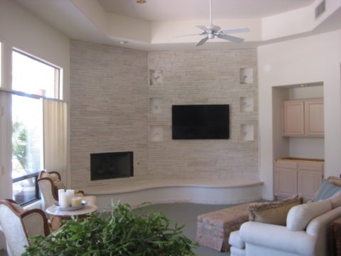
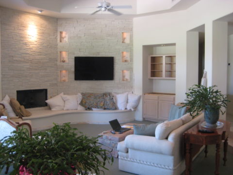
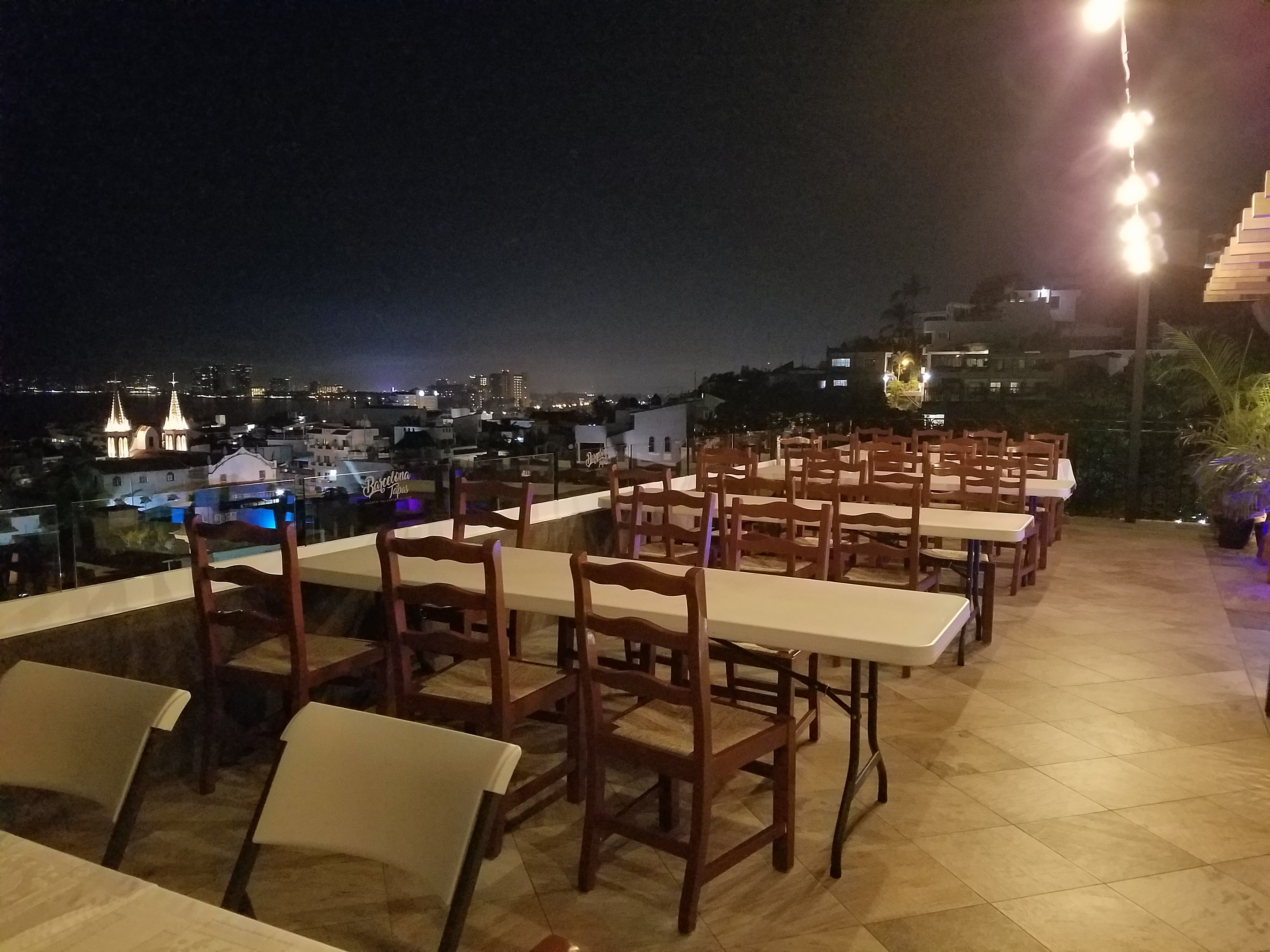
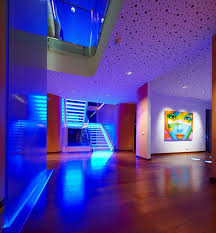
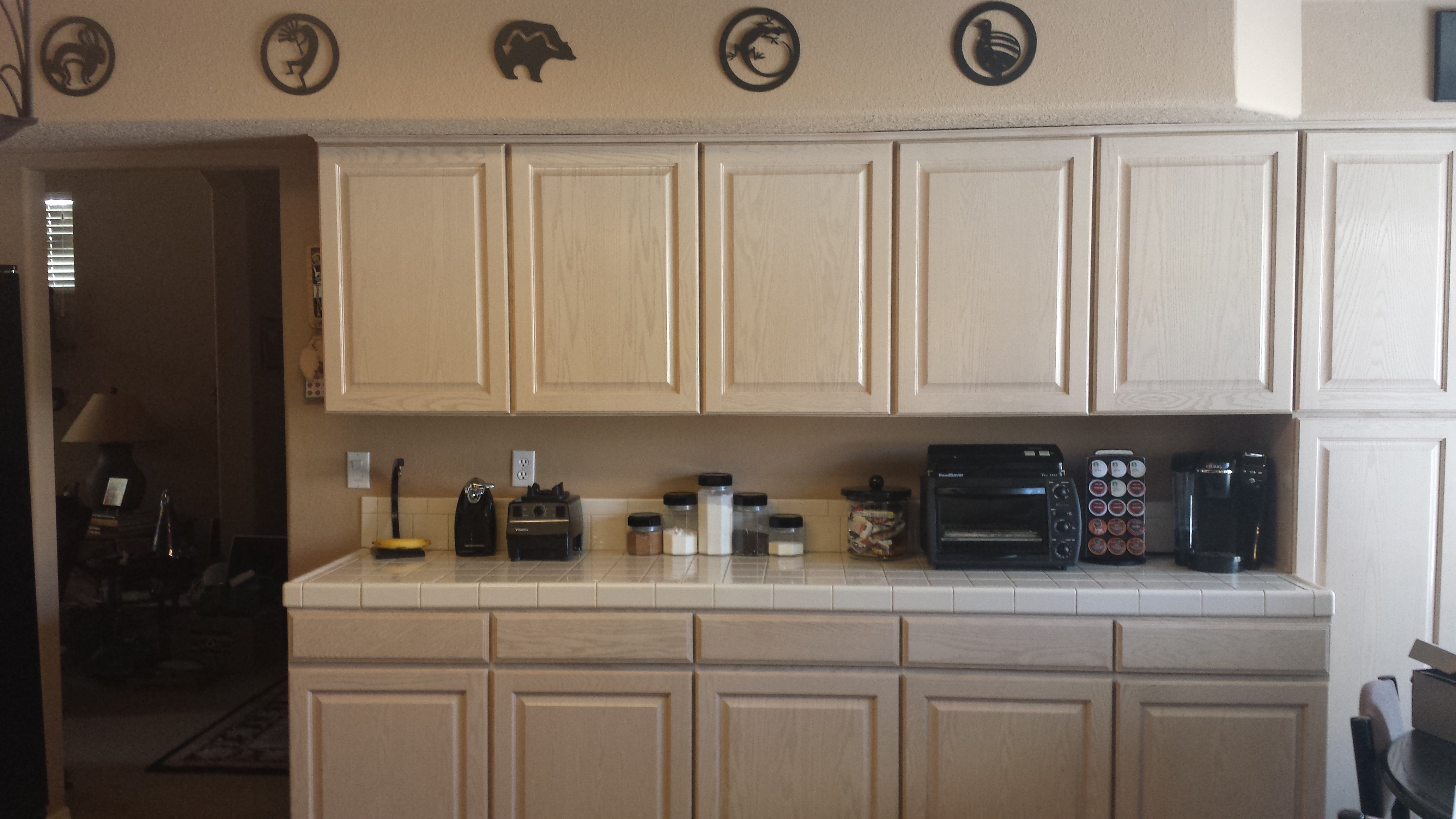
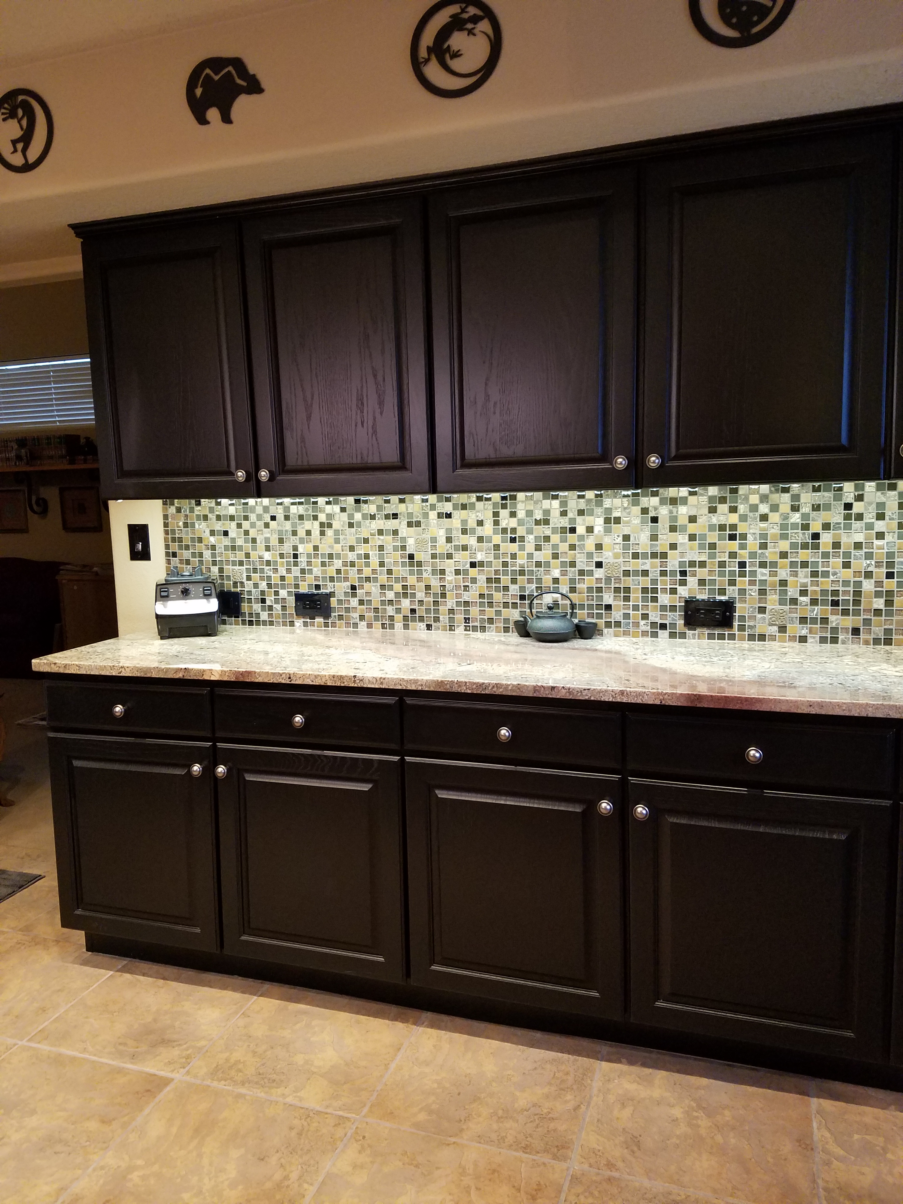
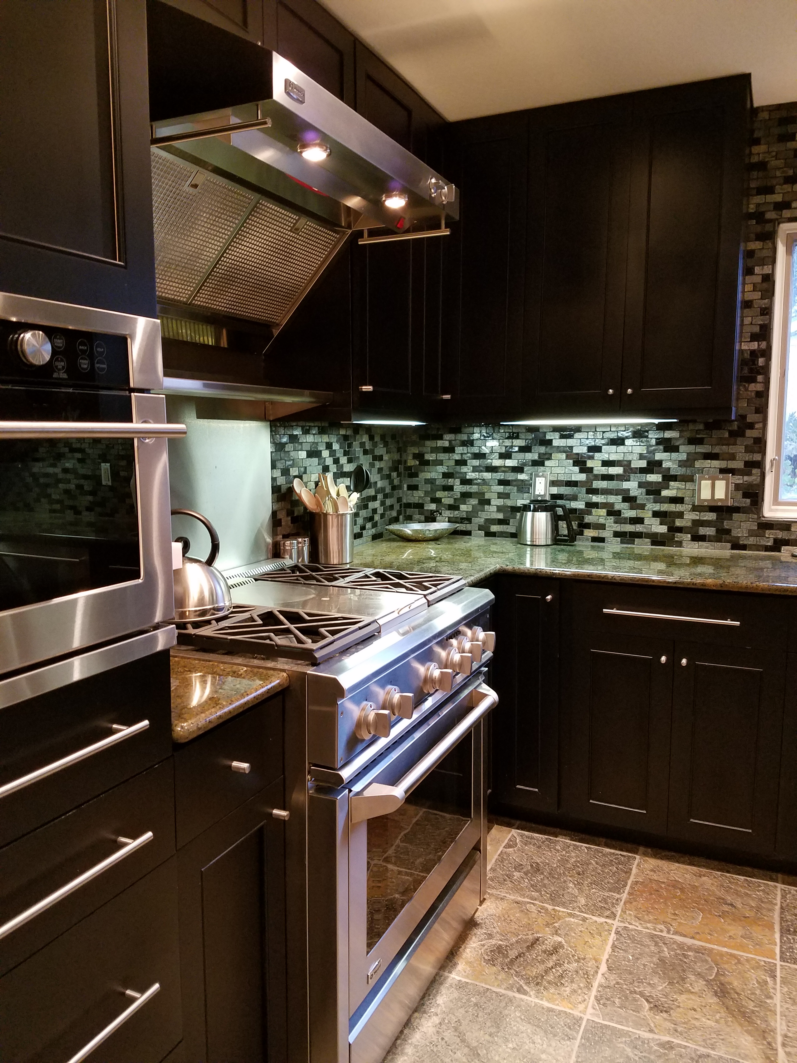
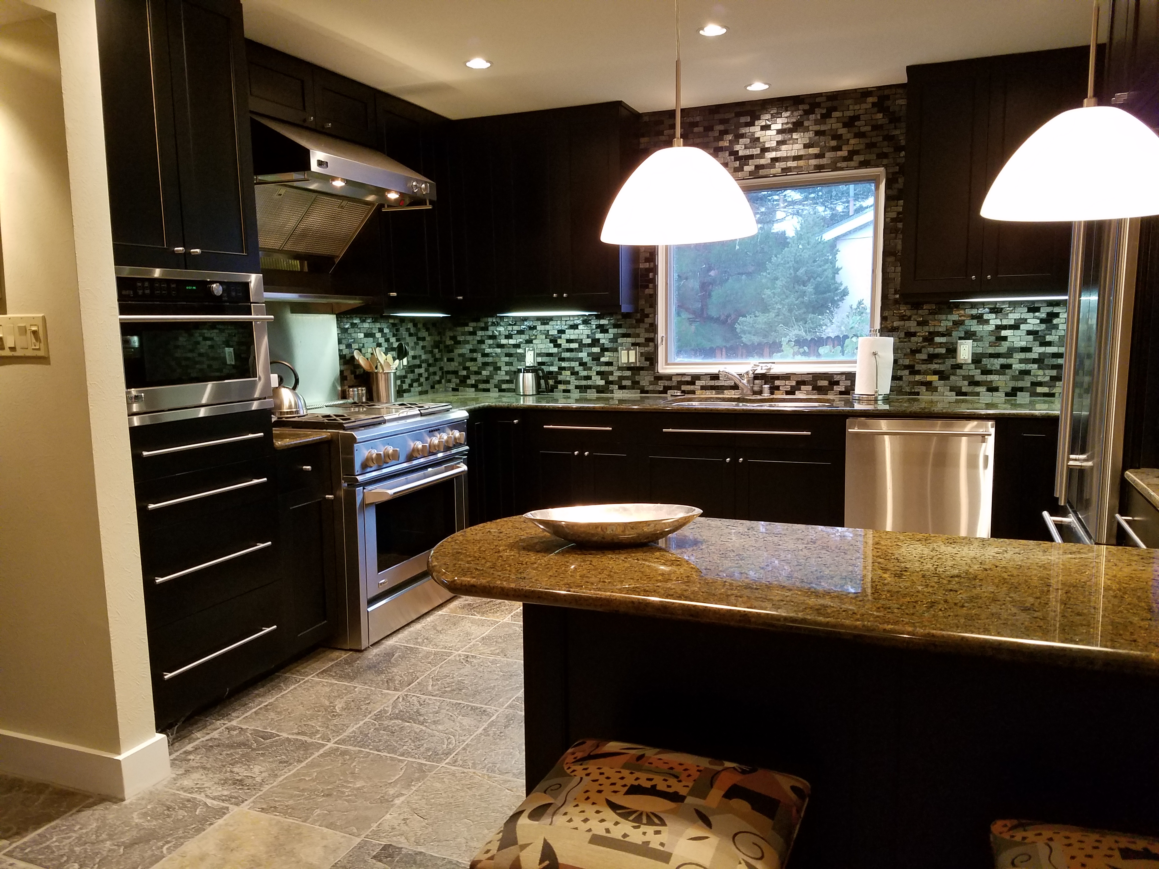
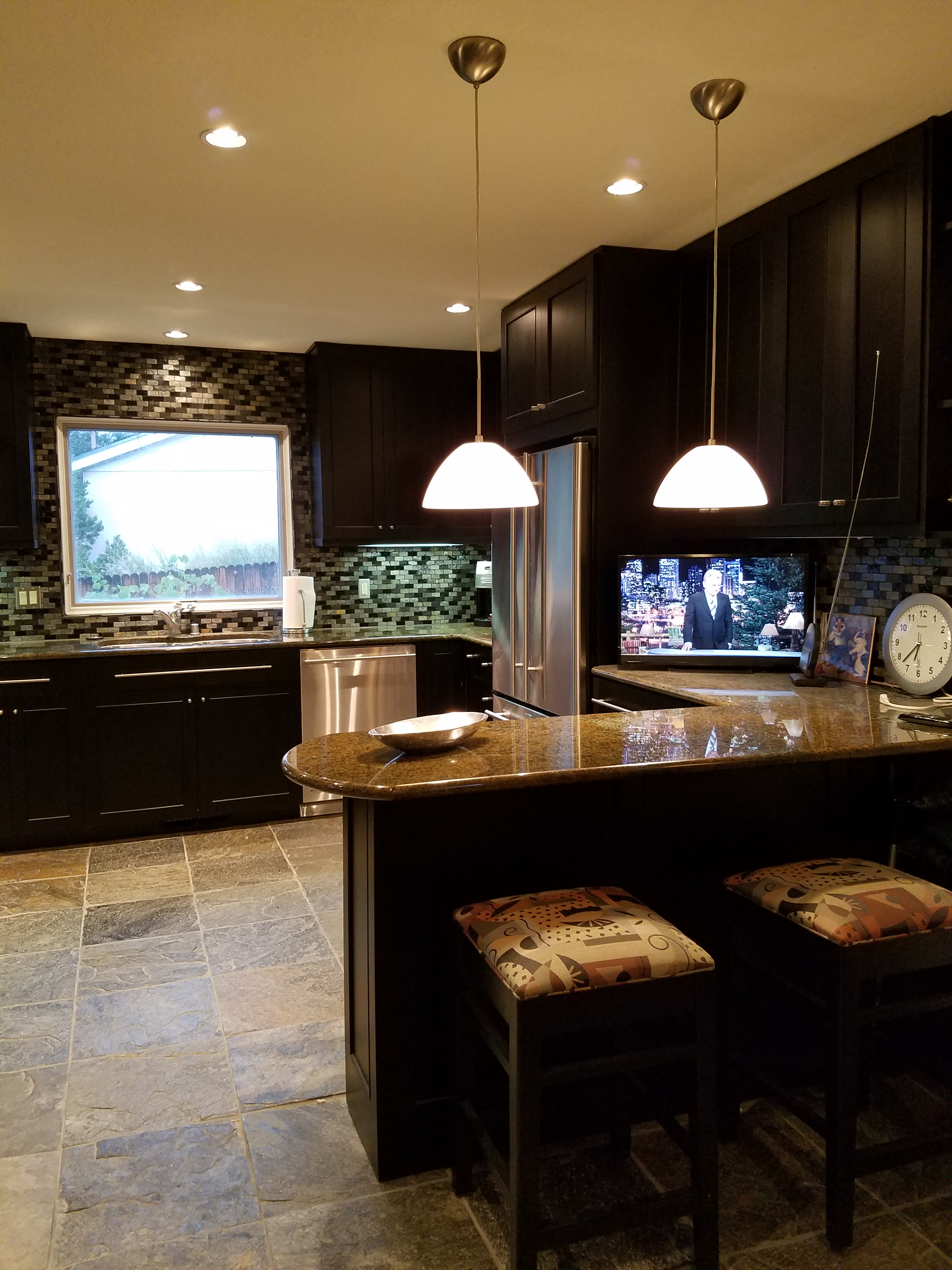
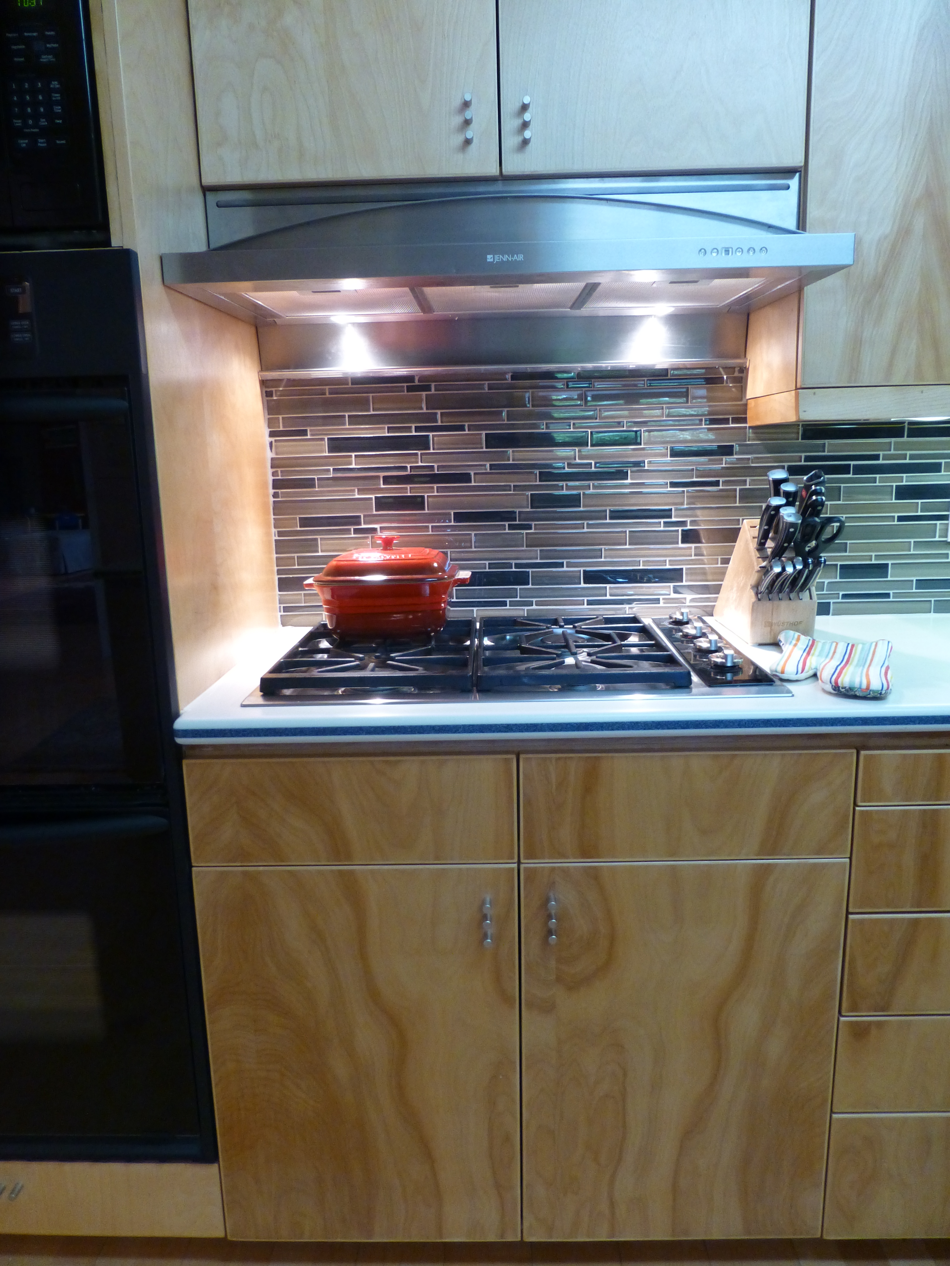
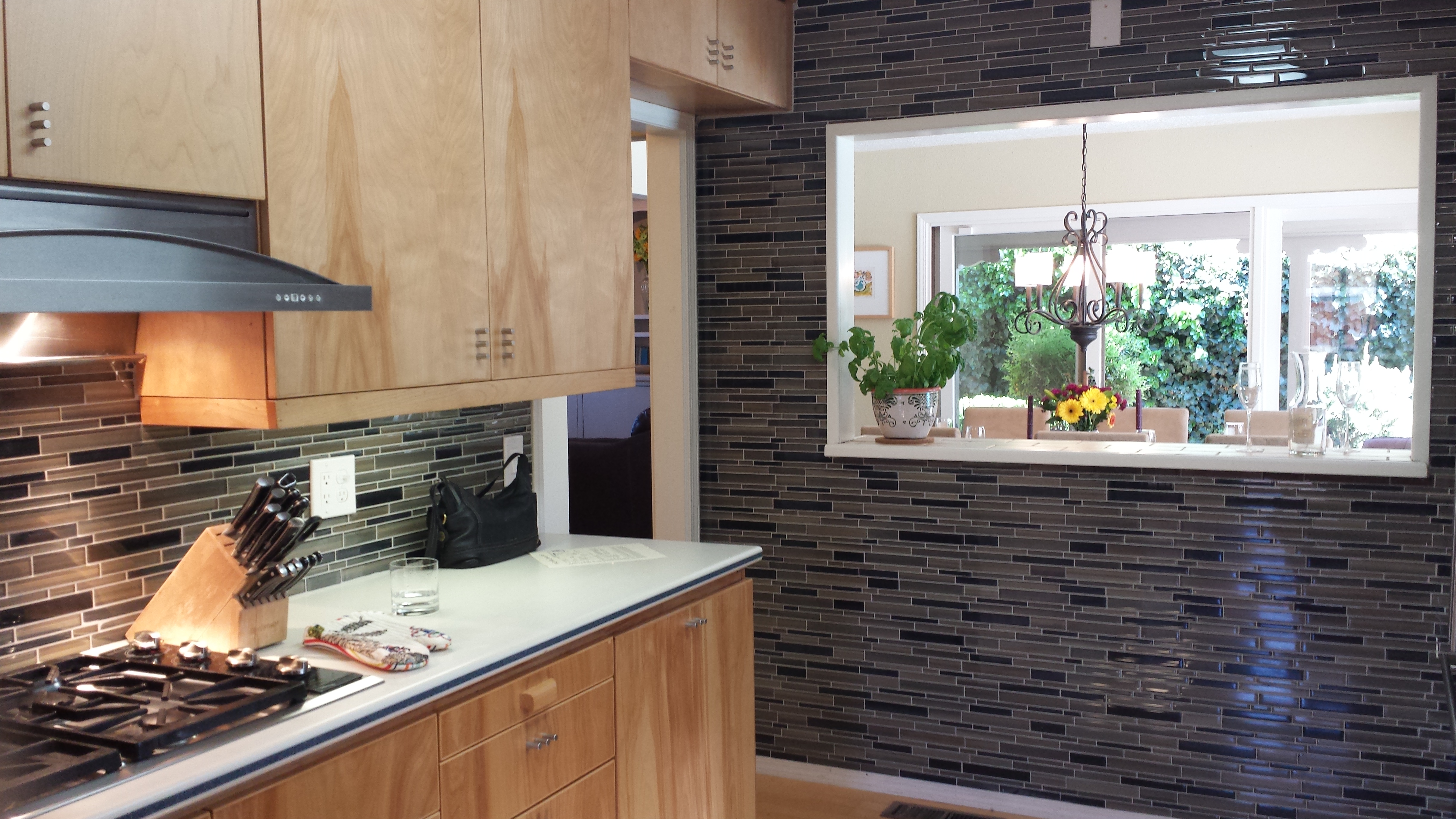
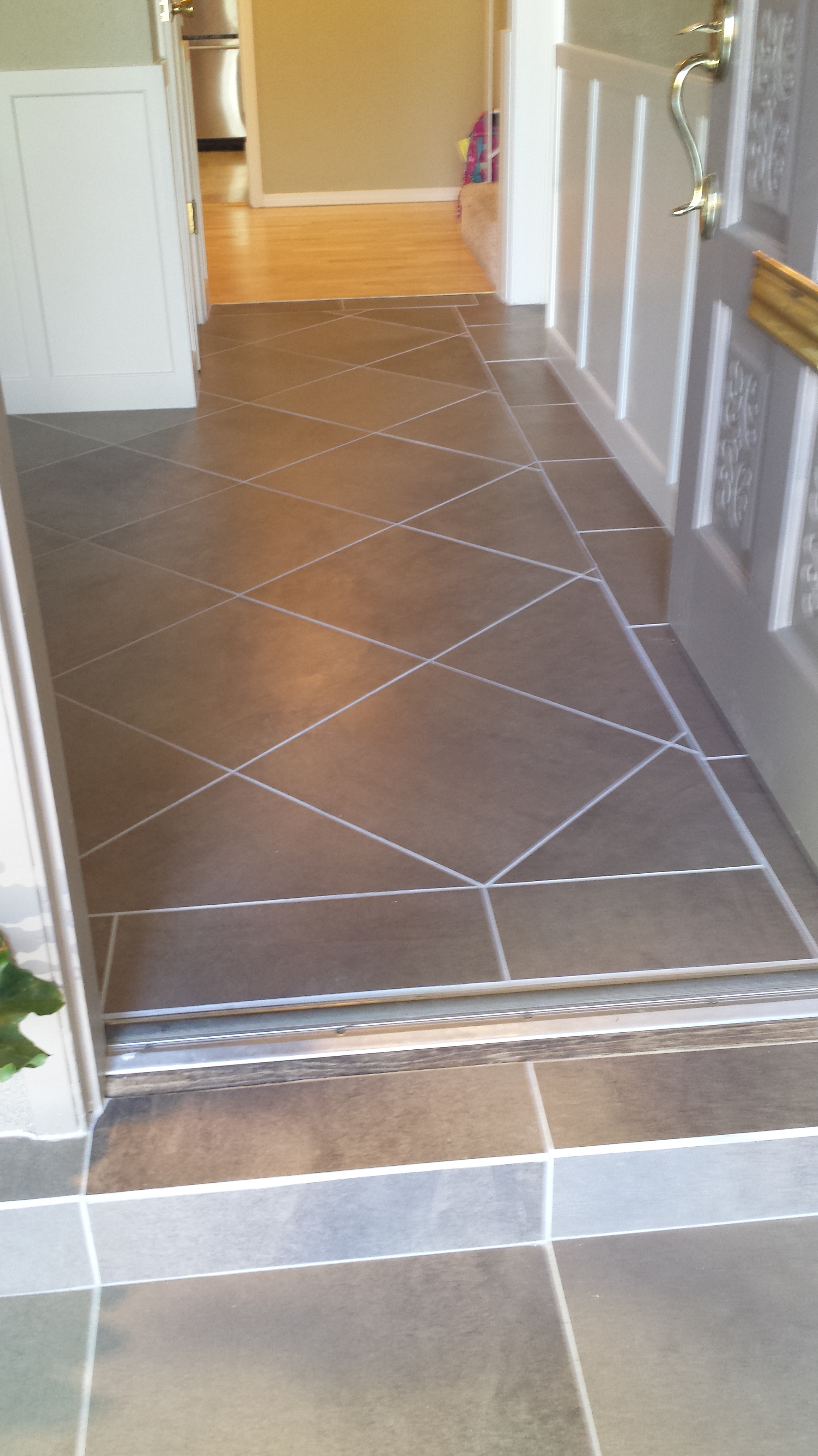
The same is true for commercial interiors. The scene should be an exclusive, custom design that reflects the unique culture, qualities, values, mission and brand, enhances productivity and satisfies the needs of the owner/occupants.

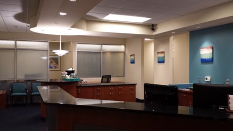
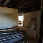
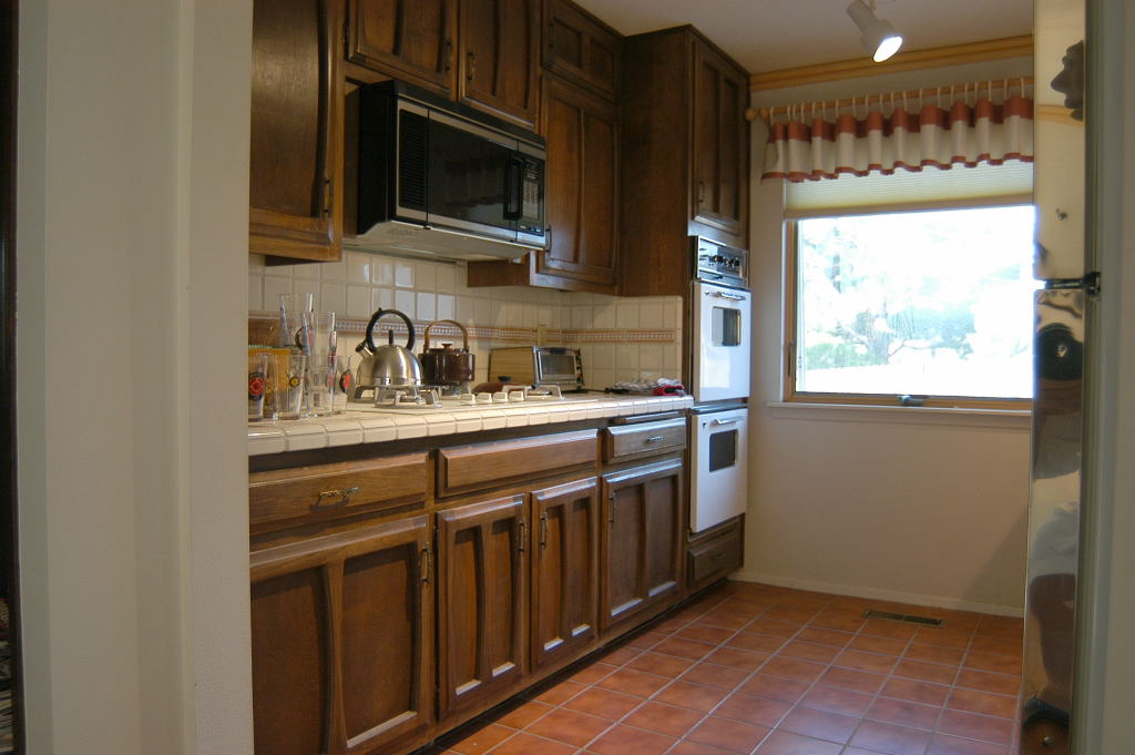
An accounting firm merged two existing, well-established firms. Old and new, grounded and progressive – the remodeled “custom” interior represents their newly defined culture.

A designer interviews the client in order to extract their desires. These many impressions of the desired design are often tough to identify and articulate by the client perhaps, but those illusive concepts, ideas, and desires are exactly what the designer gathers to cull the options, offer ideas and compose the “custom” scene.

For more on this, please visit a previous blog on the Creative Process https://patriciandesign.com/the-creative-process-of-interior-design/  and Custom Design Details https://patriciandesign.com/4680-2/and Custom Collection  https://patriciandesign.com/2017/02/


Disruption Reaps Results

Merriam Webster defines to disrupt: to interrupt the normal course or unity…So think about it when you take on your DIY projects…like reupholstering a chair.  Pick or find the chair, take a course, cut away at the fabric, pull out the staples, rip it down to the bones, (poor chair – you’ve really interfered with its unity), then put it back together. Voila!

To do something as seemingly simple as repaint, you will need to remove things from the walls and move things away from the walls, drape furniture, mask elements like molding, ceilings or other adjacent surfaces that will not be painted – or at least not with the same  color. All of that is quite a disruption.

Expand that disruption when you remodel – open a wall, replace cabinets, change flooring – each on their own sounds simple, but be prepared for disruption. Your normal course of unity will be in disarray, displacement – maybe even chaos.

However, I often reference the phrase “You have to break an egg to make an omelet” right? That sums it up. To make something wonderful, you are going to have to interrupt the normal course of unity – hence break the unity of that beautifully in-tact orb of an egg.

So do not fear disruption – go ahead – disrupt your life a bit, to effect change, that will achieve refreshing results! It is THE hardest part of the Creative Process (see pattisays April 29, 2017). https://patriciandesign.com/the-creative-process-of-interior-design/


The Excitement of Design Updating and Transformation!

For years, Barcelona Tapas has been a creatively successful culinary and social scene on a quiet cobblestone backstreet in the tropical, seaside, destination of Puerto Vallarta. The vertical profile of the sun-bleached white building is distinctive with its open spaces – dining rooms on each ascending level.

20170204_205154

It is a extremely popular, hip and happening, dining venue which has recently had a spectacular face-lift that brings the structure and open-aired/interior environment up to par with the culinary delights.

Upon arrival, the familiar, welcoming doorway opens to softly lit aggregate stairs that sweep up each tier of the towering edifice.

A massive Cantera stone fountain babbles gently amidst tropical plantings and an iron grill-work is indirectly illuminated for a dramatic effect. An expansive patio all with honed stone tile floors begins the layers of available spaces.

Next an intimate open-aired dining area with an adjacent chef’s table and luminous, full-wall wine cooler beckons with an inviting aura. The intense red drama of a bullfight is rendered in a large painting on the rear wall – a suiting backdrop to the Spanish theme.

20170201_225220

Continuing the ascension, the delightful glossy black ironwork railing follows along and up the open-to-the-sky aggregate staircase turning past the last landing.  Ahead, the beautiful,  warm glow of the new dimensional ceiling treatment accented with wood and indirect lighting draws the eye upward.

Upon arrival on this rooftop dining platform, what was always an exciting view of the city lights, both in the foreground and circling the bay miles around to the north,  now expresses the new architectural features and finishes dazzling the eye.

20170201_212626

Effective lighting, recessed ceiling details, a new clear glass railing, and modern ceiling fans dangling like detached white nosecone propellers present a whole new, fresh, modern look. The drama and effectiveness of the lighting paired with the wonderful surround sound, coming from eight Bose wall-mounted speakers and 2 sub-woofers recessed into the ceiling, result in an atmosphere and music that are seductive and sensational.

But wait – there’s more!!! Yes, an additional rooftop dining patio is revealed upon discovering the hidden staircase at the far end of the bar. New furniture and a billowing fabric-draped portico are soon to arrive!

20170204_230116

This new space not only increases the seating capacity, but offers yet another  panoramic view and trendy design-themed open venue – expanding the options even more!

The project is Chef/Owner Bill Carballo’s passion.

20170204_214701

He has been at it for years creating deliciously original and traditional Spanish tapas (here his exquisie presentations have been half eaten in the rush to enjoy)

from the immaculate exhibition kitchen at the start of the long bar, with a fine-tuned staff eager to assist and cater to your every need.

20170201_225019

This enchanting transformation has attracted new discriminating, trend-setting clients and welcomed the return of  loyal fans to experience this exciting new and stylish interpretation of Barcelona Tapas.

20170201_200631

The doormen Luis and his affable sidekick are there to greet and assist!

Thank you gentlemen and Buenos Noches until next time!!!!

Let There Be Light for the New Year!!

Short days and longs nights…Do you find that your interior is dull, lifeless and even feels a bit cavernous after dark? As the sun  sets and the lamps come on, the effects can be horrible, adequate or sensational.

Poor lighting can have remarkable subliminal effects on mood, energy, and attitude. The subtle signs of poor lighting such as dark corners, shadows on faces, difficulty reading and dull colors are all important factors that contribute to an uncomfortable interior in these short days of long, dark nights.

Lighting has multiple reasons for being—three primary ones—to see, yes, ambient light. But to do tasks (reading, sewing, playing games), and accent lighting to illuminate artwork and other interior features. Mood lighting such as candlelight (once the primary light source – now an effect in most cases) is a lesser but effective  lighting tool.  Good lighting makes amazing differences.

Beware of down-lights. Lights that shine down from the ceiling. Although a very effective and common lighting tool, they must be balanced with good ambient light.  I have often used this example of sitting in a restaurant across from your date and their face is painted with ghoulish dark shadows under their eyes, beneath their nose, and accentuating all the folds of their features. It is the opposite of a kid putting a flashlight under their chin shining upward creating similarly haunting effects. Creepy. Certainly not flattering.

2008-10-13_001

The same unpleasant effects happen in the home. It’s such a common malady of ineffective lighting that most people assume it is a necessary evil of short days. It’s sad—no, really it’s SAD—Seasonal Affective Disorder! To treat the serious effects of this syndrome there are many studies and inventive solutions, but for most of us, the less arresting effects of poor lighting can be greatly improved and our lives enhanced.

To begin this process of evaluating your lighting an improving it right away, start with the lamps—the light bulbs! We have so many choices these days including the familiar incandescent, compact fluorescent, and the newer LED with excellent color choices and low energy usage.  We could talk about the “temperature” of light sources measured in Kelvin, but we won’t—only that it runs a spectrum of warm to cool.

e6bca6db6f0faf4f9ecb0775cb4bc4eb

Walk around your home and look specifically at the color that glows from the various light sources. Does it look yellow? Does it look white? Does it look blue-ish? Recognizing these distinctions from warm to cool is the start.

light_bulb_color_temperature

Where are the shadows? Are the corners dark and recessive? And, when you combine these two, do you find, for example, dark areas and yellow glowing sources? Sometimes that soft, warm yellow is preferred while other scenes are made more intentionally crisp with cooler light.

Experiment with different lamps in your fixtures – light bulbs in your table lamps and recessed cans, hallway sconces and bathroom fixtures. It’s a fun experiment and very illuminating – yes, the pun was intended.

Are your lamp shades opaque or translucent? Do the shades themselves cast a color? Do they block the light or allow it through? Do they throw the light up and down or up, down and out? This is another detail of which to take note.

If you have dated recessed fluorescent tube units – common in kitchens for example – they are often housed in a box either recessed or surface-mounted on the ceiling. Take a look at the plastic lenses – are they discolored and yellow? This aging process can dramatically affect the quality of light that is emitted. So if you are not ready to replace these fixtures with more effective modern lighting statements, try replacing the lenses.

001-flat_sheets_before_after

A similar installation is that of skylights which have fluorescent lamps up inside the wells with that same plastic lens over the opening to the skylight. The original idea was to have the natural light pass through during the day and artificial light take over after hours. The lens  was to intentionally conceal the unattractive fluorescent tubes, but it sacrificed the depth of the framed well. A quick update is to remove the lenses and fluorescents and expose the well of the skylight adding dimension to the room and eliminating the unattractive lens that conceals the dimensional cavity. Recessed can fixtures around the skylight in the surrounding ceiling are the most common solution to this transition from old to new, a cable can be strung, pendants can be hung, but if budget constraints prohibit that investment at this time, you might investigate the power source up inside the skylight well and replace the fluorescent fixture with an inexpensive, adjustable, surface-mounted spotlight – perhaps with two heads to provide light from that same source while opening the skylight well without the unnecessary lens.

franklite-scintilla-2-light-nickel-finish-spotlight-spot8882-a94

The dark pockets around your rooms can be improved with up-lights in corners and up under plants. Inexpensive fixtures are available at any lighting store or big box home improvement stores. Place one of these up-lights (remember to select the color “temperature” that pleases you the most) and see what that additional pop in the corner does to open your space. When up-lights are used beneath plants to shoot upward and cast shadows onto the walls and ceilings can create drama and exotic interest at night. This is true both indoors and out.

Torchiere floor lamps are those that face upward. Like a torch, they send the light toward the ceiling – another effective splash of light in an otherwise dark space in the room.

Colors are radically affected by the color of light that shines upon them. Therefore, an interior color scheme can be horribly tweaked to not resemble at all the actual colors chosen and combined to create the scene, when artificially illuminated after dark. Contrarily, colors can be rendered with great brilliance and accuracy when illuminated with the right combination of lighting. (although daylight contributes in these two examples).

By the same token we can have great fun and “paint” with light creating a color scheme entirely with colored lamps washing the walls, and interior elements just for the art and exercise of doing so, but I digress.

images

In summary, look around your rooms after dark and look for opportunities to make changes that will dramatically affect the comfort level – the results will be startling!!! If planning new construction or remodel – have plenty of light in key places throughout the space. Think dimmers so you can control the amount of light. Let there be light in this Happy New Year!


Fun with PERF!

Currently finishing a project that has provided a great theme for incorporating metal, it seemed a worthy blog subject for it’s fun and flexibility! Perf is the product – a perforated steel that comes in several percentages of perforation.

We have used this many times for rolling window shades in a flexible coated nylon material. It is great for filtering for sunlight and privacy while allowing a certain amount of “see-through.” It has been used as an architectural screening material for years. You have probably seen it and not realized it on building storefronts and bus wraps – the perforated vinyl coatings are often used for advertisement because they read as though a solid from the one side and are transparent from within.

Here we are playing around with the steel to create cool elements that compliment the theme of this new taproom. The theme is silver and what material does bring to mind? Metallic. So by dressing raw steel with paint – we apply the silver finish and there we have it!

The required outside patio fencing was constructed with very generic square stock. I called it a hamster cage. It was a bland beige when we first arrived and, without notice, the shopping center management had it and the other structural columns lining the canopy/portico painted chocolate brown.

The plan had been to screen it with perforated panels. The darker paint color created a little better contrast and aided in providing a depth of detail to set-off the silver painted perf.

Inside we needed to fill the volume of this most uninteresting dropped ceiling. Already painted black and looking quite voluminous – but not in a good way – the empty space needed some mass. So in one of those restless, middle-of-the-night design sessions of insomnia the idea to create large drums for lighting shades came to mind.

Drums have been in vogue for several years now. Nothing original from the initial use for table lamp shades except their use was broadened to include suspended fixtures and halved for wall sconces. You’ve seen them – hip and happening – and these were quite over-sized and carried the space.

We needed to fill the void of the 12′ high ceilings in this room that had little or no comfort. All hard surfaces, it was a challenge to maintain the silver theme and edginess of a popular taproom while creating comfort. Seemed an oxymoron of a task. But the mass of the perforated drums in three different sizes grouped in the near center of the room did just that.

The addition of multiple warm white lamps inside will be the crowning touch. (photo to be added here in a week or so)

Then a third use of the perforated material came in the idea for a room-divider/hostess station.

img_2342

We needed a place to create a point of arrival. Whether manned or unmanned, this unit can have a chalkboard or other signage identifying special events or beer tastings, with a podium in front creates a translucent backdrop to partially cordon off the rest of the space until the customers are greeted and it also can divide the space for special events and table groupings. to accomplish all of those various purposes we designed it with heavy duty commercial casters complete with brakes so that it could be moved easily for its grand height and weight and  placed where needed for the best advantage.

Stay tuned for the complete un-veiling of this cool new interior in the coming weeks. And meanwhile dream of all the fun you can have with perf!


Resourcefulness in the Field

A bird in the hand or resourcefulness pays off – this is just a quick bit of designer humor for your Saturday morning. As I flew on an early bird flight to Phoenix for a couple of projects last week, I was sitting on the flight taking stock of what I wanted to accomplish, what was on the agenda and all the tools of the trade and accouterments and finish materials that I was taking with me. After feeling well prepared, I settled into the always enjoyable Southwest Airlines in-flight magazine.

Arriving in Phoenix was a climate change right off the bat as the outside air seeped into the jetway with a warm, welcoming temperature in the high 70s at that already early hour. As an aside just to continue the story, we had been alerted from the flight deck that there was a delay in the concourse and that we would be held at the gate until the disturbance was cleared. Sure enough, upon deplaning and entering the gate area, hundreds of people were jammed together facing to the right in anticipation of learning what was happening and hoping to soon be released. So I took my place among the hoards of travelers and occasionally stood on my tip-toes to see the TSA barrier of agents keeping us at bay.

20161114_095141

After nearly an hour we were herded to the adjacent gate and led single file out onto a mobile ramp staircase down to the tarmac and into buses which wheeled us to the D concourse where we could get to baggage claim and ground transportation. Half of the travelers making connecting flights were still held risking connections and trying patience.

Nobody was offering an explanation and when asked the response was merely that there was a security breach. Until one young SWA agent whispered to me that there was a suspicious package and that security was waiting for the dogs to investigate and until they arrived the package could not be touched. So that answered that.

Excitement over, I retrieved my bag full of engineered stone and laminate samples, paint fan decks and fabrics. Grateful that an earlier mishap at security required that I check my would-be carry-on rolling bag (which weighed a ton and would not have been fun to stow overhead) when I had forgotten about a lovely little jar of local Heidi’s Chile Raspberry jam that I was taking to my client as a hostess gift. Stopped and searched by TSA the agent kindly offered that I check my bag to save the jam – she escorted me out so that I could retrace my steps back down to the main level and check my bag.

At the SWA ticket counter I hoisted the bag onto the scales and began telling the agent about my return from TSA with my contraband and I began unzipping the bag. Clumsily juggling my purse and holding the jar of jam it flew from my hands dropping with a crash onto the brick floor and rolled away as she and I stood saucer-eyed with horror. Miracle of miracles it did not break – even crack- how that was possible, falling from that height onto a brick floor, we will never know. But it appeared after having been discovered and confiscated at security and surviving a fall from about 24 inches above a brick floor that it was destined to get to Phoenix.

As the time unfolded, we found ourselves in a meeting with the architect to do a plan review and some minor revisions prior to beginning construction. The place was demolished and debris was all about.

We found a table and spread the plans. As we began discussing the details, I realized  that with all my preparation that I had forgotten the roll of flimsy. I never travel without flimsy – trace – the roll of translucent paper that is the quick-study tool for sketching over plans. Dang.  So there we were and all of a sudden Felicia looks over a few feet away and spies a blue cardboard box covered with drywall dust. There sitting on a planter ledge in the elevator lobby of the third floor was a forgotten box of toilet seat liners!!!! Yes, how funny – she offered “won’t this work?” And we tore out a few sheets and began our work tracing options over the plans. Brian, the architect, will surly enjoy seeing himself here in today’s blog hard at work over his paper toilet seat cover!!!

We look forward to a fabulous interior for Dr. Farhan Taghizadeh’s new Arizona Facial Plastics office scheduled for completion in January!!!

20161115_123527-copy

Don’t Be Afraid of the DARK!!

For a while in the world of design trends, dark colors intimidated. Bold designers dared to apply dark eggplants,  chocolates, charcoals and black to surfaces of their projects, but only a rare few clients would take the leap. Now it seems that we are seeing people accept the dare and more dark surfaces and intense envelopes of color are appearing on the scene.  I have often been asked – “Won’t it make it small?” or “Will it be too dark?” and the reason I am making the suggestion is because I already know that it won’t!!!

I’ve blogged about small rooms with dark walls in the past, but two recent projects featured my recommendation for dark cabinets. Not dark walnut or the market-saturated “espresso” which is the trendy generic for “whatever the wood – or pretend wood, we’ll make it dark brown” – very dark.

In this first case, my client – friend after many years of consultations – brought me into their home that they had occupied for a couple+ decades. It began with the  “pickled” wood cabinets that were in vogue at the time – stained red oak with a white-wash that resulted in a peachy finish. When we first did a “punch-up” we added steel cut-outs of Mimbres designs affixed to the soffit. We also added a black table and chairs with a splashy fabric as a valance in bold colors intertwined with black. The drama lifted the anemic peach theme to new heights.

Fast-forward another 15 years and my dear client was ready for a change. She called and brought me into that familiar kitchen scene and announced that she thought she wanted to re-purpose/paint her cabinets white. l looked around the adjacent family room and beyond and pondered this request.

What you might like in a magazine spread or a Pinterest post is not necessarily applicable to your context. I visualized the dramatic change. Looked at her floor (oh, we had upgraded to a large format stone-textured porcelain from the original 8×8 glazed ceramics in the last 15 years – perhaps a decade ago), looked at her family room furniture and finishes and said “I’m not so sure that’s where you want to go.”

I knew she was fairly thorough in her investigations and would not have called me prior to doing quite a bit of research and trend monitoring so I tread a bit softly when I said “I think you should go black.”  And her response was EXACTLY what I expected as she repeated the color in complete quizzical surprise.

“Yes” I said and continued to explain why. She loved her fabric that had been hanging over her breakfast nook window for years. The table was virtually unused and the steel cut-out art was one of their favorite design elements. Black was a natural. “Don’t be afraid of the dark.” I laughingly said.

Black on oak gives a wonderful moiré effect to the grain texture as it reads though the painted surface. It’s a bit exotic, rich in texture and interesting to boot. So with a bit of hand-holding and massaging the description of the intended finished effect, she took the leap – husband in cautious adgreement – they braved this bold departure from the norm.

We first selected a granite to coordinate with the floor tiles and the soon-to-be black cabinets. A swirly geology of glorious goop featuring the rose-clay tones of the mottled stone floor with black tracing through and clear quartz for pizzazz. We then set forth creating the back-splash which began with her love of glass – but to depart from the off-the-shelf 1×1 offering we cut away sections and punctuated it with 2x2s and some 1×1 domed bullets that added further interest to the multi-toned field. 20160906_173401

With those complimentary materials selected, we began the process of painting the cabinets. Boxes in place and door and drawer fronts finished off-site. All flawlessly sprayed, with many coats of conversion varnish tinted black, the transformation was dramatic.

20140418_10474120160906_173522

The second example, of this fear of the dark when it comes to finishes, was another kitchen which was a small galley-styled golden walnut stained oak 70s model. To which, we added a rough iridescent slate floor to complement the existing stone fireplace – of the same material – only in boulder form. Seemed at this point, for this sophisticated bachelor, the perfect complement to the handsome slate would be striking black cabinets. In this case –  new, without the character of the oak in the previous project, as the cabinets were completely replaced and the new selection was made from a factory fabricated series. Similarly dramatic, the sleek black was perfect against the slate’s rugged grey/golden iridescence.

kit10-resized20160906_183640

The galley footprint was greatly expanded, by carving out of the garage work-bench  area. And again, the transformation was daunting. Here we selected a mosaic of horizontal stones and glass for the backsplash – one of the stones was exactly the same iridescent grey-golden slate as the original fireplace and stunning new floors throughout.

20160906_18371520160906_183747

Be bold, be brave and consider your context. You might just find that black is your best bet to transform your cabinets into stunning statements.


Effective Staging & Improvments Clinch the Deal

We staged a house this week.  We TRANSFORMED IT! Wonderful clients for several years, who I regard as friends too, called to say they were moving out-of-state and they needed to quickly  get their house ready for sale. So many things that we had planned to do and more, deferred due to life getting in the way, all of a sudden got put on the fast-track to get finished in less than a month!

When you think of staging a house for sale, you might think of a fall scene scented with stove-top cinnamon sticks warming in a pan. In the spring, as it is now, fresh flowers with floral fragrances wafting on breezes through open windows and doorways.  We had the floral bouquets – just a couple – as centerpieces in the dining room and another game table in the family room.

But in order to really make this house attractive to the prospective buyers – millennials and their families – experience tells me that we needed to install profound punctuations of exciting  new trendy finishes and colors.

I critiqued the kitchen for its old but good-as-new solid surface countertops with a dated, tell-tale sandwich of speckled forest green in between the bull-nosed edge of solid white. The cabinets were plain slab birch yellowed by time, with hand-crafted wooden handles. To place the emphasis where we would get the most “bang for the buck,” we kept the countertops, refinished the cabinets and added new mosaic tile and paint accents. 20160424_162546

A few years earlier, we had stripped adjacent identical cabinets in the dining area and re-finished them with multiple clear-coats of conversion varnish. In place of the two-screwed wooden handles, we installed three small conical-shaped  brushed stainless pulls. By adding the third holes at each, between the existing two of the wooden pulls, the detail looked intentional and contributed to a modernized interpretation of the cabinet design.  We now finished the kitchen cabinets to match which had been  slated for the same improvements, but put on the back-burned until now. P1140111

The end wall of the kitchen, with a large pass-through opening into the dining room, leaving no significant wall space for art or other accessorizing, was the perfect element for a dramatic, eye-catching full-wall treatment. A mosaic of horizontal glass tiles in earthen blacks and beiges balanced the warm cabinets and maple flooring with a strength, pattern, interest and glossy bling.  The same mosaic tile wrapped the room filling the back-splash  between countertops and upper cabinets. 20160424_162701

Outside we painted the garage doors, wall sconce and patio trim with a new organic neutral mushroom green shade. The landscaping was enhanced with new river rock and a couple of large ceramic planters were placed by the front entry with mature plants creating a sense of establishment. The plain concrete entry porch was tiled with a dark earthy porcelain continuing up the step and into the entry foyer replacing the burnt  orange tile that had been  neglected from the decades old original finishes. 20160424_164027

Additional planters were purchased to scatter about – but a more effective idea to have a strong showing of them at the end of the pool anchored that setting with a stunning blue ceramic colonnade bursting forth with brilliant contrasting yellow Celtic Broom. Massing things can often create more powerful statements rather than sparse, weak distributions of the same.

The master bedroom suite had been remodeled a couple of years prior. Pre-fabricated white melamine closet components were replaced with custom fabricated birch closets and cabinetry to continue the theme of the original cabinets in the main level of the home. Updated granite countertops, new lighting and mosaic tiles jazzed the dressing scene and brought order for the young parents running this busy family.

Staging a home requires thinking about clearing the clutter and dressing the scene. But beyond that, looking at more powerful elements to repair and update can make an enormous difference in the appeal to potential buyers. This was evidenced by the comments that we overheard specifically about the more dramatic installations like the new mosaic wall, welcoming entry tile and effective row of blue patio planters that we decided to employ really clinched the deal.