Nature’s Valentine’s Greeting!!!

So when you least expect it…nature speaks. On a silent coastline on a great lake in the wilds of Wisconsin the stones on the beach offered a hidden alphabet of opportunity. Upon making this discovery, I searched for and collected just the right pieces and sent a love note to my sweetheart. Wishing he were there to share in the wonderful adventure that was hiking through the enchanted woods to this lakeside hideaway, I did the next best thing and found an expression of LOVE , took a photo and messaged off to him…technology and instant gratification – well, across the miles…

20160809_182944-copy

The lovely white stones were amazing…I don’t know the geology…could probably Google it, but suffice it to say they were white and soft, angular but smooth, bleached and clean – massed in a thick bed for miles along the shoreline. I wish I could have taken buckets of them to do something…fill a large snifter, layer in the sink for the water to spill over and remind me of this scene, touch and fondle – they were so special, so uniform in size – such a natural phenomenon of raw beauty.

Paired with the rough, elegant, weathered, driftwood that was scattered along the rubble and upon which I carefully placed the stones, the composition was truly a work of art – inspired by  nature and assembled by my eager fascination with the media.

20160809_182212-copy

Take away…love is all around – OH! has that been said before? Well…love IS all around us and to find an actual, natural formation of alphabet letters that allowed the simplest expression of literal words, to be transported across the miles,  was magic.

Art…design…nature…find it!!! Happy almost Valentine’s Day!!!!

Surprise Seasonal Discoveries in the National Gallery of ART

So, in direct contrast to discovering art in unexpected places such as a simple series of brush strokes painted on a course concrete curb, (last week’s pattisays blog) this week, as fall leaves fill the air and pumpkins pop up on every surface, my observations are about discovering art occur in an actual art gallery, specifically the National Gallery of Art in Washington D.C.. Imagine that! The city has been abuzz for months in anticipation of the recent unveiling of the updated East Building.

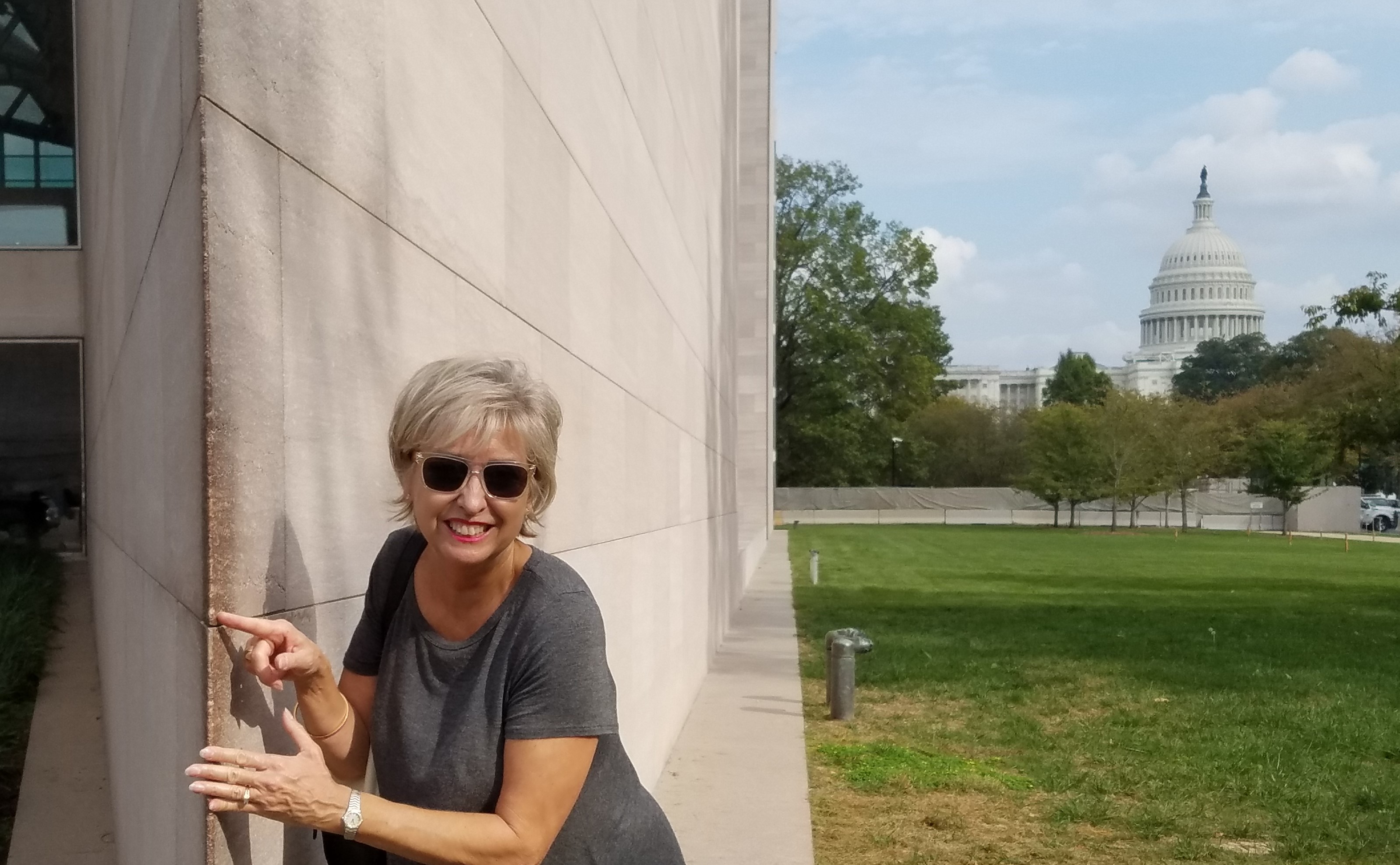
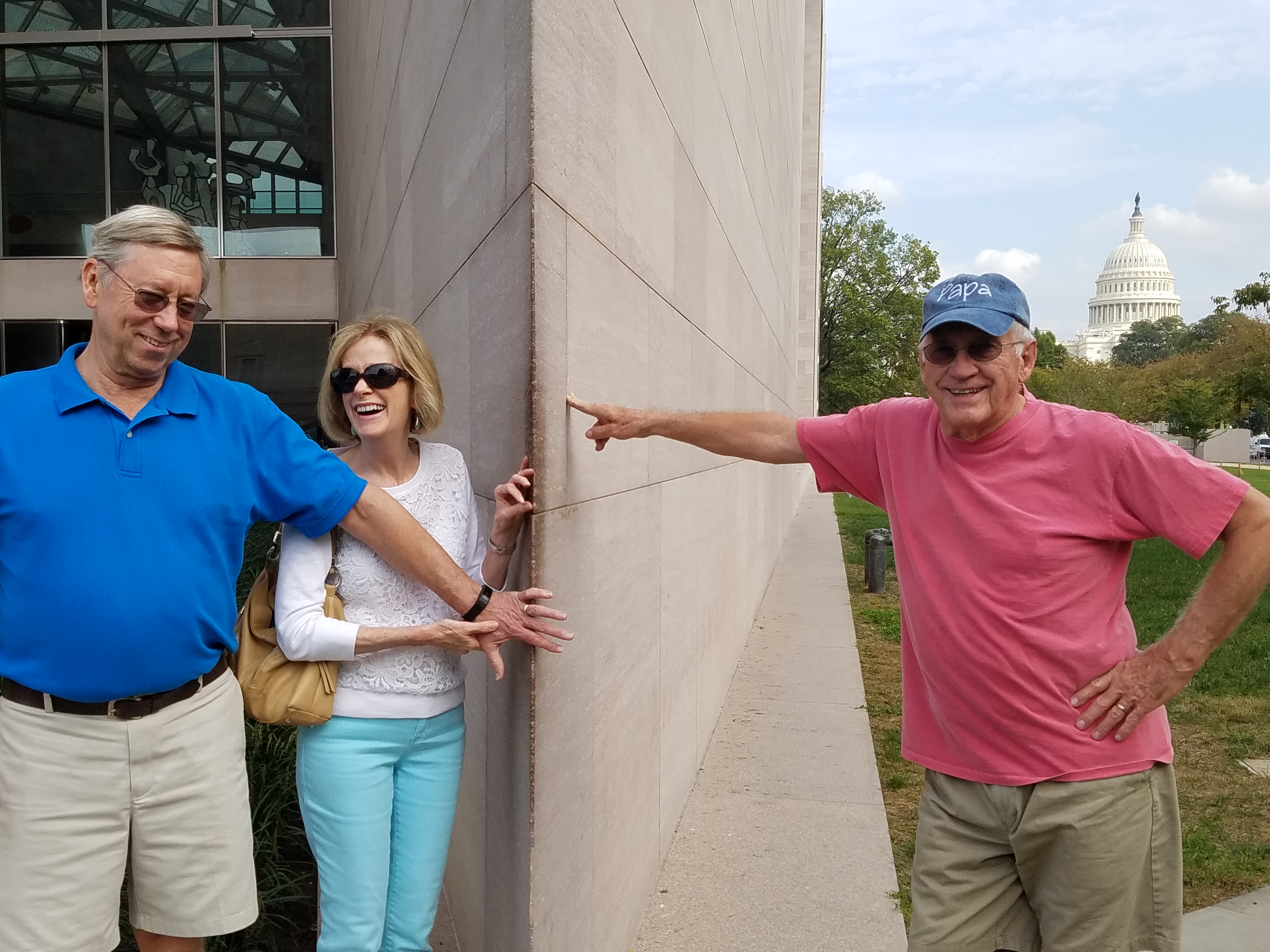
It was in 1978, the year I left my home town of Washington that I.M. Pei’s exciting new modern edifice was presented to an anxious art-loving public. So very different from the West Building and all others in the historic vicinity, some people were astonished but most were thrilled. This sleek angular sculpture of a building was a statement in and around which to display the growing modern and contemporary collection. An art-piece of its own accord. Yes, the building was at once regarded as its own work of art.  We eagerly raced to touch the famous wedge of geometry that came to such an acute angle that it begged to be touched.

i-m-pei-east-building

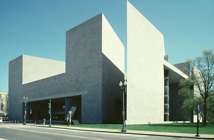
Nearly 40 years later that same fine edge is silently showing its age missing little chunks of compound and lovingly discolored with all the hands from around the world that have touched and smiled at the towering stone form in contrast to the rotund, ornamented and domed Capital in the background. Both majestically iconic, but stylistically so very different.

20161020_145510_002-copy

20161020_145320

But wait – this elegant aging beauty has had a three year rejuvenation treatment! New stairways and elevators connect galleries making the flow of exhibits more enjoyable. The tunnel connecting East to West sparkles with light and all the subtle changes result in a seamless passage through and enhanced experience for visitors.

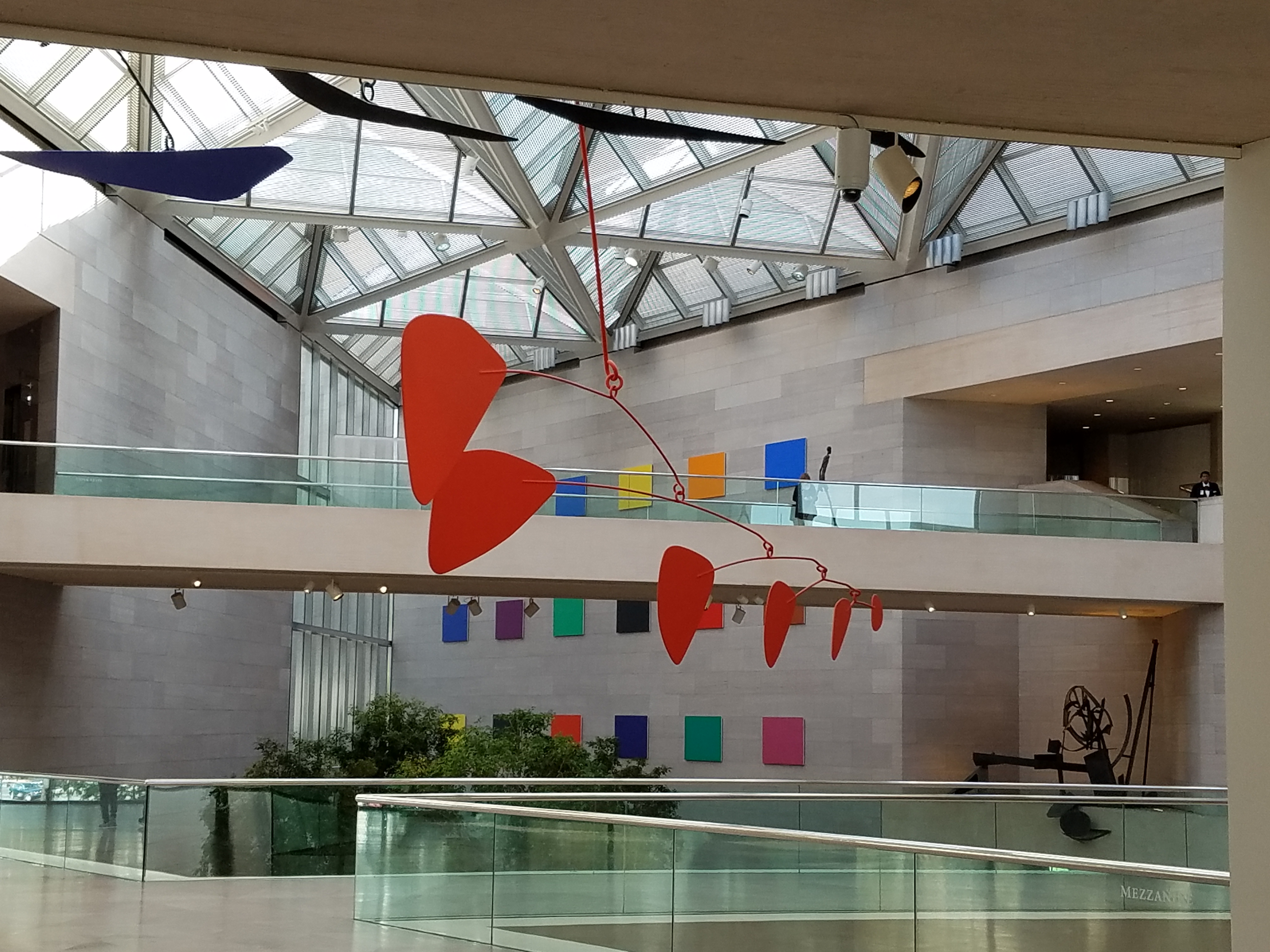
The glassy, crisp, stark, expansive lobby where the enormous Calder mobile is suspended defying its enormity and weight as it gracefully, almost motionlessly, moves silently with the subtle, indiscernible stirring of air is the fulcrum of the building. Exhibit halls tucked away but newly connected are exciting to frequent visitors who know the building so well.

20161020_120055

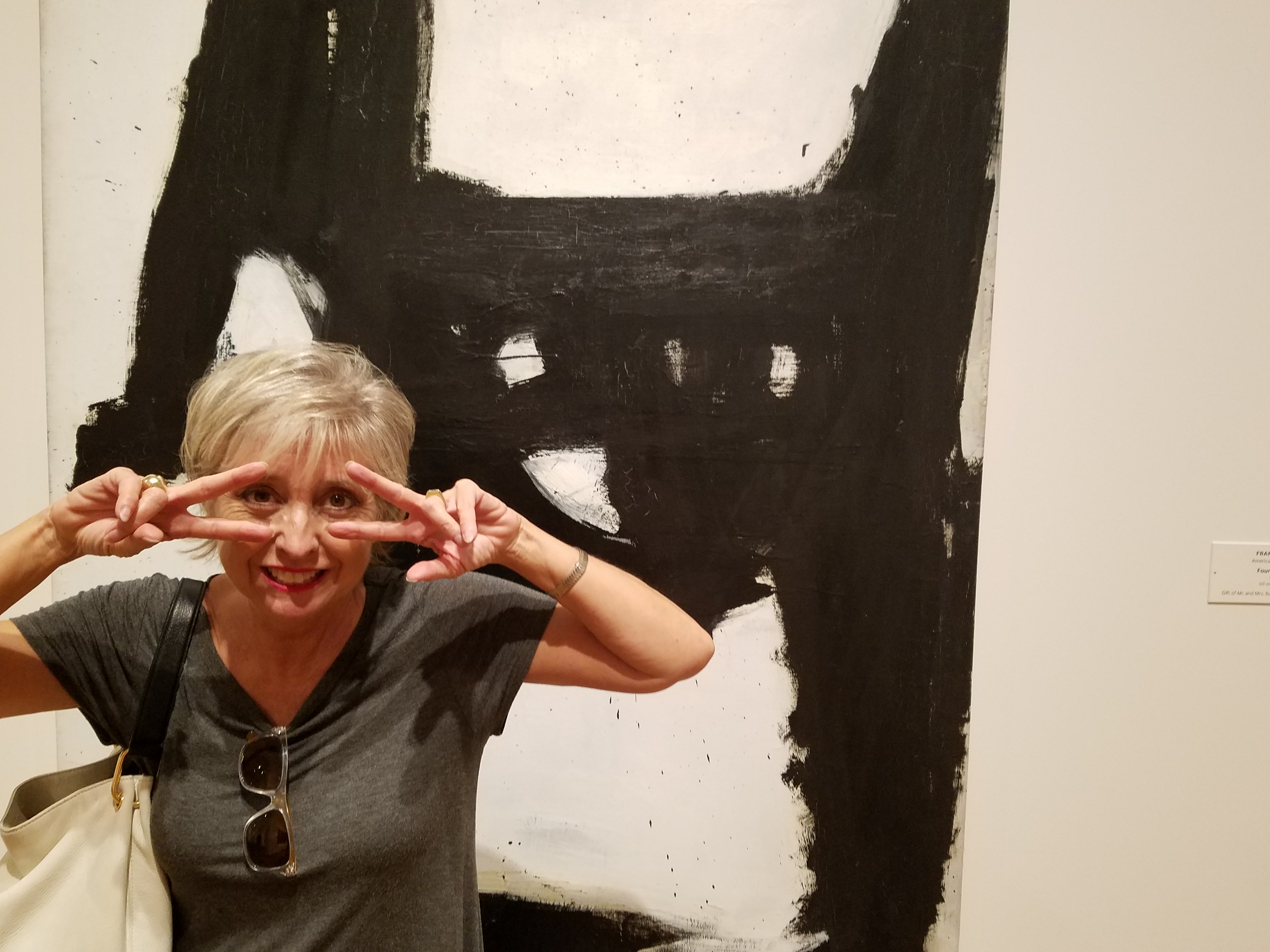
I naturally had to have a little fun and in keeping with the season made a couple of entertaining discoveries. Here Four Square and oil on Canvas by Franz Kline in 1956 is noted by The Art Story/Modern Art Insight “a fine example of  his gestural approach to painting. The viewer is led to ponder the canvas, seeing as either a close-up of a linguistic symbol, or perhaps, a set of open windows.”

20161020_141429

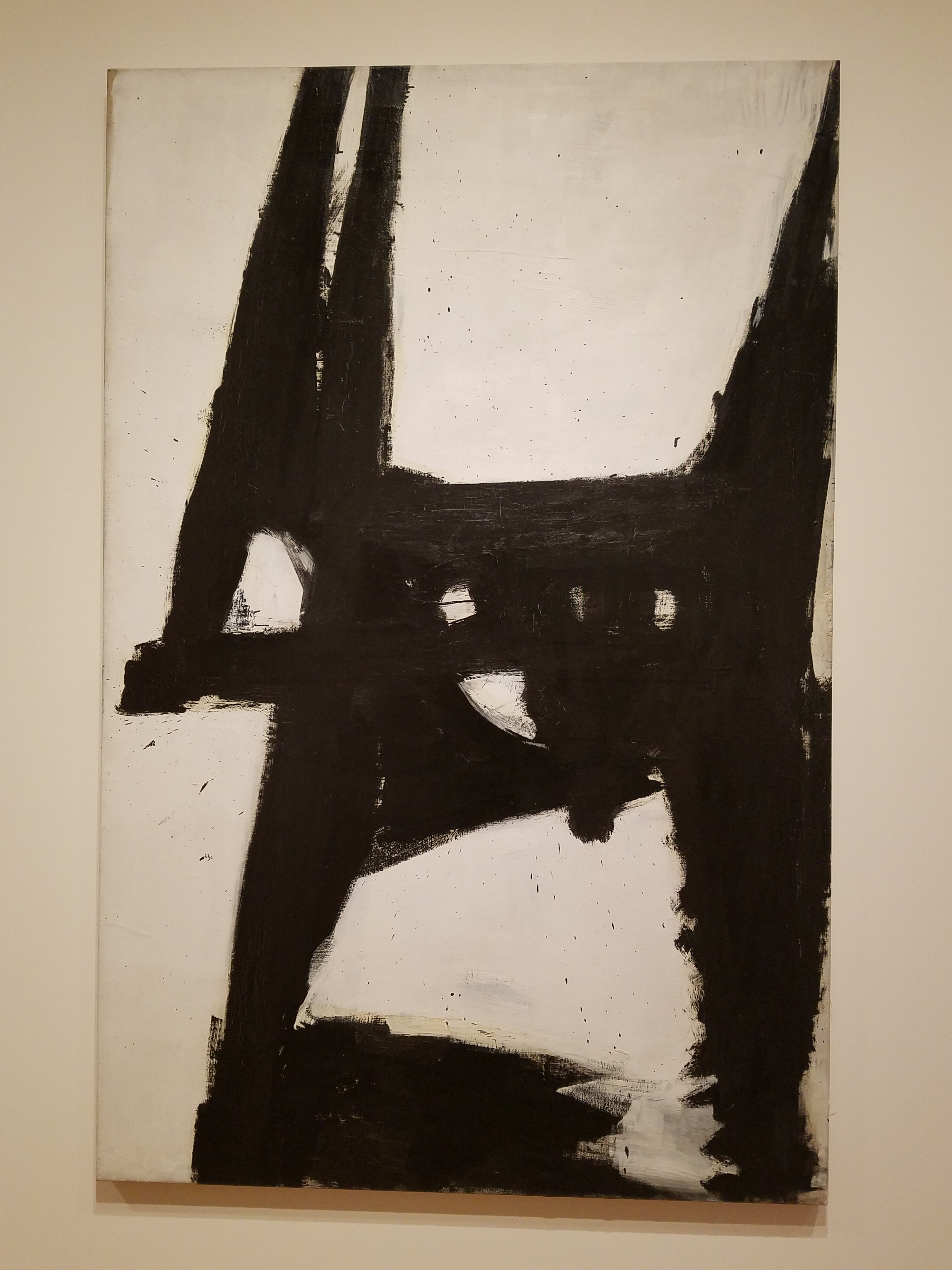
Really? Linguistic symbol or a set of windows? Well, maybe it’s the season…but I instantly saw a cat – a crazy black cat, an abstraction of James Dean’s “Pete” perhaps, which made me want a mask and to be that crazy cat and prance about for Halloween!

20161020_141522_001

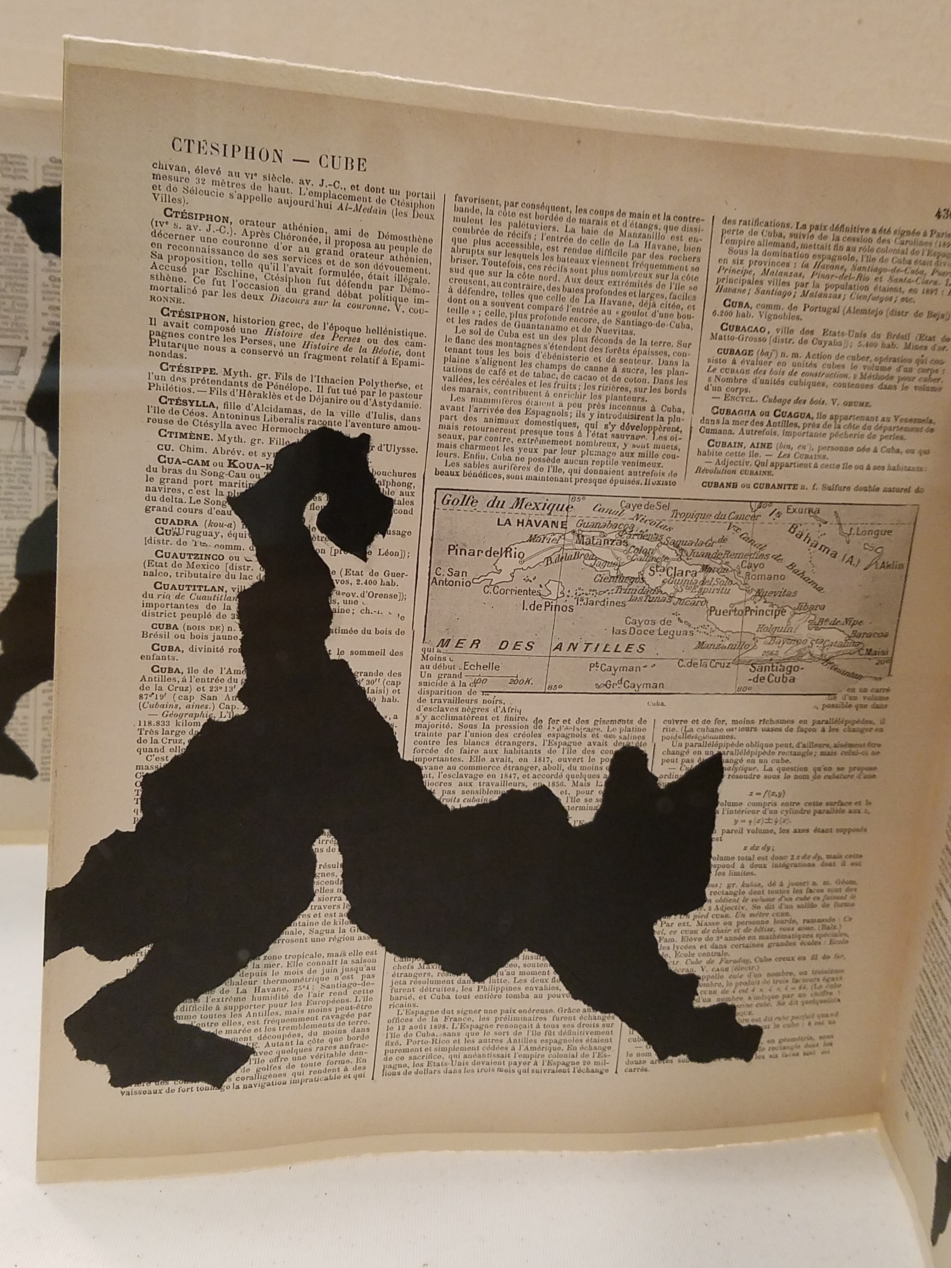
In another piece, Portage, by William Kentridge of South Africa born in my birth year of 1955, a folded accordion-like book with torn  black figures of paper affixed to encyclopedia pages resulted in my seeing another black cat! I do think it was of human figures bearing weight, carrying, moving through various poses. Call me Halloweeny – but this one was decidedly a black cat. Don’t YOU think?

20161020_143546

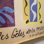
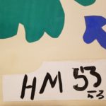
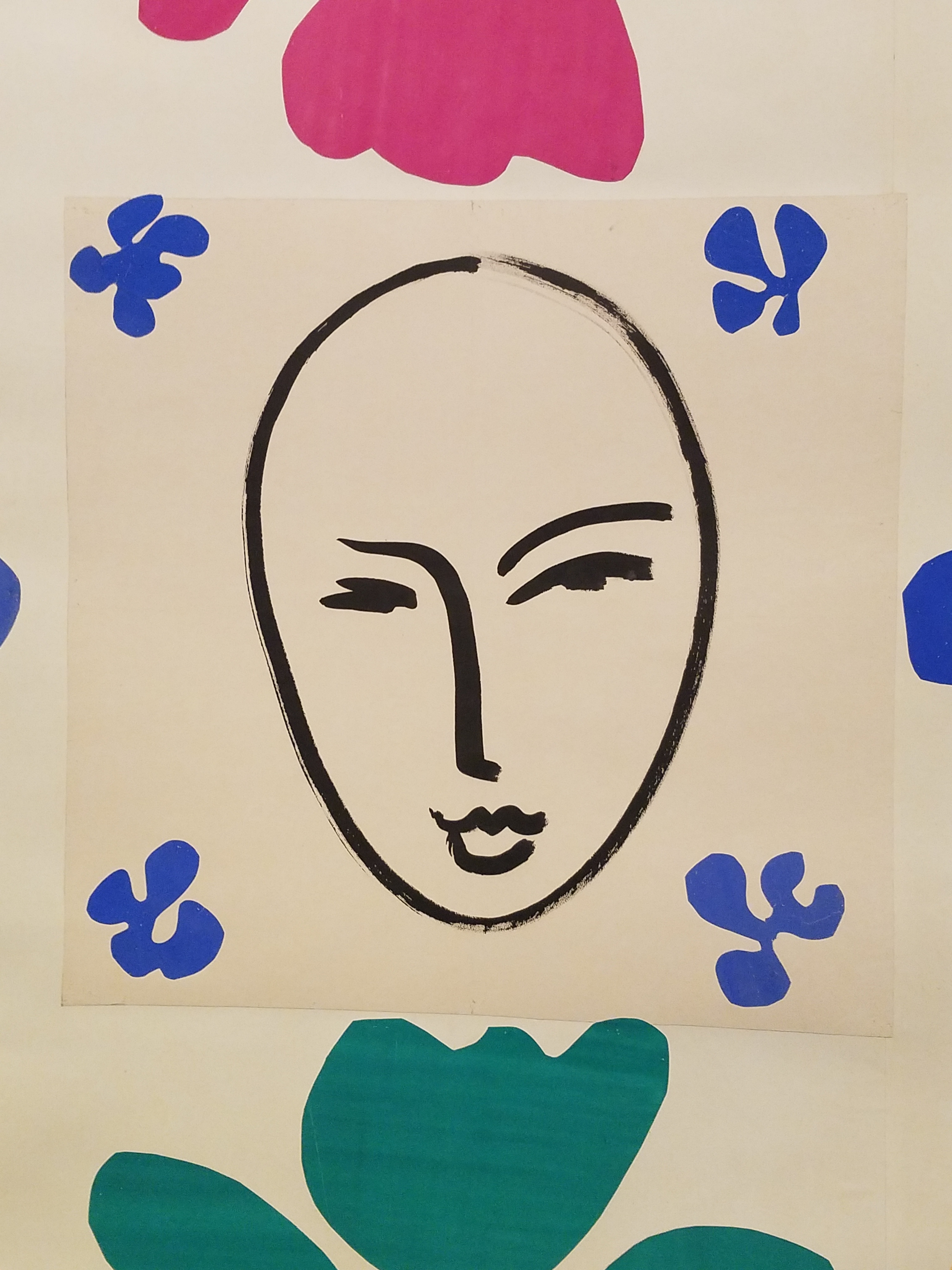
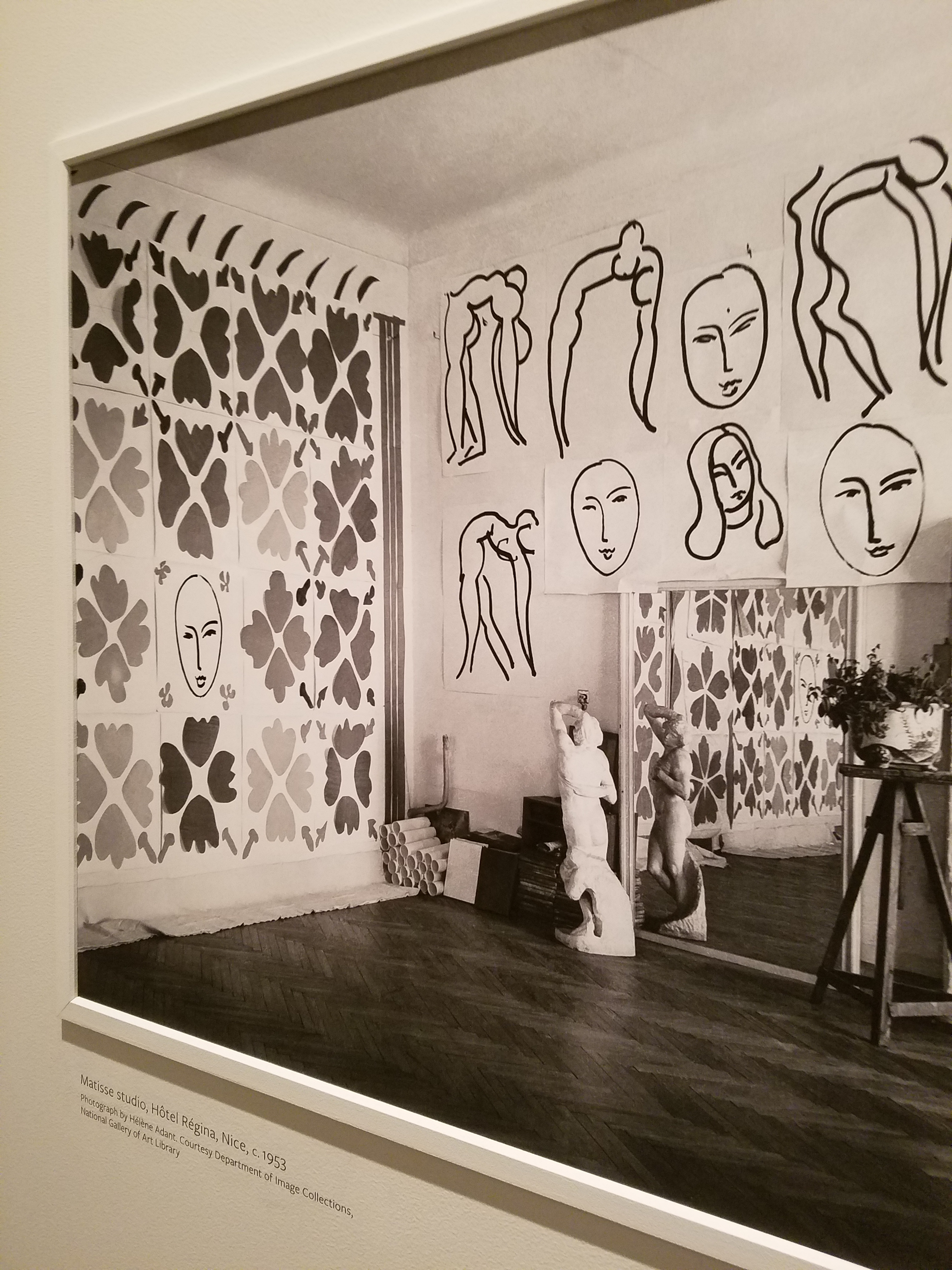
It was fabulous, exciting, fun and emotional to see the colorful Matisse cut-outs once again in such close proximity with Matisse’s placement marks and rough cut pieces – crude yet refined – rough yet lovely. Seeing these incredible compositions up close again is breath-taking.

Oh, and might this be another seasonal mask?

20161020_143742

From awestruck to silly…to a quiet reverence at coming to the black and white photo of this enormous piece in Hotel Regina in Nice in 1953!!  Seeing it in the setting of its day and captured in a photo all those many years ago was one of many moments of reverence.

20161020_143238

Once again, pay attention to the little things, be surprised, let yourself be amused and enjoy discovering art wherever you might find it – unexpected and very much expected places!


Don’t Be Afraid of the DARK!!

For a while in the world of design trends, dark colors intimidated. Bold designers dared to apply dark eggplants,  chocolates, charcoals and black to surfaces of their projects, but only a rare few clients would take the leap. Now it seems that we are seeing people accept the dare and more dark surfaces and intense envelopes of color are appearing on the scene.  I have often been asked – “Won’t it make it small?” or “Will it be too dark?” and the reason I am making the suggestion is because I already know that it won’t!!!

I’ve blogged about small rooms with dark walls in the past, but two recent projects featured my recommendation for dark cabinets. Not dark walnut or the market-saturated “espresso” which is the trendy generic for “whatever the wood – or pretend wood, we’ll make it dark brown” – very dark.

In this first case, my client – friend after many years of consultations – brought me into their home that they had occupied for a couple+ decades. It began with the  “pickled” wood cabinets that were in vogue at the time – stained red oak with a white-wash that resulted in a peachy finish. When we first did a “punch-up” we added steel cut-outs of Mimbres designs affixed to the soffit. We also added a black table and chairs with a splashy fabric as a valance in bold colors intertwined with black. The drama lifted the anemic peach theme to new heights.

Fast-forward another 15 years and my dear client was ready for a change. She called and brought me into that familiar kitchen scene and announced that she thought she wanted to re-purpose/paint her cabinets white. l looked around the adjacent family room and beyond and pondered this request.

What you might like in a magazine spread or a Pinterest post is not necessarily applicable to your context. I visualized the dramatic change. Looked at her floor (oh, we had upgraded to a large format stone-textured porcelain from the original 8×8 glazed ceramics in the last 15 years – perhaps a decade ago), looked at her family room furniture and finishes and said “I’m not so sure that’s where you want to go.”

I knew she was fairly thorough in her investigations and would not have called me prior to doing quite a bit of research and trend monitoring so I tread a bit softly when I said “I think you should go black.”  And her response was EXACTLY what I expected as she repeated the color in complete quizzical surprise.

“Yes” I said and continued to explain why. She loved her fabric that had been hanging over her breakfast nook window for years. The table was virtually unused and the steel cut-out art was one of their favorite design elements. Black was a natural. “Don’t be afraid of the dark.” I laughingly said.

Black on oak gives a wonderful moiré effect to the grain texture as it reads though the painted surface. It’s a bit exotic, rich in texture and interesting to boot. So with a bit of hand-holding and massaging the description of the intended finished effect, she took the leap – husband in cautious adgreement – they braved this bold departure from the norm.

We first selected a granite to coordinate with the floor tiles and the soon-to-be black cabinets. A swirly geology of glorious goop featuring the rose-clay tones of the mottled stone floor with black tracing through and clear quartz for pizzazz. We then set forth creating the back-splash which began with her love of glass – but to depart from the off-the-shelf 1×1 offering we cut away sections and punctuated it with 2x2s and some 1×1 domed bullets that added further interest to the multi-toned field. 20160906_173401

With those complimentary materials selected, we began the process of painting the cabinets. Boxes in place and door and drawer fronts finished off-site. All flawlessly sprayed, with many coats of conversion varnish tinted black, the transformation was dramatic.

20140418_10474120160906_173522

The second example, of this fear of the dark when it comes to finishes, was another kitchen which was a small galley-styled golden walnut stained oak 70s model. To which, we added a rough iridescent slate floor to complement the existing stone fireplace – of the same material – only in boulder form. Seemed at this point, for this sophisticated bachelor, the perfect complement to the handsome slate would be striking black cabinets. In this case –  new, without the character of the oak in the previous project, as the cabinets were completely replaced and the new selection was made from a factory fabricated series. Similarly dramatic, the sleek black was perfect against the slate’s rugged grey/golden iridescence.

kit10-resized20160906_183640

The galley footprint was greatly expanded, by carving out of the garage work-bench  area. And again, the transformation was daunting. Here we selected a mosaic of horizontal stones and glass for the backsplash – one of the stones was exactly the same iridescent grey-golden slate as the original fireplace and stunning new floors throughout.

20160906_18371520160906_183747

Be bold, be brave and consider your context. You might just find that black is your best bet to transform your cabinets into stunning statements.


Table Dressings From Nature – Inspirational Fun!


It could have been a sculptural piece of drift wood or a gnarly tree branch from the woods or a twisted piece of metal from a salvage yard…but the idea is to see things in a different way and once again—as I have done this before— to make something from nothing. And in this case, with no effort or manipulation—just the natural beauty of the found object.

The tide was out making the beach so wide it was like a great runway of wet sand. Scattered on the surface were the leavings of the waves – pieces of shell and polished stones. There amidst the beautiful debris was what looked like the suggestion of an abandoned boat hull—a dried, darkened palm sheath. I instantly knew, this would be another beginning of the tropical table-scape that I am so fond of creating when we are at the beach. P1110860

“Creating something from nothing,” my father would often say. He was a great believer in that idea that one man’s trash was another man’s treasure. We loved to beach comb together whenever we found ourselves at the tide’s edge. Sometimes it was tropical and the coral was bleached white and pocked with texture. Fine mesh pieces of purple sea fan and perfect little green “hat” shells would be nestled among the dense collections of heavier piles of white coral.

Then other scenes would find us on northern beaches of the Maryland coast where there was no coral but the ocean would wash multi-colored surf-polished stones onto the shore blanketing the sand particularly at the very edge where the water would curl between the beach and the ocean’s depths. Tiny purple and pink clam shells would peek, being abruptly exposed and quickly bury themselves back into the wet sand moistened with  each incoming wave.

On this day, the warm breeze is tropical and the beach is expansive offering rare treasures scattered broadly but sparingly on the pristine surface of sand. It is here that I encountered my centerpiece.

Don of course is saying—”what are you going to do with that? It’s too big. Leave it here.” And I assure him that it is in fact a treasure and that it will be magnificent in the center of our dinner table where we are entertaining 11 for festivities this coming weekend. He, as always, acquiesces knowing that it is futile to stand in the way of my wildly enthusiastic creativity. P1110861 P1110871

Over the next couple of days, he and I both collect white stones and shells on our daily beach walks. At my instruction, we only collect white unless it is a particularly interesting shell. The idea is to have the stark contrast with the dark hull of the palm sheath.P1120142

Our dining table is a handsome slab of travertine marble. Laminated to a double thickness and finely finished with a smooth full bull-nose edge, it is the perfect organic surface to build this also very organic centerpiece.

It needs something…the neutral tones are lovely. Yet, the dark espresso brown of the palm sheath with the white of the stones, against the creamy surface of the travertine invites something more. I realize that it can only be enhanced with another layer of organic material – here in the form of the fresh verdant green palm fronds – the perfect punctuation! P1120102

Oh would that I had collected more flat oyster shell halves…they work so well for votive candle bases…but alas, parrot green cocktail napkins will have to do for this last minute detail.

Our woven palm place mats, in their natural dried flaxen color, compliment the rest of the organics on our table. And as night falls, the sun drops beneath the sea’s horizon and twinkle of scattered candles finish our scene. Salud!


Mad About Mosaics!

When in doubt – go for the gusto!  The easy options were just that – too easy and after envisioning all of the obvious options it hit me. I adore color and texture and the varied effects of bits and pieces making a whole. Fragmenting and reconstructing, creating and melding, mixing and matching…mosaic is magnificent. Taking disparate shards and creating a scene, combining a collage of materials and making a mosaic of their complimentary shapes and textures.

Architecturally, walls are faced with murals of mosaics on grand scales that pull the public eye into fantasies of fine, fragmented details.

Inspired for years with this colorful, playful and loose art form, I recently attacked my fireplace surround. Why not break convention from the traditional use of material such as tile, stone, perhaps glass and use ALL of these materials in a bold collage of color and make a statement that lasts!

Mostly broken tiles from a variety of sources along with simple glass stones, broken ceramics, and even treasured polished Atlantic beach stones that my father collected and took to the glossy, glassy high polish of his tumbler that spun in the garage day and night with the different frits to gradually transform the smooth pebbles into those highly polished prizes. This sort of project can be an intensely personal collection of fragments and memories.

Image