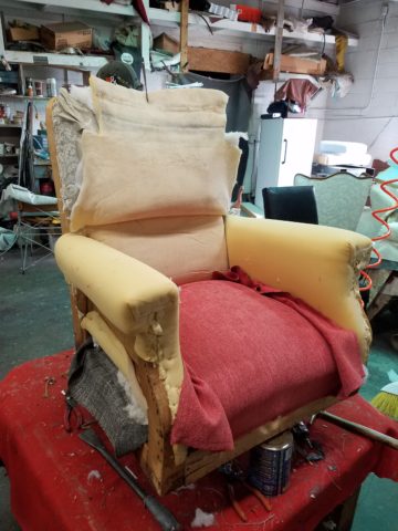
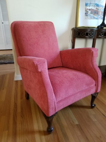
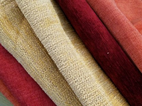
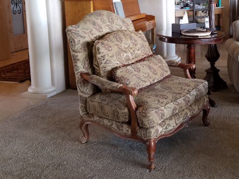
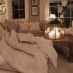
Fabulous fabrics are NOT common – that’s what they have in common!! After paint, fabrics are the most malleable design element that can make dramatic transformations in an interior. New pieces, reupholstering existing pieces, treasure-hunting to cover vintage pieces, salvaging family heirlooms, plastering or padding walls and ceilings, draping and accenting – doesn’t it sound exhilarating? Imagine the possibilities!
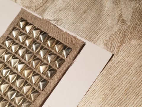
Metal studs to trim things…wrap a lampshade, border draperies, trim a sofa, adorn a pillow…so many things…and the stormy cloud printed velvet in the background of this trim – is blustery and powerful.
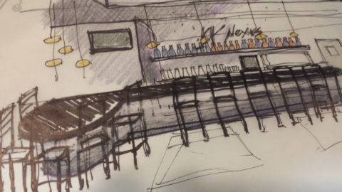
One of the most fun-filled events in our design studio are the road-trip visits by our fabulous sales reps that bring the world to our conference table!! In larger cities, the design resource centers, markets and their showrooms offer myriad marvelous samples of furniture, decorative accessories, art, lighting, fixtures, finishes and fabrics. Exciting new design trends are presented each season.
But when you live, in isolation from the major centers, as we do here in the high desert – we are treated to personal presentations that are intimate, relaxing, inspiring and educational. Here is an exclusive collection that was presented just last week. Sit back and watch the fabrics unfurl and float – one after another – in layers of color, texture and incredibly inspirational style.
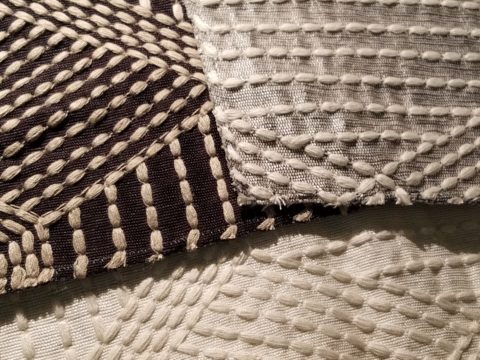
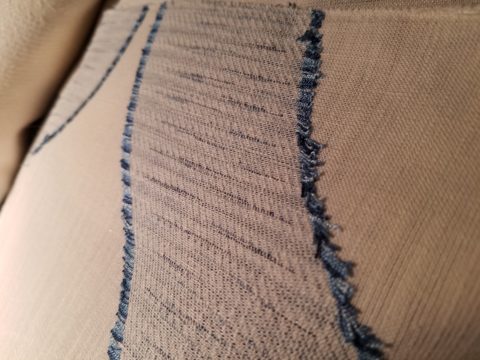
Weighty over-stitching or “top-stitching” adds detail-either high-contrast, color-on-color subtlety or the median slightly contrasting grey with white. Trending – touchable textures! Here presented for interior fashion, but you can bet that clothing fashion designers would love to play with these textiles for wearable art too!!!
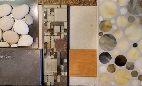
Sure, throughout the year we travel to source hubs, surf the net, call our reps, request samples, compile materials and gather what we need across the miles. It is challenging. Like living on an island and bringing the amphibious containers of supplies over the sea and up onto the beach! But inasmuch as we don’t have a design center handy to do a lot of “one-stop-shopping,” we do curate our own very extensive source library of fabrics and architectural materials. With that at our fingertips, without leaving the studio, it’s a time-saver, a stimulating place to to engage clients and we are easily spoiled!
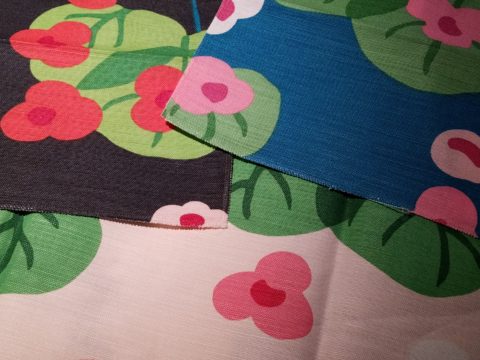
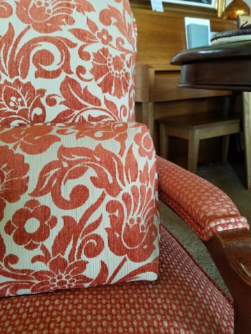
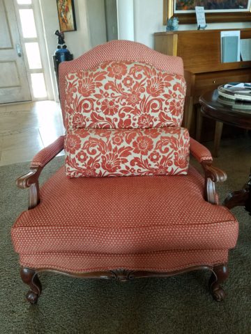
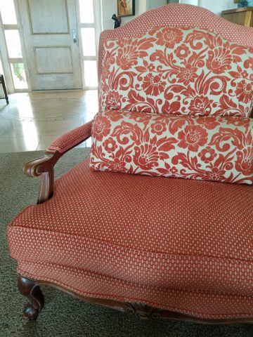
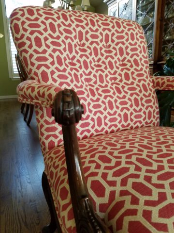
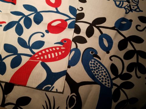
Fine weaves make terrific grounds for bold prints – here in three different color-ways – what a POP! Retro to new concepts – patterns add pizzazz!!
This recent textile presentation brought refined and rugged landscapes of intriguing textures and patterns that stimulated our design juices.
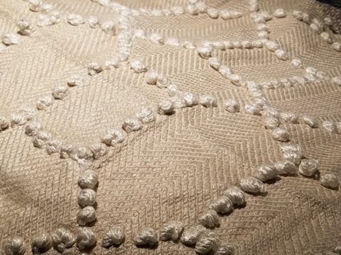
Intentionally cut after the weaving process provides extra texture and pattern interest.
Often the “backside” of these fabrics are as interesting (if not more so) than the fronts – but be mindful of floating threads and other weaving details/methods that interfere with practical use.
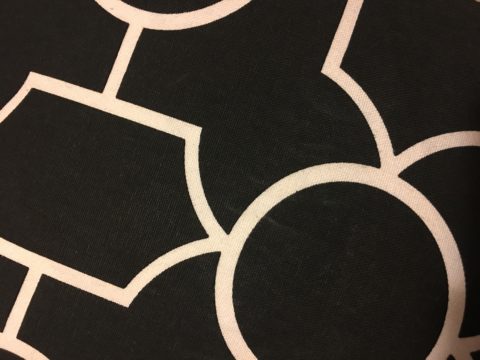
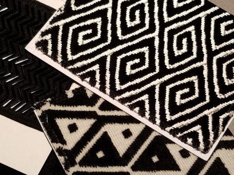
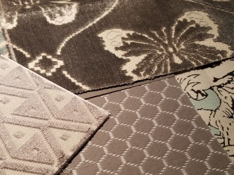
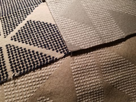
Bold “geometrics” are not only vivid with high contrast threads, the texture is what cannot be accurately replicated or conveyed via digital images on a screen. Despite the fact that I got up close and personal with these samples to photo, nothing beats touching and feeling the fibers and textures.
Complex weaves dazzle with design creativity. Bringing an artist’s concepts to fruition, with a mill to fabricate the dreams, is enchanting.
Traditions of weaving artisans are found in countries around the world. Sadly, not many fine fabrics are woven here in the States, partially due to the cost of fabrication and also due to the generations of crafts people who are experienced in the art of weaving more cultivated in other cultures. Whether organic, engineered, by hand or efficient, fast-paced mechanization – art and technology continue to push the envelope of fantastic creation and production in the fabric industry.
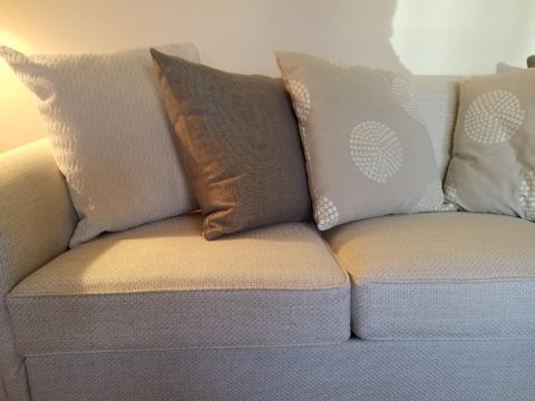
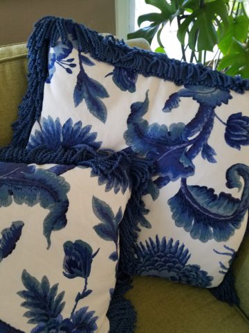
Here’s a great tip – if for only a pillow cover – if only ONE side of a pillow cover, having unique fabrics is having art. Living with functional art. Appreciating the designs, textures, craftsmanship and unique qualities of fine fabrics and wall-coverings is most satisfying.
Paints hand applied to the surface of fine woven fabrics is gilding the lily.
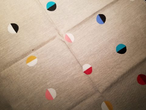
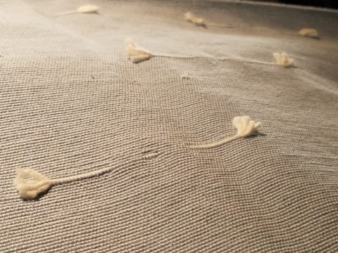
Who doesn’t love these colorfully, whimsical dot halves hand-applied to the surface of this nubby neutral??!!
Silk-screening also is an art-form that enhances the quality and appreciation of fine fabrics and papers.
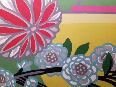
Some of this collection are vintage art-pieces resurrected with new colors on the screen prints. The caliber of a fine, timeless, resource is about quality of both design and construction. A collection that continuously offers – classic and new, bold and subtle – answers to so many opportunities, is a resource that is to be celebrated!!
We investigate the most extraordinary fabrics, in the world, so that we can compile and create the perfect combinations for your exclusive lifestyle.