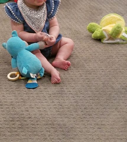
Thirteen or so years ago we designed the interior of a home for a young family complete with a toddler. The desire was to bring color and modern accents while still selecting durable materials and hopefully timeless elements.
Fast forward these many years later and this same family now with two beautiful daughters is relocating to another city, another state and a new home. This home was well furnished and much, of what was shown, stayed with the house. The trick was, after having adopted so much from the previous owners, how would they make this house their home?
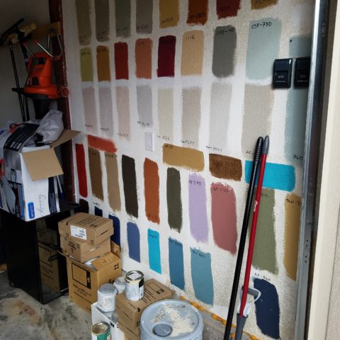
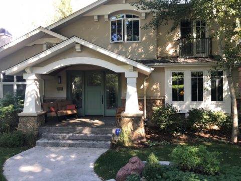
The point of arrival – the front door – was a tasteful charcoal grey, but by changing it to a bit lighter smoky green, it made a significant difference.

It’s tough to be up-rooted anytime in your school years…these girls missed the only home they had ever had, friends, activities, groups and familiar environs. This challenge was to help all four of them – parents and kids – get settled and assist in making this new house their true home.
As I flew to consult with them, I imagined the scene having seen photos to get somewhat oriented. I made the natural assumption that paint would make new statements to alter the previous owner’s selections and introduce the new family’s preferences. However, despite the change we made to the front door, it wasn’t all about paint once I arrived.
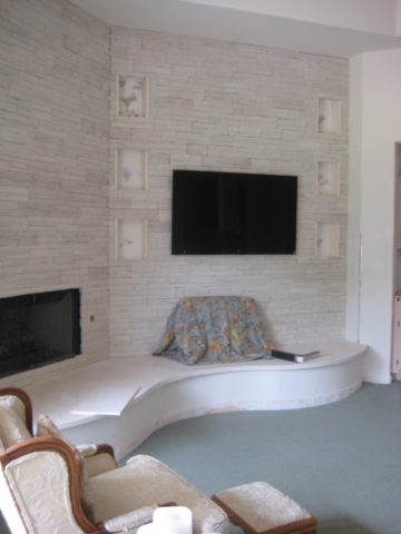
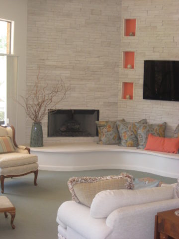
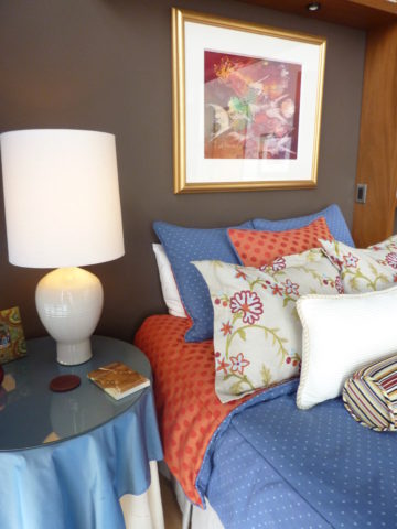
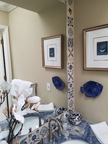
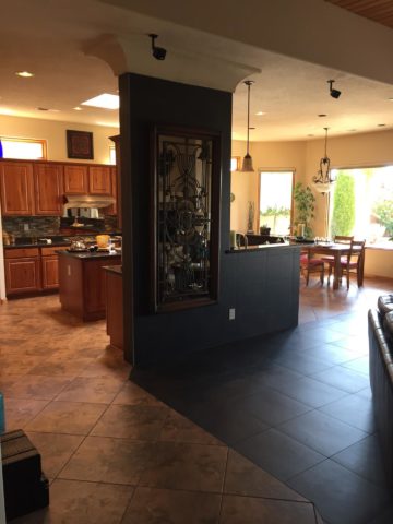
In the previous residence all those many years ago, we punctuated the interior with paint accents. Good design transcends trends and the years. Who would think that this interior was created thirteen years ago?
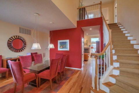
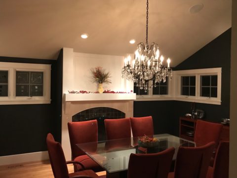
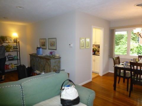
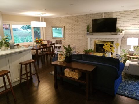
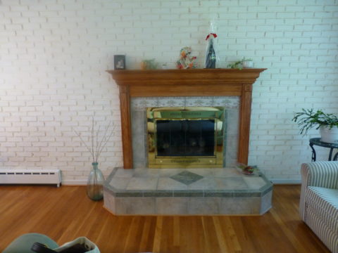
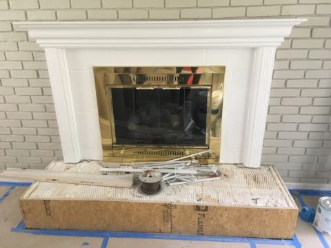
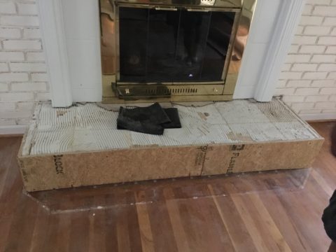
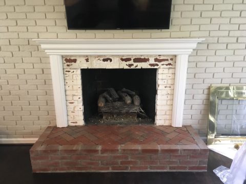
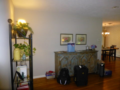
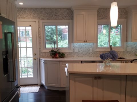
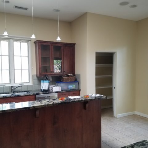
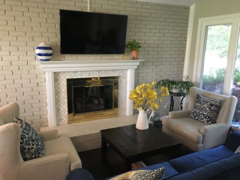
The dining room in the new home was painted entirely charcoal – trim and walls. Oppressive was an understatement and before I even got there they painted all the trim white to match the rest of the home. However, they left the fireplace charcoal – waiting for a discussion as to how to proceed.
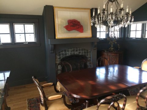
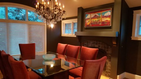
Notice the dining room furniture having moved from one home into the next. We decided to paint all the wood trim surrounding the fireplace area white to match the rest. But it produced a startling brightness that will be absorbed once a new painting is selected for above the mantle.
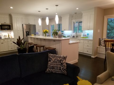
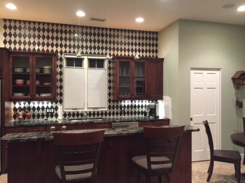
They inherited the chandalier with the home and although it is quite different from their previous dining room fixtures, they are making it their own by mixing their chairs, table, rug and sideboard.
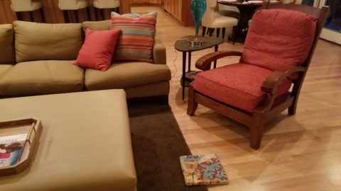
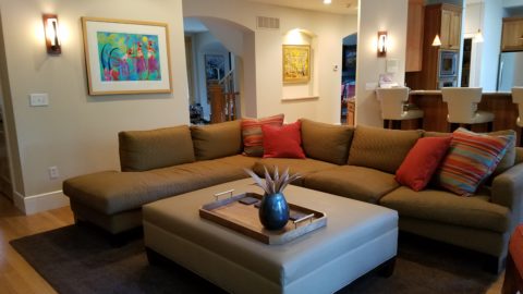
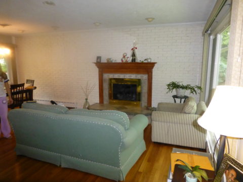
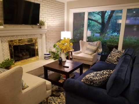
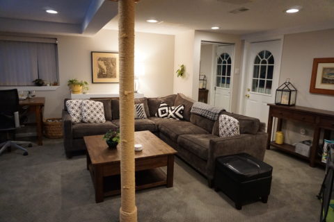
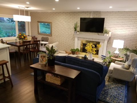
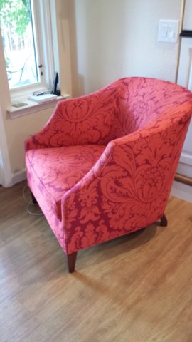
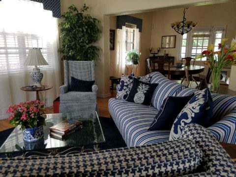
The framed lounge chair found a home in the new living room alongside the large sectional that they acquired from the previous owners of the house.
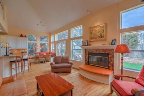
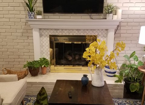
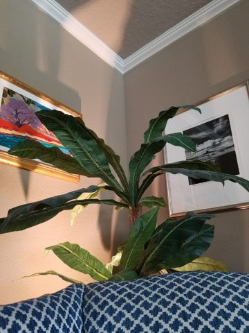
Here in the previous home, the painting over the fireplace has a prominent position, yet also has a place of prominence in the new home along with the chair and a half and the arm chair in the foreground.
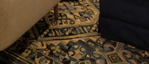
Checking out a sample of a rug to add further color to the otherwise neutral scene.
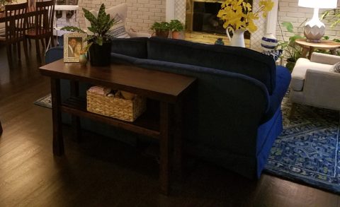
The simple placement of custom throw pillows initially designed for the banco in the kitchen are now colorful accents in the living room, on the newly acquired sectional left by the previous owners, are a remarkable save.
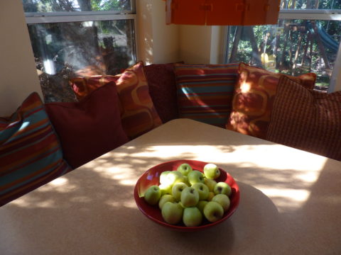
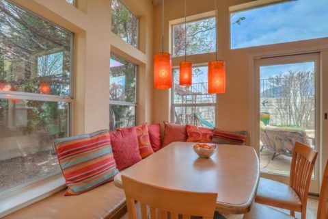
These pillows had seen their share of spilled milk and ground-in cereal over the years. But with periodic cleaning, they maintained their appearance perfectly.
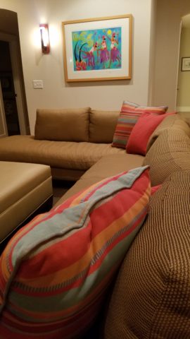
Here the pillows are the perfect accent on the camel-colored sectional that came with the new house. The painting has been a family favorite for years.
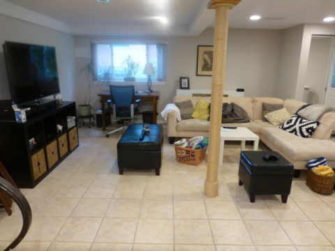
The rest of the collection of throw pillows from that original breakfast nook are being re-purposed on the sectional in the lower level media room/office. They add the necessary splash of color in this neutral scene.
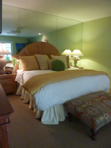
The fully upholstered chair-and-a-half also transferred from old to new. Previously in the family room, now in the music room/office. The master bedroom transferred completely. The girls’ rooms have a mix of their things and some new features. All in all it is beginning to take shape.
It pays to buy good materials that maintain well and take proper care of them. Not only will they offer years of enjoyment, in this case they bring the familiarity, to the new house, that is beginning to make it feel like “home.”
Sure, some might like the opportunity to start new without remnants of the previous life – but in this case, they cling to that which was comforting, familiar and theirs. Moving to a new home and being able to mix existing pieces so well with new ones to make this new house a home is a design success story!


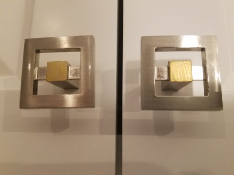
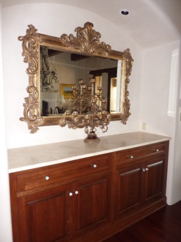
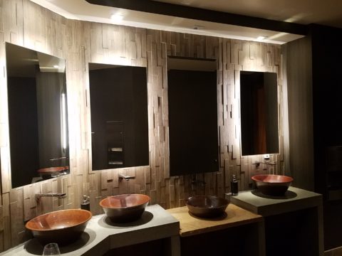


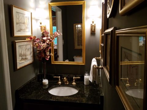
 Following trends can be costly, unnecessary and unimaginative. Gold/brass finishes have been making a come-back in recent years. Sometimes it takes time for it to trickle into your purview. But the point is – good design is good design. So it’s not so much about if it is perceived to be good enough or right or wrong…it is if you can design around it and make it great.
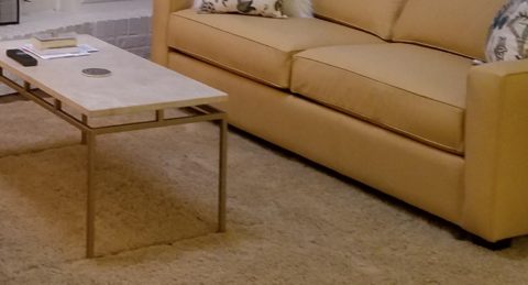
 Probably not, but it is not so much about the mixing – it is that to make something like that REALLY work, the overall design would have to be so intentionally mixed that it in itself (the intentional mixing) is an art-form.
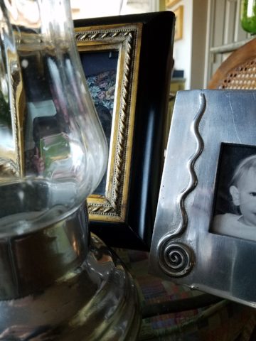
 The answer is YES. In some contextual situations, the language of the materials speaks in vernaculars that separate certain groups from others as though allowed to be intentionally different – as they ARE different.
 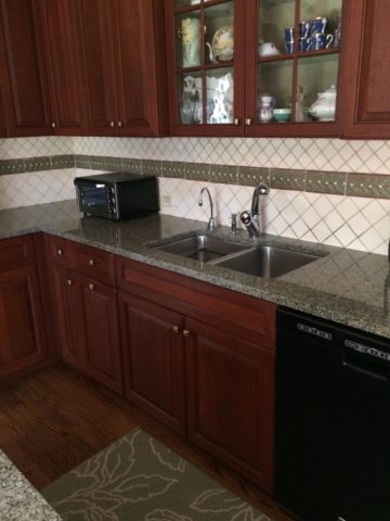 The great thing about knowing when to make statements in contrast – not conflict, is just that – knowing.
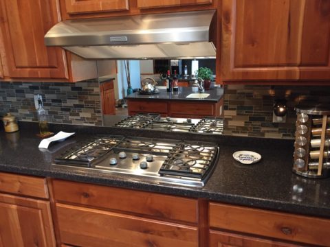
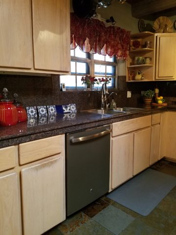
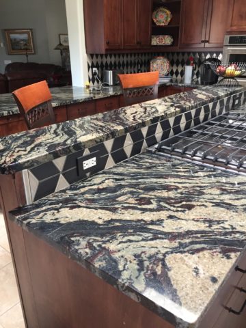
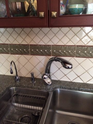
 But now we are seeing matte black – and oh is that hot! Complimenting the concrete finishes and raw steel – contrasting with the brushed stainless – punctuating the trend of the clean commercial kitchen style of design. It is a bold yet soft new option for the edgy everyday kitchen. http://www.foodandwine.com/cooking-techniques/look-these-beautiful-matte-black-major-appliances-refrigerator-ranges-ovens-and
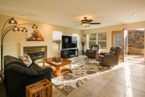
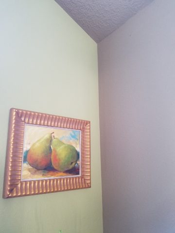
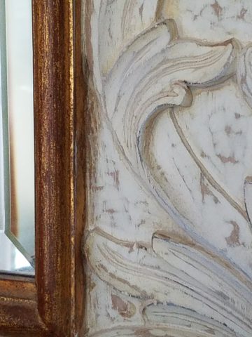
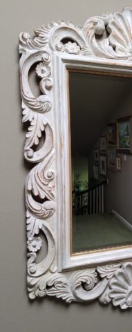
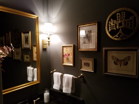 Have I ever mentioned context? Eclectic mixes can be quite fun and interesting.
 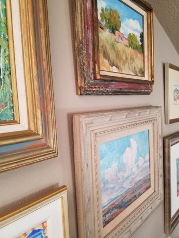 Groupings of identical moldings can be effective.
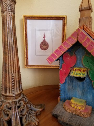
 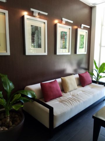 Random pieces scattered throughout can each be singularly nice. So don’t rush out and re-frame all your art. See how you intend to use it, group it, where and with what else. Be sensible and creative – be brave and do what you like! That makes sense!!!!!