The total sum of an interior…comprised of the shape and volume of a space, the colors and textures, architectural details…then layer the lighting, furnishings and decorative accessories and ta-da! But is that all there is?
The beauty and intrigue of interiors is what keeps us discovering and creating. Yes, finding intimate pockets or grand expanses that please and dazzle.
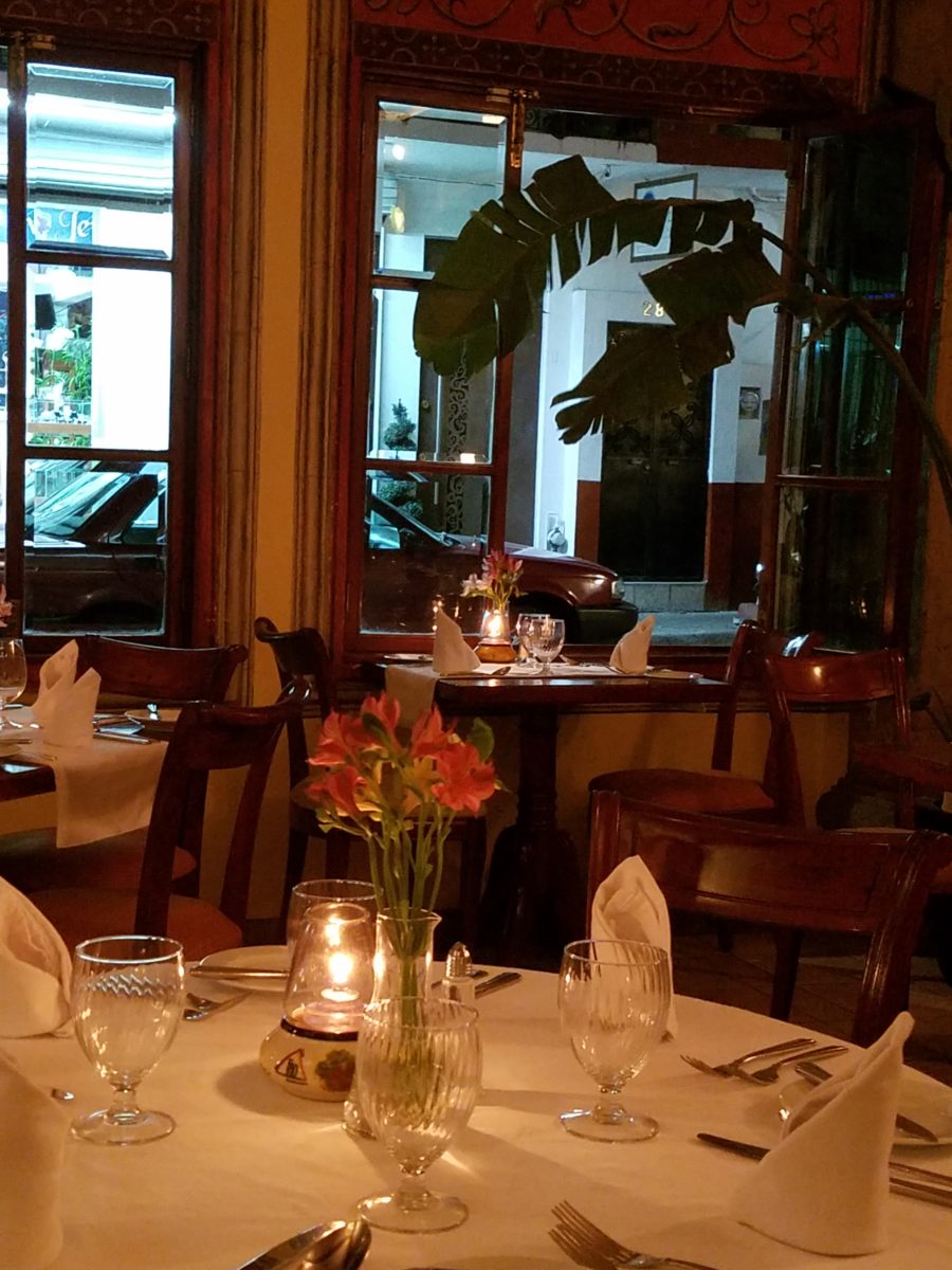
While traveling in the tropics these last few weeks, I discovered many interesting places. Oddly, while experiencing all the sights and sounds flavors and colors of this paradise, I immersed myself in the unlikely and completely opposite world of early 20th century Russia with A Gentleman in Moscow.
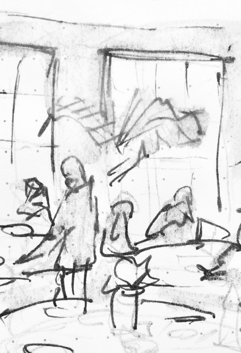
The beautifully and artistically articulate writing style of Amor Towles held me captive. And what a dichotomy to play ping-pong with my brain as I digest the restricted realm of Count Alexander Ilyich Rostov while basking in the warm sunshine with fresh sea air and palms rustling overhead…It seems that the extremes of this pairing suited me well as it was a dual escape – a vacation getaway while taking me further into fantasy with another dimensional experience of this incredibly great read!
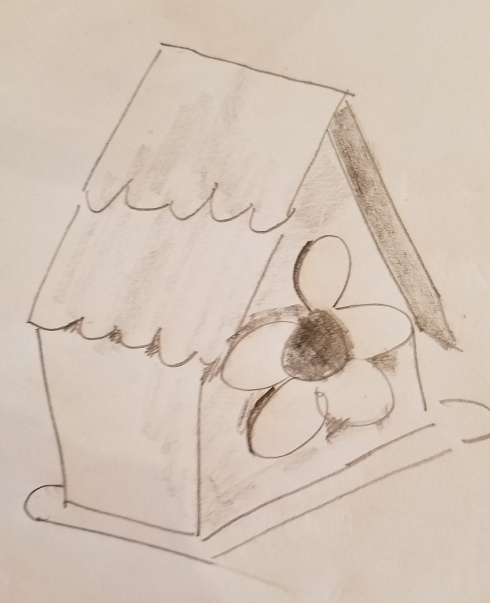
Although there were many fascinating observations made by the author, it was this passage regarding the Count encountering a young artist/architect that prompted this subject for this week’s blog. The architect, finding himself in Moscow in the post Czar age of socialistic experimentation and implementation, bemoans the lack of work “The way things stand, I’d be happy to design a birdhouse.”
The mayor of Moscow has made an observation espousing the birth of “the golden age of the prefabrication, cement-walled, five-story apartment building” – with the very practical “four-hundred-square-foot living spaces with ready access to communal bathrooms boasting four-foot tubs (after all. who has time to lie down in a bath when your neighbors are knocking at the door).” The mayor further emphasizes and rationalizes “So let us not get bogged down with elaborate designs or bow to aesthetic vanities. Let us apply ourselves instead to a universal ideal that is fitting for our times.” A horribly inhuman decree in my opinion, rather than a should-be, truly magnanimous spirit. Humans are designed to design!!
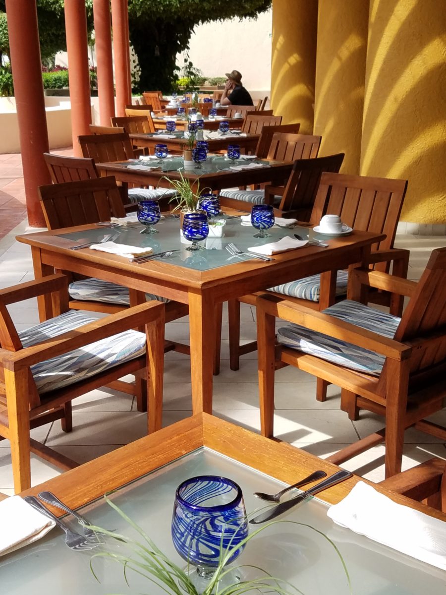
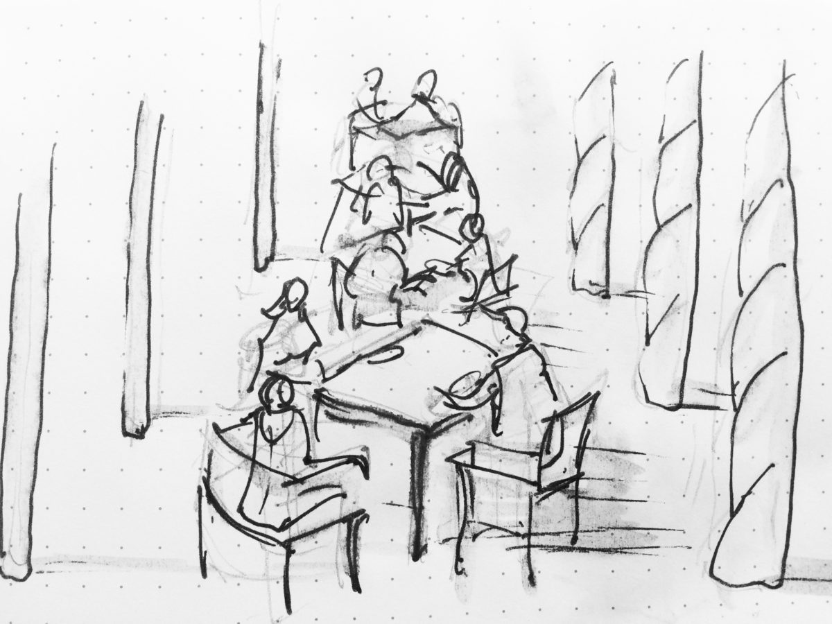
The sentiments of the new regime left the architect with having to find avenues to utilize his talents – specifically sketching as he set forth to illustrate a brochure of the city’s finest hotels as retained by the Intourist department. How sad to possess the talent and passion and be reduced to capturing the grandeur without having the opportunity to design??!!
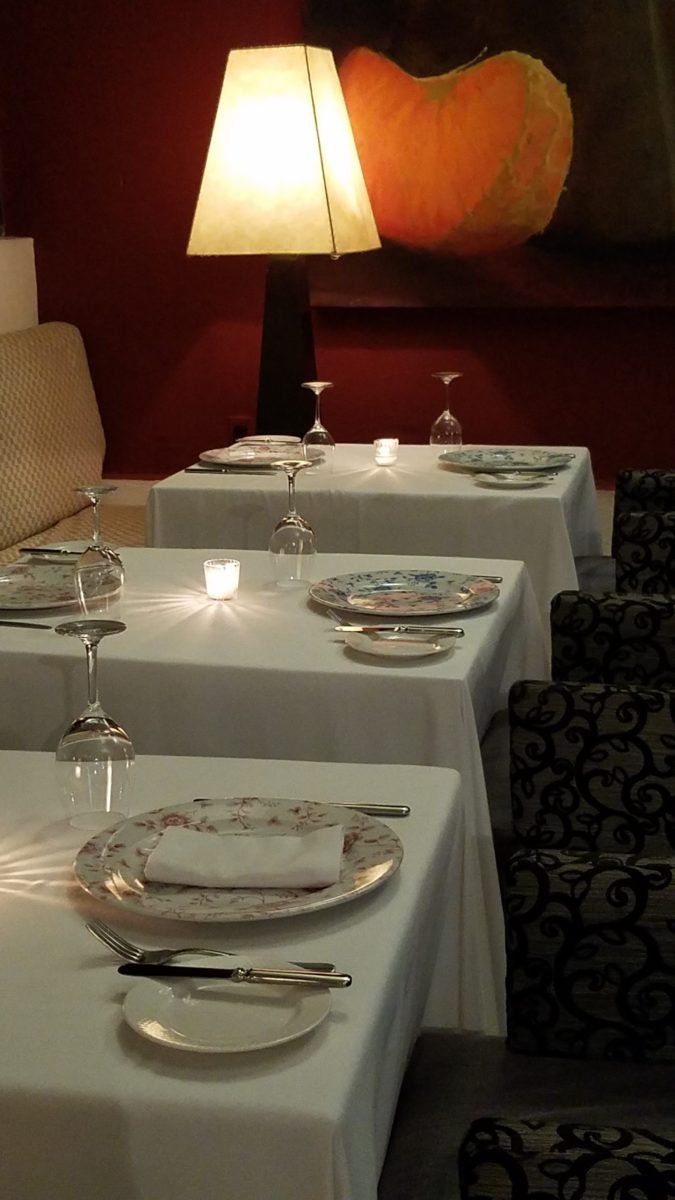
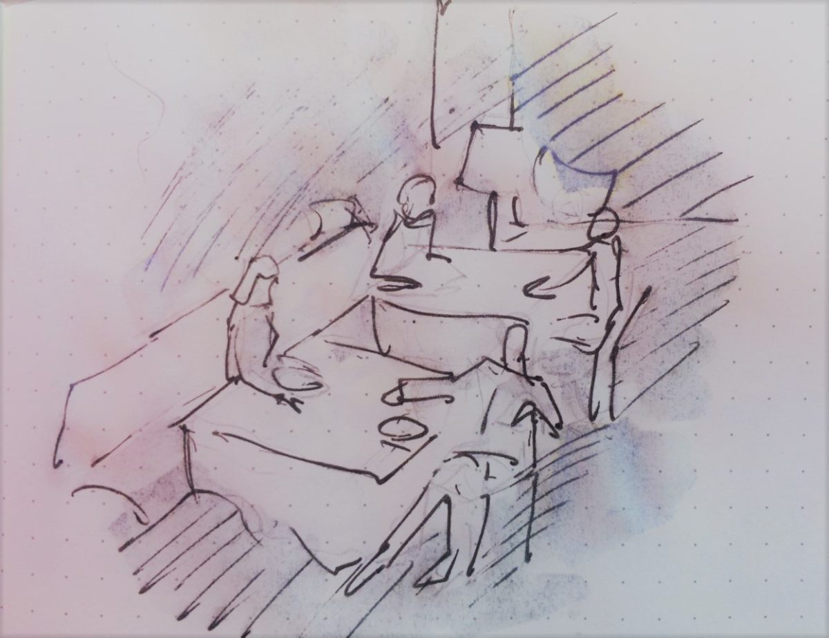
So three things struck me about this situation…one – that the artist was practicing only a portion of his talents and not the true, complete creativity that beckoned him to pursue his career…two – that renderings not only offer the opportunity to preview the proposed design of a space, but they can use artistic license to animate the space for its intended function and three – that spaces are not truly realized until they are filled with the people that are intended to occupy them.
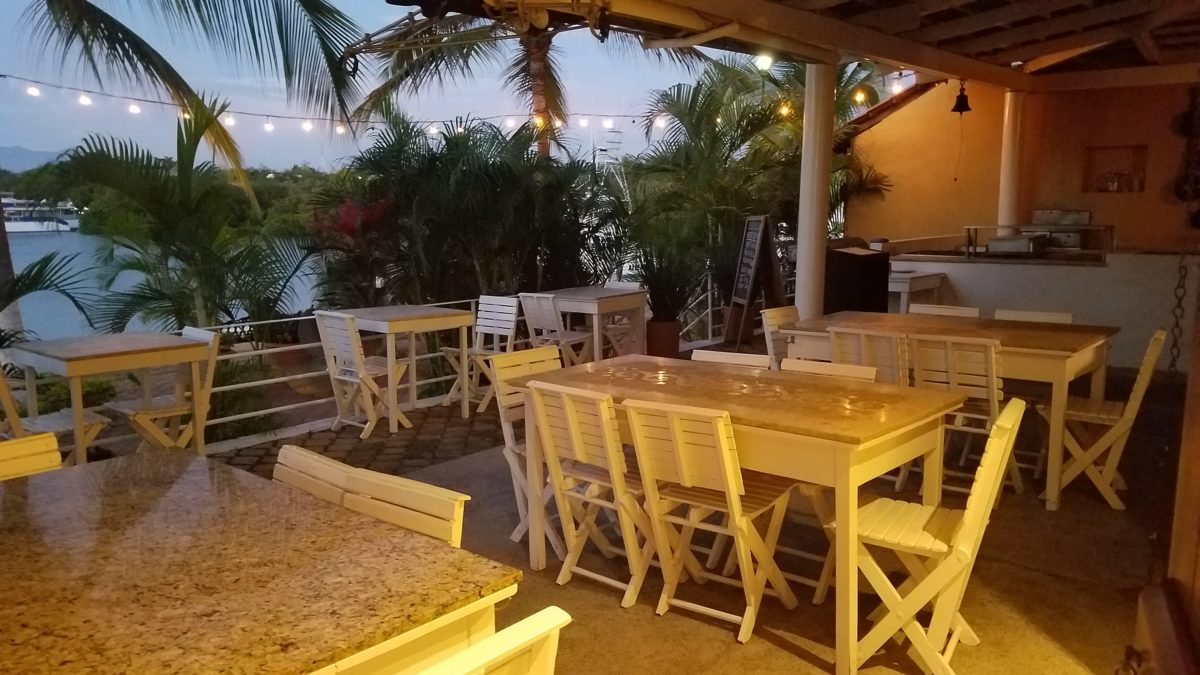
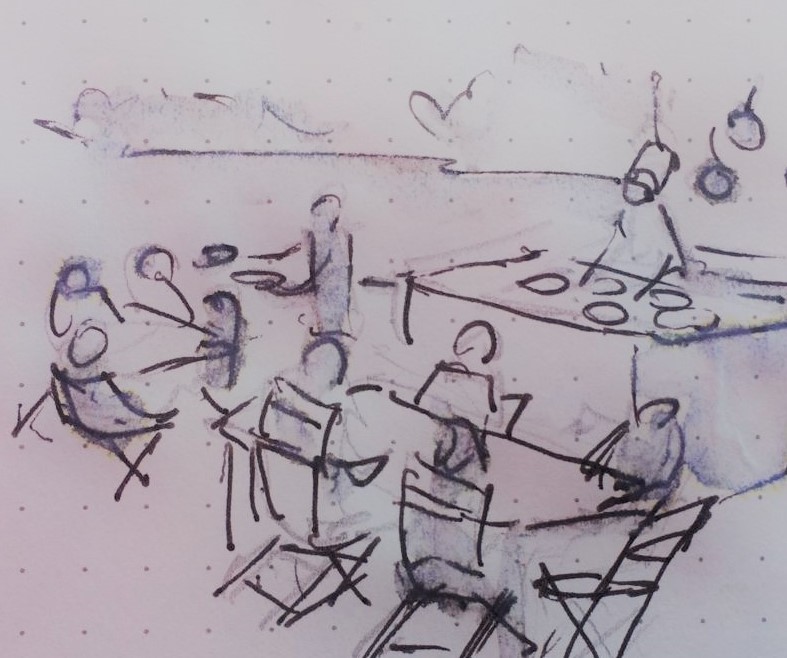
So much so is a room not really finished until it is occupied by the inhabitants for whom it was intended to function, but Towles observes through the renewed appreciation by his architect, “I suppose a room is the summation of all that has happened inside it.” And that is what I enjoyed being revealed as a result of this simple exchange in this one of many experiences in this remarkable storyline .
Humans are designed to design. Rooms are intended to perform a function. They cannot function until they are animated with whatever they were intended to serve. Sketches allow the preview. Sketches are more spontaneous and artfully creative than computer generated versions of the same. Celebrate beauty, creativity and artists!

