

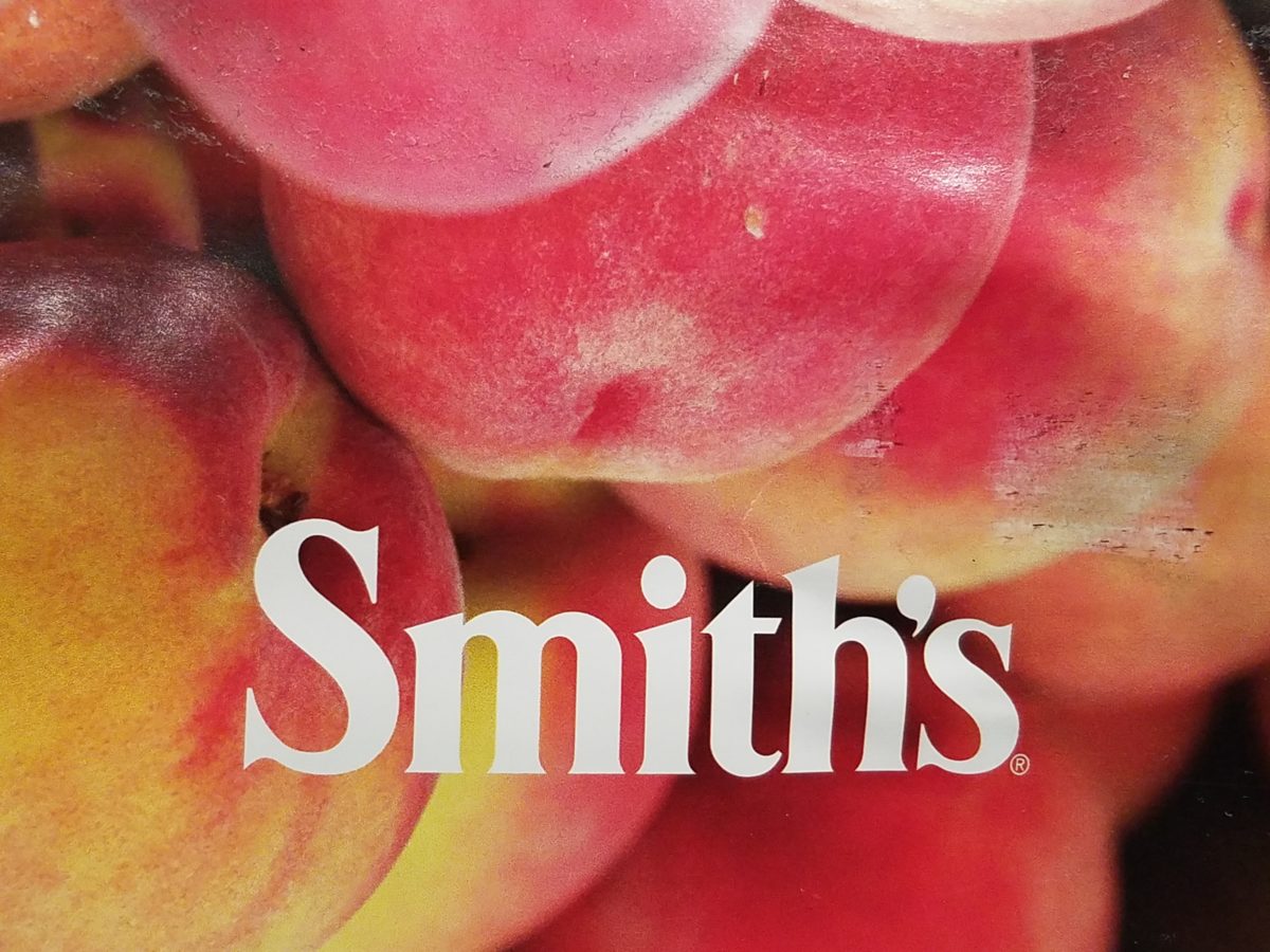
Color. Fashion and trends. Pantone’s annual pick and announcement – this year, based upon observation of the field of design scenes namely Airbnb and Apple, really? I find that amusing. Described by Pantone as “an animated life-affirming shade of orange, with golden undertones.” If orange had golden undertones, it would be more yellow-orange – a golden orange – NOT the pinky-orange suggested by their swatch of Living Coral and myriad examples that are being set forth. However, a few months ago I noticed and saved (because I liked the colors), a Smith’s Food Store envelope featuring peaches that illustrated the cozy combination of the rosy-orange coral tones with the golden yellows – a perfect pairing.
This pinky coral – a hot, but smooth, orange-ish color – has been one of my favorites for years! In 2004 I referenced it as “lipstick” that wonderful color between red, orange and pink! A hard-to-find lipstick shade sought by many!!! It melds fabulously with citrus colors and is cooled and contrasted by blues. A wall of colors depicts this perfectly.
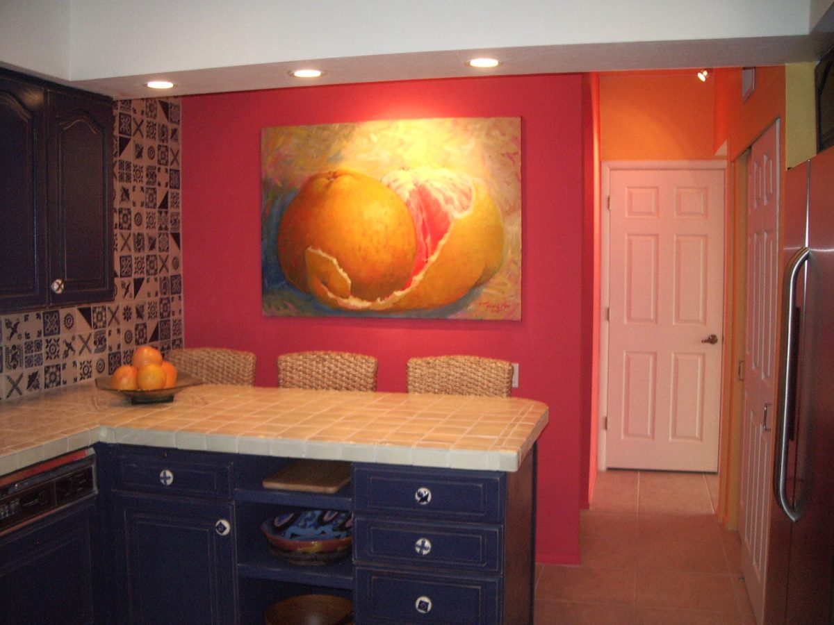
We painted the wall, took a photo of it and emailed it to Federico Leon de la Vega in Mexico to commission him to do this grapefruit painting with its luscious, pink center and coral shades, wrapped in a yellow peel and surrounded by cool, bold, brushstrokes of whites and brilliant blues.
A few years later we devoted an entire project to the fresh, citrus, color tangerine – which because of my personal preference leaned toward the coral shade of orange rather than the pure, natural tangerine. But art is about taking liberties and when developing an orange accented color scheme, all versions are allowed. Right?
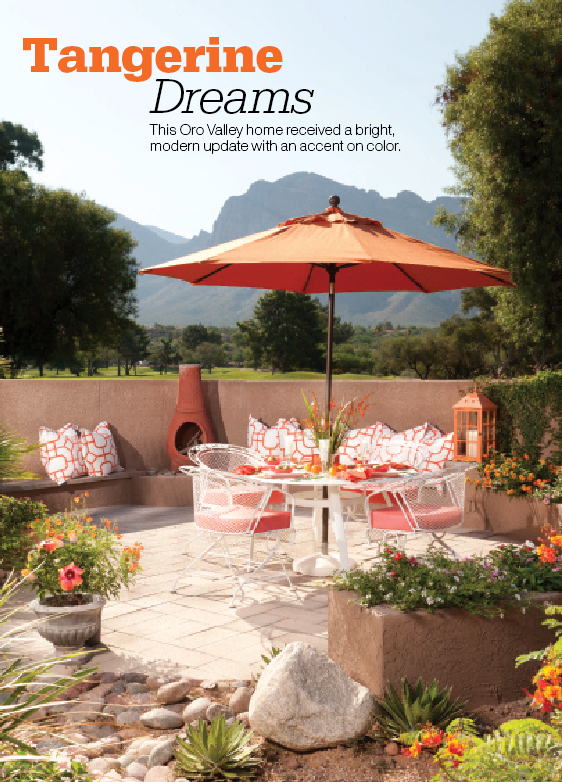
This project was punctuated with orange tones from tangerine (for which it was named), and deep warm coral-pink shades. The hue and its many vibrant values!
However, to photo these nuances of color is tough. I walked around the Tangerine project a couple of days ago. It has stood the test of time by beating trends by a few years and not adopting any particular design elements that would have given it away today.
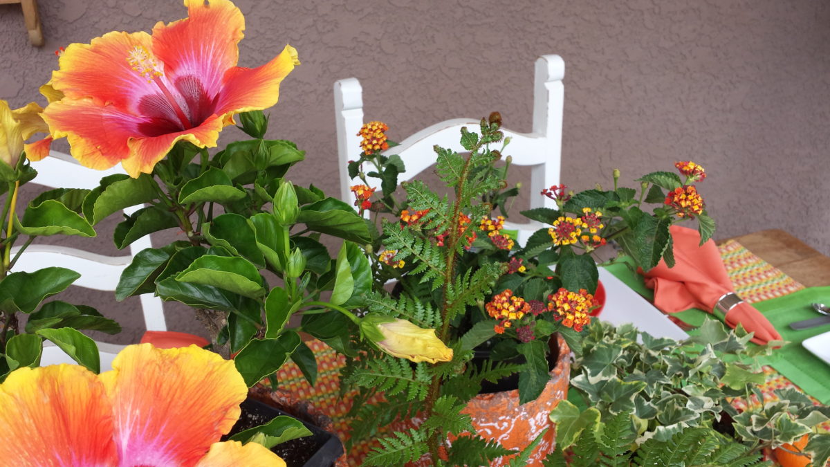
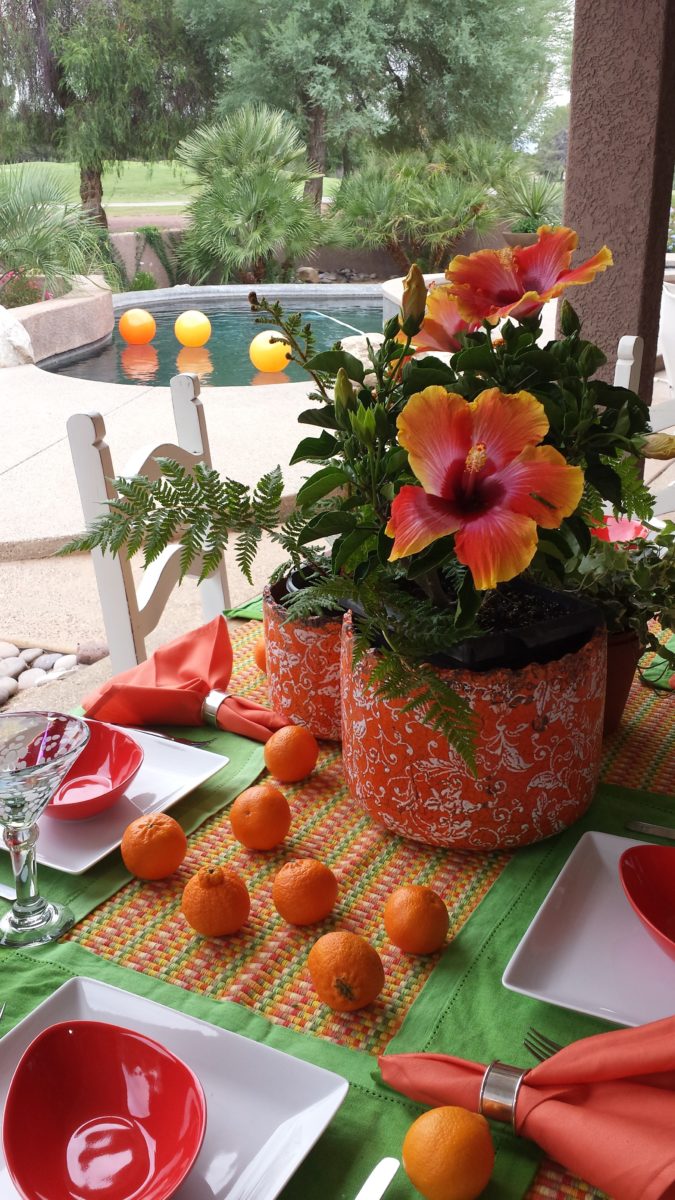
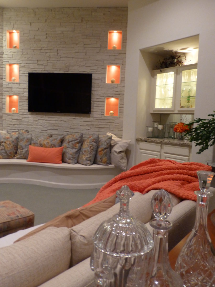
Look at how much nature played a part in the staging of these coral infused scenes!
My advice is to pick the colors that you like – the colors that make you feel good. Once determined, develop design based upon when to use that/those colors and when to contrast them or perhaps neutralize them.
Coral is bold and warm. It can read hot and energized – although is softer than red and less harsh than orange.
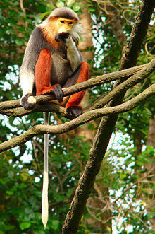
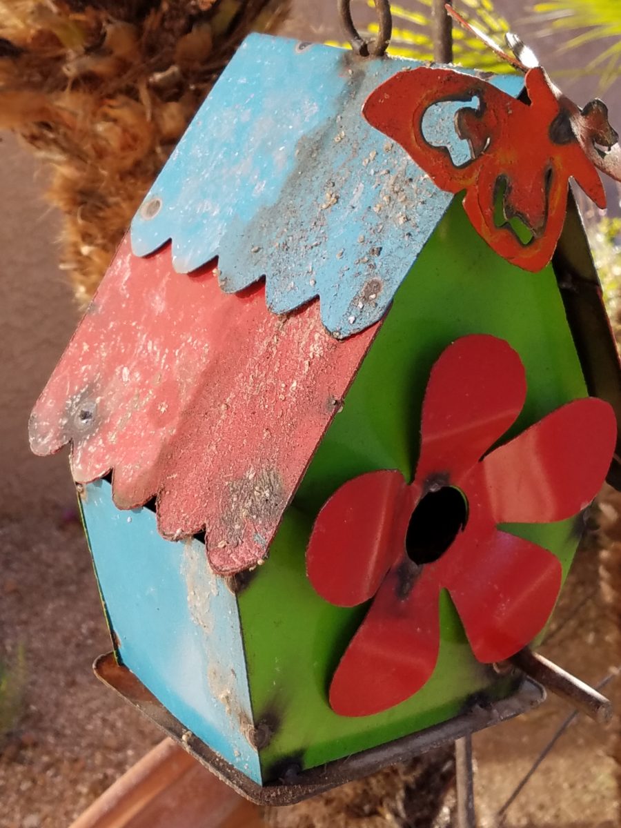
Nature is abundant with coral – not just the living sea coral – but flowers and the rare fabulous accent fur of Vietnamese monkey the red-shanked douc!
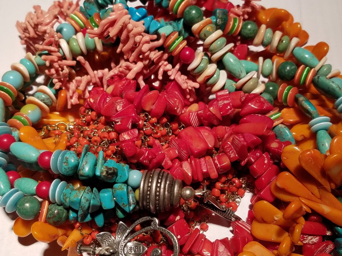
The thought of warm saltwater and fresh sea air at this time of year is tantalizing. Living coral doesn’t just say – coral, (of which there are many colors) it evokes that shade that we snap to when mentioned. Hot, soft pinky coral – a color of seduction. It is featured in jewelry and art renderings, architecture and interiors.
My advice is to pick the colors that you like – the colors that make you feel good. Once determined, develop design based upon when, where and how to use that/those colors and when to contrast them or perhaps neutralize them.
Have fun with color – any color- all colors! Welcome Pantone’s Living Coral, into the conversation and design elements, for this New Year!!!
