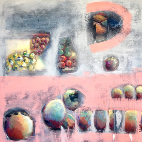
In the design vernacular we keep hearing the term “investment piece.” What makes an investment piece? Is it that you spent more on it than most other purchases? You splurged? You made an unusual purchase that generally costs more than your norm. Sure, makes sense, I get this. Considered to be a focal piece, this seems to be the nod. However, I often feel entirely differently.
Investment. An investment in time, emotion, thoughts and beliefs…what type of unusual investment? An “investment piece” is usually a focal point or a piece placed in a position of prominence. It makes sense to identify an “investment piece” as something that is monetarily outside your usual comfort zone – but must it?
Consider that there is also the fact that a piece that hits a chord and is not easily replaced – if at all – is an investment. Seeing an objet d’art, on a folding table at a garage sale or amidst the throngs of a flea market, that catches your eye and is yours for a song – the bargain of the decade, or at least that day, is an emotional investment. It’s not about the money.
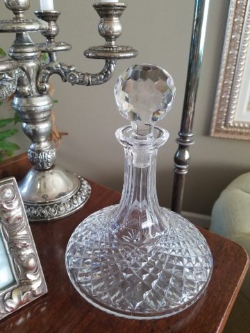
This “find” might actually have “cred” in a broad evaluation of appraisal. It might be a tiny Waterford crystal bud vase, like I found at a flea market for two dollars, about 35 years ago. I was just starting out, decorating my world, and it’s cut glistened and caught my eye from a cluttered table of garden tools, electric curlers and all manner of debris. There was and still is a true value for this type of piece. It is replaceable – not one-of-a-kind, but a lovely piece. Similarly, at garage sale many years later, I spied a sparkle across many tables to discover a large Waterford ship’s decanter clustered with a few other unmarked pieces. Neighbors selling for a friend, they were cautiously asking twenty five dollars – the bargain of the day.
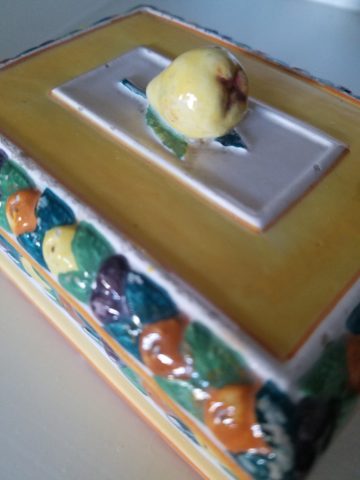
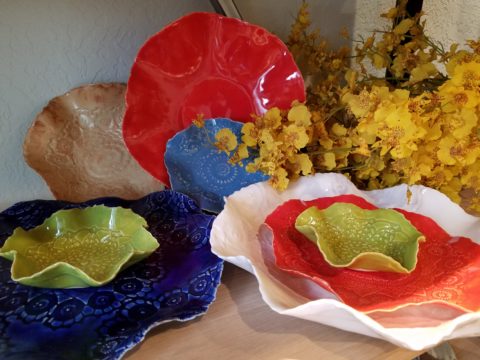
Once, in a consignment store, I came upon an ARS Italian ceramic box for five dollars that, although marked on the bottom, is not so published as to be easily priced. And I don’t care. Too me it is a one-of-a-kind find. It is old. I can’t replace it. I love the colors of the glazes and little pear top, it’s imperfections speak to it’s vintage and made-by-hand quality. It makes me smile.
When I hear people reference things by their monetary value, it strikes a sensitivity in me that is quite emotional. It annoys me. It frustrates me. Perhaps I am too sentimental, too attached to the enjoyment of “things,” but it’s what these things evoke, what they trigger in the form of memories or just spontaneous pleasure. What brings a smile, a tangible joy, is more to the point. It is a treasure.
Pieces with genuine sentimental value, because they have been inherited, reminding the current custodians of who preceded them and cared enough to preserve and pass down…and contrarily the ease with which some can unemotionally and easily part with something that has passed to them. It can be distilled to what one might find beautiful or not, and what speaks to the point – does this bring you joy or is it an onus?
It makes perfect sense that I am in this field. I see what clients have, ask them about what means what, and sometimes even argue in favor of keeping something that was destined for replacement or complete removal. I want to know what brings my clients joy. I want to make sure they don’t miss something they already have. It might just be the context that makes the difference.
Sometimes my clients have a piece – usually large – that they just don’t know how to use. They would like to, but just can’t find the right place. This is when we might consider other uses than the obvious. A bedroom dresser, might become a dining buffet. We change the context and save the piece. It gives new life and appreciation. It is a combination, in some cases, of function and joy. Thinking outside the box.
To have a careless non-attachment to things, that have not cost a relatively unusual amount, frustrates me. Yes, it can be a good thing, freeing actually. Whereas I am burdened by my sentimentality. The fact that something is disposable merely because it was a “find” or a “bargain” should not make it less valuable – in my estimation. It’s not always about an expense.
It is a similar, yet reverse, process as selecting an item because of its cost or brand as thought that validates it. As though it is the primary reason to make the decision. I prefer to encourage people to find confidence in what they like – not merely a perceived or recognizable value. The result is the uniqueness that makes their world more personal, more individual, more uniquely theirs. It’s a treasure hunt. What is the value?
An “investment piece” should be almost, if not, irreplaceable – not by its cost – but by its unique ability to bring you joy. Have confidence to know it when you see it. It will be the right decision.


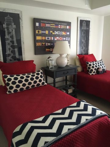
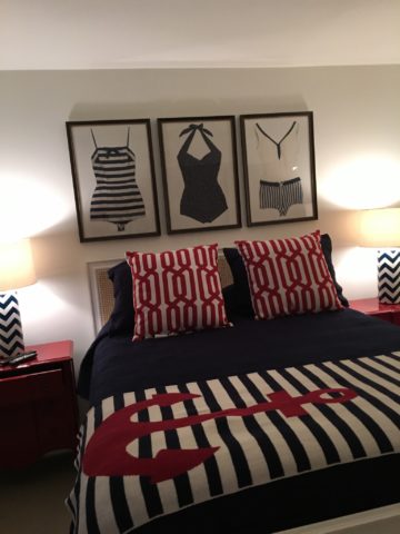
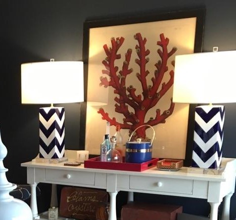
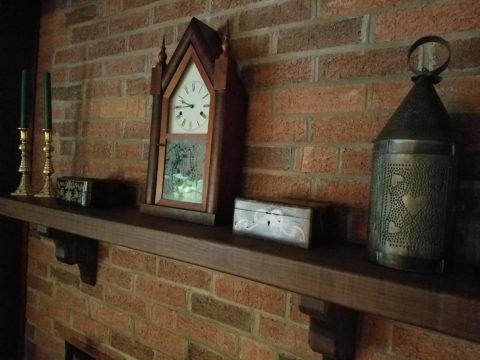
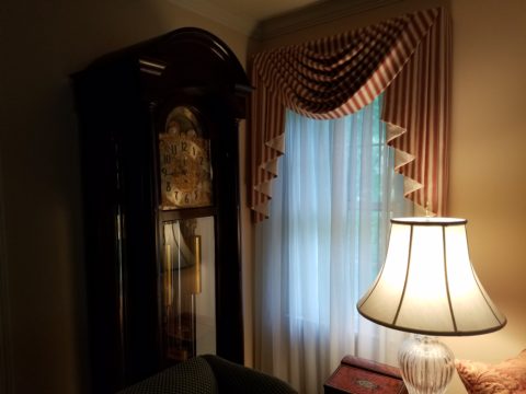
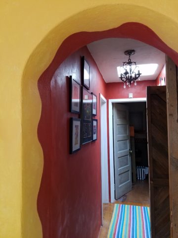
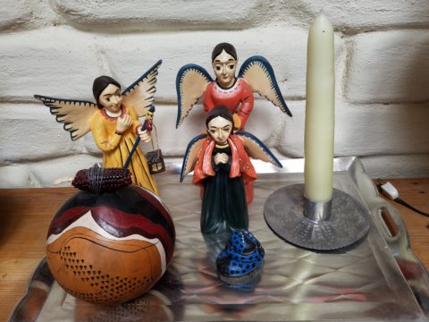
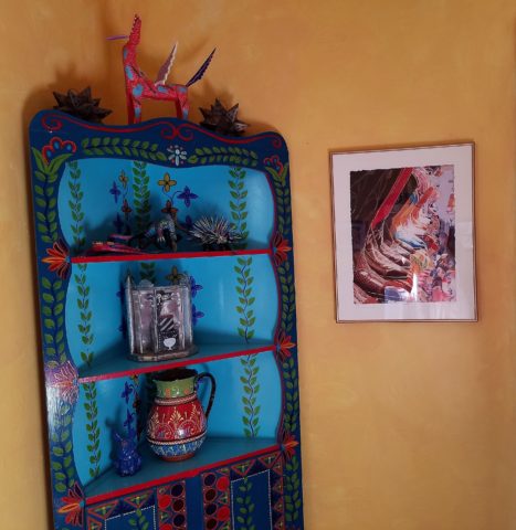


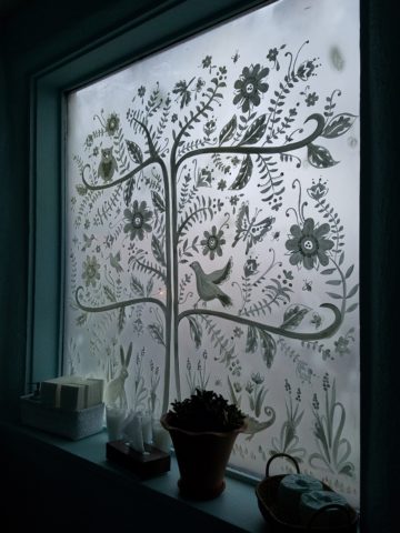
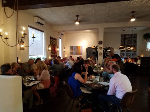
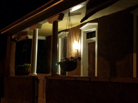
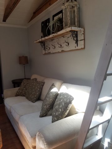
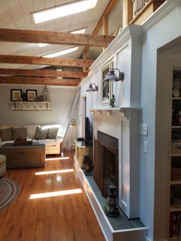
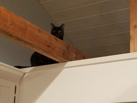
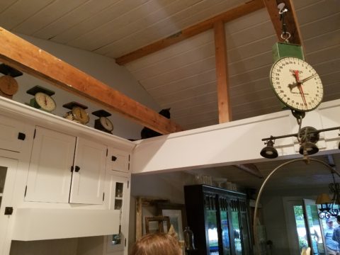
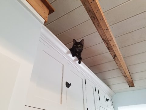
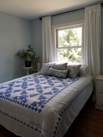
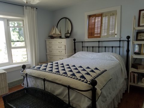
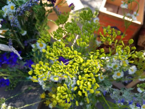
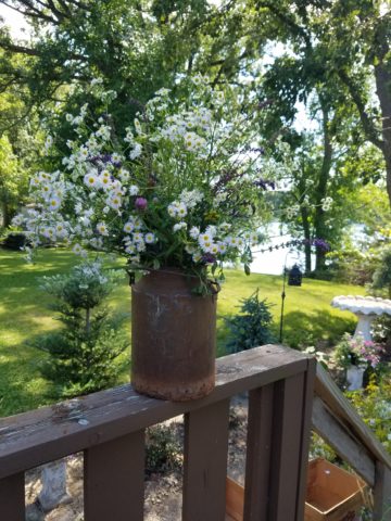
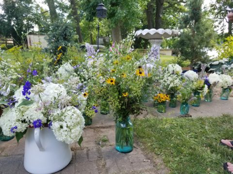
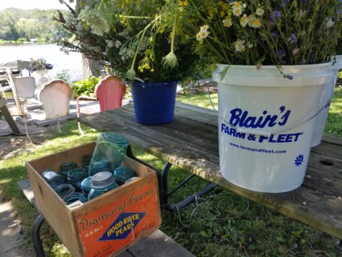
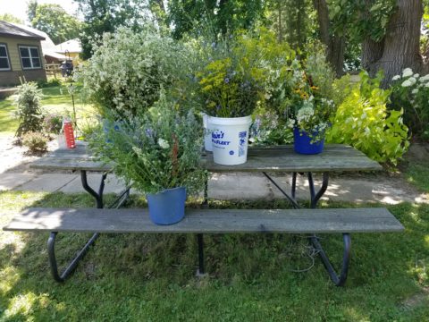
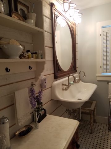 Hearing their comments as they passed through the spaces was amusing in their commonality. Everyone was amazed at the amount of work done, creative elements incorporated, fun finds she had collected to transform this modest house into this cozy cottage. Her two cats have wonderful vantage points to watch the activities in the rooms below as guests gathered to celebrate the weekend’s family wedding festivities.