What is a Picture Worth as You Plan Your Design?

We’ve all heard the expression “A picture speaks a thousand words.” And today, as I set forth to use it, I investigated its origin…seems the original quote might have been “A picture is worth ten thousand words” as stated by Fred R. Barnard in the 1920s. Either way, it conveys the same – seeing is believing and seeing is more literal in most people’s eyes. Words can describe and attempt to convey an intent or, in my world, a design concept. But to sketch it – well that’s the best way to show the intended idea. There were other unsubstantiated references to an old Japanese phrases, but suffice it to say – it is such a truism that it is referenced often.

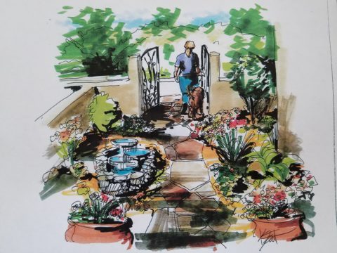
Here is an illustration of a courtyard that we have proposed. Our custom designed hand crafted iron gate inserted into the existing low wall, water feature, flagstone and plantings are all new proposals. Can you picture it? If I had arm-waived with a verbal description would it have been as helpful? It’s a small space, so it would have been easier to convey than other more complicated design concepts, but for the sake of an example, this works. I’m thinking that your answer would be – “Yes, I get it! The illustration sets the stage and really helps me visualize the intended finished product!” It is exciting and more stimulating than a rigid CAD drawing and evokes more emotion in most, if not all, clients.

I realize as I write this that it directly reflects the observations in Federico Leon de la Vega’s comments about the value and actually critical importance of handwriting as he expressed in his TED TALKS last year.


Therefore, I prefer the artist’s rendering – to support and promote the talents thereof and also for the much better rendition of the concept! So as technology advances in the realm of illustration, I intend to continue to support the skills of the artists that so effectively express our designs.

Let’s get together and plan your next design project, find solutions and create the images that will springboard the work and ultimately represent your new reality!!!

Stylists and Designers Prove Rugs Are Not Limited to Floors

Rugs on walls can be fabulous! I came across an article the other day that reminded me of my own history embracing this attention-grabbing design feature.

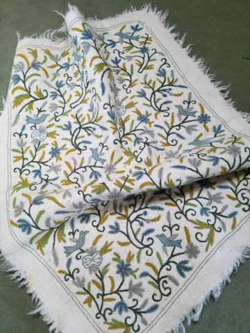
As I prepared for college and excitedly ran about gathering cool things to outfit my dorm room, I found this spectacular piece of felted embroidery. It was so spectacular and I so LOVED the colors that it became the focal point of my side of the room. Nothing says soften and warm-it-up than textiles on painted cinder block! Can I find a photo of that wonderful space from decades past? Not yet, but I pulled down the “rug” from its stashed hiding place way up on a closet shelf and have at least this to share.

It was a hippy dippy time for style and design. Even those of us a bit younger and not really hippies in the true sense of the free-love and wild abandoned lifestyle, we surely wanted to participate on the periphery with our fashion and interior design. Remember? Indian bedspreads for curtains and clothes, Mexican wedding shirts, beaded room dividers…all that and more. Pier One “shopped the world so we didn’t have to!!”

As far as my world of design and what textile wall-hangings had to do with interiors, it was more about quilts than rugs. The east coast was riddled with generations of seamstresses who perfected and perpetuated the art of patchwork. Once a necessity of frugal re-purposing, an art-form was born and evolved into magnificently detailed free-hand-stitched, award-winning, collectible masterpieces. I remember a textile exhibit at the DAR in Washington, D.C. that had incredible examples of fine fragile work carefully preserved and presented to honor this amazing artistic expression and its place in history. http://eyeonelegance.dar.org/

As is true in our world of fast-paced technology, ultimately more expeditious and modern machinery aided the artist in guiding the needles and now computer-generated digital methods of quilting and patchwork stitch at amazing rates of speed and detail.
Although weavers exist in all corners of the world, it was not a traditional art-form in our area. We would see exotic examples in homes of well-traveled adventurers. I came across this article from apartment therapy of some fun examples of rugs as wall-hangings and it sparked my memory of these thoughts on the subject.

http://www.apartmenttherapy.com/why-stylists-use-rugs-as-wall-hangings-and-you-should-too-212602

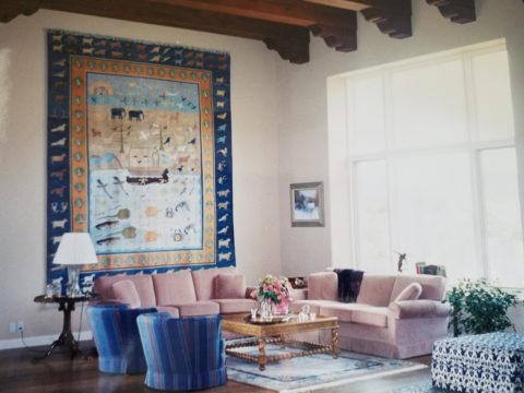
Fast forward in my history to my arrival in New Mexico – the sunny southwest where Native American weavers reign. I was instantly exposed to wonderful woven art pieces from exotic places like the soft earthen shades of the intricate Two Grey Hills and bright bold graphics of Chimayo. Everyone had examples of master weavers (and some not-so-master but fascinatingly beautiful and interestingly textural all the same), proudly mounted on authentic adobe and towering sheetrock walls of new construction. This sensational example is a powerfully beautiful focal point in the home of great collector clients.

So the take-away from this week’s musings are if you have not tried a rug on your wall – get out there and find a cool piece and get it up there!!! You will be surprised at the effective texture and interest it adds to your eclectic interior!!!
 

Valentine Expressions

You know…we designers design for our clients and ourselves around themes, we design around events, we design around seasons and of course we design around the trends…it all keeps the commerce of products and materials in motion.  And at this time of year, we see focus on wine clubs, pajama grams, stuffed teddy bears in enormous sizes, hearts, hearts, hearts…and roses natural red or gilded, it’s Valentine’s Day!!!
But it’s fair to note that all seasons have valid design consideration. Setting the scene, enhancing the moment – either for you, your family or a romantic encounter, the holidays and especially this one, evoke a desire to create a scene that conveys love and romance.

To that end , my blog is brief. Enjoy that which brings you joy. Revel in the happiness that presents itself. Create beauty where you can. And as we are want to say….art and good design can almost always bring a better scene to anyone’s place on this precious planet.

So be it a candy heart with a common message of joy, a product acquired to create a scene, a piece of jewelry to promise, a token to send love, a greeting of friendship, a message to offer support, it is all about connecting.

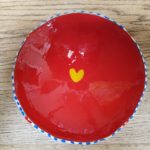
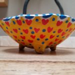
I decided to paint a bowl for my sweetheart. Yes, I had passed this guy’s booth, encouraged others to partake, had appreciated his talent, but never ventured forth. This year, I enjoyed sitting alongside Victor in the shade, with the waves lapping the beach, and soft music wafting through the  air…allowing a moment of focus on an artistic expression, a blank canvas (my bowl) to say Happy Valentine’s Day to MY Valentine.

Here is the finished result.

Connecting. We at PATRICIAN DESIGN support local artists and hope that the next time that you need a gift, want to send a message, or desire a creative addition to your personal space, that you will consider local talent to fulfill that need. OR do it yourself DIY!!!
Wear ART – Shop Local – Support LOCAL artists –  Need we say more?

Ok…we provide the greatest FREE gift wrap to get you on your way!!!
XXX000 Happy Valentine’s Day – (it’s Tuesday – better get prepared!!!)

PATRICIAN DESIGN

Hearts Are At The Heart Of It All

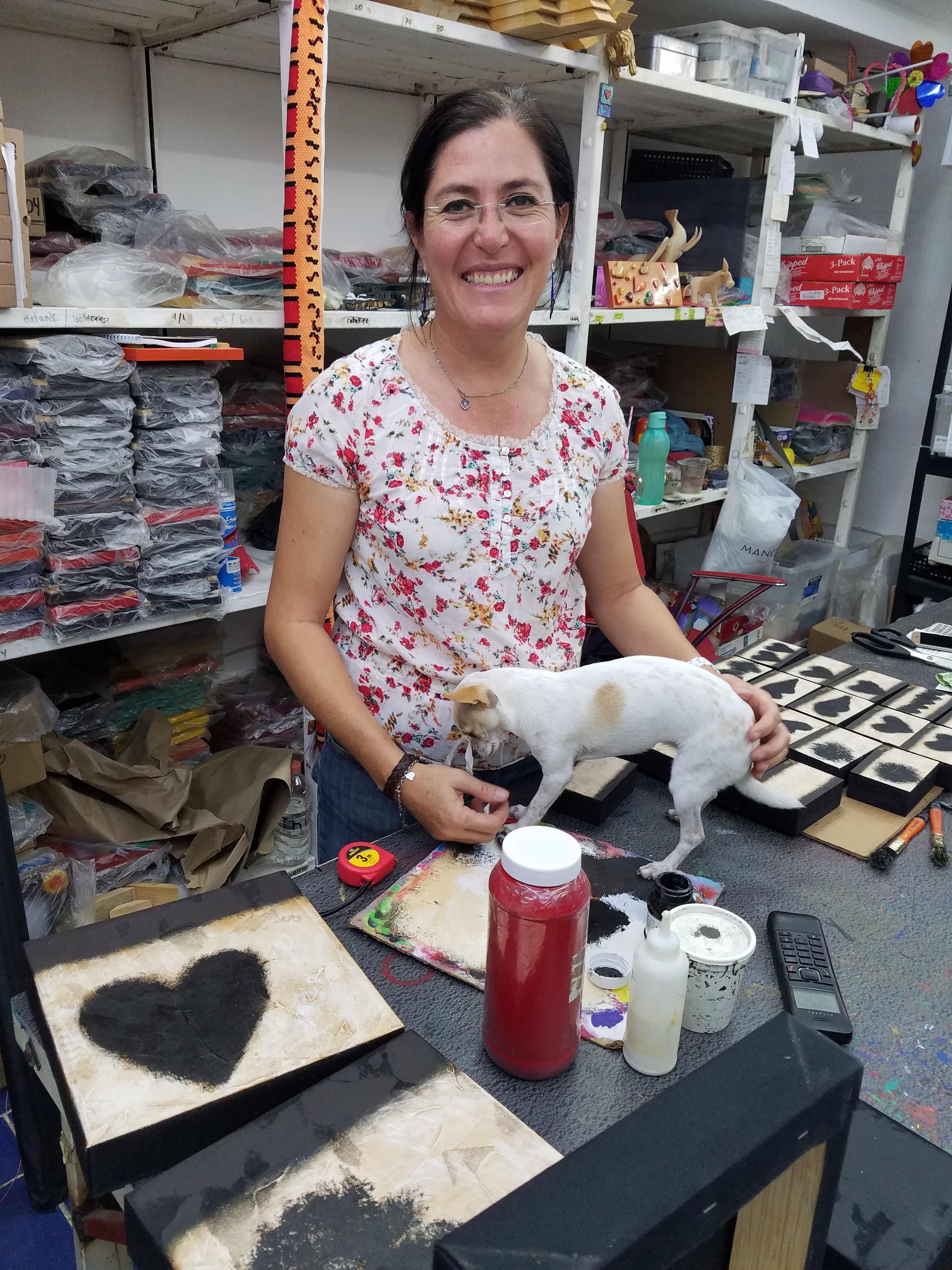
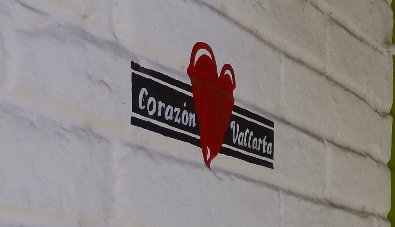
Su mundo es corazones. Artist Paola Alonso Rangel is at the heart of Vallarta and literally that is the name of her shop, Corazon Vallarta, where she thrives amidst the bustling activity in the old town, on a busy street corner, with much traffic flowing by both in vehicles and on foot.

p1120692

A man carrying a frightening large pane of glass about 6 feet long by 3 feet wide effortlessly and without intimidation marches down the street with taxis and buses bouncing by him. I cringe at the site and the young shop attendant, Nidia, shrugs with a smile and says “It’s Mexico.”

With Valentine’s Day nearing, this exciting little shop offers a wealth of opportunities to find just the right gift to say “be mine!”

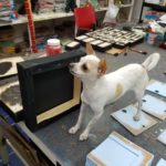
Paola’s little Chihuahua, Pecas (Freckles), suns on the front step seemingly oblivious to all the activity swirling by. She is front and center of all that is happening in Corazon Vallarta.

A designer and hands-on artist of nearly everything she sells in her shop, Alonso Rangel is a model of organization and time utilization. She has her machine fine-tuned and knows just what it takes to create, prepare, produce and market her work.

20170128_115901

In the well-lit back room of her little tienda, she has all of her art supplies neatly organized on sturdy shelving sparing not one square inch of available space. Her computer plays soft Spanish songs that, with the fan blowing gently, creates a pleasing atmosphere where she designs and paints with a couple of assistants to assemble and package her work to sell.

As is true of most urban storefronts, the fine grit that is continuously accumulating from the dusty streets and vehicles in passing contributes to the concerns of successful retail presentation. Hers and others in this type of scene perhaps suffer more due to the cobblestones which collect and distribute ongoing layers of the sooty, dusty, fines.  So everything is kept painstakingly clean and wrapped in cellophane  – just another stage of the process that makes her conscientious practices so impressive.

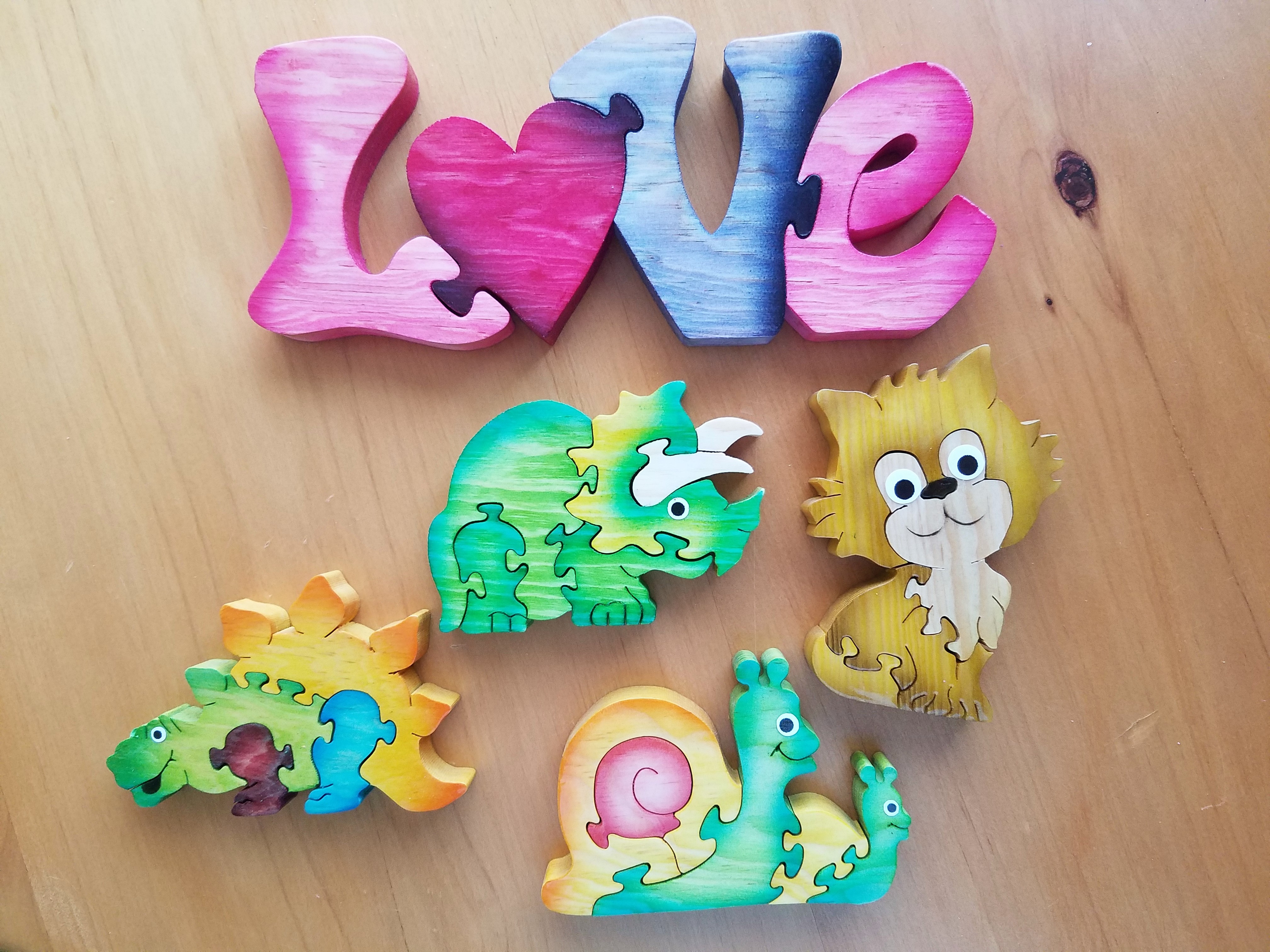
From colorful wooden puzzles, picture frames, key hangers, boxes and magnets, the expansive home decor and gift collection, on which she collaborates with her brother in Guadalajara, is a treasure of her designs and creativity. All manner of colorful animals with whimsical expressions are the subjects of her puzzles with a bit of flowers and fruit in the mix for a generous variety of choices. Alonso Rangel designs all of the pieces while her brother and his crew with a manufacturing studio in Guadalajara do all the mill-work, brilliantly colorful painting and glossy lacquer finish.

20170129_100543

Other of her work is comprised of original one-of-a-kind creations on canvas and wood, heart-themed all in keeping with her heart-felt passion for  corazones.

She efficiently sets-up her own assembly line of stages of production, with Pecas supervising closely, so that her by-hand (hecho a mano) originals are always filling the walls and shelves and being lovingly selected by customers to take home.

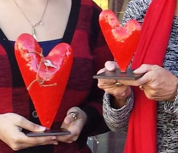
Steel heart sculptures, wooden cut-outs, carvings, and more are the multi-media of her continually, seemingly endless creative concepts and body of work!

20160205_155241-copy

Thank you Paola for all of your inspiration – by design!

p1120692-copy


Nature’s Valentine’s Greeting!!!

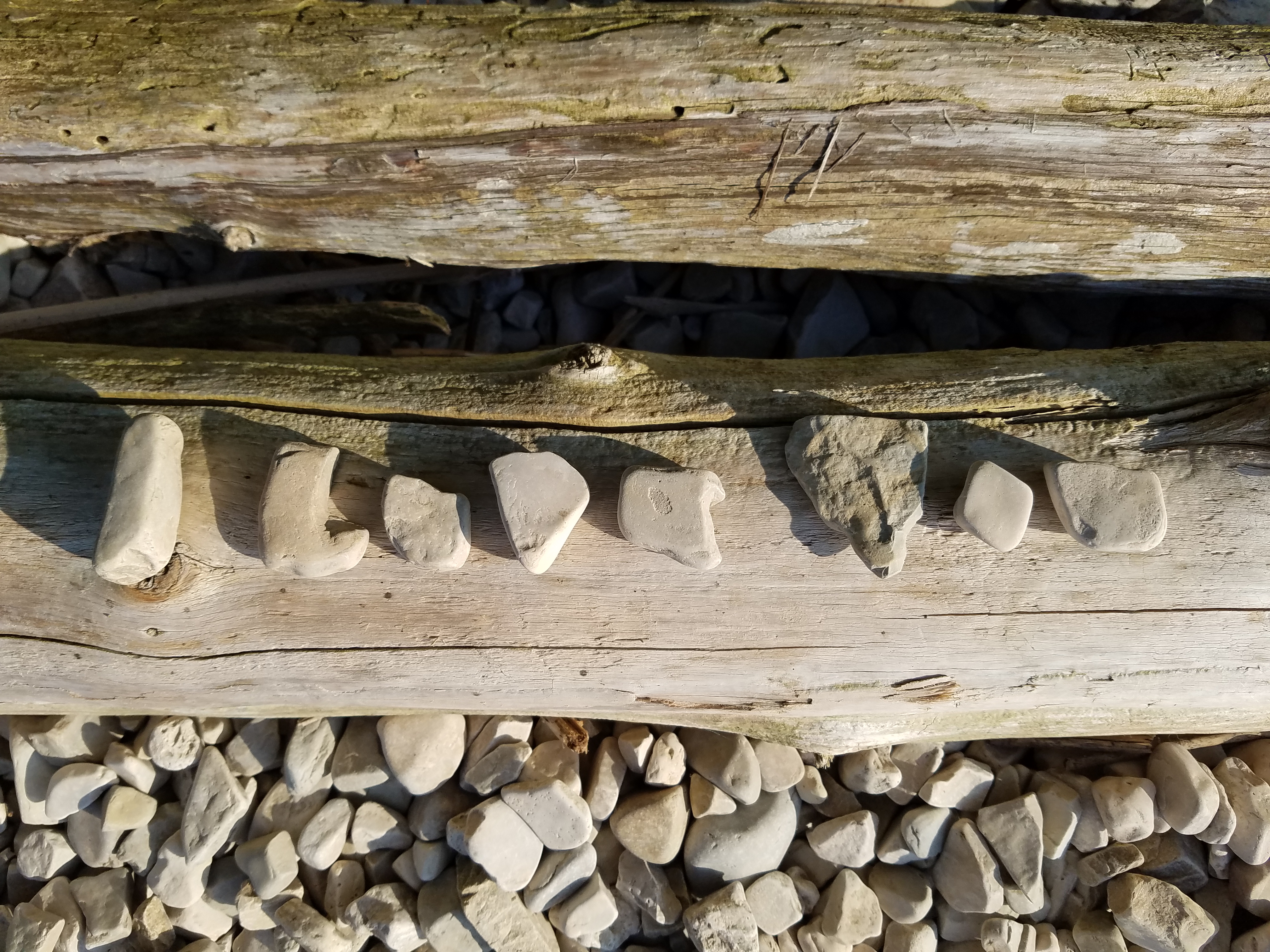
So when you least expect it…nature speaks. On a silent coastline on a great lake in the wilds of Wisconsin the stones on the beach offered a hidden alphabet of opportunity. Upon making this discovery, I searched for and collected just the right pieces and sent a love note to my sweetheart. Wishing he were there to share in the wonderful adventure that was hiking through the enchanted woods to this lakeside hideaway, I did the next best thing and found an expression of LOVE , took a photo and messaged off to him…technology and instant gratification – well, across the miles…

20160809_182944-copy

The lovely white stones were amazing…I don’t know the geology…could probably Google it, but suffice it to say they were white and soft, angular but smooth, bleached and clean – massed in a thick bed for miles along the shoreline. I wish I could have taken buckets of them to do something…fill a large snifter, layer in the sink for the water to spill over and remind me of this scene, touch and fondle – they were so special, so uniform in size – such a natural phenomenon of raw beauty.

Paired with the rough, elegant, weathered, driftwood that was scattered along the rubble and upon which I carefully placed the stones, the composition was truly a work of art – inspired by  nature and assembled by my eager fascination with the media.

20160809_182212-copy

Take away…love is all around – OH! has that been said before? Well…love IS all around us and to find an actual, natural formation of alphabet letters that allowed the simplest expression of literal words, to be transported across the miles,  was magic.

Art…design…nature…find it!!! Happy almost Valentine’s Day!!!!

Would A Love Letter Be The Same Without Handwriting?

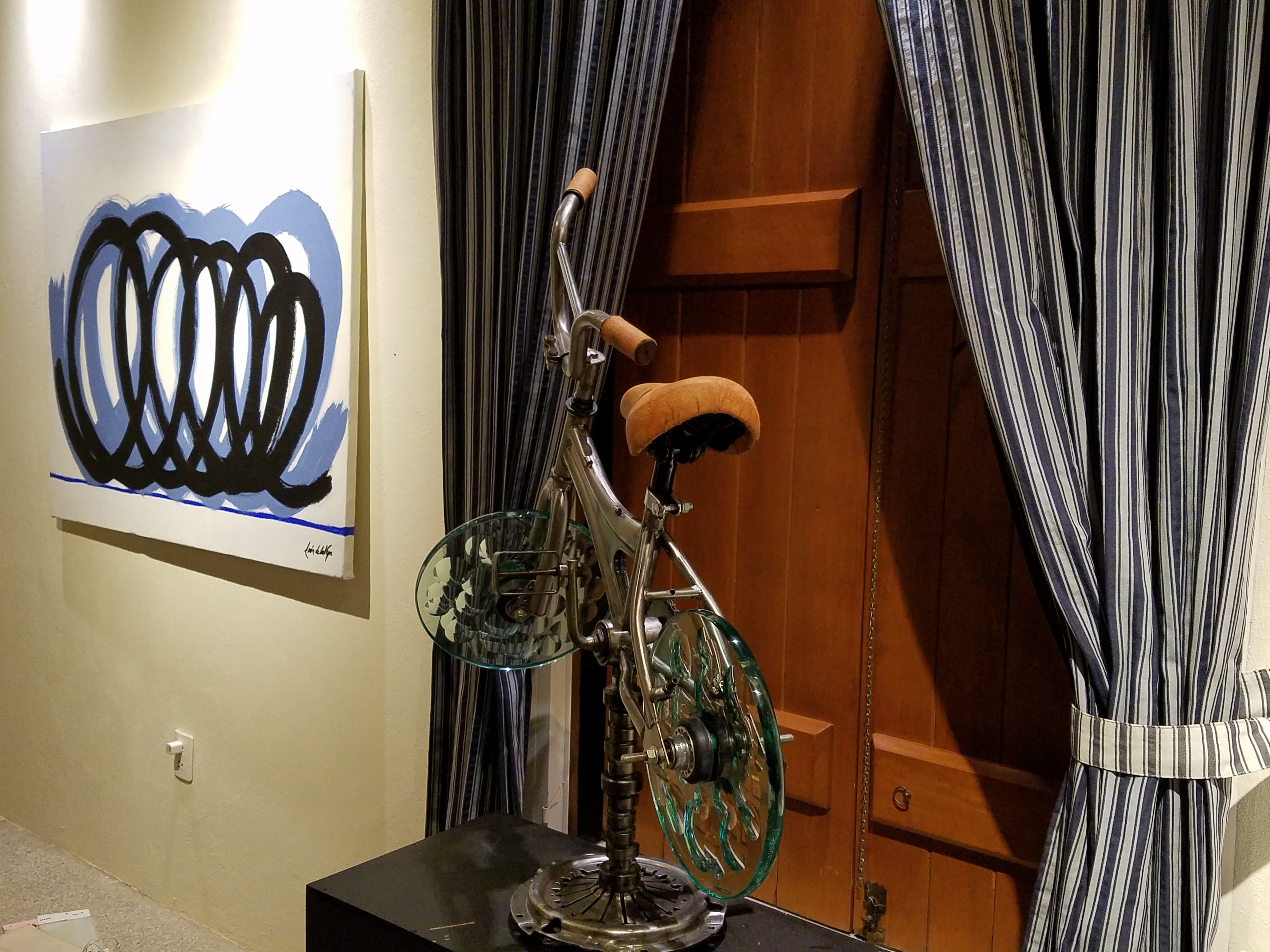
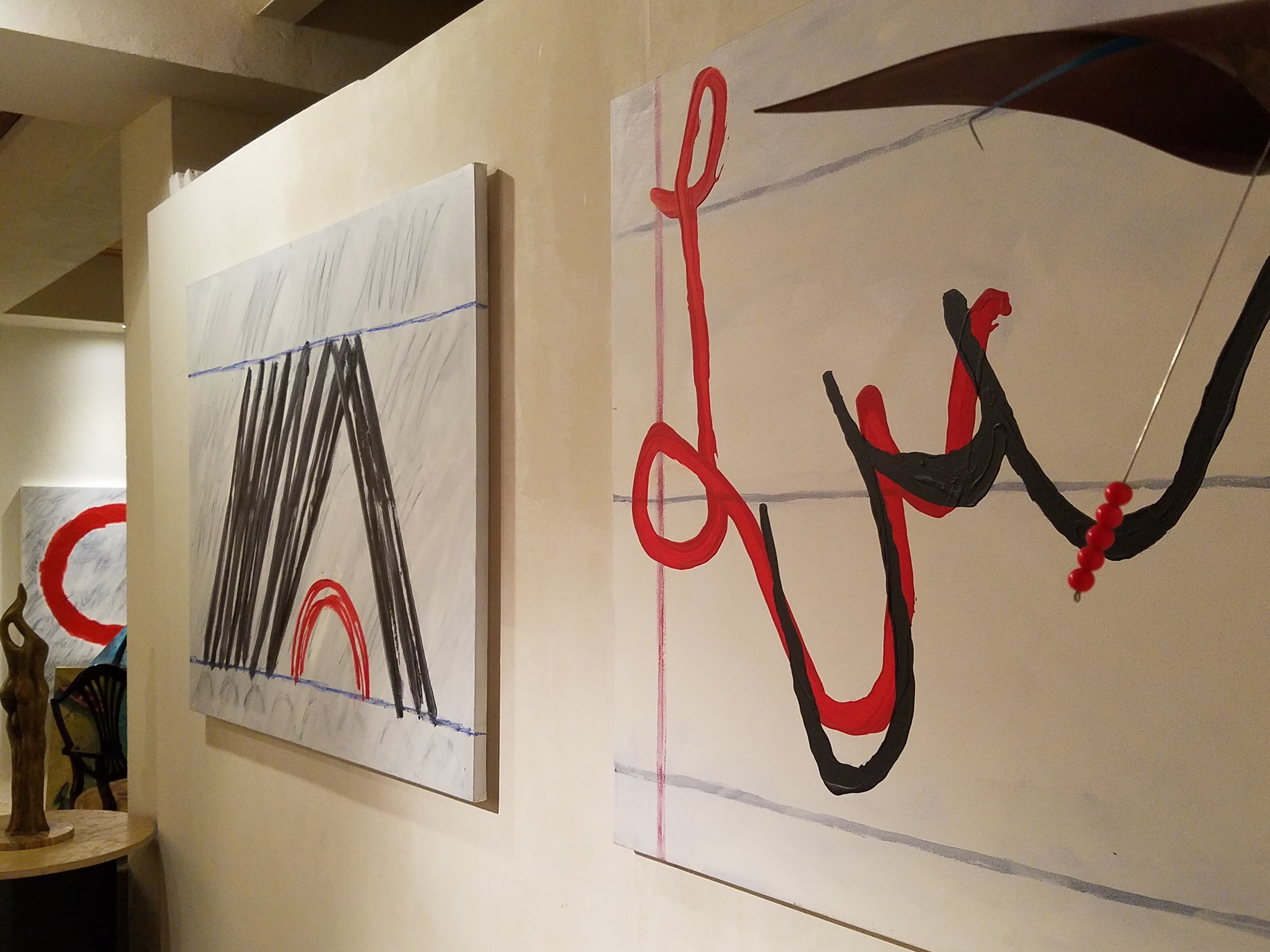
After having seen Federico Leon de la Vega’s presentation at TEDX Talks in September and after having seen some of the work in progress over the past couple of years, it was a treat last week to be in his studio to see the collection exhibited up close and in person!

Presented on fabulously enormous canvases and a few smaller studies, these bold graphic statements compile a contemporary collection that is quite astounding. The premise is quite provocative.

The idea that handwriting is a basic human means of communication having evolved into the very personal flowing script of cursive that each individual can call their own – in their own style – it’s almost as personal as a fingerprint. It is an extraordinary human function that should be protected, revered and certainly not lost to the fast-paced technology of the digital age!

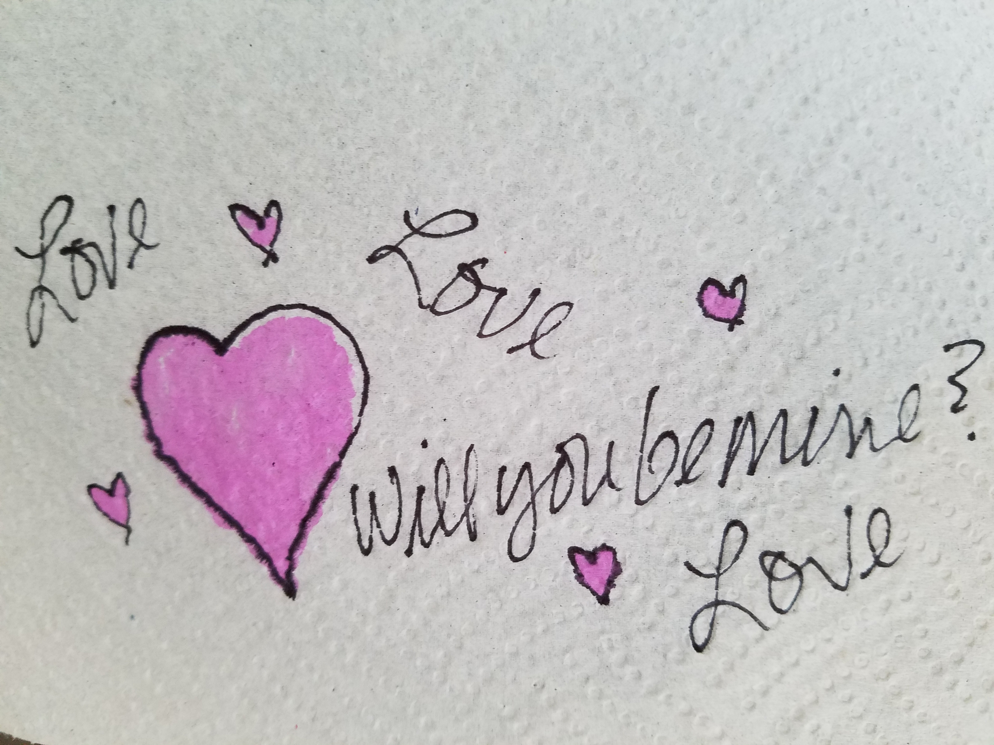
Making one’s mark on a surface…a piece of paper…to convey a thought, idea, instruction, story, a doodle on a paper towel – a love letter.

20170117_120810

With Valentine’s Day approaching, it brings to mind the idea of love letters. We read them throughout literature and listen to them in songs. We hear of them being saved over time by recipients in treasured boxes tied with ribbon to be read over and over or merely saved for others to find long after…

These magnificent oil paintings convey the art of handwriting. They celebrate the simplest marks of hand to canvas with brush and paint looping in circles and jutting in spikes – the primary strokes of handwriting. These primary strokes are the foundation of mastering the control needed to make the continuous flow of letters that become each person’s personal interpretation of the alphabet in cursive style and an exclusive means of communication.

Style – handwriting conveys personal style. Look at yours. Is it always the same or do you mix it up? Do you stay consistent or do you express different styles of your own handwriting for different purposes?  Look at your friend’s handwriting – would you recognize it anywhere?

federico-signature

It is thrilling to walk among these great canvases with their color and  bold strokes. It is arresting to realize that they are so simple yet so complex in what they are saying. We must recognize the value of handwriting. We must not let it be dropped from our schools’ curriculum. We must continue to see the importance of the pure, mind to hand, raw emotion.

Powerful spikes require starting and stopping – control.

Loose loops also require control to maintain uniformity.

20170113_194255

After control is learned, expression can take over resulting in that personal style that becomes each individual’s identifying handwriting.

20170113_194522

Federico reminds us in his talk, about how we might have attempted to write a love letter for the first time and how many times it was crumpled because it wasn’t quite right. The failed attempts of recording our feelings as we strive to say the right thing, to express our deepest emotions. Yet once accomplished, those words hand-written mean so much more than the same words conveyed by type or digital communications.

“From my heart to my mind, from my mind to my hand, from my hand to the paper I place in your hand,  so you may fold it and keep it near to your heart. No delete!”

The digital world is all around us. We cannot escape it, nor should we. However, the human evolution and the brain’s development that mastered the art of handwriting is a place that could be diminished and lost if we do not continue the art and practice of personal expression through this extraordinary medium.

All we need is love – sent via a personalized handwritten letter from the heart. Here’s to a Happy Valentine’s Day !!!

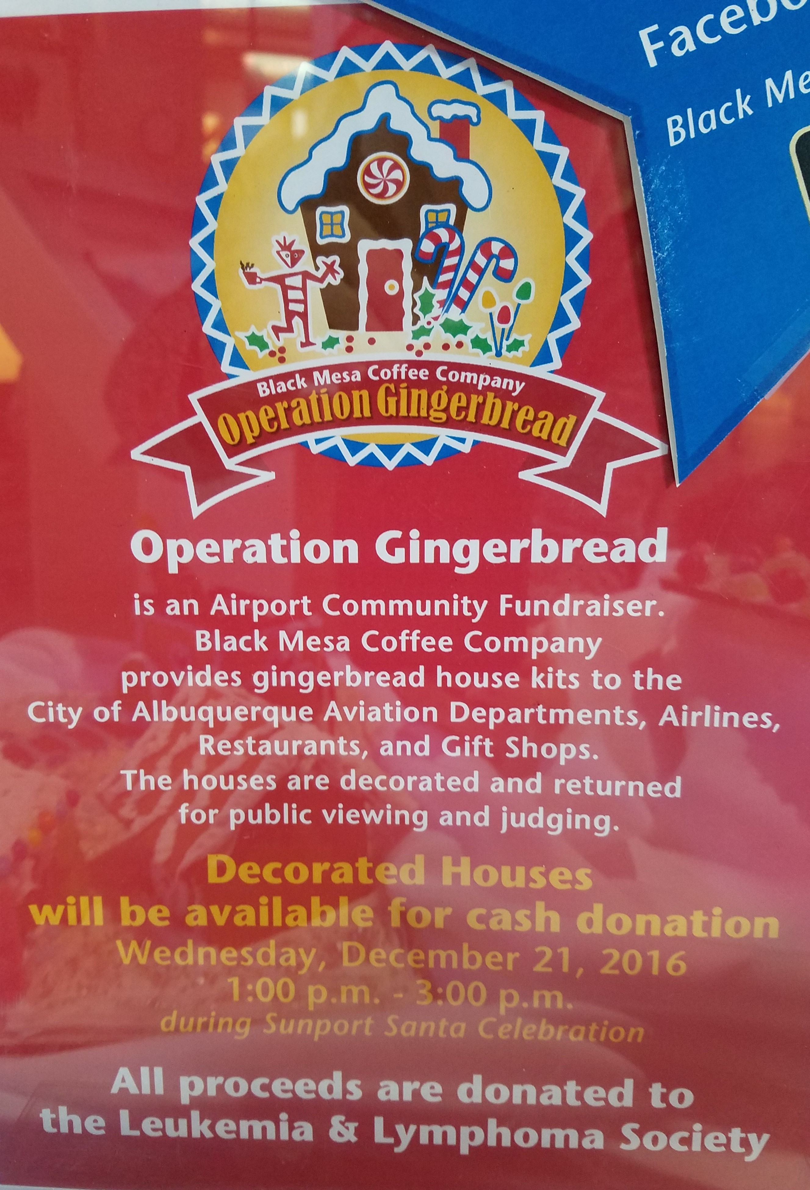
The Art & Architecture of Gingerbread Houses

Art and architecture meet all the time. Sculptural forms, building models, buildings themselves, sketches…but at this time of year, the fanciful world of gingerbread houses takes the spotlight and, in this recent scene we encountered, offered a beautiful fund-raiser while at it!!!

20161220_080440

As we pulled away in the pre-dawn hours of the  morning…we felt the chill in the air and the glow over the mountain sending us on our way.

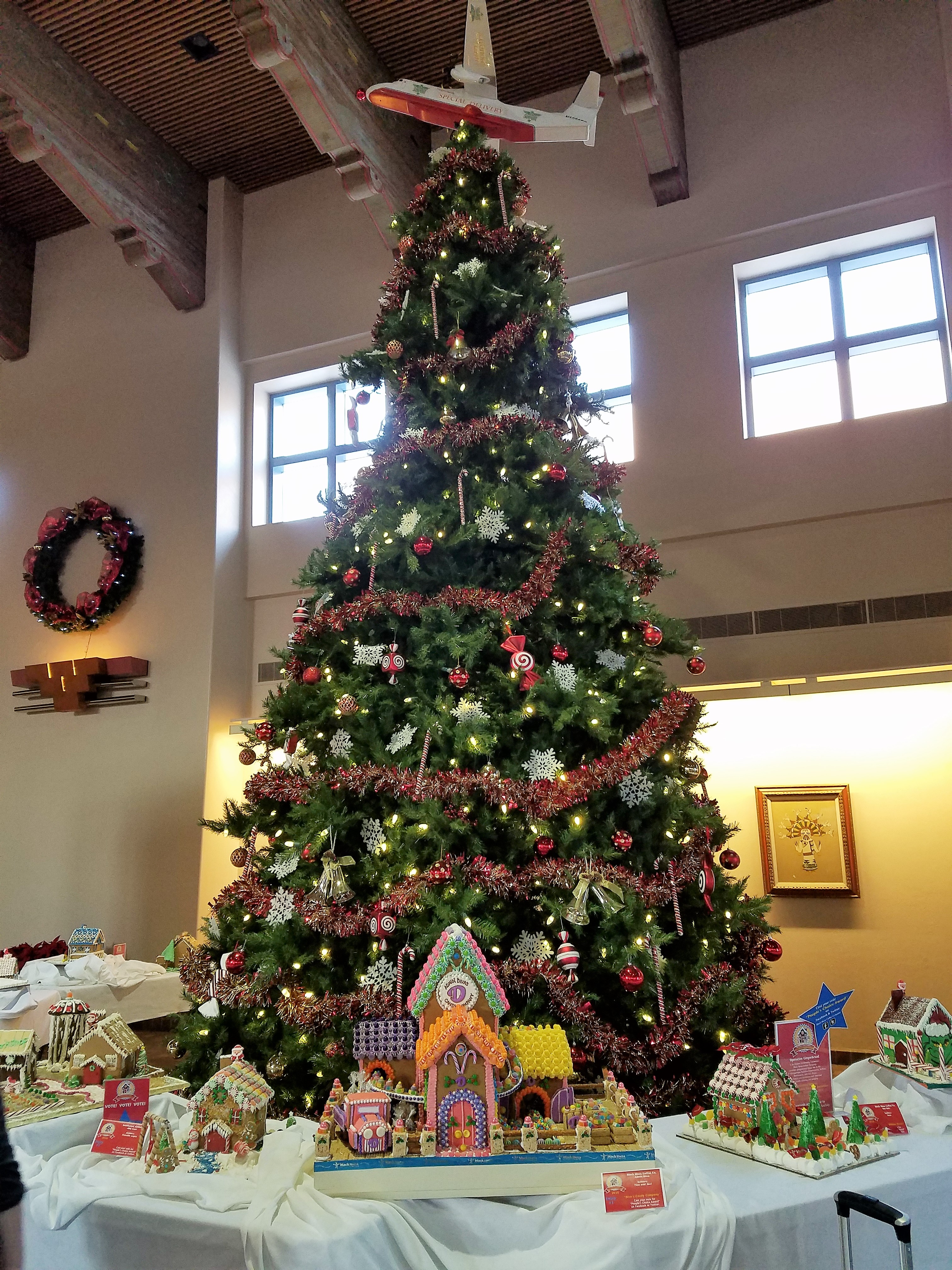
We traversed across the terminal and before cutting over left to the escalator, we spied—at the same time—a wondrously tall Christmas tree adorned with airplanes and ribbon…and surrounded by an amazing collection of ginger bread houses on display in some sort of fund-raiser fashion.

20161220_080515

Upon closer inspection, the fantasy became tangible. The individual structures took on a form of expressive life in their individual attention-getting style. Each one was quite unique incorporating rivers and ponds, vehicles and foliage of all manner.

It is a Christmas tradition to create a gingerbread house full of fantasy and fear, hope and salvation. From the simple joy of baking traditions for Christmas, to the many versions of fairy tales that save children from the wicked ones in the woods creating and story-telling surrounding these magical edifices makes gingerbread houses a staple of the winter holidays – all the while offering architectural design and  construction projects for all ages. Below, see the Hanukkah version of this adorable house.

I just read a great piece by Tori Avey in which she summarized the history of gingerbread. http://toriavey.com/?s=gingerbread

She references architectural design with the fact that: Elaborately decorated gingerbread became synonymous with all things fancy and elegant in England. The gold leaf that was often used to decorate gingerbread cookies led to the popular expression ‘to take the gilt off of gingerbread.’ The carved, white architectural details found on many colonial American seaside homes is sometimes referred to as ‘gingerbread work’.

Having been raised on the east coast, describing houses with ornate “gingerbread” detailing was part of our vocabulary. I now see it in Rocky Mountain Victorians and California seaside cottages. It always conveys a quaint, welcoming feeling.

Avey further states: Gingerbread houses originated in Germany during the 16th century. The elaborate cookie-walled houses, decorated with foil in addition to gold leaf, became associated with Christmas tradition. Their popularity rose when the Brothers Grimm wrote the story of Hansel and Gretel, in which the main characters stumble upon a house made entirely of treats deep in the forest. It is unclear whether or not gingerbread houses were a result of the popular fairy tale, or vice versa.

Recently the record for world’s largest gingerbread house was broken. The previous record was set by the Mall of America in 2006. The new winning gingerbread house, spanning nearly 40,000 cubic feet, was erected at Traditions Golf Club in Bryan, Texas.

Everything is bigger in Texas!!!

The house required a building permit and was built much like a traditional house. 4,000 gingerbread bricks were used during its construction. To put that in perspective, a recipe for a house this size would include 1,800 pounds of butter and 1,080 ounces of ground ginger. Sounds more like a gingerbread resort!

So as we walked around this wonderful display at the ABQ Sunport and marveled at the colorful creativity, I knew this was the story for today.

The cartoon in the paper that morning also found  humor in the subject.

20161220_083319

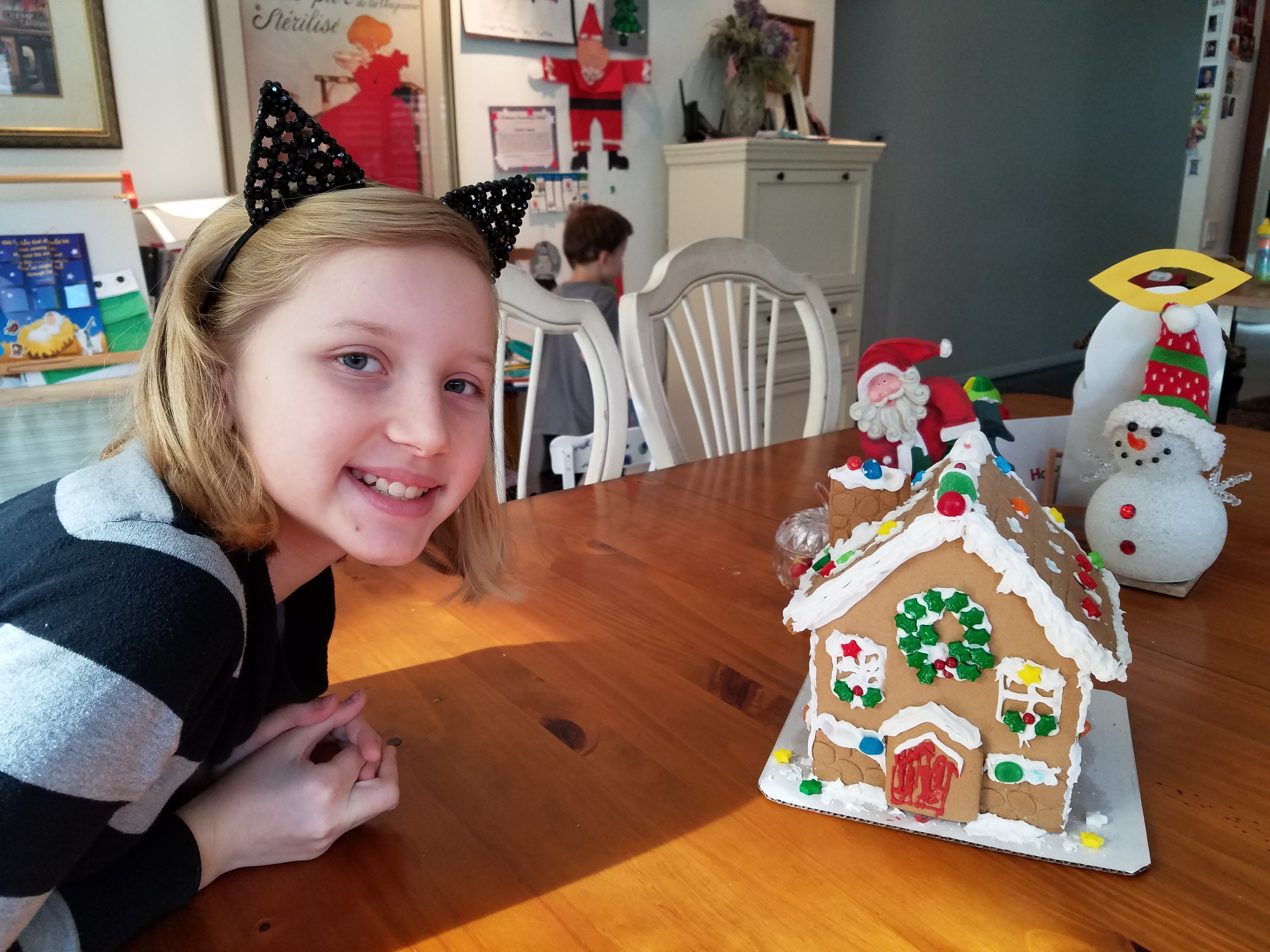
And to further galvanize that thought, we arrived in San Diego to find Keira proudly presenting their half-eaten, already picked apart gingerbread project in the center of the kitchen table. T’was the joy of gingerbread houses—post construction, eating them!!!

20161220_112922

Fun with PERF!

Currently finishing a project that has provided a great theme for incorporating metal, it seemed a worthy blog subject for it’s fun and flexibility! Perf is the product – a perforated steel that comes in several percentages of perforation.

We have used this many times for rolling window shades in a flexible coated nylon material. It is great for filtering for sunlight and privacy while allowing a certain amount of “see-through.” It has been used as an architectural screening material for years. You have probably seen it and not realized it on building storefronts and bus wraps – the perforated vinyl coatings are often used for advertisement because they read as though a solid from the one side and are transparent from within.

Here we are playing around with the steel to create cool elements that compliment the theme of this new taproom. The theme is silver and what material does bring to mind? Metallic. So by dressing raw steel with paint – we apply the silver finish and there we have it!

The required outside patio fencing was constructed with very generic square stock. I called it a hamster cage. It was a bland beige when we first arrived and, without notice, the shopping center management had it and the other structural columns lining the canopy/portico painted chocolate brown.

The plan had been to screen it with perforated panels. The darker paint color created a little better contrast and aided in providing a depth of detail to set-off the silver painted perf.

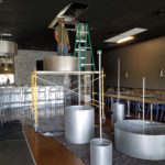
Inside we needed to fill the volume of this most uninteresting dropped ceiling. Already painted black and looking quite voluminous – but not in a good way – the empty space needed some mass. So in one of those restless, middle-of-the-night design sessions of insomnia the idea to create large drums for lighting shades came to mind.

Drums have been in vogue for several years now. Nothing original from the initial use for table lamp shades except their use was broadened to include suspended fixtures and halved for wall sconces. You’ve seen them – hip and happening – and these were quite over-sized and carried the space.

We needed to fill the void of the 12′ high ceilings in this room that had little or no comfort. All hard surfaces, it was a challenge to maintain the silver theme and edginess of a popular taproom while creating comfort. Seemed an oxymoron of a task. But the mass of the perforated drums in three different sizes grouped in the near center of the room did just that.

The addition of multiple warm white lamps inside will be the crowning touch. (photo to be added here in a week or so)

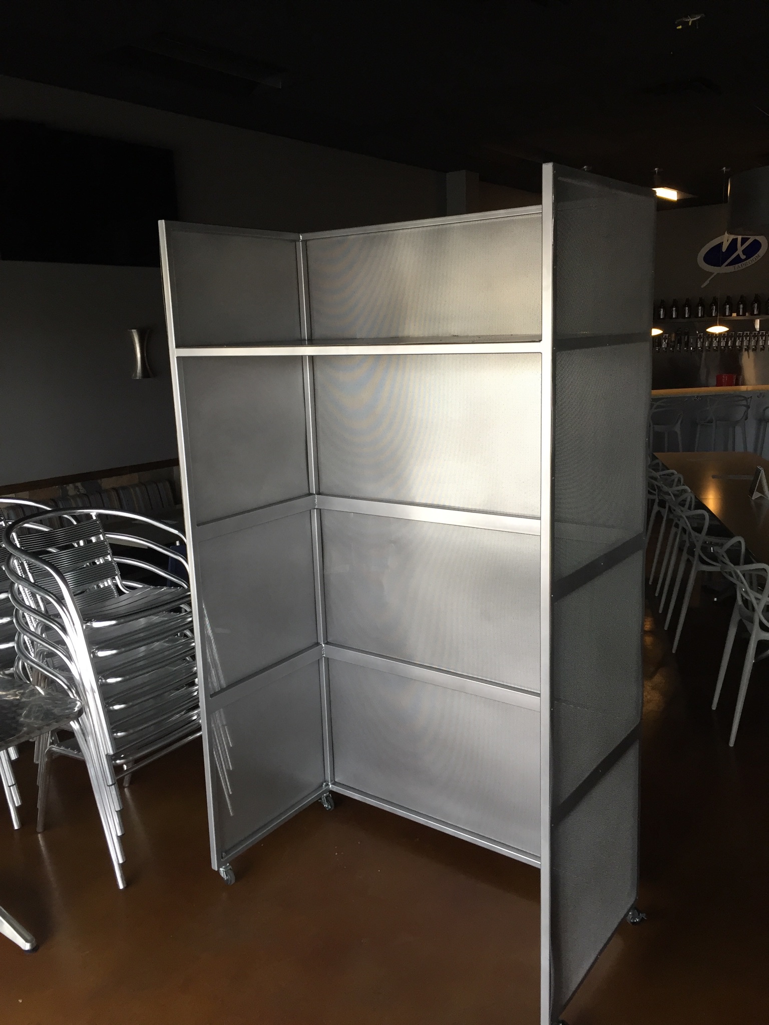
Then a third use of the perforated material came in the idea for a room-divider/hostess station.

img_2342

We needed a place to create a point of arrival. Whether manned or unmanned, this unit can have a chalkboard or other signage identifying special events or beer tastings, with a podium in front creates a translucent backdrop to partially cordon off the rest of the space until the customers are greeted and it also can divide the space for special events and table groupings. to accomplish all of those various purposes we designed it with heavy duty commercial casters complete with brakes so that it could be moved easily for its grand height and weight and  placed where needed for the best advantage.

Stay tuned for the complete un-veiling of this cool new interior in the coming weeks. And meanwhile dream of all the fun you can have with perf!


Oh the Faces! Spanish Market

The sky was grey and the air had a decidedly seasonal still-cool yesterday which called for a cozy indoor activity – offered this weekend in the handsome Hotel Albuquerque, host of the Winter Spanish Market. Yes, the decades old traditional Spanish Market held in Santa Fe outside around the Plaza, on warm summer days in July, has begun a new tradition in Albuquerque in the opposite season indoors. http://www.visitalbuquerque.org/abq365/events/detail/28th-Annual-Winter-Spanish-Market/31793/

The collection of world class artists’ booths beneath the enormous hand-tooled tin chandeliers suspended from the spacious ballroom sparkled with festive illumination and colorful creations.

20161126_151417

A variety of Mariachi bands played to the crowds as the curious and collectors wove in and out of the rows of talented exhibitors.

Fine tin-work, dyed and cut straw assemblies, weavings and jewelry presented an incredible variety of work. Fine crafted furniture and spectacular wall pieces were displayed by master carvers. It was a collection of world-class art and fine craft.

20161126_151517

Crazy interpretations of his beloved traditional retablos are Charlie Carillos commically contemporary interpretations of vintage cars with saints at the wheel. Humor that is received with mixed reviews. But his talent is undisputed. Here he entertains at his booth with his colorful delivery.

20161126_151446

By startling contrast, the rich warm colors and traditional reverence that Catherine Robles-Shaw displays in her incredible carvings and painting techniques, wonderful detail and soulfully expressive faces. Her rich hues are Old World in their sensitivity to tone on tone and dark earthen colors outlined and enhanced with ribbons of gold.

Daughter, Roxanne Shaw-Galindo, a respected santero in her own right has continued to carve her own niche in this exclusive world of bultos, retablos and other manner of fine carving and painting.

The mystic powders carefully sought and gathered from ancient land forms and mineral-rich geology diluted with water and even the precious red of the rare cochineal all contribute to the luminous, translucent colors that read so differently from other media.

And further contrast is Frank  L. Garcia with his primary colors of electric blue, yellow and  red shining off of his wood surfaces. Uplifting and extracting smiles from all who pass his booth.

20161127_085738

Oh the faces!! Each santero has his or her own style.  Like fingerprints, the santeros each have cultivated a unique “look” to their work and expressions of their subjects.  The eyes say so much. Mournful, cheerful, pensive or stony stares, the characters are exclusively their own. Despite the similarities bound by tradition, each artist presents a specifically unique style which conveys incredible personality. These signature expressions, as individual as fingerprints, represent so distinctly each  inimitable artist. Despite the similarities bound by tradition, the methods and materials, each shine with startling individuality!

Here santero Ruben Gallegos poses with Mary Anne Green an avid collector and fond owner of several of Gallegos’ work.

Lee Valdez hunches over his soon-to-be cross carefully carving the rope detail around the edges. Light pencil lines define the decoration that he follows with remarkable precision – and look – he is sporting two pair of glasses stacked atop one another – which he says works just fine.

Behind him displayed on the wall are several other crosses in all manner of carving and decorative woodwork. One piece in particular is a yellow pine cross that is riddled with dark cinnamon colored worm holes – splattered actually – creating a spectacularly natural design. And further marks of nature that Lee captures are a knot hole and adjacent burled wood that he places dead center in the intersection of the cross. The four end pieces are carved from a piece of butternut wood providing the perfect natural contrast to the yellow pine yet complimenting the dark flecks of the worm holes. Quite a find, in this amazing piece of wood he spied in a hardware store, and remarkable sensitivity to isolate and assemble the various pieces to create the whole.

20161126_145127

A striking woman caught my eye. Her thick curly black hair and handsome silver cross strung on a multi-strand necklace of turquoise made a big statement amidst all of the art and drama. Meet Vanessa Baca.

20161126_140328

As we visited briefly I learned that she is a fellow blogger and I am sure it was fate that we met as her foodinbooks.com is a wealth of observations centered around great books and fabulous food within described. She writes with great depth of description and observation AND she breaks it down and teaches you how to prepare that about what you have just read!

Sean Wells painting as we watched, represents her art in her own striking appearance. Dark hair whipped and twisted with a stylish flair and topped with screaming orange flowers.

Wells’ images are equally colorful, happy and festive. If not her fine retablos, You might recognize her Fanciful Day of the Dead wine bottles and famous, collectible Lottery Scratchers! Find her on Etsy!

It was an inspiring day of extraordinary art in a genre that is so historically and regionally rooted with original methods and patient execution paired with the artistic imaginative people who practice and study this fine work. Thanks so much Mary Ann for a rare treat!

20161126_155650-copy

Today YOU can go see this final day of  the 28th Annual Spanish Market 2016! Get over there!


Designing with Balance and the Creation of the Can Wall!

Given the opportunity to improve upon a recently completed taproom, we instantly realized that painting the entire interior would be the best quick-fix. But that instant gratification was not enough to give this needy/hungry interior some meat to get it off and running.

Atmosphere in interiors is so much a part of the brand, the identity, and the success of a business. Popularity is based upon a certain comfort level, the clientele who gravitate there and the product that they are effectively providing. Whether that is food or drink or both, the atmosphere, (including lively enjoyment by clientele), service and food/beverage – all contribute to a successful establishment.

This does not mean high-end, elegant, fancy or even simply hip – although the definition of hip can vary from spare unpretentious and un-self-conscious funky, to studied funky, to affected stylized, to trendy hip and happening,…but, it does NOT always have to represent expensive interior design.

Yet a strip center generally lacks pizzazz and to install a taproom into that generic scene takes some creativity. That does not mean money – it means just what I said, creativity.  And creative interior design is all about ingenuity and balance.

Balance in interior design is key. This interior was filled with hard, cold surfaces – concrete floors, silver-grey laminate table tops, brilliant silver table bases, grey chairs, polished white granite bar top, silver laminate bar face, silver metallic wall sconces, glistening silver under-scaled chandeliers, white walls with cobalt blue accent wall. Brrrrrrr….makes me chilly just recounting the scene. And this was summer! Imagine this setting with crisp cold wind blowing outside and snow blanketing the mountain – not the place you want to gather for a beer in the wintertime!!

20160901_160828

To instantly soften and add warmth, we painted all walls a dark taupe. The soft, mousy grey/brown color pulled from the existing slate wainscoting to tie the two wall parts into a unified “read.” It gave the silver elements (especially the sconces) a contrast – which results in “interest.”

20161103_091444

The back bar was bland even with the new paint color and to add dimension and animation we mirrored the rear center section. This illusion added depth and interest to carry the ceiling through and add a mirrored storefront and exterior reflection which created an illusion of space and character where there had been nothing.

But unlike most back-bars, this area was conspicuously naked. A couple of stainless shelves housing stemmed wine glasses, and growlers felt spare. Plus the right side of the back bar was closer to the bar and the patrons were a mere few feet from a plain, painted sheet-rock wall. Yes, there was a large format TV screen above, but straight ahead – it was just blank wall.

In the wee hours of the morning, as I tossed and turned for a variety of reasons, I jumped from thought to thought, project to project, and personal concerns pelting all the while in a seemingly endless stream of insomnia. Yet, it was during the angst that the idea of the taproom being named “Silver”…silver…beer cans are silver/aluminum…beer cans crushed and nailed to a wall…texture, silver (theme of the taproom) interest – maybe?- all converged into one of those light-bulb moments of revelation.

And yet you might say – “silver…aluminum…more cold and hard. Why would this be an asset to this interior?” I felt that the texture and dimension of the cans would add more interest than the perceived cold and hard of them. The pockets of folded shadows and the relief off from the wall, paired with the over-all massive full-wall of pattern, would all contribute a positive design element to the scene.

As I pictured the wall of circularly flattened aluminum cans in my in my  mind’s eye (a tool that I employ daily while envisioning concepts and finished products well in advance of their fruition), I furthered the concept to encompass possible bar games. Yes, derived from this perfect grid of circular aluminum discs, I began creating games in my head. A bar is often animated by bar games and this was just another opportunity to interact using this unique wall-scape. Since that initial concept, I have created 3 different versions of the animated interaction in the form of games, on this fantastic Can Wall.

So with great patience, Enrique planned the layout with literally laser precision in a perfect grid. We counted the expected number of cans vertically and horizontally aligning with the brilliant red light beams. The previously crushed cans were laid out on a table – well a handful of the 3,200 that we had prepared for the wall. It was determined that punching the nails into the cans prior to installation would expedite the process of affixing them to the Can Wall. Labor intensive from start to finish, this wall was a great accomplishment for a devoted few.

20161103_094518

As the cans were laid out on the table – initially upside down exposing the crinkly open side (devoid of tops), I instantly LOVED the complexity of the depth, texture and shadows. A tight, random application of them would have resulted in a fabulously complex matrix of design. But upon closer inspection, the “texture” was really raw, with sharp threatening edges that were not possibly reasonable within close contact with people brushing by. So, lacerating the staff was not an option – even for a really cool textural metallic wall treatment. Perhaps this application will surface in a more appropriate location away from human flesh in the not-too-distant-future!

Like hubcaps fastened to the broad side of a country barn at dusk, the reflective silver discs pop in the flanking darkness.

20161104_140152


The process is nearing completion and I will save for another blog sharing the fun and games emanating from the Can Wall,  and the entire finished project complete with new warm white pendant discs over the bar and soon-to-install enormous perforated drum light fixtures suspended from the ceiling, over-sized photo images of the brewery behind the scenes and tantalizing signature dishes in the unique category of the Nexus New Mexico Soul Food.


Meanwhile, the take-away here is…balance cold and rigid with warm and textural – along with all the other opposites that attract – when designing be balanced.