Remodeling? How to Embrace Existing Conditions – Celebrate the Story

This happening scene provided fabulous fodder, to observe existing conditions being incorporated into a design, for great benefit on many levels. Applicable to all remodel projects – see what you think!

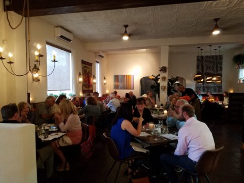
In this case, Night Club design. The styles are many, but the concept is of a  commonality comprised of a few basic functions – a fun place to socialize, meet people and enjoy the entertainment of the overall scene often including live performances. We probably all picture the image of a flashy, glitzy environment.

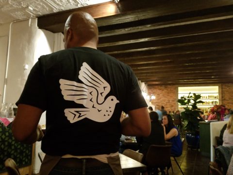
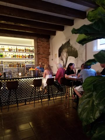
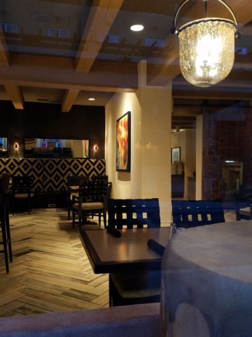
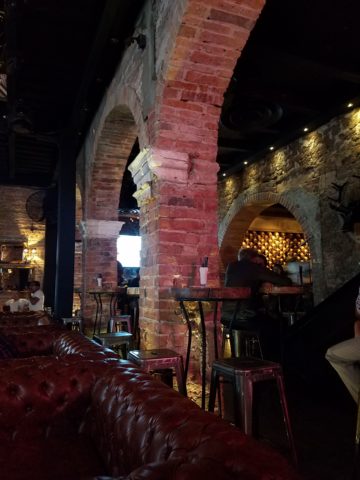
We were recently in a most unusual space that combined the glitz and bling you might expect with a “nightclub” atmosphere, but juxtaposed with rustic finishes that were unique to the original architecture. This brick expressed in some of the remaining structural elements – walls and column/arched spans of structure – was warm and rich providing an unexpected pleasing combination that so easily might have been eliminated – concealed behind slick new finishes.
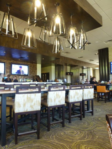
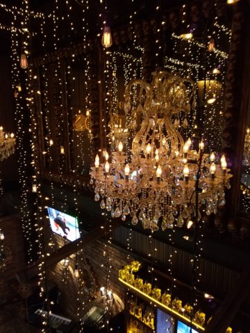
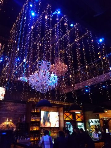
To play-up the vintage aspects of the space, ornate traditional chandeliers were suspended amidst myriad dangling strands of sparkling, golden LED lights. These provided a glittering glow of ambient light in the upper reaches of the space effecting both the downstairs and upper level of the club. This mixed lighting treatment was obviously the eye-catching  emphasis of the interior.
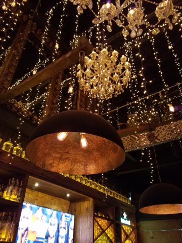
Ample light was provided by the luminous chandeliers and thousands of dangling LED pin-dot lights along with the indirect lighting of the back-bar shelves. Therefore, the large steel domes that hung suspended over the bar needed not to contribute ambient light, but were limited to effectively cast direct downward light on the bar surface. Their golden interiors provided a warm glow while the exterior surface disappeared into the darkness.
The bar was quite simple and raw, yet read in enough of an interesting and complex fashion, to compliment the scene. The design was sufficient in its components and indirect lighting worked well with all the other design decisions.
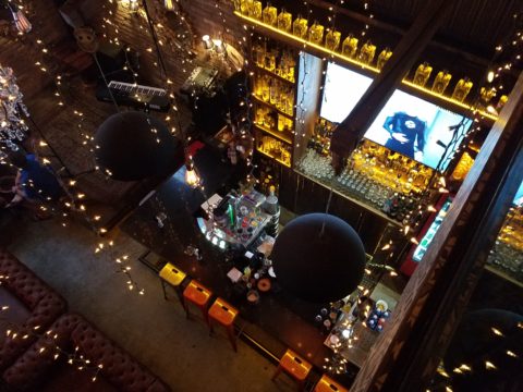
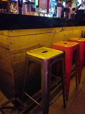
The simple Tolix-styled stools were an understated easy fit with the other surprisingly raw materials of the bar.
To answer the need for friendly group conversations, there were comfortable places to gather with zoned seating areas of tufted leather sofas and leopard-patterned rugs,  wooden grouping tables, then hi-top tables with stools and finally barstools along the length of the bar. The various areas provided options for patrons to pick the most inviting or appropriate spot to enjoy the atmosphere with friends.
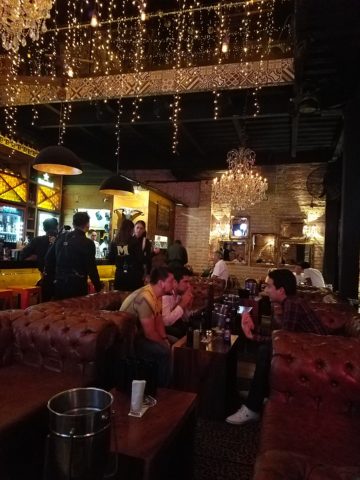
Having choices in any hospitality setting is invaluable. It allows the patrons to make their own decision how best to utilize and enjoy the space. It answers different needs and appeals to different people for different reasons, therefore inviting a variety of patrons to invest their time and money in the establishment. A broader reach of clientele.  A broader client base.

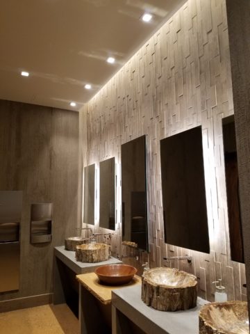
I’ve mentioned more than once that having restroom design follow the theme and quality, of the rest of the interior, is imperative. As it relates to night clubs, it is often the meeting-ground for dating, meeting new people, attracting new people and therefore,  the restroom should promote attractive feelings of approval and confidence in the guests.
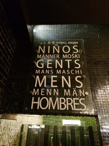
Jazzing up the restrooms in keeping with the jazzy feeling of the club environment should be a natural continuation of the design scheme. That means mirrors – full length – not merely above the sinks,  good lighting without down-lights to cast unappealing shadows on the guests.
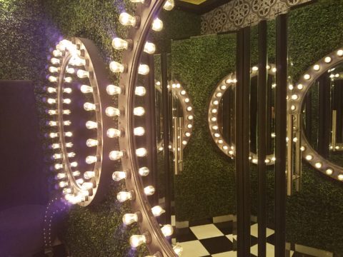
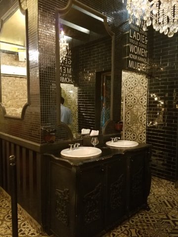
Here the placement of sinks outside the restrooms frees up space in the stall areas, while adding interest to the extended restroom area. The design theme presents free-standing bureaus for the sink cabinets. Often shared sinks are used in these anti-room set-ups, but in this case opposing sides of the vestibule provided an attractive vanity area for men and a separate one for women.
What was so inspiring and interesting as we scanned the interior were the various zones all within this complex mix of original, traditional architectural elements and adding traditional if not vintage lighting fixtures paired with modern high-tech lighting effects and large brilliant monitors featuring exotic, playful, getaway beach videos. It worked.
Have you ever encountered a structure that at first glance did not comply with the supposed new program? Awkward supports, raw materials, exposed mechanical…so ,many “unfortunate” things to get in the way of your design. Often the “imagined” design over-rides the reality of the moment. The challenge is to allow the moment – the reality of the existing conditions – to participate in the process rather than being briskly eliminated without thorough consideration.

And the additional bonus might often be cost-savings and budget stretching while not betraying that benefit at expense of the finished design. Brilliant to have incorporated the “whatever it is” – wasn’t that creative and hence, interesting!! OK – I’ll take that!

To have concealed or negated the architecture would have been almost criminal – certainly a loss of architectural integrity and textural interest.
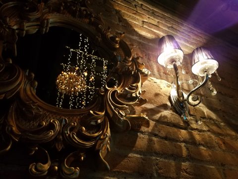
The crime of missing opportunities like the seemingly conflicting traditional elements with the need to be glitzy and modern is to be too one-directional . It’s like having “design-blinders” on that direct and focus a theme without recognizing the value of thoughtful salvage of  content, contrast and context.
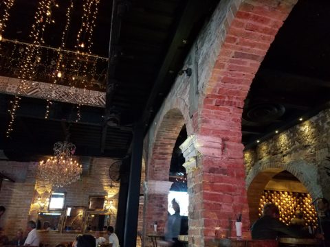
All of what we observed applies to both residential and commercial design. The takeaway is to consider existing conditions and, if applicable, embrace them. Give thoughtful consideration to the opportunities before glossing over them, concealing them or eliminating them altogether. Try to appreciate the gifts that might escape you if you insist on unnecessarily hammering and manipulating a space into submission – design submission. Rather, let it tell a story and contribute to the design process – which would more than likely result in a more unique and creative end project for that thoughtful integration of the existing elements.

Atmos and Eating by Design

How do you select a restaurant? As a patron, what makes you dine out? How do you select your preferred dining experience? I’m talking about casual and easy or even more a more in-depth gastronomic event.

When it comes to casual, quick and easy, I still want the experience to have personality – a pleasing personality and great flavors. Personality is atmosphere. Great flavors is the kitchen. Service might be “step-up and place your order” or table-side wait-staff. In either case, I want it to be a pleasing experience. Why would anyone want it to be difficult or unpleasant? Perhaps that lies in the definitions of the beholder. What is difficult or unpleasant and the various degrees thereof is not be the same for everyone.

Throughout my childhood, I remember my mother and her peers reference “atmos.” It was important. It came up often. “Does the place have atmos?” Or “what great atmos.” Atmosphere – it is the feeling you get in an environment. It is the feeling a place emits. I don’t ever recall it being used in the negative – such as this place has horrible atmos…rather, like ambiance, it was reserved to compliment.


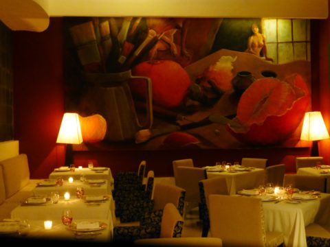
Cafe des Artistes – Puerto Vallarta – Note the full-wall mural by Federico  Leon de la Vega as a backdrop to the dining scene. Also, perhaps someone should have straightened the lamp shades!

We now hear “vibe.” The place has a good vibe – but not limited to only compliment, a place can have a decidedly bad vibe too! Is it just the saying “If you can’t say anything nice about something, don’t say anything at all?” Perhaps we are less polite than the previous generations. Yet, constructive criticism let’s you know what makes your patrons pleased. Truth be told…be honest with discretion.

As a restaurant owner, it seems that erring on the side of greater numbers sharing the same opinion of easy and pleasing would capture the greater share of the demographic. Therefore, studies are out there to determine the value of ambiance and presentation. Starting with defining the description of your eatery…who are you and what and how do you serve? What is your “brand?” Whether funky or fine, dining should be worth the visit.

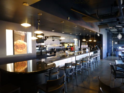
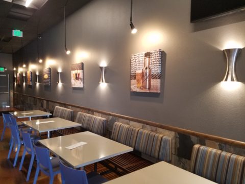
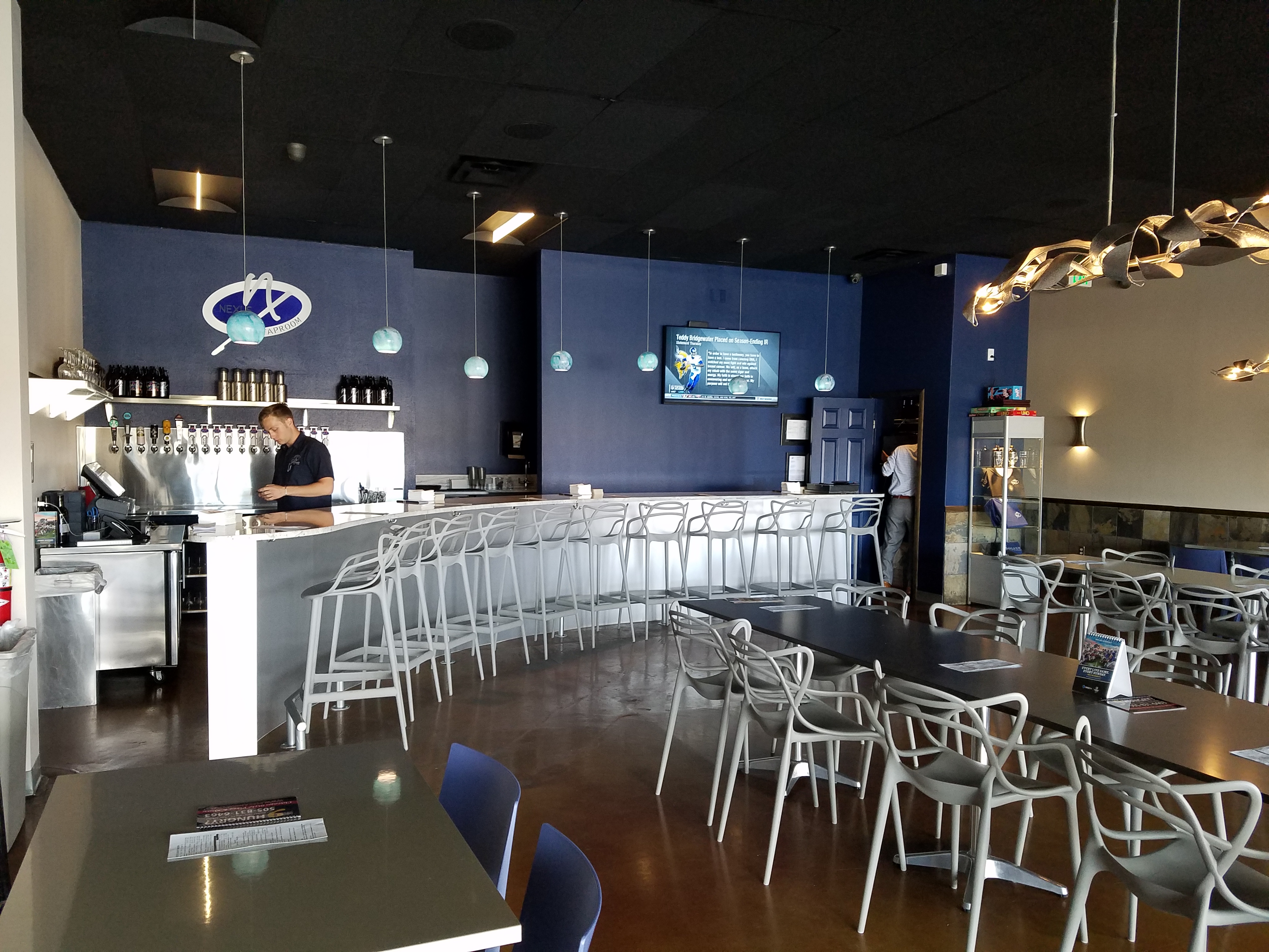
Nexus Brewery, in Albuquerque, has a unique brand and complimentary interior “vibe.”

I read a few excerpts from a fascinating new book, Gastrophysics, The New Science of Eating by Charles Spence. In it, he touches on the importance of atmosphere. He observes the value of interior design even as it relates to how much people eat and how much they spend as a result of atmospheric influences.

Another great read for understanding the art of a successful restaurant is Daniel Boardman’s Your First Restaurant – An Essential Guide. As an “essential aspect of your concept” Boardman identifies why the “thoughtfulness of the interior design” communicates to the patron a lot about the service and food that one might expect to receive.

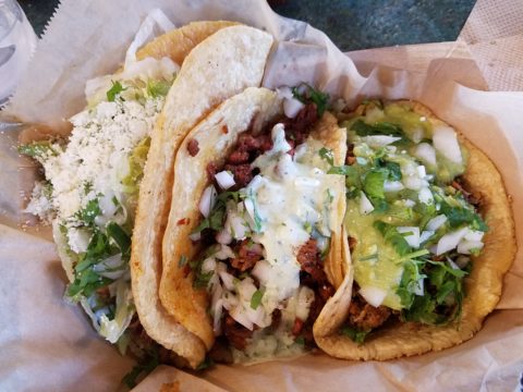
Tacos on paper – porque no?

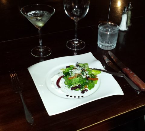
From lighting to the shape of the plate, ambiance and presentation are key features in a successful eating establishment.

All the way from candles on a white linen table cloth to a handsome juicy burger in a basket lined with paper, in the context of the environment – design details matter.

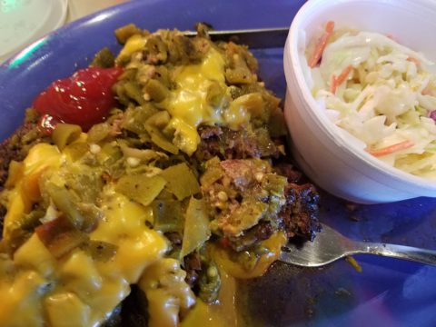
Luscious bun-less green chile cheese burger at Sparky’s in Hatch, New Mexico – served on paper and styrofoam – not fancy, but perfection!!


Stone under-foot and condiments as a center-piece!! Funky!!

Some reading this might say they don’t care. Fine. Perhaps on the surface, they think it doesn’t matter. They don’t realize the effectiveness of well thought-out details. They take these things for granted. Yet these details can make or break a dining experience – from casual to fine.

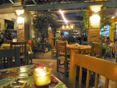
El Arrayan presents enclosed patio dining with a variety of light sources, well balanced colors and textures in Puerto Vallarta.

Next time you eat out, look around, smell the smells, hear the sounds, see the colors, notice the lighting sources and levels, feel the furniture and – have I not mentioned it? – check out the restrooms!!!!

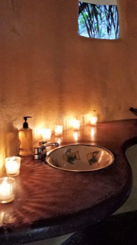
Las Caletas…in the jungle…clean and simple.

Not only should they be very clean – but they should also continue the theme of the place.

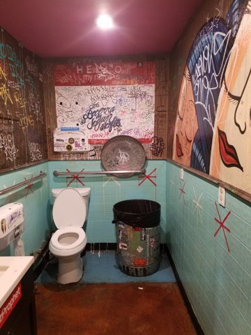
Graffiti by design, this restroom is actually immaculately clean and patrons do NOT contribute with their own markings. It is located in the street taco eatery of SALUD! in Barrio Logan, San Diego. Fast and friendly, delicious and fabulously  funky!

Pay attention and you might be surprised at what you discover about your sensitivities.

Chaco Hotel in Albuquerque is thoroughly theme-based throughout.

What you hear while dining contributes greatly to the pleasure or discomfort of your time spent in the environment. It either contributes positively or detracts annoyingly. Listen to the sounds next time you dine. At home or out, notice voices, chairs being moved, glassware, music, kitchen noises, traffic…see what detracts, what enhances or what might be considered neutral.

Interior designers are considering it all – the theme, atmosphere, colors, artwork, furniture, lighting, table dressings, serving pieces, fabrics, textures and even sound. Whether casual or more formal, these design details can make or break the success of the business.

Oro Valley Country Club, Arizona.

Even if the food is exceptional, too bright lighting, ineffective colors, uncomfortable furniture or confused design elements can result in negating even the best chef’s efforts. It is a package. It is about the whole. It is a multi-sensory experience. Buen provecho!

When is Too Much, Not Quite Enough?

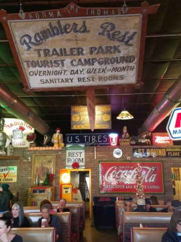
Perhaps – when you are an avid collector, limitless treasure-hunter and lover of basic Americana (comprised of the appreciation of indelible graphic design and branding mixed with a healthy dose of green chile cheeseburgers, bodacious bbq and good fun) – it’s never enough! We’re in Hatch, New Mexico at Sparky’s once again!!!! The sensational roadside attraction – Sparky’s burger bastion MUST know when too much is not enough!

Nine and a half years ago Teako made a statement and the word has been spreading ever since!

The opening of this fun and funky establishment started out with a few outrageous signs and vintage mascots like the Colonel Saunders on a bench, Ronald McDonald as the un-official greeter

and a dedication to signature green chile cheeseburgers and mouthwatering bbq. Now both sides of the street (and scattered around town) are towering, larger-than-life icons of days gone by and travelers from all over the world stop to experience this unique site.

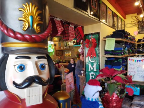
But inside, the treasures also abound! With each visit we discover new surprises and exciting additions. Because its Christmas, we were enticed by the “Say Queso” photo scene. We donned funky antlers and cozied up to the decked-out tree, with a backdrop of sparkle and ornament, beneath dangling snowflakes,

flanked by a towering toy soldier and Jolly Old Saint Nick himself!

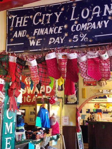
The stockings were hung in clustered abundance over the entryway to the dining room. No such thing as too many or too much here!!!

The walls are plastered with iconic paraphernalia.

Patina etched tin painted and pitted, with pocks of rust and tarnish – weathered through many storms adding further character to the familiar and not-so familiar pieces, until finding safe haven here in this magical collection.

Camp art un-selfconsciously curated on every square inch of interior space.  A nostalgic presentation and preservation of graphic design and branding.

If you’re a “picker,” a graphic designer, a nostalgia buff, burger and bbq connoisseur or just a kid looking for a memorable bite on the side of the road,

Sparky’s unintentional museum, of the colorfully entertaining and eclectic, will not disappoint! It is a must-see landmark in this our Land of Enchantment.

Be enchanted at Sparky’s! Thanks for the memories!!!!! Keep ’em coming!!!


Custom Designed Art for Branding in Commercial Interiors

Designing artwork for commercial interiors offers an opportunity to connect to the brand. It means that we take into consideration the artwork as relates to the business and its identity. You might remember a blog from last year about the can wall. It was designed for a taproom. The theme was beer. The name was “Silver” and we considered that a natural off-shoot of that was the silver color of aluminum beer cans – as a wall treatment!

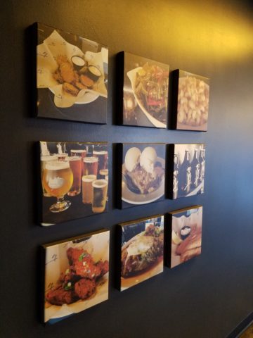
For that same project (in two locations) we further emphasized the brand with photos we took of their own products transferred to and stretched on canvas stretchers to be the “art” on the surrounding walls.


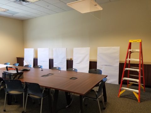
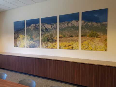
Fast forward to a conference room for an energy company home-based in Albuquerque – the iconic Sandia mountain being the earth’s monument – the familiar, perfect image to represent the company and the connection to the earth and its resources. For this  project, we were asked to build 27′ of custom , cabinetry and dress the wall above it.

The tall ceilings required a vertical element, but the length of the wall also begged for horizontal space-filling. As a cost-effective solution to such a large space, we decided to take a photo of the majestic mountain, separate it into 5 sections and have it enlarged and transferred onto aluminum panels for light weight and rigidity. The reviews were sensational as everyone loves and relates to the familiar scene – seen in such a colorfully explosive and expansive installation.

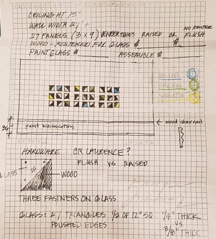
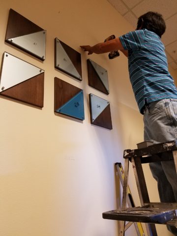
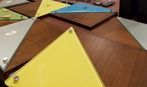
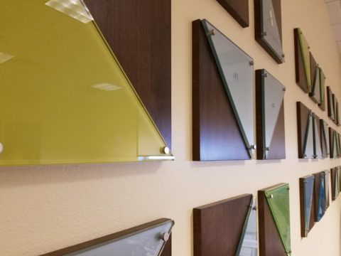
In response to the success of that solution, the client asked for a complimentary treatment for the opposing wall. Again, the wall was 27′ long and had the same ceiling height so we used multiple fragments in 3 groupings to center across the entire expanse. “Elemental Fragments” was born of the concept to have just that – fragments of elements in an orderly fashion – uniform yet random, to contrast against its formal geometry in response to the amorphous photographic landscape. Colors were derived from the blue, green and yellow in the scenic panorama interspersed in a field of silver.

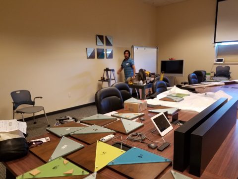
Last week, on the day of the installation, colorful creative chaos – resulting from unwrapping the individually hand-crafted compositions and scattering them across the conference table – was part of the fun, of the scene.

The tedious work of aligning all just right, with perfect spacing and level mounting, added to the anticipation of realizing the finished product.

The luminous glass against the rich, stained wood punctuated with the  brushed stainless fasteners made a striking assembly.

Modern engineering and production, worldwide energy collaborations and shared technology coming together in a grounded environment of people and their place on the planet. A daunting system of assembling fragments of many elements that make things work to bring gas to the end users. The artwork makes the concept look easy. The result of the many facets, of the actual work and the artwork representing it, is not only effective, it is triumphal.

It’s creative fun to custom design pieces to relate to the brand, the business and the culture of a project. Bringing joy, pride and a sense of confidence in the focus of the work, to the employees and guests, is a successful finale.

Bring us your design challenge and we will design a solution specifically and especially for YOU!!!


Commercial Finishes – What They Say – What They Convey

When planning a commercial project, how do you separate your personal taste from an objective view of the program for the business? This situation has occurred twice in the last year with my practice. Well, there can be blurred lines. There can be design elements that work in both environments. There certainly are offices that mimic residential living rooms – contemporary or traditional – modern or historic, but it should directly relate to the type of business and the brand of that business. What does the space say with regard to conveying the intent of the business?
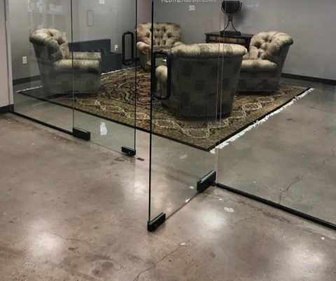
The selection of materials comes first. The bones of the building – what’s exposed, what’s concealed, flooring, wall treatments, etc…The first project was a medical related business – corporate office for a product line. The neighboring space was a physician’s office and treatment suite. The common space had existing concrete floors. The woman leading the design decisions for the medical corporate offices wanted to continue the concrete into her waiting area and throughout the offices with area rugs in each room. A small-scaled water feature, in the form of a grey box, is located adjacent to the seating and a distressed chest and metal sculpture are also part of the scene. Her selection of chairs were heavy, gold tapestry, over-stuffed and tufted. They were placed around a round table in the center of the room. All I could see was a setting for a Victorian séance. It in no way reflected the clean, crisp, fashionable brand that they had established to represent their rejuvenating medical product line. Rugs invited tripping hazards and the look was in no way speaking the language, of the intent of the business or its brand. It spoke directly of the woman’s home, from which she replicated her eclectic taste in the office.

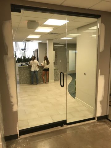
Next door, nearing completion, the physician’s group was being strong-armed into going the same route with the concrete floors. We love concrete floors in so many applications, but here – in these two spaces, they were existing, did not take the stain well and looked dark and dirty in the final polished presentation – NOT the fresh look of a sleek medical group. Not the finish to convey confidence and cleanliness. Treatment rooms had vinyl flooring for necessary maintenance, corridors and physician’s office had carpeting, but the docs rejected the contrasting finished product in the entry and restrooms and went back to the light tile flooring that was originally specified regaining the professional appearance of the intended design.

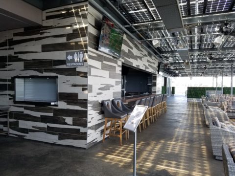
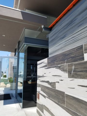
Faux wood porcelain boards are a fantastic contribution to the design offerings for both residential and commercial finish materials. Shown here on the exterior of a building by the ocean, the artsy peeled bark variegation of the pattern is striking and makes a commanding design statement.


It is carried through into the interior and back outside on the rear dining patio.

The idea is that a wooden building by a seaside is traditional – this is a stunning twist on that which was once a customary building material revisited with an invincible, high-design version. The use of wood for such a place would have been historically accurate.

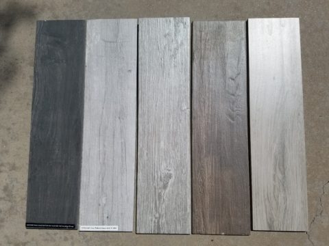
The same is true when faux porcelain planks are used on the floors in the produce section of a grocery store – replicating a produce market or barn where fresh produce is collected and sold. Some high-traffic food-service establishments, bars or breweries often want the look of wood floors – to convey a context or scene – but are not durable and therefore not advisable. A home – almost anywhere including the obvious – in the woods or by the shore, with wood flooring might not be practical, but by using the wood planking porcelain, the look is conveyed while the durability and maintenance is made effortless.

Recently an owner wanted the “look.” That sleek modern look of grey porcelain planking. His business was one that dealt with automotive repair and restoration. In evaluating his brand and the nature  of the business, real wood floors would never be the material of preference. So to use even a durable, invincible, porcelain version seemed out of place.

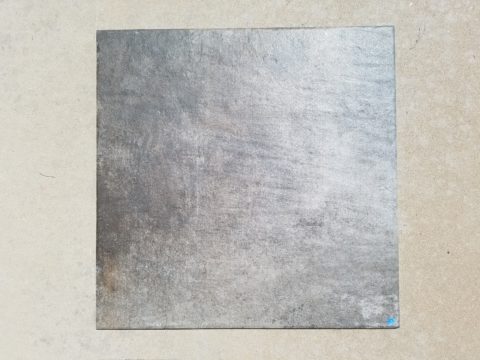
Concrete would be more the material of a garage environment. To make a corporate statement, concrete can be dressed-up. Porcelain tiles simulating concrete is an appropriate faux finish option – either way, preferable to creating an interior of grey weathered wooden planks. Watch for the completion of these projects in the coming months.

Adopting the use of materials merely because you like them or they are in vogue is not always the best approach. Consider the context, the intent, the statement materials make – how they “read,” what they say – what they convey.


Design Inspirations in the City Different

Do YOU know the way to Santa Fe, to play off of a song by another title? Up the hill and beneath a brilliant blue sky, the thunder clouds scatter with dramatic splendor. Past the cedar dotted landscape with punctuation of piñon the seasonal monsoonal green is blanketing the desert. A thrilling view passing swiftly, outside the window, like a series of paintings capturing  surreal scenes – always picturesque.

It’s July in The Land of Enchantment and a weekend getaway, in Santa Fe, promises stimulating design treats and artistic inspiration! Every visit is familiar – yet new. Around every corner, there is detail and color, decoration and un-selfconscious art.

Just when you think the Santa Fe market is saturated with myriad fabulous dining options, Paloma hits the ground running, on Guadalupe Street, to shake things up a bit!

The joy of experiencing the very new restaurant of an amazing friend was exhilarating! Marja Martin, la propietaria of this great new venue Paloma, brings limitless talent, outstanding vision and distinctive creativity to everything she touches.

The quite well-seeded Santa Fe dining scene is recipient of her newest endeavor. Already a well-established and well loved caterer, her artistic sensitivity and smart culinary concepts – that have been her signature – now result in a presentation of stunning unpretentious decor and exceptional  flavors. She’s giving patrons bold flavors and creative combinations inspired by true dining experiences, with our many-faceted Mexican neighbor’s to the south. The result is fun and transporting, in its authenticity.

Walking home, to the lovely casita of dear friends, the gates and doorways, patterns and particulars – uniquely New Mexican in their expression of design offer photographic treats. It’s magic. It’s exciting. It should be on everyone’s list to take the time to explore.
It’s as though history and current trends collide to create a patchwork of texture and color all to stimulate the senses. Exotic flavors and international everything all presented in the confines and context of this extraordinary place.

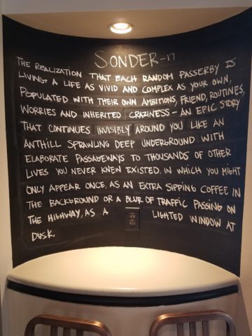
Interior design and exterior design bombarding from every pocket including this provocative little prose to ponder at Sonder. Get out there are feed your senses!


The Excitement of Design Updating and Transformation!

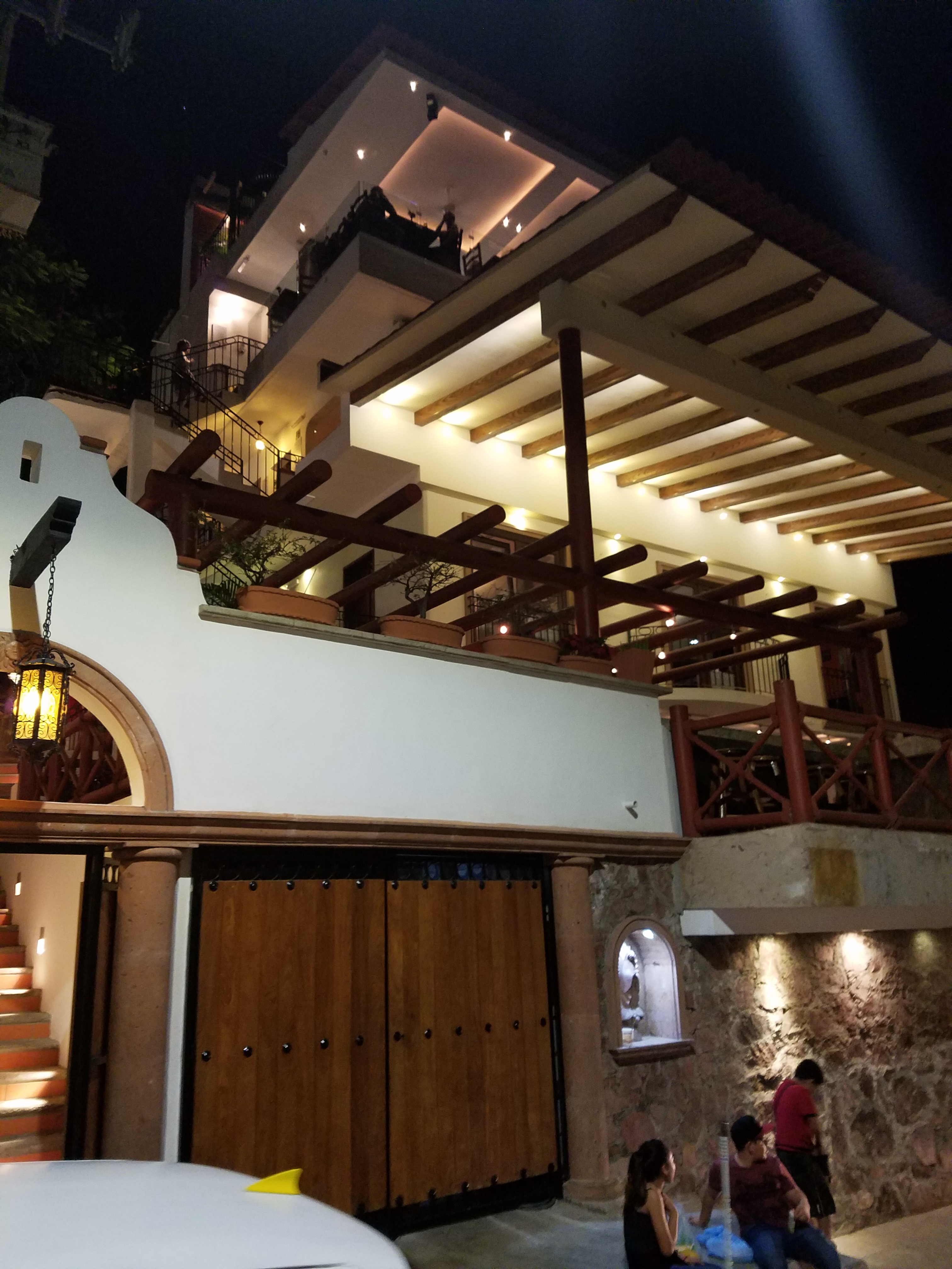
For years, Barcelona Tapas has been a creatively successful culinary and social scene on a quiet cobblestone backstreet in the tropical, seaside, destination of Puerto Vallarta. The vertical profile of the sun-bleached white building is distinctive with its open spaces – dining rooms on each ascending level.

20170204_205154

It is a extremely popular, hip and happening, dining venue which has recently had a spectacular face-lift that brings the structure and open-aired/interior environment up to par with the culinary delights.

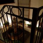
Upon arrival, the familiar, welcoming doorway opens to softly lit aggregate stairs that sweep up each tier of the towering edifice.

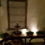
A massive Cantera stone fountain babbles gently amidst tropical plantings and an iron grill-work is indirectly illuminated for a dramatic effect. An expansive patio all with honed stone tile floors begins the layers of available spaces.

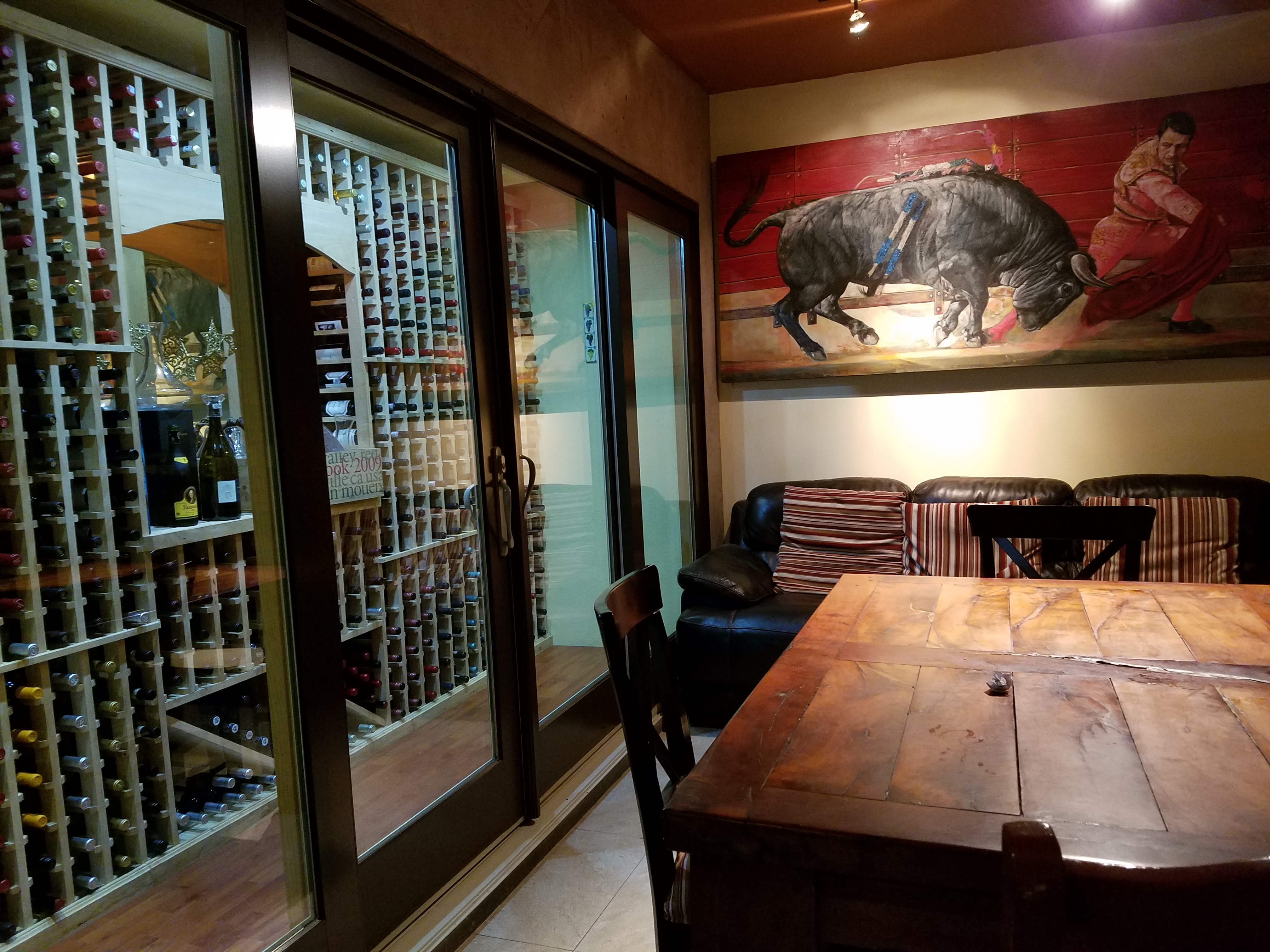
Next an intimate open-aired dining area with an adjacent chef’s table and luminous, full-wall wine cooler beckons with an inviting aura. The intense red drama of a bullfight is rendered in a large painting on the rear wall – a suiting backdrop to the Spanish theme.

20170201_225220

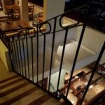
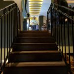
Continuing the ascension, the delightful glossy black ironwork railing follows along and up the open-to-the-sky aggregate staircase turning past the last landing.  Ahead, the beautiful,  warm glow of the new dimensional ceiling treatment accented with wood and indirect lighting draws the eye upward.

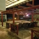
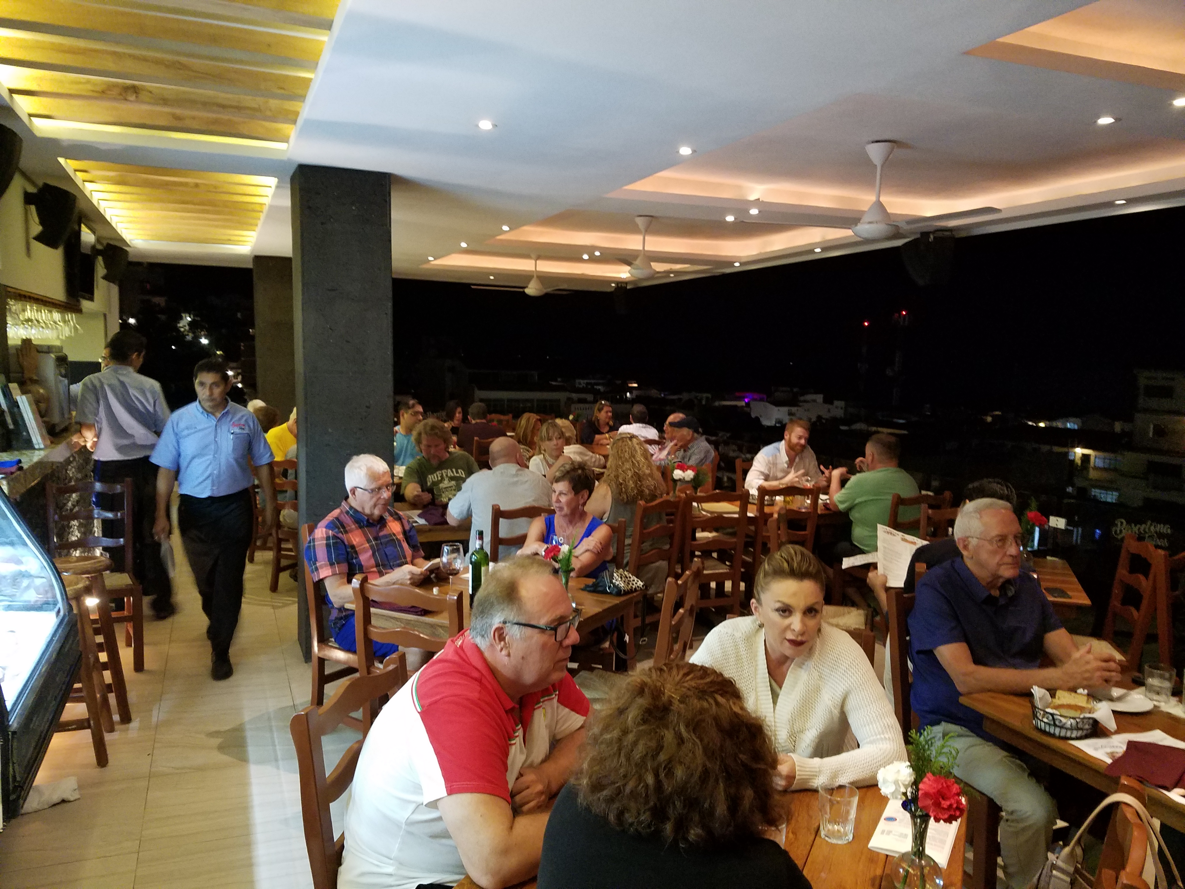
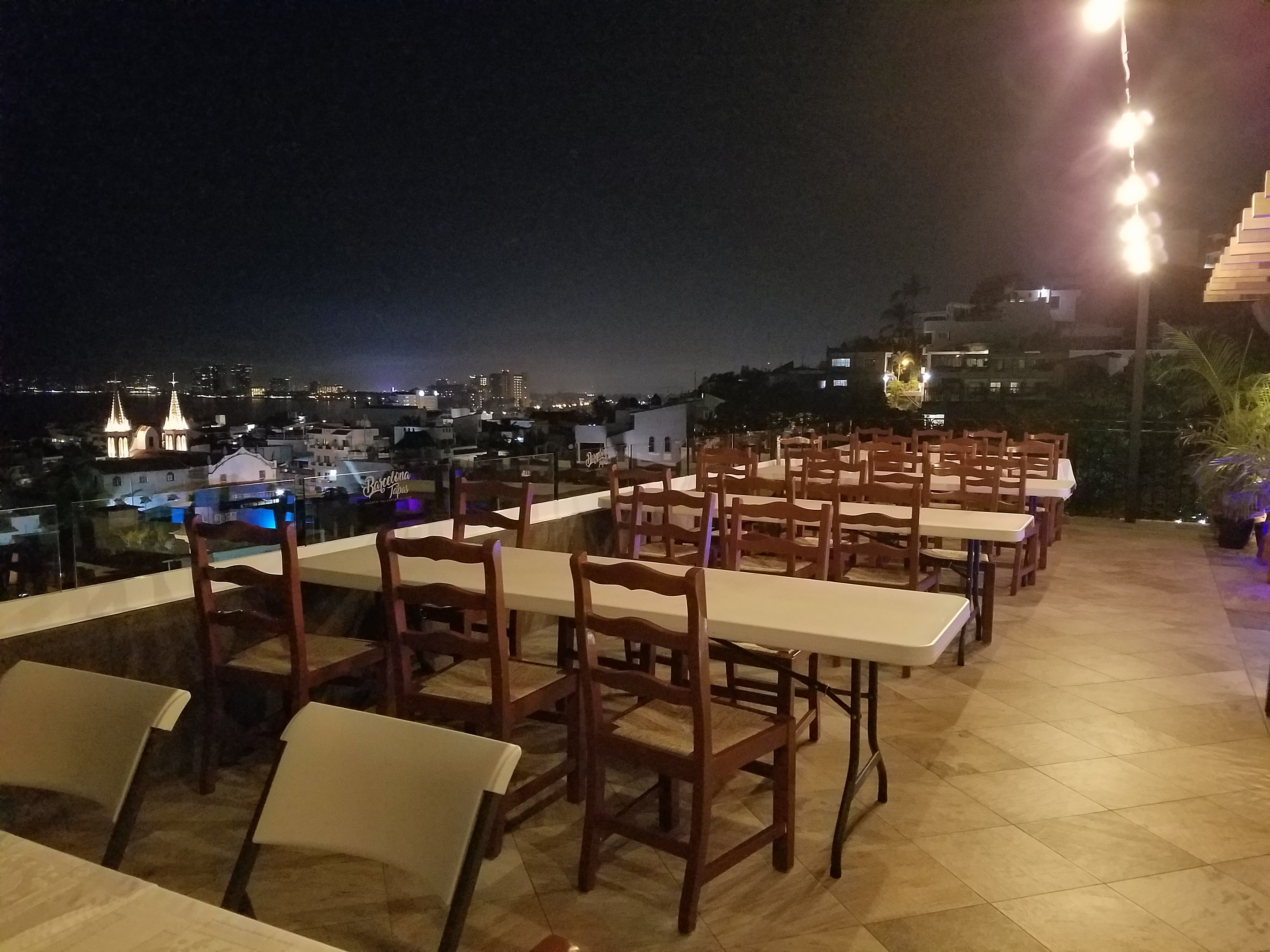
Upon arrival on this rooftop dining platform, what was always an exciting view of the city lights, both in the foreground and circling the bay miles around to the north,  now expresses the new architectural features and finishes dazzling the eye.

20170201_212626

Effective lighting, recessed ceiling details, a new clear glass railing, and modern ceiling fans dangling like detached white nosecone propellers present a whole new, fresh, modern look. The drama and effectiveness of the lighting paired with the wonderful surround sound, coming from eight Bose wall-mounted speakers and 2 sub-woofers recessed into the ceiling, result in an atmosphere and music that are seductive and sensational.

But wait – there’s more!!! Yes, an additional rooftop dining patio is revealed upon discovering the hidden staircase at the far end of the bar. New furniture and a billowing fabric-draped portico are soon to arrive!

20170204_230116

This new space not only increases the seating capacity, but offers yet another  panoramic view and trendy design-themed open venue – expanding the options even more!

The project is Chef/Owner Bill Carballo’s passion.

20170204_214701

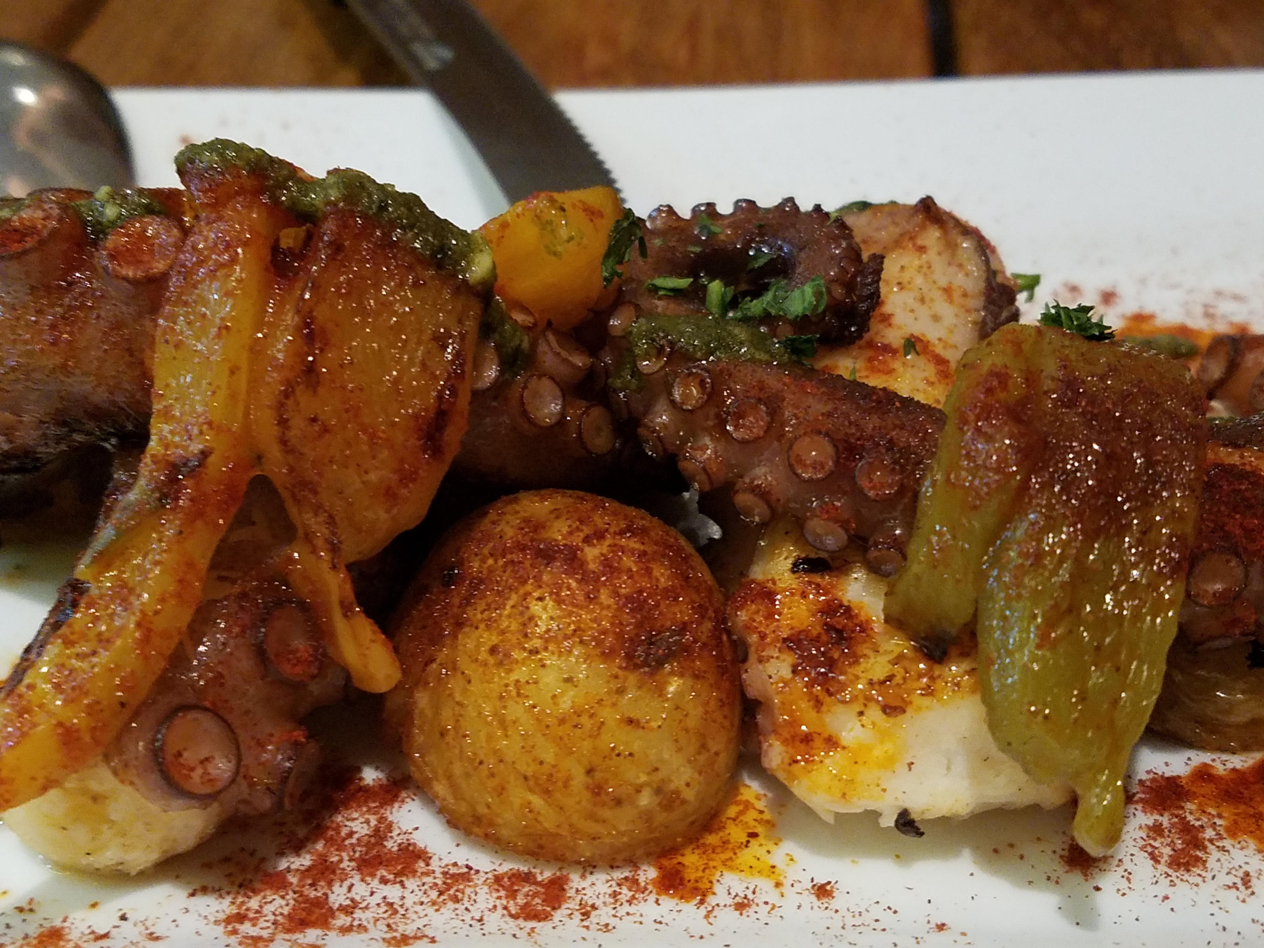
He has been at it for years creating deliciously original and traditional Spanish tapas (here his exquisie presentations have been half eaten in the rush to enjoy)

from the immaculate exhibition kitchen at the start of the long bar, with a fine-tuned staff eager to assist and cater to your every need.

20170201_225019

This enchanting transformation has attracted new discriminating, trend-setting clients and welcomed the return of  loyal fans to experience this exciting new and stylish interpretation of Barcelona Tapas.

20170201_200631

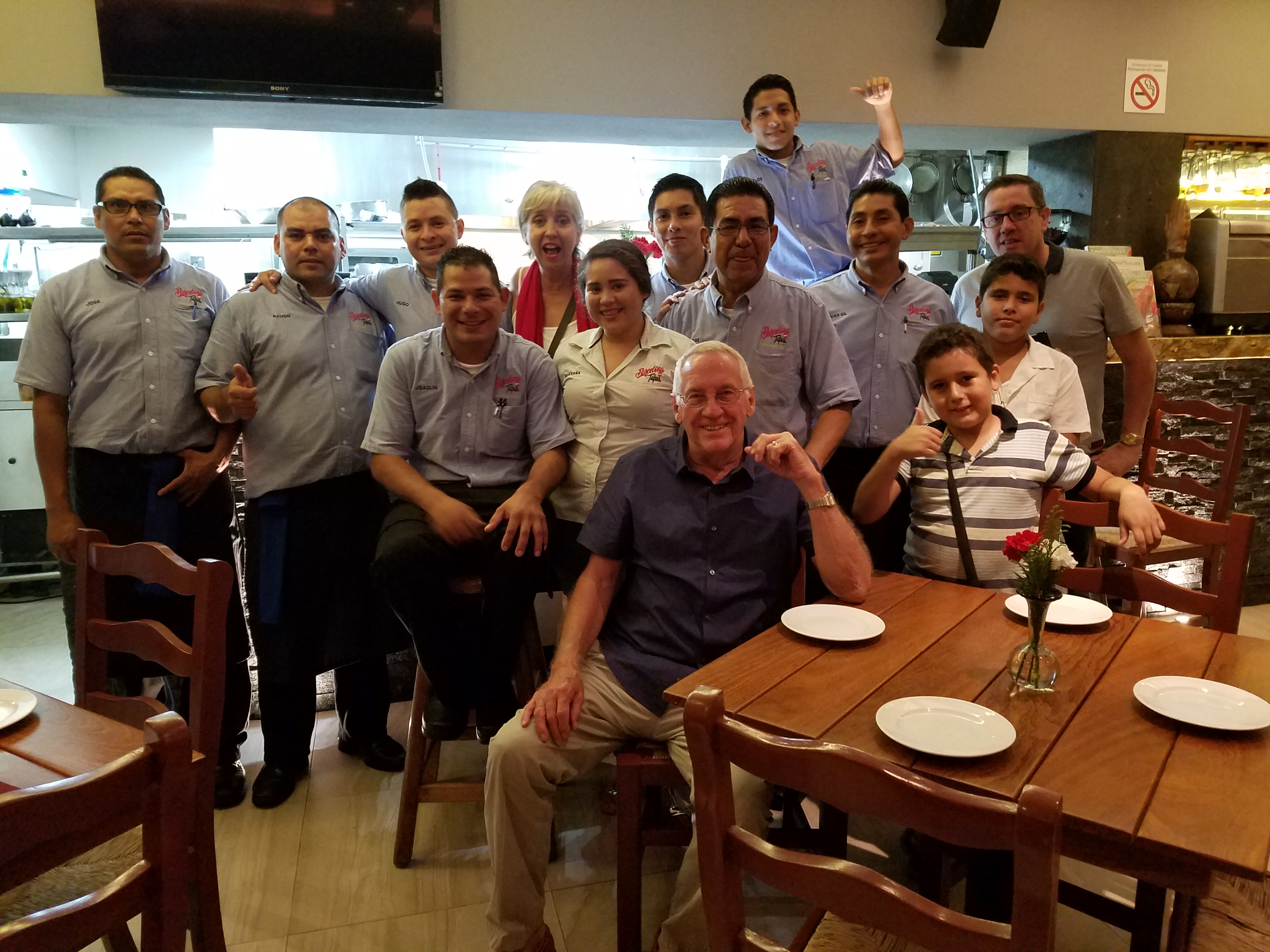
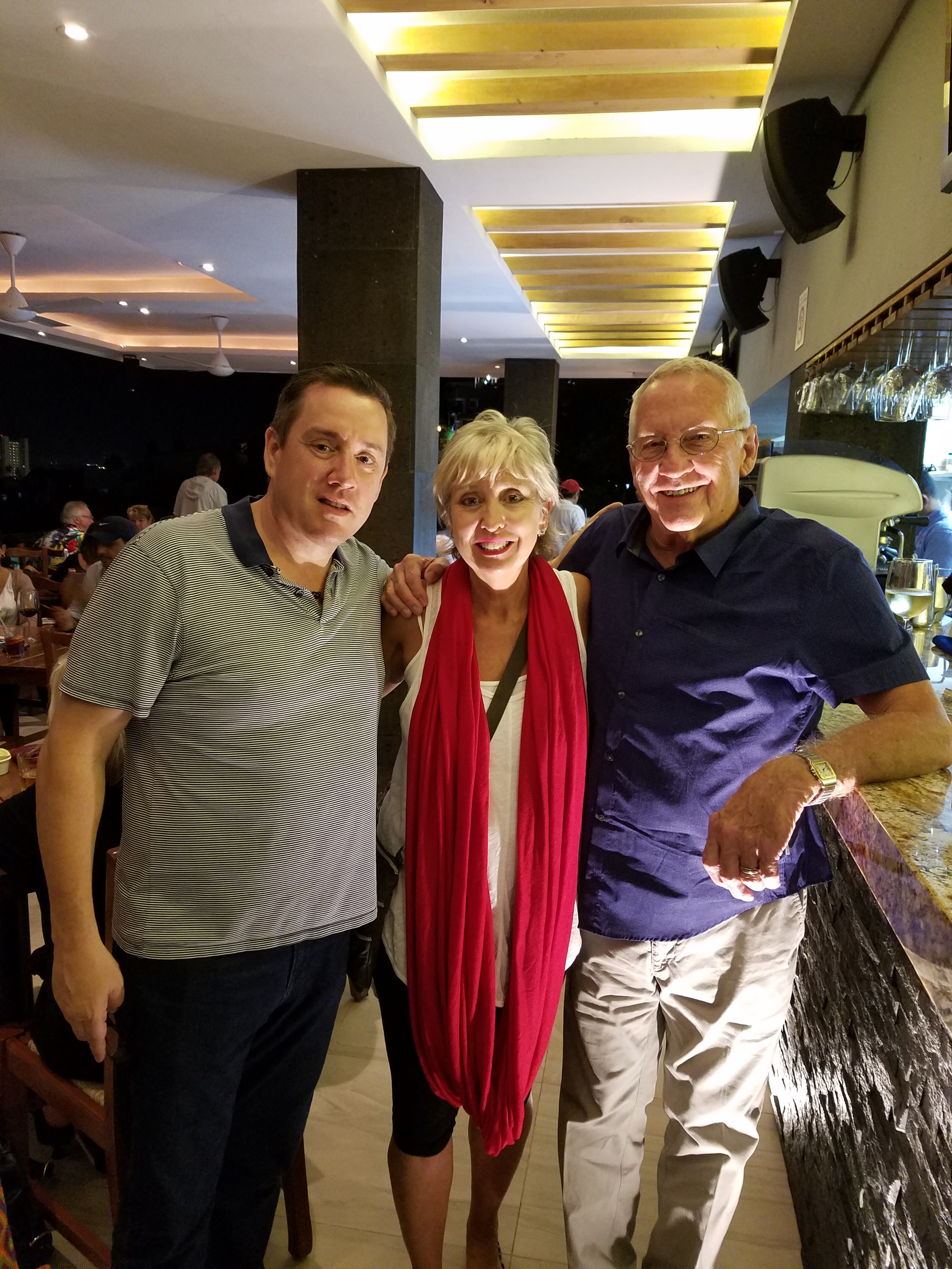
The doormen Luis and his affable sidekick are there to greet and assist!

Thank you gentlemen and Buenos Noches until next time!!!!

Fun with PERF!

Currently finishing a project that has provided a great theme for incorporating metal, it seemed a worthy blog subject for it’s fun and flexibility! Perf is the product – a perforated steel that comes in several percentages of perforation.

We have used this many times for rolling window shades in a flexible coated nylon material. It is great for filtering for sunlight and privacy while allowing a certain amount of “see-through.” It has been used as an architectural screening material for years. You have probably seen it and not realized it on building storefronts and bus wraps – the perforated vinyl coatings are often used for advertisement because they read as though a solid from the one side and are transparent from within.

Here we are playing around with the steel to create cool elements that compliment the theme of this new taproom. The theme is silver and what material does bring to mind? Metallic. So by dressing raw steel with paint – we apply the silver finish and there we have it!

The required outside patio fencing was constructed with very generic square stock. I called it a hamster cage. It was a bland beige when we first arrived and, without notice, the shopping center management had it and the other structural columns lining the canopy/portico painted chocolate brown.

The plan had been to screen it with perforated panels. The darker paint color created a little better contrast and aided in providing a depth of detail to set-off the silver painted perf.

Inside we needed to fill the volume of this most uninteresting dropped ceiling. Already painted black and looking quite voluminous – but not in a good way – the empty space needed some mass. So in one of those restless, middle-of-the-night design sessions of insomnia the idea to create large drums for lighting shades came to mind.

Drums have been in vogue for several years now. Nothing original from the initial use for table lamp shades except their use was broadened to include suspended fixtures and halved for wall sconces. You’ve seen them – hip and happening – and these were quite over-sized and carried the space.

We needed to fill the void of the 12′ high ceilings in this room that had little or no comfort. All hard surfaces, it was a challenge to maintain the silver theme and edginess of a popular taproom while creating comfort. Seemed an oxymoron of a task. But the mass of the perforated drums in three different sizes grouped in the near center of the room did just that.

The addition of multiple warm white lamps inside will be the crowning touch. (photo to be added here in a week or so)

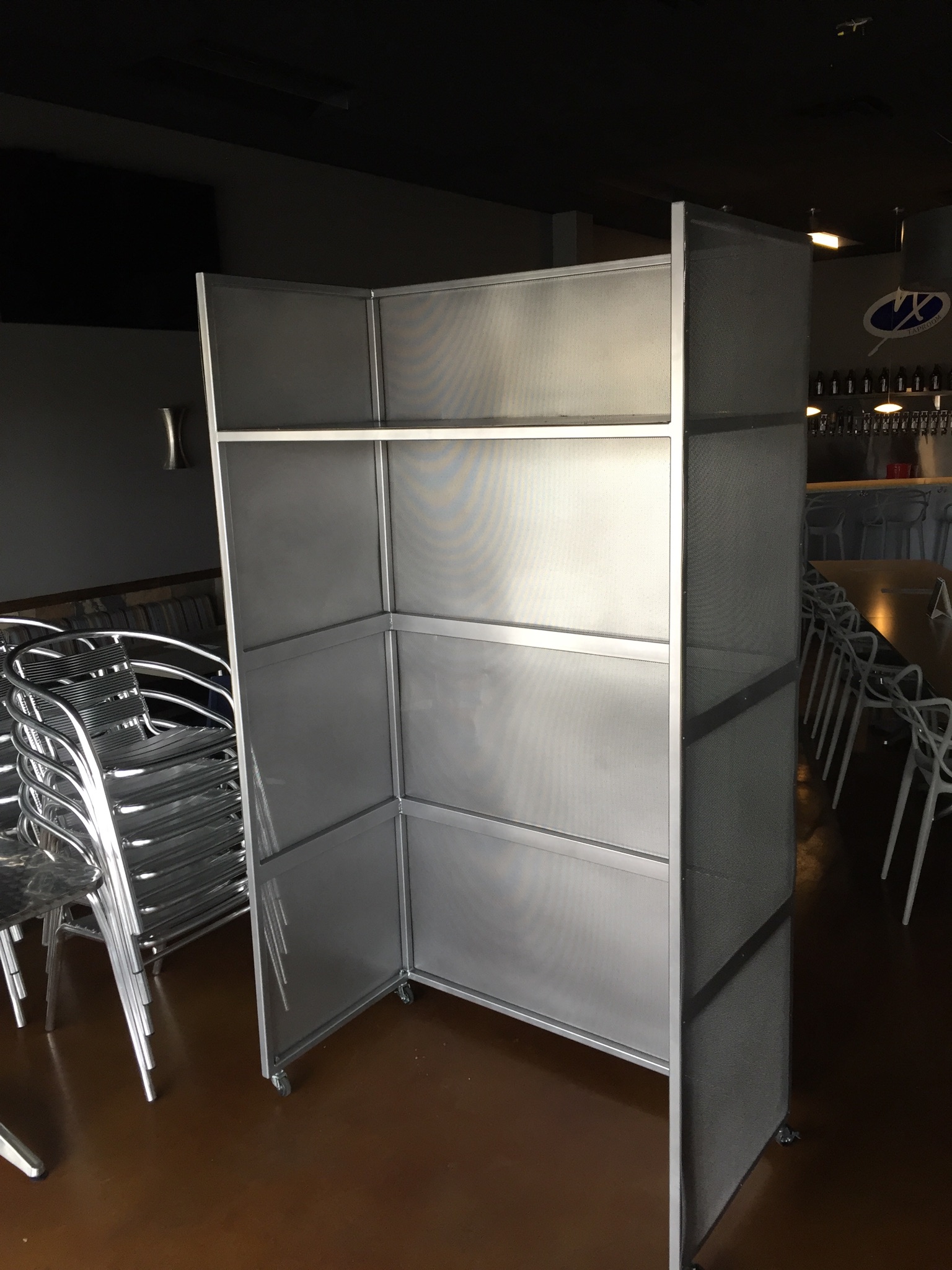
Then a third use of the perforated material came in the idea for a room-divider/hostess station.

img_2342

We needed a place to create a point of arrival. Whether manned or unmanned, this unit can have a chalkboard or other signage identifying special events or beer tastings, with a podium in front creates a translucent backdrop to partially cordon off the rest of the space until the customers are greeted and it also can divide the space for special events and table groupings. to accomplish all of those various purposes we designed it with heavy duty commercial casters complete with brakes so that it could be moved easily for its grand height and weight and  placed where needed for the best advantage.

Stay tuned for the complete un-veiling of this cool new interior in the coming weeks. And meanwhile dream of all the fun you can have with perf!


Designing with Balance and the Creation of the Can Wall!

Given the opportunity to improve upon a recently completed taproom, we instantly realized that painting the entire interior would be the best quick-fix. But that instant gratification was not enough to give this needy/hungry interior some meat to get it off and running.

Atmosphere in interiors is so much a part of the brand, the identity, and the success of a business. Popularity is based upon a certain comfort level, the clientele who gravitate there and the product that they are effectively providing. Whether that is food or drink or both, the atmosphere, (including lively enjoyment by clientele), service and food/beverage – all contribute to a successful establishment.

This does not mean high-end, elegant, fancy or even simply hip – although the definition of hip can vary from spare unpretentious and un-self-conscious funky, to studied funky, to affected stylized, to trendy hip and happening,…but, it does NOT always have to represent expensive interior design.

Yet a strip center generally lacks pizzazz and to install a taproom into that generic scene takes some creativity. That does not mean money – it means just what I said, creativity.  And creative interior design is all about ingenuity and balance.

Balance in interior design is key. This interior was filled with hard, cold surfaces – concrete floors, silver-grey laminate table tops, brilliant silver table bases, grey chairs, polished white granite bar top, silver laminate bar face, silver metallic wall sconces, glistening silver under-scaled chandeliers, white walls with cobalt blue accent wall. Brrrrrrr….makes me chilly just recounting the scene. And this was summer! Imagine this setting with crisp cold wind blowing outside and snow blanketing the mountain – not the place you want to gather for a beer in the wintertime!!

20160901_160828

To instantly soften and add warmth, we painted all walls a dark taupe. The soft, mousy grey/brown color pulled from the existing slate wainscoting to tie the two wall parts into a unified “read.” It gave the silver elements (especially the sconces) a contrast – which results in “interest.”

20161103_091444

The back bar was bland even with the new paint color and to add dimension and animation we mirrored the rear center section. This illusion added depth and interest to carry the ceiling through and add a mirrored storefront and exterior reflection which created an illusion of space and character where there had been nothing.

But unlike most back-bars, this area was conspicuously naked. A couple of stainless shelves housing stemmed wine glasses, and growlers felt spare. Plus the right side of the back bar was closer to the bar and the patrons were a mere few feet from a plain, painted sheet-rock wall. Yes, there was a large format TV screen above, but straight ahead – it was just blank wall.

In the wee hours of the morning, as I tossed and turned for a variety of reasons, I jumped from thought to thought, project to project, and personal concerns pelting all the while in a seemingly endless stream of insomnia. Yet, it was during the angst that the idea of the taproom being named “Silver”…silver…beer cans are silver/aluminum…beer cans crushed and nailed to a wall…texture, silver (theme of the taproom) interest – maybe?- all converged into one of those light-bulb moments of revelation.

And yet you might say – “silver…aluminum…more cold and hard. Why would this be an asset to this interior?” I felt that the texture and dimension of the cans would add more interest than the perceived cold and hard of them. The pockets of folded shadows and the relief off from the wall, paired with the over-all massive full-wall of pattern, would all contribute a positive design element to the scene.

As I pictured the wall of circularly flattened aluminum cans in my in my  mind’s eye (a tool that I employ daily while envisioning concepts and finished products well in advance of their fruition), I furthered the concept to encompass possible bar games. Yes, derived from this perfect grid of circular aluminum discs, I began creating games in my head. A bar is often animated by bar games and this was just another opportunity to interact using this unique wall-scape. Since that initial concept, I have created 3 different versions of the animated interaction in the form of games, on this fantastic Can Wall.

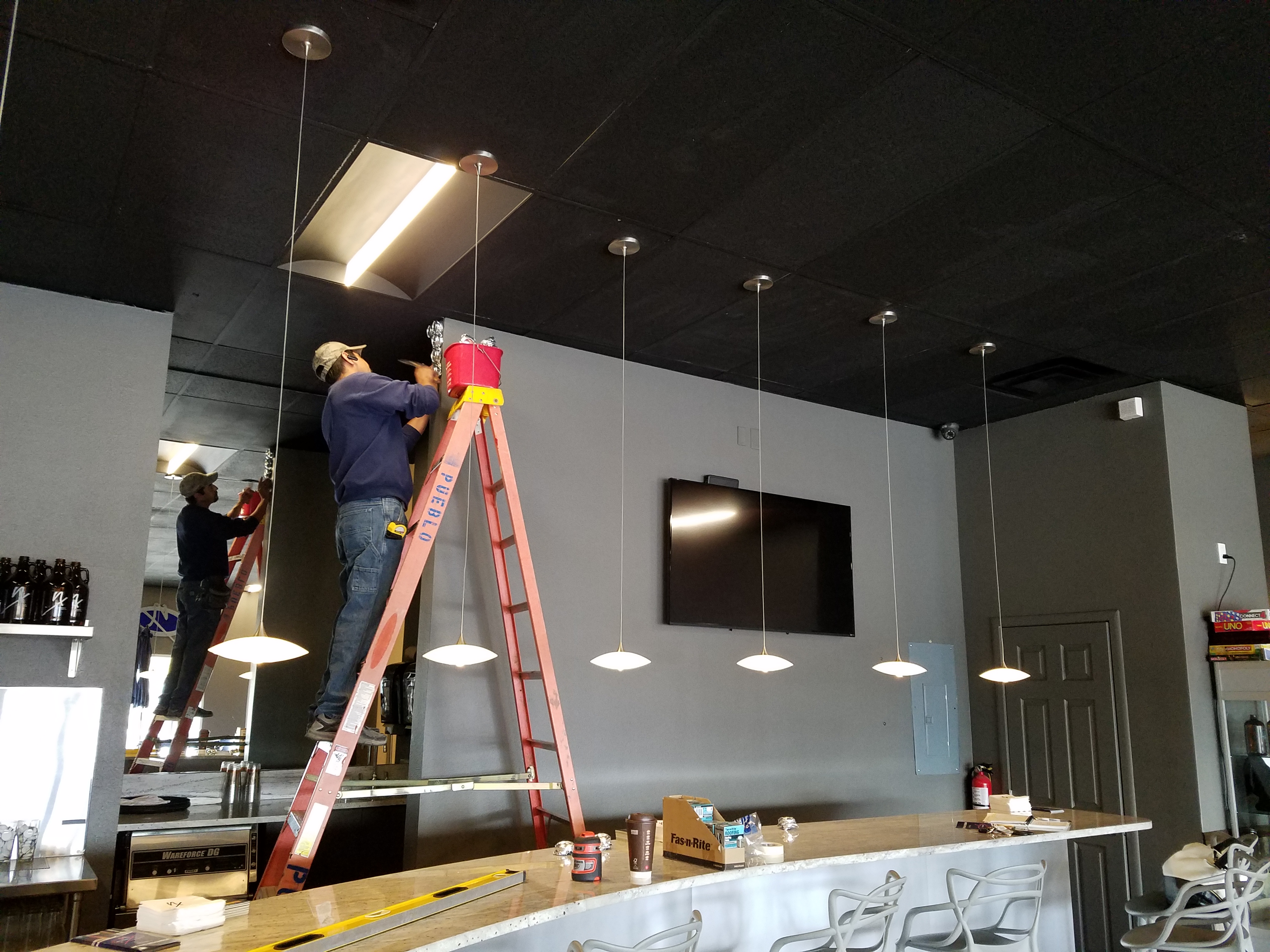
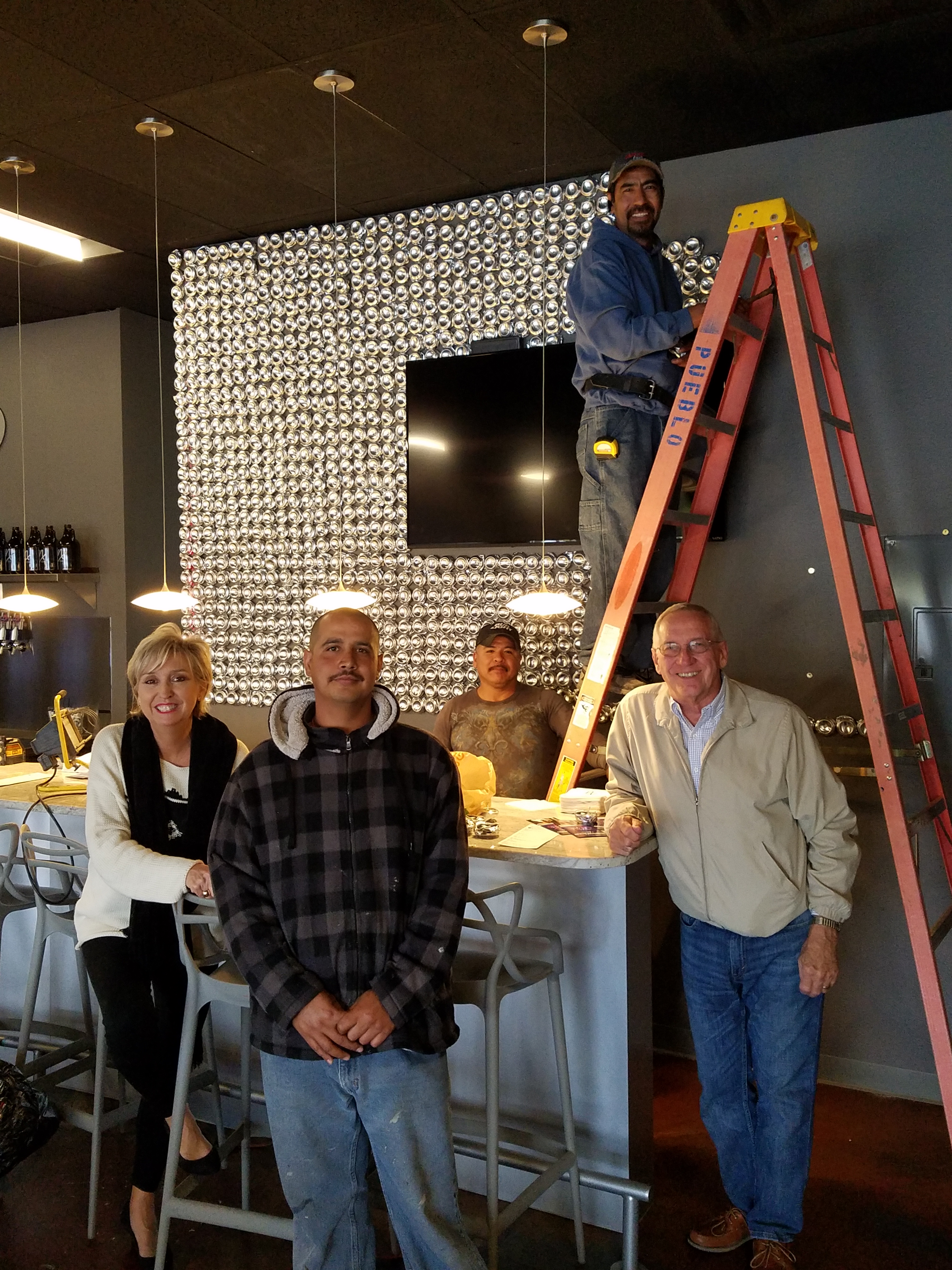
So with great patience, Enrique planned the layout with literally laser precision in a perfect grid. We counted the expected number of cans vertically and horizontally aligning with the brilliant red light beams. The previously crushed cans were laid out on a table – well a handful of the 3,200 that we had prepared for the wall. It was determined that punching the nails into the cans prior to installation would expedite the process of affixing them to the Can Wall. Labor intensive from start to finish, this wall was a great accomplishment for a devoted few.

20161103_094518

As the cans were laid out on the table – initially upside down exposing the crinkly open side (devoid of tops), I instantly LOVED the complexity of the depth, texture and shadows. A tight, random application of them would have resulted in a fabulously complex matrix of design. But upon closer inspection, the “texture” was really raw, with sharp threatening edges that were not possibly reasonable within close contact with people brushing by. So, lacerating the staff was not an option – even for a really cool textural metallic wall treatment. Perhaps this application will surface in a more appropriate location away from human flesh in the not-too-distant-future!

Like hubcaps fastened to the broad side of a country barn at dusk, the reflective silver discs pop in the flanking darkness.

20161104_140152


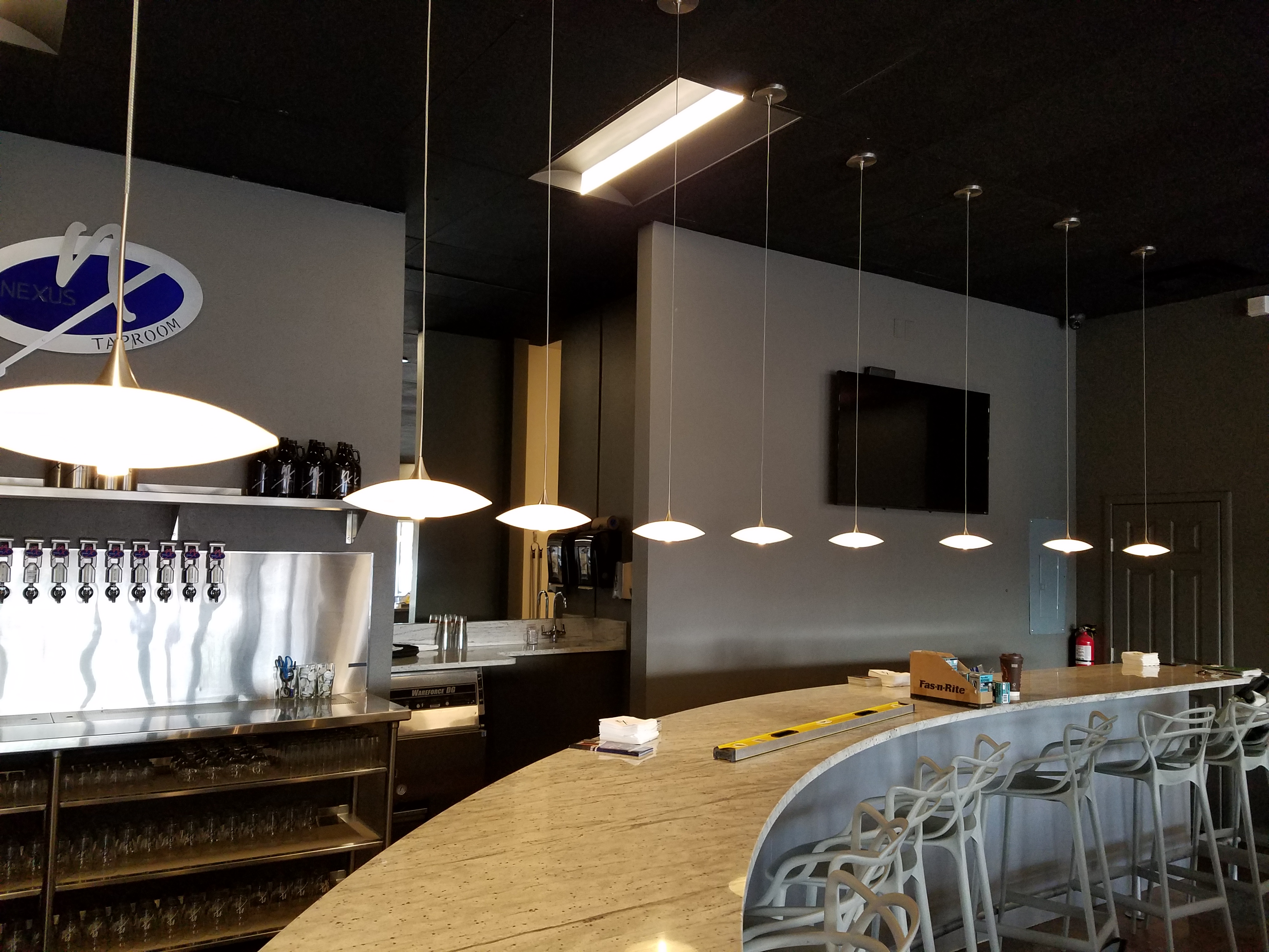
The process is nearing completion and I will save for another blog sharing the fun and games emanating from the Can Wall,  and the entire finished project complete with new warm white pendant discs over the bar and soon-to-install enormous perforated drum light fixtures suspended from the ceiling, over-sized photo images of the brewery behind the scenes and tantalizing signature dishes in the unique category of the Nexus New Mexico Soul Food.


Meanwhile, the take-away here is…balance cold and rigid with warm and textural – along with all the other opposites that attract – when designing be balanced.