The Drama of Dark

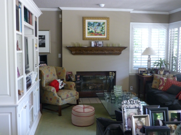
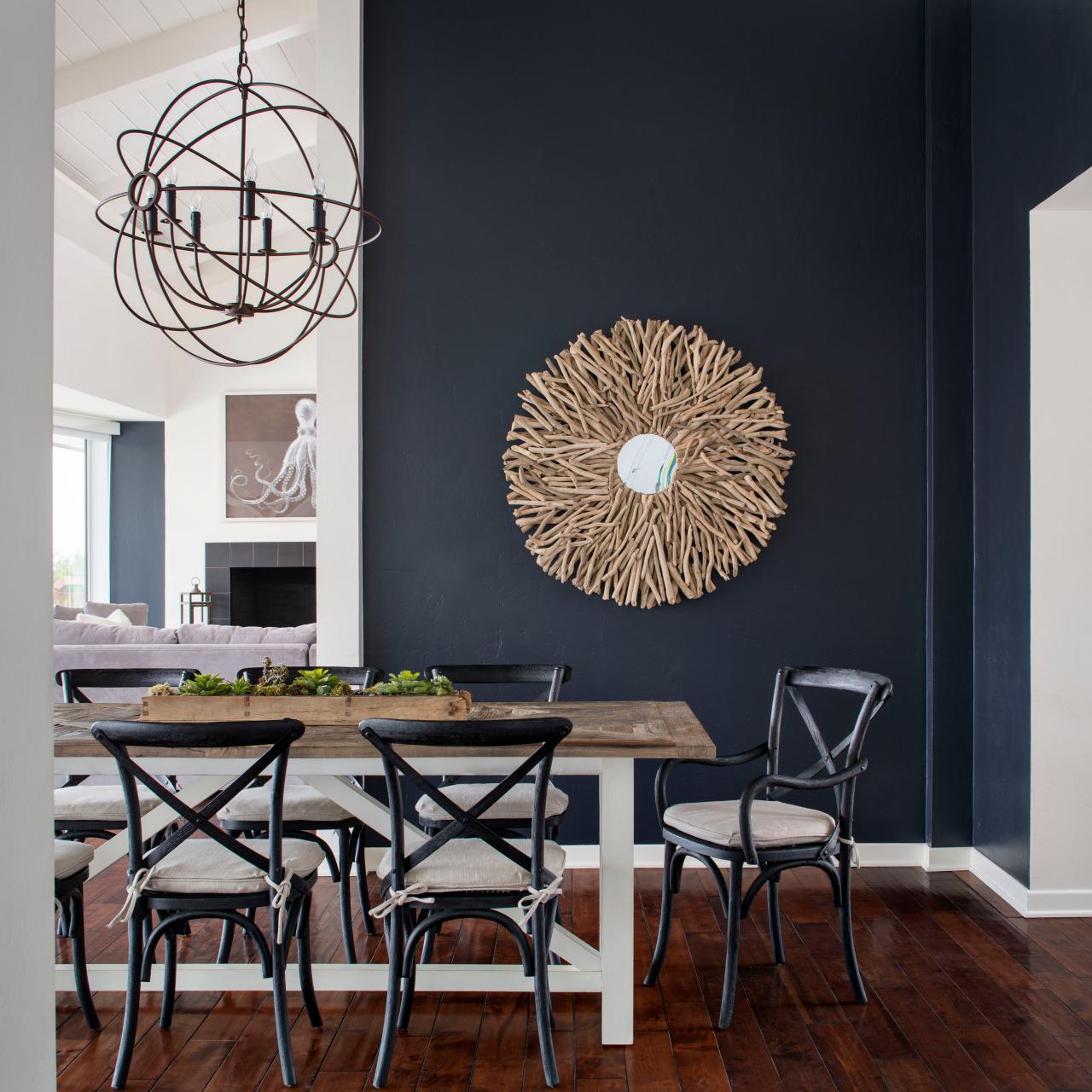
It seems counter intuitive – and that is why so many people ask me about the effect of dark wall colors – “won’t it make it look small?” and I assure them – “no,” and they are still not so sure. The most recent example of this was in an expansive home  where we were talking about accent walls – not willy nilly mind you, but in an architectural recess behind the stately china cabinet in the dining room and a doorway recess in another room. In this case, using neutral, warm grey tones – shades of same hue – value shifts for depth and architectural enhancement. Not yet painted, check out our website in a few weeks for befores paired with afters to see this example. Here though is another example Corine-Maggio_La-Jolla-Shores_1.jpg.rend.hgtvcom.1280.1280

The above photograph for CM Natural Designs by Chipper Hatter.

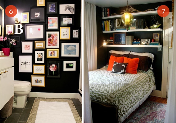
If a dark color was to make anything look small – why would one want to paint it in a tiny space? There is the more specific, counterintuitive question. The answers is that there are illusions of space. A dark color in a small space can actually read as though there is more depth to the space. Where it can be close and cozy, it is also a subtle enhancer of depth and therefore size. dark-room-collage3_large_jpg

So in another example currently in a state of remodel, a petite powder room previously papered in a dark green patterned wall-covering, now was being refreshed. There are no rules – it could have been bright, light, bold or dark…flat, glossy, organic or metallic – the possibilities are endless. But the previous rendition of this space was pleasing for its dark tones and therefore a decision was made to select a deep-toned paint for the re-do.

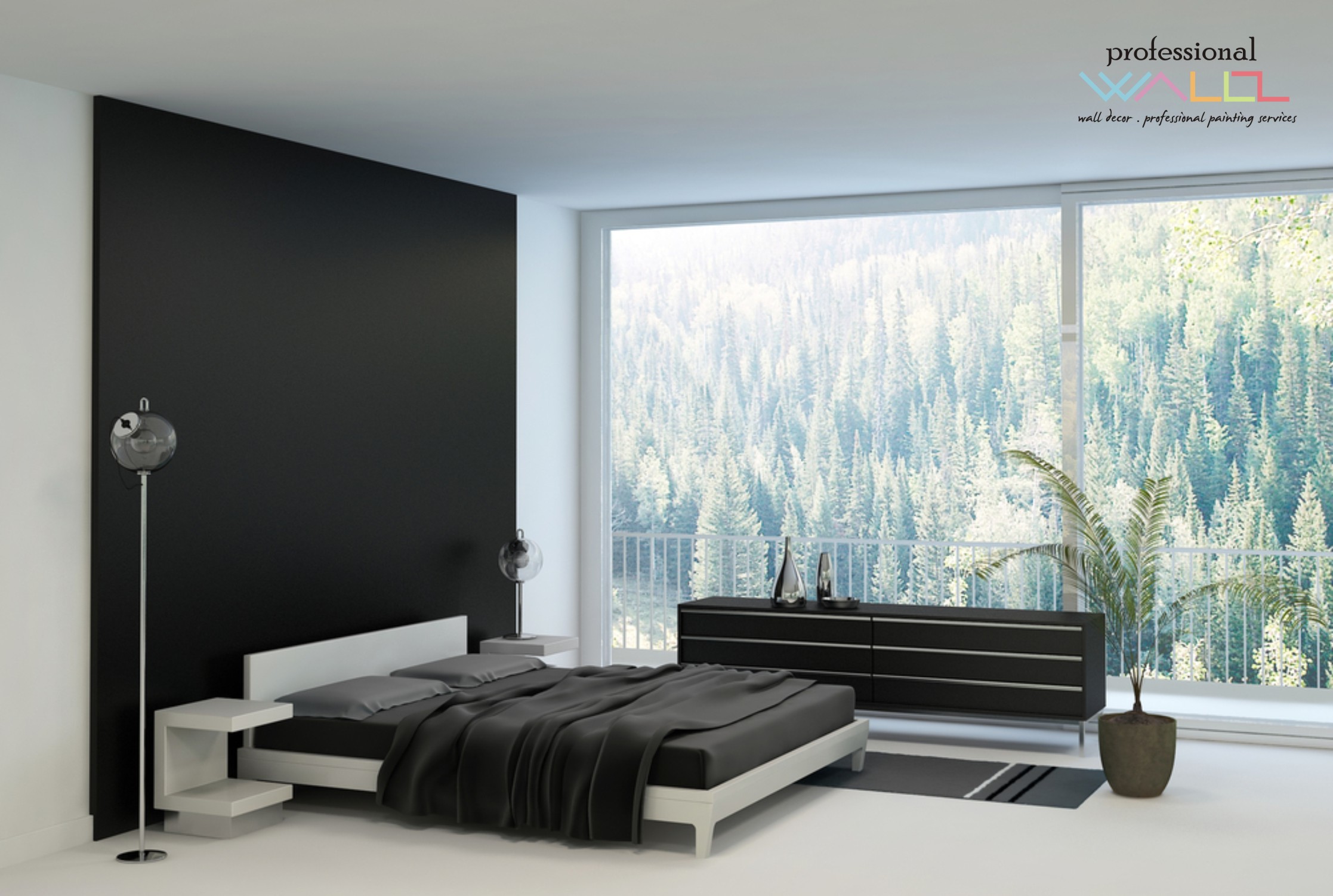
Dark colors, contrasts and lighting all can have dramatic effects on the perception of a space. Dark colors actually recede. Therefore, in many situations, if  the application of a dark color will convey a sense of depth and additional space it’s an intriguing experiment. Black-Feature-Wall-for-BedroomLike reaching into a hole or looking into space, and not seeing the boundaries well. It s a brain thing. If the brain reads dark, it suggests  a depth of space and therefore more than is really apparent. This is often used in ceiling treatments. Having a low ceiling appear higher, when painted dark, due to the illusion of depth.

OLYMPUS DIGITAL CAMERA

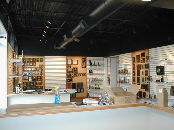
It is also effective to make something go away. An exposed mechanical or white lay-in acoustical ceiling can be institutional looking and not desirable in certain settings. Painting it black or another dark value of color, while sacrificing a bit of acoustical rating,  the ceiling will seem higher, less distinguishable and not as imposing upon the decor of the space.

So the petite powder room currently being re-floored with dark tile, re-painted with Benjamin Moore HC-166 Kendall Charcoal, new dark matrix granite vanity top and cabinet, new lighting and mirror…will soon be finished and we will post the drama of dark in before and after shots!

TRENDS – How Does One Decide?

TRENDS…we HAVE to have them…it makes us think, makes us shift…not to mention keeping viscosity in the economy. The shift is the element that moves the economy forward. Without that shift, we would be stagnantly content. And who wants to be stagnantly content – except the “Settlers” from the Direct TV ads?  DIRECTV_Commercial_2015_The_Settlers-520x245

Yet if you Google design trends they are all over the place. The intrigue is when they land on an actual theme that becomes THE TREND.

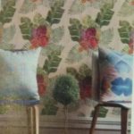
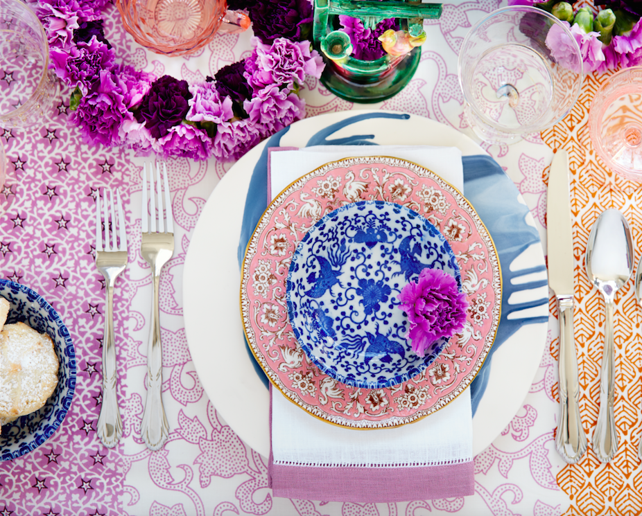
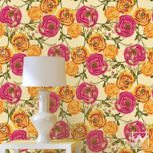
So as we advance into the new year and winter fades to spring – what lies ahead? I’m finding lots of nostalgia – features on milk glass and floral patterns and fancy geometric patterns, a recall to wallcoverings in floral prints and botanicals…Rose-wallpaper-Bari-J-WallAppeal-pattern-pink-yellow-zoom

The trick is how to invest in these elements and not have them become passé by next year. It’s all about balance – unless you have the desire and pocketbook to change out your interior annually! The desire to add something new to your personal spaces, or as my mother has always said “punch it up” is an art unto itself. How does one decide?

Information is so accessible. Access to ideas is endless. But HOW does one decide? How to make the decisions, the right combinations, what to keep and what to change…? The internet and TV…Anthropologie to Pottery Barn, Pinterest and beyond…You pin a gazillion things – but how do YOU decide?

But it gets kind of funny  – because for as many sites as you visit – there are oh so many professed “trends.” Therefore,  sifting through is the challenge and distilling what seems to take the lead. Pastels, patterns and florals is my finding…but is this just spring? Will this fade with the next season? Or is this a “look” that will last for a while? And do I embrace it all or pick and chose? How does one decide? Elle Decor 2016 design trends table

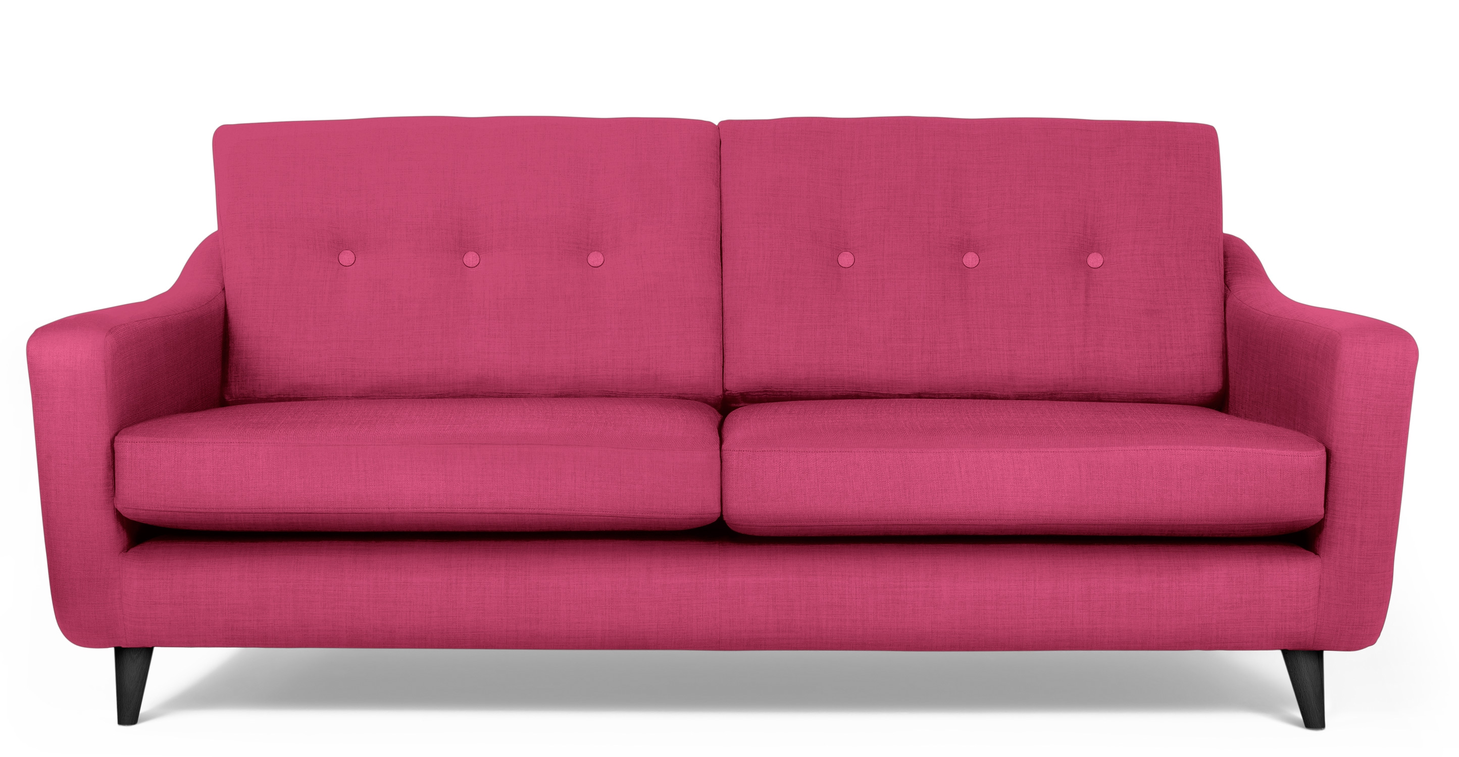
Pantone the color experts are even all over the place. Their designers were “inspired by the contrast of urban design and lush vegetation.” Whoa, really? That sure is a wide swath of possibilities!  And to say that these colors  are unisex is as though attempting to blurr the lines. A guy might wear a pastel pink, Rose Quartz, shirt – but would he upholster his sofa with it? Fashion and Home Decor often parallel their trends – and then they must veer off that same course for practical if not socially directed reasons.  Redford-3-Seater-Sofa-Peony-Pink

But the rationale is so amusing…for example,  Pantone writes: “Colors this season transport us to a happier, sunnier place where we feel free to express a wittier version of our real selves.” Yes, we all long to escape the doldrums of the short, dark, cold days of winter – hence the positive effect of transporting us to a happier, sunnier place is obvious – every year for that matter. That’s why tropical destinations are the prime vacations for winter getaways. Even most avid snow skiers manage to sneak in a run to the white sand beaches for some sun and fun alongside their plans to hit the slopes, get frost-bitten and nestle by the big fires.

I guess I’m looking for a more cerebral explanation for the color movements. And yet, maybe there aren’t any – so let’s not pretend then. What does it mean a “place where we feel free to express a wittier version of our real selves.” Wittier like a guy upholstering or painting his man cave with Rose Quartz or Peach Echo? That’s witty all right!!!!! That’s not the cerebral that I meant. But it is an interesting rationale. Color is giving us permission to express our REAL selves. I guess that’s one way.

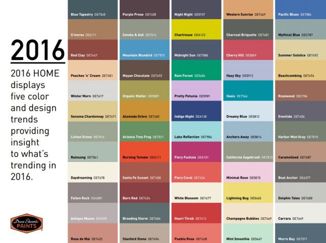
Yet, here are 5 different color series for the upcoming year…and as you can see – it’s all there – it’s all covered.  Pantone color-trends-2016


So as you climb out of the dark, cold recesses of winter and squint your eyes at the bright, colorful luminosity of spring in bloom, where will trends take you on your journey to “punch-up” your interiors?


Whales Up Close and Observations on the Spirit of Joy Series

How can I say that I am too busy to write this week? As Saturday approaches,  I realize that I have not stopped long enough to focus on any one thing, of the many that are bombarding me from all angles, about which I might formulate a theme for my story. I have to apologize, for once again, missing my Saturday deadline and hope that this was worth the wait!

Oh, to be so entertained by an onslaught of inspirational design elements as I have seen in the past few days only. And yet not only design – there was more. So I would like to start with an insert about Saturday as I (instead of writing my blog) took one last kayak cruise of the year.

A few people had gathered at the edge of the sand, pointing and remarking that they thought they had seen a whale. I looked in that direction and noticed that a few boats had gathered – often a sign that whales are spotted. I quickly pushed off in my single kayak through the gentle surf out onto the beautiful Banderas Bay and experienced for the first time whales from that most intimate vantage point. Up close and personal, it was thrilling to say the least. The beach was crowded with onlookers oohing and ahhing as they blew mists of water into the air and rose up from and back down, under the bay’s glistening surface. I paddled out and maintained a safe distance, but close enough to hear and feel the graceful power. Hump-backed and for which they are aptly named, the dark, sleek black bodies of the mother and calf were magnificent as they broke the surface and greeted the encircling boats full of eager spectators wanting to catch the show. And a show it was as the mama rolled onto her side and raised her unbelievably long, towering fin to slap the water sending spray high into the air. She slapped again and everyone thought that once was a rush and two was a treat and three and then four and I lost count at 30 times she slapped the water as though to say – “You want a show? I’ll give you a show!” She must have known that it was too dangerous to breach at that point, for a grand finale, as the close proximity of boats could have had deadly results. And I was right on the water with them. Unforgettable. The pity is that I was without camera and have only the memory of this life affirming event . An event that was awesome and outrageous and yet brought a surreal, serene sense of calm, peace and palpable, tingling joy. Friends on the beach greeted me upon my return in awe of what they had witnessed and welcoming me warmly, with enthusiasm, over my good fortune to have been out there for such an amazing display.

P1120423

This photo taken a week earlier – a bit choppier seas, with Tricia in the single and I with Victoria in the double, sets the scene of the Bay surrounded by the Sierra Madre range.

Now, having shared that incredible experience, I have decided to focus on one of the many design inspirations that I have encountered this week, but I hope you will visit our PATRICIAN DESIGN facebook page to see the collage of colorful art and texture that I have compiled to represent the many images that I have seen and offer to further stimulate your imagination.

https://www.facebook.com/media/set/?set=a.10153225877316619.1073741934.232272436618&type=3

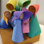
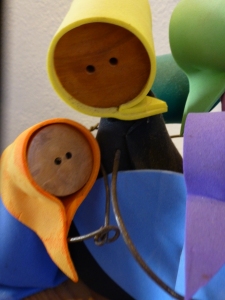
My focus at this seaside gallery of  delights today, as we  bring to a close a magical month,  is a collection of precious little figures made from synthetic foam, wood and steel. These humble little animations represent three shared events, a group hug, the “wave” at a stadium event and a gathering for solemn prayer lead by a figure of distinction – the one in the red scarf.


The spirit of collective participation is conveyed. The spirit of humble expression is conveyed. They present a sense of simplicity of some of life’s joyful moments. These simple figures are happy and content. They are intriguing and relaxing to study from many angles.

P1130108


Form and movement, color and  texture the Spirits of Joy by Federico Leon de la Vega are a wonderful representation of life’s simplest and most basic moments of sharing joy. To see art in such a distillation, such a unpretentious media, execution of mechanics and form is true pleasure. It is not overwhelming or startling, it is not outrageous or provoking – it is moving and modest.

I hope that they bring a sense of joy to the start of your week and create an indelible memory to which you can return in your quiet thoughts to bring you peace and joy.


The Colors of an Exceptional Cooking Class Cocina

To experience this glorious morning, on the open patio of a tiny commercial kitchen, in an otherwise residential neighborhood paralleling the river Cuale, in the very foodie coastal city of  Puerto Vallarta, is a treat beyond measure—but I will try to share. I will attempt to take you to this special place full of unselfconscious art and function.

The cobblestone streets are dusty and send fine particulates of powder into the atmosphere causing a fairy-dust-like twinkle in the bright morning light. We bump along in a taxi turning and curving along the circuitous route that surely would lead most to believe what they say—that “this place is so hard to find, it has to be good!!!”

The front is shut and  obviously closed for  business. The taxi driver brings this to our attention, “is closed” he says simply— assuming that he will be continuing along the bumpy calle along the rio back to the bustling scene of the awakening city and return us to our point of earlier departure. PA15821103517

“No,” we tell him “we’re taking a cooking class” “leciones en la cocina” we attempt to convey and with that he beams a broad smile and says “really?” and stops the cab along the wrong side against the opposing traffic on the little street in front of the café.

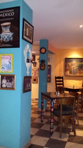
We notice Lola peeking through the door at us as she unlatches the locks motioning us through and welcoming us as we enter the quiet little checkerboard floored dining room. 20140125_204143At night this place buzzes with animated conversations and is alive with color and funky memorabilia, art and posters, collages of collectibles all on brilliantly painted walls creating an eclectic artistic interior of fun and festivity. But on this morning, the room is dormant save the three other guests waiting to participate in the morning’s class.
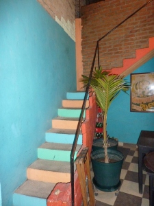
After brief introductions we are escorted through a doorway to a narrow concrete staircase. PVR 2011 after girls 1 050 Red Cabbage stairsDaylight streams from above and we ascend past more brilliantly painted walls to a second floor open to the sky onto a patio rimmed with potted herbs and flowering plants. P1120475 To the right we realize that the rest of the space is undercover, yet always exposed to the elements from that one open east-facing orientation.
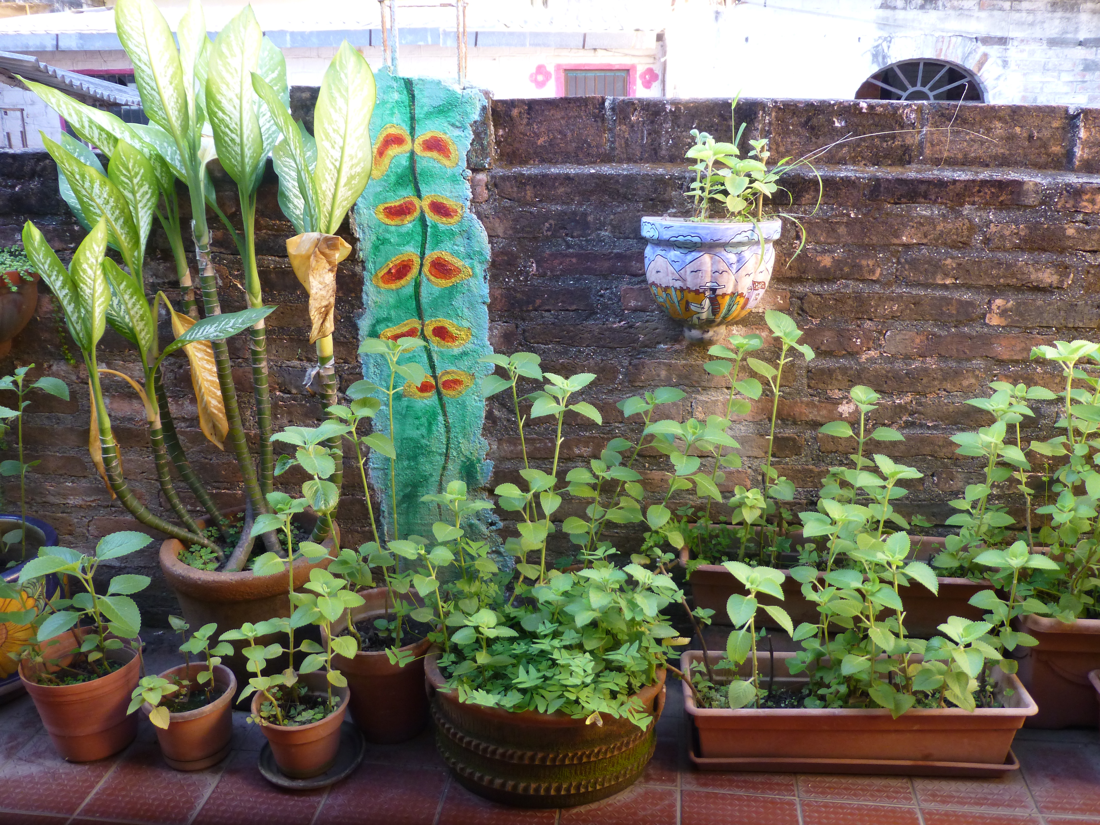
Inasmuch as I love cooking and eating and all things related to culinary pleasures, this is not the focus of this story, but rather, it is to describe this artfully inspired space and all the raw style and primitive grace we encounter in this wonderfully entertaining class of good and indigenous fresh foods and their fabulous flavors.

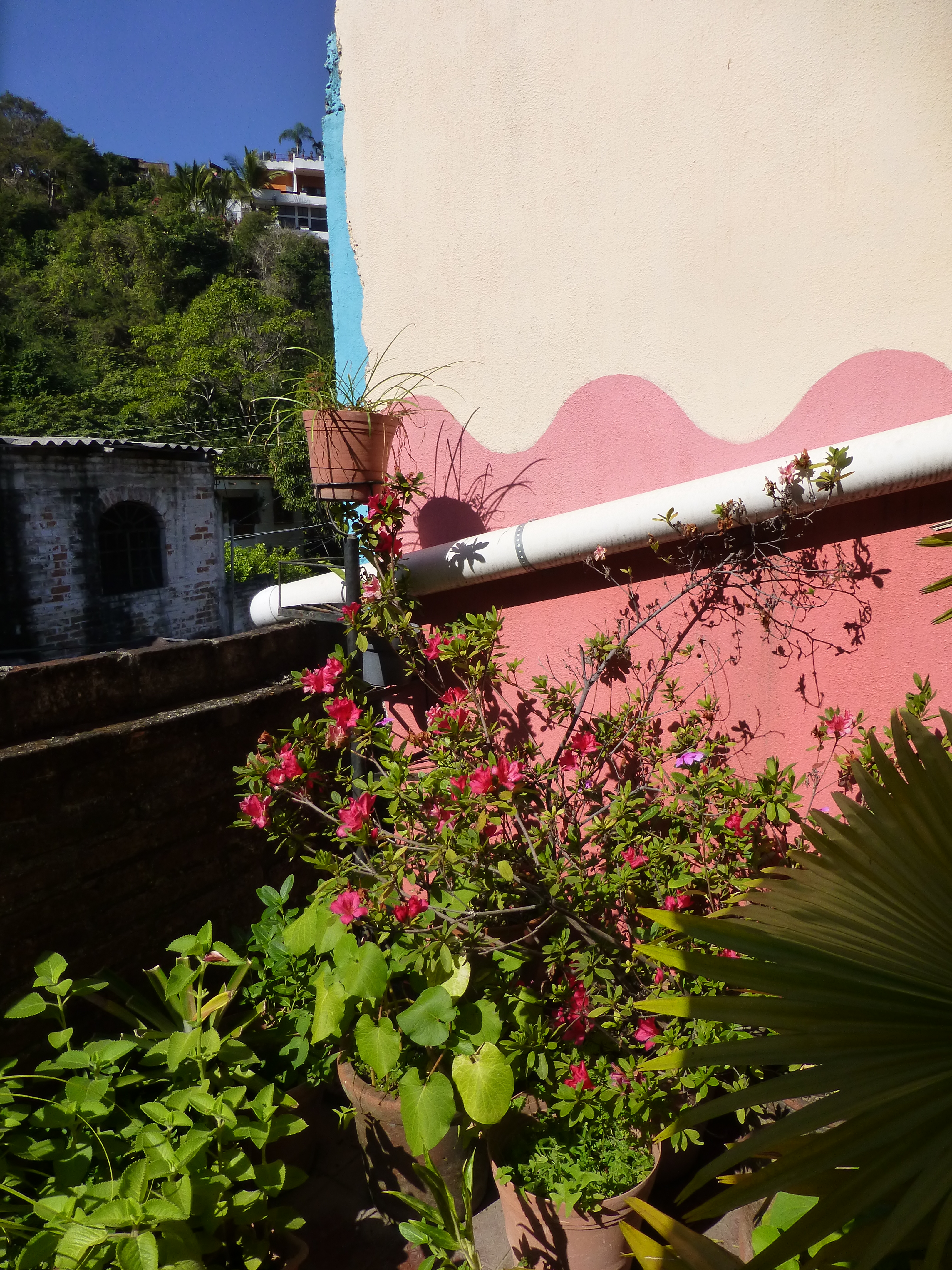
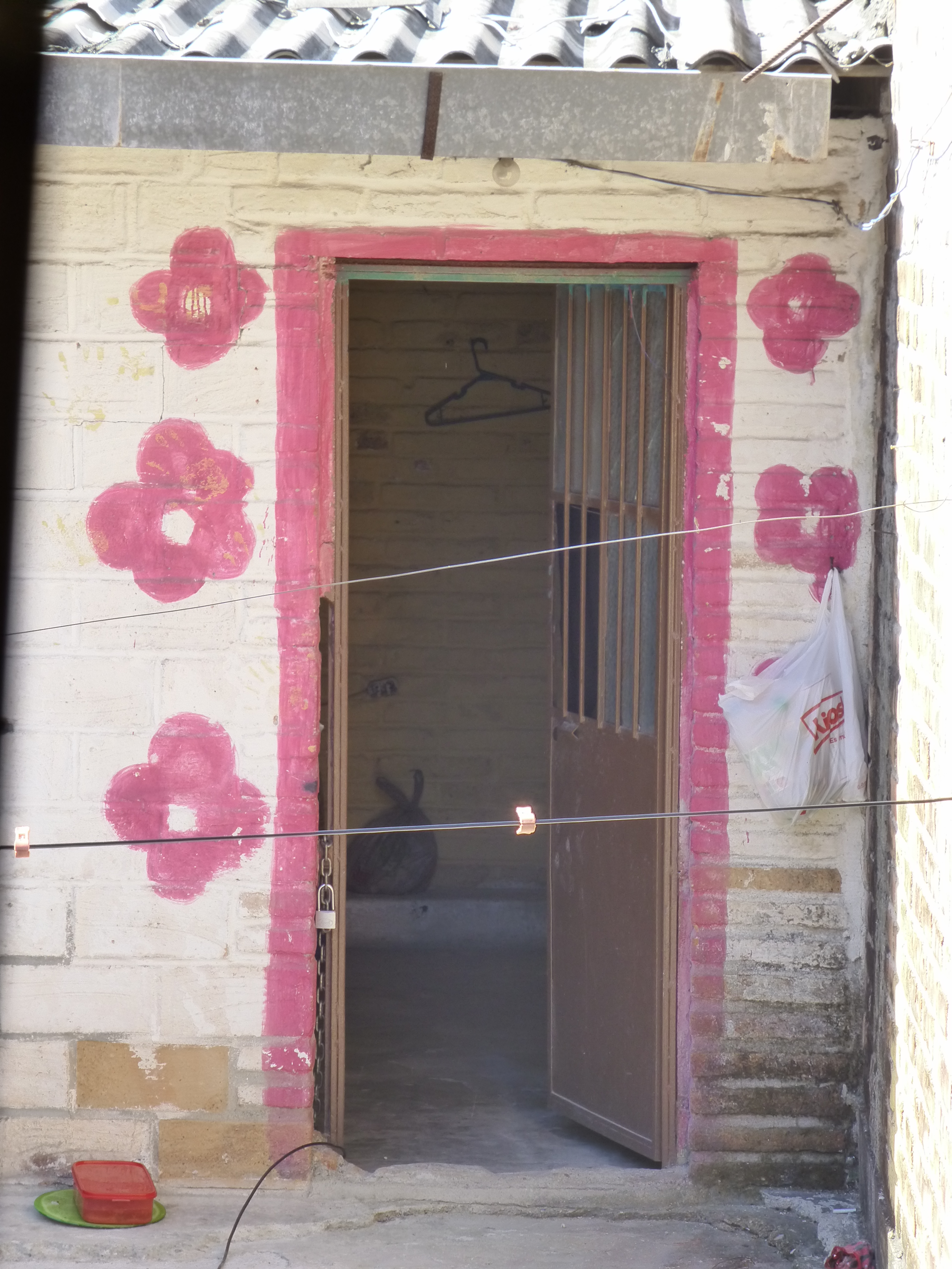
The space is charming and intimate and spotless. The colors are screaming from every direction including  a whimsical pink door surround seen over the wall of the patio. P1120522 The surrounding area is quite run-down and depressed, yet this jewel of a creative kitchen space shines boldly amidst the  impoverished surrounds. P1120524

The sky is perfect blue and sharply contrasts against the wavy pink paints dividing between pale and happy bubble gum of the stucco wall. A functioning drain-pipe of clean white PVC bisects the wall beneath which is a profusely blooming rose-colored azalea in a clay pot. P1120523

Panning into the covered portion of the space, the radiant coral color wall wraps to the back and transitions with gracefully wavy detail to a paint remarkably resembling the sky blue—of the actual sky—that we encountered out front which slams into a dazzling yellow-gold wall half painted and half tiled with the same luminous yellow color. And I have only described the backdrop!


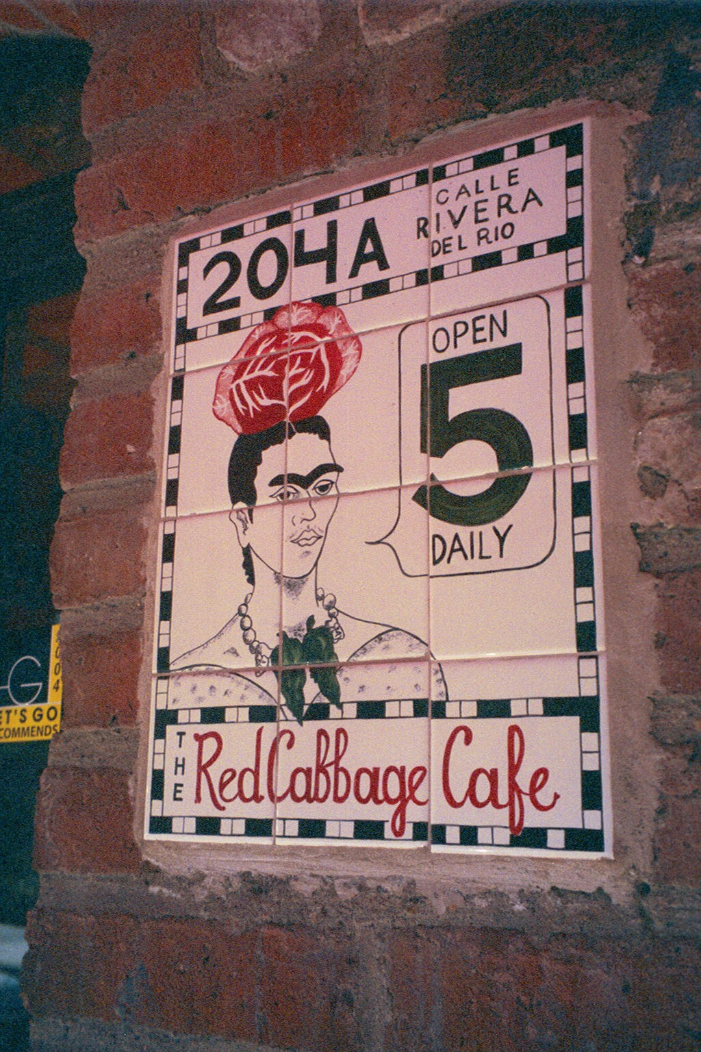
Against these boldly painted and tiled walls are layers of other things that add even more dimension and interest to the kitchen. Blue and white tableware, glazed clay vessels, and a mysteriously faded poster of Frida Kahlo. More of the sky-like blue is hanging in the form of various sized and shaped enamel cooking pots on the coral wall.


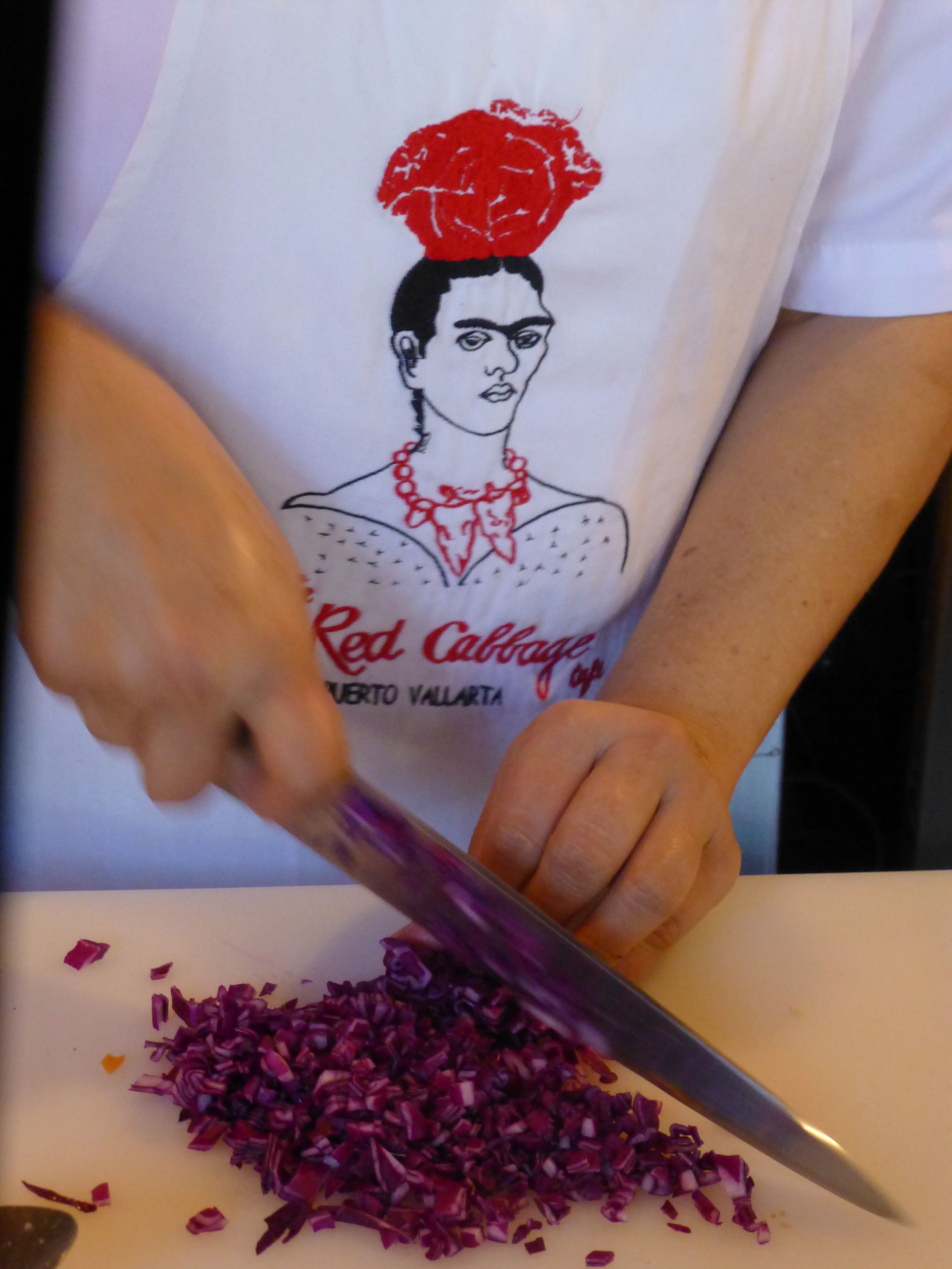
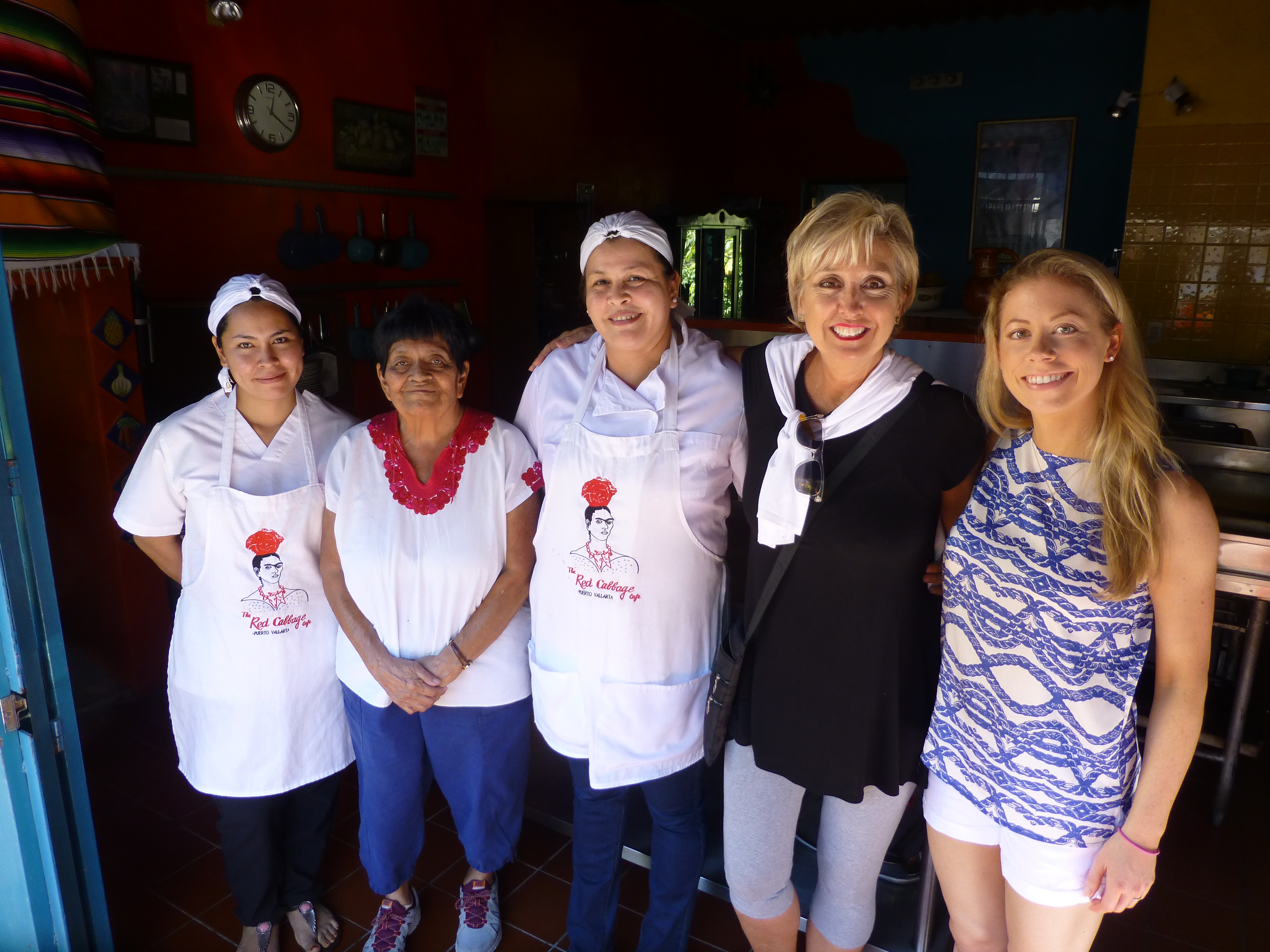
The crisp white aprons of the two chefs pop against the background of multi-colors branded with the embroidered red and black logo of Frida with a red cabbage balanced atop her head. P1120487

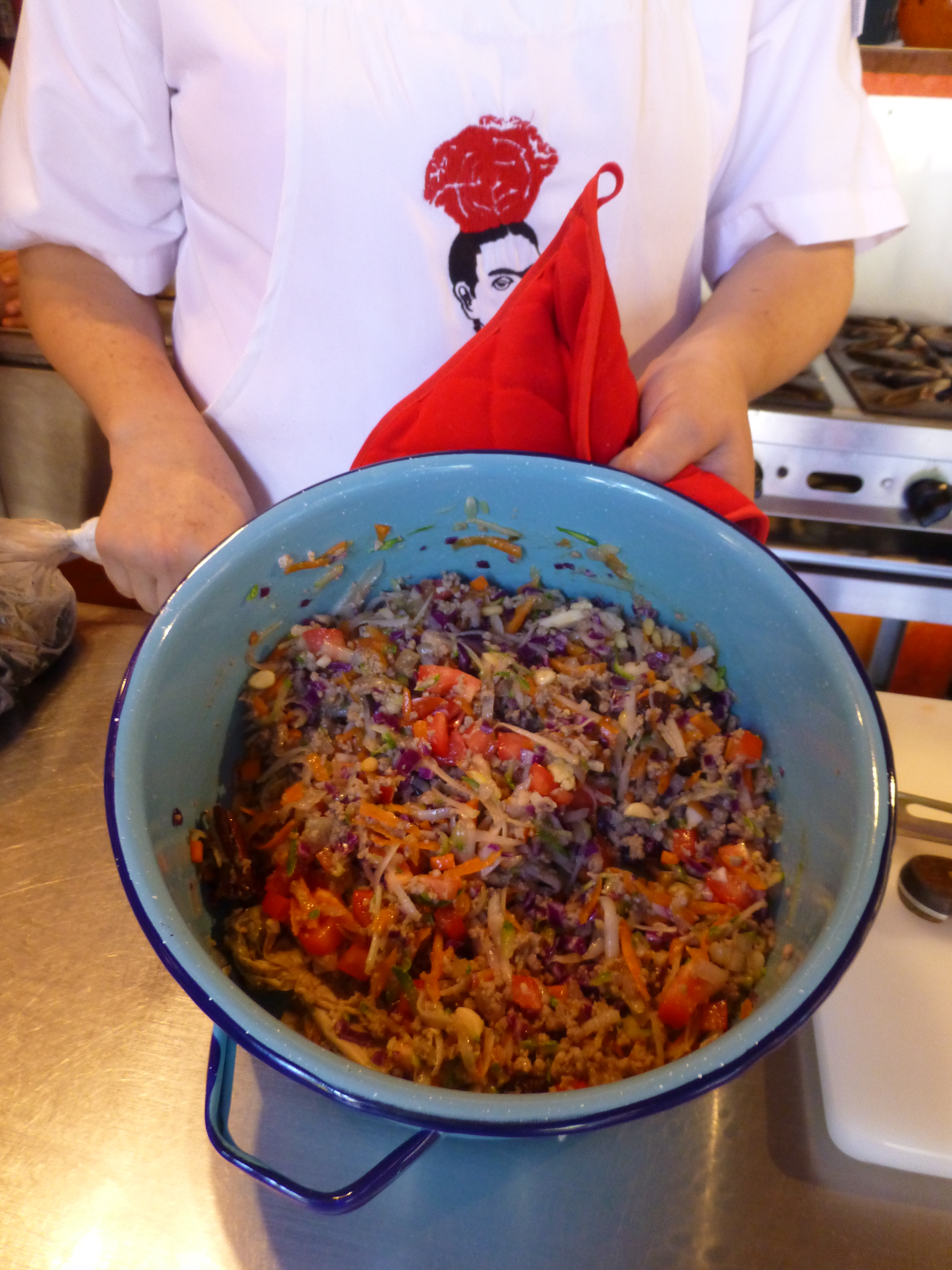
It seems from the murmurs coming from the eager students that this enchanting environment represents the promise of a flavorful feast of color and texture. The food matches the interior. The stuffing for the dark rich green roasted poblano peppers is a colorful collection of shredded carrots, red cabbage, zucchini, tomatoes, raisins and pine nuts creating a seemingly woven fabric of colors and texture. P1120491


The finished product, Chiles en Nogada, represents the Mexican flag of red green and white. Plated here on red glass for an artful presentation. P1120518

Myriad handmade condiment dishes and traditional serving pieces contribute to the collection of color we are experiencing in this spectacular sensory bombardment. And I mean that in a really good way. The intensity of the colors and layering, the structure and accessories right down to the food and its presentation results in an artistic expression that goes way beyond the sterile experience often connected with the laboratory of a commercial cooking experience.


So we say—why be status quo when you can be individually fabulous, cooking and creating in an unconventional environment that reflects the animation and joy of the flavors that comprise the artful meals?! Thank you Lola for imagining and realizing the Red Cabbage and bringing so many artful, entertaining years and delicious meals to the community of fortunate residents and happy visitors—happy that they were able to find the place!P1120530


National Poinsettia Day and Cuttings to Carry into the Future

Thank you Joel Roberts Poinsett for bringing this brilliant red and green explosion of color and such a perfect plant to represent the colors of the Christmas season to our northern climes! Upon learning that today was National Poinsettia Day, I set forth to learn a bit about why…P1110598

You too can Google it, but in a nutshell, back in the early 1800s, this observant amateur botanist was our first Ambassador to the new Republic of Mexico! Not to mention, his day job was that of a doctor and a soldier! Busy well-rounded guy it seems!

Poinsett sent cuttings of this spectacular and exotic flowering plant from where he was visiting in the Taxco region of Mexico, to his home in Charleston, South Carolina. Once he returned to Charleston, he spread the joy and sent other clippings of his magnificent discovery to friends including a Mr. Buist in Philadelphia who gave a piece to Mr. James McNab who took it to the Botanical Garden of Edinburgh, Scotland founded in 1670. (From “Paxton’s Magazine of Botany” 1837)

The initial botanical name Euphorbia pulcherrima was actually assigned by a German botanist, Wilenow, in 1833, but within 4 years it was renamed Poinsettia Pucherrima by William Hickling Prescott a historian and gardener who had been asked, by someone in authority, to rename it. He did so by selecting to honor Joel Poinsett for his numerous achievements in both government and horticulture.

This dramatic flowering plant comes in many colors – the familiar and original red to creamy off-whites, chartreuse, pinks and various variegated versions such as this fabulous marbled specimen called strawberries and cream.strawberries n cream poinsettia

Poinsett retired from his career in public service as Secretary of War in 1841. He became one of the founders of the National Institute for the Promotion of Science and the Useful – which later became the Smithsonian Institute. I was born in D.C. and raised inside the Beltway and never knew that the Smithsonian which was a memorably mandatory field trip nearly every year of my childhood, was originally named the wordy National Institute for the Promotion of Science and the Useful – but it certainly describes it all in one fell swoop!!

There are many legends and folk stories centering around this “flor de Nochebuena” in Mexico but the thread of this story that has personal interest to me is that the same poinsettia cutting taken to Edinburgh by James McNab is still producing and flowering annually in the Royal Botanical Garden in Scotland to this day.

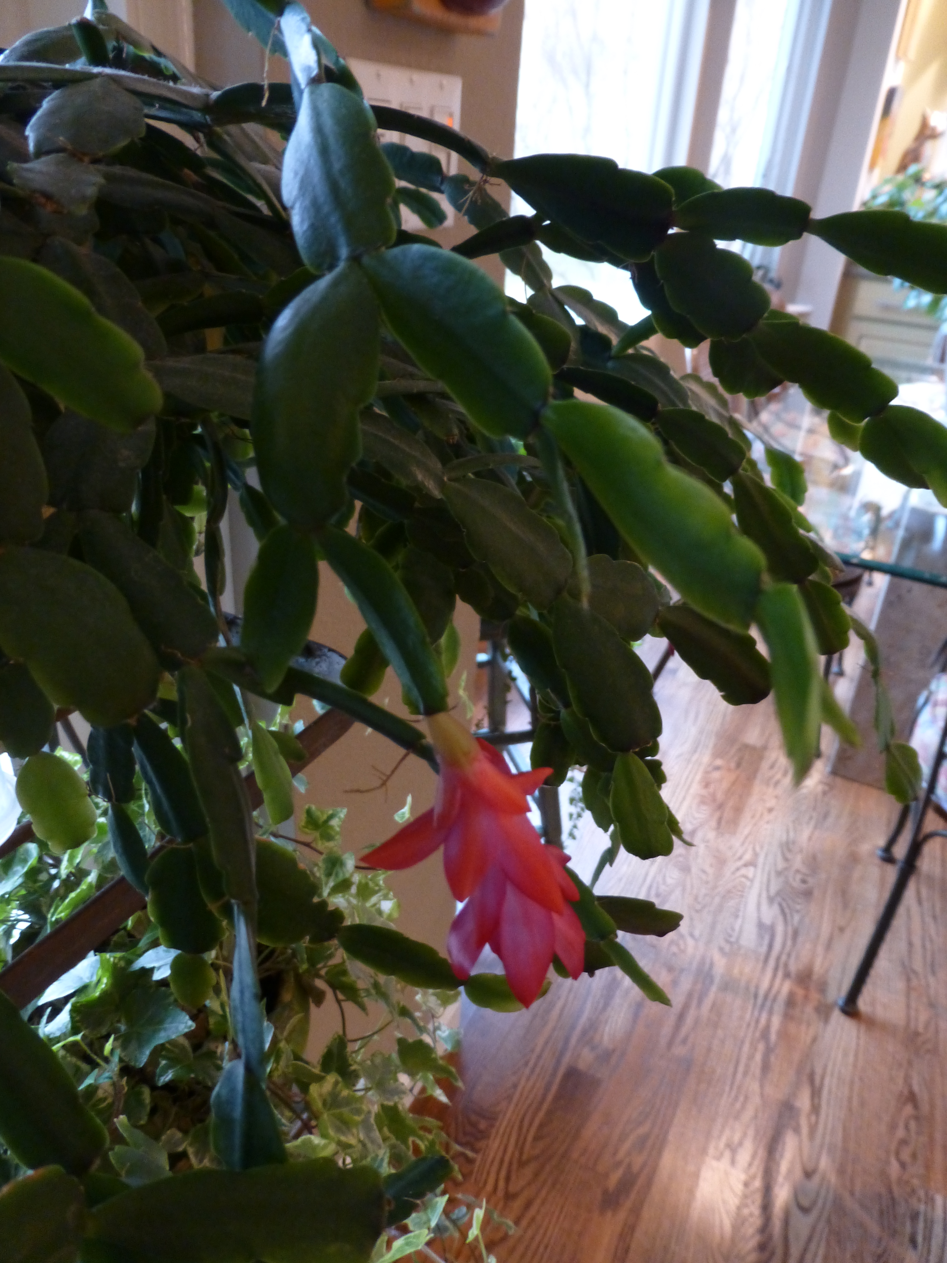
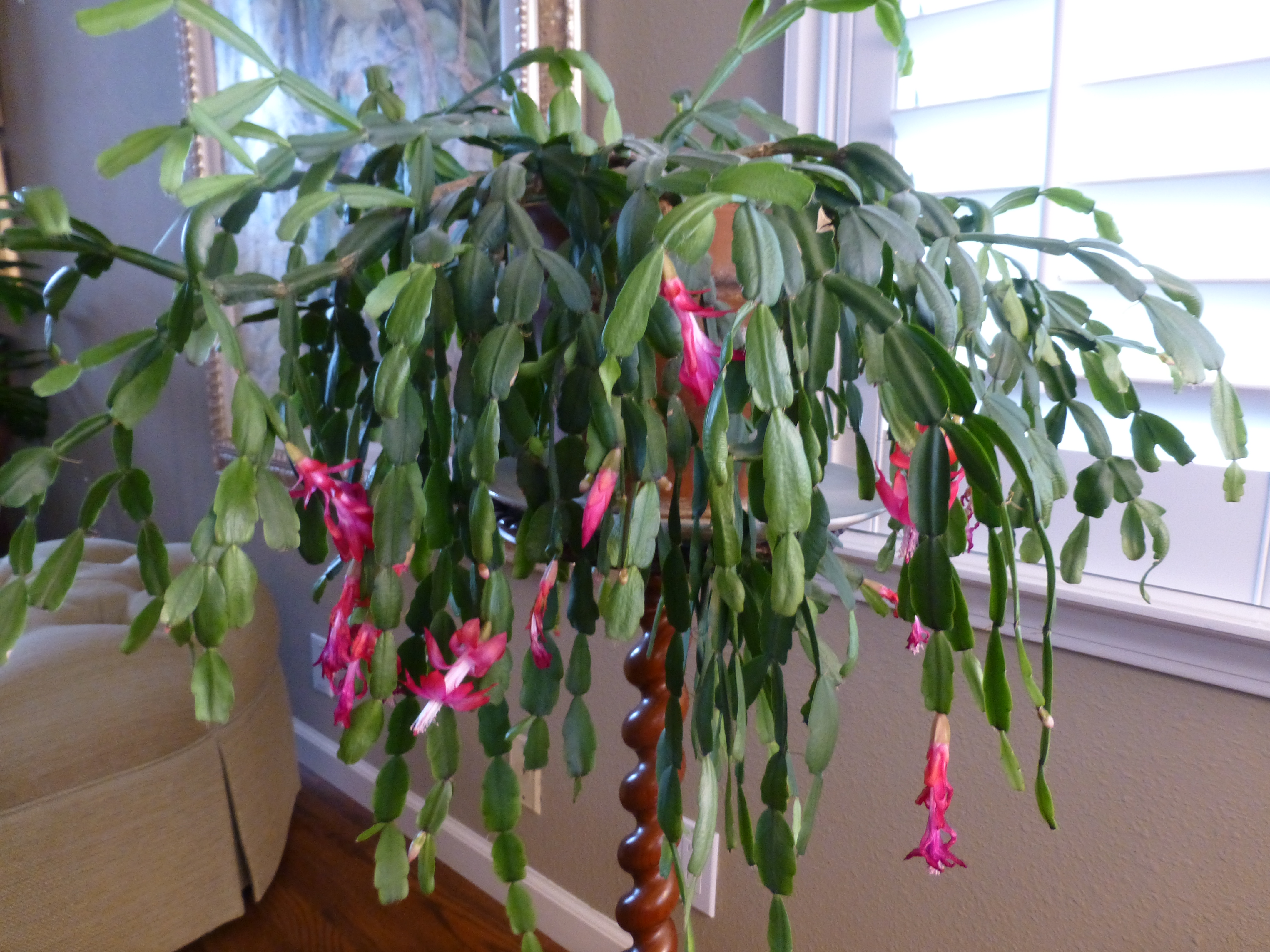
As I read this history, I was excited about this remarkable tracing of the original cuttings.  In our family we have what my grandmother , Dee Dee, always referred to as “the family cactus.” This rounded, smooth leafed variation (some have pointy, spiked leaves)with its hot pink blooms is our cactus.P1110601

Dee Dee, Anna Ives Wagner, was born in 1892 in Youngstown, New York.  She arrived at our house to live with us in the late 1950s. She brought with her a very special plant. It was a cutting off of the original plant that was in her ancestral home – the Root Home, Twin Pines – 830 River Road – then Main Street, Youngstown.

Dee Dee remembered that plant from her childhood and had heard from her mother and aunts that it was there in theirs as well – which without complicated math puts it in the house since the mid 1800s. Unfortunately we don’t know when it started…but the house dates back to our great, great, great grandfather, Dr. Benjamin Root c.1840. The house stayed in our family, passing finally to my  grandmother’s aunt Helen Root who lived there with an original cutting of the plant until the 1950s when she moved to Elmira with her niece and her husband, Edith and Ray Hulbert.

We grew-up with the family cactus bursting forth with wild fuscia blooms every fall into winter. It was always an exciting and exotic flowering extravaganza in the colder dark months of the season. It brought a sense of life, growth, and color that was a spectacular contrast to the otherwise drab, dull, dormancy of winter.P1110609

I guard my plants, given to me as a cutting by Dee Dee when I first moved to New Mexico, with great responsibility and appreciation.

Last year my Mother’s large family cactus withered before our very eyes…she was so protective of it that she perhaps neglected to give it new soil and nutrients instead favoring watering a bit too much which  resulted in its demise. As she witnessed and worried about the failing plant, we carefully cultivated clippings and as weak and depleted as they were – nurtured them in water losing a couple but saving a few so that they now are flourishing in a clay pot in a window with the soft daylight of  northern exposure displaying a resiliency, hope, and celebration of life that continues to greet each day. Perhaps  metaphors for procreation, family traditions, aging in place…

My mother is 93 and her mother, Dee Dee, lived to be three weeks shy of her 101st birthday.

Joel Poinsett died on December 12, 1851 at the age of 72 – one hundred and sixty four years ago today! Happy Poinsettia Day!! Merry Christmas Joel Poinsett!


Open Your Cupboards to the Eclecticism That You Have Collected

When I first moved to New Mexico I was enchanted (well…it IS The Land of Enchantment) by so many new things that were woven throughout people’s homes, flea markets and quaint little shops in various pockets of town. I began to collect and seek these vessels and fabrics to incorporate into my new world. Interestingly, these treasures were not and still are not featured – much less celebrated, in more trendy, stylish shops that might do well to focus on these regional functional art-forms as a means to honor our unique multi-cultural influences. We, at PATRICIAN DESIGN, enjoying offering interesting hand-built pieces in our shop for a truly one-of-a-kind collection of home decor, wearable art and  unique gift items.

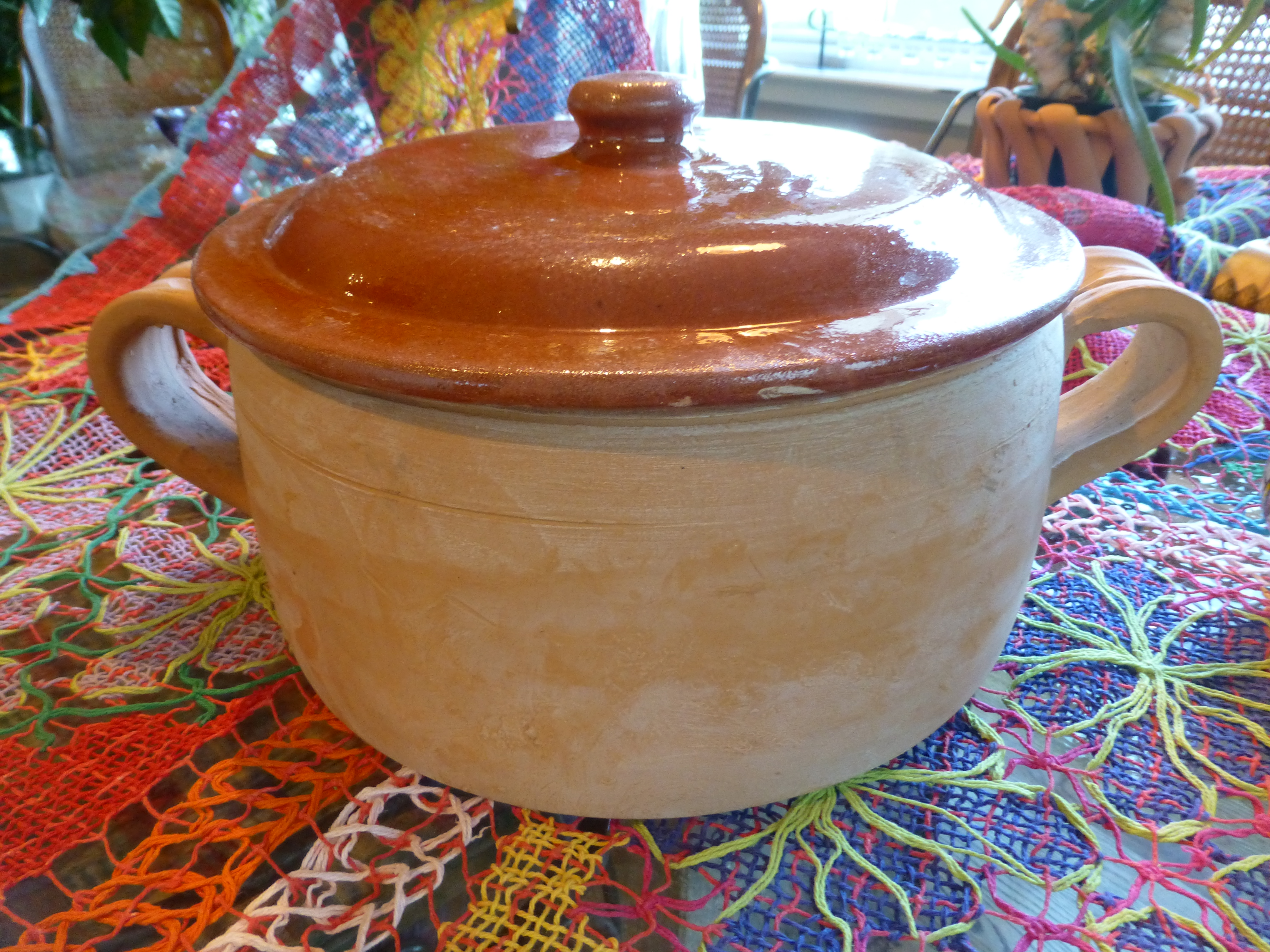
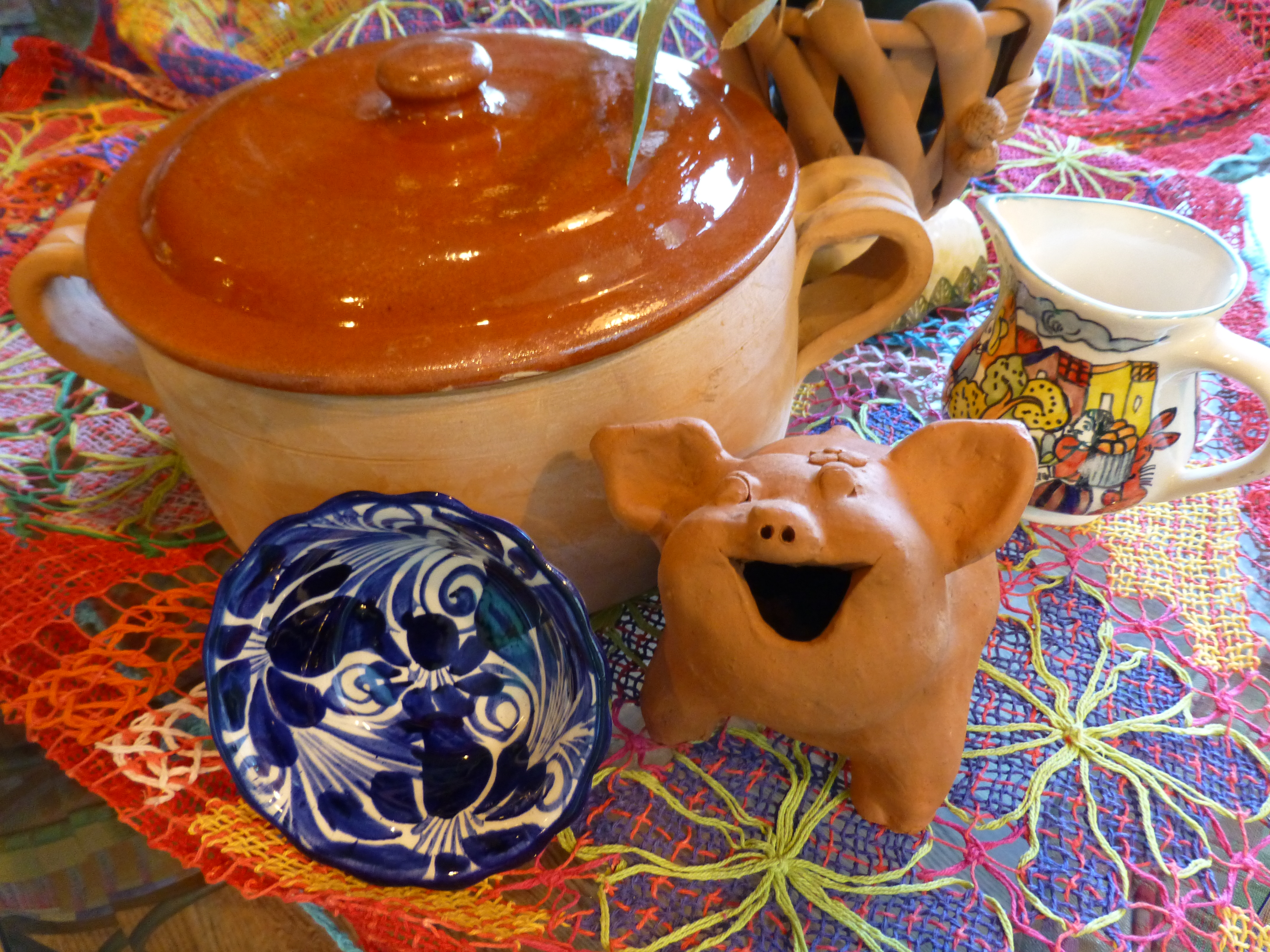
The first piece of this new influence I bought back in the late 70s. It was this fabulous squat casserole,   P1110590   to which  I have added many various colors and textures that I enjoy using throughout the year.  Christmas is notoriously red and green accented with the bling of silvers and golds. Chanukah is blue and white…but I enjoy all of the colors to celebrate every occasion! So  the many hues of the season can be found in the collection of colorful containers and serving pieces, accents and textiles that I often meld to create the festive celebration of the seasons. P1110594
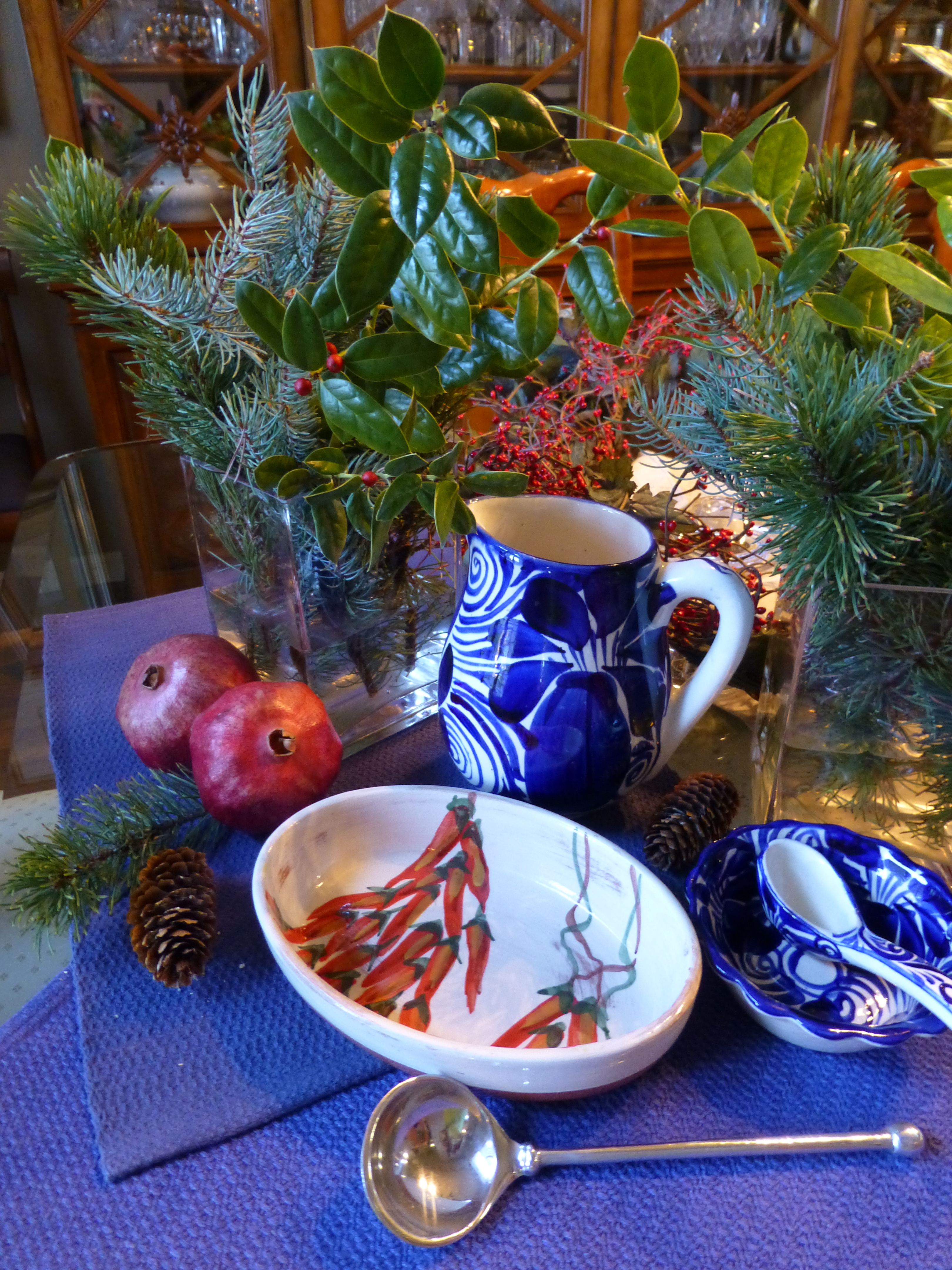
Everyone who knows me – both clients and friends – know that I love color, pattern and texture. I love contrasts and combinations. Design by eclectic assembly of things that you love and that evoke memories, things that make you smile and feed your soul, results in the most successful and interesting design.  The rich color of terracotta and history of it as a medium for making cooking vessels goes back to Old Mexico and Spain across the water. Spanish terracotta is steeped in centuries of tradition and the Mexican versions closer to home are similarly beautiful and generations old. Other cultures such as Italian and Portuguese also have crafted beautiful terracotta – as is often true, the common features, textures, and colors all share a common denominator of warmth, hand-built art, craft and natural, raw beauty.  P1110596  Notice here, the brilliant colors and intricate open-weaving of the Brazilian lace.
Raw clay colors contrasting with brilliant and rich glazes, fabulous fiber art, wood and other organics all radiating the joy of life and the festivities around food, friends  and family of these varied cultural traditions and  rich indigenous heritages. Functional art at its finest – most honest and humbly celebrated in useful daily pieces – show them, open your cupboards, let them sing.

Holiday Tablescapes KISS Theory!

For the fast switch , KISS is the name of the game – keep it simple and sensational! The Thanksgiving weekend creates a great opportunity to get a jump on Christmas. Yesterday neighbors were out precariously placing lights along their rooflines, lining walkways and blanketing shrubs. We noticed this as we were out walking, observing, not quite ready to dive in to the next holiday ourselves.

But I did think that this was a great opportunity to illustrate a continuation of my favorite seasonal design practices and that is going outside to nature to get inspiration and actual elements for my creations. And the most remarkable aspect of this exercise is that it is all in our own yard. Look around and you will be amazed at what is out there!

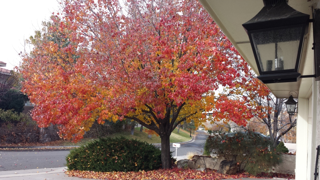
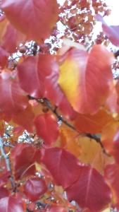
For Thanksgiving I had been inspired by the blazing colors of the Bradford Pear that was – is still – screaming with color at the front of our house. 20151126_093537The rich maroons transitioning to corals and rosy tones into brilliant golds and even bright yellows  were irresistible. It’s similar to a maple tree with its magnificent range of fall colors but with precious little round heart-shaped leaves. 20151126_093558
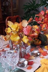
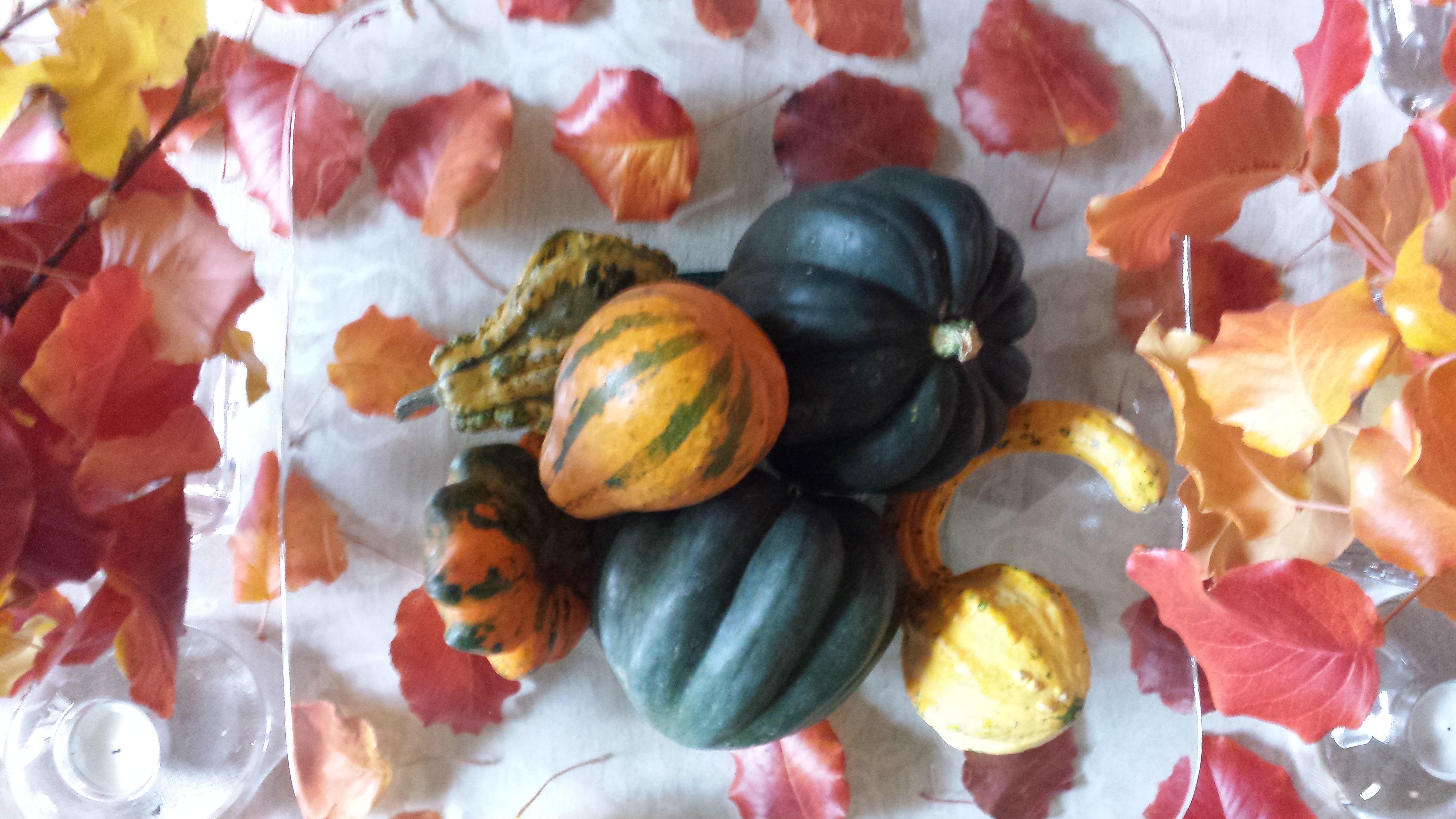
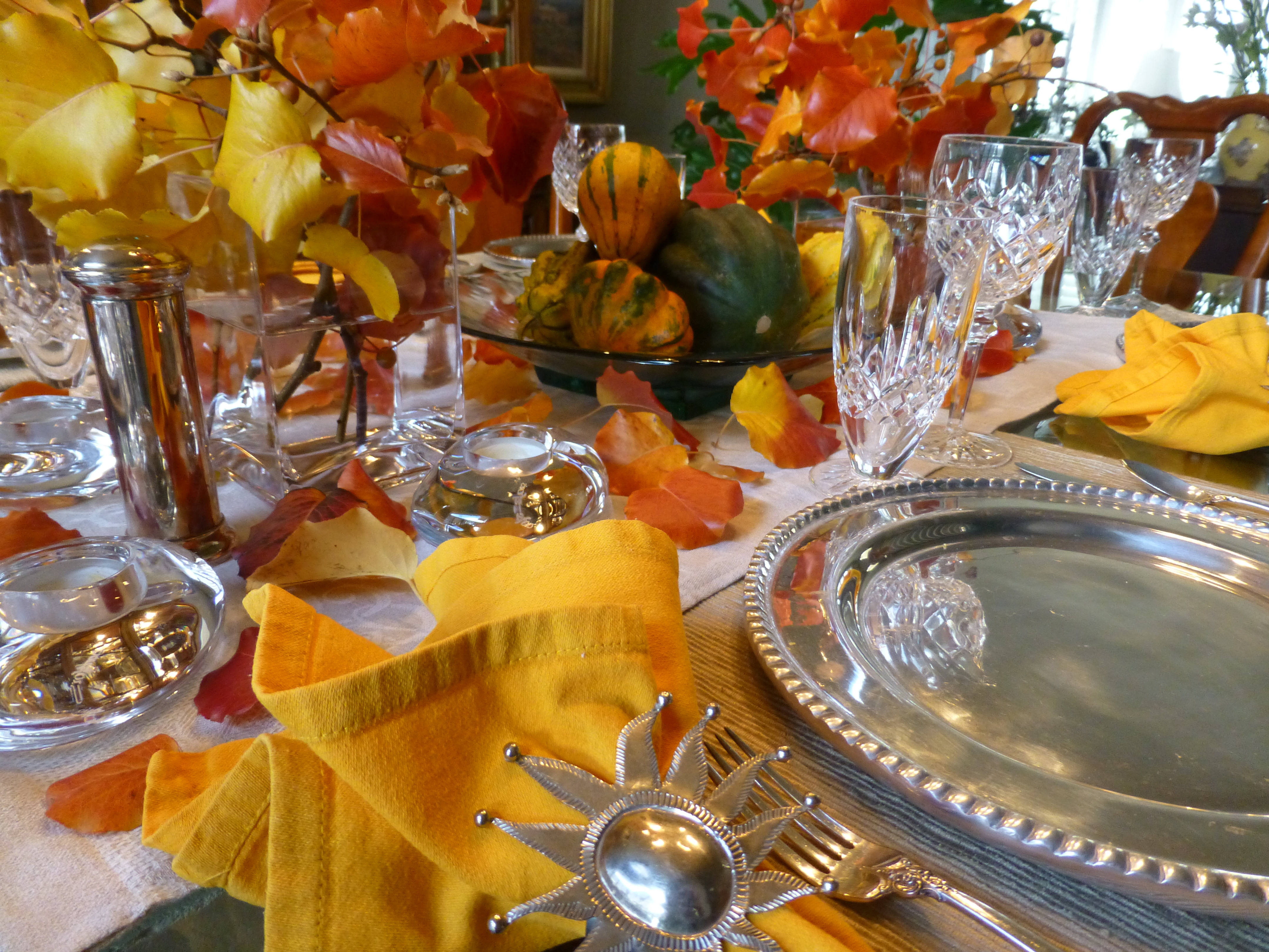
20151126_095436 - CopyI created a tablescape using short-cut branches in a pair of squatty square glass vessels flanking a large square hand-blown glass platter. In the center on the platter, I gathered acorn squash which we will be enjoying baked with brown sugar and butter later this week, and added some ornamental gourds for their interesting shapes and colors. 20151126_093945 After scattering some of the leaves around the arrangement on the neutral linen table runner, the result was boldly colorful, organic and spicy scene bursting with autumnal warmth.P1110503So as I pondered this setting this morning, two days later…the leaves on the table were getting crunchy, the branches were dropping leaves and the water in the containers was a bit cloudy…time to clean it up! Since it seems that everyone is already transitioning to Christmas themes, I thought why not do the same?! The alternative of merely cleaning it up and leaving it barren was a bit anticlimactic after enjoying the spectacular beauty of this recent  holiday table. So here again nature was calling to venture forth and scour the yard for the next seasonal statement.
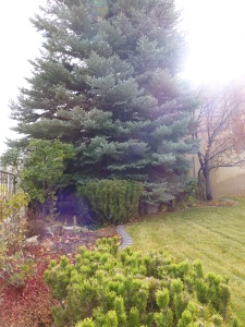
Now remember, this is just a quick transition…I can take it leagues and layers further as the weeks progress by adding holiday runners, ornaments, some bling and other accoutrements. But for today, the switch is quick. I ventured out into the yard and cut some bushy mugo pine and smoky blue spruce branches,  P1110558 a few holly sprigs from the bushes in front and jammed them into the same freshly refilled square glass vases. In the center, the neutral linen runner remained and on the glass platter I kept the acorn squash, traded the gourds for electric green granny smith apples and a couple of pomegranates ( I had bought three last week and had already picked my way through the many juicy morsels of one – leaving two to do the red thing in my centerpiece today).P1110556
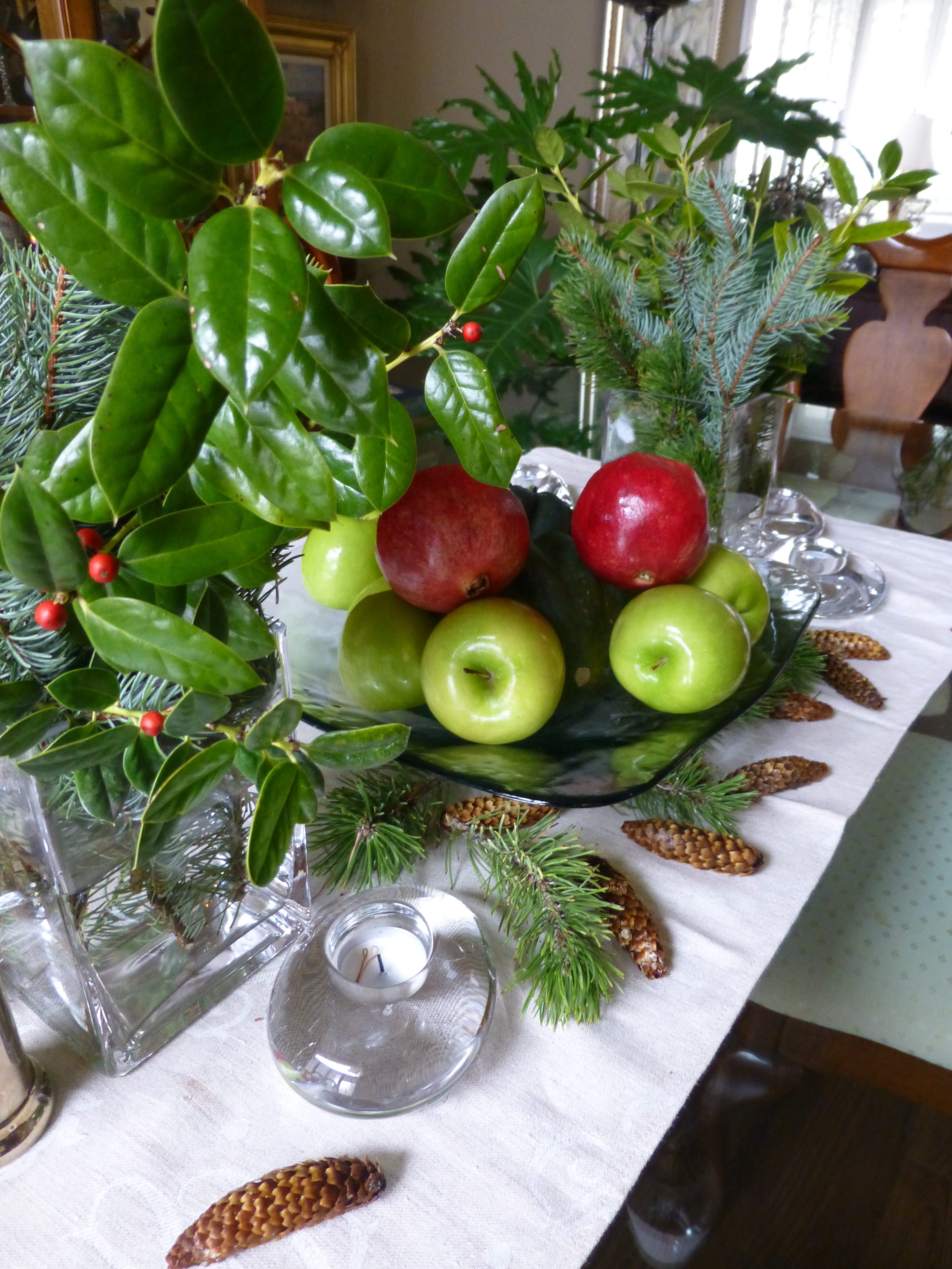
I scattered a few pine cones and Voila – my instantly transitioned tablescape said “Christmas is on its way!”


Random Colors in Nature’s Eggs


When I opened this cartoon of eggs given to us by friends the other night fresh from their chicken coop, I was amazed by the soft rich color combination that  burst forth.  And color is so a part of my design sensitivity that anytime I encounter an unexpected scheme, the inspiration is incredibly stimulating. So much so in this case that I created today’s story!  20151114_085947

My friends have a ridiculously chic chicken coop.  By that I mean being beautifully white-washed and accessorized including having a crystal chandelier complete with a dimmer—for the rooster and his women to “get into the mood.” chandalier in coop

I might have thought that this contributed to the glorious soft colors that they produced—mood colors…but I actually do know better. I know that it is the breed that produces the color of the shells and not eating carrots for peachy/orange shades or leafy greens for the soft aqua and celadon tones.

These colors though—grouped all together in this random collection, looked like intentionally dyed Easter eggs. The artist of this collection was nature and random selection of hens and collection of eggs and unconscious placement in the carton. I did not rearrange them and they did not arrange them in advance of sending them home with us. It is truly random beauty created by nature. 20151114_085930

Meet Handsome Boy the rooster of this coop. rooster  His women are a fine group of chicks named simply Hello Ladies as that is how they are collectively greeted daily.  hens in coop  They represent the breeds Ameraucanas which produces the green/blue series, Buffs Orpington for  peachy/light brown and Wyandotte for the darker orange brown shell shades. The combination is a color scheme that is so wonderfully balanced with complimentary opposites that it is one of pleasing perfection.

Here are a few color cards from a Benjamin Moore fan-deck of paint colors that represent the range of  complimentary hues and soft values in this earthen clay-like warm palette paired with and balanced by the cool water and flora reminiscent shades.  20151115_125439

Upon closer inspection, the range of tones from these cards closes in on the soft colors of the egg shells.

20151114_085930

Nature’s random beauty translated by the design-eye into paint colors and fabric samples for an inspired interior design. fabric 20151121_075630_resized


Redheads are Brighter – Even in a Chair

There once was a chair

quite bland, blond and fair.

A victim of the 80s

when pickling and white-wash went crazy.

But along came a designer

who sat down beside her

and painted her troubles away.

20151105_100857_resized20151111_105300_resized

Now she is sassy

coral red and quite classy.

And with her new flair

has inspired others bland and fair,

to make the change

that’s all the rage

to be bold over lighter

redheads are brighter!

20151109_091739

(My bright and creative friend, Lynn Platow has more sassy savvy exuding from her very brilliant core than anyone I know. Check out her site http://www.redheadsarebrighter.com/)

Art and Design in Nature

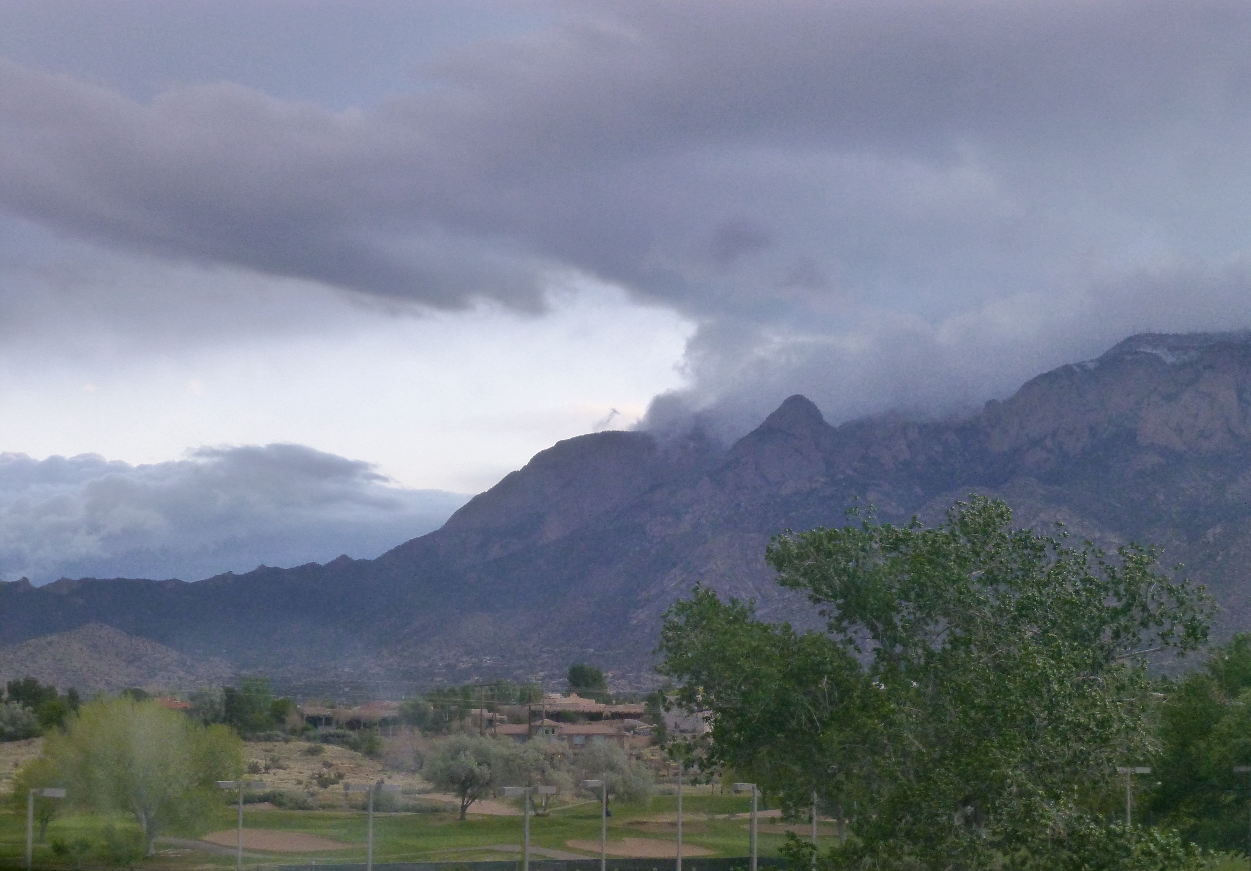
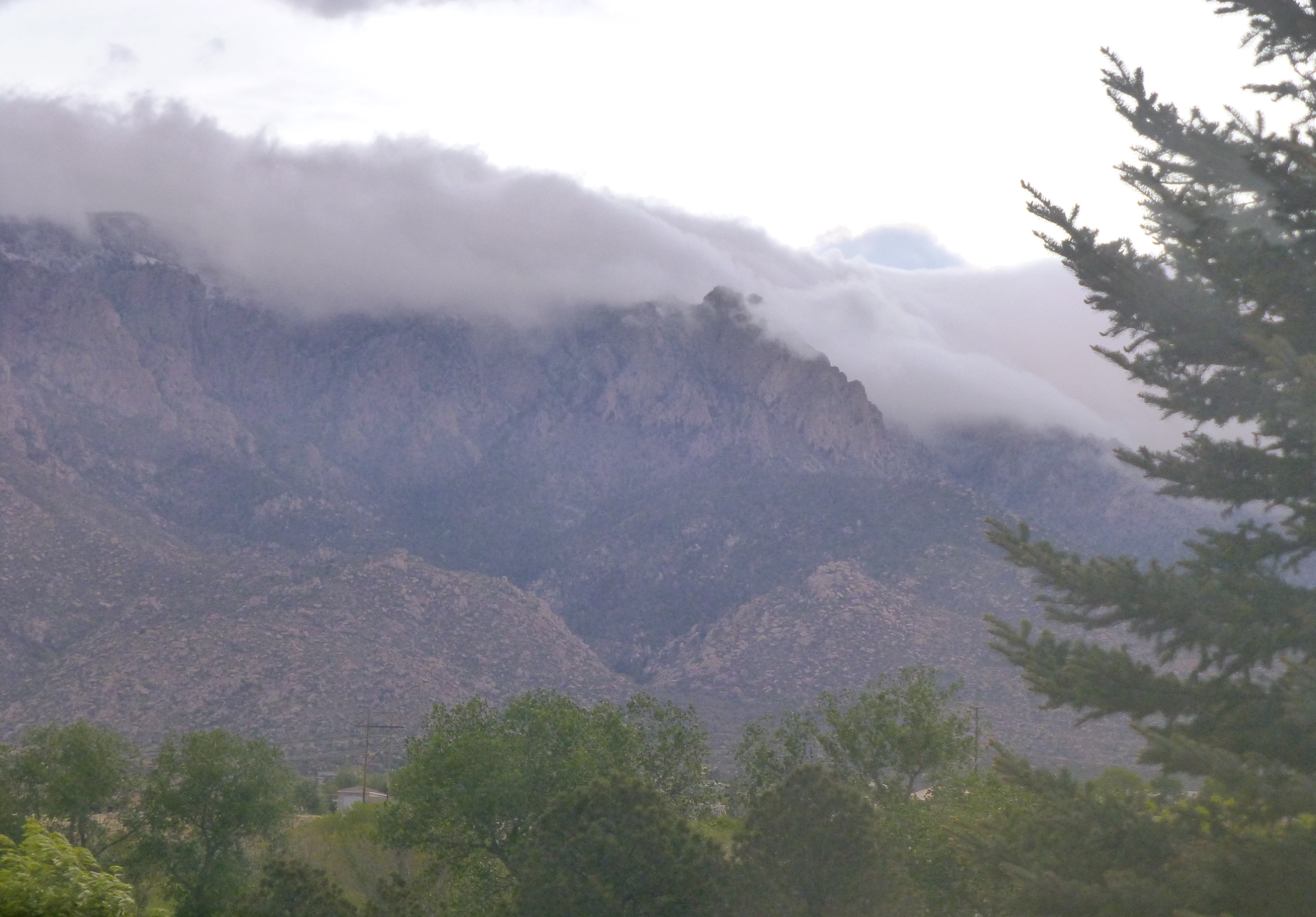
A spontaneous decision to play hooky Friday morning and hike with a friend for the second time in a week up an invigorating 8 mile trail that climbs about 2,000+ vertical feet was once again spectacular. I am always inspired and rejuvenated – finding beauty along the familiar path – hiking up the La Luz trail of the Sandia. Every turn offers a scene of unbelievable beauty, 20151002_105521expansive vistas, towering peaks, massive walls of granite and dense growth of trees and forest. The aspen are turning. Upon closer inspection the intimate beauty underfoot is equally stunning with intense color and pattern.

The warm air comes.

The leaf sprouts and opens and grows green.

The tree reaches skyward and the leaves shimmy in the breeze.

The tree bends and sways.

The leaves flip and cling.

The air chills.

The leaves turn golden.

The tree releases the leaves.

The leaves fall to the ground.

The tree is surrounded by the fallen leaves.

The leaves turn pewter dark.

Their scattered pattern is beautiful.

Inspiration for a printed fabric or a woven textile?

A painting perhaps?

There is so much art and design in nature,

with which to be inspired.20151002_114440