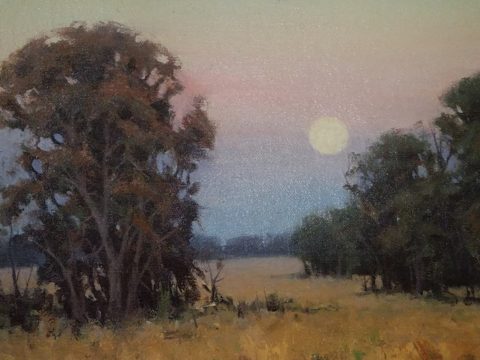
While in Park City this weekend, I pondered what might the subject of this week’s story be. Dazzled by the smart presentation of this hidden little jewel of a town, I was continuously remarking about the fresh abundance of flowers, well maintained facades, manicured lawns and medians and the obviously collective appreciation for what draws patrons to want, if not need, to invest in property, art, clothing, home decor and food! Yes, need – it can become an imperative!
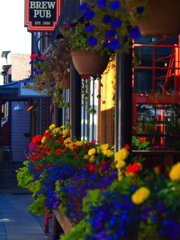
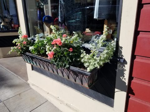
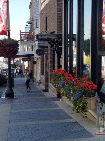
Here a restaurant has dressed their facade with brilliant red flowering boxes beneath the sidewalk window.
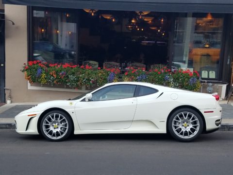
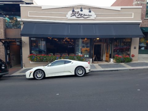
Oh – oops…do you think it might have been the Ferrari that was drawing attention?
Imagine your patrons being drawn into your establishment as an imperative – a must see, or must buy here, or must try this place, or must check out their wares, or must taste their food or drink their craft beer!
The patio of this brew pub is surrounded by fresh flowers in rustic wooden boxes.
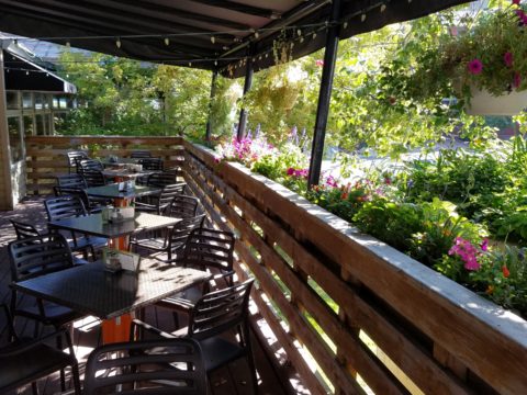
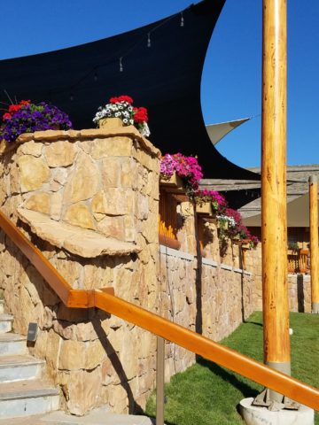
Preparing to open for the day, this pub also has light strings to animate the patio at night.
You see this charming presentation potential in small resort communities and those who have cultivated their assets to the max, reap the benefits of their vision, smart development and on-going maintenance.
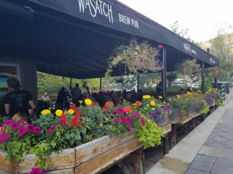
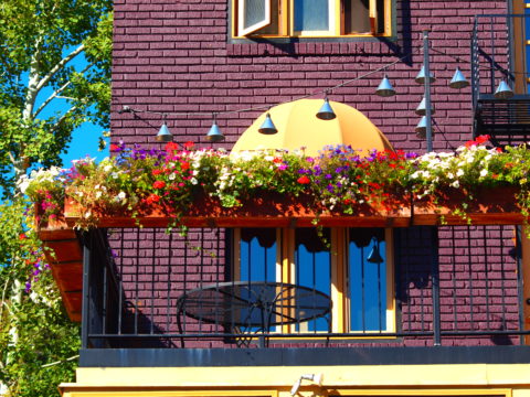
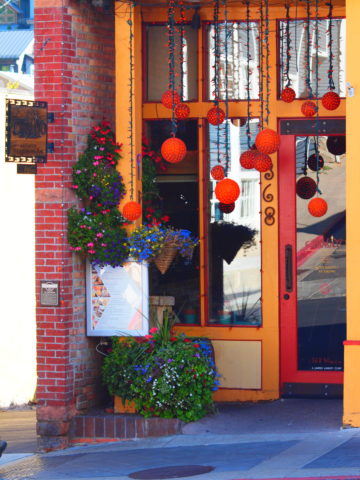
Another brew pub sees value in an eye-catching floral frontage. Courtesy – Heather Harrell
The architecture is decidedly mountain themed, vintage 19th century colorful and textural, but interestingly punctuated by modern elements and fresh ideas. The practical pitched roofs, quaint scale, textural wood trim and detailing, all contribute to this charming scene.
Courtesy – Heather Harrell
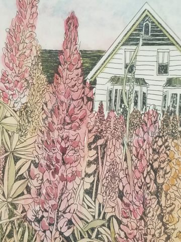
To dismiss the value of flowers in marketing is to ignore the Flower Power!
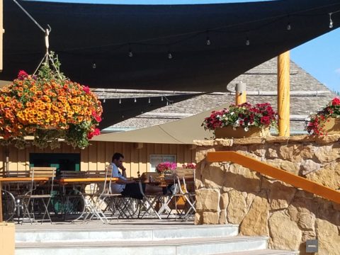
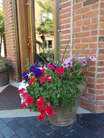
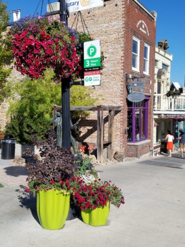
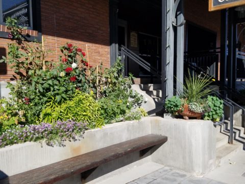
Some places take a little more work to grow seasonal sprays of abundant color in pots, buckets, bowls, barrels and boxes, but the effect of drawing people is undeniable.
Courtesy – Heather Harrell
From Key West to Anchorage, the results are proven. Beauty, color, nature sells.
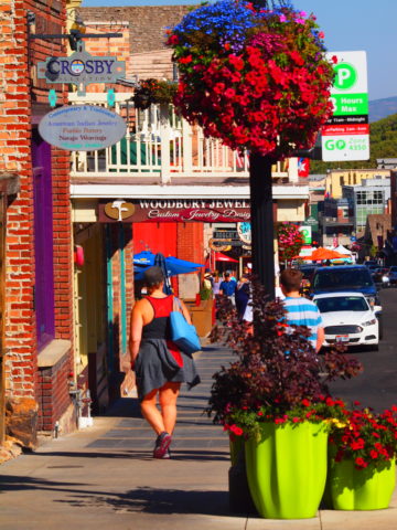
It’s a combination of color being a visual POP amidst concrete and brick, but it is also the positive life-affirming statement that it projects.
We know color in advertising is a draw and we know that anything that adds animation is a draw – flowers colorfully animate the street-scape and draw customers to them.
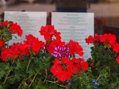
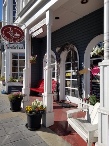
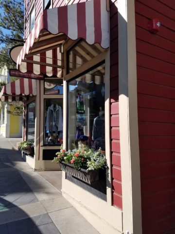
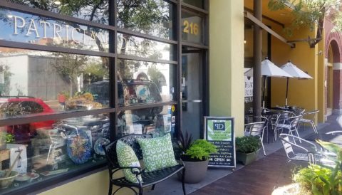
Here the passers-by are drawn to the menus posted in the window by the red geraniums that brilliantly are placed in planters in front of them.
Courtesy – Heather Harrell
They infuse the built environment with nature.
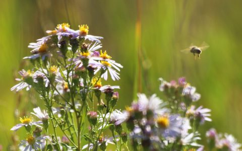
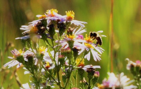
Like hummingbirds swiftly hone in on the finest blooms or like bees collecting pollen, we are drawn toward that which speaks visually from the surrounding foliage.
Courtesy – Heather Harrell
Texture is another element in this mix. We know that good design is about balance. Flowers balance the otherwise hard surfaces in their periphery. The finishes on a streetscape or sidewalk scene are generally, if not exclusively, hard. Flowers soften the surrounding surfaces and also balance the smooth and hard with random shape, texture, flexibility and even movement.
Whether a casual bar or fine dining restaurant, retail shop or any business wanting to attract and invite the public to them, flowers are an asset.
I feel about flowers similarly to how I feel about twinkling lights on a patio or in public trees. The advantage in the lights is that they can survive the frigid elements and make their statement in all seasons. Lesson here – once the plants are spent for the season, keep the lights on!!! Both elements are valuable draws and enhance the atmosphere of any establishment or environment. (Go back and notice how many photos have visible stringed lights in them!)
And if possible, plant those past-season pots with hearty pansies, ornamental kale or evergreen shrubs to keep the life calling from the sidewalks.
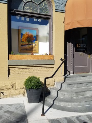
An art gallery has boxwood in steel vessels at the entrance.
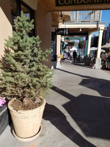
A potted evergreen will add life to the paved surfaces when the flower season has passed.
And for the sake of broadening the reach on this subject, to include not only the flowers and the mention of stringed lights, is the inclusion of creative signs, banners, flags, umbrellas and other elements that contribute to the festive nature that attracts peoples interest and draws them into your business.
Courtesy – Heather Harrell
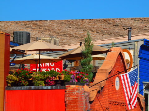
Rooftop bar with flowers, flags and umbrellas – King Edward too! Courtesy – Heather Harrell
Celebrate the the power of flowers!


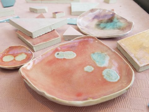
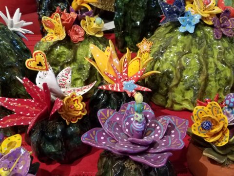
 Two days ago I found myself in an in-home art-studio/workroom that blew me away!