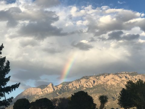
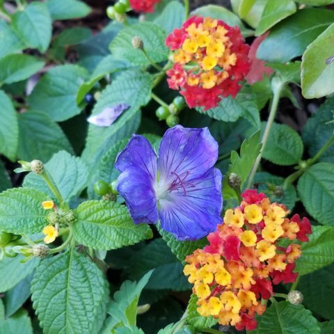
This last week I was inspired by a rainbow that appeared over our great Sandia Mountain and within 3 minutes I nearly tripped over a bed of flowers presenting the same rainbow of colors. With this pairing of color coincidence, I felt compelled to write this week’s blog about color.
Color can be difficult. It is so critical to effective design decisions whether graphic design, fashion design, interior design or architecture. It might be used for a logo to brand a business , a room scheme or the exterior of a monumental building…how do you begin to select a color or a color scheme?
Well first you have to consider your client. What are their needs and desires? Once narrowed, the search for the perfect colors to convey their project’s personality begins.
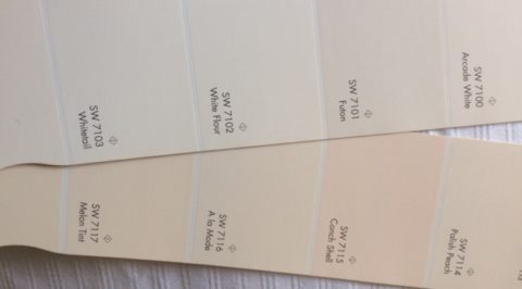
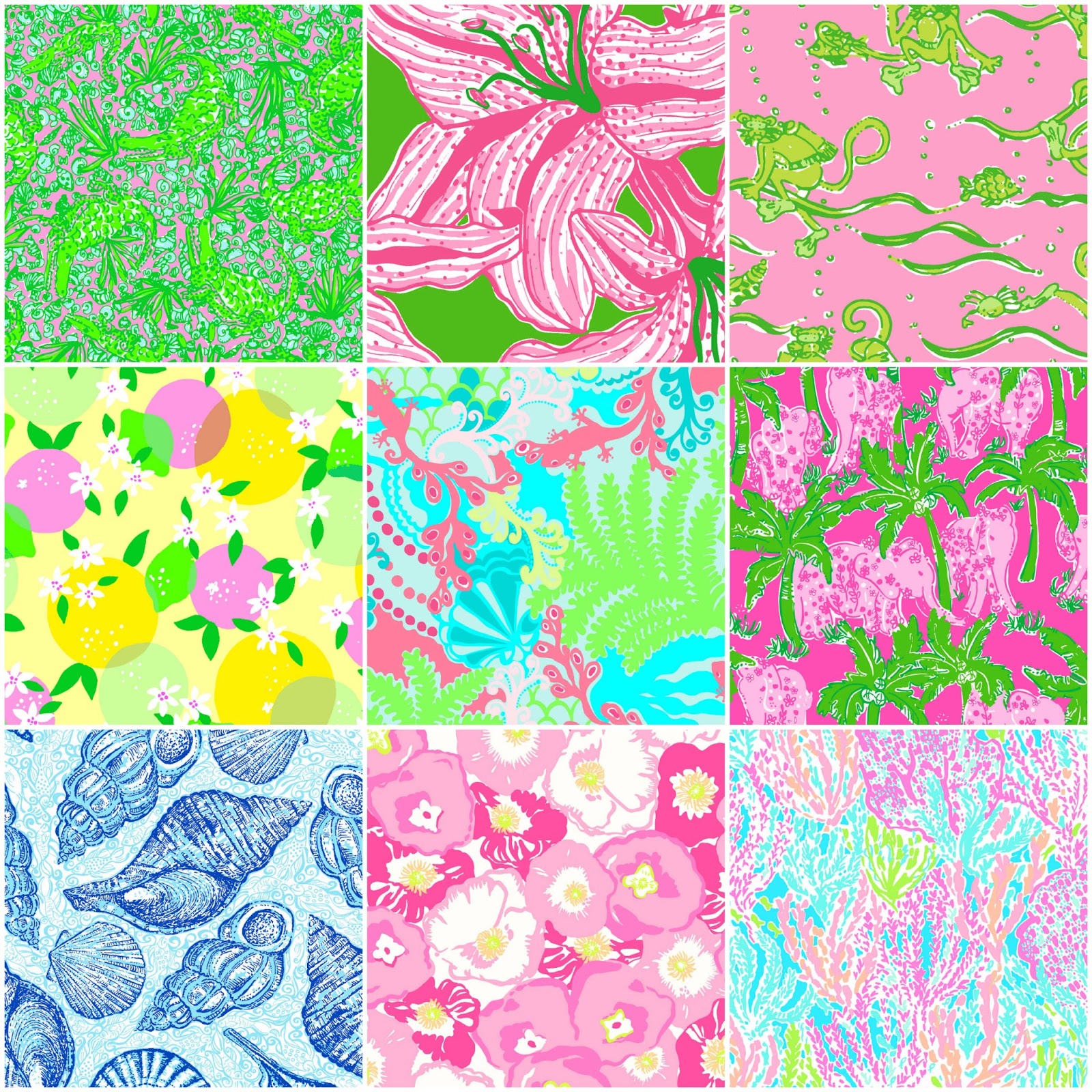
Computers aid designers in finding fine nuances between colors. Exploring the range of values in a hue – the range of light to dark of a specific color and the adjacent colors that meld from one to the next has become easier.
It all comes down to the color wheel. It’s a circle illustrating the colors of the spectrum. The relationship of these colors are the building blocks of all the colors. Sir Isaac Newton – the same of the apple and gravity fame – devised this understanding of the rainbow of colors back in the 1600s using a prism to identify the components.
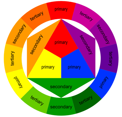
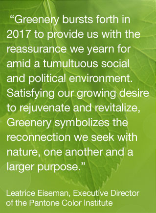
As children we are taught about the rainbow of colors comprising ROY G BIV – the easy to remember name that represents the colors RED ORANGE YELLLOW GREEN BLUE INDIGO VIOLET
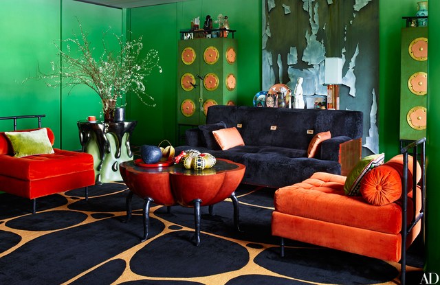
Decisions regarding the selection of colors and the resulting schemes are identified by the following relationships:
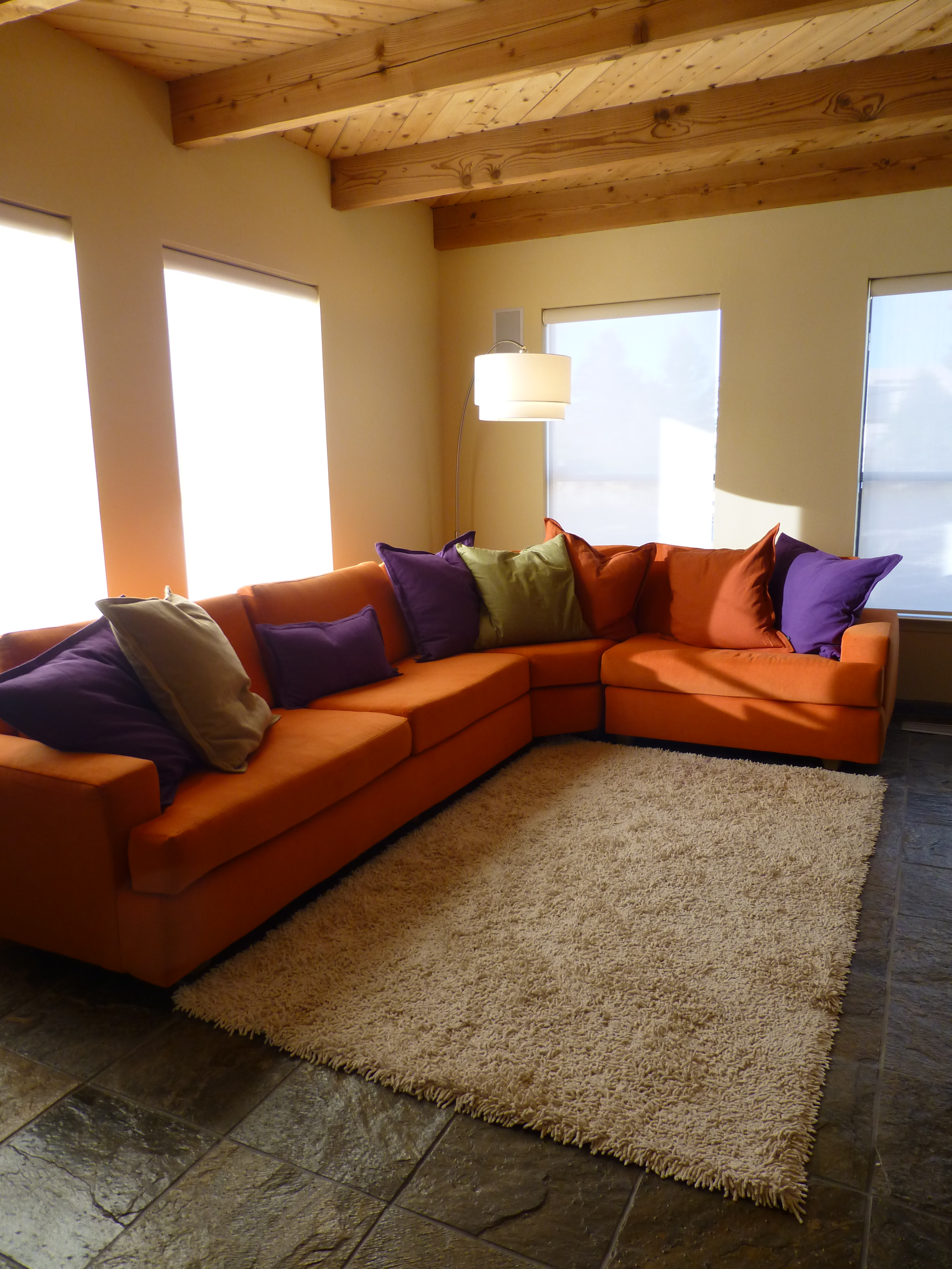
Complimentary – two opposite colors on the color wheel
Monochromatic – three different values of the same color
Analogous – three adjacent colors on the color wheel
Split Complements – one color and the two adjacent tertiary colors of its complement
Triadic – three evenly spaced colors on the color wheel
Tetradic – two complimentary pairs of colors
As I pursued this topic today, I encountered an interesting site by a guy Jason Cohen. If you are curious to know more on the subject, check out https://blog.asmartbear.com/color-wheels.html
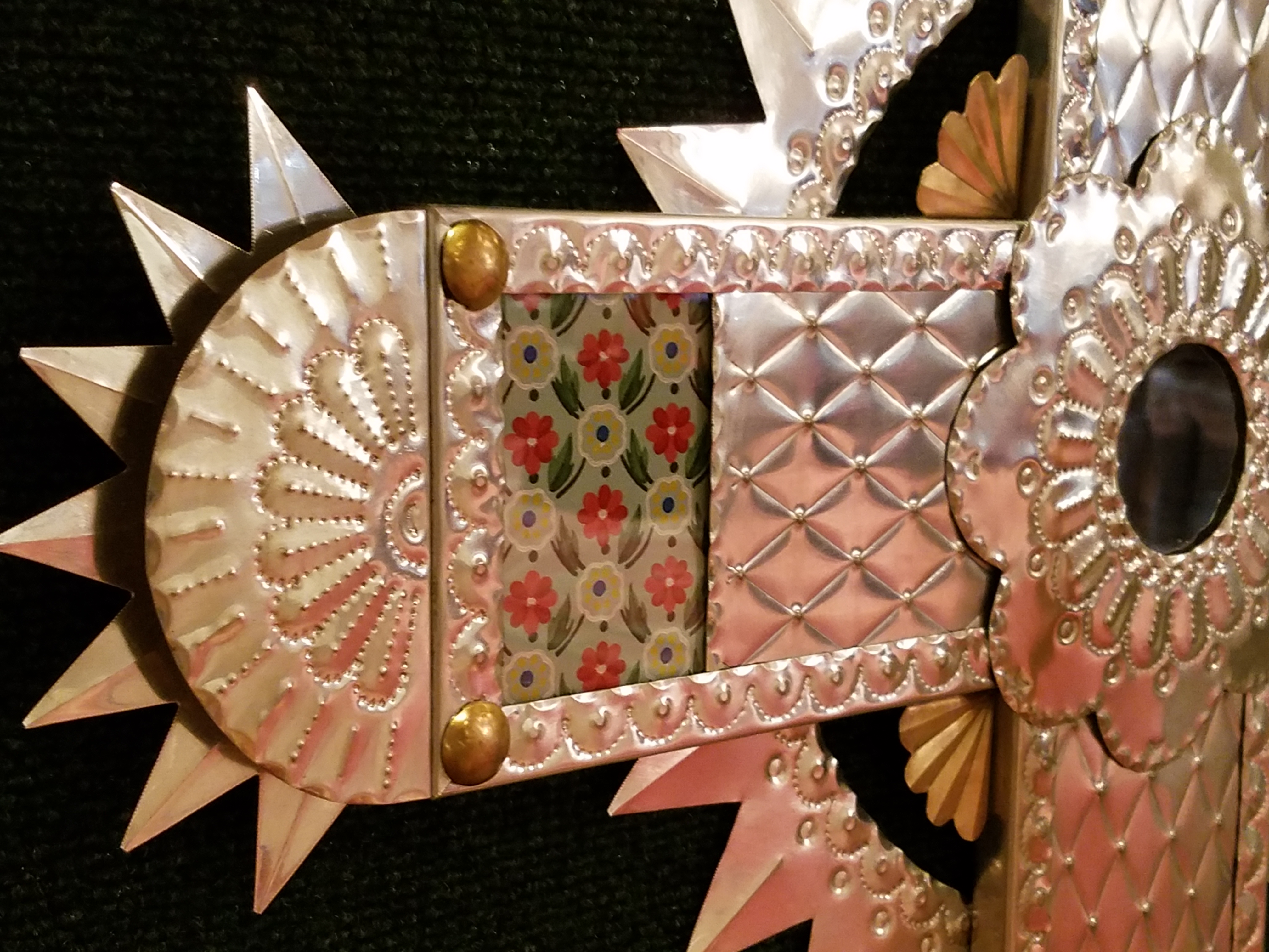
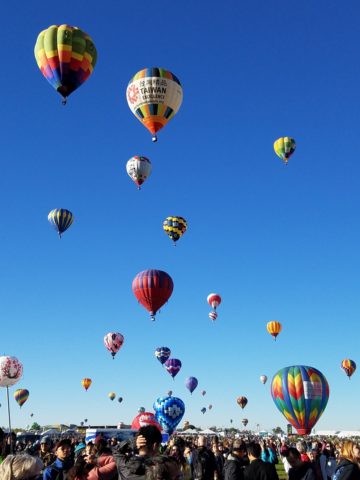
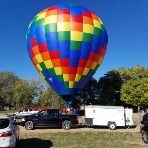
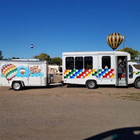
This last week, over the course of 2 days, I encountered several examples of these colors all around me. From the rainbow to the flowers and myriad balloons. It didn’t hurt that it was during the International Balloon Fiesta http://www.balloonfiesta.com/ which is one of the most colorful events in the world.
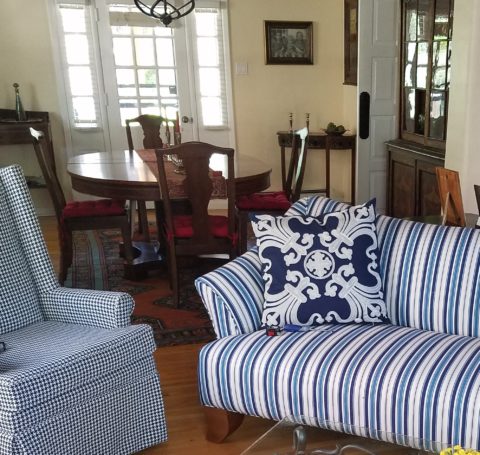
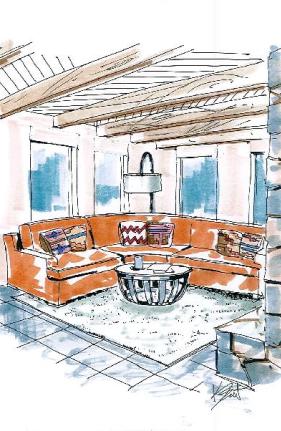
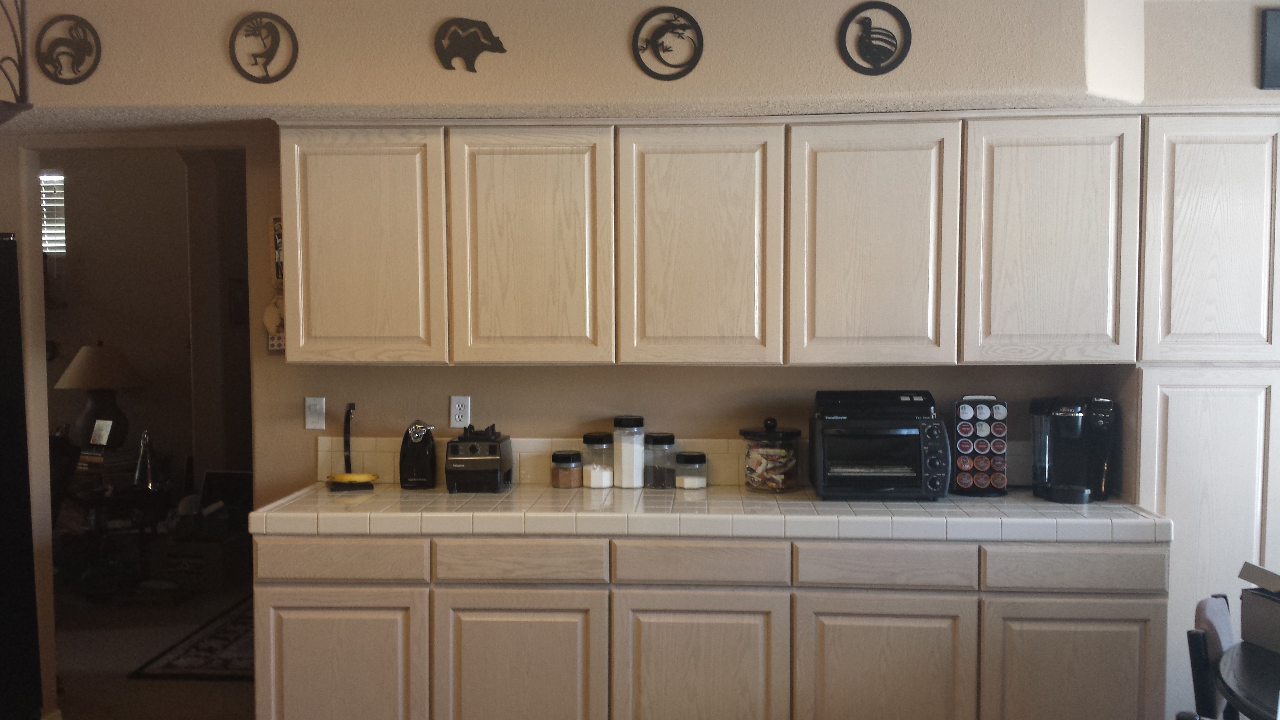
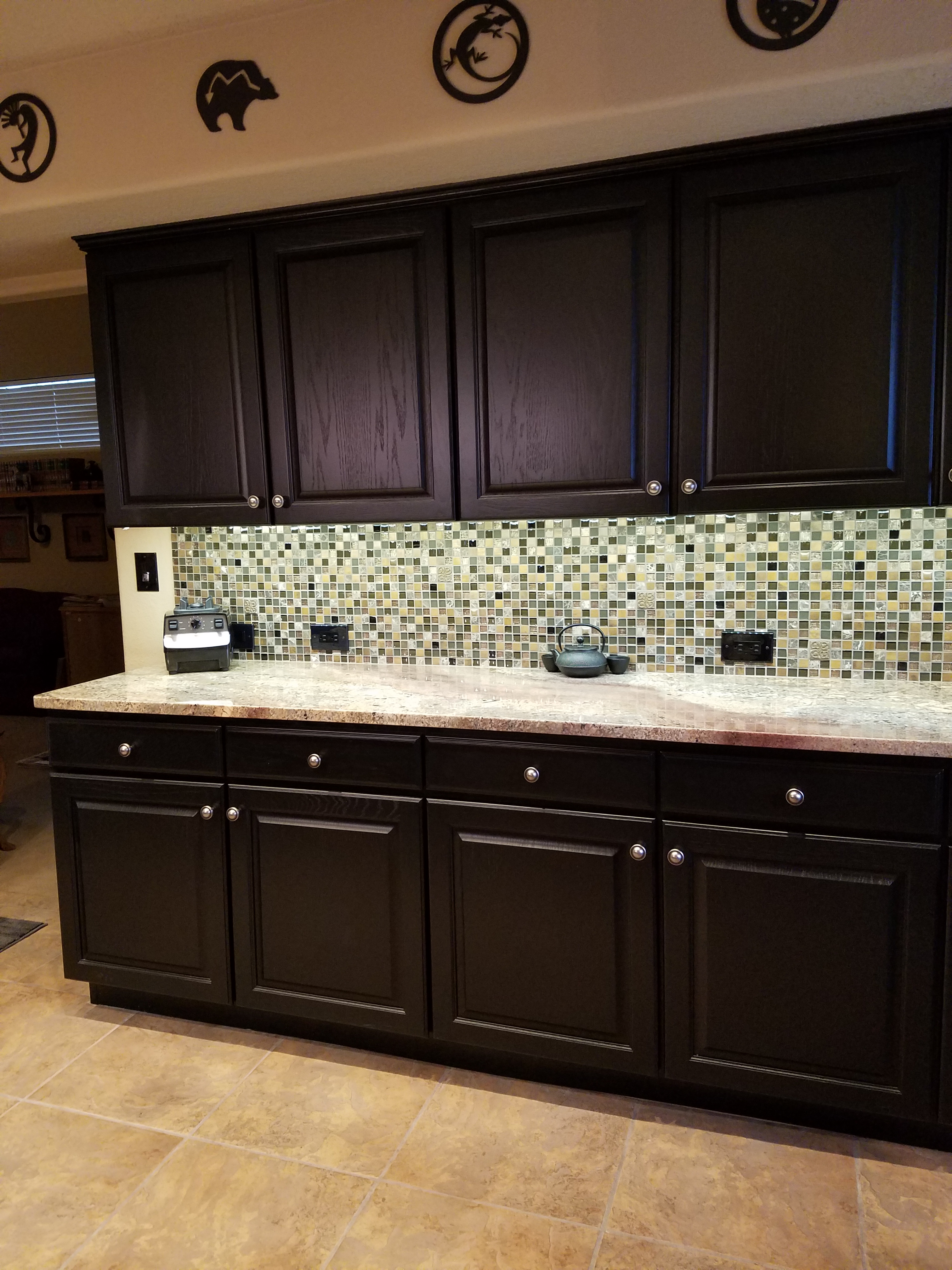
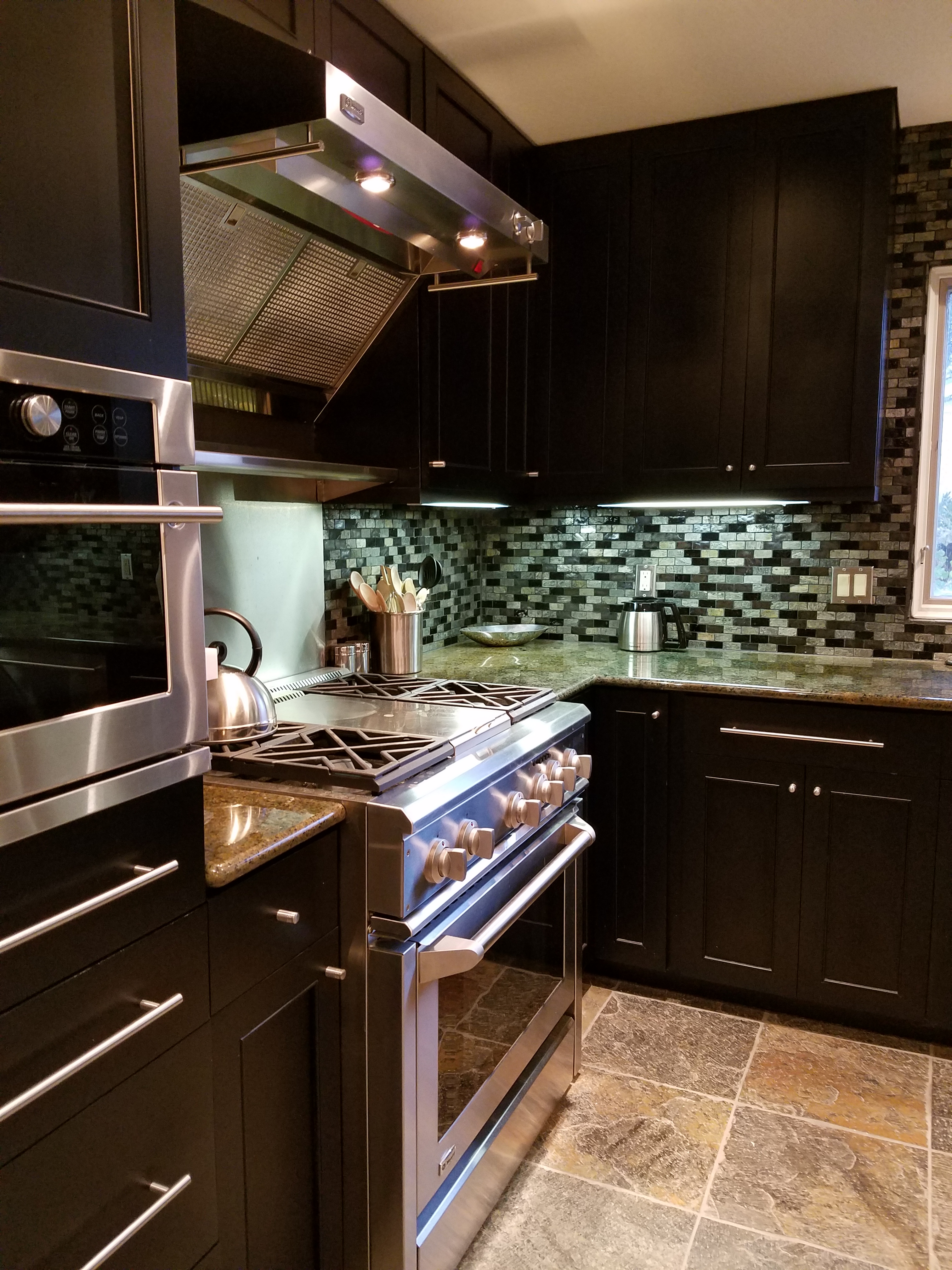
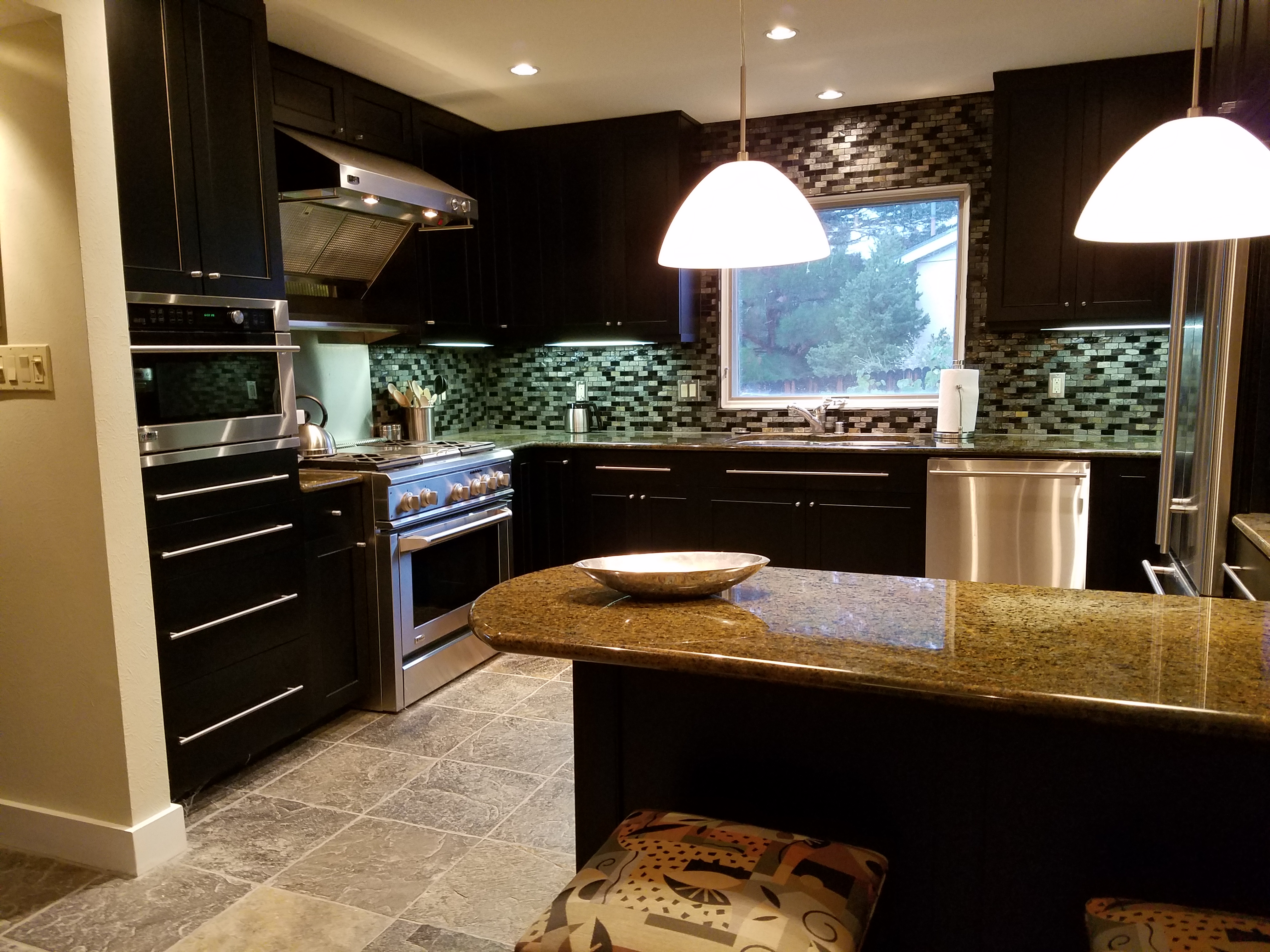
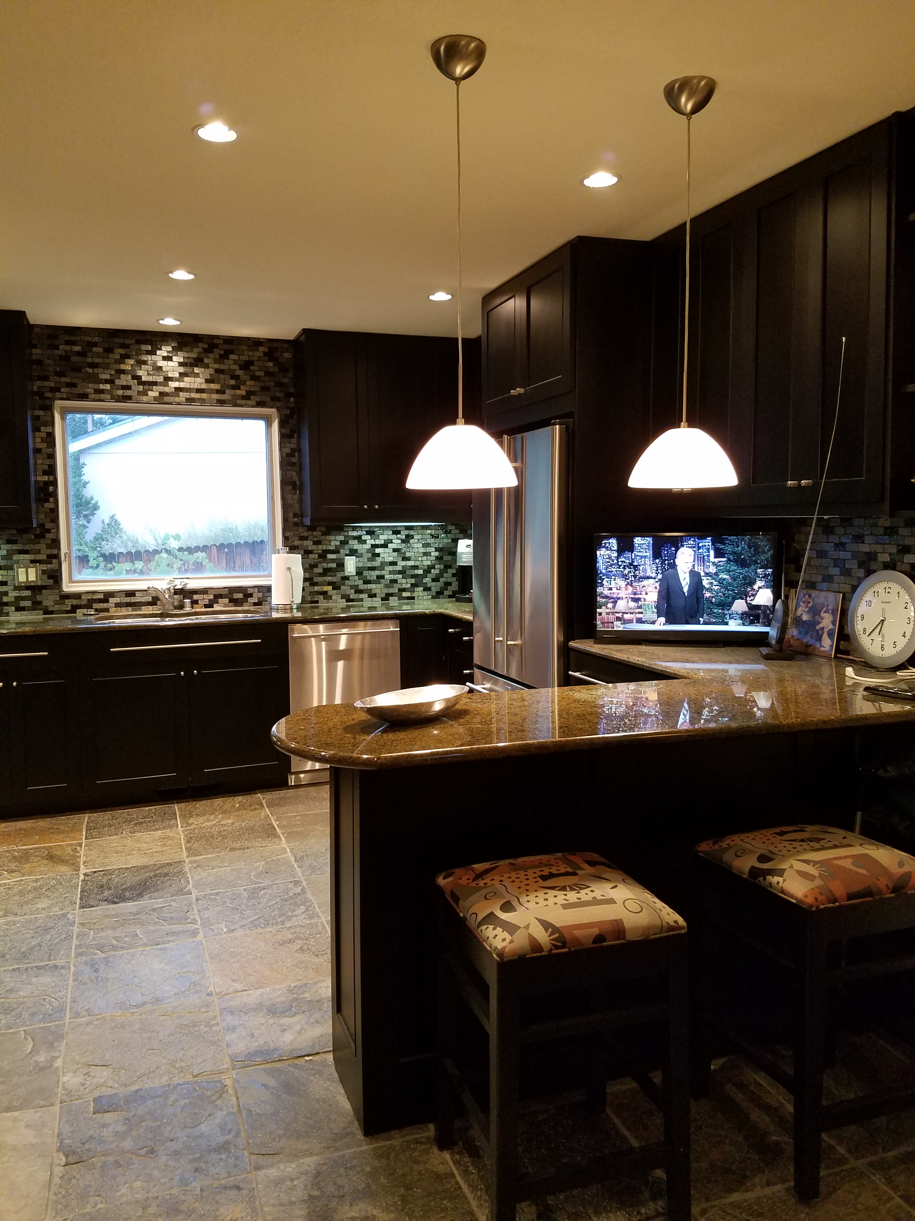
Unless we have a limitless budget affording custom design materials, it is best to begin with the materials that offer the fewest colors. I have mentioned this in the past, there are more paint colors than there are carpet colors, fabric colors, or solid surface materials. Therefore, selecting your color scheme based upon the selection of a material with fewer color options is the best start…you build from there…paint being the easiest component to finish the scheme.
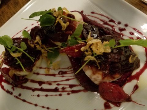
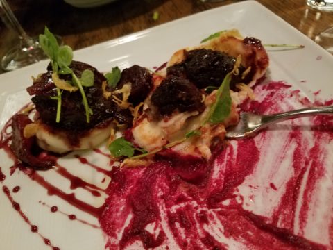
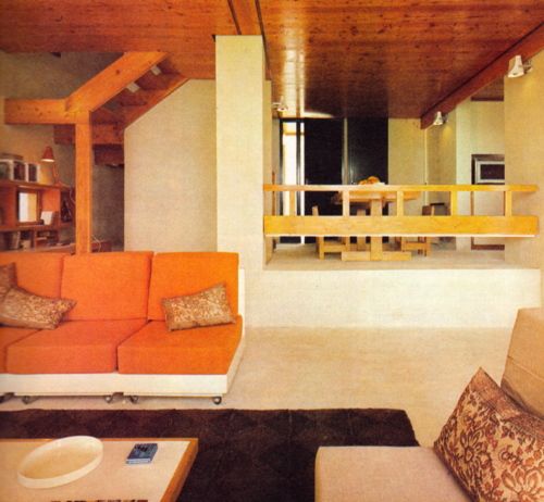
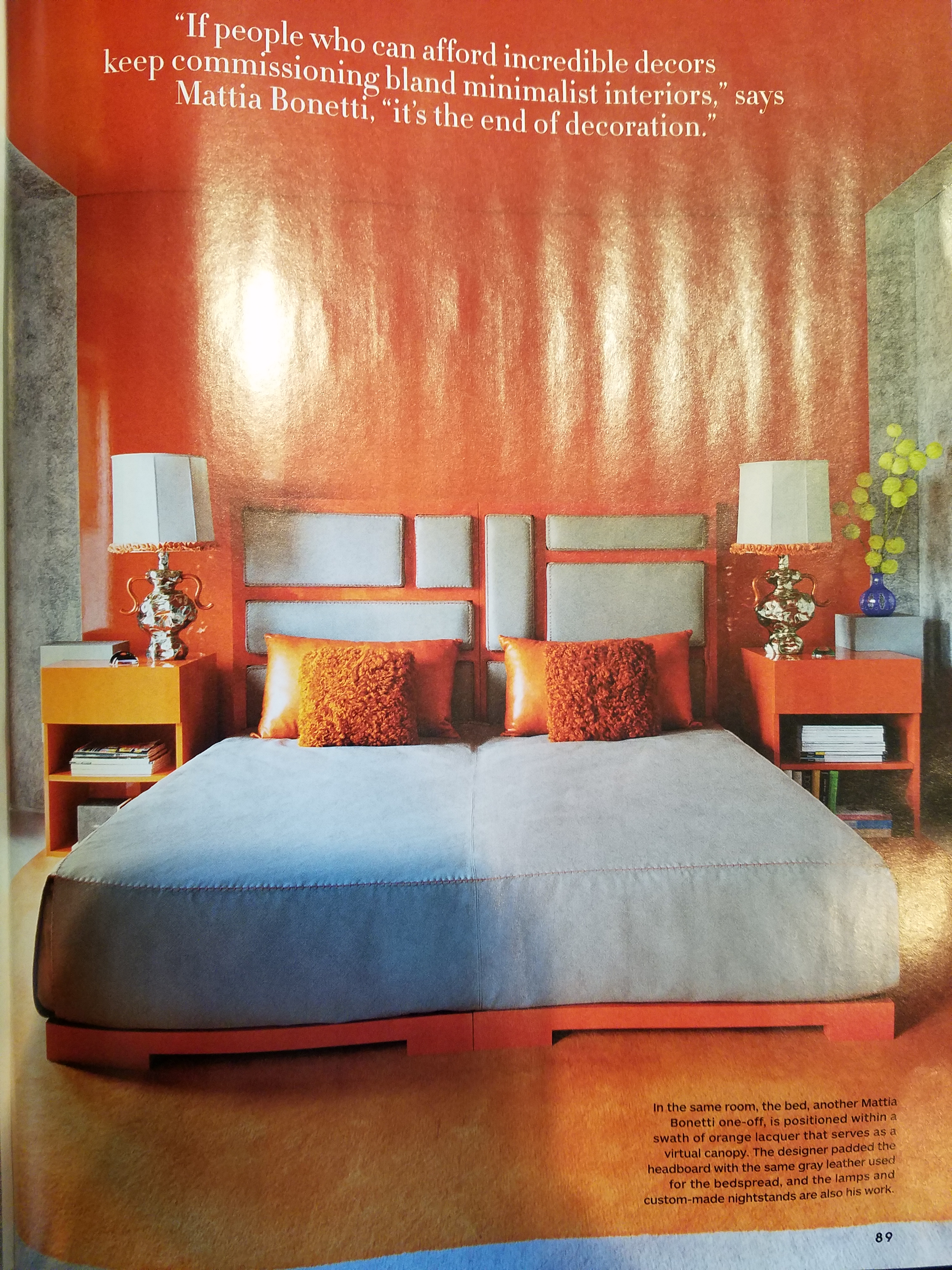
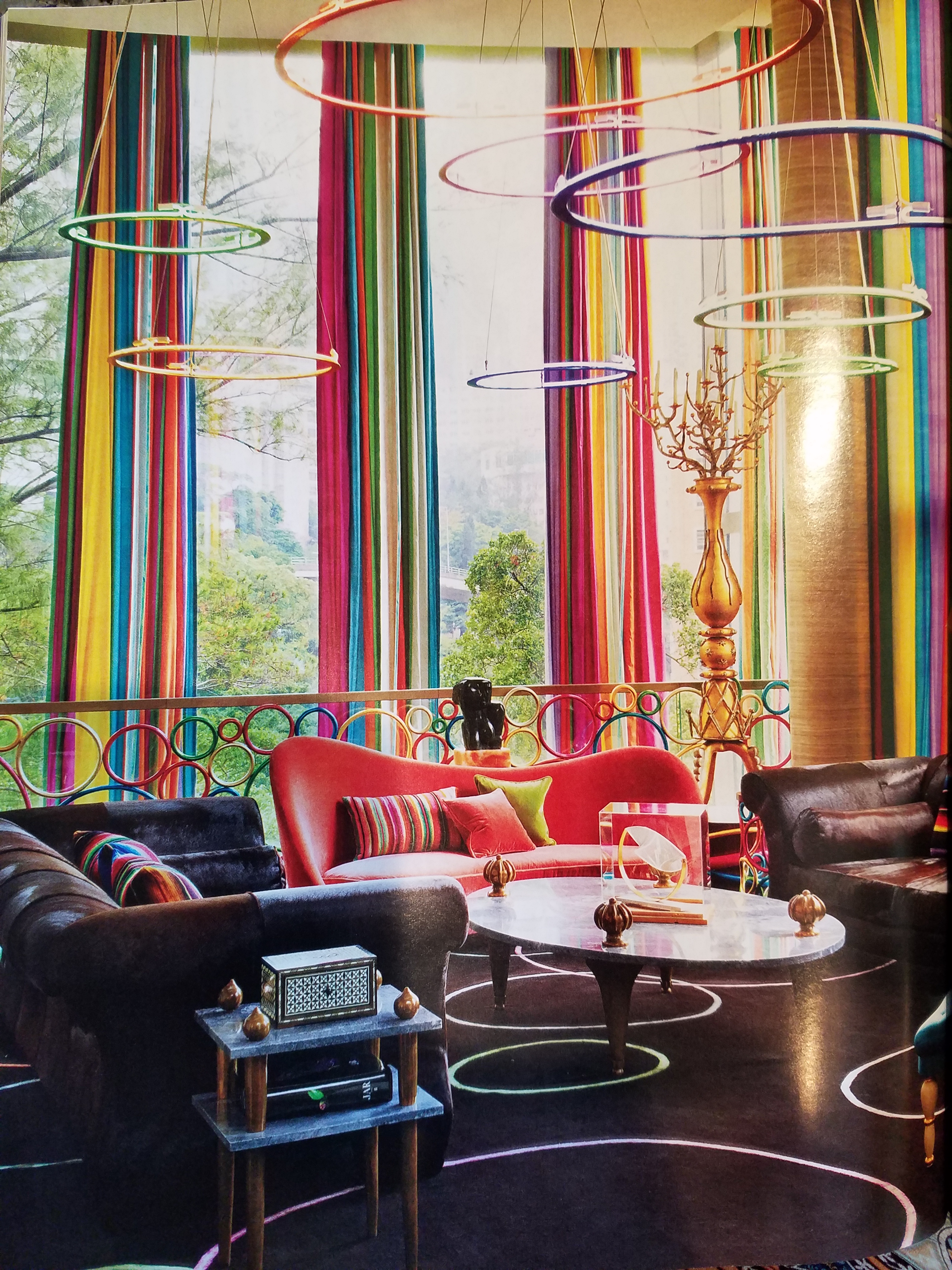
Color affects mood, perceived temperature, individual’s reaction to seasonal cues, and all manner of context. Pastels in springtime and warm tones in the fall – color makes powerful suggestions and should be used as a tool with that power in mind. The power of suggestion. What are you suggesting? What are you trying to convey?
With your best intentions, colors will change with light sources, time of day, adjacent colors and people’s own perceptions. It is not a perfect science when you consider all those variables. Take caution to select colors based upon the conditions that will occur in the final location/presentation. Without fear, pick your color schemes and beware, but don’t be afraid!