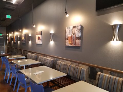
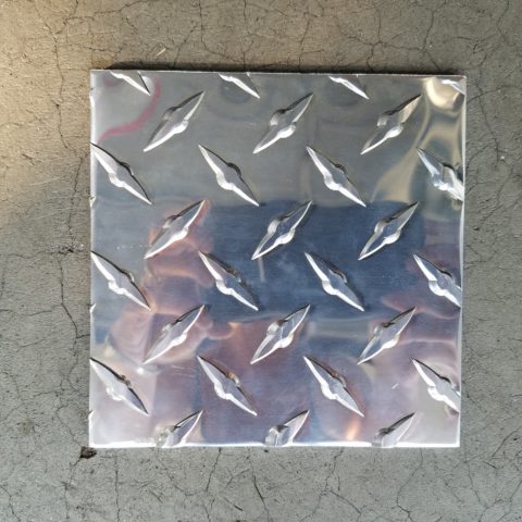
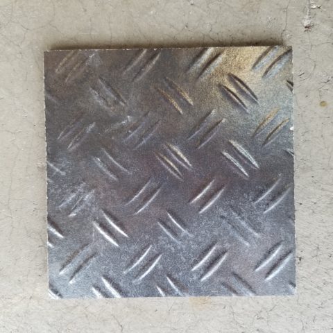
Designing artwork for commercial interiors offers an opportunity to connect to the brand. It means that we take into consideration the artwork as relates to the business and its identity. You might remember a blog from last year about the can wall. It was designed for a taproom. The theme was beer. The name was “Silver” and we considered that a natural off-shoot of that was the silver color of aluminum beer cans – as a wall treatment!
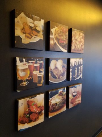
For that same project (in two locations) we further emphasized the brand with photos we took of their own products transferred to and stretched on canvas stretchers to be the “art” on the surrounding walls.
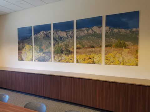
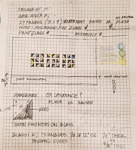
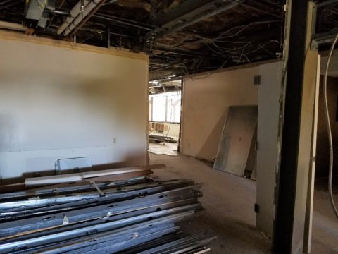
Fast forward to a conference room for an energy company home-based in Albuquerque – the iconic Sandia mountain being the earth’s monument – the familiar, perfect image to represent the company and the connection to the earth and its resources. For this project, we were asked to build 27′ of custom , cabinetry and dress the wall above it.
The tall ceilings required a vertical element, but the length of the wall also begged for horizontal space-filling. As a cost-effective solution to such a large space, we decided to take a photo of the majestic mountain, separate it into 5 sections and have it enlarged and transferred onto aluminum panels for light weight and rigidity. The reviews were sensational as everyone loves and relates to the familiar scene – seen in such a colorfully explosive and expansive installation.
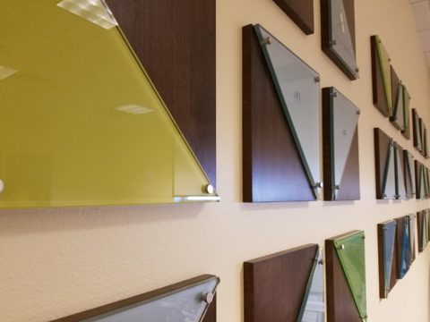
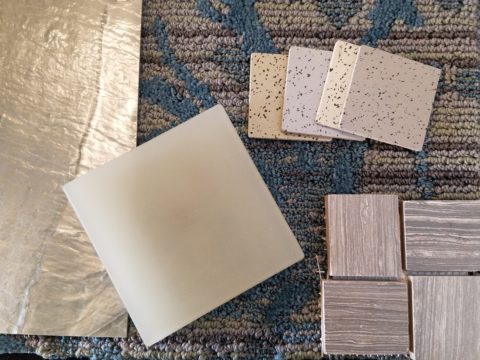
In response to the success of that solution, the client asked for a complimentary treatment for the opposing wall. Again, the wall was 27′ long and had the same ceiling height so we used multiple fragments in 3 groupings to center across the entire expanse. “Elemental Fragments” was born of the concept to have just that – fragments of elements in an orderly fashion – uniform yet random, to contrast against its formal geometry in response to the amorphous photographic landscape. Colors were derived from the blue, green and yellow in the scenic panorama interspersed in a field of silver.
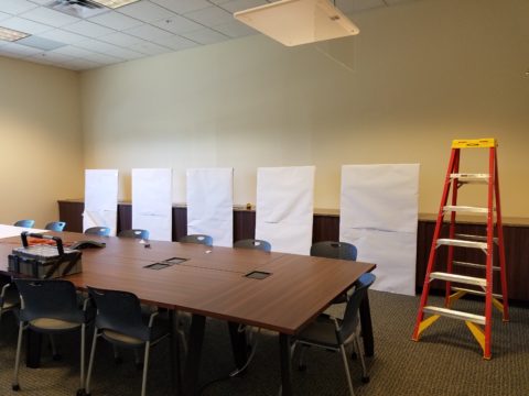
Last week, on the day of the installation, colorful creative chaos – resulting from unwrapping the individually hand-crafted compositions and scattering them across the conference table – was part of the fun, of the scene.
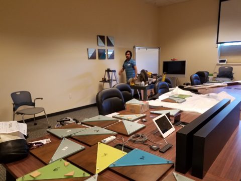
The tedious work of aligning all just right, with perfect spacing and level mounting, added to the anticipation of realizing the finished product.
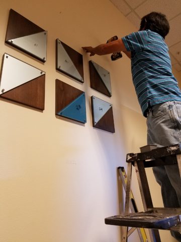
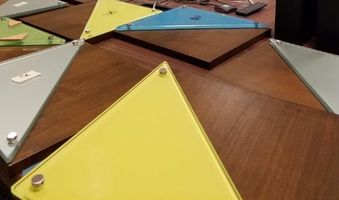
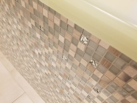
The luminous glass against the rich, stained wood punctuated with the brushed stainless fasteners made a striking assembly.
Modern engineering and production, worldwide energy collaborations and shared technology coming together in a grounded environment of people and their place on the planet. A daunting system of assembling fragments of many elements that make things work to bring gas to the end users. The artwork makes the concept look easy. The result of the many facets, of the actual work and the artwork representing it, is not only effective, it is triumphal.
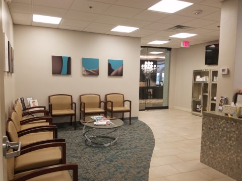
It’s creative fun to custom design pieces to relate to the brand, the business and the culture of a project. Bringing joy, pride and a sense of confidence in the focus of the work, to the employees and guests, is a successful finale.
Bring us your design challenge and we will design a solution specifically and especially for YOU!!!
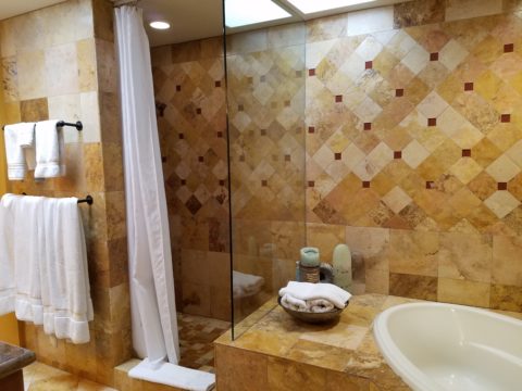
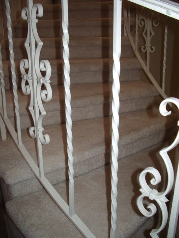
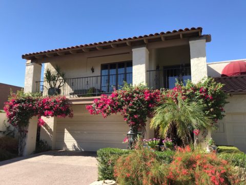
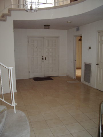
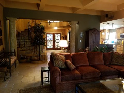
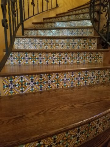
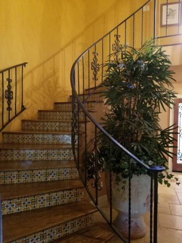
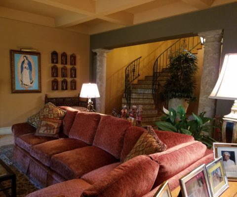
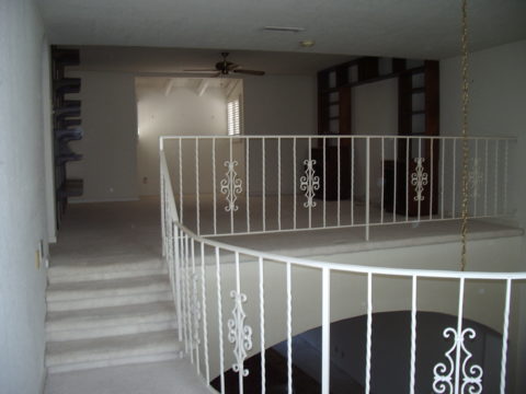
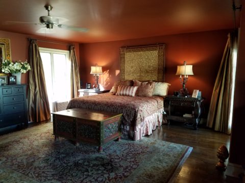

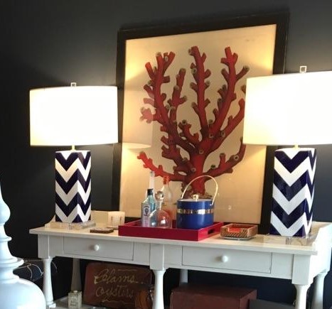
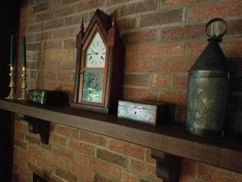
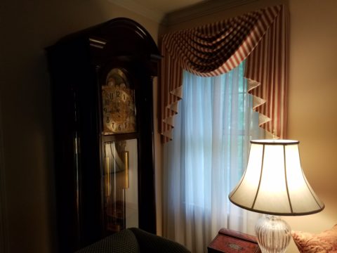
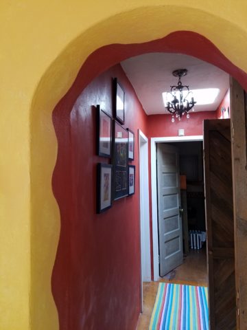
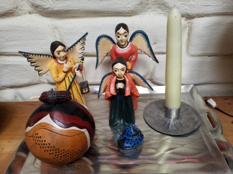
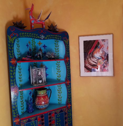
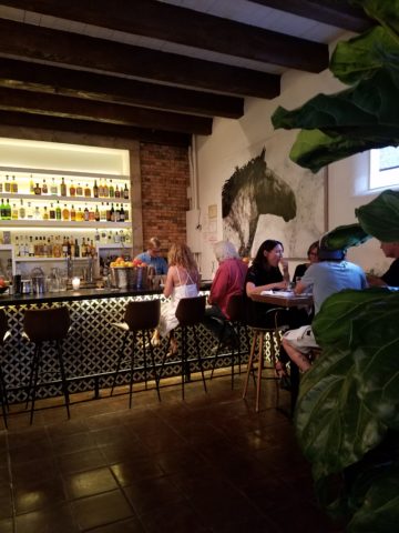
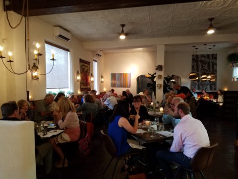
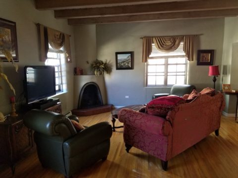
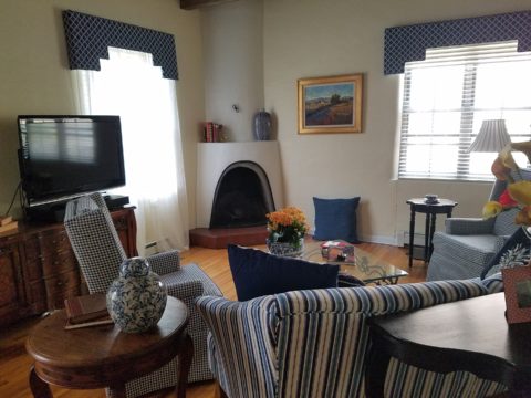
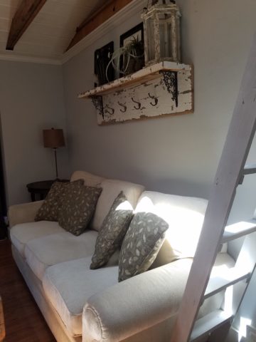
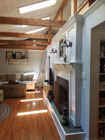
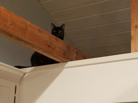
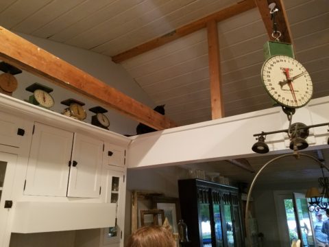
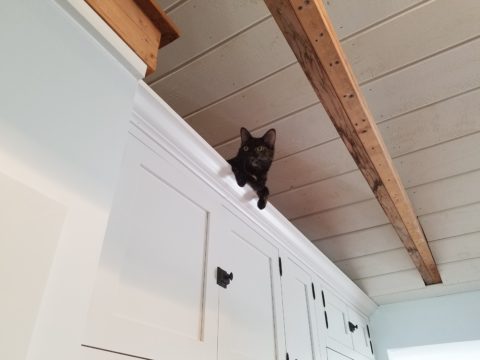
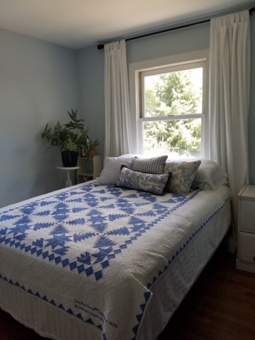
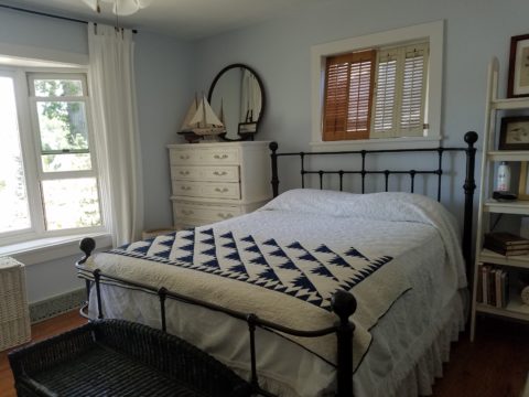
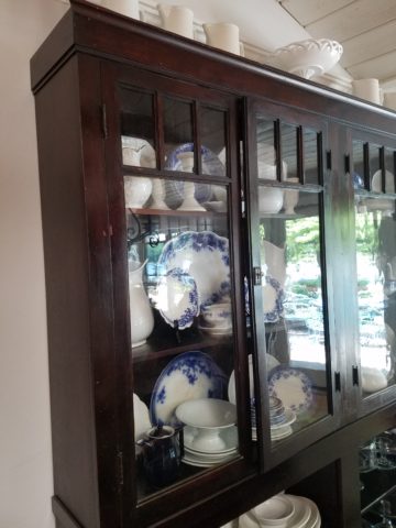
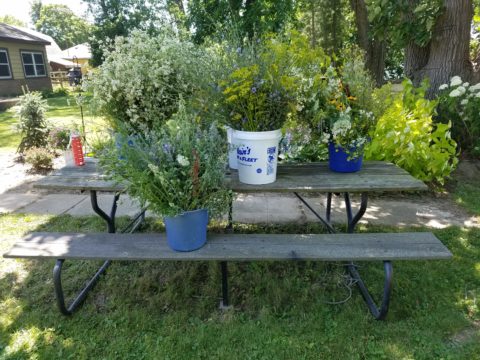
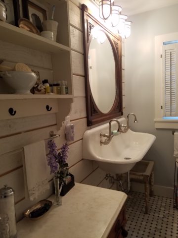 Hearing their comments as they passed through the spaces was amusing in their commonality. Everyone was amazed at the amount of work done, creative elements incorporated, fun finds she had collected to transform this modest house into this cozy cottage. Her two cats have wonderful vantage points to watch the activities in the rooms below as guests gathered to celebrate the weekend’s family wedding festivities.
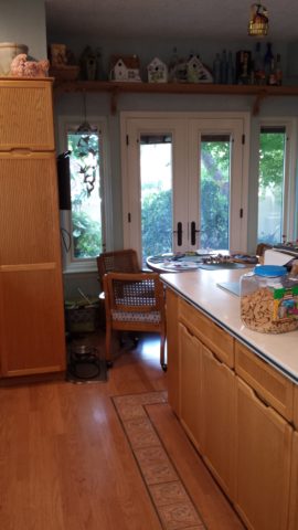