Blossoms are bursting forth and spring is near…Flowers have a decidedly feminine bent, but due to their organic nature and natural occurrence as the season begins to unfold, I truly believe that they are a gender-less element of rebirth, warmth, optimism and wonder.
In our backyard, these minis are ahead of their more attenuated cousins!
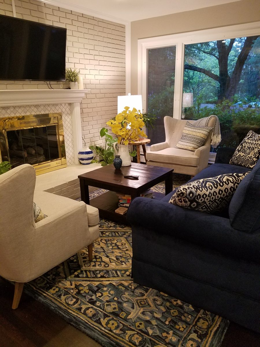
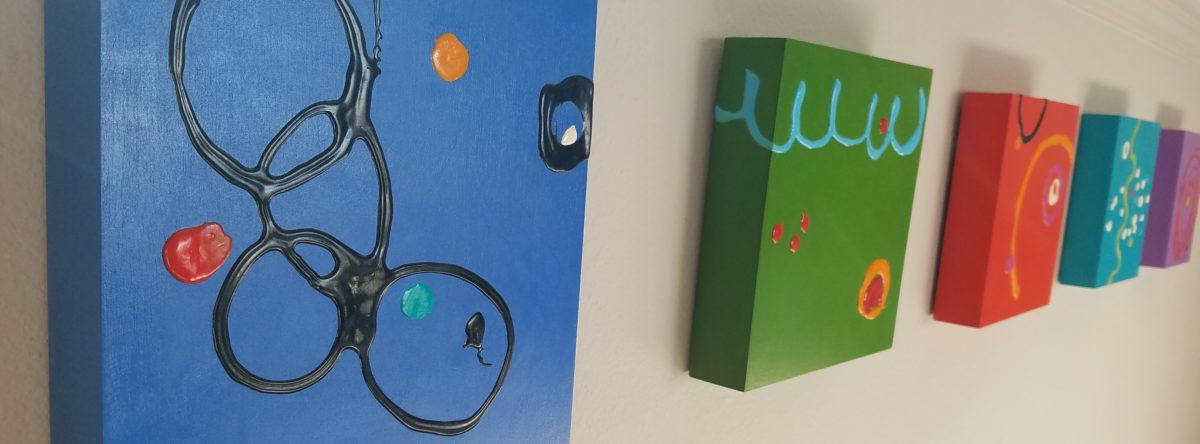
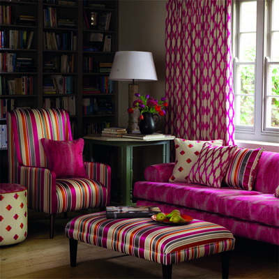
Interior designers welcome floral fabrics as contributing to the pattern mixes, accents and animated offerings amidst other geometric, stripe and solid pieces.
Floral fabrics – here on a textural ground, bring artistic accents to an interior!
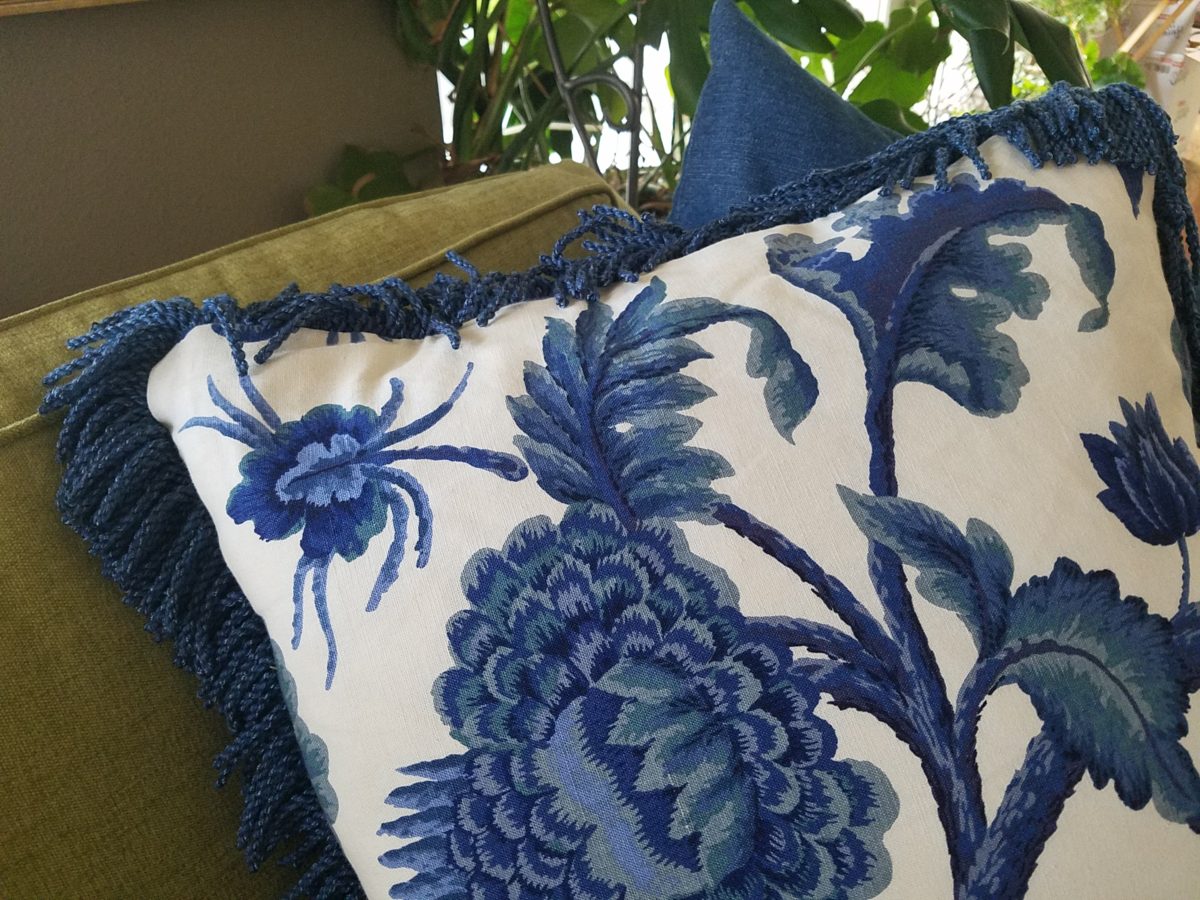
Yet, men don’t gravitate to floral fabrics unless perhaps they sport a tropical shirt in the summer – the uniform of the relaxed, vacay, free and festive escape! You might not find a floral throw pillow on their sofa when batching it. But why not? Spring is spring, flowers are flowers – who doesn’t like them? Embrace your natural instincts! Be brave! Go beyond the aloha shirt and fling a floral throw pillow on your sofa!
Ok…perhaps without the fringe? This denim-blue color on a linen texture is not too flowery – but makes a bright, fresh statement!
Ok – forget the possible gender gap on this subject…
But I did tip-toe outside on the patio tile this morning chilling my toes, to hop across the still dormant grass, in order to take these shots of the first bulbs forced through the crunchy soil to greet the season.
Our daffodils are one of the very first signs of Spring here in the high desert…not indigenous, for sure, but a happy addition to the garden!
In previous spring seasons, I have written about cutting
branches before they bloom in order to “force” the blooms for early bouquets
indoors…and inasmuch as several of the flowering trees have begun to burst,
including Bradford Pears, our is close,
but not quite there.
Bradford pears are early bloomers…go outside and find some flowering tree or bush in your yard and cut a few branches. Leave them tall, long and lanky – if you have the space. Bring them inside and stick them in a bucket of water, or the vase you ultimately intend too use, and watch them bloom practically before your very eyes! It is a fantastic way to celebrate spring in your home or office!
The forecast for the Washington DC cherry blossom peak is early April.
A bit early still, but you can monitor the progress at https://cherryblossomwatch.com/
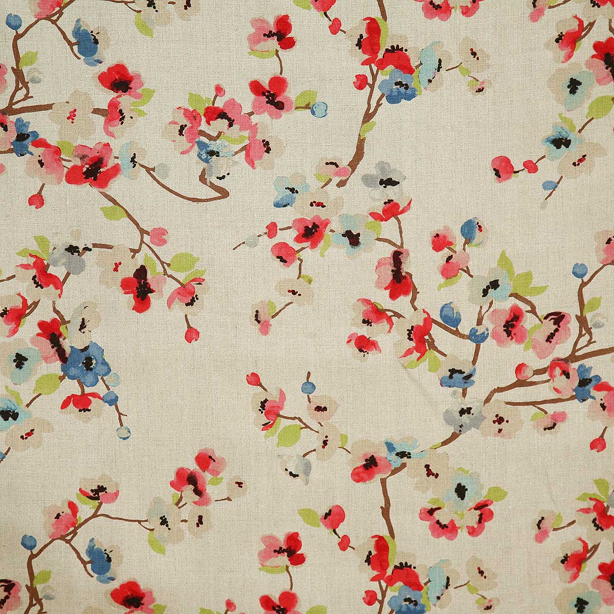
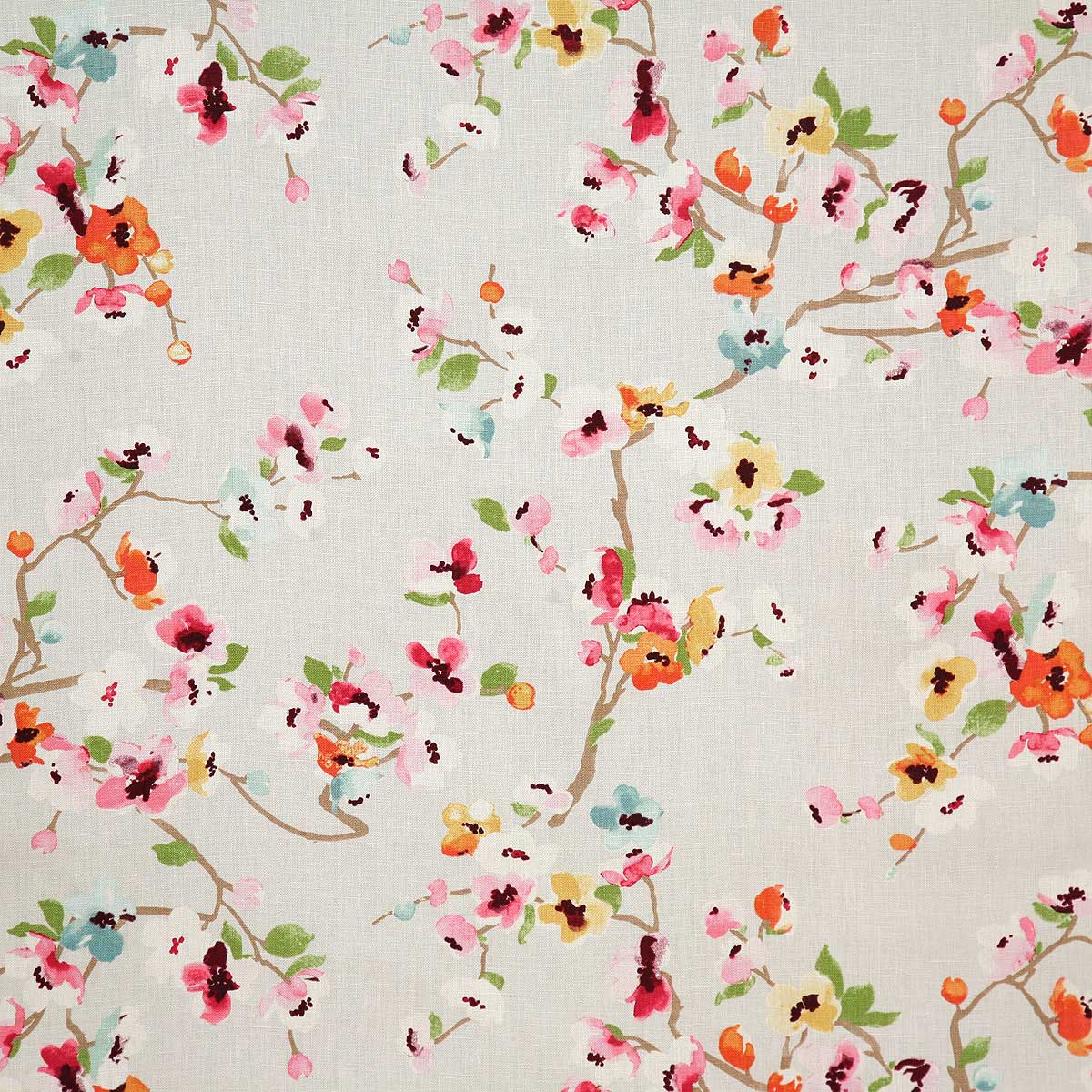
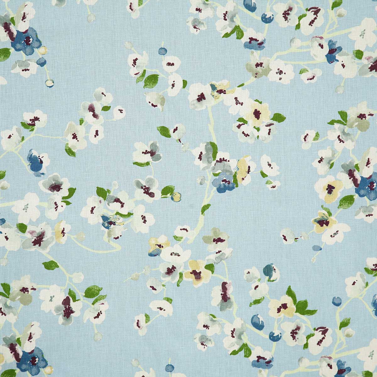
My personal pick for a fabulous floral pattern this season is Pindler’s Cherry Blossom. Floral patterns for Spring – and all year round! I like this one for its linen texture and loose watercolor style. It is relaxed and yet can be crisp – a very versatile print and fabric. It comes in 5 different color-ways and therefore offers many opportunities to incorporate in your interior schemes.
Pindler’s Cherry Blossom on linen – magentaSky, a second of the five color in the Cherry Blossom series from Pindler and Pindler
Artistic accents always a great design detail. We have samples of these fabulous finds at PATRICIAN DESIGN. Come visit our extensive design library for terrific trends, resources, ideas and inspiration!
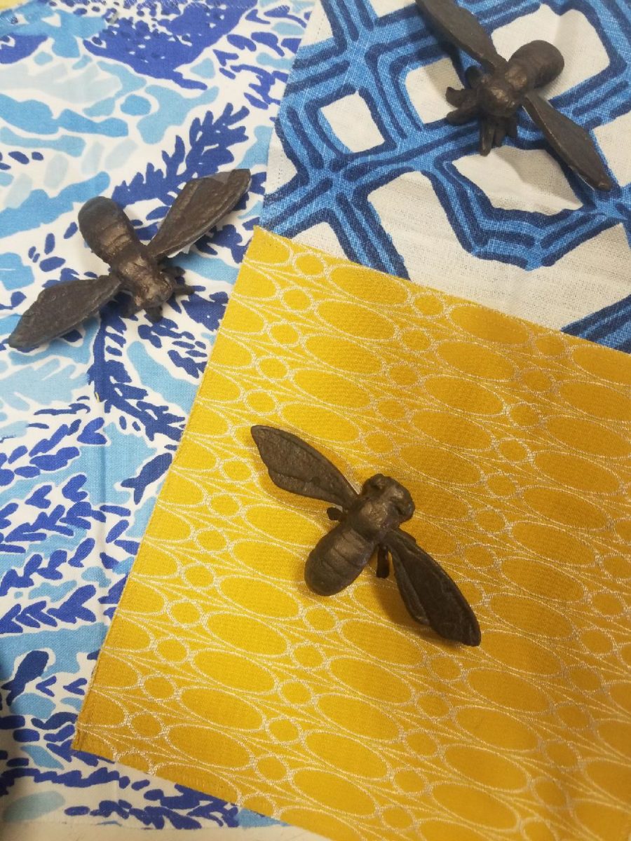
What’s all the buzz about bees this week?? Seems it has been studied and determined that they can discern between blue and yellow in order to prove they can perform remarkable arithmetic.
Last fall while hiking in Boulder, I spied this little fellow on a cornflower.
Yes, it’s official – they can distinguish colors – blue and yellow – in order to prove their math skills! Want to know more? You can immerse yourself in the study here:
In our source library at PATRICIAN DESIGN, we have hundreds of fabric samples from designers all over the world…these little iron bees were irresistible for our purposes today!!
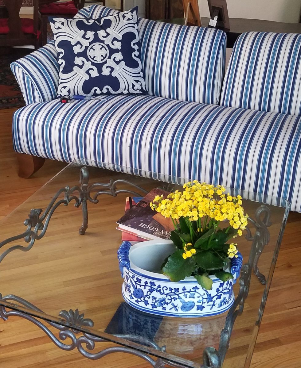
Blue and yellow as a color palette is classic. I never tire of it. I find myself encountering it often. Blue and white…often punctuated with yellow. It transcends styles.
Color schemes are the basis for so many design related exercises. Finding your color preferences for your lifestyle from clothing fashions to interior appointments – it’s about personality, temperature, lighting…
Here’s a great link to get you thinking about color palettes
or finding one that suits your personality.
Collecting art, investing in art, loving art, designing with
art…one aspect or all of the above, art in interior design has many facets. I
have written previously about and presented a workshop about “I want a
piece of art to go with my red sofa,” a kind of raspberry in the face of curators,
collectors, critics and appraisers who would never take or condone that
approach. But the desire and need exists and as a interior designer it is
wonderful to work with artists who can and want to respond to cues, take on
commissions and create for specific parameters.
Contrary to opinions from the high-brows, this is not to say that these artists lack artistic integrity or meaningful self-expression. Their value is as any other – determined by what the market will bear. The basis for this writing is that we work with many artists who love their work. And creating it (even under direction) brings them and their patrons joy.
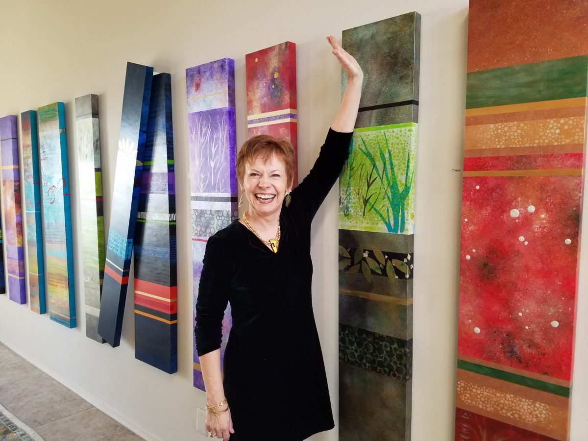
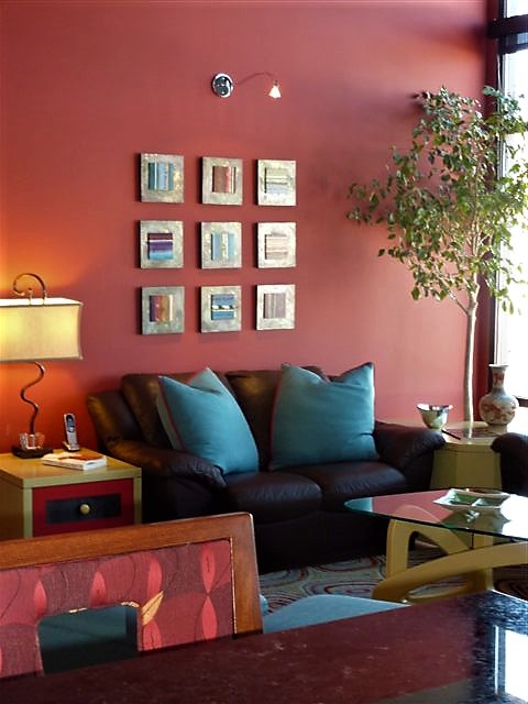
Featured here is the up-lifting, colorful and texturally abstract
work of Patricia Forbes. We have enjoyed commissioning her for specific
interiors over the years and are never disappointed in the quality and creativity
of her pieces.
For scale, diminutive Forbes poses by her Vertical Stick series.
With so many mass-produced art offerings at the trendy home
decor stores, it is refreshing to encounter new clients who are at the start of
their nesting years, establishing their own domains, selecting things that
bring them comfort and identity and who’s appreciation lies in acquiring original art.
Designing an interior is about comfort and personal identity. It is about surrounding oneself with things that work – both functionally and aesthetically. Individual’s requirements, in either of those departments, can vary greatly – but suffice it to say, each person or couple or family unit creates a home environment based upon their likes and needs (and budget).
Enter the interior designer. When calling on the assistance
of someone outside the intimacy of the home, the client is hoping for and
expecting a successful custom-tailoring of their requests based upon the
experience of the professional.
When designing an interior, it is exciting to use existing
pieces already owned by the client. It is gratifying to arrange and place those
items in ways not yet imagined – thereby justifying the investment in design
consultation. After an intense session of rearranging furniture, artwork and
decorative accessories the “ta-da” moment is one of near instant
gratification and satisfaction.
When an interior needs a little something to pull it
together, fill a gap, create an accent or establish a focal point, it is great
fun to engage the creativity of an artist to custom design a piece to fit the
need. Approaching an artist for the express purpose of acquiring a piece of their
work to enhance a space is an exciting
venture. It is a personal connection between artist and patron that creates a
communion, a bond.
Here I took inspiration from a single panel that Forbes had constructed and requested a series of 9 panels grouped in a grid to make a larger statement on the wall. The interest created from a grid of images adds movement and dimension to this series already complex with sculpted texture and applied layers.
Color, texture, size, style, subject (or not) all are aspects of art that are to be considered for the personal interests of both artist and patron. If the patron has selected an artist to approach about a commission it is as a result of experiencing their work and appreciating it. The artist, in response, is to accept the parameters of the request and enjoy the challenge and process of creating the intended/desired finished product.
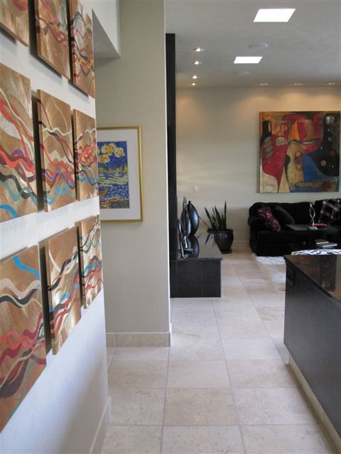
The intensity of this rich red wall was decided early in the design process. As we built layers of existing elements and introduced new pieces, the desire for a custom installation became apparent. This Urban Elements series was a collaborative effort between Forbes and me to provide a bit of an edgy, industrial vibe to this eclectic urban loft. Note too that the end table and coffee table were locally crafted for the project by Kirt Kirkpatrick
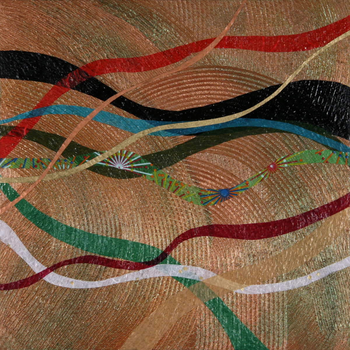
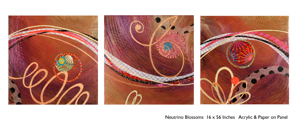
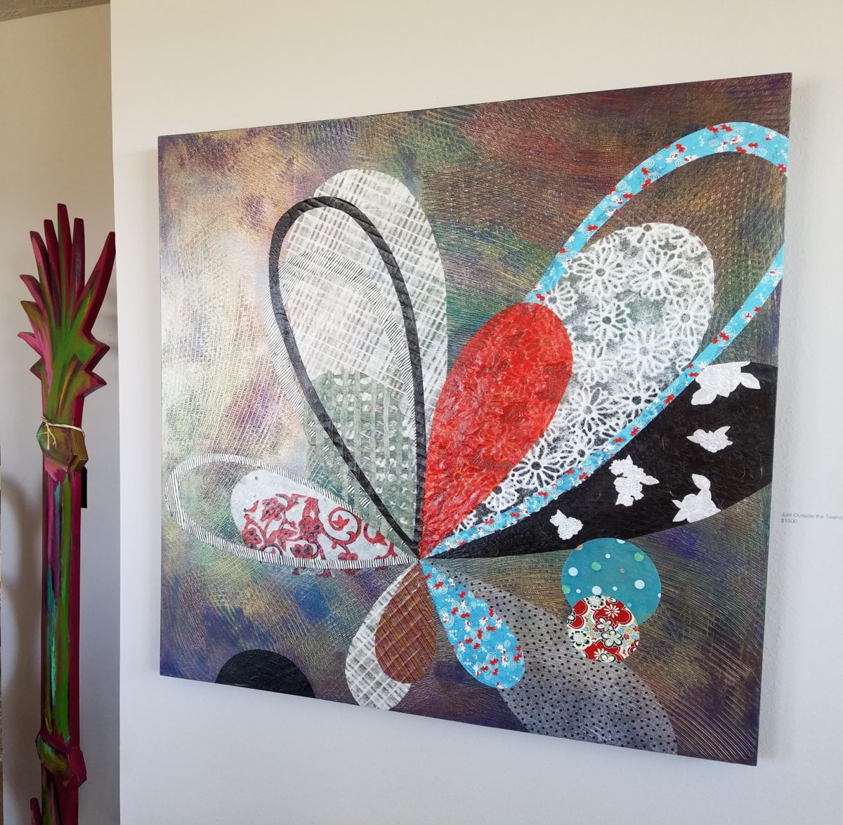
Forbes’ creativity is rooted in pattern, color and texture.
Primarily non-objective, her pieces are compositions of movement and dimension.
Working with a layering technique, she builds her action with a collage of
papers and fibers, paint and stain. Action is key when describing Forbes’ artwork.
She creates for herself, but when called upon to collaborate
on a project, her eager curiosity for what might result is enthusiastic and
ever-promising. About her style and self-expression she states “When I
have created a joyfulness and vibrancy in the work, I know I ahve created an
experience I wish to share.”
When asked…
1. How/when/why did you start your abstract technique of
layering colors and textures?
Forbes has always been drawn to color as a means of her personal expression, once she “experimented with acrylic materials that would hold a texture and started playing with those using combs and rubber spatulas and sticks to mark in the materials” she was hooked. “Metallic and interference paints call to me — so I began to combine the over the textured backgrounds, and then discovered that with acrylic one could imbed paper. It was really experimentation and discovery of what these amazing materials could do…”
2. What is the most satisfying aspect of your art for you personally?
The
element of surprise is what gets Forbes excited! “When something comes
together almost unexpectedly and I wonder how I did that — it’s always a search
for the right combination of elements, colors, textures, feelings.”
When they all come together she experiences great satisfaction. “It’s
like turning over pieces to see what fits. Sometimes I have to turn over a lot
of pieces to get the right combination — sometimes wondering whether to
continue. Seems like it is always worth continuing the work to a happy
conclusion.”
3. Why do you enjoy commissions to create specific pieces
for interiors/patrons?
Forbes
expresses genuine gratitude for her patrons. “I feel honored and
appreciated when someone likes and appreciates my work and invites me to do
something special for their home or office space.”
4. What pleases/satisfies you about this custom commission process?
The
process of working together with her
patrons is positive creative challenge. “I enjoy the collaborative aspect
and going through the process with a client or designer and receiving their
feedback as the work progresses.”
The
satisfaction for a designer in partnering with an artist is designing and realizing
a vision to complete a space. Bringing visions to reality. I often say that my team provides tremendous
support in making my dreams come true. From artists and craftspeople to seamstresses
and all manner of contractors, it is truly a team effort to achieve great
results!
Time to remodel the kitchen!! This charming little bungalow had already experienced its share of remodeling – well, not so much structural – although, many interior design transformations had occurred over the decades. In the mix, the well-used and enjoyed kitchen was feeling a quite tired and dated.
You might remember I have used this now completed project, in the last few months, during its transformation process to identify certain features and design practices. Here is the as-promised unveiling of the before and after photos for further discussion about the design process, intent and results.
We loved the mottled color and organic character of the existing slate floors and opposing green-grey beams with spanning boards of a caramel stain. These were the two elements that went well together as though intentionally planned. Yet in between, the pale, peachy pickled oak cabinets with their radius detailing and red-rose/black matrix of the tiled granite counter-tops, didn’t seem to speak at all well with the ceiling treatment and slate floor’s greens, rusts and charcoal tones. It was a dark, confused space.
When observing and “listening to” the house, it was evident that the current kitchen, in addition to being poorly coordinated, had absolutely nothing to do with the original architectural intent. The new owners had brought a few very fine antique pieces into the home. The mid-century circa 1964 age of the house accepted them on its original hardwood floors also adorned with their fine antique rugs…but something was missing. There was no cohesive thread running through the house. Over the years finishes and decorative elements had been selected and installed without any consideration for original materials or an attempt to introduce compatible and harmonious materials for the good of the home’s overall theme.
In all fairness, had the entire interior been gutted and a
contemporary interior been uniformly installed into the framework/shell of the structure,
I might have considered it a success. However, this multiple decade decor was a
mix of disparate trends and preferences that had no commonality.
To begin the process of bringing this home into a cohesive
design last year, we had redesigned the living room. There we introduced a classic
blue and white color scheme derived from the Persian rug in the adjacent dining
room.
To the corner kiva fireplace, we added a sandstone hearth and
mantle with just enough blue and white Talavera tile trim at the base of the
hearth to subtly coordinate with the new scheme. The Talavera was an
appropriate material for this New Mexican bungalow.
The original fireplace had a dark, broken brick quarry tile hearth and no cap on the mantle.The face-lift replaced the hearth material with broken-edged sandstone slab and matching mantle cap with Talavera detailing at the bottom.
With this living room having been so successfully re-designed, the obvious thought came into the discussion to continue the vernacular of the blue and white Talavera into the kitchen. As a bit of a purist when it comes to application and termination of materials, I was not content for a mere back-splash. No, if the tile were to be effective and commandeer the stage, it had to be used wall-to-wall as though an entire wall treatment.
Treating the Talavera tile as wall-covering, it continues from the kitchen, into the adjacent pocket-space housing a desk and laundry machines.
But wait! The addition of an earthy aqua handmade tile from
Spain offered an appealing and unexpected accent woven intermittently through
the Talavera. It created a coordinating thread from the colors found in the mottled
slate floors and ceiling beams.
Pre-grout shot shows the individually cut 1″ pieces inserted as mosaics into the random field of Talavera
The cabinets were in excellent condition, but the doors were
sadly dated and in no way spoke to the home’s other cabinets, doors and finish
carpentry.
The confused interior finishes we in need of a transformation!
With the white raised panel theme throughout the home’s original appointments, we elected to salvage the cabinet boxes and replace the doors and drawer fronts with a similar raised panel detail. The same red oak was used and, with a glossy white paint applied, the grain “read-through” with a very intentional yet subtle moiré-like pattern. The new raised panel white doors and drawers, with crowning top molding provided a crisp, timeless motif. The random patterned Talavera used as an entire wall-covering was very effective. The kitchen was quite gussied-up!!
The transformation was dramatically successful!
The existing slate floor was beautifully organic and I felt, from a design standpoint, was a must to salvage. Making it look like an intentional selection – part of the new scheme – was imperative. Therefore, selecting a counter-top that communed with the tones in the floor resulted in a selection of concrete-like engineered Italian quartz material – balancing the floor with the next horizontal plane and ultimately with the stained and green-grey boards of the existing ceiling treatment.
The new concrete-like Italian quartz counter-tops coordinate well with the other materials.
Another asset was the connection to the outdoors, however the existing window over the sink was high and small.
The window over the sink was high and small…
By bucking the warranty of the Pella people, we had a new double-hung window made to close down onto the new counter-top that passed through from inside to out. They would not fabricate the window to do what we intended, so we had the contractor remove the bottom of the new window frame, thus rendering the warranty null and void, in order to have a completely open, uninterrupted pass-through when raised.
Amusing and interesting…existing family pieces of blue and white ceramics are being discovered and used as decorative accessories in the new kitchen!
We also captured the opportunity to open the opposing wall into the hallway adding pass-through light and dimension to the space. This exponentially expanded the space and made the encapsulated kitchen feel much less confined.
Before, the kitchen felt small and dark…Opening the wall into the hallway brought in additional light and dimension.
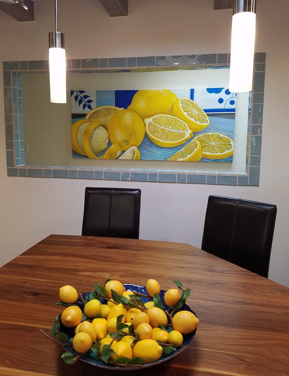
To add drama to the newly created dimension, we discussed having a painting commissioned to pop an accent of yellow into the blue and white scheme on the far hallway wall. Lemons, a perfect citrus for the kitchen, was decided for the theme.
A miniature oil painting by Federico Leon de la Vega was used to Photoshop into the scene to inspire and convey the design intent.
The additional POP of yellow is a dramatically effective contribution to the overall composition. After consideration, the owners selected a local artist to paint the full-scale painting.
A local Albuquerque artist, Thomas Tomlinson rendered the lemons in acrylic with blue and white tile details.
In summary…keeping the original slate floor, existing cabinet boxes (replacing door and drawer-fronts only), with a bling of new chrome cabinet pulls, switching out the stained glass pendants, replacing the island’s surface with a handsome solid walnut top and a new coordinating concrete-like counter-tops on the periphery, with the decorative embellishment of the Talavera tile continued from the subtle introduction at the living room’s kiva fireplace, the transformation of the kitchen is stunning – not trendy – and was truly, uniquely designed for the architecture and forward, on-going contextual design conversation of the home.
Uniquely designed…
Look around and listen to the environment for and in which
you are designing. What makes the best sense for the design direction
considering the function and context of your project?
Colors for fashion, interiors or a composing a bouquet are like the many ingredients, spices and herbs selected for great food. Creating dishes with fine flavors and visual appeal, by selecting the right combination, is good culinary design. So we see the spices and ingredients of design everywhere!
Assembling the colors, textures and shapes in a bouquet…
The art is in gathering the right combinations, textures, colors, flavors,…ok – maybe edible bouquets…Well, we’re not tasting the interiors – but some are scrumptious! Ooh – good enough to eat! And the fashion – yes, we’ve seen edible fabrics…generally not attempted in draperies – but who knows? The sky is the limit in design!!!
A few years ago, Kingston University Fashion Student, Emily Crane began pioneering a new strain of edible couture created from gelatin and seaweed! Brilliant and beautiful!!
Inasmuch as edible couture and creating fabrics from edible materials is fascinating, I digress…the actual point of my story is to recognize the common denominators between gathering materials for all forms of art – the assemblages result in the creative finished products. In this instance, interiors and their color schemes which bear likenesses to beautiful foods!
Color is the most apparent ingredient of most artistic design endeavors. It is the most obvious and first to catch your eye. Assembling an interior is usually grounded by a desired color. The foundation of a room begins with deciding a direction with color. This might seem to be contrary to the concept that form follows function – but I believe that the designing for the two are often concurrent events. The vision occurs while the function is simultaneously examined. Most people visualize in color.
I often write about color. It is an ongoing fascination to discover who prefers what color(s) and why. It offers the beginning of the visualization of a concept. As the framework is discussed – such as programming a kitchen. Inevitably, in the early stages, colors and materials are discussed. They might change. They might not end up as first imagined, but color aids in the visualization and process of design.
Look around your world and consider color. Why did you choose your interior colors? When selecting a color for the surfaces, fabrics and finish materials what would you do differently and why. Taking care not to merely react to trends, what colors will bring you joy? Trends often tempt. They are enticing and new, but they move along…It takes thorough examination to determine if a trend is truly applicable or merely a passing temptation. The validation of design is the approval of the occupants or function for whom/which it serves. Not just the feature of a new trend.
So have a little fun seeing these interiors
paired with edible color schemes as dishes are correlated to interior schemes.
The spices and ingredients selected to create the flavor bursts might be hot green jalapenos, serranos, tart limes, dried red chiles balanced by the soft and warm yellow of corn tortillas.
What interior might look like a spicy platter of festivity?
Perhaps bold wall colors sprinkled with myriad decorative accessories and
functional art.
Spicy colors in this festive kitchen.
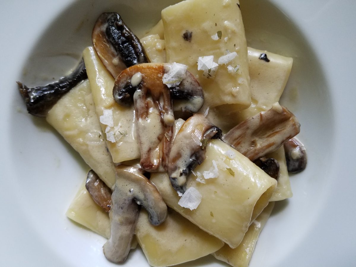
Imagine creating a creamy white-sauce mushroom pasta with
velvety texture and soft finish. The ingredients you would reach for would be
the cream, pasta, white pepper and perhaps a touch a sherry. Sautéing the
mushrooms in butter for a luscious golden brown.
Invitingly divine.
An interior that captures a similar feel derived from the same palette of colors…
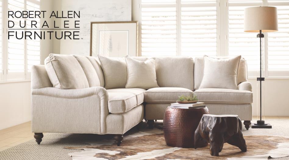
Mimicking the creamy mushroom palette, rich wood, copper and steel tones contrast against the creamy whites in this interior featuring one of our favorite furniture and fabric lines – Duralee/Robert Allen! Duralee/Robert Allen has many collections providing the perfect fabrics and furnishings for so many deliciously diverse interior projects!
From creamy, soft and warm to cool and refreshing…
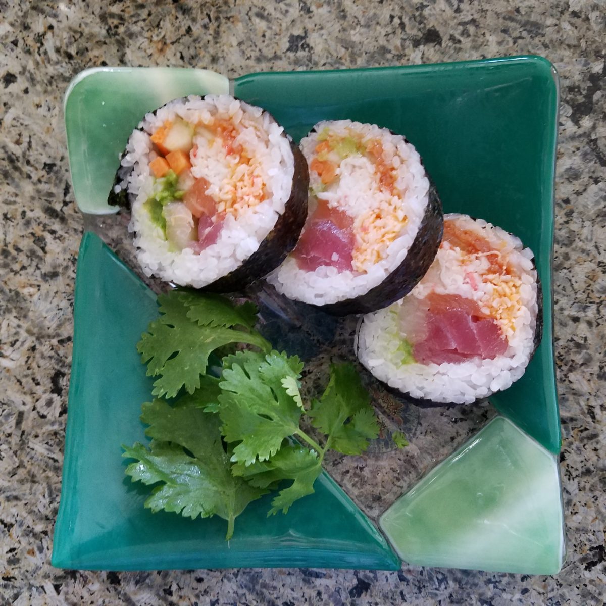
Cool sushi plates featuring the pink and orange tones of tender fresh fish, cilantro sprig greens, and so white rice!
An interior possessing similar colors – the perfect ingredients to create a stunning design!
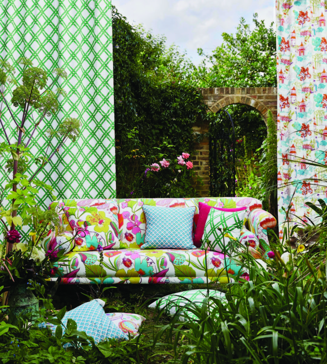
Durlaee encompasses many fine collections. Here the Clarke & Clarke Oriental Garden fabrics are gathered together to present a fresh scene reminiscent of our colorfully fresh sushi plate!
Ready for reds?
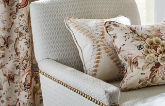
A berry lovely dish with creamy whites…Our delectable raspberry tart presented on a lace-embossed white pottery piece accented with finely sliced toasted almonds sets the stage for the next interior color scheme… Once again we are featuring Duralee’s Clarke & Clarke statement called Zanzibar a brilliant raspberry and red ethnic statement inspired by the exotic and vibrant world of Tanzania, Africa. Discovering the creativity of colors and fabrics in distant places offers a mélange of ingredients with which to create an exciting interior design!
Mix it up. Gather the
ingredients that will bring you joy and result in a deliciously creative
interior!!! Come see and feel these fabulous fabrics and furnishings from
Duralee/Robert Allen in our comprehensive design resource library at PATRICIAN
DESIGN! Call us and we will send samples!
The total sum of an interior…comprised of the shape and volume of a space, the colors and textures, architectural details…then layer the lighting, furnishings and decorative accessories and ta-da! But is that all there is?
The beauty and intrigue of interiors is what keeps us
discovering and creating. Yes, finding intimate pockets or grand expanses that
please and dazzle.
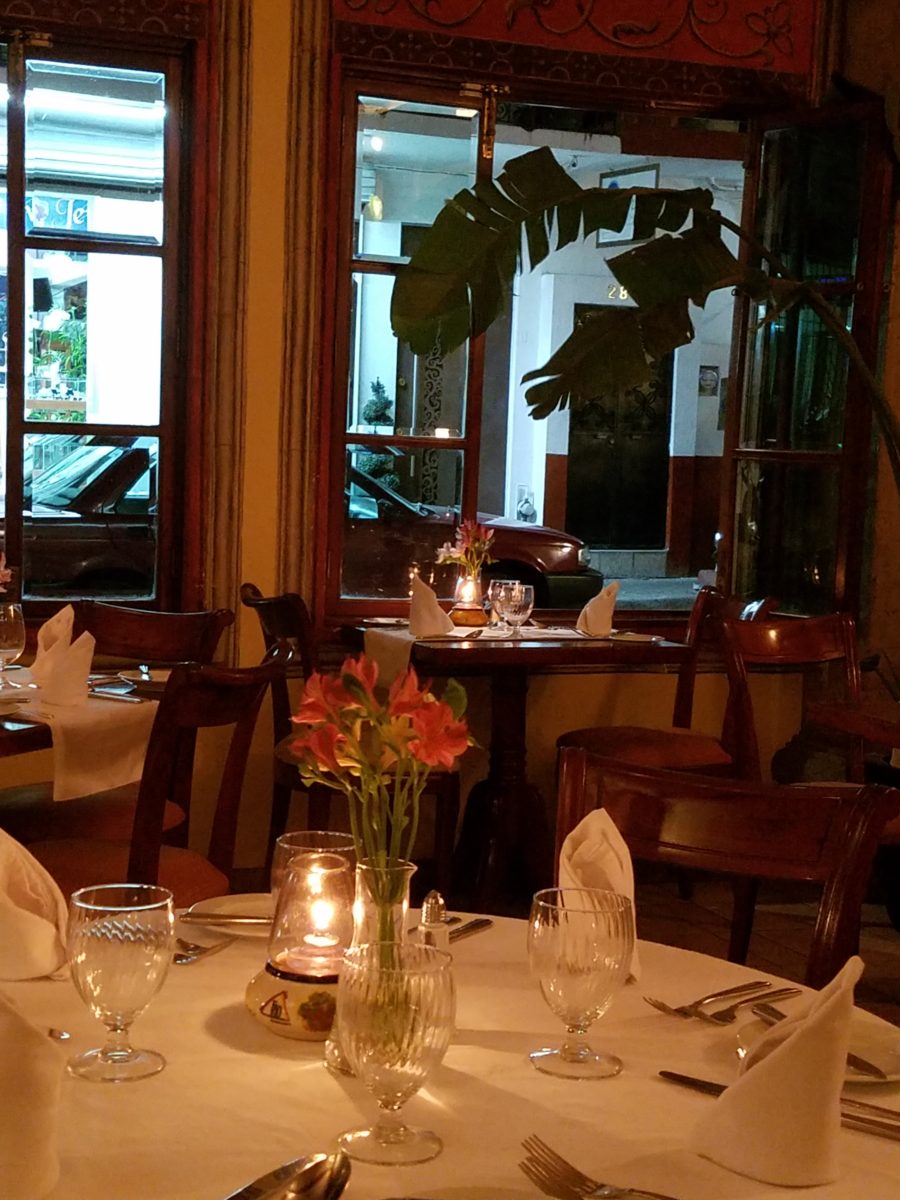
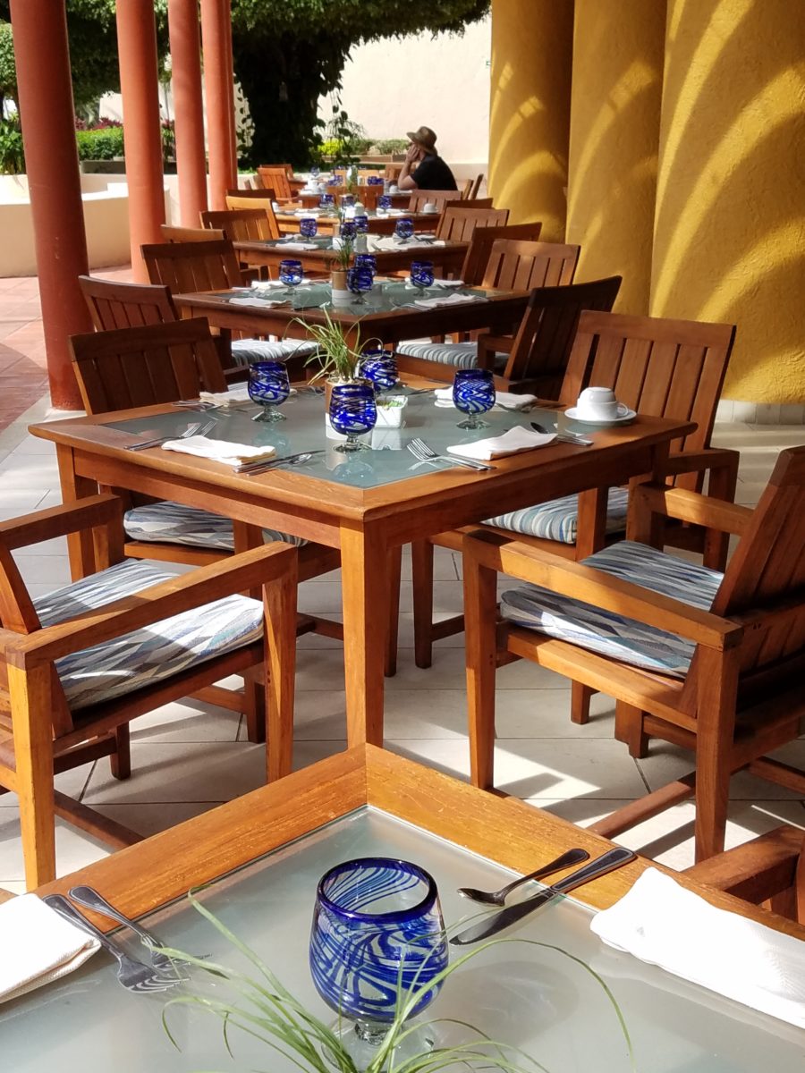
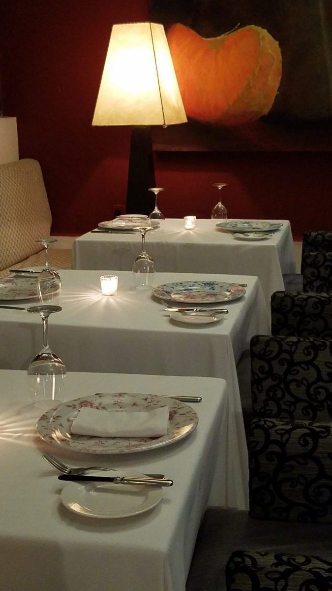
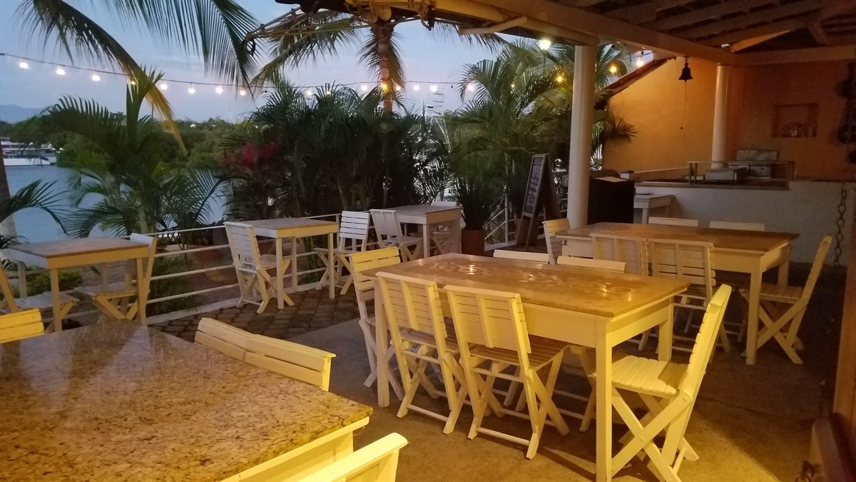
The romance of this setting caught my eye…the far table by the window – set for two seemed a likely scene for a tete e tete to take place!
While traveling in the tropics these last few weeks, I
discovered many interesting places. Oddly, while experiencing all the sights
and sounds flavors and colors of this paradise, I immersed myself in the
unlikely and completely opposite world of early 20th century Russia with A
Gentleman in Moscow.
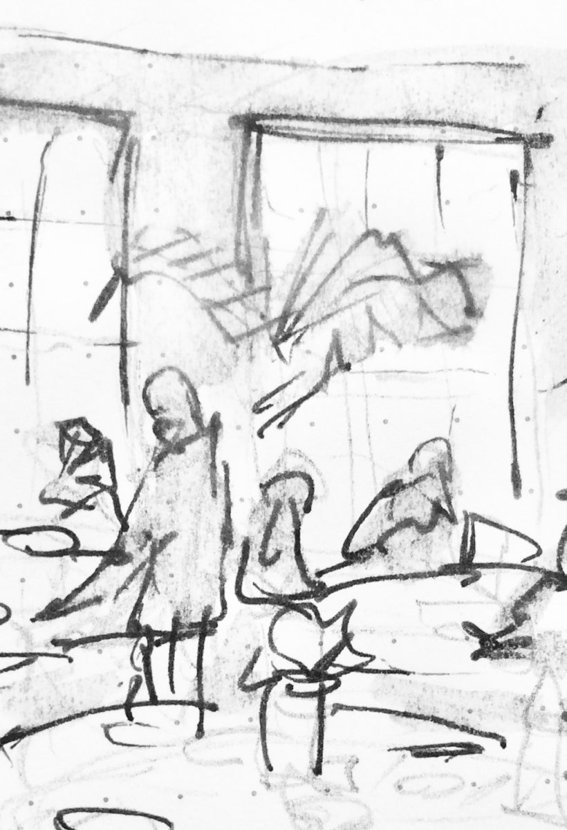
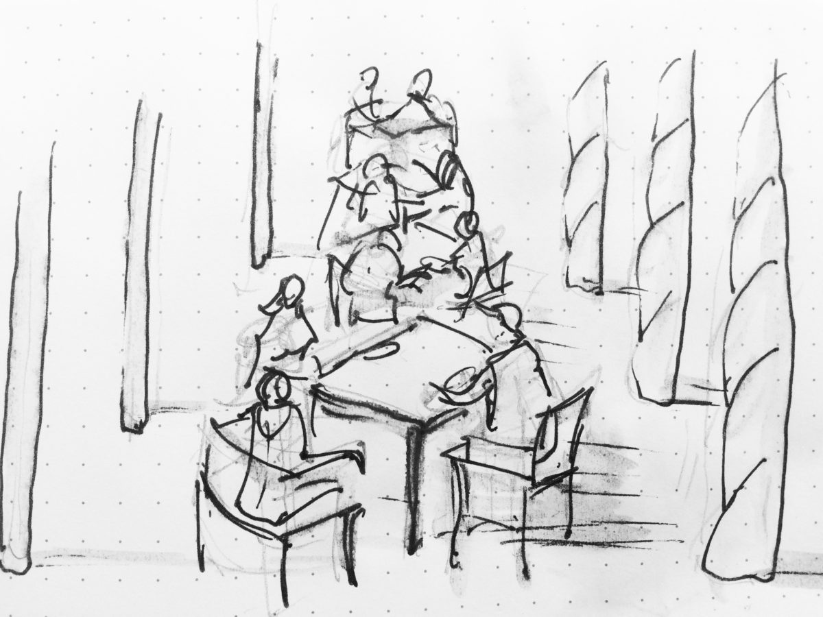
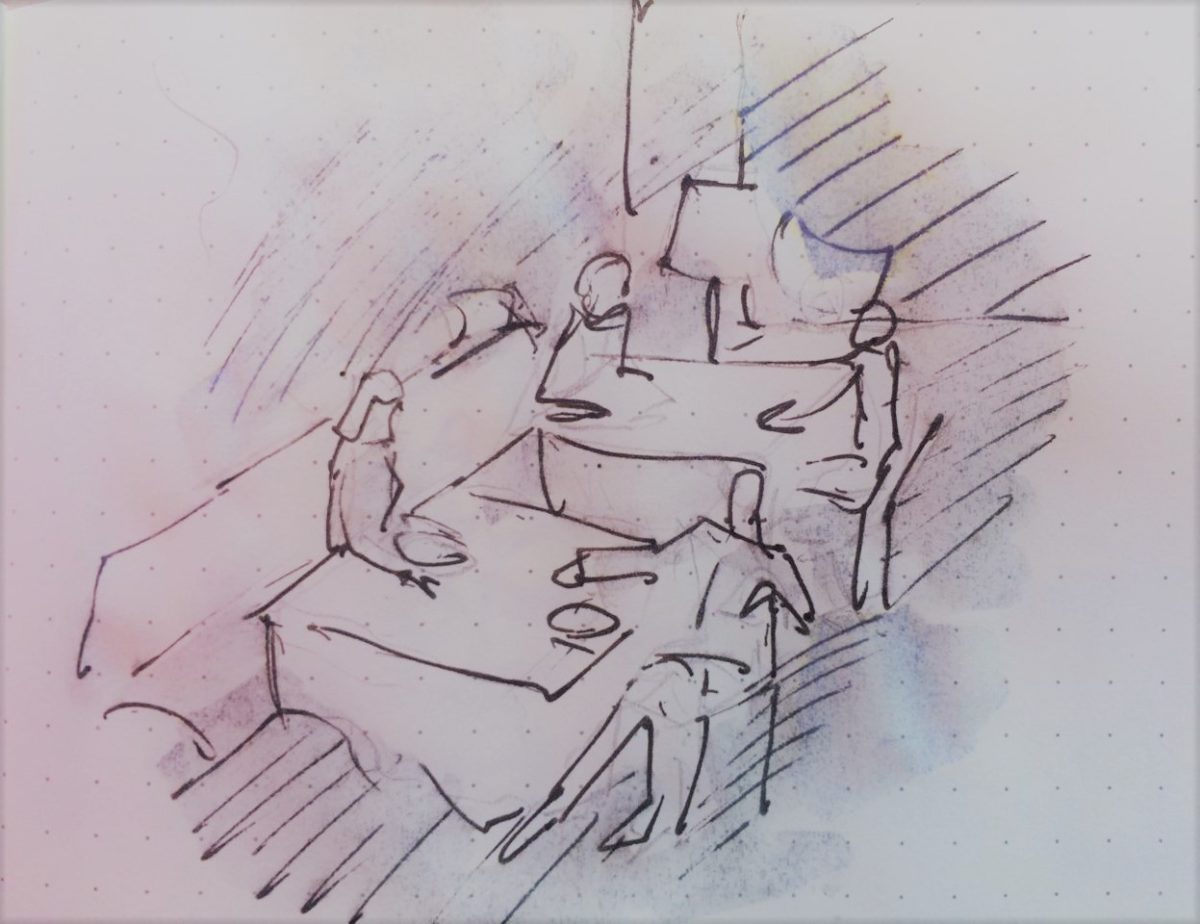
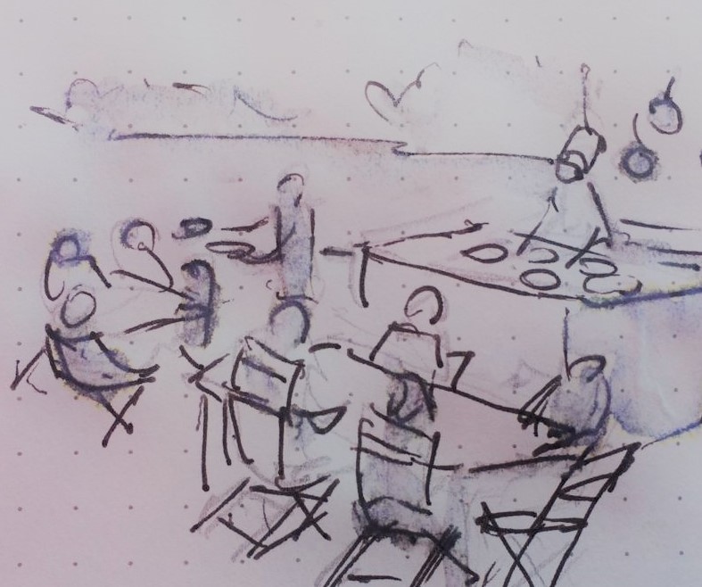
Just for fun, I sat with Federico Leon de la Vega today as he did 4 – minute sketches of some of my photos…needless to say, proper illustrations would have proved more telling of my romanticizing the talents of artists conveying imaginary activities in interiors…but it was fun to play with this today!
The beautifully and artistically articulate writing style of
Amor Towles held me captive. And what a dichotomy to play ping-pong with my
brain as I digest the restricted realm of Count Alexander Ilyich Rostov while
basking in the warm sunshine with fresh sea air and palms rustling overhead…It
seems that the extremes of this pairing suited me well as it was a dual escape
– a vacation getaway while taking me further into fantasy with another dimensional
experience of this incredibly great read!
Although there were many fascinating observations made by
the author, it was this passage regarding the Count encountering a young
artist/architect that prompted this subject for this week’s blog. The
architect, finding himself in Moscow in the post Czar age of socialistic
experimentation and implementation, bemoans the lack of work “The way things
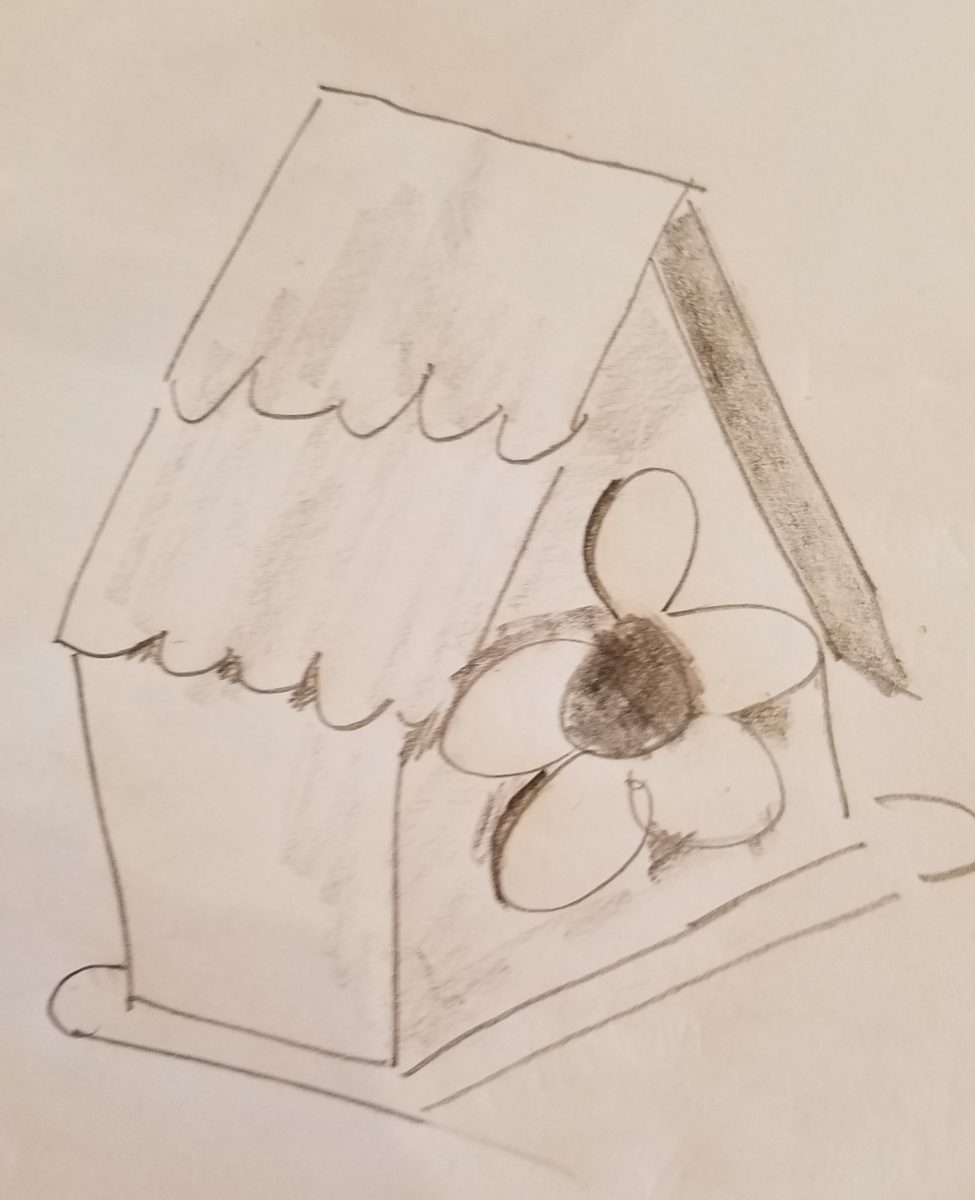
stand, I’d be happy to design a birdhouse.”
“The way things stand, I would be happy to design a birdhouse!” Sketch by PH
The mayor of Moscow has made an observation espousing the birth of “the golden age of the prefabrication, cement-walled, five-story apartment building” – with the very practical “four-hundred-square-foot living spaces with ready access to communal bathrooms boasting four-foot tubs (after all. who has time to lie down in a bath when your neighbors are knocking at the door).” The mayor further emphasizes and rationalizes “So let us not get bogged down with elaborate designs or bow to aesthetic vanities. Let us apply ourselves instead to a universal ideal that is fitting for our times.” A horribly inhuman decree in my opinion, rather than a should-be, truly magnanimous spirit. Humans are designed to design!!
The sentiments of the new regime left the architect with having to find avenues to utilize his talents – specifically sketching as he set forth to illustrate a brochure of the city’s finest hotels as retained by the Intourist department. How sad to possess the talent and passion and be reduced to capturing the grandeur without having the opportunity to design??!!
So three things struck me about this situation…one – that the artist was practicing only a portion of his talents and not the true, complete creativity that beckoned him to pursue his career…two – that renderings not only offer the opportunity to preview the proposed design of a space, but they can use artistic license to animate the space for its intended function and three – that spaces are not truly realized until they are filled with the people that are intended to occupy them.
So much so is a room not really finished until it is occupied by the inhabitants for whom it was intended to function, but Towles observes through the renewed appreciation by his architect, “I suppose a room is the summation of all that has happened inside it.” And that is what I enjoyed being revealed as a result of this simple exchange in this one of many experiences in this remarkable storyline .
Humans are designed to design. Rooms are intended to perform a function. They cannot function until they are animated with whatever they were intended to serve. Sketches allow the preview. Sketches are more spontaneous and artfully creative than computer generated versions of the same. Celebrate beauty, creativity and artists!
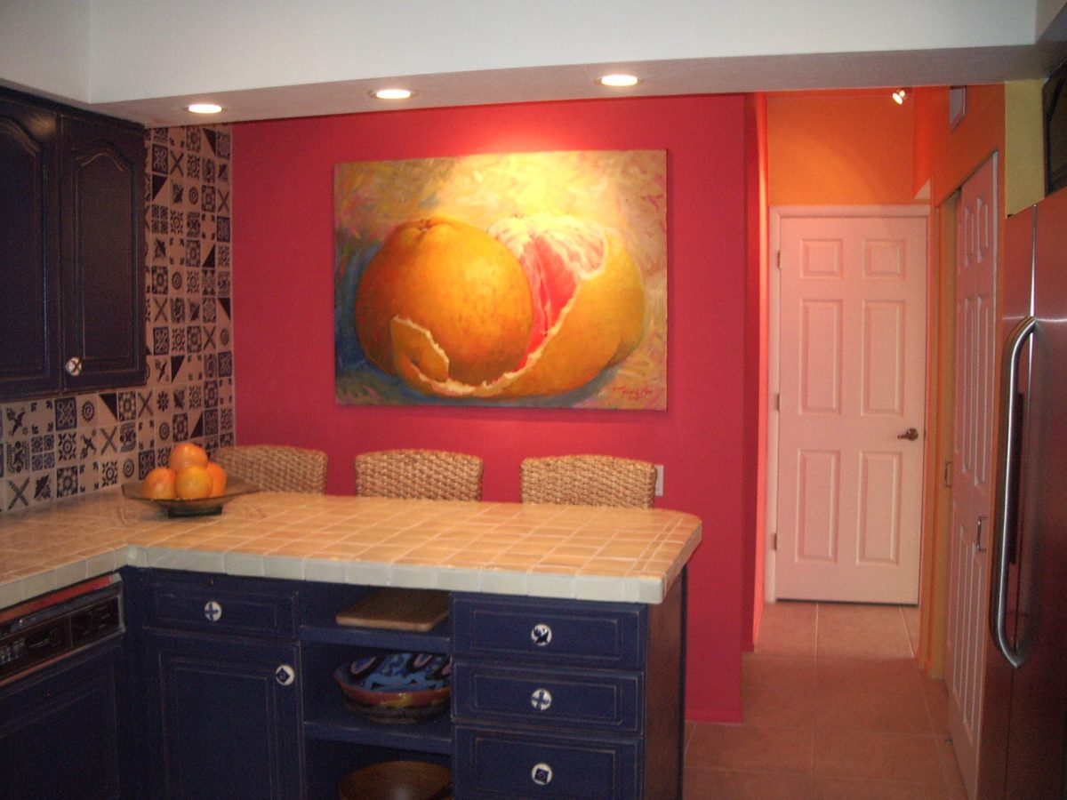
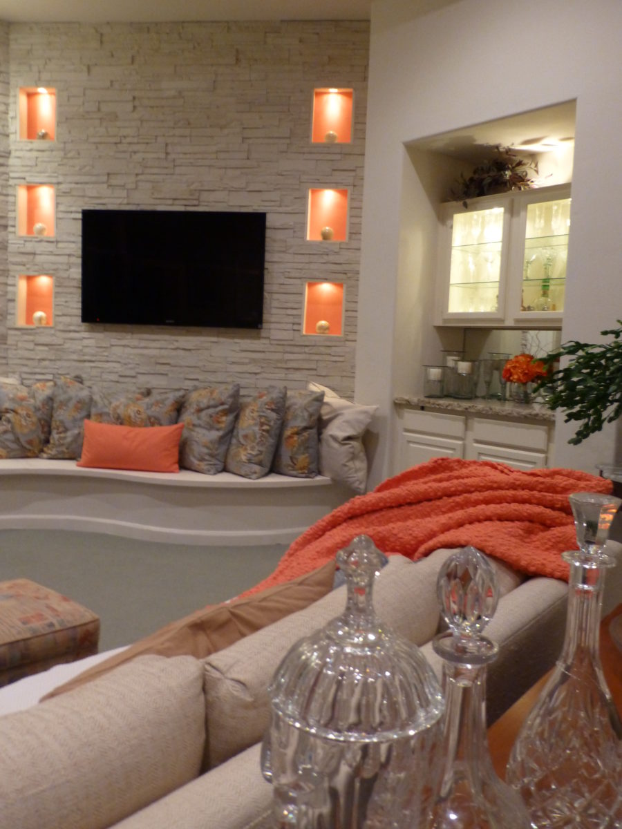
Color. Fashion and trends. Pantone’s annual pick and announcement – this year, based upon observation of the field of design scenes namely Airbnb and Apple, really? I find that amusing. Described by Pantone as “an animated life-affirming shade of orange, with golden undertones.” If orange had golden undertones, it would be more yellow-orange – a golden orange – NOT the pinky-orange suggested by their swatch of Living Coral and myriad examples that are being set forth. However, a few months ago I noticed and saved (because I liked the colors), a Smith’s Food Store envelope featuring peaches that illustrated the cozy combination of the rosy-orange coral tones with the golden yellows – a perfect pairing.
This pinky coral – a hot, but smooth, orange-ish color – has been one of my favorites for years! In 2004 I referenced it as “lipstick” that wonderful color between red, orange and pink! A hard-to-find lipstick shade sought by many!!! It melds fabulously with citrus colors and is cooled and contrasted by blues. A wall of colors depicts this perfectly.
We painted the wall, took a photo of it and emailed it to Federico Leon de la Vega in Mexico to commission him to do this grapefruit painting with its luscious, pink center and coral shades, wrapped in a yellow peel and surrounded by cool, bold, brushstrokes of whites and brilliant blues.
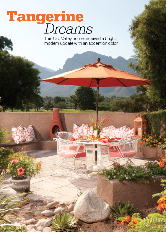
A few years later we devoted an entire project to the fresh, citrus, color tangerine – which because of my personal preference leaned toward the coral shade of orange rather than the pure, natural tangerine. But art is about taking liberties and when developing an orange accented color scheme, all versions are allowed. Right?
This project was punctuated with orange tones from tangerine (for which it was named), and deep warm coral-pink shades. The hue and its many vibrant values!
However, to photo these nuances of color is tough. I walked around the Tangerine project a couple of days ago. It has stood the test of time by beating trends by a few years and not adopting any particular design elements that would have given it away today.
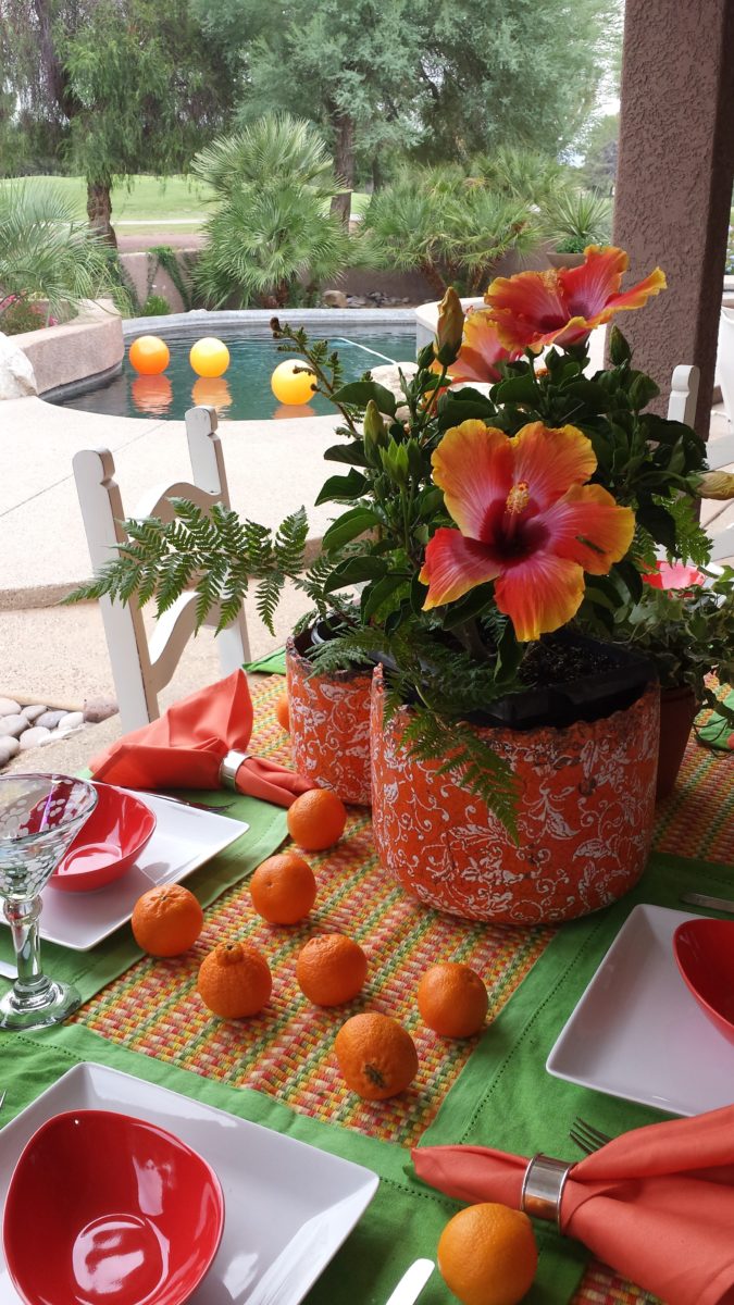
Look at how much nature played a part in the staging of these coral infused scenes!
My advice is to pick the colors that you like – the colors that make you feel
good. Once determined, develop design based upon when to use that/those colors
and when to contrast them or perhaps neutralize them.
Coral is bold and warm. It can read hot and energized –
although is softer than red and less harsh than orange.
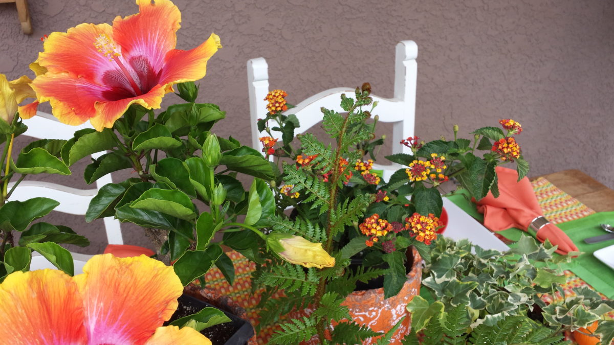
Nature is abundant with coral – not just the living sea
coral – but flowers and the rare fabulous accent fur of Vietnamese monkey the
red-shanked douc!
Vietnam’s red-shanked douc- brilliant coral accents in his coat!
The thought of warm saltwater and fresh sea air at this time
of year is tantalizing. Living coral
doesn’t just say – coral, (of which there are many colors) it evokes that shade that we snap to when
mentioned. Hot, soft pinky coral – a color of seduction. It is featured in
jewelry and art renderings, architecture and interiors.
My advice is to pick the colors that you like – the colors that make you feel good. Once determined, develop design based upon when, where and how to use that/those colors and when to contrast them or perhaps neutralize them.
A little whimsy to celebrate this bold exciting color of the year!!!
Have fun with color – any color- all colors! Welcome Pantone’s Living Coral, into the conversation and design elements, for this New Year!!!
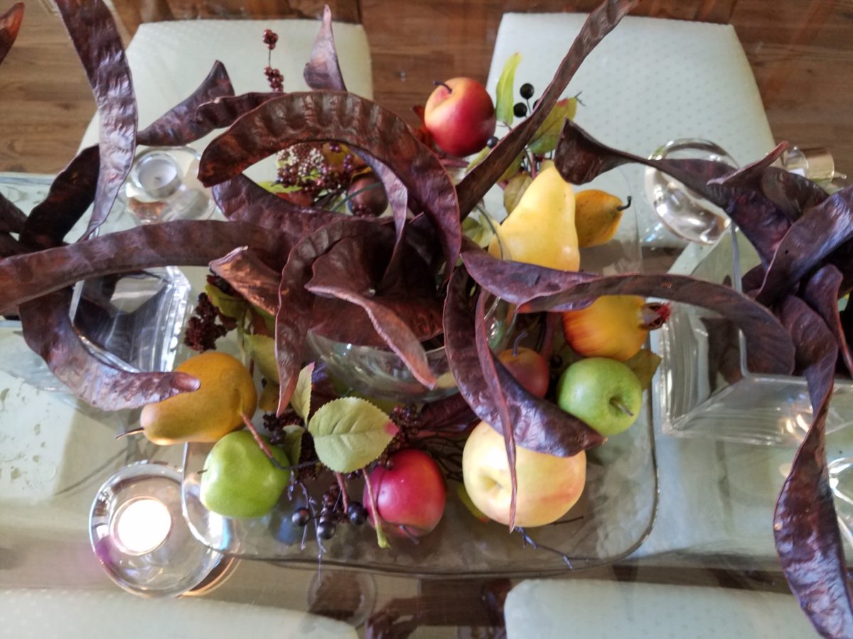
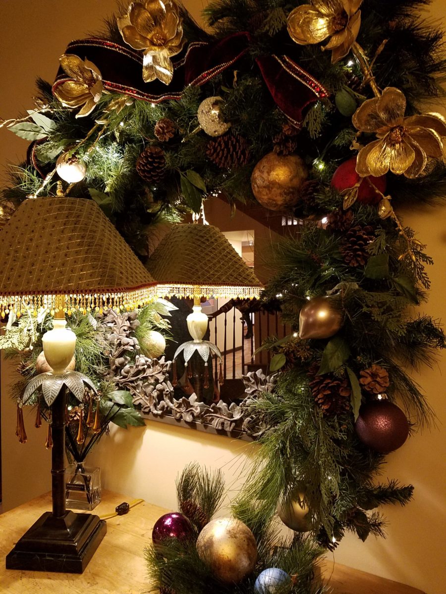
The return of the pods with a twist! Those gorgeously twisted mahogany colored Locust pods that fall every autumn and beg to be re-purposed, if not for their procreating seeds, as table dressings!!! Yes, I have embraced their raw, organic beauty for quite some time. Look back to my introduction to these handsome hulls and the first fabulous table-scape that resulted. https://patriciandesign.com/resourceful-creative-festive-fun/
The original autumnal centerpiece using the Locust pods a couple of years ago…
There have been many bouquets since. Then yesterday, as I walked my 10,000 step trek around a nearby park, I pondered the theme for this Christmas blog and another pod piece came to mind. One lone Locust tree there in the park had produced a blanket of pods that have been weathering these last couple of months – fortunately, not weathered too badly. I gathered 2 dozen of them and marched home with a purpose! Fists full and looking a bit curious, I passed several strollers wondering about my two unusual bouquets.
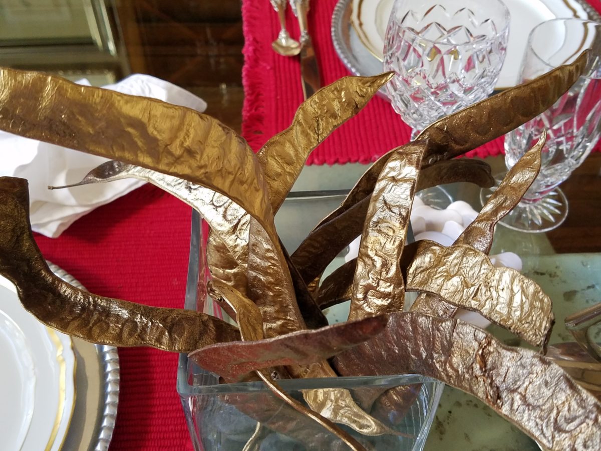
My idea was to tweak them from their natural autumnal brown
to a gilded glory!
Spray painting on brown craft paper – both sides – instant transformation!
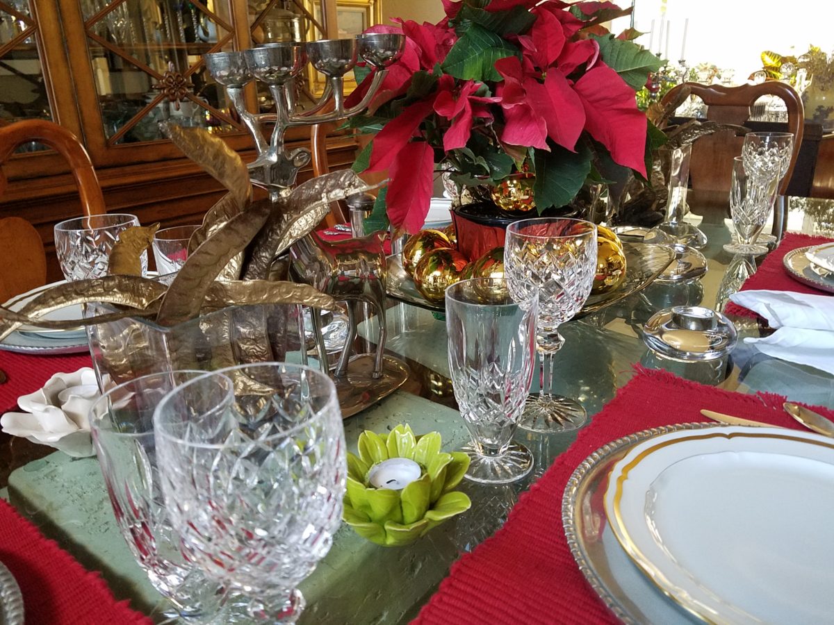
Yes, gilding the lily of lovely rich, natural pods to become wildly twisted golden spires flanking the traditional poinsettia of our Christmas table.
Building the scene as I go…
Last minute gold glass balls ringing the red poinsettia centerpiece,
Spruce sprigs from the yard.
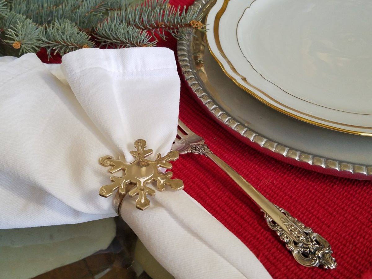
a pair of silver reindeer, silver snowflake napkin rings, blue spruce cuttings from the backyard, scattered votive holders, crystal and china for the touch of formality and we’re ready for our silver and gold, red and green, festive feast!
Mexican pewter chargers, with fine gold trimmed Limoge china, Grand Baroque sterling and aluminum snowflake napkin rings – mixes metals to the max!
There are presents to wrap as Christmas approaches, but here is another kind of wrapping up – from completing projects to taking inventory – the end of the year is busy and everyone is anxious to get things wrapped up!!
Parties are scheduled and scenes are set.
Lovely party last night! Thank you Anne and Ken!!!
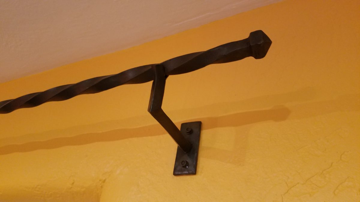
Company is coming and the final kitchen drawer was just finished, walls are painted, custom iron rods were just installed, the tree is up and all is decked for Christmas. The draperies are being finished and should be installed before the big day! Will they be finished before the guests arrive?
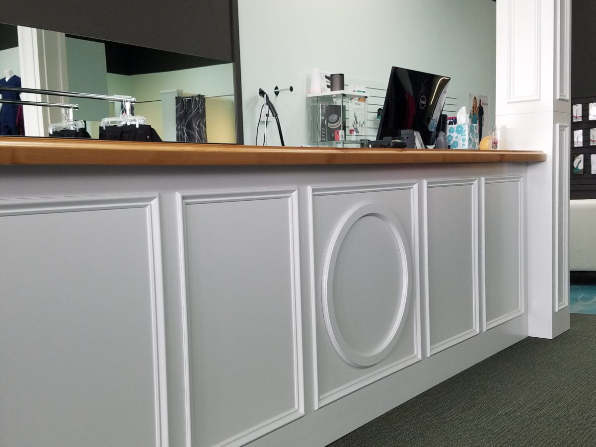
The new store is open! (Watch for more on this soon!) The front window is in festive mode with a Christmas tree and mannequins sporting the newest fashions. The last minute details are installed on the magnificent wrap desk, the POS (Point of Sale – not to be confused with what they might be calling it during the glitch) computer cash register system is on the fritz and hours of remote consultation puts everyone on edge.
The custom designed and crafted tables are finished – although we missed the Thanksgiving deadline – a ski trip that weekend made that a forgivable situation. Delivery to Boulder dodging snow storms was a success and the tables exceeded expectations!
Two entirely different tables custom designed and fabricated, delivered and installed!
Other projects proceed as chair cushions are being finished, cabinet pulls are on order, the rug pad is due any day, the construction drawings for the commercial kitchen are underway, the solar shades are in and working nicely on the designated remotes, the walls need to be patched and painted – hopefully this week, the landscape plans are being priced, the sign package for the exterior of the building are also being priced and the plumbing fixtures aren’t here and might not be in time, the counter tops are still to be fabricated, the plumbing needs to arrive and be installed…and those last few items are for my own house!
If anyone thinks that the designers’ projects go more smoothly or finish on time and go off without a hitch – think again. Murphy’s Law isn’t prejudiced. My own indecision, delivery of the wrong sinks, budget modifications and time delays related to design details being painstakingly executed all contributed to my project not being cleared up before Christmas. Through no fault of my wonderful contractors, so many other things are in play. Designing projects is like conducting orchestras – well, to the extent that there are many players who must perform when expected without flaws – and that is not the nature of most projects. Unlike an orchestra performing a piece, having practiced for hours, days, months, years…projects are never identical and practice cannot make perfect. The variables are many and the permutations and possibilities for glitches seem endless! Perhaps it’s more like juggling rather than conducting!!!
So as we wrap-up the year and hope that everyone’s projects are providing comfort, enhanced function, fun and even profitability, we thank all of our clients and contractors who participate in the process. We are thankful for each of you – our clients and we are equally thankful for all those artists and craftspeople on our team who make our dreams come true.
Designing is like cooking – I guess cooking is a form of design. Yes, it certainly is. Whether it is graphic design, fashion design, architecture, musical composition, poetry, landscape or interior design – artists of all media – the art of creating, designing, composing, it is all about the right ingredients in the right amount to balance the scene. Proportion.
Even though I will be focusing on interior design, the”scene” could be the sheet music, the canvas, the poet’s screen or paper…the “scene” is the window that frames/encompasses the finished product. To compare these artistic endeavors, to the art of cooking, is so obvious to me.
Everyone must cook something. Whether it is merely heating up beanie weenies, with a sliced dill pickle tossed in, chased with a gin on the rocks, it is a composition that must result in a tasty scene – for someone. Having said that, we must also note that “beauty is in the eye of the beholder.” The more successful compositions appeal to a greater number of aficionados.
To cook, one must combine the right ingredients, in the right proportions, to combine to result in the best finished product. When I design, as with cooking, it is often “create as you go”…it is important to add an element and taste…re-think…evaluate…
Assembling ingredients and considering the balance of them in the finished product.
At a glance, the significant distinctions between cooking and interior design is that in cooking, the finished product might be gorgeous, but taste terrible. Interior design is all visual – on the surface…or so you might think…until you evaluate function. A beautiful cake needs to taste as good as it looks. An interior must function as well as it looks. Both are dependent on the subliminal factors that result in a truly successful finish product.
Successful is also in the eye of the beholder…25+ years ago my mother and I went shopping for a leather sofa. She, at 5′ 3″, was a bit on the “vertically challenged” side of the ergonomic spectrum. Therefore, actually sitting in the contenders was important so that her feet comfortably rested on the floor and her back against the back – no propping up with throw pillows to make the fit. So we searched and sat and searched and sat until one day, like Goldilocks, we found one that was “just right.”
A few weeks later, having waited anxiously for this perfect sofa to arrive, Mom excitedly called me and said “they’re delivering my sofa today!” I told her I would be by after work to see it. But before I could finish my day and see this long-awaited focal piece, she called again exclaiming “It’s the wrong sofa!” To which I replied “hang on – I’ll be right there.”
Sure enough, I watched her as she sat on her beautiful new leather sofa and looked like Lily Tomlin doing Edith Ann! Her legs shot straight out and even with a scoot forward, her feet dangled in mid-air. We knew something was wrong. It looked like the right sofa, but we didn’t have the intended dimensions of what we ordered. So all we could do was go back to the showroom and hope the sofa that we thought we had ordered was still on the floor and go from there…
With great relief, we found the showroom model…Mom crossed the room and took a seat. A very comfortable seat. Everything fit just right. So what was with the sofa that was delivered earlier today? As it turned out, it was the right sofa, only hers was brand new. The one on the floor had been sat upon for months and by a thousand fannies…the answer was simple prompted by a simple question. Would they exchange the brand new cushion filling for the broken down stuffing that was in the floor model? And with that – voila! Her new sofa was modified to be the perfect fit – old, broken-down cushions and all!!!!! She still sits comfortably on that sofa today. Function. The outside looked great – the ingredients were a bit off. Ingredients make the difference.
I used this example with a client recently when she had a chair reupholstered. Per her request, the stuffing was not changed – but the upholsterer thought that the collapsed appearance was not good and would reflect a lack of attention on his part. So he plumped and made more firm the stuffing inside his new, tighter envelopes. She was not pleased and thought all was lost. I assured her that it was an easy fix and asked that it be redone. He is in the process of modifying the fill to accomplish the comfort she remembers. The chair looks great – but the ingredients/details are not creating the function that would make it a truly successful design.
As a designer, we often (especially in bidding environments) are faced with “or equal” substitutions to our design selections. The specifications have to be within a certain tolerance, but the results can radically change the complexion, success, look and effectiveness of the design. Imagine how this could affect a recipe? Well,sometimes great new recipes come from unintentional substitutions….take these cookies I baked last weekend.
Barbara Bush’s popular Cowboy Cookies – unplanned, I had a wild hair to bake cookies. I can count on one hand how often that has happened in the last 20 years!! So having had these fabulous cookies recently (thanks Feath), I rummaged through the pantry for the ingredients. Well, I had wholewheat flour, not all purpose, I had a few butterscotch morsels and a few more white chocolate chips. I had no chocolate chips nor coconut. I had steel cut oats not rolled oats. Too lazy to run to the store, I thought that the worst that could happen was that my cookies would be terrible and I would have wasted the ingredients and a couple hours of time…However, I am pleased to report that they are wonderful and resulted in a new oatmeal cookie worth sharing. Substitutions can work, but the harmony of ingredients is the key.
Another issue that can challenge a good design is when there are too many chefs in the kitchen. The ingredients can become imbalanced and substitutions can be made that alter if not spoil the intended results. In some projects, the”lead” shifts. The contractor, subs, and owner can all insert changes that alter the design. This usually occurs without regard for the design as a whole. Each person has their field of vision, their focus of expertise or special interest. Sweet, salty, acidic…each has its place – balance. A disregard for any of the ingredients, poor substitutions or imbalanced quantities – will alter the results.
Yin and Yang – the balance of our known universe – is all at the root of the balance of good design. Balance and the relationships of scale (which are also forms of balance). Rough/Smooth, Shiny/Dull, Dark/Light, Soft/Hard are all ingredients of good design. The balance of these are the equation of successful solutions. And this doesn’t even include the magic of color its balance and compliments.
Many people are good cooks. They have an innate sense of what works. Many people have an innate sense of good design. They often take it for granted. They might not be able to articulate it – but they can create it, they know it when they see it and they employ the rules of balance whether they realize it or not. In both of these cases, theses innately talented people often need reinforcement or encouragement – validation – affirmation.
From dinner guests to friends coming over to see the new furniture arrangement, talented cooks and decorators can get the job done – as with all professional chefs and designers – with the support and contribution of the talents around them.