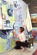
Recently chatting with a wonderfully multi-talented mixed-media artist of many colors, Laura Balombini and I commiserated on the Creative Process. A few weeks ago I blogged about the Creative Process as relates to client and designer interaction. Some people enjoy the detailed nature of the process and some prefer to be spared that enjoyment.
This recent conversation explored the hidden facets of the Creative Process. The light bulbs that go off in the wee hours of a sleepless night, the honing over time combinations and details, and the tapestry of life experiences that become the personal library of resources from which creativity is drawn. Sitting in traffic can even result in an unexpected, seemingly unrelated epiphany!
Often called the inelegant “brain fart,” ideas bombard. They pop out often uninvited – when one is NOT even focusing and trying to come up with a solution. They come about without prompt or foresight. They happen.
Creative minds can rarely unplug. Downtime takes a concerted effort. Even those rare moments of attempted escape are invariably interrupted by unwanted, but often valuable, ideas. Not that the ideas are unwanted, but the spontaneous interruptions can be unavoidably annoying.
Yet, it is exciting. Having ideas and bringing them to fruition is greatly satisfying. Balombini was bemoaning a similar quandary. Often asked “How long did it take you to paint that?” She said to me that the answer was obvious, but not what the observer wants to hear. Sometimes it takes minutes and other times it takes months. How can one charge the same square inch price or similar range of value for one piece that takes little time and something that takes much longer? She lamented that she wished curious observers would direct their questions more toward a genuine interest in the “process.” Such as, “How did you come to select that color combination?” or “What inspired this assemblage?”
Inspiration is not a straight line. It is trial and error. It is a combination and accumulation of layers of ideas and fragments of many experiences. It is an illuminating and distilling of observations – all stored in the many compartments of the creative mind to be extracted and applied as the opportunities warrant.
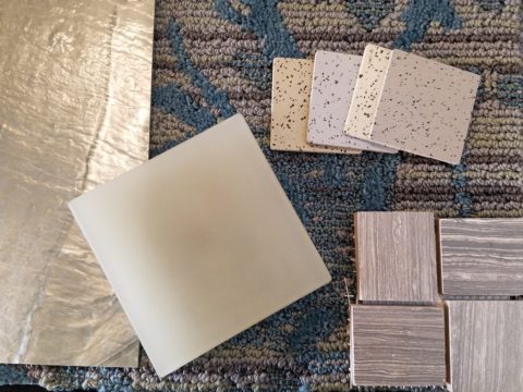
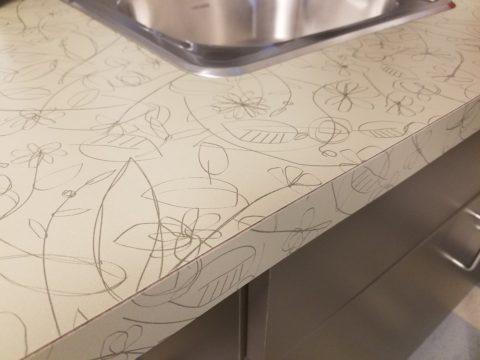
Where she and I differ is that she, as an artist, creates constantly as a part of her process – as a necessity of her creativity and/or in hope of attracting a buyer (unless it is a commission – in which case, she hopes to satisfy the buyer) and I, as an interior designer, provide clients a service of creative ideas, solutions, suggestions and opinions toward an end. The ideas are selected, dismissed, modified and ultimately executed resulting in a finished design that is the product of the Creative Process. The creative services should provide effective solutions and be unique and thoughtfully custom-tailored for the client’s individual requirements and desires. The solutions are a result of many educated elements, collected life experiences and observations.
To appreciate what it takes to create is to take an interest in the complexities of the “process”. What might take minutes, to convey or even execute, results from a thought process and observations that are without boundary. The cumulative collection of experiences is what enable the designer or artist to find creative solutions, offer a variety of ideas and possibilities. This is the shared commonality of our discussion.
How often have you strolled through a museum or art gallery and thought, “I could do that!”
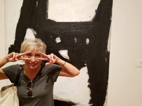
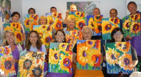
Have you ever attended a wine and paint event and tried to render the subject and watched as other of your fun-loving companions struggle to do the same, with as many different results as there are participants at the party? Copying is not easy, but it is very different from originating.
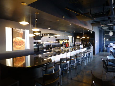
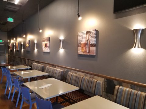
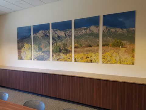
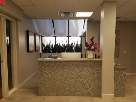
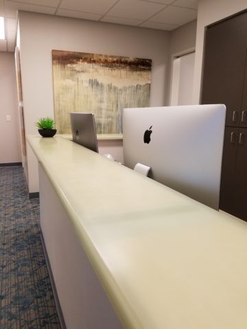
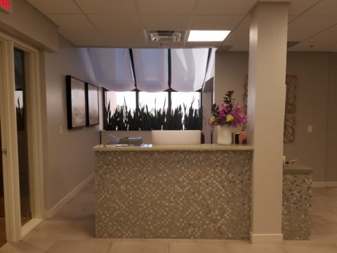
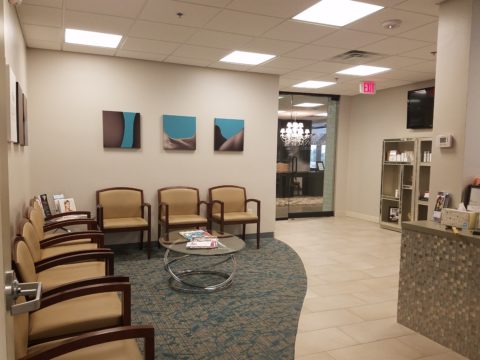
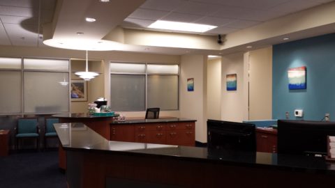
As I pondered this blog’s subject yesterday, in advance of putting it into print, another remarkably related and coincidental exchange took place. There I stood in the company of two co-workers of a business office for which I had designed the interior. They, having arrived after the project had been completed, were not privy to the details of the design elements and the process over months that took place. One asked the origin of the art series punctuating the east wall of the reception area. It was a collection of contiguous abstracted landscapes with rough dashes of brush strokes and stacked layers of color. She asked if it was a result of a wine and paint party. I was aghast.
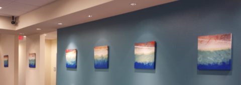
But upon further conversation it was clear that they recognized the same sized images, with a similar subject matter on each and the same color palette – not thinking beyond to the technically un-selfconscious (I like that word) process and ultimate application and execution. As we looked more closely and discussed the complexity of the texture and layering they came to understand that had they or I tried to copy it, we would not have had that remarkably un-selfconscious effect. Ours would be more tense and rigid, in the attempt to be relaxed, loose and seemingly simple. A new appreciation was realized. I had initiated an artistically creative commission from the very talented Federico Leon de la Vega as a solution for a long expanse with a splash of colorful, original, sophistication.
Artistic creativity is nebulous like a blond grabbing at the air…collecting her thoughts!!! Yet that nebulous creativity results in concrete solutions. Commission a painting, ask questions, buy one spontaneously when you like it, retain an interior designer and appreciate the Creative Process. Be creative and have a little fun. Try not to let it interfere with, or usurp, your attempts at some relaxing downtime.
The thickly applied paint on the canvas of the feature image, for this story, is by Ron Cheek. Incredible color balance, generous application of oil paint and loose strokes layered to present a powerful landscape. How long did it take him to do that? A lifetime up to that point.
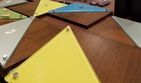
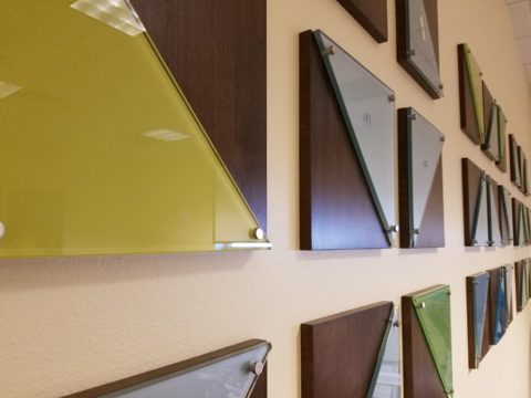
Please visit our boutique gallery/design studio in downtown Albuquerque to see work by these fine artists and others!