Valentine Expressions

You know…we designers design for our clients and ourselves around themes, we design around events, we design around seasons and of course we design around the trends…it all keeps the commerce of products and materials in motion.  And at this time of year, we see focus on wine clubs, pajama grams, stuffed teddy bears in enormous sizes, hearts, hearts, hearts…and roses natural red or gilded, it’s Valentine’s Day!!!

But it’s fair to note that all seasons have valid design consideration. Setting the scene, enhancing the moment – either for you, your family or a romantic encounter, the holidays and especially this one, evoke a desire to create a scene that conveys love and romance.

To that end , my blog is brief. Enjoy that which brings you joy. Revel in the happiness that presents itself. Create beauty where you can. And as we are want to say….art and good design can almost always bring a better scene to anyone’s place on this precious planet.

So be it a candy heart with a common message of joy, a product acquired to create a scene, a piece of jewelry to promise, a token to send love, a greeting of friendship, a message to offer support, it is all about connecting.

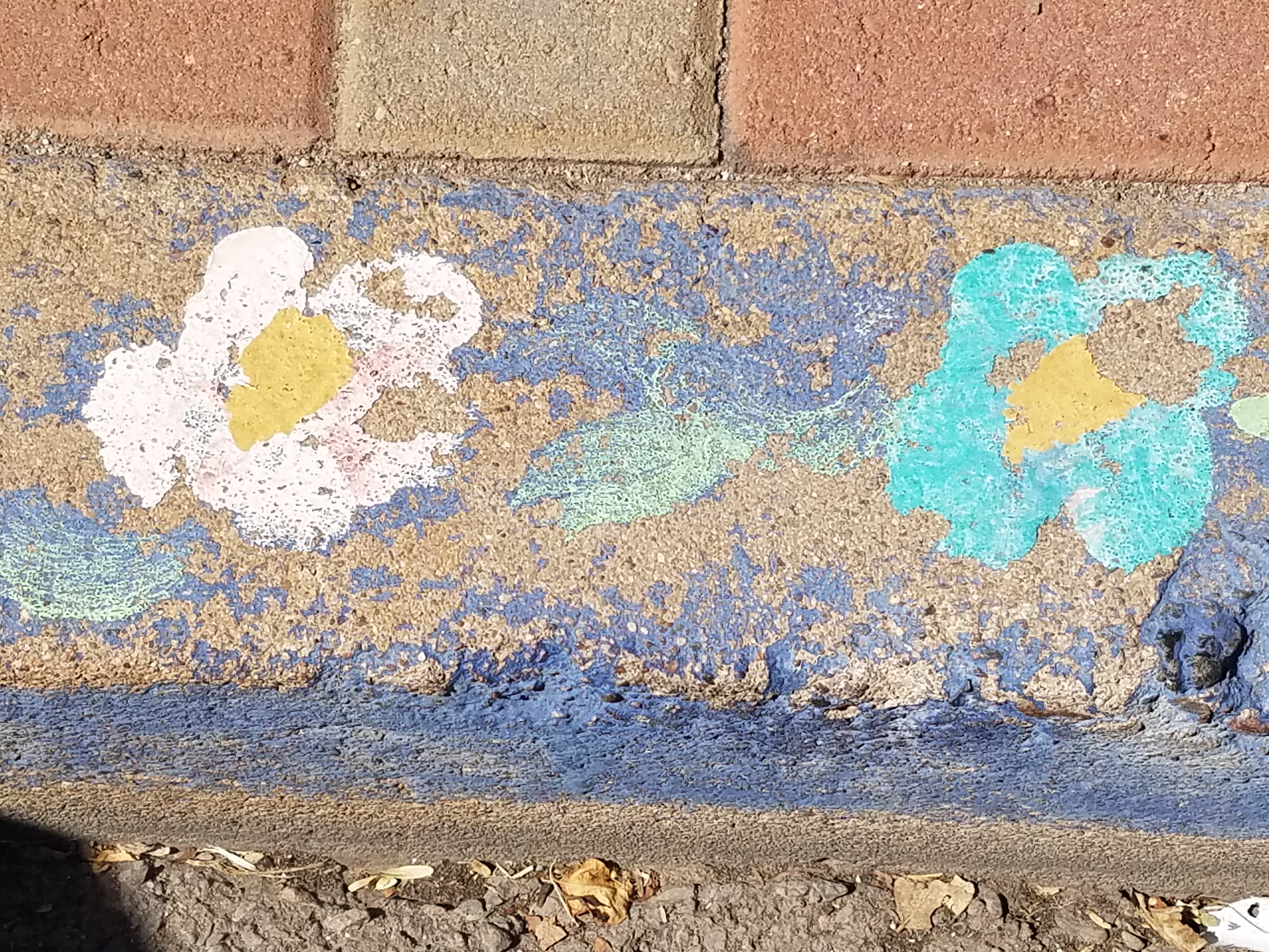
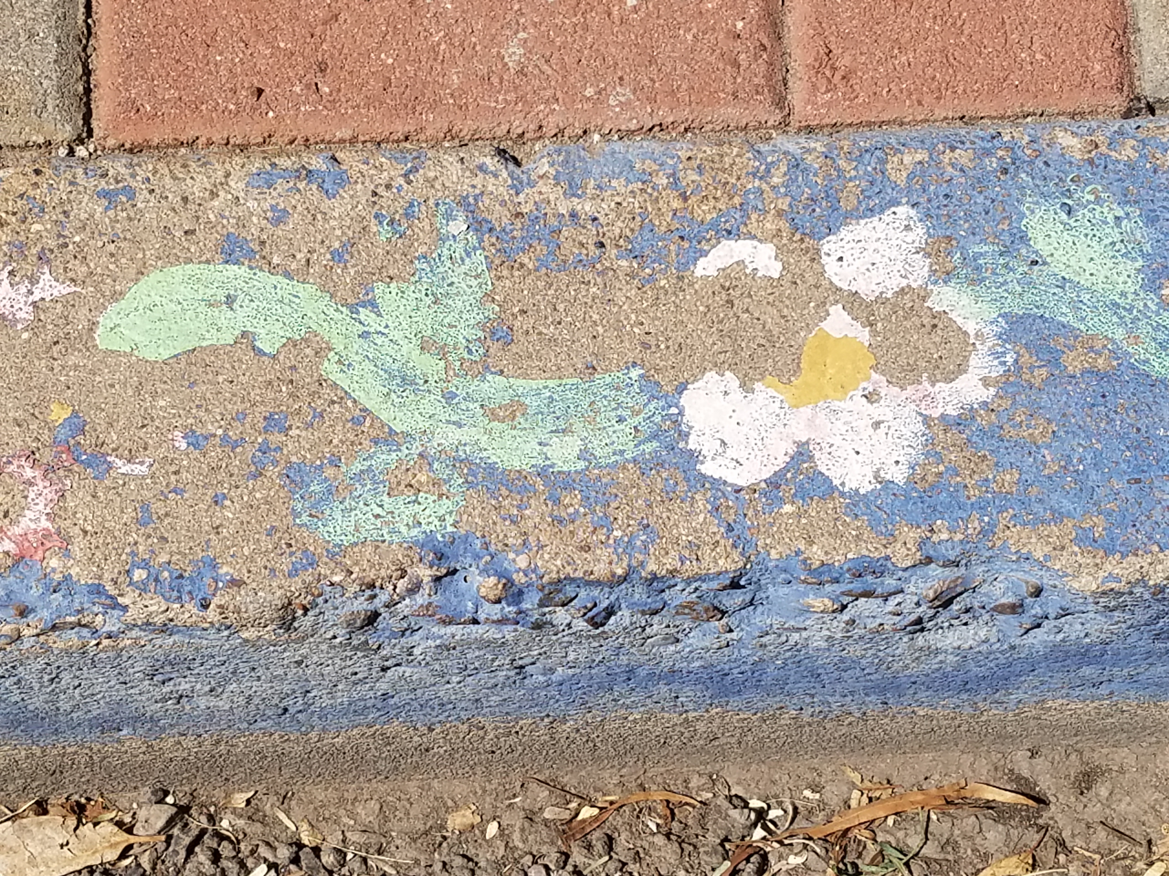
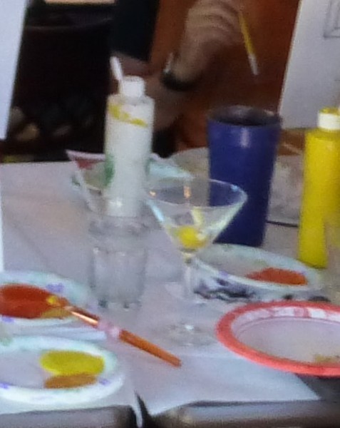
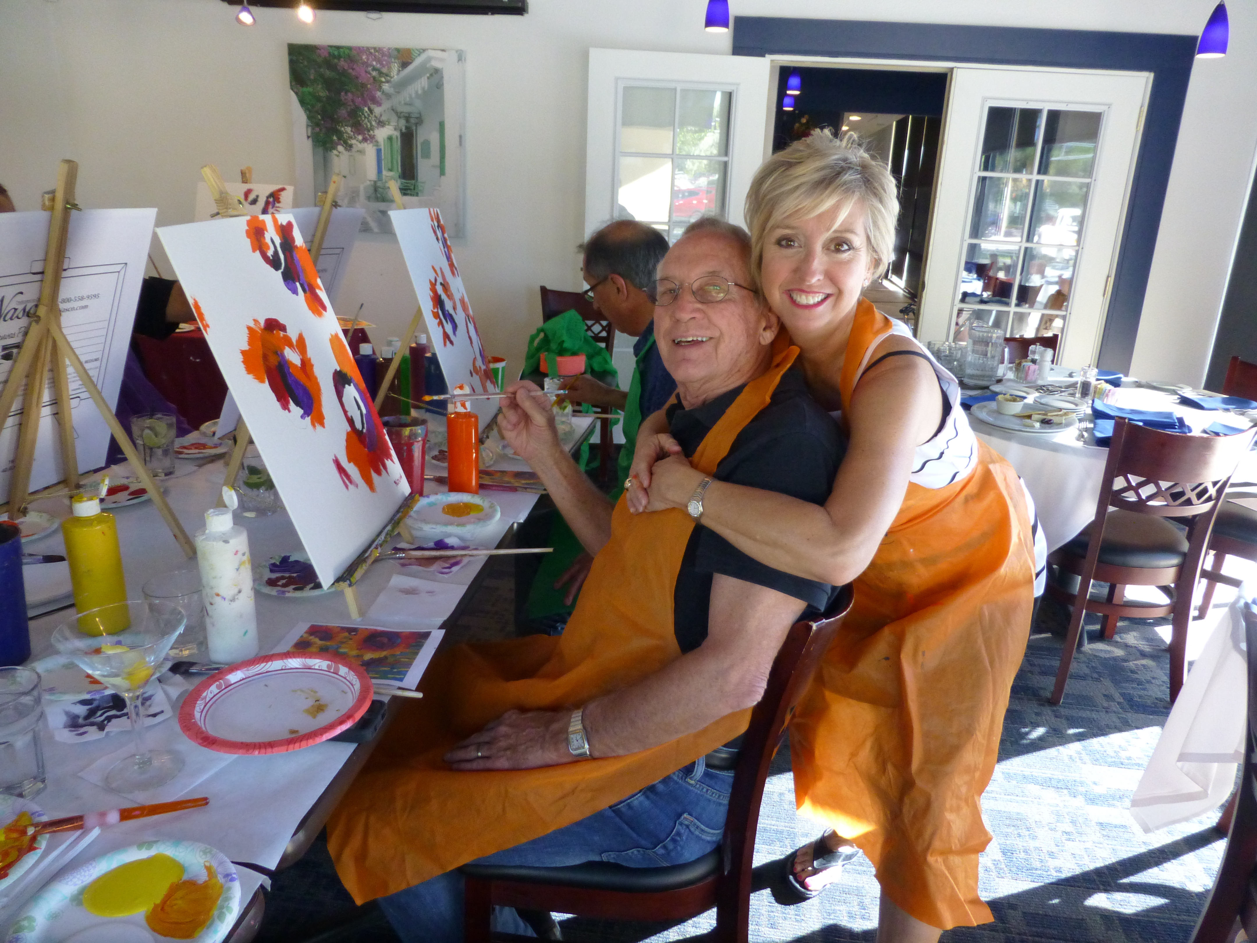
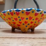
I decided to paint a bowl for my sweetheart. Yes, I had passed this guy’s booth, encouraged others to partake, had appreciated his talent, but never ventured forth. This year, I enjoyed sitting alongside Victor in the shade, with the waves lapping the beach, and soft music wafting through the  air…allowing a moment of focus on an artistic expression, a blank canvas (my bowl) to say Happy Valentine’s Day to MY Valentine.

Here is the finished result.

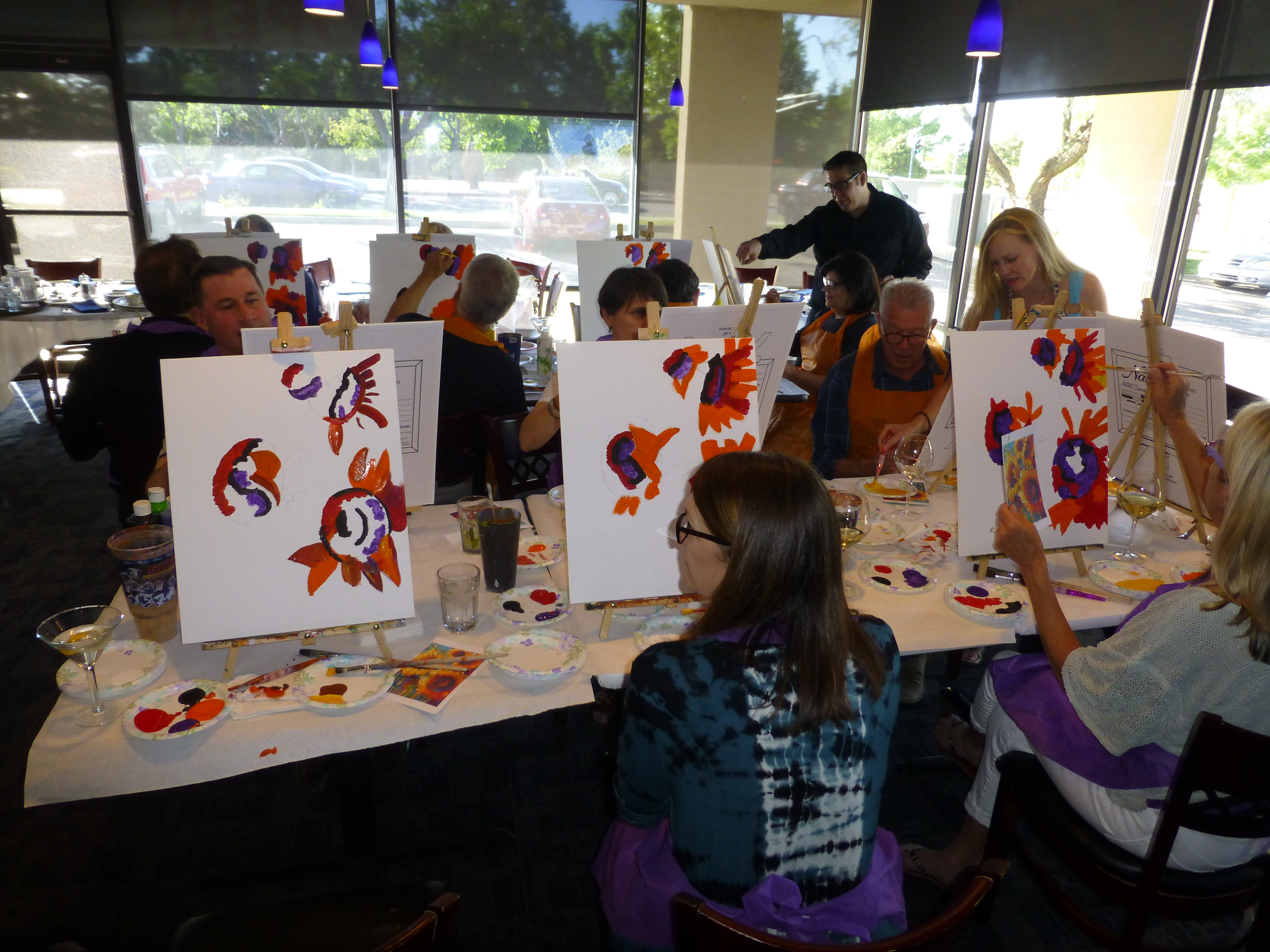
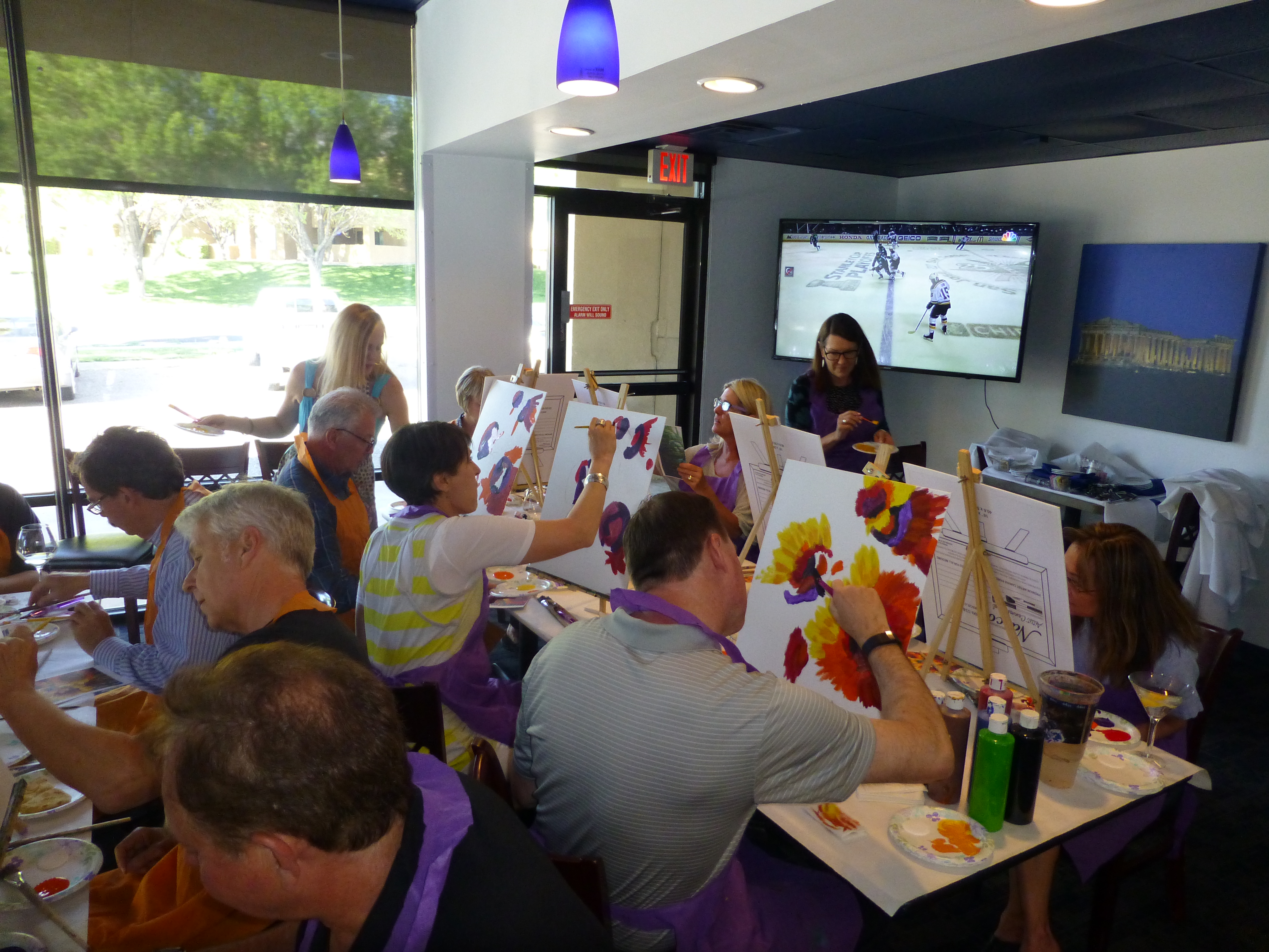
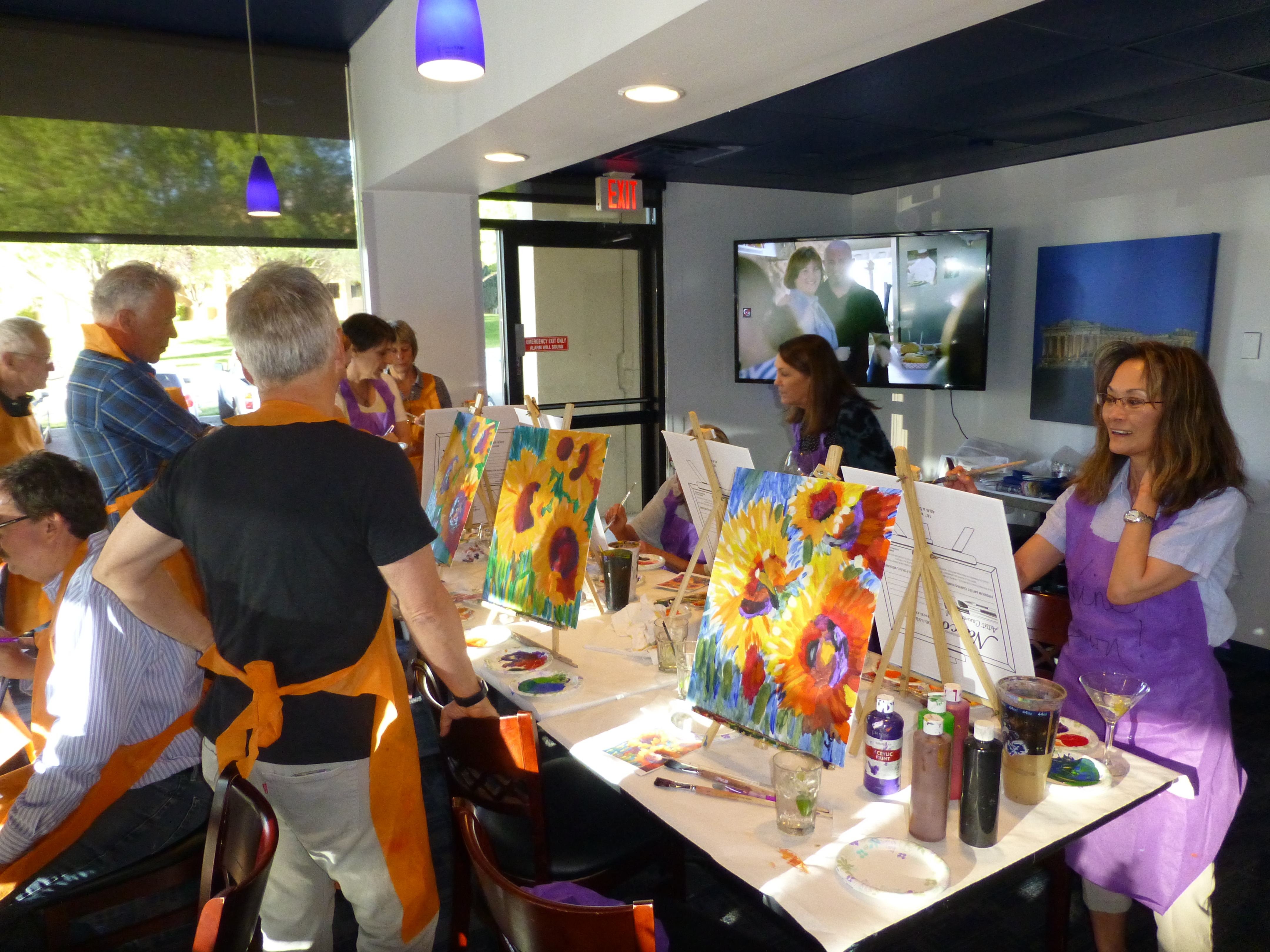
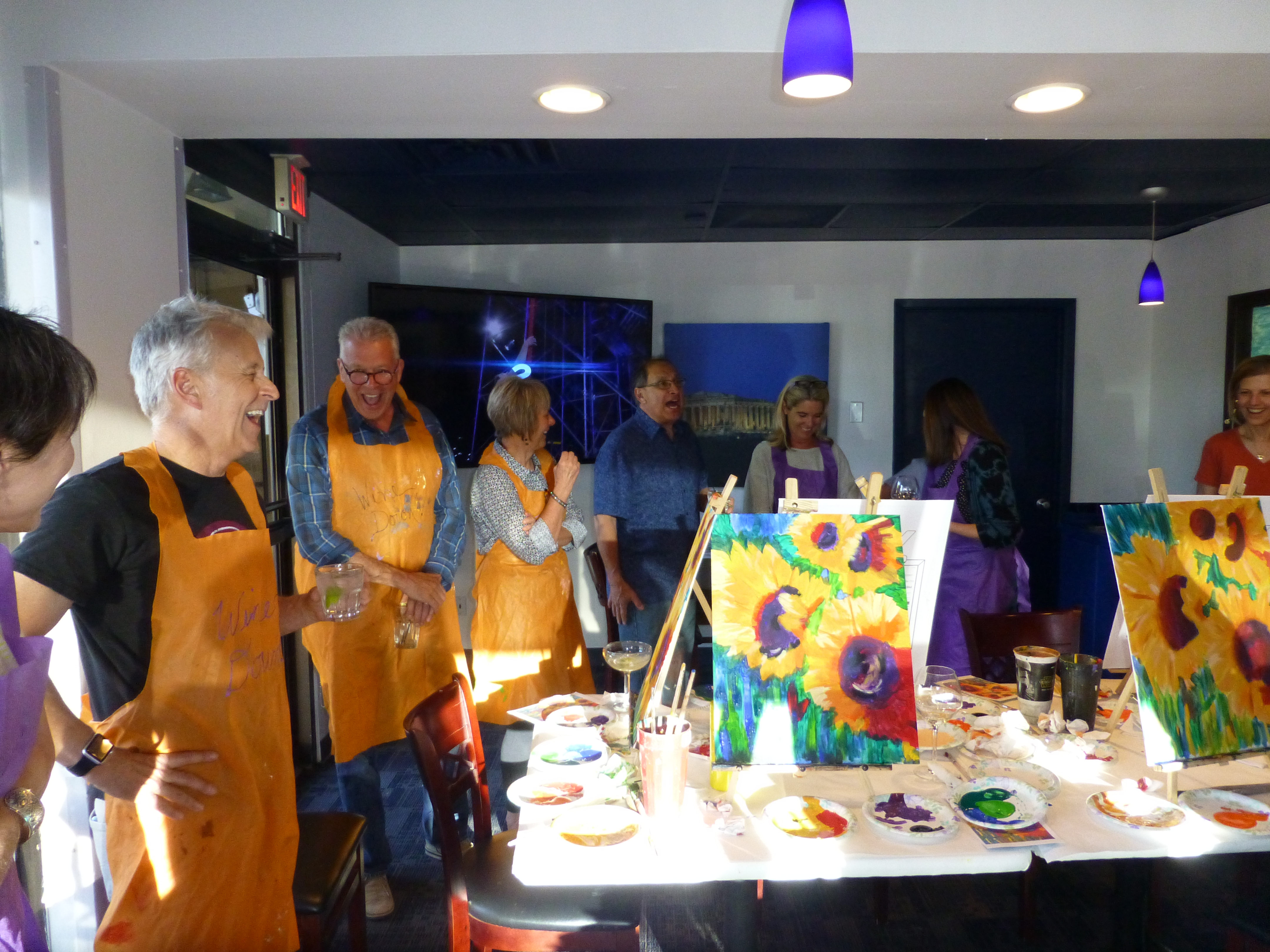
Connecting. We at PATRICIAN DESIGN support local artists and hope that the next time that you need a gift, want to send a message, or desire a creative addition to your personal space, that you will consider local talent to fulfill that need. OR do it yourself DIY!!!

Wear ART – Shop Local – Support LOCAL artists –  Need we say more?

Ok…we provide the greatest FREE gift wrap to get you on your way!!!

XXX000 Happy Valentine’s Day – (it’s Tuesday – better get prepared!!!)

PATRICIAN DESIGN

Nature’s Valentine’s Greeting!!!

So when you least expect it…nature speaks. On a silent coastline on a great lake in the wilds of Wisconsin the stones on the beach offered a hidden alphabet of opportunity. Upon making this discovery, I searched for and collected just the right pieces and sent a love note to my sweetheart. Wishing he were there to share in the wonderful adventure that was hiking through the enchanted woods to this lakeside hideaway, I did the next best thing and found an expression of LOVE , took a photo and messaged off to him…technology and instant gratification – well, across the miles…

20160809_182944-copy

The lovely white stones were amazing…I don’t know the geology…could probably Google it, but suffice it to say they were white and soft, angular but smooth, bleached and clean – massed in a thick bed for miles along the shoreline. I wish I could have taken buckets of them to do something…fill a large snifter, layer in the sink for the water to spill over and remind me of this scene, touch and fondle – they were so special, so uniform in size – such a natural phenomenon of raw beauty.

Paired with the rough, elegant, weathered, driftwood that was scattered along the rubble and upon which I carefully placed the stones, the composition was truly a work of art – inspired by  nature and assembled by my eager fascination with the media.

20160809_182212-copy

Take away…love is all around – OH! has that been said before? Well…love IS all around us and to find an actual, natural formation of alphabet letters that allowed the simplest expression of literal words, to be transported across the miles,  was magic.

Art…design…nature…find it!!! Happy almost Valentine’s Day!!!!

The Art & Architecture of Gingerbread Houses

Art and architecture meet all the time. Sculptural forms, building models, buildings themselves, sketches…but at this time of year, the fanciful world of gingerbread houses takes the spotlight and, in this recent scene we encountered, offered a beautiful fund-raiser while at it!!!

20161220_080440

As we pulled away in the pre-dawn hours of the  morning…we felt the chill in the air and the glow over the mountain sending us on our way.

We traversed across the terminal and before cutting over left to the escalator, we spied—at the same time—a wondrously tall Christmas tree adorned with airplanes and ribbon…and surrounded by an amazing collection of ginger bread houses on display in some sort of fund-raiser fashion.

20161220_080515

Upon closer inspection, the fantasy became tangible. The individual structures took on a form of expressive life in their individual attention-getting style. Each one was quite unique incorporating rivers and ponds, vehicles and foliage of all manner.

It is a Christmas tradition to create a gingerbread house full of fantasy and fear, hope and salvation. From the simple joy of baking traditions for Christmas, to the many versions of fairy tales that save children from the wicked ones in the woods creating and story-telling surrounding these magical edifices makes gingerbread houses a staple of the winter holidays – all the while offering architectural design and  construction projects for all ages. Below, see the Hanukkah version of this adorable house.

I just read a great piece by Tori Avey in which she summarized the history of gingerbread. http://toriavey.com/?s=gingerbread

She references architectural design with the fact that: Elaborately decorated gingerbread became synonymous with all things fancy and elegant in England. The gold leaf that was often used to decorate gingerbread cookies led to the popular expression ‘to take the gilt off of gingerbread.’ The carved, white architectural details found on many colonial American seaside homes is sometimes referred to as ‘gingerbread work’.

Having been raised on the east coast, describing houses with ornate “gingerbread” detailing was part of our vocabulary. I now see it in Rocky Mountain Victorians and California seaside cottages. It always conveys a quaint, welcoming feeling.

Avey further states: Gingerbread houses originated in Germany during the 16th century. The elaborate cookie-walled houses, decorated with foil in addition to gold leaf, became associated with Christmas tradition. Their popularity rose when the Brothers Grimm wrote the story of Hansel and Gretel, in which the main characters stumble upon a house made entirely of treats deep in the forest. It is unclear whether or not gingerbread houses were a result of the popular fairy tale, or vice versa.

Recently the record for world’s largest gingerbread house was broken. The previous record was set by the Mall of America in 2006. The new winning gingerbread house, spanning nearly 40,000 cubic feet, was erected at Traditions Golf Club in Bryan, Texas.

Everything is bigger in Texas!!!

The house required a building permit and was built much like a traditional house. 4,000 gingerbread bricks were used during its construction. To put that in perspective, a recipe for a house this size would include 1,800 pounds of butter and 1,080 ounces of ground ginger. Sounds more like a gingerbread resort!

So as we walked around this wonderful display at the ABQ Sunport and marveled at the colorful creativity, I knew this was the story for today.

The cartoon in the paper that morning also found  humor in the subject.

20161220_083319

And to further galvanize that thought, we arrived in San Diego to find Keira proudly presenting their half-eaten, already picked apart gingerbread project in the center of the kitchen table. T’was the joy of gingerbread houses—post construction, eating them!!!

20161220_112922

Color of the Year 2017 Greenery!!

Ta Da! Pantone announces its color of the year for the coming 2017…drum roll please…and the color is Greenery!! Yay!!! Last year there were two  – yes, imagine that – they couldn’t decide so they slurried Rose Quartz and Serenity resulting in a pale, cool, wimpy blend of soft rose and lavenderesque shades into a blended wispy pastel dream. Non-committal, in my opinion…lacking confidence.  Last year the rationale was stated by Pantone’s Executive Director, Leatrice Eiseman as…

pantone-color-of-the-year-lee-eiseman-quote-2016

But this year they have it with this fresh organic hue in a yellow-ish shade primed for this year’s rationale from Ms. Eiseman which is:

pantone-color-of-the-year-lee-eiseman-quote-2017

I have always loved green. I grew up in a Virginia jungle of a suburban neighborhood inside the Beltway surrounding my hometown of Washington DC. where the first signs of spring were the tiny tips of dogwood leaves poking forth from the delicate branches of those beautiful under-growth trees. The dogwoods were the graceful, human-scale layer beneath the towering canopy of the immense, rigid, vertical tulip poplar and white oak trees that commanded the woods.

Soft mosses, lacey ferns and perky lily of the valley carpeted the hidden pockets of our backyard. New growth is that prediction of amazing renewal and promise of the start of summer. So it is a prime observation that as Eiseman states in her 2017 rationale “greenery…bursts forth…with a reassurance we yearn for…” although I do not feel this is peculiar to this year as winter always makes me yearn for greenery and the reassurance  that spring and summer will return.

My mother also loved green and that probably influenced my childhood perception of comfort and context of it in interior design. She had and still has an eye for color. In 1959 she selected an amazing sculpted wool pile carpet in a warm, dark, neutral, taupe tone and built upon it a color scheme of pinks and greens that was subtle and relaxing, organic and contrasting, blending beautifully in our wooded setting of verdant lushness in which we were cozily situated.

That was upstairs where we felt like we lived in a flowering tree house amidst the dense collection of green leafy between the trees and surrounded by all shades of pink and white azaleas. Downstairs, where we retreated in the winter months, her greens were mixed with gold tones creating a warm interpretation of the greenery around us.

When so many in that era, between the 60s and 70s, were styling interiors with heavy oranges, browns and golds,

orange-and-brown-f934b00ae8a8aabb9fa7d7d8e3ccec30

my mother gravitated toward Lily Pulitzer’s fresh, tropical palette of lime green and hot pinks, clean crisp turquoise and citrusy lemon yellow – both in her wardrobe and her interior accent colors.

most-popular-lilly-pulitzer-prints-no-names

Our beach house was turquoise and teal, navy and tan – the sea and the sand.

Following color trends is a slippery slope. I have blogged about it in the past. Adopting that which is often a combination of colors instantly records a place in time when everything from bath towels and shower curtains, bed dressings to draperies appears in the marketplace and inserts its predetermined obsolescent combinations into the lives of so many who would rather catch the wave – often behind the crest – to own and participate in what is conveyed by the market to be the “in” thing to do and to have.

It is best not to embrace and adopt the combinations that the market presents. It is better to select color and combinations that transcend the trends – skirt them so as not to fall into the trap of dated color schemes and tired combinations. Some avoid the trap by staying neutral. The safe, timeless colors of whites and grays mushrooms and taupes- but where is the risk and fun in that?

“Too bad for them” I often remark. It is such a missed opportunity…a limitation to select colors that you think you are supposed to like rather than those that truly bring you joy. I say “go for joy every time.” Color is such personality. It is a stage-setting element. It is a backdrop or foreground. It is a theme. It is an atmosphere.

With all that having been said, I for one am thrilled with this fresh selection for the new year. A bright beginning full of hope and new growth, fresh starts and positive forward movement – organic and life-affirming. So seek the colors that brings you joy and go forth with color in this new 2017 soon to arrive. My personal schemes will always have greenery!!!

ART on the Curb

Silly little doodles in unlikely places. In some cases they might be considered undesirable graffiti, but I stepped over this beautiful little statement the other day and was compelled to take a photo as it made me smile.20160924_112705

Brush strokes now weathered and faded, chipped and primitive in their simplicity the colors were so pleasing and the floral motif quite nice.

It’s as though a child with a beginner’s eye took a single brush with bold steaks capturing the essence of a daisy. But then it looked like wind-swept clouds dancing in the suggestion of daisies floating across the sky above the sea.

Upon closer inspection, the aggregate stained blue is grounded by a collage of straw and leaf particles suggesting the beach’s detritus. This little composition has so much detail, so much suggestion, so much to offer if you take the time to look down…look closely…

20160924_112702


We often see things in clouds…they move slowly morphing from the identifiable image into others or nothing. This miniature fantasy freezes the floating image on the texture of the concrete to create the composition of this most amazing piece.

Inspiration comes from many avenues. It is sparked by a suggestion, ignited in a flash by something in passing – a word, a phrase, an image, a cloud…

I now will start a folder of art in unlikely places…little details…a future tapestry of observations. Take a moment to see these little studies as you step through the world.

Painting Party Pairs Art with Uninhibited Partiers

By total coincidence but perfectly timed for the segue from the  last couple of  week’s topics,  we attended a couple’s cocktails and canvas painting party last week.  Artistic expression and the fear of taking the leap has been facilitated by these social gatherings centered around painting and wine. You’ve heard of them, if not yet participated in one. This clever pairing has taken the country by storm. The model is to have an instructor teach a group of friends to copy a pre-selected subject and create their own interpretation on a canvas all the while losing inhibition by imbibing in a glass of wine or cocktail. Actually multiple glasses of wine and cocktails! The more the merrier! P1140371 - Copy

And merry it is. It’s fun and freeing. It’s creativity within boundaries but with enough encouragement and pretty much lack of judgment to produce some very successful finished products.  And this is where we found ourselves last Sunday afternoon. Operative word there, we. P1140384

Yes, I had attended several of these fun-filled events in the past – all women – always entertaining. But this was quite different as it was designed to be couples – husbands painting right alongside their more willing spouses were encouraged to let loose and copy the sunflowers.

Unlike other like-kinds of parties that I had attended, this gal started off each person’s canvas with a faint charcoal-transfer outline of the preliminary placement of the centers of the sunflowers. This was intended to get everyone started on the right track but also said loud and clear – this is what we are painting and deviating from the plan, changing the format or grouping was not encouraged. P1140376

That said, it was just fine that we all pursued the same clutch of gorgeously impressionistic floral explosions with bold brush strokes and colorful blotches of paint tying it all together for a happy theme. Most if not all of the men and perhaps a couple of the women had never tried their hand at painting. This might have been the first attempt at artistic expression that they had ever experienced. I know that was true for my husband!

The setting was fabulous in a private dining room of our local Greek restaurant with brilliant sunlight streaming in through the entire wall of west-facing windows illuminating large format photos of Grecian isles, ancient structures, classic white buildings with cascading brilliant pink bougainvillea set against the piercing blue sky and surrounding sea. A big screen TV mounted high in the far corner featured the very muddy Preakness followed by the Blues and San Jose dashing about on the ice. P1140374

But the attention soon turned to the canvases in front of each budding artist. Primed with cocktails, we donned aprons, selected our seats and set to work in front of our table-top easels. The paints are acrylic, water-based – easy to apply and also to clean-up during or after the session. . As the first splotches of color were applied, the comments began to fly around the room. From whining about how difficult it was to complaints about the blossoming results, the room became animated with commentary. P1140386

People began getting up and viewing others’ progress. Compliments and comparisons were a flurry as the instructor made her way around the room aiding those in duress and adding touches here and there. It was hysterical. Everyone was having a blast, creating their own interpretation of the offered subject and seeing it take shape before their very eyes by their very own hand and all the while amidst lively conversation and milling about the room. Seeing the finished products all so similar yet each very different is the marvel of this exercise.

One enthusiastic participant went out into the dining room and requested participation from restaurant patrons in the way of their leaving their tables and coming into the gallery of all of our redundant sunflowers and voting for their favorites – this added to the hysteria as they made their picks, voiced their critiques and the “artists” received their accolades. P1140402

Dinner followed taking this group of new-found friends to the dining room where everyone ordered from the menu and continued the convivial conversations into the evening. But I learned today that Don doesn’t care if he ever picks up a paintbrush again – he didn’t discover a hidden passion nor exceptional talent. He has no love for the process nor the results, but thoroughly enjoyed the party!!! Woo Hoo!! P1140406 - Copy


Whales Up Close and Observations on the Spirit of Joy Series

How can I say that I am too busy to write this week? As Saturday approaches,  I realize that I have not stopped long enough to focus on any one thing, of the many that are bombarding me from all angles, about which I might formulate a theme for my story. I have to apologize, for once again, missing my Saturday deadline and hope that this was worth the wait!

Oh, to be so entertained by an onslaught of inspirational design elements as I have seen in the past few days only. And yet not only design – there was more. So I would like to start with an insert about Saturday as I (instead of writing my blog) took one last kayak cruise of the year.

A few people had gathered at the edge of the sand, pointing and remarking that they thought they had seen a whale. I looked in that direction and noticed that a few boats had gathered – often a sign that whales are spotted. I quickly pushed off in my single kayak through the gentle surf out onto the beautiful Banderas Bay and experienced for the first time whales from that most intimate vantage point. Up close and personal, it was thrilling to say the least. The beach was crowded with onlookers oohing and ahhing as they blew mists of water into the air and rose up from and back down, under the bay’s glistening surface. I paddled out and maintained a safe distance, but close enough to hear and feel the graceful power. Hump-backed and for which they are aptly named, the dark, sleek black bodies of the mother and calf were magnificent as they broke the surface and greeted the encircling boats full of eager spectators wanting to catch the show. And a show it was as the mama rolled onto her side and raised her unbelievably long, towering fin to slap the water sending spray high into the air. She slapped again and everyone thought that once was a rush and two was a treat and three and then four and I lost count at 30 times she slapped the water as though to say – “You want a show? I’ll give you a show!” She must have known that it was too dangerous to breach at that point, for a grand finale, as the close proximity of boats could have had deadly results. And I was right on the water with them. Unforgettable. The pity is that I was without camera and have only the memory of this life affirming event . An event that was awesome and outrageous and yet brought a surreal, serene sense of calm, peace and palpable, tingling joy. Friends on the beach greeted me upon my return in awe of what they had witnessed and welcoming me warmly, with enthusiasm, over my good fortune to have been out there for such an amazing display.

P1120423

This photo taken a week earlier – a bit choppier seas, with Tricia in the single and I with Victoria in the double, sets the scene of the Bay surrounded by the Sierra Madre range.

Now, having shared that incredible experience, I have decided to focus on one of the many design inspirations that I have encountered this week, but I hope you will visit our PATRICIAN DESIGN facebook page to see the collage of colorful art and texture that I have compiled to represent the many images that I have seen and offer to further stimulate your imagination.

https://www.facebook.com/media/set/?set=a.10153225877316619.1073741934.232272436618&type=3

My focus at this seaside gallery of  delights today, as we  bring to a close a magical month,  is a collection of precious little figures made from synthetic foam, wood and steel. These humble little animations represent three shared events, a group hug, the “wave” at a stadium event and a gathering for solemn prayer lead by a figure of distinction – the one in the red scarf.


The spirit of collective participation is conveyed. The spirit of humble expression is conveyed. They present a sense of simplicity of some of life’s joyful moments. These simple figures are happy and content. They are intriguing and relaxing to study from many angles.

P1130108


Form and movement, color and  texture the Spirits of Joy by Federico Leon de la Vega are a wonderful representation of life’s simplest and most basic moments of sharing joy. To see art in such a distillation, such a unpretentious media, execution of mechanics and form is true pleasure. It is not overwhelming or startling, it is not outrageous or provoking – it is moving and modest.

I hope that they bring a sense of joy to the start of your week and create an indelible memory to which you can return in your quiet thoughts to bring you peace and joy.