Eclecticism in Design – What Does it Mean? What Does it Say?

Looking back (to both sides of the turn of the 20th century), eclectic interiors were only cultivated by the very rich. Those who had the discretionary income to take vacations abroad, had diplomatic ties or nomadic adventuresome types who took precious time off to explore different locations and  cultures other than from whence they came. Others of means might have merely hired decorators to create interiors that suggested such adventure and access, without leaving their drawing rooms. Expensive eclecticism catapulted status.

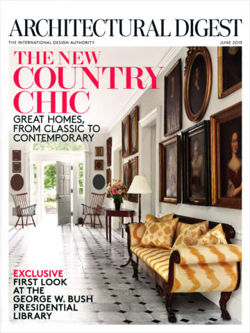
Leaf through decades of Architectural Digest – THE authority on design for examples and inspiration of fabulously eclectic interiors among all the varied styles they have documented for us!

A surge in eclecticism occurred with the many military personnel and their families who were stationed overseas and were able to transport containers of belongings along the way.

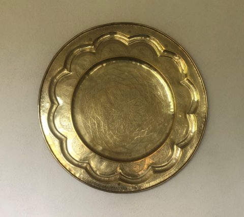
Recognize a meter tray? A meter size diameter of solid brass tooled with hand detailing and pressed/formed/hammered designs. From table tops to wall hangings, they are statement pieces!

They brought back fine and fun arts and crafts from around the globe. These homes were distinctively punctuated with art that was recognizable in those circles – you could tell where people had been stationed by the decorative elements in their homes.

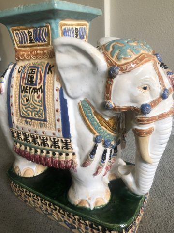
A souvenir from 1970s South Vietnam! Ceramic elephants were the rage!!! From stand-alone accents to end tables and bases for larger cocktail tables supporting glass slabs, these animated novelties of artistic expressions continue to bring joy decades later!

As the original owners handed down these nostalgic treasures, the history of the discoveries was diluted if not lost but the appreciation for many of the collectibles remained and was passed down to younger generations starting their homes. Inherited interiors spawns eclecticism.

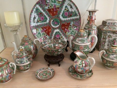
Antique collection Rose Medallion passed down in a family.

Many homes have been assembled with the elements gifted by others resulting in a nostalgic, familiar collage of decorative accessories.

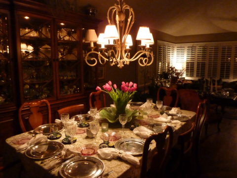
Vintage pink glass salad plates, family antique chairs, and a china cabinet of new and old collectibles used and mixed with love and affection.

Pier One capitalized on this decades ago. Their slogan was something like “we shop the world so you don’t have to.” In lieu of experiencing great world travels, the buyers sought exotic, interesting, affordable, mass-produced items and eclecticism expanded exponentially. They actually set seasonal decor trends with their ability to influence the market with their sweeping design reach to international artisans and fabricators, massive buying power, focused design team and extensive marketing campaigns.

Some, in order to create that sense of eclecticism, haunt thrift stores and antique markets. “Thrifting” is today’s trend for gathering eclectic “finds.” From antiques to current cast-offs, the sport can be quite satisfying, cost-effective and can result in some amazing acquisitions!

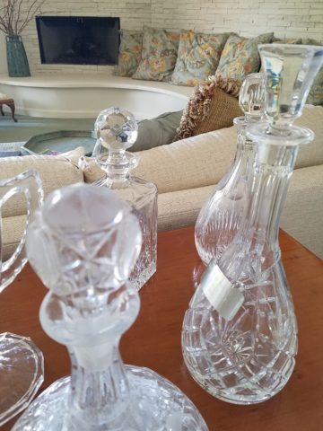
“Thrifted” antique table and eclectic crystal decanters contrast sweeping contour of limestone hearth.

Eclecticism means varied interests and experiences, an appreciation for what is good and fun rather than merely coordinating. It suggests independence, personal taste and style, with a freedom from convention and changing trends. A successful eclectic interior still requires balance and proper placement and distribution of the varied objects. Have what you like. Be surrounded by things that make you feel good, productive and bring you joy.

Bring Elegant Functional Pottery into Your Daily Life

Powerfully, pretty, porcelain, pottery graces the urban storefront window this month, of the east gallery of PATRICIAN DESIGN, with elegant, functional inspiration.

The opening of this the second  installation of the Resilience exhibit features a collection of porcelain pieces that is intended to be an entirely functional  ensemble of art.

It’s been refreshing to have these well established artists paired with exciting emerging artists presenting their expressive talents, in the form of something that you can use and enjoy, to enhance the aesthetic connections in your daily life.

Resilience, conceived by Helen Atkins, an exciting emerging artist herself, is the manager of consignment art at PATRICIAN DESIGN.

Her concept was to “explore the experience of local female artists at various junctures if their careers.”

As a recipient of the Makeshift Grant Project, “Resilience” is funded by the downtown Albuquerque Arts & Cultural District and the Albuquerque Community Foundation. The name of this project suggests that the strength and flexibility of clay as it is formed is an analogy to similar characteristics in the course of a woman’s life. Strength and flexibility – resiliency and tenacious fortitude are the features the two share  and which are celebrated with this show.

In addition to this relevant topic of women, the functionality of this collection is what is even more expansive. No gender specific appeal to this wonderful work, the idea that pulling in from the disposable practices of everyday life, strikes a universal chord.

To pull in and focus on what  you have and use in your daily life is the beginning. Evaluating between pure function and added beauty being introduced as an enhancing element is the trick. Then discovering individual pieces that bring enjoyment  while contributing to the function as well as the aesthetic of the scene,  from an interior design standpoint, is wonderful.

Your “scene” should be exclusively personal to you and your life experiences.  It is personal and wonderful to incorporate handmade artwork in all aspects of a design project. To appreciate the detail and have the opportunity of taking that artwork all the way to daily tableware is pure joy. These and other potters that we feature at PATRICIAN DESIGN offer just that – the opportunity to incorporate art into the simple functions of eating and drinking.

Artist  Kathryne Cyman is a master of the 400 year-old Japanese process of Arita pottery.  Please read more about Kathryne’s journey at http://art.unm.edu/kathryne-cyman/   Showing alongside her capable student Jordyn Bernicke, the two present simple, elegant, affordable pottery pieces for you to bring into your  daily life.

Imagine the soft, delicate yet durable cup in your hand from which to sip and relax. Even to toss o.j. on the run – the basic action of drinking from a handmade vessel, in a color and finish that makes you smile, is an enhancement to the day.

Sensory perceptions ignited by the feel and the look of a beautiful piece of pottery is restorative.

We are privileged to have this exhibit and to meet these fine artists. We are privileged as a community to have this program at UNM.  It appears that the natural beauty of New Mexico, life lived close to the earth and celebrated by Native Americans for generations is a parallel practice to the Arita process by the artisans in Japan.

This exhibit proves that to admire the techniques that produce beauty is to acknowledge the importance and value of including these elements in our daily lives.

Easter Art Encounters

Toodling around Tucson today this Easter eve, we came upon some fun seasonal art!! From antique to modern masterpieces made today, it was quite a diverse array!

An antique Lalique French crystal bowl was an elegant vessel to present these hand-painted pastel wooden eggs.  Mixing refined with folk-art is a wonderful contrast in style!

Potter Robin Chlad designs and builds these  stunning three-dimensional crosses. Adorned with birds and flowers, no two are alike and the brilliant colors are fabulous!

We hopped past these adorable bunnies! So many colors of fine metal-craft each. What a whimsical collection by artist Jeffie Brewer!! And his subject matter is well beyond bunnies!!!!

Explosions of spring cactus are in bloom from nature’s statement in these vivid coral barrel cacti we encountered in a xeric garden,

to the artist Lucky Coleman’s fanciful  interpretations using brilliant combinations of glazes on dazzling sculptures of clay! The beauty of nature to the fantasy of an artist’s creativity, we witnessed magnificent blooms! A time of rebirth and new life  – spring is in the air!

Happy EASTER!!!! Happy SPRING!!!!!


For the LOVE of Fine China – USE IT – Inspired Table Settings

From the Diminishing Dining Room of last week’s observations, https://patriciandesign.com/category/dining-rooms/, I decided to further the conversation to encourage a new-found appreciation for having fun setting dinner tables!  I found fodder from Kentucky Fried Chicken served on formal silver platters to wipe-clean placements of dazzling designs to dress your tables.  A collection of tireless designers defend the use of fine china – own it, buy it, find it, inherit it, enjoy it, keep it and use it – don’t send it to the thrift shop!!!

Yes, the art of fine dining seems to be set aside in favor of ease and expediency, but this article from The Washington Post’s HOME section (thank you Feath – my clipping service) brings it all home to use and enjoy.  It is a celebration of art, design and playful creativity.

Not everyone loves to entertain, to create the “tablescape,” to even bother to put together an outfit to wear. Not everyone loves to get dressed in the morning – it is a chore, an obligation, a mere necessity. That’s unfortunate in my estimation. For those of us who do – love it – it is all about having fun with fashion or interior design is just that – FUN!

Last spring I began a series  of emails that I blasted to our mailing list called COOK + PARTY. It was (and will continue this next season) a collection of weekly recipes paired with table-top art pieces. In our gift boutique, we represent an incredible collection of artists who create fabulous tableware.  I paired a piece with a recipe each week to inspire and encourage everyone to use “functional” art in their daily lives and specifically for entertaining and even the family dining table.

https://patriciandesign.com/category/art-and-food/

Recent fodder revealed a great source for fabulous wipe-clean placemats from Caspari.  For decades a fine source for the best paper cocktail napkins, Caspari offers these bold patterns and colors, prints of fine china and fabulous fabrics – re-use and easy to clean – why not?

https://www.casparionline.com/catalogsearch/result/?q=placemat

A previous fall blog that I wrote illustrates the open-mindedness of looking around to find inspiration for seasonal table dressings.  The decision for your table-top inspiration can be spontaneous – just go outside and look around!


Among the refreshingly optimistic designers that were quoted in the Washington Post article:

https://www.washingtonpost.com/lifestyle/home/that-old-fussy-china-can-fit-your-casual-lifestyle-designers-talk-about-how/2018/02/21/46761538-0084-11e8-8acf-ad2991367d9d_story.html?utm_term=.3a6fde2e5124

Barry Dixon, from the verdant rolling hills of Warrenton, Virginia, specifically points out that this process of setting your table should be fun!  Don’t pull-out the same things each time – mix it up! Change it up by adding color and pattern differently with every new opportunity.

Seasonal flowers, yellow woven cotton place-mats, embroidered folk-art table runner, basket chargers beneath classic Limoges topped with ceramic napkin rings – it looks like spring!

Designer Timothy Corrigan tells us that many people find it too difficult to entertain with their best things because the onus of proper cleaning and put-away is too much! But Mr. Corrrigan points out the joy of using your best things every day – everyday is a celebration and what you enjoy should be used.

In another springtime setting…organic, rustic things with finery – black stones nestle fresh purple Campatula flowers antique Limoges and basket chargers –  makes an eclectic table settings – it’snot all or nothing…it’s the combinations and scene that is being set.

Hutton Wilkinson – way out in L.A. where casual chic is the practice of distilling what migrated from the more formal sister coast to the east – noted that he believes presentation is the key to success. It isn’t so much about what is served (don’t tell the chefs that), but rather on what it is served and how it is presented.  Imagine buckets of Kentucky Fried chicken served on elegant Georgian silver platters. That simple fast-food chicken becomes  magnificently irresistible. You can’t say you’re too busy to cook with that creative solution! Wilkinson believes that presentation helps food taste better in addition to looking beautiful! He advocates buying china because it’s beautiful – not merely serviceable. I agree…it’s not all about the mundane purpose of eating off of it – but rather the joy of eating off of it!!

Making your guests feel appreciated and treating them to a unique, pleasing experience is a gift to them.  A special treat to show that you care –  going that extra distance of detail and design.

Color combinations, textures,patterns – wonderfully pleasing tablescapes are a treat for the eye. (So special Marsha!)

So don’t say it’s too difficult…keep it simple with Real Simple – the source for easy, ingenious ideas and simple truths……the following link for proper place-settings will get you started.

https://www.realsimple.com/holidays-entertaining/entertaining/how-to-set-a-table

Patti says – “make it special every day.”

Atmos and Eating by Design

How do you select a restaurant? As a patron, what makes you dine out? How do you select your preferred dining experience? I’m talking about casual and easy or even more a more in-depth gastronomic event.

When it comes to casual, quick and easy, I still want the experience to have personality – a pleasing personality and great flavors. Personality is atmosphere. Great flavors is the kitchen. Service might be “step-up and place your order” or table-side wait-staff. In either case, I want it to be a pleasing experience. Why would anyone want it to be difficult or unpleasant? Perhaps that lies in the definitions of the beholder. What is difficult or unpleasant and the various degrees thereof is not be the same for everyone.

Throughout my childhood, I remember my mother and her peers reference “atmos.” It was important. It came up often. “Does the place have atmos?” Or “what great atmos.” Atmosphere – it is the feeling you get in an environment. It is the feeling a place emits. I don’t ever recall it being used in the negative – such as this place has horrible atmos…rather, like ambiance, it was reserved to compliment.


Cafe des Artistes – Puerto Vallarta – Note the full-wall mural by Federico  Leon de la Vega as a backdrop to the dining scene. Also, perhaps someone should have straightened the lamp shades!

We now hear “vibe.” The place has a good vibe – but not limited to only compliment, a place can have a decidedly bad vibe too! Is it just the saying “If you can’t say anything nice about something, don’t say anything at all?” Perhaps we are less polite than the previous generations. Yet, constructive criticism let’s you know what makes your patrons pleased. Truth be told…be honest with discretion.

As a restaurant owner, it seems that erring on the side of greater numbers sharing the same opinion of easy and pleasing would capture the greater share of the demographic. Therefore, studies are out there to determine the value of ambiance and presentation. Starting with defining the description of your eatery…who are you and what and how do you serve? What is your “brand?” Whether funky or fine, dining should be worth the visit.

Nexus Brewery, in Albuquerque, has a unique brand and complimentary interior “vibe.”

I read a few excerpts from a fascinating new book, Gastrophysics, The New Science of Eating by Charles Spence. In it, he touches on the importance of atmosphere. He observes the value of interior design even as it relates to how much people eat and how much they spend as a result of atmospheric influences.

Another great read for understanding the art of a successful restaurant is Daniel Boardman’s Your First Restaurant – An Essential Guide. As an “essential aspect of your concept” Boardman identifies why the “thoughtfulness of the interior design” communicates to the patron a lot about the service and food that one might expect to receive.

Tacos on paper – porque no?

From lighting to the shape of the plate, ambiance and presentation are key features in a successful eating establishment.

All the way from candles on a white linen table cloth to a handsome juicy burger in a basket lined with paper, in the context of the environment – design details matter.

Luscious bun-less green chile cheese burger at Sparky’s in Hatch, New Mexico – served on paper and styrofoam – not fancy, but perfection!!


Stone under-foot and condiments as a center-piece!! Funky!!

Some reading this might say they don’t care. Fine. Perhaps on the surface, they think it doesn’t matter. They don’t realize the effectiveness of well thought-out details. They take these things for granted. Yet these details can make or break a dining experience – from casual to fine.

El Arrayan presents enclosed patio dining with a variety of light sources, well balanced colors and textures in Puerto Vallarta.

Next time you eat out, look around, smell the smells, hear the sounds, see the colors, notice the lighting sources and levels, feel the furniture and – have I not mentioned it? – check out the restrooms!!!!

Las Caletas…in the jungle…clean and simple.

Not only should they be very clean – but they should also continue the theme of the place.

Graffiti by design, this restroom is actually immaculately clean and patrons do NOT contribute with their own markings. It is located in the street taco eatery of SALUD! in Barrio Logan, San Diego. Fast and friendly, delicious and fabulously  funky!

Pay attention and you might be surprised at what you discover about your sensitivities.

Chaco Hotel in Albuquerque is thoroughly theme-based throughout.

What you hear while dining contributes greatly to the pleasure or discomfort of your time spent in the environment. It either contributes positively or detracts annoyingly. Listen to the sounds next time you dine. At home or out, notice voices, chairs being moved, glassware, music, kitchen noises, traffic…see what detracts, what enhances or what might be considered neutral.

Interior designers are considering it all – the theme, atmosphere, colors, artwork, furniture, lighting, table dressings, serving pieces, fabrics, textures and even sound. Whether casual or more formal, these design details can make or break the success of the business.

Oro Valley Country Club, Arizona.

Even if the food is exceptional, too bright lighting, ineffective colors, uncomfortable furniture or confused design elements can result in negating even the best chef’s efforts. It is a package. It is about the whole. It is a multi-sensory experience. Buen provecho!

DIY – Inspiration is All Around!

DIY is so in vogue. Where it used to be chic to hire someone to do everything in your world, now practicality rules! The savings and fun of doing things yourself is huge. There are so many inspirations on-line. Ideas overflow-ith and the possibilities are endless.

Where do you get YOUR inspiration? It’s all around us. I had been contemplating a shower/wedding gift. I always prefer to find something unique rather than picking from a registry at Nordstrom’s or William Sonoma…but this one was a challenge.

Recently, my inspiration came from taking a morning walk through the desert.

The decorative graphic on the invitation was a floral arrangement of soft pastels and antlers. Yes, antlers. This bride-to-be is a hunter. A long, lanky, beautiful, feminine, crack shot! I’ve known her since she was a toddler. I had been picturing that graphic in my mind in an effort to divine some special gift that related to that theme…something uniquely memorable and lasting.

As I walked through the rough desert grasses and around piles of dead tumbleweeds I regarded them with a new-found appreciation. They had such an interesting structural framework that I realized that they clearly resembled antlers.

They became the springboard for a floral arrangement that would replicate the theme of the invitation and, with that, I began selecting them and carefully carrying their rotund prickly selves back to the car.

Next step – what else will make this a successful rendition of the theme I was trying to emulate? Off to the craft stores! I selected delicate, creamy-white wooden roses, soft pink mini silk roses and some fill from both Michael’s and Hobby Lobby. The PERFECT ceramic vessel presented itself in an soft, oval shape glazed in a powder blue, but with edges and character that offered attractive, desirable, intentional imperfection.

As I have mentioned in past stories, a successful designer has a good team. Building a team to realize your dreams is the key to that success and I called on my very special and exquisitely talented floral designer to assemble my gatherings into the image of my intent. Melba has made my dreams come true for years. She gets into my head and interprets my words and elements to create a finished product that has hit the nail on the head over and over again.

I pulled out the many materials that I had purchased. She evaluated each, talked to me about my concept, and studied the combinations that were laid out on the table.

This piece exceeded my expectations. The fine branches of the tumbleweeds were the delicate punctuation amidst the flowers.

When she actually ordered real, bleached deer antlers that became the statuary of the piece, I was thrilled! Not only was the finished arrangement perfection, I didn’t think it was realistic to expect to get real antlers and incorporate them into this design in such short notice. She had less than 2 weeks! It was spectacular.

DIY inspiration is all around – even in dead, dried tumbleweeds. Creativity begins with a concept and progresses with the fun of making it uniquely yours. Team DIY!


Resourceful Creative Festive Fun

When it’s time sensitive and just can’t wait – what do you get? A BONUS BLOG!!!  Yes! A mid-week blog for the holidays! It began beneath a brilliant blue sky yesterday as the air, with a teeny bit of a  chill, was contrasted by the then warm sunshine glistening through a deciduous denuded Honey Locust making it’s lonely leftover pods look like birds silhouetted against the sky.

Scattered all over the ground were the same fallen wonderfully twisted mahogany-colored pods writhing amidst the dried leaves.

The color was so rich and warm it was irresistible. As I bent over to inspect one, I was captured by the unique quality of each pod and the amazing contours of their graceful, elongated shapes.

Almost as though they were varnished, they had a semi-gloss that was naturally beautiful. This is art in nature. This is inspiration. I can see this as a magnificent drapery fabric – a grand wall of these intertwined ribbons of organic seed pods.

20161120_140253

However, on a more current and immediate note – I saw a centerpiece or multiple centerpieces as it turned out. I gathered the pods in my fist as though a wonderfully wild bouquet. I then needed a bag (thank you Becky) as I kept dropping them, in an effort to force the ever growing collection.

Here is the quickie result of the awesome autumnal centerpiece. I had a faux wreath of berries and leaves, tossed in a few recently harvested local apples, (thank you Vigils), some leaves gathered from the driveway as the Bradford Pear – which, a little late this year due to our unseasonably warm Indian Summer this fall, has only started to drop its gloriously radiant leaves. And Voila!

I stood back and looked over my shoulder and saw the collapsed plastic bag still spilling pods out over the counter-top.

20161121_103710

I was about to call all my friends and ask “Do you want a piece of this fabulous, festive, fall, focus of attention? And I quickly realized I could expand the joy for those of you with grand tables  needing a longer statement down the center.

So flanking glass vases provided the extension I needed. Now this was quick – adding gravel, sand or moss in the vases would add interest and depth, maybe pheasant feathers, other dried flower pods and grasses – this was just a start based upon an irresistible inspiration scattered before me.

20161121_101825

So keep your eyes peeled for opportunities when you least expect them and make something out of nothing. Save unnecessary expense when you find your design accessories for free!!! Happy Thanksgiving!!!

pd-exteriors-logo