Quilting – An At-Home Workroom of Color!

It’s not your grandmother’s quilting these days…computers have radically altered the landscape of this generations old art form.  Two days ago I found myself in an in-home art-studio/workroom that blew me away!

Initially a craft born out of necessity, as creative survivors accustomed to “making something out of nothing” re-purposed scraps of material to patchwork new articles of clothing, homegoods and ultimately art for the walls. This clever, resourceful, utilization was celebrated in Dolly Parton’s song turned movie, about her true-life “Coat of Many Colors.” https://en.wikipedia.org/wiki/Dolly_Parton%27s_Coat_of_Many_Colors

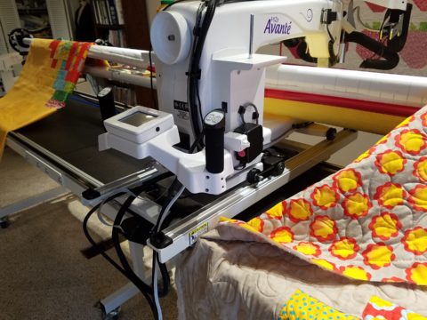
The intricate designs and refinement of pattern details was obviously all done by hand, but with the development of machines and now computers for this purpose, the possibilities are endless.

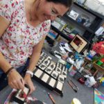
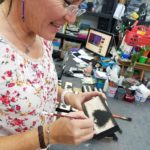
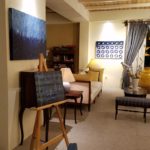
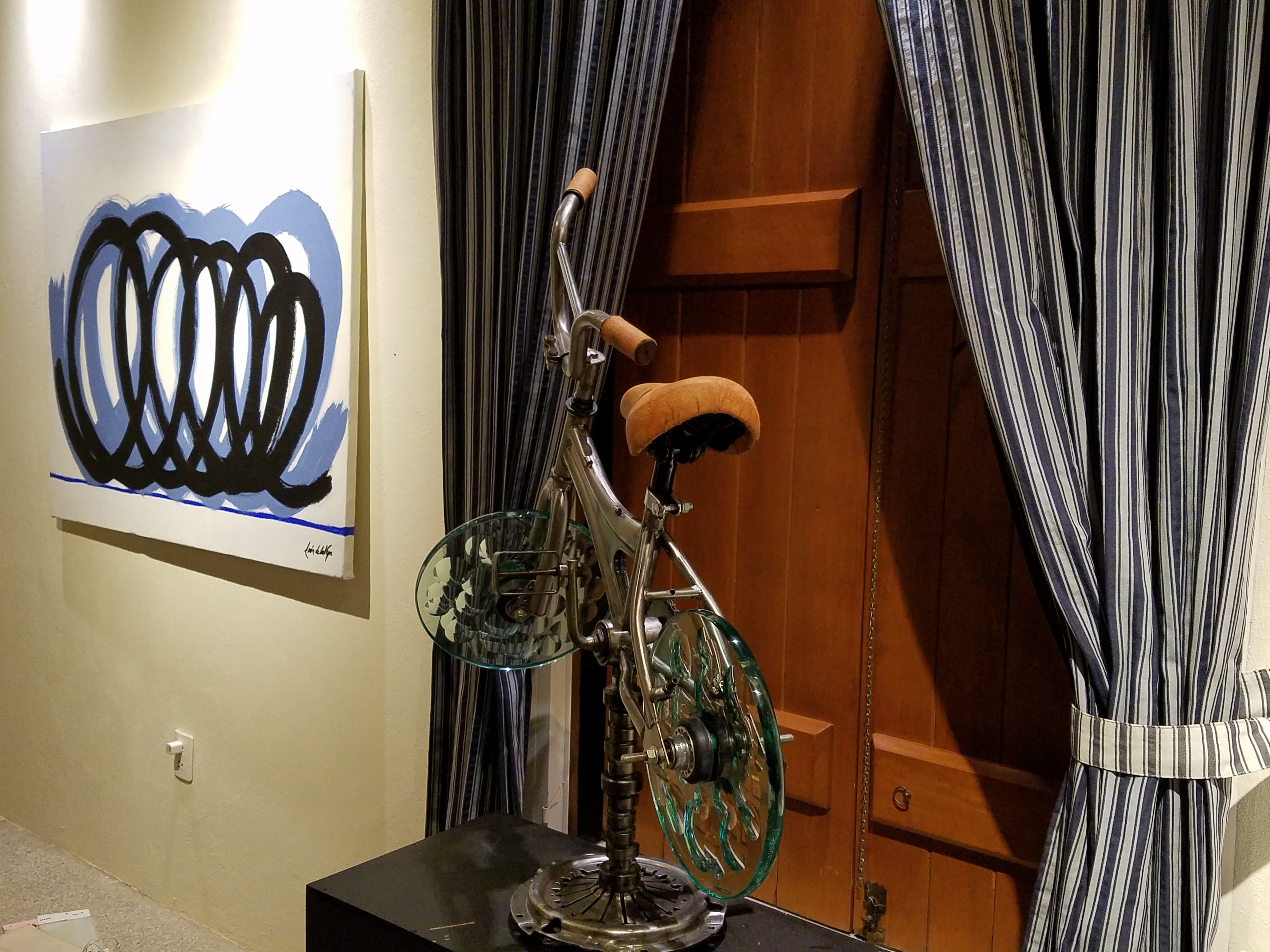
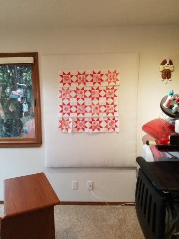
So as I turned the corner, to see a would-be remodel of combining two bedrooms and expanding to the north of the existing shell, I was astonished to see this remarkable, expansive workroom – all white – punctuated with colorful creativity. Colors, textures, patterns…this extraordinary, rather Renaissance, woman had carved out a generous space to explore this phenomenal art and craft.

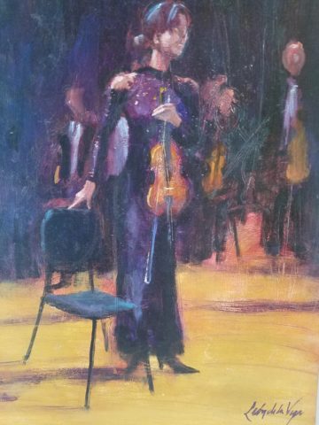
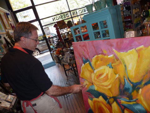
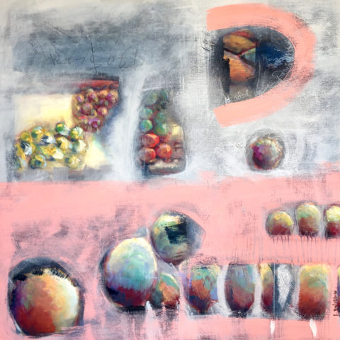
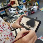
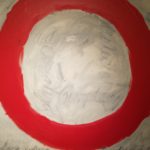
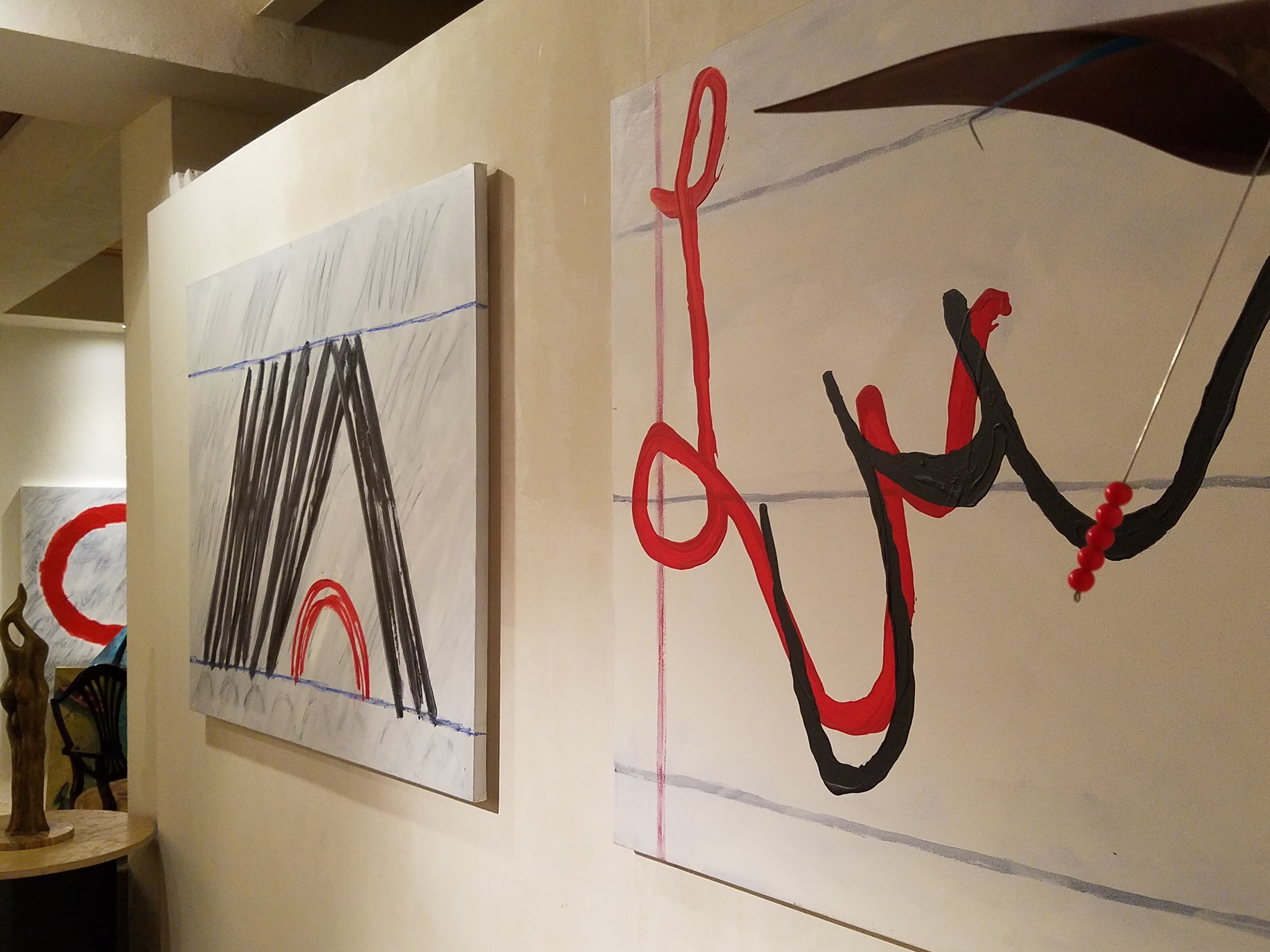
As an artist, Sue Watrous’ paintings and sketches are quite photo-real. On a few of her pieces, she has deconstructed the elements in the painting cutting them from fabric of many grey-tones defying the fact that they are textile assemblages.

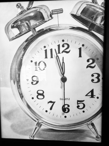
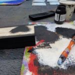
This original pencil drawing – yes, photo-realistic, is amazing.

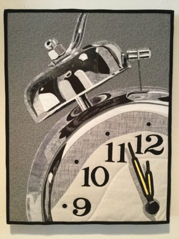
Then to create the same image as a patchwork quilt is remarkable!!

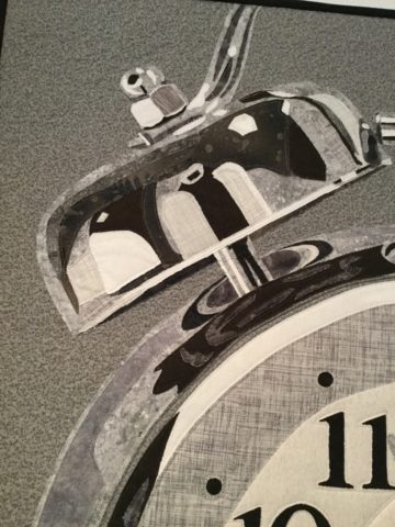
Yes, look closely, you can see the patches of fabric that are assembled in the many grey tones to create this amazing piece.

Her joie de vivre is derived from this magical space and the creations that she imagines and brings to fruition.

Upon entering her amazing domain, I felt as though I was entering an operating room – everything in perfect order, clean and spare – like a clean-room at Intel – I should gown-out or suit-up!!!

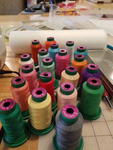
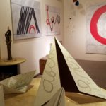
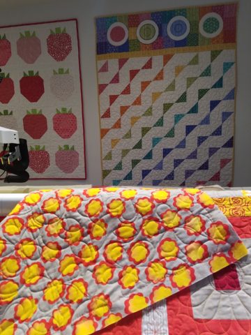
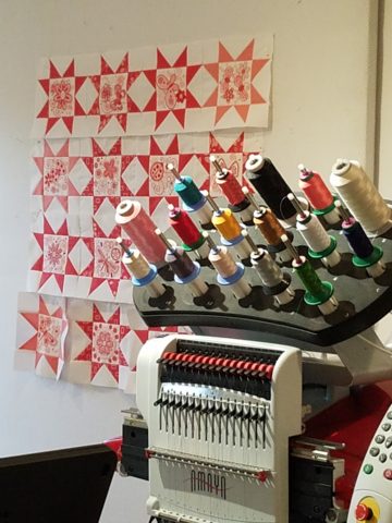
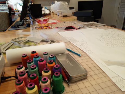
I might be exaggerating because it was white and clean, but warm and welcoming with the rainbow spectrum of thread spools and quilts both finished and in progress displayed on the walls and on the other many surfaces.

Self-taught, she nonchalantly references the many computerized machines strategically placed around the  room. There is an order to the layout and her approach is meticulous. Despite the fact that there is an active quilting community here – they are too busy quilting to teach – so Sue jumped into this after having seen a presentation at a show about five years ago. Years ago she quilted – but at this juncture, she knew at once that she wanted to enter this exciting and challenging realm, of computerized art assist!

Like the shoemaker who has no shoes, her quilts have yet to adorn the walls or bed dressings throughout the rest of her home. She doesn’t sell her work – but her family all has homes riddled with choice pieces.

Her paintings are placed amidst her interior, but not her quilts. Today I focused on a large wall to be the future home of a near-to-be- completed quilt.

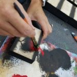
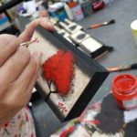
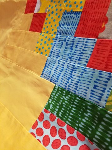
She tells me that the fabrics are like paints – she is painting with fabric.


And although she is not yet dying her own pieces, she told me of meeting a textile artist who spun her own thread from her own llamas, dyed it, designed and fabricated her own work.  Sue has created most if not all of her patterns and designs and I am confident that before this is over, she will be donning rubber gloves and dunking material in dye vats to find a new layer of creativity.


TAKE NOTICE – Or You Might Just Miss Something Extraordinary!!

The world is becoming so fast. Decisions are “snap.” Instant  gratification abounds. And as we get caught-up in it all, more and more…there is a pendulum swinging. People are taking notice and longing for a reprieve. There is a clinging to values that if not grasped, might be lost.

Slow Food, farm-to-table proximity, support local, shop small…sound familiar? And does it appeal? Why do you think? As Amazon gobbles-up Whole Foods and everyone finds expeditious shopping satisfaction in cyber-space at the click of a finger – why?

Last night, as the sun set and the lights penetrated the darkness with their warm glow, I found myself strolling around, taking photos and breathing in the moist night air. Seaside, tucked in a quiet corner of a significant marina in Nuevo Vallarta, I recognized the magic. I was experiencing such magic.

It’s actually all around us, but it often takes a change of venue to realize it. In your world there is magic all around, but you have to take notice!

As I strolled, I came upon the painting recently completed by a dear friend. As I learned of the intent and while studying this painting of “The Violinist”, the sensitivity of the artist is revealed. And later confirmed by him.  Her tentative stance and demeanor begs the question he set the stage to ask: “Might this be her debut?”

The Violinist – a detail of the original oil painting by Federico Leon de la Vega

I then spoke to the sister-in-law of the artist, (chef/owner of the acclaimed Estudio-Cafe) and she reminded me about Joshua Bell.  Although I had forgotten his name, his enlightening story was quickly remembered. Have you heard of him? He’s the world-famous violinist who participated in a little experiment prompted by The Washington Post a few years ago. The idea was to have him play a $3 million dollar 1733 Stradivarius violin incognito, in the Washington METRO, to see if anyone noticed. Disguised as a street musician, with a baseball cap, he played for 45 minutes and collected a mere $32.00!! This is a man who, two days before, played to a sellout crowd of pricey ticket-holders in a Boston theater.  A world-class musician, with a priceless instrument, performing classical music of all of mankind and barely anyone notices!

Menu cover of Estudio-Cafe, Nuevo Vallarta

Coincidentally, I came upon another violinist-themed art piece last evening as I meandered through the patio among the quite varied artwork. Here a graceful bronze of a lithe, nude, mermaid projects imaginary sound wafting from her poised violin through the warm evening breeze.  I was enchanted. And my imagination was running wild!

Ready for evening to begin Estudio-Cafe Nuevo Vallarta, Mexico

Passersby seemed not to recognize the art beside them. As they walked slowly passing by the patio, unhurried, but caught-up in conversation, hopefully enjoying the incredible setting in which they found themselves. Yet they were oblivious to the outstanding collection of art displayed quietly, unpretentiously on the patio.

One of a captivating series of the mermaids in bronze by Octavio Gonzales

Back to powers of observation and taking time to absorb all the beauty and experiences around you…Joshua Bell admits, in retrospect, that it was terribly noisy and very fast-paced down in the METRO as better than 1,000 people rushed to their appointments. But regardless, it illuminates the concern that if we don’t pause to listen as we pass by the world’s most beautiful music, what other amazing things in this life might we be missing?

My husband continuously observes that I am NOT very observant. I know that this is true and I think it is because he and I observe differently. He takes in a wide swath of his surroundings – all sensory perceptions – 360. While I zero in on things and can be oblivious to something right in front of me, in favor of something nearby that has caught my eye. I would not make a very good Columbo as he  often points out! But I do enjoy the details as I encounter them!

From an interior design standpoint, I take in entire scenes and their context all the time. I “practice” this – I am practicing interior design. This is not spontaneity, it is the art of the study and evaluation of a scene. The challenging work of problem-solving. Until or unless something catches my eye that interrupts the study in favor of the unexpected!!!!

STOP and smell (or paint) the roses!!!!!

Federico Leon de la Vega with a previous commission of “Yellow Rose of Texas Bouquet” oil on canvas.

COMFORT & JOY with ART

A few years ago I gave a talk. The title was  something like “I Need a Piece of Art to Go with My Red Sofa.”  It was a defensive argument giving liberty to those who sought artwork for decorative purposes rather than an esoteric rationale. As an interior designer surrounded by artistic influences and drawn to the limitless styles, pieces, concepts and movements of the art world, I see and appreciate both sides of this controversial coin.

Federico Leon de la Vega’s Pomogranates

In my opinion art should bring joy. And that is not to discount art as a social commentary, honest statement of artistic philosophy, opinion, or personal expression. As an interior designer, my simple philosophy is that joy is a goal of interior habitats – function and joy simultaneously. For me, there is a synonym for beauty in there. Oh – and how apropos – it’s Christmas time and the carol God Rest Ye Merry Gentlemen specifically identifies bringing “tidings of comfort and joy.”

In this  month’s December 2017 issue of AD “Architectural Digest” Living with Art, architect Luis Laplace offers that he doesn’t really know about beauty in art. He sounds modest and self-effacing.  “I say I don’t know beauty. When I see that something works, then I see beauty.”  I say that is saying a lot about context. But inasmuch as I can see context being so perfect to showcase a piece that it validates it somehow, it seems lacking in the department of honest personal appreciation or criticism. Surely he must find beauty in art before it is placed.

I can see admitting that something having potential is a valid “wait and see” position to take when allowing a piece to be placed to its best advantage, prior to judging it too harshly – but that seems reserved for pieces about which one is trying to give them the benefit of the doubt! It sounds a bit like tap-dancing…making excuses. Excuses for not having an initial opinion or spontaneous reaction – much less appreciation – much less, joy.

Festive boat bringing JOY at the San Diego harbor parade last week.

Another comment that Laplace makes in this article “High Art” is that “We never use art as a decoration,” he declares. “We design for installation and rotation.” And I am sure in his world, that is exactly what he does. But let’s get down to earth and acknowledge that it’s a chicken and egg thing – the luxury to design expressly for the presentation of magnificent rotating works of art versus finding joy in a piece to decorate your world – with or without rotation. He makes decoration sound like a bad word. And perhaps he thinks it is – but why? Adornment, decoration, enhancement, emphasis – all superlatives, in my estimation.

Federico Leon de la Vega’s Script on Blue

In a completely opposite place on the planet both figuratively and physically, Robert Downey Jr, in this same issue of AD, expresses an explanation for their selections and design direction. “We didn’t set out to do something conspicuously whacky.” He obviously gets great joy and a kick in the pants out of his approach which he cements, with the following comment: “We just enjoy a bit of whimsy and fun.”  And then a negative nod to separate him from the more cerebral art enthusiasts – “We definitely don’t like boring.”

But that is a direct comment on the joy thing and one of my oft borrowed quotes “One man’s trash is another man’s treasure.” Here, a tangible example that I created for my grandson, Liam a few years ago. Debris he and I collected while on a walk one day, I assembled into a collage and had it framed for him with the plaque to remind him to look at things and regard things from all angles.

From what one person derives joy, another might find boring and uninteresting. And that oddly seems to return to the Luis Laplace comment about not seeing beauty until it is placed and then can be recognized. Hmmmm…Yet, I am saying that it might be of value to study things and  think about things differently than face value at a quick glance…spontaneity is valid and so is “love at first sight,” but often things are missed because their context s not serving them well. That space above your red sofa might be just the context and proper setting to showcase the “whatever it is” piece which might be far less interesting otherwise.

Which is why, in this time of international commerce delivering things from all over the planet with an almost instant gratification speed, we still have difficulty making decisions about what to chose to have in our world. Which fabric, which furniture, which art…the choices are at our fingertips and delivered to our doorsteps without leaving our living rooms, but fear of costly mistakes, second guessing trends and how to make good investments still remain the dilemma shared by most. Fear of trusting your own joy. Or, better yet, discovering and defining your personal joy.

Which brings me to the last quote I extracted from the December  2017 issue of AD by an artist, Brian Donnelly, speaking about his own residence and art collection, and that is  “I don’t buy art to put in specific places. I just collect what I love and hope to find a place for it.” Sounds like spontaneous joy to me!!

Closing with best wishes for a Merry Christmas and “tidings of comfort and joy.”


How Long Did It Take You to Do That?”

Recently chatting with a wonderfully multi-talented mixed-media artist of many colors, Laura Balombini and I commiserated on the Creative Process. A few weeks ago I blogged about the Creative Process as relates to client and designer interaction. Some people enjoy the detailed nature of the process and some prefer to be spared that enjoyment.

This recent conversation explored the hidden facets of the Creative Process. The light bulbs that go off in the wee hours of a sleepless night, the honing over time combinations and details, and the tapestry of life experiences that become the personal library of resources from which creativity is drawn.  Sitting in traffic can even result in an unexpected, seemingly unrelated epiphany!

Often called the inelegant “brain fart,” ideas bombard. They pop out often uninvited – when one is NOT even focusing and trying to come up with a solution. They come about without prompt or foresight. They happen.

Creative minds can rarely unplug. Downtime takes a concerted effort. Even those rare moments of attempted escape are invariably interrupted by unwanted, but often valuable, ideas. Not that the ideas are unwanted, but the spontaneous interruptions can be unavoidably annoying.

Yet, it is exciting. Having ideas and bringing them to fruition is greatly satisfying.  Balombini was bemoaning a similar quandary. Often asked “How long did it take you to paint that?” She said to me that the answer was obvious, but not what the observer wants to hear. Sometimes it takes minutes and other times it takes months. How can one charge the same square inch price or similar range of value for one piece that takes little time and something that takes much longer?  She lamented that she wished curious observers would direct their questions more toward a genuine interest in the “process.” Such as, “How did you come to select that color combination?” or “What inspired this assemblage?”


Inspiration is not a straight line. It is trial and error. It is a combination and accumulation of layers of ideas and fragments of many experiences. It is an illuminating and distilling of observations – all stored in the many compartments of the creative mind to be extracted and applied as the opportunities warrant.

Where she and I differ is that she, as an artist, creates constantly as a part of her process – as a necessity of her creativity and/or in hope of attracting a buyer (unless it is a commission – in which case, she hopes to satisfy the buyer) and I, as an interior designer, provide clients a service of creative ideas, solutions, suggestions and opinions toward an end. The ideas are selected, dismissed, modified and ultimately executed resulting in a finished design that is the product of the Creative Process. The creative services should provide effective solutions and be unique and thoughtfully custom-tailored for the client’s individual requirements and desires. The solutions are a result of many educated elements, collected life experiences and observations.

To appreciate what it takes to create is to take an interest in the complexities of the “process”. What might take minutes, to convey or even execute, results from a thought process and observations that are without boundary. The cumulative collection of experiences is what enable the designer or artist to find creative solutions, offer a variety of ideas and possibilities. This is the shared commonality of our discussion.

How often have you strolled through a museum or art gallery and thought, “I could do that!”

Have you ever attended a wine and paint event and tried to render the subject and watched as other of your fun-loving companions struggle to do the same, with as many different results as there are participants at the party? Copying is not easy, but it is very different from originating.

As I pondered this blog’s subject yesterday, in advance of putting it into print, another remarkably related and coincidental exchange took place. There I stood in the company of two co-workers of a business office for which I had designed the interior. They, having arrived after the project had been completed, were not privy to the details of the design elements and the process over months that took place. One asked the origin of the art series punctuating the east wall of the reception area. It was a collection of contiguous abstracted landscapes with rough dashes of brush strokes and stacked layers of color.  She asked if it was a result of a wine and paint party. I was aghast.

But upon further conversation it was clear that they recognized the same sized images, with a similar subject matter on each and the same color palette – not thinking beyond to the technically un-selfconscious (I like that word) process and ultimate application and execution. As we looked more closely and discussed the complexity of the texture and layering they came to understand that had they or I tried to copy it, we would not have had that remarkably un-selfconscious effect.  Ours would be more tense and rigid, in the attempt to be relaxed, loose and seemingly simple.  A new appreciation was realized. I had initiated an artistically creative commission from the very talented Federico Leon de la Vega as a solution for a long expanse with a splash of colorful, original, sophistication.

Artistic creativity is nebulous like a blond grabbing at the air…collecting her thoughts!!! Yet that nebulous creativity results in concrete solutions. Commission a painting, ask questions, buy one spontaneously when you like it, retain an interior designer and appreciate the Creative Process. Be creative and have a little fun. Try not to let it interfere with, or usurp, your attempts at some relaxing downtime.

The thickly applied paint on the canvas of the feature image, for this story, is by Ron Cheek. Incredible color balance, generous application of oil paint and loose strokes layered to present a powerful landscape. How long did it take him to do that? A lifetime up to that point.

Please visit our boutique gallery/design studio in downtown Albuquerque to see work by  these fine artists and others!

Custom Designed Art for Branding in Commercial Interiors

Designing artwork for commercial interiors offers an opportunity to connect to the brand. It means that we take into consideration the artwork as relates to the business and its identity. You might remember a blog from last year about the can wall. It was designed for a taproom. The theme was beer. The name was “Silver” and we considered that a natural off-shoot of that was the silver color of aluminum beer cans – as a wall treatment!

For that same project (in two locations) we further emphasized the brand with photos we took of their own products transferred to and stretched on canvas stretchers to be the “art” on the surrounding walls.


Fast forward to a conference room for an energy company home-based in Albuquerque – the iconic Sandia mountain being the earth’s monument – the familiar, perfect image to represent the company and the connection to the earth and its resources. For this  project, we were asked to build 27′ of custom , cabinetry and dress the wall above it.

The tall ceilings required a vertical element, but the length of the wall also begged for horizontal space-filling. As a cost-effective solution to such a large space, we decided to take a photo of the majestic mountain, separate it into 5 sections and have it enlarged and transferred onto aluminum panels for light weight and rigidity. The reviews were sensational as everyone loves and relates to the familiar scene – seen in such a colorfully explosive and expansive installation.

In response to the success of that solution, the client asked for a complimentary treatment for the opposing wall. Again, the wall was 27′ long and had the same ceiling height so we used multiple fragments in 3 groupings to center across the entire expanse. “Elemental Fragments” was born of the concept to have just that – fragments of elements in an orderly fashion – uniform yet random, to contrast against its formal geometry in response to the amorphous photographic landscape. Colors were derived from the blue, green and yellow in the scenic panorama interspersed in a field of silver.

Last week, on the day of the installation, colorful creative chaos – resulting from unwrapping the individually hand-crafted compositions and scattering them across the conference table – was part of the fun, of the scene.

The tedious work of aligning all just right, with perfect spacing and level mounting, added to the anticipation of realizing the finished product.

The luminous glass against the rich, stained wood punctuated with the  brushed stainless fasteners made a striking assembly.

Modern engineering and production, worldwide energy collaborations and shared technology coming together in a grounded environment of people and their place on the planet. A daunting system of assembling fragments of many elements that make things work to bring gas to the end users. The artwork makes the concept look easy. The result of the many facets, of the actual work and the artwork representing it, is not only effective, it is triumphal.

It’s creative fun to custom design pieces to relate to the brand, the business and the culture of a project. Bringing joy, pride and a sense of confidence in the focus of the work, to the employees and guests, is a successful finale.

Bring us your design challenge and we will design a solution specifically and especially for YOU!!!


Loved Loving Vincent!!!!

Last night was a crystal clear starry starry night as we strolled down the quiet urban sidewalk, between the building facades, on our way to what we soon came to realize was an event we would never forget. Once settled in our seats and after way too many previews, the magic began and we were instantly mesmerized by the millions of brushstrokes of over 100 artists recreating the world immediately before and for a year after the death of Vincent Van Gogh.

There, in a cozy theater downtown, we experienced a wondrous film, Loving Vincent. We embarked on a extraordinary journey and were lost in this fanciful world of brilliant color and bold movement as the movie unfolded with an animation unlike we had ever experienced. It was a though we were watching Van Gogh paint this film. The rough deliberate strokes were actually moving as the scenes unfolded – the scenes were alive with the movement of the animation.

http://lovingvincent.com/

This remarkable delivery vehicle to convey a portion of Van Gogh’s world brought colors dancing – even screaming – across the screen in familiar swirls, and deliberate marks that were so identifiably his. What the artists were able to accomplish was astonishing. The focal surface of the theater was busy with the seemingly live brushstrokes of Vincent Van Gogh. Borrowing from his actual paintings, the viewer is transported into the world of his interpretation from street scenes where he experienced the corner with the yellow house to capturing individual’s who appeared throughout the film such as The Zouave in his red hat distinctive of his French military service, to the bearded postman, Joseph Roulin, who was so key in the intimate, mysterious and different story line, the expansive scenery of Provence and the intimate details of daily life.

As a true Van Gogh fan, it  was love at first sight – do you remember where you were when first introduced to his magic? Having grown-up in Washington, D.C. I was fortunate to have had family visits and school field trips to the magnificent National Gallery of Art where, upon each visit starting at a very young age, I would scour the gift shop for postcards of my favorite images – taking home with me memories of the beautiful influences that have continued to shape my appreciation for color and composition, balance and light, contrast and context, subject matter and the power of observation. I must credit my  mother and grandmother for instilling in me this awareness of things of beauty and their importance in our lives.

Fast-forward a bit…way back when…dare I admit…when first studying art history in college, the bible was HW Janson’s HISTORY OF ART. A daunting tome filled with the overview of all that is art as we knew it at the time. Van Gogh and his impressionist colleagues were sprinkled throughout latter portion of the book.

There his genius was once again presented to me stirring a wild appreciation for his rebellious disregard for conventional painting styles. He possessed and fed his own passionate, if not desperate, need to apply paint to surfaces, capturing life and telling stories from his unique and insightfully perceptive vantage point.  The Impressionists have always stirred a passion for the boldly colorful, adventuresome, romantic and sensitively sensual expressions of life for me.

Years later my husband and I were fortunate to attend the National Gallery’s exhibit Masterpieces from the Van Gogh Museum Amsterdam.

It was the fall of 1998 and we were thrilled to be walking toward the oh so familiar edifice with great eagerness for what awaited.

The line wrapped the building, but moved along with efficient, orderly procession as the anticipation grew with each forward step.

Inside we purchased the audio tour tapes and, with headsets on, immersed ourselves for the next few hours in the dazzling world of this remarkable artist.

His unique undaunted expression of the scenes, people and details around him, through his own unschooled techniques, was awe-inspiring.

Tormented and tested he discovered his passion and for a very few years carving out an indelible place that will live, breathe and be enjoyed forever.

The people in their joys and sorrows, fashion of the time, landscapes of bountiful beauty, interiors of keenly observed detail all expressed through his sensitive eye and brought to generations of viewers – a priceless gift to the world.

The take-away…embrace bold expression, fear not color in your world, appreciate the details, and go see this film, Loving Vincent, before it leaves a theater near YOU!!!!

What is a Picture Worth as You Plan Your Design?

We’ve all heard the expression “A picture speaks a thousand words.” And today, as I set forth to use it, I investigated its origin…seems the original quote might have been “A picture is worth ten thousand words” as stated by Fred R. Barnard in the 1920s. Either way, it conveys the same – seeing is believing and seeing is more literal in most people’s eyes. Words can describe and attempt to convey an intent or, in my world, a design concept. But to sketch it – well that’s the best way to show the intended idea. There were other unsubstantiated references to an old Japanese phrases, but suffice it to say – it is such a truism that it is referenced often.

Here is an illustration of a courtyard that we have proposed. Our custom designed hand crafted iron gate inserted into the existing low wall, water feature, flagstone and plantings are all new proposals. Can you picture it? If I had arm-waived with a verbal description would it have been as helpful? It’s a small space, so it would have been easier to convey than other more complicated design concepts, but for the sake of an example, this works. I’m thinking that your answer would be – “Yes, I get it! The illustration sets the stage and really helps me visualize the intended finished product!” It is exciting and more stimulating than a rigid CAD drawing and evokes more emotion in most, if not all, clients.

I realize as I write this that it directly reflects the observations in Federico Leon de la Vega’s comments about the value and actually critical importance of handwriting as he expressed in his TED TALKS last year.


Therefore, I prefer the artist’s rendering – to support and promote the talents thereof and also for the much better rendition of the concept! So as technology advances in the realm of illustration, I intend to continue to support the skills of the artists that so effectively express our designs.

Let’s get together and plan your next design project, find solutions and create the images that will springboard the work and ultimately represent your new reality!!!

Design Dreams Come True – Custom Collection

Designing is great fun. But the key to completing the circle that starts with an idea in response to a need (or not) is having that design come to fruition. I am grateful  for having a great team of detailed design fabricators who make my dreams come true.  And they spoil me. I think many designers will say the same thing. What starts on a cocktail napkin,  torn piece of flimsy trace off a roll, a sheet of graph paper or more formally, working drawings, takes shape with the collaboration of designer and fabricators who are not just fabricators, but invaluable contributors to the finished products’ construction and design details. These are the seamstresses, upholsterers, carpenters, iron-workers and all manner of construction trades who bring these creations to fruition!

Several years ago we had a client who was daring in her desire to have a super modern loft. Her history of traditional furnishings and up-bringing was well in place in Washington state, but this opportunity to have a second home, an urban loft, made way for her exercising the juices that offered a new alternative lifestyle and a new “look.”

One of the many key pieces in this fabulous space turned out to be the cornerstone of a new custom collection that we fondly call PATRICIAN DESIGN’S  “Hammered Home.”

As I planned the pieces for this fun and hip urban interior, I designed painted pieces, modern tonsus,  a Nelson inspired coffee table, red and raw steel glass-topped dining table base, a new take on a drop-leaf desk and colorful mixed media end-table/chests all custom fabricated by my team, but I wanted something more, something that gave rich, detail and dimension, interest and art and this new line of custom furniture was born. The first piece, a nightstand/end table for a dual-purposed guest room/study combined clean-lined wood with steel.  So with a quick sketch of the dimensions and form, my desire to have metal legs suspending it off the floor, metal accents but not severe – I thought, hammered?

The wood tone was to be a more milk chocolate than mahogany but tight-grained and true medium  brown. The floors were an existing light engineered material and this brown contrasted nicely.

The next opportunity to introduce this combo theme of our “Hammered Home” design came with a young family’s need for a media armoire in the “family” room. Several years ago when “espresso” hit the design scene for the new trend for modern furniture, everyone  from Target to Pottery Barn to Robb & Stuckey filled their inventory with the dark coffee bean wood finish.  As a designer, I recognized the value of the trend and wanted to accept it, but take it a step further for these very smart and successful, yuppy clients.

In previous blogs, I have clearly stated that all trends are not created equal. some are passing fancies of color combinations that soon become dated or design elements that don’t leave a significant mark to pass the test of time. But the dark chocolate/coffee color enriched that which had so often been blond, light woods and cherry/cinnamon tones of recent popularity and contributed a valid alternate stain theme for wood furniture. The media armoire for a young family’s “family” room, was clean-lined and new. The bling was industrial enough not to be glitzy, but just enough silver-grey metallic to contrast against the dark wood.

The next version of this “Hammered Home” collection came in front of a stacked sandstone wall of bone white, creamy cream, a hint of gold and a tinge of iron rust. We picked the darker rust tone to contrast against the otherwise soft light stone wall colors – the rusty hue suggested a cinnamon colored alder – stain magic! This pair of low profile media cabinets housed all the components and an incredible bundle of wires streaming into the back of the cabinet from all points of the house – and it’s called wi-fi? Really? Due to the color scheme, we decided that a copper metal panel would really meld with the cinnamon-stain of the alder. So we took it a step further to enhance the copper, knock it down a bit and highlight the texture with a blackened rub that nestles into the hollows and allows the bas relief to shine. It is a warm, rich, dimensional textural wonderfulness.

So when a very fun client called last fall wanting a surprise for his wife – nightstands perhaps? I laughed because my husband often says that he’s getting me storm windows for a Valentine’s Day gift…funny – every girl’s dream!! But nightstands are at least in the realm of dreamland!!! So knowing the room and its existing color scheme, I decided upon a satin black with the same hammered blackened copper panels. The combination of the black and blackened copper was sensational. The style was more transitional than the previous clean-lined pieces – but it goes to show that this hammered metal design theme can transcend the styles…

20170214_111817-copy


We LOVE working with this client as he knows that he either has an idea (a new nightstand) that we can create or he calls and asks – what can we create for the next event? Whether birthday, anniversary, Christmas, or Valentine’s Day – we have provided locally hand-loomed textiles wraps, wild embroidery throws, magnificent oil paintings, locally hand-crafted jewelry and more! How fun for him to know that each present is custom and unique, supports local artists and will be a treasure forever. Plus he doesn’t have to shop!!!!!

So we delivered our surprise cabinet last week on Valentine’s Tuesday, I stopped at a quickie store and bought some simple heart stickers – not much larger than a postage stamp, I stuck one in the drawer and one on the shelf of the lower cabinet and thought that whenever she opened this cabinet she will remember that it was her Valentine’s surprise!!! We had a key, took the cabinet to their bedroom, removed the old nightstand, replaced it with the new one…Voila! She came home to a really neat surprise!!! And might there be a matching one in the works?? We can’t say.

20170214_111817

Custom fun – support local artists and make your dreams come true!!!!!

Hearts Are At The Heart Of It All

Su mundo es corazones. Artist Paola Alonso Rangel is at the heart of Vallarta and literally that is the name of her shop, Corazon Vallarta, where she thrives amidst the bustling activity in the old town, on a busy street corner, with much traffic flowing by both in vehicles and on foot.

p1120692

A man carrying a frightening large pane of glass about 6 feet long by 3 feet wide effortlessly and without intimidation marches down the street with taxis and buses bouncing by him. I cringe at the site and the young shop attendant, Nidia, shrugs with a smile and says “It’s Mexico.”

With Valentine’s Day nearing, this exciting little shop offers a wealth of opportunities to find just the right gift to say “be mine!”

Paola’s little Chihuahua, Pecas (Freckles), suns on the front step seemingly oblivious to all the activity swirling by. She is front and center of all that is happening in Corazon Vallarta.

A designer and hands-on artist of nearly everything she sells in her shop, Alonso Rangel is a model of organization and time utilization. She has her machine fine-tuned and knows just what it takes to create, prepare, produce and market her work.

20170128_115901

In the well-lit back room of her little tienda, she has all of her art supplies neatly organized on sturdy shelving sparing not one square inch of available space. Her computer plays soft Spanish songs that, with the fan blowing gently, creates a pleasing atmosphere where she designs and paints with a couple of assistants to assemble and package her work to sell.

As is true of most urban storefronts, the fine grit that is continuously accumulating from the dusty streets and vehicles in passing contributes to the concerns of successful retail presentation. Hers and others in this type of scene perhaps suffer more due to the cobblestones which collect and distribute ongoing layers of the sooty, dusty, fines.  So everything is kept painstakingly clean and wrapped in cellophane  – just another stage of the process that makes her conscientious practices so impressive.

From colorful wooden puzzles, picture frames, key hangers, boxes and magnets, the expansive home decor and gift collection, on which she collaborates with her brother in Guadalajara, is a treasure of her designs and creativity. All manner of colorful animals with whimsical expressions are the subjects of her puzzles with a bit of flowers and fruit in the mix for a generous variety of choices. Alonso Rangel designs all of the pieces while her brother and his crew with a manufacturing studio in Guadalajara do all the mill-work, brilliantly colorful painting and glossy lacquer finish.

20170129_100543

Other of her work is comprised of original one-of-a-kind creations on canvas and wood, heart-themed all in keeping with her heart-felt passion for  corazones.

She efficiently sets-up her own assembly line of stages of production, with Pecas supervising closely, so that her by-hand (hecho a mano) originals are always filling the walls and shelves and being lovingly selected by customers to take home.

Steel heart sculptures, wooden cut-outs, carvings, and more are the multi-media of her continually, seemingly endless creative concepts and body of work!

20160205_155241-copy

Thank you Paola for all of your inspiration – by design!

p1120692-copy


Would A Love Letter Be The Same Without Handwriting?

After having seen Federico Leon de la Vega’s presentation at TEDX Talks in September and after having seen some of the work in progress over the past couple of years, it was a treat last week to be in his studio to see the collection exhibited up close and in person!

Presented on fabulously enormous canvases and a few smaller studies, these bold graphic statements compile a contemporary collection that is quite astounding. The premise is quite provocative.

The idea that handwriting is a basic human means of communication having evolved into the very personal flowing script of cursive that each individual can call their own – in their own style – it’s almost as personal as a fingerprint. It is an extraordinary human function that should be protected, revered and certainly not lost to the fast-paced technology of the digital age!

Making one’s mark on a surface…a piece of paper…to convey a thought, idea, instruction, story, a doodle on a paper towel – a love letter.

20170117_120810

With Valentine’s Day approaching, it brings to mind the idea of love letters. We read them throughout literature and listen to them in songs. We hear of them being saved over time by recipients in treasured boxes tied with ribbon to be read over and over or merely saved for others to find long after…

These magnificent oil paintings convey the art of handwriting. They celebrate the simplest marks of hand to canvas with brush and paint looping in circles and jutting in spikes – the primary strokes of handwriting. These primary strokes are the foundation of mastering the control needed to make the continuous flow of letters that become each person’s personal interpretation of the alphabet in cursive style and an exclusive means of communication.

Style – handwriting conveys personal style. Look at yours. Is it always the same or do you mix it up? Do you stay consistent or do you express different styles of your own handwriting for different purposes?  Look at your friend’s handwriting – would you recognize it anywhere?

federico-signature

It is thrilling to walk among these great canvases with their color and  bold strokes. It is arresting to realize that they are so simple yet so complex in what they are saying. We must recognize the value of handwriting. We must not let it be dropped from our schools’ curriculum. We must continue to see the importance of the pure, mind to hand, raw emotion.

Powerful spikes require starting and stopping – control.

Loose loops also require control to maintain uniformity.

20170113_194255

After control is learned, expression can take over resulting in that personal style that becomes each individual’s identifying handwriting.

20170113_194522

Federico reminds us in his talk, about how we might have attempted to write a love letter for the first time and how many times it was crumpled because it wasn’t quite right. The failed attempts of recording our feelings as we strive to say the right thing, to express our deepest emotions. Yet once accomplished, those words hand-written mean so much more than the same words conveyed by type or digital communications.

“From my heart to my mind, from my mind to my hand, from my hand to the paper I place in your hand,  so you may fold it and keep it near to your heart. No delete!”

The digital world is all around us. We cannot escape it, nor should we. However, the human evolution and the brain’s development that mastered the art of handwriting is a place that could be diminished and lost if we do not continue the art and practice of personal expression through this extraordinary medium.

All we need is love – sent via a personalized handwritten letter from the heart. Here’s to a Happy Valentine’s Day !!!