“Wonder Time” & Creativity

I love the creative process. I love darting from idea to idea – the random electric jolt that results from spontaneous concepts that will create something wonderful, if not significant and the gratification of the final product!

That is interior design – creating something that enhances an interior – an interior (and exterior) space and all the elements within that serve people. Designing an interior which solves problems, increases enjoyment, and hopefully has staying power is the goal. Unless intentionally transient and intended to be impermanent, offering a design that has staying power transcends trends and creates without a framework of only the present.

If you are a client, potential client or an associate in this crazy, wonderful business don’t you ask yourself, “How does creativity happen?” An idea? A need?
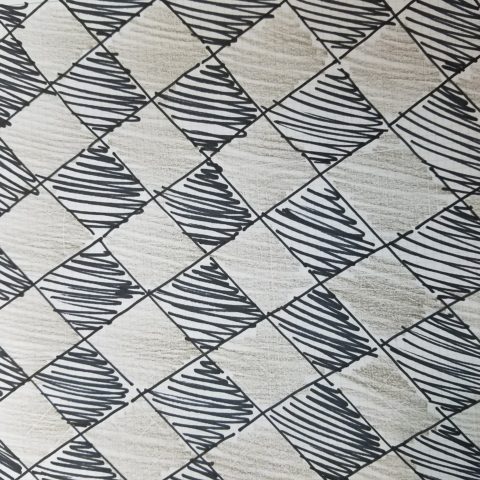
So the idea occurred on-site as I sketched a pattern that I thought would be the perfect statement and backdrop for all else in the house.
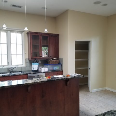
 

The kitchen had some expensive elements that were not practical to change. Existing cabinets, natural stone counter-tops and ceramic tile flooring all had to stay.
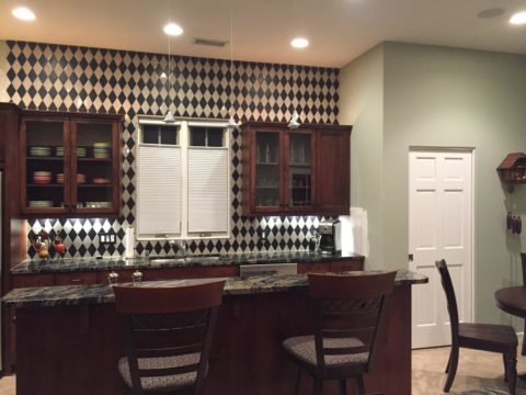
 

The original sketch realized in an nearly black, charcoal and cream tile pattern with an added opportunity for the client to turn an error into artistic expression.

Well this client asked and made a creative discovery: “George (young-adult son) Juan (tile installer) and I had a lot of fun figuring out…the tile work behind the stove…That was supposed to be solid black..didn’t even get ordered…and George worked with the left over pieces and designed that (solution) himself!!!! I think it’s amazing and will always be so special bc of how it came to be!!”
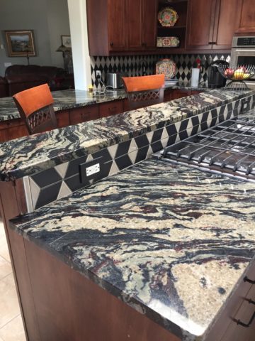
“Basically, what happened was we ran out of the tan colored tile and only had some smaller-than-half pieces left from the cuts.” Resulting in George’s creative solution!!

Personal experience with years of working with a variety of people has shown the extraordinary difference in how each individual perceives and proceeds through the design process and related creativity. For some, the design process is an exciting adventure to be navigated with or without the aid of an exhibition leader (professional designer) to explore and travel the amazing paths of color, balance, detail, elements and combinations. For others it is not only not an exciting adventure, but one of frustration, anxiety and sheer obligation to complete a necessary task(s). Like a project with a deadline – finite and compulsory. Where’s the joy?
To design for others is the name of the game – the professional practice. In order to effectively design for others, one must have empathy. To extract a client’s wishes and create for the express purpose of making them look good, feel good, enjoy their environment, produce well and feel empowered all requires getting into their world. When you effectively do so with the genuine desire to make better, you empathize with their concerns, desires, sensitivities, and needs in order to design effective solutions.
How the brain perceives things and how sensitivities are realized, by different individuals, is remarkable. From our amazing, autistic grandson who finds wonder in very focused things from red cars to distinct shapes and colors, words and pictorial representations of them, to my dementia-challenged nonagenarian mother who clings to her very core appreciation for beauty and everything well designed; perceptions, sensitivities and levels of awareness continually astound.
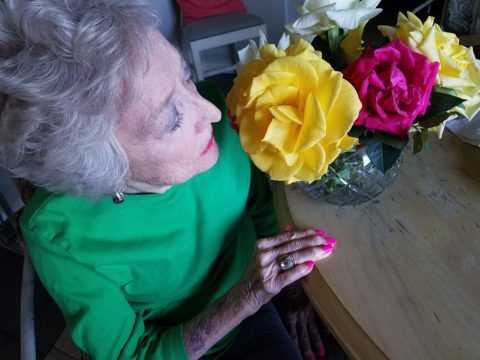
Elsie de Wolfe a Renaissance woman of broad reaching creative ability said “I am going to make everything around me beautiful – that will be my life.” I wonder now if Mom knew of this amazing woman and heard this phrase that so reminds me of her, but sadly she would not be able to grasp or convey any possible recollection of that now.

I place an enormous emphasis on what I call, “Wonder Time.” Everyone needs time to “wonder.” We should all take more time to WONDER. It is in those moments that amazing things can happen. Realizations can be illuminated, ideas are formed and dreams materialize. It is a time for creativity. Do you take time to “wonder?”

For my once-toddler cousin, I remember the moment so clearly. We were on a mission to get something from the car. It offered an opportunity to have an mini adventure and explore the parking area of our beach house. We had descended many stairs to come out at ground level into the dark, shadowed carport of the massive exposed-concrete structure. It was spooky and mysterious in the twilight. As we made our way holding hands through the shadows, she all of sudden said “I wonder…” and was clearly deep in thought pondering something of our adventure that I wish  I could remember. But her phrase, “I wonder” is clear as a bell, to this day, more than 30 years later. I looked at her and asked “You what?” Wonder was such  an abstract word – a BIG word for such a little person – that it made me wonder what she knew about wondering!!!!! We dashed back upstairs and I announced to the gathered group – “She wonders!!” And began to explain our experiences in the depths  of the concrete carport. The blooming result, of that toddler full of wonderment, is today a highly observant and creative young adult.

Being inquisitive is part of that creative process – the “what if” of it all. I use that often in my design practice…”what if”…and “if, then.” It is not finite, it is a process that presents itself and a variety of tangents continuously.  Designer Todd Oldham observes that creative people are different and if you are not one, you will not understand the need to be creative. He knows that “as a creative person, you can actually survive off of your ideas.”

I agree. For some, creativity is a necessary aspect of being. It is a way of seeing. It is unavoidable and random. It is essential. It is life affirming and life giving. You either are one of the “creatives” or you are not. Yet creativity exists in each of us. It is not learned, but it can be honed.

The sensitivity that comes with this profoundly innate sense is sometimes an onerous burden. Being pleased by design details around you from nature to the built environment, from fashion to well-designed freeway overpasses, details matter and a great joy is the benefit. However, details can have the adverse affect, if not well executed. If they are not well placed or well designed details, they can grate and annoy, raise blood pressure and cause all manner of anxiety. It is an onus to be so sensitive to details. Poor lighting in a restaurant, imbalance of surface textures, ineffective or inappropriate colors  – it is all about that phrase “Beauty is in the eye of the beholder” and if the sensitive person is presented with jarring elements that they behold or consider to be in error, it can be most unavoidably disturbing.
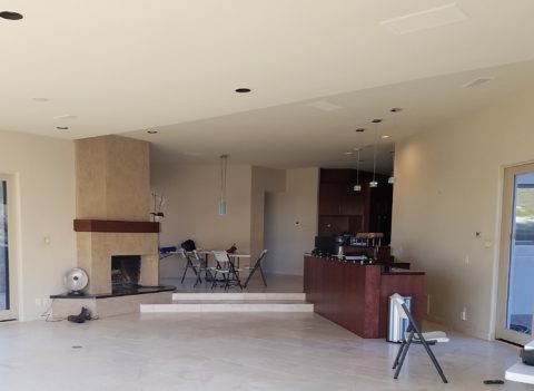
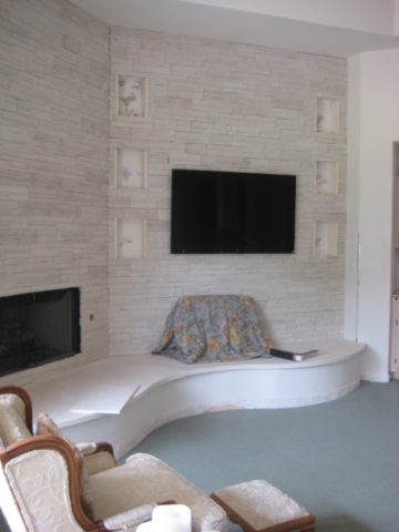
The placement of this fireplace an bar so grated on my sensitivities that it was amazingly uncomfortable being in this space. A challenge for correcting without structural modification for sure!

Like creative writers and their critics, who have often expressed their strength in the power of words…for designers and artists of many media, it is the power of color, lighting, pattern, and composition.

Good design is never out of style.
Friends Don’t Let Friends Pick Paint Colors

WHY? It’s never as easy as it seems! You can track the trends. See what is relevant to today’s popular design concepts. But how do you really pick a paint color? Warm versus cool, safe versus bold…there are seemingly limitless choices and so many things affect the decision. HELP!!!!!!

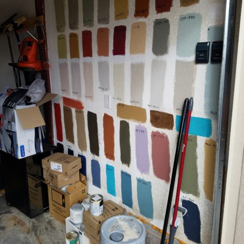
Does it help to swipe a swath on a wall?

Not usually. The surrounding often white paint isolates the color in a small concentration and it cannot begin to give the full effect of an entire wall or more. The most telling is to paint an entire section of wall that you can frame in your field of vision without seeing anything else.  That or painting an entire wall, for the best test.

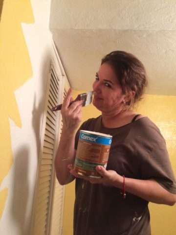
Here a frustrated color connoisseur tried several test patches before calling for HELP!!! But we LOVE the novelty of the effect! What a conversation  piece – a work of art in its own right!!

When is the ceiling painted other than white and why?

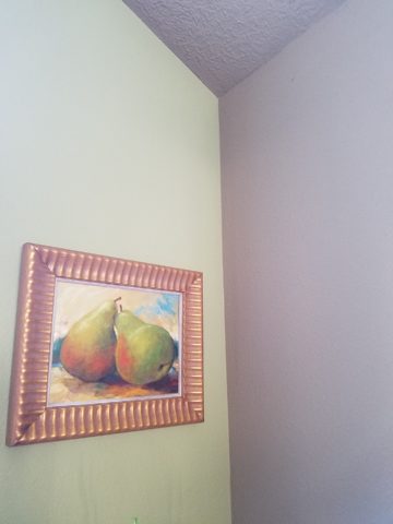
Some colors stand-out and are more imposing while others meld with their associates.  It depends upon your personal comfort level. For example a room painted a sunny yellow might be too bold or imposing if the ceiling were to be painted that same color – white would be customary and give relief and contrast to the yellow vertical surfaces.  A more mellow color (like a taupe) might work well on all surfaces creating a soft, unifying encapsulation.  Shades of the same color – lighter or darker – can also prove to be an effective treatment. Light reflectance – artificial versus natural, depth, the hue and value all play a part in determining what works in a given situation. Not to mention any existing furnishings that might direct a color direction/selection.

Should different walls be different colors?

Why not? Variety is the spice of fabulous interiors – but that doesn’t negate the beauty of an all white interior . Knowing when you want color, how much and from what source is part of the balance of design.

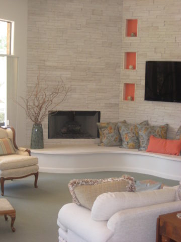
Remodeling this room was comprised of removing walls, adding a serpentine banco and hearth, stone wall surface, painting stained cabinets…We started this project with a new white on white texture and contrast of 3 different stone materials adjacent white walls and white wood trim.


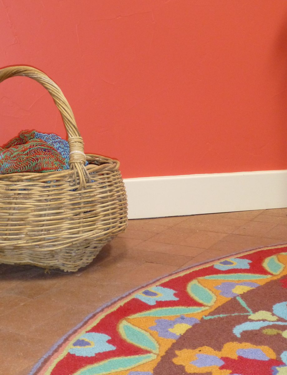
We ultimately added coral punctuation in the recesses of the niches.

What is color layering with paint?

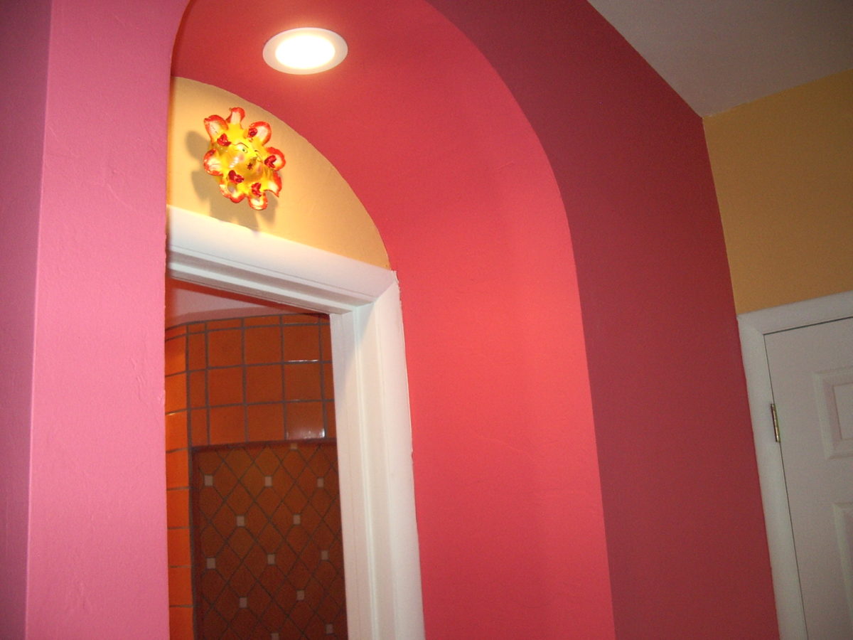
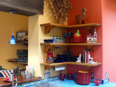
Planes of color seen over-lapping can provide a fantastic effect of colors literally layering over each other. Looking through an interior and reading a wall of one color and another wall behind it peeking out with a different color can add interest and contrast.

How do you stop colors from wall to wall?

I prefer stopping on an inside corner – always. But that’s me. I prefer to “read” the element (wall, monolith, enclosure, etc) as a structural unit. As though the wall were build of that material – the finish suggests the material rather than illustrating a surface application that quits. And I feel the same way about any surface application – tile, wall-covering – preferring to stop on an inside corner to define the element from beginning to end.

EXCEPTION: I have had several instances where we have a little  fun with transitions between colors – a zig-zag motif, for example, can provide a surface graphic and change colors on one surface!!

Wrapping a corner from a full wall of yellow to another – but not wanting the yellow on the entire following wall – intentional graphics are fun and allow for the change of color.

Semi-gloss versus flat?

Glossy finishes show more defects in the surface material. So a wall with imperfections such as texture flaws, repairs, any uneven detail will be enhanced. So to minimize defects, a flat paint is preferable. It also depends upon what you are trying to convey – a smooth plaster finish – might be better expressed with a semi-gloss but an earthen softness is better with a flat paint. Clean ability and durability might play into this decision – but not at the expense of the desired visual effect as there are many grades of paint to accomplish various levels of ease of maintenance – consult your paint products professional.
Contrasting a gloss against a flat on different adjacent elements is a nice contrast such as wood trim in a gloss against flat on the adjacent wall. Is the trim the same color as the wall or is it a contrasting color?

Do dark colors make small spaces smaller?

It is a deceptive misconception that this is the case. Dark colors recede and therefore can actually expand the illusion of space. A dark ceiling seems to recede into the void and creates the feeling that the surface is far much higher than it really is. Dark colors behind light colors does the same – recede as a back-drop. Do not fear dark colors – they contribute depth and drama.
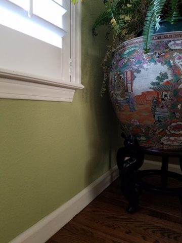
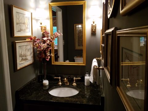
Picking paint colors is like selecting the backdrop for your world. All your things are set against this plane.  Applying paint is having control of transformation. Like controlling when and how the sun washes the dawn or the night envelopes in darkness and all the amazing colors that occur in-between.  Visualizing the end result, creating the transformation that takes place beneath the brush, roller or spray gun as it alters the scene are magical powers.


TRENDS DIE – What’s New for 2018?

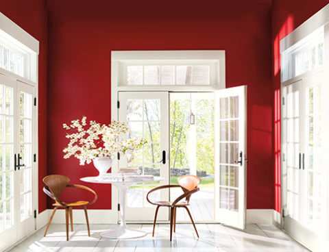
I was surfing for fodder about the new color trends to kick-off this first mindful missive for the New Year and the color trends were all over the place – no consistency at all. From Ben Moore selecting Caliente AF290,

“Caliente is the signature color of a modern architectural masterpiece; a lush carpet rolled out for a grand arrival; the assured backdrop for a book-lined library; a powerful first impression on a glossy front door. The eye can’t help but follow its bold strokes. Harness the vitality.” 

—Ellen O’Neill, Benjamin Moore & Co.

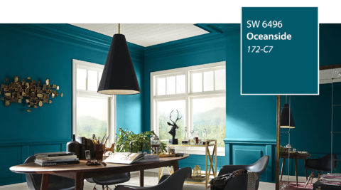
to Sherwin Williams in a totally opposite direction proclaiming Oceanside SW 6496 their color of the year.

“A collision of rich blue with jewel-toned green, a color that is both accessible and elusive… A complex, deep color that offers a sense of the familiar with a hint of the unknown, Oceanside, bridges together a harmonious balance of blues and greens that can be found in what’s old and new.”

What? Are we straddling now?  Do we have one foot in one color trend while the other stretches across the color wheel and causes us to nearly do the splits trying desperately to hang on?

The walls of my east gallery space were a spicy version of Caliente for nearly 20 years! Bold at the time and unheard-of for  gallery walls – it was not to be changed for nearly 2 decades!!!

Whew – that was a run. I even named the retail space “Caliente.” And the color-band between the crown and picture molding at the back was a version of Oceanside – a lighter value of the blue-green hue.

The Grand Re-Opening July 2016 presented a dramatic transformation to a pale aqua resulting in a diametrically opposed feeling – a cleansing from what was crowded and hot to spare and cool.

But I digress…

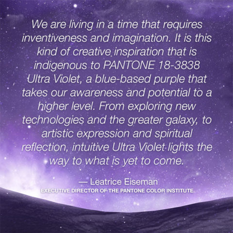
Annoyed by the seeming authority, but weak contrasting rationale that I encountered with the wide range of picks and opinions, I left the paint companies and clicked over to the Pantone site. There I encountered their authoritative, ethereal color forecast of the year – Ultra Violet!!!!!

Yikes – they were coming at me from every conceivable direction!!! How on earth is any eager apartment dwelling or home-owning individual supposed to know how to go forward in sprucing up their space without fear?

Then  I came upon a piece by Mehgan Nesmith Ugh, What’s With These Generational Color “Trends”? From observing the broad reaching trend surrounding millennial pink to snippets from other sources,  I scanned the paragraphs amused, but still not satisfied. Until I arrived at paragraph 6 and there it was – the true fact that keeps the world moving forward – for better or worse – TRENDS DIE.

Yes they do and for good reason. I’ve said it before, take care in making costly selections that will stay with you past their prime. Trends are there for a reason. Designers dabble in creativity every day of the year to come up with things to tantalize, inspire, evoke, and entertain – and most importantly, SELL. Some of these trends stick. Then they are no longer trends, they transition and become classics. But to transcend the fleeting status of trend, “it” must have something very solid about its being.

And when it comes to interior design, with all the style trends for furniture, fabrics, architectural elements, finishes and decorative accessories – colors race through history like no other design element has or will. Colors rule and when they are good, they are very very good, but when they are bad, they are horrid!!!!! Thank you Mr. Longfellow!!

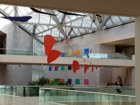
Take the massively graceful modern art piece suspended from the ceiling of the East Wing of the National Art Gallery in Washington, D.C. – classic – both in form and color. Red and black. Strong and simple. Bold and brilliant. Imagine if it were this year’s Pantone pick Ultra Violet  Aghhhh!!!!!!!

Actually, methinks I protest too much. The shade of purple picked, by Pantone, is heavy on the blue rather than the red.  The blue cast gives it a calm. Not whacky like Barney screaming purple – but, rather a royal shade.  Nonetheless, it is better served as an accent – don’t buy  wallpaper in it. Go ahead and paint the walls and have your fun – but know that you can change it without peeling off hundreds, if not thousands of dollars of wall-covering or re-upholstering your sofa like Meghan was tempted to do!!

It’s a color that stands alone – plays better by itself than with friends – like the child’s report card where the box that says “plays well with others” is not checked.  In my estimation, it will read well with clean, crisp white.  However, like Ms. Nesmith aptly says in her piece “if you are  still curious about that Gen Z yellow, buy a vase!”

That’s how we play with  colors and create a bit  of collision, unexpected off-key harmony, intrigue and suspense. But it is not for the faint of heart and the chance of tiring of it is paramount. Trends die and colors are tricky.

So Happy New Year and Happy New Colors in your world to refresh and renew!! Thank you Meghan, for your lively contribution to today’s story.


The Importance of Color in Design – How to Begin

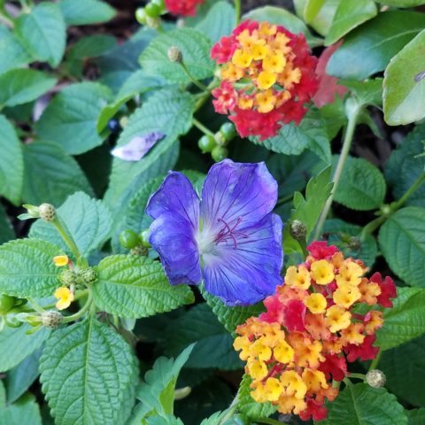
This last week I was inspired by a rainbow that appeared over our great Sandia Mountain and within 3 minutes I nearly tripped over a bed of flowers presenting the same rainbow of colors. With this pairing of color coincidence, I felt compelled to write this week’s blog about color.

Color can be difficult. It is so critical to effective design decisions whether graphic design, fashion design, interior design or architecture.  It might be used for a logo to brand a business , a room scheme or the exterior of a monumental building…how do you begin to select a color or a color scheme?

Well first you have to consider your client. What are their needs and desires? Once narrowed, the search for the perfect colors to convey their project’s personality begins.

Computers aid designers in finding fine nuances between colors. Exploring the range of values in a hue – the range of light to dark of a specific color and the adjacent colors that meld from one to the next has become easier.

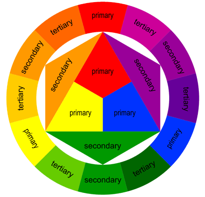
It all comes down to the color wheel. It’s a circle illustrating the colors of the spectrum. The relationship of these colors are the building blocks of all the colors. Sir Isaac  Newton – the same of the apple and gravity fame – devised this understanding of the rainbow of colors back in the 1600s using a prism to identify the components.

As children we are taught about the rainbow of colors comprising ROY G BIV – the easy to remember name that represents the colors RED ORANGE YELLLOW GREEN BLUE INDIGO VIOLET

Decisions regarding the selection of colors and the resulting schemes are identified by the following relationships:

Complimentary –  two opposite colors on the color wheel

Monochromatic – three different values of the same color

Analogous –  three adjacent colors on the color wheel

Split Complements –  one color and the two adjacent tertiary colors of its complement

Triadic – three evenly spaced colors on the color wheel

Tetradic – two complimentary pairs of colors

As I pursued this topic today, I encountered an interesting site by a guy Jason Cohen. If you are curious to know more on the subject,  check out  https://blog.asmartbear.com/color-wheels.html

This last week, over the course of 2 days, I encountered several examples of these colors all around me. From the rainbow to the flowers and myriad balloons. It didn’t hurt that it was during the International Balloon Fiesta http://www.balloonfiesta.com/ which is one of the most colorful events in the world.


Unless we have a limitless budget affording custom design materials, it is best to begin with the materials that offer the fewest colors. I have mentioned this in the past, there are more paint colors than there are carpet colors, fabric colors, or solid surface materials. Therefore, selecting your color scheme based upon the selection of a material with fewer color options is the best start…you build from there…paint being the easiest component to finish the scheme.

Color affects mood, perceived temperature, individual’s reaction to seasonal cues, and all manner of context. Pastels in springtime and warm tones in the fall – color makes powerful suggestions and should be used as a tool with that power in mind. The power of suggestion. What are you suggesting? What are you trying to convey?

With your best intentions, colors will change with light sources, time of day, adjacent colors and people’s own perceptions. It is not a perfect science when you consider all those variables. Take caution to select colors based upon the conditions that will occur in the final location/presentation. Without fear, pick your color schemes and beware, but don’t be afraid!

Color Schemes and the Complex Simplicity of It All

Color schemes are many. Color schemes evoke a mood or convey an atmosphere. They certainly can and often are responsible for imagined temperatures and/or seasonal sensations. What constitutes a pleasing color scheme? What constitutes pleasing? It all comes down to balance, layering and subsequent interest. It takes a enlightened eye and usually cannot be achieved by accident.

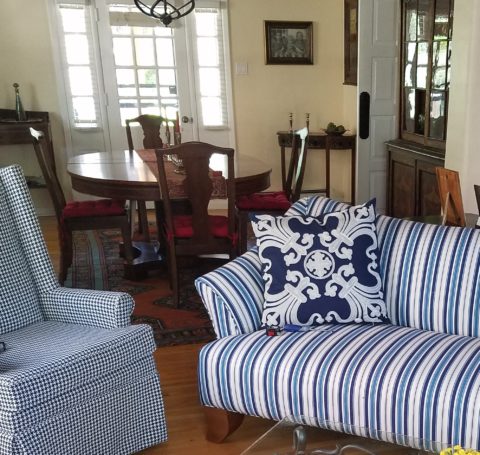
We are nearing completion of a living room that incorporates many design elements. Family heirloom antiques add a vintage touch along with the architectural style of the bungalow home.  Contrasting these pieces is a sleek-lined, modern, sofa that we found and reupholstered. And while not driven or influenced by current color trends, we selected a scheme derived from the existing Persian rugs. By extracting the blue and white from the patterns to refresh the interior – a classic, timeless color combination – we blended a wonderful scheme. Finding the common denominator(s) blue and white, we sought to anchor all with this consistent theme. Differing patterns provided additional layering and interest.

Then, just last week while dashing through the DCA terminal for SWA, my eye caught the attention of several magazine covers all featuring blue and white schemes!  Always in vogue, but not always featured as the cover story, this coincidental (or not) collection of blue and white photo images was a riot! I was forced to snap a few shots to send to my happy blue and white client.

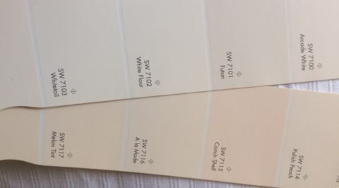
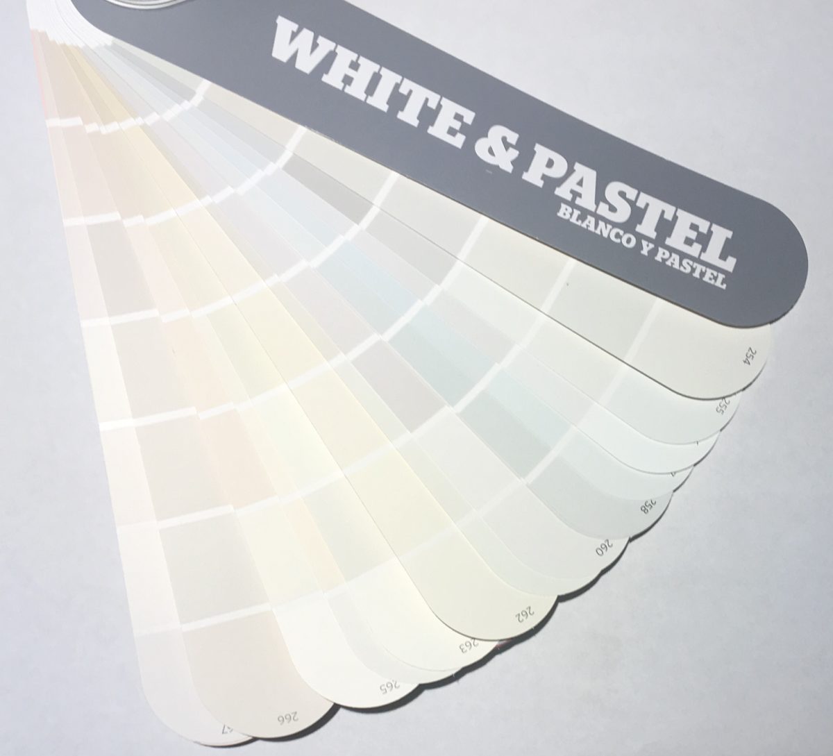
If I described a new master bath remodel project as all white, I wonder what might come to mind. All whites are not created equal and the variation is startling when you see them in context, adjacent to one another. So here is the easiest example. A fan-deck from Sherwin Williams shows a collection of whites. They “read” very differently from one to the next. Yet taken one at a time – isolated from the rest – each would seem to be just plain white. Notice too how they differ from the white paper upon which they are printed – it is the spacing between the color chips – and even the white fabric upon which they were placed for the photo!

But there is really no such thing as “just plain white.” Once seen next to another, their unique qualities of hue come into play. A yellow white is creamy, while a cool white reads blue. It’s the context that makes the  color more legible. Without that they could be assumed and accepted to be merely “white.”

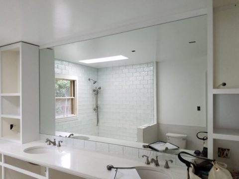
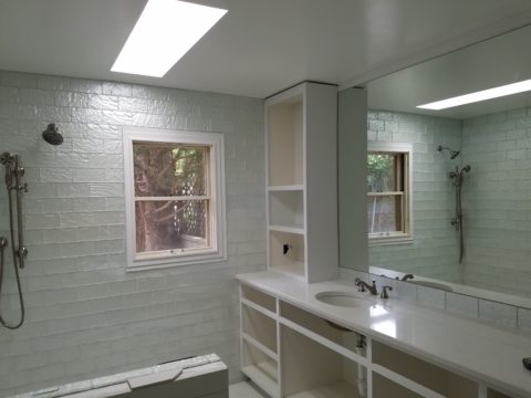
So, in this recent color scheme nearing completion, whites in context show their many colors. At first glance and if asked, one would say “the room is all white.”

Upon closer inspection (photos taken from a different angle seconds apart), that simplicity is replaced by a more complex, heightened level of awareness. This complexity is what adds interest and results in a better finished product than a true monochrome. What was a collection of white materials, in this master bath, is truly revealed as shades of white varying from ever so soft celadon to cream and grey to what might be read as actual “white” white.


Don’t trust your eye when it comes to color. Discover how paint on walls changes all through the day. Artificial light-sources alter the way a color appears.  Context with other colors alters the way one perceives color. Color is fun! Colors are fun! When designing interiors, enjoy the process of layering and the varying effects colors have on each other. Simplicity is usually not really simple. That term can be deceptive. Making it look that way is an art. Encourage the enjoyment of discovery.

Color of the Year 2017 Greenery!!

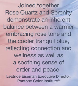
Ta Da! Pantone announces its color of the year for the coming 2017…drum roll please…and the color is Greenery!! Yay!!! Last year there were two  – yes, imagine that – they couldn’t decide so they slurried Rose Quartz and Serenity resulting in a pale, cool, wimpy blend of soft rose and lavenderesque shades into a blended wispy pastel dream. Non-committal, in my opinion…lacking confidence.  Last year the rationale was stated by Pantone’s Executive Director, Leatrice Eiseman as…

pantone-color-of-the-year-lee-eiseman-quote-2016

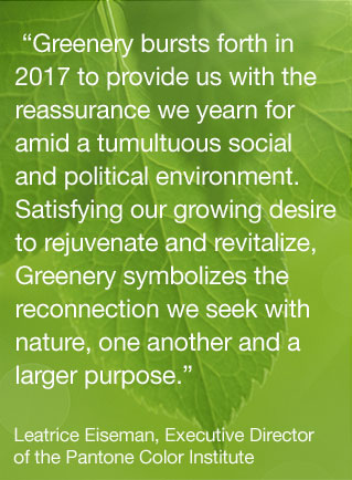
But this year they have it with this fresh organic hue in a yellow-ish shade primed for this year’s rationale from Ms. Eiseman which is:

pantone-color-of-the-year-lee-eiseman-quote-2017

I have always loved green. I grew up in a Virginia jungle of a suburban neighborhood inside the Beltway surrounding my hometown of Washington DC. where the first signs of spring were the tiny tips of dogwood leaves poking forth from the delicate branches of those beautiful under-growth trees. The dogwoods were the graceful, human-scale layer beneath the towering canopy of the immense, rigid, vertical tulip poplar and white oak trees that commanded the woods.

Soft mosses, lacey ferns and perky lily of the valley carpeted the hidden pockets of our backyard. New growth is that prediction of amazing renewal and promise of the start of summer. So it is a prime observation that as Eiseman states in her 2017 rationale “greenery…bursts forth…with a reassurance we yearn for…” although I do not feel this is peculiar to this year as winter always makes me yearn for greenery and the reassurance  that spring and summer will return.

My mother also loved green and that probably influenced my childhood perception of comfort and context of it in interior design. She had and still has an eye for color. In 1959 she selected an amazing sculpted wool pile carpet in a warm, dark, neutral, taupe tone and built upon it a color scheme of pinks and greens that was subtle and relaxing, organic and contrasting, blending beautifully in our wooded setting of verdant lushness in which we were cozily situated.

That was upstairs where we felt like we lived in a flowering tree house amidst the dense collection of green leafy between the trees and surrounded by all shades of pink and white azaleas. Downstairs, where we retreated in the winter months, her greens were mixed with gold tones creating a warm interpretation of the greenery around us.

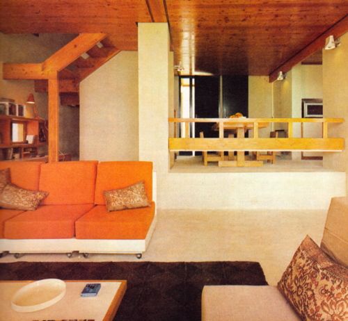
When so many in that era, between the 60s and 70s, were styling interiors with heavy oranges, browns and golds,

orange-and-brown-f934b00ae8a8aabb9fa7d7d8e3ccec30

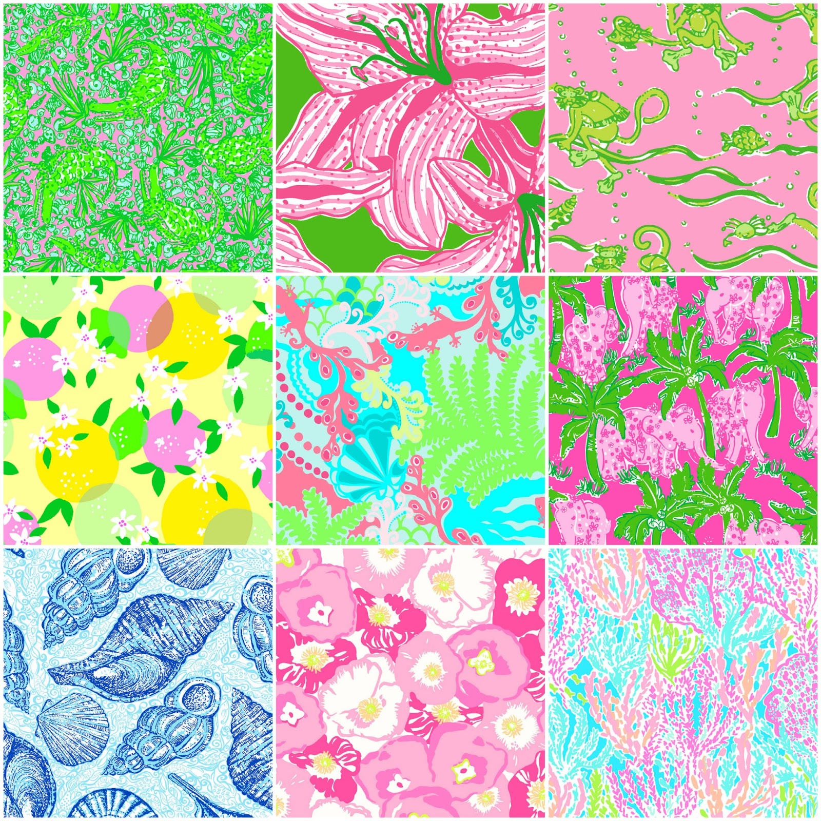
my mother gravitated toward Lily Pulitzer’s fresh, tropical palette of lime green and hot pinks, clean crisp turquoise and citrusy lemon yellow – both in her wardrobe and her interior accent colors.

most-popular-lilly-pulitzer-prints-no-names

Our beach house was turquoise and teal, navy and tan – the sea and the sand.

Following color trends is a slippery slope. I have blogged about it in the past. Adopting that which is often a combination of colors instantly records a place in time when everything from bath towels and shower curtains, bed dressings to draperies appears in the marketplace and inserts its predetermined obsolescent combinations into the lives of so many who would rather catch the wave – often behind the crest – to own and participate in what is conveyed by the market to be the “in” thing to do and to have.

It is best not to embrace and adopt the combinations that the market presents. It is better to select color and combinations that transcend the trends – skirt them so as not to fall into the trap of dated color schemes and tired combinations. Some avoid the trap by staying neutral. The safe, timeless colors of whites and grays mushrooms and taupes- but where is the risk and fun in that?

“Too bad for them” I often remark. It is such a missed opportunity…a limitation to select colors that you think you are supposed to like rather than those that truly bring you joy. I say “go for joy every time.” Color is such personality. It is a stage-setting element. It is a backdrop or foreground. It is a theme. It is an atmosphere.

With all that having been said, I for one am thrilled with this fresh selection for the new year. A bright beginning full of hope and new growth, fresh starts and positive forward movement – organic and life-affirming. So seek the colors that brings you joy and go forth with color in this new 2017 soon to arrive. My personal schemes will always have greenery!!!