Da Vinci, The Genius

When you hear the name da Vinci, Leonardo da Vinci, its undeniably familiar. You might instantly call-up a synonym – genius. But what do you really, other than the Mona Lisa, recognize? And what do you even know about her and the painting itself? For the past several months now nearing the end of its run, the exhibition Da Vinci, The Genius, at the Albuquerque Natural History Museum, presented by Grande Exhibitions of Victoria, Australia in collaboration with the Museo Leonardo da Vinci , Rome and the French Scientific engineer Pascal Cotte is an amazing consolidation of information on this singularly remarkable man.

An artist or even designer are such understated titles for this man of extraordinary inventions, concepts, engineering, art and science, because he was the true Renaissance Man! He touched so many things to advance countless trades and disciplines many of which are the basis of machinery and equipment in use today. But as brilliant as the universal exploits of this amazing polymath are, this would be a tedious blog if I focused on the many pulley systems, gadgets, mirrors, SCUBA suits and even flying machines that he created in his lifetime.

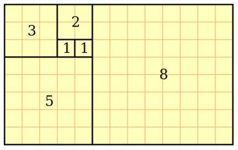
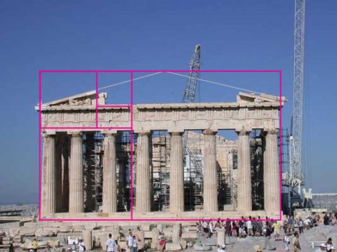
Rather, I would like to use this fascinating field trip that I just experienced to examine how I as a designer have been influenced by da Vinci – specifically, the spectacular rendition of the Golden Mean – nature’s perfect ratio that occurs in nearly everything around us. This common mathematical ratio is used to create subliminal perfection and pleasing compositions that mimic the perfect ratio found in nature and specifically, for my purposes, in design.

If you remove this square from the rectangle, you’ll be left with another, smaller Golden Rectangle. This could continue infinitely.

I have written about this previously in greater depth. It is a subject that has no limits as the application of this ratio helps assure good compositions whether you realize it or not. For graphic designers it is a must. For interior designers and architects it the formula for so many aspects of their work. People in art and design have employed the use of this perfect ratio for thousands of years. If you apply it – it is foolproof.


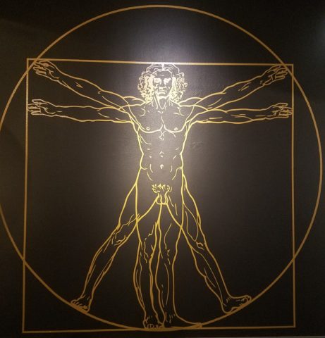
But back to the exhibit…there he was – the iconic man rendered in gold on black. You’ve seen it. But to know him is to see the perfection in the proportions that da Vinci used to create this perfect figure.

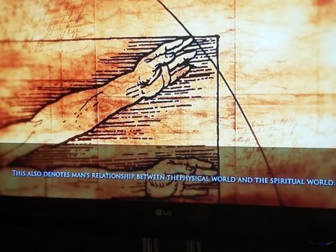
Right there in a commanding focal point was da Vinci’s drawing of Vitruvian Man. The accompanying video explained the relationship of all the dimensions as they related to the perfection of the Golden Ratio. Time and time again it is evident in the sections of this perfect anatomy.

Da Vinci correlated that the perfection of the proportions should be applied to represent the perfect human anatomical body and that it was an analogy for the entire workings of the universe.

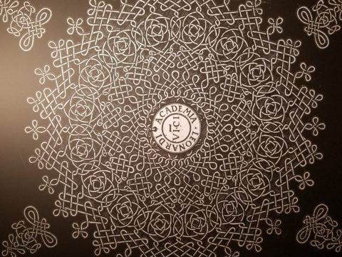
His magnificent study of knots became sought-after for luxury fabrics used in 15th century fashion – many of which costumes and finery he designed. Interpretations as lover’s knots – the bond between them was a popular notion of his time and afterward.


It is an exhibition worth seeing. Even if you have stood in front of the real Mona Lisa and have visited sites exhibiting his vast creations and noted observations, this exhibition is worth a visit!

Have You Listened to Your Heart on a Quest to Create ART?

When do you know when to listen to a sign? What opportunity changes your life? From romance to career changes and all manner of life’s opportunities – what catches your attention? What switches on inside and makes you take notice? Having someone cross your path and not realize he/she is your soul-mate. We’ve seen many movies with this elusive thread woven through the plot. One of my favorite songs, about such would-be near-misses, is “If He’s Ever Near”  in which Karla Bonoff pines…

They say just once in life
You find someone that’s right
But the world looks so confused
I can’t tell false from true

And love’s so hard to find
In this state of mind
Oh I hope I’ll know him
I hope I’ll know him
If he’s ever near

…her yearning hits a cord.  What is a sign? How do you know? What action do you take? It’s not always particularly obvious.
Recognizing opportunities is what separates many successful people from the rest of the world. Taking chances, when those signs make their appearance, is the other factor. Risk-taking is a scary leap into the unknown, but so often results in great reward when it is a true calling and approached with dedication to seek and meet the challenges.

Seems from many with whom I’ve spoken, a true calling is pretty clear. It taps into a passion and ignites a level of excitement and enthusiasm that is hence to fore unmatched. It becomes an irreversible path forward. Like an involuntary propulsion. Thrilling for some – terrifying for others. Which type are YOU? Perhaps you find yourself in the middle – healthy respect for the trepidation, but curiosity for what’s in store!!!

Twice this week I have met with artists who are each taking an enormous leap into a new life direction. One who might not be ready for me to blog about her adventure has leaped from a 30+ year life in Mexico… to a year-long reunion in Arizona with family tapping into the vibrant art scene in Sedona…then a soul-searching move to New Mexico where she invested her savings to start a new independent life…and after exploring her options and searching introspectively for her personal needs, happiness and goals has decided, after yet another year, to sell her new home and return to Sedona to pursue what she firmly believes is her calling. She took leaps, explored options, followed leads and returned to what she initially thought was the right place for her, but which had contingencies that masked her true indicators. She did not want to have imagined constraints rule her decision. Now she realizes that it is her choice, her viewpoint, and ultimately her quest for joy. Her focus and grace have inspired me on many levels and I hope to share her story once she’s ready!

Yesterday I was visited by a Renaissance artist whose enthusiasm and self-effacing manner bring sunshine to every event!  Kim Jackson has a new-found passion!  Having mastered her profession in the arena of photography (http://www.kimjacksonphotography.com)  she had an encounter that looks like will change her life path with new-found joy.

Sprinkled at my reception desk, I was presented with an array of amazing little jewels. Kim spread a collection of painted rocks and miniature paintings in a scattering like pebbles and fallen leaves. Only these jewels were painted with such detail and expression that I was arrested – awestruck.
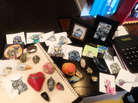
Her own words about this turning point in her life is enchanting.

Last summer I was gifted a painted rock by a 4 year old girl about to lose both of her dogs – the rock read “Love”.
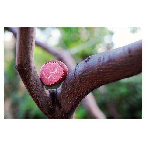
I was touched and photographed it to share with my instagram followers, which lead me down the #paintedrock hashtag. The first artist’s post I clicked on – she does amazing mandala dot art – shared what kind of paint she used and gave other general tips. By that afternoon I had a rainbow of colors and was painting my first rocks.

Kim was there to capture the family on the eve of having to put their two dogs down. The little girl presented her with a simple yet profound object and message that resonated so strongly with Kim that it sparked an idea that lead down a path…

 My rock art (art rocks) style has evolved in the last 10 months, and at the beginning of May 2018 I painted my first 2D “little dessert” and bird paintings – supposed to be gifts for Mother’s Day. With encouragement from a fellow artist I have approached galleries and received warm reviews on both the stones and little paintings. 
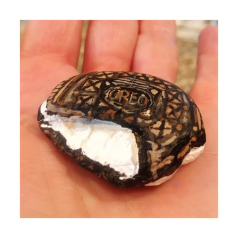
Although Kim’s photography still plays a significant and pleasurable career role in her life, this quest to explore other of her creative energies and talents is proving to be an exciting and potentially lucrative path.

Thanks to the support of my husband Billy, I feel extremely lucky to be given a chance with a second artistic medium – something I never dreamed I would be able to do. I’ve lived my entire life thinking that I could not paint well. While feeling blessed to make a career out of my photography, this is an exciting new direction, I am excited to see where it leads.
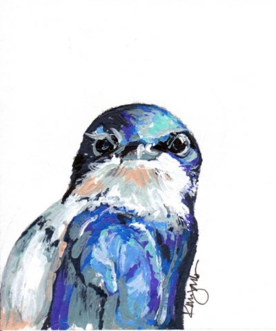
I see Kim as a precious stone, of many facets. Although she will still pursue her love of photography and capture people’s lives and many story chapters, Kim will make room for this blossoming career move into the exploration of creating art directly from her heart to her hand.

This sentiment has been so profoundly stated by Federico Leon de la Vega as he references a similar heartfelt expression regarding the (very personal and possibly evolutionary level) value of handwriting. https://www.youtube.com/watch?v=H9j_pLgCr1U
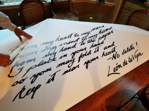
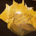
Federico prepares a prp for his TEDX Talk. “From my head to my mind, from my mind to my hand, from my hand to the paper, I place in your hand, so you may fold it and keep it near your heart.”

Some things cross your path unwanted and certainly change your life. For the undesirable things, I recently read this phrase  by Glennon Doyle “Your wound probably is not your fault, but your healing is your responsibility.” Well, you might very well have caused your wound – but either way, taking charge of the healing is your responsibility. Which makes me realize that which we have all been told so many times –  that your destiny is in YOUR hands.

As this relates to art – do not be afraid to explore your creative tendencies. Do not feel you are not worthy or good enough. Experiment. There are so many examples of late bloomers in life. A prime example are the magnificent Portraits of Courage by George W Bush. He dabbled and played with a wide variety of subjects before he hit on portraiture. His abstractly artistic interpretations of people too shape and he discovered that these seemingly primitive paintings had intriguing representation, expression, character, beauty and appeal. The path led him to a powerful platform for veterans, fund-raising opportunities, heightened awareness and acknowledgement of sacrifice.

https://www.bushcenter.org/exhibits-and-events/exhibits/2017/portraits-of-courage-exhibit.html

As stated on the website, this exercise has become significant:

A VIBRANT COLLECTION OF OIL PAINTINGS AND STORIES BY PRESIDENT GEORGE W. BUSH HONORING THE SACRIFICE AND COURAGE OF AMERICA’S MILITARY VETERANS — AND HIGHLIGHTING THE WORK OF THE BUSH INSTITUTE’S MILITARY SERVICE INITIATIVE.

A great article on the accidental painter is here in The Artists’ Network

“These portrait paintings aren’t great but they are gutsy, because it is gutsy to show your artwork period, but it is really gutsy when you know the work isn’t perfect and you do it anyway, because it matters to you.

We could all learn a little bit from this–to embrace our abilities as they are right now, and then to simply let the work go…”

It’s not about a perception of being great or even good enough – most artists never really believe that they are. It is about following your passion – in this case, artistic expression. You might be surprised at what happens next! Believe in the power of ART!!


Picking PINK!

Prompted by pieces peppering a pastel presentation for an artist’s opening reception entitled Resilience we held here at PATRICIAN DESIGN last Friday evening, I was pondering this week’s topic when PINK peeked  into my thoughts.

Pale pink is an unsung color – often considered to be insipid and lacking ooomph, it really is quite satisfactory. Pounced on by millennials, with their popular color trend “Millennial Pink” passion for all things in fashion and home style, pink has made a bit of a splash in recent years.

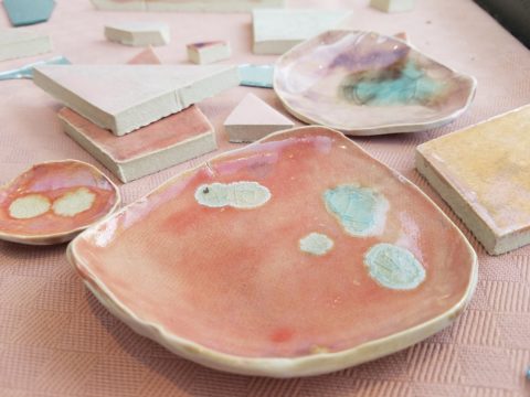
Last Friday, with the creation of the display window featuring pottery shards scattered along the floor, artist Helen Atkin’s peachy pastel pink and soft coral glazes melded together against the soft geometric woven textile resulting in a confection of comfortable color and texture.

Helen Atkins’ shards and little dishes sprinkled in the east gallery window at PATRICIAN DESIGN.

I awoke today with this color on my mind. Swirling thoughts, so often the case, as one thing leads to another and I thought – I wonder how much of that most satisfactory and pleasing color I have here in my immediate world. So, I set-forth  to find out.

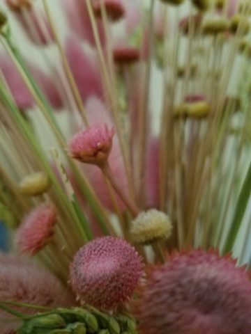
Gathered on the nightstand in the guest room, this cluster of dried flowers is a fragile collection of soft pink tones.

Walking around the house, I came upon so many examples that I really was quite pleased. The re-discovery of each made me feel content. I realize that although they are seemingly insignificant that they are really quite sentimental pieces gathered through the years and each so distinctly different from the next.

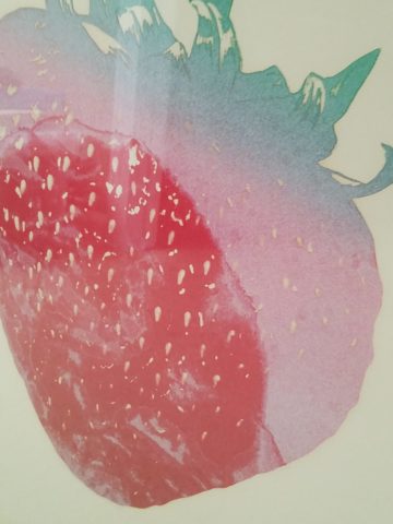
One of my first purchases when I moved across the country was this discarded, damaged Tamarind print of a large nearly psychedelic strawberry from the famed print-making institute  where rejected failures spoke the language of “one man’s trash is another man’s treasure” and it was mine to adorn my new, naked, New Mexican walls.

Generally referencing feminine imagery and romance, pink is delicate yet full of depth and variation – as with all colors – the range is limitless for value, tone, blending of shades…Contrasting warm yellows and cool blues frame pink so well.

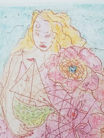
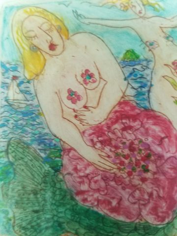
Detail of one of several of my Gerhard Lehner lovlies, I Still Sail to the Virgin Islands. As the artists explains – “An original like-etching a la poupe arrived from drawn textural lines and painted effects which allows the poetic ink to transfer to the fine rag paper.”

Detail – Fine Craft and Dance by Gerard Lehner


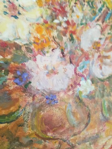
Bold floral brush strokes sweep through the pinks and peach, coral and rose, accented with the contrasting vessel in a brilliant cobalt blue, Peggy Zuris was a master of color and style.

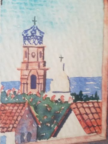
Memories of the warm glow of the pink roof-tiled, painted and plastered buildings along the Puerto Vallarta coastline absorb and reflect the rising and setting sun during all exposures of the day.

Detail – watercolor featuring iconic Our Lady of Guadalupe church by Victor Torres Tellas

Meandering from room to room I encounter so many pretty pink things. I obviously gravitate to this amidst my many other colors as a necessary element woven through my comfort zone.

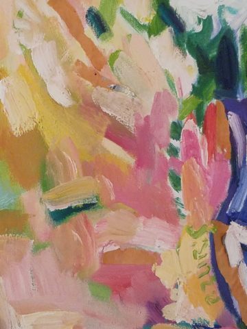
Detail – Fantastically French floral oil on canvas by Anne Sandry

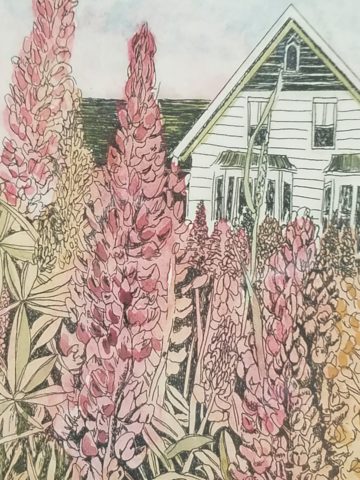
And I adore this finely detailed hand-colored etching showcasing a foreground field of pink lupines,bought decades ago in the artist’s studio at The Torpedo Factory.

Detail of etching by Lyndia Terre

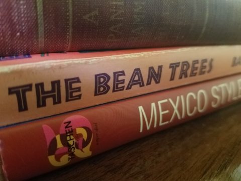
Then I came upon these book bindings stacked unconsciously atop a mahogany dresser , resulting in a study in pinks presenting a pleasing palette.

I realize that I was exposed to the priority of pink at an early age as my  mother’s interior design palette incorporated pinks and soft greens in the more formal areas as well as outside on our screened porch and patio beyond, to the gardens with magnificent mounds of screaming pink azaleas blooming and their explosions of color every spring. Surrounded by lush verdant foliage of the woods where we lived, pink contrasted well with the many shades of green into which we were intimately nestled. We were comfortably punctuated with pink. Therefore it was not a foreign color and complimented the transitions into other darker green tones and yellow accents throughout our house. The original scrolled wool wall-to-wall carpet was a medium pinky-clay color. Quite unusual, yet neutral, providing an earthy grounding.  Mom also enjoyed the vibrant introduction of designer Lily Pulitzer onto the scene in the 60s and peppered her wardrobe with Pulitzer pinks from carnation to hot fuscia contrasting with chartreuse green. Today her classic iconic colors and patterns still make significant design statements.  Mom has never been afraid of color! I inherited that fearless foray into colors of anything fun and fabulous

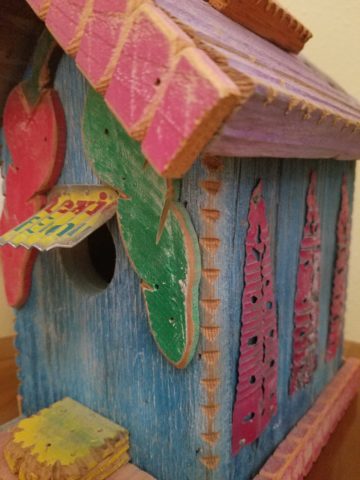
This handcrafted New Mexican church (birdhouse – having never been outside to host a bird) sports an eclectic array of enchanting elements using pinks to perk up the collection of colors. I realize as I tour these rooms of colorful artwork, that I love the combination of pinks with blues and yellows!!

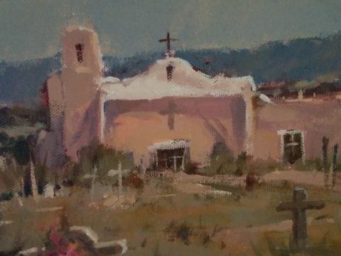
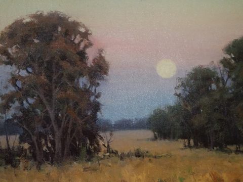
and also the appreciation for the soft subtleties too. These two magnificent oil paintings depicting New Mexican scenes with the oh-so-pleasing pinks.

Detail – oil painting Church at Golden by Marilyn Yates


Detail – oil painting Moonrise by Bruce Piel

This has been a fun and illuminating exercise. I’ve determined that pink is essential to me.

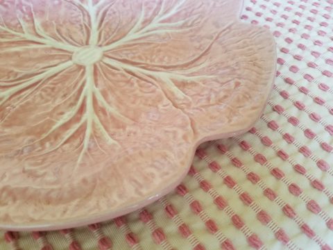
Why not a pink cabbage plate on the guest room duvet cover dotted with woven clay-pink slubs?

It occurs in so many things that bring me joy.

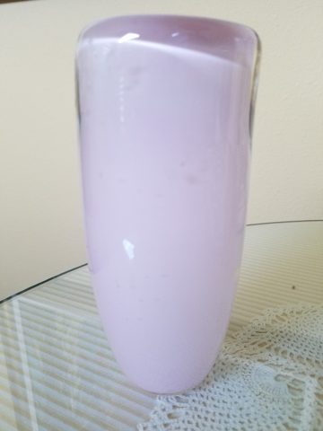
A heavy, luminous hand-blown glass vase.


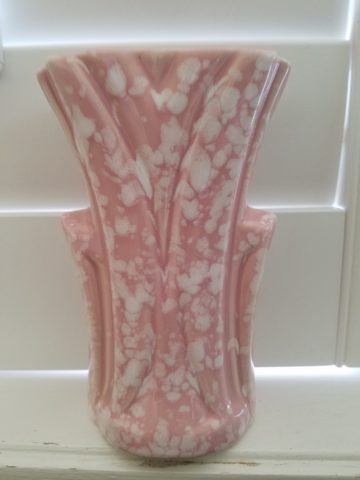
Speckled vintage vase – a touch of fun!

As my dear friend Corinne aptly named her shop, it is The Color of Joy. Pick a color – any color – and go around your interior spaces and see what you discover – perhaps you will find your essential grounding color. It just might be a surprise. Find what brings you joy.

Friends Don’t Let Friends Pick Paint Colors

WHY? It’s never as easy as it seems! You can track the trends. See what is relevant to today’s popular design concepts. But how do you really pick a paint color? Warm versus cool, safe versus bold…there are seemingly limitless choices and so many things affect the decision. HELP!!!!!!

Does it help to swipe a swath on a wall?

Not usually. The surrounding often white paint isolates the color in a small concentration and it cannot begin to give the full effect of an entire wall or more. The most telling is to paint an entire section of wall that you can frame in your field of vision without seeing anything else.  That or painting an entire wall, for the best test.

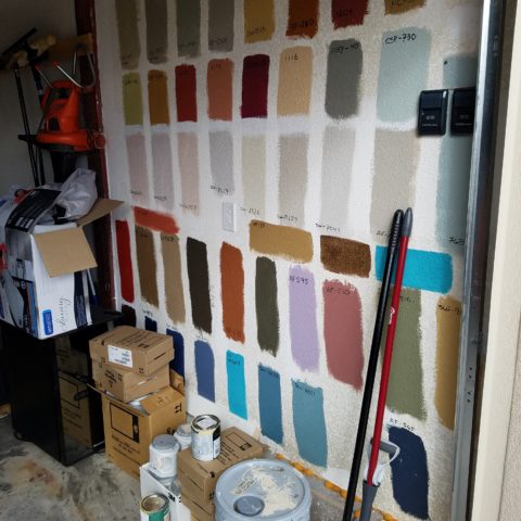
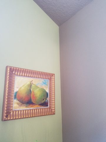
Here a frustrated color connoisseur tried several test patches before calling for HELP!!! But we LOVE the novelty of the effect! What a conversation  piece – a work of art in its own right!!

When is the ceiling painted other than white and why?

Some colors stand-out and are more imposing while others meld with their associates.  It depends upon your personal comfort level. For example a room painted a sunny yellow might be too bold or imposing if the ceiling were to be painted that same color – white would be customary and give relief and contrast to the yellow vertical surfaces.  A more mellow color (like a taupe) might work well on all surfaces creating a soft, unifying encapsulation.  Shades of the same color – lighter or darker – can also prove to be an effective treatment. Light reflectance – artificial versus natural, depth, the hue and value all play a part in determining what works in a given situation. Not to mention any existing furnishings that might direct a color direction/selection.

Should different walls be different colors?

Why not? Variety is the spice of fabulous interiors – but that doesn’t negate the beauty of an all white interior . Knowing when you want color, how much and from what source is part of the balance of design.

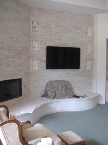
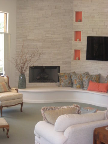
Remodeling this room was comprised of removing walls, adding a serpentine banco and hearth, stone wall surface, painting stained cabinets…We started this project with a new white on white texture and contrast of 3 different stone materials adjacent white walls and white wood trim.


We ultimately added coral punctuation in the recesses of the niches.

What is color layering with paint?

Planes of color seen over-lapping can provide a fantastic effect of colors literally layering over each other. Looking through an interior and reading a wall of one color and another wall behind it peeking out with a different color can add interest and contrast.

How do you stop colors from wall to wall?

I prefer stopping on an inside corner – always. But that’s me. I prefer to “read” the element (wall, monolith, enclosure, etc) as a structural unit. As though the wall were build of that material – the finish suggests the material rather than illustrating a surface application that quits. And I feel the same way about any surface application – tile, wall-covering – preferring to stop on an inside corner to define the element from beginning to end.

EXCEPTION: I have had several instances where we have a little  fun with transitions between colors – a zig-zag motif, for example, can provide a surface graphic and change colors on one surface!!

Wrapping a corner from a full wall of yellow to another – but not wanting the yellow on the entire following wall – intentional graphics are fun and allow for the change of color.

Semi-gloss versus flat?

Glossy finishes show more defects in the surface material. So a wall with imperfections such as texture flaws, repairs, any uneven detail will be enhanced. So to minimize defects, a flat paint is preferable. It also depends upon what you are trying to convey – a smooth plaster finish – might be better expressed with a semi-gloss but an earthen softness is better with a flat paint. Clean ability and durability might play into this decision – but not at the expense of the desired visual effect as there are many grades of paint to accomplish various levels of ease of maintenance – consult your paint products professional.

Contrasting a gloss against a flat on different adjacent elements is a nice contrast such as wood trim in a gloss against flat on the adjacent wall. Is the trim the same color as the wall or is it a contrasting color?

Do dark colors make small spaces smaller?

It is a deceptive misconception that this is the case. Dark colors recede and therefore can actually expand the illusion of space. A dark ceiling seems to recede into the void and creates the feeling that the surface is far much higher than it really is. Dark colors behind light colors does the same – recede as a back-drop. Do not fear dark colors – they contribute depth and drama.

Picking paint colors is like selecting the backdrop for your world. All your things are set against this plane.  Applying paint is having control of transformation. Like controlling when and how the sun washes the dawn or the night envelopes in darkness and all the amazing colors that occur in-between.  Visualizing the end result, creating the transformation that takes place beneath the brush, roller or spray gun as it alters the scene are magical powers.


Loved Loving Vincent!!!!

Last night was a crystal clear starry starry night as we strolled down the quiet urban sidewalk, between the building facades, on our way to what we soon came to realize was an event we would never forget. Once settled in our seats and after way too many previews, the magic began and we were instantly mesmerized by the millions of brushstrokes of over 100 artists recreating the world immediately before and for a year after the death of Vincent Van Gogh.
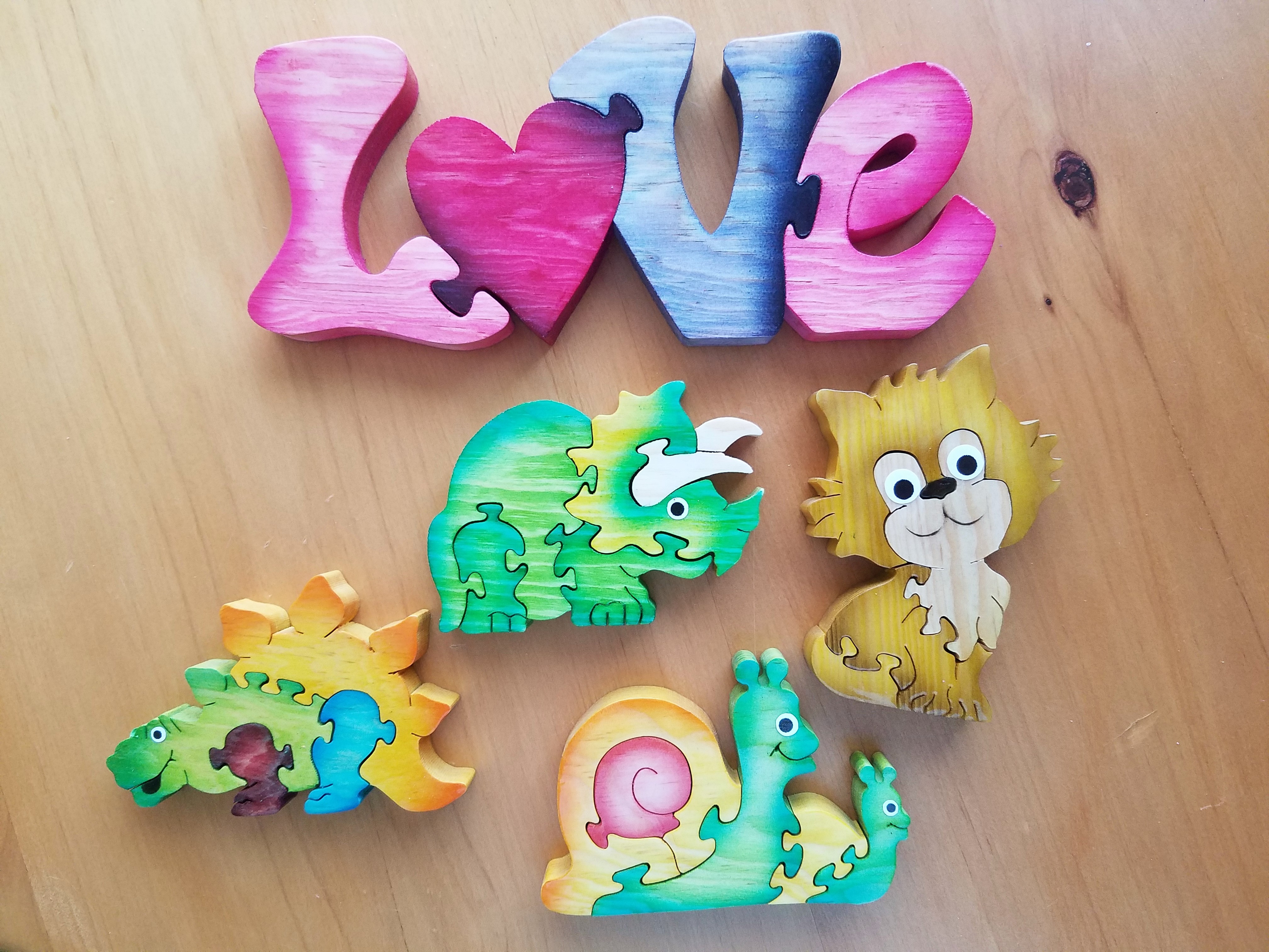
There, in a cozy theater downtown, we experienced a wondrous film, Loving Vincent. We embarked on a extraordinary journey and were lost in this fanciful world of brilliant color and bold movement as the movie unfolded with an animation unlike we had ever experienced. It was a though we were watching Van Gogh paint this film. The rough deliberate strokes were actually moving as the scenes unfolded – the scenes were alive with the movement of the animation.
http://lovingvincent.com/

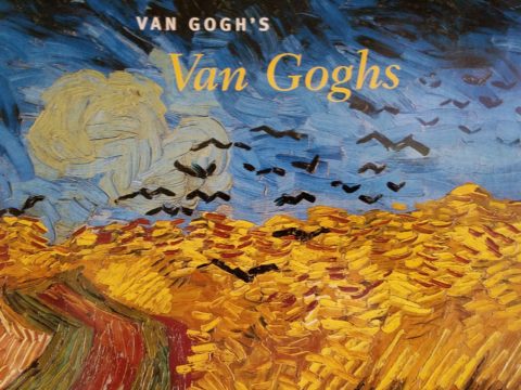
This remarkable delivery vehicle to convey a portion of Van Gogh’s world brought colors dancing – even screaming – across the screen in familiar swirls, and deliberate marks that were so identifiably his. What the artists were able to accomplish was astonishing. The focal surface of the theater was busy with the seemingly live brushstrokes of Vincent Van Gogh. Borrowing from his actual paintings, the viewer is transported into the world of his interpretation from street scenes where he experienced the corner with the yellow house to capturing individual’s who appeared throughout the film such as The Zouave in his red hat distinctive of his French military service, to the bearded postman, Joseph Roulin, who was so key in the intimate, mysterious and different story line, the expansive scenery of Provence and the intimate details of daily life.

As a true Van Gogh fan, it  was love at first sight – do you remember where you were when first introduced to his magic? Having grown-up in Washington, D.C. I was fortunate to have had family visits and school field trips to the magnificent National Gallery of Art where, upon each visit starting at a very young age, I would scour the gift shop for postcards of my favorite images – taking home with me memories of the beautiful influences that have continued to shape my appreciation for color and composition, balance and light, contrast and context, subject matter and the power of observation. I must credit my  mother and grandmother for instilling in me this awareness of things of beauty and their importance in our lives.

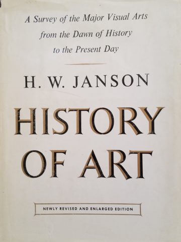
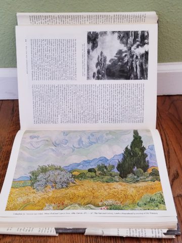
Fast-forward a bit…way back when…dare I admit…when first studying art history in college, the bible was HW Janson’s HISTORY OF ART. A daunting tome filled with the overview of all that is art as we knew it at the time. Van Gogh and his impressionist colleagues were sprinkled throughout latter portion of the book.

There his genius was once again presented to me stirring a wild appreciation for his rebellious disregard for conventional painting styles. He possessed and fed his own passionate, if not desperate, need to apply paint to surfaces, capturing life and telling stories from his unique and insightfully perceptive vantage point.  The Impressionists have always stirred a passion for the boldly colorful, adventuresome, romantic and sensitively sensual expressions of life for me.

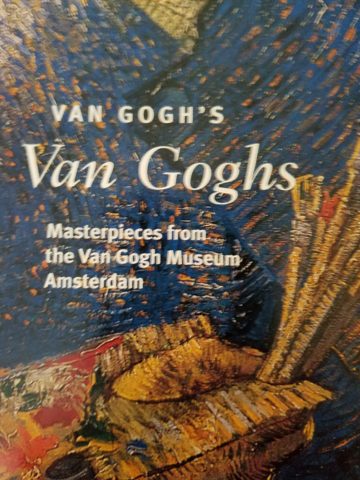
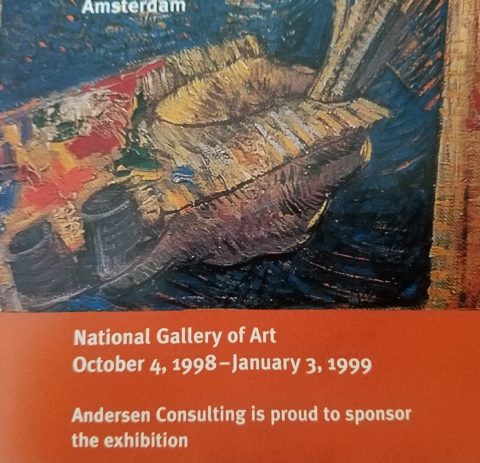
Years later my husband and I were fortunate to attend the National Gallery’s exhibit Masterpieces from the Van Gogh Museum Amsterdam.

It was the fall of 1998 and we were thrilled to be walking toward the oh so familiar edifice with great eagerness for what awaited.

The line wrapped the building, but moved along with efficient, orderly procession as the anticipation grew with each forward step.

Inside we purchased the audio tour tapes and, with headsets on, immersed ourselves for the next few hours in the dazzling world of this remarkable artist.

His unique undaunted expression of the scenes, people and details around him, through his own unschooled techniques, was awe-inspiring.

Tormented and tested he discovered his passion and for a very few years carving out an indelible place that will live, breathe and be enjoyed forever.

The people in their joys and sorrows, fashion of the time, landscapes of bountiful beauty, interiors of keenly observed detail all expressed through his sensitive eye and brought to generations of viewers – a priceless gift to the world.

The take-away…embrace bold expression, fear not color in your world, appreciate the details, and go see this film, Loving Vincent, before it leaves a theater near YOU!!!!

Hearts Are At The Heart Of It All

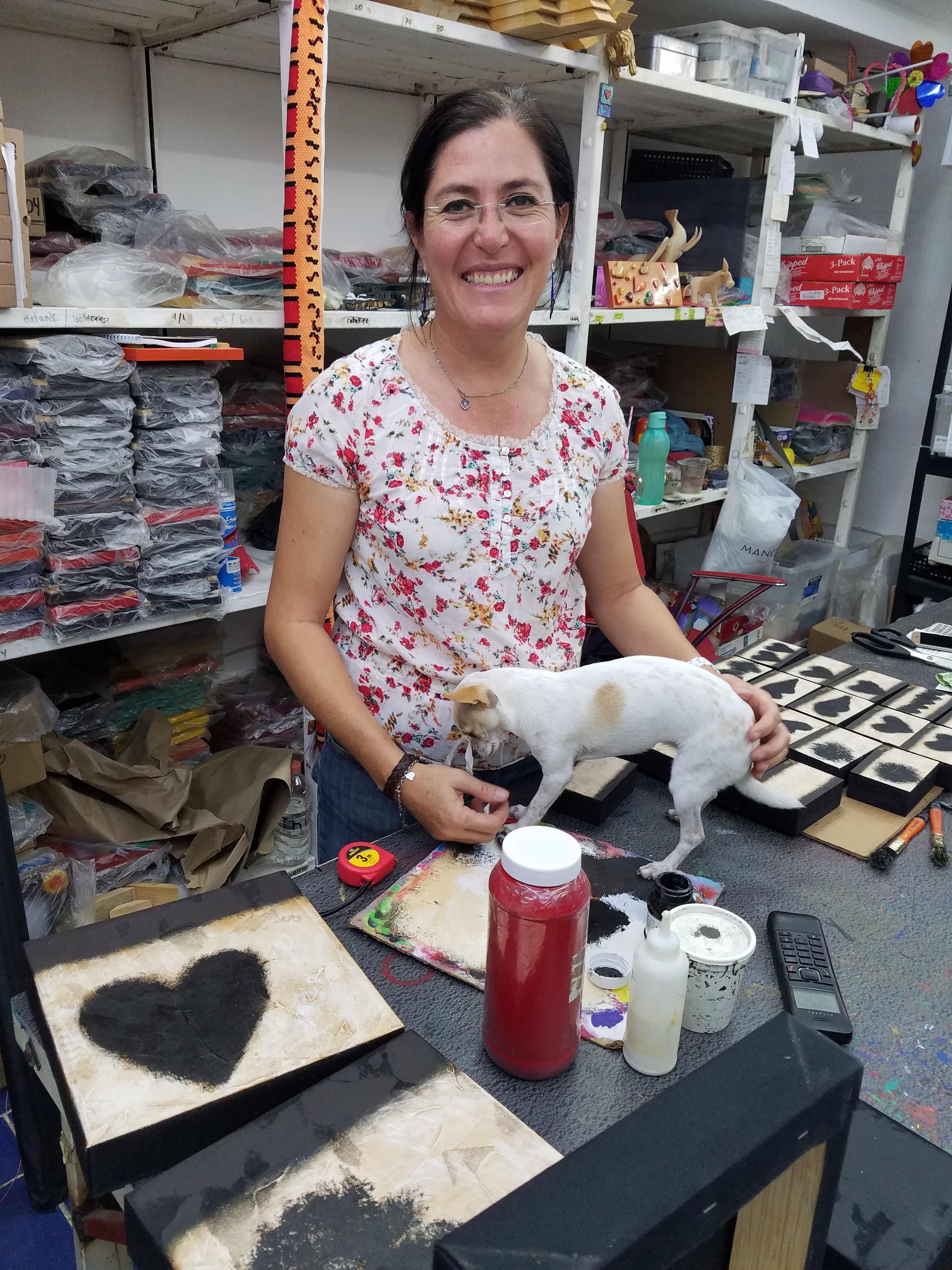
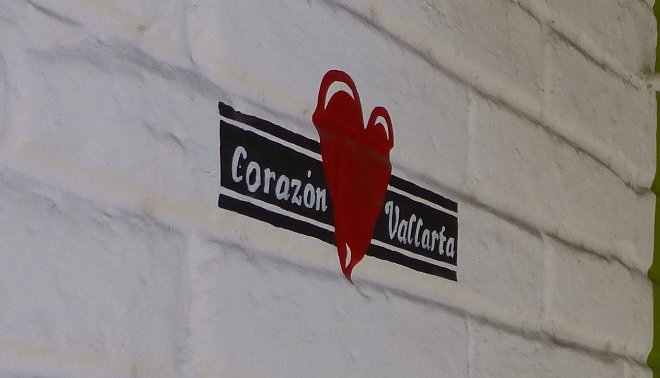
Su mundo es corazones. Artist Paola Alonso Rangel is at the heart of Vallarta and literally that is the name of her shop, Corazon Vallarta, where she thrives amidst the bustling activity in the old town, on a busy street corner, with much traffic flowing by both in vehicles and on foot.

p1120692

A man carrying a frightening large pane of glass about 6 feet long by 3 feet wide effortlessly and without intimidation marches down the street with taxis and buses bouncing by him. I cringe at the site and the young shop attendant, Nidia, shrugs with a smile and says “It’s Mexico.”

With Valentine’s Day nearing, this exciting little shop offers a wealth of opportunities to find just the right gift to say “be mine!”

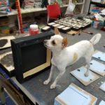
Paola’s little Chihuahua, Pecas (Freckles), suns on the front step seemingly oblivious to all the activity swirling by. She is front and center of all that is happening in Corazon Vallarta.

A designer and hands-on artist of nearly everything she sells in her shop, Alonso Rangel is a model of organization and time utilization. She has her machine fine-tuned and knows just what it takes to create, prepare, produce and market her work.

20170128_115901

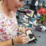
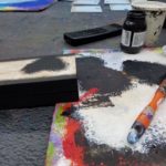
In the well-lit back room of her little tienda, she has all of her art supplies neatly organized on sturdy shelving sparing not one square inch of available space. Her computer plays soft Spanish songs that, with the fan blowing gently, creates a pleasing atmosphere where she designs and paints with a couple of assistants to assemble and package her work to sell.

As is true of most urban storefronts, the fine grit that is continuously accumulating from the dusty streets and vehicles in passing contributes to the concerns of successful retail presentation. Hers and others in this type of scene perhaps suffer more due to the cobblestones which collect and distribute ongoing layers of the sooty, dusty, fines.  So everything is kept painstakingly clean and wrapped in cellophane  – just another stage of the process that makes her conscientious practices so impressive.

From colorful wooden puzzles, picture frames, key hangers, boxes and magnets, the expansive home decor and gift collection, on which she collaborates with her brother in Guadalajara, is a treasure of her designs and creativity. All manner of colorful animals with whimsical expressions are the subjects of her puzzles with a bit of flowers and fruit in the mix for a generous variety of choices. Alonso Rangel designs all of the pieces while her brother and his crew with a manufacturing studio in Guadalajara do all the mill-work, brilliantly colorful painting and glossy lacquer finish.

20170129_100543

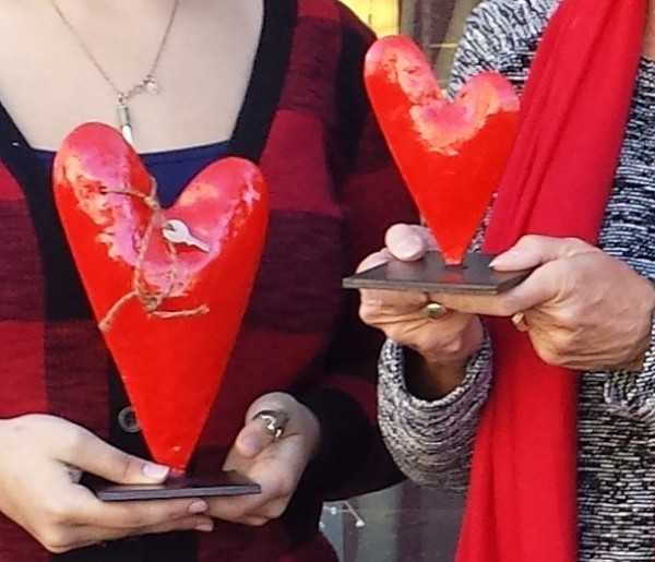
Other of her work is comprised of original one-of-a-kind creations on canvas and wood, heart-themed all in keeping with her heart-felt passion for  corazones.

She efficiently sets-up her own assembly line of stages of production, with Pecas supervising closely, so that her by-hand (hecho a mano) originals are always filling the walls and shelves and being lovingly selected by customers to take home.

Steel heart sculptures, wooden cut-outs, carvings, and more are the multi-media of her continually, seemingly endless creative concepts and body of work!

20160205_155241-copy

Thank you Paola for all of your inspiration – by design!

p1120692-copy


Would A Love Letter Be The Same Without Handwriting?

After having seen Federico Leon de la Vega’s presentation at TEDX Talks in September and after having seen some of the work in progress over the past couple of years, it was a treat last week to be in his studio to see the collection exhibited up close and in person!

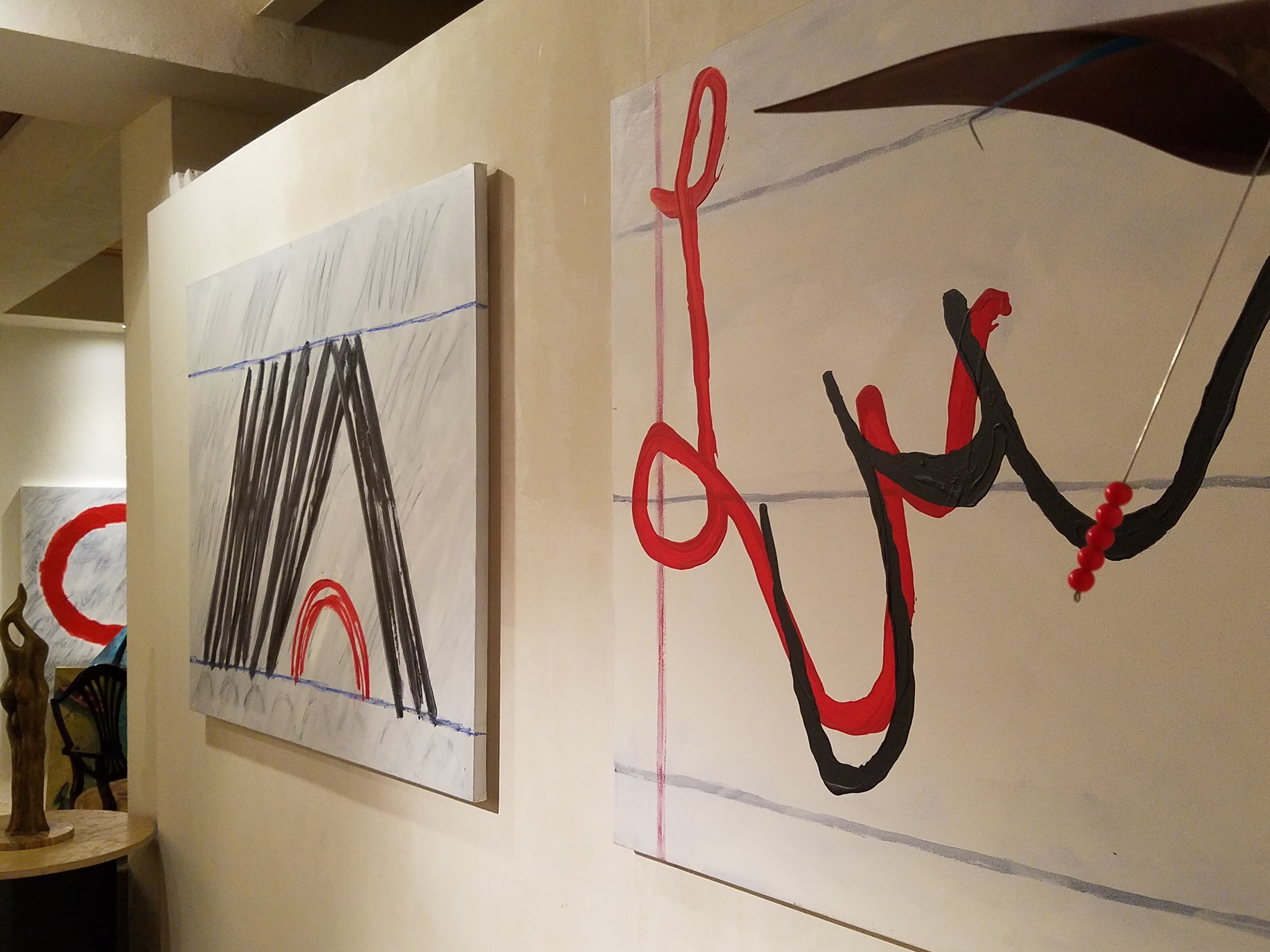
Presented on fabulously enormous canvases and a few smaller studies, these bold graphic statements compile a contemporary collection that is quite astounding. The premise is quite provocative.

The idea that handwriting is a basic human means of communication having evolved into the very personal flowing script of cursive that each individual can call their own – in their own style – it’s almost as personal as a fingerprint. It is an extraordinary human function that should be protected, revered and certainly not lost to the fast-paced technology of the digital age!

Making one’s mark on a surface…a piece of paper…to convey a thought, idea, instruction, story, a doodle on a paper towel – a love letter.

20170117_120810

With Valentine’s Day approaching, it brings to mind the idea of love letters. We read them throughout literature and listen to them in songs. We hear of them being saved over time by recipients in treasured boxes tied with ribbon to be read over and over or merely saved for others to find long after…

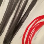
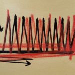
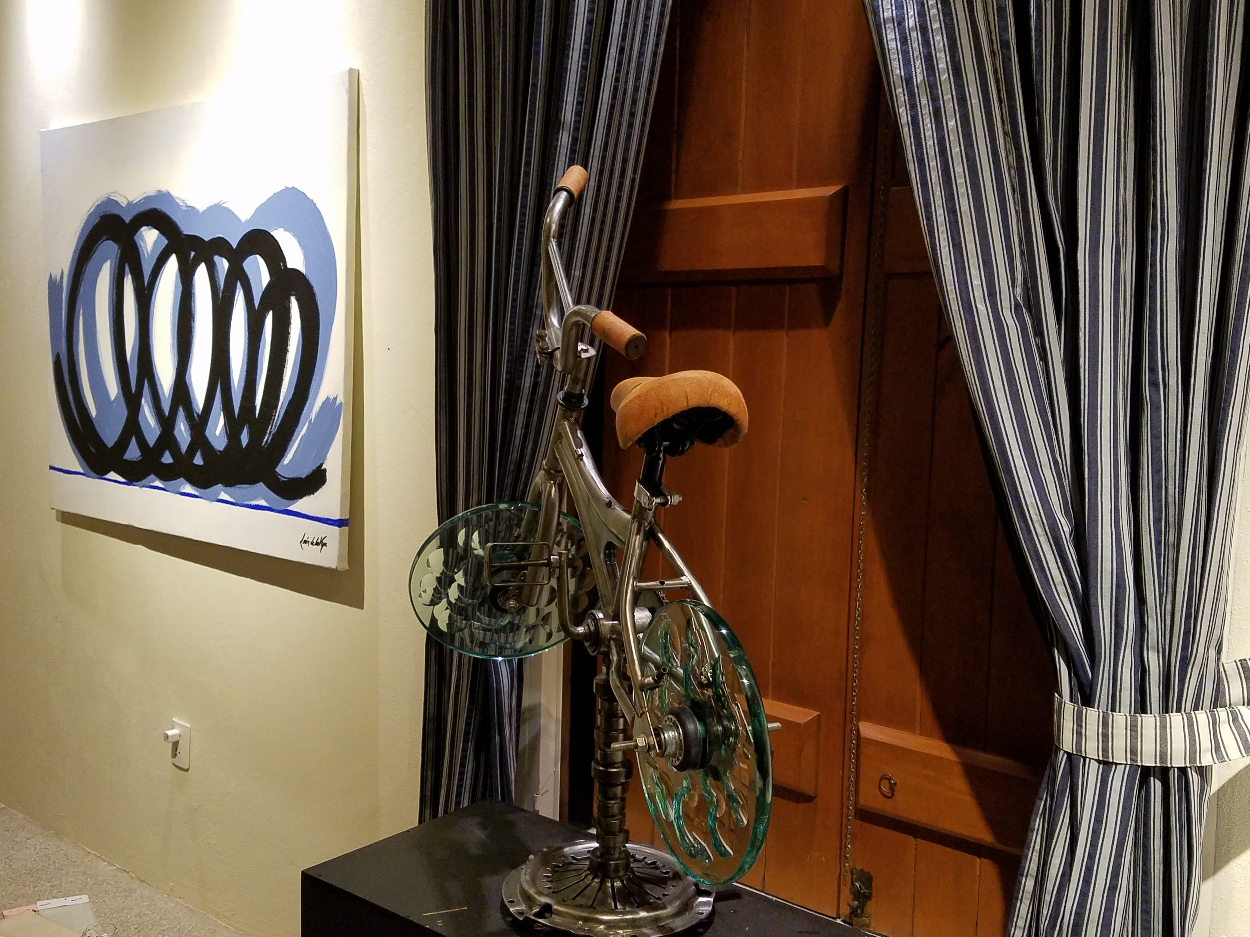
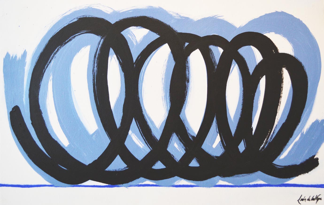
These magnificent oil paintings convey the art of handwriting. They celebrate the simplest marks of hand to canvas with brush and paint looping in circles and jutting in spikes – the primary strokes of handwriting. These primary strokes are the foundation of mastering the control needed to make the continuous flow of letters that become each person’s personal interpretation of the alphabet in cursive style and an exclusive means of communication.

Style – handwriting conveys personal style. Look at yours. Is it always the same or do you mix it up? Do you stay consistent or do you express different styles of your own handwriting for different purposes?  Look at your friend’s handwriting – would you recognize it anywhere?

federico-signature

It is thrilling to walk among these great canvases with their color and  bold strokes. It is arresting to realize that they are so simple yet so complex in what they are saying. We must recognize the value of handwriting. We must not let it be dropped from our schools’ curriculum. We must continue to see the importance of the pure, mind to hand, raw emotion.

Powerful spikes require starting and stopping – control.

Loose loops also require control to maintain uniformity.

20170113_194255

After control is learned, expression can take over resulting in that personal style that becomes each individual’s identifying handwriting.

20170113_194522

Federico reminds us in his talk, about how we might have attempted to write a love letter for the first time and how many times it was crumpled because it wasn’t quite right. The failed attempts of recording our feelings as we strive to say the right thing, to express our deepest emotions. Yet once accomplished, those words hand-written mean so much more than the same words conveyed by type or digital communications.

“From my heart to my mind, from my mind to my hand, from my hand to the paper I place in your hand,  so you may fold it and keep it near to your heart. No delete!”

The digital world is all around us. We cannot escape it, nor should we. However, the human evolution and the brain’s development that mastered the art of handwriting is a place that could be diminished and lost if we do not continue the art and practice of personal expression through this extraordinary medium.

All we need is love – sent via a personalized handwritten letter from the heart. Here’s to a Happy Valentine’s Day !!!

An Artist in the House Inspired by Rhapsody in Blue

An artist in the house is a rare treat. Yes, you who are artists and those of you who have an artist in the family are spoiled by  this continuum of creativity bursting about you. As a designer I am of an artistic nature. I think in artistic expressions, react to artistic stimuli, and make decisions based upon aesthetic sensitivities that I inherently have.

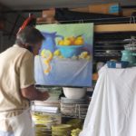
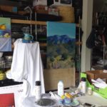
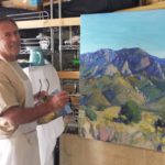
But these weeks being visited once again by our dear friend and respected artist Federico Leon de la Vega and having him painting on the patio and in what we fondly refer to as the estudio-garage, we are surrounded by the unique scent of solvents and products peculiar to his trade of oil painting and the genius of his ability to express his observations on canvas.

Canvases scattered about with partially  completed masterpieces, ideas started and left to dry or waiting for further inspiration while others begin and take shape in varying degrees of completion. A mountain standing on end about 4′ long by 3′ tall, a lemon rind un-peeling in an abstract interpretation of the bright yellow fruit. A still life of citrus lemons and blue pottery creating a classic combination of color.

But in addition to this wondrous collection of colorful and dramatic paintings surrounding us is Federico’s ongoing project of  Mind Your Calligraphy which continues to grow and expand on this very compelling subject. As any of you who have watched the YouTube video by the same name know by now, this fascinating, universally important subject about cursive touches so many imperatives in our lives. ejercicio-preparatorio-2-federico-leon-de-la-vega

Based upon his passionate observations on the subject and translating those observations into paintings illustrating the concepts and precepts that frame this topic, Leon de la Vega is compiling an exciting body of work and references to bring this more to the fore. His recent invitation to speak at the TED-X Talks in Albuquerque this fall are a further step in bringing this essential topic to the attention of those who can make a difference.

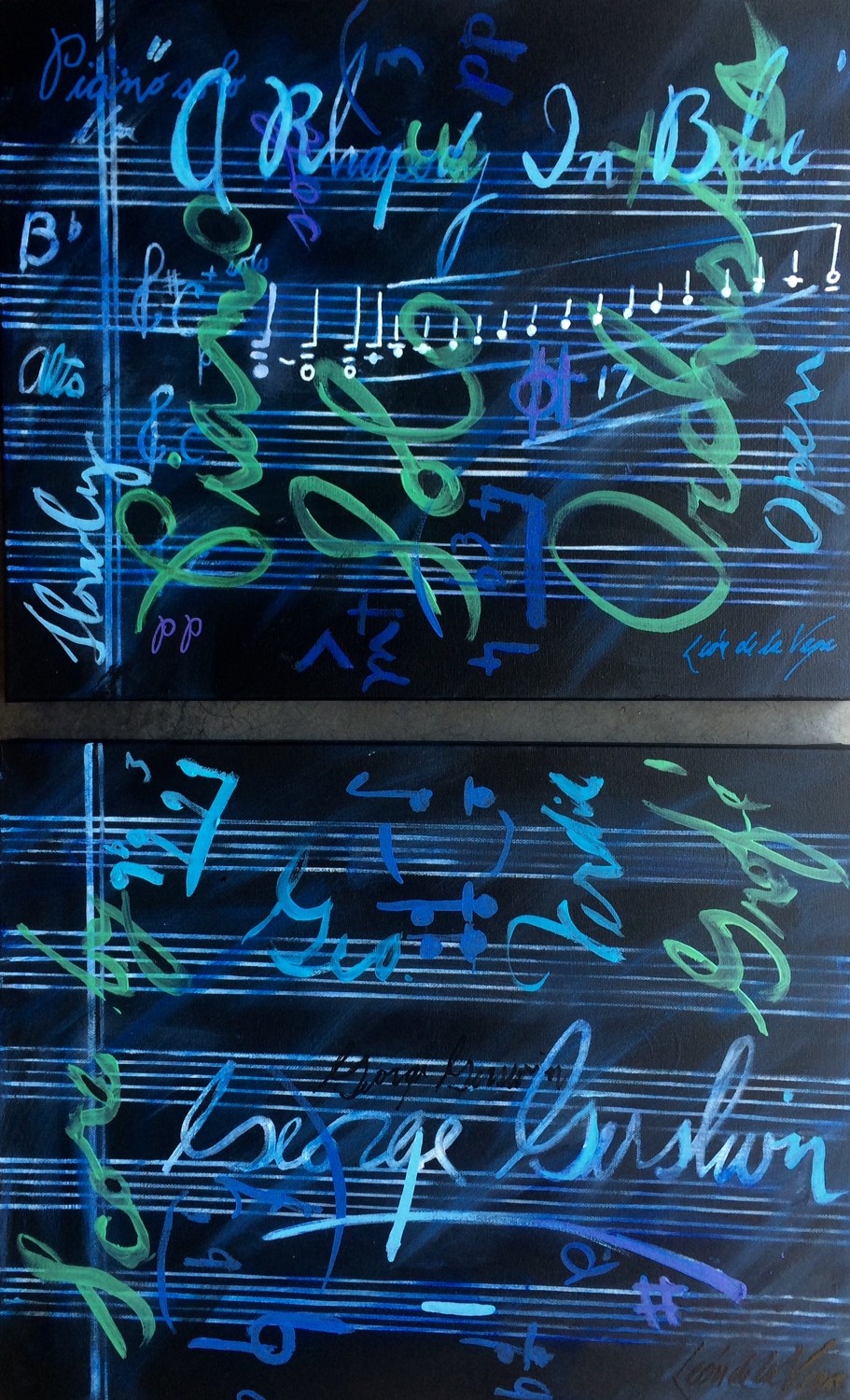
Here are two new paintings depicting inspiration from handwritten music scores. Federico met with a client who has a great love of music by his magnificent glossy black grand  piano commanding attention in the corner of his sunroom.  The two began discussing how handwritten music scores, like cursive, allow the individual the quick personal freedom of jotting ideas on paper that can later be transferred to printed, digital means. And in fact those simple personal writings of notes on paper become quite valuable as they are uniquely and spontaneously penned by the hand of the artist. What could be more personal? The two men focused on Gershwin as they further discussed their mutual enjoyment of music, the unique appreciation and connection of expression through handwritten musical creations. Resulting from this conversation, the composer became the focus of these two abstractions of Rhapsody in Blue.  Gershwin diptych


Painting Party Pairs Art with Uninhibited Partiers

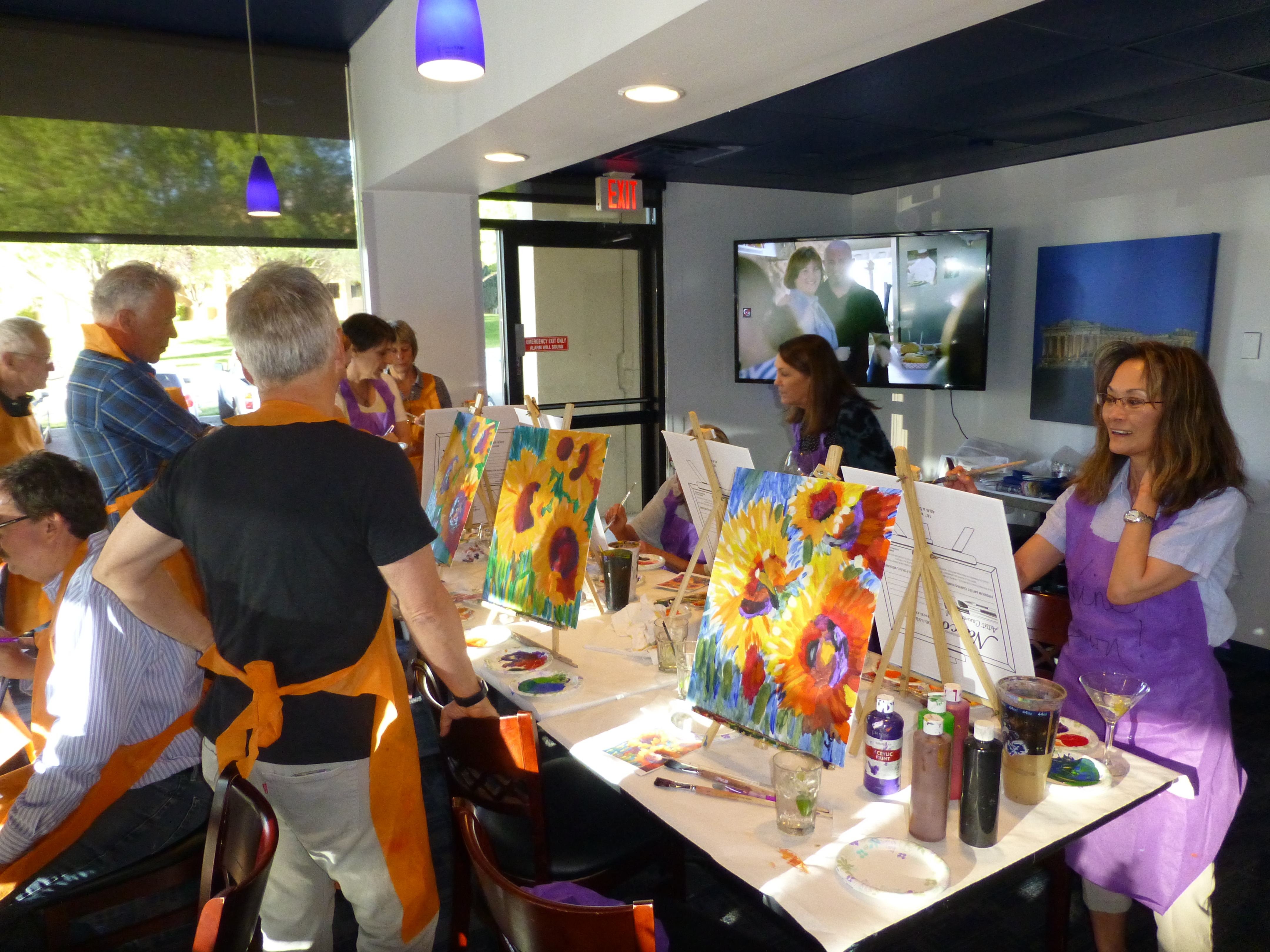
By total coincidence but perfectly timed for the segue from the  last couple of  week’s topics,  we attended a couple’s cocktails and canvas painting party last week.  Artistic expression and the fear of taking the leap has been facilitated by these social gatherings centered around painting and wine. You’ve heard of them, if not yet participated in one. This clever pairing has taken the country by storm. The model is to have an instructor teach a group of friends to copy a pre-selected subject and create their own interpretation on a canvas all the while losing inhibition by imbibing in a glass of wine or cocktail. Actually multiple glasses of wine and cocktails! The more the merrier! P1140371 - Copy

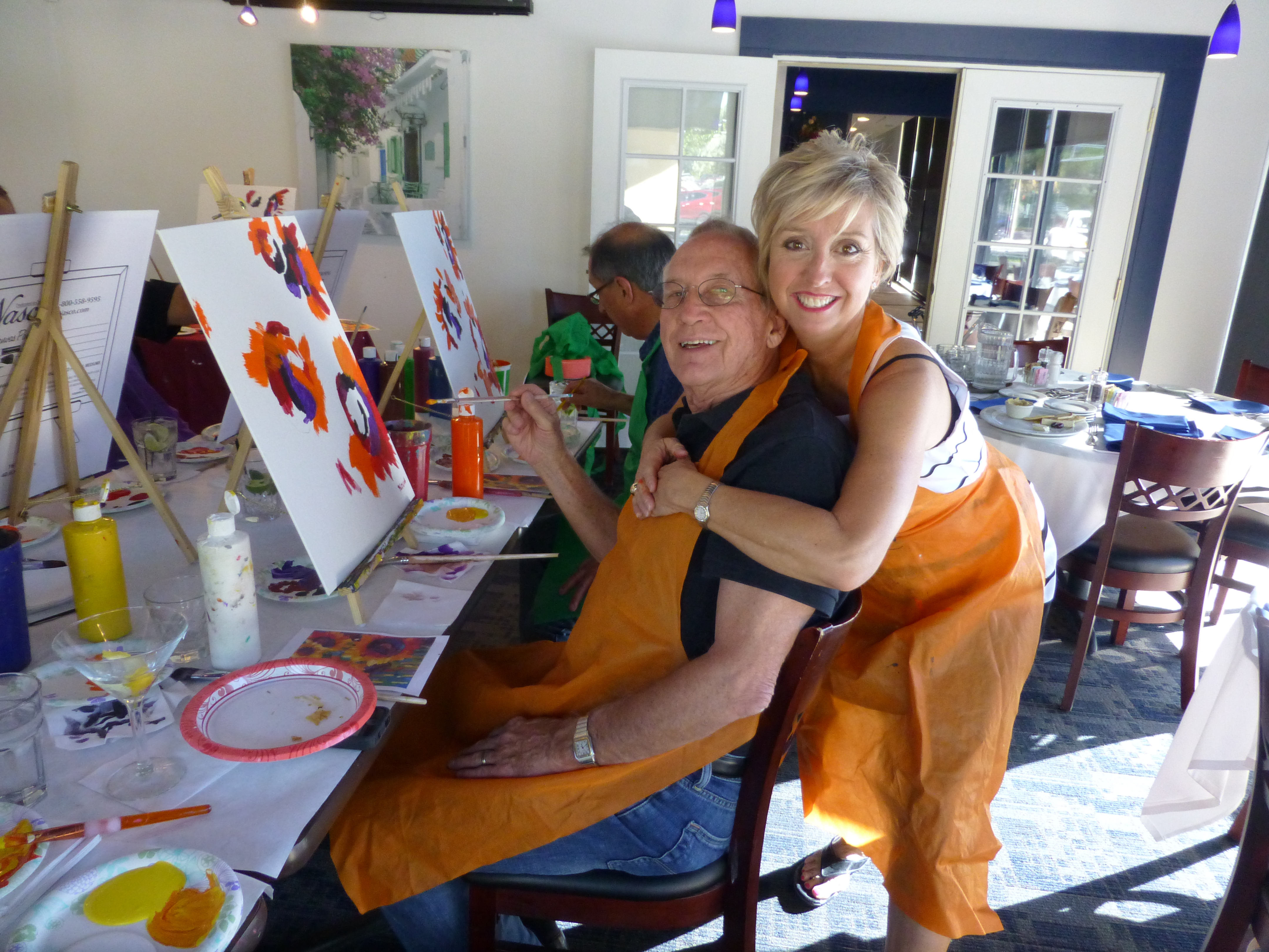
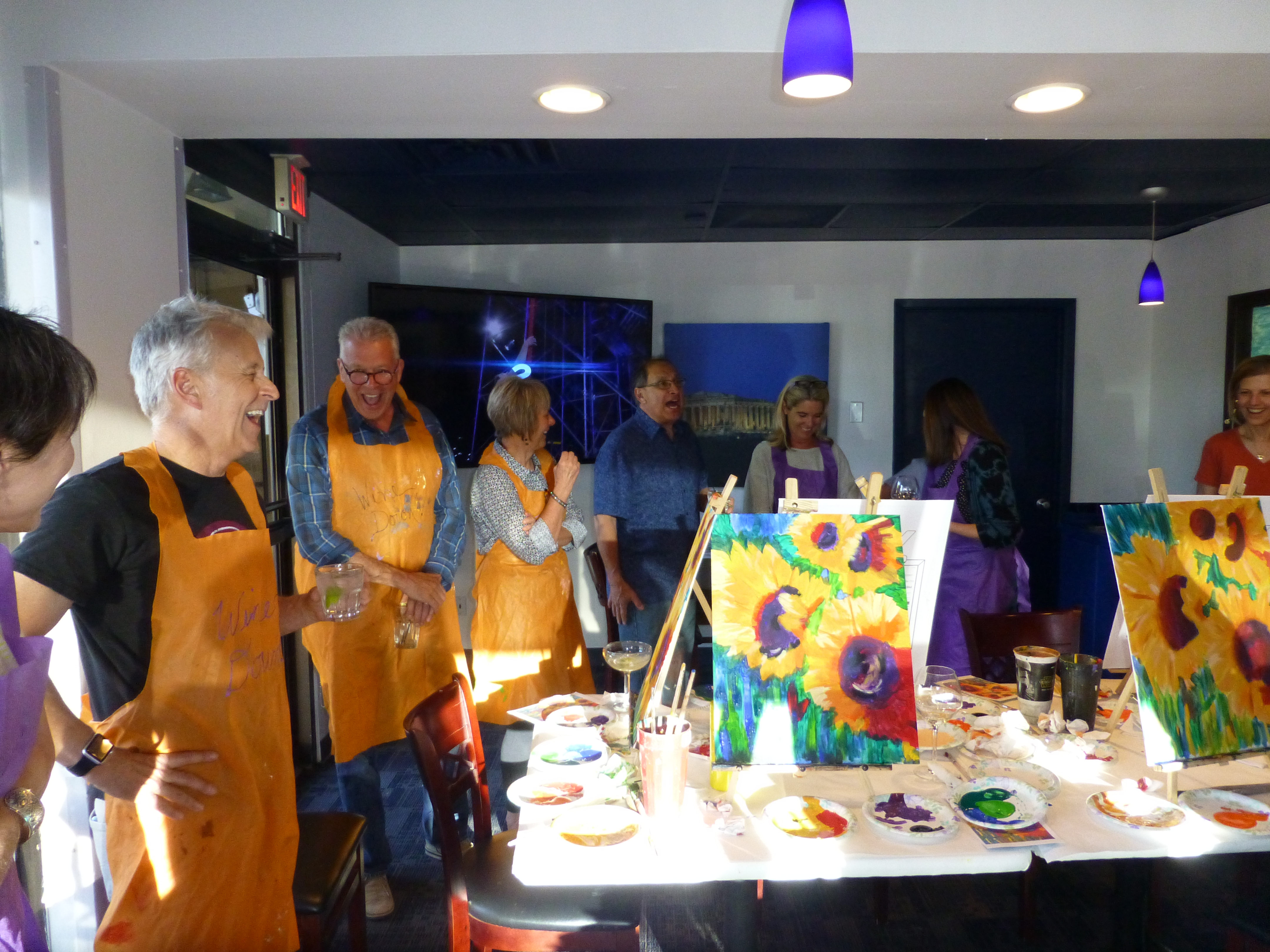
And merry it is. It’s fun and freeing. It’s creativity within boundaries but with enough encouragement and pretty much lack of judgment to produce some very successful finished products.  And this is where we found ourselves last Sunday afternoon. Operative word there, we. P1140384

Yes, I had attended several of these fun-filled events in the past – all women – always entertaining. But this was quite different as it was designed to be couples – husbands painting right alongside their more willing spouses were encouraged to let loose and copy the sunflowers.

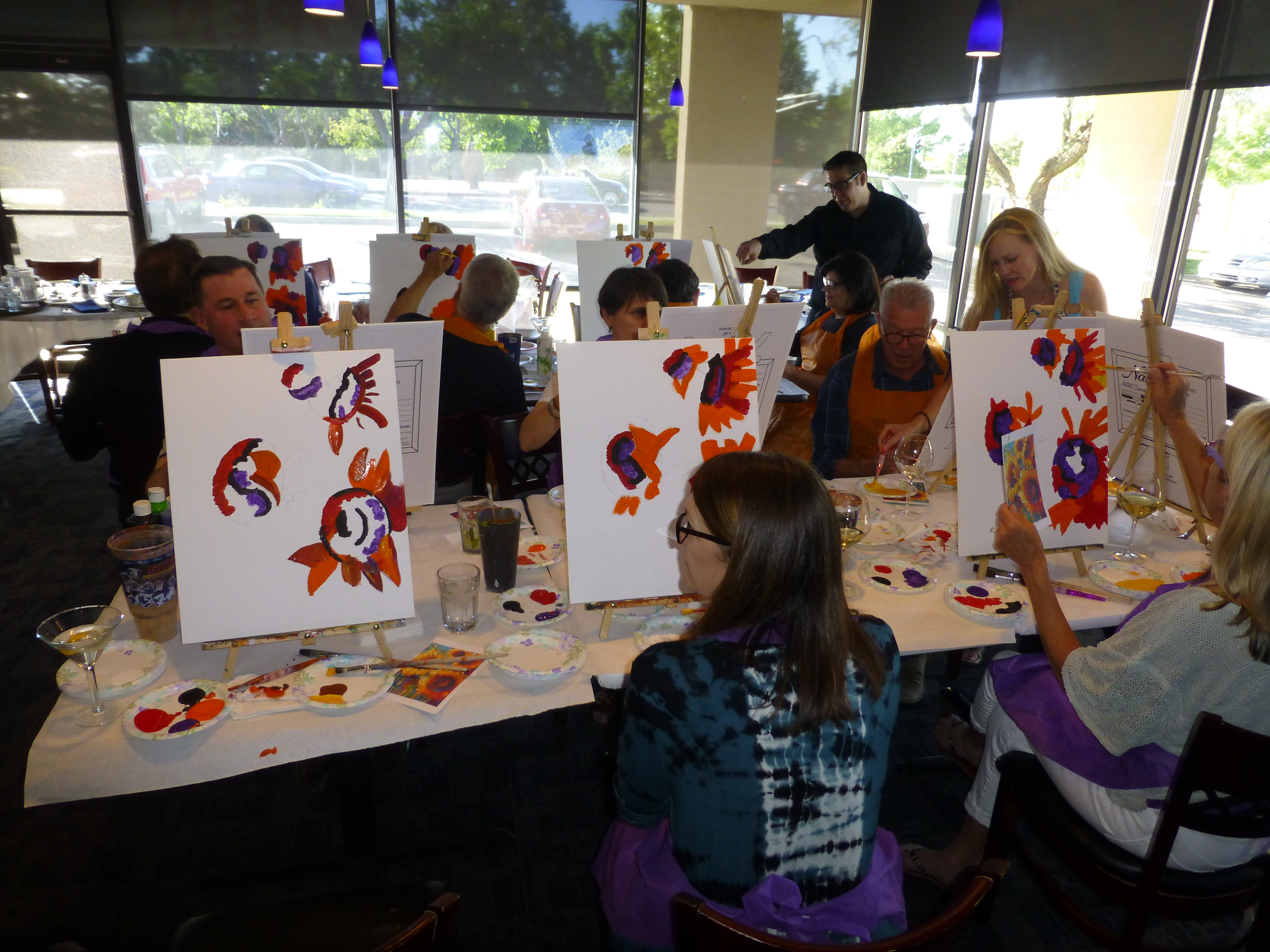
Unlike other like-kinds of parties that I had attended, this gal started off each person’s canvas with a faint charcoal-transfer outline of the preliminary placement of the centers of the sunflowers. This was intended to get everyone started on the right track but also said loud and clear – this is what we are painting and deviating from the plan, changing the format or grouping was not encouraged. P1140376

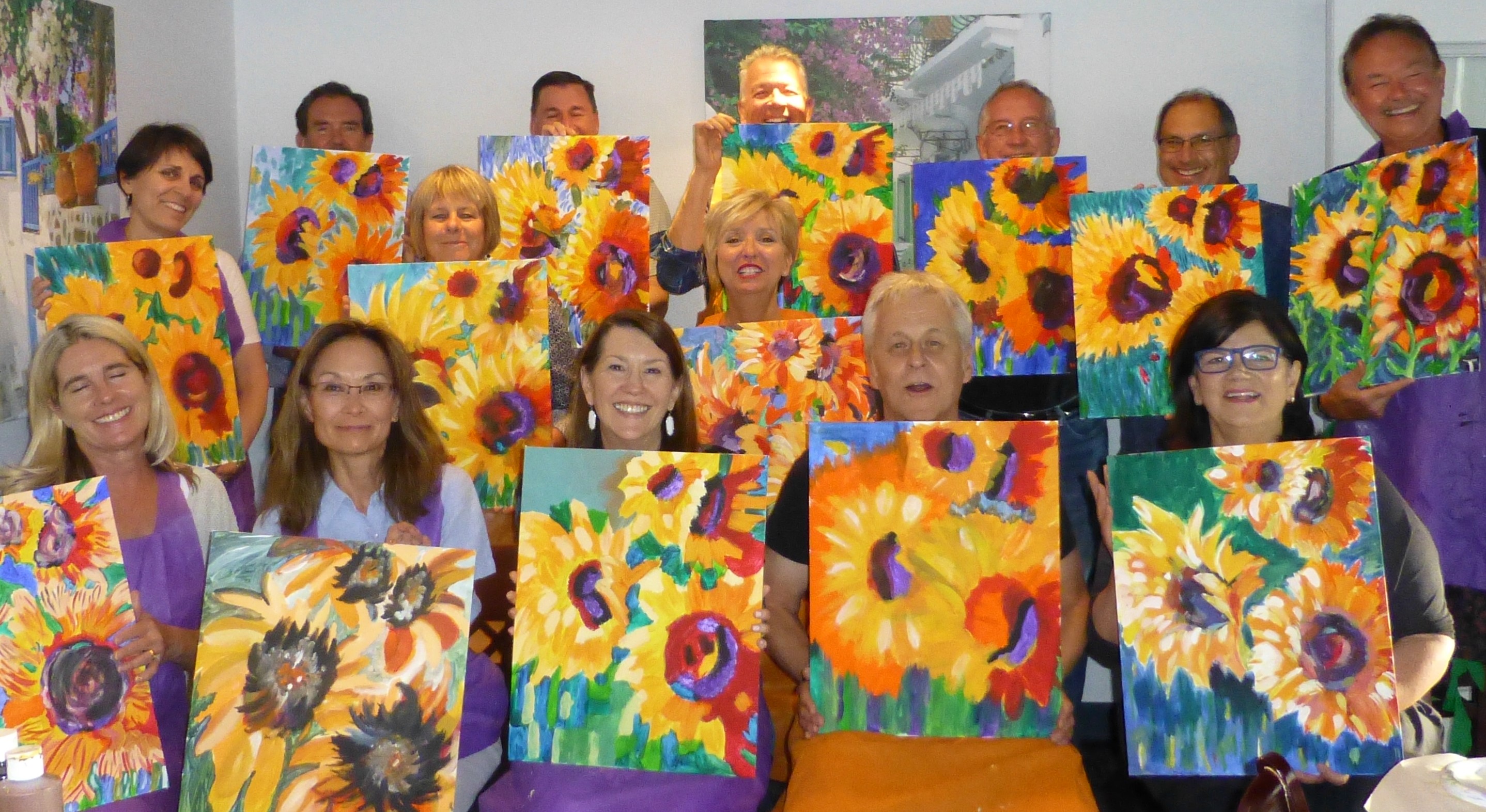
That said, it was just fine that we all pursued the same clutch of gorgeously impressionistic floral explosions with bold brush strokes and colorful blotches of paint tying it all together for a happy theme. Most if not all of the men and perhaps a couple of the women had never tried their hand at painting. This might have been the first attempt at artistic expression that they had ever experienced. I know that was true for my husband!

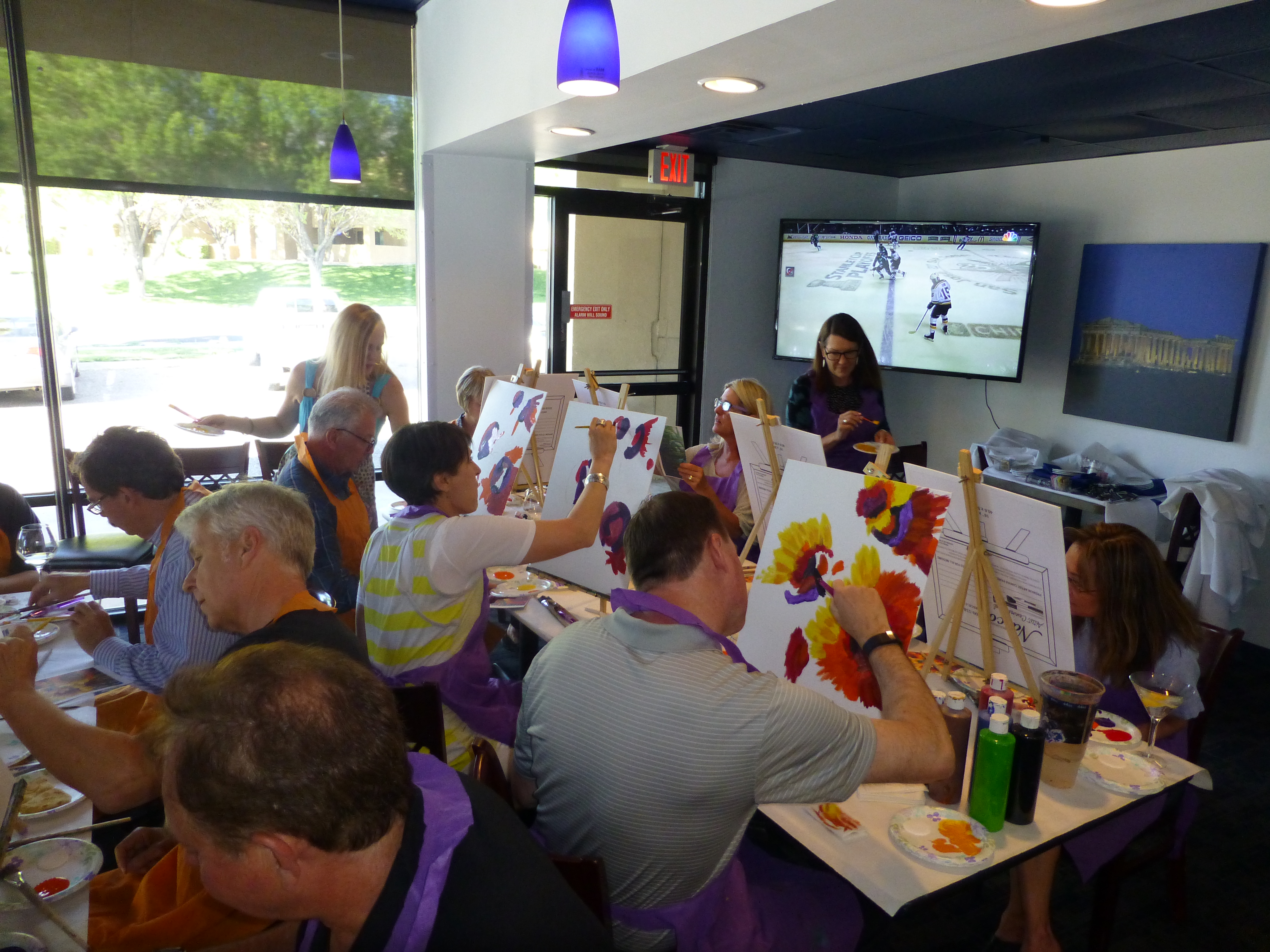
The setting was fabulous in a private dining room of our local Greek restaurant with brilliant sunlight streaming in through the entire wall of west-facing windows illuminating large format photos of Grecian isles, ancient structures, classic white buildings with cascading brilliant pink bougainvillea set against the piercing blue sky and surrounding sea. A big screen TV mounted high in the far corner featured the very muddy Preakness followed by the Blues and San Jose dashing about on the ice. P1140374

But the attention soon turned to the canvases in front of each budding artist. Primed with cocktails, we donned aprons, selected our seats and set to work in front of our table-top easels. The paints are acrylic, water-based – easy to apply and also to clean-up during or after the session. . As the first splotches of color were applied, the comments began to fly around the room. From whining about how difficult it was to complaints about the blossoming results, the room became animated with commentary. P1140386

People began getting up and viewing others’ progress. Compliments and comparisons were a flurry as the instructor made her way around the room aiding those in duress and adding touches here and there. It was hysterical. Everyone was having a blast, creating their own interpretation of the offered subject and seeing it take shape before their very eyes by their very own hand and all the while amidst lively conversation and milling about the room. Seeing the finished products all so similar yet each very different is the marvel of this exercise.

One enthusiastic participant went out into the dining room and requested participation from restaurant patrons in the way of their leaving their tables and coming into the gallery of all of our redundant sunflowers and voting for their favorites – this added to the hysteria as they made their picks, voiced their critiques and the “artists” received their accolades. P1140402

Dinner followed taking this group of new-found friends to the dining room where everyone ordered from the menu and continued the convivial conversations into the evening. But I learned today that Don doesn’t care if he ever picks up a paintbrush again – he didn’t discover a hidden passion nor exceptional talent. He has no love for the process nor the results, but thoroughly enjoyed the party!!! Woo Hoo!! P1140406 - Copy


The Artistic Expression of Cursive Handwriting – A Priceless Piece of Evolution

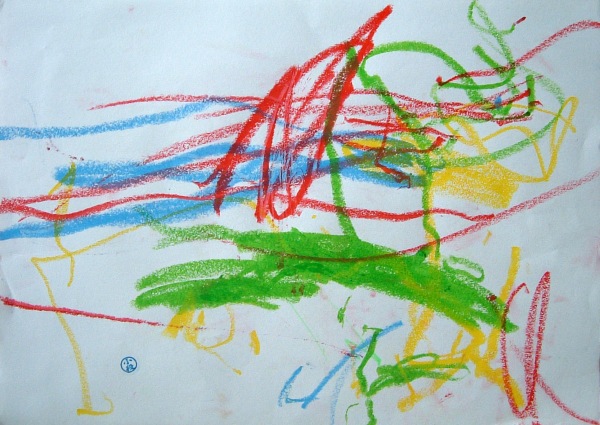
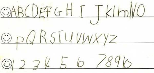
So for those who take the leap and delve into their artistic expression (reference last week’s pattisays…) – those who DO IT instead of critiquing “I could do that” –  are exploring vast depths of their awareness, sensitivity, and personal signature through a piece of art. But that same freedom of expression has been cultivated in society beginning with scribbles,  and the fundamentals of handwriting. From scribbles, scribble to basic block alphabetic B_after to the loop de loops of beginning cursive, ejercicio-preparatorio-2-federico-leon-de-la-vegathe lessons encourage and open doors to very personal and individualistic communication.
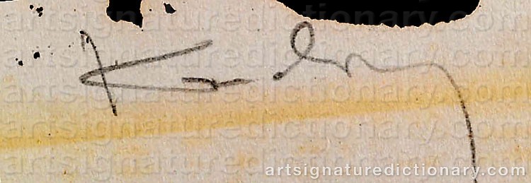
Most of us are all painfully aware that cursive is no longer taught in many schools. We are so seduced by technology that we are not selective about  what to save and what to advance beyond in this evolution. This conscious evolution may have a devastatingly regressive cost.

What is the danger?

The classic final question and answer in Beauty Pagents is something like “What is your wish for the world?” or  “What is the most critical issue facing  the world today?” Some might say “Global warming.” The truthful seemingly naive response we have heard for decades is “World Peace” or parodied version “Whirled Peas.” All kidding aside, this certainly is an important and noble quest – the root of which in today’s technology is “Nuclear War.” Yes, if we have nuclear wall everything else is moot. Education, clean air and water, whirled peas, nada. Well, shy nuclear war, another great issue facing our world today is the loss of the brain to hand expression via tool we take so for granted, handwriting.

Handwriting is a tool, yes. A tool to communicate private notes, grocery lists, love letters, instructions to the sitter and thank you notes for deeds so appreciated. Not to mention rough drafts for non-digital scratchings of the most intimate and possibly important historical communications on the planet.  A good friend is examining this troubling fact through his own artistic expression. Please visit the video Mind Your Calligraphy https://www.youtube.com/watch?v=4mO7ctV05Js where Federico Leon de la Vega

explores the neurological results of this modern-day tragedy that has the potential to change civilization as we know it. Not to mention loss of certain very specific brain functions of human evolution!

The artist must train not only his eye, but his soul. Wassily Kandinsky

Without the basic form of  flowing handwriting – the motion with an ease of fluid, natural motion to convey one’s thoughts, ideas, emotions, needs, and desires, we erase a portion of the brain’s function. We erase the personal expression offered  and made available by the human connection between our thoughts and our hands – our tools. The control our hands to artistically pen calligraphy – unique to each individual  – is a priceless piece of evolution.

Returning to the artistic expression…Plein air painting and field studies for scientific research might be the last vestiges of our need to communicate and connect through nature. If not free from technology,  perhaps in concert with the tools of technology. Taking a digital camera, phone or tablet into the field while painting on-site or using the technology to process what is discovered and/or captured in the scientific field studies might be those last vestiges.

We know why, so let’s think about what influence we might have to continue the art of cursive. How to perpetuate the evolution of that which is oh so personal a form of expression and that has such a powerfully effective and essential connection to our brains.

Like Kandinsky observed – it is the soul of a person that is expressed through artistic media. And there is nothing more intimate than the seemingly simple connection through individualistically personal script. f4426e761a5ab09c179a23e22301df58-1000