Commercial Finishes – What They Say – What They Convey

When planning a commercial project, how do you separate your personal taste from an objective view of the program for the business? This situation has occurred twice in the last year with my practice. Well, there can be blurred lines. There can be design elements that work in both environments. There certainly are offices that mimic residential living rooms – contemporary or traditional – modern or historic, but it should directly relate to the type of business and the brand of that business. What does the space say with regard to conveying the intent of the business?

The selection of materials comes first. The bones of the building – what’s exposed, what’s concealed, flooring, wall treatments, etc…The first project was a medical related business – corporate office for a product line. The neighboring space was a physician’s office and treatment suite. The common space had existing concrete floors. The woman leading the design decisions for the medical corporate offices wanted to continue the concrete into her waiting area and throughout the offices with area rugs in each room. A small-scaled water feature, in the form of a grey box, is located adjacent to the seating and a distressed chest and metal sculpture are also part of the scene. Her selection of chairs were heavy, gold tapestry, over-stuffed and tufted. They were placed around a round table in the center of the room. All I could see was a setting for a Victorian séance. It in no way reflected the clean, crisp, fashionable brand that they had established to represent their rejuvenating medical product line. Rugs invited tripping hazards and the look was in no way speaking the language, of the intent of the business or its brand. It spoke directly of the woman’s home, from which she replicated her eclectic taste in the office.

Next door, nearing completion, the physician’s group was being strong-armed into going the same route with the concrete floors. We love concrete floors in so many applications, but here – in these two spaces, they were existing, did not take the stain well and looked dark and dirty in the final polished presentation – NOT the fresh look of a sleek medical group. Not the finish to convey confidence and cleanliness. Treatment rooms had vinyl flooring for necessary maintenance, corridors and physician’s office had carpeting, but the docs rejected the contrasting finished product in the entry and restrooms and went back to the light tile flooring that was originally specified regaining the professional appearance of the intended design.

Faux wood porcelain boards are a fantastic contribution to the design offerings for both residential and commercial finish materials. Shown here on the exterior of a building by the ocean, the artsy peeled bark variegation of the pattern is striking and makes a commanding design statement.


It is carried through into the interior and back outside on the rear dining patio.

The idea is that a wooden building by a seaside is traditional – this is a stunning twist on that which was once a customary building material revisited with an invincible, high-design version. The use of wood for such a place would have been historically accurate.

The same is true when faux porcelain planks are used on the floors in the produce section of a grocery store – replicating a produce market or barn where fresh produce is collected and sold. Some high-traffic food-service establishments, bars or breweries often want the look of wood floors – to convey a context or scene – but are not durable and therefore not advisable. A home – almost anywhere including the obvious – in the woods or by the shore, with wood flooring might not be practical, but by using the wood planking porcelain, the look is conveyed while the durability and maintenance is made effortless.

Recently an owner wanted the “look.” That sleek modern look of grey porcelain planking. His business was one that dealt with automotive repair and restoration. In evaluating his brand and the nature  of the business, real wood floors would never be the material of preference. So to use even a durable, invincible, porcelain version seemed out of place.

Concrete would be more the material of a garage environment. To make a corporate statement, concrete can be dressed-up. Porcelain tiles simulating concrete is an appropriate faux finish option – either way, preferable to creating an interior of grey weathered wooden planks. Watch for the completion of these projects in the coming months.

Adopting the use of materials merely because you like them or they are in vogue is not always the best approach. Consider the context, the intent, the statement materials make – how they “read,” what they say – what they convey.


Moody Blues – Moody Rooms

What’s more trendy than an existing word that comes into the mainstream with a new relevance or targeted use? I’m sure you will giggle a bit thinking about some of the trendy words – original or re-constituted – that have come and gone. How do they get inserted in our popular culture? Who started it? How quickly did it catch-on and how? I will have fun with a variety of trending design words in coming blogs – enjoy expanding your design vocabulary with these if they are not already a part of your vernacular.

I’ve written about dark rooms and dark colors in the past…don’t be afraid of the dark! But to now discover that the use of the word “moody” has surfaced and playing a role in describing such spaces is novel. Trending now – “moody” rooms. Or at least describing dark spaces as “moody.”

We recently gave a face-lift to a tiny powder room. It was dark-ish before, but with a printed wallcovering from the 80s. It had stood the test of time and served the owners well, but it was time for new cabinets, countertop, hardware and fixtures.

We decided to run new floor tile from the entry through to this room. It was a large format dark porcelain. This dark chocolate leather-like look was a deep and “moody” selection to recede and add depth  to the space.

Yes, it creates a decided “mood.” A mood of somber elegance. The quiet space is perfect for the duty it performs. As a powder room, it is visited quickly and by many. We selected a velvety dark wall paint Benjamin Moore HC 166 Kendall Charcoal rather than replacing the wall-covering with new.


For interest, instead of one large commanding piece, we  gathered a collection of complimentary wall art from other rooms and even some clever thrifting (always an entertaining and satisfying treasure hunt) to create an interesting grouping to be enjoyed from the intimate vantage point.

The new lighting flanking the mirror rather than coming from a bar above is soft and  in keeping with the  colonial decor of the home located inside the beltway of our Nation’s Capital. New granite is dark and rich, white porcelain adds a crisp contrast and new cabinets coordinate with other renovated casework in the home.

When surfing the internet for design inspiration and subsequently speaking with design professionals, be clear. Picking up new ways of expressing design ideas is fun – but the simple truth is just that – simple. Keep it simple, explain your goals, go dark if you like, be a bit moody if it is the effect that you wish to achieve. Have fun and don’t be afraid of the dark!!


Regional Design Fun!

So many regions, so little time!!!! All the design directions available based upon where you are and what you love – just think!! Regional design provides a strong connection to the surrounding environs. From selecting artwork to color schemes, decorative accessories and even room scents, creating regionally specific interiors is a fun way to go. Often reserved for second homes, the novelty of focusing  on the design theme specific to the region does not always reflect real life.

Real life is usually comprised of a variety  of experiences, tastes, acquired objects, interests etc…designing around a specific regional theme is more deliberately focused and therefore not as eclectic as a person’s true life experiences and resulting accumulation of possessions and reflection of varied interests.

Seaside design would incorporate decorative accessories, fabrics and colors to represent the surroundings such as nautical themes and the elements of the natural scene incorporating seashells, seascapes, etc…

Therefore, the primary place of residence in such a locale would reflect that context but not necessarily be completely designed around it. The second home would have the novelty of centering the design exclusively on that seaside theme.

Here is a stunning example of the Americana By the Sea Bungalow! A spritz or burning of Votivo’s White Ocean Sands in this scene – oh heck – why? Just open the windows and breathe in the salty sea air!!!

While in the metropolitan Washington area, one can’t help but notice the architectural influence of colonial times and the interiors which reflect the same.

Steeped in the history of our relatively young country and the pre-colonial decorative arts that came across the water to the New World, the antiques, reproductions and embellishments are telling.

This whimsical casita in Santa Fe illustrates the colorful folk-art of both old and New Mexico, bold paint colors, graphic transitions, and the enchanting architecture of adobe charm. As a second home, the extravagance of collecting and displaying in a fanciful setting is a fun, on-going project!

A corner cabinet by acclaimed folk-art painter Barbara Peabody makes a bold statement housing additional collectibles from Old and New Mexico. A giclee print of a fabulous watercolor by Susan Weeks – the art of decoratively detailed cowboy boots.

Where do YOU live? What themes from your area do you incorporate in your interior design? Get out there are soak it in, gather ideas, start collections, buy local and have fun!!!!!!

Design Inspirations in the City Different

Do YOU know the way to Santa Fe, to play off of a song by another title? Up the hill and beneath a brilliant blue sky, the thunder clouds scatter with dramatic splendor. Past the cedar dotted landscape with punctuation of piñon the seasonal monsoonal green is blanketing the desert. A thrilling view passing swiftly, outside the window, like a series of paintings capturing  surreal scenes – always picturesque.

It’s July in The Land of Enchantment and a weekend getaway, in Santa Fe, promises stimulating design treats and artistic inspiration! Every visit is familiar – yet new. Around every corner, there is detail and color, decoration and un-selfconscious art.

Just when you think the Santa Fe market is saturated with myriad fabulous dining options, Paloma hits the ground running, on Guadalupe Street, to shake things up a bit!

The joy of experiencing the very new restaurant of an amazing friend was exhilarating! Marja Martin, la propietaria of this great new venue Paloma, brings limitless talent, outstanding vision and distinctive creativity to everything she touches.

The quite well-seeded Santa Fe dining scene is recipient of her newest endeavor. Already a well-established and well loved caterer, her artistic sensitivity and smart culinary concepts – that have been her signature – now result in a presentation of stunning unpretentious decor and exceptional  flavors. She’s giving patrons bold flavors and creative combinations inspired by true dining experiences, with our many-faceted Mexican neighbor’s to the south. The result is fun and transporting, in its authenticity.

Walking home, to the lovely casita of dear friends, the gates and doorways, patterns and particulars – uniquely New Mexican in their expression of design offer photographic treats. It’s magic. It’s exciting. It should be on everyone’s list to take the time to explore.

It’s as though history and current trends collide to create a patchwork of texture and color all to stimulate the senses. Exotic flavors and international everything all presented in the confines and context of this extraordinary place.

Interior design and exterior design bombarding from every pocket including this provocative little prose to ponder at Sonder. Get out there are feed your senses!


The CREATIVE PROCESS of Interior Design

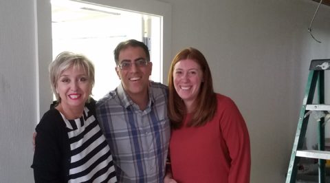
At the outset of a design project, certain first steps are common. It is after those initial steps that things can take two very different directions. First you have the desire or need to make some changes/improvements. You decide with whom you want to work to design and implement.

If you take the time to plan every aspect of a project, make all the selections, get all the details down on paper—well notated and drawn so as to convey every intent, you may begin and proceed without hesitation. The project can be scheduled and run accordingly. Easy peasy—with that prior proper planning.

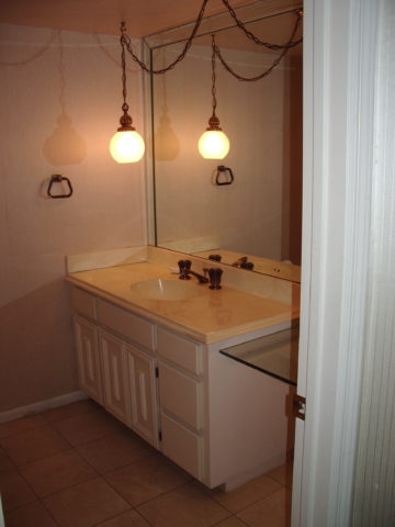
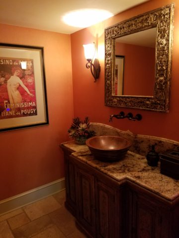
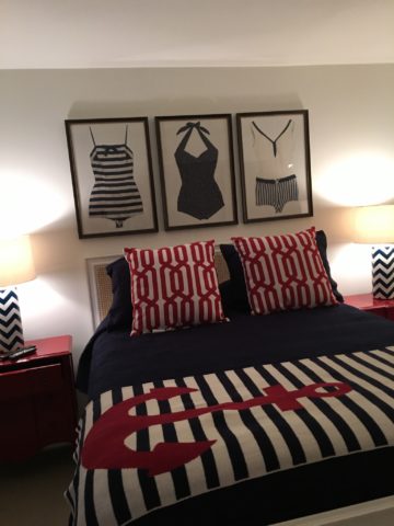
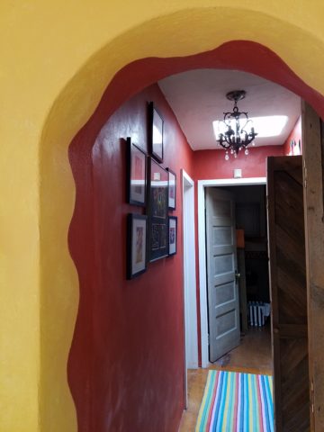
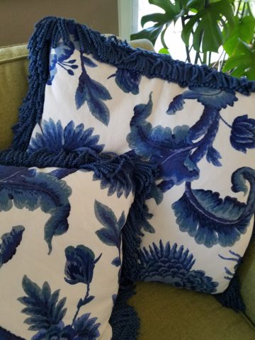
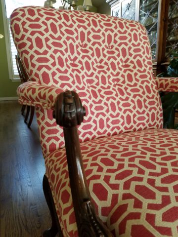
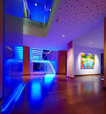
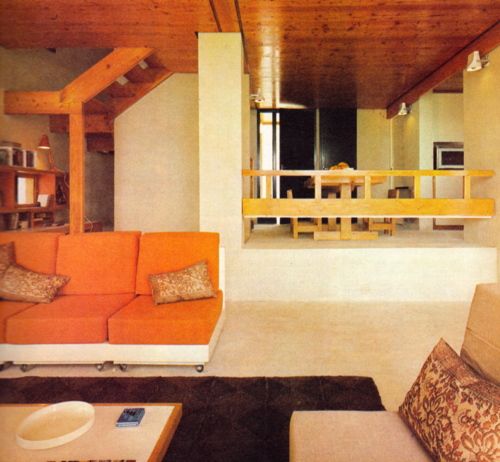
Whoa—is that real life? Well it works for many. It works for those too busy to delve into the many possibilities, to be open to the evolution of the process, to enjoy the adventure of creativity. I’m talking about the projects not requiring permits – fabrics, finishes and furniture. New cabinets in a kitchen, switch out the counter-tops, get new updated back-splash…rearrange, replace, recover furniture…paint walls, hang art, mostly cosmetic enhancements in this case.  Clearly some just want it done—and have no interest in the creative process.  However, do you ever have a second thought? Does one decision affect the next? As you experience the design and implementation process, might you change you mind…have another idea? It happens all the time. It is more realistic, fun and feels like a true artistic endeavor.

But is your intent to create an art piece? Is it to experience an artistic endeavor? Or do you just want some new pieces, finishes, an update? These are two very different situations that require different processes.

True design is centered around the unique requirements and desires of the client. It is responsive and reactive. It is also proactive and filled with anticipation. The design process is one of balance and equation. If…then…

This process is intuitive and educated. It is based upon expectation and perception. Like tipping back in a chair…back…back…until you might fall and then—you catch yourself and all is right with the world—exciting but measured.

Why do you hire an interior designer? With all the information available at your fingertips, why do you need to pay someone to do what you like? If you know what you like, you have the time and you have gathered a folder of ideas, why do you need a designer? Might it be to sort through options? Or to decide between choices of fabrics, groupings, arrangement, scale, style? Merely to hold your hand while you make those decisions? Do you have 5 photos of sofas? Do you have a million pictures of materials? Have you picked up or ordered clippings of fabrics? How do you decide among these many options? How do you know you are making the right/best decision given your options? What is timeless? What is trendy? What will last? What is practical? Which direction should it go? What goes with what? Ha—its funny if you start looking at your options and asking those questions…and there are a gazillion more during the process.

The idea behind hiring the right professional, is that they will help make the best decisions that will narrow your search and selections resulting in a distilled version of the gazillion ideas your have pinned, clipped, saved, collected and visualized. Not to mention they might and should bring other new ideas to the mix. The end result of responsible design consultation should provide a design you would not have had, that you like better than your efforts alone and eliminate costly mistakes saving both time and money.

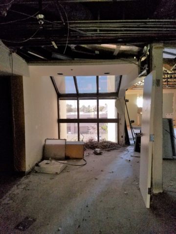
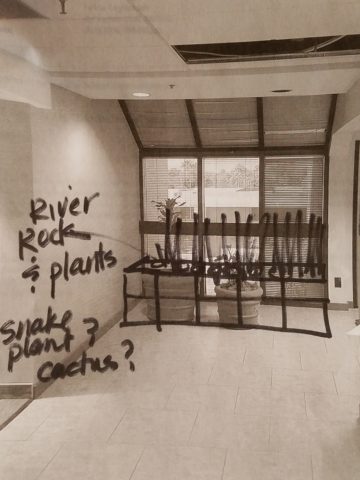
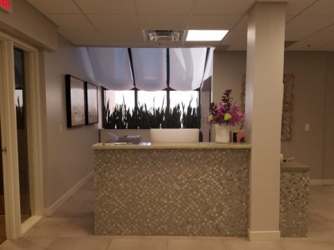
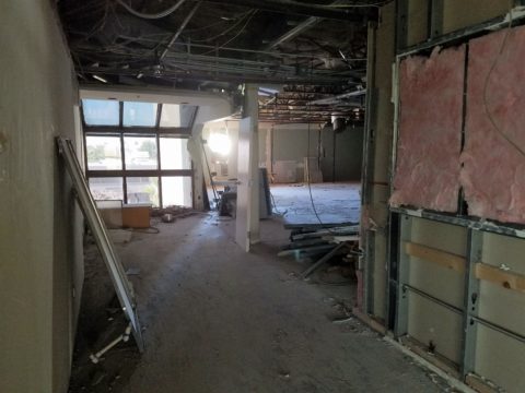
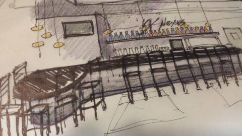
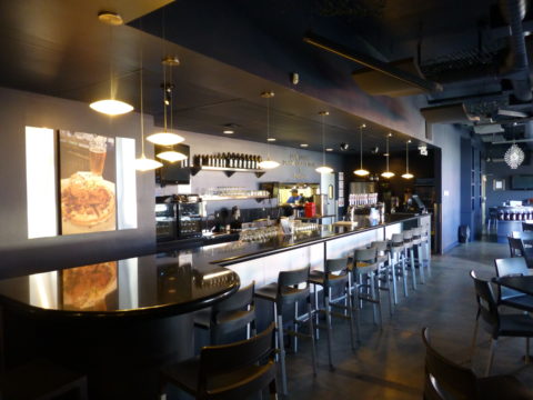
The most difficult part is to recognize that not everyone receives information and processes it the same. One person’s mental image of a design concept might not be the same as another’s. Conveying ideas is an abstraction that can only be somewhat helped with illustrations and models. From quick sketches to well rendered illustrations, dimensional drawings to actual models, nothing will ever exactly convey what will be the finished product.

A sketch like this TV cabinet suggests a possible solution to an a/v issue…

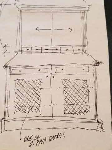
Finished similarly to this piece of finely crafted knotty alder.

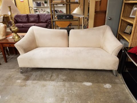
And this tired, yet fabulous contemporary sofa – can you visualize it in an elegant, classic navy stripe with new wooden feet? Watch for this transformation in a coming blog!!

It’s all conceptual. It’s not real—until its real. How’s that for a profound observation? Both designers and clients need to be very clear on this prior to committing to a design process. Visualization can be tricky. It effects expectations.

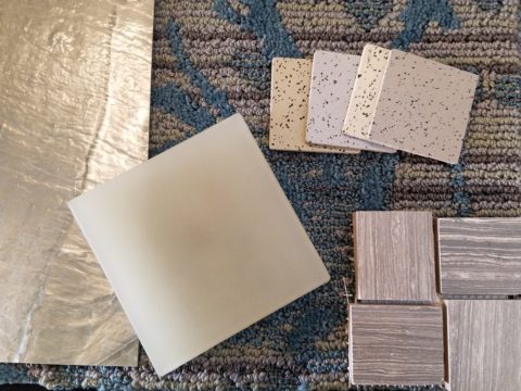
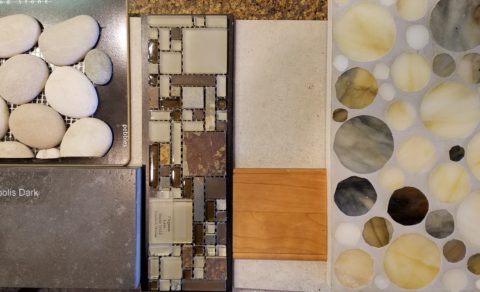
Communication is key. Choosing good, descriptive words…tangible samples of materials… illustrations…models…not all projects warrant the latter examples. The cost of the communication tools must be weighed against the value to the project.


So the creative process is fun and adventurous. The permutations are endless. So many choices, so little time. But if you make one decision, you narrow your steps. With each decision you build toward the finished product. And the beauty of giving yourself permission to “create” means that you can change your mind at any time, massaging the process as you proceed.

It takes patience and resilience. Art is creativity—opening the mind to possibilities.

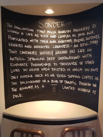
Creativity is defined as the tendency to generate or recognize ideas, alternatives, or possibilities that may be useful in solving problems, communicating with others, and entertaining ourselves and others. (page 396) What is creativity? – California State University, Northridge https://www.csun.edu/~vcpsy00h/creativity/define.htm

The entertainment factor (above) is an interesting point—because it relates to the previously mentioned—fun! This creative process can be and should be FUN!!!

Being prepared to make alterations, fine-tune, add details and work toward that place that determines completion. Like a painter in front of a canvas…knowing when to stop. It can be over-worked. It can be compromised by going too far beyond that which is good. This does not merely refer to clutter or busy design…each is applicable and depending upon the definition and eye of the beholder (again perception) it can all constitute good design. One man’s clutter is another man’s complex design. But who makes those decisions? The critics for one—if the work is out there to be critiqued by the professionals, but the bottom line is the end user. If it solves the issues, serves the purpose, satisfies the desires—that is success. YOU (the end user) determine the success or failure of your design project.

But that determination of success or failure is a shared responsibility. It is a team effort of communication, contribution and patience with the process. The creative process has few limitations. Budget for one is important and physical restrictions—but other than those—designing is as though a living organism’s path. Designing is the abstract – to tangible way of navigating the fluidity, growth and development of the creative process.

So be free to explore and enjoy the possibilities. They are endless. Seeing the design materialize with the additions, and deletions, changes and modifications is part of the exhilaration of it all. It wants to be exciting and feed that thrill of anticipation and fulfillment of desire.

Create—and enjoy—it is good for your life.


10 Tips for Spring Refreshers

Like bears coming out of hibernation, people start to stretch and yawn and look around and ask me “What can I do to refresh my interior for spring?” It’s similar to the fall preparation for hunkering down for the winter…”What can I do to cozy-up my house?” as the leaves drop and a chill wafts through the air.

Spring is the season for re-birth and starting fresh. Fresh – what does that suggest? This year we are very fortunate that Pantone set forth the color direction for the entire year – greenery. I have great enthusiasm for incorporating this bright verdant living color throughout the seasons – yes, a color for all seasons – but we are not limited to green in its various forms. I give you permission to add color that makes you feel good. Pick your favorite color…any color!

Now let’s get to that question about “What can I do to refresh my interior for spring?.” Here are 10 tips to change your world and bring joy as spring approaches.

  1. Color POP: Speaking of your favorite color…”paint magic” as its often referred is the practically instantaneous positive reinforcement that you need to make a quick, effective change in your interior! Pick an accent wall – preferably one that is framed by inside corners (rather than stopping a color on an outside corner) and take the leap of painting it an entirely different color than your norm.  Bear in mind other color cues in the room so as not to create a discord of color or completion between your design elements – but don’t be afraid either. The idea is a pleasing POP! and an extra pointer, if your room is already painted a decisive color, white can be the accent. Yes, white can be an intentional color accent and not the lack of color that it can often seem to be.
  2. Live Plants and Flowers: Spring suggests flowers and greenery – to watch them grow toward the warm weather, bulbs inside can be fun, bouquets of your favorite flowers, sprigs of greenery in a small vase can even be enough. A bud vase on your bathroom sink counter, a statement piece at your entry or coffee table, a flowering plant with young buds to last a few weeks, a fern to add feathery freshness. – any and all of these can add life to your interior spaces.  If you have flowering trees or bushes outside, this is the time to cut a few branches and bring them inside, place in a vase with water and the warmth of your interior will “force” the buds to bloom – Voila!
  3. Reupholster to Refresh: Do you have a tired piece of furniture that might deserve a new fabric? A favorite comfy chair, a hand-me-down of sentimental value, a good frame (bones) that can be salvaged to new with a change of printed fabric, leather, or woven textile. This furniture facelift is just the trick to give new life to older pieces.
  4. Change It Up: When you move things around and rearrange your furniture, artwork and accessories you will be surprised how you can refresh without adding anything new. Take a look at your furniture arrange. Can the same pieces be rearranged in the same room and create a new look?? Might you move one piece out to another room or bring in a different piece from some other room?
  5. Pillows to Toss: Throw pillows…throw them out! Well, I exaggerate a bit, but cycle them into a bag in the closet for another time or place or “recovery” and find some fun new pillows to brighten and refresh your interior. What an effective change a few colorful pillows can make in a room!
  6. Add Art: DIY or find something to cheer you! Dressing your walls with new work can lift your  spirits!
  7. Fresh Fragrances: Like Votive’s Pink Mimosa or Skeem’s Current Mangosteen scented candles, or Vance Kittera incense will add a dimension of sensory appreciation to refresh the stale, stagnant air of winter.
  8. Wipe and Dry: New dishtowels are a great and simple boost to change seasons! Find some fresh and uplifting colors to brighten your kitchen and make wiping up more fun! They make a great gift too!
  9. Stash Your Throw: What’s that afghan on your sofa or that blanket on your bed? Switch out the dark colors of winter with fresh new accents to add color and cuddle in too!
  10. Get Tidy: Marie Kondo has written books about it- she knows the “life-changing magic” that getting organized and tidy can do for you! Spring cleaning is a great therapy and introspective look at the things you own, how much you have and what is clutter beyond your ability to enjoy it all.


Let There Be Light for the New Year!!

Short days and longs nights…Do you find that your interior is dull, lifeless and even feels a bit cavernous after dark? As the sun  sets and the lamps come on, the effects can be horrible, adequate or sensational.

Poor lighting can have remarkable subliminal effects on mood, energy, and attitude. The subtle signs of poor lighting such as dark corners, shadows on faces, difficulty reading and dull colors are all important factors that contribute to an uncomfortable interior in these short days of long, dark nights.

Lighting has multiple reasons for being—three primary ones—to see, yes, ambient light. But to do tasks (reading, sewing, playing games), and accent lighting to illuminate artwork and other interior features. Mood lighting such as candlelight (once the primary light source – now an effect in most cases) is a lesser but effective  lighting tool.  Good lighting makes amazing differences.

Beware of down-lights. Lights that shine down from the ceiling. Although a very effective and common lighting tool, they must be balanced with good ambient light.  I have often used this example of sitting in a restaurant across from your date and their face is painted with ghoulish dark shadows under their eyes, beneath their nose, and accentuating all the folds of their features. It is the opposite of a kid putting a flashlight under their chin shining upward creating similarly haunting effects. Creepy. Certainly not flattering.

2008-10-13_001

The same unpleasant effects happen in the home. It’s such a common malady of ineffective lighting that most people assume it is a necessary evil of short days. It’s sad—no, really it’s SAD—Seasonal Affective Disorder! To treat the serious effects of this syndrome there are many studies and inventive solutions, but for most of us, the less arresting effects of poor lighting can be greatly improved and our lives enhanced.

To begin this process of evaluating your lighting an improving it right away, start with the lamps—the light bulbs! We have so many choices these days including the familiar incandescent, compact fluorescent, and the newer LED with excellent color choices and low energy usage.  We could talk about the “temperature” of light sources measured in Kelvin, but we won’t—only that it runs a spectrum of warm to cool.

e6bca6db6f0faf4f9ecb0775cb4bc4eb

Walk around your home and look specifically at the color that glows from the various light sources. Does it look yellow? Does it look white? Does it look blue-ish? Recognizing these distinctions from warm to cool is the start.

light_bulb_color_temperature

Where are the shadows? Are the corners dark and recessive? And, when you combine these two, do you find, for example, dark areas and yellow glowing sources? Sometimes that soft, warm yellow is preferred while other scenes are made more intentionally crisp with cooler light.

Experiment with different lamps in your fixtures – light bulbs in your table lamps and recessed cans, hallway sconces and bathroom fixtures. It’s a fun experiment and very illuminating – yes, the pun was intended.

Are your lamp shades opaque or translucent? Do the shades themselves cast a color? Do they block the light or allow it through? Do they throw the light up and down or up, down and out? This is another detail of which to take note.

If you have dated recessed fluorescent tube units – common in kitchens for example – they are often housed in a box either recessed or surface-mounted on the ceiling. Take a look at the plastic lenses – are they discolored and yellow? This aging process can dramatically affect the quality of light that is emitted. So if you are not ready to replace these fixtures with more effective modern lighting statements, try replacing the lenses.

001-flat_sheets_before_after

A similar installation is that of skylights which have fluorescent lamps up inside the wells with that same plastic lens over the opening to the skylight. The original idea was to have the natural light pass through during the day and artificial light take over after hours. The lens  was to intentionally conceal the unattractive fluorescent tubes, but it sacrificed the depth of the framed well. A quick update is to remove the lenses and fluorescents and expose the well of the skylight adding dimension to the room and eliminating the unattractive lens that conceals the dimensional cavity. Recessed can fixtures around the skylight in the surrounding ceiling are the most common solution to this transition from old to new, a cable can be strung, pendants can be hung, but if budget constraints prohibit that investment at this time, you might investigate the power source up inside the skylight well and replace the fluorescent fixture with an inexpensive, adjustable, surface-mounted spotlight – perhaps with two heads to provide light from that same source while opening the skylight well without the unnecessary lens.

franklite-scintilla-2-light-nickel-finish-spotlight-spot8882-a94

The dark pockets around your rooms can be improved with up-lights in corners and up under plants. Inexpensive fixtures are available at any lighting store or big box home improvement stores. Place one of these up-lights (remember to select the color “temperature” that pleases you the most) and see what that additional pop in the corner does to open your space. When up-lights are used beneath plants to shoot upward and cast shadows onto the walls and ceilings can create drama and exotic interest at night. This is true both indoors and out.

Torchiere floor lamps are those that face upward. Like a torch, they send the light toward the ceiling – another effective splash of light in an otherwise dark space in the room.

Colors are radically affected by the color of light that shines upon them. Therefore, an interior color scheme can be horribly tweaked to not resemble at all the actual colors chosen and combined to create the scene, when artificially illuminated after dark. Contrarily, colors can be rendered with great brilliance and accuracy when illuminated with the right combination of lighting. (although daylight contributes in these two examples).

By the same token we can have great fun and “paint” with light creating a color scheme entirely with colored lamps washing the walls, and interior elements just for the art and exercise of doing so, but I digress.

images

In summary, look around your rooms after dark and look for opportunities to make changes that will dramatically affect the comfort level – the results will be startling!!! If planning new construction or remodel – have plenty of light in key places throughout the space. Think dimmers so you can control the amount of light. Let there be light in this Happy New Year!


Color of the Year 2017 Greenery!!

Ta Da! Pantone announces its color of the year for the coming 2017…drum roll please…and the color is Greenery!! Yay!!! Last year there were two  – yes, imagine that – they couldn’t decide so they slurried Rose Quartz and Serenity resulting in a pale, cool, wimpy blend of soft rose and lavenderesque shades into a blended wispy pastel dream. Non-committal, in my opinion…lacking confidence.  Last year the rationale was stated by Pantone’s Executive Director, Leatrice Eiseman as…

pantone-color-of-the-year-lee-eiseman-quote-2016

But this year they have it with this fresh organic hue in a yellow-ish shade primed for this year’s rationale from Ms. Eiseman which is:

pantone-color-of-the-year-lee-eiseman-quote-2017

I have always loved green. I grew up in a Virginia jungle of a suburban neighborhood inside the Beltway surrounding my hometown of Washington DC. where the first signs of spring were the tiny tips of dogwood leaves poking forth from the delicate branches of those beautiful under-growth trees. The dogwoods were the graceful, human-scale layer beneath the towering canopy of the immense, rigid, vertical tulip poplar and white oak trees that commanded the woods.

Soft mosses, lacey ferns and perky lily of the valley carpeted the hidden pockets of our backyard. New growth is that prediction of amazing renewal and promise of the start of summer. So it is a prime observation that as Eiseman states in her 2017 rationale “greenery…bursts forth…with a reassurance we yearn for…” although I do not feel this is peculiar to this year as winter always makes me yearn for greenery and the reassurance  that spring and summer will return.

My mother also loved green and that probably influenced my childhood perception of comfort and context of it in interior design. She had and still has an eye for color. In 1959 she selected an amazing sculpted wool pile carpet in a warm, dark, neutral, taupe tone and built upon it a color scheme of pinks and greens that was subtle and relaxing, organic and contrasting, blending beautifully in our wooded setting of verdant lushness in which we were cozily situated.

That was upstairs where we felt like we lived in a flowering tree house amidst the dense collection of green leafy between the trees and surrounded by all shades of pink and white azaleas. Downstairs, where we retreated in the winter months, her greens were mixed with gold tones creating a warm interpretation of the greenery around us.

When so many in that era, between the 60s and 70s, were styling interiors with heavy oranges, browns and golds,

orange-and-brown-f934b00ae8a8aabb9fa7d7d8e3ccec30

my mother gravitated toward Lily Pulitzer’s fresh, tropical palette of lime green and hot pinks, clean crisp turquoise and citrusy lemon yellow – both in her wardrobe and her interior accent colors.

most-popular-lilly-pulitzer-prints-no-names

Our beach house was turquoise and teal, navy and tan – the sea and the sand.

Following color trends is a slippery slope. I have blogged about it in the past. Adopting that which is often a combination of colors instantly records a place in time when everything from bath towels and shower curtains, bed dressings to draperies appears in the marketplace and inserts its predetermined obsolescent combinations into the lives of so many who would rather catch the wave – often behind the crest – to own and participate in what is conveyed by the market to be the “in” thing to do and to have.

It is best not to embrace and adopt the combinations that the market presents. It is better to select color and combinations that transcend the trends – skirt them so as not to fall into the trap of dated color schemes and tired combinations. Some avoid the trap by staying neutral. The safe, timeless colors of whites and grays mushrooms and taupes- but where is the risk and fun in that?

“Too bad for them” I often remark. It is such a missed opportunity…a limitation to select colors that you think you are supposed to like rather than those that truly bring you joy. I say “go for joy every time.” Color is such personality. It is a stage-setting element. It is a backdrop or foreground. It is a theme. It is an atmosphere.

With all that having been said, I for one am thrilled with this fresh selection for the new year. A bright beginning full of hope and new growth, fresh starts and positive forward movement – organic and life-affirming. So seek the colors that brings you joy and go forth with color in this new 2017 soon to arrive. My personal schemes will always have greenery!!!

Fun with PERF!

Currently finishing a project that has provided a great theme for incorporating metal, it seemed a worthy blog subject for it’s fun and flexibility! Perf is the product – a perforated steel that comes in several percentages of perforation.

We have used this many times for rolling window shades in a flexible coated nylon material. It is great for filtering for sunlight and privacy while allowing a certain amount of “see-through.” It has been used as an architectural screening material for years. You have probably seen it and not realized it on building storefronts and bus wraps – the perforated vinyl coatings are often used for advertisement because they read as though a solid from the one side and are transparent from within.

Here we are playing around with the steel to create cool elements that compliment the theme of this new taproom. The theme is silver and what material does bring to mind? Metallic. So by dressing raw steel with paint – we apply the silver finish and there we have it!

The required outside patio fencing was constructed with very generic square stock. I called it a hamster cage. It was a bland beige when we first arrived and, without notice, the shopping center management had it and the other structural columns lining the canopy/portico painted chocolate brown.

The plan had been to screen it with perforated panels. The darker paint color created a little better contrast and aided in providing a depth of detail to set-off the silver painted perf.

Inside we needed to fill the volume of this most uninteresting dropped ceiling. Already painted black and looking quite voluminous – but not in a good way – the empty space needed some mass. So in one of those restless, middle-of-the-night design sessions of insomnia the idea to create large drums for lighting shades came to mind.

Drums have been in vogue for several years now. Nothing original from the initial use for table lamp shades except their use was broadened to include suspended fixtures and halved for wall sconces. You’ve seen them – hip and happening – and these were quite over-sized and carried the space.

We needed to fill the void of the 12′ high ceilings in this room that had little or no comfort. All hard surfaces, it was a challenge to maintain the silver theme and edginess of a popular taproom while creating comfort. Seemed an oxymoron of a task. But the mass of the perforated drums in three different sizes grouped in the near center of the room did just that.

The addition of multiple warm white lamps inside will be the crowning touch. (photo to be added here in a week or so)

Then a third use of the perforated material came in the idea for a room-divider/hostess station.

img_2342

We needed a place to create a point of arrival. Whether manned or unmanned, this unit can have a chalkboard or other signage identifying special events or beer tastings, with a podium in front creates a translucent backdrop to partially cordon off the rest of the space until the customers are greeted and it also can divide the space for special events and table groupings. to accomplish all of those various purposes we designed it with heavy duty commercial casters complete with brakes so that it could be moved easily for its grand height and weight and  placed where needed for the best advantage.

Stay tuned for the complete un-veiling of this cool new interior in the coming weeks. And meanwhile dream of all the fun you can have with perf!


Fe Fi Fo Finishes

I have resisted faux wood porcelain tile, without good reason, just for the sake of installing something new. I have believed that it is great for a Long John Silver’s fast-food place attempting to convey the look of a wharf, fish shack etc…it is also good for a grocery store produce department – again, trying to depict a grower’s market with barn-wood floors while all the time being easy to maintain and virtually indestructible. But for a home (unless it too needs to be indestructible), chic restaurant, office lobby – I find it way too cold and faux. wood grained porcelian tile generic

Furthering the disdain for the material is poor specification and poor installation. Having grout joints accentuate the tile making even less believable than it already is – is the worst.

But as usual, if you wait long enough the trend will either fizzle or bloom and bloom it has- check out these really fun porcelain pieces of plank in colors – yes colors on purpose to exaggerate the idea!!! Now this is a trend with which I could have a little fun!!! 20160604_075109_resized

The first generation of the faux wood porcelain planks took themselves too seriously and so did the designers who used them (except in the smart applications aforementioned and perhaps an ultra contemporary beach house desiring an ease of maintenance flooring material). Not to mention, they were not the finest examples. But with all embracing this trend and using it everywhere – walls, floors etc…I found myself in boxes of cold wood-like tile – fun? I think not. wood-grain-porcelain-tile-floor-wall-bathroom-atlas-concorde-etic

The evolution of the product has advanced its aesthetic and applications. Inserting shocking contrasts weathered-wood-look-porcelain-tile-kitchen-floor-abk of grain and color just for the sake of design. Yay!!

So yesterday we had an all-day continuing education marathon. It was comprised of several independent  courses on a variety of interesting subjects well delivered by entertaining and informed speakers, a trade show of great design sources, a lovely lunch, and finishing with a festive cocktail hour. During the course of cruising the trade show along all the vendors’ displays, I stopped at a familiar one presenting tile of all manner – including wood-grained porcelains. I engaged in conversation with one of the reps and specifically about the tired over-use of this trend. We were in perfect harmony regarding our agreement on this subject.  While there I did admit a straying from the natural integrity of the materials that I generally embrace when recently I specified a vinyl wood flooring material in a residential application. This particular installation was prompted by the desire to have the look of wood flooring but with the resilience, durability and soft cushion that this unusual product offered. We had wet area conditions right off the pool area where traffic patterns to the restroom and kitchen were constantly traveled by adults, kids and dogs. The pliable product installed with a tight tongue and groove detailing and the remarkably beautiful faux wood-grained finish had great color, texture and dimension. To further belie the true content of the material, we placed stunning hand-knotted wool rugs on top of it making it more believable to the eye of the beholder. We have successfully fooled everyone to date while offering a water and dog toenail impervious, super easy to maintain floor!!!

So there is a time and place for nearly everything…just don’t settle because the trend is set-forth. Take each material and make decisions for the right materials in the right places – and never shy away from having a little fun!!! modern-porcelain-floor-tile-uonuon-14-ora-italiana-1