Collecting art, investing in art, loving art, designing with art…one aspect or all of the above, art in interior design has many facets. I have written previously about and presented a workshop about “I want a piece of art to go with my red sofa,” a kind of raspberry in the face of curators, collectors, critics and appraisers who would never take or condone that approach. But the desire and need exists and as a interior designer it is wonderful to work with artists who can and want to respond to cues, take on commissions and create for specific parameters.
Contrary to opinions from the high-brows, this is not to say that these artists lack artistic integrity or meaningful self-expression. Their value is as any other – determined by what the market will bear. The basis for this writing is that we work with many artists who love their work. And creating it (even under direction) brings them and their patrons joy.
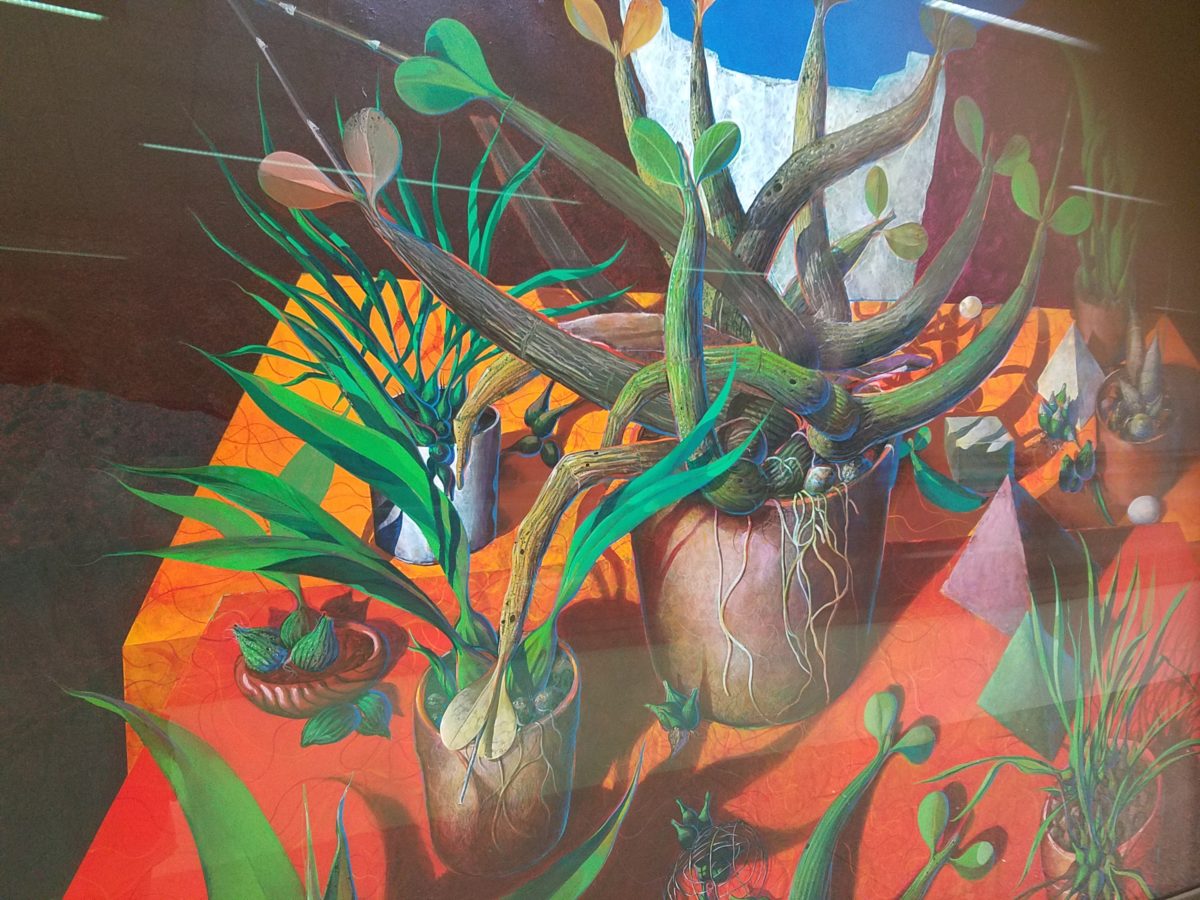
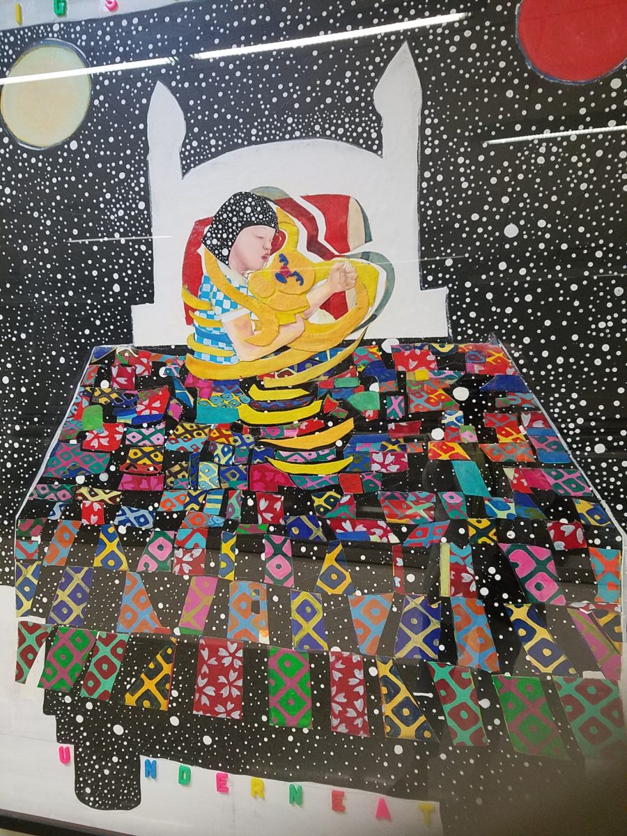
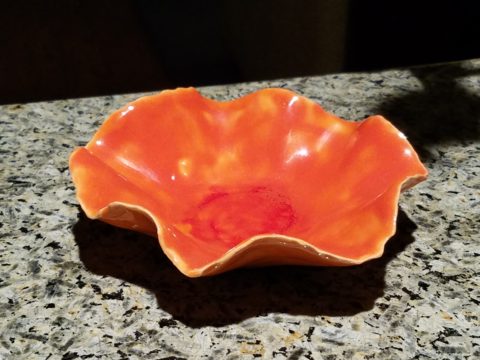
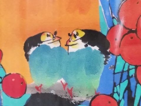
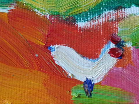
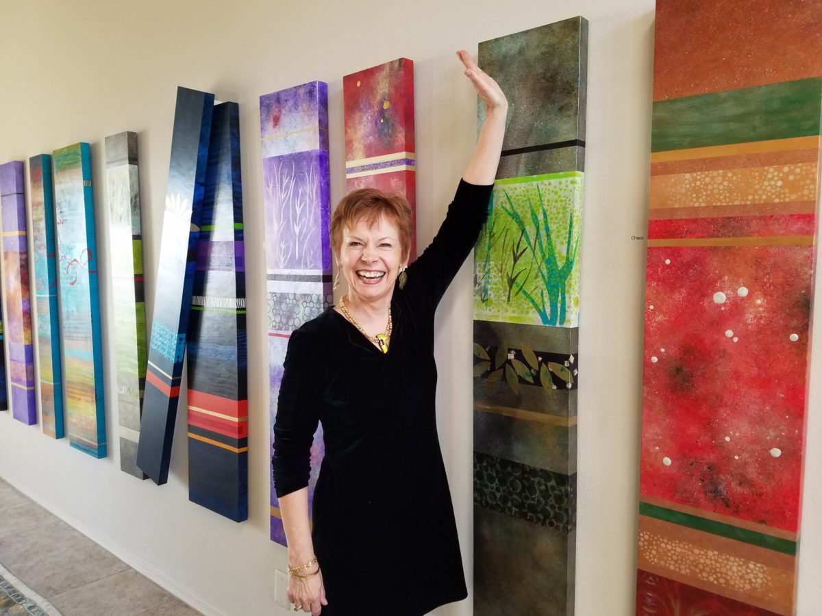
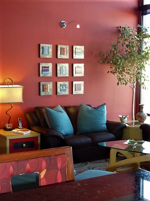
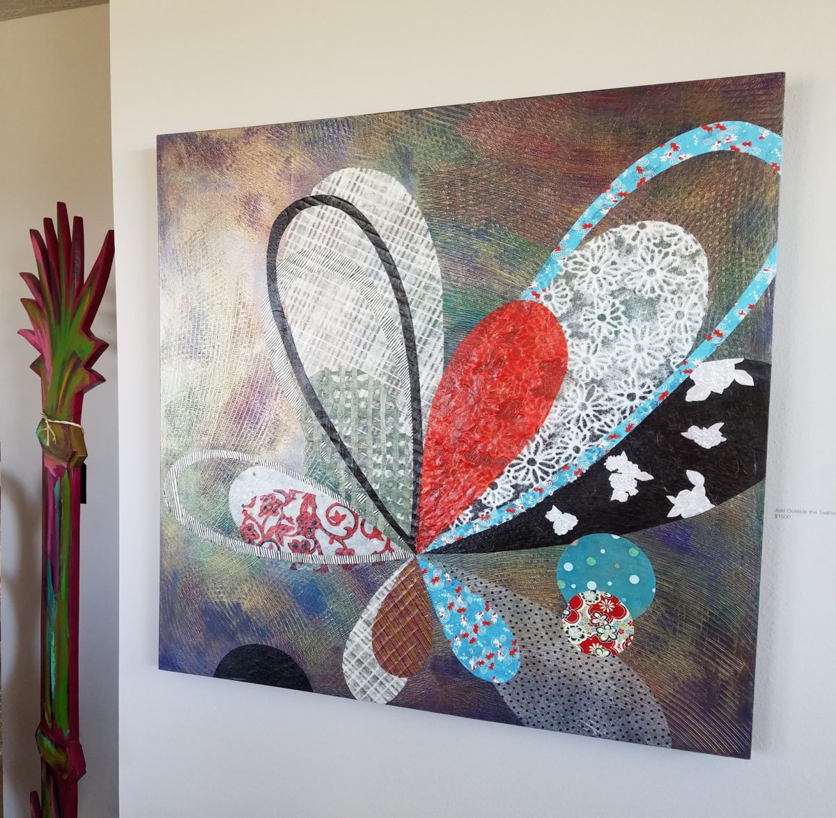
Featured here is the up-lifting, colorful and texturally abstract work of Patricia Forbes. We have enjoyed commissioning her for specific interiors over the years and are never disappointed in the quality and creativity of her pieces.
With so many mass-produced art offerings at the trendy home decor stores, it is refreshing to encounter new clients who are at the start of their nesting years, establishing their own domains, selecting things that bring them comfort and identity and who’s appreciation lies in acquiring original art.
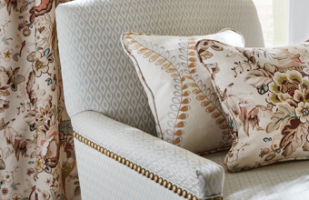
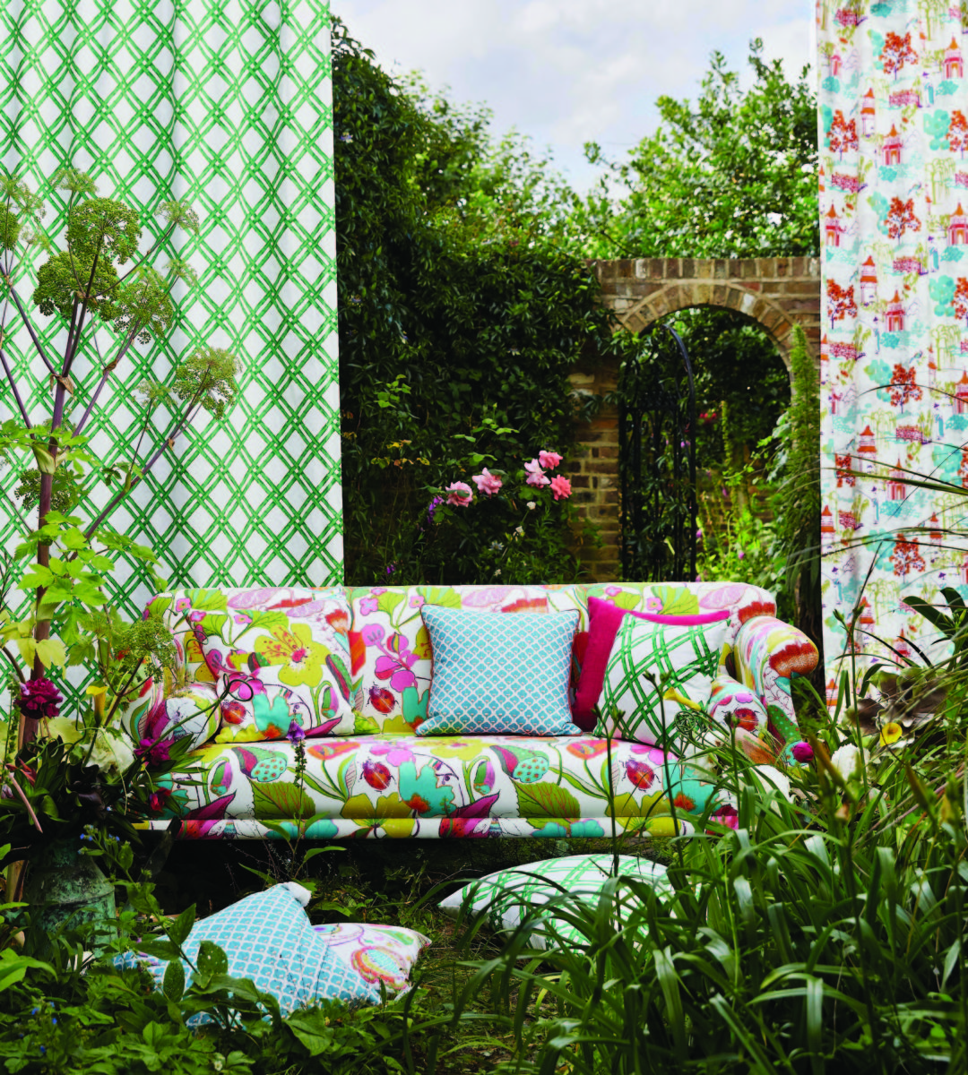
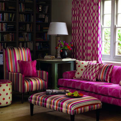
Designing an interior is about comfort and personal identity. It is about surrounding oneself with things that work – both functionally and aesthetically. Individual’s requirements, in either of those departments, can vary greatly – but suffice it to say, each person or couple or family unit creates a home environment based upon their likes and needs (and budget).
Enter the interior designer. When calling on the assistance of someone outside the intimacy of the home, the client is hoping for and expecting a successful custom-tailoring of their requests based upon the experience of the professional.
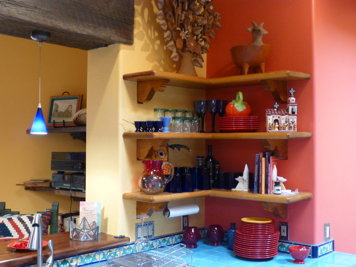
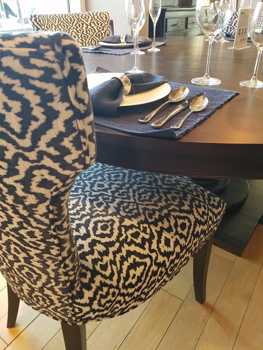
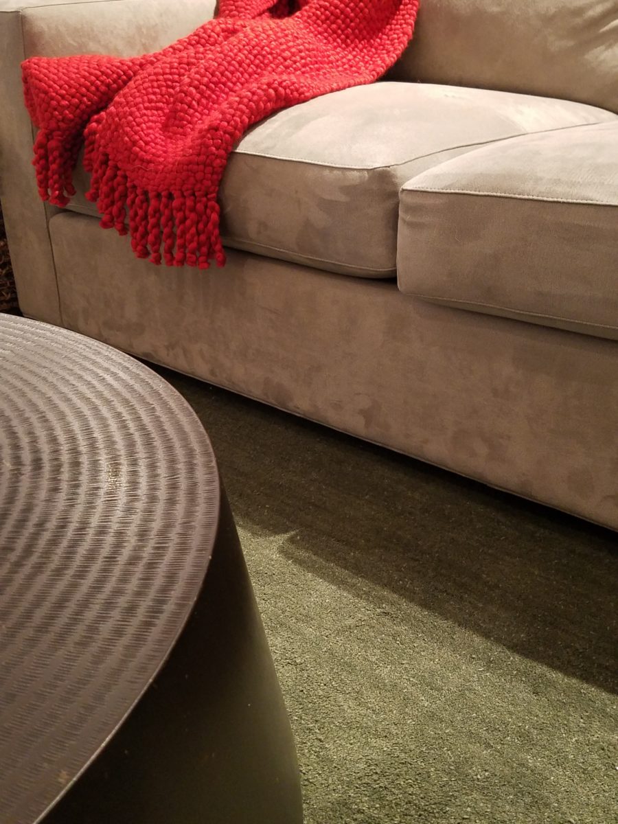
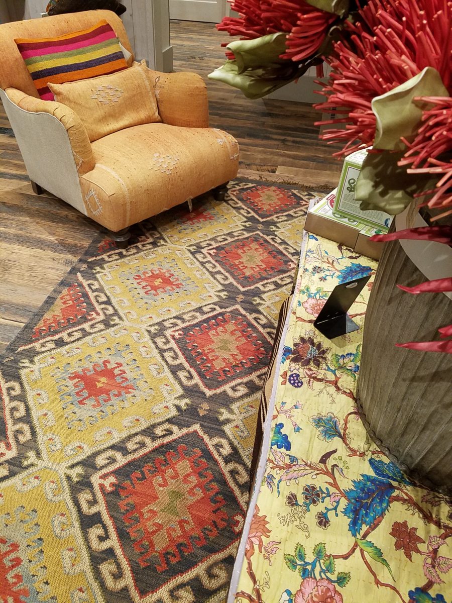
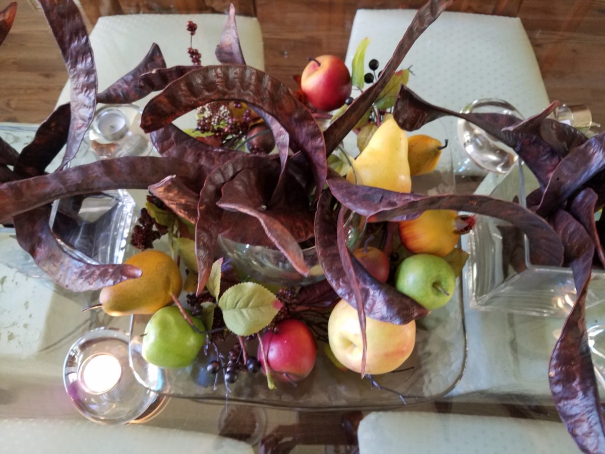
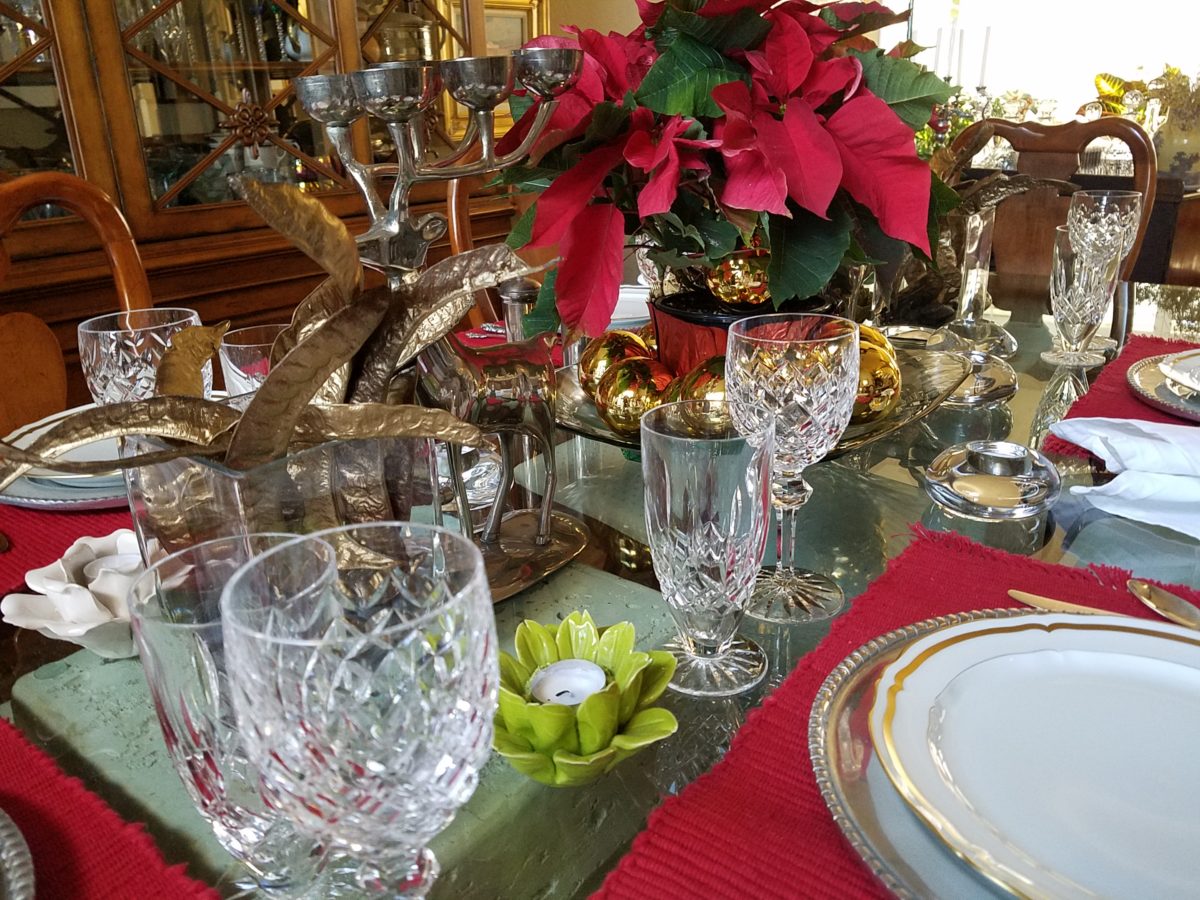
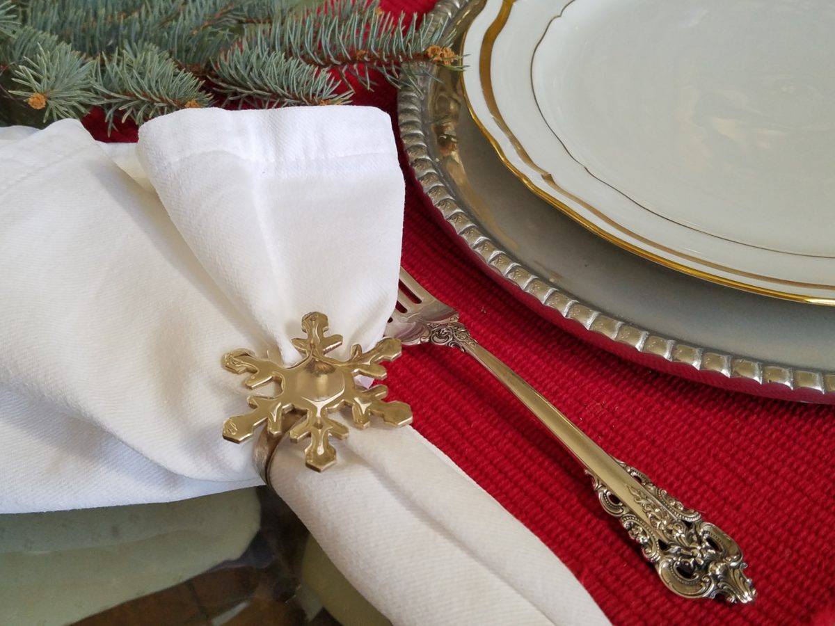
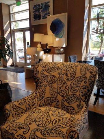
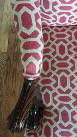
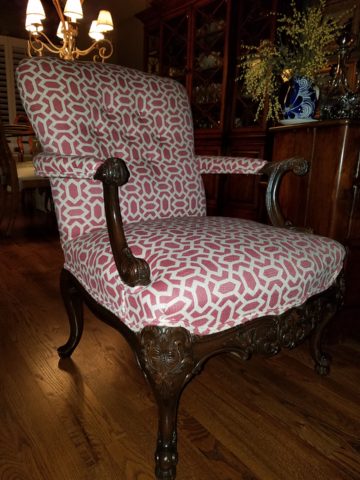
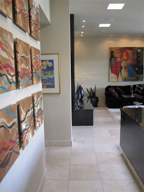
When designing an interior, it is exciting to use existing pieces already owned by the client. It is gratifying to arrange and place those items in ways not yet imagined – thereby justifying the investment in design consultation. After an intense session of rearranging furniture, artwork and decorative accessories the “ta-da” moment is one of near instant gratification and satisfaction.
When an interior needs a little something to pull it together, fill a gap, create an accent or establish a focal point, it is great fun to engage the creativity of an artist to custom design a piece to fit the need. Approaching an artist for the express purpose of acquiring a piece of their work to enhance a space is an exciting venture. It is a personal connection between artist and patron that creates a communion, a bond.
Color, texture, size, style, subject (or not) all are aspects of art that are to be considered for the personal interests of both artist and patron. If the patron has selected an artist to approach about a commission it is as a result of experiencing their work and appreciating it. The artist, in response, is to accept the parameters of the request and enjoy the challenge and process of creating the intended/desired finished product.
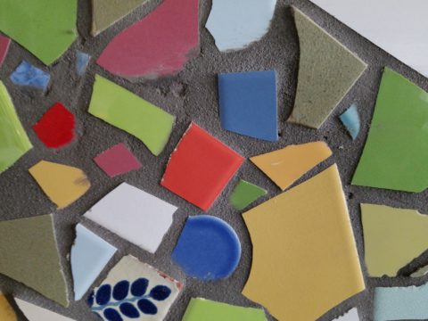
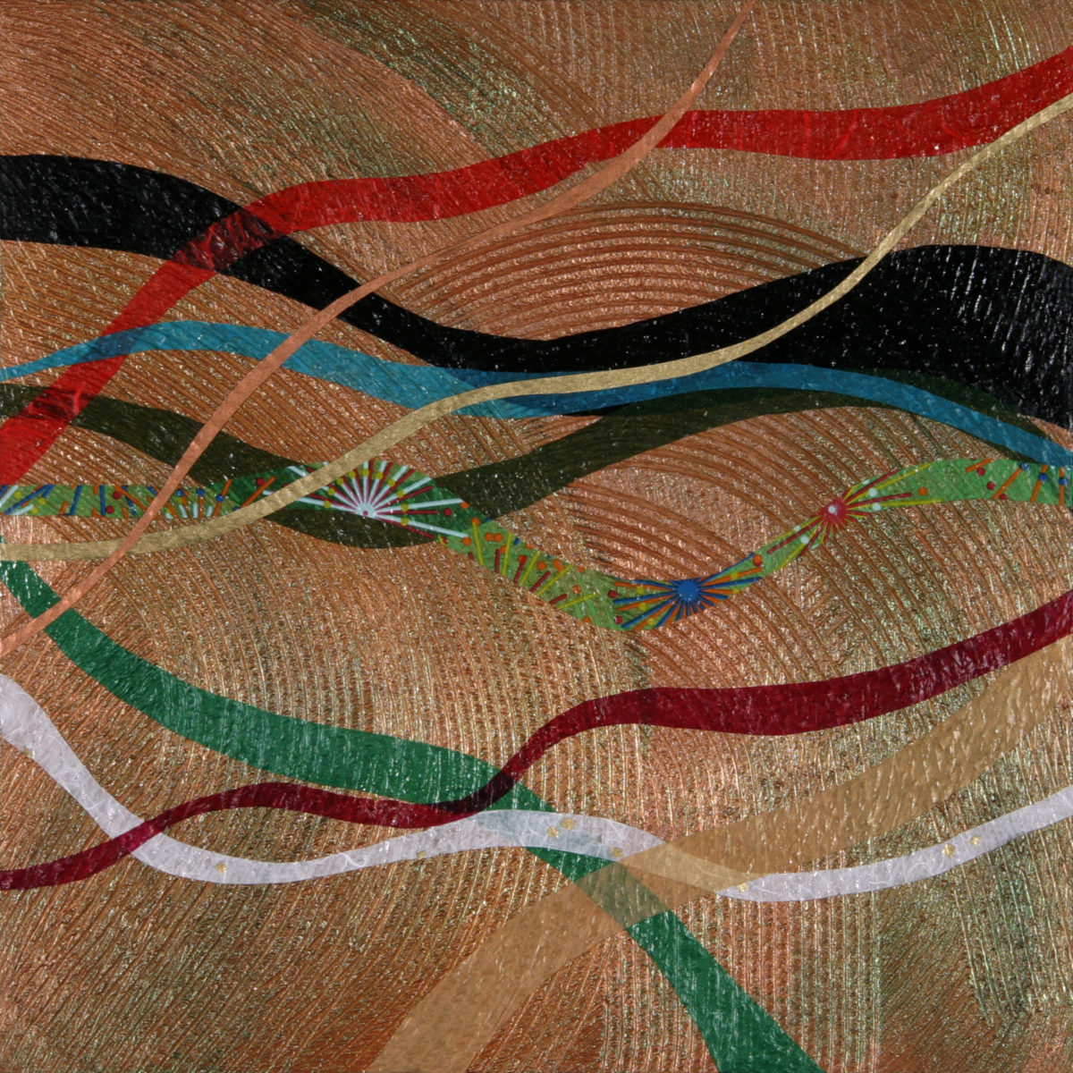
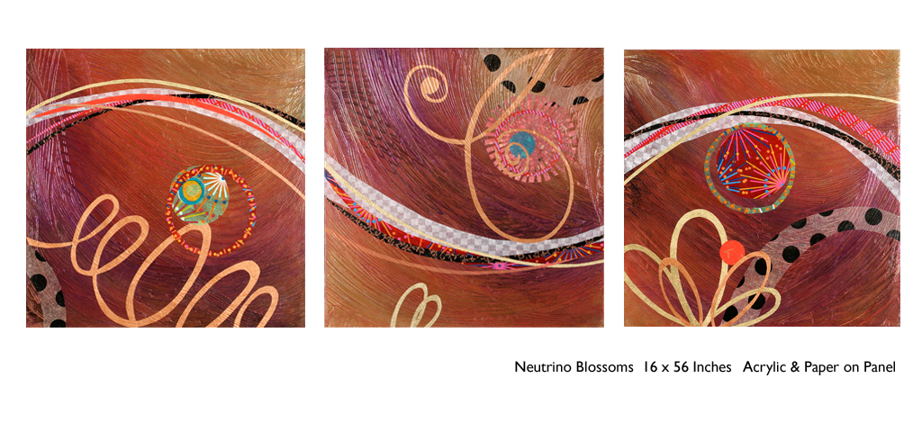
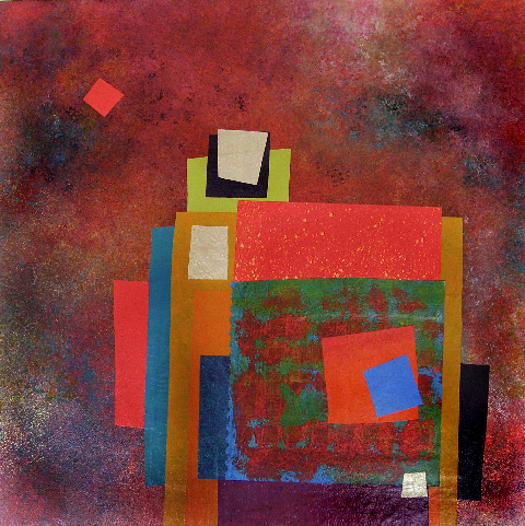
Forbes’ creativity is rooted in pattern, color and texture. Primarily non-objective, her pieces are compositions of movement and dimension. Working with a layering technique, she builds her action with a collage of papers and fibers, paint and stain. Action is key when describing Forbes’ artwork.
She creates for herself, but when called upon to collaborate on a project, her eager curiosity for what might result is enthusiastic and ever-promising. About her style and self-expression she states “When I have created a joyfulness and vibrancy in the work, I know I ahve created an experience I wish to share.”
When asked…
1. How/when/why did you start your abstract technique of layering colors and textures?
Forbes has always been drawn to color as a means of her personal expression, once she “experimented with acrylic materials that would hold a texture and started playing with those using combs and rubber spatulas and sticks to mark in the materials” she was hooked. “Metallic and interference paints call to me — so I began to combine the over the textured backgrounds, and then discovered that with acrylic one could imbed paper. It was really experimentation and discovery of what these amazing materials could do…”
2. What is the most satisfying aspect of your art for you personally?
The element of surprise is what gets Forbes excited! “When something comes together almost unexpectedly and I wonder how I did that — it’s always a search for the right combination of elements, colors, textures, feelings.” When they all come together she experiences great satisfaction. “It’s like turning over pieces to see what fits. Sometimes I have to turn over a lot of pieces to get the right combination — sometimes wondering whether to continue. Seems like it is always worth continuing the work to a happy conclusion.”
3. Why do you enjoy commissions to create specific pieces for interiors/patrons?
Forbes
expresses genuine gratitude for her patrons. “I feel honored and
appreciated when someone likes and appreciates my work and invites me to do
something special for their home or office space.”
4. What pleases/satisfies you about this custom commission process?
The process of working together with her patrons is positive creative challenge. “I enjoy the collaborative aspect and going through the process with a client or designer and receiving their feedback as the work progresses.”
The satisfaction for a designer in partnering with an artist is designing and realizing a vision to complete a space. Bringing visions to reality. I often say that my team provides tremendous support in making my dreams come true. From artists and craftspeople to seamstresses and all manner of contractors, it is truly a team effort to achieve great results!