Changes in social interactions, style of entertaining, cost of real estate and family dynamics all contribute to what we are seeing as the diminishing dining room. Yes, there are circles who still maintain and use formal dining rooms in their social repertoire.
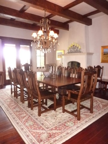
Elegant entertaining, grand social gatherings and family traditions still support the validity of the formal dining room. However, the fact remains that the concept is changing.
It’s easy to digress from the focus on design and delve into the demise of the family dinner hour. that time when families truly gathered to share, enjoy, report, critique, discuss, plan…more and more fragmented we are losing what was a very galvanizing core of child development and character-building. But I digress…
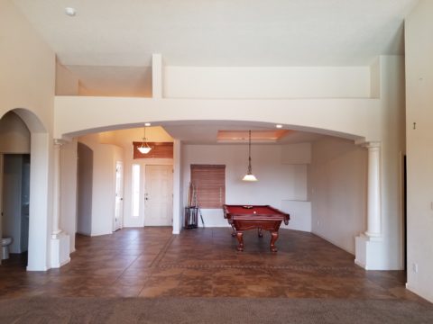
Take the bachelor who would rather have his pool table than a dining table…moving it into the house first and making that statement clear.
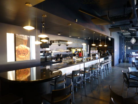
Entertaining has become more casual, more spontaneous and geared to an open-plan of kitchen conversations, bars and movable group conversations. The act of gathering around a formal dining table after the customary cocktail hour is now more free-form.
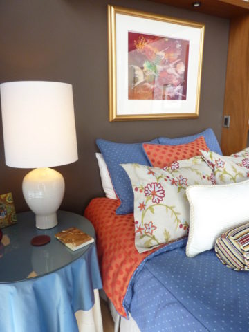
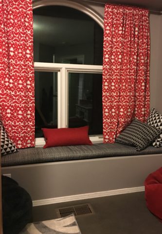
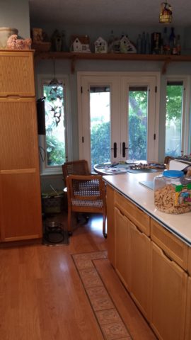
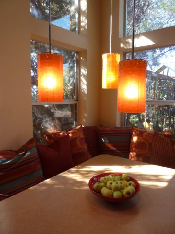
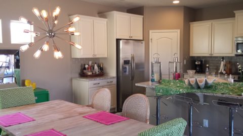
Placed directly off the kitchen and connected to the family room – the open plan flows…
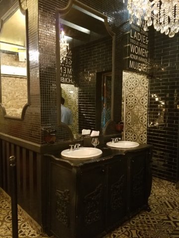
The cost of real estate certainly plays a part in the diminishing dining room. Space is limited and therefore consolidating the dining area to one rather than a separate breakfast space and formal dining room utilizes space to greater advantage. Having an unused dining room occupy so much square footage is wasteful.
Family dynamics dictate that with the busy schedules and conflicting schedules, the seeming luxury of a formal dinner-hour have changed. Whether in the breakfast dining space or formal (if there is one), the act of sitting together for a nightly ritual of dining is less being practiced.
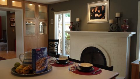
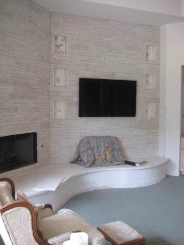
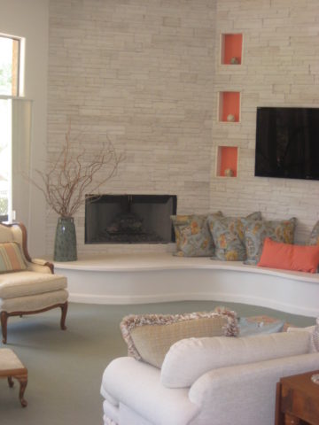
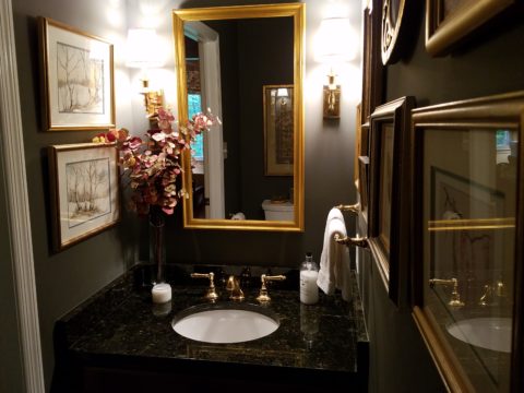
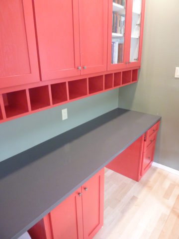
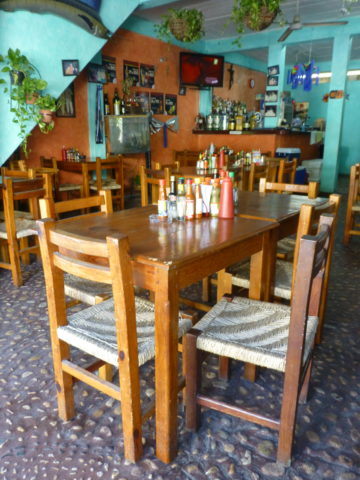
Here, this dining area is in the den off the kitchen…a better use of the space by this family’s estimation.
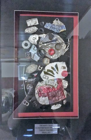
As I was writing this, I stopped and thought of the dining room scene from Meet the Parents and I cracked up reliving the events and they unfolded one ridiculous thing after another…and then I Googled famous dining room scenes to find other examples – because I was amused and curious…I found several memorable examples like the Griswold’s Christmas, Eat, Drink, Man, Woman, Tortilla Soup – oh and Tom Jones with Albert Finney – a classic!!! So many other wonderful scenes – but one day will it all be history? Mere memories of days gone by?
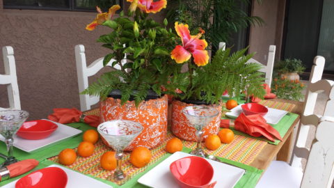
So today the open plans expanding the interaction between kitchen and dining – family rooms melding from the kitchen bar…the concept and lifestyles that dictate the practicality and ultimately the design directions are becoming redefined. And we also see the expansion of outdoor living – additional dining opportunities are ever blossoming on patios…
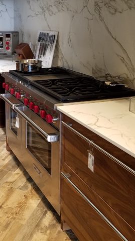
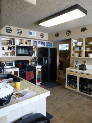
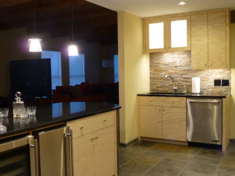
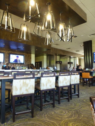
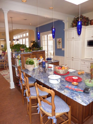
The exhibition kitchen concept that has driven restaurants for years made it into homes for the same reason – communing with the action and participants, connecting with the preparation experience and even sharing the preparation experience – dinner guests as well as family members often share the food prep as a form of socializing and entertainment.
The limiting idea that encapsulated the kitchen away from the activities surrounding it was in many cases to be dismantled. The disruption of encircling and kitchen, unveiling it and even incorporating it with the dining experience has become more the norm.
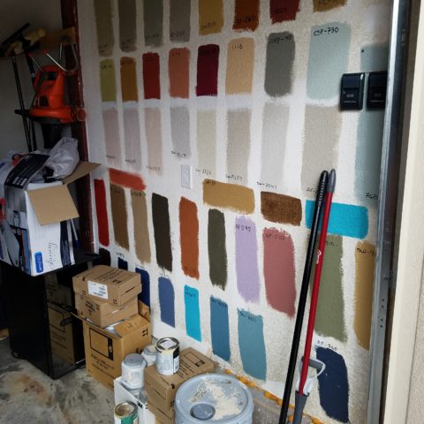
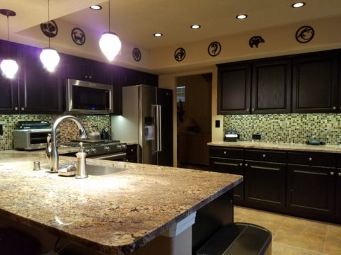
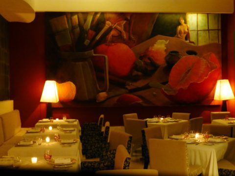
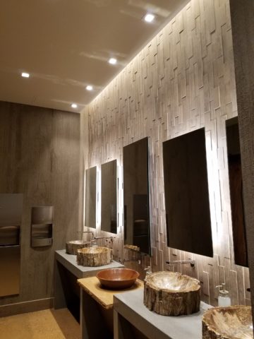
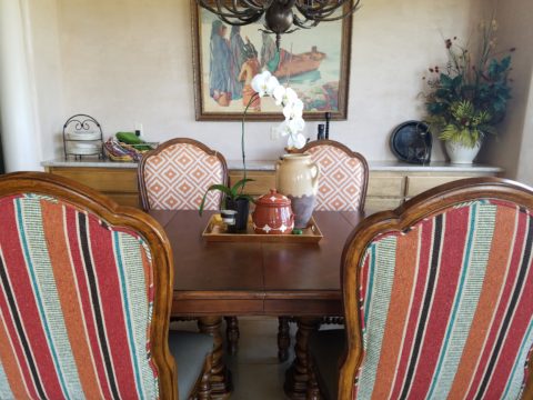
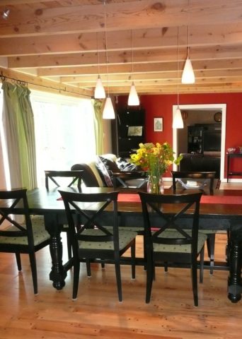
Still playing with colors…this wonderful dining room begins to take shape as an adjunct to the kitchen.
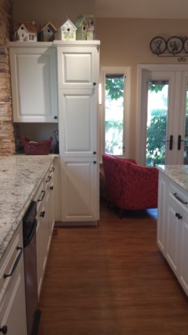
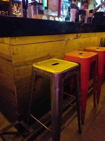
The kitchen is the fulcrum of family life. The dining room is not separate from it anymore. The dining space is part of the preparation space or very close to it. A kitchen island with bar stools are often the most popular perch in a home – for family and guests alike.
So this provokes thought about new home design, remodeling and re-purposing space, re-thinking how to best claim family time and related activities and designing around those practical considerations and needs.