Arriving for the first time in our American Southwest, one might feel like they have entered a different country, if not a different world!! To fly from anywhere else where there are rolling green hills, or green fields or dense green wooded landscapes, not to mention tropical environs and cruise over America’s Southwest, it looks like the moon – or some barren planet. Everyone remembers their first impression. Whether exotic or scary, lonely or seemingly uninhabitable, once you get on the ground and explore the beauty and variety of what’s here, you’re bitten – even smitten.
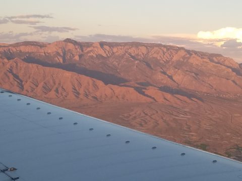
In all fairness, this is a completely defoliated winter shot!! Many now know how lush this magnificent Sandia Mountain can be at the top, in the summer. Yes, I said lush.
No other region has the distinct architecture and tri-cultural identity of what has become the elemental design style and flavor of this magical place. From “sea to shining sea” New England to Southern California you will find nuances of regional distinction – but not to the degree that the American southwest is set apart. Architectural influences from colonization have been the standard guiding style nationwide. Yet the ancient, practical elements, of civilization that long preceded the Europeans discovering the New World, is at the roots of this enchanting design style.
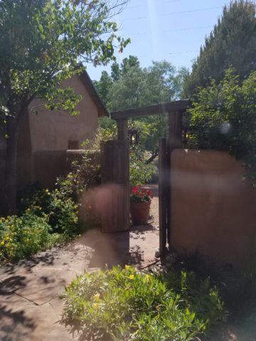
Tri-cultural architecture and interior design results from the remarkable history combining Native Americans carving out of stone walls, building with mud (adobe) bricks, devising simple, practical designs to capture heat and insulate in cold while minimizing solar gain in the warm weather months, with the conquering Spaniards and their colonial influences, and finally the pioneers from the east with their colonial English influences. Now more often replicated, with frame construction and stucco facades, this unique melding is the core of Southwestern architectural design.
When one hears the term “earth tones” setting a design trend in the 70s, it suggests the brown, tan, orange palette that was terribly limiting. Certainly to label it earth tones, it became a curse of a color scheme. Sadly to link it to a representation of southwestern design was misplaced and unfortunate. And how sad to think that it was so broadly accepted – like lemmings following blindly – everyone adopted this as a truism. So often the case with trends. The 70’s also spawned a diametrically opposite color scheme of blues and greens to refresh that which had been so mired in the “earth-tone” movement.
However, real earth tones are limitless. Earth tones are all colors…look down…look around. Even if you confine your interpretation to the dirt beneath your feet – the colors are vastly more than the brown, tan, rust, orange that became the rage. Soft pinks and grays, pale blue and whites…look at dirt. It might be more clay, might be more peat – from soft terracotta to dark espresso – dirt is earth and the colors and tones are limitless.
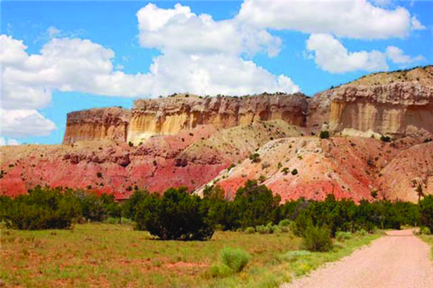
Tom Glover captured the beauty of the natural landscape through his artistic photographic medium that Georgia O’Keeffe and others have depicted through their artistic media.
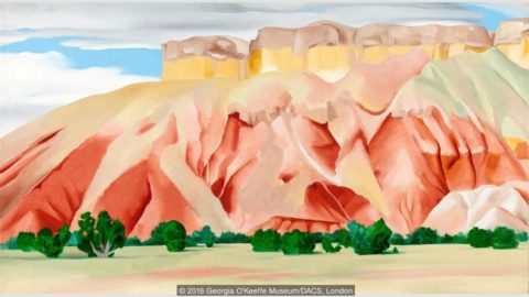
Georgia O’Keeffe saw it and captured it in her own enduring style.
Nature offers color. Natural dyes have riddled that art world through time. Synthetic dyes took it a level further. But nature is at the core of all we have in this world.
http://www.quilthistory.com/dye.htm
Turquoise being a natural mineral in the American Southwest became a signature accent color punctuating the soft earthen tones of the adobe design palette.
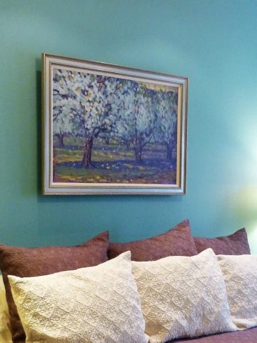
Artist Victoria Martinez Rodgers paints a valley apple orchard and the turquoise wall is the perfect backdrop.
Color was always there for those who cared to notice. The great painters of this region presented it well. Their recordings of everything from the many colors of the rugged windswept landscapes to lush green mountain forests with shimmering golden aspen groves – and bosque cottonwoods screaming with yellow brilliance capture and convey so much more.
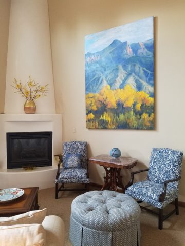
In autumn, bosque cottonwoods explode with color sending a streak of brilliant yellow all along the Rio Grande. Federico Leon de la Vega create this commissioned oil painting from a photo provided by his clients.
There are the natural and also synthetic dyes that were woven through the magnificent textiles of the Native Americans – blankets and articles of clothing were not limited to buckskin animal hides.
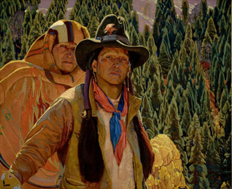
Ernest Blumenschein was the founder of the Taos Society of Artists capturing the color and textures of the realities that he encountered in this Land of Enchantment.
Sunsets everywhere play a part in the imagery of the landscape – here we see vast landscapes with brilliant fiery skies and those exciting corals and lavenders, soft pink and blue wisps provide inspiration for wall colors and backdrops to our richly embellished interior designs.
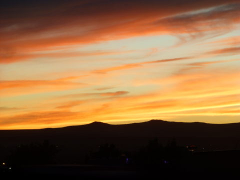
Yet spare, understated neutral interpretations also offer elegant representations of southwestern style.
So what do you visualize when you think of Southwestern Design? Please don’t say a turquoise wooden cutout of a howling coyote! Death by Southwestern Style – the overdose resulting from overdone clichés and trends that have spoiled the real art and beauty.
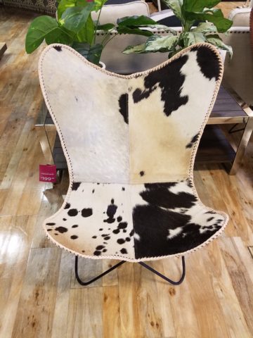
It doesn’t have to be all about cow skulls and pelts…but these cow hide butterfly chairs are pretty cool!!!
Perhaps you see a Mexican influence which is also part of the melding of the regional style – like food, we have a fine line sometimes with certain traditional dishes that when adopted and adapted by American Southwest kitchens took on a unique identity all its own – differing between Texas, New Mexico, Arizona and California. We all enjoy bringing art and craft from our southern neighbors into our designs.
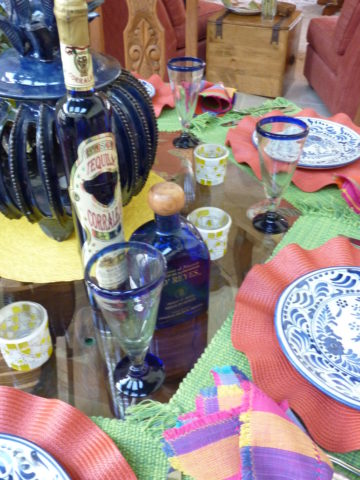
Borrowing, sharing, combining so many design elements such as adobe architecture, colonial wood trim detailing, fired brick technology, Mexican Talavera tile and pottery,
Native American textiles and so many other handcrafts
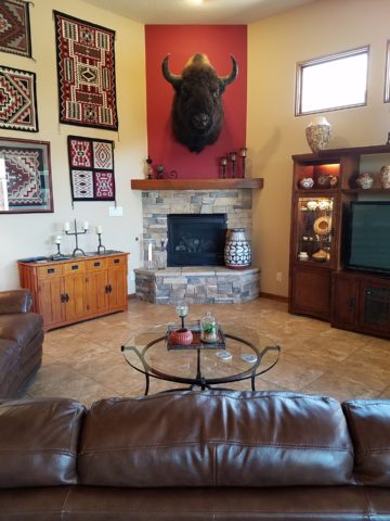
The owners of this interior have an intimate relationship with each of the artists that they have collected down to this magnificent mount of a buffalo. They knew him and his name and why he was put down.
from punched and tooled tin, paintings and pottery – southwestern interior design is rich with color, texture, artistic detailing and true soul. The connection to the earth is undeniable and nature always plays a key role.
So how might you introduce southwestern influences into YOUR design scheme? You could tile the wall(s) of a powder room in Talavera Tile. Maybe just a mirror surround?
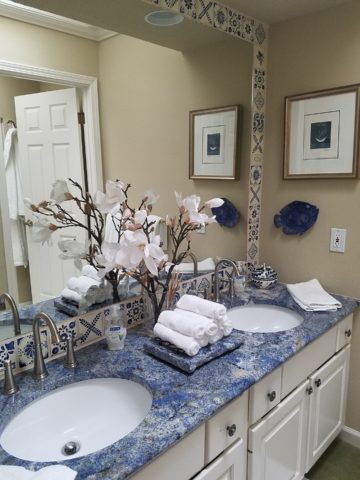
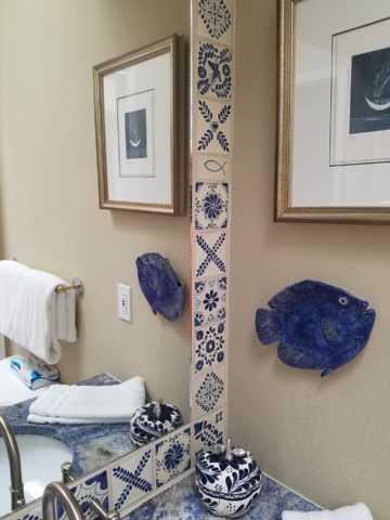
You might paint an accent wall – or all walls in a room or some other bold color inspired by a regional image
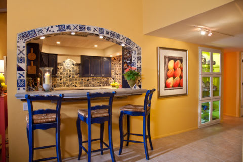
Mango watercolor by Susan Weeks splashes coral against the golden yellow wall with a lime green lighted cabinet showcasing old, traditional, low-fire Talavera tableware. classic Talavera blue and white tile frame the bar opening and on through out the kitchen.
and collect art pieces such a punched tin crosses, wood and straw,

landscape or still life painting, hang a blanket or drape a bed with a beautiful woven textile…introducing different styles speaks to last week’s story about eclecticism. Don’t be afraid to mix things that you like. What brings you joy?

