An aside today to address a different design statement – of fashion, not interiors, I’m speaking out about FAKE JEANS. In the design field we watch trends and acknowledge the importance and validity of new design ideas, combinations, forms and functions. When torn jeans made the scene a couple of years ago, it was amusing and seemed to be a cheap, cheesy, frivolous attempt at something overly shabby chic. The discount stores were stuffed with them and the mainstream stores too.
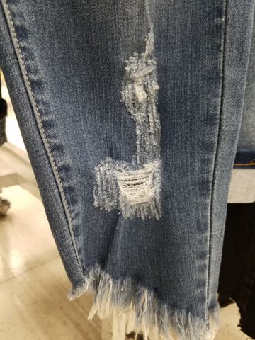
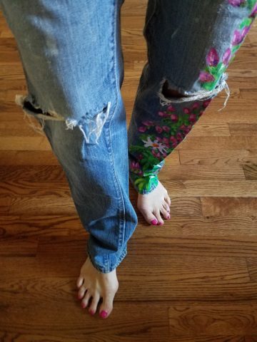
Perhaps a cat clawed this pair to shreds? And the bottom – up above the ankle? Puzzling…
But it continued to make me roll my eyes with disbelief and when I saw well-heeled women sporting them and paying serious money for them. I was truly amazed.
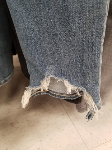
Fraying at the bottom suggests that they were comfortably too long and dragged to this result…but as a crop jean? HOW might one fray up the back of their upper ankle or calf? Hmmm…
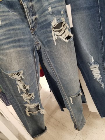
Do you have a pair or two or three? All colors? All varying lengths and tapers? How long did you hold out before you caved and found the perfectly worn pair for you? Are they just broken through at the knee or are they riddled with torn, mangled shreds of fabric? Are they lacerated in mid-thigh? How might THAT have happened?
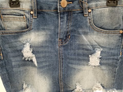
This is a skirt version of the story. But what IS the story? High thigh wear spots…
So does this make me sound like an oldster? Read more and see what you think. It’s NOT about the frayed tears, it’s about where they are, why they are, how they look and how many they are. I see jeans that look like they have been doused with acid! How might THAT happen? But boy when it did – whew, you saved them!! And wore them to tell the story!!!
I think this might have been a bear attack!!!!!
Others are worn in the oddest places of the structure having nothing to do with normal wear and tear – totally random splotches of abraded material – defying common sense.
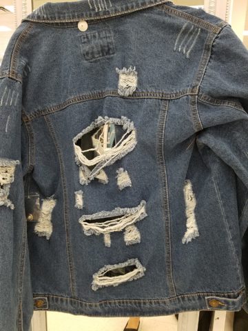
This jacket looks like somebody got into a bit of trouble!! Including scratch marks!!!
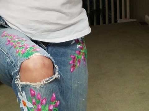
These jeans were my favorite. I loved the fit and the feel, the texture and color of the denim and they got better with age. They were Levis and are now crowding 50 years old!!!
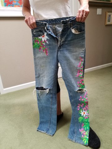
Yes, from the 70s, these jeans were the best. And I’ve saved them out of an inordinate sense of nostalgia. When you find jeans that have all these critical features you wear them to death. And that’s just what I did! These jeans were so perfect and had no stretch to fake the fit! The more I wore them and the more I washed them the softer they became and the more invaluable they became to my wardrobe and hence, my identity. They were my fabulous freaking fashion fundamentals.
After a few years of near daily wear, these jeans began to gradually fade and wear away the darker threads in favor of the lighter cross threads of the twill. The seams and edges were breaking down. They began to show signs of possibly breaking through at the knee. They were experiencing the metamorphosis of Wabi-Sabi and I was anxious about their dematerializing. While a part of me loved these indications that they were truly my favorite as proven by these lovingly worn signs, I was facing a fear of loss.
I have previously written about the intensely thoughtful book by Leonard Koren, Wabi Sabi for Artists, Designers, Poets & Philosophers and as I write this I went into my desk and extracted it once again to find a passage that so speaks to this subject of “The Material Qualities of Wabi Sabi…The suggestion of natural process. Things wabi-sabi are expressions of time frozen. They are made of materials that are visibly vulnerable to the effects of weathering and human treatment.. They record the sun, wind, rain, heat, and cold in a language of discoloration, rust, tarnish, stain, warping, shrinking, shriveling, and cracking. Their nicks, chips, bruises, scars, dents, peeling, and other forms of attrition are a testament to histories of use and misuse. Though things wabi-sabi may be on the point of de-materialization (or materialization) – extremely faint, fragile, or desiccated – they still possess an undiminished poise and strength of character.”
“Irregular. Things wabi-sabi are indifferent to conventional good taste. since we already know what the correct” design solutions are, wabi-sabi thoughtfully offers the “wrong” solutions.” (A side note: Koren mentions regularity in mass production and designers looking for ways to express poetic artistry and sabotage perfection to intentionally create irregularity). I don’t think the endless racks and stacks of identically torn, abraded, ripped, and even mangled jeans was what he had in mind!!!
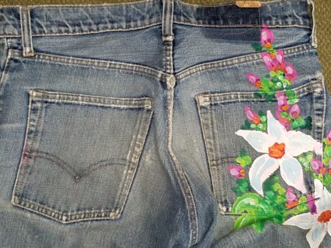
So these jeans of mine expressed unmatched strength of character impossible to replicate in my estimation and as time marched on and they gradually frayed and broke through I mourned the demise. The seams stopped the tears from severing the legs of these amazing jeans. I continued to wear them finding the badge of honest wear quite fashionably cool. But inasmuch as I loved the tears for what it represented in a life well lived and personified aging and the passage of time, I wanted to celebrate the priceless nature of these jeans and give them a revitalization without changing their character. With that I decided to add a little Flower Power, as I whipped out my brushes and paints and embellished them with hipppy dippy flowers to celebrate their age and honest wear.
Honest. I guess that’s what my gripe is about.
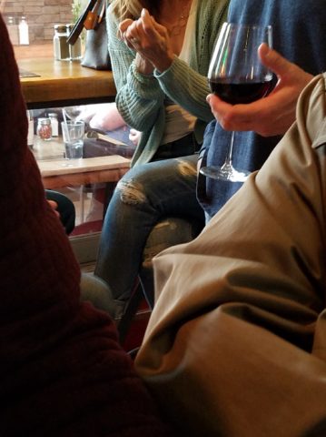
Night before last, I spied this common jean scene sitting at a wine bar. These actually look like they could have been naturally worn through in the knees, except you then see the mid- thigh rip – how would that have happened?
I doubt it is empathy that the celebrities sport the fake torn jeans off the rack. It is not empathy for those less fortunate who have torn jeans from wear and an inability to replace them due to cost. Impoverished people in torn jeans are not trying to make a fashion statement and the people who are enjoying the forced-casual novelty of looking like they loved their jeans until they ripped or to make a social statement about “I am really on your level of every man/woman” are not fooling anyone – really? Neither one flies. Neither one is honest.
And to be perfectly honest about these jeans – they don’t button today. I had not tried them on in decades. My skinny, lanky, lovely niece did a few years ago.

And as I held them up today to photo, I decided just to try. I pulled them on exactly as I remember trying not to further rip them unnecessarily, got them all the way up wriggling into the well-worn butt and they weren’t going to button together -not this week.
But I now have a new summer goal! Might I trim-up enough to button my old favs? That would be a feat! Stay tuned!
If your jeans didn’t wear out from love and appreciation, I say, “give it up!” Like the Emperor’s New Clothes, look at them for what they are and exclaim They are NOT Real! Eeeuwwwww!!!!! It’s a ridiculous, silly trend. It’s an affectation of numerous charades.
Good design. It’s in the eyes of the beholder. But I prefer to embrace the real effects of shabby chic and the ultimate wabi-sabi in fashion and interiors. Relaxed and un-constructed is one thing, but these ridiculous artificially torn jeans are beyond the pale!!! Ask me what I REALLY think!!!!!


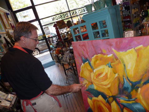
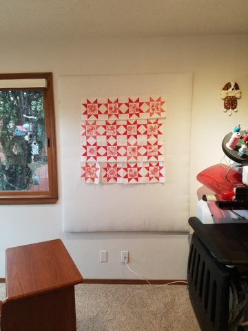
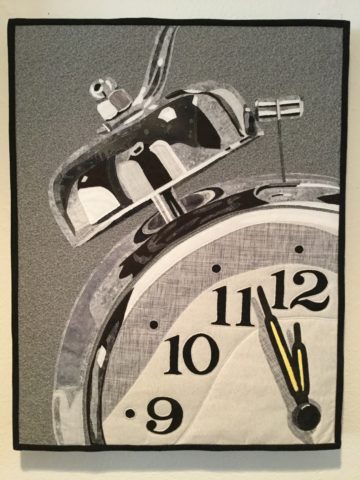
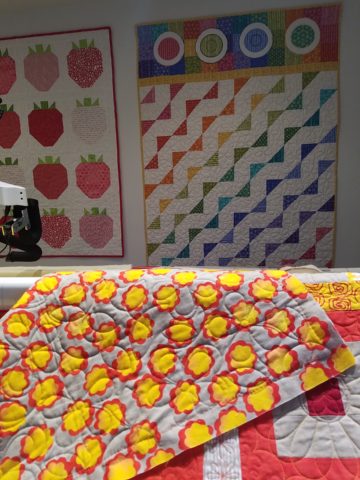
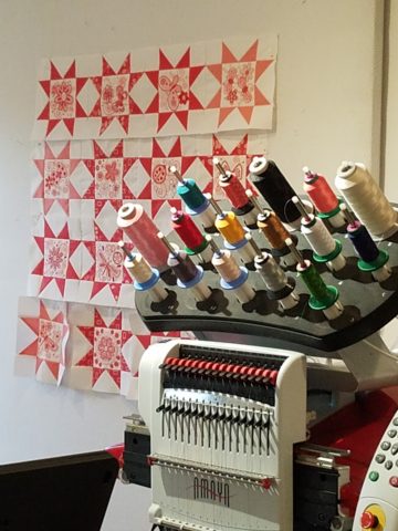
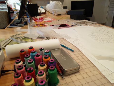
 Two days ago I found myself in an in-home art-studio/workroom that blew me away!
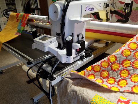

 https://www.casparionline.com/catalogsearch/result/?q=placemat