Cats, Patterns and Participation

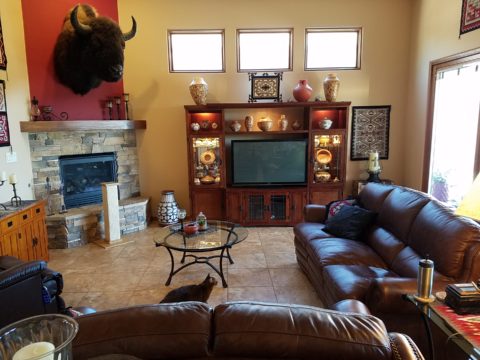
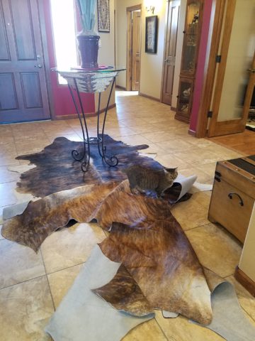
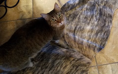
During the course of this day’s consultation this precious and perky bob-tailed cat, Kachina, inserted herself into the entire process.  She greeted me upon arrival, walked all manner of adjacent furniture as we discussed the scope of work. She tip-toed across tables, sofa and chair backs, and ultimately the hides we were considering for upholstery.

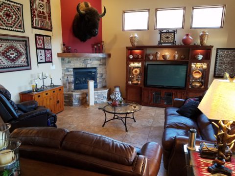
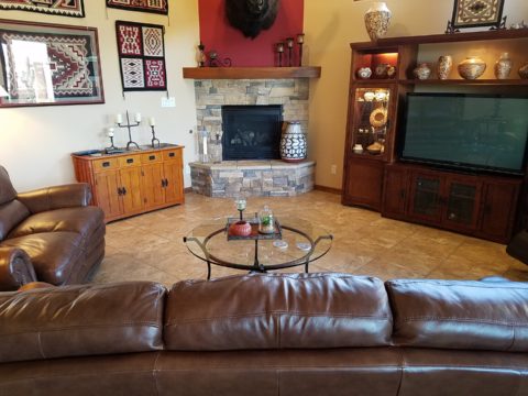
Initially we viewed the room and its present arrangement and realized that the l-shaped right angle position of the sofa, loveseat and recliner conflicted with the angles in the room. the sofa was perpendicular to the TV/display. The fireplace was at an angle in the corner. Neither one had the central focus – the attention was split from all angles. So the question was…Is it necessary to have the recliner as the primary TV viewing piece? Seemed like all the pieces were crammed together and the room was not being utilized to its full potential.

Kachina even has her eye on that bulky sofa as though to say – MOVE IT!


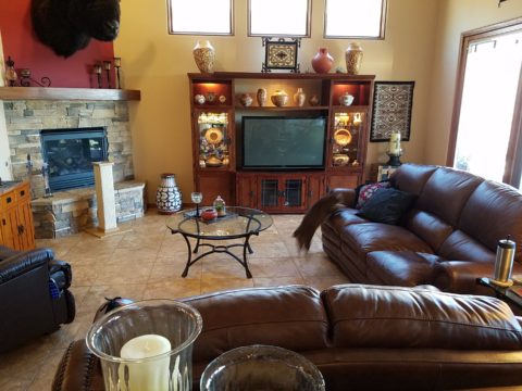
Kachina leaped onto the sofa to make her point- agreeing to the subject of our conversation!

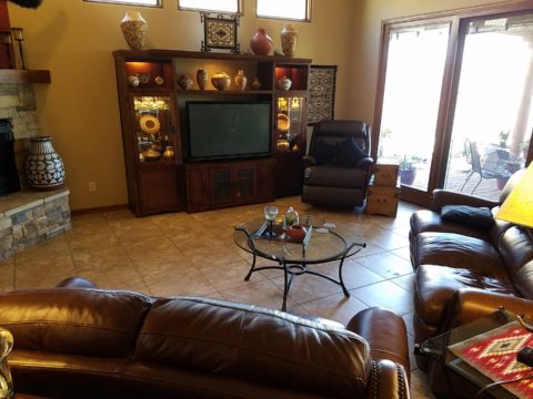
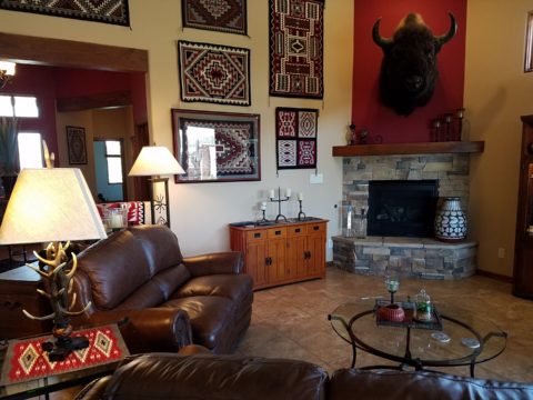
It was determined that the recliner need not be positioned to directly view the TV. Once we turned the sofa to be parallel to the fireplace, it also opened the angle to the entire room and framed both the TV/display unit and fireplace. The recliner tucked into the far corner -not facing the TV – created a cozy nook for reading and next to the patio doors allowed a view of the backyard.

Needless to say, this fireplace crowned by this magnificent buffalo was an incredible focal point.  Formerly from Wyoming, this couple knew this buffalo. They knew his name and knew that he became too aggressive and gored at least one female to death – who had to also be put down and who’s pelt was on the floor in another area of the home. The hunt and subsequent shoot has been preciously preserved and revered. These were not mere trophies.

This is the most extraordinary collection of very fine Native American Art I have ever seen in a private residence. From to carved stone, amazing weavings to paintings and pottery, the presentation is stunning.

To soften all the hard and cold materials of the floor tile, leather and iron detailing, we are now on the hunt for the perfect area rug. Probably a shag to carry the balance of the contrasting finishes. Design is all about contrast, balance and harmony.  Unless the intent is to intentionally disrupt, in which case, the contrast takes center stage!!!!

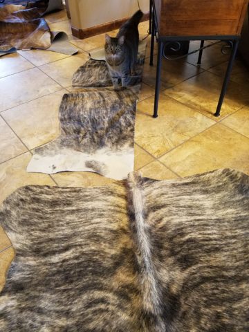
These gorgeous brindle cow hides were so exotic and beautiful. The patterns and colors were wonderful and the couple who owned them had a great respect for the animals, and the celebration of their beautiful pelts.

Kachina was nearly camouflaged with her pretty pelt against theirs.

It’s fun when pets participate.

We will be making a pair of ottomans  with these two hides. Great for pull-up at parties to gather around the cocktail table in the center of the room. Watch for the additional photos once the work is finished.

Real Jeans are Wabi Sabi

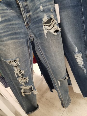
An aside today to address a different design statement – of fashion, not interiors, I’m speaking out about FAKE JEANS. In the design field we watch trends and acknowledge the importance and validity of new design ideas, combinations, forms and functions. When torn jeans made the scene a couple of years ago, it was amusing and seemed to be a cheap, cheesy, frivolous attempt at something overly shabby chic. The discount stores were stuffed with them and the mainstream stores too.

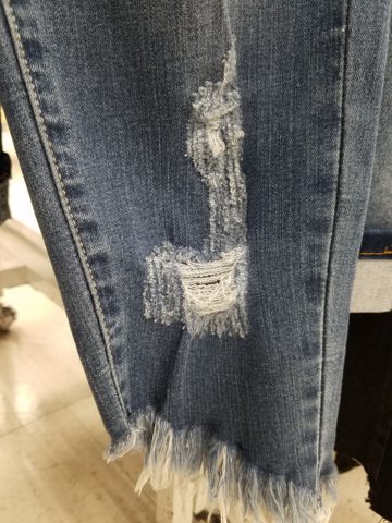
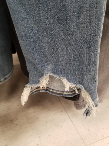
Perhaps a cat clawed this pair to shreds? And the bottom – up above the ankle? Puzzling…

But it continued to make me roll my eyes with disbelief and when I saw well-heeled women sporting them and paying serious money for them. I was truly amazed.

Fraying at the bottom suggests that they were comfortably too long and dragged to this result…but as a crop jean? HOW might one fray up the back of their upper ankle or calf? Hmmm…

Do you have a pair or two or three? All colors? All varying lengths and tapers? How long did you hold out before you caved and found the perfectly worn pair for you? Are they just broken through at the knee or are they riddled with torn, mangled shreds of fabric? Are they lacerated in mid-thigh? How might THAT have happened?

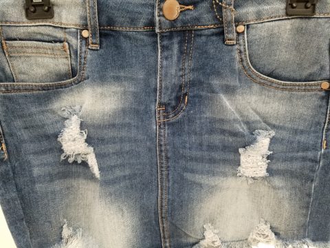
This is a skirt version of the story. But what IS the story? High thigh wear spots…

So does this make me sound like an oldster? Read more and see what you think. It’s NOT about the frayed tears, it’s about where they are, why they are, how they look and how many they are. I see jeans that look like they have been doused with acid! How might THAT happen? But boy when it did – whew, you saved them!! And wore them to tell the story!!!

I think this might have been a bear attack!!!!!

Others are worn in the oddest places of the structure having nothing to do with normal wear and tear – totally random splotches of abraded material – defying common sense.

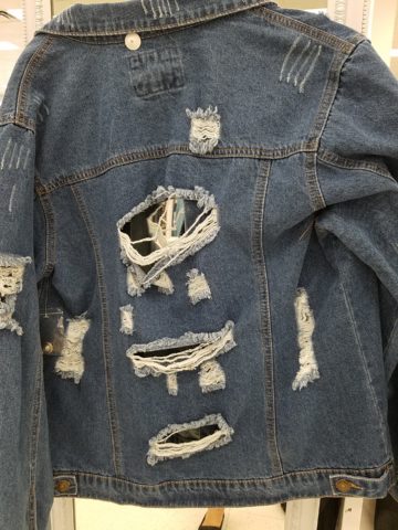
This jacket looks like somebody got into a bit of trouble!! Including scratch marks!!!

These jeans were my favorite. I loved the fit and the feel, the texture and color of the denim  and they got better with age. They were Levis and are now crowding 50 years old!!!

Yes, from the 70s, these jeans were the best. And I’ve saved them out of an inordinate sense of nostalgia. When you find jeans that have all these critical features you wear them to death. And that’s just what I did! These jeans were so perfect and had no stretch to fake the fit! The more I wore them and the more I washed them the softer they became and the more invaluable they became to my wardrobe and hence, my identity.  They were my fabulous freaking fashion fundamentals.

After a few years of near daily wear, these jeans began to gradually fade and wear away the darker threads in favor of the lighter cross threads of the twill. The seams and edges were breaking down. They began to show signs of possibly breaking through at the knee. They were experiencing the metamorphosis of Wabi-Sabi and I was anxious about their dematerializing. While a part of me loved these indications that they were truly my favorite as proven by these lovingly worn signs, I was facing a fear of loss.

I have previously written about the intensely thoughtful book by Leonard Koren,  Wabi Sabi for Artists, Designers, Poets & Philosophers and as I write this I went into my desk and extracted it once again to find a  passage that so speaks to this subject of  “The Material Qualities of Wabi Sabi…The suggestion of natural process. Things wabi-sabi are expressions of time frozen. They are made of materials that are visibly vulnerable to the effects of weathering and human treatment.. They record the sun, wind, rain, heat, and cold in a language of discoloration, rust, tarnish, stain, warping, shrinking, shriveling, and cracking. Their nicks, chips, bruises, scars, dents, peeling, and other forms of attrition are a testament to histories of use and misuse.  Though things wabi-sabi may be on the point of de-materialization (or materialization) – extremely faint, fragile, or desiccated – they still possess an undiminished poise and strength of character.”

“Irregular. Things wabi-sabi are indifferent to conventional good taste. since we already know what the correct” design solutions are, wabi-sabi thoughtfully offers the “wrong” solutions.” (A side note:  Koren mentions regularity in mass production and designers looking for ways to express poetic artistry and sabotage perfection to intentionally create irregularity). I don’t think the endless racks and stacks of identically torn, abraded, ripped, and even mangled jeans was what he had in mind!!!
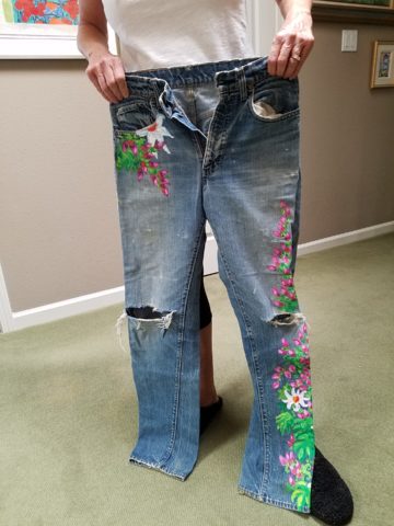
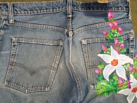
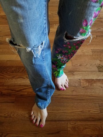
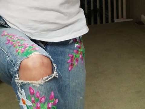
So these jeans of mine expressed unmatched strength of character impossible to replicate in my estimation and as time marched on and they gradually frayed and broke through I mourned the demise. The seams stopped the tears from severing the legs of these amazing jeans. I continued to wear them finding the badge of honest wear quite fashionably cool. But inasmuch as I loved the tears for what it represented in a life well lived and personified aging and the passage of time, I wanted to celebrate the priceless nature of these jeans and give them a revitalization without changing their character. With that I decided to add a little Flower Power, as I whipped out my brushes and paints and embellished them with hipppy  dippy flowers to celebrate their age and honest wear.

Honest. I guess that’s what my gripe is about.

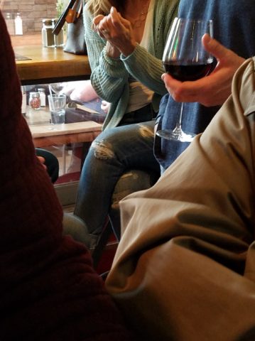
Night before last, I spied this common jean scene sitting at a wine bar. These actually look like they could have been naturally worn through in the knees, except you then see the mid- thigh rip – how would that have happened?

I doubt it is empathy that the celebrities sport the fake torn jeans off the rack. It is not empathy for those less fortunate who have torn jeans from wear and an inability to replace them due to cost. Impoverished people in torn jeans are  not trying to make a fashion statement and the people who are enjoying the forced-casual novelty of looking like they loved their jeans until they ripped or to make a social statement about “I am really on your level of every man/woman” are not fooling anyone – really? Neither one flies. Neither one is honest.

And to be perfectly honest about these jeans – they don’t button today. I had not tried them on in decades. My skinny, lanky, lovely niece did a few years ago.


And as I held them up today to photo, I decided just to try. I pulled them on exactly as I remember trying not to further rip them unnecessarily, got them all the way up wriggling into the well-worn butt and they weren’t going to button together -not this week.


But I  now have a new summer goal! Might I trim-up enough to button my old favs? That would be a feat!  Stay tuned!

If your jeans didn’t wear out from love and appreciation, I say, “give it up!” Like the Emperor’s New Clothes, look at them for what they are and exclaim They are NOT Real! Eeeuwwwww!!!!! It’s a  ridiculous, silly trend. It’s an affectation of numerous charades.

Good design. It’s in the eyes of the beholder. But I prefer to embrace the real effects of shabby chic and the ultimate wabi-sabi in fashion and interiors. Relaxed and un-constructed is one thing, but these ridiculous artificially torn jeans are beyond the pale!!! Ask me what I REALLY think!!!!!

10 Tips for Remodeling: To Improve and Enhance

I’m currently working on an urban loft apartment.  The criteria with which I was presented, upon our first meeting, consisted of three items: One – to enclose an open bedroom to provide privacy, Two  – to provide alternate access to the shared master bathroom. (There is also a powder room, but the shower and tub were only accessible through the master bedroom), Three – because it is a relatively small footprint with voluminous tall ceilings, he was hoping to create a small second tier for additional square-footage.  I understood these items to be his intended “improvements.”

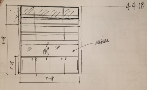
While on-site, at the first meeting, it was (and is always) impossible to limit the observations to only those isolated areas of concern without seeing all else that is occurring around the space.  Therefore, I consider the extra comments that I offered for minor changes to be “enhancements.” These are things that have not had or do not have  priority in the eyes of the client and might have even gone unnoticed forever. Items such as adding a wing wall at the front entry to screen view from the door through the kitchen, concealing a new tall closet of matching cabinetry directly behind the wall to add storage to the kitchen,  add a clerestory window and bookcase with cabinets to the new wall between the master bedroom and living area for borrowed light and additional storage!

Occasionally these offerings are met with a shrug, hmmm or a “maybe” and not really considered to be of great value, but more often than not they are greeted with exclamations like ‘Oh, I never would have thought of that.”  “What a cool idea!”  “I would love to have that.”  And it is with this enthusiasm that my client responded.

So when considering remodeling or identifying the primary improvements needed, begin with the priorities then layer design details of additional enhancements and you will create a master plan that can be executed over time in phases in a preferred or practical order of priority.

1. Begin with your list to improve the function and enjoyment of your environment.

2.Prioritize the list and guesstimate costs to establish a starting conversation    regarding budget.

3. In addition to cost – consider pairing like-kinds of things together such as adding or removing a wall which involves framing, sheetrock, texture, paint – it might be cost-effective to do all items related to these trades even if they are not the same priority.

4. The distinction between improving and enhancing is a fine line because improving does enhance, however I consider improving more practical and enhancing with embellishments that are less critical, but make further improvements and enhance the quality of the space. Such as crown molding, improved base trim, unobtrusively installed mirrors, windows, updated hardware, etc… https://bit.ly/2HCYrU

5. Storage is always welcome. Look for opportunities to add cabinets, vertical spaces to maximize your footprint, second-tier countertops, raise cabinet heights even furniture to provide additional storage. https://bit.ly/2GZglUa 

6. Passing daylight through to interior spaces is more common in offices than in residences, yet for the same reasons of “borrowing” light in commercial spaces, skylights, vertical slivers of glass, transoms and clerestories are valuable assets when it comes to bringing daylight into pockets of darkness. https://bit.ly/2HCddKU

7.Evaluate your existing lighting. Adding dimmable ambient light to rooms to supplement existing down-lights such as pendants in kitchens, translucent lamps shades on table and floor lamps, even well-concealed under-cabinet lights will add control and mood enhancements. Spot light wall art and sculptural pieces, illuminate corners with up-lights (up through trees, behind chairs), and consider changing to LED lamping (bulbs) for longer-life, cost -effectiveness and a full range of colors!

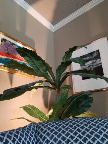
This up-light filters through the plant from behind the chair casting interesting shadows and illuminating an otherwise dark corner.

8. When considering new flooring know your needs as there are so many options for soft under-foot, freeze-proof to carry outside, ease of maintenance, durability, non-slip, and of course the many aesthetic preferences.

This interlocking vinyl floor has remarkable graining look, color and texture and provides soft “give” underfoot. These new luxury vinyls defy our early perceptions of faux finishes.

9. Stacking laundry machines have provided terrific opportunities for added space in laundry rooms, more cabinets, counter space, laundry sinks, craft areas and more! https://bit.ly/2HpkKih

10.Opening walls enlarges spaces – even a peek-through, but also create the interest of depth and layering of dimension, color and light.  https://bit.ly/2GZrMLj

“Wonder Time” & Creativity

I love the creative process. I love darting from idea to idea – the random electric jolt that results from spontaneous concepts that will create something wonderful, if not significant and the gratification of the final product!

That is interior design – creating something that enhances an interior – an interior (and exterior) space and all the elements within that serve people. Designing an interior which solves problems, increases enjoyment, and hopefully has staying power is the goal. Unless intentionally transient and intended to be impermanent, offering a design that has staying power transcends trends and creates without a framework of only the present.

If you are a client, potential client or an associate in this crazy, wonderful business don’t you ask yourself, “How does creativity happen?” An idea? A need?

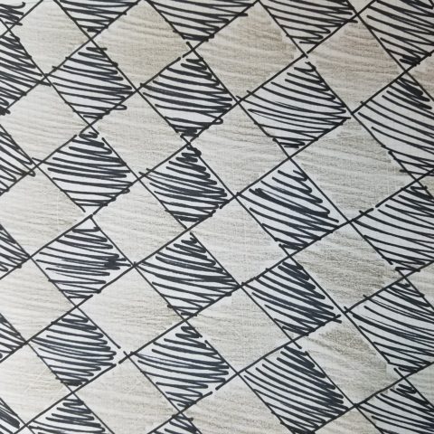
So the idea occurred on-site as I sketched a pattern that I thought would be the perfect statement and backdrop for all else in the house.


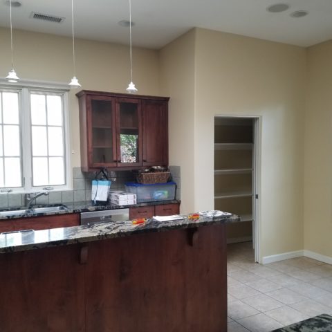
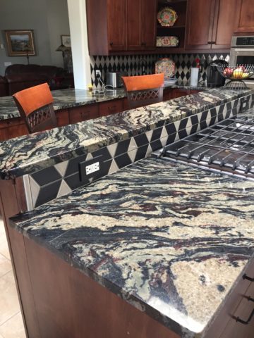
The kitchen had some expensive elements that were not practical to change. Existing cabinets, natural stone counter-tops and ceramic tile flooring all had to stay.


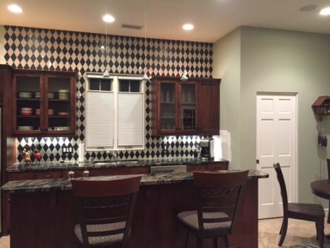
The original sketch realized in an nearly black, charcoal and cream tile pattern with an added opportunity for the client to turn an error into artistic expression.

Well this client asked and made a creative discovery: “George (young-adult son) Juan (tile installer) and I had a lot of fun figuring out…the tile work behind the stove…That was supposed to be solid black..didn’t even get ordered…and George worked with the left over pieces and designed that (solution) himself!!!! I think it’s amazing and will always be so special bc of how it came to be!!”

“Basically, what happened was we ran out of the tan colored tile and only had some smaller-than-half pieces left from the cuts.” Resulting in George’s creative solution!!

Personal experience with years of working with a variety of people has shown the extraordinary difference in how each individual perceives and proceeds through the design process and related creativity. For some, the design process is an exciting adventure to be navigated with or without the aid of an exhibition leader (professional designer) to explore and travel the amazing paths of color, balance, detail, elements and combinations. For others it is not only not an exciting adventure, but one of frustration, anxiety and sheer obligation to complete a necessary task(s). Like a project with a deadline – finite and compulsory. Where’s the joy?

To design for others is the name of the game – the professional practice. In order to effectively design for others, one must have empathy. To extract a client’s wishes and create for the express purpose of making them look good, feel good, enjoy their environment, produce well and feel empowered all requires getting into their world. When you effectively do so with the genuine desire to make better, you empathize with their concerns, desires, sensitivities, and needs in order to design effective solutions.

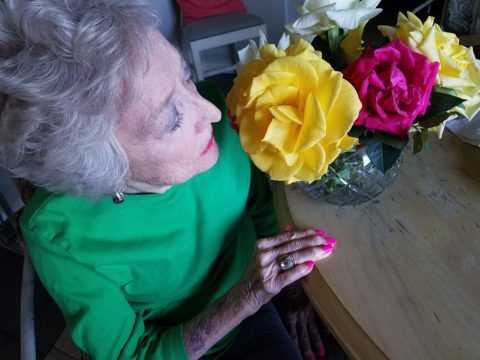
How the brain perceives things and how sensitivities are realized, by different individuals, is remarkable. From our amazing, autistic grandson who finds wonder in very focused things from red cars to distinct shapes and colors, words and pictorial representations of them, to my dementia-challenged nonagenarian mother who clings to her very core appreciation for beauty and everything well designed; perceptions, sensitivities and levels of awareness continually astound.

Elsie de Wolfe a Renaissance woman of broad reaching creative ability said “I am going to make everything around me beautiful – that will be my life.” I wonder now if Mom knew of this amazing woman and heard this phrase that so reminds me of her, but sadly she would not be able to grasp or convey any possible recollection of that now.

I place an enormous emphasis on what I call, “Wonder Time.” Everyone needs time to “wonder.” We should all take more time to WONDER. It is in those moments that amazing things can happen. Realizations can be illuminated, ideas are formed and dreams materialize. It is a time for creativity. Do you take time to “wonder?”

For my once-toddler cousin, I remember the moment so clearly. We were on a mission to get something from the car. It offered an opportunity to have an mini adventure and explore the parking area of our beach house. We had descended many stairs to come out at ground level into the dark, shadowed carport of the massive exposed-concrete structure. It was spooky and mysterious in the twilight. As we made our way holding hands through the shadows, she all of sudden said “I wonder…” and was clearly deep in thought pondering something of our adventure that I wish  I could remember. But her phrase, “I wonder” is clear as a bell, to this day, more than 30 years later. I looked at her and asked “You what?” Wonder was such  an abstract word – a BIG word for such a little person – that it made me wonder what she knew about wondering!!!!! We dashed back upstairs and I announced to the gathered group – “She wonders!!” And began to explain our experiences in the depths  of the concrete carport. The blooming result, of that toddler full of wonderment, is today a highly observant and creative young adult.

Being inquisitive is part of that creative process – the “what if” of it all. I use that often in my design practice…”what if”…and “if, then.” It is not finite, it is a process that presents itself and a variety of tangents continuously.  Designer Todd Oldham observes that creative people are different and if you are not one, you will not understand the need to be creative. He knows that “as a creative person, you can actually survive off of your ideas.”

I agree. For some, creativity is a necessary aspect of being. It is a way of seeing. It is unavoidable and random. It is essential. It is life affirming and life giving. You either are one of the “creatives” or you are not. Yet creativity exists in each of us. It is not learned, but it can be honed.

The sensitivity that comes with this profoundly innate sense is sometimes an onerous burden. Being pleased by design details around you from nature to the built environment, from fashion to well-designed freeway overpasses, details matter and a great joy is the benefit. However, details can have the adverse affect, if not well executed. If they are not well placed or well designed details, they can grate and annoy, raise blood pressure and cause all manner of anxiety. It is an onus to be so sensitive to details. Poor lighting in a restaurant, imbalance of surface textures, ineffective or inappropriate colors  – it is all about that phrase “Beauty is in the eye of the beholder” and if the sensitive person is presented with jarring elements that they behold or consider to be in error, it can be most unavoidably disturbing.

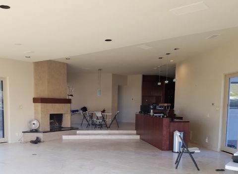
The placement of this fireplace an bar so grated on my sensitivities that it was amazingly uncomfortable being in this space. A challenge for correcting without structural modification for sure!

Like creative writers and their critics, who have often expressed their strength in the power of words…for designers and artists of many media, it is the power of color, lighting, pattern, and composition.

Good design is never out of style.

Quilting – An At-Home Workroom of Color!

It’s not your grandmother’s quilting these days…computers have radically altered the landscape of this generations old art form.  Two days ago I found myself in an in-home art-studio/workroom that blew me away!
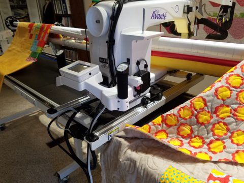
Initially a craft born out of necessity, as creative survivors accustomed to “making something out of nothing” re-purposed scraps of material to patchwork new articles of clothing, homegoods and ultimately art for the walls. This clever, resourceful, utilization was celebrated in Dolly Parton’s song turned movie, about her true-life “Coat of Many Colors.” https://en.wikipedia.org/wiki/Dolly_Parton%27s_Coat_of_Many_Colors

The intricate designs and refinement of pattern details was obviously all done by hand, but with the development of machines and now computers for this purpose, the possibilities are endless.

So as I turned the corner, to see a would-be remodel of combining two bedrooms and expanding to the north of the existing shell, I was astonished to see this remarkable, expansive workroom – all white – punctuated with colorful creativity. Colors, textures, patterns…this extraordinary, rather Renaissance, woman had carved out a generous space to explore this phenomenal art and craft.

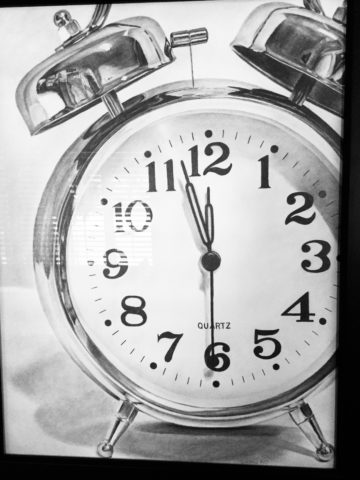
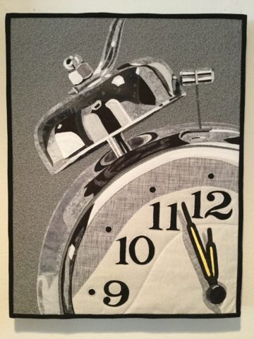
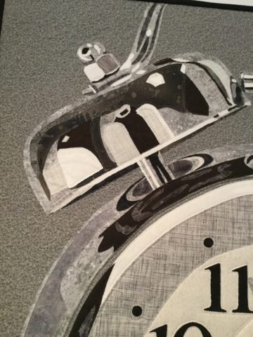
As an artist, Sue Watrous’ paintings and sketches are quite photo-real. On a few of her pieces, she has deconstructed the elements in the painting cutting them from fabric of many grey-tones defying the fact that they are textile assemblages.

This original pencil drawing – yes, photo-realistic, is amazing.

Then to create the same image as a patchwork quilt is remarkable!!

Yes, look closely, you can see the patches of fabric that are assembled in the many grey tones to create this amazing piece.

Her joie de vivre is derived from this magical space and the creations that she imagines and brings to fruition.

Upon entering her amazing domain, I felt as though I was entering an operating room – everything in perfect order, clean and spare – like a clean-room at Intel – I should gown-out or suit-up!!!

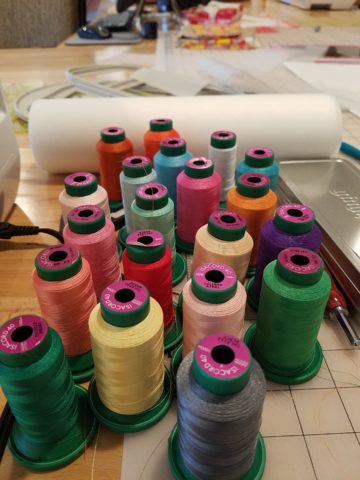
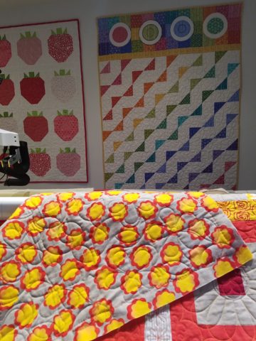
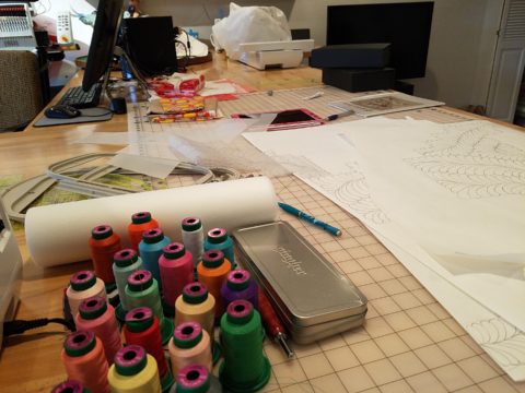
I might be exaggerating because it was white and clean, but warm and welcoming with the rainbow spectrum of thread spools and quilts both finished and in progress displayed on the walls and on the other many surfaces.

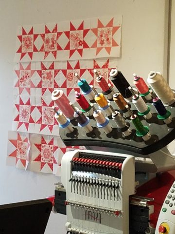
Self-taught, she nonchalantly references the many computerized machines strategically placed around the  room. There is an order to the layout and her approach is meticulous. Despite the fact that there is an active quilting community here – they are too busy quilting to teach – so Sue jumped into this after having seen a presentation at a show about five years ago. Years ago she quilted – but at this juncture, she knew at once that she wanted to enter this exciting and challenging realm, of computerized art assist!

Like the shoemaker who has no shoes, her quilts have yet to adorn the walls or bed dressings throughout the rest of her home. She doesn’t sell her work – but her family all has homes riddled with choice pieces.

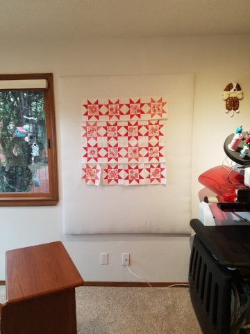
Her paintings are placed amidst her interior, but not her quilts. Today I focused on a large wall to be the future home of a near-to-be- completed quilt.

She tells me that the fabrics are like paints – she is painting with fabric.


And although she is not yet dying her own pieces, she told me of meeting a textile artist who spun her own thread from her own llamas, dyed it, designed and fabricated her own work.  Sue has created most if not all of her patterns and designs and I am confident that before this is over, she will be donning rubber gloves and dunking material in dye vats to find a new layer of creativity.


Ten Tips on Mixing Metals – Making Sense of It All

How to mix and not mix metals….that is the question. Is it nobler to stick with one throughout or might I venture into a mix of metallic material? From switch plates to chandeliers, this question comes up all the time – and it’s fair. With all the options and the TRENDS saying one thing or another (probably to sell you something or to stand with a current trend fearful of venturing forth), it is a common dilemma. Here are a few tips to give you confidence in the  metal mixing mêlée.

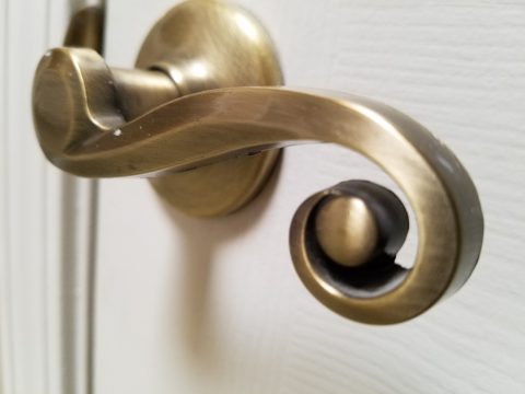
  1. IF the door hinges are one thing – the handles should match. We often see pre-hung doors with brass hinges and a retro-fit of brush chrome or bronze – that is a no-no. 
  2. Is brass finish out – should I change all my hinges and door handles? In – out…no sooner does one hear that a finish is passé or they think they themselves are stuck with a less than new and trendy finish – be calm and carry on – to quote a couple of “trendy” phrases that drive me up a wall – it’s all good.
  3. If you have brass – embrace it! Fear not – it is all about the manner in which you present it – in what context you design with it. Following trends can be costly, unnecessary and unimaginative. Gold/brass finishes have been making a come-back in recent years. Sometimes it takes time for it to trickle into your purview. But the point is – good design is good design. So it’s not so much about if it is perceived to be good enough or right or wrong…it is if you can design around it and make it great. 
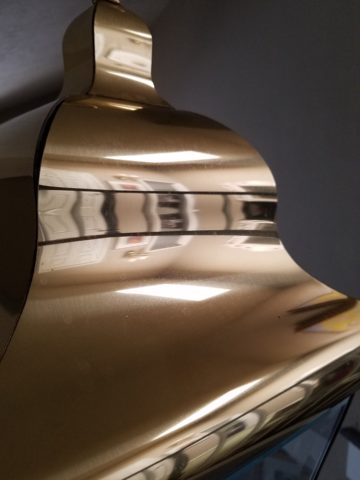
  4. Should you mix a bright brass chandelier with brushed stainless door hardware? Probably not, but it is not so much about the mixing – it is that to make something like that REALLY work, the overall design would have to be so intentionally mixed that it in itself (the intentional mixing) is an art-form. 
  5. If a kitchen has brushed chrome detailing (appliance trim, faucet, etc…), may I use brass cabinet pulls?  The answer is YES. In some contextual situations, the language of the materials speaks in vernaculars that separate certain groups from others as though allowed to be intentionally different – as they ARE different. The great thing about knowing when to make statements in contrast – not conflict, is just that – knowing.
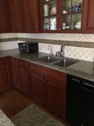
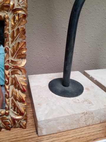
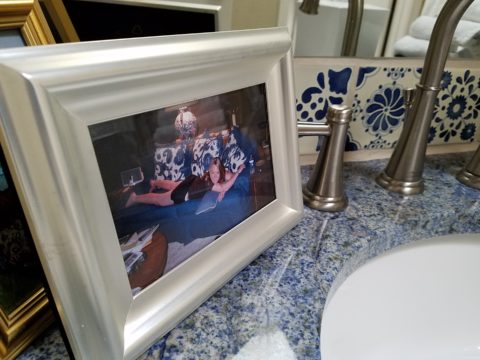
  6. The old world and contrasting contemporary look of Bronze, the stalwart wrought iron read of Black, the bling of Polished Chrome, the modern softening of the silver with Brushed Chrome or Stainless, the traditions and suggested opulence of Brass and Gold, the warm median balance of brushed nickel – guess what? They all have their place depending upon the context of design. 
  7. New finishes for appliances rule the kitchen. We thought we had it made when Sub Zero and others offered slots for panels for the fronts of appliances to enable matching of the flanking cabinets. But for those who wanted off-the-shelf units, beyond the merry-go-round colors from harvest gold to avocado green, burnt orange to basic white – the colors of the past were challenged by bold black and brushed stainless finishes – the new fab. But now we are seeing matte black – and oh is that hot! Complimenting the concrete finishes and raw steel – contrasting with the brushed stainless – punctuating the trend of the clean commercial kitchen style of design. It is a bold yet soft new option for the edgy everyday kitchen.                                    http://www.foodandwine.com/cooking-techniques/look-these-beautiful-matte-black-major-appliances-refrigerator-ranges-ovens-and
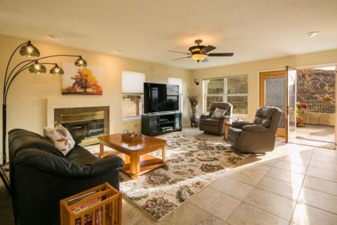
  8. Ceiling fans present the same conundrum. Do they match the ceiling and go away? Do they hang suspended like a giant menacing propeller threatening to decapitate anyone who comes near? A black fan against a white ceiling might. A bronze fan in the middle of everything might appear a bit top-heavy. Ceiling height makes a difference. Surrounding decor makes a huge difference. Whether it is to be noticed or quietly disrupt the air for refreshing breezes without screaming their source – those are compelling questions. I cannot even address whether it should match the door handles – it makes me crazy. Unless it is an intentional focal point – like palm-frond paddles in a tropical bar – or industrial mechanisms intended to further that contextual theme, I think nearly all of them should visually go away.  Who wants the focal point of a room to be a fan centered and suspended from the ceiling to hover overhead and command the visual impact of a nose-diving airplane? Unless of course – that is the theme.  The fan designers would argue.

    Oh my – brass, chrome, bronze…where is the focal point? My eyes are darting everywhere!

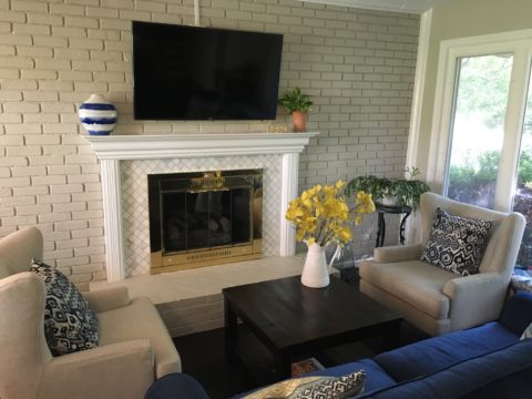
  9. Fireplace grills…often found in polished brass – they can stay or be painted out – with a flat black that makes them fade into the void of the opening or simulate a cast-iron grate. They can be painted with a faux-rust finish – there are many possibilities – maybe even fire-engine red. The point is, once again, it is the context that makes it successful or appropriate – there is really no right or wrong answer here. 
  10. Tip # 10 is to take each offered finish as it comes, evaluate the context, find your focal point(s), what is the most cost-effective to change? All the door handles and hinges or the light fixture over the dining table? I say it in so many blogs…do not let trends rule your life. Have confidence in your own likes and comfort and go with it – good design never goes out of style. 
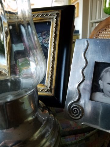
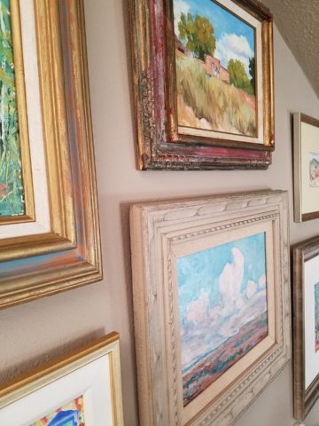
  11. BONUS TIP!! Do all my picture frames have to be the same finish? Do I have to re-frame my gold frames or change my maple to chrome or go black on all of them?  Have I ever mentioned context? Eclectic mixes can be quite fun and interesting.  Groupings of identical moldings can be effective.    Random pieces scattered throughout can each be singularly nice. So don’t rush out and re-frame all your art. See how you intend to use it, group it, where and with what else. Be sensible and creative – be brave and do what you like! That makes sense!!!!!
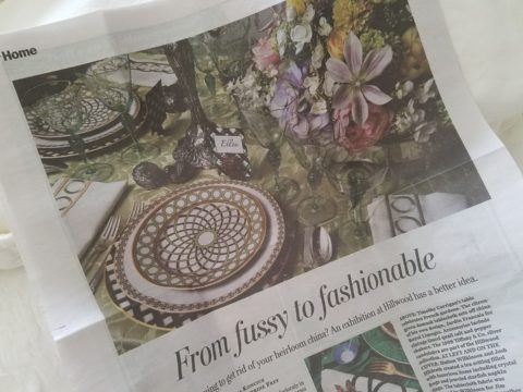
 

For the LOVE of Fine China – USE IT – Inspired Table Settings

From the Diminishing Dining Room of last week’s observations, https://patriciandesign.com/category/dining-rooms/, I decided to further the conversation to encourage a new-found appreciation for having fun setting dinner tables!  I found fodder from Kentucky Fried Chicken served on formal silver platters to wipe-clean placements of dazzling designs to dress your tables.  A collection of tireless designers defend the use of fine china – own it, buy it, find it, inherit it, enjoy it, keep it and use it – don’t send it to the thrift shop!!!

Yes, the art of fine dining seems to be set aside in favor of ease and expediency, but this article from The Washington Post’s HOME section (thank you Feath – my clipping service) brings it all home to use and enjoy.  It is a celebration of art, design and playful creativity.

Not everyone loves to entertain, to create the “tablescape,” to even bother to put together an outfit to wear. Not everyone loves to get dressed in the morning – it is a chore, an obligation, a mere necessity. That’s unfortunate in my estimation. For those of us who do – love it – it is all about having fun with fashion or interior design is just that – FUN!

Last spring I began a series  of emails that I blasted to our mailing list called COOK + PARTY. It was (and will continue this next season) a collection of weekly recipes paired with table-top art pieces. In our gift boutique, we represent an incredible collection of artists who create fabulous tableware.  I paired a piece with a recipe each week to inspire and encourage everyone to use “functional” art in their daily lives and specifically for entertaining and even the family dining table.

https://patriciandesign.com/category/art-and-food/

Recent fodder revealed a great source for fabulous wipe-clean placemats from Caspari.  For decades a fine source for the best paper cocktail napkins, Caspari offers these bold patterns and colors, prints of fine china and fabulous fabrics – re-use and easy to clean – why not?

https://www.casparionline.com/catalogsearch/result/?q=placemat

A previous fall blog that I wrote illustrates the open-mindedness of looking around to find inspiration for seasonal table dressings.  The decision for your table-top inspiration can be spontaneous – just go outside and look around!


Among the refreshingly optimistic designers that were quoted in the Washington Post article:

https://www.washingtonpost.com/lifestyle/home/that-old-fussy-china-can-fit-your-casual-lifestyle-designers-talk-about-how/2018/02/21/46761538-0084-11e8-8acf-ad2991367d9d_story.html?utm_term=.3a6fde2e5124

Barry Dixon, from the verdant rolling hills of Warrenton, Virginia, specifically points out that this process of setting your table should be fun!  Don’t pull-out the same things each time – mix it up! Change it up by adding color and pattern differently with every new opportunity.

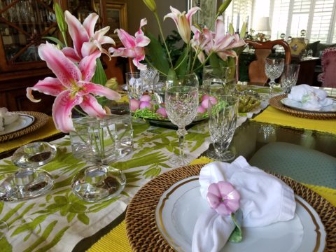
Seasonal flowers, yellow woven cotton place-mats, embroidered folk-art table runner, basket chargers beneath classic Limoges topped with ceramic napkin rings – it looks like spring!

Designer Timothy Corrigan tells us that many people find it too difficult to entertain with their best things because the onus of proper cleaning and put-away is too much! But Mr. Corrrigan points out the joy of using your best things every day – everyday is a celebration and what you enjoy should be used.

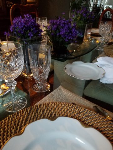
In another springtime setting…organic, rustic things with finery – black stones nestle fresh purple Campatula flowers antique Limoges and basket chargers –  makes an eclectic table settings – it’snot all or nothing…it’s the combinations and scene that is being set.

Hutton Wilkinson – way out in L.A. where casual chic is the practice of distilling what migrated from the more formal sister coast to the east – noted that he believes presentation is the key to success. It isn’t so much about what is served (don’t tell the chefs that), but rather on what it is served and how it is presented.  Imagine buckets of Kentucky Fried chicken served on elegant Georgian silver platters. That simple fast-food chicken becomes  magnificently irresistible. You can’t say you’re too busy to cook with that creative solution! Wilkinson believes that presentation helps food taste better in addition to looking beautiful! He advocates buying china because it’s beautiful – not merely serviceable. I agree…it’s not all about the mundane purpose of eating off of it – but rather the joy of eating off of it!!

Making your guests feel appreciated and treating them to a unique, pleasing experience is a gift to them.  A special treat to show that you care –  going that extra distance of detail and design.

Color combinations, textures,patterns – wonderfully pleasing tablescapes are a treat for the eye. (So special Marsha!)

So don’t say it’s too difficult…keep it simple with Real Simple – the source for easy, ingenious ideas and simple truths……the following link for proper place-settings will get you started.

https://www.realsimple.com/holidays-entertaining/entertaining/how-to-set-a-table

Patti says – “make it special every day.”

Diminishing Dining Rooms – How Do We Dine at Home?

Changes in social interactions, style of entertaining, cost of real estate and family dynamics all contribute to what we are seeing as the diminishing dining room. Yes, there are circles who still maintain and use formal dining rooms in their social repertoire.

Elegant entertaining, grand social gatherings and family traditions still support the validity of the formal dining room. However, the fact remains that the concept is changing.


It’s easy to digress from the focus on design and delve into the demise of the family dinner hour. that time when families truly gathered to share, enjoy, report, critique, discuss, plan…more and more fragmented we are losing what was a very galvanizing core of child development and character-building. But I digress…

Take the bachelor who would rather have his pool table than a dining table…moving it into the house first and making that statement clear.


Entertaining has become more casual, more spontaneous and geared to an open-plan of kitchen conversations, bars and movable group conversations. The act of gathering around a formal dining table after the customary cocktail hour is now more free-form.

Placed directly off the kitchen and connected to the family room – the open plan flows…

The cost of real estate certainly plays a part in the diminishing dining room. Space is limited and therefore consolidating the dining area to one rather than a separate breakfast space and formal dining room utilizes space to greater advantage. Having an unused dining room occupy so much square footage is wasteful.

Family dynamics dictate that with the busy schedules and conflicting schedules, the seeming luxury of a formal dinner-hour have changed. Whether in the breakfast dining space or formal (if there is one), the act of sitting together for a nightly ritual of dining is less being practiced.

Here, this dining area is in the den off the kitchen…a better use of the space by this family’s estimation.

As I was writing this, I stopped and thought of the dining room scene from Meet the Parents and I cracked up reliving the events and they unfolded one ridiculous thing after another…and then I Googled famous dining room scenes to find other examples – because I was amused and curious…I found several memorable examples like the Griswold’s Christmas, Eat, Drink, Man, Woman, Tortilla Soup – oh and Tom Jones with Albert Finney – a classic!!! So many other wonderful scenes – but one day will it all be history? Mere memories of days gone by?

So today the open plans expanding the interaction between kitchen and dining – family rooms melding from the kitchen bar…the concept and lifestyles that dictate the practicality and ultimately the design directions are becoming redefined. And we also see the expansion of outdoor living – additional dining opportunities are ever blossoming on patios…


The exhibition kitchen concept that has driven restaurants for years made it into homes for the same reason – communing with the action and participants, connecting with the preparation experience and even sharing the preparation experience – dinner guests as well as family members often share the food prep as a form of socializing and entertainment.

The limiting idea that encapsulated the kitchen away from the activities surrounding it was in many cases to be dismantled. The disruption of encircling and kitchen, unveiling it and even incorporating it with the dining experience has become more the norm.

Still playing with colors…this wonderful dining room begins to take shape as an adjunct to the kitchen.

The kitchen is the fulcrum of family life. The dining room is not separate from it anymore. The dining space is part of the preparation space or very close to it. A kitchen island with bar stools are often the most popular perch in a home – for family and guests alike.


So this provokes thought about new home design, remodeling and re-purposing space, re-thinking how to best claim family time and related activities and designing around those practical considerations and needs.

What Do Fabulous Fabrics Have in Common?

Fabulous fabrics are NOT common – that’s what they have in common!!  After paint, fabrics are the most  malleable design element that can make dramatic transformations in an interior.  New pieces, reupholstering existing pieces, treasure-hunting to cover vintage pieces, salvaging family heirlooms, plastering or padding walls and ceilings, draping and accenting – doesn’t it sound exhilarating? Imagine the  possibilities!

Metal studs to trim things…wrap a lampshade, border draperies, trim a sofa, adorn a pillow…so many things…and the stormy cloud printed velvet in the background of this trim – is blustery and powerful.

One of the most fun-filled events in our design studio are the road-trip visits by our fabulous sales reps that bring the world to our conference table!!  In larger cities, the design resource centers, markets and their showrooms offer myriad marvelous samples of furniture, decorative accessories, art, lighting, fixtures, finishes and fabrics.  Exciting new design trends are presented each season.

But when you live, in isolation from the major centers, as we do here in the high desert – we are treated to personal presentations that are intimate, relaxing, inspiring and educational. Here is an exclusive collection that was presented just last week. Sit back and watch the fabrics unfurl and float – one after another – in layers of color, texture and incredibly inspirational style.

Weighty over-stitching or “top-stitching” adds detail-either high-contrast, color-on-color subtlety or the median slightly contrasting grey with white. Trending – touchable textures! Here presented for interior fashion, but you can bet that clothing fashion designers would love to play with these textiles for wearable art too!!!

Sure, throughout the year we travel  to source hubs, surf the net, call our reps, request samples, compile materials and gather what we need across the miles. It is challenging.  Like living on an island and bringing the amphibious containers of supplies over the sea and up onto the beach! But inasmuch as we don’t have a design center handy to do a lot of “one-stop-shopping,” we do curate our own very extensive source library of fabrics and architectural materials. With that at our fingertips, without leaving the studio, it’s a time-saver, a stimulating place to to engage clients and we are easily spoiled!

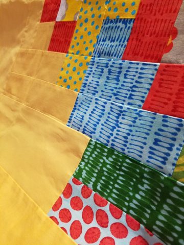
Fine weaves make terrific grounds for bold prints – here in three different color-ways – what a POP! Retro to new concepts – patterns add pizzazz!!

This recent textile presentation brought refined and rugged landscapes of intriguing textures and patterns that  stimulated our design juices.

Intentionally cut after the weaving process provides extra texture and pattern interest.


Often the “backside” of these fabrics are as interesting (if not more so) than the fronts – but be mindful of floating threads and other weaving details/methods that interfere with practical use.

Bold “geometrics” are not only vivid with high contrast threads, the texture is what cannot be accurately replicated or conveyed via digital images on a  screen. Despite the fact that I got up close and personal with these samples to photo, nothing beats touching and feeling the fibers and textures.

Complex weaves dazzle with design creativity. Bringing an artist’s concepts to fruition, with a mill to fabricate the dreams, is enchanting.

Traditions of weaving artisans are found in countries around the world. Sadly,  not many fine fabrics are woven here in the States, partially due to the cost of fabrication and also due to the generations of crafts people who are experienced in the art of weaving more cultivated in other cultures. Whether organic, engineered, by hand or efficient, fast-paced mechanization – art and technology continue to push the envelope of fantastic creation and production in the fabric industry.

Here’s a great tip – if for only a pillow cover – if only ONE side of a pillow cover, having unique fabrics is having art. Living with functional art. Appreciating the designs, textures, craftsmanship and unique qualities of fine fabrics and wall-coverings is most satisfying.

Paints hand applied to the surface of fine woven fabrics is gilding the lily.

Who doesn’t love these colorfully, whimsical dot halves hand-applied to the surface of this nubby neutral??!!

Silk-screening also is an art-form that enhances the quality and appreciation of fine fabrics and papers.

Some of this collection are vintage art-pieces resurrected with new colors on the screen prints.  The caliber of a fine, timeless, resource is about quality of both design and construction. A collection that continuously offers – classic and new, bold and subtle – answers to so many opportunities, is a resource that is to be celebrated!!

We investigate the most extraordinary fabrics, in the world, so that we can compile and create the perfect combinations for your exclusive lifestyle.

What’s Trending? Do YOU Need An Interior Designer?

As we move forward into this new year…the story is the same – only some details have changed or been added to past stories. By that I mean if you search for trends – they are ALWAYS all over the place.

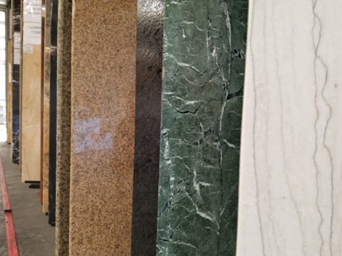
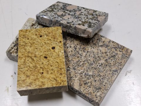
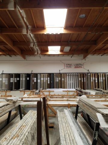
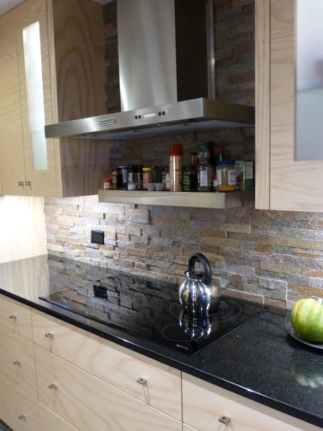
We do find years when really new ideas take the stage – like when the shift from plastic laminate to stone slab counter-tops became a valid trend.  It was a trend brought about by improved technology, shipping,  cost and ultimately availability. After that, the engineered surfaces that grew from this trend broadening the offerings – explored color, texture and pattern and continue to introduce new options.

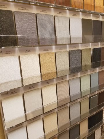
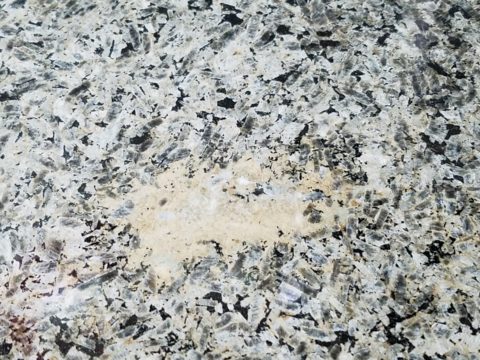
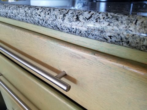
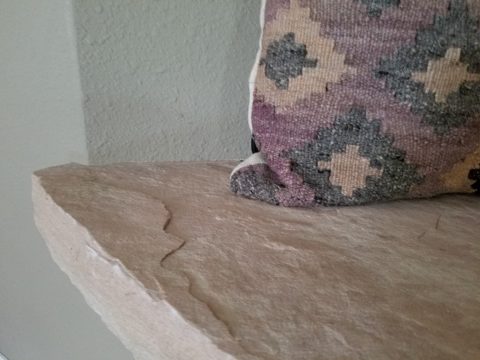
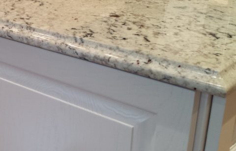
Myriad surface materials mimic natural stone – when is it preferable over natural stone?


Engineered stone products offer many bold, solid colors from pure white to amazing primary colors.

So right now bold color accents are in,  wall covering that made a come-back a couple of years ago is sticking for the time being and with newer bolder prints. Fabrics too – prints are bold and large scale!

Wood on walls is trending. Printed concrete tile is the big thing. Farmhouse sinks – in different finishes than customary stainless or white.  Vintage light fixtures – enhanced with new technology and lamping.

So, does that mean I can’t have a white sink or shouldn’t have a stainless one?  I should use printed concrete tiles in my kitchen or bathroom? If my home lacks a bold print wall covering am I missing something? If  I’m not sporting some raw concrete, am I out of style? Is the wall full of family photos in my bedroom passé?

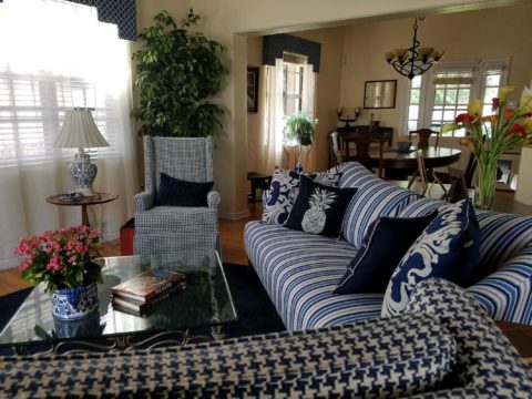
Surrounding by existing vintage pieces and family heirlooms, the new living room pieces added some contrasting, contemporary lines with clean, crisp, classic, blue and white fabric patterns.

Oh, the pressure to get it right!!!! Oh so many choices – how do I decide? Do I have to start over? I want to be in style – but I don’t know what that even means between today and 6 months from now. I like neutrals – am I dating myself?

Neutral fabrics in a variety of textures and subtle patterns on a recently re-upholstered sofa.

Be calm and carry on…that’s why interior designers exist!!  Sorting through all the conflicting, changing information and choices can be exhausting! Just get on Pinterest and look for any subject about an interior – window treatments, living rooms, bedrooms, wall treatments, flooring…with each year, the choices expand. The permutations seem endless. HOW does one ever decide?

Mark my word, we will be flooded with interiors plastered with printed concrete tiles, faux printed concrete tiles, filament light bulbs and jarring color contrasts, in the coming months and perhaps even years…These trends have already made their mark. But it will be the creative manner, in which the various printed concrete tiles are used and when the vintage style of filament fixtures is appropriate and effective. What colors are used (where, how and with what) is what will set a few exceptional installations apart from myriad uninspired, if not confused, versions.

An effective interior designer knows what is trendy versus a trend designed and positioned for lasting impact. This is a major part of the equation. Existing conditions with regard to architectural style, existing furnishings, personal preferences, budget, priorities, all play roles in the design process.

A young teen’s bedroom was recently redesigned to reflect her developing tastes and preferences. Bold color and a variety of geometrics and patterns make a bold, fresh statement.

You don’t want to be coerced into making changes just because new style suggestions are being presented. Trends DON’T RULE – despite the fact that the design community wants you to think they do, in order to continually change things up! Don’t be a victim of too many directives regarding what is in style. It’s intimidating and mostly due to access. We have access to so many opinions, on-line sites, magazines and advertisements that the pressure, conflicting information and choices can be ridiculous.

It’s YOUR interior, your style, your comfort and functionality. Yes, it’s all about YOU and yours.

Do YOU need an interior designer?