Ten Tips on Mixing Metals – Making Sense of It All

How to mix and not mix metals….that is the question. Is it nobler to stick with one throughout or might I venture into a mix of metallic material? From switch plates to chandeliers, this question comes up all the time – and it’s fair. With all the options and the TRENDS saying one thing or another (probably to sell you something or to stand with a current trend fearful of venturing forth), it is a common dilemma. Here are a few tips to give you confidence in the  metal mixing mêlée.

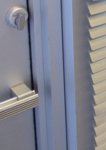
  1. IF the door hinges are one thing – the handles should match. We often see pre-hung doors with brass hinges and a retro-fit of brush chrome or bronze – that is a no-no. 
  2. Is brass finish out – should I change all my hinges and door handles? In – out…no sooner does one hear that a finish is passé or they think they themselves are stuck with a less than new and trendy finish – be calm and carry on – to quote a couple of “trendy” phrases that drive me up a wall – it’s all good.
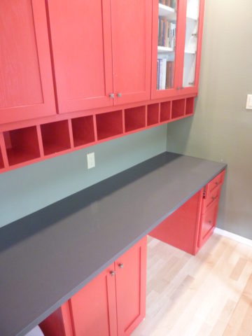
  3. If you have brass – embrace it! Fear not – it is all about the manner in which you present it – in what context you design with it. Following trends can be costly, unnecessary and unimaginative. Gold/brass finishes have been making a come-back in recent years. Sometimes it takes time for it to trickle into your purview. But the point is – good design is good design. So it’s not so much about if it is perceived to be good enough or right or wrong…it is if you can design around it and make it great. 
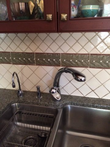
  4. Should you mix a bright brass chandelier with brushed stainless door hardware? Probably not, but it is not so much about the mixing – it is that to make something like that REALLY work, the overall design would have to be so intentionally mixed that it in itself (the intentional mixing) is an art-form. 
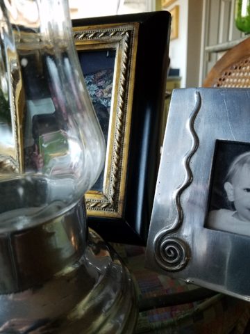
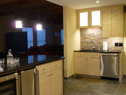
  5. If a kitchen has brushed chrome detailing (appliance trim, faucet, etc…), may I use brass cabinet pulls?  The answer is YES. In some contextual situations, the language of the materials speaks in vernaculars that separate certain groups from others as though allowed to be intentionally different – as they ARE different. 
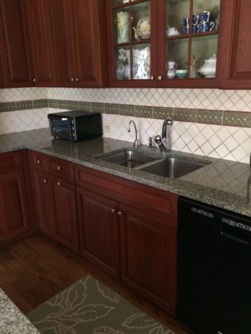
The great thing about knowing when to make statements in contrast – not conflict, is just that – knowing.
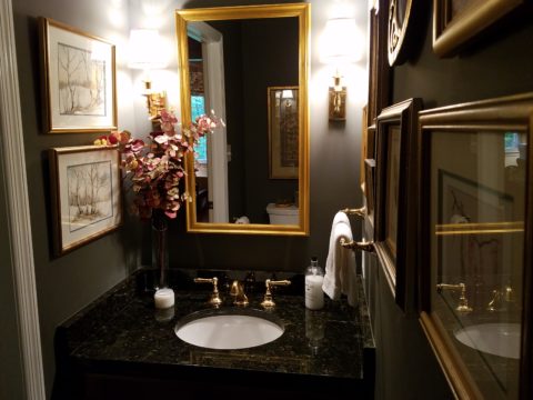
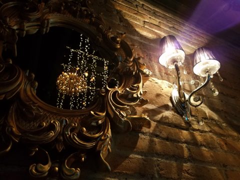
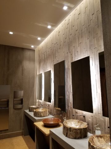
  6. The old world and contrasting contemporary look of Bronze, the stalwart wrought iron read of Black, the bling of Polished Chrome, the modern softening of the silver with Brushed Chrome or Stainless, the traditions and suggested opulence of Brass and Gold, the warm median balance of brushed nickel – guess what? They all have their place depending upon the context of design. 
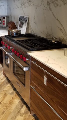
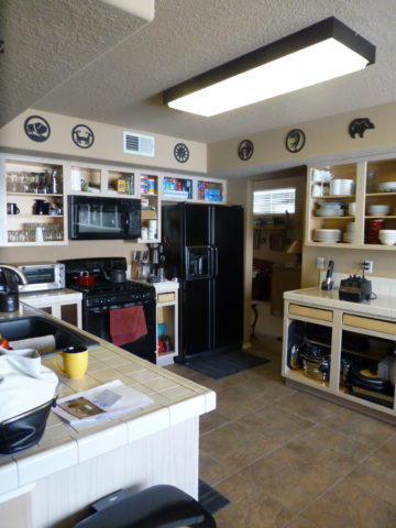
  7. New finishes for appliances rule the kitchen. We thought we had it made when Sub Zero and others offered slots for panels for the fronts of appliances to enable matching of the flanking cabinets. But for those who wanted off-the-shelf units, beyond the merry-go-round colors from harvest gold to avocado green, burnt orange to basic white – the colors of the past were challenged by bold black and brushed stainless finishes – the new fab. But now we are seeing matte black – and oh is that hot! Complimenting the concrete finishes and raw steel – contrasting with the brushed stainless – punctuating the trend of the clean commercial kitchen style of design. It is a bold yet soft new option for the edgy everyday kitchen.                                    http://www.foodandwine.com/cooking-techniques/look-these-beautiful-matte-black-major-appliances-refrigerator-ranges-ovens-and
  8. Ceiling fans present the same conundrum. Do they match the ceiling and go away? Do they hang suspended like a giant menacing propeller threatening to decapitate anyone who comes near? A black fan against a white ceiling might. A bronze fan in the middle of everything might appear a bit top-heavy. Ceiling height makes a difference. Surrounding decor makes a huge difference. Whether it is to be noticed or quietly disrupt the air for refreshing breezes without screaming their source – those are compelling questions. I cannot even address whether it should match the door handles – it makes me crazy. Unless it is an intentional focal point – like palm-frond paddles in a tropical bar – or industrial mechanisms intended to further that contextual theme, I think nearly all of them should visually go away.  Who wants the focal point of a room to be a fan centered and suspended from the ceiling to hover overhead and command the visual impact of a nose-diving airplane? Unless of course – that is the theme.  The fan designers would argue.

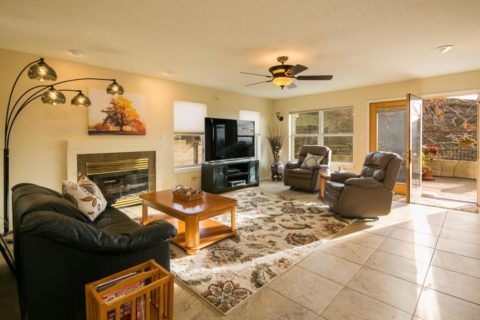
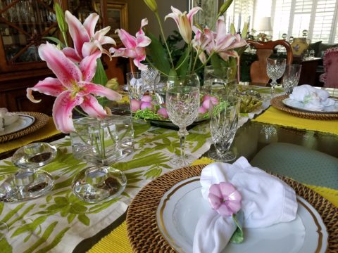
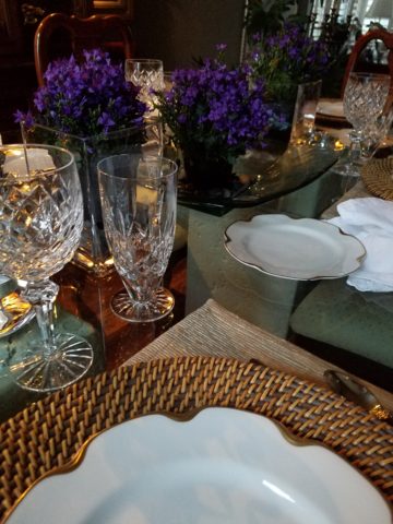
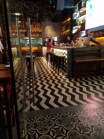
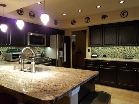
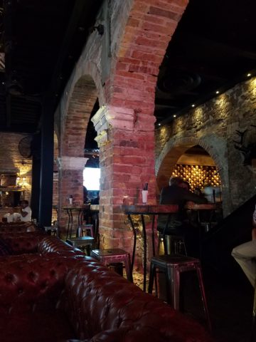
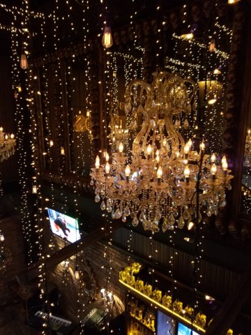
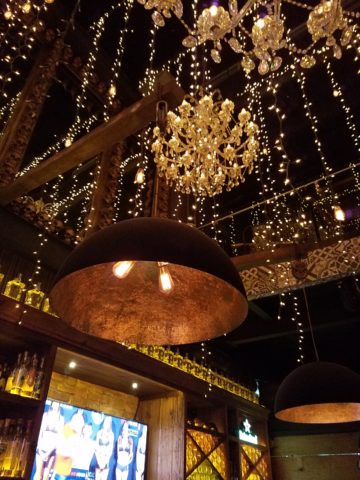
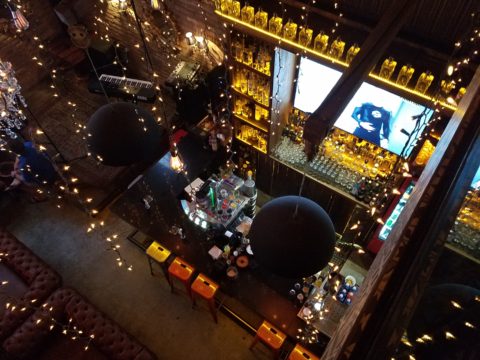
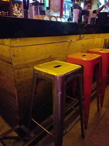
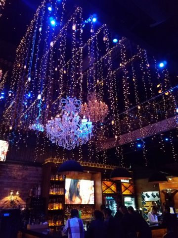
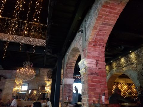
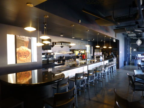
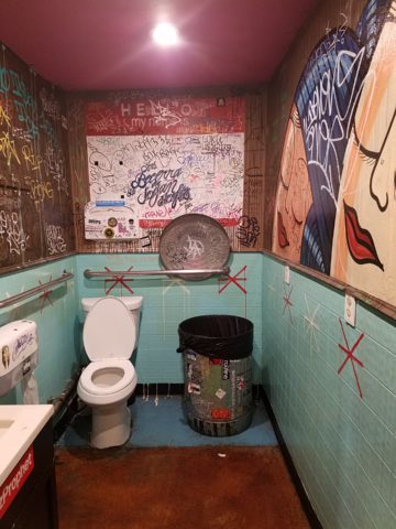
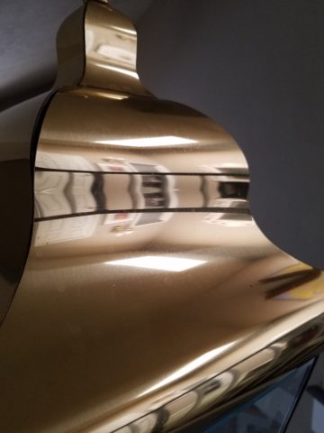
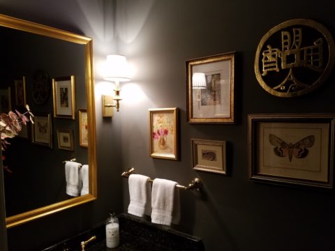
    Oh my – brass, chrome, bronze…where is the focal point? My eyes are darting everywhere!

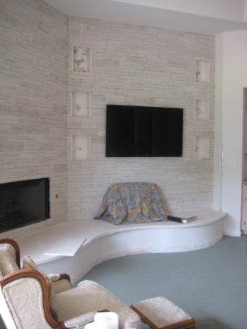
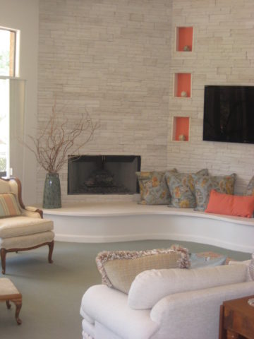
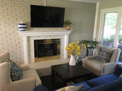
  9. Fireplace grills…often found in polished brass – they can stay or be painted out – with a flat black that makes them fade into the void of the opening or simulate a cast-iron grate. They can be painted with a faux-rust finish – there are many possibilities – maybe even fire-engine red. The point is, once again, it is the context that makes it successful or appropriate – there is really no right or wrong answer here. 
  10. Tip # 10 is to take each offered finish as it comes, evaluate the context, find your focal point(s), what is the most cost-effective to change? All the door handles and hinges or the light fixture over the dining table? I say it in so many blogs…do not let trends rule your life. Have confidence in your own likes and comfort and go with it – good design never goes out of style. 
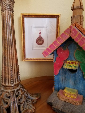
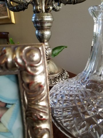
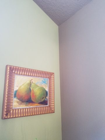
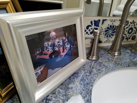
  11. BONUS TIP!! Do all my picture frames have to be the same finish? Do I have to re-frame my gold frames or change my maple to chrome or go black on all of them?  
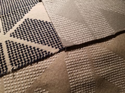
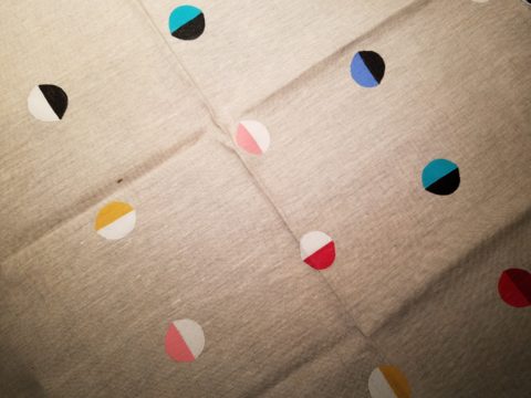
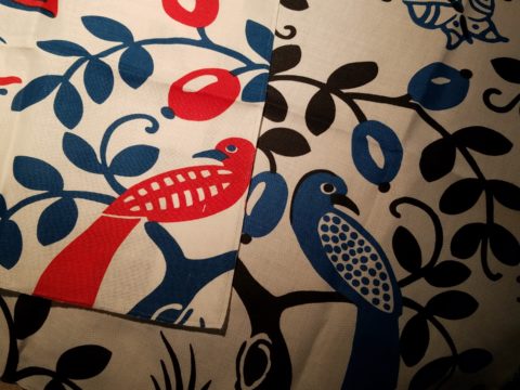
Have I ever mentioned context? Eclectic mixes can be quite fun and interesting.  
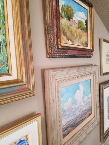
Groupings of identical moldings can be effective.    
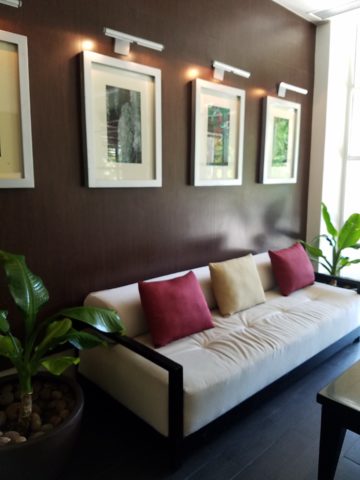
Random pieces scattered throughout can each be singularly nice. So don’t rush out and re-frame all your art. See how you intend to use it, group it, where and with what else. Be sensible and creative – be brave and do what you like! That makes sense!!!!!


For the LOVE of Fine China – USE IT – Inspired Table Settings

From the Diminishing Dining Room of last week’s observations, https://patriciandesign.com/category/dining-rooms/, I decided to further the conversation to encourage a new-found appreciation for having fun setting dinner tables!  I found fodder from Kentucky Fried Chicken served on formal silver platters to wipe-clean placements of dazzling designs to dress your tables.  A collection of tireless designers defend the use of fine china – own it, buy it, find it, inherit it, enjoy it, keep it and use it – don’t send it to the thrift shop!!!

Yes, the art of fine dining seems to be set aside in favor of ease and expediency, but this article from The Washington Post’s HOME section (thank you Feath – my clipping service) brings it all home to use and enjoy.  It is a celebration of art, design and playful creativity.

Not everyone loves to entertain, to create the “tablescape,” to even bother to put together an outfit to wear. Not everyone loves to get dressed in the morning – it is a chore, an obligation, a mere necessity. That’s unfortunate in my estimation. For those of us who do – love it – it is all about having fun with fashion or interior design is just that – FUN!

Last spring I began a series  of emails that I blasted to our mailing list called COOK + PARTY. It was (and will continue this next season) a collection of weekly recipes paired with table-top art pieces. In our gift boutique, we represent an incredible collection of artists who create fabulous tableware.  I paired a piece with a recipe each week to inspire and encourage everyone to use “functional” art in their daily lives and specifically for entertaining and even the family dining table.

https://patriciandesign.com/category/art-and-food/

Recent fodder revealed a great source for fabulous wipe-clean placemats from Caspari.  For decades a fine source for the best paper cocktail napkins, Caspari offers these bold patterns and colors, prints of fine china and fabulous fabrics – re-use and easy to clean – why not?

https://www.casparionline.com/catalogsearch/result/?q=placemat

A previous fall blog that I wrote illustrates the open-mindedness of looking around to find inspiration for seasonal table dressings.  The decision for your table-top inspiration can be spontaneous – just go outside and look around!


Among the refreshingly optimistic designers that were quoted in the Washington Post article:

https://www.washingtonpost.com/lifestyle/home/that-old-fussy-china-can-fit-your-casual-lifestyle-designers-talk-about-how/2018/02/21/46761538-0084-11e8-8acf-ad2991367d9d_story.html?utm_term=.3a6fde2e5124

Barry Dixon, from the verdant rolling hills of Warrenton, Virginia, specifically points out that this process of setting your table should be fun!  Don’t pull-out the same things each time – mix it up! Change it up by adding color and pattern differently with every new opportunity.

Seasonal flowers, yellow woven cotton place-mats, embroidered folk-art table runner, basket chargers beneath classic Limoges topped with ceramic napkin rings – it looks like spring!

Designer Timothy Corrigan tells us that many people find it too difficult to entertain with their best things because the onus of proper cleaning and put-away is too much! But Mr. Corrrigan points out the joy of using your best things every day – everyday is a celebration and what you enjoy should be used.

In another springtime setting…organic, rustic things with finery – black stones nestle fresh purple Campatula flowers antique Limoges and basket chargers –  makes an eclectic table settings – it’snot all or nothing…it’s the combinations and scene that is being set.

Hutton Wilkinson – way out in L.A. where casual chic is the practice of distilling what migrated from the more formal sister coast to the east – noted that he believes presentation is the key to success. It isn’t so much about what is served (don’t tell the chefs that), but rather on what it is served and how it is presented.  Imagine buckets of Kentucky Fried chicken served on elegant Georgian silver platters. That simple fast-food chicken becomes  magnificently irresistible. You can’t say you’re too busy to cook with that creative solution! Wilkinson believes that presentation helps food taste better in addition to looking beautiful! He advocates buying china because it’s beautiful – not merely serviceable. I agree…it’s not all about the mundane purpose of eating off of it – but rather the joy of eating off of it!!

Making your guests feel appreciated and treating them to a unique, pleasing experience is a gift to them.  A special treat to show that you care –  going that extra distance of detail and design.

Color combinations, textures,patterns – wonderfully pleasing tablescapes are a treat for the eye. (So special Marsha!)

So don’t say it’s too difficult…keep it simple with Real Simple – the source for easy, ingenious ideas and simple truths……the following link for proper place-settings will get you started.

https://www.realsimple.com/holidays-entertaining/entertaining/how-to-set-a-table

Patti says – “make it special every day.”

Friends Don’t Let Friends Pick Paint Colors

WHY? It’s never as easy as it seems! You can track the trends. See what is relevant to today’s popular design concepts. But how do you really pick a paint color? Warm versus cool, safe versus bold…there are seemingly limitless choices and so many things affect the decision. HELP!!!!!!

Does it help to swipe a swath on a wall?

Not usually. The surrounding often white paint isolates the color in a small concentration and it cannot begin to give the full effect of an entire wall or more. The most telling is to paint an entire section of wall that you can frame in your field of vision without seeing anything else.  That or painting an entire wall, for the best test.

Here a frustrated color connoisseur tried several test patches before calling for HELP!!! But we LOVE the novelty of the effect! What a conversation  piece – a work of art in its own right!!

When is the ceiling painted other than white and why?

Some colors stand-out and are more imposing while others meld with their associates.  It depends upon your personal comfort level. For example a room painted a sunny yellow might be too bold or imposing if the ceiling were to be painted that same color – white would be customary and give relief and contrast to the yellow vertical surfaces.  A more mellow color (like a taupe) might work well on all surfaces creating a soft, unifying encapsulation.  Shades of the same color – lighter or darker – can also prove to be an effective treatment. Light reflectance – artificial versus natural, depth, the hue and value all play a part in determining what works in a given situation. Not to mention any existing furnishings that might direct a color direction/selection.

Should different walls be different colors?

Why not? Variety is the spice of fabulous interiors – but that doesn’t negate the beauty of an all white interior . Knowing when you want color, how much and from what source is part of the balance of design.

Remodeling this room was comprised of removing walls, adding a serpentine banco and hearth, stone wall surface, painting stained cabinets…We started this project with a new white on white texture and contrast of 3 different stone materials adjacent white walls and white wood trim.


We ultimately added coral punctuation in the recesses of the niches.

What is color layering with paint?

Planes of color seen over-lapping can provide a fantastic effect of colors literally layering over each other. Looking through an interior and reading a wall of one color and another wall behind it peeking out with a different color can add interest and contrast.

How do you stop colors from wall to wall?

I prefer stopping on an inside corner – always. But that’s me. I prefer to “read” the element (wall, monolith, enclosure, etc) as a structural unit. As though the wall were build of that material – the finish suggests the material rather than illustrating a surface application that quits. And I feel the same way about any surface application – tile, wall-covering – preferring to stop on an inside corner to define the element from beginning to end.

EXCEPTION: I have had several instances where we have a little  fun with transitions between colors – a zig-zag motif, for example, can provide a surface graphic and change colors on one surface!!

Wrapping a corner from a full wall of yellow to another – but not wanting the yellow on the entire following wall – intentional graphics are fun and allow for the change of color.

Semi-gloss versus flat?

Glossy finishes show more defects in the surface material. So a wall with imperfections such as texture flaws, repairs, any uneven detail will be enhanced. So to minimize defects, a flat paint is preferable. It also depends upon what you are trying to convey – a smooth plaster finish – might be better expressed with a semi-gloss but an earthen softness is better with a flat paint. Clean ability and durability might play into this decision – but not at the expense of the desired visual effect as there are many grades of paint to accomplish various levels of ease of maintenance – consult your paint products professional.

Contrasting a gloss against a flat on different adjacent elements is a nice contrast such as wood trim in a gloss against flat on the adjacent wall. Is the trim the same color as the wall or is it a contrasting color?

Do dark colors make small spaces smaller?

It is a deceptive misconception that this is the case. Dark colors recede and therefore can actually expand the illusion of space. A dark ceiling seems to recede into the void and creates the feeling that the surface is far much higher than it really is. Dark colors behind light colors does the same – recede as a back-drop. Do not fear dark colors – they contribute depth and drama.

Picking paint colors is like selecting the backdrop for your world. All your things are set against this plane.  Applying paint is having control of transformation. Like controlling when and how the sun washes the dawn or the night envelopes in darkness and all the amazing colors that occur in-between.  Visualizing the end result, creating the transformation that takes place beneath the brush, roller or spray gun as it alters the scene are magical powers.


What Do Fabulous Fabrics Have in Common?

Fabulous fabrics are NOT common – that’s what they have in common!!  After paint, fabrics are the most  malleable design element that can make dramatic transformations in an interior.  New pieces, reupholstering existing pieces, treasure-hunting to cover vintage pieces, salvaging family heirlooms, plastering or padding walls and ceilings, draping and accenting – doesn’t it sound exhilarating? Imagine the  possibilities!

Metal studs to trim things…wrap a lampshade, border draperies, trim a sofa, adorn a pillow…so many things…and the stormy cloud printed velvet in the background of this trim – is blustery and powerful.

One of the most fun-filled events in our design studio are the road-trip visits by our fabulous sales reps that bring the world to our conference table!!  In larger cities, the design resource centers, markets and their showrooms offer myriad marvelous samples of furniture, decorative accessories, art, lighting, fixtures, finishes and fabrics.  Exciting new design trends are presented each season.

But when you live, in isolation from the major centers, as we do here in the high desert – we are treated to personal presentations that are intimate, relaxing, inspiring and educational. Here is an exclusive collection that was presented just last week. Sit back and watch the fabrics unfurl and float – one after another – in layers of color, texture and incredibly inspirational style.

Weighty over-stitching or “top-stitching” adds detail-either high-contrast, color-on-color subtlety or the median slightly contrasting grey with white. Trending – touchable textures! Here presented for interior fashion, but you can bet that clothing fashion designers would love to play with these textiles for wearable art too!!!

Sure, throughout the year we travel  to source hubs, surf the net, call our reps, request samples, compile materials and gather what we need across the miles. It is challenging.  Like living on an island and bringing the amphibious containers of supplies over the sea and up onto the beach! But inasmuch as we don’t have a design center handy to do a lot of “one-stop-shopping,” we do curate our own very extensive source library of fabrics and architectural materials. With that at our fingertips, without leaving the studio, it’s a time-saver, a stimulating place to to engage clients and we are easily spoiled!

Fine weaves make terrific grounds for bold prints – here in three different color-ways – what a POP! Retro to new concepts – patterns add pizzazz!!

This recent textile presentation brought refined and rugged landscapes of intriguing textures and patterns that  stimulated our design juices.

Intentionally cut after the weaving process provides extra texture and pattern interest.


Often the “backside” of these fabrics are as interesting (if not more so) than the fronts – but be mindful of floating threads and other weaving details/methods that interfere with practical use.

Bold “geometrics” are not only vivid with high contrast threads, the texture is what cannot be accurately replicated or conveyed via digital images on a  screen. Despite the fact that I got up close and personal with these samples to photo, nothing beats touching and feeling the fibers and textures.

Complex weaves dazzle with design creativity. Bringing an artist’s concepts to fruition, with a mill to fabricate the dreams, is enchanting.

Traditions of weaving artisans are found in countries around the world. Sadly,  not many fine fabrics are woven here in the States, partially due to the cost of fabrication and also due to the generations of crafts people who are experienced in the art of weaving more cultivated in other cultures. Whether organic, engineered, by hand or efficient, fast-paced mechanization – art and technology continue to push the envelope of fantastic creation and production in the fabric industry.

Here’s a great tip – if for only a pillow cover – if only ONE side of a pillow cover, having unique fabrics is having art. Living with functional art. Appreciating the designs, textures, craftsmanship and unique qualities of fine fabrics and wall-coverings is most satisfying.

Paints hand applied to the surface of fine woven fabrics is gilding the lily.

Who doesn’t love these colorfully, whimsical dot halves hand-applied to the surface of this nubby neutral??!!

Silk-screening also is an art-form that enhances the quality and appreciation of fine fabrics and papers.

Some of this collection are vintage art-pieces resurrected with new colors on the screen prints.  The caliber of a fine, timeless, resource is about quality of both design and construction. A collection that continuously offers – classic and new, bold and subtle – answers to so many opportunities, is a resource that is to be celebrated!!

We investigate the most extraordinary fabrics, in the world, so that we can compile and create the perfect combinations for your exclusive lifestyle.

What’s Trending? Do YOU Need An Interior Designer?

As we move forward into this new year…the story is the same – only some details have changed or been added to past stories. By that I mean if you search for trends – they are ALWAYS all over the place.

We do find years when really new ideas take the stage – like when the shift from plastic laminate to stone slab counter-tops became a valid trend.  It was a trend brought about by improved technology, shipping,  cost and ultimately availability. After that, the engineered surfaces that grew from this trend broadening the offerings – explored color, texture and pattern and continue to introduce new options.

Myriad surface materials mimic natural stone – when is it preferable over natural stone?


Engineered stone products offer many bold, solid colors from pure white to amazing primary colors.

So right now bold color accents are in,  wall covering that made a come-back a couple of years ago is sticking for the time being and with newer bolder prints. Fabrics too – prints are bold and large scale!

Wood on walls is trending. Printed concrete tile is the big thing. Farmhouse sinks – in different finishes than customary stainless or white.  Vintage light fixtures – enhanced with new technology and lamping.

So, does that mean I can’t have a white sink or shouldn’t have a stainless one?  I should use printed concrete tiles in my kitchen or bathroom? If my home lacks a bold print wall covering am I missing something? If  I’m not sporting some raw concrete, am I out of style? Is the wall full of family photos in my bedroom passé?

Surrounding by existing vintage pieces and family heirlooms, the new living room pieces added some contrasting, contemporary lines with clean, crisp, classic, blue and white fabric patterns.

Oh, the pressure to get it right!!!! Oh so many choices – how do I decide? Do I have to start over? I want to be in style – but I don’t know what that even means between today and 6 months from now. I like neutrals – am I dating myself?

Neutral fabrics in a variety of textures and subtle patterns on a recently re-upholstered sofa.

Be calm and carry on…that’s why interior designers exist!!  Sorting through all the conflicting, changing information and choices can be exhausting! Just get on Pinterest and look for any subject about an interior – window treatments, living rooms, bedrooms, wall treatments, flooring…with each year, the choices expand. The permutations seem endless. HOW does one ever decide?

Mark my word, we will be flooded with interiors plastered with printed concrete tiles, faux printed concrete tiles, filament light bulbs and jarring color contrasts, in the coming months and perhaps even years…These trends have already made their mark. But it will be the creative manner, in which the various printed concrete tiles are used and when the vintage style of filament fixtures is appropriate and effective. What colors are used (where, how and with what) is what will set a few exceptional installations apart from myriad uninspired, if not confused, versions.

An effective interior designer knows what is trendy versus a trend designed and positioned for lasting impact. This is a major part of the equation. Existing conditions with regard to architectural style, existing furnishings, personal preferences, budget, priorities, all play roles in the design process.

A young teen’s bedroom was recently redesigned to reflect her developing tastes and preferences. Bold color and a variety of geometrics and patterns make a bold, fresh statement.

You don’t want to be coerced into making changes just because new style suggestions are being presented. Trends DON’T RULE – despite the fact that the design community wants you to think they do, in order to continually change things up! Don’t be a victim of too many directives regarding what is in style. It’s intimidating and mostly due to access. We have access to so many opinions, on-line sites, magazines and advertisements that the pressure, conflicting information and choices can be ridiculous.

It’s YOUR interior, your style, your comfort and functionality. Yes, it’s all about YOU and yours.

Do YOU need an interior designer?

A Dozen Tips for Planning a Kitchen Update

As we know, kitchens and bathrooms lead the features that often make or break a house sale. Investing in such improvements can not only enhance your living experience, but also serve you well when it comes time to sell. There are a few basic tips to follow as you embark on this could-be, (but need-not be) daunting project. Here are some important things to consider for all facets of the experience!

  1. To begin, note what things about your kitchen you would like to improve – both functional and aesthetic.
  2. Gather inspirations – make a hard-copy file or at least collect in a folder in your computer things that inspire you in your quest for your improved kitchen. Use kitchen design magazines, Pinterest posts or remodeled kitchen ideas that you Google-search. These ideas are a great springboard to narrowing your design direction and conveying your concept to your design professional.
  3. Based upon your “inspirations” what is your color scheme? This direction will impact options and decisions for finish materials such as flooring, cabinets, countertops, back-splashes, wall finish and window treatments.
  4. Is it merely a facelift? New cabinet doors and drawer fronts? Perhaps new countertops and back-splash. Or is it a complete gut and replace?
  5. New appliances – replacements or additional components?
  6. Sketch the layout of your new kitchen, if applicable. Make sure the available space accomplishes what you are imagining.
  7. Imagine the finished product. Illustrations of the “after” design are the best way to accomplish this.
  8. When in this process should you consult with a design professional? Perhaps after number 3 once you have gathered examples of your preferences…I let the list continue beyond number 3 to give you an idea of where in the process you might feel the need to have some qualified assistance!! An experienced designer will see things you don’t, know things you might not have considered and ideally maximize your budget by avoiding costly mistakes or missed opportunities.
  9. For example, don’t miss opportunities for additional storage – this is a critically creative design detail that results, in great benefit, to the finished product.
  10. In fairness to you and your contractor, try to establish a budget. Do a little homework. Gather rough costs for lineal feet of cabinets, appliances, design consultation and construction costs (a good resource are the home-improvement stores). Give yourself some latitude as this cannot be a finite budget at this early stage of the planning.
  11. With your design pro, discuss contractors that fit the bill to what you are trying to accomplish. If you are only tackling cosmetic improvements, a general contractor might not be needed. For example, new wall finish, countertops and appliances or new cabinet fronts, a new light fixture…these are individual sub-contractor projects. But as soon as you get into moving plumbing and electric, adding or removing walls, puncturing the envelope with windows or skylights – you had better hire a general contractor to take responsibility for the scheduling, coordination, licensing and permitting of the work.
  12. Once your scope of work is determined, you might need to get familiar with great carry-out in your neighborhood!!! That and a few great restaurants too, as you might be without your kitchen during a portion, if not all, of the process once the work begins!!!

Here are a few projects that we have documented with pretty effective “before and afters” to help you consider some of the above referenced tips.

These peachy pickled white-washed red-oak cabinets had classic lines and were in excellent shape after 30 years! The original owners were ready for an update.


Purely cosmetic (except for replacing the lighting) we saved the cabinets in their entirety, painted the boxes, doors and drawers. By shooting the fronts remotely, quality control was insured and caused less imposition at the residence.


Black accent pieces were already in play. The new black finish was a dramatic transformation. Using a special tinted varnish, proper prep and several coats results in a very strong new finish. All other finishes were replaced with a conscientious effort to coordinate with the existing flooring. The result “reads” as though it was all done at the same time. The floor tile looks good as new!


Similarly, we saved the cabinet boxes, but differently from the previous project, we added a few updated cabinet features and replaced the door and drawer fronts to a more classic raised panel detail.


Again the transformation was exciting, but by saving the perfectly good cabinets, we had far less disruption to the home-owners. Enhanced cabinet details for improved drawer glides, additional storage, new counter-tops, new lighting, and as is true with all of these projects “cabinet jewelry,” in the way of new door and drawer pulls and handles, adds the finishing touches.


This very dated kitchen from the early 70s, had a new owner – a single man – and he definitely didn’t want this provincial look!


In this case, a general contractor was in order. We opened walls, re-designed all the lighting, replaced all cabinets with new custom cabinets, appliances, flooring, counter-tops and back-splashes. The transformation is astonishing!


TAKE NOTICE – Or You Might Just Miss Something Extraordinary!!

The world is becoming so fast. Decisions are “snap.” Instant  gratification abounds. And as we get caught-up in it all, more and more…there is a pendulum swinging. People are taking notice and longing for a reprieve. There is a clinging to values that if not grasped, might be lost.

Slow Food, farm-to-table proximity, support local, shop small…sound familiar? And does it appeal? Why do you think? As Amazon gobbles-up Whole Foods and everyone finds expeditious shopping satisfaction in cyber-space at the click of a finger – why?

Last night, as the sun set and the lights penetrated the darkness with their warm glow, I found myself strolling around, taking photos and breathing in the moist night air. Seaside, tucked in a quiet corner of a significant marina in Nuevo Vallarta, I recognized the magic. I was experiencing such magic.

It’s actually all around us, but it often takes a change of venue to realize it. In your world there is magic all around, but you have to take notice!

As I strolled, I came upon the painting recently completed by a dear friend. As I learned of the intent and while studying this painting of “The Violinist”, the sensitivity of the artist is revealed. And later confirmed by him.  Her tentative stance and demeanor begs the question he set the stage to ask: “Might this be her debut?”

The Violinist – a detail of the original oil painting by Federico Leon de la Vega

I then spoke to the sister-in-law of the artist, (chef/owner of the acclaimed Estudio-Cafe) and she reminded me about Joshua Bell.  Although I had forgotten his name, his enlightening story was quickly remembered. Have you heard of him? He’s the world-famous violinist who participated in a little experiment prompted by The Washington Post a few years ago. The idea was to have him play a $3 million dollar 1733 Stradivarius violin incognito, in the Washington METRO, to see if anyone noticed. Disguised as a street musician, with a baseball cap, he played for 45 minutes and collected a mere $32.00!! This is a man who, two days before, played to a sellout crowd of pricey ticket-holders in a Boston theater.  A world-class musician, with a priceless instrument, performing classical music of all of mankind and barely anyone notices!

Menu cover of Estudio-Cafe, Nuevo Vallarta

Coincidentally, I came upon another violinist-themed art piece last evening as I meandered through the patio among the quite varied artwork. Here a graceful bronze of a lithe, nude, mermaid projects imaginary sound wafting from her poised violin through the warm evening breeze.  I was enchanted. And my imagination was running wild!

Ready for evening to begin Estudio-Cafe Nuevo Vallarta, Mexico

Passersby seemed not to recognize the art beside them. As they walked slowly passing by the patio, unhurried, but caught-up in conversation, hopefully enjoying the incredible setting in which they found themselves. Yet they were oblivious to the outstanding collection of art displayed quietly, unpretentiously on the patio.

One of a captivating series of the mermaids in bronze by Octavio Gonzales

Back to powers of observation and taking time to absorb all the beauty and experiences around you…Joshua Bell admits, in retrospect, that it was terribly noisy and very fast-paced down in the METRO as better than 1,000 people rushed to their appointments. But regardless, it illuminates the concern that if we don’t pause to listen as we pass by the world’s most beautiful music, what other amazing things in this life might we be missing?

My husband continuously observes that I am NOT very observant. I know that this is true and I think it is because he and I observe differently. He takes in a wide swath of his surroundings – all sensory perceptions – 360. While I zero in on things and can be oblivious to something right in front of me, in favor of something nearby that has caught my eye. I would not make a very good Columbo as he  often points out! But I do enjoy the details as I encounter them!

From an interior design standpoint, I take in entire scenes and their context all the time. I “practice” this – I am practicing interior design. This is not spontaneity, it is the art of the study and evaluation of a scene. The challenging work of problem-solving. Until or unless something catches my eye that interrupts the study in favor of the unexpected!!!!

STOP and smell (or paint) the roses!!!!!

Federico Leon de la Vega with a previous commission of “Yellow Rose of Texas Bouquet” oil on canvas.

Remodeling? How to Embrace Existing Conditions – Celebrate the Story

This happening scene provided fabulous fodder, to observe existing conditions being incorporated into a design, for great benefit on many levels. Applicable to all remodel projects – see what you think!

In this case, Night Club design. The styles are many, but the concept is of a  commonality comprised of a few basic functions – a fun place to socialize, meet people and enjoy the entertainment of the overall scene often including live performances. We probably all picture the image of a flashy, glitzy environment.

We were recently in a most unusual space that combined the glitz and bling you might expect with a “nightclub” atmosphere, but juxtaposed with rustic finishes that were unique to the original architecture. This brick expressed in some of the remaining structural elements – walls and column/arched spans of structure – was warm and rich providing an unexpected pleasing combination that so easily might have been eliminated – concealed behind slick new finishes.

To play-up the vintage aspects of the space, ornate traditional chandeliers were suspended amidst myriad dangling strands of sparkling, golden LED lights. These provided a glittering glow of ambient light in the upper reaches of the space effecting both the downstairs and upper level of the club. This mixed lighting treatment was obviously the eye-catching  emphasis of the interior.

Ample light was provided by the luminous chandeliers and thousands of dangling LED pin-dot lights along with the indirect lighting of the back-bar shelves. Therefore, the large steel domes that hung suspended over the bar needed not to contribute ambient light, but were limited to effectively cast direct downward light on the bar surface. Their golden interiors provided a warm glow while the exterior surface disappeared into the darkness.

The bar was quite simple and raw, yet read in enough of an interesting and complex fashion, to compliment the scene. The design was sufficient in its components and indirect lighting worked well with all the other design decisions.

The simple Tolix-styled stools were an understated easy fit with the other surprisingly raw materials of the bar.

To answer the need for friendly group conversations, there were comfortable places to gather with zoned seating areas of tufted leather sofas and leopard-patterned rugs,  wooden grouping tables, then hi-top tables with stools and finally barstools along the length of the bar. The various areas provided options for patrons to pick the most inviting or appropriate spot to enjoy the atmosphere with friends.

Having choices in any hospitality setting is invaluable. It allows the patrons to make their own decision how best to utilize and enjoy the space. It answers different needs and appeals to different people for different reasons, therefore inviting a variety of patrons to invest their time and money in the establishment. A broader reach of clientele.  A broader client base.

I’ve mentioned more than once that having restroom design follow the theme and quality, of the rest of the interior, is imperative. As it relates to night clubs, it is often the meeting-ground for dating, meeting new people, attracting new people and therefore,  the restroom should promote attractive feelings of approval and confidence in the guests.

Jazzing up the restrooms in keeping with the jazzy feeling of the club environment should be a natural continuation of the design scheme. That means mirrors – full length – not merely above the sinks,  good lighting without down-lights to cast unappealing shadows on the guests.

Here the placement of sinks outside the restrooms frees up space in the stall areas, while adding interest to the extended restroom area. The design theme presents free-standing bureaus for the sink cabinets. Often shared sinks are used in these anti-room set-ups, but in this case opposing sides of the vestibule provided an attractive vanity area for men and a separate one for women.

What was so inspiring and interesting as we scanned the interior were the various zones all within this complex mix of original, traditional architectural elements and adding traditional if not vintage lighting fixtures paired with modern high-tech lighting effects and large brilliant monitors featuring exotic, playful, getaway beach videos. It worked.

Have you ever encountered a structure that at first glance did not comply with the supposed new program? Awkward supports, raw materials, exposed mechanical…so ,many “unfortunate” things to get in the way of your design. Often the “imagined” design over-rides the reality of the moment. The challenge is to allow the moment – the reality of the existing conditions – to participate in the process rather than being briskly eliminated without thorough consideration.

And the additional bonus might often be cost-savings and budget stretching while not betraying that benefit at expense of the finished design. Brilliant to have incorporated the “whatever it is” – wasn’t that creative and hence, interesting!! OK – I’ll take that!

To have concealed or negated the architecture would have been almost criminal – certainly a loss of architectural integrity and textural interest.

The crime of missing opportunities like the seemingly conflicting traditional elements with the need to be glitzy and modern is to be too one-directional . It’s like having “design-blinders” on that direct and focus a theme without recognizing the value of thoughtful salvage of  content, contrast and context.

All of what we observed applies to both residential and commercial design. The takeaway is to consider existing conditions and, if applicable, embrace them. Give thoughtful consideration to the opportunities before glossing over them, concealing them or eliminating them altogether. Try to appreciate the gifts that might escape you if you insist on unnecessarily hammering and manipulating a space into submission – design submission. Rather, let it tell a story and contribute to the design process – which would more than likely result in a more unique and creative end project for that thoughtful integration of the existing elements.

DIY…Do It Yourself Beachfront Getaways or DWI…Designing While Intoxicated!!

Not as the title suggests…tequila shots and all – but another kind of intoxication…an intoxication from unexpected beauty, sensory overload, inspiration as seen in the following photographs.

Those of you bundled up against the elements this time of year…freezing your booties off in the icy winter climes. Enjoy this escape into your unbridled imagination of design and lifestyle gone wild!

Thought a beachfront condo was out of reach? Think again. With all the DIY out there on the internet today, anything is possible. As evidenced by the inspiring framework of architecture that I have encountered just this week alone, consider the possibilities and have a little fun!!!

Very simple things trigger design concepts. Beyond the fascination I have had with these beach structures, this particular photo was bathed in late afternoon light. The glow of the orange towels was emitting a warmth that was so tropical, had it not been on a tropical beach, finding the same boldly colored and textured structure in a snow storm would have elicited a startling, contrasting feeling of the same tangible warmth.

This make-shift west-facing beachfront was so beautiful, in its simplicity, that it spurred ideas of bold fresh color, basic found-material furniture possibilities, fabric design and organic architectural solutions for patios both commercial and residential.

Imagine raw elements  incorporated  with concealed structural support to convey the feeling of spontaneous simplicity.

Then there’s that general calling that speaks to “the natural integrity of the materials.” You realize it is a grounding.  It is a starting point of reference to all the embellishments, layers, machinations and manipulations that are possible.

Wood is wood until it is stained, painted,  appliquéd…when does it lose its “natural integrity?”  Even raw, man-made cinder block – CMU – concrete masonry units have their own natural character. Then stained in the aggregate or applied color, thickly coated…it alters it’s state – losing its material’s natural integrity.

What ignites design thrills? The fireworks of ideas that burst onto the scene illuminating so much that was previously obscured. It doesn’t have to be a remote and seemingly inaccessible tropical beach…it’s everywhere. Look around. See texture and color, shape and frame. Urban, suburban and rural settings in any climate all offer inspiration that can be isolated and appreciated. Design inspiration can be intoxicating.

Why is designing so exciting? Why is it often such a rush? You never know when an idea will appear or from where.

The world around you is a constant stimulation of ideas, inspirations and possibilities. You are thirsty for  whatever is out there…whatever is waiting to be discovered, implemented… quench those longings.  It is all about the freedom to allow ideas to be spawned from anything around you or in intertwined with your own imagination.

What fun to have come upon these simple structures on a glorious and sparsely populated beach. What fanciful design ideas and story-lines were prompted by the imaginary occupants, their creativity, resourcefulness and problem-solving simplicity.  Lest you think they house the homeless adventurers, they are actually sun-shades for creative surfers and affluent sun-bathers seeking a primitive beach experience.

How might these primitive structural solutions play into a future project? Watch for design trends to incorporate more organic materials and nature’s inspirations!

I’m ready to explore the possibilities. Are YOU?

Atmos and Eating by Design

How do you select a restaurant? As a patron, what makes you dine out? How do you select your preferred dining experience? I’m talking about casual and easy or even more a more in-depth gastronomic event.

When it comes to casual, quick and easy, I still want the experience to have personality – a pleasing personality and great flavors. Personality is atmosphere. Great flavors is the kitchen. Service might be “step-up and place your order” or table-side wait-staff. In either case, I want it to be a pleasing experience. Why would anyone want it to be difficult or unpleasant? Perhaps that lies in the definitions of the beholder. What is difficult or unpleasant and the various degrees thereof is not be the same for everyone.

Throughout my childhood, I remember my mother and her peers reference “atmos.” It was important. It came up often. “Does the place have atmos?” Or “what great atmos.” Atmosphere – it is the feeling you get in an environment. It is the feeling a place emits. I don’t ever recall it being used in the negative – such as this place has horrible atmos…rather, like ambiance, it was reserved to compliment.


Cafe des Artistes – Puerto Vallarta – Note the full-wall mural by Federico  Leon de la Vega as a backdrop to the dining scene. Also, perhaps someone should have straightened the lamp shades!

We now hear “vibe.” The place has a good vibe – but not limited to only compliment, a place can have a decidedly bad vibe too! Is it just the saying “If you can’t say anything nice about something, don’t say anything at all?” Perhaps we are less polite than the previous generations. Yet, constructive criticism let’s you know what makes your patrons pleased. Truth be told…be honest with discretion.

As a restaurant owner, it seems that erring on the side of greater numbers sharing the same opinion of easy and pleasing would capture the greater share of the demographic. Therefore, studies are out there to determine the value of ambiance and presentation. Starting with defining the description of your eatery…who are you and what and how do you serve? What is your “brand?” Whether funky or fine, dining should be worth the visit.

Nexus Brewery, in Albuquerque, has a unique brand and complimentary interior “vibe.”

I read a few excerpts from a fascinating new book, Gastrophysics, The New Science of Eating by Charles Spence. In it, he touches on the importance of atmosphere. He observes the value of interior design even as it relates to how much people eat and how much they spend as a result of atmospheric influences.

Another great read for understanding the art of a successful restaurant is Daniel Boardman’s Your First Restaurant – An Essential Guide. As an “essential aspect of your concept” Boardman identifies why the “thoughtfulness of the interior design” communicates to the patron a lot about the service and food that one might expect to receive.

Tacos on paper – porque no?

From lighting to the shape of the plate, ambiance and presentation are key features in a successful eating establishment.

All the way from candles on a white linen table cloth to a handsome juicy burger in a basket lined with paper, in the context of the environment – design details matter.

Luscious bun-less green chile cheese burger at Sparky’s in Hatch, New Mexico – served on paper and styrofoam – not fancy, but perfection!!


Stone under-foot and condiments as a center-piece!! Funky!!

Some reading this might say they don’t care. Fine. Perhaps on the surface, they think it doesn’t matter. They don’t realize the effectiveness of well thought-out details. They take these things for granted. Yet these details can make or break a dining experience – from casual to fine.

El Arrayan presents enclosed patio dining with a variety of light sources, well balanced colors and textures in Puerto Vallarta.

Next time you eat out, look around, smell the smells, hear the sounds, see the colors, notice the lighting sources and levels, feel the furniture and – have I not mentioned it? – check out the restrooms!!!!

Las Caletas…in the jungle…clean and simple.

Not only should they be very clean – but they should also continue the theme of the place.

Graffiti by design, this restroom is actually immaculately clean and patrons do NOT contribute with their own markings. It is located in the street taco eatery of SALUD! in Barrio Logan, San Diego. Fast and friendly, delicious and fabulously  funky!

Pay attention and you might be surprised at what you discover about your sensitivities.

Chaco Hotel in Albuquerque is thoroughly theme-based throughout.

What you hear while dining contributes greatly to the pleasure or discomfort of your time spent in the environment. It either contributes positively or detracts annoyingly. Listen to the sounds next time you dine. At home or out, notice voices, chairs being moved, glassware, music, kitchen noises, traffic…see what detracts, what enhances or what might be considered neutral.

Interior designers are considering it all – the theme, atmosphere, colors, artwork, furniture, lighting, table dressings, serving pieces, fabrics, textures and even sound. Whether casual or more formal, these design details can make or break the success of the business.

Oro Valley Country Club, Arizona.

Even if the food is exceptional, too bright lighting, ineffective colors, uncomfortable furniture or confused design elements can result in negating even the best chef’s efforts. It is a package. It is about the whole. It is a multi-sensory experience. Buen provecho!