Hidden Talent Exposed

Hidden talent – that remarkable artwork that appears (seemingly) out of nowhere, on a par with great masters of the medium. I considered this element of surprise – looking back several decades to a local painter, Wilson Hurley, who had more than one very different, distinguished career and diverse life experiences before he delved deeply into his passion for painting in his 40s. Once exposed, his paintings revealed his extraordinary talents and he become a nationally recognized treasure for his sweeping landscapes and a variety of other subjects.  

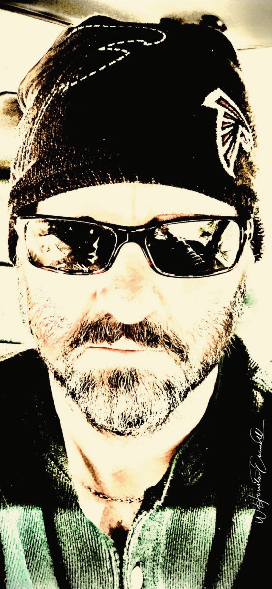
On that note, I have just gotten off the phone with a very good friend, in Florida, Houston Evans. I have recently learned that he is a passionate weekend photographer! An amazing photo appeared in a Facebook post and I was astonished by the enchanting image, color and composition. I was instantly captivated – and curious. Upon closer inspection, his stylish swashbuckling  signature made me realize that this hobby was subtly becoming more than that – yes, he had his mark digitally mastered and is probably THE perfect brand for his diverse and stunning work.

“Star Power” is the luminous celebration of a pineapple.

As I quizzed him about his interest in photography, I learned that he attributes his eye for art, color and design to his mother who’s side of the family has spawned other talented artists, in his generation. He has been posting on Instagram for quite some time – hundreds of images. I didn’t know. I didn’t “follow.” He is modest about his photos and does it for his own amusement, pure pleasure and personal enjoyment – that he likes to share. “I don’t do it to imagine it on someone’s wall.” Yet this observer believes that there is where it absolutely should be! Many walls…many places! #houstonevansphotography

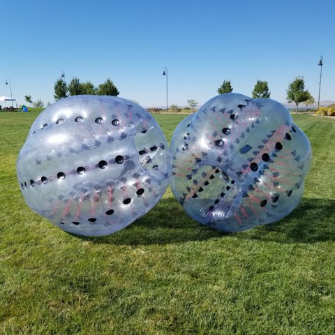
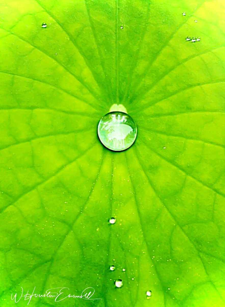
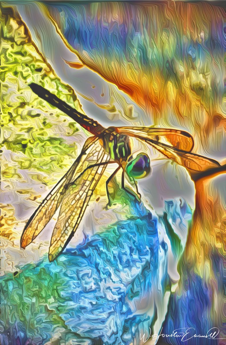
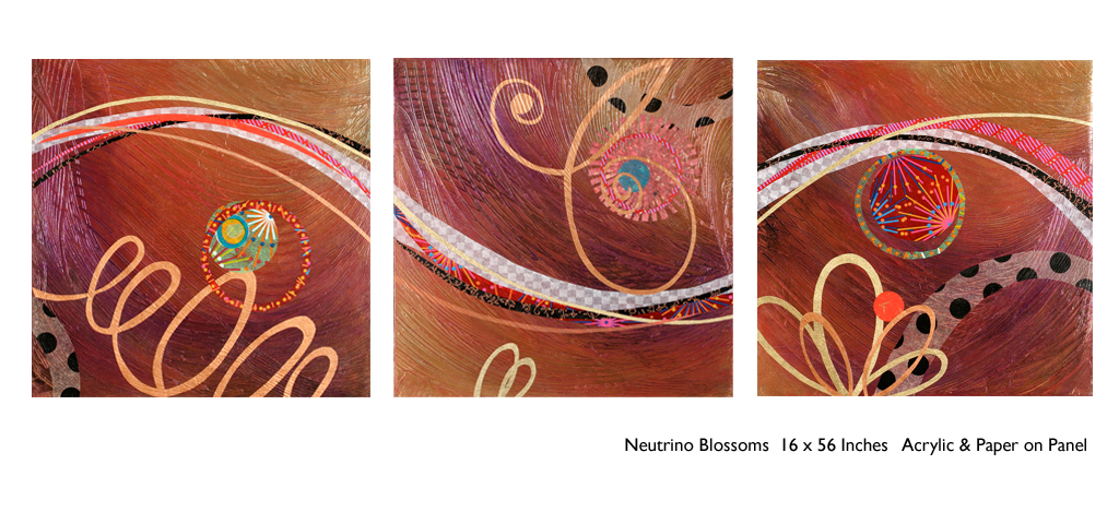
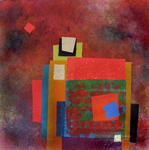
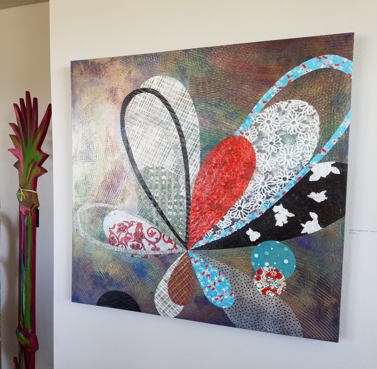
He plays with the medium and all the tools and tricks of the trade. He enjoys the freedom of experimentation. The results are controlled, yet spontaneous. From high resolution to fuzzy pixels that require distance to assimilate. Up close for precise detail and soft smears for imagination to take hold, the variety of clarity or lack thereof are a part of the experience and expression.  

“Makin’ Hay” has an enhanced pointillist treatment – a Van Gogh-esque subject with a twist.

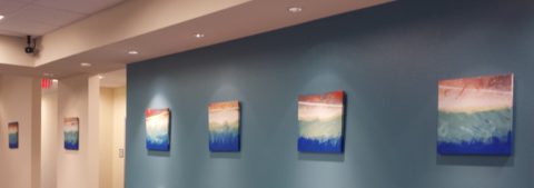
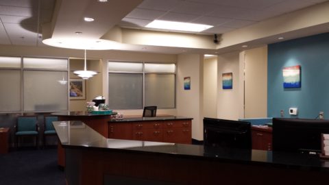
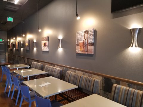
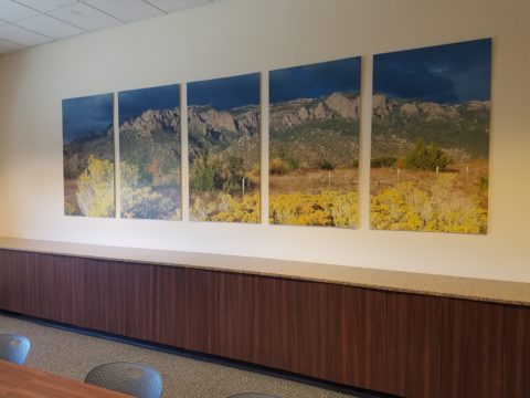
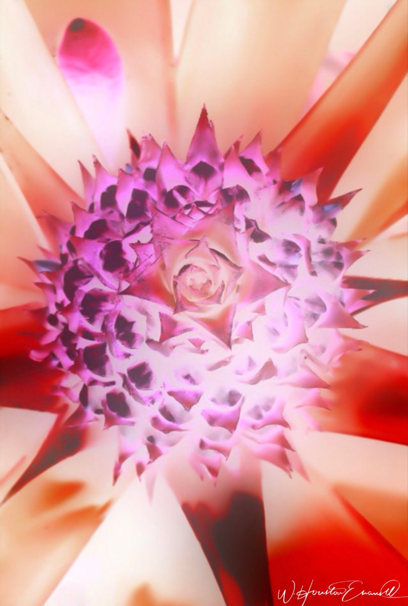
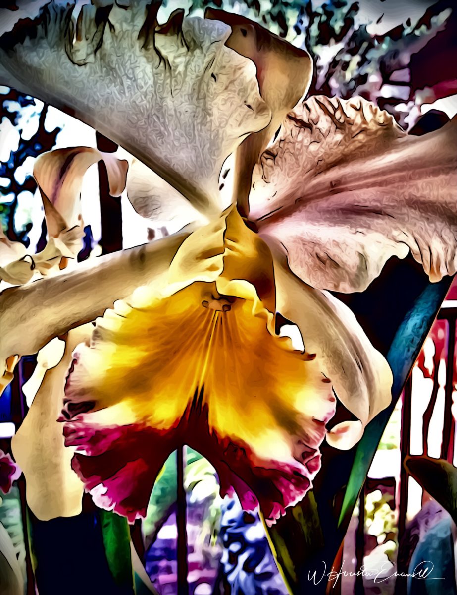
From my interior designer’s perspective, his bold images would be key focal points in the drama of architectural spaces – interiors from Miami to Honolulu and on around the world!!! I can see the towering orchids in hotel lobbies, bars, restaurants and swanky condos everywhere!!! I am eager to find a project, for which his work would be the key to the scheme, unveiling a spontaneous design resulting from the inspiration of the image.

“Oblique Orchid” screams floral superiority as a commanding focal image.
“Shooting the Bird” speaks to paradise revisited!!!

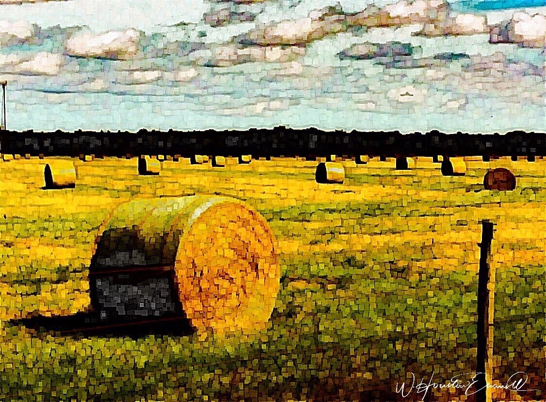
In the beginning, the photos stood on their own merits. Evans keeps his originals – some of which remain just that – in their original form, while others are tweaked or more radically manipulated to create stunning subjects and compositions.

This brilliant, fresh simplicity of “Aqua Eye” observes the droplet’s reflection in the center of the cheery chartreuse petal.
Coming upon a cool caddie “Daddy Long Legs.”

I can see his limitless fantasies contributing to the imaginative narrative of Meow Wolf, gracing hotel lobbies with larger-than-life orchid explosions and commanding condo walls with magical statements of tropical color, subject and form. Translucent installations of LED illumination could result in magnificent walls of design influence.

“No Flies on Me” is a fantasy of oozing colors and form melting and melding around the psychedelic dragon fly.

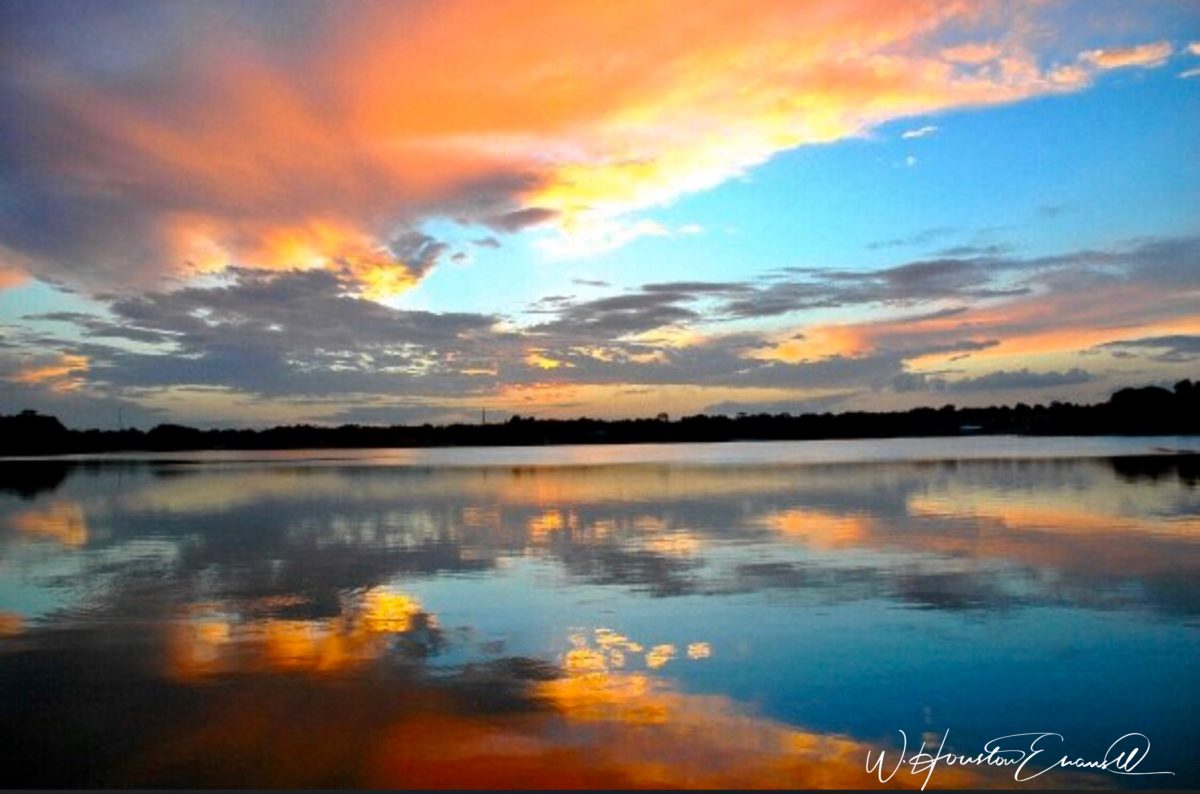
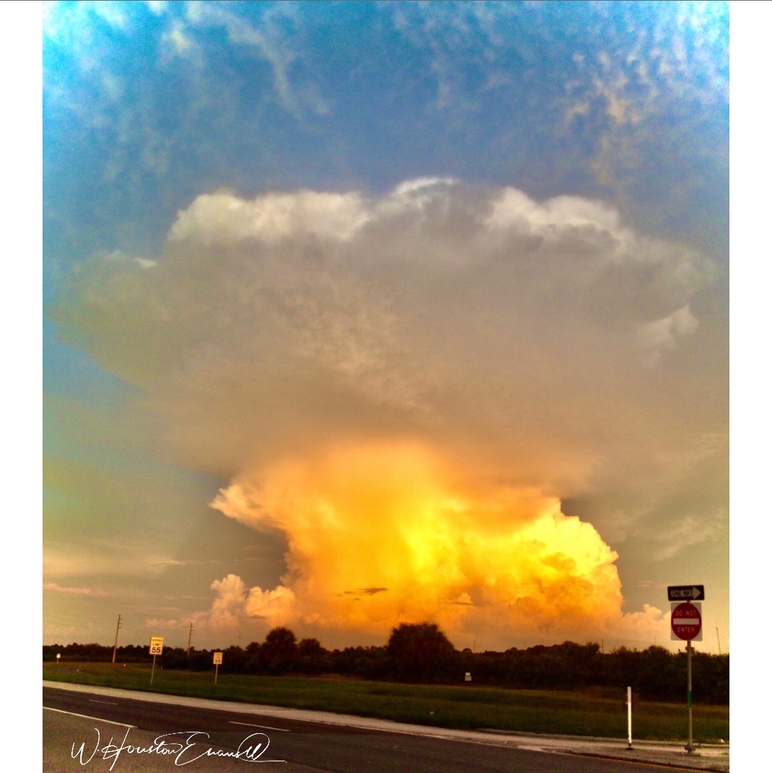
The digital age is advancing with such a pace that we are all caught-up in photos of food, whacky selfies and sunsets on fire…but having an artist’s eye, to truly see the potential and master the tools that are now available – using them to create valid and valued masterpieces of art, is extraordinary.

“Copy Cat” reflections mirror a chorus of color from sky to watery impressionistic likeness.
This “Roadside Attraction” must have been a startling scene to distract dazzled drivers.

I truly believe that his work is exceptional – full of heart and soul – and spectacular fun!!!!!!!! I’m thrilled to learn of these images and now enjoy the continued progress of his discoveries and creations. Let’s see where this goes!!!!! He just might be coming out of hiding!!

Yes, his selfie – “Prickled!”

Focus on an Artist, Patricia Forbes and the Art of Custom Design.

Collecting art, investing in art, loving art, designing with art…one aspect or all of the above, art in interior design has many facets. I have written previously about and presented a workshop about “I want a piece of art to go with my red sofa,” a kind of raspberry in the face of curators, collectors, critics and appraisers who would never take or condone that approach. But the desire and need exists and as a interior designer it is wonderful to work with artists who can and want to respond to cues, take on commissions and create for specific parameters.

Contrary to opinions from the high-brows, this is not to say that these artists lack artistic integrity or meaningful self-expression. Their value is as any other – determined by what the market will bear. The basis for this writing is that we work with many artists who love their work. And creating it (even under direction) brings them and their patrons joy.

Featured here is the up-lifting, colorful and texturally abstract work of Patricia Forbes. We have enjoyed commissioning her for specific interiors over the years and are never disappointed in the quality and creativity of her pieces.

For scale, diminutive Forbes poses by her Vertical Stick series.

With so many mass-produced art offerings at the trendy home decor stores, it is refreshing to encounter new clients who are at the start of their nesting years, establishing their own domains, selecting things that bring them comfort and identity and who’s appreciation lies in acquiring original art.

Designing an interior is about comfort and personal identity. It is about surrounding oneself with things that work – both functionally and aesthetically. Individual’s requirements, in either of those departments, can vary greatly – but suffice it to say, each person or couple or family unit creates a home environment based upon their likes and needs (and budget).

Enter the interior designer. When calling on the assistance of someone outside the intimacy of the home, the client is hoping for and expecting a successful custom-tailoring of their requests based upon the experience of the professional.

When designing an interior, it is exciting to use existing pieces already owned by the client. It is gratifying to arrange and place those items in ways not yet imagined – thereby justifying the investment in design consultation. After an intense session of rearranging furniture, artwork and decorative accessories the “ta-da” moment is one of near instant gratification and satisfaction.

When an interior needs a little something to pull it together, fill a gap, create an accent or establish a focal point, it is great fun to engage the creativity of an artist to custom design a piece to fit the need. Approaching an artist for the express purpose of acquiring a piece of their work to enhance a space is  an exciting venture. It is a personal connection between artist and patron that creates a communion, a bond.

Here I took inspiration from a single panel that Forbes had constructed and requested a series of 9 panels grouped in a grid to make a larger statement on the wall. The interest created from a grid of images adds movement and dimension to this series already complex with sculpted texture and applied layers.

Color, texture, size, style, subject (or not) all are aspects of art that are to be considered for the personal  interests of both artist and patron. If the patron has selected an artist to approach about a commission it is as a result of experiencing their work and appreciating it. The artist, in response, is to accept the parameters of the request and enjoy the challenge and process of creating the intended/desired finished product.

The intensity of this rich red wall was decided early in the design process. As we built layers of existing elements and introduced new pieces, the desire for a custom installation became apparent. This Urban Elements series was a collaborative effort between Forbes and me to provide a bit of an edgy, industrial vibe to this eclectic urban loft. Note too that the end table and coffee table were locally crafted for the project by Kirt Kirkpatrick

Forbes’ creativity is rooted in pattern, color and texture. Primarily non-objective, her pieces are compositions of movement and dimension. Working with a layering technique, she builds her action with a collage of papers and fibers, paint and stain. Action is key when describing Forbes’ artwork.

She creates for herself, but when called upon to collaborate on a project, her eager curiosity for what might result is enthusiastic and ever-promising. About her style and self-expression she states “When I have created a joyfulness and vibrancy in the work, I know I ahve created an experience I wish to share.”

When asked…

1. How/when/why did you start your abstract technique of layering colors and textures?

Forbes has always been drawn to color as a means of her personal expression, once she “experimented with acrylic materials that would hold a texture and  started playing with those using combs and rubber spatulas and sticks to mark in the materials” she was hooked.  “Metallic and interference paints call to me — so I began to combine the over the textured backgrounds, and  then discovered that with acrylic one could imbed paper.  It was really experimentation and discovery of what these amazing materials could do…”

2. What is the most satisfying aspect of your art  for you personally?

The element of surprise is what gets Forbes excited! “When something comes together almost unexpectedly and I wonder how I did that — it’s always a search for the right combination of elements, colors, textures, feelings.”  When they all come together she experiences great satisfaction.  “It’s like turning over pieces to see what fits. Sometimes I have to turn over a lot of pieces to get the right combination — sometimes wondering whether to continue.  Seems like it is always worth continuing the work to a happy conclusion.”

3. Why do you enjoy commissions to create specific pieces for interiors/patrons?

Forbes expresses genuine gratitude for her patrons. “I feel honored and appreciated when someone likes and appreciates my work and invites me to do something special for their home or office space.”  

4. What pleases/satisfies you about this custom commission process?

The process of working together with  her patrons is positive creative challenge. “I enjoy the collaborative aspect and going through the process with a client or designer and receiving their feedback as the work progresses.”

The satisfaction for a designer in partnering with an artist is designing and realizing a vision to complete a space. Bringing visions to reality.  I often say that my team provides tremendous support in making my dreams come true. From artists and craftspeople to seamstresses and all manner of contractors, it is truly a team effort to achieve great results!

Urban “Pieced Work” – an artistic narrative

We are excited to have the opportunity to bring a design installation(s) into a new project that will serve to support the brand with a twist. A nearly completed new smokehouse is coming to Albuquerque. This home-grown eatery blends family history and southern roots with southwestern barbecue flavors including indigenous  wood and iconic chile blends. But this is not about their cooking profile. It is about how we have arrived at a design theme that will define and further the identity in this new, specialized smokehouse department of this larger local brand.

To accomplish this task, we examined the concept the owner had  to remodel an existing facility that had been a popular gathering post serving this community for decades. The fringe barrio location was of a demographic primarily comprised of Mexican/Americans. Decades past it was home to a heavily black community. The fabric of these cultural combinations suggested a mosaic of color and vibrant heritages.

The spark of cultural references lead to discussion of the popular artistic expression of urban mural painting.


When we began the dialogue, the decision to have a mural painted by local neighborhood kids, with a mentor to design and supervise the work,  seemed to be the direction we were headed. After subject matter debate and development, I veered off on another tangent that might take a less subjective approach, be weather-proof and more durable for a patio location – mosaic.

This new more impervious and durable medium still offered the opportunity to engage the community, but with less focus on a specific subject and more about geometric color and texture. We discussed the details of installation so as to keep it simple for kids to participate using whole tiles – minimize cutting, if any, for starters.

Inspiration came from several other installations such as the Albuquerque Convention Center’s on-going mosaic mural project wrapping many sections of the buildings with intricate scenes of New Mexican lifestyle and cultural diversity. The colorful mosaic is an elegant and sophisticated contribution to our city’s cultural aesthetic.

Helen Atkins, manager of consignment art at PATRICIAN DESIGN’s downtown boutique gallery and the lead on their current restaurant mural project, has worked on several phases of the Convention Center’s mural project.

We have incorporated mosaic into several of our own design projects such as last week’s blog https://patriciandesign.com/trust-and-custom-designs/about a residential kitchen installation.

Here, in another installation, a fireplace surround of mosaic adds movement, color and textural interest to the room.

Ultimately, one of Helen Atkin’s personal photographs cemented the approach. It was decided that a geometry of different sizes and disparate glazes and designs of tiles pieced together in a colorful, textural  panel would be our design theme.

Helen Atkins, a recognized artist in many media, captured this in passing while visiting New Zealand. It’s crisp, yet irregular composition was intriguing and pleasing. It became the springboard for the concept for a geometric mosaic panel to anchor the theme of this new New Mexico eating establishment.

The idea became more exciting as we began gathering material from local tile distributors and our own personal inventories of favorite treasures saved for a special project. Here it was.  It seemed such a strong design element and therefore offered a new direction for the actual brand of this establishment. We embraced the idea and brought it into the interior and distributed murals throughout the space.

Still under construction, we will not divulge the identity or locations of this project just yet. But suffice it to say, the murals are an exciting part of this interior design scheme.

As we further discussed the plans to implement this project, school started and the ease of coordinating the assistance of neighborhood kids became more difficult. Helen lead the project as primary installer, coordinator and supervisor. She enlisted the assistance of a couple of people – one experienced and the other not at all.

We have named this series, Urban Pieced Work – an artistic narrative. Here we are interpreting generations old sewing patchwork using ceramic, glass and pottery pieces rather than the traditional fabric patches. The original folk art needlework has been in the American vernacular for ages.  In these installations, this up-cycled  use of discarded or discontinued tiles is similar to patchwork fabrics, re-purposed to make clothing, wall decor, window treatments and bed dressing when times were tough – often referred to as “pieced work.”

My paternal grandmother in New Mexico made this twin quilt for my bed when I was a child in Virginia.


My same grandmother made this and was given to me by my cousin, her only other granddaughter.

Mosaic is often, like fabric patchwork, a practical art form that puts scrap, shards and fragments to good use in an artistic fashion. Note though that more sophisticated mosaics have been designed more intentionally for centuries not merely as salvaged material. These masterpieces both in contemporary work and antiquities represent many periods in history and movements in artistic expression.


This mosaic version connects with the history of the restaurant’s roots and southern heritage. The panels’ mural nature speaks to the urban murals found throughout the community.

Located strategically throughout the interior, these murals have become a strong design element and anchor for this facet of the brand.


Another shot of the spectacular cultural story murals at the Albuquerque Convention Center.

We have woven a meaningful artistic statement throughout the interior and also on the exterior of the building. In addition, we will be inserting a graphic version into the signage and logo design.


Urban Pieced Work – an artistic narrative, of a New Mexican Smokehouse, will provide pleasing design visuals throughout this new interior, provoke conversation and interaction, weave an element of history and context with the southern roots of this exciting new eatery!

Join the conversation and watch for the first succulent flavors to come out of the smokers later this year.


Decorative Wallcovering – Fun with Tile

When you think about finishing a wall, you probably think about paint colors…you might think about a wallcovering – wallpaper, or even a mirror – I’ve previously noted how mirroring an entire wall can exponentially expand a room – a dimensional effect/illusion that suggests the room extends well beyond its actual size. But another wall treatment, with which I LOVE to play, is tile!

All over the world, the art of designing and creating decorative finishes with tile has been evolving for centuries. All cultures have utilized mud and clay, glazes and fire to bake beautiful patterns and colors onto geometric slabs. Shapes of rectangular, square, octagonal, dots or diamonds – the geometric shapes are many and the designs are limitless.

As is true with other wall treatments, I prefer not to stop on an outside corner. I believe that the color or material should suggest a built mass – part of the architecture. To stop on an outside corner suggests a veneer. It proves that the finish on the element is not a structural/integral part of a built mass. When you paint into an inside corner and stop, it allows the mass the read as though solid and not merely superficially treated. The same is true with tile. Don’t stop it until you get to an inside corner – if possible. There are situations that force a finished edge on the flat plain of a wall – but avoid outside corners at all cost!!

This entire shower is tiled floor to ceiling, around the pony wall, bench…no door…it reads like a built environment of stone tile.

Think of the surface as an architectural element. Tile from floor to ceiling, inside corner to inside corner – wrapping corners, if needed, along the way.

Take a backsplash…customarily used to do just that – catch splashes at the back wall of a wet area (sink) countertop…bathrooms and kitchens, behind sinks and between upper and lower cabinets – but why stop there?

The entire back wall of this kitchen is mosaic marble tiles in a herringbone pattern.

Think of it as a true wallcovering – wallpaper. Commit to the entire surface. Here are more effective examples…

The backsplash and entire adjacent wall were covered in glass mosaic tiles. It “reads” like wallpaper.

here again, the classic blue and white Talavera tile backsplash is continued along the entire wall from floor to ceiling.

We are currently working on a couple of kitchen projects that will soon be completed. They both use tile liberally. Each quite different from the other. Stay tuned for the finished products!

In bathrooms, the area around a mirror can be more than merely the backsplash. Embed the mirror into the tile surround or tile the entire wall and hang a mirror on top of the tile surface.

This mirror is flush with the surrounding tile, suggesting that it is embedded into a tile wall.


Planning this transformation, the mosaic vase was the inspiration. Then loose tiles were scattered on the countertop and the concept began. Note, the existing mirror was attached to wall with light fixture mounted above it and a medicine cabinet off to the side.


The transformation involved removing the medicine cabinet, taking the floor tile up the wall and wrapping it floor to ceiling. It was also cut into smaller squares to use behind the sink as a “full-wall backsplash.” Then punctuated with glass and glazed tiles to create an updated design. Relocating electrical to flanking the mirror for a pair of new sconces and a new countertop, faucet and sink with existing cabinets painted resulted in a cost-effective design.


Here a mirror is mounted on top of the fully tiled wall. Inside and outside of the shower enclosure the tile is a true wall treatment.

I recently received this advertisement in my email. It was such a spectacular collection that it caught my eye and I share here one of the patterns and context shots as the backdrop to a range.

Mosaic assemblages can be fun! Here is a fireplace surround.

The addition of three-dimensional pieces adds interest.


This exterior fireplace surround tolerates the elements – an all-season installation.

Here is a mosaic mural of a dynamic geometric abstraction  discovered in New Zealand. We are using this inspiration to establish a theme in a current restaurant project. An interpretation of this in the form of geometric tiles of various sizes, colors and patterns  will  be used to create a cohesive repeated design element through various areas of the restaurant – both inside and out. Watch for this completed project in coming months.

Commercial restrooms can benefit from full-wall tile treatments too. Not only does it look complete, but it is an ease of maintenance consideration.

Three dimensional tiles add interest to this cactus motif!


Fun with color and texture, tile are also easy too keep clean – terrific for public restrooms.

Murals are also terrific ways to use tile as art in your  interior/exterior designs!

This is embedded into the stucco for an integral installation.

When using outside though, remember to consider the range of temperature and moisture to which  it will be exposed. Porcelain is the most durable in areas where the temperatures get to and below freezing. Freezing and thawing can destroy tile. Many murals are made from clay that is not suitable in cold climates!

Inset into the tile wall treatment is this stunning glass mosaic abstract mural.

Tile – it’s a nearly limitless medium. So consider the possibilities for your next project! As a piece of art, an accent wall or an entire installation – full-wall treatments make a statement! Have fun with tile!


Quilting – An At-Home Workroom of Color!

It’s not your grandmother’s quilting these days…computers have radically altered the landscape of this generations old art form.  
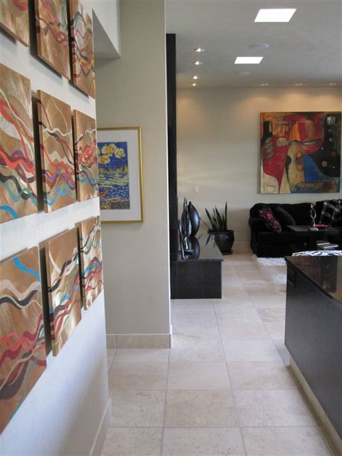
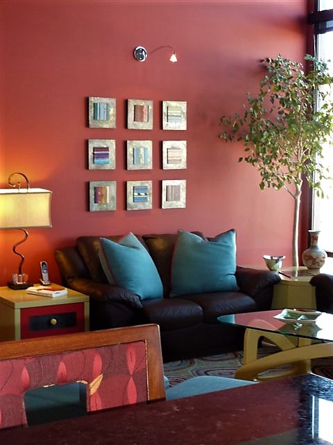
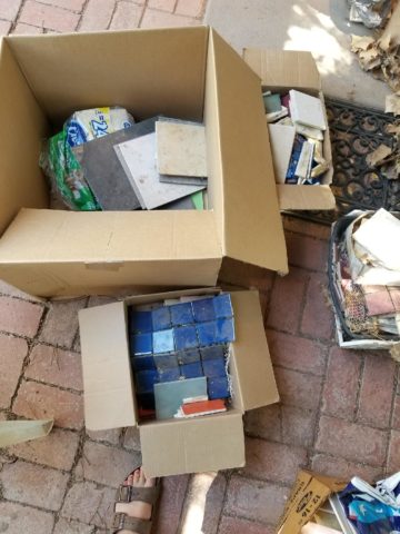
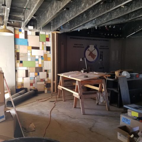
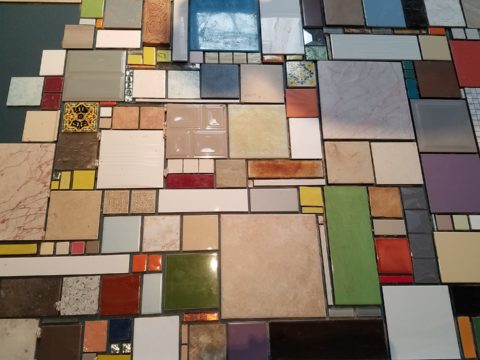
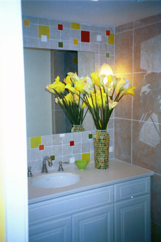
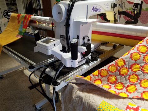
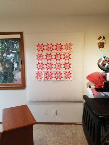
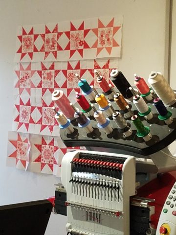
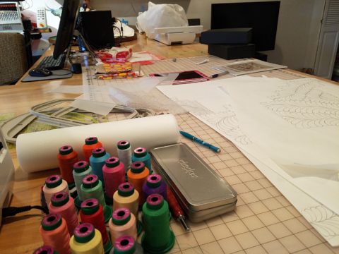
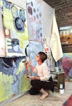
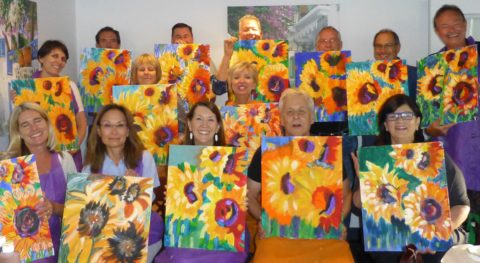
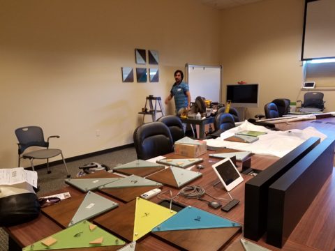
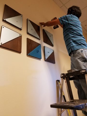
Two days ago I found myself in an in-home art-studio/workroom that blew me away!

Initially a craft born out of necessity, as creative survivors accustomed to “making something out of nothing” re-purposed scraps of material to patchwork new articles of clothing, homegoods and ultimately art for the walls. This clever, resourceful, utilization was celebrated in Dolly Parton’s song turned movie, about her true-life “Coat of Many Colors.” https://en.wikipedia.org/wiki/Dolly_Parton%27s_Coat_of_Many_Colors

The intricate designs and refinement of pattern details was obviously all done by hand, but with the development of machines and now computers for this purpose, the possibilities are endless.

So as I turned the corner, to see a would-be remodel of combining two bedrooms and expanding to the north of the existing shell, I was astonished to see this remarkable, expansive workroom – all white – punctuated with colorful creativity. Colors, textures, patterns…this extraordinary, rather Renaissance, woman had carved out a generous space to explore this phenomenal art and craft.

As an artist, Sue Watrous’ paintings and sketches are quite photo-real. On a few of her pieces, she has deconstructed the elements in the painting cutting them from fabric of many grey-tones defying the fact that they are textile assemblages.

This original pencil drawing – yes, photo-realistic, is amazing.

Then to create the same image as a patchwork quilt is remarkable!!

Yes, look closely, you can see the patches of fabric that are assembled in the many grey tones to create this amazing piece.

Her joie de vivre is derived from this magical space and the creations that she imagines and brings to fruition.

Upon entering her amazing domain, I felt as though I was entering an operating room – everything in perfect order, clean and spare – like a clean-room at Intel – I should gown-out or suit-up!!!

I might be exaggerating because it was white and clean, but warm and welcoming with the rainbow spectrum of thread spools and quilts both finished and in progress displayed on the walls and on the other many surfaces.

Self-taught, she nonchalantly references the many computerized machines strategically placed around the  room. There is an order to the layout and her approach is meticulous. Despite the fact that there is an active quilting community here – they are too busy quilting to teach – so Sue jumped into this after having seen a presentation at a show about five years ago. Years ago she quilted – but at this juncture, she knew at once that she wanted to enter this exciting and challenging realm, of computerized art assist!

Like the shoemaker who has no shoes, her quilts have yet to adorn the walls or bed dressings throughout the rest of her home. She doesn’t sell her work – but her family all has homes riddled with choice pieces.

Her paintings are placed amidst her interior, but not her quilts. Today I focused on a large wall to be the future home of a near-to-be- completed quilt.

She tells me that the fabrics are like paints – she is painting with fabric.


And although she is not yet dying her own pieces, she told me of meeting a textile artist who spun her own thread from her own llamas, dyed it, designed and fabricated her own work.  Sue has created most if not all of her patterns and designs and I am confident that before this is over, she will be donning rubber gloves and dunking material in dye vats to find a new layer of creativity.


TRENDS DIE – What’s New for 2018?

I was surfing for fodder about the new color trends to kick-off this first mindful missive for the New Year and the color trends were all over the place – no consistency at all. From Ben Moore selecting Caliente AF290,

“Caliente is the signature color of a modern architectural masterpiece; a lush carpet rolled out for a grand arrival; the assured backdrop for a book-lined library; a powerful first impression on a glossy front door. The eye can’t help but follow its bold strokes. Harness the vitality.” 

—Ellen O’Neill, Benjamin Moore & Co.

to Sherwin Williams in a totally opposite direction proclaiming Oceanside SW 6496 their color of the year.

“A collision of rich blue with jewel-toned green, a color that is both accessible and elusive… A complex, deep color that offers a sense of the familiar with a hint of the unknown, Oceanside, bridges together a harmonious balance of blues and greens that can be found in what’s old and new.”

What? Are we straddling now?  Do we have one foot in one color trend while the other stretches across the color wheel and causes us to nearly do the splits trying desperately to hang on?

The walls of my east gallery space were a spicy version of Caliente for nearly 20 years! Bold at the time and unheard-of for  gallery walls – it was not to be changed for nearly 2 decades!!!

Whew – that was a run. I even named the retail space “Caliente.” And the color-band between the crown and picture molding at the back was a version of Oceanside – a lighter value of the blue-green hue.

The Grand Re-Opening July 2016 presented a dramatic transformation to a pale aqua resulting in a diametrically opposed feeling – a cleansing from what was crowded and hot to spare and cool.

But I digress…

Annoyed by the seeming authority, but weak contrasting rationale that I encountered with the wide range of picks and opinions, I left the paint companies and clicked over to the Pantone site. There I encountered their authoritative, ethereal color forecast of the year – Ultra Violet!!!!!

Yikes – they were coming at me from every conceivable direction!!! How on earth is any eager apartment dwelling or home-owning individual supposed to know how to go forward in sprucing up their space without fear?

Then  I came upon a piece by Mehgan Nesmith Ugh, What’s With These Generational Color “Trends”? From observing the broad reaching trend surrounding millennial pink to snippets from other sources,  I scanned the paragraphs amused, but still not satisfied. Until I arrived at paragraph 6 and there it was – the true fact that keeps the world moving forward – for better or worse – TRENDS DIE.

Yes they do and for good reason. I’ve said it before, take care in making costly selections that will stay with you past their prime. Trends are there for a reason. Designers dabble in creativity every day of the year to come up with things to tantalize, inspire, evoke, and entertain – and most importantly, SELL. Some of these trends stick. Then they are no longer trends, they transition and become classics. But to transcend the fleeting status of trend, “it” must have something very solid about its being.

And when it comes to interior design, with all the style trends for furniture, fabrics, architectural elements, finishes and decorative accessories – colors race through history like no other design element has or will. Colors rule and when they are good, they are very very good, but when they are bad, they are horrid!!!!! Thank you Mr. Longfellow!!

Take the massively graceful modern art piece suspended from the ceiling of the East Wing of the National Art Gallery in Washington, D.C. – classic – both in form and color. Red and black. Strong and simple. Bold and brilliant. Imagine if it were this year’s Pantone pick Ultra Violet  Aghhhh!!!!!!!

Actually, methinks I protest too much. The shade of purple picked, by Pantone, is heavy on the blue rather than the red.  The blue cast gives it a calm. Not whacky like Barney screaming purple – but, rather a royal shade.  Nonetheless, it is better served as an accent – don’t buy  wallpaper in it. Go ahead and paint the walls and have your fun – but know that you can change it without peeling off hundreds, if not thousands of dollars of wall-covering or re-upholstering your sofa like Meghan was tempted to do!!

It’s a color that stands alone – plays better by itself than with friends – like the child’s report card where the box that says “plays well with others” is not checked.  In my estimation, it will read well with clean, crisp white.  However, like Ms. Nesmith aptly says in her piece “if you are  still curious about that Gen Z yellow, buy a vase!”

That’s how we play with  colors and create a bit  of collision, unexpected off-key harmony, intrigue and suspense. But it is not for the faint of heart and the chance of tiring of it is paramount. Trends die and colors are tricky.

So Happy New Year and Happy New Colors in your world to refresh and renew!! Thank you Meghan, for your lively contribution to today’s story.


COMFORT & JOY with ART

A few years ago I gave a talk. The title was  something like “I Need a Piece of Art to Go with My Red Sofa.”  It was a defensive argument giving liberty to those who sought artwork for decorative purposes rather than an esoteric rationale. As an interior designer surrounded by artistic influences and drawn to the limitless styles, pieces, concepts and movements of the art world, I see and appreciate both sides of this controversial coin.

Federico Leon de la Vega’s Pomogranates

In my opinion art should bring joy. And that is not to discount art as a social commentary, honest statement of artistic philosophy, opinion, or personal expression. As an interior designer, my simple philosophy is that joy is a goal of interior habitats – function and joy simultaneously. For me, there is a synonym for beauty in there. Oh – and how apropos – it’s Christmas time and the carol God Rest Ye Merry Gentlemen specifically identifies bringing “tidings of comfort and joy.”

In this  month’s December 2017 issue of AD “Architectural Digest” Living with Art, architect Luis Laplace offers that he doesn’t really know about beauty in art. He sounds modest and self-effacing.  “I say I don’t know beauty. When I see that something works, then I see beauty.”  I say that is saying a lot about context. But inasmuch as I can see context being so perfect to showcase a piece that it validates it somehow, it seems lacking in the department of honest personal appreciation or criticism. Surely he must find beauty in art before it is placed.

I can see admitting that something having potential is a valid “wait and see” position to take when allowing a piece to be placed to its best advantage, prior to judging it too harshly – but that seems reserved for pieces about which one is trying to give them the benefit of the doubt! It sounds a bit like tap-dancing…making excuses. Excuses for not having an initial opinion or spontaneous reaction – much less appreciation – much less, joy.

Festive boat bringing JOY at the San Diego harbor parade last week.

Another comment that Laplace makes in this article “High Art” is that “We never use art as a decoration,” he declares. “We design for installation and rotation.” And I am sure in his world, that is exactly what he does. But let’s get down to earth and acknowledge that it’s a chicken and egg thing – the luxury to design expressly for the presentation of magnificent rotating works of art versus finding joy in a piece to decorate your world – with or without rotation. He makes decoration sound like a bad word. And perhaps he thinks it is – but why? Adornment, decoration, enhancement, emphasis – all superlatives, in my estimation.

Federico Leon de la Vega’s Script on Blue

In a completely opposite place on the planet both figuratively and physically, Robert Downey Jr, in this same issue of AD, expresses an explanation for their selections and design direction. “We didn’t set out to do something conspicuously whacky.” He obviously gets great joy and a kick in the pants out of his approach which he cements, with the following comment: “We just enjoy a bit of whimsy and fun.”  And then a negative nod to separate him from the more cerebral art enthusiasts – “We definitely don’t like boring.”

But that is a direct comment on the joy thing and one of my oft borrowed quotes “One man’s trash is another man’s treasure.” Here, a tangible example that I created for my grandson, Liam a few years ago. Debris he and I collected while on a walk one day, I assembled into a collage and had it framed for him with the plaque to remind him to look at things and regard things from all angles.

From what one person derives joy, another might find boring and uninteresting. And that oddly seems to return to the Luis Laplace comment about not seeing beauty until it is placed and then can be recognized. Hmmmm…Yet, I am saying that it might be of value to study things and  think about things differently than face value at a quick glance…spontaneity is valid and so is “love at first sight,” but often things are missed because their context s not serving them well. That space above your red sofa might be just the context and proper setting to showcase the “whatever it is” piece which might be far less interesting otherwise.

Which is why, in this time of international commerce delivering things from all over the planet with an almost instant gratification speed, we still have difficulty making decisions about what to chose to have in our world. Which fabric, which furniture, which art…the choices are at our fingertips and delivered to our doorsteps without leaving our living rooms, but fear of costly mistakes, second guessing trends and how to make good investments still remain the dilemma shared by most. Fear of trusting your own joy. Or, better yet, discovering and defining your personal joy.

Which brings me to the last quote I extracted from the December  2017 issue of AD by an artist, Brian Donnelly, speaking about his own residence and art collection, and that is  “I don’t buy art to put in specific places. I just collect what I love and hope to find a place for it.” Sounds like spontaneous joy to me!!

Closing with best wishes for a Merry Christmas and “tidings of comfort and joy.”


How Long Did It Take You to Do That?”

Recently chatting with a wonderfully multi-talented mixed-media artist of many colors, Laura Balombini and I commiserated on the Creative Process. A few weeks ago I blogged about the Creative Process as relates to client and designer interaction. Some people enjoy the detailed nature of the process and some prefer to be spared that enjoyment.

This recent conversation explored the hidden facets of the Creative Process. The light bulbs that go off in the wee hours of a sleepless night, the honing over time combinations and details, and the tapestry of life experiences that become the personal library of resources from which creativity is drawn.  Sitting in traffic can even result in an unexpected, seemingly unrelated epiphany!

Often called the inelegant “brain fart,” ideas bombard. They pop out often uninvited – when one is NOT even focusing and trying to come up with a solution. They come about without prompt or foresight. They happen.

Creative minds can rarely unplug. Downtime takes a concerted effort. Even those rare moments of attempted escape are invariably interrupted by unwanted, but often valuable, ideas. Not that the ideas are unwanted, but the spontaneous interruptions can be unavoidably annoying.

Yet, it is exciting. Having ideas and bringing them to fruition is greatly satisfying.  Balombini was bemoaning a similar quandary. Often asked “How long did it take you to paint that?” She said to me that the answer was obvious, but not what the observer wants to hear. Sometimes it takes minutes and other times it takes months. How can one charge the same square inch price or similar range of value for one piece that takes little time and something that takes much longer?  She lamented that she wished curious observers would direct their questions more toward a genuine interest in the “process.” Such as, “How did you come to select that color combination?” or “What inspired this assemblage?”


Inspiration is not a straight line. It is trial and error. It is a combination and accumulation of layers of ideas and fragments of many experiences. It is an illuminating and distilling of observations – all stored in the many compartments of the creative mind to be extracted and applied as the opportunities warrant.

Where she and I differ is that she, as an artist, creates constantly as a part of her process – as a necessity of her creativity and/or in hope of attracting a buyer (unless it is a commission – in which case, she hopes to satisfy the buyer) and I, as an interior designer, provide clients a service of creative ideas, solutions, suggestions and opinions toward an end. The ideas are selected, dismissed, modified and ultimately executed resulting in a finished design that is the product of the Creative Process. The creative services should provide effective solutions and be unique and thoughtfully custom-tailored for the client’s individual requirements and desires. The solutions are a result of many educated elements, collected life experiences and observations.

To appreciate what it takes to create is to take an interest in the complexities of the “process”. What might take minutes, to convey or even execute, results from a thought process and observations that are without boundary. The cumulative collection of experiences is what enable the designer or artist to find creative solutions, offer a variety of ideas and possibilities. This is the shared commonality of our discussion.

How often have you strolled through a museum or art gallery and thought, “I could do that!”

Have you ever attended a wine and paint event and tried to render the subject and watched as other of your fun-loving companions struggle to do the same, with as many different results as there are participants at the party? Copying is not easy, but it is very different from originating.

As I pondered this blog’s subject yesterday, in advance of putting it into print, another remarkably related and coincidental exchange took place. There I stood in the company of two co-workers of a business office for which I had designed the interior. They, having arrived after the project had been completed, were not privy to the details of the design elements and the process over months that took place. One asked the origin of the art series punctuating the east wall of the reception area. It was a collection of contiguous abstracted landscapes with rough dashes of brush strokes and stacked layers of color.  She asked if it was a result of a wine and paint party. I was aghast.

But upon further conversation it was clear that they recognized the same sized images, with a similar subject matter on each and the same color palette – not thinking beyond to the technically un-selfconscious (I like that word) process and ultimate application and execution. As we looked more closely and discussed the complexity of the texture and layering they came to understand that had they or I tried to copy it, we would not have had that remarkably un-selfconscious effect.  Ours would be more tense and rigid, in the attempt to be relaxed, loose and seemingly simple.  A new appreciation was realized. I had initiated an artistically creative commission from the very talented Federico Leon de la Vega as a solution for a long expanse with a splash of colorful, original, sophistication.

Artistic creativity is nebulous like a blond grabbing at the air…collecting her thoughts!!! Yet that nebulous creativity results in concrete solutions. Commission a painting, ask questions, buy one spontaneously when you like it, retain an interior designer and appreciate the Creative Process. Be creative and have a little fun. Try not to let it interfere with, or usurp, your attempts at some relaxing downtime.

The thickly applied paint on the canvas of the feature image, for this story, is by Ron Cheek. Incredible color balance, generous application of oil paint and loose strokes layered to present a powerful landscape. How long did it take him to do that? A lifetime up to that point.

Please visit our boutique gallery/design studio in downtown Albuquerque to see work by  these fine artists and others!

Custom Designed Art for Branding in Commercial Interiors

Designing artwork for commercial interiors offers an opportunity to connect to the brand. It means that we take into consideration the artwork as relates to the business and its identity. You might remember a blog from last year about the can wall. It was designed for a taproom. The theme was beer. The name was “Silver” and we considered that a natural off-shoot of that was the silver color of aluminum beer cans – as a wall treatment!

For that same project (in two locations) we further emphasized the brand with photos we took of their own products transferred to and stretched on canvas stretchers to be the “art” on the surrounding walls.


Fast forward to a conference room for an energy company home-based in Albuquerque – the iconic Sandia mountain being the earth’s monument – the familiar, perfect image to represent the company and the connection to the earth and its resources. For this  project, we were asked to build 27′ of custom , cabinetry and dress the wall above it.

The tall ceilings required a vertical element, but the length of the wall also begged for horizontal space-filling. As a cost-effective solution to such a large space, we decided to take a photo of the majestic mountain, separate it into 5 sections and have it enlarged and transferred onto aluminum panels for light weight and rigidity. The reviews were sensational as everyone loves and relates to the familiar scene – seen in such a colorfully explosive and expansive installation.

In response to the success of that solution, the client asked for a complimentary treatment for the opposing wall. Again, the wall was 27′ long and had the same ceiling height so we used multiple fragments in 3 groupings to center across the entire expanse. “Elemental Fragments” was born of the concept to have just that – fragments of elements in an orderly fashion – uniform yet random, to contrast against its formal geometry in response to the amorphous photographic landscape. Colors were derived from the blue, green and yellow in the scenic panorama interspersed in a field of silver.

Last week, on the day of the installation, colorful creative chaos – resulting from unwrapping the individually hand-crafted compositions and scattering them across the conference table – was part of the fun, of the scene.

The tedious work of aligning all just right, with perfect spacing and level mounting, added to the anticipation of realizing the finished product.

The luminous glass against the rich, stained wood punctuated with the  brushed stainless fasteners made a striking assembly.

Modern engineering and production, worldwide energy collaborations and shared technology coming together in a grounded environment of people and their place on the planet. A daunting system of assembling fragments of many elements that make things work to bring gas to the end users. The artwork makes the concept look easy. The result of the many facets, of the actual work and the artwork representing it, is not only effective, it is triumphal.

It’s creative fun to custom design pieces to relate to the brand, the business and the culture of a project. Bringing joy, pride and a sense of confidence in the focus of the work, to the employees and guests, is a successful finale.

Bring us your design challenge and we will design a solution specifically and especially for YOU!!!


Getting Smashed with Good Design!

Here I was walking along, on this sun-washed Sunday morning, when I came upon what appeared to be giant frog’s eggs in the middle of a field – like ET had laid enormous translucent eggs on earth – I looked up, I looked around and there they sat – tumbled on the grass…the scene was surreal and beautiful in the early morning’s light.

Upon closer inspection, guys were hauling many more of them from a remote truck, onto the field.

I started taking photos and was approached by a man who asked if I had ever seen them before. No, I certainly had not. And inasmuch as this is NOT intended to be an endorsement or advertisement – the bold name, on the side of each, stated KNOCKERBALL!

I was so excited to come upon this other-worldly landscape that I began to fantasize about the many effects of good design. I shot inside the transparent globes, along the edges, down the rows and with great mountain backdrops.


The shape, color and structural detail was fascinating and fun! The taught cords inside created another layer of interest.

The kind man who was coordinating this event explained that they set-up soccer-like goals and wear these globes crashing and smashing, running and rolling across the field – unfortunately, I had to leave before the action began. It must be a blast!

I have since learned that “bubble ball” and “bubble soccer” are other names for this new fangled game and related equipment. They are not always rented for game days, but are also purchased as singletons and used to roll down hills and other antics. So fun! Check out this site: https://knockerball.com/what-is-knockerball/

Play with good design. Get smashed with good design. Discover good design. Get excited about good  design – wherever you find it!!