Trust and Custom Designs

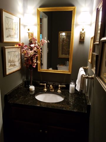
Trust. When asking any kind of advice, you generally ask those you trust. That’s not to say that you might not question the advice. There is never only one way to accomplish something, therefore, advice can be as different as the number of advisers you ask!

From a design standpoint, to offer and create custom elements, it’s often the case that the client will say, “Can you show me an example of that?”  If something is new and different, created specifically in context and for this project, there IS no example. There might be similar things, or close approximations of the design – or not – but not the actual design. Trusting your designer to extract your wishes, taste, preferences and applicability to the space is key to creating something very special.

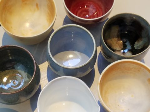
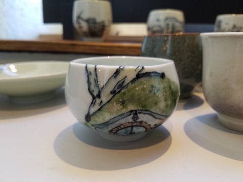
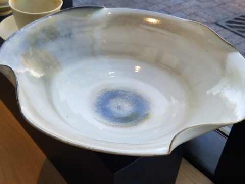
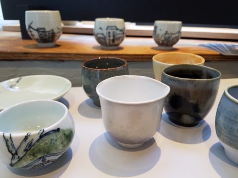
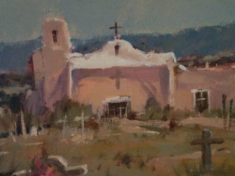
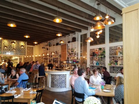
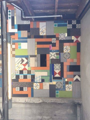
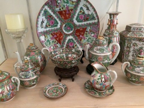
So, I can show examples of mixed pattern Talavera on a wall. I first did this in Tucson about 13 years ago to create a wallpaper-like full wall installation.

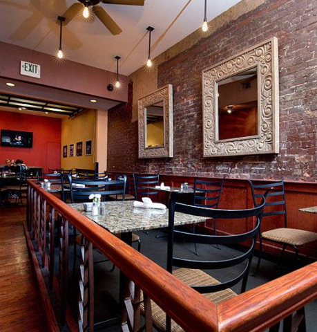
As I referenced this casita installation for my clients, while planning their kitchen remodel, I also came upon a restaurant in St. Louis this last spring that used a similar approach in an Italian theme…Talavera? Mexican? Italian? Oh well…another example I brought to the conversation.

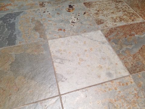
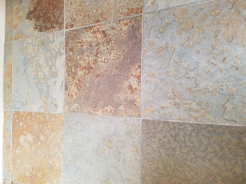
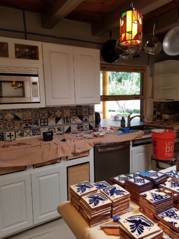
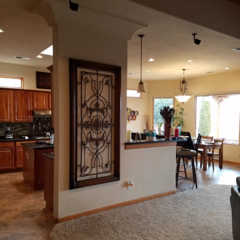
For this new kitchen remodel project, we were working with existing conditions, the layout and the mottled green, rust, aqua, charcoal slate floor. All else was up for grabs. However, because I really feel strongly about context, I mentally gathered elements from other parts of the home and intentionally embraced the floor.

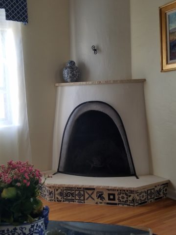
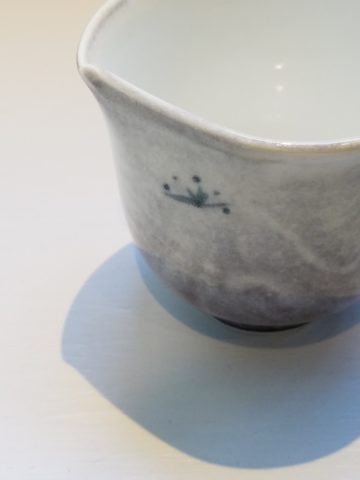
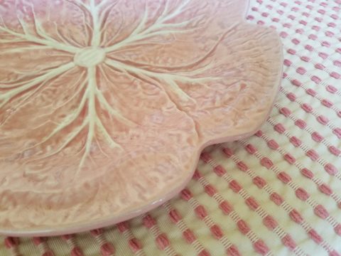
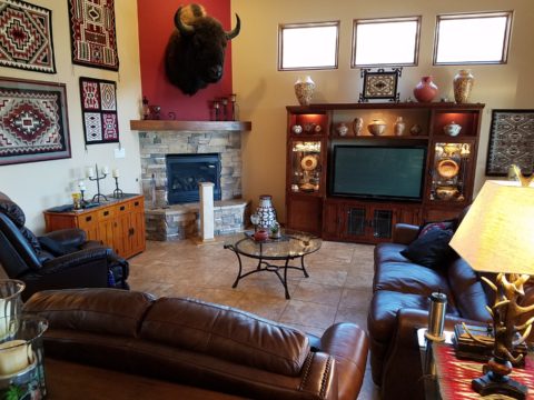
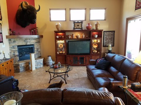
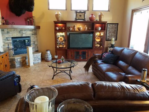
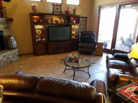
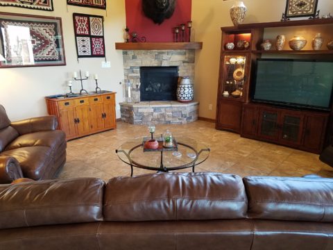
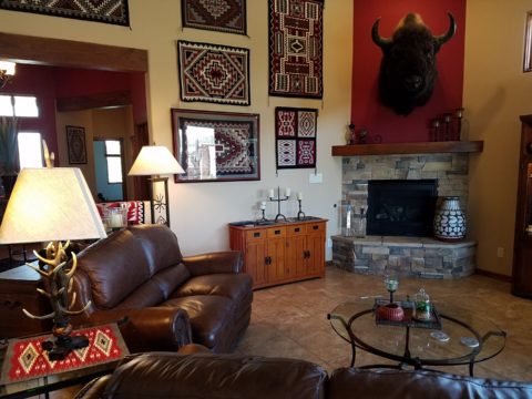
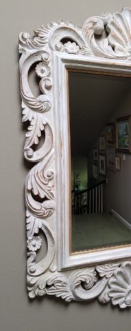
This fireplace was given a face lift last year to add the stone hearth and mantle with the decorative Talavera tile detailing.

I believe to abandon existing design themes reads like a designer show home – each room done by a different designer, without any cohesive design continuity. Pair the idea to make an effort to lace the rooms together, with the effort to adopt certain fixed materials and you have compelling diagram of creative remodeling guidelines.

When it is either not practical to replace an existing design element or when the existence of the that design element makes for an un-self conscious part of the composition, it can be priceless.  The slate floor was of smaller 12″ format tiles than might be more popular today, but it’s unusual color and very organic feel was worth the challenge. Turning a questionable design element into an asset is success!


Once the flooring was determined to be key in the new design, extracting features (specifically colors) from it became the next task. We had already discussed bringing the blue and white Talavera in from the living room, but my client was not feeling the joy of pairing it with this wildly mottled slate floor.

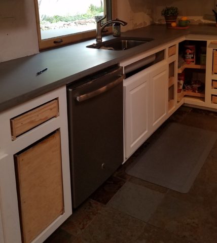
To meld the design elements together, I selected a concrete-like engineered countertop (which came in two colors both of which were seen in the mottled slate – and provides fodder for a future story). This provided a solid anchor for the design between the mottled floor and the multi-patterned Talavera.

But what might be the one more thing to make this design be even more unique and more cohesive? I set forth to find the impossible, an aqua, handmade tile that would complement the Talavera in the light irregularity and “hecho a mano” feel.

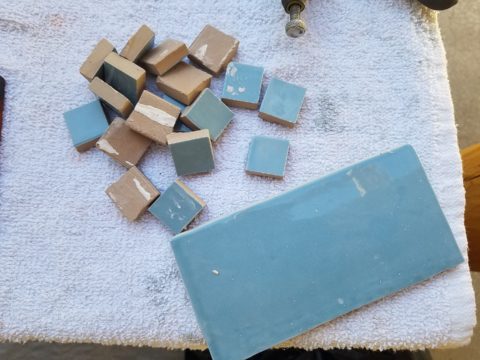
The perfect handmade aqua tile from Spain (photo reads more blue) from DAL tile was the perfect accent.

The absolutely ideal accent appeared unexpectedly as I thought I would be searching farther and wider for this perfect piece. By cutting it into 1″ pieces we would have the artistic accent woven through the patchwork of Talavera, thereby inserting the aqua and adding interest and unexpected detail.

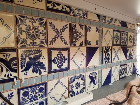
By not planning a symmetrical grid of the accent mosaics, but by creating random lines the unexpected quality of the installation continues.

At this stage, the grout could be grey or white – specifically off white (of which there are many). Opting for the white, to allow the tile to read in its patchwork pattern, without added confusion with a grid of grout competing for attention. We then made a last minute switch on the white grout to a creamier one after seeing the many colors of off-white Talavera up on the wall – leaning more creamy than merely off-white. Could I have shown an example of this design scheme? No, this was created specifically for this project, this client and the space that deserves such attention to detail.

We’re not finished yet. Watch for this transformation to be unveiled in coming weeks complete with before and afters!

Paper Airplanes – Happy Joy

This week, upon arrival at the Denver airport, as I navigate this architecturally dramatic facility, I’m funneled with the masses making our way, from the gate area, to the trains, to the terminal. When suddenly, gracefully overhead as we ascend the escalator, large versions of paper airplanes hover above. Probably steel, but with the familiar fold and form of the simple paper origami originals, they were a whimsical attention divergence.


When I arrived at the top of the escalator, I realized that they were also above the escalator across the way so I walked over there (to the surprise of the masses with whom I had been funneling along). A couple in the crowd even called out “hey” or “ma’am” …I turned to see some were concerned that I had lost my way and expressed concern that I follow the pack. I waved to these helpful strangers indicating with my phone in hand that I was stopping to take a photo of these wonderful suspended planes.

This ignited a curiosity that led me to investigate a bit more. I have since learned that they are part of the Denver International Airport’s Arts & Venues Denver: Public Art Program 1994. There are 140 of these suspended would-be-paper (steel alloy) planes and they are the work of artist Patty Ortiz titled Experimental Aviation. A well-recognized artist and curator of contemporary art with decades of art management experience she “believes that art intrinsically is a social object and when placed as an action in relationship with the viewer ad participant that art carries a profound interconnectedness within real experience.” And there I was experiencing the simple loveliness and joy that these airplane sculptures conveyed, in context with the often monotonous air travel experience.

Kids who love paper airplanes never seem to grow up. I’ve written about this before, in the blog about Federico Leon de la Vega’s TEDx Talks a couple of years ago. Watch his Talk and see the final scene as the planes fly through the audience. https://www.youtube.com/watch?v=H9j_pLgCr1U

Paper airplanes are timeless tools of communication set flying from one person to another often with a secret note inside. Unfold and discover the message. Like passenger pigeons of days gone by…but unlike their obsolete and ultimately extinct message-delivering cousins, paper airplanes are timeless.

Never taking up the art, it has fascinated me forever. Origami seems to be originated from the Japanese word for folding – ori – and paper – kami = Orikami. Japanese art is so fine in all of its forms. And back to the paper airplanes, San Francisco hosted a competition Origami-Palooza complete with education and presentation of many facets of origami work including the Paper Airplane Challenge. Last month “The Paper Airplane Guy,” John Collins, the world record holder for paper airplane distance was there to assist in honing your paper airplane folding skills to insure greater success with your paper airplane flying! https://japancentersf.com/events/origami-palooza-great-paper-airplane-contest/

My happy observation of this past week and my advice with it – grab a piece of paper and try your hand at folding and flying a paper airplane!!!!!

Decorative Wallcovering – Fun with Tile

When you think about finishing a wall, you probably think about paint colors…you might think about a wallcovering – wallpaper, or even a mirror – I’ve previously noted how mirroring an entire wall can exponentially expand a room – a dimensional effect/illusion that suggests the room extends well beyond its actual size. But another wall treatment, with which I LOVE to play, is tile!

All over the world, the art of designing and creating decorative finishes with tile has been evolving for centuries. All cultures have utilized mud and clay, glazes and fire to bake beautiful patterns and colors onto geometric slabs. Shapes of rectangular, square, octagonal, dots or diamonds – the geometric shapes are many and the designs are limitless.

As is true with other wall treatments, I prefer not to stop on an outside corner. I believe that the color or material should suggest a built mass – part of the architecture. To stop on an outside corner suggests a veneer. It proves that the finish on the element is not a structural/integral part of a built mass. When you paint into an inside corner and stop, it allows the mass the read as though solid and not merely superficially treated. The same is true with tile. Don’t stop it until you get to an inside corner – if possible. There are situations that force a finished edge on the flat plain of a wall – but avoid outside corners at all cost!!

This entire shower is tiled floor to ceiling, around the pony wall, bench…no door…it reads like a built environment of stone tile.

Think of the surface as an architectural element. Tile from floor to ceiling, inside corner to inside corner – wrapping corners, if needed, along the way.

Take a backsplash…customarily used to do just that – catch splashes at the back wall of a wet area (sink) countertop…bathrooms and kitchens, behind sinks and between upper and lower cabinets – but why stop there?

The entire back wall of this kitchen is mosaic marble tiles in a herringbone pattern.

Think of it as a true wallcovering – wallpaper. Commit to the entire surface. Here are more effective examples…

The backsplash and entire adjacent wall were covered in glass mosaic tiles. It “reads” like wallpaper.

here again, the classic blue and white Talavera tile backsplash is continued along the entire wall from floor to ceiling.

We are currently working on a couple of kitchen projects that will soon be completed. They both use tile liberally. Each quite different from the other. Stay tuned for the finished products!

In bathrooms, the area around a mirror can be more than merely the backsplash. Embed the mirror into the tile surround or tile the entire wall and hang a mirror on top of the tile surface.

This mirror is flush with the surrounding tile, suggesting that it is embedded into a tile wall.


Planning this transformation, the mosaic vase was the inspiration. Then loose tiles were scattered on the countertop and the concept began. Note, the existing mirror was attached to wall with light fixture mounted above it and a medicine cabinet off to the side.


The transformation involved removing the medicine cabinet, taking the floor tile up the wall and wrapping it floor to ceiling. It was also cut into smaller squares to use behind the sink as a “full-wall backsplash.” Then punctuated with glass and glazed tiles to create an updated design. Relocating electrical to flanking the mirror for a pair of new sconces and a new countertop, faucet and sink with existing cabinets painted resulted in a cost-effective design.


Here a mirror is mounted on top of the fully tiled wall. Inside and outside of the shower enclosure the tile is a true wall treatment.

I recently received this advertisement in my email. It was such a spectacular collection that it caught my eye and I share here one of the patterns and context shots as the backdrop to a range.

Mosaic assemblages can be fun! Here is a fireplace surround.

The addition of three-dimensional pieces adds interest.


This exterior fireplace surround tolerates the elements – an all-season installation.

Here is a mosaic mural of a dynamic geometric abstraction  discovered in New Zealand. We are using this inspiration to establish a theme in a current restaurant project. An interpretation of this in the form of geometric tiles of various sizes, colors and patterns  will  be used to create a cohesive repeated design element through various areas of the restaurant – both inside and out. Watch for this completed project in coming months.

Commercial restrooms can benefit from full-wall tile treatments too. Not only does it look complete, but it is an ease of maintenance consideration.

Three dimensional tiles add interest to this cactus motif!


Fun with color and texture, tile are also easy too keep clean – terrific for public restrooms.

Murals are also terrific ways to use tile as art in your  interior/exterior designs!

This is embedded into the stucco for an integral installation.

When using outside though, remember to consider the range of temperature and moisture to which  it will be exposed. Porcelain is the most durable in areas where the temperatures get to and below freezing. Freezing and thawing can destroy tile. Many murals are made from clay that is not suitable in cold climates!

Inset into the tile wall treatment is this stunning glass mosaic abstract mural.

Tile – it’s a nearly limitless medium. So consider the possibilities for your next project! As a piece of art, an accent wall or an entire installation – full-wall treatments make a statement! Have fun with tile!


Eclecticism in Design – What Does it Mean? What Does it Say?

Looking back (to both sides of the turn of the 20th century), eclectic interiors were only cultivated by the very rich. Those who had the discretionary income to take vacations abroad, had diplomatic ties or nomadic adventuresome types who took precious time off to explore different locations and  cultures other than from whence they came. Others of means might have merely hired decorators to create interiors that suggested such adventure and access, without leaving their drawing rooms. Expensive eclecticism catapulted status.

Leaf through decades of Architectural Digest – THE authority on design for examples and inspiration of fabulously eclectic interiors among all the varied styles they have documented for us!

A surge in eclecticism occurred with the many military personnel and their families who were stationed overseas and were able to transport containers of belongings along the way.

Recognize a meter tray? A meter size diameter of solid brass tooled with hand detailing and pressed/formed/hammered designs. From table tops to wall hangings, they are statement pieces!

They brought back fine and fun arts and crafts from around the globe. These homes were distinctively punctuated with art that was recognizable in those circles – you could tell where people had been stationed by the decorative elements in their homes.

A souvenir from 1970s South Vietnam! Ceramic elephants were the rage!!! From stand-alone accents to end tables and bases for larger cocktail tables supporting glass slabs, these animated novelties of artistic expressions continue to bring joy decades later!

As the original owners handed down these nostalgic treasures, the history of the discoveries was diluted if not lost but the appreciation for many of the collectibles remained and was passed down to younger generations starting their homes. Inherited interiors spawns eclecticism.

Antique collection Rose Medallion passed down in a family.

Many homes have been assembled with the elements gifted by others resulting in a nostalgic, familiar collage of decorative accessories.

Vintage pink glass salad plates, family antique chairs, and a china cabinet of new and old collectibles used and mixed with love and affection.

Pier One capitalized on this decades ago. Their slogan was something like “we shop the world so you don’t have to.” In lieu of experiencing great world travels, the buyers sought exotic, interesting, affordable, mass-produced items and eclecticism expanded exponentially. They actually set seasonal decor trends with their ability to influence the market with their sweeping design reach to international artisans and fabricators, massive buying power, focused design team and extensive marketing campaigns.

Some, in order to create that sense of eclecticism, haunt thrift stores and antique markets. “Thrifting” is today’s trend for gathering eclectic “finds.” From antiques to current cast-offs, the sport can be quite satisfying, cost-effective and can result in some amazing acquisitions!

“Thrifted” antique table and eclectic crystal decanters contrast sweeping contour of limestone hearth.

Eclecticism means varied interests and experiences, an appreciation for what is good and fun rather than merely coordinating. It suggests independence, personal taste and style, with a freedom from convention and changing trends. A successful eclectic interior still requires balance and proper placement and distribution of the varied objects. Have what you like. Be surrounded by things that make you feel good, productive and bring you joy.

HOME – An Artist’s Perspective

It was quite by accident that we ran into SAAM! Truly, our destination and plan for the afternoon was to catch a bite at the hip and artsy Jaleo tapas restaurant and head to the Bible Museum to see some cool film of all of the buildings in downtown DC that feature biblical quotes on their facades – or something to that effect. But as we sat there in this trippy Spanish-themed interior, right next to the window, we

watched the staff bring in umbrellas from the sidewalk seating areas as the wind picked-up and the sky darkened. Our plans soon began to change. We dawdled at the table well past our tantalizing tapas feast and watched the rain come down in sheets.

As the time past, it became apparent that the Bible Museum was too daunting a task to embark on after the storm subsided. So we dashed between the drops to the nearby Smithsonian American Art Museum – SAAM!

Having never been there before and not having planned this outing, we entered without a clue as to what we might find – except perhaps the portraits of the Presidents – cool enough. Yet inasmuch as the exhibits were wonderful and many faceted, I want to focus on one inspired installation that pertains directly to architecture and design.

Considered to be perhaps the most compelling architectural artists around today, Do Ho Suh takes nostalgia for “home” to a whole new dimension. He figured out that he didn’t need to wait for enchanted ruby red slippers – no, he re-creates memories of “home” and makes them transportable all over the planet. And by whole new dimension, I mean we walked through fine translucent fabrics – taught and stitched – over concealed stainless steel frames creating hallways of houses where he had formerly lived around the world.

With great attention to detail, he stitched door hardware, radiators, and wood trim details. It was remarkable.

This interactive immersion was thought provoking. I think it is impossible to pass through this presentation without experiencing a few fleeting personal memories of the your own past homes. As Dorothy taught us,”There’s no place like home.”

It was as though the sheer polyester fabric was misty or ethereal as though not really there – a very effective medium to suggest a thought or memory. How fascinating to render a structure with such a diaphanous, fragile sense – tangible yet not.  “Almost Home.” There, but not quite.

The time it must have taken to create this tedious textile architectural art-piece, of delicately painstaking work, surely proves his love for these past dwellings.

This presentation will be the most comprehensive of Do Ho Suh’s work ever shown on the East Coast. And wait – there’s more! After having navigated the Twilight Zone of Do Ho Suh’s recollections, I was even more strongly drawn to this large-scale piece of stitched textile work mounted on the wall! It was a colorful and beautifully complex collection of images of people and homes in various states of movement and fantasy.


Colorful threads intentionally strewn from the stitched images of human figures, some sporting houses on their heads, another running with memories flying behind his head…taking the home (s) through life’s stages – memories…home is where the heart is…taking their memories with them…

People parachuting with houses floating through the air…pitched roofs and domes – all manner of interpretations of “home.”

There is a stitched reference to Seoul and a house on a jetty suspended above a wild, choppy sea.

Live – dwell – reside – inhabit…Be quick – it’s only there until the 5th of August.

Mirror Mirror on the Wall – Do You Even Notice Me at All?

Designers use tricks, “trompe l oeil” – ever heard of it? Parlez-vous français? It’s a trick of the eye – and how handy is that to create an effect? Often murals are painted to give the illusion of depth or a scene that is not real, yet might fool you into thinking it is.  Similarly, mirrors can create the illusion of dimension and improve spaces – especially small spaces or rooms that feel particularly one-sided. Like the idea? Want to hear some fun designer tips?

Large decorative mirrors expand the dining space in this restaurant. Faux finish  composite material give the impression of hand-carved wood – not!

Mirrors in the Bath We know mirrors are commonly used for practical purposes such as bathroom vanities. They can be simple over-the-sink functional elements or framed versions for decorative pizzazz.

Below,  a built-in tiled surround is nearly a full-wall treatment but with a little relief.

an a more encapsulated/inset mirror shown here

or full wall-to wall treatments that “go away” leaving only the illusion that the room continues beyond…you don’t really “see” the mirror, you see the illusion of space that it creates.

Bathrooms can be intimate spaces of decorative interest


or expanded to be grand spaces of extraordinary volume.

Dining Room Décor and Expansion Other rooms of the house can benefit from mirrors too. Often mirrors are placed in dining rooms over buffets to once again give the illusion of space to a room that is often small for the number of furniture pieces and people that gather there. It is an opportunity to add a decorative element as well as expand the space.

Mixing Geometrics A rectangular console table, sideboard, buffet or dresser enjoys the contrast of a round mirror

Mirrors as Artistic Accessories There are also fun additions to existing pieces like this framed grill-work which is given a new element of interest by adding a mirror behind the iron, set into the frame. Depth and interest instantly change the nature of this decorative wall piece.

Yes, the mirror becomes the decorative focal point. Large framed mirrors can become just that – a great focal point AND provide an illusion of depth. Notice too, the entire wall was tiled behind this focal piece adding further drama and interest.

The limitless options for frames and shapes makes mirrors a valuable accessory similar to a piece of artwork!

Kitchen Surprises Here’s a little trick…rather than looking into a tiled wall behind your cook-top, insert a mirror into the back-splash! It will give the illusion of an opening passing through to another room!!

Wish for a Window Add a “window” where you have none. A “fake window” adds dimension to an otherwise encapsulated interior space. This can be with an actual window to which you add mirrored glass to replace existing or merely a grouping of mirrors to suggest a window to the world.

Embellish with Crafts Here we added white shells to have a little DIY fun!

Make it BIGGER – Make it Better Expand your living space, add value and create perceived square-footage!! Truly enlarging a room with a trick of design expertise is to know where to mirror an entire wall to achieve that illusion of a much larger space.

Consider what is being reflected. You won’t want it reflecting an open bathroom door necessarily…You can even enhance the area that will be reflected to maximize the effect.

Theatrical/Dramatic Lighting Effects and Mirrors

ART & Technology As is true with our fast-paced word today, the art of creating mirrors has gone from fine craft to commodity. Phenomenal prices are now available for what once was a luxury item.  Certainly, there are exquisite hand carved, fantastically finished and even gilded wood frames still being designed and handcrafted by artisans around the world,

but the offerings for production pieces of man-made faux wood and other interesting composites are now on the market. Beveling used to be an art. It was performed by hand (and still is – but it is a lost art and it’s not as necessary a trade with the advances in technology to achieve the detail).

Difficult to see the hand-beveled work on this amazing hand-carved mirror.

The effects of a bevel either on the mirror within a frame or here as a frame itself, bevels add detail of angular reflection that add interest to a mirror’s single-plane depth providing the angular plane to reflect other surrounding facets of the scene.

Mirrors are one of the most versatile and effective design components. Look at them, look into them, use them, play with them – they will expand your world!!

Have You Listened to Your Heart on a Quest to Create ART?

When do you know when to listen to a sign? What opportunity changes your life? From romance to career changes and all manner of life’s opportunities – what catches your attention? What switches on inside and makes you take notice? Having someone cross your path and not realize he/she is your soul-mate. We’ve seen many movies with this elusive thread woven through the plot. One of my favorite songs, about such would-be near-misses, is “If He’s Ever Near”  in which Karla Bonoff pines…

They say just once in life
You find someone that’s right
But the world looks so confused
I can’t tell false from true

And love’s so hard to find
In this state of mind
Oh I hope I’ll know him
I hope I’ll know him
If he’s ever near

…her yearning hits a cord.  What is a sign? How do you know? What action do you take? It’s not always particularly obvious.

Recognizing opportunities is what separates many successful people from the rest of the world. Taking chances, when those signs make their appearance, is the other factor. Risk-taking is a scary leap into the unknown, but so often results in great reward when it is a true calling and approached with dedication to seek and meet the challenges.

Seems from many with whom I’ve spoken, a true calling is pretty clear. It taps into a passion and ignites a level of excitement and enthusiasm that is hence to fore unmatched. It becomes an irreversible path forward. Like an involuntary propulsion. Thrilling for some – terrifying for others. Which type are YOU? Perhaps you find yourself in the middle – healthy respect for the trepidation, but curiosity for what’s in store!!!

Twice this week I have met with artists who are each taking an enormous leap into a new life direction. One who might not be ready for me to blog about her adventure has leaped from a 30+ year life in Mexico… to a year-long reunion in Arizona with family tapping into the vibrant art scene in Sedona…then a soul-searching move to New Mexico where she invested her savings to start a new independent life…and after exploring her options and searching introspectively for her personal needs, happiness and goals has decided, after yet another year, to sell her new home and return to Sedona to pursue what she firmly believes is her calling. She took leaps, explored options, followed leads and returned to what she initially thought was the right place for her, but which had contingencies that masked her true indicators. She did not want to have imagined constraints rule her decision. Now she realizes that it is her choice, her viewpoint, and ultimately her quest for joy. Her focus and grace have inspired me on many levels and I hope to share her story once she’s ready!

Yesterday I was visited by a Renaissance artist whose enthusiasm and self-effacing manner bring sunshine to every event!  Kim Jackson has a new-found passion!  Having mastered her profession in the arena of photography (http://www.kimjacksonphotography.com)  she had an encounter that looks like will change her life path with new-found joy.

Sprinkled at my reception desk, I was presented with an array of amazing little jewels. Kim spread a collection of painted rocks and miniature paintings in a scattering like pebbles and fallen leaves. Only these jewels were painted with such detail and expression that I was arrested – awestruck.

Her own words about this turning point in her life is enchanting.

Last summer I was gifted a painted rock by a 4 year old girl about to lose both of her dogs – the rock read “Love”.

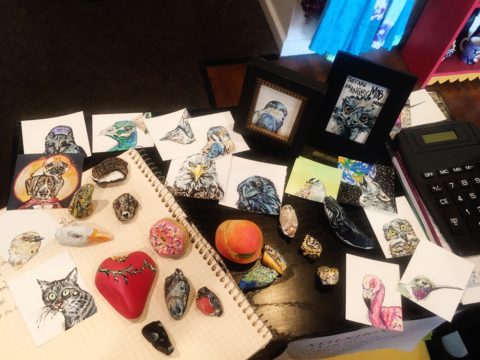
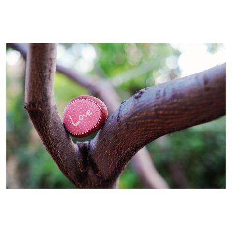
I was touched and photographed it to share with my instagram followers, which lead me down the #paintedrock hashtag. The first artist’s post I clicked on – she does amazing mandala dot art – shared what kind of paint she used and gave other general tips. By that afternoon I had a rainbow of colors and was painting my first rocks.

Kim was there to capture the family on the eve of having to put their two dogs down. The little girl presented her with a simple yet profound object and message that resonated so strongly with Kim that it sparked an idea that lead down a path…

 My rock art (art rocks) style has evolved in the last 10 months, and at the beginning of May 2018 I painted my first 2D “little dessert” and bird paintings – supposed to be gifts for Mother’s Day. With encouragement from a fellow artist I have approached galleries and received warm reviews on both the stones and little paintings. 

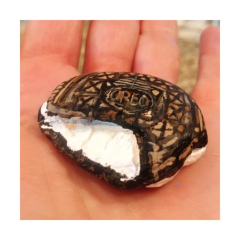
Although Kim’s photography still plays a significant and pleasurable career role in her life, this quest to explore other of her creative energies and talents is proving to be an exciting and potentially lucrative path.

Thanks to the support of my husband Billy, I feel extremely lucky to be given a chance with a second artistic medium – something I never dreamed I would be able to do. I’ve lived my entire life thinking that I could not paint well. While feeling blessed to make a career out of my photography, this is an exciting new direction, I am excited to see where it leads.

I see Kim as a precious stone, of many facets. Although she will still pursue her love of photography and capture people’s lives and many story chapters, Kim will make room for this blossoming career move into the exploration of creating art directly from her heart to her hand.

This sentiment has been so profoundly stated by Federico Leon de la Vega as he references a similar heartfelt expression regarding the (very personal and possibly evolutionary level) value of handwriting. https://www.youtube.com/watch?v=H9j_pLgCr1U

Federico prepares a prp for his TEDX Talk. “From my head to my mind, from my mind to my hand, from my hand to the paper, I place in your hand, so you may fold it and keep it near your heart.”

Some things cross your path unwanted and certainly change your life. For the undesirable things, I recently read this phrase  by Glennon Doyle “Your wound probably is not your fault, but your healing is your responsibility.” Well, you might very well have caused your wound – but either way, taking charge of the healing is your responsibility. Which makes me realize that which we have all been told so many times –  that your destiny is in YOUR hands.

As this relates to art – do not be afraid to explore your creative tendencies. Do not feel you are not worthy or good enough. Experiment. There are so many examples of late bloomers in life. A prime example are the magnificent Portraits of Courage by George W Bush. He dabbled and played with a wide variety of subjects before he hit on portraiture. His abstractly artistic interpretations of people too shape and he discovered that these seemingly primitive paintings had intriguing representation, expression, character, beauty and appeal. The path led him to a powerful platform for veterans, fund-raising opportunities, heightened awareness and acknowledgement of sacrifice.

https://www.bushcenter.org/exhibits-and-events/exhibits/2017/portraits-of-courage-exhibit.html

As stated on the website, this exercise has become significant:

A VIBRANT COLLECTION OF OIL PAINTINGS AND STORIES BY PRESIDENT GEORGE W. BUSH HONORING THE SACRIFICE AND COURAGE OF AMERICA’S MILITARY VETERANS — AND HIGHLIGHTING THE WORK OF THE BUSH INSTITUTE’S MILITARY SERVICE INITIATIVE.

A great article on the accidental painter is here in The Artists’ Network

“These portrait paintings aren’t great but they are gutsy, because it is gutsy to show your artwork period, but it is really gutsy when you know the work isn’t perfect and you do it anyway, because it matters to you.

We could all learn a little bit from this–to embrace our abilities as they are right now, and then to simply let the work go…”

It’s not about a perception of being great or even good enough – most artists never really believe that they are. It is about following your passion – in this case, artistic expression. You might be surprised at what happens next! Believe in the power of ART!!


Bring Elegant Functional Pottery into Your Daily Life

Powerfully, pretty, porcelain, pottery graces the urban storefront window this month, of the east gallery of PATRICIAN DESIGN, with elegant, functional inspiration.

The opening of this the second  installation of the Resilience exhibit features a collection of porcelain pieces that is intended to be an entirely functional  ensemble of art.

It’s been refreshing to have these well established artists paired with exciting emerging artists presenting their expressive talents, in the form of something that you can use and enjoy, to enhance the aesthetic connections in your daily life.

Resilience, conceived by Helen Atkins, an exciting emerging artist herself, is the manager of consignment art at PATRICIAN DESIGN.

Her concept was to “explore the experience of local female artists at various junctures if their careers.”

As a recipient of the Makeshift Grant Project, “Resilience” is funded by the downtown Albuquerque Arts & Cultural District and the Albuquerque Community Foundation. The name of this project suggests that the strength and flexibility of clay as it is formed is an analogy to similar characteristics in the course of a woman’s life. Strength and flexibility – resiliency and tenacious fortitude are the features the two share  and which are celebrated with this show.

In addition to this relevant topic of women, the functionality of this collection is what is even more expansive. No gender specific appeal to this wonderful work, the idea that pulling in from the disposable practices of everyday life, strikes a universal chord.

To pull in and focus on what  you have and use in your daily life is the beginning. Evaluating between pure function and added beauty being introduced as an enhancing element is the trick. Then discovering individual pieces that bring enjoyment  while contributing to the function as well as the aesthetic of the scene,  from an interior design standpoint, is wonderful.

Your “scene” should be exclusively personal to you and your life experiences.  It is personal and wonderful to incorporate handmade artwork in all aspects of a design project. To appreciate the detail and have the opportunity of taking that artwork all the way to daily tableware is pure joy. These and other potters that we feature at PATRICIAN DESIGN offer just that – the opportunity to incorporate art into the simple functions of eating and drinking.

Artist  Kathryne Cyman is a master of the 400 year-old Japanese process of Arita pottery.  Please read more about Kathryne’s journey at http://art.unm.edu/kathryne-cyman/   Showing alongside her capable student Jordyn Bernicke, the two present simple, elegant, affordable pottery pieces for you to bring into your  daily life.

Imagine the soft, delicate yet durable cup in your hand from which to sip and relax. Even to toss o.j. on the run – the basic action of drinking from a handmade vessel, in a color and finish that makes you smile, is an enhancement to the day.

Sensory perceptions ignited by the feel and the look of a beautiful piece of pottery is restorative.

We are privileged to have this exhibit and to meet these fine artists. We are privileged as a community to have this program at UNM.  It appears that the natural beauty of New Mexico, life lived close to the earth and celebrated by Native Americans for generations is a parallel practice to the Arita process by the artisans in Japan.

This exhibit proves that to admire the techniques that produce beauty is to acknowledge the importance and value of including these elements in our daily lives.

Picking PINK!

Prompted by pieces peppering a pastel presentation for an artist’s opening reception entitled Resilience we held here at PATRICIAN DESIGN last Friday evening, I was pondering this week’s topic when PINK peeked  into my thoughts.

Pale pink is an unsung color – often considered to be insipid and lacking ooomph, it really is quite satisfactory. Pounced on by millennials, with their popular color trend “Millennial Pink” passion for all things in fashion and home style, pink has made a bit of a splash in recent years.

Last Friday, with the creation of the display window featuring pottery shards scattered along the floor, artist Helen Atkin’s peachy pastel pink and soft coral glazes melded together against the soft geometric woven textile resulting in a confection of comfortable color and texture.

Helen Atkins’ shards and little dishes sprinkled in the east gallery window at PATRICIAN DESIGN.

I awoke today with this color on my mind. Swirling thoughts, so often the case, as one thing leads to another and I thought – I wonder how much of that most satisfactory and pleasing color I have here in my immediate world. So, I set-forth  to find out.

Gathered on the nightstand in the guest room, this cluster of dried flowers is a fragile collection of soft pink tones.

Walking around the house, I came upon so many examples that I really was quite pleased. The re-discovery of each made me feel content. I realize that although they are seemingly insignificant that they are really quite sentimental pieces gathered through the years and each so distinctly different from the next.

One of my first purchases when I moved across the country was this discarded, damaged Tamarind print of a large nearly psychedelic strawberry from the famed print-making institute  where rejected failures spoke the language of “one man’s trash is another man’s treasure” and it was mine to adorn my new, naked, New Mexican walls.

Generally referencing feminine imagery and romance, pink is delicate yet full of depth and variation – as with all colors – the range is limitless for value, tone, blending of shades…Contrasting warm yellows and cool blues frame pink so well.

Detail of one of several of my Gerhard Lehner lovlies, I Still Sail to the Virgin Islands. As the artists explains – “An original like-etching a la poupe arrived from drawn textural lines and painted effects which allows the poetic ink to transfer to the fine rag paper.”

Detail – Fine Craft and Dance by Gerard Lehner


Bold floral brush strokes sweep through the pinks and peach, coral and rose, accented with the contrasting vessel in a brilliant cobalt blue, Peggy Zuris was a master of color and style.

Memories of the warm glow of the pink roof-tiled, painted and plastered buildings along the Puerto Vallarta coastline absorb and reflect the rising and setting sun during all exposures of the day.

Detail – watercolor featuring iconic Our Lady of Guadalupe church by Victor Torres Tellas

Meandering from room to room I encounter so many pretty pink things. I obviously gravitate to this amidst my many other colors as a necessary element woven through my comfort zone.

Detail – Fantastically French floral oil on canvas by Anne Sandry

And I adore this finely detailed hand-colored etching showcasing a foreground field of pink lupines,bought decades ago in the artist’s studio at The Torpedo Factory.

Detail of etching by Lyndia Terre

Then I came upon these book bindings stacked unconsciously atop a mahogany dresser , resulting in a study in pinks presenting a pleasing palette.

I realize that I was exposed to the priority of pink at an early age as my  mother’s interior design palette incorporated pinks and soft greens in the more formal areas as well as outside on our screened porch and patio beyond, to the gardens with magnificent mounds of screaming pink azaleas blooming and their explosions of color every spring. Surrounded by lush verdant foliage of the woods where we lived, pink contrasted well with the many shades of green into which we were intimately nestled. We were comfortably punctuated with pink. Therefore it was not a foreign color and complimented the transitions into other darker green tones and yellow accents throughout our house. The original scrolled wool wall-to-wall carpet was a medium pinky-clay color. Quite unusual, yet neutral, providing an earthy grounding.  Mom also enjoyed the vibrant introduction of designer Lily Pulitzer onto the scene in the 60s and peppered her wardrobe with Pulitzer pinks from carnation to hot fuscia contrasting with chartreuse green. Today her classic iconic colors and patterns still make significant design statements.  Mom has never been afraid of color! I inherited that fearless foray into colors of anything fun and fabulous

This handcrafted New Mexican church (birdhouse – having never been outside to host a bird) sports an eclectic array of enchanting elements using pinks to perk up the collection of colors. I realize as I tour these rooms of colorful artwork, that I love the combination of pinks with blues and yellows!!

and also the appreciation for the soft subtleties too. These two magnificent oil paintings depicting New Mexican scenes with the oh-so-pleasing pinks.

Detail – oil painting Church at Golden by Marilyn Yates


Detail – oil painting Moonrise by Bruce Piel

This has been a fun and illuminating exercise. I’ve determined that pink is essential to me.

Why not a pink cabbage plate on the guest room duvet cover dotted with woven clay-pink slubs?

It occurs in so many things that bring me joy.

A heavy, luminous hand-blown glass vase.


Speckled vintage vase – a touch of fun!

As my dear friend Corinne aptly named her shop, it is The Color of Joy. Pick a color – any color – and go around your interior spaces and see what you discover – perhaps you will find your essential grounding color. It just might be a surprise. Find what brings you joy.

Cats, Patterns and Participation

During the course of this day’s consultation this precious and perky bob-tailed cat, Kachina, inserted herself into the entire process.  She greeted me upon arrival, walked all manner of adjacent furniture as we discussed the scope of work. She tip-toed across tables, sofa and chair backs, and ultimately the hides we were considering for upholstery.

Initially we viewed the room and its present arrangement and realized that the l-shaped right angle position of the sofa, loveseat and recliner conflicted with the angles in the room. the sofa was perpendicular to the TV/display. The fireplace was at an angle in the corner. Neither one had the central focus – the attention was split from all angles. So the question was…Is it necessary to have the recliner as the primary TV viewing piece? Seemed like all the pieces were crammed together and the room was not being utilized to its full potential.

Kachina even has her eye on that bulky sofa as though to say – MOVE IT!


Kachina leaped onto the sofa to make her point- agreeing to the subject of our conversation!

It was determined that the recliner need not be positioned to directly view the TV. Once we turned the sofa to be parallel to the fireplace, it also opened the angle to the entire room and framed both the TV/display unit and fireplace. The recliner tucked into the far corner -not facing the TV – created a cozy nook for reading and next to the patio doors allowed a view of the backyard.

Needless to say, this fireplace crowned by this magnificent buffalo was an incredible focal point.  Formerly from Wyoming, this couple knew this buffalo. They knew his name and knew that he became too aggressive and gored at least one female to death – who had to also be put down and who’s pelt was on the floor in another area of the home. The hunt and subsequent shoot has been preciously preserved and revered. These were not mere trophies.

This is the most extraordinary collection of very fine Native American Art I have ever seen in a private residence. From to carved stone, amazing weavings to paintings and pottery, the presentation is stunning.

To soften all the hard and cold materials of the floor tile, leather and iron detailing, we are now on the hunt for the perfect area rug. Probably a shag to carry the balance of the contrasting finishes. Design is all about contrast, balance and harmony.  Unless the intent is to intentionally disrupt, in which case, the contrast takes center stage!!!!

These gorgeous brindle cow hides were so exotic and beautiful. The patterns and colors were wonderful and the couple who owned them had a great respect for the animals, and the celebration of their beautiful pelts.

Kachina was nearly camouflaged with her pretty pelt against theirs.

It’s fun when pets participate.

We will be making a pair of ottomans  with these two hides. Great for pull-up at parties to gather around the cocktail table in the center of the room. Watch for the additional photos once the work is finished.