Young Family Prioritizes Remodel

We all know that traditional housing floor plans are changing to maximize smaller footprints. The result is a more open layout. This preference, often seen in “loft” design where warehouse space is converted to living spaces – without many walls and with an eye on the interestingly industrial finishes of the existing space.  But this same concept applies to new home construction for starters or down-sizing to smaller homes and is definitely applicable in remodels of existing traditionally compartmentalized plans.

Lifestyles too have opened kitchens. Although often to maximize smaller spaces, they are also more open as cooking is more celebrated in the home and related activities are shared.  Kitchens have truly become the fulcrum of family life. So when this young  couple purchased their first home, the vintage 1960s split-level plan was not quite right.

The kitchen was a narrow galley-style tucked into a rear corner of the main floor. And although it had recently been remodeled, it was confining and not conducive to entertaining and growing a family.

The point of arrival was an open space with entry wall about 12-15 feet from the front door. To the right, the living room had a focal fireplace and the adjacent dining room made an “L” back to where the kitchen was tucked behind that previously mentioned entry wall.

So this progressive young couple thought way beyond merely  opening the wall creating a pass-through bar to better connect the kitchen to the living spaces. No, they said ” Let’s blast this baby out of here!” And with that they proceeded to visualize the point of arrival being the actual kitchen in full-view as guests arrived. Hello!!!!!

The former kitchen containment was revealed to present the new elongated welcoming bar counter-top, luminous glass pendants and supplemental recessed down lights, to meet and greet all who pass through their front door! Original hardwood floors were refinished in a dark walnut stain.

Their priorities were to create a larger, more functional kitchen with a clean, modern look and feel while making all open to better interact with their soon-to-arrive baby!

The clean white on white finishes in the kitchen are fresh and crisp. Lest you think they saved and added to existing cabinets, they did not – all cabinets are new!

And this might be considered gilding the lily, but we added a splash of artistic expression when we hand-painted the small squares in the new brushed stainless cabinet pulls to give them a bit of extra pizzazz!!!

By using the Carrara mosaic as a wall-covering, rather than merely a back-splash, the walls get a truly finished built-environment “read.”

The upper bar counter-top bows at bar-level to offer a more comfortable conversation scene.

The living room became a cozy sitting area off this wonderfully open kitchen and dining area.

Existing brick walls were softened with a grey-taupe to contrast with the white trim making it POP!

The fireplace now has a complimentary new Carrara mosaic in a diamond pattern to coordinate with the new herringbone mosaic of the kitchen wall.

And baby accoutrements adds colorful animation to the beautifully finished scene!

“HELLO!” they say. “Welcome to our beautiful new home!”


Mirror Mirror on the Wall – Do You Even Notice Me at All?

Designers use tricks, “trompe l oeil” – ever heard of it? Parlez-vous français? It’s a trick of the eye – and how handy is that to create an effect? Often murals are painted to give the illusion of depth or a scene that is not real, yet might fool you into thinking it is.  Similarly, mirrors can create the illusion of dimension and improve spaces – especially small spaces or rooms that feel particularly one-sided. Like the idea? Want to hear some fun designer tips?

Large decorative mirrors expand the dining space in this restaurant. Faux finish  composite material give the impression of hand-carved wood – not!

Mirrors in the Bath We know mirrors are commonly used for practical purposes such as bathroom vanities. They can be simple over-the-sink functional elements or framed versions for decorative pizzazz.

Below,  a built-in tiled surround is nearly a full-wall treatment but with a little relief.

an a more encapsulated/inset mirror shown here

or full wall-to wall treatments that “go away” leaving only the illusion that the room continues beyond…you don’t really “see” the mirror, you see the illusion of space that it creates.

Bathrooms can be intimate spaces of decorative interest


or expanded to be grand spaces of extraordinary volume.

Dining Room Décor and Expansion Other rooms of the house can benefit from mirrors too. Often mirrors are placed in dining rooms over buffets to once again give the illusion of space to a room that is often small for the number of furniture pieces and people that gather there. It is an opportunity to add a decorative element as well as expand the space.

Mixing Geometrics A rectangular console table, sideboard, buffet or dresser enjoys the contrast of a round mirror

Mirrors as Artistic Accessories There are also fun additions to existing pieces like this framed grill-work which is given a new element of interest by adding a mirror behind the iron, set into the frame. Depth and interest instantly change the nature of this decorative wall piece.

Yes, the mirror becomes the decorative focal point. Large framed mirrors can become just that – a great focal point AND provide an illusion of depth. Notice too, the entire wall was tiled behind this focal piece adding further drama and interest.

The limitless options for frames and shapes makes mirrors a valuable accessory similar to a piece of artwork!

Kitchen Surprises Here’s a little trick…rather than looking into a tiled wall behind your cook-top, insert a mirror into the back-splash! It will give the illusion of an opening passing through to another room!!

Wish for a Window Add a “window” where you have none. A “fake window” adds dimension to an otherwise encapsulated interior space. This can be with an actual window to which you add mirrored glass to replace existing or merely a grouping of mirrors to suggest a window to the world.

Embellish with Crafts Here we added white shells to have a little DIY fun!

Make it BIGGER – Make it Better Expand your living space, add value and create perceived square-footage!! Truly enlarging a room with a trick of design expertise is to know where to mirror an entire wall to achieve that illusion of a much larger space.

Consider what is being reflected. You won’t want it reflecting an open bathroom door necessarily…You can even enhance the area that will be reflected to maximize the effect.

Theatrical/Dramatic Lighting Effects and Mirrors

ART & Technology As is true with our fast-paced word today, the art of creating mirrors has gone from fine craft to commodity. Phenomenal prices are now available for what once was a luxury item.  Certainly, there are exquisite hand carved, fantastically finished and even gilded wood frames still being designed and handcrafted by artisans around the world,

but the offerings for production pieces of man-made faux wood and other interesting composites are now on the market. Beveling used to be an art. It was performed by hand (and still is – but it is a lost art and it’s not as necessary a trade with the advances in technology to achieve the detail).

Difficult to see the hand-beveled work on this amazing hand-carved mirror.

The effects of a bevel either on the mirror within a frame or here as a frame itself, bevels add detail of angular reflection that add interest to a mirror’s single-plane depth providing the angular plane to reflect other surrounding facets of the scene.

Mirrors are one of the most versatile and effective design components. Look at them, look into them, use them, play with them – they will expand your world!!

Bring Elegant Functional Pottery into Your Daily Life

Powerfully, pretty, porcelain, pottery graces the urban storefront window this month, of the east gallery of PATRICIAN DESIGN, with elegant, functional inspiration.

The opening of this the second  installation of the Resilience exhibit features a collection of porcelain pieces that is intended to be an entirely functional  ensemble of art.

It’s been refreshing to have these well established artists paired with exciting emerging artists presenting their expressive talents, in the form of something that you can use and enjoy, to enhance the aesthetic connections in your daily life.

Resilience, conceived by Helen Atkins, an exciting emerging artist herself, is the manager of consignment art at PATRICIAN DESIGN.

Her concept was to “explore the experience of local female artists at various junctures if their careers.”

As a recipient of the Makeshift Grant Project, “Resilience” is funded by the downtown Albuquerque Arts & Cultural District and the Albuquerque Community Foundation. The name of this project suggests that the strength and flexibility of clay as it is formed is an analogy to similar characteristics in the course of a woman’s life. Strength and flexibility – resiliency and tenacious fortitude are the features the two share  and which are celebrated with this show.

In addition to this relevant topic of women, the functionality of this collection is what is even more expansive. No gender specific appeal to this wonderful work, the idea that pulling in from the disposable practices of everyday life, strikes a universal chord.

To pull in and focus on what  you have and use in your daily life is the beginning. Evaluating between pure function and added beauty being introduced as an enhancing element is the trick. Then discovering individual pieces that bring enjoyment  while contributing to the function as well as the aesthetic of the scene,  from an interior design standpoint, is wonderful.

Your “scene” should be exclusively personal to you and your life experiences.  It is personal and wonderful to incorporate handmade artwork in all aspects of a design project. To appreciate the detail and have the opportunity of taking that artwork all the way to daily tableware is pure joy. These and other potters that we feature at PATRICIAN DESIGN offer just that – the opportunity to incorporate art into the simple functions of eating and drinking.

Artist  Kathryne Cyman is a master of the 400 year-old Japanese process of Arita pottery.  Please read more about Kathryne’s journey at http://art.unm.edu/kathryne-cyman/   Showing alongside her capable student Jordyn Bernicke, the two present simple, elegant, affordable pottery pieces for you to bring into your  daily life.

Imagine the soft, delicate yet durable cup in your hand from which to sip and relax. Even to toss o.j. on the run – the basic action of drinking from a handmade vessel, in a color and finish that makes you smile, is an enhancement to the day.

Sensory perceptions ignited by the feel and the look of a beautiful piece of pottery is restorative.

We are privileged to have this exhibit and to meet these fine artists. We are privileged as a community to have this program at UNM.  It appears that the natural beauty of New Mexico, life lived close to the earth and celebrated by Native Americans for generations is a parallel practice to the Arita process by the artisans in Japan.

This exhibit proves that to admire the techniques that produce beauty is to acknowledge the importance and value of including these elements in our daily lives.

Picking PINK!

Prompted by pieces peppering a pastel presentation for an artist’s opening reception entitled Resilience we held here at PATRICIAN DESIGN last Friday evening, I was pondering this week’s topic when PINK peeked  into my thoughts.

Pale pink is an unsung color – often considered to be insipid and lacking ooomph, it really is quite satisfactory. Pounced on by millennials, with their popular color trend “Millennial Pink” passion for all things in fashion and home style, pink has made a bit of a splash in recent years.

Last Friday, with the creation of the display window featuring pottery shards scattered along the floor, artist Helen Atkin’s peachy pastel pink and soft coral glazes melded together against the soft geometric woven textile resulting in a confection of comfortable color and texture.

Helen Atkins’ shards and little dishes sprinkled in the east gallery window at PATRICIAN DESIGN.

I awoke today with this color on my mind. Swirling thoughts, so often the case, as one thing leads to another and I thought – I wonder how much of that most satisfactory and pleasing color I have here in my immediate world. So, I set-forth  to find out.

Gathered on the nightstand in the guest room, this cluster of dried flowers is a fragile collection of soft pink tones.

Walking around the house, I came upon so many examples that I really was quite pleased. The re-discovery of each made me feel content. I realize that although they are seemingly insignificant that they are really quite sentimental pieces gathered through the years and each so distinctly different from the next.

One of my first purchases when I moved across the country was this discarded, damaged Tamarind print of a large nearly psychedelic strawberry from the famed print-making institute  where rejected failures spoke the language of “one man’s trash is another man’s treasure” and it was mine to adorn my new, naked, New Mexican walls.

Generally referencing feminine imagery and romance, pink is delicate yet full of depth and variation – as with all colors – the range is limitless for value, tone, blending of shades…Contrasting warm yellows and cool blues frame pink so well.

Detail of one of several of my Gerhard Lehner lovlies, I Still Sail to the Virgin Islands. As the artists explains – “An original like-etching a la poupe arrived from drawn textural lines and painted effects which allows the poetic ink to transfer to the fine rag paper.”

Detail – Fine Craft and Dance by Gerard Lehner


Bold floral brush strokes sweep through the pinks and peach, coral and rose, accented with the contrasting vessel in a brilliant cobalt blue, Peggy Zuris was a master of color and style.

Memories of the warm glow of the pink roof-tiled, painted and plastered buildings along the Puerto Vallarta coastline absorb and reflect the rising and setting sun during all exposures of the day.

Detail – watercolor featuring iconic Our Lady of Guadalupe church by Victor Torres Tellas

Meandering from room to room I encounter so many pretty pink things. I obviously gravitate to this amidst my many other colors as a necessary element woven through my comfort zone.

Detail – Fantastically French floral oil on canvas by Anne Sandry

And I adore this finely detailed hand-colored etching showcasing a foreground field of pink lupines,bought decades ago in the artist’s studio at The Torpedo Factory.

Detail of etching by Lyndia Terre

Then I came upon these book bindings stacked unconsciously atop a mahogany dresser , resulting in a study in pinks presenting a pleasing palette.

I realize that I was exposed to the priority of pink at an early age as my  mother’s interior design palette incorporated pinks and soft greens in the more formal areas as well as outside on our screened porch and patio beyond, to the gardens with magnificent mounds of screaming pink azaleas blooming and their explosions of color every spring. Surrounded by lush verdant foliage of the woods where we lived, pink contrasted well with the many shades of green into which we were intimately nestled. We were comfortably punctuated with pink. Therefore it was not a foreign color and complimented the transitions into other darker green tones and yellow accents throughout our house. The original scrolled wool wall-to-wall carpet was a medium pinky-clay color. Quite unusual, yet neutral, providing an earthy grounding.  Mom also enjoyed the vibrant introduction of designer Lily Pulitzer onto the scene in the 60s and peppered her wardrobe with Pulitzer pinks from carnation to hot fuscia contrasting with chartreuse green. Today her classic iconic colors and patterns still make significant design statements.  Mom has never been afraid of color! I inherited that fearless foray into colors of anything fun and fabulous

This handcrafted New Mexican church (birdhouse – having never been outside to host a bird) sports an eclectic array of enchanting elements using pinks to perk up the collection of colors. I realize as I tour these rooms of colorful artwork, that I love the combination of pinks with blues and yellows!!

and also the appreciation for the soft subtleties too. These two magnificent oil paintings depicting New Mexican scenes with the oh-so-pleasing pinks.

Detail – oil painting Church at Golden by Marilyn Yates


Detail – oil painting Moonrise by Bruce Piel

This has been a fun and illuminating exercise. I’ve determined that pink is essential to me.

Why not a pink cabbage plate on the guest room duvet cover dotted with woven clay-pink slubs?

It occurs in so many things that bring me joy.

A heavy, luminous hand-blown glass vase.


Speckled vintage vase – a touch of fun!

As my dear friend Corinne aptly named her shop, it is The Color of Joy. Pick a color – any color – and go around your interior spaces and see what you discover – perhaps you will find your essential grounding color. It just might be a surprise. Find what brings you joy.

Cats, Patterns and Participation

During the course of this day’s consultation this precious and perky bob-tailed cat, Kachina, inserted herself into the entire process.  She greeted me upon arrival, walked all manner of adjacent furniture as we discussed the scope of work. She tip-toed across tables, sofa and chair backs, and ultimately the hides we were considering for upholstery.

Initially we viewed the room and its present arrangement and realized that the l-shaped right angle position of the sofa, loveseat and recliner conflicted with the angles in the room. the sofa was perpendicular to the TV/display. The fireplace was at an angle in the corner. Neither one had the central focus – the attention was split from all angles. So the question was…Is it necessary to have the recliner as the primary TV viewing piece? Seemed like all the pieces were crammed together and the room was not being utilized to its full potential.

Kachina even has her eye on that bulky sofa as though to say – MOVE IT!


Kachina leaped onto the sofa to make her point- agreeing to the subject of our conversation!

It was determined that the recliner need not be positioned to directly view the TV. Once we turned the sofa to be parallel to the fireplace, it also opened the angle to the entire room and framed both the TV/display unit and fireplace. The recliner tucked into the far corner -not facing the TV – created a cozy nook for reading and next to the patio doors allowed a view of the backyard.

Needless to say, this fireplace crowned by this magnificent buffalo was an incredible focal point.  Formerly from Wyoming, this couple knew this buffalo. They knew his name and knew that he became too aggressive and gored at least one female to death – who had to also be put down and who’s pelt was on the floor in another area of the home. The hunt and subsequent shoot has been preciously preserved and revered. These were not mere trophies.

This is the most extraordinary collection of very fine Native American Art I have ever seen in a private residence. From to carved stone, amazing weavings to paintings and pottery, the presentation is stunning.

To soften all the hard and cold materials of the floor tile, leather and iron detailing, we are now on the hunt for the perfect area rug. Probably a shag to carry the balance of the contrasting finishes. Design is all about contrast, balance and harmony.  Unless the intent is to intentionally disrupt, in which case, the contrast takes center stage!!!!

These gorgeous brindle cow hides were so exotic and beautiful. The patterns and colors were wonderful and the couple who owned them had a great respect for the animals, and the celebration of their beautiful pelts.

Kachina was nearly camouflaged with her pretty pelt against theirs.

It’s fun when pets participate.

We will be making a pair of ottomans  with these two hides. Great for pull-up at parties to gather around the cocktail table in the center of the room. Watch for the additional photos once the work is finished.

10 Tips for Remodeling: To Improve and Enhance

I’m currently working on an urban loft apartment.  The criteria with which I was presented, upon our first meeting, consisted of three items: One – to enclose an open bedroom to provide privacy, Two  – to provide alternate access to the shared master bathroom. (There is also a powder room, but the shower and tub were only accessible through the master bedroom), Three – because it is a relatively small footprint with voluminous tall ceilings, he was hoping to create a small second tier for additional square-footage.  I understood these items to be his intended “improvements.”

While on-site, at the first meeting, it was (and is always) impossible to limit the observations to only those isolated areas of concern without seeing all else that is occurring around the space.  Therefore, I consider the extra comments that I offered for minor changes to be “enhancements.” These are things that have not had or do not have  priority in the eyes of the client and might have even gone unnoticed forever. Items such as adding a wing wall at the front entry to screen view from the door through the kitchen, concealing a new tall closet of matching cabinetry directly behind the wall to add storage to the kitchen,  add a clerestory window and bookcase with cabinets to the new wall between the master bedroom and living area for borrowed light and additional storage!

Occasionally these offerings are met with a shrug, hmmm or a “maybe” and not really considered to be of great value, but more often than not they are greeted with exclamations like ‘Oh, I never would have thought of that.”  “What a cool idea!”  “I would love to have that.”  And it is with this enthusiasm that my client responded.

So when considering remodeling or identifying the primary improvements needed, begin with the priorities then layer design details of additional enhancements and you will create a master plan that can be executed over time in phases in a preferred or practical order of priority.

1. Begin with your list to improve the function and enjoyment of your environment.

2.Prioritize the list and guesstimate costs to establish a starting conversation    regarding budget.

3. In addition to cost – consider pairing like-kinds of things together such as adding or removing a wall which involves framing, sheetrock, texture, paint – it might be cost-effective to do all items related to these trades even if they are not the same priority.

4. The distinction between improving and enhancing is a fine line because improving does enhance, however I consider improving more practical and enhancing with embellishments that are less critical, but make further improvements and enhance the quality of the space. Such as crown molding, improved base trim, unobtrusively installed mirrors, windows, updated hardware, etc… https://bit.ly/2HCYrU

5. Storage is always welcome. Look for opportunities to add cabinets, vertical spaces to maximize your footprint, second-tier countertops, raise cabinet heights even furniture to provide additional storage. https://bit.ly/2GZglUa 

6. Passing daylight through to interior spaces is more common in offices than in residences, yet for the same reasons of “borrowing” light in commercial spaces, skylights, vertical slivers of glass, transoms and clerestories are valuable assets when it comes to bringing daylight into pockets of darkness. https://bit.ly/2HCddKU

7.Evaluate your existing lighting. Adding dimmable ambient light to rooms to supplement existing down-lights such as pendants in kitchens, translucent lamps shades on table and floor lamps, even well-concealed under-cabinet lights will add control and mood enhancements. Spot light wall art and sculptural pieces, illuminate corners with up-lights (up through trees, behind chairs), and consider changing to LED lamping (bulbs) for longer-life, cost -effectiveness and a full range of colors!

This up-light filters through the plant from behind the chair casting interesting shadows and illuminating an otherwise dark corner.

8. When considering new flooring know your needs as there are so many options for soft under-foot, freeze-proof to carry outside, ease of maintenance, durability, non-slip, and of course the many aesthetic preferences.

This interlocking vinyl floor has remarkable graining look, color and texture and provides soft “give” underfoot. These new luxury vinyls defy our early perceptions of faux finishes.

9. Stacking laundry machines have provided terrific opportunities for added space in laundry rooms, more cabinets, counter space, laundry sinks, craft areas and more! https://bit.ly/2HpkKih

10.Opening walls enlarges spaces – even a peek-through, but also create the interest of depth and layering of dimension, color and light.  https://bit.ly/2GZrMLj

“Wonder Time” & Creativity

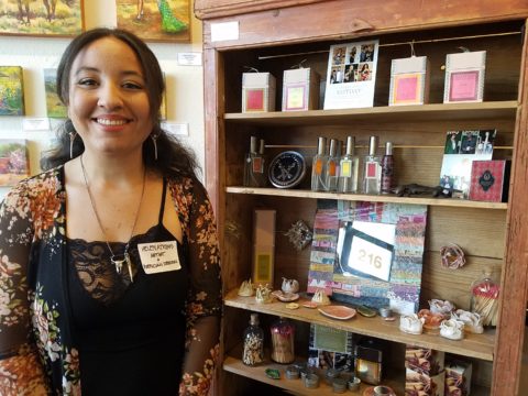
I love the creative process. I love darting from idea to idea – the random electric jolt that results from spontaneous concepts that will create something wonderful, if not significant and the gratification of the final product!

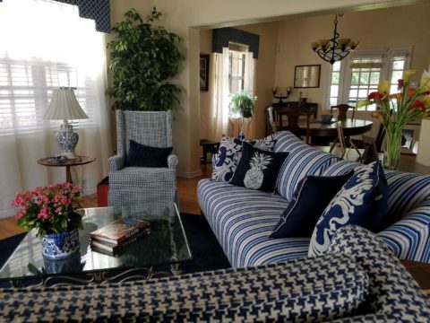
That is interior design – creating something that enhances an interior – an interior (and exterior) space and all the elements within that serve people. Designing an interior which solves problems, increases enjoyment, and hopefully has staying power is the goal. Unless intentionally transient and intended to be impermanent, offering a design that has staying power transcends trends and creates without a framework of only the present.

If you are a client, potential client or an associate in this crazy, wonderful business don’t you ask yourself, “How does creativity happen?” An idea? A need?

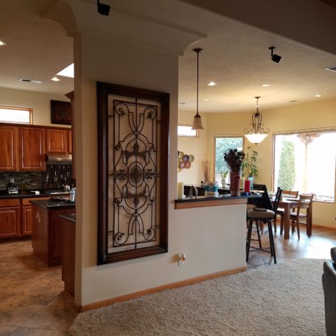
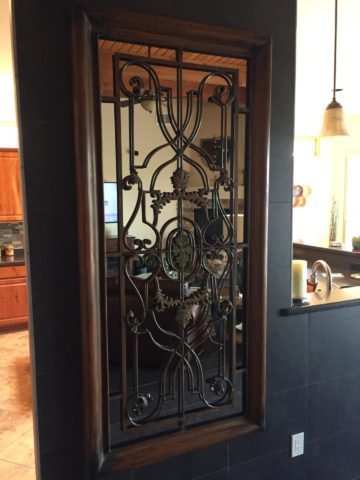
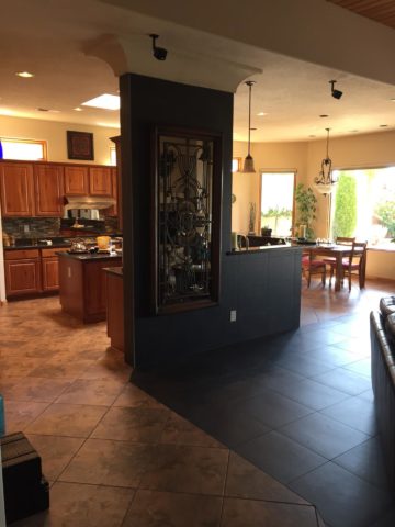
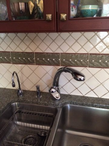
So the idea occurred on-site as I sketched a pattern that I thought would be the perfect statement and backdrop for all else in the house.


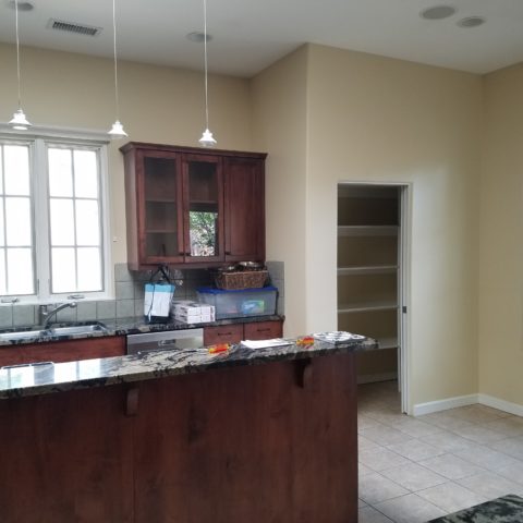
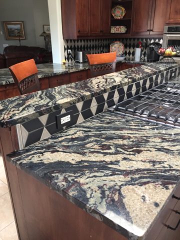
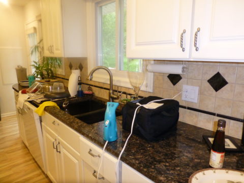
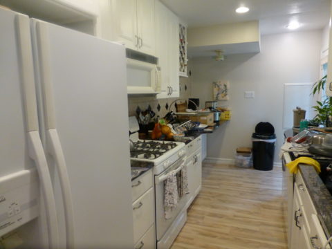
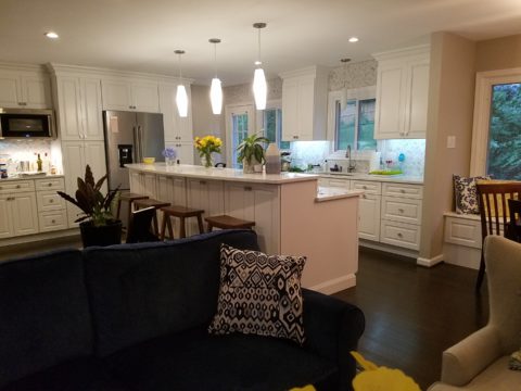
The kitchen had some expensive elements that were not practical to change. Existing cabinets, natural stone counter-tops and ceramic tile flooring all had to stay.


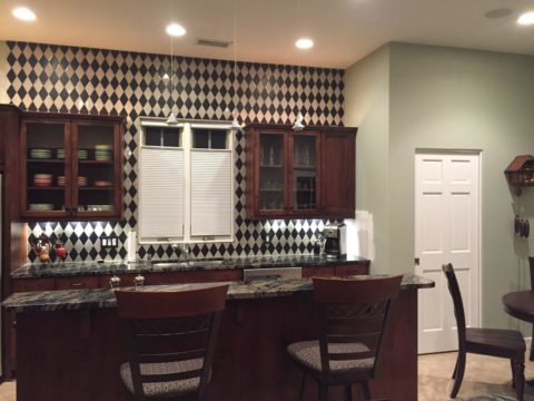
The original sketch realized in an nearly black, charcoal and cream tile pattern with an added opportunity for the client to turn an error into artistic expression.

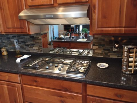
Well this client asked and made a creative discovery: “George (young-adult son) Juan (tile installer) and I had a lot of fun figuring out…the tile work behind the stove…That was supposed to be solid black..didn’t even get ordered…and George worked with the left over pieces and designed that (solution) himself!!!! I think it’s amazing and will always be so special bc of how it came to be!!”

“Basically, what happened was we ran out of the tan colored tile and only had some smaller-than-half pieces left from the cuts.” Resulting in George’s creative solution!!

Personal experience with years of working with a variety of people has shown the extraordinary difference in how each individual perceives and proceeds through the design process and related creativity. For some, the design process is an exciting adventure to be navigated with or without the aid of an exhibition leader (professional designer) to explore and travel the amazing paths of color, balance, detail, elements and combinations. For others it is not only not an exciting adventure, but one of frustration, anxiety and sheer obligation to complete a necessary task(s). Like a project with a deadline – finite and compulsory. Where’s the joy?

To design for others is the name of the game – the professional practice. In order to effectively design for others, one must have empathy. To extract a client’s wishes and create for the express purpose of making them look good, feel good, enjoy their environment, produce well and feel empowered all requires getting into their world. When you effectively do so with the genuine desire to make better, you empathize with their concerns, desires, sensitivities, and needs in order to design effective solutions.

How the brain perceives things and how sensitivities are realized, by different individuals, is remarkable. From our amazing, autistic grandson who finds wonder in very focused things from red cars to distinct shapes and colors, words and pictorial representations of them, to my dementia-challenged nonagenarian mother who clings to her very core appreciation for beauty and everything well designed; perceptions, sensitivities and levels of awareness continually astound.

Elsie de Wolfe a Renaissance woman of broad reaching creative ability said “I am going to make everything around me beautiful – that will be my life.” I wonder now if Mom knew of this amazing woman and heard this phrase that so reminds me of her, but sadly she would not be able to grasp or convey any possible recollection of that now.

I place an enormous emphasis on what I call, “Wonder Time.” Everyone needs time to “wonder.” We should all take more time to WONDER. It is in those moments that amazing things can happen. Realizations can be illuminated, ideas are formed and dreams materialize. It is a time for creativity. Do you take time to “wonder?”

For my once-toddler cousin, I remember the moment so clearly. We were on a mission to get something from the car. It offered an opportunity to have an mini adventure and explore the parking area of our beach house. We had descended many stairs to come out at ground level into the dark, shadowed carport of the massive exposed-concrete structure. It was spooky and mysterious in the twilight. As we made our way holding hands through the shadows, she all of sudden said “I wonder…” and was clearly deep in thought pondering something of our adventure that I wish  I could remember. But her phrase, “I wonder” is clear as a bell, to this day, more than 30 years later. I looked at her and asked “You what?” Wonder was such  an abstract word – a BIG word for such a little person – that it made me wonder what she knew about wondering!!!!! We dashed back upstairs and I announced to the gathered group – “She wonders!!” And began to explain our experiences in the depths  of the concrete carport. The blooming result, of that toddler full of wonderment, is today a highly observant and creative young adult.

Being inquisitive is part of that creative process – the “what if” of it all. I use that often in my design practice…”what if”…and “if, then.” It is not finite, it is a process that presents itself and a variety of tangents continuously.  Designer Todd Oldham observes that creative people are different and if you are not one, you will not understand the need to be creative. He knows that “as a creative person, you can actually survive off of your ideas.”

I agree. For some, creativity is a necessary aspect of being. It is a way of seeing. It is unavoidable and random. It is essential. It is life affirming and life giving. You either are one of the “creatives” or you are not. Yet creativity exists in each of us. It is not learned, but it can be honed.

The sensitivity that comes with this profoundly innate sense is sometimes an onerous burden. Being pleased by design details around you from nature to the built environment, from fashion to well-designed freeway overpasses, details matter and a great joy is the benefit. However, details can have the adverse affect, if not well executed. If they are not well placed or well designed details, they can grate and annoy, raise blood pressure and cause all manner of anxiety. It is an onus to be so sensitive to details. Poor lighting in a restaurant, imbalance of surface textures, ineffective or inappropriate colors  – it is all about that phrase “Beauty is in the eye of the beholder” and if the sensitive person is presented with jarring elements that they behold or consider to be in error, it can be most unavoidably disturbing.

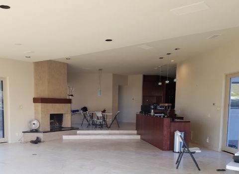
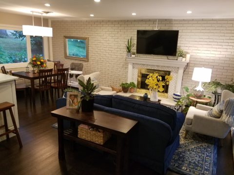
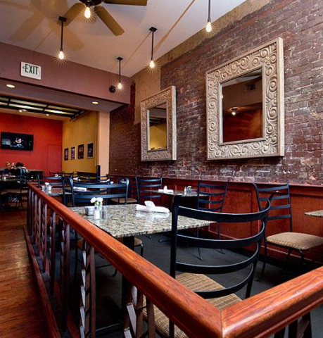
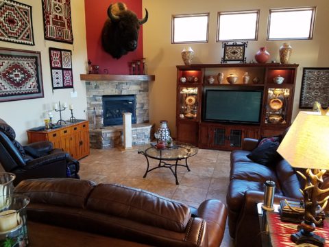
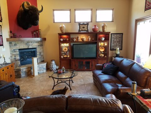
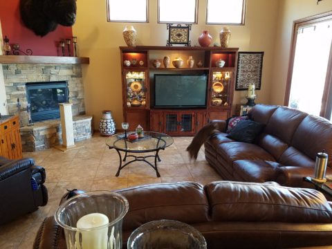
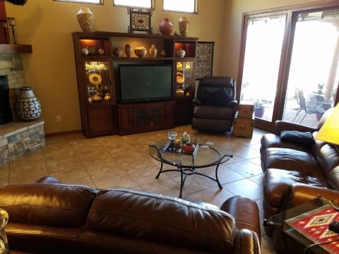
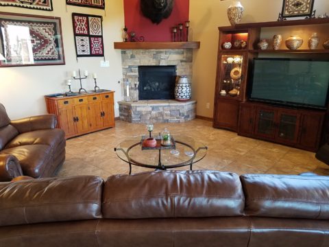
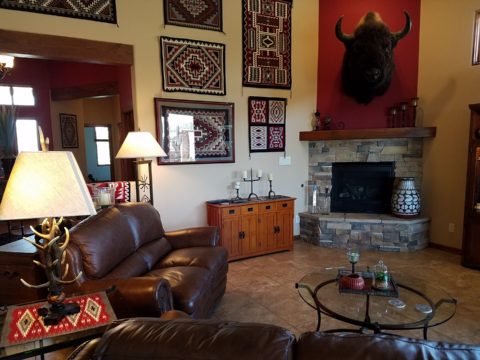
The placement of this fireplace an bar so grated on my sensitivities that it was amazingly uncomfortable being in this space. A challenge for correcting without structural modification for sure!

Like creative writers and their critics, who have often expressed their strength in the power of words…for designers and artists of many media, it is the power of color, lighting, pattern, and composition.

Good design is never out of style.

Quilting – An At-Home Workroom of Color!

It’s not your grandmother’s quilting these days…computers have radically altered the landscape of this generations old art form.  
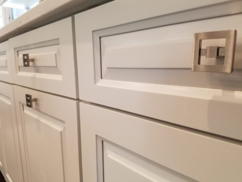
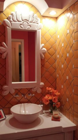
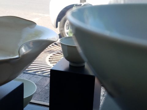
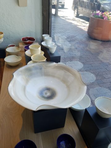
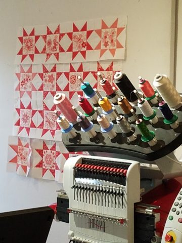
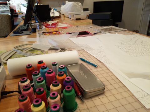
Two days ago I found myself in an in-home art-studio/workroom that blew me away!

Initially a craft born out of necessity, as creative survivors accustomed to “making something out of nothing” re-purposed scraps of material to patchwork new articles of clothing, homegoods and ultimately art for the walls. This clever, resourceful, utilization was celebrated in Dolly Parton’s song turned movie, about her true-life “Coat of Many Colors.” https://en.wikipedia.org/wiki/Dolly_Parton%27s_Coat_of_Many_Colors

The intricate designs and refinement of pattern details was obviously all done by hand, but with the development of machines and now computers for this purpose, the possibilities are endless.

So as I turned the corner, to see a would-be remodel of combining two bedrooms and expanding to the north of the existing shell, I was astonished to see this remarkable, expansive workroom – all white – punctuated with colorful creativity. Colors, textures, patterns…this extraordinary, rather Renaissance, woman had carved out a generous space to explore this phenomenal art and craft.

As an artist, Sue Watrous’ paintings and sketches are quite photo-real. On a few of her pieces, she has deconstructed the elements in the painting cutting them from fabric of many grey-tones defying the fact that they are textile assemblages.

This original pencil drawing – yes, photo-realistic, is amazing.

Then to create the same image as a patchwork quilt is remarkable!!

Yes, look closely, you can see the patches of fabric that are assembled in the many grey tones to create this amazing piece.

Her joie de vivre is derived from this magical space and the creations that she imagines and brings to fruition.

Upon entering her amazing domain, I felt as though I was entering an operating room – everything in perfect order, clean and spare – like a clean-room at Intel – I should gown-out or suit-up!!!

I might be exaggerating because it was white and clean, but warm and welcoming with the rainbow spectrum of thread spools and quilts both finished and in progress displayed on the walls and on the other many surfaces.

Self-taught, she nonchalantly references the many computerized machines strategically placed around the  room. There is an order to the layout and her approach is meticulous. Despite the fact that there is an active quilting community here – they are too busy quilting to teach – so Sue jumped into this after having seen a presentation at a show about five years ago. Years ago she quilted – but at this juncture, she knew at once that she wanted to enter this exciting and challenging realm, of computerized art assist!

Like the shoemaker who has no shoes, her quilts have yet to adorn the walls or bed dressings throughout the rest of her home. She doesn’t sell her work – but her family all has homes riddled with choice pieces.

Her paintings are placed amidst her interior, but not her quilts. Today I focused on a large wall to be the future home of a near-to-be- completed quilt.

She tells me that the fabrics are like paints – she is painting with fabric.


And although she is not yet dying her own pieces, she told me of meeting a textile artist who spun her own thread from her own llamas, dyed it, designed and fabricated her own work.  Sue has created most if not all of her patterns and designs and I am confident that before this is over, she will be donning rubber gloves and dunking material in dye vats to find a new layer of creativity.


Ten Tips on Mixing Metals – Making Sense of It All

How to mix and not mix metals….that is the question. Is it nobler to stick with one throughout or might I venture into a mix of metallic material? From switch plates to chandeliers, this question comes up all the time – and it’s fair. With all the options and the TRENDS saying one thing or another (probably to sell you something or to stand with a current trend fearful of venturing forth), it is a common dilemma. Here are a few tips to give you confidence in the  metal mixing mêlée.

  1. IF the door hinges are one thing – the handles should match. We often see pre-hung doors with brass hinges and a retro-fit of brush chrome or bronze – that is a no-no. 
  2. Is brass finish out – should I change all my hinges and door handles? In – out…no sooner does one hear that a finish is passé or they think they themselves are stuck with a less than new and trendy finish – be calm and carry on – to quote a couple of “trendy” phrases that drive me up a wall – it’s all good.
  3. If you have brass – embrace it! Fear not – it is all about the manner in which you present it – in what context you design with it. 
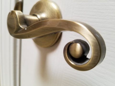
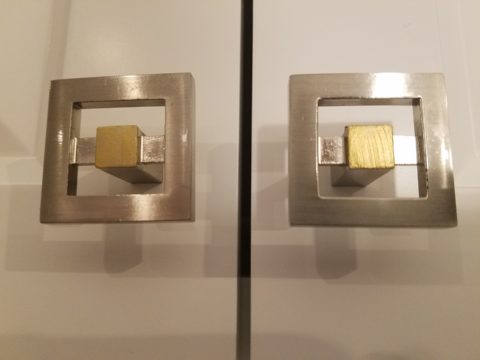
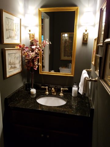
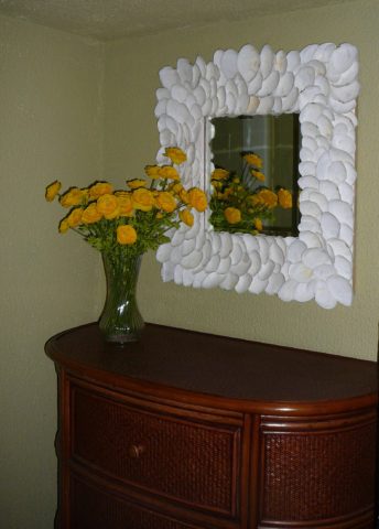
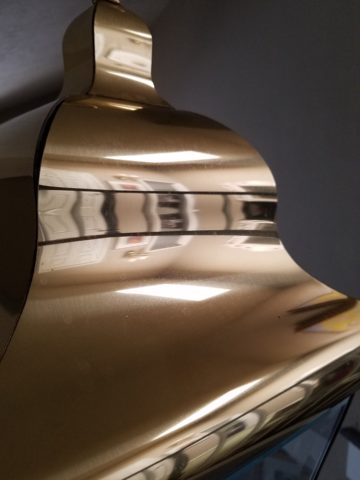
Following trends can be costly, unnecessary and unimaginative. Gold/brass finishes have been making a come-back in recent years. Sometimes it takes time for it to trickle into your purview. But the point is – good design is good design. So it’s not so much about if it is perceived to be good enough or right or wrong…it is if you can design around it and make it great. 
  4. Should you mix a bright brass chandelier with brushed stainless door hardware? Probably not, but it is not so much about the mixing – it is that to make something like that REALLY work, the overall design would have to be so intentionally mixed that it in itself (the intentional mixing) is an art-form. 
  5. If a kitchen has brushed chrome detailing (appliance trim, faucet, etc…), may I use brass cabinet pulls?  
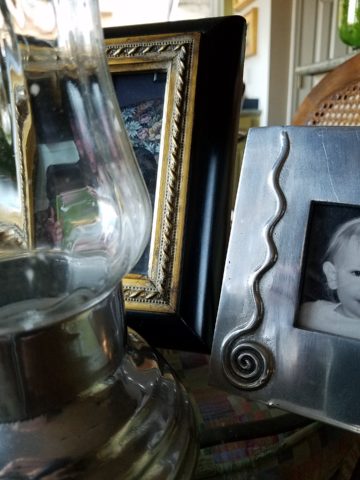
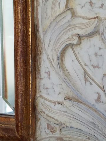
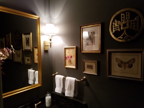
The answer is YES. In some contextual situations, the language of the materials speaks in vernaculars that separate certain groups from others as though allowed to be intentionally different – as they ARE different. 
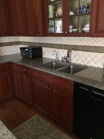
The great thing about knowing when to make statements in contrast – not conflict, is just that – knowing.
  6. The old world and contrasting contemporary look of Bronze, the stalwart wrought iron read of Black, the bling of Polished Chrome, the modern softening of the silver with Brushed Chrome or Stainless, the traditions and suggested opulence of Brass and Gold, the warm median balance of brushed nickel – guess what? They all have their place depending upon the context of design. 
  7. New finishes for appliances rule the kitchen. We thought we had it made when Sub Zero and others offered slots for panels for the fronts of appliances to enable matching of the flanking cabinets. But for those who wanted off-the-shelf units, beyond the merry-go-round colors from harvest gold to avocado green, burnt orange to basic white – the colors of the past were challenged by bold black and brushed stainless finishes – the new fab. 
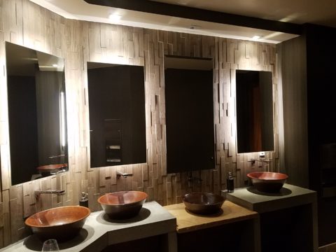
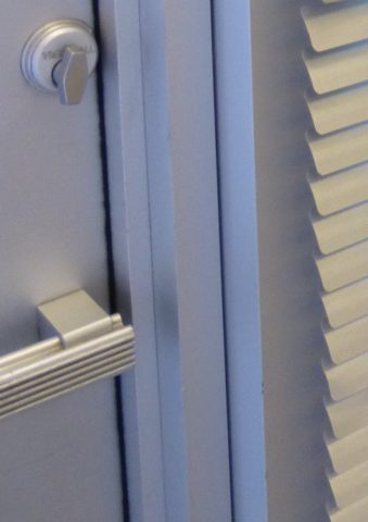
But now we are seeing matte black – and oh is that hot! Complimenting the concrete finishes and raw steel – contrasting with the brushed stainless – punctuating the trend of the clean commercial kitchen style of design. It is a bold yet soft new option for the edgy everyday kitchen.                                    http://www.foodandwine.com/cooking-techniques/look-these-beautiful-matte-black-major-appliances-refrigerator-ranges-ovens-and
  8. Ceiling fans present the same conundrum. Do they match the ceiling and go away? Do they hang suspended like a giant menacing propeller threatening to decapitate anyone who comes near? A black fan against a white ceiling might. A bronze fan in the middle of everything might appear a bit top-heavy. Ceiling height makes a difference. Surrounding decor makes a huge difference. Whether it is to be noticed or quietly disrupt the air for refreshing breezes without screaming their source – those are compelling questions. I cannot even address whether it should match the door handles – it makes me crazy. Unless it is an intentional focal point – like palm-frond paddles in a tropical bar – or industrial mechanisms intended to further that contextual theme, I think nearly all of them should visually go away.  Who wants the focal point of a room to be a fan centered and suspended from the ceiling to hover overhead and command the visual impact of a nose-diving airplane? Unless of course – that is the theme.  The fan designers would argue.

    Oh my – brass, chrome, bronze…where is the focal point? My eyes are darting everywhere!

  9. Fireplace grills…often found in polished brass – they can stay or be painted out – with a flat black that makes them fade into the void of the opening or simulate a cast-iron grate. They can be painted with a faux-rust finish – there are many possibilities – maybe even fire-engine red. The point is, once again, it is the context that makes it successful or appropriate – there is really no right or wrong answer here. 
  10. Tip # 10 is to take each offered finish as it comes, evaluate the context, find your focal point(s), what is the most cost-effective to change? All the door handles and hinges or the light fixture over the dining table? I say it in so many blogs…do not let trends rule your life. Have confidence in your own likes and comfort and go with it – good design never goes out of style. 
  11. BONUS TIP!! Do all my picture frames have to be the same finish? Do I have to re-frame my gold frames or change my maple to chrome or go black on all of them?  
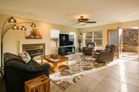
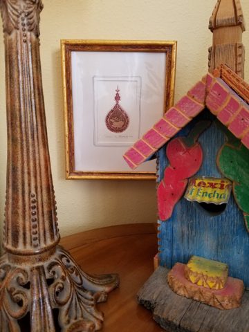
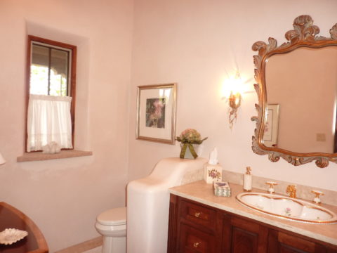
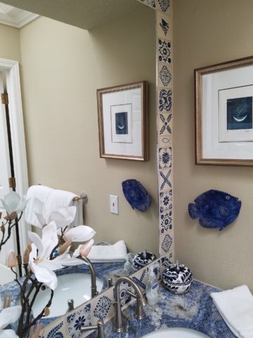
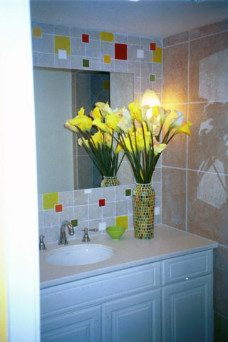
Have I ever mentioned context? Eclectic mixes can be quite fun and interesting.  
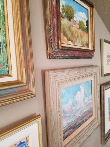
Groupings of identical moldings can be effective.    
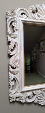
Random pieces scattered throughout can each be singularly nice. So don’t rush out and re-frame all your art. See how you intend to use it, group it, where and with what else. Be sensible and creative – be brave and do what you like! That makes sense!!!!!


For the LOVE of Fine China – USE IT – Inspired Table Settings

From the Diminishing Dining Room of last week’s observations, https://patriciandesign.com/category/dining-rooms/, I decided to further the conversation to encourage a new-found appreciation for having fun setting dinner tables!  I found fodder from Kentucky Fried Chicken served on formal silver platters to wipe-clean placements of dazzling designs to dress your tables.  A collection of tireless designers defend the use of fine china – own it, buy it, find it, inherit it, enjoy it, keep it and use it – don’t send it to the thrift shop!!!

Yes, the art of fine dining seems to be set aside in favor of ease and expediency, but this article from The Washington Post’s HOME section (thank you Feath – my clipping service) brings it all home to use and enjoy.  It is a celebration of art, design and playful creativity.

Not everyone loves to entertain, to create the “tablescape,” to even bother to put together an outfit to wear. Not everyone loves to get dressed in the morning – it is a chore, an obligation, a mere necessity. That’s unfortunate in my estimation. For those of us who do – love it – it is all about having fun with fashion or interior design is just that – FUN!

Last spring I began a series  of emails that I blasted to our mailing list called COOK + PARTY. It was (and will continue this next season) a collection of weekly recipes paired with table-top art pieces. In our gift boutique, we represent an incredible collection of artists who create fabulous tableware.  I paired a piece with a recipe each week to inspire and encourage everyone to use “functional” art in their daily lives and specifically for entertaining and even the family dining table.

https://patriciandesign.com/category/art-and-food/

Recent fodder revealed a great source for fabulous wipe-clean placemats from Caspari.  For decades a fine source for the best paper cocktail napkins, Caspari offers these bold patterns and colors, prints of fine china and fabulous fabrics – re-use and easy to clean – why not?

https://www.casparionline.com/catalogsearch/result/?q=placemat

A previous fall blog that I wrote illustrates the open-mindedness of looking around to find inspiration for seasonal table dressings.  The decision for your table-top inspiration can be spontaneous – just go outside and look around!


Among the refreshingly optimistic designers that were quoted in the Washington Post article:

https://www.washingtonpost.com/lifestyle/home/that-old-fussy-china-can-fit-your-casual-lifestyle-designers-talk-about-how/2018/02/21/46761538-0084-11e8-8acf-ad2991367d9d_story.html?utm_term=.3a6fde2e5124

Barry Dixon, from the verdant rolling hills of Warrenton, Virginia, specifically points out that this process of setting your table should be fun!  Don’t pull-out the same things each time – mix it up! Change it up by adding color and pattern differently with every new opportunity.

Seasonal flowers, yellow woven cotton place-mats, embroidered folk-art table runner, basket chargers beneath classic Limoges topped with ceramic napkin rings – it looks like spring!

Designer Timothy Corrigan tells us that many people find it too difficult to entertain with their best things because the onus of proper cleaning and put-away is too much! But Mr. Corrrigan points out the joy of using your best things every day – everyday is a celebration and what you enjoy should be used.

In another springtime setting…organic, rustic things with finery – black stones nestle fresh purple Campatula flowers antique Limoges and basket chargers –  makes an eclectic table settings – it’snot all or nothing…it’s the combinations and scene that is being set.

Hutton Wilkinson – way out in L.A. where casual chic is the practice of distilling what migrated from the more formal sister coast to the east – noted that he believes presentation is the key to success. It isn’t so much about what is served (don’t tell the chefs that), but rather on what it is served and how it is presented.  Imagine buckets of Kentucky Fried chicken served on elegant Georgian silver platters. That simple fast-food chicken becomes  magnificently irresistible. You can’t say you’re too busy to cook with that creative solution! Wilkinson believes that presentation helps food taste better in addition to looking beautiful! He advocates buying china because it’s beautiful – not merely serviceable. I agree…it’s not all about the mundane purpose of eating off of it – but rather the joy of eating off of it!!

Making your guests feel appreciated and treating them to a unique, pleasing experience is a gift to them.  A special treat to show that you care –  going that extra distance of detail and design.

Color combinations, textures,patterns – wonderfully pleasing tablescapes are a treat for the eye. (So special Marsha!)

So don’t say it’s too difficult…keep it simple with Real Simple – the source for easy, ingenious ideas and simple truths……the following link for proper place-settings will get you started.

https://www.realsimple.com/holidays-entertaining/entertaining/how-to-set-a-table

Patti says – “make it special every day.”