HOME – An Artist’s Perspective

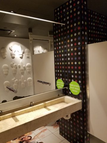
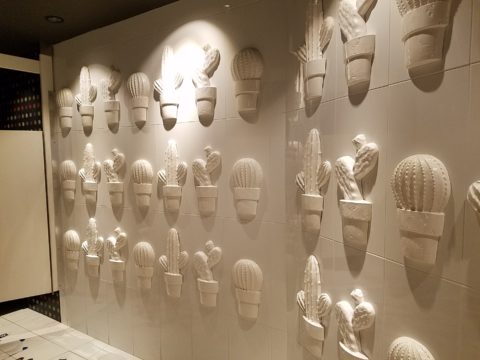
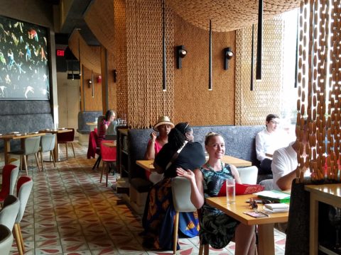
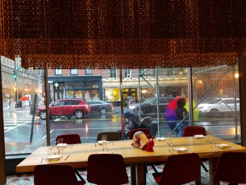
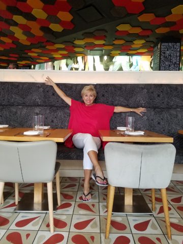
It was quite by accident that we ran into SAAM! Truly, our destination and plan for the afternoon was to catch a bite at the hip and artsy Jaleo tapas restaurant and head to the Bible Museum to see some cool film of all of the buildings in downtown DC that feature biblical quotes on their facades – or something to that effect. But as we sat there in this trippy Spanish-themed interior, right next to the window, we

watched the staff bring in umbrellas from the sidewalk seating areas as the wind picked-up and the sky darkened. Our plans soon began to change. We dawdled at the table well past our tantalizing tapas feast and watched the rain come down in sheets.

As the time past, it became apparent that the Bible Museum was too daunting a task to embark on after the storm subsided. So we dashed between the drops to the nearby Smithsonian American Art Museum – SAAM!

Having never been there before and not having planned this outing, we entered without a clue as to what we might find – except perhaps the portraits of the Presidents – cool enough. Yet inasmuch as the exhibits were wonderful and many faceted, I want to focus on one inspired installation that pertains directly to architecture and design.

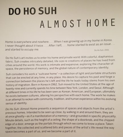
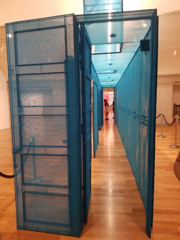
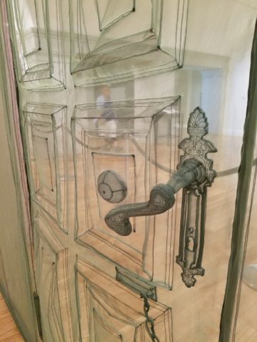
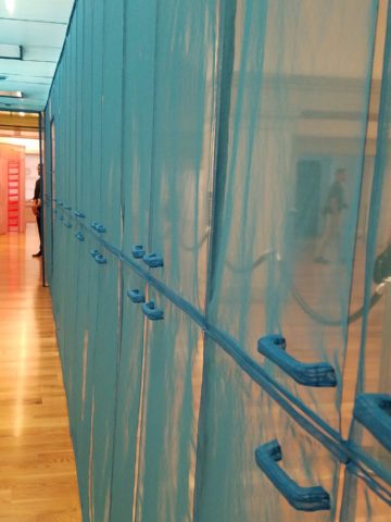
Considered to be perhaps the most compelling architectural artists around today, Do Ho Suh takes nostalgia for “home” to a whole new dimension. He figured out that he didn’t need to wait for enchanted ruby red slippers – no, he re-creates memories of “home” and makes them transportable all over the planet. And by whole new dimension, I mean we walked through fine translucent fabrics – taught and stitched – over concealed stainless steel frames creating hallways of houses where he had formerly lived around the world.

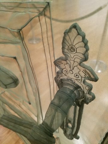
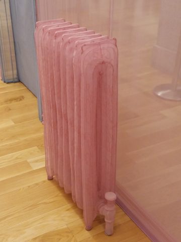
With great attention to detail, he stitched door hardware, radiators, and wood trim details. It was remarkable.

This interactive immersion was thought provoking. I think it is impossible to pass through this presentation without experiencing a few fleeting personal memories of the your own past homes. As Dorothy taught us,”There’s no place like home.”

It was as though the sheer polyester fabric was misty or ethereal as though not really there – a very effective medium to suggest a thought or memory. How fascinating to render a structure with such a diaphanous, fragile sense – tangible yet not.  “Almost Home.” There, but not quite.

The time it must have taken to create this tedious textile architectural art-piece, of delicately painstaking work, surely proves his love for these past dwellings.

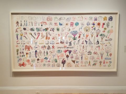
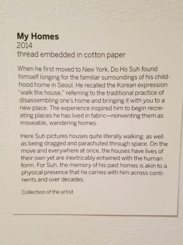
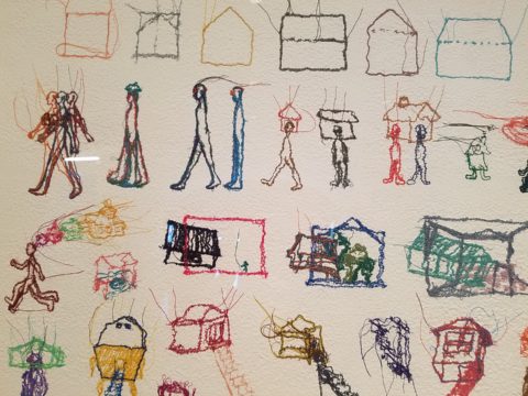
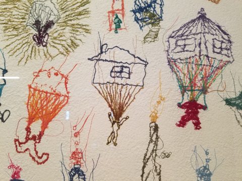
This presentation will be the most comprehensive of Do Ho Suh’s work ever shown on the East Coast. And wait – there’s more! After having navigated the Twilight Zone of Do Ho Suh’s recollections, I was even more strongly drawn to this large-scale piece of stitched textile work mounted on the wall! It was a colorful and beautifully complex collection of images of people and homes in various states of movement and fantasy.
 

Colorful threads intentionally strewn from the stitched images of human figures, some sporting houses on their heads, another running with memories flying behind his head…taking the home (s) through life’s stages – memories…home is where the heart is…taking their memories with them…

People parachuting with houses floating through the air…pitched roofs and domes – all manner of interpretations of “home.”

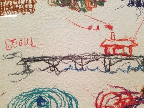
There is a stitched reference to Seoul and a house on a jetty suspended above a wild, choppy sea.

Live – dwell – reside – inhabit…Be quick – it’s only there until the 5th of August.

Living Room Transformation

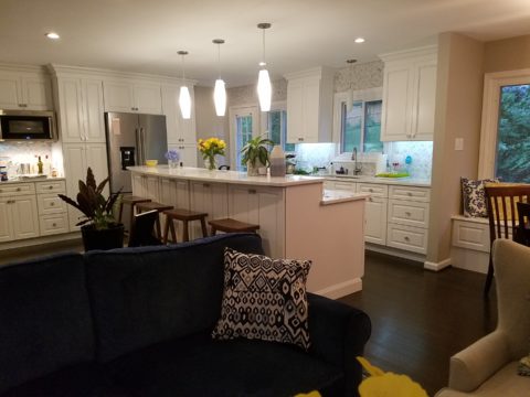
As an adjunct to last week’s story about the progressive young couple and their dramatic kitchen remodel, I thought I should finish the subject and tell about the adjacent living room transformation and comfortable family room on the lower level.

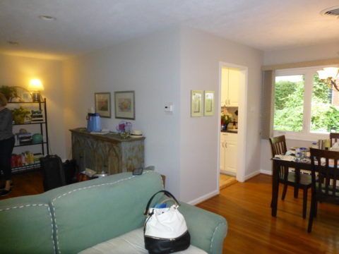
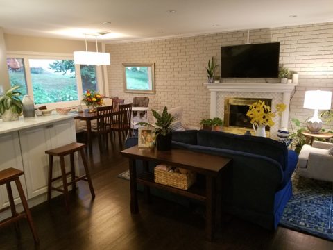
When the kitchen grew to become the focal point upon entering and the bar counter expanded into the living area, it reduced that space to now become a comfortable sitting room for guests to gather or the family to relax while activities are  brewing in the kitchen.

Looking through to the dining room where a built-in storage bench was added along the window wall, offers additional seating. A new fabric-shade chandelier softens the light levels. All lighting in this remodel are on dimmers.

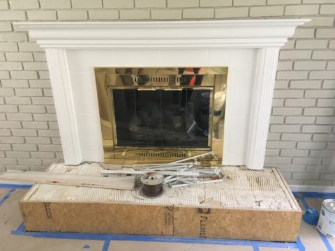
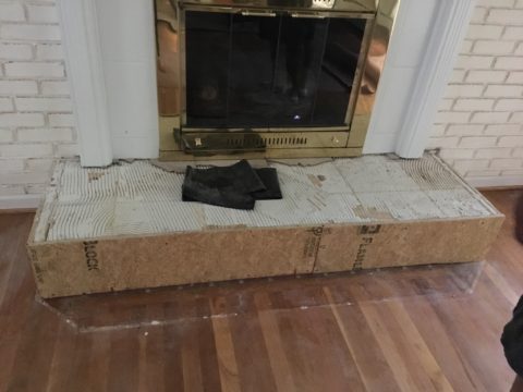
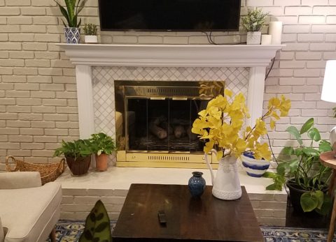
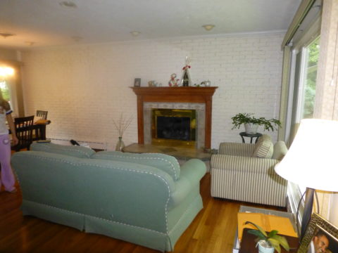
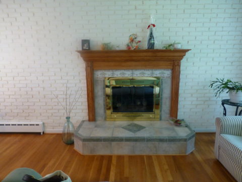
The former white brick wall had gently rubbed edges to suggest a distressed condition exposing the red brick beneath.  The fireplace had an unrelated golden oak mantle and surround with insipid tile inset also used to cover the hearth. The tile was a glazed faux marble with a Victorian design accent feature.

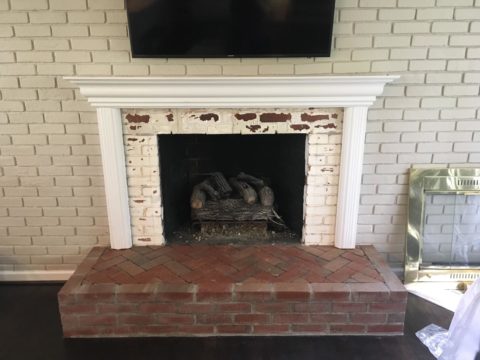
By simply painting the oak white to match the rest of the wood trim throughout the home and also painting the brick a soft taupe/grey tone, the look was instantly transformed. But they still had that awful tile…so here’s a design tip: to buy time either while you decide or until you save-up for the next phase, paint the tile away!!! To accommodate a new TV that is to go over the mantle, the wood surround was shortened. Notice the extra piece of wood trim that was removed to lower the mantle.

The hearth was removed and rebuilt (without the cut-off corners) with brick and painted to match the wall. Lucky for them the hardwood floor went beneath the hearth – so when they modified the size, they didn’t have to patch the floor! Tile was removed and replaced with 2×2 mosaic Carrara marble to coordinate with the herringbone mosaic of the same marble in the new kitchen backsplash/wall (see last week’s  blog).

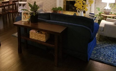
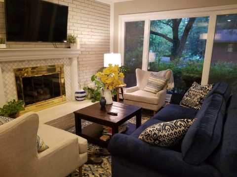
A sofa found, for nearly free, was in good shape and reupholstered beautifully in this plush, durable navy solid.

The classic blue and white motif was punctuated with organic yellow.

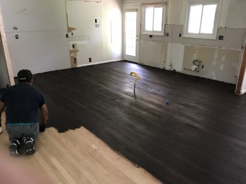
The newly refinished original hardwood floors – taken from a golden oak finish to a rich espresso/walnut stain…

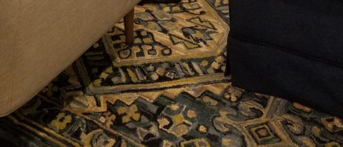
…with the blue and white wool hook rug creates a handsome contrast. The rug actually “reads” blue and white, but upon  closer inspection has warm khaki tones, soft turquoise detailing and is quite complex.

This revitalized cozy ambiance of this new sitting area/living room is perfect for this growing young family!

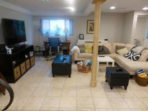
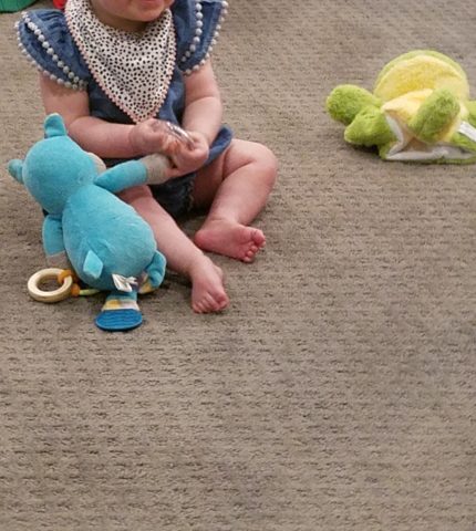
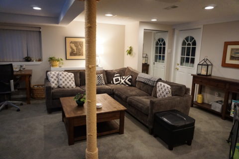
And for a more expansive gathering space, the lower level family room received a new sectional sofa in a durable charcoal fabric and a low-pile small diamond patterned wall to wall carpeting to conceal what had been cold tile  floors and make a comfortable room for all seasons!

Purrrrrrhaps someday they’ll have a cat to climb that crazy rope-wrapped pole!!!!!


Good Design. Do You Know It When You See It?

Have you ever found yourself saying – “This is spectacular!” and even genuinely loving it – but not being able to live with it or perhaps wear it? Interior design, fashion design, architecture…we know good design when we see it. We have an appreciation for the creativity, impact, look and feel of a space, but it might not be something or someplace where we would like to spend a lot of time, much less live. “A nice place to visit, but you wouldn’t want to live there.” Ever feel that way?

Then there’s “Beauty is in the eye of the beholder.” And that certainly is true as each person has their own reaction to, or opinion about, design and relative and various interpretations of beauty.

Yet walking into a room and saying “Wow” and having a smile come across your face is an involuntary response to the positive visual impact. To be objective, this is imperative – yet it is very subjective too.

I am currently designing for a couple who have very colorful ideas about their interior design. We touched on this the other day when she said that her mother would probably do an eye roll when she gets to see the finished product in person. It would not be her choice.  It would  not be her “taste.” I stated, with encouragement, that she would surely appreciate the fabulous design of it all – perhaps just not want her interior to make same statement. Fair.

Taste. I had a teacher once tell us  “There is no such thing as bad taste, just bad design.” My point is that you often can appreciate good design without necessarily wanting it for yourself- and, you should. Like viewing a runway model – a spectacular design might be something that you genuinely appreciate, but might not necessarily want to own or wear. You should be able to separate recognizing good design and not correlate it to your personal taste. Be objective – separate the two – good design and your preference in design.

Does it function well? Does it perform well for its purpose? Is it effective? And then there’s the “wow” factor. It’s exciting to see good design and have that reaction. You do NOT have to want it for yourself to acknowledge the fact that it works, elicits a positive response and represents good design.

If neutrals make you comfortable and bring you peace and joy, bold layers of colors with many patterns might just not be your cup of tea. But allowing yourself the freedom to “get it,” is liberating. Knowing that you don’t have to want it, in order to validate it, is a relief – no?

So don’t be afraid to like a variety of things or appreciate a broad range of designs, because nobody is going to judge you for your keen appreciation. You don’t have to love it or leave it  you can love it and leave it. Have fun exploring good design – it’s all around.


Mirror Mirror on the Wall – Do You Even Notice Me at All?

Designers use tricks, “trompe l oeil” – ever heard of it? Parlez-vous français? It’s a trick of the eye – and how handy is that to create an effect? Often murals are painted to give the illusion of depth or a scene that is not real, yet might fool you into thinking it is.  Similarly, mirrors can create the illusion of dimension and improve spaces – especially small spaces or rooms that feel particularly one-sided. Like the idea? Want to hear some fun designer tips?

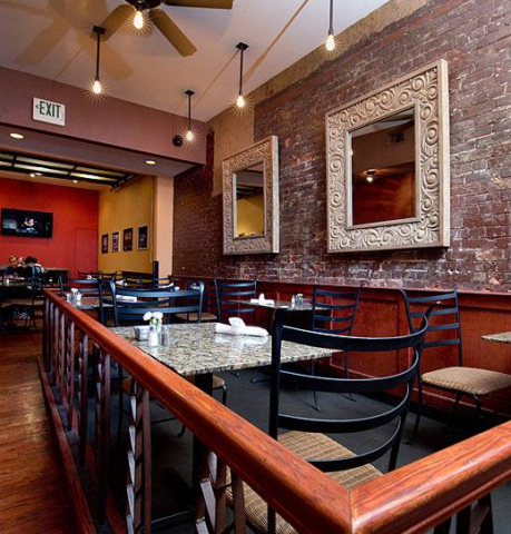
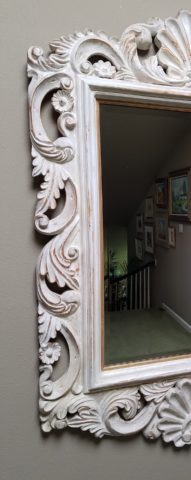
Large decorative mirrors expand the dining space in this restaurant. Faux finish  composite material give the impression of hand-carved wood – not!

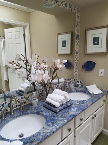
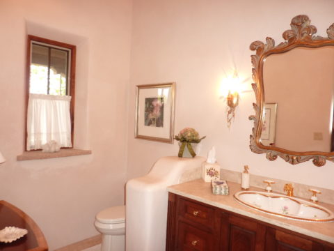
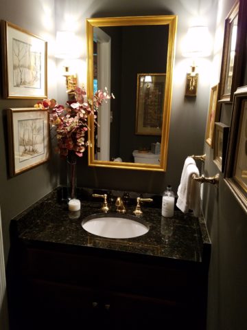
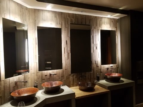
Mirrors in the Bath We know mirrors are commonly used for practical purposes such as bathroom vanities. They can be simple over-the-sink functional elements or framed versions for decorative pizzazz.

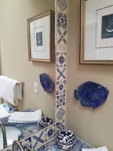
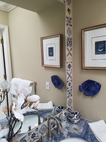
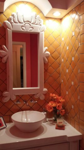
Below,  a built-in tiled surround is nearly a full-wall treatment but with a little relief.

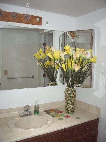
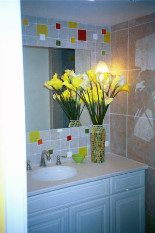
an a more encapsulated/inset mirror shown here

or full wall-to wall treatments that “go away” leaving only the illusion that the room continues beyond…you don’t really “see” the mirror, you see the illusion of space that it creates.

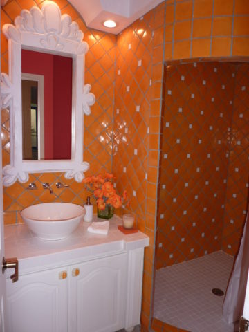
Bathrooms can be intimate spaces of decorative interest


or expanded to be grand spaces of extraordinary volume.

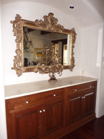
Dining Room Décor and Expansion Other rooms of the house can benefit from mirrors too. Often mirrors are placed in dining rooms over buffets to once again give the illusion of space to a room that is often small for the number of furniture pieces and people that gather there. It is an opportunity to add a decorative element as well as expand the space.

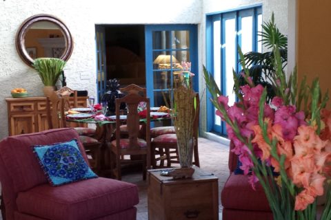
Mixing Geometrics A rectangular console table, sideboard, buffet or dresser enjoys the contrast of a round mirror

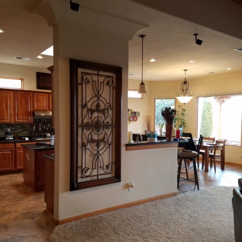
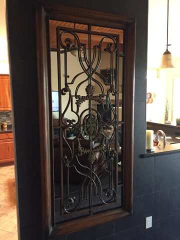
Mirrors as Artistic Accessories There are also fun additions to existing pieces like this framed grill-work which is given a new element of interest by adding a mirror behind the iron, set into the frame. Depth and interest instantly change the nature of this decorative wall piece.

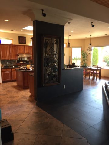
Yes, the mirror becomes the decorative focal point. Large framed mirrors can become just that – a great focal point AND provide an illusion of depth. Notice too, the entire wall was tiled behind this focal piece adding further drama and interest.

The limitless options for frames and shapes makes mirrors a valuable accessory similar to a piece of artwork!

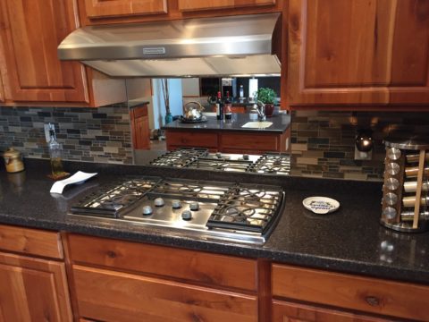
Kitchen Surprises Here’s a little trick…rather than looking into a tiled wall behind your cook-top, insert a mirror into the back-splash! It will give the illusion of an opening passing through to another room!!

Wish for a Window Add a “window” where you have none. A “fake window” adds dimension to an otherwise encapsulated interior space. This can be with an actual window to which you add mirrored glass to replace existing or merely a grouping of mirrors to suggest a window to the world.

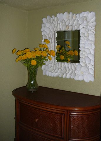
Embellish with Crafts Here we added white shells to have a little DIY fun!

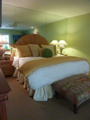
Make it BIGGER – Make it Better Expand your living space, add value and create perceived square-footage!! Truly enlarging a room with a trick of design expertise is to know where to mirror an entire wall to achieve that illusion of a much larger space.

Consider what is being reflected. You won’t want it reflecting an open bathroom door necessarily…You can even enhance the area that will be reflected to maximize the effect.

Theatrical/Dramatic Lighting Effects and Mirrors

ART & Technology As is true with our fast-paced word today, the art of creating mirrors has gone from fine craft to commodity. Phenomenal prices are now available for what once was a luxury item.  Certainly, there are exquisite hand carved, fantastically finished and even gilded wood frames still being designed and handcrafted by artisans around the world,

but the offerings for production pieces of man-made faux wood and other interesting composites are now on the market. Beveling used to be an art. It was performed by hand (and still is – but it is a lost art and it’s not as necessary a trade with the advances in technology to achieve the detail).

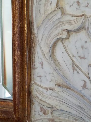
Difficult to see the hand-beveled work on this amazing hand-carved mirror.

The effects of a bevel either on the mirror within a frame or here as a frame itself, bevels add detail of angular reflection that add interest to a mirror’s single-plane depth providing the angular plane to reflect other surrounding facets of the scene.

Mirrors are one of the most versatile and effective design components. Look at them, look into them, use them, play with them – they will expand your world!!

Have You Listened to Your Heart on a Quest to Create ART?

When do you know when to listen to a sign? What opportunity changes your life? From romance to career changes and all manner of life’s opportunities – what catches your attention? What switches on inside and makes you take notice? Having someone cross your path and not realize he/she is your soul-mate. We’ve seen many movies with this elusive thread woven through the plot. One of my favorite songs, about such would-be near-misses, is “If He’s Ever Near”  in which Karla Bonoff pines…

They say just once in life
You find someone that’s right
But the world looks so confused
I can’t tell false from true

And love’s so hard to find
In this state of mind
Oh I hope I’ll know him
I hope I’ll know him
If he’s ever near

…her yearning hits a cord.  What is a sign? How do you know? What action do you take? It’s not always particularly obvious.

Recognizing opportunities is what separates many successful people from the rest of the world. Taking chances, when those signs make their appearance, is the other factor. Risk-taking is a scary leap into the unknown, but so often results in great reward when it is a true calling and approached with dedication to seek and meet the challenges.

Seems from many with whom I’ve spoken, a true calling is pretty clear. It taps into a passion and ignites a level of excitement and enthusiasm that is hence to fore unmatched. It becomes an irreversible path forward. Like an involuntary propulsion. Thrilling for some – terrifying for others. Which type are YOU? Perhaps you find yourself in the middle – healthy respect for the trepidation, but curiosity for what’s in store!!!

Twice this week I have met with artists who are each taking an enormous leap into a new life direction. One who might not be ready for me to blog about her adventure has leaped from a 30+ year life in Mexico… to a year-long reunion in Arizona with family tapping into the vibrant art scene in Sedona…then a soul-searching move to New Mexico where she invested her savings to start a new independent life…and after exploring her options and searching introspectively for her personal needs, happiness and goals has decided, after yet another year, to sell her new home and return to Sedona to pursue what she firmly believes is her calling. She took leaps, explored options, followed leads and returned to what she initially thought was the right place for her, but which had contingencies that masked her true indicators. She did not want to have imagined constraints rule her decision. Now she realizes that it is her choice, her viewpoint, and ultimately her quest for joy. Her focus and grace have inspired me on many levels and I hope to share her story once she’s ready!

Yesterday I was visited by a Renaissance artist whose enthusiasm and self-effacing manner bring sunshine to every event!  Kim Jackson has a new-found passion!  Having mastered her profession in the arena of photography (http://www.kimjacksonphotography.com)  she had an encounter that looks like will change her life path with new-found joy.

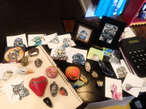
Sprinkled at my reception desk, I was presented with an array of amazing little jewels. Kim spread a collection of painted rocks and miniature paintings in a scattering like pebbles and fallen leaves. Only these jewels were painted with such detail and expression that I was arrested – awestruck.

Her own words about this turning point in her life is enchanting.

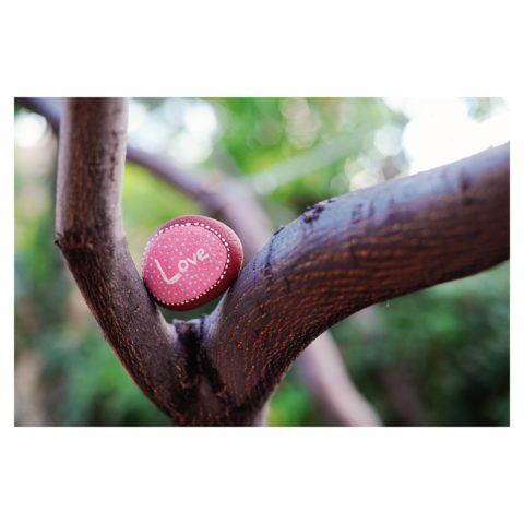
Last summer I was gifted a painted rock by a 4 year old girl about to lose both of her dogs – the rock read “Love”.

I was touched and photographed it to share with my instagram followers, which lead me down the #paintedrock hashtag. The first artist’s post I clicked on – she does amazing mandala dot art – shared what kind of paint she used and gave other general tips. By that afternoon I had a rainbow of colors and was painting my first rocks.
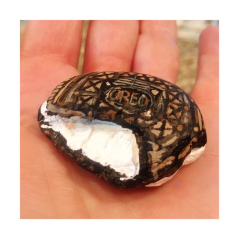
Kim was there to capture the family on the eve of having to put their two dogs down. The little girl presented her with a simple yet profound object and message that resonated so strongly with Kim that it sparked an idea that lead down a path…

 My rock art (art rocks) style has evolved in the last 10 months, and at the beginning of May 2018 I painted my first 2D “little dessert” and bird paintings – supposed to be gifts for Mother’s Day. With encouragement from a fellow artist I have approached galleries and received warm reviews on both the stones and little paintings. 

Although Kim’s photography still plays a significant and pleasurable career role in her life, this quest to explore other of her creative energies and talents is proving to be an exciting and potentially lucrative path.
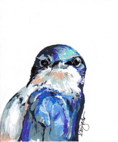
Thanks to the support of my husband Billy, I feel extremely lucky to be given a chance with a second artistic medium – something I never dreamed I would be able to do. I’ve lived my entire life thinking that I could not paint well. While feeling blessed to make a career out of my photography, this is an exciting new direction, I am excited to see where it leads.

I see Kim as a precious stone, of many facets. Although she will still pursue her love of photography and capture people’s lives and many story chapters, Kim will make room for this blossoming career move into the exploration of creating art directly from her heart to her hand.

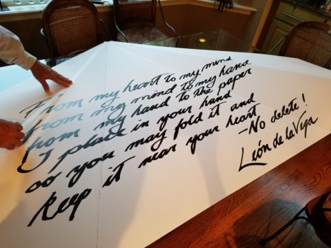
This sentiment has been so profoundly stated by Federico Leon de la Vega as he references a similar heartfelt expression regarding the (very personal and possibly evolutionary level) value of handwriting. https://www.youtube.com/watch?v=H9j_pLgCr1U

Federico prepares a prp for his TEDX Talk. “From my head to my mind, from my mind to my hand, from my hand to the paper, I place in your hand, so you may fold it and keep it near your heart.”

Some things cross your path unwanted and certainly change your life. For the undesirable things, I recently read this phrase  by Glennon Doyle “Your wound probably is not your fault, but your healing is your responsibility.” Well, you might very well have caused your wound – but either way, taking charge of the healing is your responsibility. Which makes me realize that which we have all been told so many times –  that your destiny is in YOUR hands.

As this relates to art – do not be afraid to explore your creative tendencies. Do not feel you are not worthy or good enough. Experiment. There are so many examples of late bloomers in life. A prime example are the magnificent Portraits of Courage by George W Bush. He dabbled and played with a wide variety of subjects before he hit on portraiture. His abstractly artistic interpretations of people too shape and he discovered that these seemingly primitive paintings had intriguing representation, expression, character, beauty and appeal. The path led him to a powerful platform for veterans, fund-raising opportunities, heightened awareness and acknowledgement of sacrifice.

https://www.bushcenter.org/exhibits-and-events/exhibits/2017/portraits-of-courage-exhibit.html

As stated on the website, this exercise has become significant:

A VIBRANT COLLECTION OF OIL PAINTINGS AND STORIES BY PRESIDENT GEORGE W. BUSH HONORING THE SACRIFICE AND COURAGE OF AMERICA’S MILITARY VETERANS — AND HIGHLIGHTING THE WORK OF THE BUSH INSTITUTE’S MILITARY SERVICE INITIATIVE.

A great article on the accidental painter is here in The Artists’ Network

“These portrait paintings aren’t great but they are gutsy, because it is gutsy to show your artwork period, but it is really gutsy when you know the work isn’t perfect and you do it anyway, because it matters to you.

We could all learn a little bit from this–to embrace our abilities as they are right now, and then to simply let the work go…”

It’s not about a perception of being great or even good enough – most artists never really believe that they are. It is about following your passion – in this case, artistic expression. You might be surprised at what happens next! Believe in the power of ART!!


Discovering Patterns

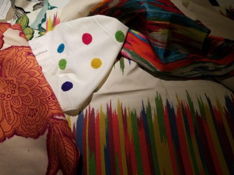
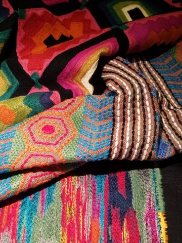
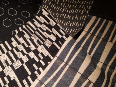
This week began with a juicy fabric presentation. I say juicy because it got my design juices working and I was inspired to take photos and imagine the opportunities to insert these wonderful colors, patterns and textures into upcoming projects.

Take the chicken and the egg scenario. Do YOU often find that exciting design elements invite thoughts of projects for which to use them?

A fun exercise is to take your camera and search for patterns to photo…patterns are everywhere from cast shadows to fabrics, signs and graphics to fallen leaves.

Seeing these exciting new fabrics – you had no intention of changing all your throw pillows, but these stimulating samples might make you consider changing your entire collection!

The opportunity to offer unique fabrics for clients who would otherwise never be exposed to the samples – not know of the possibilities – is exciting. Being able to make this introduction is a treat.

This first batch was of clean, sophisticated, woven, geometrics in blacks, whites and charcoal tones.

Whimsical patterns and textures, with splashes of color, offer more possibilities.

Now see these rich woven patterns and colors in this next series. An explosion of color and pattern  with a decidedly native direction – prime for New Mexico and design projects looking to evoke the elements of the southwest and other opportunities inspired by indigenous art.

With all this freshly implanted in my ever-swirling brain of design fragments waiting to be assembled, I traveled north this weekend for an enchanting New Mexico wedding that further fed the theme of indigenous art, pattern and design.

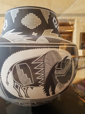
The lobby of Buffalo Thunder was riddled with magnificent pueblo pottery. The designs were wonderfully intricate and I saw them as stand-alone elements that could easily be fabric motifs. Here on pottery – but so fascinating to consider as possible inspirations for fabric patterns and designs.

Anasazi Buffalo Pot – Acoma Pueblo

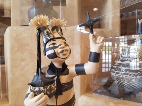
Suggestive of a court jester, this expressive piece tells a figure story. The bold patterns make a powerfully beautiful statement. Who loves bold stripes? Do you wear them? Do you upholster with them?

Evening Star by Katherine Wall from the Jemez Pueblo

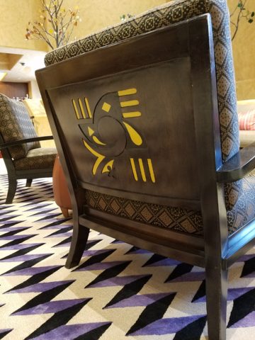
Cut-outs on lobby lounge chairs, with geometric upholstery, atop bold zig-zags of the area rug proves combining patterns creates a fine line between exciting juxtapositions and pairings – and risking possible disturbing disruption of order. Comedian Steven Wright uses dry wacky wit delivering hysterically funny observations to convey a sense of the obvious with a twist. I’m paraphrasing one I remember from years ago… “You know that feeling that you get when you lean way back in a chair…way back on the back legs…back so far that you are just about to fall…I feel like that all the time.” That’s like that feeling with challenging design. It goes just far enough to get your attention…designers get that feeling as they push the theoretical limits of design – all the time!

Ok- this is not perhaps THE most outrageous example of this theory – but a fun, eye-catching combination nonetheless!

Buffalo Thunder resort was the jumping off point to then venture beyond into the thrilling landscape of La Mesita Ranch.

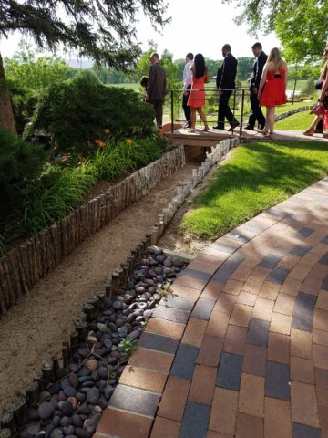
Mixing different colors of brick make this random patterned walkway very pleasing and interesting.

The setting was natural, organic and inspired.

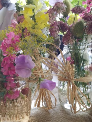
Simply lovely centerpieces

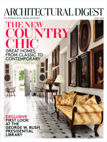
See a lovely, intense example blooming blue and white and much more in Nantucket on the cover of the new June 2018 issue of Architectural Digest.  http://www.theenglishroom.biz/2018/05/29/nantucket-beauty-by-markham-roberts/

So look for patterns all around. Discover exciting opportunities to mix patterns and textures.

Be brave – play with patterns!


Bring Elegant Functional Pottery into Your Daily Life

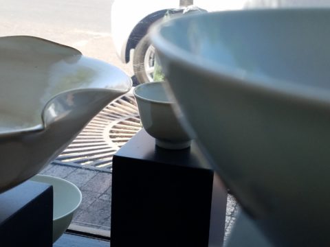
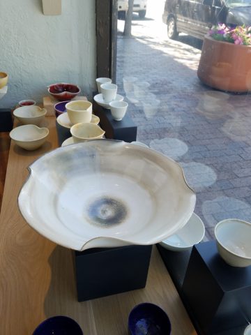
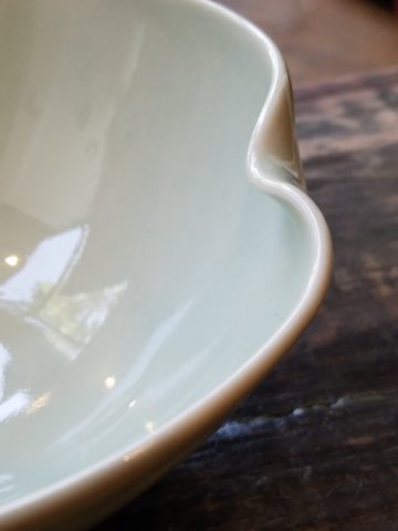
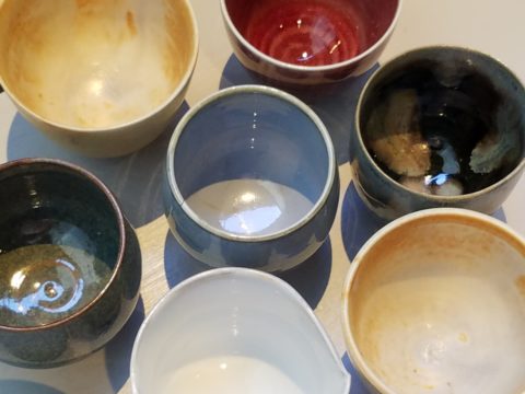
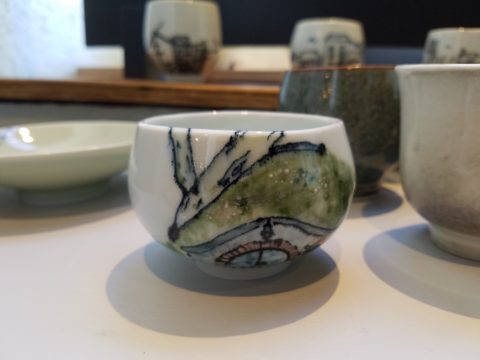
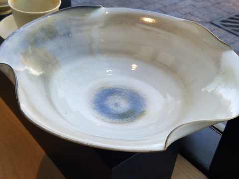
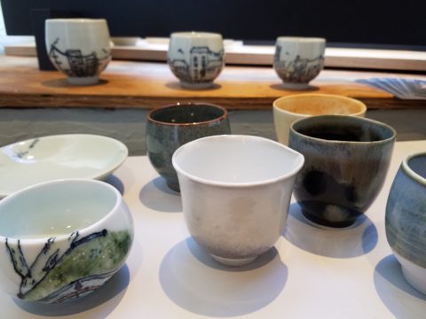
Powerfully, pretty, porcelain, pottery graces the urban storefront window this month, of the east gallery of PATRICIAN DESIGN, with elegant, functional inspiration.

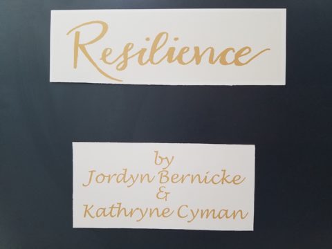
The opening of this the second  installation of the Resilience exhibit features a collection of porcelain pieces that is intended to be an entirely functional  ensemble of art.

It’s been refreshing to have these well established artists paired with exciting emerging artists presenting their expressive talents, in the form of something that you can use and enjoy, to enhance the aesthetic connections in your daily life.

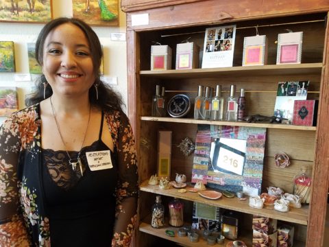
Resilience, conceived by Helen Atkins, an exciting emerging artist herself, is the manager of consignment art at PATRICIAN DESIGN.

Her concept was to “explore the experience of local female artists at various junctures if their careers.”

As a recipient of the Makeshift Grant Project, “Resilience” is funded by the downtown Albuquerque Arts & Cultural District and the Albuquerque Community Foundation. The name of this project suggests that the strength and flexibility of clay as it is formed is an analogy to similar characteristics in the course of a woman’s life. Strength and flexibility – resiliency and tenacious fortitude are the features the two share  and which are celebrated with this show.

In addition to this relevant topic of women, the functionality of this collection is what is even more expansive. No gender specific appeal to this wonderful work, the idea that pulling in from the disposable practices of everyday life, strikes a universal chord.

To pull in and focus on what  you have and use in your daily life is the beginning. Evaluating between pure function and added beauty being introduced as an enhancing element is the trick. Then discovering individual pieces that bring enjoyment  while contributing to the function as well as the aesthetic of the scene,  from an interior design standpoint, is wonderful.

Your “scene” should be exclusively personal to you and your life experiences.  It is personal and wonderful to incorporate handmade artwork in all aspects of a design project. To appreciate the detail and have the opportunity of taking that artwork all the way to daily tableware is pure joy. These and other potters that we feature at PATRICIAN DESIGN offer just that – the opportunity to incorporate art into the simple functions of eating and drinking.

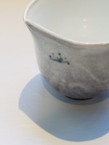
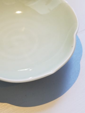
Artist  Kathryne Cyman is a master of the 400 year-old Japanese process of Arita pottery.  Please read more about Kathryne’s journey at http://art.unm.edu/kathryne-cyman/   Showing alongside her capable student Jordyn Bernicke, the two present simple, elegant, affordable pottery pieces for you to bring into your  daily life.

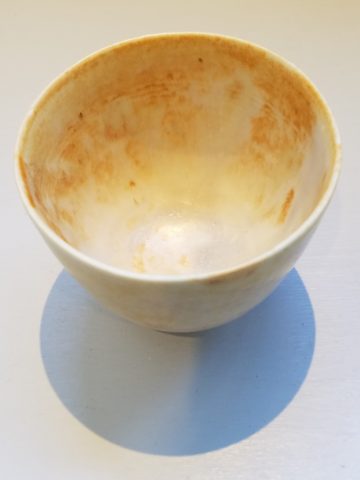
Imagine the soft, delicate yet durable cup in your hand from which to sip and relax. Even to toss o.j. on the run – the basic action of drinking from a handmade vessel, in a color and finish that makes you smile, is an enhancement to the day.

Sensory perceptions ignited by the feel and the look of a beautiful piece of pottery is restorative.

We are privileged to have this exhibit and to meet these fine artists. We are privileged as a community to have this program at UNM.  It appears that the natural beauty of New Mexico, life lived close to the earth and celebrated by Native Americans for generations is a parallel practice to the Arita process by the artisans in Japan.

This exhibit proves that to admire the techniques that produce beauty is to acknowledge the importance and value of including these elements in our daily lives.

Selecting Stone

Stone. How do you select your stone? How did we become so fortunate to have so many choices? So many that we “take it for granted” or with a bit of stone humor, “for granite!!”

I’ve previously noted that trends come about as a result of changes in technology, availability, or the mere on-going need to keep creating and to keep the economy moving forward with the insatiable need for the newest – whatever.

In the early last century, plastic laminate – commonly known as Formica by both brand and composition – was invented and, over the ensuing decades, grew in color, pattern and application. It was THE counter-top material for cost and availability for generations and is still widely used today expanding its reach with quite remarkable textures, colors and faux finishes.

Stone – natural and timeless has been the luxury material – an alternative for only the rich and famous or those fortunate enough to live next door to a quarry. Stone has been the heart and the natural art of the world’s structure – the fantastic geology of our earth since the beginning and has formed with astonishing beauty and variety with the evolution of the planet. Quarried for centuries, ancient civilizations installed magnificent structures in close proximity to the source – natural resources with monetary resources at hand resulted in everything from edifices to interior finishes and furniture.

Voila – then technology and supply chain logistics made the cost and availability more accessible bringing stone into modern kitchens everywhere. Stone transported from Brazil, China, Italy and nearly every pocket of the planet offers a world of choices for YOUR counter-tops (and more). But with so many choices, how do you chose?

This will be a focal point of your kitchen. It is either the neutral against other lively patterns and textures or it is a matrix of color or perhaps a bold prominent swirling, sweeping statement of fantasy and magical movement. It is valuable to remind yourself that you are studying geology. Nature formed this. It is nature’s art.

Even in a tight matrix stone, irregular surprises of deposits can occur. The choice is to capture those statements adding character in your countertop or dodge them in favor of a more uniform, expected appearance. You either appreciate the wild nature of the seeming imperfections and regard them as fortunate finds or your prefer the expected uniformity of the overall look of the stone you have selected.  To accomplish this one way or another is to select your slab.

When ordering from a big box store, you often do not have that opportunity – they draw from an assortment of stocking sources and you won’t have the chance to pick your slab – just your variety. This can result in happy or not so happy surprises. Stone is a natural material.

Stone can be finished in a variety of textures from very highly polished to honed and even rough leather-like textures. These features are further details and enhancements that will make a significant difference in the overall style and impression of your design decisions. It’s a big investment – study your options and combinations of adjacent materials.

Samples of stone are just that – samples – cuttings from a slab – but no two slabs are alike. The sample you hold in your hand and place against cabinet and tile options might have a streak running trough it or be primarily one color that you picked because you loved – but the actual slab might not be that same composition.

The closet thing you can get is to have consecutive slabs cut allowing amazing pattern matching and anticipated designs. But it will slowly morph away from the specific design as the slabs are sliced illustrating the natural evolution of the stone’s formation.

When you have the opportunity, pick your slab. You can then see the actual details of the stone and more specifically you can layout your countertop template directly on the stone to know exactly what will occur where and how the finished countertop will look. In any case, a natural stone surface is a unique work of art!

Here, a unique warehouse of pre-cut slabs all 2, 3 or 4 x9 feet. The cost is reduced due to bulk fabrication. Field cutting handles most installs while other fabrications shop can be engaged to create custom installations.

Every piece of rock extracted from the earth has its own character. From color, pattern, and mineral specks, enhanced by the process of cutting and polishing. Like a stone washed by rain, the colors are more rich and brilliant…that same stone dried has a softer dull appearance. This distinction between shiny or mat, polished or honed is another choice depending upon the context and look of the intended design.  Knowing what a natural thing can become either used in its raw state or enhanced to modify its appearance is the key to more choices.

BONUS offer!!! You can have your island in a different stone for contrast or complimentary reasons!!!

Once you’ve selected your stone, you then pick the edge detail. A few options are – square for a clean modern look,

radius for a more durable edge and softer statement. Notice the seam that results from laminating two thin slabs for a larger bullnose  subtle and if done well, not noticeable without close inspection.

Broken edge for the rough natural look – granite (the tough choice) and also shown here, sandstone (not the best choice for a working counter-top, but rustic and great for wall caps, benches, mantles and hearths.


An ogee edge for a more formal detail.

Natural stone is durable and easy to maintain. Have no fear! It tolerates heat and is terrific for transferring hot baking pans or dishes from the stove or oven. You can chip the edge with a strong blow – but otherwise will not be easily damaged. The stain issues are nearly non-existent. While some stones are more prone to staining, others are more imperious and with improved sealants, most are warranted for anti-stain. Furthermore, stains – IF they occur, can be usually be removed/restored/refinished on-site. The only other concern might be susceptibility to acid etching which varies with differing stones. As is true with staining, these areas can often be repaired on-site in your home.

If you want to be certain of your stone’s properties prior to purchasing, use a sample and apply the dealer’s suggested sealer. Put test patches on it with things like tomato paste, citrus juice, oil and wait a few hours…wipe the sample clean and you’ll know how it responded. Each stone’s resistance to staining, scratching or etching varies with the source, composition, color and finish.

Now natural stone has a lot of competition from man-made materials, solid surfaces, engineered stone, concrete…they vary according to their fabrication, composition and finish, but most do not possess the same durability and impervious properties of natural stone. Investigate each on its own merits. There are often times when design decisions favor the aesthetic of a man-made material. As always, make your decision weighing the pros and cons.

With so many choices…how will YOU decide?


:


The Seeds Which Result in Enthusiastic Inspiration.

When is the seed planted for a child who might just pursue a career in the arts, architecture or related design fields? How did the aptitude and interest first present itself? When are varied interests honed into a focused passion? If you’re reading this as a “creative,” do you remember the earliest exercises flexing your creativity?

As an budding interior designer, I always enjoyed changing my room and futzing around the  house arranging accessories and still-life groupings. Color was always important as were patterns and textures.  Balance seemed intuitive too. I loved visiting art galleries and I became aware that I noticed and possessed an appreciation for art in its many forms, styles and media.  I derived great joy from recognizing beauty, potential and the creative process.  It followed to the out-of-doors too as I loved the gardens, layers of trees  and made truly organic “forts” in the log pile nestled in the fallen oak and tulip poplar leaves of my childhood.

I also practiced landscape design – trimming English ivy meticulously from underneath so as not to whack off the front edges. I created exotic fern gardens by finding indigenous ferns in the woods and bringing them into the less wild pockets of our wooded backyard – arranging and placing them just right. Spider plants procreated their dangling off-spring that I trimmed and rooted in multiple clay pots lining our patio wall waiting to mature over the summer and be presented as gifts to admiring plant lovers.

Upon returning from a lively Padres and Cardinals baseball game last night, we were greeted by a spot-lit city and pompous parallel parade.  Our boldly preciously precocious 7 year granddaughter

had created a magical world with all manner of pets, creatures, super heroes and trinkets  adorning the architecture and riding in the parade of colorful vehicles.


The lighting was particularly effective as it cast shadows and illuminated the many elements and characters that animated the scene. This is the perfect temptation for rival siblings to destroy. One sweeping sword  or outstretched arm would send this amazing project to rubble. Tonight however there was no such rivalry resulting in destruction. Rather it was protected and revered until we arrived home for the presentation.

“You like my  city, don’t you?” was the confident query – set-forth with an affirmative assumption – regardless of the questioning format, of the comment she delivered. Yes the city and parallel parade was quite exceptional. So much so that it inspired thoughtful observation and examination including this writing today.

As I knelt down and captured various angles of the structures, towers, tiers, columns, pediments and facades with my trusty phone, I realized that this took a tremendous amount of material.  The raw wooden building blocks were nostalgically familiar – the very same blocks, triangles, square and round columns, bricks and cubes with which I had built towering structures as a child. Creativity can certainly be spawned with limited resources and often results in remarkably ingenious results, but as  looked around this particular scene, I discovered baskets, bins, boxes and piles of things. Things with which  to create a limitless fantasy world.

These, paired with her wonderful imagination, were the tools of this creative child who had a treasure trove of parts and pieces, characters and vehicles providing countless components waiting for the imagination to assemble into this and other amazing scenes. Singing while she works, it is evident that this child is over-flowing with artistic expression.

The fantastic architecture and design we admire today was spawned by creative minds using existing tools or inventing new elements to create and ultimately construct seemingly unimaginable buildings around the world.  Yet they were imagined and they became realities from fantastic dreams and ideas, bravery and determination. A creative will that was once a seed of enthusiastic inspiration.

Happy Mother’s Day to all, with a particular emphasis on mine for all of her creativity and encouragement though the years, of my many phases of artistic exploration, appreciation and expression.


Picking PINK!

Prompted by pieces peppering a pastel presentation for an artist’s opening reception entitled Resilience we held here at PATRICIAN DESIGN last Friday evening, I was pondering this week’s topic when PINK peeked  into my thoughts.

Pale pink is an unsung color – often considered to be insipid and lacking ooomph, it really is quite satisfactory. Pounced on by millennials, with their popular color trend “Millennial Pink” passion for all things in fashion and home style, pink has made a bit of a splash in recent years.

Last Friday, with the creation of the display window featuring pottery shards scattered along the floor, artist Helen Atkin’s peachy pastel pink and soft coral glazes melded together against the soft geometric woven textile resulting in a confection of comfortable color and texture.

Helen Atkins’ shards and little dishes sprinkled in the east gallery window at PATRICIAN DESIGN.

I awoke today with this color on my mind. Swirling thoughts, so often the case, as one thing leads to another and I thought – I wonder how much of that most satisfactory and pleasing color I have here in my immediate world. So, I set-forth  to find out.

Gathered on the nightstand in the guest room, this cluster of dried flowers is a fragile collection of soft pink tones.

Walking around the house, I came upon so many examples that I really was quite pleased. The re-discovery of each made me feel content. I realize that although they are seemingly insignificant that they are really quite sentimental pieces gathered through the years and each so distinctly different from the next.

One of my first purchases when I moved across the country was this discarded, damaged Tamarind print of a large nearly psychedelic strawberry from the famed print-making institute  where rejected failures spoke the language of “one man’s trash is another man’s treasure” and it was mine to adorn my new, naked, New Mexican walls.

Generally referencing feminine imagery and romance, pink is delicate yet full of depth and variation – as with all colors – the range is limitless for value, tone, blending of shades…Contrasting warm yellows and cool blues frame pink so well.

Detail of one of several of my Gerhard Lehner lovlies, I Still Sail to the Virgin Islands. As the artists explains – “An original like-etching a la poupe arrived from drawn textural lines and painted effects which allows the poetic ink to transfer to the fine rag paper.”

Detail – Fine Craft and Dance by Gerard Lehner


Bold floral brush strokes sweep through the pinks and peach, coral and rose, accented with the contrasting vessel in a brilliant cobalt blue, Peggy Zuris was a master of color and style.

Memories of the warm glow of the pink roof-tiled, painted and plastered buildings along the Puerto Vallarta coastline absorb and reflect the rising and setting sun during all exposures of the day.

Detail – watercolor featuring iconic Our Lady of Guadalupe church by Victor Torres Tellas

Meandering from room to room I encounter so many pretty pink things. I obviously gravitate to this amidst my many other colors as a necessary element woven through my comfort zone.

Detail – Fantastically French floral oil on canvas by Anne Sandry

And I adore this finely detailed hand-colored etching showcasing a foreground field of pink lupines,bought decades ago in the artist’s studio at The Torpedo Factory.

Detail of etching by Lyndia Terre

Then I came upon these book bindings stacked unconsciously atop a mahogany dresser , resulting in a study in pinks presenting a pleasing palette.

I realize that I was exposed to the priority of pink at an early age as my  mother’s interior design palette incorporated pinks and soft greens in the more formal areas as well as outside on our screened porch and patio beyond, to the gardens with magnificent mounds of screaming pink azaleas blooming and their explosions of color every spring. Surrounded by lush verdant foliage of the woods where we lived, pink contrasted well with the many shades of green into which we were intimately nestled. We were comfortably punctuated with pink. Therefore it was not a foreign color and complimented the transitions into other darker green tones and yellow accents throughout our house. The original scrolled wool wall-to-wall carpet was a medium pinky-clay color. Quite unusual, yet neutral, providing an earthy grounding.  Mom also enjoyed the vibrant introduction of designer Lily Pulitzer onto the scene in the 60s and peppered her wardrobe with Pulitzer pinks from carnation to hot fuscia contrasting with chartreuse green. Today her classic iconic colors and patterns still make significant design statements.  Mom has never been afraid of color! I inherited that fearless foray into colors of anything fun and fabulous

This handcrafted New Mexican church (birdhouse – having never been outside to host a bird) sports an eclectic array of enchanting elements using pinks to perk up the collection of colors. I realize as I tour these rooms of colorful artwork, that I love the combination of pinks with blues and yellows!!

and also the appreciation for the soft subtleties too. These two magnificent oil paintings depicting New Mexican scenes with the oh-so-pleasing pinks.

Detail – oil painting Church at Golden by Marilyn Yates


Detail – oil painting Moonrise by Bruce Piel

This has been a fun and illuminating exercise. I’ve determined that pink is essential to me.

Why not a pink cabbage plate on the guest room duvet cover dotted with woven clay-pink slubs?

It occurs in so many things that bring me joy.

A heavy, luminous hand-blown glass vase.


Speckled vintage vase – a touch of fun!

As my dear friend Corinne aptly named her shop, it is The Color of Joy. Pick a color – any color – and go around your interior spaces and see what you discover – perhaps you will find your essential grounding color. It just might be a surprise. Find what brings you joy.