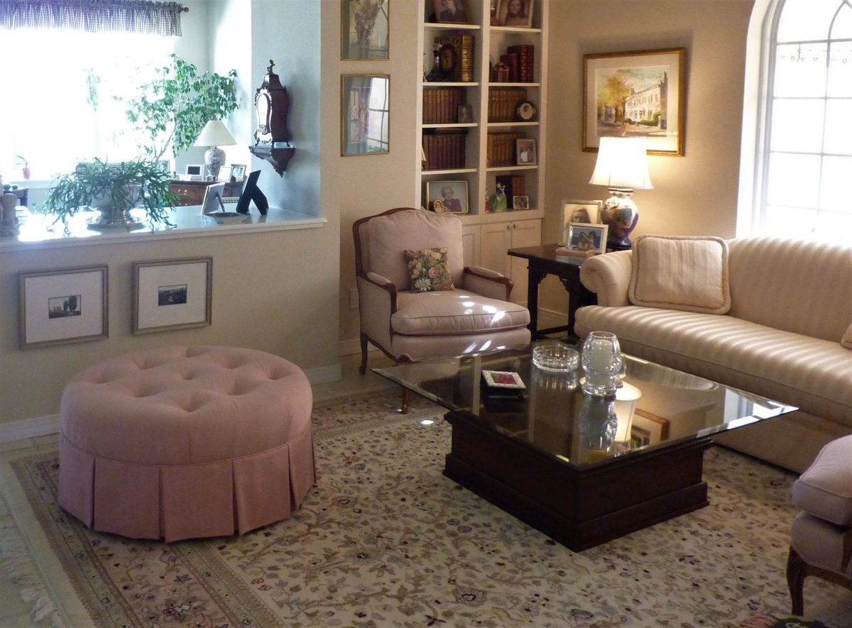
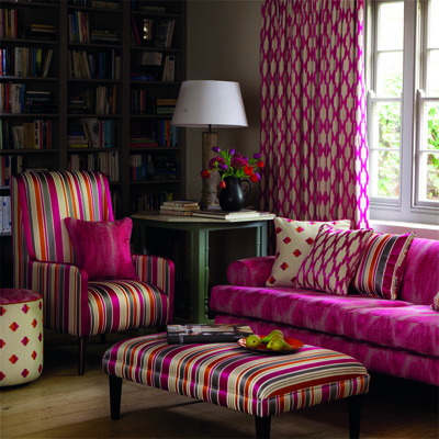
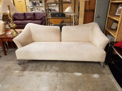
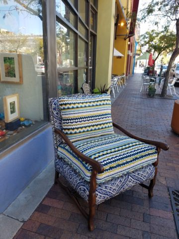
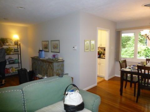
It’s always a good idea to have extra seating, but in small spaces, it’s not always easy to make a room arrangement work. Apartments, lofts, condos…pulling up dining chairs isn’t necessarily the best solution. What is a great solution is something low that does not block the scene and can be easily moved to change the groupings.
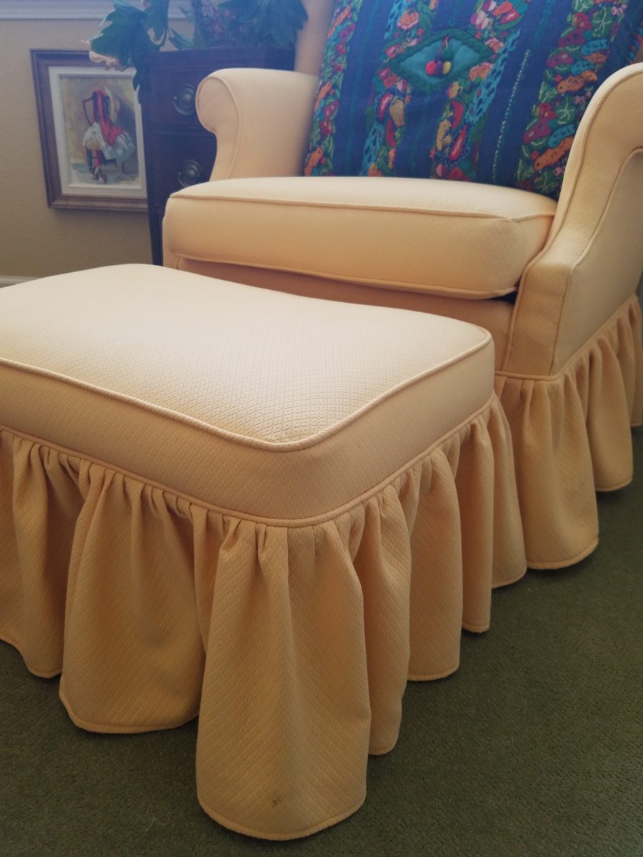
Footstools, benches, poufs, ottomans…as an ensemble with a chair or a stand-alone piece, the options are endless. Trends are often spawned from necessity or convenience of not change for the sake of change.
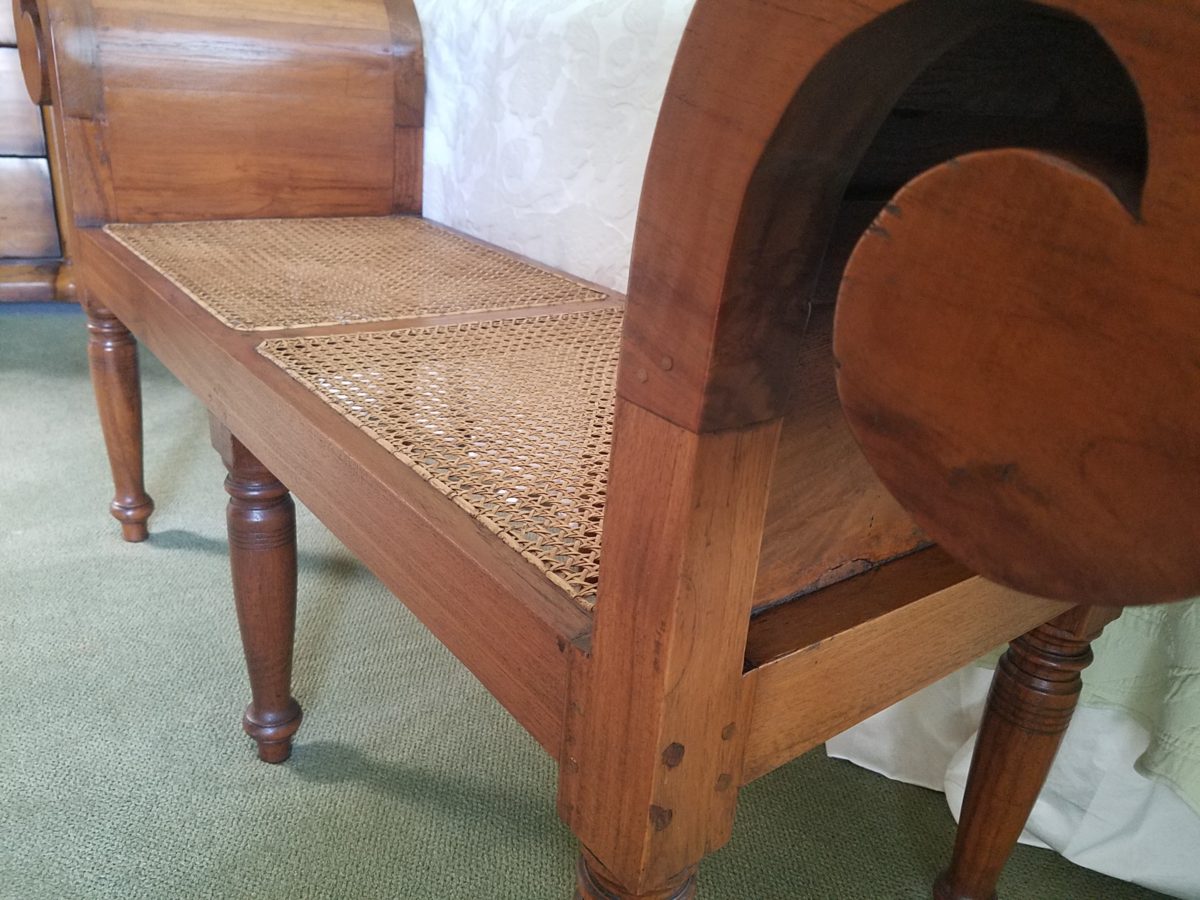
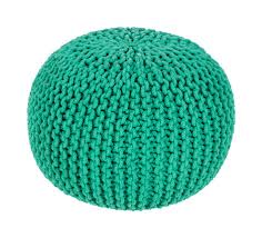
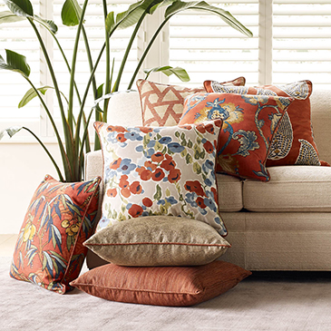
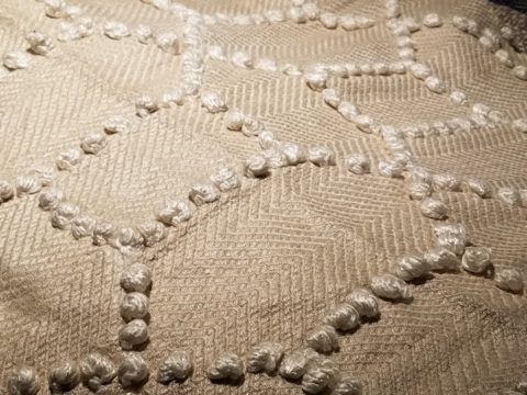
Bedrooms can also offer footstool/ottomans when there is only room for one chair. For reclining to read or as a pull-up for a second seat.Benches are a great seating option.It’s not a wonder that we have sold numerous of these clever SURYA Cotton Poufs in myriad colors in our shop!
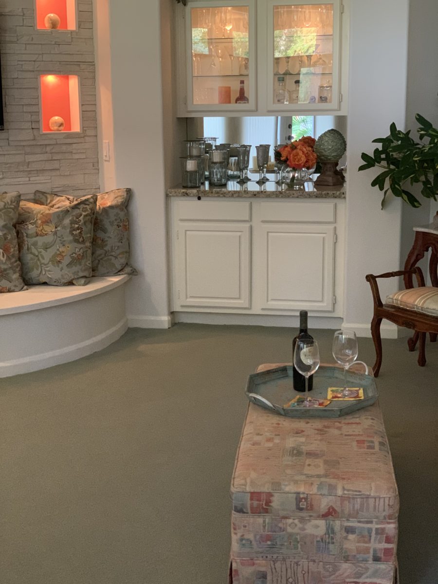
Often used for coffee tables – with a tray for stability beneath drinks, benches or ottomans can double as a foot rest or table-like surface.
An upholstered bench can be pulled in front of the fireplace or used as a cocktail table with a sturdy tray.
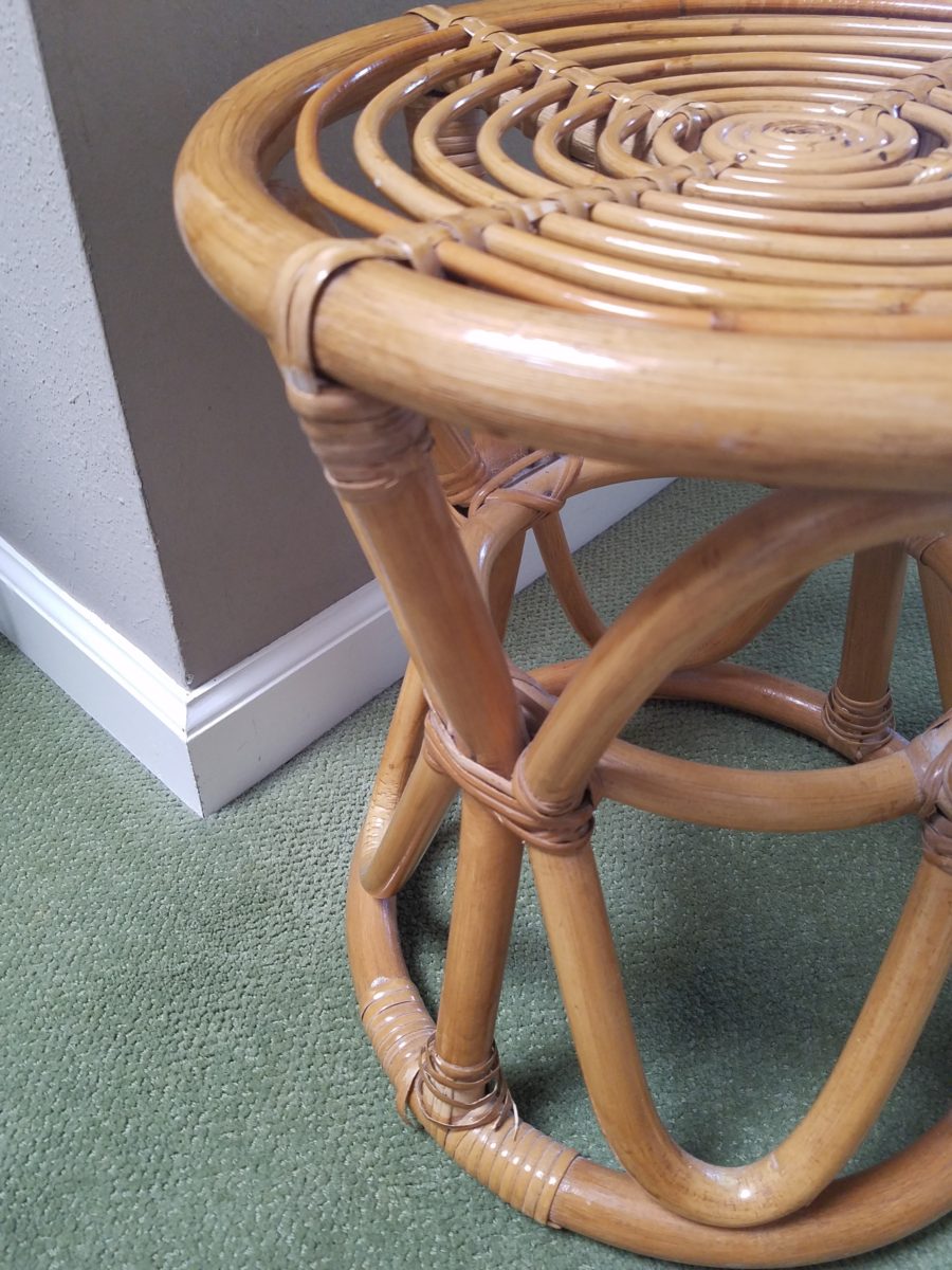
Something as simple as a rattan stool can be easy to pull-up.
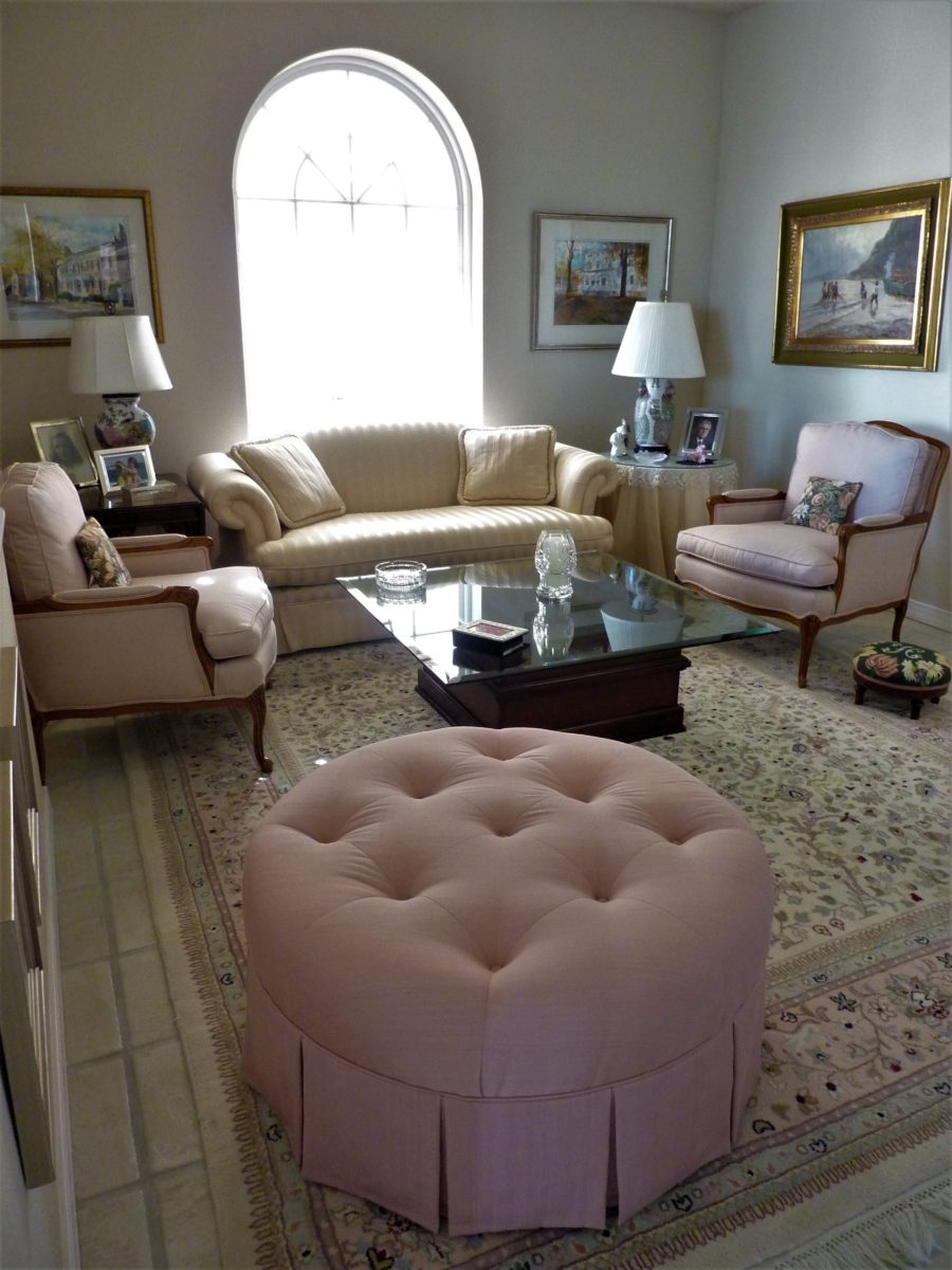
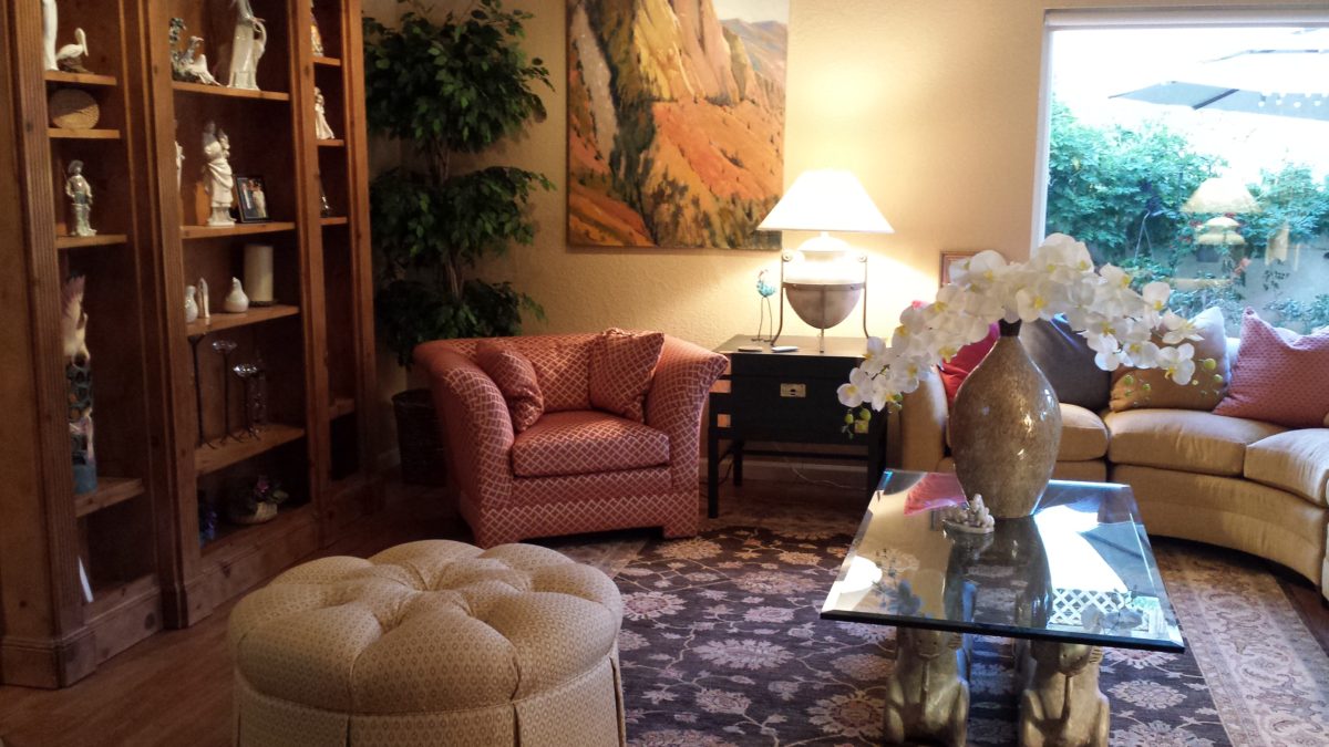
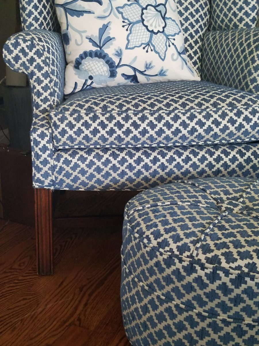
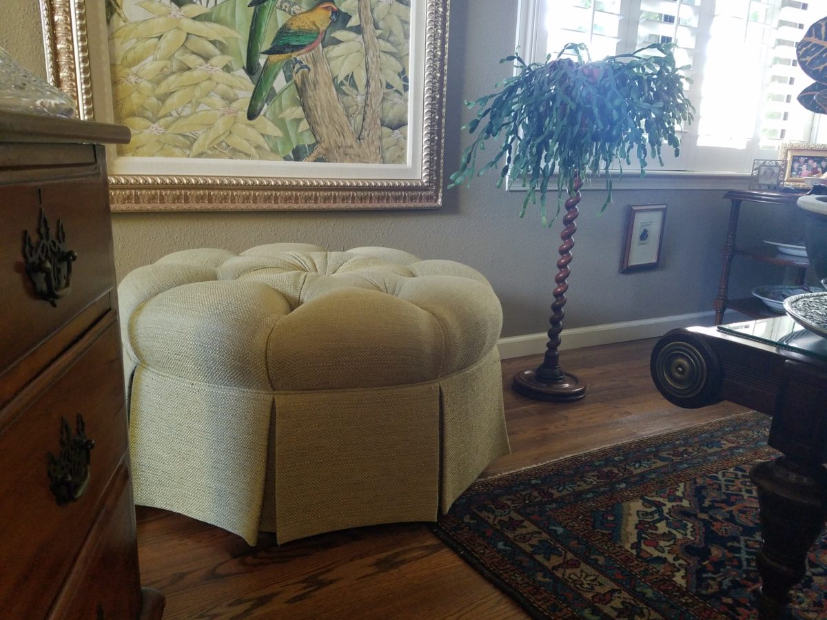
A pair of ottoman frame a seating area. An ottoman never has its back to anyone or anything.
You can seat more than one person on a good-sized piece.
A round one can have guests facing different directions to join in different conversations around the room.
Low in front of a fireplace, tucked beneath a coffee table or a console table, they can easily be pulled out when needed.
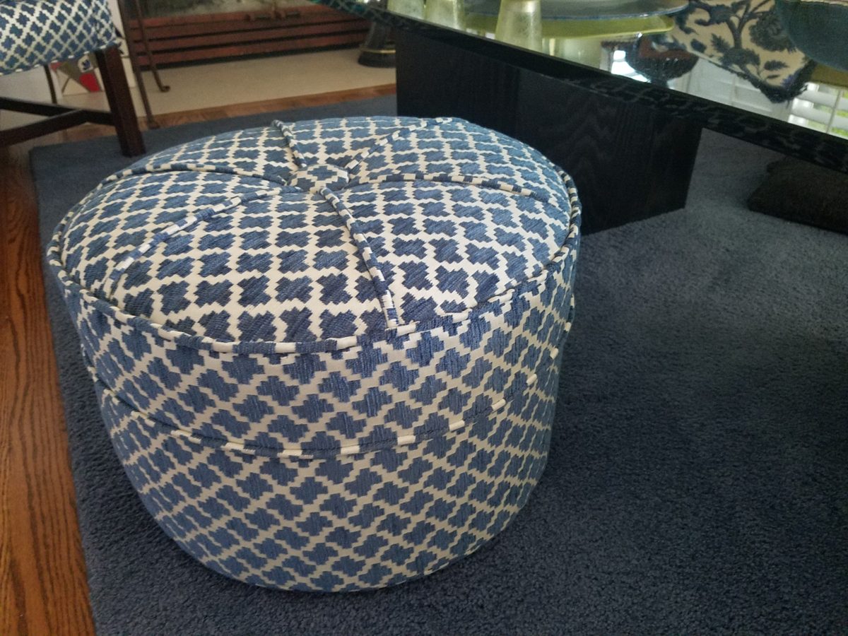
Here a pair of square cubes are stowed beneath a console and pulled up to the group for extra seating.
They add a splash of color or pattern.
Or they can meld in with the color scheme.
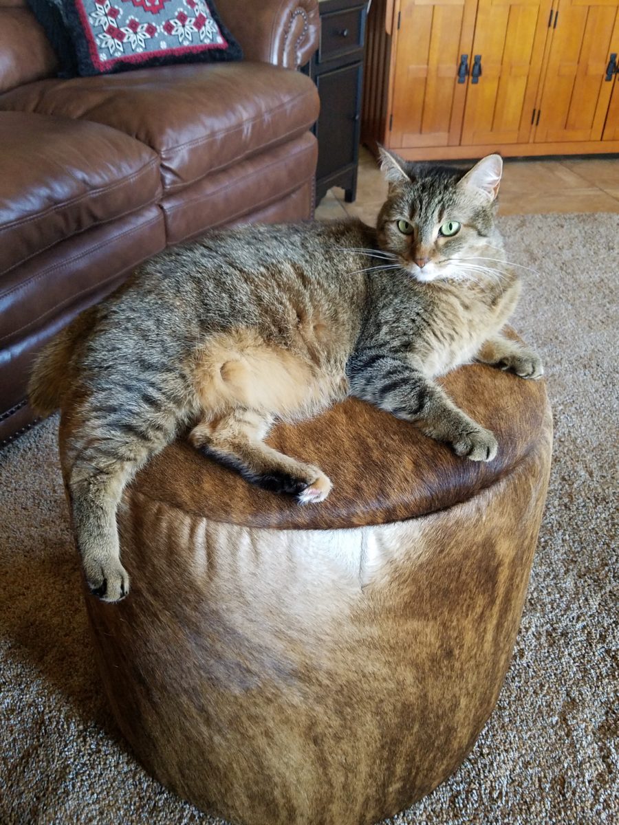
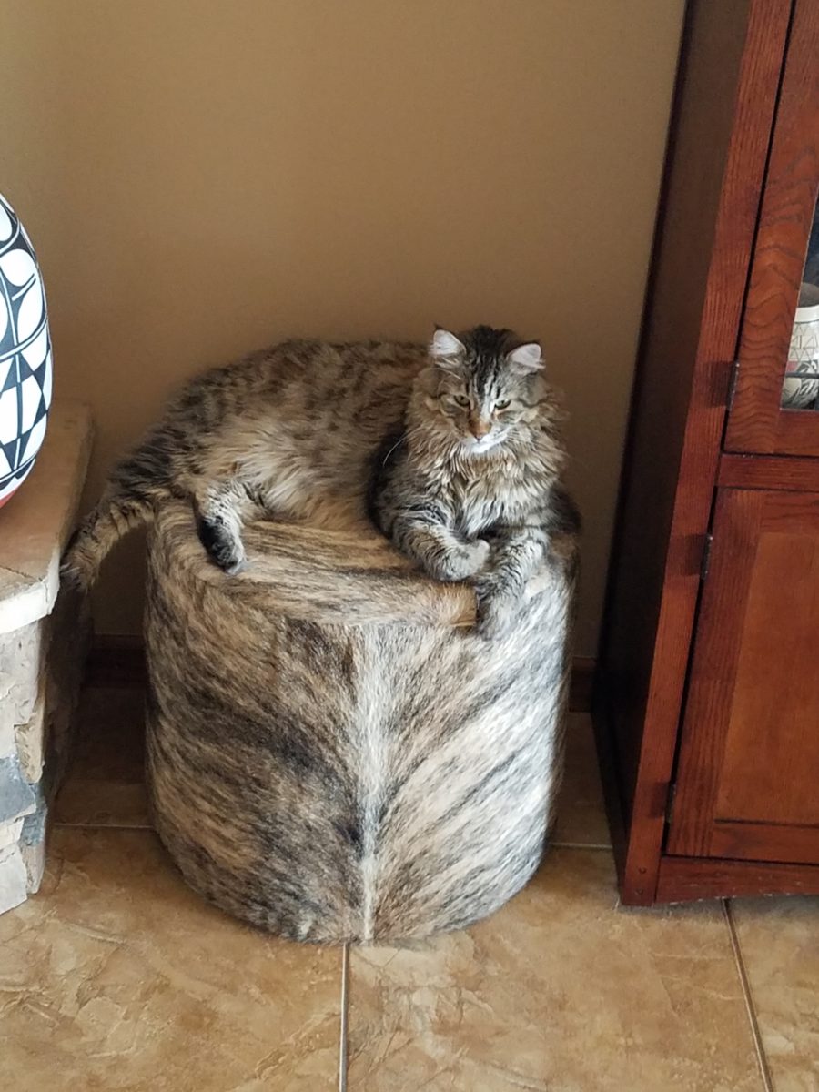
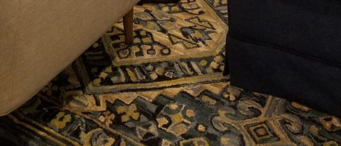
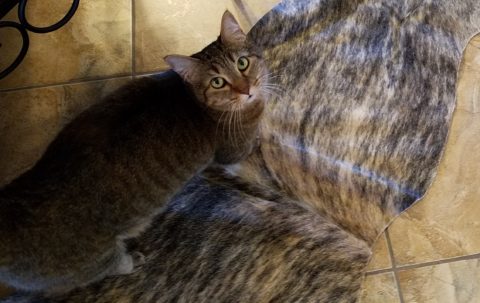
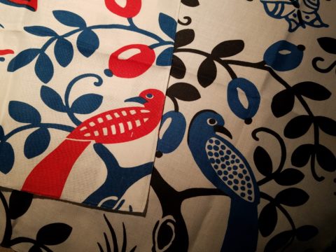
These cats think they are hiding on these custom fabricated cow hide stools. Cow hide camouflage makes the perfect perch for these cats…but they are intended to be handy for guests as pull-up seats around the coffee table in front of the fireplace.
Look at your room and see if it wouldn’t benefit from an extra low-profile seat or two.
Colors for fashion, interiors or a composing a bouquet are like the many ingredients, spices and herbs selected for great food. Creating dishes with fine flavors and visual appeal, by selecting the right combination, is good culinary design. So we see the spices and ingredients of design everywhere!
Assembling the colors, textures and shapes in a bouquet…
The art is in gathering the right combinations, textures, colors, flavors,…ok – maybe edible bouquets…Well, we’re not tasting the interiors – but some are scrumptious! Ooh – good enough to eat! And the fashion – yes, we’ve seen edible fabrics…generally not attempted in draperies – but who knows? The sky is the limit in design!!!
A few years ago, Kingston University Fashion Student, Emily Crane began pioneering a new strain of edible couture created from gelatin and seaweed! Brilliant and beautiful!!
Inasmuch as edible couture and creating fabrics from edible materials is fascinating, I digress…the actual point of my story is to recognize the common denominators between gathering materials for all forms of art – the assemblages result in the creative finished products. In this instance, interiors and their color schemes which bear likenesses to beautiful foods!
Color is the most apparent ingredient of most artistic design endeavors. It is the most obvious and first to catch your eye. Assembling an interior is usually grounded by a desired color. The foundation of a room begins with deciding a direction with color. This might seem to be contrary to the concept that form follows function – but I believe that the designing for the two are often concurrent events. The vision occurs while the function is simultaneously examined. Most people visualize in color.
I often write about color. It is an ongoing fascination to discover who prefers what color(s) and why. It offers the beginning of the visualization of a concept. As the framework is discussed – such as programming a kitchen. Inevitably, in the early stages, colors and materials are discussed. They might change. They might not end up as first imagined, but color aids in the visualization and process of design.
Look around your world and consider color. Why did you choose your interior colors? When selecting a color for the surfaces, fabrics and finish materials what would you do differently and why. Taking care not to merely react to trends, what colors will bring you joy? Trends often tempt. They are enticing and new, but they move along…It takes thorough examination to determine if a trend is truly applicable or merely a passing temptation. The validation of design is the approval of the occupants or function for whom/which it serves. Not just the feature of a new trend.
So have a little fun seeing these interiors
paired with edible color schemes as dishes are correlated to interior schemes.
The spices and ingredients selected to create the flavor bursts might be hot green jalapenos, serranos, tart limes, dried red chiles balanced by the soft and warm yellow of corn tortillas.
What interior might look like a spicy platter of festivity?
Perhaps bold wall colors sprinkled with myriad decorative accessories and
functional art.
Spicy colors in this festive kitchen.
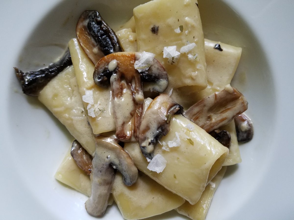
Imagine creating a creamy white-sauce mushroom pasta with
velvety texture and soft finish. The ingredients you would reach for would be
the cream, pasta, white pepper and perhaps a touch a sherry. Sautéing the
mushrooms in butter for a luscious golden brown.
Invitingly divine.
An interior that captures a similar feel derived from the same palette of colors…
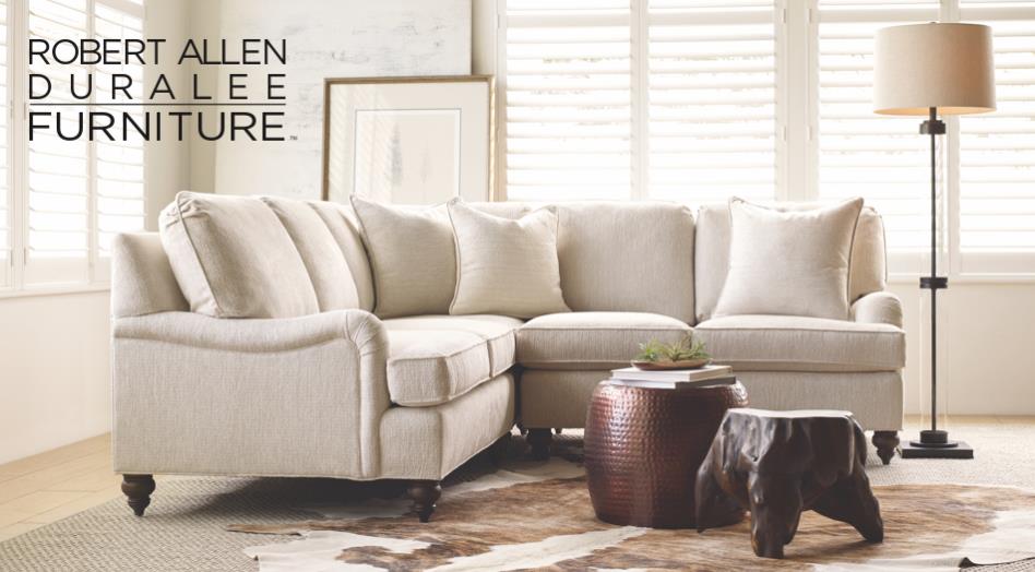
Mimicking the creamy mushroom palette, rich wood, copper and steel tones contrast against the creamy whites in this interior featuring one of our favorite furniture and fabric lines – Duralee/Robert Allen! Duralee/Robert Allen has many collections providing the perfect fabrics and furnishings for so many deliciously diverse interior projects!
From creamy, soft and warm to cool and refreshing…
Cool sushi plates featuring the pink and orange tones of tender fresh fish, cilantro sprig greens, and so white rice!
An interior possessing similar colors – the perfect ingredients to create a stunning design!
Durlaee encompasses many fine collections. Here the Clarke & Clarke Oriental Garden fabrics are gathered together to present a fresh scene reminiscent of our colorfully fresh sushi plate!
Ready for reds?
A berry lovely dish with creamy whites…Our delectable raspberry tart presented on a lace-embossed white pottery piece accented with finely sliced toasted almonds sets the stage for the next interior color scheme… Once again we are featuring Duralee’s Clarke & Clarke statement called Zanzibar a brilliant raspberry and red ethnic statement inspired by the exotic and vibrant world of Tanzania, Africa. Discovering the creativity of colors and fabrics in distant places offers a mélange of ingredients with which to create an exciting interior design!
Mix it up. Gather the
ingredients that will bring you joy and result in a deliciously creative
interior!!! Come see and feel these fabulous fabrics and furnishings from
Duralee/Robert Allen in our comprehensive design resource library at PATRICIAN
DESIGN! Call us and we will send samples!
Designing is like cooking – I guess cooking is a form of design. Yes, it certainly is. Whether it is graphic design, fashion design, architecture, musical composition, poetry, landscape or interior design – artists of all media – the art of creating, designing, composing, it is all about the right ingredients in the right amount to balance the scene. Proportion.
Even though I will be focusing on interior design, the”scene” could be the sheet music, the canvas, the poet’s screen or paper…the “scene” is the window that frames/encompasses the finished product. To compare these artistic endeavors, to the art of cooking, is so obvious to me.
Everyone must cook something. Whether it is merely heating up beanie weenies, with a sliced dill pickle tossed in, chased with a gin on the rocks, it is a composition that must result in a tasty scene – for someone. Having said that, we must also note that “beauty is in the eye of the beholder.” The more successful compositions appeal to a greater number of aficionados.
To cook, one must combine the right ingredients, in the right proportions, to combine to result in the best finished product. When I design, as with cooking, it is often “create as you go”…it is important to add an element and taste…re-think…evaluate…
Assembling ingredients and considering the balance of them in the finished product.
At a glance, the significant distinctions between cooking and interior design is that in cooking, the finished product might be gorgeous, but taste terrible. Interior design is all visual – on the surface…or so you might think…until you evaluate function. A beautiful cake needs to taste as good as it looks. An interior must function as well as it looks. Both are dependent on the subliminal factors that result in a truly successful finish product.
Successful is also in the eye of the beholder…25+ years ago my mother and I went shopping for a leather sofa. She, at 5′ 3″, was a bit on the “vertically challenged” side of the ergonomic spectrum. Therefore, actually sitting in the contenders was important so that her feet comfortably rested on the floor and her back against the back – no propping up with throw pillows to make the fit. So we searched and sat and searched and sat until one day, like Goldilocks, we found one that was “just right.”
A few weeks later, having waited anxiously for this perfect sofa to arrive, Mom excitedly called me and said “they’re delivering my sofa today!” I told her I would be by after work to see it. But before I could finish my day and see this long-awaited focal piece, she called again exclaiming “It’s the wrong sofa!” To which I replied “hang on – I’ll be right there.”
Sure enough, I watched her as she sat on her beautiful new leather sofa and looked like Lily Tomlin doing Edith Ann! Her legs shot straight out and even with a scoot forward, her feet dangled in mid-air. We knew something was wrong. It looked like the right sofa, but we didn’t have the intended dimensions of what we ordered. So all we could do was go back to the showroom and hope the sofa that we thought we had ordered was still on the floor and go from there…
With great relief, we found the showroom model…Mom crossed the room and took a seat. A very comfortable seat. Everything fit just right. So what was with the sofa that was delivered earlier today? As it turned out, it was the right sofa, only hers was brand new. The one on the floor had been sat upon for months and by a thousand fannies…the answer was simple prompted by a simple question. Would they exchange the brand new cushion filling for the broken down stuffing that was in the floor model? And with that – voila! Her new sofa was modified to be the perfect fit – old, broken-down cushions and all!!!!! She still sits comfortably on that sofa today. Function. The outside looked great – the ingredients were a bit off. Ingredients make the difference.
I used this example with a client recently when she had a chair reupholstered. Per her request, the stuffing was not changed – but the upholsterer thought that the collapsed appearance was not good and would reflect a lack of attention on his part. So he plumped and made more firm the stuffing inside his new, tighter envelopes. She was not pleased and thought all was lost. I assured her that it was an easy fix and asked that it be redone. He is in the process of modifying the fill to accomplish the comfort she remembers. The chair looks great – but the ingredients/details are not creating the function that would make it a truly successful design.
As a designer, we often (especially in bidding environments) are faced with “or equal” substitutions to our design selections. The specifications have to be within a certain tolerance, but the results can radically change the complexion, success, look and effectiveness of the design. Imagine how this could affect a recipe? Well,sometimes great new recipes come from unintentional substitutions….take these cookies I baked last weekend.
Barbara Bush’s popular Cowboy Cookies – unplanned, I had a wild hair to bake cookies. I can count on one hand how often that has happened in the last 20 years!! So having had these fabulous cookies recently (thanks Feath), I rummaged through the pantry for the ingredients. Well, I had wholewheat flour, not all purpose, I had a few butterscotch morsels and a few more white chocolate chips. I had no chocolate chips nor coconut. I had steel cut oats not rolled oats. Too lazy to run to the store, I thought that the worst that could happen was that my cookies would be terrible and I would have wasted the ingredients and a couple hours of time…However, I am pleased to report that they are wonderful and resulted in a new oatmeal cookie worth sharing. Substitutions can work, but the harmony of ingredients is the key.
Another issue that can challenge a good design is when there are too many chefs in the kitchen. The ingredients can become imbalanced and substitutions can be made that alter if not spoil the intended results. In some projects, the”lead” shifts. The contractor, subs, and owner can all insert changes that alter the design. This usually occurs without regard for the design as a whole. Each person has their field of vision, their focus of expertise or special interest. Sweet, salty, acidic…each has its place – balance. A disregard for any of the ingredients, poor substitutions or imbalanced quantities – will alter the results.
Yin and Yang – the balance of our known universe – is all at the root of the balance of good design. Balance and the relationships of scale (which are also forms of balance). Rough/Smooth, Shiny/Dull, Dark/Light, Soft/Hard are all ingredients of good design. The balance of these are the equation of successful solutions. And this doesn’t even include the magic of color its balance and compliments.
Many people are good cooks. They have an innate sense of what works. Many people have an innate sense of good design. They often take it for granted. They might not be able to articulate it – but they can create it, they know it when they see it and they employ the rules of balance whether they realize it or not. In both of these cases, theses innately talented people often need reinforcement or encouragement – validation – affirmation.
From dinner guests to friends coming over to see the new furniture arrangement, talented cooks and decorators can get the job done – as with all professional chefs and designers – with the support and contribution of the talents around them.
Are you drawn to pet adoption events? Do you wander over when you find the dog adoption people parked, out in the open, along the side of the road, in the corner of a parking lot or even at the pet stores themselves? I don’t. I avoid them like the plague. I know that given just one sweet look or mournful expression or happy eager wag, I would have a problem.
I rescued my Rockford about 30 years ago. He had been kept chained to a tree in a backyard with a choke collar that he had very much outgrown.
I absolutely cannot allow myself to be tempted knowing that my resistance would be weak and my resolve would be challenged. I don’t need a dog at this time in my busy, crazy life. However, I would certainly go that route, if I were in the market.
Little Mini was passed from house to house until the fit was just right!
We all know that adopting a pet – dog or cat…or other…is such a wonderful gift – to them and to the lucky new owner! And I feel the same way about furniture and home decor. Yes, I see a direct correlation between “thrifting” and pet adoption. Funny?
Whether it is a early start on the garage sale circuit (not my bag, but very worthwhile) or estate sales (also not my thing as I get too emotional, about the family not wanting the treasures) or scouting consignment shops and thrift stores (less emotional because the context of the pieces are not so personal) it’s all about treasure hunting. It’s a growing trend for sure!
But like pet adoption, I see salvaging a previously owned piece, over buying new, just like giving a fresh start to a neglected, even forgotten, treasure. And, as you know, they say “One man’s trash is another man’s treasure.” and I so believe that statement! That same phrase could be said about your newly adopted pooch! Your new “treasure.” As well as that fabulous hand carved chair – your new treasure!
Bring it home, get it cleaned up, play with it around the house and get it some new clothes – oh – am I talking about the new four legged family member or that awesome new chair??!! Interesting similarities are shared by the adopted pet and the adopted furniture find!
All dressed up and ready for a party!!!!
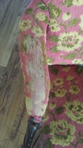
From Victorian through mid-century modern, reupholstering gives a fresh new outfit to that fabulous piece that has been left sporting a shabby suit.
Threadbare but still fabulous – what a great save!
See beyond the existing condition – “You can’t tell a book by its cover.” And you will see beyond the surface focusing on the lines, bones and details.
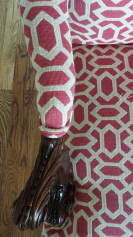
This Winged Victory of a sofa was ripe for re-purposing!
New suit and shoes and this was a great save!!!!!
Discovering great pieces is soulful. Eclecticism is interesting. Balance is better achieved when you have a mix of interesting things. Buying all new is not as creative and can result in a monotonous look that is immediately dated. You’ll know what year THAT room ensemble was created!!!!! Furthermore, re-purposing, recycling, up-cycling trends provides an opportunity to employ the talents of the local upholsterers and refinishers – support local talent!
To a void that pitfall – be brave and seek your pieces. Assemble them with care and embrace unique things. If you love them – make them part of your world. Find potential and then enhance it. Context enhances. Mix new with old and give new life to old pieces. It will be a satisfying and rewarding experience.
What you see in a thrift shop is one thing – seeing beyond it to a new context that celebrates it and features it with other things you love is the personal magic that makes YOUR interior uniquely yours.
This tired but handsome piece came to us in need of a face lift!
Multiple fabrics add pizzazz! Find just the right fabrics and you have a custom masterpiece! And the lumbar pillow for this one is still on it’s way, for a third pattern providing even more interest!!!!!
Give new life to old pieces and it will be a rewarding experience. Then go out an adopt a dog!
Finishing touches are always the beast to tame at the end of the hunt. Yes, you’ve hunted, you’ve searched, you’ve gathered, you’ve assembled and stood back and observed your work. What’s needed? What’s missing? When is it finished?
Just the word finish sets up a mental block for many. It’s like decisions period. Once you make a decision, you’ve lost your choices. Losing choices can be a dilemma in itself! So, from Pinterest to HGTV and the internet at your fingertips the choices and options are endless, but what do YOU want to do, to call it “done? It’s all in the details…
Schumacher offers details right down to the trim on the draperies! This bold key design makes all the difference!
And inasmuch as you can’t seem to GET it done, you WANT it done – just can’t seem to get there from here. How do you decide what you need to add for those incomplete finishing touches – to be FINISHED? Know though, that to have the feeling that it is finished is a good thing. Yet, that doesn’t mean you can’t change it – sooner or later!
We interior designers have jobs because our clients need to do things, change things, finish things. It seems that with all the options presented on TV and the internet, people are jumping in with inspired ideas, making decisions, buying things and doing things – then coming to a screeching halt! “HELP!” is the cry when everything seems to be too much – or not enough – or too uncertain and overwhelming – or not just right.
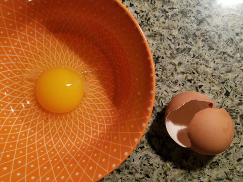
As if your own self-imposed frustrations and pressures are not enough, your partner rants…”Just finish it – will you? Be DONE with it!!!” Not everyone loves a DIY project. Most people don’t even like the disruption of a professional team coming in and tackling the job. Alas, “you have to break an egg to make an omelet,” some wise person once said.
Whether you’re changing paint colors for the third time in a month or tossing throw pillows around the room, to no satisfactory avail, there’s something missing…something is not quite right…it’s not there yet.
Have you removed everything from the walls and lined them up waiting for inspiration as to how and where they should be placed and grouped – maybe re-framed?
What about a mirror to add depth? Is it an installed mirror – the illusion of space without calling attention to the mirror itself or should I hang a framed mirror that makes the statement in its entirety? Do I lean it against the wall or is that a trendy affectation?
Uttermost is one of our favorite sources!
Studied nonchalance is an art form. How to achieve that intentionally unpretentiously naturally relaxed look is a challenge. Just writing about it here is an effort in describing that which is supposed to be effortless!!!!
Perhaps it is a monotony of height. Do you need a tall piece among other lower elements in the room? Maybe a tree in the corner is the answer or a statue of some vertical art statement, to add interest and height. Perhaps you might consider hanging something, from the ceiling – a mobile or origami bird or even a light fixture, to draw the eye up from the otherwise low furniture pieces.
Robert Allen presents perfect fabrics for colorful pillow accents…and there’s that tall plant for height!
Speaking of light fixtures…how does your almost finished, but not quite there yet, room look at night? Are there dark pockets and corners that would benefit from some concealed up-lights – indirect lighting can be quite effective and enhance a spooky, dismal space.
LOVE this before & after! Check out John Cullen Lighting for some great ideas and inspiration!! https://www.johncullenlighting.com/
Spooky is the season and, with the holidays approaching, the need to get things finished before guests arrive or you leave to visit… or just the hectic nature of the baking, gift-buying and wrapping, shipping and other communications aspects of the season are upon you – pressure you to want to get things finished!
Brunschwig and Fils by Kravet offers an amazing collection of prints – mix and match!!!
Have you consulted with a friend? Do they rise to the invitation of critiquing your present state of affairs and offer design ideas that further serve to confuse you? Better yet, ask two friends and get two different options for finishing your space and then what? Pick one and the other’s feelings are hurt that you didn’t take their advice – even if they are not aware that your decisions moving forward were offered by another friend.
From the rug (thank you Company C for your “Colorful Living!” to the table accessories and all the things, pieces, fabrics, details in-between – finishing touches FINISH the job!!!
A designer is a problem solver, a tie-breaker, a marriage counselor, a creative who extracts your needs and – evaluating all options – offers the best solutions to get your job finished!
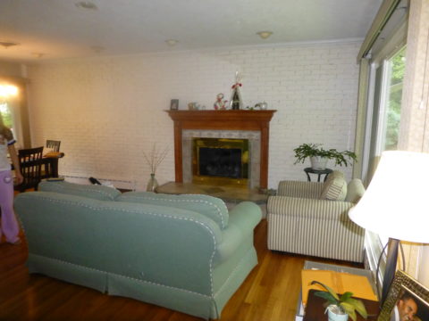
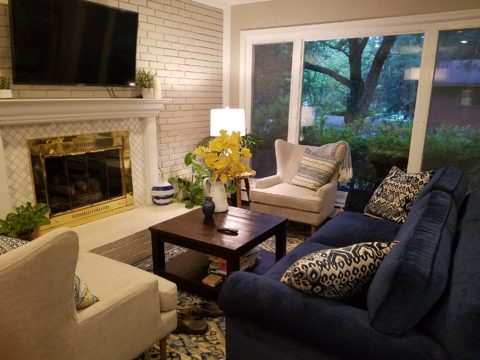
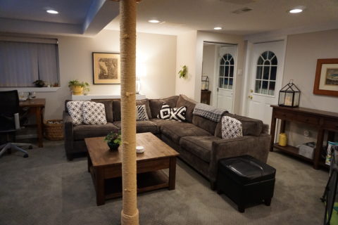
As an adjunct to last week’s story about the progressive young couple and their dramatic kitchen remodel, I thought I should finish the subject and tell about the adjacent living room transformation and comfortable family room on the lower level.
When the kitchen grew to become the focal point upon entering and the bar counter expanded into the living area, it reduced that space to now become a comfortable sitting room for guests to gather or the family to relax while activities are brewing in the kitchen.
Looking through to the dining room where a built-in storage bench was added along the window wall, offers additional seating. A new fabric-shade chandelier softens the light levels. All lighting in this remodel are on dimmers.
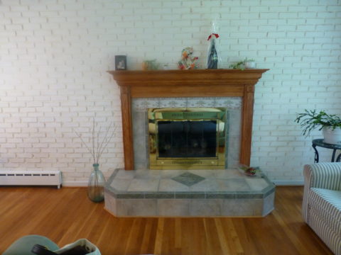
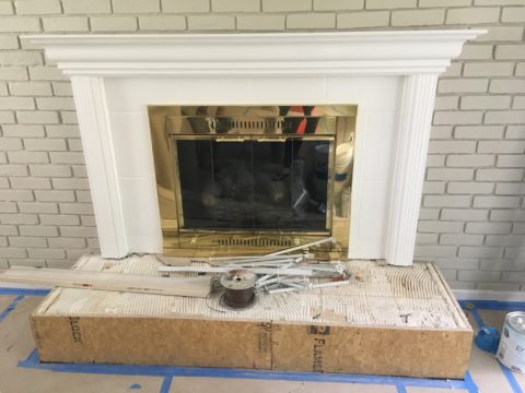
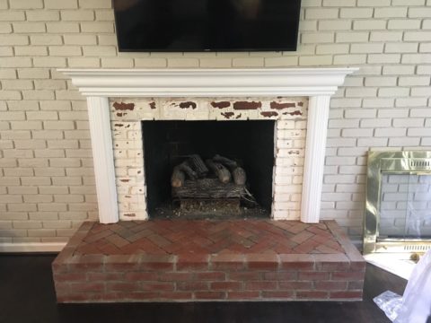
The former white brick wall had gently rubbed edges to suggest a distressed condition exposing the red brick beneath. The fireplace had an unrelated golden oak mantle and surround with insipid tile inset also used to cover the hearth. The tile was a glazed faux marble with a Victorian design accent feature.
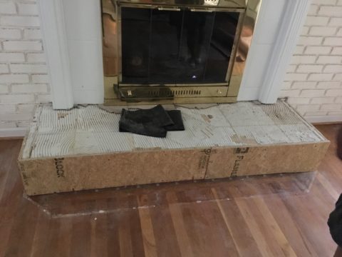
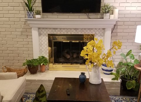
By simply painting the oak white to match the rest of the wood trim throughout the home and also painting the brick a soft taupe/grey tone, the look was instantly transformed. But they still had that awful tile…so here’s a design tip: to buy time either while you decide or until you save-up for the next phase, paint the tile away!!! To accommodate a new TV that is to go over the mantle, the wood surround was shortened. Notice the extra piece of wood trim that was removed to lower the mantle.
The hearth was removed and rebuilt (without the cut-off corners) with brick and painted to match the wall. Lucky for them the hardwood floor went beneath the hearth – so when they modified the size, they didn’t have to patch the floor! Tile was removed and replaced with 2×2 mosaic Carrara marble to coordinate with the herringbone mosaic of the same marble in the new kitchen backsplash/wall (see last week’s blog).
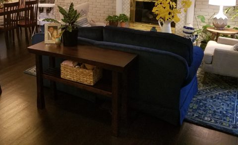
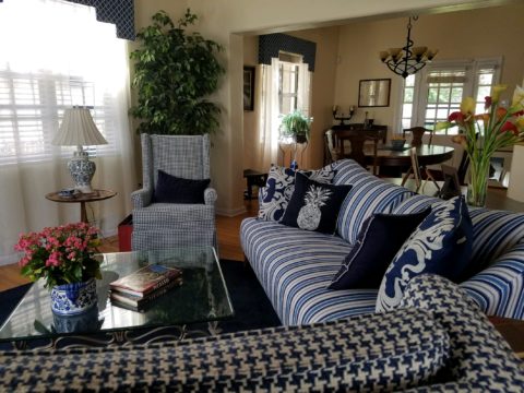
A sofa found, for nearly free, was in good shape and reupholstered beautifully in this plush, durable navy solid.
The classic blue and white motif was punctuated with organic yellow.
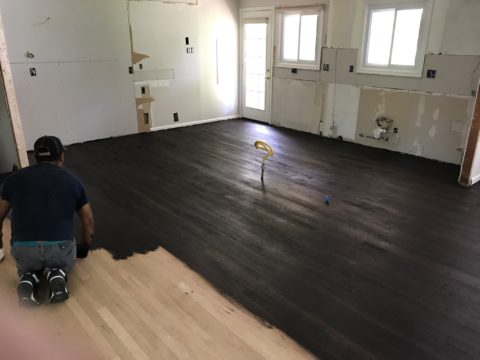
The newly refinished original hardwood floors – taken from a golden oak finish to a rich espresso/walnut stain…
…with the blue and white wool hook rug creates a handsome contrast. The rug actually “reads” blue and white, but upon closer inspection has warm khaki tones, soft turquoise detailing and is quite complex.
This revitalized cozy ambiance of this new sitting area/living room is perfect for this growing young family!
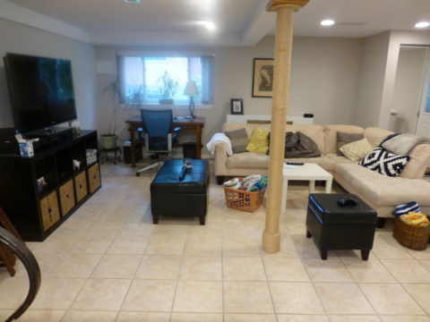
And for a more expansive gathering space, the lower level family room received a new sectional sofa in a durable charcoal fabric and a low-pile small diamond patterned wall to wall carpeting to conceal what had been cold tile floors and make a comfortable room for all seasons!
Purrrrrrhaps someday they’ll have a cat to climb that crazy rope-wrapped pole!!!!!
This week began with a juicy fabric presentation. I say juicy because it got my design juices working and I was inspired to take photos and imagine the opportunities to insert these wonderful colors, patterns and textures into upcoming projects.
Take the chicken and the egg scenario. Do YOU often find that exciting design elements invite thoughts of projects for which to use them?
A fun exercise is to take your camera and search for patterns to photo…patterns are everywhere from cast shadows to fabrics, signs and graphics to fallen leaves.
Seeing these exciting new fabrics – you had no intention of changing all your throw pillows, but these stimulating samples might make you consider changing your entire collection!
The opportunity to offer unique fabrics for clients who would otherwise never be exposed to the samples – not know of the possibilities – is exciting. Being able to make this introduction is a treat.
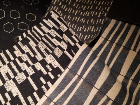
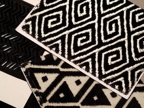
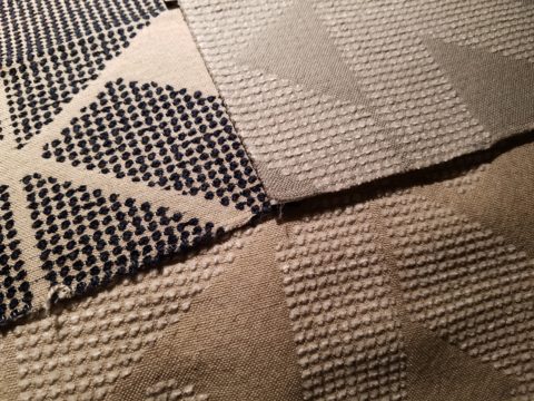
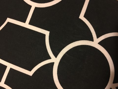
This first batch was of clean, sophisticated, woven, geometrics in blacks, whites and charcoal tones.
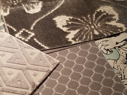
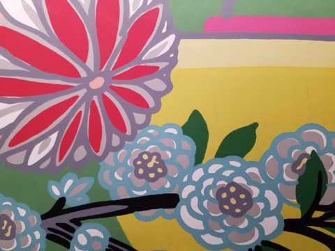
Whimsical patterns and textures, with splashes of color, offer more possibilities.
Now see these rich woven patterns and colors in this next series. An explosion of color and pattern with a decidedly native direction – prime for New Mexico and design projects looking to evoke the elements of the southwest and other opportunities inspired by indigenous art.
With all this freshly implanted in my ever-swirling brain of design fragments waiting to be assembled, I traveled north this weekend for an enchanting New Mexico wedding that further fed the theme of indigenous art, pattern and design.
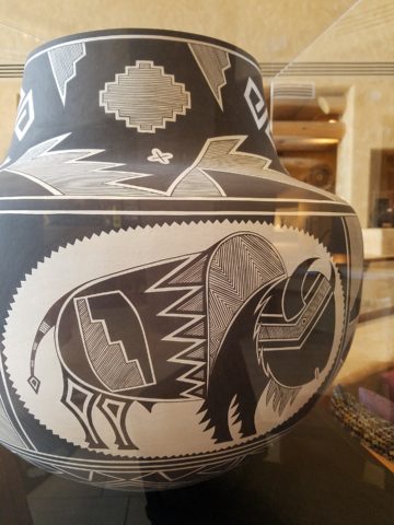
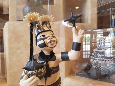
The lobby of Buffalo Thunder was riddled with magnificent pueblo pottery. The designs were wonderfully intricate and I saw them as stand-alone elements that could easily be fabric motifs. Here on pottery – but so fascinating to consider as possible inspirations for fabric patterns and designs.
Anasazi Buffalo Pot – Acoma Pueblo
Suggestive of a court jester, this expressive piece tells a figure story. The bold patterns make a powerfully beautiful statement. Who loves bold stripes? Do you wear them? Do you upholster with them?
Evening Star by Katherine Wall from the Jemez Pueblo
Cut-outs on lobby lounge chairs, with geometric upholstery, atop bold zig-zags of the area rug proves combining patterns creates a fine line between exciting juxtapositions and pairings – and risking possible disturbing disruption of order. Comedian Steven Wright uses dry wacky wit delivering hysterically funny observations to convey a sense of the obvious with a twist. I’m paraphrasing one I remember from years ago… “You know that feeling that you get when you lean way back in a chair…way back on the back legs…back so far that you are just about to fall…I feel like that all the time.” That’s like that feeling with challenging design. It goes just far enough to get your attention…designers get that feeling as they push the theoretical limits of design – all the time!
Ok- this is not perhaps THE most outrageous example of this theory – but a fun, eye-catching combination nonetheless!
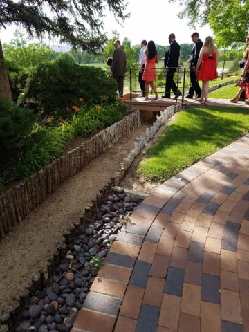
Buffalo Thunder resort was the jumping off point to then venture beyond into the thrilling landscape of La Mesita Ranch.
Mixing different colors of brick make this random patterned walkway very pleasing and interesting.
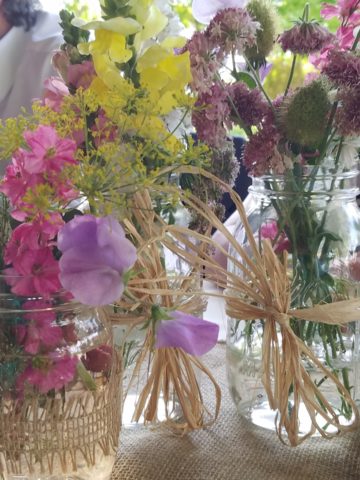
The setting was natural, organic and inspired.
Simply lovely centerpieces
See a lovely, intense example blooming blue and white and much more in Nantucket on the cover of the new June 2018 issue of Architectural Digest. http://www.theenglishroom.biz/2018/05/29/nantucket-beauty-by-markham-roberts/
So look for patterns all around. Discover exciting opportunities to mix patterns and textures.
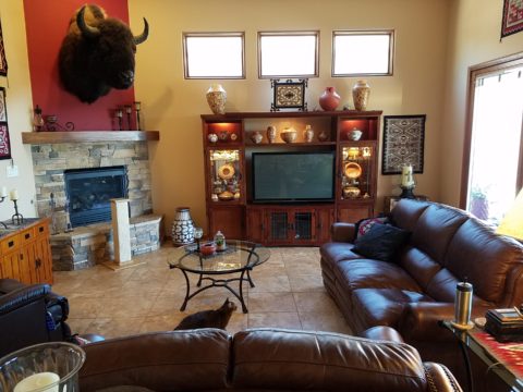
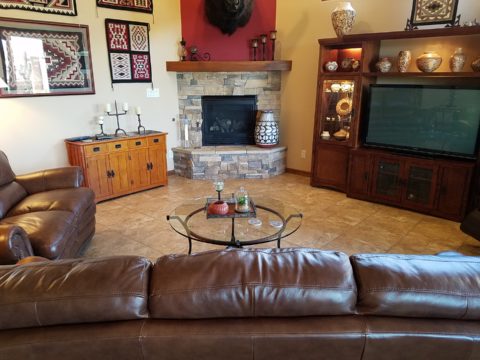
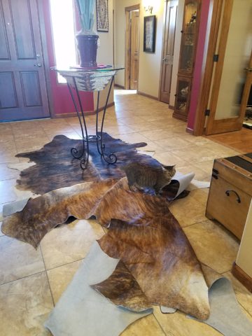
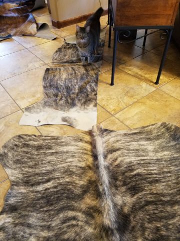
During the course of this day’s consultation this precious and perky bob-tailed cat, Kachina, inserted herself into the entire process. She greeted me upon arrival, walked all manner of adjacent furniture as we discussed the scope of work. She tip-toed across tables, sofa and chair backs, and ultimately the hides we were considering for upholstery.
Initially we viewed the room and its present arrangement and realized that the l-shaped right angle position of the sofa, loveseat and recliner conflicted with the angles in the room. the sofa was perpendicular to the TV/display. The fireplace was at an angle in the corner. Neither one had the central focus – the attention was split from all angles. So the question was…Is it necessary to have the recliner as the primary TV viewing piece? Seemed like all the pieces were crammed together and the room was not being utilized to its full potential.
Kachina even has her eye on that bulky sofa as though to say – MOVE IT!
Kachina leaped onto the sofa to make her point- agreeing to the subject of our conversation!
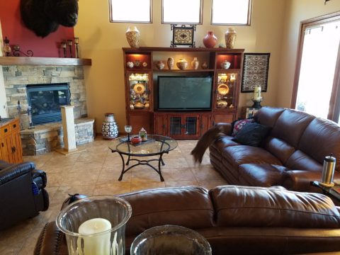
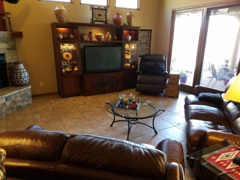
It was determined that the recliner need not be positioned to directly view the TV. Once we turned the sofa to be parallel to the fireplace, it also opened the angle to the entire room and framed both the TV/display unit and fireplace. The recliner tucked into the far corner -not facing the TV – created a cozy nook for reading and next to the patio doors allowed a view of the backyard.
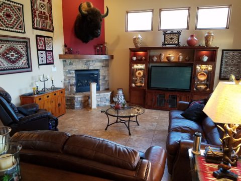
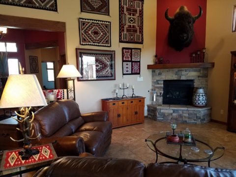
Needless to say, this fireplace crowned by this magnificent buffalo was an incredible focal point. Formerly from Wyoming, this couple knew this buffalo. They knew his name and knew that he became too aggressive and gored at least one female to death – who had to also be put down and who’s pelt was on the floor in another area of the home. The hunt and subsequent shoot has been preciously preserved and revered. These were not mere trophies.
This is the most extraordinary collection of very fine Native American Art I have ever seen in a private residence. From to carved stone, amazing weavings to paintings and pottery, the presentation is stunning.
To soften all the hard and cold materials of the floor tile, leather and iron detailing, we are now on the hunt for the perfect area rug. Probably a shag to carry the balance of the contrasting finishes. Design is all about contrast, balance and harmony. Unless the intent is to intentionally disrupt, in which case, the contrast takes center stage!!!!
These gorgeous brindle cow hides were so exotic and beautiful. The patterns and colors were wonderful and the couple who owned them had a great respect for the animals, and the celebration of their beautiful pelts.
Kachina was nearly camouflaged with her pretty pelt against theirs.
It’s fun when pets participate.
We will be making a pair of ottomans with these two hides. Great for pull-up at parties to gather around the cocktail table in the center of the room. Watch for the additional photos once the work is finished.
Fabulous fabrics are NOT common – that’s what they have in common!! After paint, fabrics are the most malleable design element that can make dramatic transformations in an interior. New pieces, reupholstering existing pieces, treasure-hunting to cover vintage pieces, salvaging family heirlooms, plastering or padding walls and ceilings, draping and accenting – doesn’t it sound exhilarating? Imagine the possibilities!
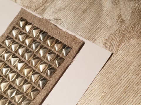
Metal studs to trim things…wrap a lampshade, border draperies, trim a sofa, adorn a pillow…so many things…and the stormy cloud printed velvet in the background of this trim – is blustery and powerful.
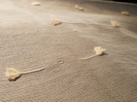
One of the most fun-filled events in our design studio are the road-trip visits by our fabulous sales reps that bring the world to our conference table!! In larger cities, the design resource centers, markets and their showrooms offer myriad marvelous samples of furniture, decorative accessories, art, lighting, fixtures, finishes and fabrics. Exciting new design trends are presented each season.
But when you live, in isolation from the major centers, as we do here in the high desert – we are treated to personal presentations that are intimate, relaxing, inspiring and educational. Here is an exclusive collection that was presented just last week. Sit back and watch the fabrics unfurl and float – one after another – in layers of color, texture and incredibly inspirational style.
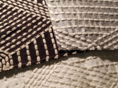
Weighty over-stitching or “top-stitching” adds detail-either high-contrast, color-on-color subtlety or the median slightly contrasting grey with white. Trending – touchable textures! Here presented for interior fashion, but you can bet that clothing fashion designers would love to play with these textiles for wearable art too!!!
Sure, throughout the year we travel to source hubs, surf the net, call our reps, request samples, compile materials and gather what we need across the miles. It is challenging. Like living on an island and bringing the amphibious containers of supplies over the sea and up onto the beach! But inasmuch as we don’t have a design center handy to do a lot of “one-stop-shopping,” we do curate our own very extensive source library of fabrics and architectural materials. With that at our fingertips, without leaving the studio, it’s a time-saver, a stimulating place to to engage clients and we are easily spoiled!
Fine weaves make terrific grounds for bold prints – here in three different color-ways – what a POP! Retro to new concepts – patterns add pizzazz!!
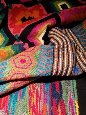
This recent textile presentation brought refined and rugged landscapes of intriguing textures and patterns that stimulated our design juices.
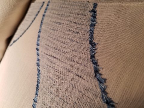
Intentionally cut after the weaving process provides extra texture and pattern interest.
Often the “backside” of these fabrics are as interesting (if not more so) than the fronts – but be mindful of floating threads and other weaving details/methods that interfere with practical use.
Bold “geometrics” are not only vivid with high contrast threads, the texture is what cannot be accurately replicated or conveyed via digital images on a screen. Despite the fact that I got up close and personal with these samples to photo, nothing beats touching and feeling the fibers and textures.
Complex weaves dazzle with design creativity. Bringing an artist’s concepts to fruition, with a mill to fabricate the dreams, is enchanting.
Traditions of weaving artisans are found in countries around the world. Sadly, not many fine fabrics are woven here in the States, partially due to the cost of fabrication and also due to the generations of crafts people who are experienced in the art of weaving more cultivated in other cultures. Whether organic, engineered, by hand or efficient, fast-paced mechanization – art and technology continue to push the envelope of fantastic creation and production in the fabric industry.
Here’s a great tip – if for only a pillow cover – if only ONE side of a pillow cover, having unique fabrics is having art. Living with functional art. Appreciating the designs, textures, craftsmanship and unique qualities of fine fabrics and wall-coverings is most satisfying.
Paints hand applied to the surface of fine woven fabrics is gilding the lily.
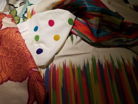
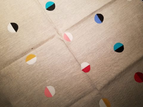
Who doesn’t love these colorfully, whimsical dot halves hand-applied to the surface of this nubby neutral??!!
Silk-screening also is an art-form that enhances the quality and appreciation of fine fabrics and papers.
Some of this collection are vintage art-pieces resurrected with new colors on the screen prints. The caliber of a fine, timeless, resource is about quality of both design and construction. A collection that continuously offers – classic and new, bold and subtle – answers to so many opportunities, is a resource that is to be celebrated!!
We investigate the most extraordinary fabrics, in the world, so that we can compile and create the perfect combinations for your exclusive lifestyle.
As we move forward into this new year…the story is the same – only some details have changed or been added to past stories. By that I mean if you search for trends – they are ALWAYS all over the place.
We do find years when really new ideas take the stage – like when the shift from plastic laminate to stone slab counter-tops became a valid trend. It was a trend brought about by improved technology, shipping, cost and ultimately availability. After that, the engineered surfaces that grew from this trend broadening the offerings – explored color, texture and pattern and continue to introduce new options.
Myriad surface materials mimic natural stone – when is it preferable over natural stone?
Engineered stone products offer many bold, solid colors from pure white to amazing primary colors.
So right now bold color accents are in, wall covering that made a come-back a couple of years ago is sticking for the time being and with newer bolder prints. Fabrics too – prints are bold and large scale!
Wood on walls is trending. Printed concrete tile is the big thing. Farmhouse sinks – in different finishes than customary stainless or white. Vintage light fixtures – enhanced with new technology and lamping.
So, does that mean I can’t have a white sink or shouldn’t have a stainless one? I should use printed concrete tiles in my kitchen or bathroom? If my home lacks a bold print wall covering am I missing something? If I’m not sporting some raw concrete, am I out of style? Is the wall full of family photos in my bedroom passé?
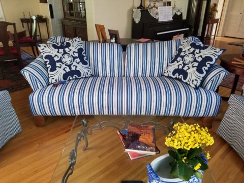
Surrounding by existing vintage pieces and family heirlooms, the new living room pieces added some contrasting, contemporary lines with clean, crisp, classic, blue and white fabric patterns.
Oh, the pressure to get it right!!!! Oh so many choices – how do I decide? Do I have to start over? I want to be in style – but I don’t know what that even means between today and 6 months from now. I like neutrals – am I dating myself?
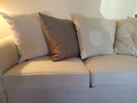
Neutral fabrics in a variety of textures and subtle patterns on a recently re-upholstered sofa.
Be calm and carry on…that’s why interior designers exist!! Sorting through all the conflicting, changing information and choices can be exhausting! Just get on Pinterest and look for any subject about an interior – window treatments, living rooms, bedrooms, wall treatments, flooring…with each year, the choices expand. The permutations seem endless. HOW does one ever decide?
Mark my word, we will be flooded with interiors plastered with printed concrete tiles, faux printed concrete tiles, filament light bulbs and jarring color contrasts, in the coming months and perhaps even years…These trends have already made their mark. But it will be the creative manner, in which the various printed concrete tiles are used and when the vintage style of filament fixtures is appropriate and effective. What colors are used (where, how and with what) is what will set a few exceptional installations apart from myriad uninspired, if not confused, versions.
An effective interior designer knows what is trendy versus a trend designed and positioned for lasting impact. This is a major part of the equation. Existing conditions with regard to architectural style, existing furnishings, personal preferences, budget, priorities, all play roles in the design process.
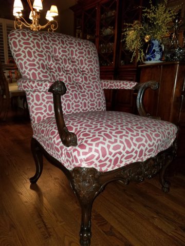
A young teen’s bedroom was recently redesigned to reflect her developing tastes and preferences. Bold color and a variety of geometrics and patterns make a bold, fresh statement.
You don’t want to be coerced into making changes just because new style suggestions are being presented. Trends DON’T RULE – despite the fact that the design community wants you to think they do, in order to continually change things up! Don’t be a victim of too many directives regarding what is in style. It’s intimidating and mostly due to access. We have access to so many opinions, on-line sites, magazines and advertisements that the pressure, conflicting information and choices can be ridiculous.
It’s YOUR interior, your style, your comfort and functionality. Yes, it’s all about YOU and yours.