Entrepreneurs! Getting Started with Design!

Starting out with your first brick and mortar business, the tasks are many. After homing in on your business specifics, selecting a name, designing a logo, deciding colors…you have your license and your business plan, you’ve found a place and then you need to present your business to the world!

A few weeks ago, we began a new project that is just what I have described…an exciting first-timer in the business world, having worked for others is now ready to do her own thing, be her own boss, make her own decisions and assume the risks necessary to take this leap into entrepreneurial adventure.

It’s exciting and scary, daunting at times and fun too. And it should be fun. Finding something that you enjoy, something you believe in and believe that you can do as well as, if not (hopefully) better than, anyone else in your market.

With inventory determined, name and logo designed the last task was to create the space to present her concept. We won’t divulge that today, the project is yet to be presented, but the framework is on what I want to comment.

We began compiling some finish options…paint, upholstery, privacy curtains, carpet and a little brushed aluminum bling!! We want to reinforce her brand with key colors and finishes.

Knowing the terms of the lease agreement – what is the landlord’s responsibility, what is grandfathered-in, what can be changed, any spending allowances amortized into the lease…these are all things that are necessary to determine how to go about designing the interior. It is necessary to establish costs within the over-all start-up budget. Having helpful, knowledgeable, creative people around you with whom to assemble your team is imperative.

We arrived at the site to find a very clean slate. Located in a retail strip center, it was a white box.

We instantly decided the flooring would be a combination of polished concrete and broadloom carpeting, some lights stay and some go, spots will be added, colors will reinforce her brand.

Toward the back, a break-room kitchen area needed demolition. This pocket would become fitting rooms.

There was existing ceramic tile on the floor that also needed to be removed. These were things that our client could attack herself – saving money and getting to know her space.

We learned that the restrooms were grandfathered in and did not require any additional improvements – other than cosmetic.

We learned that we could make changes and additions to the lights and only needed a permit for electrical portion of the work.

Many of these discoveries were of pleasant surprise to our client who had been miss-directed a bit and was in a state of frustration and near defeat. Gathering good information is imperative, in order to save time and money, make good decisions and know your options. Get out there and get busy!!!!!

Soon to bee completed, watch for this transformation in coming weeks.

Relocating – Making a new house a HOME

Thirteen or so years ago we designed the interior of a home for a young family complete with a toddler. The desire was to bring color and modern accents while still selecting durable materials and hopefully timeless elements.

Fast forward these many years later and this same family now with two beautiful daughters is relocating to another city, another state and a new home. This home was well furnished and much, of what was shown, stayed with the house. The trick was, after having adopted so much from the previous owners, how would they make this house their home?

The point of arrival – the front door – was a tasteful charcoal grey, but by changing it to a bit lighter smoky green, it made a significant difference.

It’s tough to be up-rooted anytime in your school years…these girls missed the only home they had ever had, friends, activities, groups and familiar environs. This challenge was to help all four of them – parents and kids – get settled and assist in making this new house their true home.

As I flew to consult with them, I imagined the scene having seen photos to get somewhat oriented. I made the natural assumption that paint would make new statements to alter the previous owner’s selections and introduce the new family’s preferences. However, despite the change we made to the front door, it wasn’t all about paint once I arrived.

In the previous residence all those many years ago, we punctuated the interior with paint accents. Good design transcends trends and the years. Who would think that this interior was created thirteen years ago?


The dining room in the new home was painted entirely charcoal – trim and walls. Oppressive was an understatement and before I even got there they painted all the trim white to match the rest of the home.  However, they left the fireplace charcoal – waiting for a discussion as to how to proceed.


Notice the dining room furniture having moved from one home into the next. We decided to paint all the wood trim surrounding the fireplace area white to match the rest. But it produced a startling brightness that will be absorbed once a new painting is selected for above the mantle.

They inherited the chandalier with the home and although it is quite different from their previous dining room fixtures, they are making it their own by mixing their chairs, table, rug and sideboard.

The framed lounge chair found a home in the new living room alongside the large sectional that they acquired from the previous owners of the house.

Here in the previous home, the painting over the fireplace has a prominent position, yet also has a place of prominence in the new home along with the chair and a half and the arm chair in the foreground.


Checking out a sample of a rug to add further color to the otherwise neutral scene.

The simple placement of custom throw pillows initially designed for the banco in the kitchen are now colorful accents in the living room, on the newly acquired sectional left by the previous owners, are a remarkable save.


These pillows had seen their share of spilled milk and ground-in cereal over the years. But with periodic cleaning, they maintained their appearance perfectly.

Here the pillows are the perfect accent on the camel-colored sectional that came with the new house. The painting has been a family favorite for years.

The rest of the collection of throw pillows from that original breakfast nook are being re-purposed on the sectional in the lower level media room/office.   They add the necessary splash of color in this neutral scene.

The fully upholstered chair-and-a-half also transferred from old to new. Previously in the family room, now in the music room/office. The master bedroom transferred completely. The girls’ rooms have a mix of their things and some new features. All in all it is beginning to take shape.

It pays to buy good materials that maintain well and take proper care of them. Not only will they offer years of enjoyment, in this case they bring the familiarity, to the new house, that is beginning to make it feel like “home.”

Sure, some might like the opportunity to start new without remnants of the previous life – but in this case, they cling to that which was comforting, familiar and theirs. Moving to a new home and being able to mix existing pieces so well with new ones to make this new house a home is a design success story!


FLOWER POWER – A Marketing Imperative

While in Park City this weekend, I pondered what might the subject of this week’s story be. Dazzled by the smart presentation of this hidden little jewel of a town, I was continuously remarking about the fresh abundance of flowers, well maintained facades, manicured lawns and medians and the obviously collective appreciation for what draws patrons to want, if not need, to invest in property, art, clothing, home decor and food! Yes, need – it can become an imperative!

Here a restaurant has dressed their facade with brilliant red flowering boxes beneath the sidewalk window.

Oh – oops…do you think it might have been the Ferrari that was drawing attention?

Imagine your patrons being drawn into your establishment as an imperative – a must see, or must buy here, or must try this place, or must check out their wares, or must taste their food or drink their craft beer!

The patio of this brew pub is surrounded by fresh flowers in rustic wooden boxes.

Preparing to open for the day, this pub also has light strings to animate the patio at night.

You see this charming presentation potential in small resort communities and those who have cultivated their assets to the max, reap the benefits of their vision, smart development and on-going maintenance.

 Another brew pub sees value in an eye-catching floral frontage. Courtesy – Heather Harrell

The architecture is decidedly mountain themed, vintage 19th century colorful and textural, but interestingly punctuated by modern elements and fresh ideas. The practical pitched roofs, quaint scale, textural wood trim and detailing, all contribute to this charming scene.

Courtesy – Heather Harrell

To dismiss the value of flowers in marketing is to ignore the Flower Power!

Some places take a little more work to grow seasonal sprays of abundant color in pots, buckets,  bowls, barrels and boxes, but the effect of drawing people is undeniable.

 Courtesy – Heather Harrell

From Key West to Anchorage, the results are proven. Beauty, color, nature sells.

It’s a combination of color being a visual POP amidst concrete and brick, but it is also the positive life-affirming statement that it projects.

We know color in advertising is a draw and we know that anything that adds animation is a draw – flowers colorfully animate the street-scape and draw customers to them.

Here the passers-by are drawn to the menus posted in the window by the red geraniums that brilliantly are placed in planters in front of them.


Courtesy – Heather Harrell

They infuse the built environment with nature.


Like hummingbirds swiftly hone in on the finest blooms or like bees collecting pollen, we are drawn toward that which speaks visually from the surrounding foliage.


Courtesy – Heather Harrell

Texture is another element in this mix. We know that good design is about balance. Flowers balance the otherwise hard surfaces in their periphery. The finishes on a streetscape or sidewalk scene are generally, if not exclusively, hard. Flowers soften the surrounding surfaces and also balance the smooth and hard with random shape, texture, flexibility and even movement.

Whether a casual bar or fine dining restaurant, retail shop or any business wanting to attract and invite the public to them, flowers are an asset.

I feel about flowers similarly to how I feel about twinkling lights on a patio or in public trees. The advantage in the lights is that they can survive the frigid elements and make their statement in all seasons. Lesson here – once the plants are spent for the season, keep the lights on!!! Both elements are valuable draws and enhance the atmosphere of any establishment or environment. (Go back and notice how many photos have visible stringed lights in them!)

And if possible, plant those past-season pots with hearty pansies, ornamental kale or evergreen shrubs to keep the life calling from the sidewalks.

An art gallery has boxwood in steel vessels at the entrance.

A potted evergreen will add life to the paved surfaces when the flower season has passed.

And  for the sake of broadening the reach on this subject, to include not only the flowers and the mention of stringed lights, is the inclusion of creative signs, banners, flags, umbrellas and other elements that contribute to the festive nature that attracts peoples interest and draws them into your business.

Courtesy – Heather Harrell


Rooftop bar with flowers, flags and umbrellas – King Edward too!        Courtesy – Heather Harrell

Celebrate the the power of flowers!


Eclecticism in Design – What Does it Mean? What Does it Say?

Looking back (to both sides of the turn of the 20th century), eclectic interiors were only cultivated by the very rich. Those who had the discretionary income to take vacations abroad, had diplomatic ties or nomadic adventuresome types who took precious time off to explore different locations and  cultures other than from whence they came. Others of means might have merely hired decorators to create interiors that suggested such adventure and access, without leaving their drawing rooms. Expensive eclecticism catapulted status.

Leaf through decades of Architectural Digest – THE authority on design for examples and inspiration of fabulously eclectic interiors among all the varied styles they have documented for us!

A surge in eclecticism occurred with the many military personnel and their families who were stationed overseas and were able to transport containers of belongings along the way.

Recognize a meter tray? A meter size diameter of solid brass tooled with hand detailing and pressed/formed/hammered designs. From table tops to wall hangings, they are statement pieces!

They brought back fine and fun arts and crafts from around the globe. These homes were distinctively punctuated with art that was recognizable in those circles – you could tell where people had been stationed by the decorative elements in their homes.

A souvenir from 1970s South Vietnam! Ceramic elephants were the rage!!! From stand-alone accents to end tables and bases for larger cocktail tables supporting glass slabs, these animated novelties of artistic expressions continue to bring joy decades later!

As the original owners handed down these nostalgic treasures, the history of the discoveries was diluted if not lost but the appreciation for many of the collectibles remained and was passed down to younger generations starting their homes. Inherited interiors spawns eclecticism.

Antique collection Rose Medallion passed down in a family.

Many homes have been assembled with the elements gifted by others resulting in a nostalgic, familiar collage of decorative accessories.

Vintage pink glass salad plates, family antique chairs, and a china cabinet of new and old collectibles used and mixed with love and affection.

Pier One capitalized on this decades ago. Their slogan was something like “we shop the world so you don’t have to.” In lieu of experiencing great world travels, the buyers sought exotic, interesting, affordable, mass-produced items and eclecticism expanded exponentially. They actually set seasonal decor trends with their ability to influence the market with their sweeping design reach to international artisans and fabricators, massive buying power, focused design team and extensive marketing campaigns.

Some, in order to create that sense of eclecticism, haunt thrift stores and antique markets. “Thrifting” is today’s trend for gathering eclectic “finds.” From antiques to current cast-offs, the sport can be quite satisfying, cost-effective and can result in some amazing acquisitions!

“Thrifted” antique table and eclectic crystal decanters contrast sweeping contour of limestone hearth.

Eclecticism means varied interests and experiences, an appreciation for what is good and fun rather than merely coordinating. It suggests independence, personal taste and style, with a freedom from convention and changing trends. A successful eclectic interior still requires balance and proper placement and distribution of the varied objects. Have what you like. Be surrounded by things that make you feel good, productive and bring you joy.

Living Room Transformation

As an adjunct to last week’s story about the progressive young couple and their dramatic kitchen remodel, I thought I should finish the subject and tell about the adjacent living room transformation and comfortable family room on the lower level.

When the kitchen grew to become the focal point upon entering and the bar counter expanded into the living area, it reduced that space to now become a comfortable sitting room for guests to gather or the family to relax while activities are  brewing in the kitchen.

Looking through to the dining room where a built-in storage bench was added along the window wall, offers additional seating. A new fabric-shade chandelier softens the light levels. All lighting in this remodel are on dimmers.

The former white brick wall had gently rubbed edges to suggest a distressed condition exposing the red brick beneath.  The fireplace had an unrelated golden oak mantle and surround with insipid tile inset also used to cover the hearth. The tile was a glazed faux marble with a Victorian design accent feature.

By simply painting the oak white to match the rest of the wood trim throughout the home and also painting the brick a soft taupe/grey tone, the look was instantly transformed. But they still had that awful tile…so here’s a design tip: to buy time either while you decide or until you save-up for the next phase, paint the tile away!!! To accommodate a new TV that is to go over the mantle, the wood surround was shortened. Notice the extra piece of wood trim that was removed to lower the mantle.

The hearth was removed and rebuilt (without the cut-off corners) with brick and painted to match the wall. Lucky for them the hardwood floor went beneath the hearth – so when they modified the size, they didn’t have to patch the floor! Tile was removed and replaced with 2×2 mosaic Carrara marble to coordinate with the herringbone mosaic of the same marble in the new kitchen backsplash/wall (see last week’s  blog).

A sofa found, for nearly free, was in good shape and reupholstered beautifully in this plush, durable navy solid.

The classic blue and white motif was punctuated with organic yellow.

The newly refinished original hardwood floors – taken from a golden oak finish to a rich espresso/walnut stain…

…with the blue and white wool hook rug creates a handsome contrast. The rug actually “reads” blue and white, but upon  closer inspection has warm khaki tones, soft turquoise detailing and is quite complex.

This revitalized cozy ambiance of this new sitting area/living room is perfect for this growing young family!

And for a more expansive gathering space, the lower level family room received a new sectional sofa in a durable charcoal fabric and a low-pile small diamond patterned wall to wall carpeting to conceal what had been cold tile  floors and make a comfortable room for all seasons!

Purrrrrrhaps someday they’ll have a cat to climb that crazy rope-wrapped pole!!!!!


Young Family Prioritizes Remodel

We all know that traditional housing floor plans are changing to maximize smaller footprints. The result is a more open layout. This preference, often seen in “loft” design where warehouse space is converted to living spaces – without many walls and with an eye on the interestingly industrial finishes of the existing space.  But this same concept applies to new home construction for starters or down-sizing to smaller homes and is definitely applicable in remodels of existing traditionally compartmentalized plans.

Lifestyles too have opened kitchens. Although often to maximize smaller spaces, they are also more open as cooking is more celebrated in the home and related activities are shared.  Kitchens have truly become the fulcrum of family life. So when this young  couple purchased their first home, the vintage 1960s split-level plan was not quite right.

The kitchen was a narrow galley-style tucked into a rear corner of the main floor. And although it had recently been remodeled, it was confining and not conducive to entertaining and growing a family.

The point of arrival was an open space with entry wall about 12-15 feet from the front door. To the right, the living room had a focal fireplace and the adjacent dining room made an “L” back to where the kitchen was tucked behind that previously mentioned entry wall.

So this progressive young couple thought way beyond merely  opening the wall creating a pass-through bar to better connect the kitchen to the living spaces. No, they said ” Let’s blast this baby out of here!” And with that they proceeded to visualize the point of arrival being the actual kitchen in full-view as guests arrived. Hello!!!!!

The former kitchen containment was revealed to present the new elongated welcoming bar counter-top, luminous glass pendants and supplemental recessed down lights, to meet and greet all who pass through their front door! Original hardwood floors were refinished in a dark walnut stain.

Their priorities were to create a larger, more functional kitchen with a clean, modern look and feel while making all open to better interact with their soon-to-arrive baby!

The clean white on white finishes in the kitchen are fresh and crisp. Lest you think they saved and added to existing cabinets, they did not – all cabinets are new!

And this might be considered gilding the lily, but we added a splash of artistic expression when we hand-painted the small squares in the new brushed stainless cabinet pulls to give them a bit of extra pizzazz!!!

By using the Carrara mosaic as a wall-covering, rather than merely a back-splash, the walls get a truly finished built-environment “read.”

The upper bar counter-top bows at bar-level to offer a more comfortable conversation scene.

The living room became a cozy sitting area off this wonderfully open kitchen and dining area.

Existing brick walls were softened with a grey-taupe to contrast with the white trim making it POP!

The fireplace now has a complimentary new Carrara mosaic in a diamond pattern to coordinate with the new herringbone mosaic of the kitchen wall.

And baby accoutrements adds colorful animation to the beautifully finished scene!

“HELLO!” they say. “Welcome to our beautiful new home!”


Mirror Mirror on the Wall – Do You Even Notice Me at All?

Designers use tricks, “trompe l oeil” – ever heard of it? Parlez-vous français? It’s a trick of the eye – and how handy is that to create an effect? Often murals are painted to give the illusion of depth or a scene that is not real, yet might fool you into thinking it is.  Similarly, mirrors can create the illusion of dimension and improve spaces – especially small spaces or rooms that feel particularly one-sided. Like the idea? Want to hear some fun designer tips?

Large decorative mirrors expand the dining space in this restaurant. Faux finish  composite material give the impression of hand-carved wood – not!

Mirrors in the Bath We know mirrors are commonly used for practical purposes such as bathroom vanities. They can be simple over-the-sink functional elements or framed versions for decorative pizzazz.

Below,  a built-in tiled surround is nearly a full-wall treatment but with a little relief.

an a more encapsulated/inset mirror shown here

or full wall-to wall treatments that “go away” leaving only the illusion that the room continues beyond…you don’t really “see” the mirror, you see the illusion of space that it creates.

Bathrooms can be intimate spaces of decorative interest


or expanded to be grand spaces of extraordinary volume.

Dining Room Décor and Expansion Other rooms of the house can benefit from mirrors too. Often mirrors are placed in dining rooms over buffets to once again give the illusion of space to a room that is often small for the number of furniture pieces and people that gather there. It is an opportunity to add a decorative element as well as expand the space.

Mixing Geometrics A rectangular console table, sideboard, buffet or dresser enjoys the contrast of a round mirror

Mirrors as Artistic Accessories There are also fun additions to existing pieces like this framed grill-work which is given a new element of interest by adding a mirror behind the iron, set into the frame. Depth and interest instantly change the nature of this decorative wall piece.

Yes, the mirror becomes the decorative focal point. Large framed mirrors can become just that – a great focal point AND provide an illusion of depth. Notice too, the entire wall was tiled behind this focal piece adding further drama and interest.

The limitless options for frames and shapes makes mirrors a valuable accessory similar to a piece of artwork!

Kitchen Surprises Here’s a little trick…rather than looking into a tiled wall behind your cook-top, insert a mirror into the back-splash! It will give the illusion of an opening passing through to another room!!

Wish for a Window Add a “window” where you have none. A “fake window” adds dimension to an otherwise encapsulated interior space. This can be with an actual window to which you add mirrored glass to replace existing or merely a grouping of mirrors to suggest a window to the world.

Embellish with Crafts Here we added white shells to have a little DIY fun!

Make it BIGGER – Make it Better Expand your living space, add value and create perceived square-footage!! Truly enlarging a room with a trick of design expertise is to know where to mirror an entire wall to achieve that illusion of a much larger space.

Consider what is being reflected. You won’t want it reflecting an open bathroom door necessarily…You can even enhance the area that will be reflected to maximize the effect.

Theatrical/Dramatic Lighting Effects and Mirrors

ART & Technology As is true with our fast-paced word today, the art of creating mirrors has gone from fine craft to commodity. Phenomenal prices are now available for what once was a luxury item.  Certainly, there are exquisite hand carved, fantastically finished and even gilded wood frames still being designed and handcrafted by artisans around the world,

but the offerings for production pieces of man-made faux wood and other interesting composites are now on the market. Beveling used to be an art. It was performed by hand (and still is – but it is a lost art and it’s not as necessary a trade with the advances in technology to achieve the detail).

Difficult to see the hand-beveled work on this amazing hand-carved mirror.

The effects of a bevel either on the mirror within a frame or here as a frame itself, bevels add detail of angular reflection that add interest to a mirror’s single-plane depth providing the angular plane to reflect other surrounding facets of the scene.

Mirrors are one of the most versatile and effective design components. Look at them, look into them, use them, play with them – they will expand your world!!

A Tale of Two Kitchens

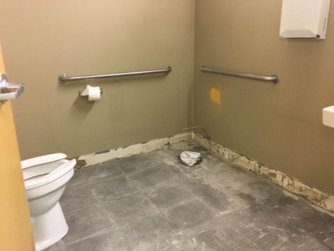
Often with remodeling…it’s both the best of times as the anticipation for the exciting transitions is ignited, but since it takes “breaking an egg to make an omelet”, it is often the worst of times too as the demolition and displacement begins. Thank you Mr. Dickens, you set forth a mastery of profoundly conflicting opposites that I have used here which describe so many design project experiences so well.

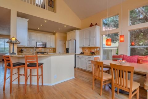
Currently, in our shop, we are designing almost parallel kitchens. They are at nearly identical beginning stages. The owners share little in common, if anything, except perhaps the age of their homes. The sizes are similar, yet one is a bit larger offering different options for design consideration.

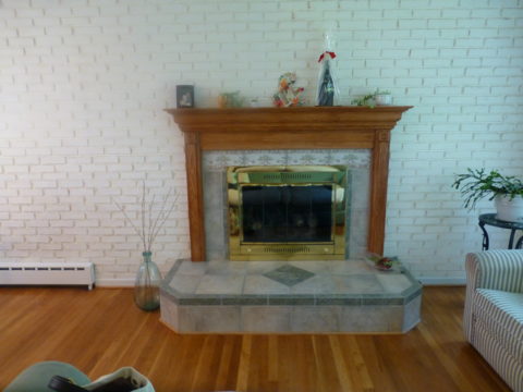
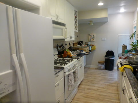
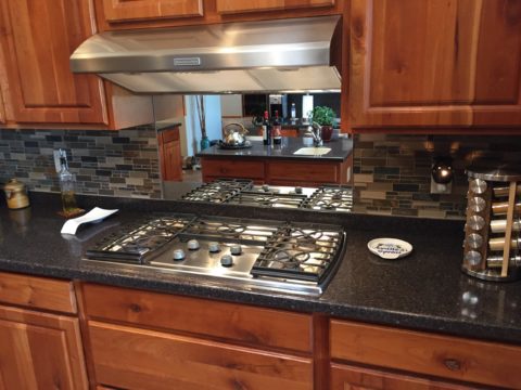
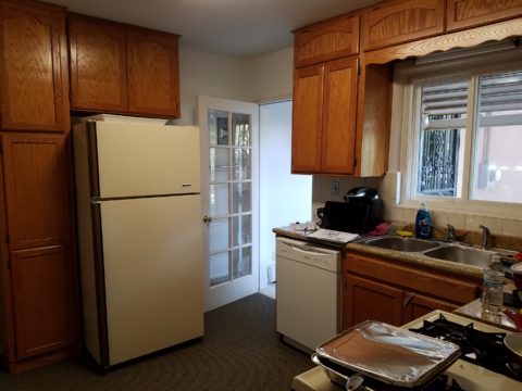
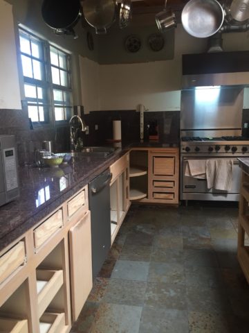
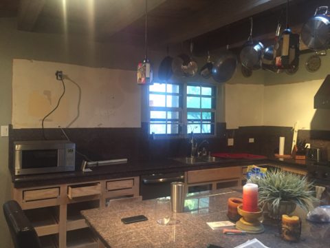
Both kitchens had been remodeled, from their originals, somewhere in the 70s and possibly 80s. One installed traditional drop-panel golden-oak with a curvy valance over the sink.

Brilliant blue paint to come will transform these re-purposed/salvaged cabinets with new personality!

The other flat panel radius corners for a “modern” look – also in lighter bleached oak.

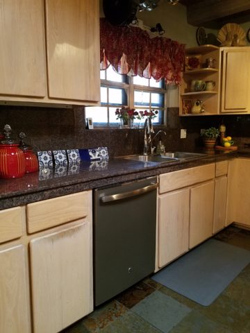
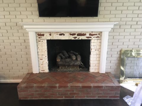
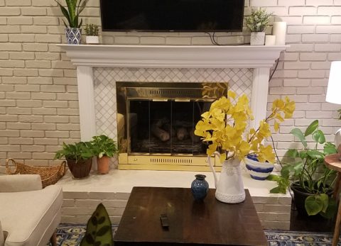
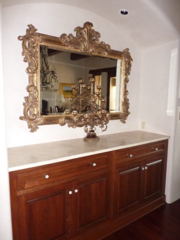
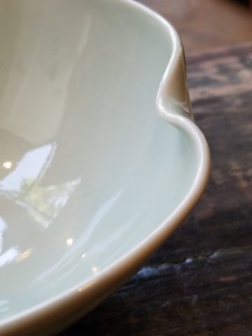
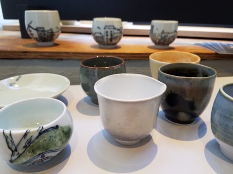
Each set of cabinets were in good condition opening the conversation to salvage versus replace. Certainly we encounter cabinets that have been destroyed by hard use and neglect, but when the boxes are reasonably well constructed – or enough so that some reinforcement will enhance their weight-bearing and usability qualities, we often take the route of refurbishing. (NOTE: As a DIY, this requires much research to insure that a new finish will be flawless, durable and easy to maintain.)

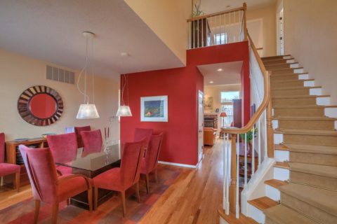
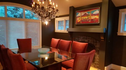
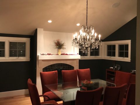
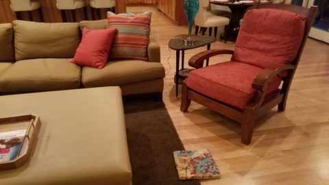
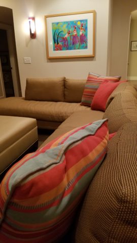
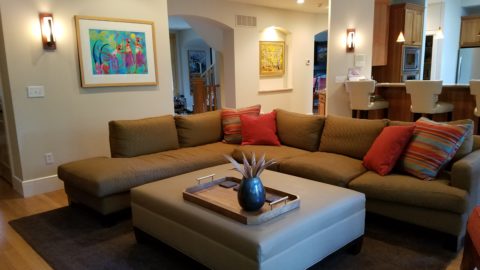
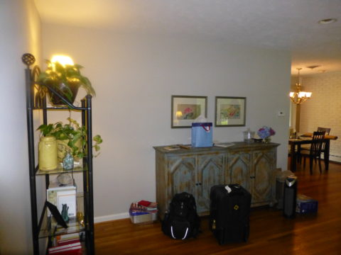
The beginning for each project propelled forward with distinctly different ideas. One to follow the original character of the home’s raised panels painted white doors and trim throughout, the other seeking an entire transformation to a multi-colored fiesta of fun!

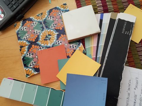
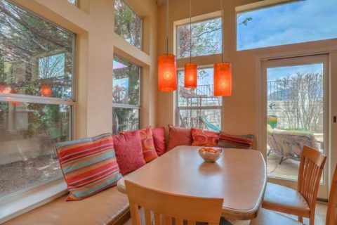
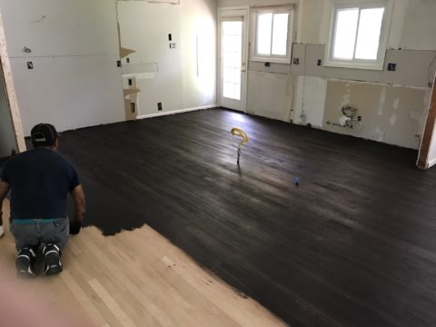
Mexican Talavera tile with Mexican terracotta Saltillo for the kitchen floor adjacent to white oak narrow plank original tongue and groove floor recently unveiled from beneath wall-to-wall carpeting.

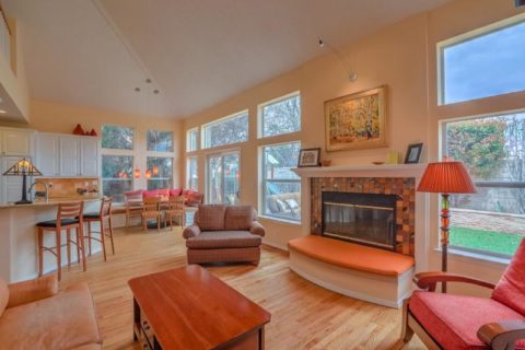
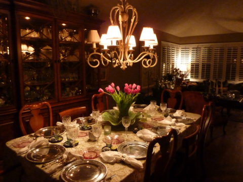
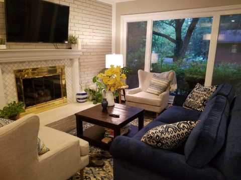
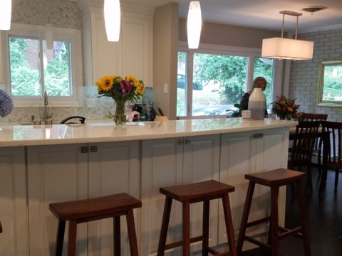
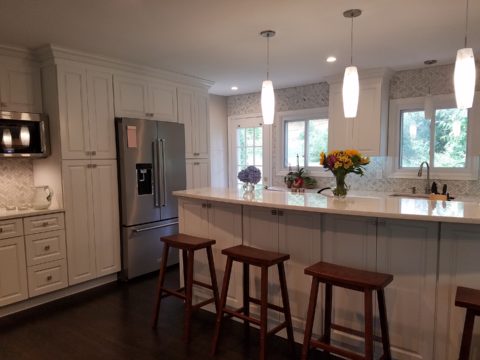
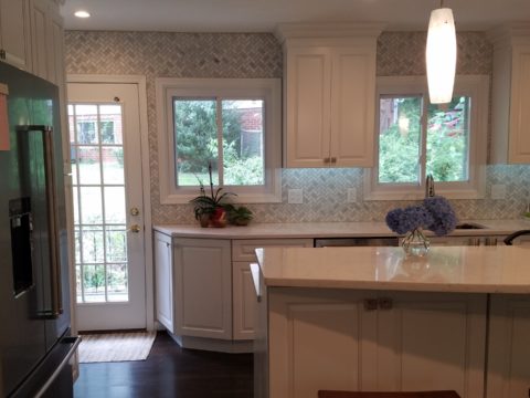
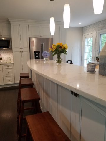
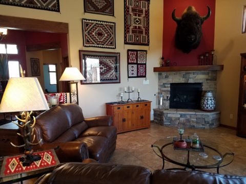
Now that’s not to say that the more traditional soon-to-be white, raised panel kitchen will not be full of fun – as it will ultimately have a “party pass-through” connecting the kitchen through to the patio beyond and counter-top that transitions seamlessly from the sink area inside straight out to a party bar! A custom-sized double-hung window will open the scene in the warm weather months. We know that it’s going to be classic with a tremendous twist of fun!!!

The patio level is a step down. The kitchen counter inside will flow through a new window that is lower – opening directly on the countertop surface – providing bar height outside.

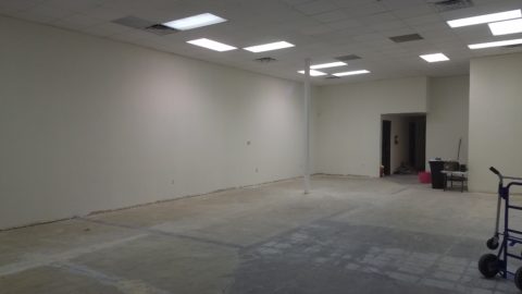
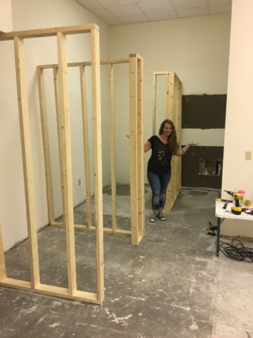
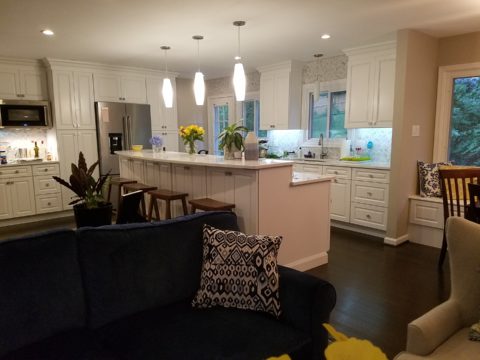
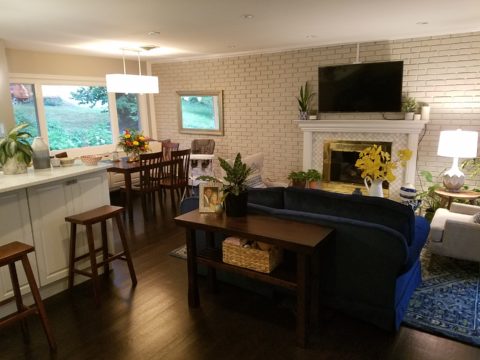
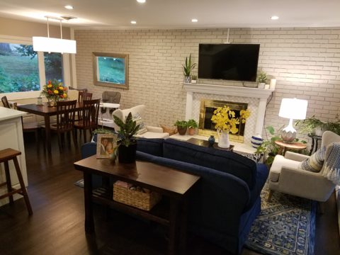
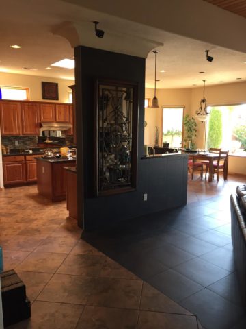
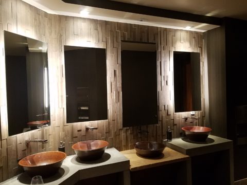
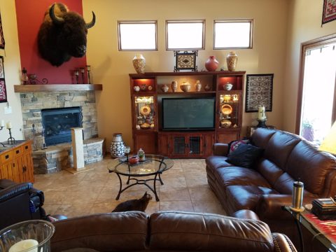
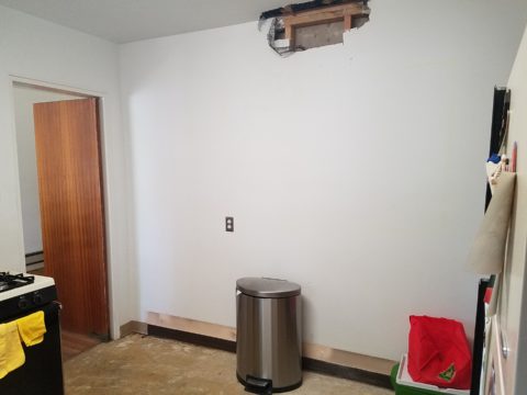
Both kitchens are being “opened” by removing portions of walls which have isolated them in years past. By removing the walls, additional daylight will be evident, a perceive expansion of the space will be realized and a connectivity to the other living areas for personal and entertaining enjoyment will become a reality.

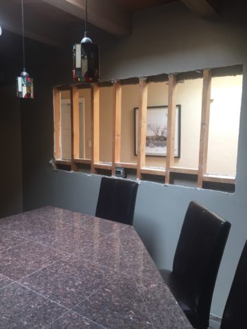
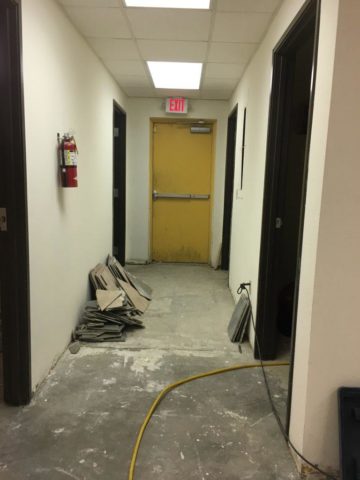
Breaking through to daylight from the hallway skylight – adds not only light, but incredible depth and dimension!!


This is soon to open into the living room and large picture window beyond – a peak at the mountain will be an added reward.

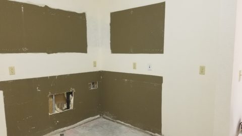
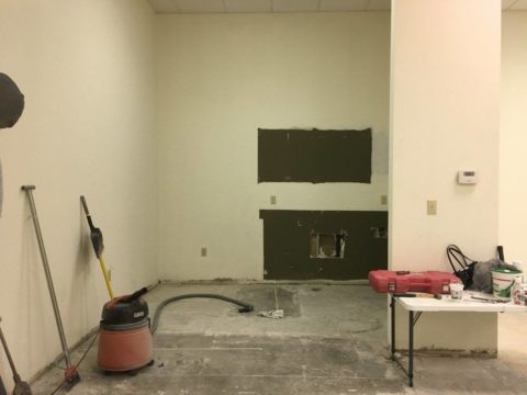
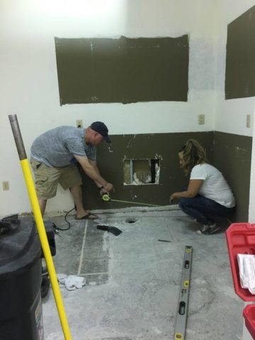
A bit of structural modification to both are resulting in minor delays for permitting processes – other aspects of the work will continue, in the meanwhile, like the continued selection of finish materials, lighting fixtures and cabinet modifications.

In both cases we have discussed the design challenge of existing materials. I have found over the years that often, when confronted with existing conditions you might not have set-forth to include, they add character and an element of unselfconscious cool-ness. It occurs when certain conditions or materials are in place that you might not have chosen or planned into the design. Designs from scratch, that are too well coordinated or too perfectly planned, can lack that element of surprise or unexpected interest.

The first home had slate tile floors with a unusual mottling of colors leading with a cool aqua and including charcoal grays, smoky blues, ochre and rusty tones.

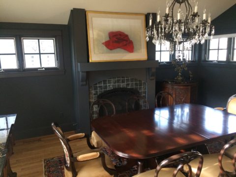
The other inherited period hollow mahogany doors all trimmed with white molding and original cabinetry. Do we paint them white – which would be the customary response or leave them and invite that element of “oh you kept these doors?”

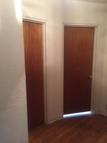
In this second example it would be easy to “neutralize,” if not replace, the dated doors. However, the homeowner, having many fond experiences in Guatemala, appreciated the great condition of the tropical wood, grain and finish – so we will start without painting them and re-evaluate down the line as the new colors and finishes splash their celebration over the scene. As the transformation takes place, the decision regarding the doors can be re-evaluated.

This is a prime example of the design process. Often there are elements on a project that are a puzzlement. The great thing is that often the decision to remove, modify or leave unchanged can wait until the scene evolves. If you have the luxury to design as you go, you will have more opportunities to consider context, contrast, new options etc…that are often obscured by the overwhelming and often daunting task of visualizing the finished product.

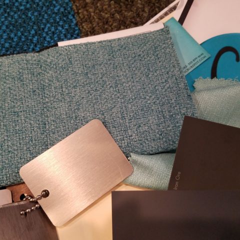
Sharing the same vision is one of the hardest aspects of the design process. Full color architectural renderings, illustrations and even sketches go a long way in conveying the intent, but no two people see exactly the same thing through their mind’s eye.  During these preliminary stages of design concepts, nebulous ideas and imagined finished products, the opportunities for misconception are great.

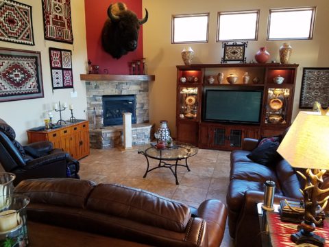
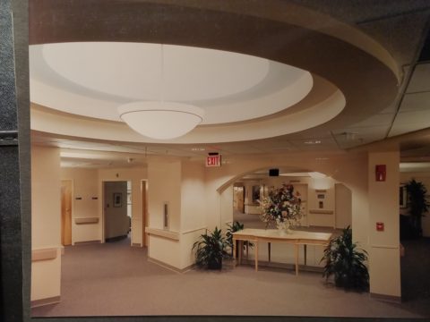
I remember a hospital project many years ago where the head nurse was wincing at our suggestion of maple cabinets, headboards and other carpentry details. She kept quiet, but we (the design team) kept hearing rumors that she loved the color scheme, direction of the interior design and all of its architectural interest and design finishes, yet she could not embrace our suggestion of maple cabinets. One afternoon once we had gathered the materials for a touchy-feely presentation of color boards and tangible design elements, she had this incredibly surprised expression and exclaimed that she had never seen maple that color – it was natural – like a blond, wood, basketball floor. She further explained that she “pictured” the dark reddish Ethan Allen maple furniture of her childhood in her grandmother’s house. Needless to say, she had been having great difficulty accepting its inclusion into a design scheme of smoky lavenders, pastel clay tones, creamy whites, warm terra cottas and maple wood (in our mind’s eye – natural – and in hers, what she always thought was natural maple – dark reddish brown!!).

Communication is a powerful tool… often major decisions, opinions and actions can result in miscues due to miscommunications. To avoid such misunderstandings take care to provide thorough explanations along with tangible samples and other visual aids.

As we progress with these two kitchen remodels, we look forward to dramatic transformations, exciting phases of design work, some anxious anticipation, and ultimately four happy clients each enjoying their personal spaces, reflecting their lifestyle, home style and distinct personalities.  Watch for updates and before and after dazzlers!

Bring Elegant Functional Pottery into Your Daily Life

Powerfully, pretty, porcelain, pottery graces the urban storefront window this month, of the east gallery of PATRICIAN DESIGN, with elegant, functional inspiration.

The opening of this the second  installation of the Resilience exhibit features a collection of porcelain pieces that is intended to be an entirely functional  ensemble of art.

It’s been refreshing to have these well established artists paired with exciting emerging artists presenting their expressive talents, in the form of something that you can use and enjoy, to enhance the aesthetic connections in your daily life.

Resilience, conceived by Helen Atkins, an exciting emerging artist herself, is the manager of consignment art at PATRICIAN DESIGN.

Her concept was to “explore the experience of local female artists at various junctures if their careers.”

As a recipient of the Makeshift Grant Project, “Resilience” is funded by the downtown Albuquerque Arts & Cultural District and the Albuquerque Community Foundation. The name of this project suggests that the strength and flexibility of clay as it is formed is an analogy to similar characteristics in the course of a woman’s life. Strength and flexibility – resiliency and tenacious fortitude are the features the two share  and which are celebrated with this show.

In addition to this relevant topic of women, the functionality of this collection is what is even more expansive. No gender specific appeal to this wonderful work, the idea that pulling in from the disposable practices of everyday life, strikes a universal chord.

To pull in and focus on what  you have and use in your daily life is the beginning. Evaluating between pure function and added beauty being introduced as an enhancing element is the trick. Then discovering individual pieces that bring enjoyment  while contributing to the function as well as the aesthetic of the scene,  from an interior design standpoint, is wonderful.

Your “scene” should be exclusively personal to you and your life experiences.  It is personal and wonderful to incorporate handmade artwork in all aspects of a design project. To appreciate the detail and have the opportunity of taking that artwork all the way to daily tableware is pure joy. These and other potters that we feature at PATRICIAN DESIGN offer just that – the opportunity to incorporate art into the simple functions of eating and drinking.

Artist  Kathryne Cyman is a master of the 400 year-old Japanese process of Arita pottery.  Please read more about Kathryne’s journey at http://art.unm.edu/kathryne-cyman/   Showing alongside her capable student Jordyn Bernicke, the two present simple, elegant, affordable pottery pieces for you to bring into your  daily life.

Imagine the soft, delicate yet durable cup in your hand from which to sip and relax. Even to toss o.j. on the run – the basic action of drinking from a handmade vessel, in a color and finish that makes you smile, is an enhancement to the day.

Sensory perceptions ignited by the feel and the look of a beautiful piece of pottery is restorative.

We are privileged to have this exhibit and to meet these fine artists. We are privileged as a community to have this program at UNM.  It appears that the natural beauty of New Mexico, life lived close to the earth and celebrated by Native Americans for generations is a parallel practice to the Arita process by the artisans in Japan.

This exhibit proves that to admire the techniques that produce beauty is to acknowledge the importance and value of including these elements in our daily lives.

Cats, Patterns and Participation

During the course of this day’s consultation this precious and perky bob-tailed cat, Kachina, inserted herself into the entire process.  She greeted me upon arrival, walked all manner of adjacent furniture as we discussed the scope of work. She tip-toed across tables, sofa and chair backs, and ultimately the hides we were considering for upholstery.

Initially we viewed the room and its present arrangement and realized that the l-shaped right angle position of the sofa, loveseat and recliner conflicted with the angles in the room. the sofa was perpendicular to the TV/display. The fireplace was at an angle in the corner. Neither one had the central focus – the attention was split from all angles. So the question was…Is it necessary to have the recliner as the primary TV viewing piece? Seemed like all the pieces were crammed together and the room was not being utilized to its full potential.

Kachina even has her eye on that bulky sofa as though to say – MOVE IT!


Kachina leaped onto the sofa to make her point- agreeing to the subject of our conversation!

It was determined that the recliner need not be positioned to directly view the TV. Once we turned the sofa to be parallel to the fireplace, it also opened the angle to the entire room and framed both the TV/display unit and fireplace. The recliner tucked into the far corner -not facing the TV – created a cozy nook for reading and next to the patio doors allowed a view of the backyard.

Needless to say, this fireplace crowned by this magnificent buffalo was an incredible focal point.  Formerly from Wyoming, this couple knew this buffalo. They knew his name and knew that he became too aggressive and gored at least one female to death – who had to also be put down and who’s pelt was on the floor in another area of the home. The hunt and subsequent shoot has been preciously preserved and revered. These were not mere trophies.

This is the most extraordinary collection of very fine Native American Art I have ever seen in a private residence. From to carved stone, amazing weavings to paintings and pottery, the presentation is stunning.

To soften all the hard and cold materials of the floor tile, leather and iron detailing, we are now on the hunt for the perfect area rug. Probably a shag to carry the balance of the contrasting finishes. Design is all about contrast, balance and harmony.  Unless the intent is to intentionally disrupt, in which case, the contrast takes center stage!!!!

These gorgeous brindle cow hides were so exotic and beautiful. The patterns and colors were wonderful and the couple who owned them had a great respect for the animals, and the celebration of their beautiful pelts.

Kachina was nearly camouflaged with her pretty pelt against theirs.

It’s fun when pets participate.

We will be making a pair of ottomans  with these two hides. Great for pull-up at parties to gather around the cocktail table in the center of the room. Watch for the additional photos once the work is finished.