What’s YOUR Favorite Color? A Little Project for Fun!

Pick a color. What’s your fav? Do you HAVE a favorite color? I was asked the other day that very question and I was really at a loss…I looked at her, furrowed my brow and cocked my head.  I wanted to have an answer – a simple answer that stated a definitive preference for a color – my most favorite. Rather than producing a quick sure pick, I faltered as she stepped in and said – I’ll bet it’s purple!

Well, actually I can definitively say that purple is NOT my favorite color, but the funny thing is I can love purple, in certain context. The real answer is that I love nearly any color in a certain context.

When I ponder the question a bit more, I can assertively say bright pinks, cornflower blues, golden yellows, chartreuse and brilliant orange. But the truth is, I love so many colors that I am hard-pressed to select just one! It sounds like a Lilly Pulitzer color board.

So I thought of a little exercise. I decided to pick a color at random. Then overwhelmed with the myriad colors that might produce one random pick, I fine-tuned random and said to myself, perhaps a color of the season. To me that was currently and boldly orange. So the idea was that I would walk in and around my house today and capture things that were orange.

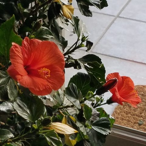
This screaming orange hibiscus just came in from the patio to escape the chilling temperatures that have swept down in the last couple of days…happy to transition indoors for the winter!

Try it. Pick a color – not necessarily your favorite – but certainly one you like and walk inside and outside of your house and see how many examples you can find, of that color, in your immediate world. Photograph things that have that color – all or in part, even little details – anyplace that color occurs.  It’s fun and very interesting to see what you discover!!

Autumn is loaded with vibrant colors, but orange is one of the most fiery.

So I selected orange as my color today. I dashed around the house and collected a variety of things that were orange. I was actually astonished at how many I discovered.

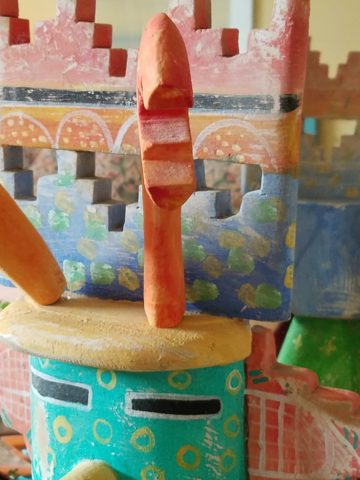
This dramatic Hopi – influenced kachina by Gregory Lomayesva sports stylized antlers in a flat but brilliant orange.

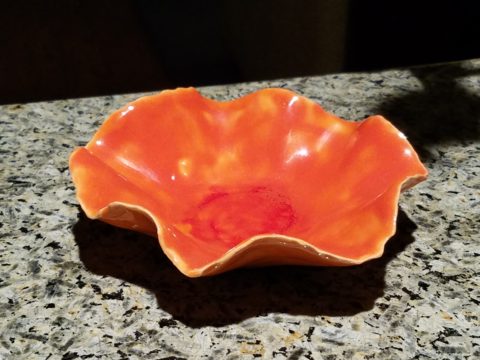
Festive ceramics by Ann Marie Werner Smith – here a graceful orange bowl that sits on the counter…it pops against the contrasting granite.

It is interesting because I know my world is not heavily orange, but I found so many wonderful splashes of it throughout my interior and even startling exterior, in the way of the leaves on the Bradford Pear tree.

From fresh mini pumpkins and flowers…

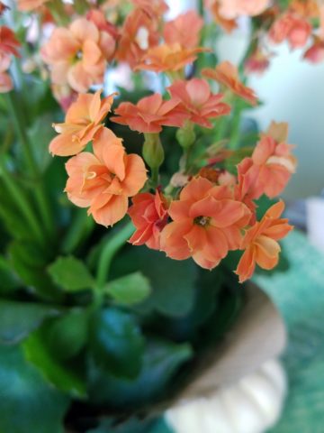
A succulent orange flowering Kalanchoe is our seasonal centerpiece on the kitchen table.

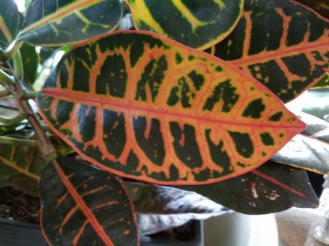
A variegated Croton plant has lacy veining of bright orange, pink and yellow contrasted against it dark green background.

to artwork with swaths of orange streaking through them.

A lovely little oil painting by Jeff Otis depicts a very autumnal New Mexico river scene.

At the last minute, while waiting in the Bejing airport, I found this precious little painting of birds and berries. The background is a vibrant orange. Notice the fresh blues adjacent to the orange. This is a detail of the much larger piece.

Peggy Zuris really knew color. Her bold and confident brush strokes applied in luscious swaths placed adjacent colors perfectly juxtaposed creating uplifting renditions of daily life. This little chicken is a detail of a fanciful rural scene.

The balance of color was so interesting. Where I found orange, I nearly always found blue – unless it was a stand-alone like the glass bowl of oranges – or my coral necklace with its nuggets of bright orange coral.

Fresh oranges with their intricately textured rinds fill a glass bowl on the kitchen counter.

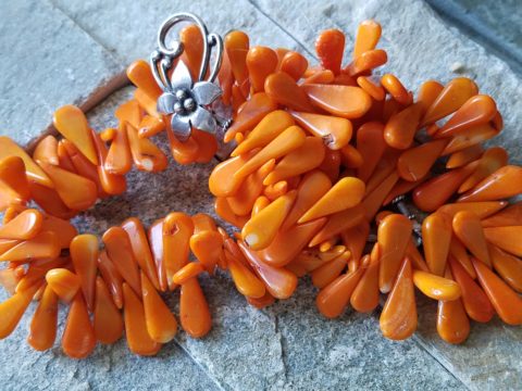
Nuggets of coral look like candy corn tightly beaded on this delicious necklace I wore too Santa Fe today!!

Colors balance and contrast.

Even the coasters that attracted my attention last weekend at a bar. I was so taken by them that I brought them home and had them sitting on the kitchen counter. They were intriguing and offered interest and visual stimulation to my graphic art sensibilities.

I began this story earlier today, then took a break and tootled up to Santa Fe where I came across a couple more bright orange pieces…

And on the way home, I was even blinded by an orange fireball glowing beneath the stormy sky silhouetting the dark mesas and glistening off the wet pavement. It’s intense heat contrasting with the cold, damp asphalt that was a result of our first seasonal snow seen here spitting at the windshield.

Gather your collection of photos of your color today. Ponder how they and the color make you feel. Do you get joy from the color and the things you have discovered? Was this not your thought-to-be favorite color and if not, might it be one of them? How do YOU answer the question, what is your favorite color and having determined that, ask yourself:  Do I wear it a lot? Would I paint my walls that color? Do I have upholstery that color? When is a favorite color an accent? Is the joy in the little spots of punctuation? Are they intense, but small, elements of joy without over-doing it? I see a collection of abstract images, details of things – some of which can be cropped more – to create an abstract collage of wall art. Voila!

Color – an amazing facet of design and it’s most versatile component. It’s been a fun test and a compelling story. So what’s YOUR favorite color?

Finishing Touches FINISH the Job!

Finishing touches are always the beast to tame at the end of the hunt. Yes, you’ve hunted, you’ve searched, you’ve gathered, you’ve assembled and stood back and observed your work. What’s needed? What’s missing? When is it finished?

Just the word finish sets up a mental block for many. It’s like decisions period. Once you make a decision, you’ve lost your choices. Losing choices can be a dilemma in itself!   So, from Pinterest to HGTV and the internet at your fingertips the choices and options are endless, but what do YOU want to do, to call it “done? It’s all in the details…

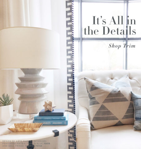
Schumacher  offers details right down to the trim on the draperies! This bold key design makes all the difference!

And inasmuch as you can’t seem to GET it done, you WANT it done – just can’t seem to get there from here. How do you decide what you need to add for those incomplete finishing touches – to be FINISHED?  Know though, that to have the feeling that it is finished is a good thing. Yet, that doesn’t mean you can’t change it – sooner or later!

We interior designers have jobs because our clients need to do things, change things, finish things. It seems that with all the options presented on TV and the internet, people are jumping in with inspired ideas, making decisions, buying things and doing things – then coming to a screeching halt! “HELP!” is the cry when everything seems to be too much – or not enough – or too uncertain and overwhelming – or not just right.

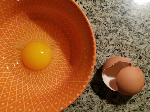
As if your own self-imposed frustrations and pressures are not enough, your partner rants…”Just finish it – will you? Be DONE with it!!!” Not everyone loves a DIY project. Most people don’t even like the disruption of a professional team coming in and tackling the job. Alas, “you have to break an egg to make an omelet,” some wise person once said.

Whether you’re changing paint colors for the third time in a month or tossing throw pillows around the room, to no satisfactory avail,  there’s something missing…something is not quite right…it’s not there yet.

Have you removed everything from the walls and lined them up waiting for inspiration as to how and where they should be placed and grouped – maybe re-framed?

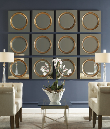
What about a mirror to add depth? Is it an installed mirror – the illusion of space without calling attention to the mirror itself or should I hang a framed mirror that makes the statement in its entirety? Do I lean it against the wall or is that a trendy affectation?

Uttermost is one of our favorite sources!

Studied nonchalance is an art form.  How to achieve that intentionally unpretentiously naturally relaxed look is a challenge.  Just writing about it here is an effort in describing that which is supposed to be effortless!!!!

Perhaps it is a monotony of height. Do you need a tall piece among other lower elements in the room? Maybe a tree in the corner is the answer or a statue of some vertical art statement, to add interest and height. Perhaps you might consider hanging something, from the ceiling – a mobile or origami bird or even a light fixture, to draw the eye up from the otherwise low furniture pieces.

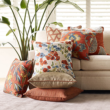
Robert Allen presents perfect fabrics for colorful pillow accents…and there’s that tall plant for height!

Speaking of light fixtures…how does your almost finished, but not quite there yet, room look at night? Are there dark pockets and corners that would benefit from some concealed up-lights – indirect lighting can be quite effective and enhance a spooky, dismal space.

LOVE this before & after! Check out John Cullen Lighting for some great ideas and inspiration!! https://www.johncullenlighting.com/

Spooky is the season and, with the holidays approaching, the need to get things finished before guests arrive or you leave to visit… or just the hectic nature of the baking,  gift-buying and wrapping, shipping and other communications aspects of the season are upon you – pressure you to want to get things finished!

Brunschwig and Fils by Kravet offers an amazing collection of prints – mix and match!!!

Have you consulted with a friend? Do they rise to the invitation of critiquing your present state of affairs and offer design ideas that further serve to confuse you? Better yet, ask two friends and get two different options for finishing your space and then what? Pick one and the other’s feelings are hurt that you didn’t take their advice – even if they are not aware that your decisions moving forward were offered by another friend.

From the rug (thank you Company C for your “Colorful Living!” to the table accessories and all the things, pieces, fabrics, details in-between – finishing touches FINISH the job!!!

A designer is a problem solver, a tie-breaker, a marriage counselor, a creative who extracts your needs and – evaluating all options – offers the best solutions to get your job finished!

Seasonal Shifts in Design – When Do YOU Make the Transitions Between Seasons?

I am often asked, “When should I make seasonal changes and how?” This can come from retailers debating their front window displays to individuals wondering when, to change the wreath on the front door and on into their interior decor, to reflect the seasons.

The answer is a combination of things. It’s personal – probably starting with where you live. And for me, it is more than just decorative accents, it’s food and drink and clothing for sure. Clothing though might have real, practical adjustments for temperature, but fashion design and seasonal changes are part of the fun!

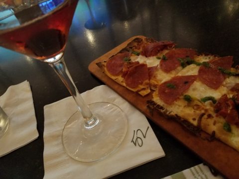
So to kick-off fall, I shifted into my seasonal drinking modification  – dark drinks – moving from citrus embellishments to the delightful, succulent, marinated cherry at the bottom of a well crafted Manhattan. The perceived warmth of darker drinks is real for me. I would never select a Manhattan in the summer. But I must admit, a vodka martini with a twist is a 365 fall-back beverage for any festive situation.

The rich warmth of a well crafted Manhattan…

Clothing and the opportunity to make design statements that reflect the seasonal shift are also fun to embrace! Along with the Manhattan last Friday night, I transitioned into a felted wool tunic with a local artist’s hand-woven black chenille over-sized scarf. Still sleeveless – as the shift is still a bit of a struggle to let go of summer, it was a decidedly seasonal reality nod!

Truth be known, the wide expanse of floor to ceiling folding glass panel doors were wide open right behind us as we sat at the bar allowing a direct connection with the crowds gathered on the patio beneath the high-hat heaters. Truly a straddling of the seasonal shift – not quite ready to let go of al fresco dining???!!!

Seasonal shifts in weather will be a sure way to respond to a want to change decorative elements. And even being a bit pro-active can be a good thing – but when is too early – too early?

Most of us cringe when we hear Christmas music in October or see the merchandise out that early – combining Halloween costumes and candy corn with Christmas trees and all the ornaments. Awful!!!!!!

Across the country, we have experienced a delay in the autumnal shift this year. Summer kept clinging. Warm weather belied the calendar. But when the weather shifts…and the temperature drops…we want to hunker down and cozy up. Perhaps in addition to the decorative items, you might simmer cinnamon sticks on the stove or light candles with spicy scents. How about a hearty beef stew for dinner?

Here we are in mid-October and summer was here yesterday and gone today with the incoming storms, cool drizzle and cloudy skies.

I just got off the phone with Victoria up and over in Fairfield and she bemoaned the fact that last week she was attending classes in shorts and today she is bundled up in a Patagonia fleece jacket not wanting to leave her bed! The seasons have shifted like a slap in the face!

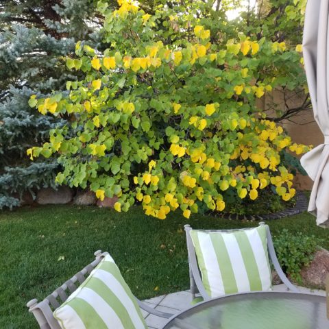
Color is a key element in expressing the seasons. Between summer and fall, golden yellows bridge the gap. Leaves on our red bud tree change from brilliant lime green of summer to brilliant lemon yellow as fall sets in…lime to lemon – a brilliant color statement!

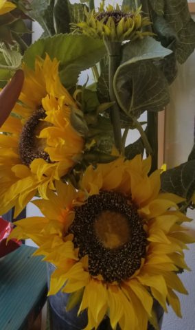
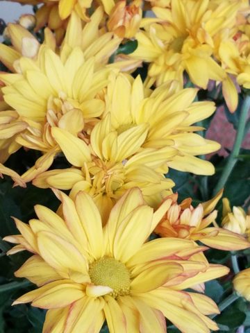
From late summer sunflowers to early autumn chrysanthemums, the brilliant golden yellow satisfies the transition between seasons.

As fall proceeds, the darker tones of rust and caramels suggest the waning season…crunchy, dried leaves and final wisps of foliage going dormant for the winter.

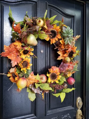
I’m hanging my Black-eyed Susan wreath today out on the front door! I might even leap to the addition of a funky black cat that I have to welcome Halloween. But it has not been a gradual expression of acknowledging the change in seasons, it has been summer…bam – fall.

DIY – I made this and one for Mom a few years ago – they last. Get a grapevine wreath, select your favorite leaves, fruit and flowers, grab your glue gun and wire clippers – Voila!

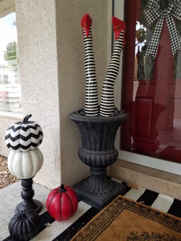
What spurred this subject for this week’s blog was seeing my neighbor’s witch’s legs a few days ago sticking out from the elegant planter by her front door. I first thought – what a riot! Then I realized, it’s mid-October and I have yet to accept that!

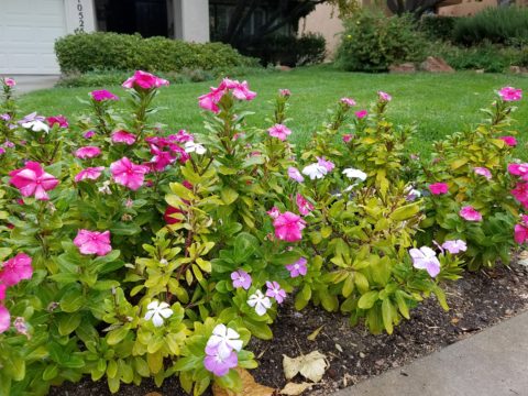
I am very reluctant to release summer. I’m a warm weather one for sure. I cling to the last vestiges of sunlight as it tracks around out house…less evident, less accessible…shorter days…darker mornings and evenings… NO!!!!!!! I resist, but must succumb. There’s no escaping it. The seasons change and time marches on….The happy fuchsia and pink vinca in our front yard might not make it another day with night temperatures threatening to drop.
The happy pinks and greens of vinca out by the mailbox are about to get nipped!!!

Decorative accessories punctuate the landscape of autumnal interior design. From real pumpkins and gourds, squashes and mums, to their artificial counterparts made from many media. Glass and pottery, papier-mâché and straw-like wraps, silk flowers and faux fall leaves, the possibilities are endless.

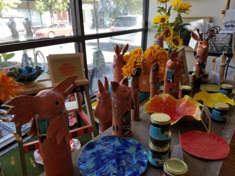
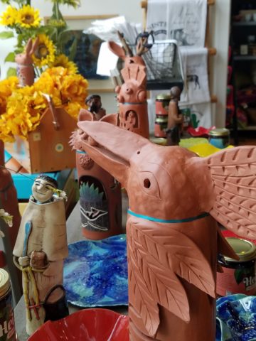
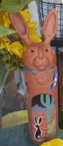
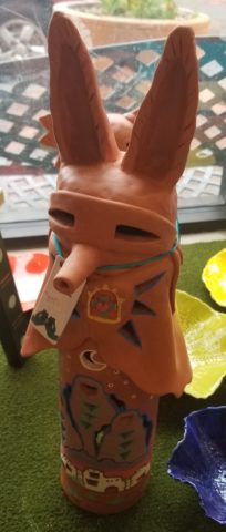
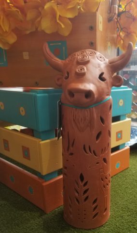
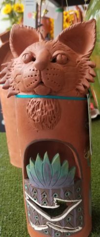
This year some outstanding hand-built pottery figurines caught my eye. Artist Robyn Chlad of Tucson, Arizona has designed and created a collection of wonderful statuary luminarias that are an extraordinary design decree for this and all seasons! Kachina-like, these art-pieces make a fabulously functional statement!

This proud raven holds a berry in his beak!

At first I was attracted to their vertical shape and fine detailing. The characters had personality – rigid in their cylindrical forms, yet very animated of expression and fine features.

Chlad has depicted regional animals with a bit of folkloric whimsy (in the jackalope – half jack rabbit/half horned antelope) to  present a collection of irresistible characters to gather at your dining table, or greet you on your entry console, perk-up your powder room, collect on your cocktail table, grace your patio, or animate your kitchen!!! How fun are they?

A caped coyote – the masked bandit!

They each are pierced with designs, to allow the light to glow from inside, that depict the landscape or regional architecture in and around which these creatures roam. Illuminated by electrical lamps, battery bulbs, or candles, they are fantastic!


Functional art – these pottery luminarias are exciting art pieces to add a joyful glow to your shorter days and darker hours….

The raw terracotta clay contributes to their natural beauty and complimentary color with a fall palette.  It is a strong statement, yet the surfaces are smoothly burnished and have a soft read. The touches of matte glazes add just enough adornment enhancing the statues with soft earthen color accents.


Embrace the seasons and have fun selecting your personal design statements as you transform between seasons!!!

Entrepreneurs! Getting Started with Design!

Starting out with your first brick and mortar business, the tasks are many. After homing in on your business specifics, selecting a name, designing a logo, deciding colors…you have your license and your business plan, you’ve found a place and then you need to present your business to the world!

A few weeks ago, we began a new project that is just what I have described…an exciting first-timer in the business world, having worked for others is now ready to do her own thing, be her own boss, make her own decisions and assume the risks necessary to take this leap into entrepreneurial adventure.

It’s exciting and scary, daunting at times and fun too. And it should be fun. Finding something that you enjoy, something you believe in and believe that you can do as well as, if not (hopefully) better than, anyone else in your market.

With inventory determined, name and logo designed the last task was to create the space to present her concept. We won’t divulge that today, the project is yet to be presented, but the framework is on what I want to comment.

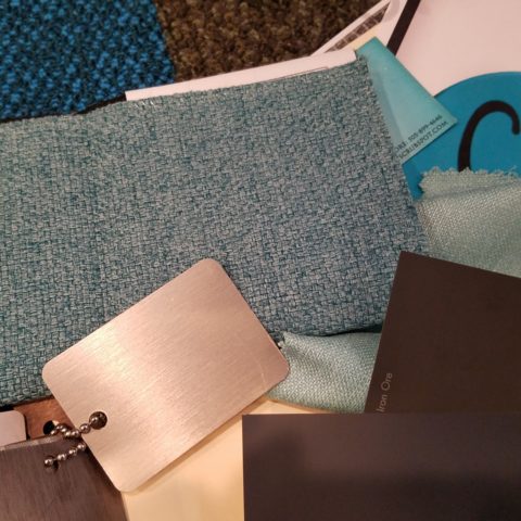
We began compiling some finish options…paint, upholstery, privacy curtains, carpet and a little brushed aluminum bling!! We want to reinforce her brand with key colors and finishes.

Knowing the terms of the lease agreement – what is the landlord’s responsibility, what is grandfathered-in, what can be changed, any spending allowances amortized into the lease…these are all things that are necessary to determine how to go about designing the interior. It is necessary to establish costs within the over-all start-up budget. Having helpful, knowledgeable, creative people around you with whom to assemble your team is imperative.

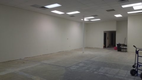
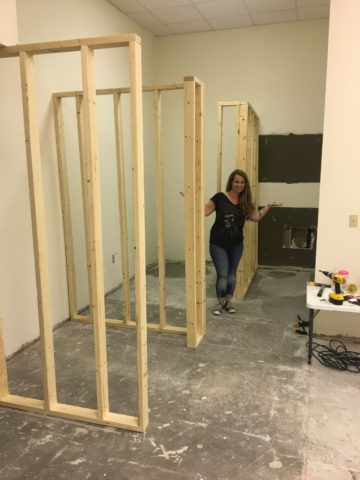
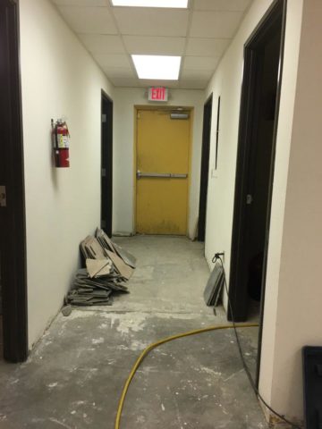
We arrived at the site to find a very clean slate. Located in a retail strip center, it was a white box.

We instantly decided the flooring would be a combination of polished concrete and broadloom carpeting, some lights stay and some go, spots will be added, colors will reinforce her brand.

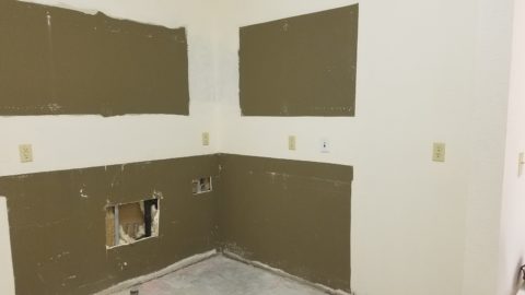
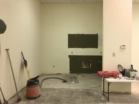
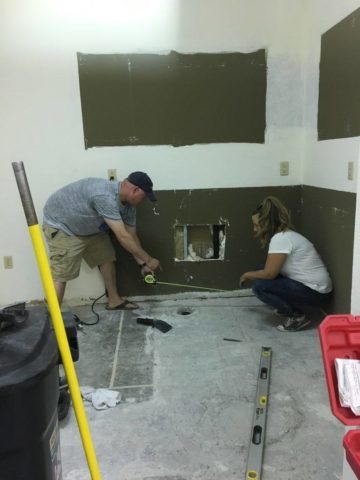
Toward the back, a break-room kitchen area needed demolition. This pocket would become fitting rooms.

There was existing ceramic tile on the floor that also needed to be removed. These were things that our client could attack herself – saving money and getting to know her space.

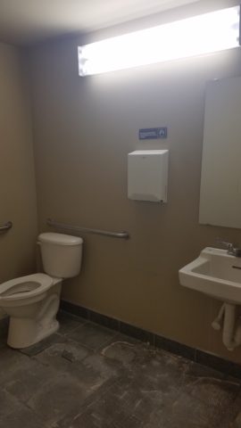
We learned that the restrooms were grandfathered in and did not require any additional improvements – other than cosmetic.

We learned that we could make changes and additions to the lights and only needed a permit for electrical portion of the work.

Many of these discoveries were of pleasant surprise to our client who had been miss-directed a bit and was in a state of frustration and near defeat. Gathering good information is imperative, in order to save time and money, make good decisions and know your options. Get out there and get busy!!!!!

Soon to bee completed, watch for this transformation in coming weeks.

Relocating – Making a new house a HOME

Thirteen or so years ago we designed the interior of a home for a young family complete with a toddler. The desire was to bring color and modern accents while still selecting durable materials and hopefully timeless elements.

Fast forward these many years later and this same family now with two beautiful daughters is relocating to another city, another state and a new home. This home was well furnished and much, of what was shown, stayed with the house. The trick was, after having adopted so much from the previous owners, how would they make this house their home?

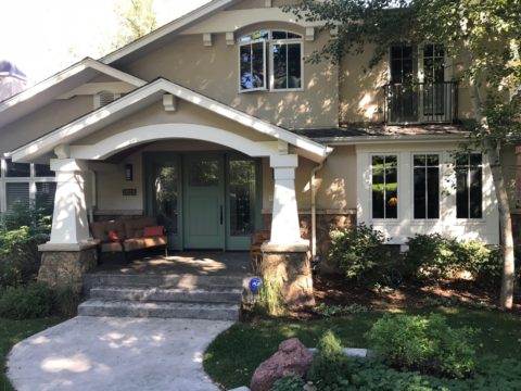
The point of arrival – the front door – was a tasteful charcoal grey, but by changing it to a bit lighter smoky green, it made a significant difference.

It’s tough to be up-rooted anytime in your school years…these girls missed the only home they had ever had, friends, activities, groups and familiar environs. This challenge was to help all four of them – parents and kids – get settled and assist in making this new house their true home.

As I flew to consult with them, I imagined the scene having seen photos to get somewhat oriented. I made the natural assumption that paint would make new statements to alter the previous owner’s selections and introduce the new family’s preferences. However, despite the change we made to the front door, it wasn’t all about paint once I arrived.

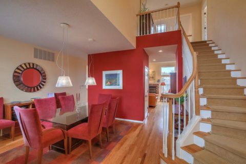
In the previous residence all those many years ago, we punctuated the interior with paint accents. Good design transcends trends and the years. Who would think that this interior was created thirteen years ago?


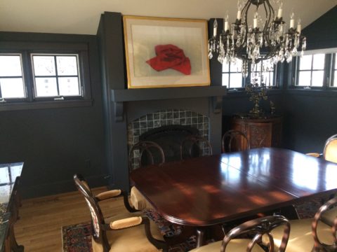
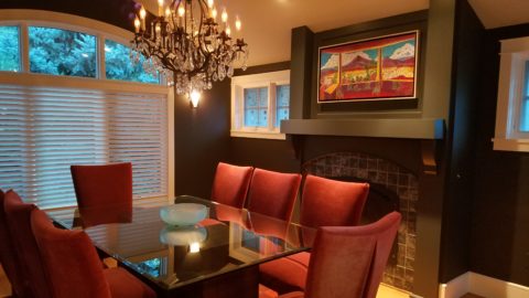
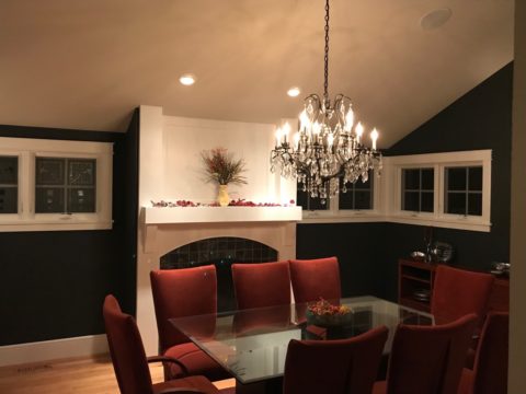
The dining room in the new home was painted entirely charcoal – trim and walls. Oppressive was an understatement and before I even got there they painted all the trim white to match the rest of the home.  However, they left the fireplace charcoal – waiting for a discussion as to how to proceed.


Notice the dining room furniture having moved from one home into the next. We decided to paint all the wood trim surrounding the fireplace area white to match the rest. But it produced a startling brightness that will be absorbed once a new painting is selected for above the mantle.

They inherited the chandalier with the home and although it is quite different from their previous dining room fixtures, they are making it their own by mixing their chairs, table, rug and sideboard.

The framed lounge chair found a home in the new living room alongside the large sectional that they acquired from the previous owners of the house.

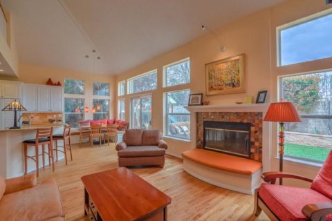
Here in the previous home, the painting over the fireplace has a prominent position, yet also has a place of prominence in the new home along with the chair and a half and the arm chair in the foreground.


Checking out a sample of a rug to add further color to the otherwise neutral scene.

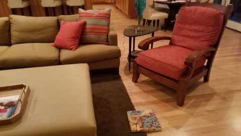
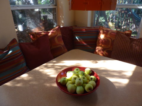
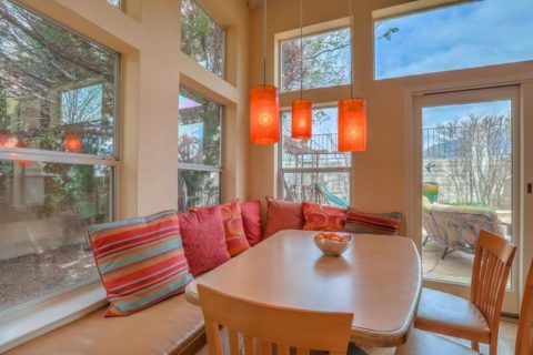
The simple placement of custom throw pillows initially designed for the banco in the kitchen are now colorful accents in the living room, on the newly acquired sectional left by the previous owners, are a remarkable save.


These pillows had seen their share of spilled milk and ground-in cereal over the years. But with periodic cleaning, they maintained their appearance perfectly.

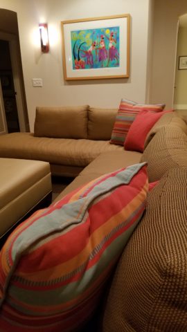
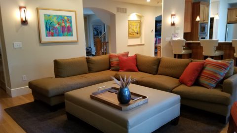
Here the pillows are the perfect accent on the camel-colored sectional that came with the new house. The painting has been a family favorite for years.

The rest of the collection of throw pillows from that original breakfast nook are being re-purposed on the sectional in the lower level media room/office.   They add the necessary splash of color in this neutral scene.

The fully upholstered chair-and-a-half also transferred from old to new. Previously in the family room, now in the music room/office. The master bedroom transferred completely. The girls’ rooms have a mix of their things and some new features. All in all it is beginning to take shape.

It pays to buy good materials that maintain well and take proper care of them. Not only will they offer years of enjoyment, in this case they bring the familiarity, to the new house, that is beginning to make it feel like “home.”

Sure, some might like the opportunity to start new without remnants of the previous life – but in this case, they cling to that which was comforting, familiar and theirs. Moving to a new home and being able to mix existing pieces so well with new ones to make this new house a home is a design success story!


Southwest Style – What is it?

Arriving for the first time in our American Southwest, one might feel like they have entered a different country, if not a different world!! To fly from anywhere else where there are rolling green hills, or green fields or dense green wooded landscapes, not to mention tropical environs and cruise over America’s Southwest, it looks like the moon – or some barren planet. Everyone remembers their first impression. Whether exotic or scary, lonely or seemingly uninhabitable, once you get on the ground and explore the beauty and variety of what’s here, you’re bitten – even smitten.

In all fairness, this is a completely defoliated winter shot!! Many now know how lush this magnificent Sandia Mountain can be at the top, in the summer. Yes, I said lush.

No other region has the distinct architecture and tri-cultural identity of what has become the elemental design style and flavor of this magical place. From “sea to shining sea” New England to Southern California you will find nuances of regional distinction – but not to the degree that the American southwest is set apart. Architectural influences from colonization have been the standard guiding style nationwide. Yet the ancient, practical elements, of civilization that long preceded the Europeans discovering the New World, is at the roots of this enchanting design style.

Tri-cultural architecture and interior design results from the remarkable history combining Native Americans carving out of stone walls, building with mud (adobe) bricks, devising simple, practical designs to capture heat and insulate in cold while minimizing solar gain in the warm weather months, with the conquering Spaniards and their colonial influences, and finally the pioneers from the east with their colonial English influences.  Now more often replicated, with frame construction and stucco facades, this unique melding is the core of Southwestern architectural design.

When one hears the term “earth tones” setting a design trend in the 70s, it suggests the brown, tan, orange palette that was terribly limiting. Certainly to label it earth tones, it became a curse of a color scheme. Sadly to link it to a representation of southwestern design was misplaced and unfortunate. And how sad to think that it was so broadly accepted – like lemmings following blindly – everyone adopted this as a truism. So often the case with trends.   The 70’s also spawned a diametrically opposite color scheme of blues and greens to refresh that which had been so mired in the “earth-tone” movement.

However, real earth tones are limitless. Earth tones are all colors…look down…look around. Even if you confine your interpretation to the dirt beneath your feet – the colors are vastly more than the brown, tan, rust, orange that became the rage. Soft pinks and grays, pale blue and whites…look at dirt. It might be more clay, might be more peat – from soft terracotta to dark espresso – dirt is earth and the colors and tones are limitless.

Tom Glover captured the beauty of the natural landscape through his artistic photographic medium that Georgia O’Keeffe and others have depicted through their artistic media.


Georgia O’Keeffe saw it and captured it in her own enduring style.

Nature offers color. Natural dyes have riddled that art world through time. Synthetic dyes took it a level further. But nature is at the core of all we have in this world.

http://www.quilthistory.com/dye.htm

Turquoise being a natural mineral in the American Southwest became a signature accent color punctuating the soft earthen tones of the adobe design palette.

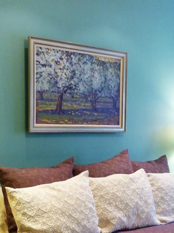
Artist Victoria Martinez Rodgers paints a valley apple orchard and the turquoise wall is the perfect backdrop.

Color was always there for those who cared to notice. The great painters of this region presented it well. Their recordings of everything from the many colors of the rugged windswept landscapes to lush green mountain forests with shimmering golden aspen groves – and bosque cottonwoods screaming with yellow brilliance capture and convey so much more.

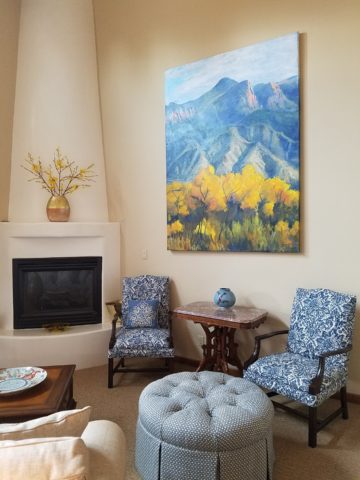
In autumn, bosque cottonwoods explode with color sending a streak of brilliant yellow all along the Rio Grande. Federico Leon de la Vega create this commissioned oil painting from a photo provided by his clients.

There are the natural and also synthetic dyes that were woven through the magnificent textiles of the Native Americans – blankets and articles of clothing were not limited to buckskin animal hides.

Ernest Blumenschein was the founder of the Taos Society of Artists capturing the color and textures of the realities that he encountered in this Land of Enchantment.

Sunsets everywhere play a part in the imagery of the landscape – here we see vast landscapes with brilliant fiery skies and those exciting corals and lavenders, soft pink and blue wisps provide inspiration for wall colors and backdrops to our richly embellished interior designs.

Yet spare, understated neutral interpretations also offer elegant representations of southwestern style.

So what do you visualize when you think of Southwestern Design? Please don’t say a turquoise wooden cutout of a howling coyote! Death by Southwestern Style – the overdose resulting from overdone clichés and trends that have spoiled the real art and beauty.

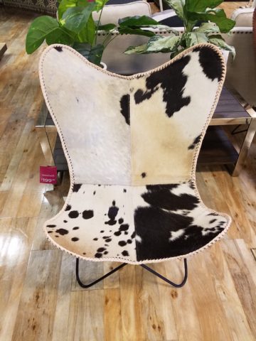
It doesn’t have to be all about cow skulls and pelts…but these cow hide butterfly chairs are pretty  cool!!!

Perhaps you see a Mexican influence which is also part of the melding of the regional style – like food, we have a fine line sometimes with certain traditional dishes that when adopted and adapted by American Southwest kitchens took on a unique identity all its own – differing between Texas, New Mexico, Arizona and California. We all enjoy bringing art and craft from our southern neighbors into our designs.

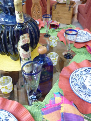
Borrowing, sharing, combining so many design elements such as adobe architecture, colonial wood trim detailing, fired brick technology, Mexican Talavera tile and pottery,

Native American textiles and so many other handcrafts

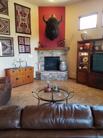
The owners of this interior have an intimate relationship with each of the artists that they have collected down to this magnificent mount of a buffalo. They knew him and his name and why he was put down.

from punched and tooled tin, paintings and pottery – southwestern interior design is rich with color, texture, artistic detailing and true soul. The connection to the earth is undeniable and nature always plays a key role.

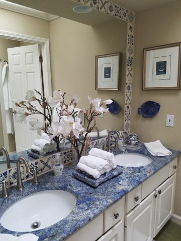
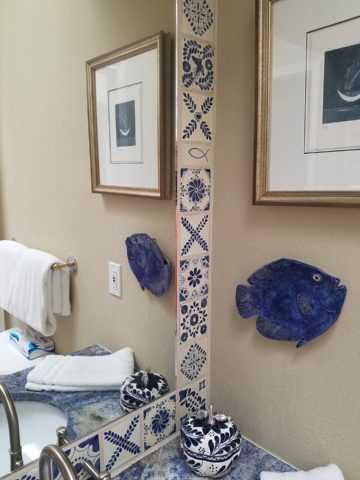
So how might you introduce southwestern influences into YOUR design scheme? You could tile the wall(s) of a powder room in Talavera Tile. Maybe just a mirror surround?

You might paint an accent wall – or all walls in a room or some other bold color inspired by a regional image

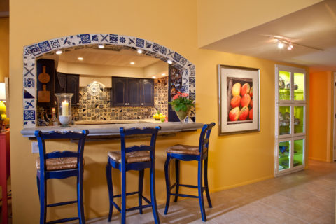
Mango watercolor by Susan Weeks splashes coral against the golden yellow wall with a lime green lighted cabinet showcasing old, traditional, low-fire Talavera tableware. classic Talavera blue and white tile frame the bar opening and on through out the kitchen.

and collect art pieces such a punched tin crosses, wood and straw,

landscape or still life painting, hang a blanket or drape a bed with a beautiful woven textile…introducing different styles speaks to last week’s story about eclecticism. Don’t be afraid to mix things that you like. What brings you joy?


Living Room Transformation

As an adjunct to last week’s story about the progressive young couple and their dramatic kitchen remodel, I thought I should finish the subject and tell about the adjacent living room transformation and comfortable family room on the lower level.

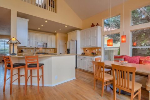
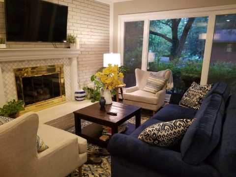
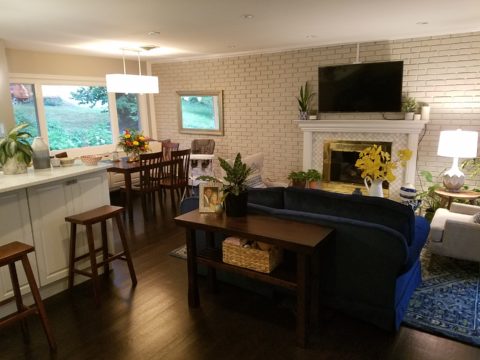
When the kitchen grew to become the focal point upon entering and the bar counter expanded into the living area, it reduced that space to now become a comfortable sitting room for guests to gather or the family to relax while activities are  brewing in the kitchen.

Looking through to the dining room where a built-in storage bench was added along the window wall, offers additional seating. A new fabric-shade chandelier softens the light levels. All lighting in this remodel are on dimmers.

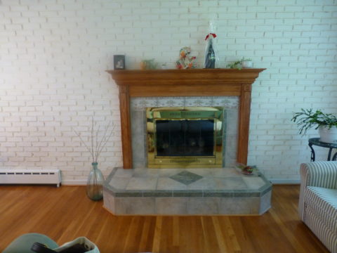
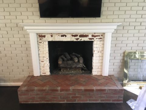
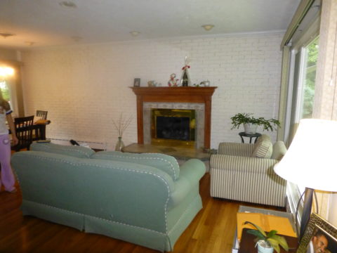
The former white brick wall had gently rubbed edges to suggest a distressed condition exposing the red brick beneath.  The fireplace had an unrelated golden oak mantle and surround with insipid tile inset also used to cover the hearth. The tile was a glazed faux marble with a Victorian design accent feature.

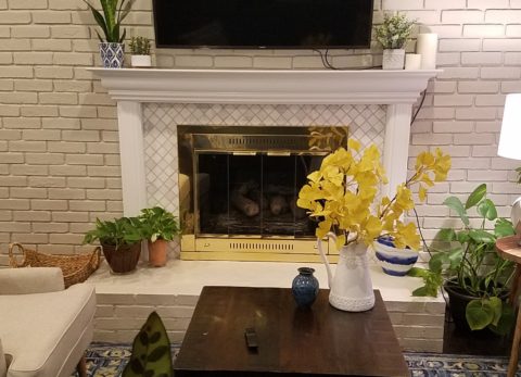
By simply painting the oak white to match the rest of the wood trim throughout the home and also painting the brick a soft taupe/grey tone, the look was instantly transformed. But they still had that awful tile…so here’s a design tip: to buy time either while you decide or until you save-up for the next phase, paint the tile away!!! To accommodate a new TV that is to go over the mantle, the wood surround was shortened. Notice the extra piece of wood trim that was removed to lower the mantle.

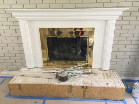
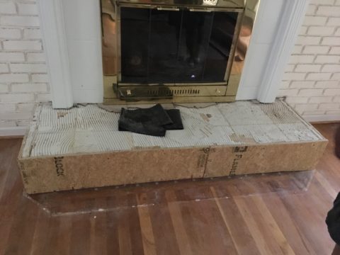
The hearth was removed and rebuilt (without the cut-off corners) with brick and painted to match the wall. Lucky for them the hardwood floor went beneath the hearth – so when they modified the size, they didn’t have to patch the floor! Tile was removed and replaced with 2×2 mosaic Carrara marble to coordinate with the herringbone mosaic of the same marble in the new kitchen backsplash/wall (see last week’s  blog).

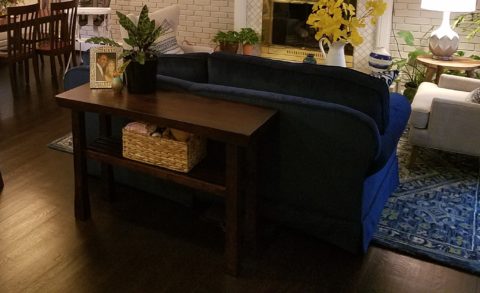
A sofa found, for nearly free, was in good shape and reupholstered beautifully in this plush, durable navy solid.

The classic blue and white motif was punctuated with organic yellow.

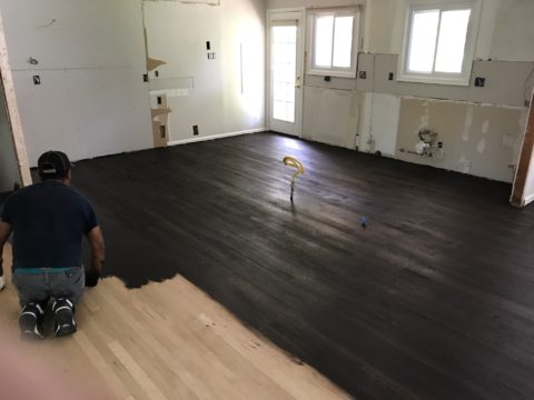
The newly refinished original hardwood floors – taken from a golden oak finish to a rich espresso/walnut stain…

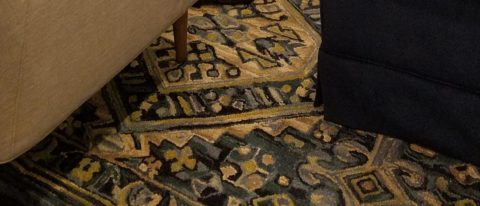
…with the blue and white wool hook rug creates a handsome contrast. The rug actually “reads” blue and white, but upon  closer inspection has warm khaki tones, soft turquoise detailing and is quite complex.

This revitalized cozy ambiance of this new sitting area/living room is perfect for this growing young family!

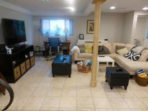
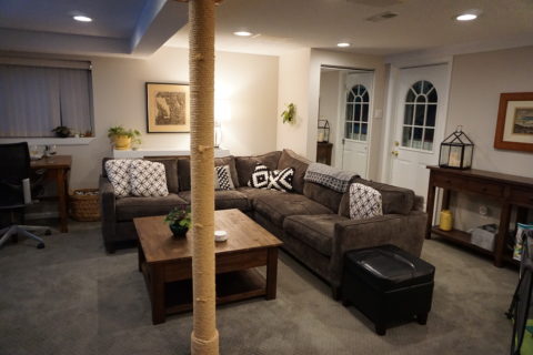
And for a more expansive gathering space, the lower level family room received a new sectional sofa in a durable charcoal fabric and a low-pile small diamond patterned wall to wall carpeting to conceal what had been cold tile  floors and make a comfortable room for all seasons!

Purrrrrrhaps someday they’ll have a cat to climb that crazy rope-wrapped pole!!!!!


Young Family Prioritizes Remodel

We all know that traditional housing floor plans are changing to maximize smaller footprints. The result is a more open layout. This preference, often seen in “loft” design where warehouse space is converted to living spaces – without many walls and with an eye on the interestingly industrial finishes of the existing space.  But this same concept applies to new home construction for starters or down-sizing to smaller homes and is definitely applicable in remodels of existing traditionally compartmentalized plans.

Lifestyles too have opened kitchens. Although often to maximize smaller spaces, they are also more open as cooking is more celebrated in the home and related activities are shared.  Kitchens have truly become the fulcrum of family life. So when this young  couple purchased their first home, the vintage 1960s split-level plan was not quite right.

The kitchen was a narrow galley-style tucked into a rear corner of the main floor. And although it had recently been remodeled, it was confining and not conducive to entertaining and growing a family.

The point of arrival was an open space with entry wall about 12-15 feet from the front door. To the right, the living room had a focal fireplace and the adjacent dining room made an “L” back to where the kitchen was tucked behind that previously mentioned entry wall.

So this progressive young couple thought way beyond merely  opening the wall creating a pass-through bar to better connect the kitchen to the living spaces. No, they said ” Let’s blast this baby out of here!” And with that they proceeded to visualize the point of arrival being the actual kitchen in full-view as guests arrived. Hello!!!!!
The former kitchen containment was revealed to present the new elongated welcoming bar counter-top, luminous glass pendants and supplemental recessed down lights, to meet and greet all who pass through their front door! Original hardwood floors were refinished in a dark walnut stain.

Their priorities were to create a larger, more functional kitchen with a clean, modern look and feel while making all open to better interact with their soon-to-arrive baby!

The clean white on white finishes in the kitchen are fresh and crisp. Lest you think they saved and added to existing cabinets, they did not – all cabinets are new!

And this might be considered gilding the lily, but we added a splash of artistic expression when we hand-painted the small squares in the new brushed stainless cabinet pulls to give them a bit of extra pizzazz!!!
By using the Carrara mosaic as a wall-covering, rather than merely a back-splash, the walls get a truly finished built-environment “read.”

The upper bar counter-top bows at bar-level to offer a more comfortable conversation scene.

The living room became a cozy sitting area off this wonderfully open kitchen and dining area.

Existing brick walls were softened with a grey-taupe to contrast with the white trim making it POP!
The fireplace now has a complimentary new Carrara mosaic in a diamond pattern to coordinate with the new herringbone mosaic of the kitchen wall.

And baby accoutrements adds colorful animation to the beautifully finished scene!

“HELLO!” they say. “Welcome to our beautiful new home!”


A Tale of Two Kitchens

Often with remodeling…it’s both the best of times as the anticipation for the exciting transitions is ignited, but since it takes “breaking an egg to make an omelet”, it is often the worst of times too as the demolition and displacement begins. Thank you Mr. Dickens, you set forth a mastery of profoundly conflicting opposites that I have used here which describe so many design project experiences so well.

Currently, in our shop, we are designing almost parallel kitchens. They are at nearly identical beginning stages. The owners share little in common, if anything, except perhaps the age of their homes. The sizes are similar, yet one is a bit larger offering different options for design consideration.

Both kitchens had been remodeled, from their originals, somewhere in the 70s and possibly 80s. One installed traditional drop-panel golden-oak with a curvy valance over the sink.

Brilliant blue paint to come will transform these re-purposed/salvaged cabinets with new personality!

The other flat panel radius corners for a “modern” look – also in lighter bleached oak.

Each set of cabinets were in good condition opening the conversation to salvage versus replace. Certainly we encounter cabinets that have been destroyed by hard use and neglect, but when the boxes are reasonably well constructed – or enough so that some reinforcement will enhance their weight-bearing and usability qualities, we often take the route of refurbishing. (NOTE: As a DIY, this requires much research to insure that a new finish will be flawless, durable and easy to maintain.)

The beginning for each project propelled forward with distinctly different ideas. One to follow the original character of the home’s raised panels painted white doors and trim throughout, the other seeking an entire transformation to a multi-colored fiesta of fun!

Mexican Talavera tile with Mexican terracotta Saltillo for the kitchen floor adjacent to white oak narrow plank original tongue and groove floor recently unveiled from beneath wall-to-wall carpeting.

Now that’s not to say that the more traditional soon-to-be white, raised panel kitchen will not be full of fun – as it will ultimately have a “party pass-through” connecting the kitchen through to the patio beyond and counter-top that transitions seamlessly from the sink area inside straight out to a party bar! A custom-sized double-hung window will open the scene in the warm weather months. We know that it’s going to be classic with a tremendous twist of fun!!!
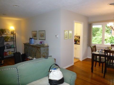
The patio level is a step down. The kitchen counter inside will flow through a new window that is lower – opening directly on the countertop surface – providing bar height outside.

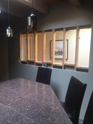
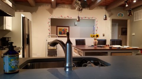
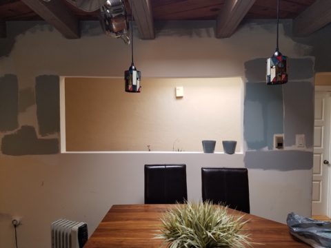
Both kitchens are being “opened” by removing portions of walls which have isolated them in years past. By removing the walls, additional daylight will be evident, a perceive expansion of the space will be realized and a connectivity to the other living areas for personal and entertaining enjoyment will become a reality.

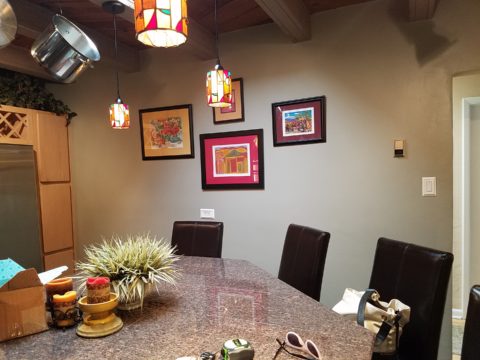
Breaking through to daylight from the hallway skylight – adds not only light, but incredible depth and dimension!!
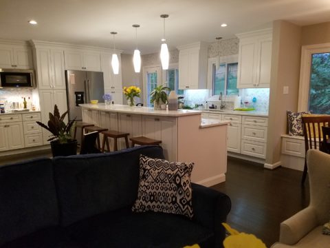
 

This is soon to open into the living room and large picture window beyond – a peak at the mountain will be an added reward.

A bit of structural modification to both are resulting in minor delays for permitting processes – other aspects of the work will continue, in the meanwhile, like the continued selection of finish materials, lighting fixtures and cabinet modifications.

In both cases we have discussed the design challenge of existing materials. I have found over the years that often, when confronted with existing conditions you might not have set-forth to include, they add character and an element of unselfconscious cool-ness. It occurs when certain conditions or materials are in place that you might not have chosen or planned into the design. Designs from scratch, that are too well coordinated or too perfectly planned, can lack that element of surprise or unexpected interest.

The first home had slate tile floors with a unusual mottling of colors leading with a cool aqua and including charcoal grays, smoky blues, ochre and rusty tones.

The other inherited period hollow mahogany doors all trimmed with white molding and original cabinetry. Do we paint them white – which would be the customary response or leave them and invite that element of “oh you kept these doors?”

In this second example it would be easy to “neutralize,” if not replace, the dated doors. However, the homeowner, having many fond experiences in Guatemala, appreciated the great condition of the tropical wood, grain and finish – so we will start without painting them and re-evaluate down the line as the new colors and finishes splash their celebration over the scene. As the transformation takes place, the decision regarding the doors can be re-evaluated.

This is a prime example of the design process. Often there are elements on a project that are a puzzlement. The great thing is that often the decision to remove, modify or leave unchanged can wait until the scene evolves. If you have the luxury to design as you go, you will have more opportunities to consider context, contrast, new options etc…that are often obscured by the overwhelming and often daunting task of visualizing the finished product.

Sharing the same vision is one of the hardest aspects of the design process. Full color architectural renderings, illustrations and even sketches go a long way in conveying the intent, but no two people see exactly the same thing through their mind’s eye.  During these preliminary stages of design concepts, nebulous ideas and imagined finished products, the opportunities for misconception are great.

I remember a hospital project many years ago where the head nurse was wincing at our suggestion of maple cabinets, headboards and other carpentry details. She kept quiet, but we (the design team) kept hearing rumors that she loved the color scheme, direction of the interior design and all of its architectural interest and design finishes, yet she could not embrace our suggestion of maple cabinets. One afternoon once we had gathered the materials for a touchy-feely presentation of color boards and tangible design elements, she had this incredibly surprised expression and exclaimed that she had never seen maple that color – it was natural – like a blond, wood, basketball floor. She further explained that she “pictured” the dark reddish Ethan Allen maple furniture of her childhood in her grandmother’s house. Needless to say, she had been having great difficulty accepting its inclusion into a design scheme of smoky lavenders, pastel clay tones, creamy whites, warm terra cottas and maple wood (in our mind’s eye – natural – and in hers, what she always thought was natural maple – dark reddish brown!!).

Communication is a powerful tool… often major decisions, opinions and actions can result in miscues due to miscommunications. To avoid such misunderstandings take care to provide thorough explanations along with tangible samples and other visual aids.

As we progress with these two kitchen remodels, we look forward to dramatic transformations, exciting phases of design work, some anxious anticipation, and ultimately four happy clients each enjoying their personal spaces, reflecting their lifestyle, home style and distinct personalities.  Watch for updates and before and after dazzlers!
Picking PINK!

Prompted by pieces peppering a pastel presentation for an artist’s opening reception entitled Resilience we held here at PATRICIAN DESIGN last Friday evening, I was pondering this week’s topic when PINK peeked  into my thoughts.

Pale pink is an unsung color – often considered to be insipid and lacking ooomph, it really is quite satisfactory. Pounced on by millennials, with their popular color trend “Millennial Pink” passion for all things in fashion and home style, pink has made a bit of a splash in recent years.

Last Friday, with the creation of the display window featuring pottery shards scattered along the floor, artist Helen Atkin’s peachy pastel pink and soft coral glazes melded together against the soft geometric woven textile resulting in a confection of comfortable color and texture.

Helen Atkins’ shards and little dishes sprinkled in the east gallery window at PATRICIAN DESIGN.

I awoke today with this color on my mind. Swirling thoughts, so often the case, as one thing leads to another and I thought – I wonder how much of that most satisfactory and pleasing color I have here in my immediate world. So, I set-forth  to find out.

Gathered on the nightstand in the guest room, this cluster of dried flowers is a fragile collection of soft pink tones.

Walking around the house, I came upon so many examples that I really was quite pleased. The re-discovery of each made me feel content. I realize that although they are seemingly insignificant that they are really quite sentimental pieces gathered through the years and each so distinctly different from the next.

One of my first purchases when I moved across the country was this discarded, damaged Tamarind print of a large nearly psychedelic strawberry from the famed print-making institute  where rejected failures spoke the language of “one man’s trash is another man’s treasure” and it was mine to adorn my new, naked, New Mexican walls.

Generally referencing feminine imagery and romance, pink is delicate yet full of depth and variation – as with all colors – the range is limitless for value, tone, blending of shades…Contrasting warm yellows and cool blues frame pink so well.

Detail of one of several of my Gerhard Lehner lovlies, I Still Sail to the Virgin Islands. As the artists explains – “An original like-etching a la poupe arrived from drawn textural lines and painted effects which allows the poetic ink to transfer to the fine rag paper.”

Detail – Fine Craft and Dance by Gerard Lehner


Bold floral brush strokes sweep through the pinks and peach, coral and rose, accented with the contrasting vessel in a brilliant cobalt blue, Peggy Zuris was a master of color and style.

Memories of the warm glow of the pink roof-tiled, painted and plastered buildings along the Puerto Vallarta coastline absorb and reflect the rising and setting sun during all exposures of the day.

Detail – watercolor featuring iconic Our Lady of Guadalupe church by Victor Torres Tellas

Meandering from room to room I encounter so many pretty pink things. I obviously gravitate to this amidst my many other colors as a necessary element woven through my comfort zone.

Detail – Fantastically French floral oil on canvas by Anne Sandry

And I adore this finely detailed hand-colored etching showcasing a foreground field of pink lupines,bought decades ago in the artist’s studio at The Torpedo Factory.

Detail of etching by Lyndia Terre

Then I came upon these book bindings stacked unconsciously atop a mahogany dresser , resulting in a study in pinks presenting a pleasing palette.

I realize that I was exposed to the priority of pink at an early age as my  mother’s interior design palette incorporated pinks and soft greens in the more formal areas as well as outside on our screened porch and patio beyond, to the gardens with magnificent mounds of screaming pink azaleas blooming and their explosions of color every spring. Surrounded by lush verdant foliage of the woods where we lived, pink contrasted well with the many shades of green into which we were intimately nestled. We were comfortably punctuated with pink. Therefore it was not a foreign color and complimented the transitions into other darker green tones and yellow accents throughout our house. The original scrolled wool wall-to-wall carpet was a medium pinky-clay color. Quite unusual, yet neutral, providing an earthy grounding.  Mom also enjoyed the vibrant introduction of designer Lily Pulitzer onto the scene in the 60s and peppered her wardrobe with Pulitzer pinks from carnation to hot fuscia contrasting with chartreuse green. Today her classic iconic colors and patterns still make significant design statements.  Mom has never been afraid of color! I inherited that fearless foray into colors of anything fun and fabulous

This handcrafted New Mexican church (birdhouse – having never been outside to host a bird) sports an eclectic array of enchanting elements using pinks to perk up the collection of colors. I realize as I tour these rooms of colorful artwork, that I love the combination of pinks with blues and yellows!!

and also the appreciation for the soft subtleties too. These two magnificent oil paintings depicting New Mexican scenes with the oh-so-pleasing pinks.

Detail – oil painting Church at Golden by Marilyn Yates


Detail – oil painting Moonrise by Bruce Piel

This has been a fun and illuminating exercise. I’ve determined that pink is essential to me.

Why not a pink cabbage plate on the guest room duvet cover dotted with woven clay-pink slubs?

It occurs in so many things that bring me joy.

A heavy, luminous hand-blown glass vase.


Speckled vintage vase – a touch of fun!

As my dear friend Corinne aptly named her shop, it is The Color of Joy. Pick a color – any color – and go around your interior spaces and see what you discover – perhaps you will find your essential grounding color. It just might be a surprise. Find what brings you joy.