Conquering the Fear of Color – A Q&A Interview with Patti

The serenity of neutral color schemes has a significant place in interior design. However, it is more about the fear of color that I approach this article today. Committing to color arrests most people – they want it and admire it but are fearful about selecting and committing to bold colors.

Beautiful neutrals are a color all to themselves. Layers of whites, creams, grays offer sophisticated schemes.

However, that is not all that causes clients to reach out for assistance. Even if they have made a decision about taking the leap, it is how much, where and with what or to what the color is applied or occurs.

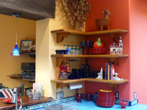
A white kitchen receives a patchwork of blue and white Talavera tile as a backdrop adding depth and interest.
In addition, upon closer inspection, we have incorporated a fine detail of an aqua glazed Spanish tile running horizontally and vertically through the patterned tiles.

I remember when architect Antoine Predock’s project for United Blood Services in Albuquerque https://bit.ly/3LBQbDv made a splash – a really RED splash when he stuccoed the entire exterior brazenly brilliant, bold, blood red! It was astonishing – astonishingly effective!!! https://bit.ly/3NNQihd If a picture speaks a thousand words, color is right there in conveying remarkable communications.

From branding to personal style, color is key.

The addition of our tongue and groove walnut wall established the theme for the rest of the furniture in this interior.


My staff recently investigated information from projects. They posed questions and gathered observations regarding my use of color. Photos, at the end illustrate some specific color decisions and why. The resulting questions and answers are as follows:

Patti Hoech‘s design practice has been and continues to be an exploration and emphasis of the subtleties and strengths of color. It is an integral part of her work. We wanted to know why and when she discovered this specialization in her design sensitivity and how it relates to her approach to effective design decisions.  We are asking clients and colleagues to pose questions to get the answers.

Why is color so important?

Patti Says: Color is power and peace. Color is important on so many levels – personal joy (or aversion), perceived temperature, brand identification, seasonal interactions, emphasis, and contrast. Color is everywhere. Understanding and harnessing it for specific purposes is key.

This new backsplash had a specific purpose, which was to acknowledge the existing rust-colored porcelain sink and the intensely green marble stone countertops. By pulling those two colors into the tile selection so strongly and interspersing other colors that complemented the palette, the result was an effectively unifying design detail.

How do you determine the color specifics for your projects?

Patti Says: What color brings you joy? What color tells your story? Interviewing clients about their color preferences – being an important question begins the dialog regarding what colors to incorporate and why. This can be personal preferences or aversions or specific colors relating to branding whether it is new or existing. Also, existing fixed design/architectural elements might also play a significant part in developing an effective color scheme.

Do you believe color affects the lives of your clients in their homes and workplaces?

Patti Says: Absolutely!! Color can insert many subliminal effects that impose on people’s perception of a space or graphic. Color can evoke emotion, instill comfort or agitation, rekindle memories, spur appetite, affect perceived temperature. It can embed recall for commercial brands. Color can be a clever tool.

In this interior for Boba Tea, we played with the colors of the flavors and the multi-colored tiles to correlate to the fun experience of sucking the tapioca pearls.  

How do you navigate color trends?

Patti Says: Trends are necessary to keep our market moving. Capitalism is based on consumer activity, and nothing generates purchasing frenzies like stimulating new trends in the market. However, basing design decisions on trends must take into consideration the intended longevity of the design.  Much of color trends are based upon pairings and combinations of color.  It is those combinations that can “date” a color scheme – not so much a specific color. It is how, where and with what it is used that pegs it.

A classic, well-balanced color combination of blue, white, and yellow is a comfortable warm and cool with a neutral that transcends trends. Fabrics and finishes contribute to how one updates a classic color scheme.

Do you feel you are a forecaster or influencer?

Patti Says: I believe that I have imparted and am still providing thoughtful, challenging color consultation to my commercial and residential clients.  Having prospective clients request designs based upon others that we have produced is telling and flattering. It means they have confidence in the decisions regarding long-lasting color schemes – if not timeless, in some cases. However, it must be said that design elements that present the color often determine – in many ways – how well a selected color or color scheme “holds up” over time. Considerations regrading patterns, materials, and elements can and might be either improved or modified over time while maintaining the same color scheme. Forecasting anticipates color trends. I have successfully influenced clients to make selections based upon an anticipation of future color directions in the market or merely go with classic combinations that have been proven over time. . .

What has influenced your appreciation for and interpretation of color in design?

Patti Says: It started at an early age. Observing the world around me. Nature, architecture, decorative arts (china, textiles, artwork), fashion, logos/brands, trends, regional colors, seasonal colors, cycles of color…Pinks, turquoises, yellows of buildings in the West Indies, bold color statements of Mexico…Color is profoundly important and signature in its application. From fish to birds, flowers to leaves – color captivates me and urges me to find words to express it and continue to have it a primary part of my descriptive vocabulary.  As an omnipresent element in the design process, color is unavoidable, but to enjoy it so fully and embrace the limitless range of options is an exciting artist’s pallet of possibilities which stimulates me at every turn.

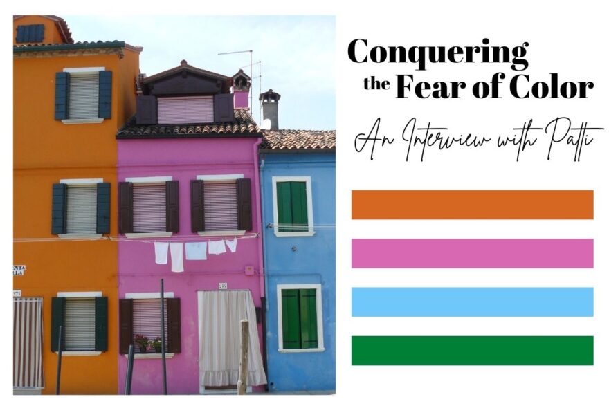
The magic of color on architectural exteriors can be amazing. Here in Burano, Italy my dear friend captured the colors! Similar to what we see in Guanajuato, Mexico and the sunny islands of the West Indies.

I attribute much of my color awareness to my mother. I remember being greatly influenced by her sense of color and design. Her sensitivity and talent were innate. She selected fabrics that had unusual color and pattern combinations. When orange, avocado, brown, and gold prevailed in the 60s and 70s, she selected the olives with chartreuse and gold for the less formal areas of our lives and leaned into Lily Pulitzer’s dynamic colors and patterns for her clothing and a pastel version of soft pinks and verdant greens for our more formal areas. The master suite was primarily yellow with beautiful bits of blues. Beach scenes always emphasized blues and greens. Nothing in our world was on common trend, but an artful interpretation of color combinations, eclecticism and comfort. Pairings of orange and brown were never her happy place nor was gold and brown.  But orange and PINK – YES! Pink and green especially! And browns were recognized in context with stone shades of greys and tans.  I believe that sense was greatly influenced by richly organic, textured stone walls of the West Indies – Danish architecture in the tropics where limitless colors of greens and blues punctuated with flowers were all around.

As a result of this of this early introduction to the value of color, my personal spaces reflected similar sensitivities. Beginning with pink in the early years I graduated into blues, turquoise and greens for my teen years. The final scheme, in my room in the home in which I grew up, was a dusty pink, clay, and mocha-rose. No one in my world had that color scheme in the late 70s and it was difficult to assemble. It helped that I worked part time in a design showroom in Georgetown where handling the amazing abundance of fabulous fabrics was a daily inspiration. Throughout my life experiences color has been a constant distraction. Not in a bad way, but rather a noticeable, unavoidable interruption that causes me to pause and take note. Ask anyone who knows me – I stop and remark about color at every turn.  For better or worse, I comment on color. It is a deep appreciation that I enjoy sharing. And the most rewarding is discovering color for clients who yearn for it but don’t quite know how to find and use that which would make them feel the joy of color!

A dear friend in Mexico recently took a leap in selecting an accent color for his seaside villa. Once an all white interior, which was lovely and fresh, he wanted a new look that provided contrast and strengthened his color theme. The yellow accents made me smile when he unveiled his new look!

Color plays a major role in discovering and expressing personal style.  Fear not – color is your friend. Find your style. Live your style. Love your Style.

Serenity and Peace in Water Features

The serene sound of a fountain can provide mesmerizing relaxation. Like white noise, but better. Close your eyes, in close proximity to a little fountain, and be lulled into a wonderful respite zone. Even indoors, this is an effective relaxation element…outside the birds and breeze contribute to the joy. 

Pets reap benefits too! Kona gets a refreshing sip from the fountain!!!
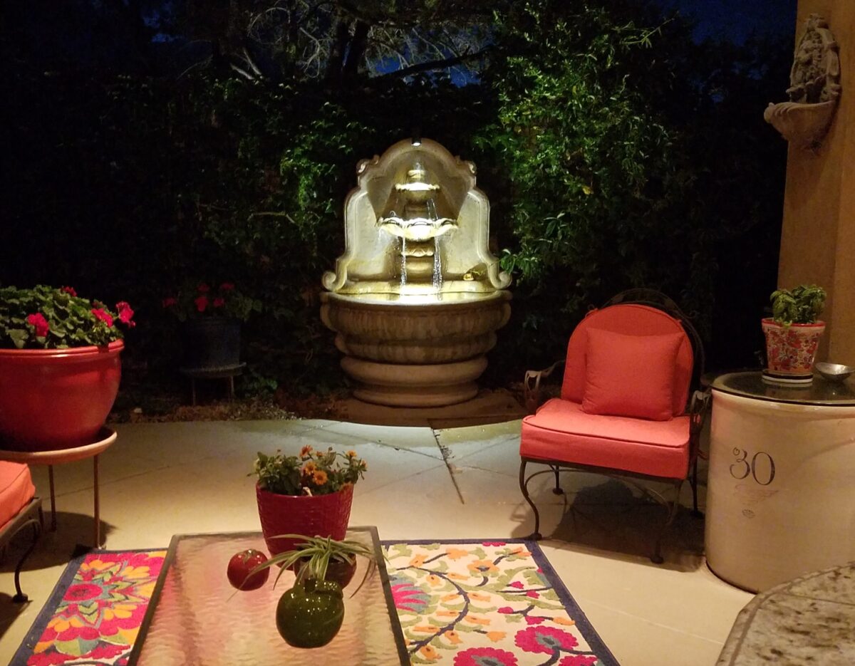
At night, that same fountain offers gentle water sounds and an interesting sculptural effect.

Social distancing and isolation – these two popular terms that have defined so much of our daily living in the last several months and imparted a negative connotation. They paint a picture of living more at home – alone and even “out-of-touch” – literally.  All of my childhood I heard the phrase “ne touche pas!” My uncle’s favorite, for sure! And now I hear it in my mind all the time. Don’t touch the shopping cart, door handle, people’s hands, “ne touche pas!” and if you do – wash and sanitize to a fare-thee-well!

Yet, on a positive note, this stay safe – be safe – living at home has spawned creativity to maximize that environment and relieve stress. It means, more than ever, expanding your outdoor options from placing a pair of chairs and tiny table on a previously unused, diminutive urban balcony or adding a palatial pool in your backyard…there are many options in-between depending on your circumstances and means. 

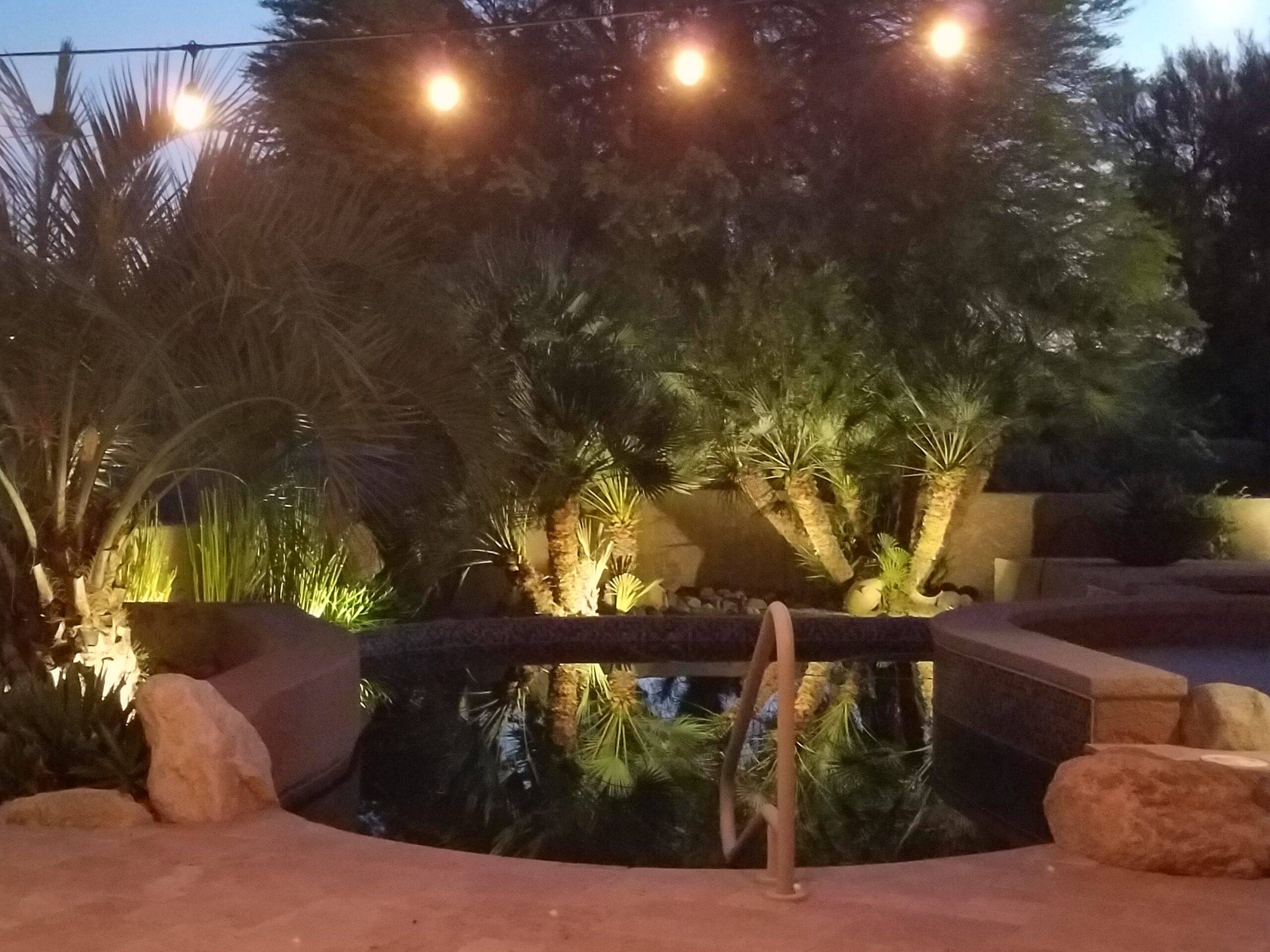
Our cousin in Tucson has created a lagoon effect with the dark bottom and mosaic trim. an oasis in the desert.

Water features are an amazingly therapeutic design element. Water suggests cleansing. It is refreshing and renewing. Water has promise. It can also suggest escape.

The Calgon add campaign of decades ago resonates today for those of us who remember…”Calgon, take me away…Lose yourself in luxury” The escape and indulgence of a relaxing soak in a tub. The gentle buoyancy relieves tension and encourages rest. It often suggests leisure. It is a luxurious, pampering exercise.

 https://www.youtube.com/watch?v=8yjGPgs0_S0  Here is a video from the 70s to take you back to “Take me away…” Come back Calgon!!! We miss your commercials now more than ever!!!

Taking that refreshing water scene outdoors is one of the most popular design projects trending today. From DIY to major construction people are discovering ways to escape without leaving home. Water features provide virtual escapes and actual refreshment for many people seeking that added dimension, diversion and sought-after pleasure in their lives.

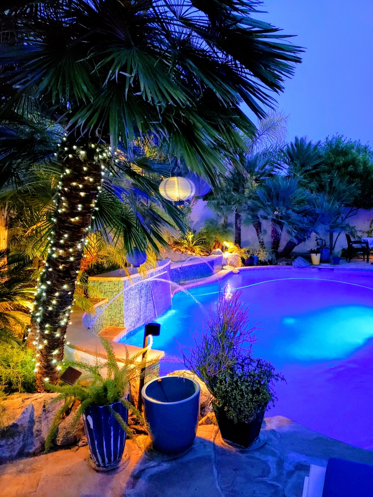
A friend in Phoenix has tricked out her pool with fabulous landscaping, spectacular iridescent glass tiles and LED lighting – the luminous colors an be changed with her mood!!!!

Swimming pools, a gorgeous grotto, lap lane, all afford the luxury of submersion and even exercise.

We’re speaking with Diamond Spas of Longmont, Colorado this week on behalf of a client who is interested in a partially above ground swim spa!! https://www.diamondspas.com/swimming-pool-spa-collection/custom-pools/stainless-steel-swimming-pools/

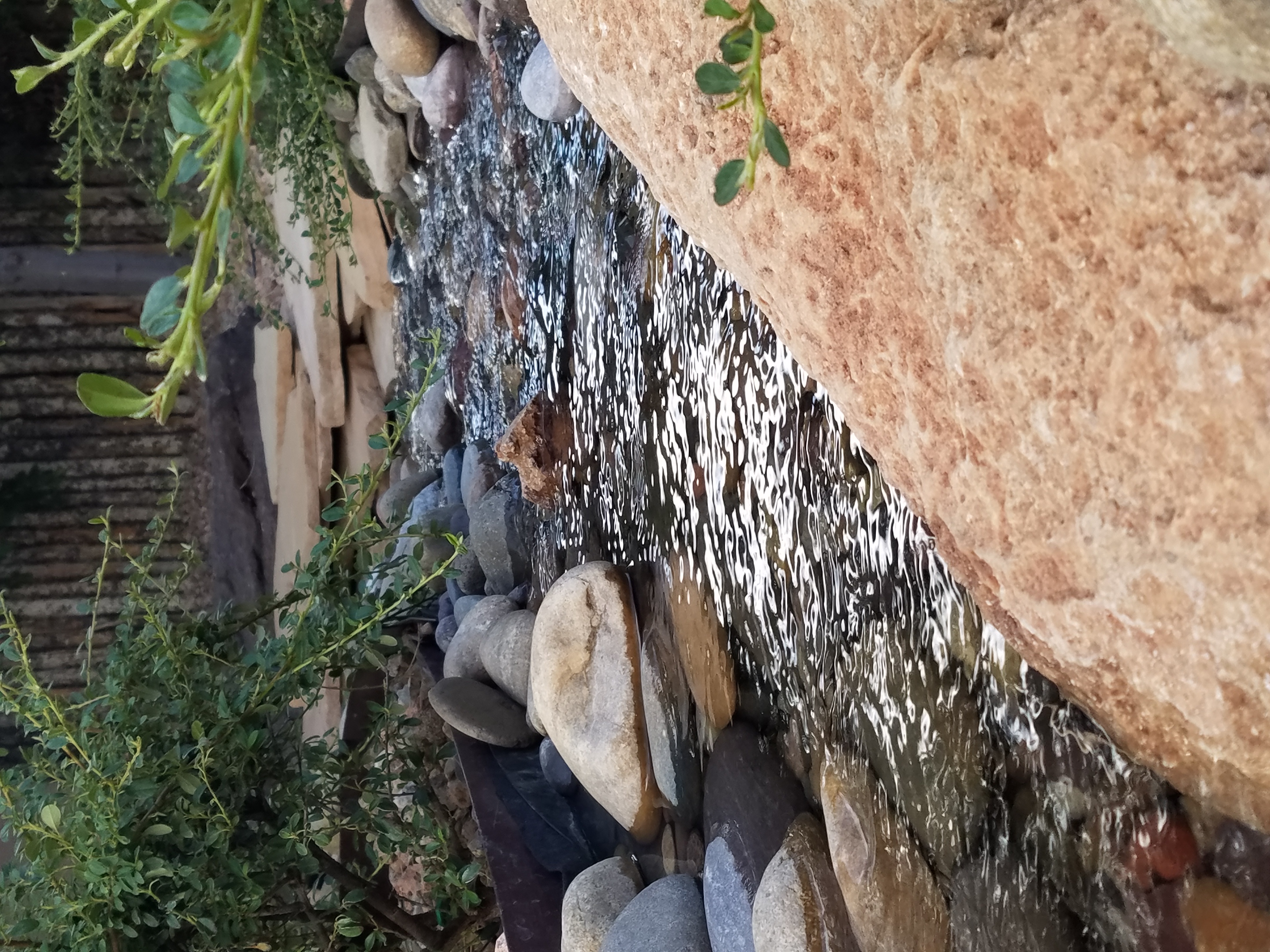
The sound of a small water feature to a creek-like landscape addition in your yard – the projects are many. This DIY guy created what he fondly calls “Covid Creek” – a project that took several weeks of focused creativity and back-breaking work all prompted by being stuck at home. The results are a magical mountain stream flowing beneath the trees in their modest-sized backyard. A creek-like water feature or pond can offer a respite to sit beside, dangle your toes and imagine scene far from the confines of our limited environs. You would be amazed at what beautiful illusions can be accomplished!!!

A babbling backyard book built as a therapeutic DIY project during the COVID confinement.

Such multi-sensory water features offering the touch and feel of water, gentle sound and visual beauty are powerful design elements to exercise the senses. Our senses suffer with redundant stimulation.  The reclusive limitations of recent months have us stagnating with sameness.  It’s the variety if stimuli we are so accustomed to experiencing that keeps things interesting and alive. Moving water is one of these exceptional sensory stimulations. 

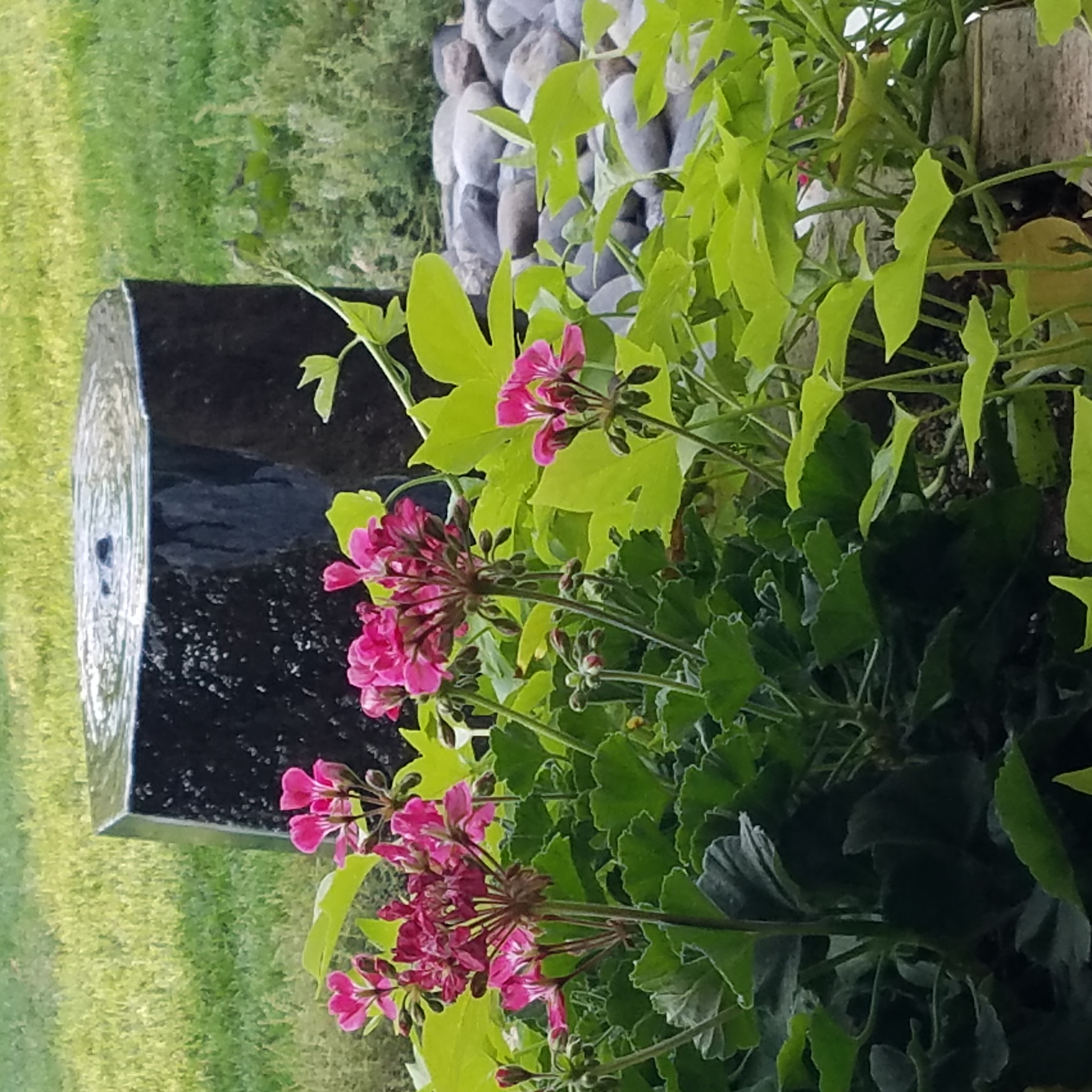
Organic garden sculptures – chiseled granite boulders with re-circulating water – meld with the landscaping.

Whether a tiny fountain or in-ground pool…even a galvanized livestock tub – investigate your options. Regard your environment and study your spaces to select the best design elements for your setting. 

Fantasy Centerpieces in a Magical Setting

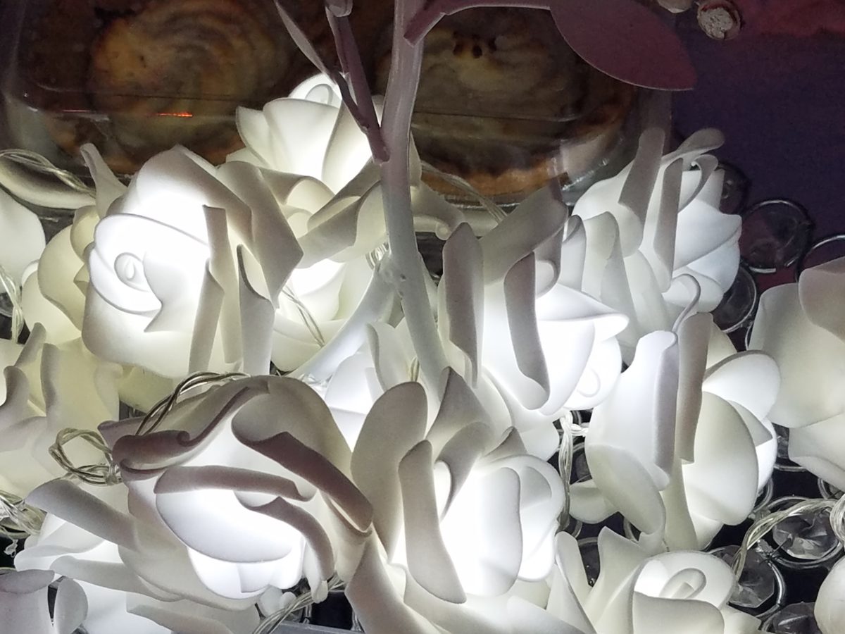
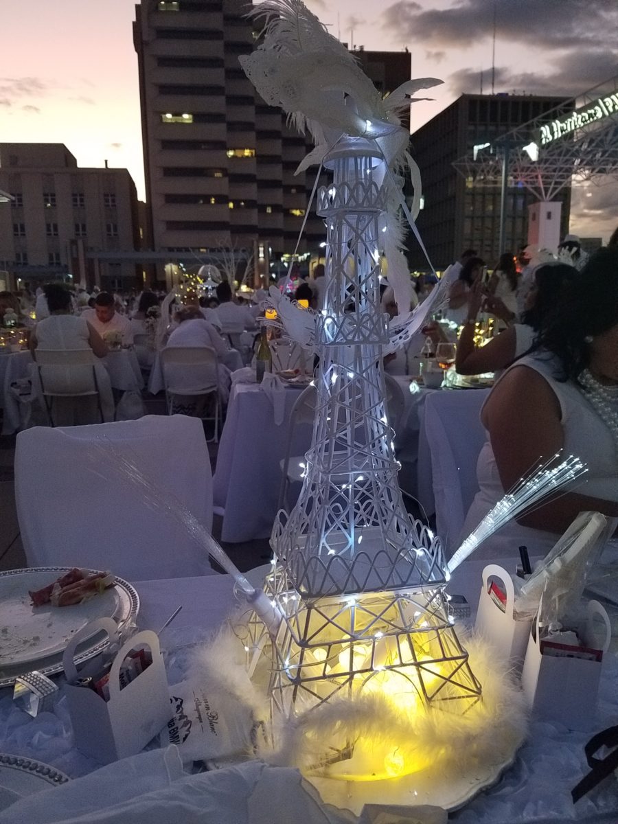
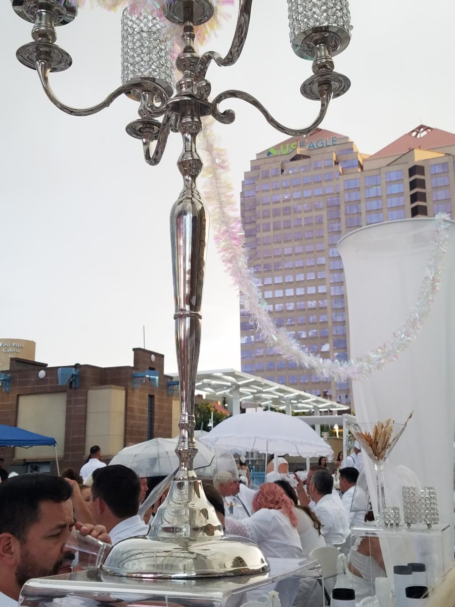
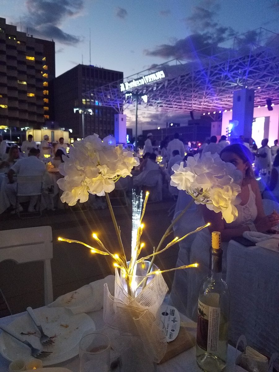
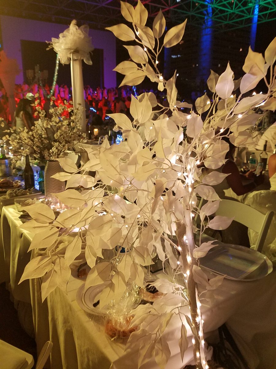
Inspiration for centerpieces – here – a neutral color scheme – white on white on white…Often limited to weddings, take a tip from a social phenomenon – Diner en Blanc for dramatic centerpieces! Any of which could be ablaze with seasonal color – depending upon your desired theme. And with the advancements in LED lighting, the colors are limitless and instantly changeable.
The Diner en Blanc is an international event that began in Paris, 1988. An amazing concept that began with an invitation among friends to an elegant al fresco affair. This unique gathering was prestigious and decadent.

Someone gave a nod to the city of origin!

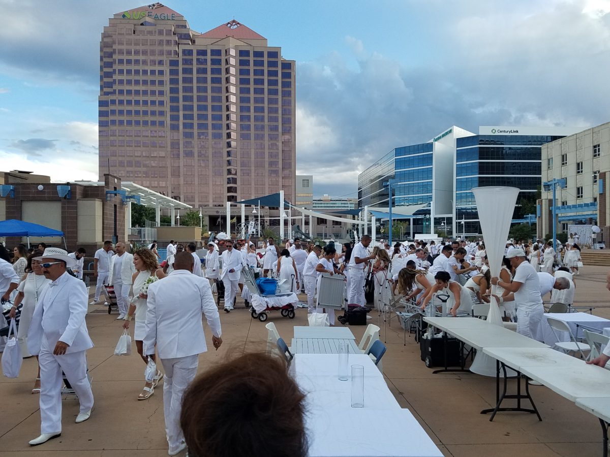
Everyone wore white so that they could find each other amidst other crowds who were gathered at the venue. ( Which becomes rather humorous amidst 2,000 people ALL wearing white!!) https://www.google.com/search?q=origin+diner+en+blanc&oq=origin+diner+en+blanc&aqs=chrome..69i57j0.5779j0j4&sourceid=chrome&ie=UTF-8
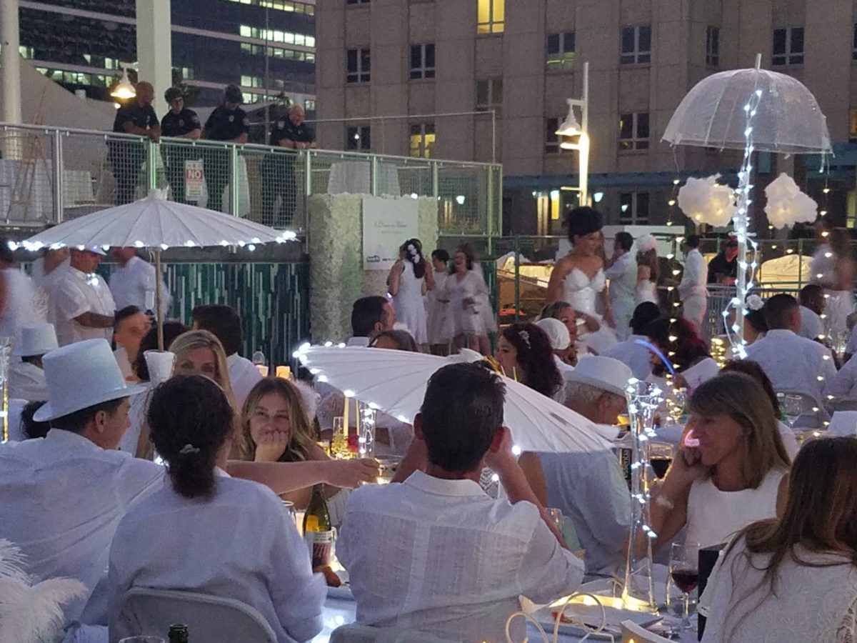
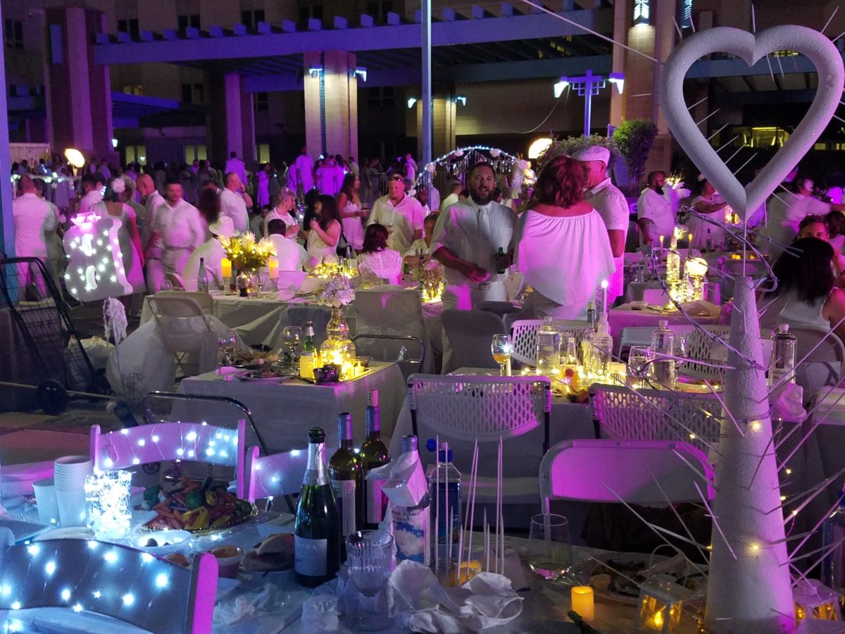
The remarkable event spread around the world and Albuquerque has celebrated this creative event for several years. This is my second experience with this white fantasy. Every year the venue is kept secret only to be revealed at the last moment when attendees are assembled and usually transported on buses to the destination. This surprise location was right across from the designated gathering places downtown. And instead of boarding a bus each group, expecting just that, cued up as though to go aboard – only to be led single file across the street to the expansive Civic Plaza!
One big patio party!

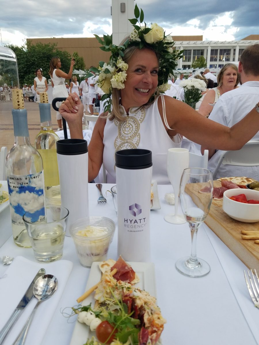
This year with the Hyatt Regency team screaming with creativity from the table dressings…to the phenomenal food…to the fabulous frivolity – it was magic!

Would you believe luscious, chunky lobster salad served in a half tail, sliced beef filet and many artfully decadent extras…

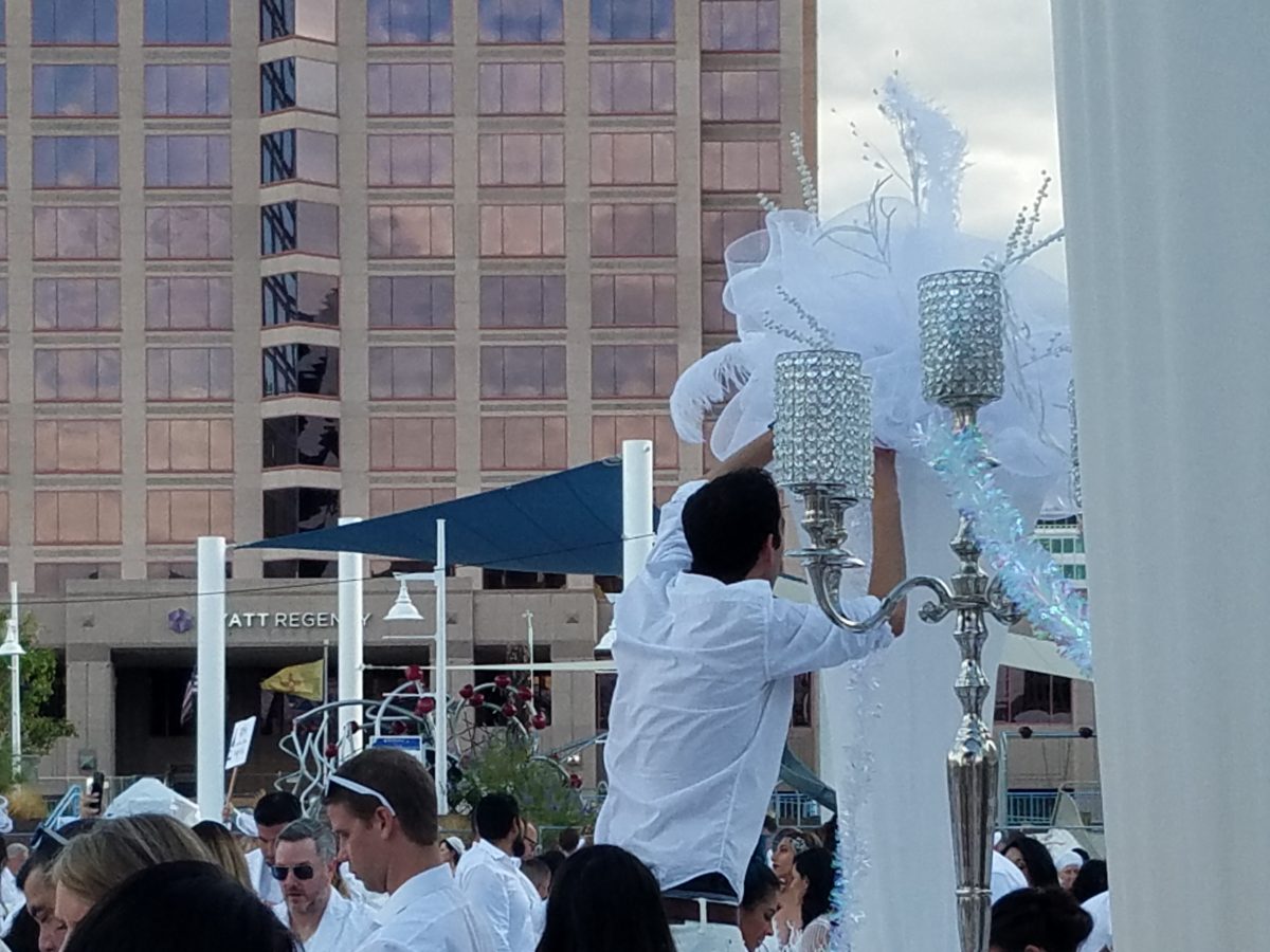
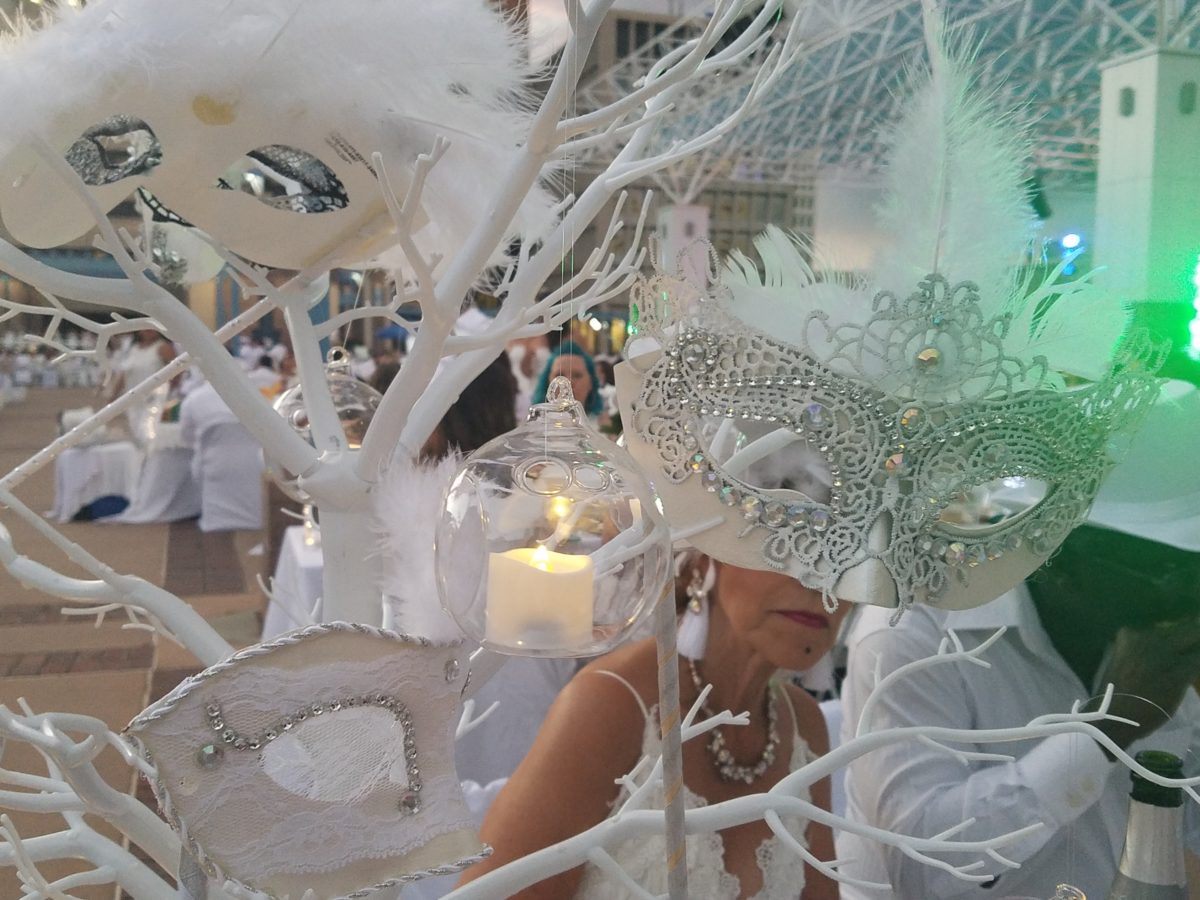
Asked to wear white, bring your own tables, chairs, table dressings, centerpieces – all in white – the evening unfolds with exciting flurries of fabric, flowers, statuary, lights – all intended to make a spectacular statement for each group’s table.

Imagine all of this theatrical staging with 2,000 performers (we) in one enormous space – outside in the perfection of a last ditch of summer evening. It is a remarkable event.

Pretty parasols…
mysterious masks…

As I strolled through the tables capturing photos of the various “tablescapes”, I realized that the creativity was applicable to so many possibilities of table dressings – with color added!

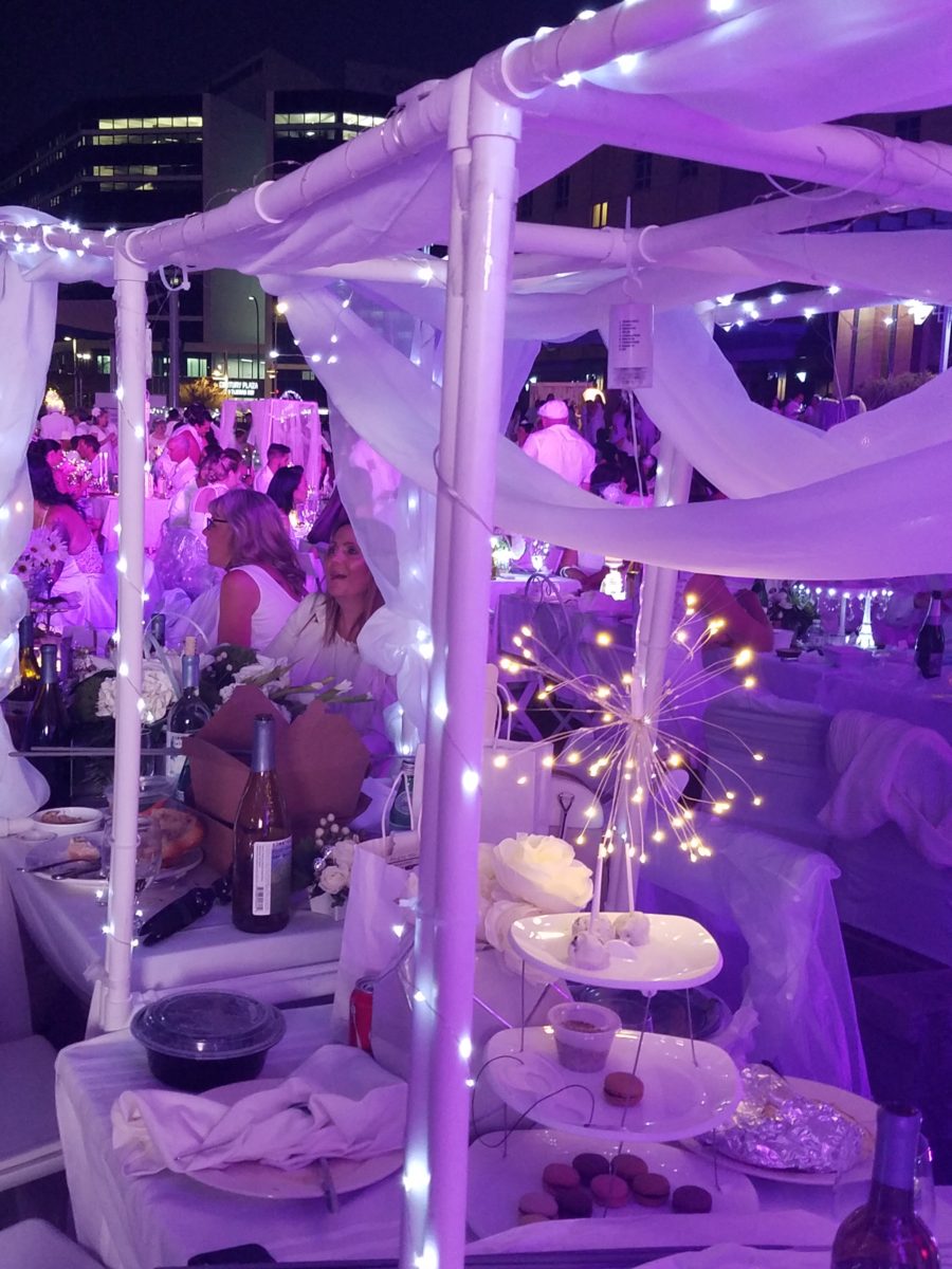
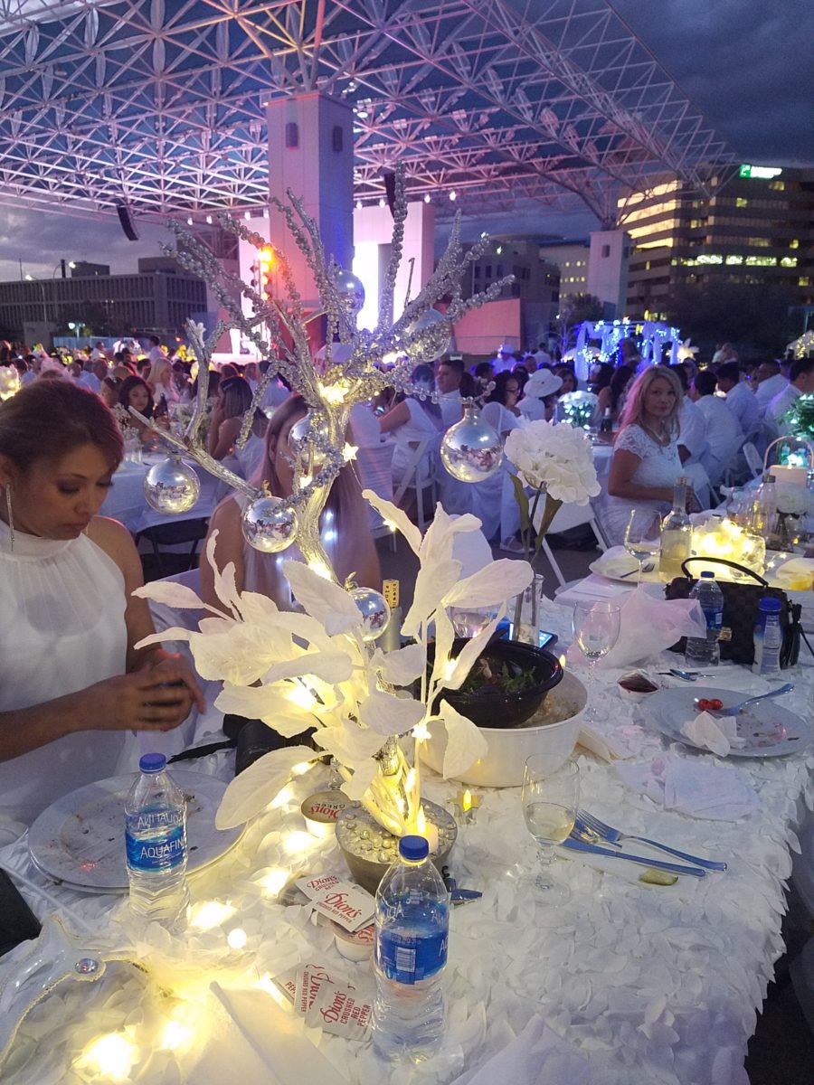
LED lighting set the scene aglow with myriad magical colors! It changes the perceived temperature of a scene.

So enjoy seeing these creations and imagine them in seasonal splendor – fall now…winter coming…spring bursting forth and summer ablaze with color – for your upcoming parties throughout the year!

The scene changed and darkness fell..

With magnificent mariachis to flowing flamenco dancers the entertainment was dazzling and morphed into an enthusiastic DJ who rocked the stage for dancing into the night… It was an exterior nightclub – an excellent setting for a many faceted affair! https://www.facebook.com/DinerEnBlanc.Albuquerque/

An elegant table for Dion’s Pizza and water bottles!!!

Cheers to elegant parties! Who needs an excuse???

Friends Don’t Let Friends Pick Paint Colors

WHY? It’s never as easy as it seems! You can track the trends. See what is relevant to today’s popular design concepts. But how do you really pick a paint color? Warm versus cool, safe versus bold…there are seemingly limitless choices and so many things affect the decision. HELP!!!!!!

Does it help to swipe a swath on a wall?

Not usually. The surrounding often white paint isolates the color in a small concentration and it cannot begin to give the full effect of an entire wall or more. The most telling is to paint an entire section of wall that you can frame in your field of vision without seeing anything else.  That or painting an entire wall, for the best test.

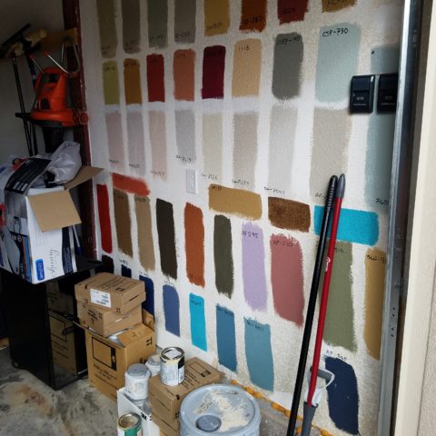
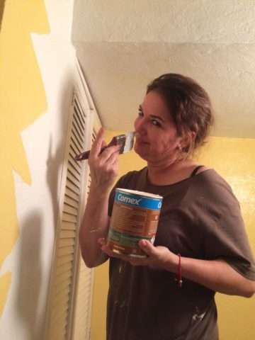
Here a frustrated color connoisseur tried several test patches before calling for HELP!!! But we LOVE the novelty of the effect! What a conversation  piece – a work of art in its own right!!

When is the ceiling painted other than white and why?

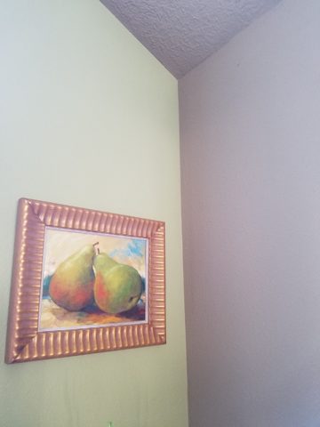
Some colors stand-out and are more imposing while others meld with their associates.  It depends upon your personal comfort level. For example a room painted a sunny yellow might be too bold or imposing if the ceiling were to be painted that same color – white would be customary and give relief and contrast to the yellow vertical surfaces.  A more mellow color (like a taupe) might work well on all surfaces creating a soft, unifying encapsulation.  Shades of the same color – lighter or darker – can also prove to be an effective treatment. Light reflectance – artificial versus natural, depth, the hue and value all play a part in determining what works in a given situation. Not to mention any existing furnishings that might direct a color direction/selection.

Should different walls be different colors?

Why not? Variety is the spice of fabulous interiors – but that doesn’t negate the beauty of an all white interior . Knowing when you want color, how much and from what source is part of the balance of design.

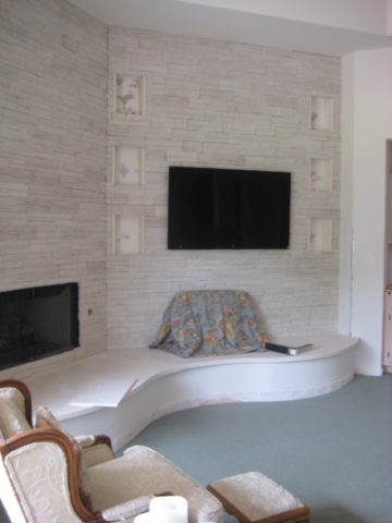
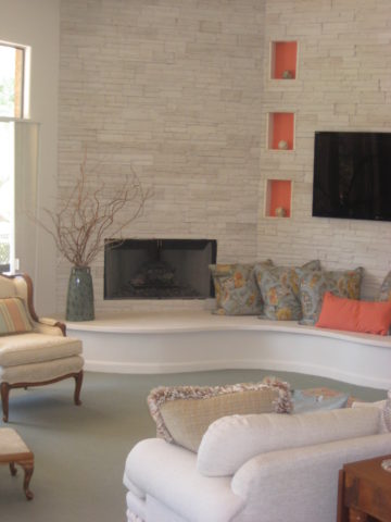
Remodeling this room was comprised of removing walls, adding a serpentine banco and hearth, stone wall surface, painting stained cabinets…We started this project with a new white on white texture and contrast of 3 different stone materials adjacent white walls and white wood trim.


We ultimately added coral punctuation in the recesses of the niches.

What is color layering with paint?

Planes of color seen over-lapping can provide a fantastic effect of colors literally layering over each other. Looking through an interior and reading a wall of one color and another wall behind it peeking out with a different color can add interest and contrast.

How do you stop colors from wall to wall?

I prefer stopping on an inside corner – always. But that’s me. I prefer to “read” the element (wall, monolith, enclosure, etc) as a structural unit. As though the wall were build of that material – the finish suggests the material rather than illustrating a surface application that quits. And I feel the same way about any surface application – tile, wall-covering – preferring to stop on an inside corner to define the element from beginning to end.

EXCEPTION: I have had several instances where we have a little  fun with transitions between colors – a zig-zag motif, for example, can provide a surface graphic and change colors on one surface!!

Wrapping a corner from a full wall of yellow to another – but not wanting the yellow on the entire following wall – intentional graphics are fun and allow for the change of color.

Semi-gloss versus flat?

Glossy finishes show more defects in the surface material. So a wall with imperfections such as texture flaws, repairs, any uneven detail will be enhanced. So to minimize defects, a flat paint is preferable. It also depends upon what you are trying to convey – a smooth plaster finish – might be better expressed with a semi-gloss but an earthen softness is better with a flat paint. Clean ability and durability might play into this decision – but not at the expense of the desired visual effect as there are many grades of paint to accomplish various levels of ease of maintenance – consult your paint products professional.

Contrasting a gloss against a flat on different adjacent elements is a nice contrast such as wood trim in a gloss against flat on the adjacent wall. Is the trim the same color as the wall or is it a contrasting color?

Do dark colors make small spaces smaller?

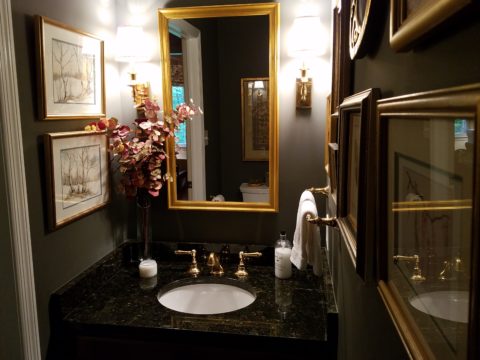
It is a deceptive misconception that this is the case. Dark colors recede and therefore can actually expand the illusion of space. A dark ceiling seems to recede into the void and creates the feeling that the surface is far much higher than it really is. Dark colors behind light colors does the same – recede as a back-drop. Do not fear dark colors – they contribute depth and drama.

Picking paint colors is like selecting the backdrop for your world. All your things are set against this plane.  Applying paint is having control of transformation. Like controlling when and how the sun washes the dawn or the night envelopes in darkness and all the amazing colors that occur in-between.  Visualizing the end result, creating the transformation that takes place beneath the brush, roller or spray gun as it alters the scene are magical powers.


A Most Illuminating Lighting Course Proves – It Exists!

As is often the case, after attending an engaging and informative continuing education class, I am compelled to share at least a fraction of the energy that I experienced today. When a class is good, it is energizing. This was a most illuminating lighting course!

We know that as interior designers that light plays a significant role in creating a scene. Whether task lighting, ambient lighting, spot lighting or washes of color – light plays an important role. What’s so exciting and compelling is the technology that is so rapidly changing the possibilities!

The profound change is a result of the perfected application of Light Emitting Diodes – LED lighting. Lynne Wilkinson takes the complexity of physics and speaks in plain language with a humorous and entertaining delivery distilling that which is incredibly complex into digestible information.

Here’s a link to Philips for more information:

https://www.usa.philips.com/c-m-li/led-light-bulbs

So today I want to impart a tiny bit of the exciting content of this day. If a child asked you – “what is light?” How might you answer that?  Um…well…it’s uh…Electromagnetic radiation. Duh! After clearing that hurdle, we settled into distinguishing the technology between incandescent and fluorescent and a number of other lighting sources.  We discussed temperature Kelvin, luminescence, illumination and the atomic composition of protons, neutrons and electrons that are involved. So how is this interesting to YOU?

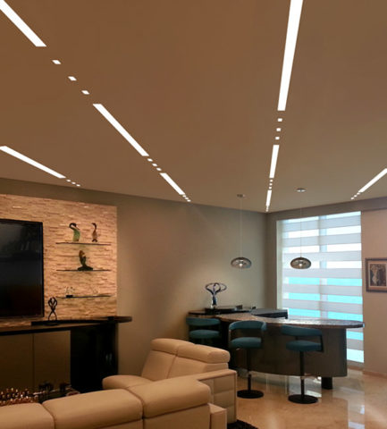
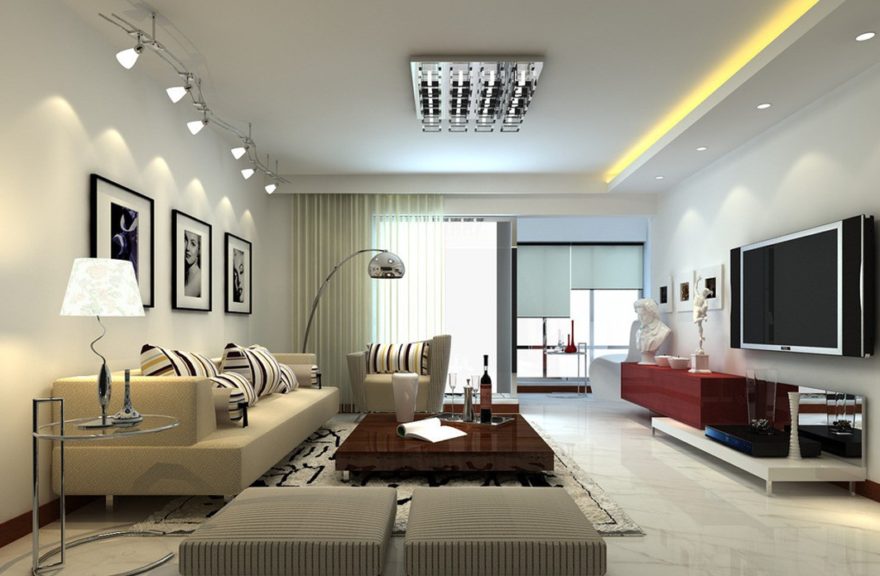
Well…inasmuch as we in the field have kept step with much  of this terminology throughout our careers, and the sci-fi interpretations of the possibilities – the future is HERE! If you just look at I-Phones being only 10 years old, yes, 2007 – we’ve come a long way baby!! Nearly anything you can imagine already exists! And if it doesn’t yet, the brains in the incubators are racing to discover and invent the next iteration of these amazing possibilities!! Look at these cool dots and dashes dramatically streaking across a living room ceiling!


You probably know that LEDs are energy efficient. Have you noticed how dramatically their price has come down in the last, say, three years? They used to be $50 and now they are under $10..  They burn for 50,000 hours…but as they diminish, the quality of their light changes – they will burn long after the accuracy of their illumination has changed. Do you care?

So many health issues are still being discovered with regard to the effectiveness of lighting. Circadian rhythms – how your body is biologically on a timer. How it needs rest and waking hours. What interferes with the natural melatonin in your system that can affect your health. Dark is for sleep. Blue light versus red light can interfere with your good sleep? Here’s a hint – don’t leave computer screens or cell phones on in your bedroom – get rid  of the clocks and other light-emitting devices when you are trying to sleep. AVOID the cool colors – blue especially.

To take this to a higher level of interaction, artificial lighting can be “tuned.” We know it can be dimmed and change color – but tuning is the technology of changing the temperature and related color to compliment the activity in the space. Your living room can be tuned to track the time of day to compliment warm early morning, bright cool mid day, dimming down to the warmth of an evening glow. Do you care? Maybe not today – but to better organize and track a busy day, this can be soothing to compliment your morning coffee…energize you into a more productive mode as the day progresses and calm you as the day closes. It might be handy if you lived in Scandinavia where the days are shorter and the desire to create a sense of daylight’s progression is real.

In an operating room – do you want your surgeon to see well into your body parts? By tuning the room in zones, you can place certain colors of light over the surgery to better illuminate and contrast the focal point or dim the light to read monitors better (as in many endoscopic procedures where they go in with a camera and don’t even see the action except on the monitors which are better read with a darkened surrounding quality of light or lack thereof), or brighten other areas where medical implements, keyboards, etc need brighter light to do the job. The understanding and ability to control these various light levels, colors and luminescence is becoming very apparent. Might ultimately be invaluable.

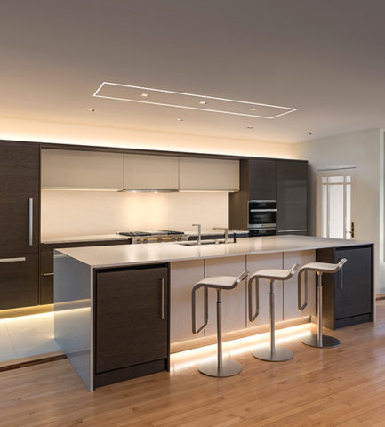
Back to interior design applications and concerns – the idea is to create effective, appropriate light and not see the source. I have always said this especially in the realm of landscape lighting – yes outside. I never use the “runway lights,” rather I chose to conceal the light source and have it spill, wash, spot and filter without giving away the source of the light.  It is more subtle, effective, natural, soft, and pleasing. So in a kitchen, don’t let the under-counter lights be spotty, reflected on any adjacent dark or shiny surface, use smaller aperture ceiling fixtures (cans), hockey pucks in cabinets create shadows…with all the new LED tapes, fixtures and diffusers these faux pas are very avoidable.

Lightology has an exciting site full of great images, ideas and information

http://www.lightology.com/index.php?module=how_to&sub=new-recessed-lighting

As recently as 18 months ago we were remodeling a bar and wanted to use LED tape the full-length beneath the long countertop  – but the cost was significant. Today, that cost is a fraction of what it was. So I might be re-visiting that bar detail!!!

So many lights can be field modified cut and shaped. With the perfection of Organic LEDs, seemingly limitless possibilities exist. Imagine your laptop being so pliable that you can roll it into a tight tube and pack it effortlessly without fear of cracking or breaking. Light-weight and completely flexible. They exist.

Imagine an entire wall in your home that is a touch screen that can be installed as easily as wallpaper. Yes, pliable and paper thin, glued onto the wall and operate as a computer – all your news and information at your fingertips at a scale that commands the room. Smart surfaces – they exist.

Learn more from Planar

http://www.planar.com/products/led-video-walls/led-calculator/#!/welcome

Learn more from Corning:

https://www.corning.com/au/en/about-us/news-events/features/willow-samples.html

Back to now – smart homes can do so much from an app on your phone and lighting is a huge part of that control. You already know that you can turn you lights on and off from your phone on a beach in Tahiti. But did you know that your phone can be as small as a lipstick tube or small flashlight and have a retractable screen of flexible OLED – easy to hold, pack, carry and with a simple tug, click or push of a button reveal a thin full screen? It exists.

Learn more about OLED:

https://www.oled-info.com/introduction

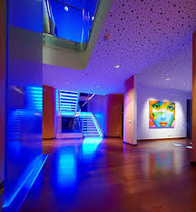
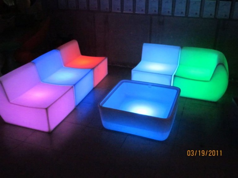
Architecture and interior design benefit greatly from this technology, but are probably the last to be jumping on the bandwagon. This technology is introduced in so many other aspects of our world before it gets to mere offices and residences. Fabric panel walls that have lights IN the fabric and can be controlled for color and movement, resin furniture glowing from inside that can be used outside in all-weather, stair treads that sparkle with glass embedded into them and coffee tables that have pressure sensitivity that when you touch them they respond. So many of these creative applications are already very cost-effective and remarkably accessible.

Here is more about glowing furniture from Marceladick:

A German company, Cerion, making exciting glass pieces embedded with LEDs

http://glassprocessing.eu/dg-glass-furniture-glass-processing-3d-laser.htm

Glowing ceiling layers that once were inconvenient to replace lamps (bulbs) often were left dark rather than scale the heights to maintain. Now the long lasting light sources produce their glow for many years.

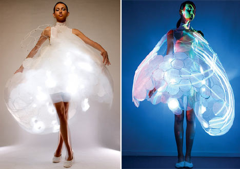
Fashion is also enhanced with the advent of these light sources in the actual fabrics. Models sporting luminous layers, glowing translucence, sparkling luminescence adding elements to clothing imagined. Think about draperies!

Here is a fashion-forward blog to share:

These exciting applications will be sure to get you thinking about the many possibilities. Love light? Use light!!

Color Schemes and the Complex Simplicity of It All

Color schemes are many. Color schemes evoke a mood or convey an atmosphere. They certainly can and often are responsible for imagined temperatures and/or seasonal sensations. What constitutes a pleasing color scheme? What constitutes pleasing? It all comes down to balance, layering and subsequent interest. It takes a enlightened eye and usually cannot be achieved by accident.

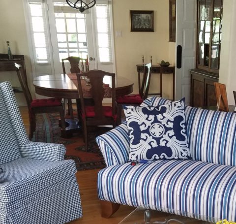
We are nearing completion of a living room that incorporates many design elements. Family heirloom antiques add a vintage touch along with the architectural style of the bungalow home.  Contrasting these pieces is a sleek-lined, modern, sofa that we found and reupholstered. And while not driven or influenced by current color trends, we selected a scheme derived from the existing Persian rugs. By extracting the blue and white from the patterns to refresh the interior – a classic, timeless color combination – we blended a wonderful scheme. Finding the common denominator(s) blue and white, we sought to anchor all with this consistent theme. Differing patterns provided additional layering and interest.

Then, just last week while dashing through the DCA terminal for SWA, my eye caught the attention of several magazine covers all featuring blue and white schemes!  Always in vogue, but not always featured as the cover story, this coincidental (or not) collection of blue and white photo images was a riot! I was forced to snap a few shots to send to my happy blue and white client.

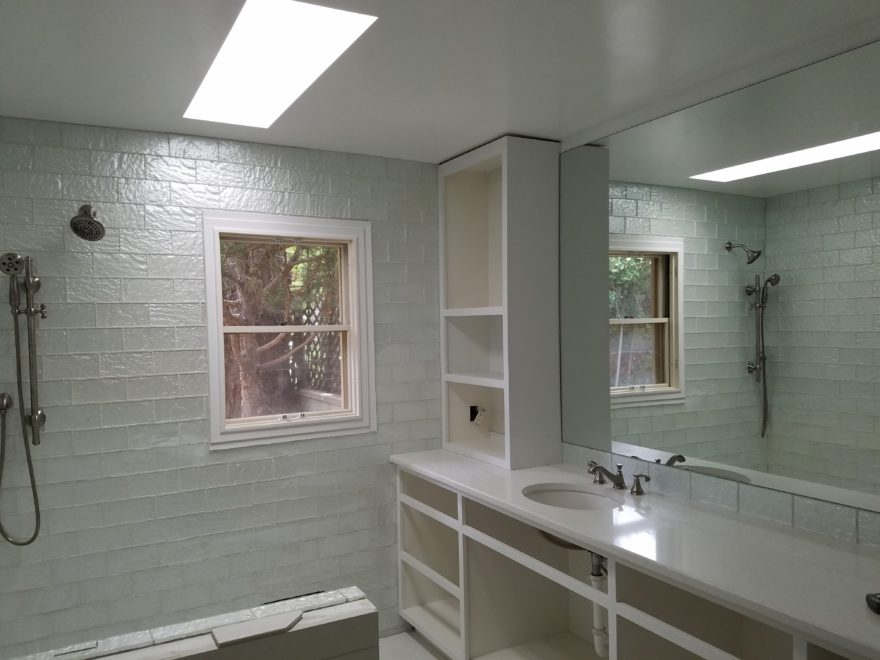
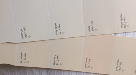
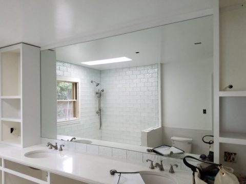
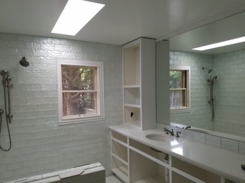
If I described a new master bath remodel project as all white, I wonder what might come to mind. All whites are not created equal and the variation is startling when you see them in context, adjacent to one another. So here is the easiest example. A fan-deck from Sherwin Williams shows a collection of whites. They “read” very differently from one to the next. Yet taken one at a time – isolated from the rest – each would seem to be just plain white. Notice too how they differ from the white paper upon which they are printed – it is the spacing between the color chips – and even the white fabric upon which they were placed for the photo!

But there is really no such thing as “just plain white.” Once seen next to another, their unique qualities of hue come into play. A yellow white is creamy, while a cool white reads blue. It’s the context that makes the  color more legible. Without that they could be assumed and accepted to be merely “white.”

So, in this recent color scheme nearing completion, whites in context show their many colors. At first glance and if asked, one would say “the room is all white.”

Upon closer inspection (photos taken from a different angle seconds apart), that simplicity is replaced by a more complex, heightened level of awareness. This complexity is what adds interest and results in a better finished product than a true monochrome. What was a collection of white materials, in this master bath, is truly revealed as shades of white varying from ever so soft celadon to cream and grey to what might be read as actual “white” white.


Don’t trust your eye when it comes to color. Discover how paint on walls changes all through the day. Artificial light-sources alter the way a color appears.  Context with other colors alters the way one perceives color. Color is fun! Colors are fun! When designing interiors, enjoy the process of layering and the varying effects colors have on each other. Simplicity is usually not really simple. That term can be deceptive. Making it look that way is an art. Encourage the enjoyment of discovery.

Let There Be Light for the New Year!!

Short days and longs nights…Do you find that your interior is dull, lifeless and even feels a bit cavernous after dark? As the sun  sets and the lamps come on, the effects can be horrible, adequate or sensational.

Poor lighting can have remarkable subliminal effects on mood, energy, and attitude. The subtle signs of poor lighting such as dark corners, shadows on faces, difficulty reading and dull colors are all important factors that contribute to an uncomfortable interior in these short days of long, dark nights.

Lighting has multiple reasons for being—three primary ones—to see, yes, ambient light. But to do tasks (reading, sewing, playing games), and accent lighting to illuminate artwork and other interior features. Mood lighting such as candlelight (once the primary light source – now an effect in most cases) is a lesser but effective  lighting tool.  Good lighting makes amazing differences.

Beware of down-lights. Lights that shine down from the ceiling. Although a very effective and common lighting tool, they must be balanced with good ambient light.  I have often used this example of sitting in a restaurant across from your date and their face is painted with ghoulish dark shadows under their eyes, beneath their nose, and accentuating all the folds of their features. It is the opposite of a kid putting a flashlight under their chin shining upward creating similarly haunting effects. Creepy. Certainly not flattering.

2008-10-13_001

The same unpleasant effects happen in the home. It’s such a common malady of ineffective lighting that most people assume it is a necessary evil of short days. It’s sad—no, really it’s SAD—Seasonal Affective Disorder! To treat the serious effects of this syndrome there are many studies and inventive solutions, but for most of us, the less arresting effects of poor lighting can be greatly improved and our lives enhanced.

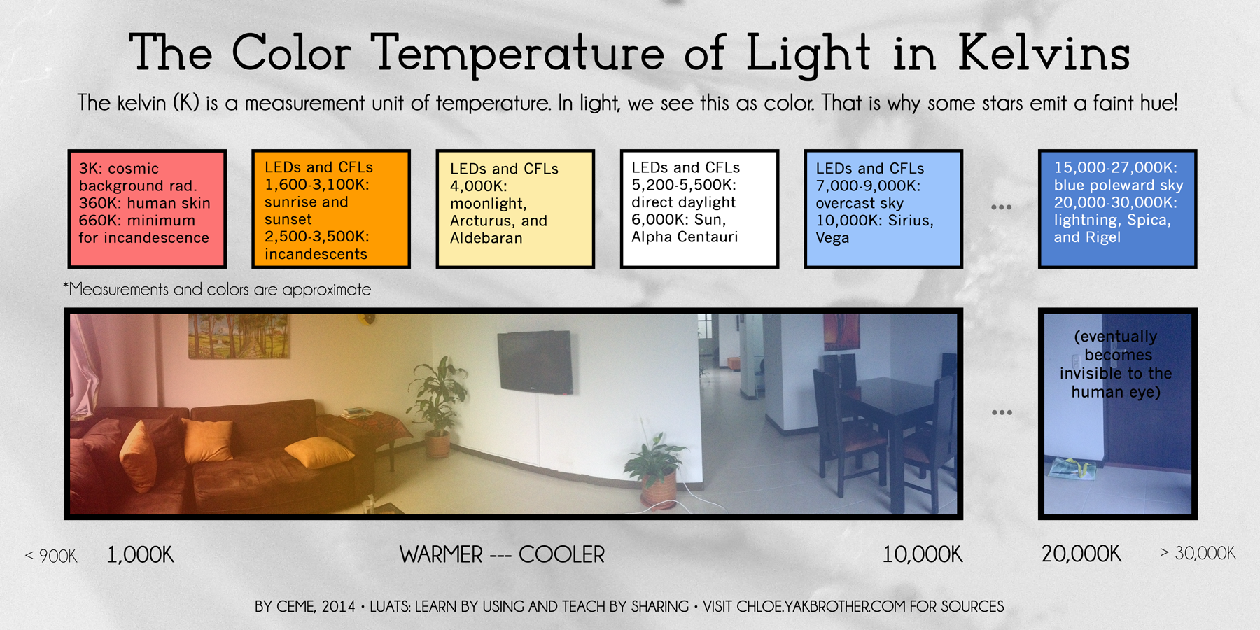
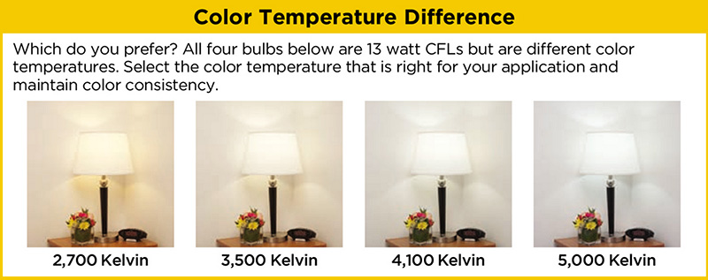
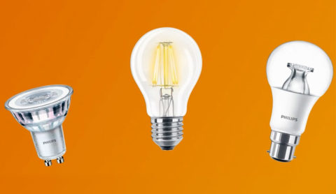
To begin this process of evaluating your lighting an improving it right away, start with the lamps—the light bulbs! We have so many choices these days including the familiar incandescent, compact fluorescent, and the newer LED with excellent color choices and low energy usage.  We could talk about the “temperature” of light sources measured in Kelvin, but we won’t—only that it runs a spectrum of warm to cool.

e6bca6db6f0faf4f9ecb0775cb4bc4eb

Walk around your home and look specifically at the color that glows from the various light sources. Does it look yellow? Does it look white? Does it look blue-ish? Recognizing these distinctions from warm to cool is the start.

light_bulb_color_temperature

Where are the shadows? Are the corners dark and recessive? And, when you combine these two, do you find, for example, dark areas and yellow glowing sources? Sometimes that soft, warm yellow is preferred while other scenes are made more intentionally crisp with cooler light.

Experiment with different lamps in your fixtures – light bulbs in your table lamps and recessed cans, hallway sconces and bathroom fixtures. It’s a fun experiment and very illuminating – yes, the pun was intended.

Are your lamp shades opaque or translucent? Do the shades themselves cast a color? Do they block the light or allow it through? Do they throw the light up and down or up, down and out? This is another detail of which to take note.

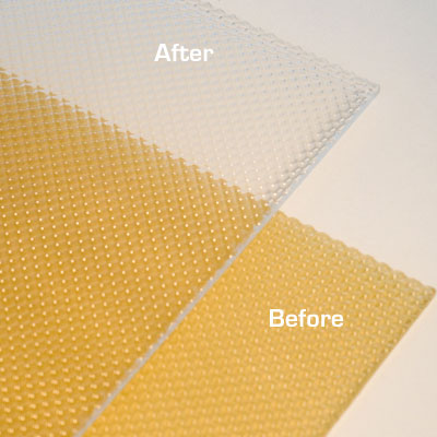
If you have dated recessed fluorescent tube units – common in kitchens for example – they are often housed in a box either recessed or surface-mounted on the ceiling. Take a look at the plastic lenses – are they discolored and yellow? This aging process can dramatically affect the quality of light that is emitted. So if you are not ready to replace these fixtures with more effective modern lighting statements, try replacing the lenses.

001-flat_sheets_before_after

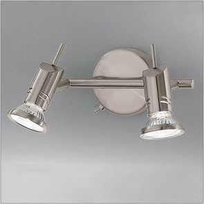
A similar installation is that of skylights which have fluorescent lamps up inside the wells with that same plastic lens over the opening to the skylight. The original idea was to have the natural light pass through during the day and artificial light take over after hours. The lens  was to intentionally conceal the unattractive fluorescent tubes, but it sacrificed the depth of the framed well. A quick update is to remove the lenses and fluorescents and expose the well of the skylight adding dimension to the room and eliminating the unattractive lens that conceals the dimensional cavity. Recessed can fixtures around the skylight in the surrounding ceiling are the most common solution to this transition from old to new, a cable can be strung, pendants can be hung, but if budget constraints prohibit that investment at this time, you might investigate the power source up inside the skylight well and replace the fluorescent fixture with an inexpensive, adjustable, surface-mounted spotlight – perhaps with two heads to provide light from that same source while opening the skylight well without the unnecessary lens.

franklite-scintilla-2-light-nickel-finish-spotlight-spot8882-a94

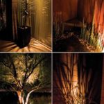
The dark pockets around your rooms can be improved with up-lights in corners and up under plants. Inexpensive fixtures are available at any lighting store or big box home improvement stores. Place one of these up-lights (remember to select the color “temperature” that pleases you the most) and see what that additional pop in the corner does to open your space. When up-lights are used beneath plants to shoot upward and cast shadows onto the walls and ceilings can create drama and exotic interest at night. This is true both indoors and out.

Torchiere floor lamps are those that face upward. Like a torch, they send the light toward the ceiling – another effective splash of light in an otherwise dark space in the room.

Colors are radically affected by the color of light that shines upon them. Therefore, an interior color scheme can be horribly tweaked to not resemble at all the actual colors chosen and combined to create the scene, when artificially illuminated after dark. Contrarily, colors can be rendered with great brilliance and accuracy when illuminated with the right combination of lighting. (although daylight contributes in these two examples).

By the same token we can have great fun and “paint” with light creating a color scheme entirely with colored lamps washing the walls, and interior elements just for the art and exercise of doing so, but I digress.

images

In summary, look around your rooms after dark and look for opportunities to make changes that will dramatically affect the comfort level – the results will be startling!!! If planning new construction or remodel – have plenty of light in key places throughout the space. Think dimmers so you can control the amount of light. Let there be light in this Happy New Year!