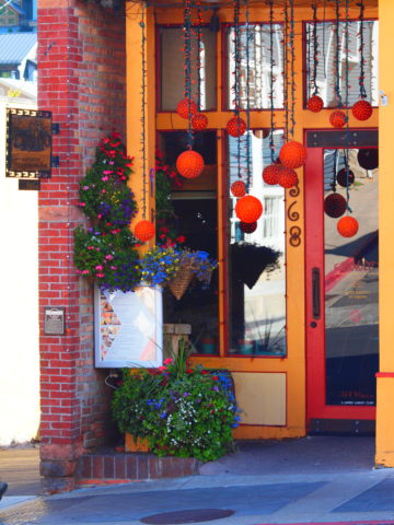
The world is full of detail. From the wonders of nature and the perfection of a flower, to the man-made creations that come from inspiration of all sorts. The combined influences that result, in interesting and good design, are limitless and we now have layers of platforms upon which ideas are presented. The access to creativity is staggering.
Take Etsy and Pinterest. There the ideas abound. Everyone has access to creative ideas unlike ever before in our world. In the past, a keen eye observed and discerned. The clever managed to find inspiration in the most obscure places, analyze observations and interpret them for their own purposes. Creativity was spawned from observation paired with original thought. Yet, that observation was generally first-hand. Therefore, those that got about more, saw more and had greater exposure to more (and there you have it) were creatively stimulated more!
We (perhaps I should say I since it is from my own vantage point and experiences, from whence I speak/write), often are so busy observing that we don’t take the time to dissect and catalog the information we discover. I am so very guilty of that as I am so captivated by design and creativity that I forget to remember!!! Ha – yes – forget to remember or record!!!!
I constantly find myself regretting to have taken a photo of something (some who know how many photos I take might want to take exception with this point), but it’s true. I regret not taking a photo or studying something which, retrospectively, I recognize as something quite special. In the rush to experience the entire scene, I fail to notice or retain the details. Have you ever felt that you were so caught-up in a new experience that afterward you feel you should have paid closer attention? I forget to remember to store the observations or I forget to take a photo – regretting it afterward.
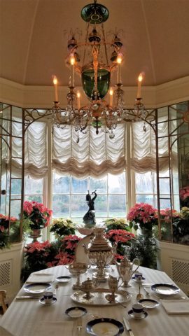
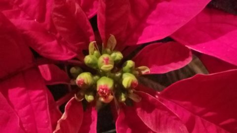
The breakfast room aat Hillwood Mansion where Marjorie Post rarely entertained, but was always set to do so. Pink poinsettias are the seasonal choice.
This can be from a class lecture to a theatrical production. I wish I had focused more closely rather than getting distracted by my own imagination which often runs rampant with the encounter. However, the stimulation can be so great that the imagination kicks in and causes diversions, in the attention, resulting in a deficit of detail gathering. Hence a clear case of un-diagnosed ADD!!!
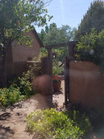
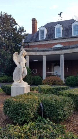
With all of this having been the prelude to my thoughts for the day, I have elected to pick out a few details from a recent tour of the Hillwood Estate and Gardens nestled on magnificent wooded grounds in the heart of northeast Washington, DC. And how wonderful to have had the opportunity this week to stroll through the mansion, now museum, of the late Marjorie Merriweather Post during the Christmas season.
As previously mentioned, I would have, could have, should have taken more photos, but was so enchanted at every turn by the beauty and gracious luxury that unfolded, I was too busy darting from one magnificent scene to the next to capture more than I share here. I apologize.
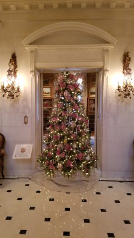
Her favorite color was pink and this tree greeting visitors upon arrival is a precious jewel among many beautiful Christmas trees and decorations displayed in the mansion.
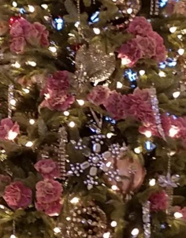
From the reflection on the polished floors of the little white lights to the shimmering crystal punctuated with pink blossoms bedecking the tree was undeniably elegant.
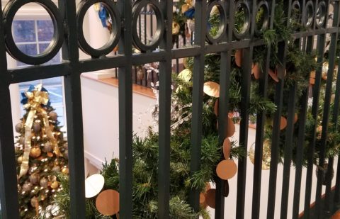
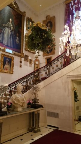
The railings ascending the staircase at the reception desk were draped with garland and strung with simple gold painted discs which were repeated in the coordinating tree which also featured a collection of blue reproduction Faberge eggs.
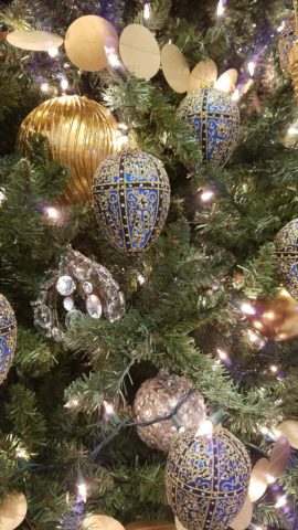
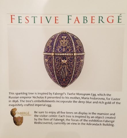
Marjorie Post was a discerning collector of all manner of artistic beauty including exceptional Russian decorative art. The actual exhibit of Faberge currently available for view on the property is nearing its end. Many dazzlingly detailed pieces from her own collection and others on loan for the exhibit are being shown.
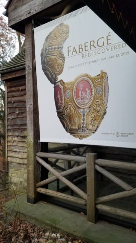
If you are in Washington this month, please treat yourself. This exhibit of Faberge pieces is outstanding.
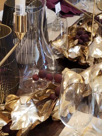
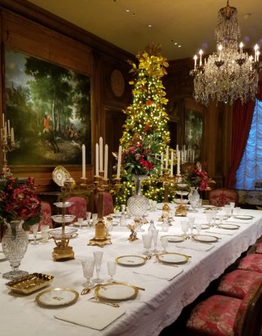
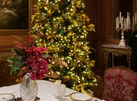
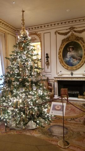
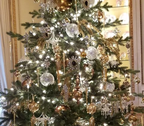
The gold leaves on this magnificent tree in the dining room would be fun to replicate. Could have easily been dipped in gold leaf. Like lime leaves – or from your garden perhaps photinia or laurel even rhododendron – maybe go faux with silk from the craft store – spray ’em gold!!! Paint magic!
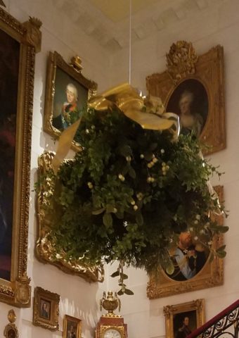
And if you have ever installed a dangle of mistletoe…check this out! This elegant bundle suspended, from the towering heights of the entry hall, puts all other sprigs to shame!!! In the opulent foyer, this grand ball of gilded ribbon-clad mistletoe invites those to tempt the fates of love and superstition, with but a kiss!
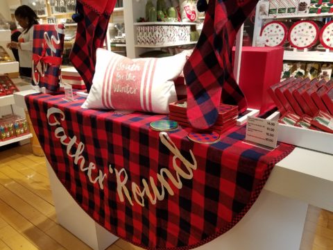
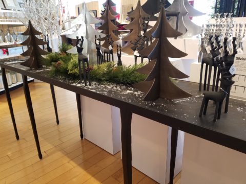
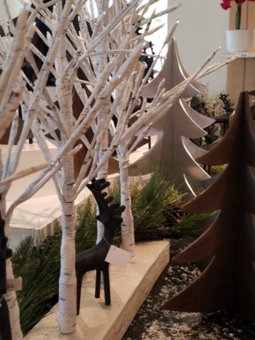
Whether it is a theme of gold or a snowy season of white, find details and enjoy the creative opportunities that present themselves to you in passing or from the depths of your imagination and create your own holiday magic!!!
Creating fantasy, festivity or seasonal celebration, gather the details every day from observing all the particulars around you. It is amazing from where you can collect ideas and be inspired to create your own festive fantasy!!!!!! Then be sure to take some photos!!!!!!!