We are excited to have the opportunity to bring a design installation(s) into a new project that will serve to support the brand with a twist. A nearly completed new smokehouse is coming to Albuquerque. This home-grown eatery blends family history and southern roots with southwestern barbecue flavors including indigenous wood and iconic chile blends. But this is not about their cooking profile. It is about how we have arrived at a design theme that will define and further the identity in this new, specialized smokehouse department of this larger local brand.
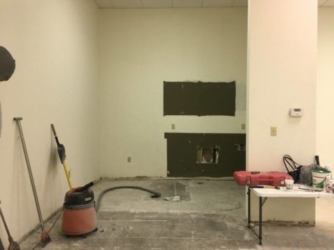
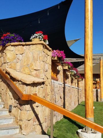
To accomplish this task, we examined the concept the owner had to remodel an existing facility that had been a popular gathering post serving this community for decades. The fringe barrio location was of a demographic primarily comprised of Mexican/Americans. Decades past it was home to a heavily black community. The fabric of these cultural combinations suggested a mosaic of color and vibrant heritages.
The spark of cultural references lead to discussion of the popular artistic expression of urban mural painting.
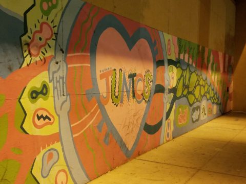
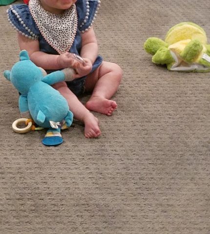
When we began the dialogue, the decision to have a mural painted by local neighborhood kids, with a mentor to design and supervise the work, seemed to be the direction we were headed. After subject matter debate and development, I veered off on another tangent that might take a less subjective approach, be weather-proof and more durable for a patio location – mosaic.
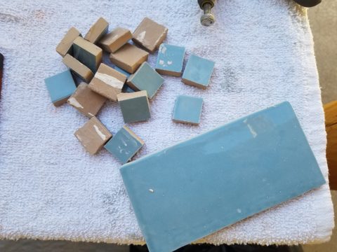
This new more impervious and durable medium still offered the opportunity to engage the community, but with less focus on a specific subject and more about geometric color and texture. We discussed the details of installation so as to keep it simple for kids to participate using whole tiles – minimize cutting, if any, for starters.
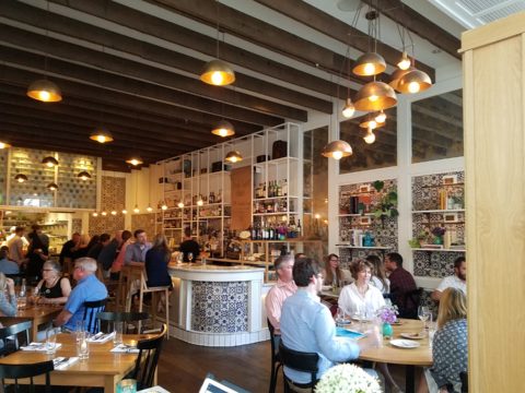
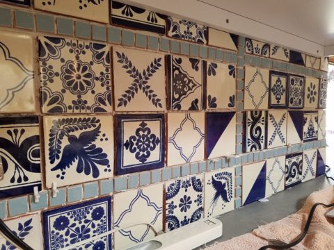
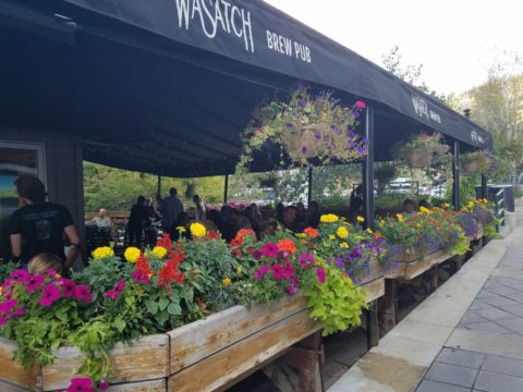
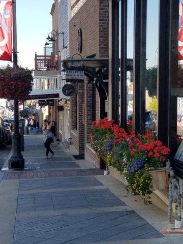
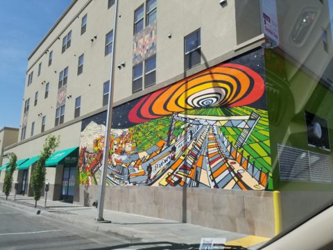
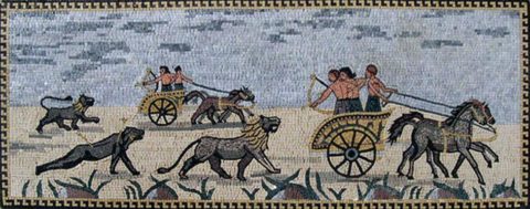
Inspiration came from several other installations such as the Albuquerque Convention Center’s on-going mosaic mural project wrapping many sections of the buildings with intricate scenes of New Mexican lifestyle and cultural diversity. The colorful mosaic is an elegant and sophisticated contribution to our city’s cultural aesthetic.
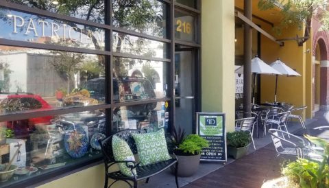
Helen Atkins, manager of consignment art at PATRICIAN DESIGN’s downtown boutique gallery and the lead on their current restaurant mural project, has worked on several phases of the Convention Center’s mural project.
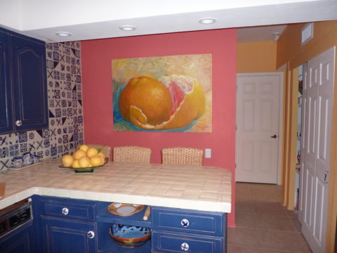
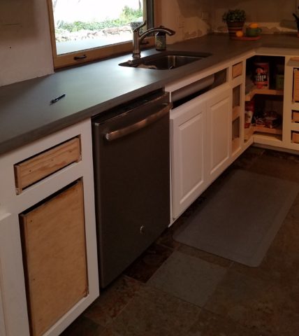
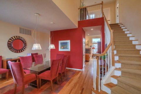
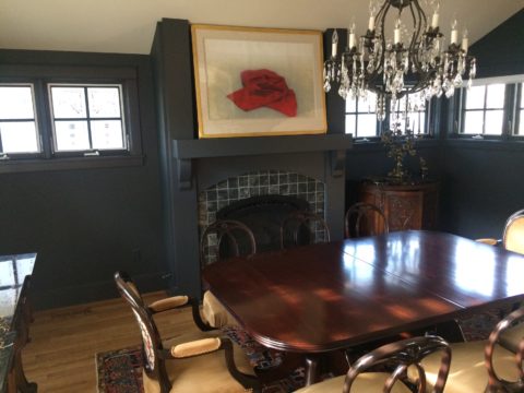
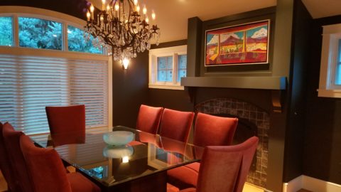
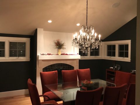
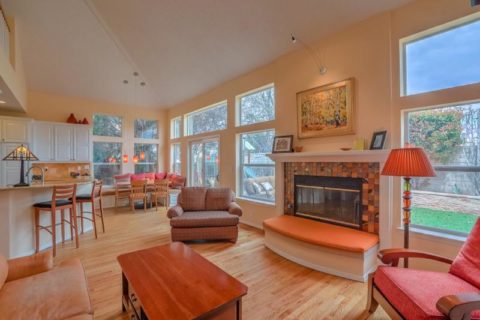
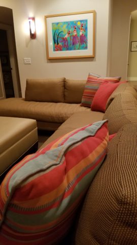
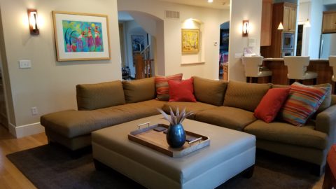
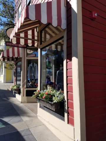
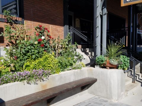
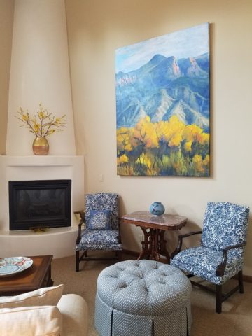
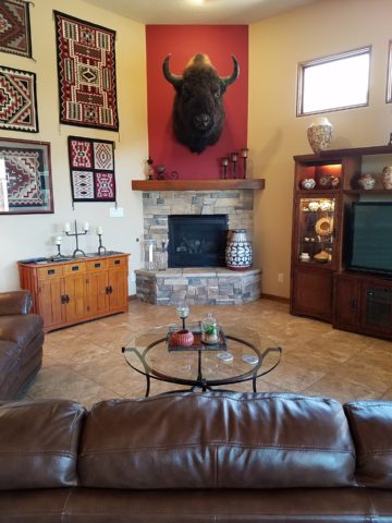
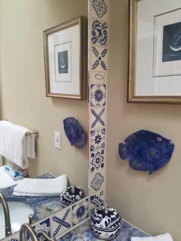
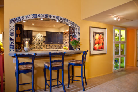
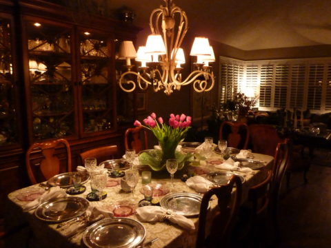
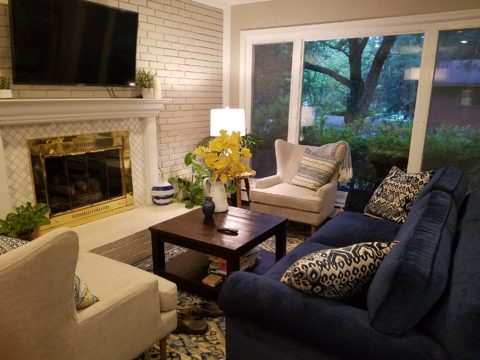
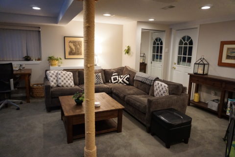
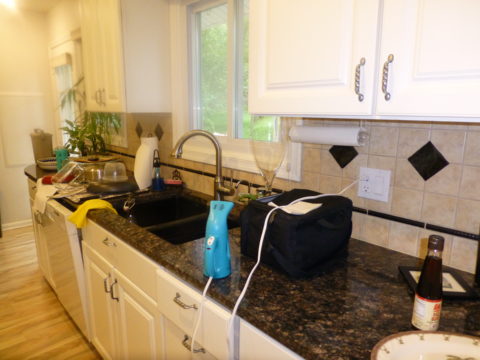
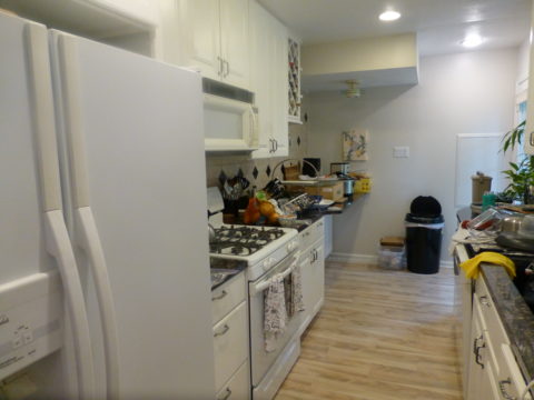
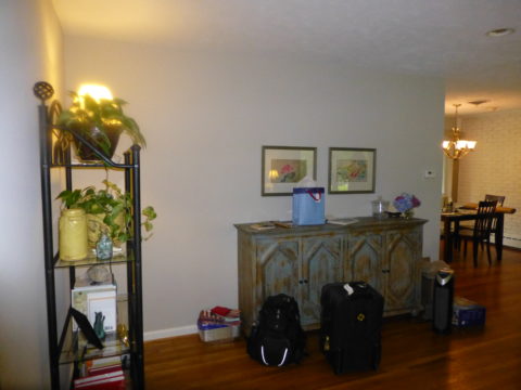
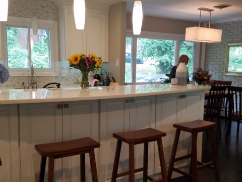
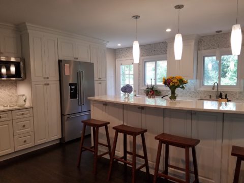
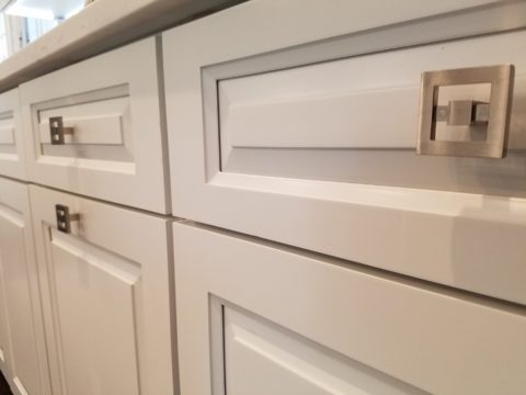
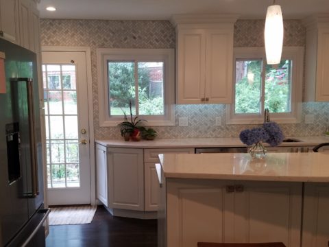
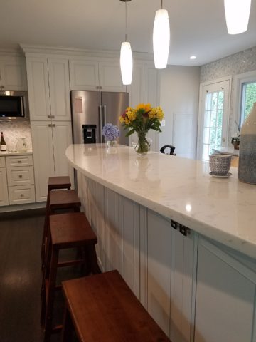
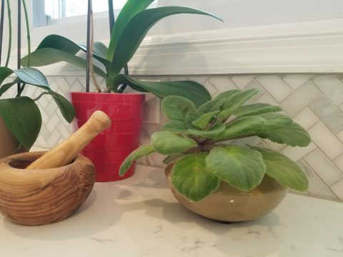
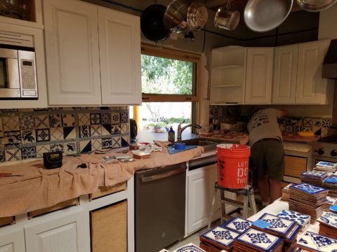
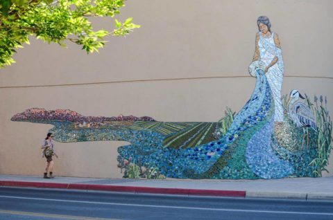
We have incorporated mosaic into several of our own design projects such as last week’s blog https://patriciandesign.com/trust-and-custom-designs/about a residential kitchen installation.
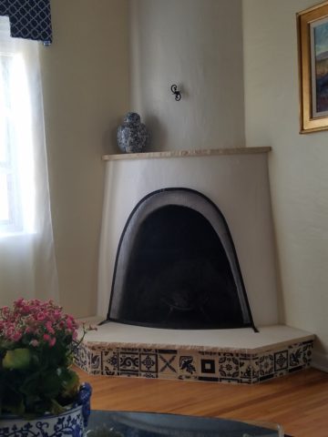
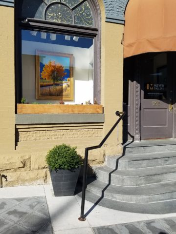
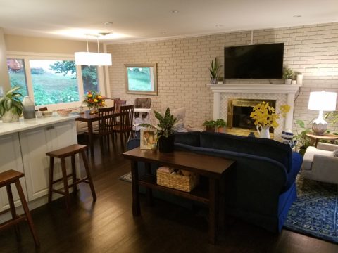
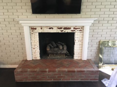
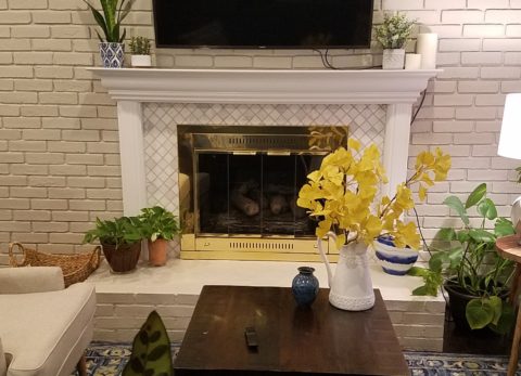
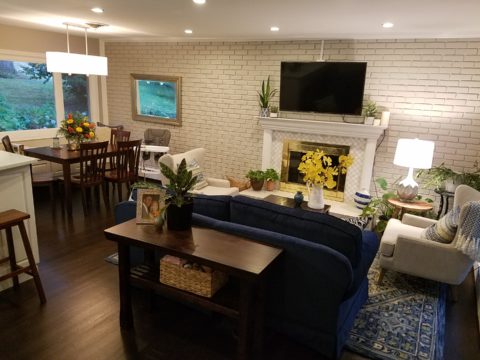
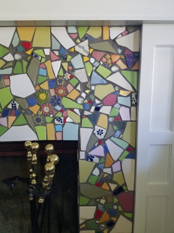
Here, in another installation, a fireplace surround of mosaic adds movement, color and textural interest to the room.
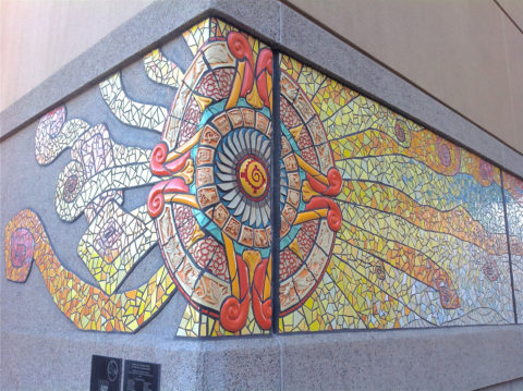
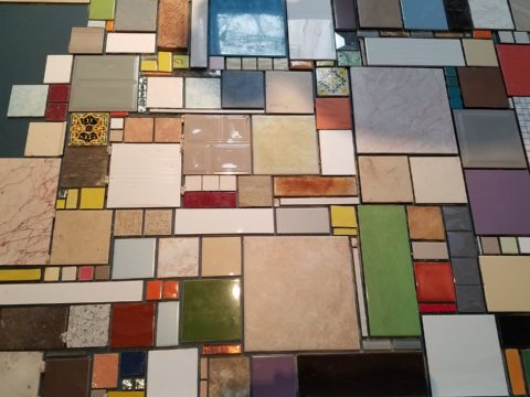
Ultimately, one of Helen Atkin’s personal photographs cemented the approach. It was decided that a geometry of different sizes and disparate glazes and designs of tiles pieced together in a colorful, textural panel would be our design theme.
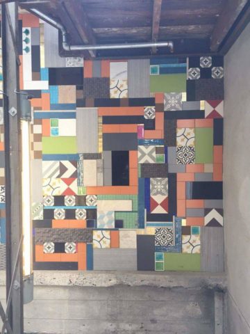
Helen Atkins, a recognized artist in many media, captured this in passing while visiting New Zealand. It’s crisp, yet irregular composition was intriguing and pleasing. It became the springboard for the concept for a geometric mosaic panel to anchor the theme of this new New Mexico eating establishment.
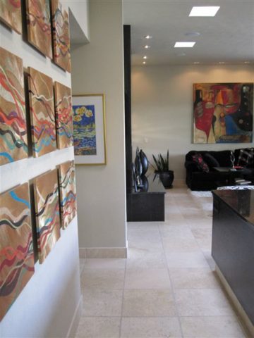
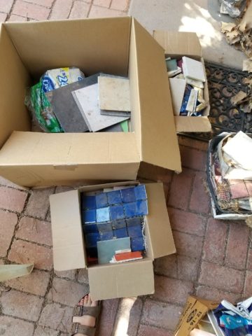
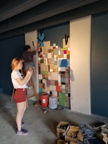
The idea became more exciting as we began gathering material from local tile distributors and our own personal inventories of favorite treasures saved for a special project. Here it was. It seemed such a strong design element and therefore offered a new direction for the actual brand of this establishment. We embraced the idea and brought it into the interior and distributed murals throughout the space.
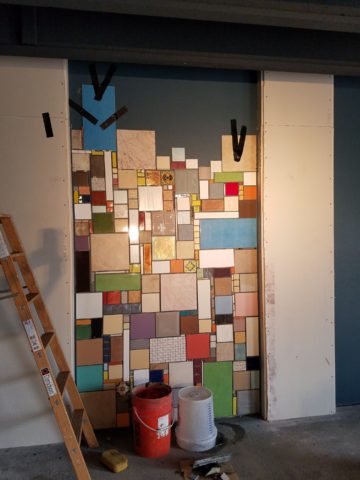
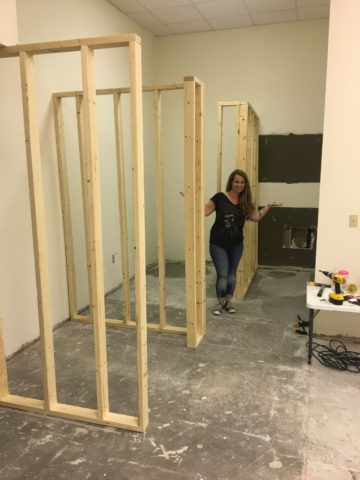
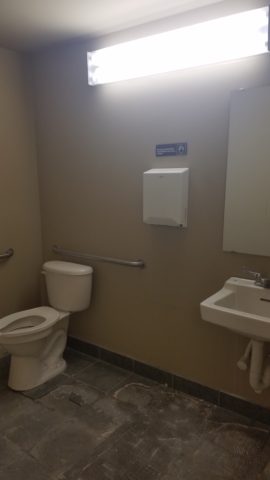
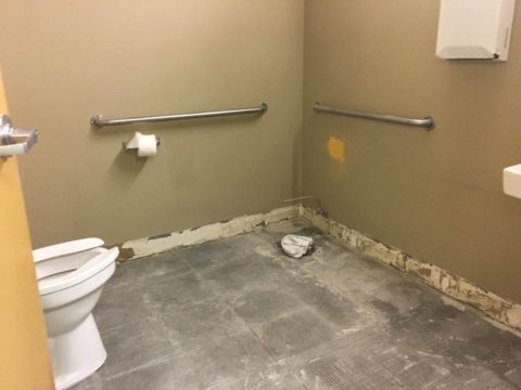
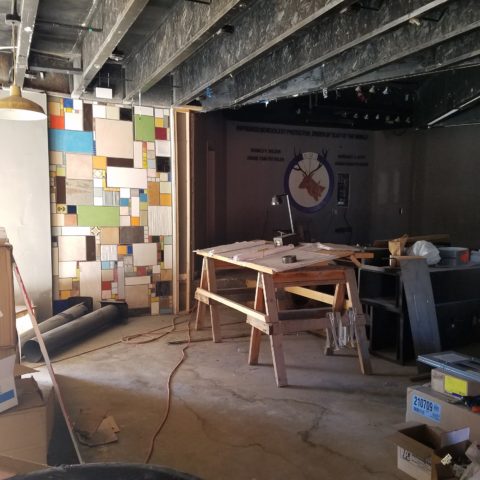
Still under construction, we will not divulge the identity or locations of this project just yet. But suffice it to say, the murals are an exciting part of this interior design scheme.
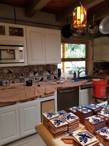
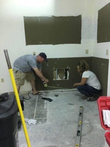
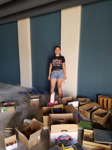
As we further discussed the plans to implement this project, school started and the ease of coordinating the assistance of neighborhood kids became more difficult. Helen lead the project as primary installer, coordinator and supervisor. She enlisted the assistance of a couple of people – one experienced and the other not at all.
We have named this series, Urban Pieced Work – an artistic narrative. Here we are interpreting generations old sewing patchwork using ceramic, glass and pottery pieces rather than the traditional fabric patches. The original folk art needlework has been in the American vernacular for ages. In these installations, this up-cycled use of discarded or discontinued tiles is similar to patchwork fabrics, re-purposed to make clothing, wall decor, window treatments and bed dressing when times were tough – often referred to as “pieced work.”
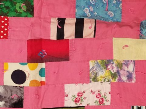
My paternal grandmother in New Mexico made this twin quilt for my bed when I was a child in Virginia.
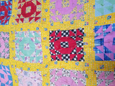
My same grandmother made this and was given to me by my cousin, her only other granddaughter.
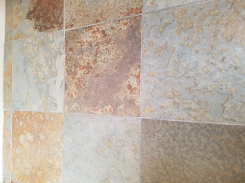
Mosaic is often, like fabric patchwork, a practical art form that puts scrap, shards and fragments to good use in an artistic fashion. Note though that more sophisticated mosaics have been designed more intentionally for centuries not merely as salvaged material. These masterpieces both in contemporary work and antiquities represent many periods in history and movements in artistic expression.
This mosaic version connects with the history of the restaurant’s roots and southern heritage. The panels’ mural nature speaks to the urban murals found throughout the community.
Located strategically throughout the interior, these murals have become a strong design element and anchor for this facet of the brand.
Another shot of the spectacular cultural story murals at the Albuquerque Convention Center.
We have woven a meaningful artistic statement throughout the interior and also on the exterior of the building. In addition, we will be inserting a graphic version into the signage and logo design.
Urban Pieced Work – an artistic narrative, of a New Mexican Smokehouse, will provide pleasing design visuals throughout this new interior, provoke conversation and interaction, weave an element of history and context with the southern roots of this exciting new eatery!
Join the conversation and watch for the first succulent flavors to come out of the smokers later this year.