Hidden talent – that remarkable artwork that appears (seemingly) out of nowhere, on a par with great masters of the medium. I considered this element of surprise – looking back several decades to a local painter, Wilson Hurley, who had more than one very different, distinguished career and diverse life experiences before he delved deeply into his passion for painting in his 40s. Once exposed, his paintings revealed his extraordinary talents and he become a nationally recognized treasure for his sweeping landscapes and a variety of other subjects.
On that note, I have just gotten off the phone with a very good friend, in Florida, Houston Evans. I have recently learned that he is a passionate weekend photographer! An amazing photo appeared in a Facebook post and I was astonished by the enchanting image, color and composition. I was instantly captivated – and curious. Upon closer inspection, his stylish swashbuckling signature made me realize that this hobby was subtly becoming more than that – yes, he had his mark digitally mastered and is probably THE perfect brand for his diverse and stunning work.
“Star Power” is the luminous celebration of a pineapple.
As I quizzed him about his interest in photography, I learned that he attributes his eye for art, color and design to his mother who’s side of the family has spawned other talented artists, in his generation. He has been posting on Instagram for quite some time – hundreds of images. I didn’t know. I didn’t “follow.” He is modest about his photos and does it for his own amusement, pure pleasure and personal enjoyment – that he likes to share. “I don’t do it to imagine it on someone’s wall.” Yet this observer believes that there is where it absolutely should be! Many walls…many places! #houstonevansphotography
He plays with the medium and all the tools and tricks of the trade. He enjoys the freedom of experimentation. The results are controlled, yet spontaneous. From high resolution to fuzzy pixels that require distance to assimilate. Up close for precise detail and soft smears for imagination to take hold, the variety of clarity or lack thereof are a part of the experience and expression.
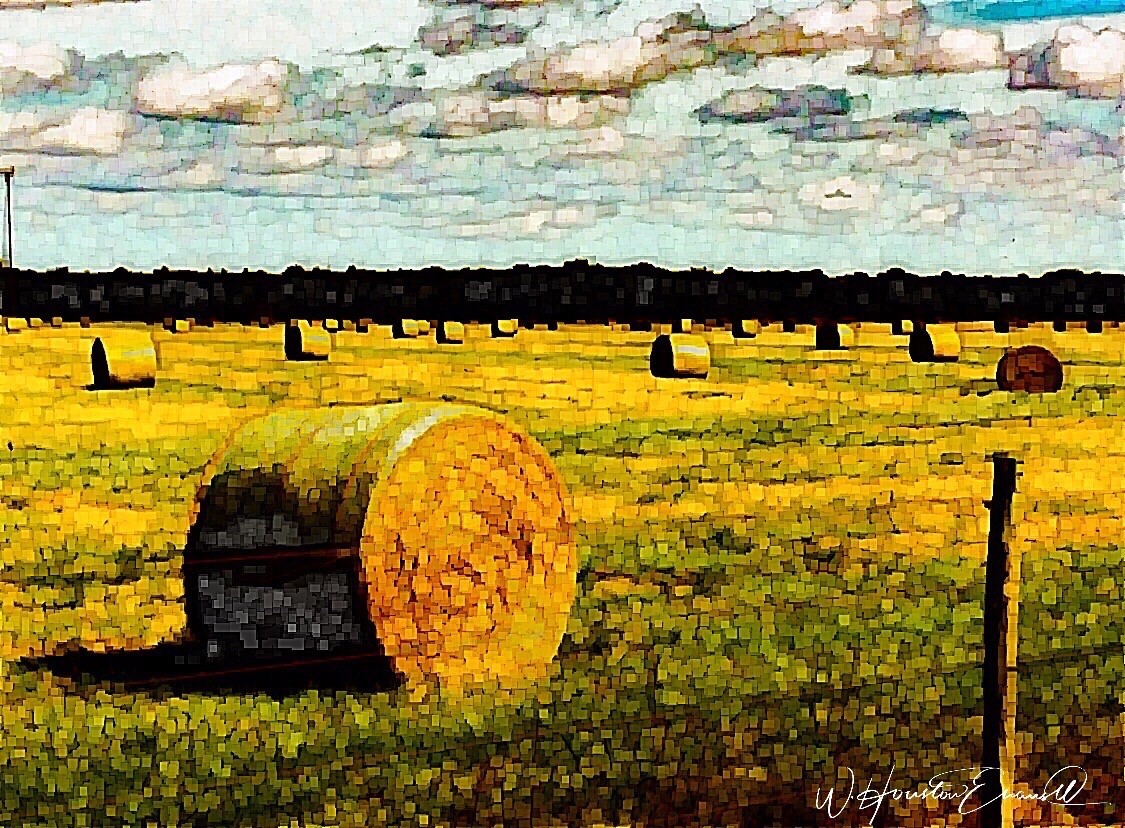
“Makin’ Hay” has an enhanced pointillist treatment – a Van Gogh-esque subject with a twist.
From my interior designer’s perspective, his bold images would be key focal points in the drama of architectural spaces – interiors from Miami to Honolulu and on around the world!!! I can see the towering orchids in hotel lobbies, bars, restaurants and swanky condos everywhere!!! I am eager to find a project, for which his work would be the key to the scheme, unveiling a spontaneous design resulting from the inspiration of the image.
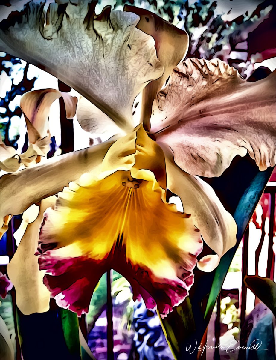
“Oblique Orchid” screams floral superiority as a commanding focal image. “Shooting the Bird” speaks to paradise revisited!!!
In the beginning, the photos stood on their own merits. Evans keeps his originals – some of which remain just that – in their original form, while others are tweaked or more radically manipulated to create stunning subjects and compositions.
This brilliant, fresh simplicity of “Aqua Eye” observes the droplet’s reflection in the center of the cheery chartreuse petal. Coming upon a cool caddie “Daddy Long Legs.”
I can see his limitless fantasies contributing to the imaginative narrative of Meow Wolf, gracing hotel lobbies with larger-than-life orchid explosions and commanding condo walls with magical statements of tropical color, subject and form. Translucent installations of LED illumination could result in magnificent walls of design influence.
“No Flies on Me” is a fantasy of oozing colors and form melting and melding around the psychedelic dragon fly.
The digital age is advancing with such a pace that we are
all caught-up in photos of food, whacky selfies and sunsets on fire…but
having an artist’s eye, to truly see the potential and master the tools that
are now available – using them to create valid and valued masterpieces of art,
is extraordinary.
“Copy Cat” reflections mirror a chorus of color from sky to watery impressionistic likeness.This “Roadside Attraction” must have been a startling scene to distract dazzled drivers.
I truly believe that his work is exceptional – full of heart and soul – and spectacular fun!!!!!!!! I’m thrilled to learn of these images and now enjoy the continued progress of his discoveries and creations. Let’s see where this goes!!!!! He just might be coming out of hiding!!
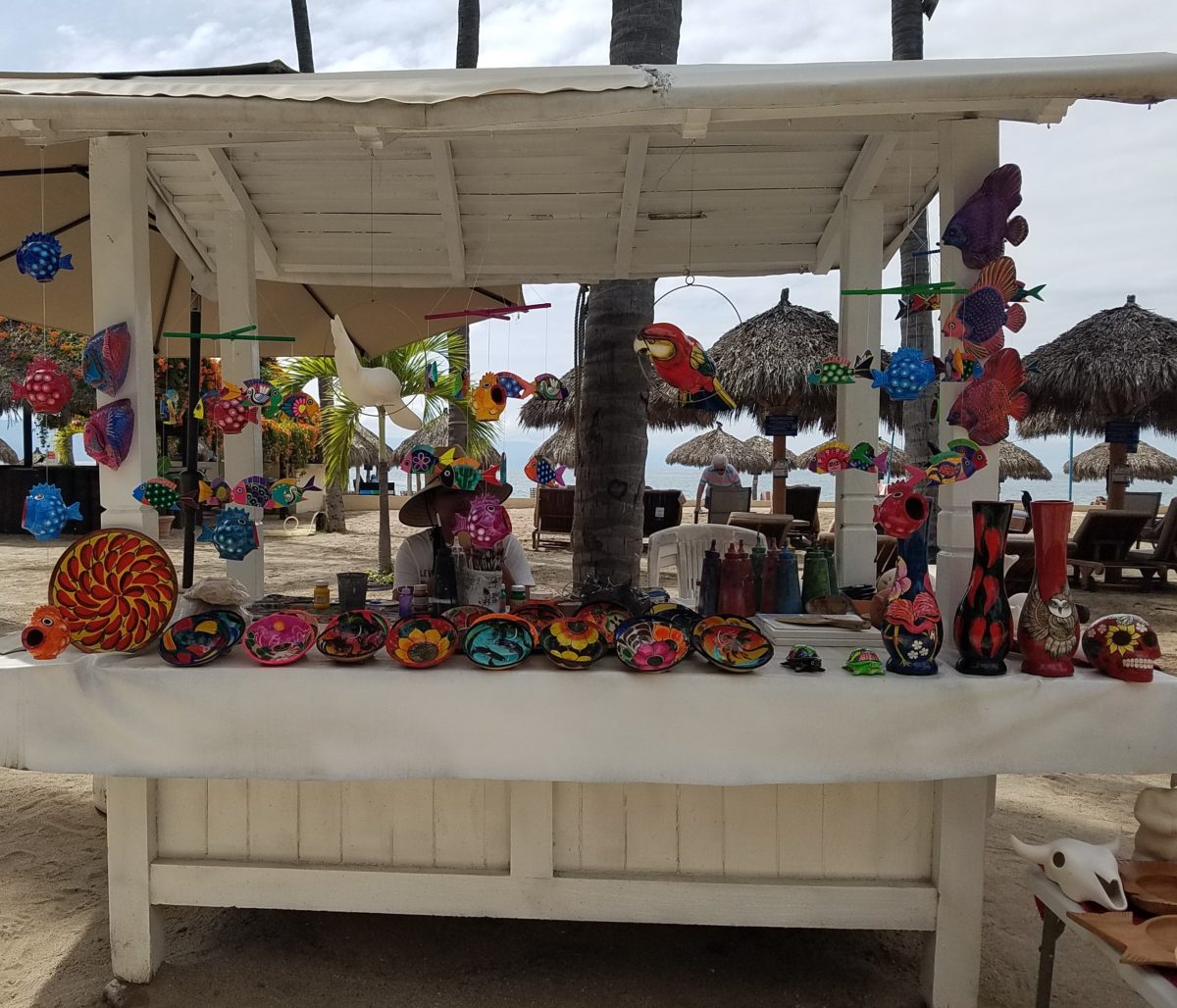
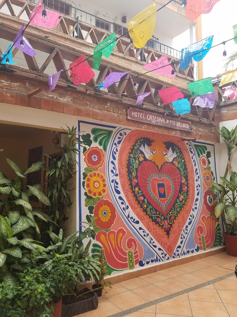
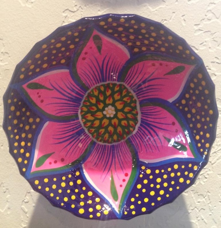
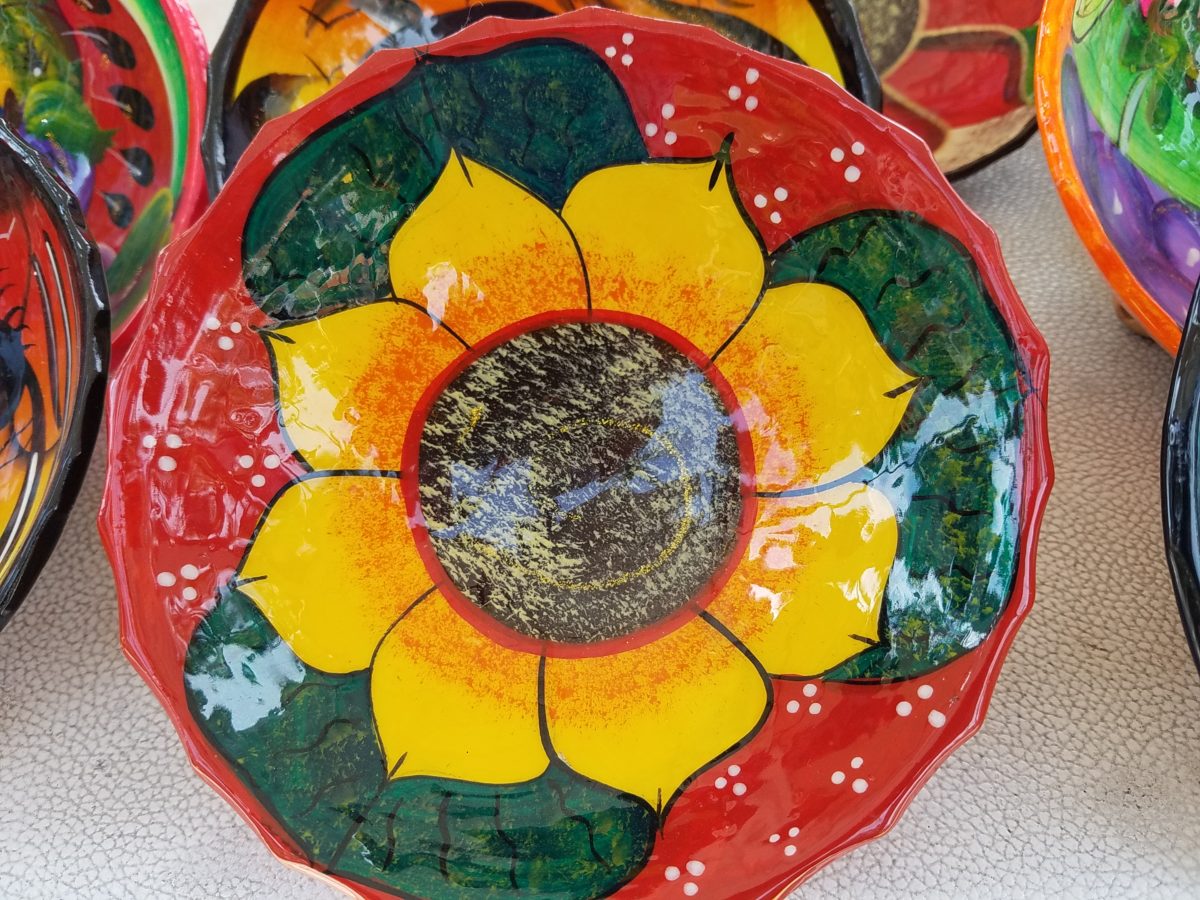
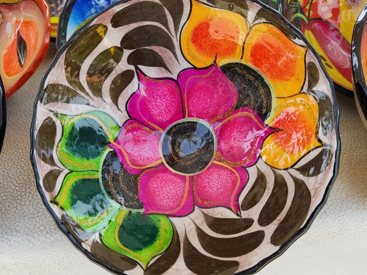
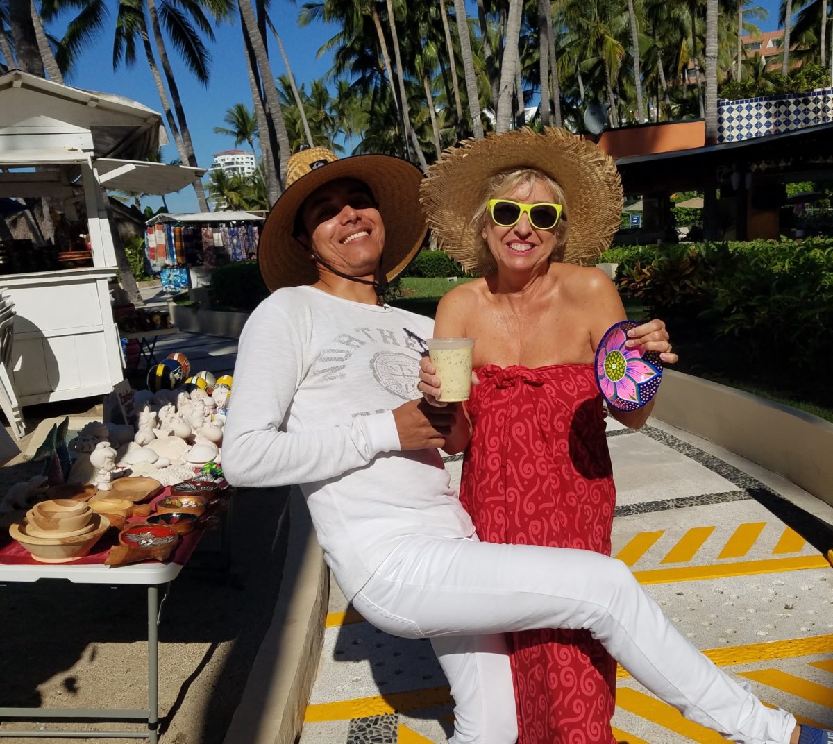
Hidden genius can be found amidst seemingly redundant arts and crafts. Walking by you might not notice. Passing by many beach stands, they begin to look alike – very repetitive. The colorful wares and handcraft are striking and eye-catching and full of fiesta, yet if you pay attention you will notice the nuances. Discovering the true designer/artist.
An escape to the tropics and especially to another country offer a reprieve from the cold and add an exotic element to getting out-of-town. Discovering the many indigenous art forms that come from all over Mexico is fun and exciting. Getting to know the makers and the distinctions in their work is another exciting level of appreciation.
As is true with so many things, detail and design matter. I buy a smattering of things for my gallery/gift boutique. I like to support the local vendors and makers that produce these fantasy-filled folk-art pieces. From fabrics to stuffed animals, painted pottery to murals and mosaics, the art is abundant and deserves to be examined.
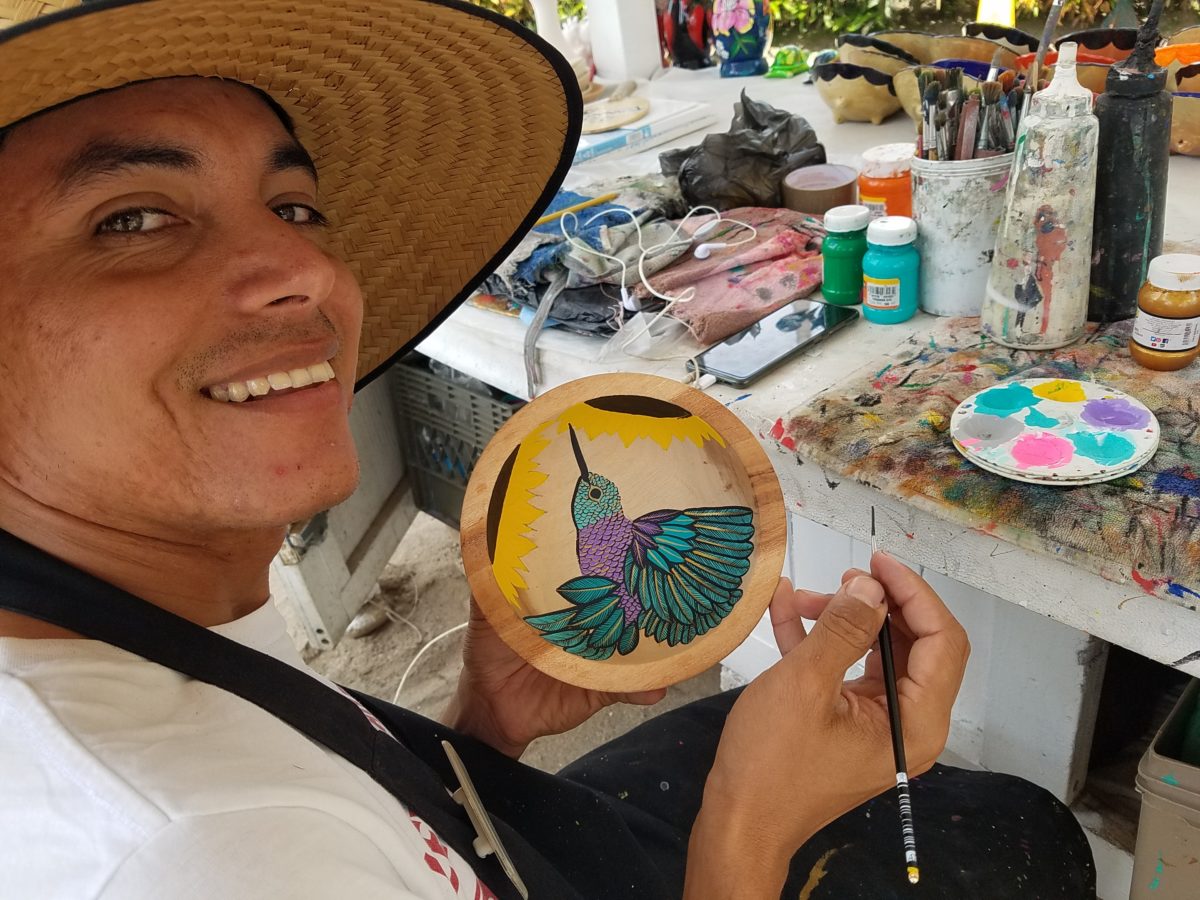
As an example, I am focusing on Victor Rivera. Victor is an artist and more so, an incredibly gifted designer. His sense of pattern and imagery is exquisite. It reminds me of my mother’s love of Marimekko and Lily Pulitzer in the 60s and 70s. Her appreciation was a tremendous influence on me. The joy of color and pattern was a exhilarating celebration to wear and accessorize your home. Victor seems to possess a like-kind of innate sensibility and talent for devising and executing sensational color, pattern, motif and resulting design. He is currently creating, from a modest beach stand, what I believe is clearly different from others doing what might be thought to be similar work.
Like Maija Isola – a peer of my mother’s, having been born in the 20s her designs transcend the many decades in which she influenced color, pattern and bold imagery. Her work continues to live and influence the evolution of Scandinavian artistic direction and its impact on the world of design. https://www.marimekko.com/com_en/world-of marimekko/design/designers/maija-isola
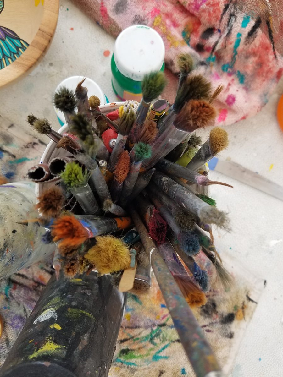
Watching Victor select his brushes, for the various applications and control on his designs, is fascinating and amazing.
The sense of pattern and design is a different category of artistic talent, in my observation and estimation. A master, of pattern, form, design detail and art, is an artist. However, the focus on the repetition and integral connection of patterns – for this purpose in a one-dimensional application – is an intensely different pocket of an artistic brain.
And this brings me back to Victor. I want someone in a position to embrace and promote him, in the world of fabric design and influence, to catapult him to the level to which he can and should aspire. Shout-out to Alegreea and the fabulous designers at Pineda Colavin!!!!!!!
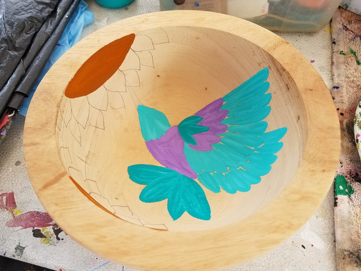
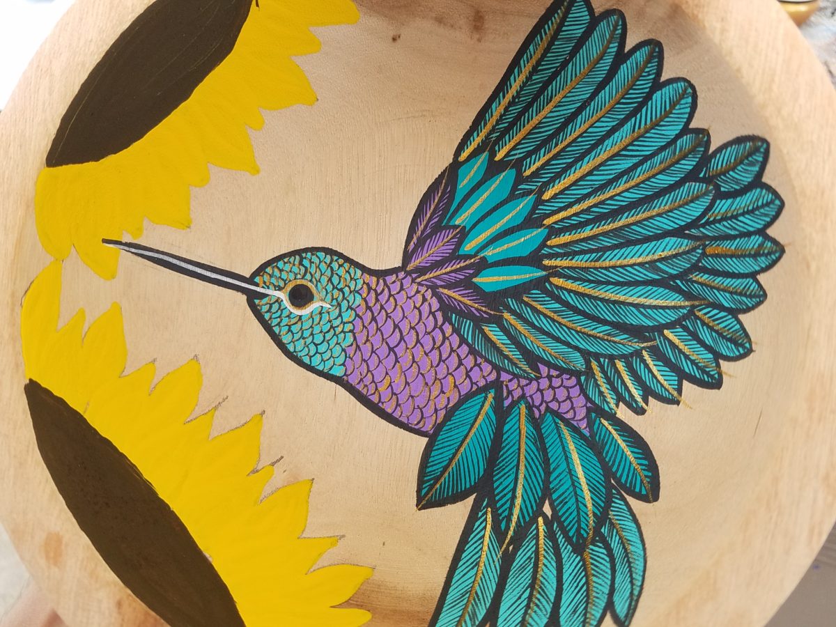
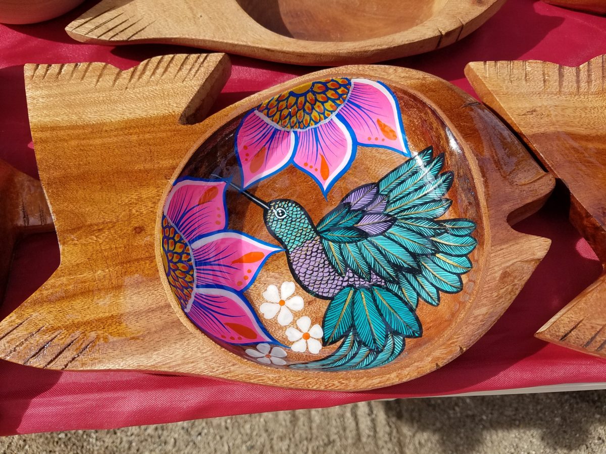
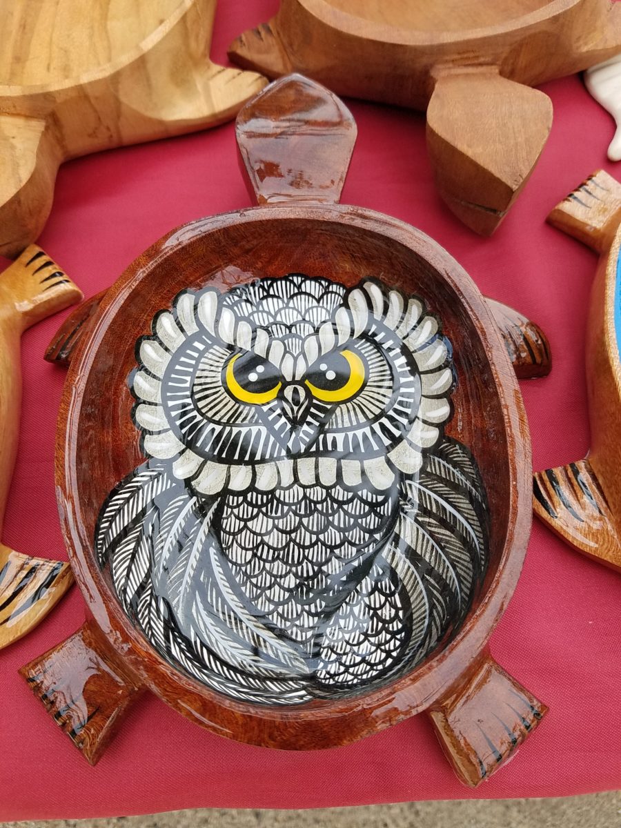
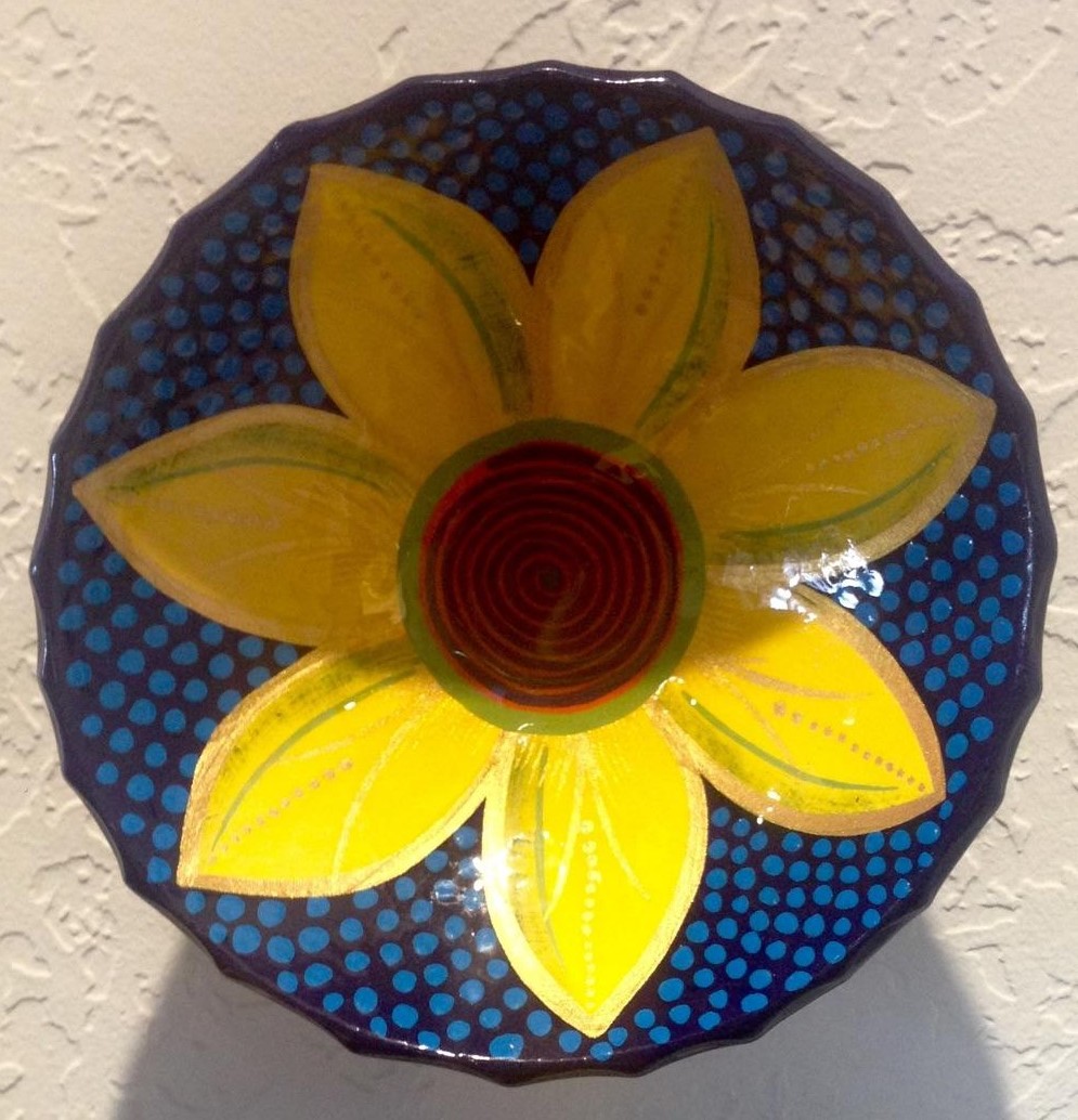
His hummingbirds begin with a pencil drawing and basic “fill” colors at the start. Working on both clay and wood prefabricated bowls by other artisans, his many layers of colors and details take shape.
With myriad, mostly monotonous, Mexican street/beach artists, Victor is a beacon of light that stands out among the throngs. Once you stop to notice – the work he is creating is astonishingly unique and beautiful. His designs are laced with meticulous detail, outstanding color combinations captivating and beautiful.
He will paint expeditiously simple works to satisfy the tourists and keep an inventory at the ready for spontaneous purchase – but when he has quiet time and is caught-up on his table of offerings, he creates amazing pieces that are truly remarkable. It is important to note though, that his more expeditious pieces still have a color combination with strokes of accents that still are above and well beyond the common.
He will paint commissions all day long – but left to his own devices, his creativity is boundless. And, referencing back to the Scandinavian designers, his floral designs are outstanding!
Taking time to examine the world around you and the beauty of detail that awaits, is a joyful experience of great discovery and satisfaction! Not to mention great fun!!!
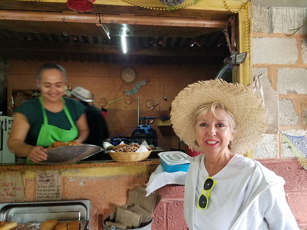
After experiencing and pondering the value of incorporating nature’s elements into architectural planning in the previous blog, I find myself winding into the countryside from sea level to a mile high into jungles and ultimately pine forests, across vast expanses of rivers and towering bridges spanning grand abysses…and stopping at a modest panaderia (bakery) on the side of the road.
You can’t tell a book by its cover as this simple little rural structure – standing alone – looked curiously intriguing and quaint enough, with an unpaved parking area transitioning to well-tended pea-gravel. Traffic cruised by, on the way across the bridge.
Those that knew, turned in. We pulled off the road and were told that this couple had a wonderful bakery and were promised an exceptional treat! Fresh empanadas that would bring remarkably satisfying mid-morning joy.
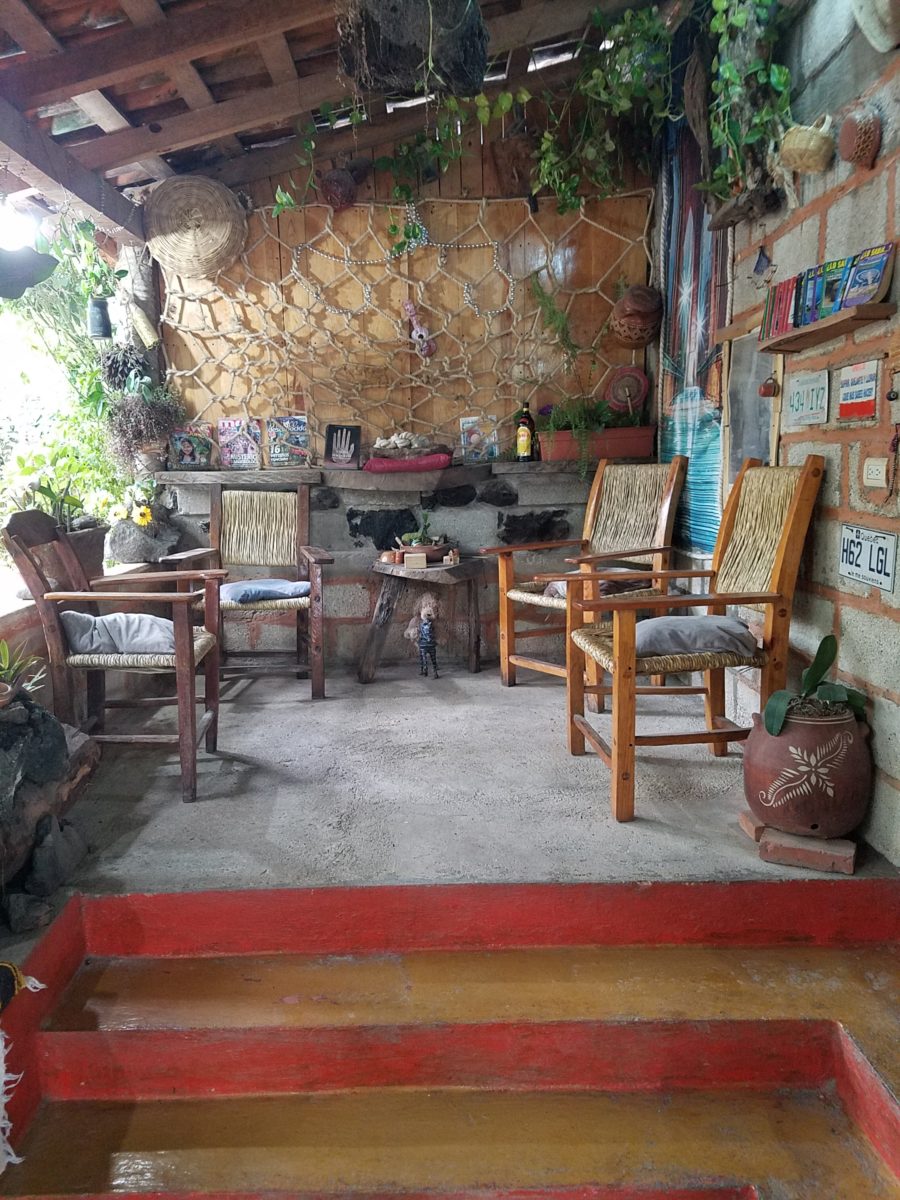
Very tidy and thoughtfully eclectic, this little destination bakery is a precious find.
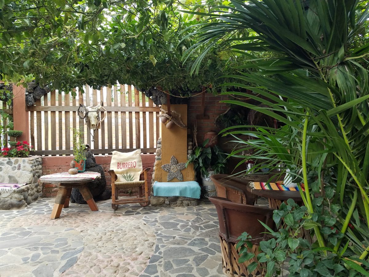
Oh, were we in for a surprise! At the entry, I stopped to shoot the whimsical cup of coffee mosaic set in a field of stone and concrete. I thought – what a fun design element to greet arrivals and set the stage. But I had no idea to what extent I was about to be elated. What unfolded so exceeded my expectations that I wanted to stay all day!!!
Happy stone and tile-work adorned the pathways. From the textures of stone and brick, tile and wood – it was an organic fantasy – an unexpected design experience.
Simple, yet spectacular – simply spectacular!!!!!
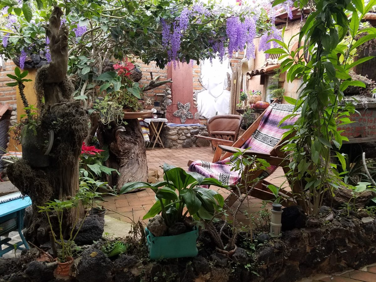
Ceilings of colorful floral blooms – perhaps wisteria – suspended from their vines and other plantings intertwined with the structure.
Spotless and meticulous the eclectic elements were a harmonious creation.Stone walls, wooden slats, vines and adobe all worked together to define the spaces.
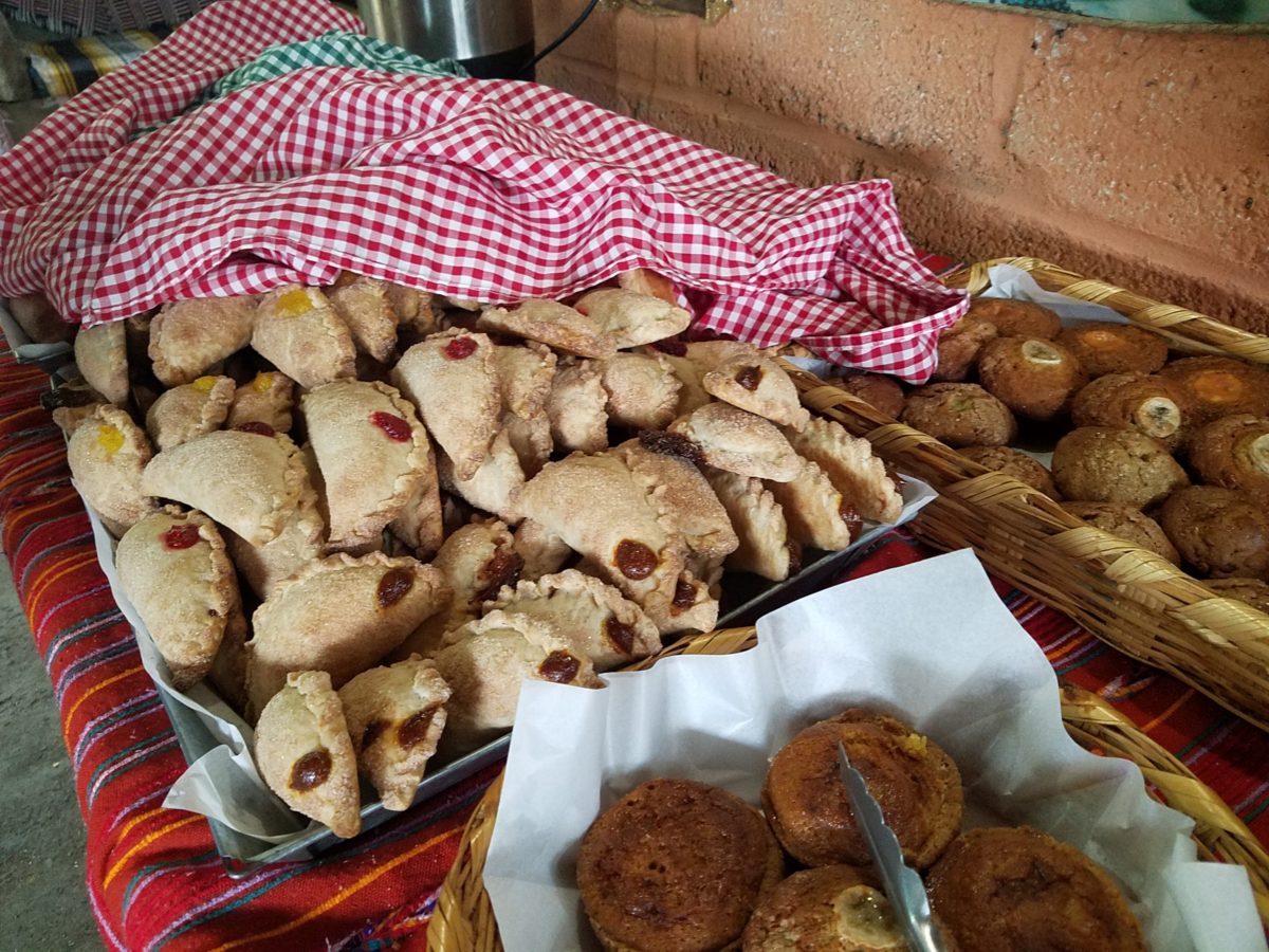
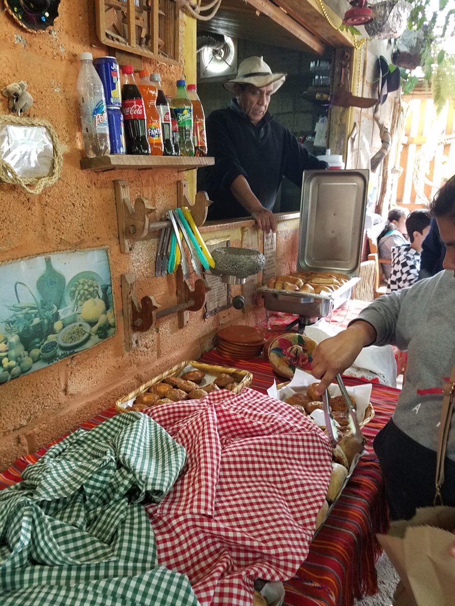
The wafting aroma of fresh baked goods – it was more than delightful. From warm savory clouds with mushroom filling and another with chile-laced sausages – and an array of sweet strawberry, cream and pineapple empanadas to corn muffins, banana muffins and more! All nestled beneath colorfully woven cotton tablecloths.
Light and delicious – the best empanadas ever!! With a tiny sprinkles of granulated sugar, for a sweet crunch, before sinking into the fabulous fillings! Muffins challenged any others and savory treats were so satisfyingly delectable. Little buttons of banana slices on top denoted which were the banana muffins!!
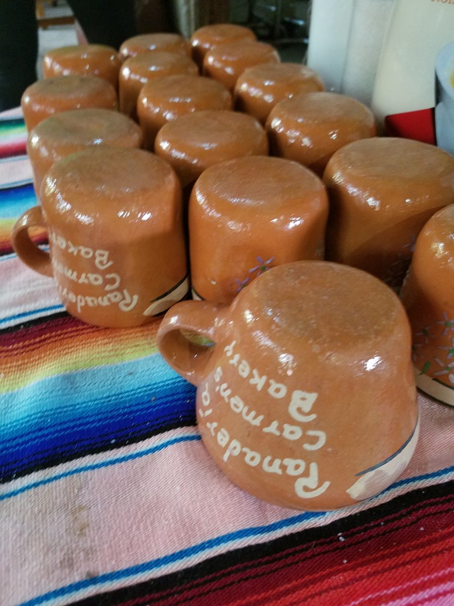
Rich Mexican coffee with a touch of freshly ground cinnamon and luscious hot chocolate were served in custom-glazed “barro ware” complimenting the fresh-from-the-oven confections.
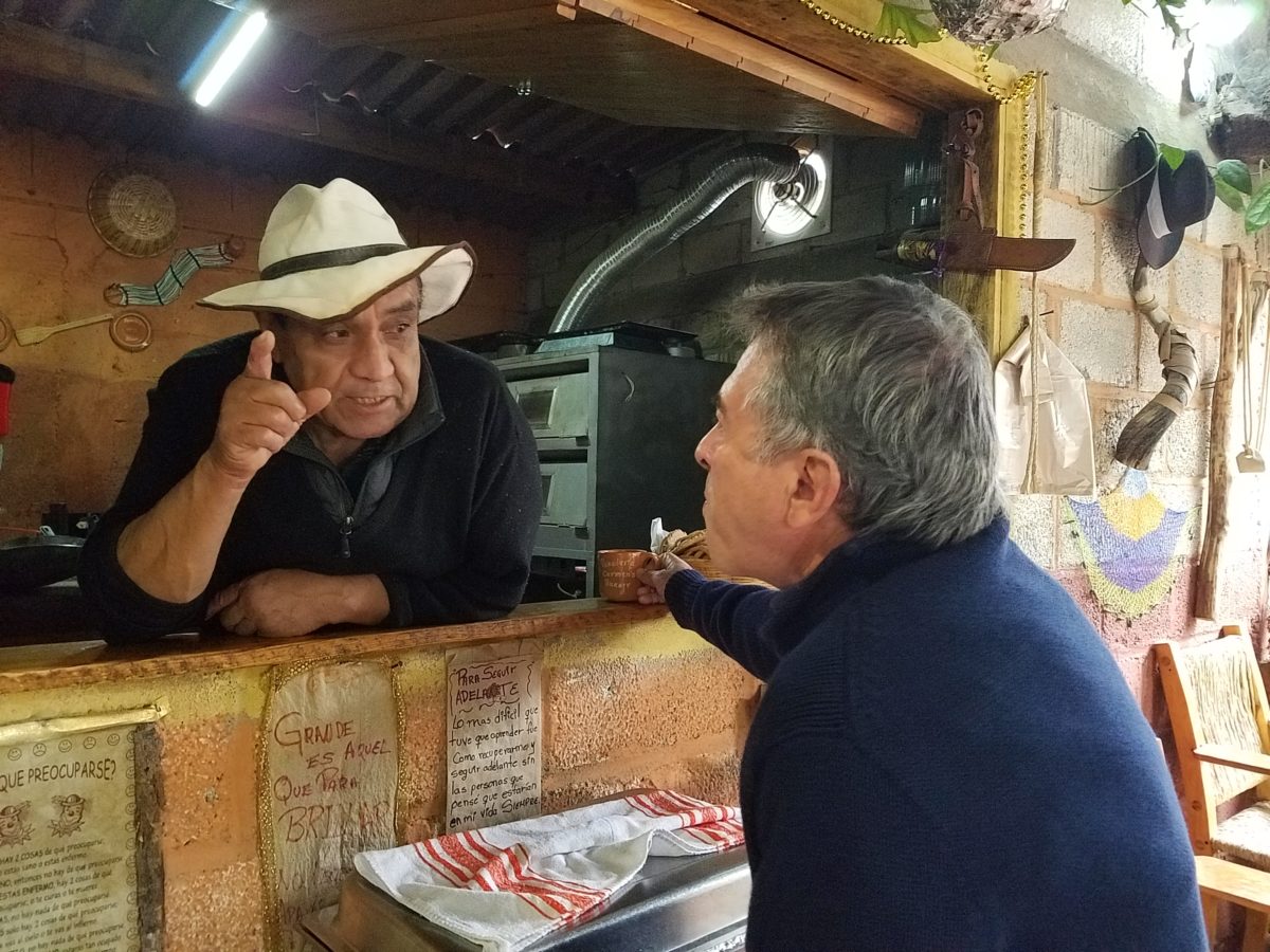
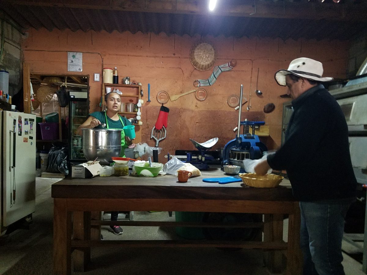
The exhibition baking kitchen overlooked the serving line. The buffet of pastries thoughtfully explained by our gracious and welcoming host, Jesus!
Carmen presents fresh strawberry tarts just from the oven!!! A combination of old and new – tradition and technology meet in this cozy kitchen.
Fragmented spaces open, yet enclosed, offered intimate pockets in which to pause and enjoy.
Color-pops insert themselves effectively around the interior and exterior spaces.Inviting seating areas semi-concealed offer private repose. Tucked away – more areas to enjoy…
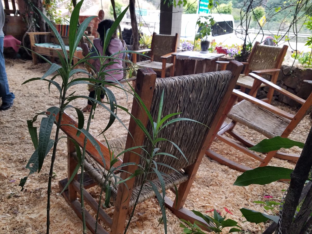
Clever use of clean blond wood shavings on the floor of the main covered patio created a wall-to-wall carpet of fresh aromatics complimenting the inviting aromas emitted from the ovens. Rocking chairs and rigid sturdy versions, with a fun little rope swing, all surrounded by tropical plantings made a cozy area to gather.
Soft underfoot and subtly fragrant – the wood chips make a great shag carpet!!!
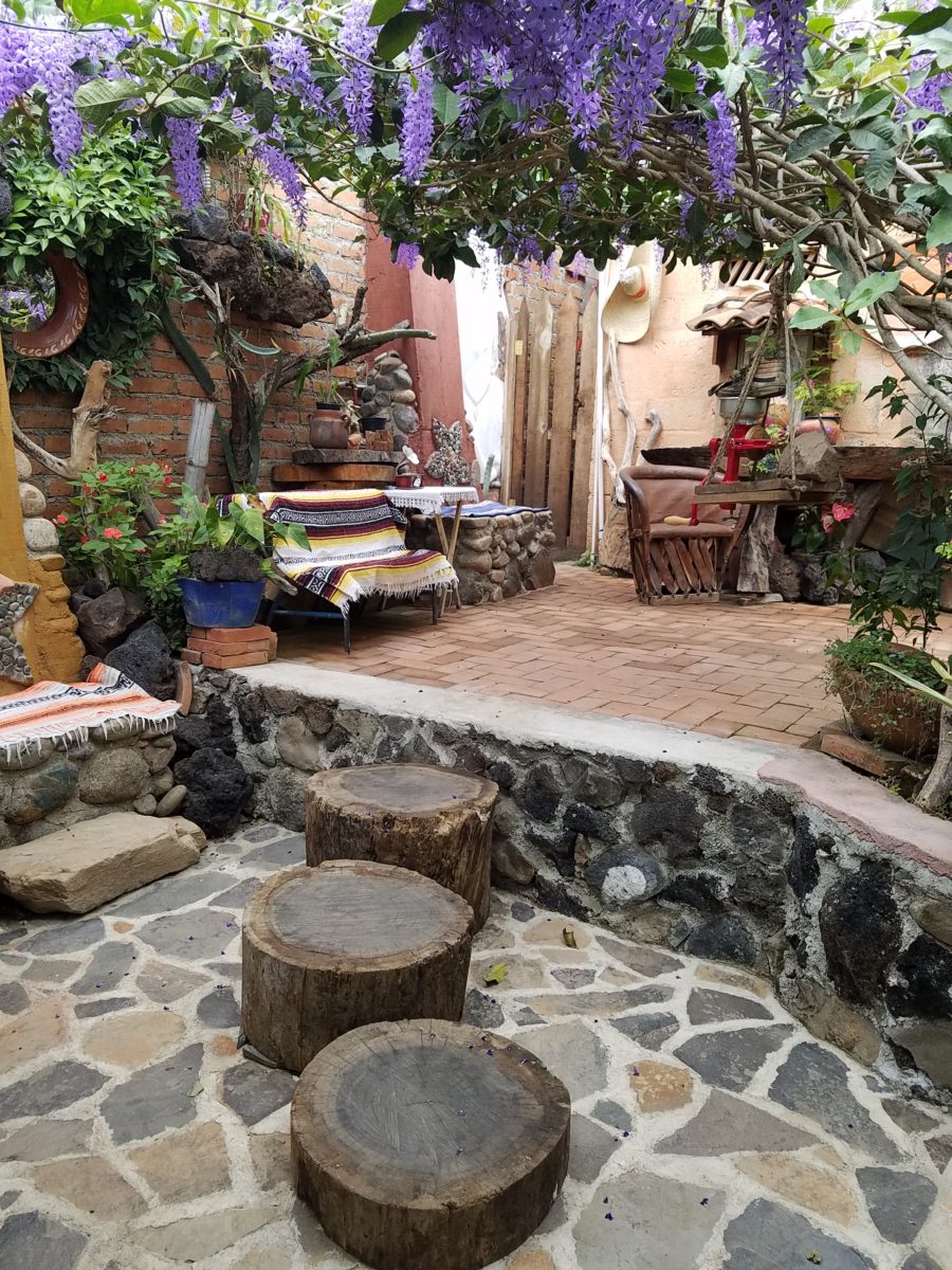
As I meandered around exploring all the interesting spaces, textures, colors and plantings, I marveled at the sensitivity with which this had all been crafted and assembled. It was artful interior design with an exterior feel – open air and charming, with a decidedly handcrafted, Mexican sense of place.
Slices of handsome tree trunks make perfect stepping “stones” with graduated heights.
It was an eclectic collage of furniture, structure and organics – living and static – that was welcoming and artful, delightful and so pleasing, that it was a treat for all the senses.
The cool morning air of the mountains mingled, with the comforting fragrances, creating an atmosphere inviting gentle conversations of people gathered around good food and artfully relaxed surroundings.
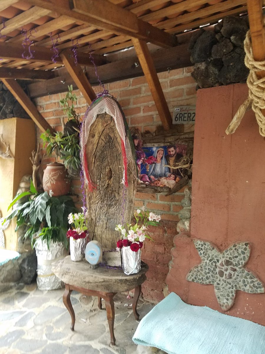
Peek in places and through doorways to find worlds of design
waiting to be discovered!!!
Neighborhood covenants, zoning, physical practicality, budgetary constraints…all enter into whether it is realistic or desirable to save vegetation when clearing land for development. Carving around existing growth can be a tedious and costly addition to a project. But there are times when it is a design asset – an imperative even – to the over-all setting and effect of the scene.
Saving trees when designing a built environment is a challenge
that often pays off.
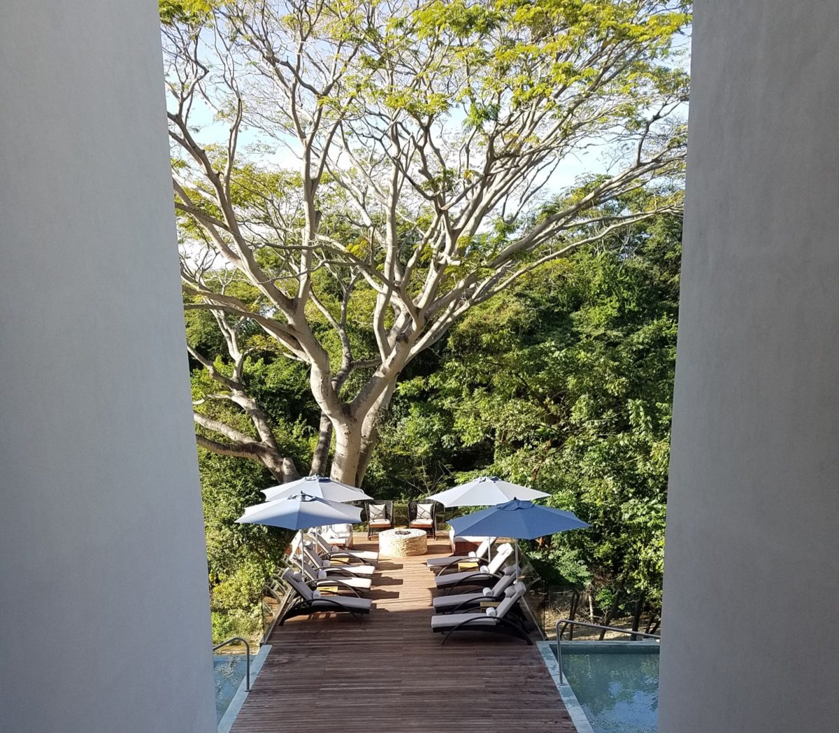
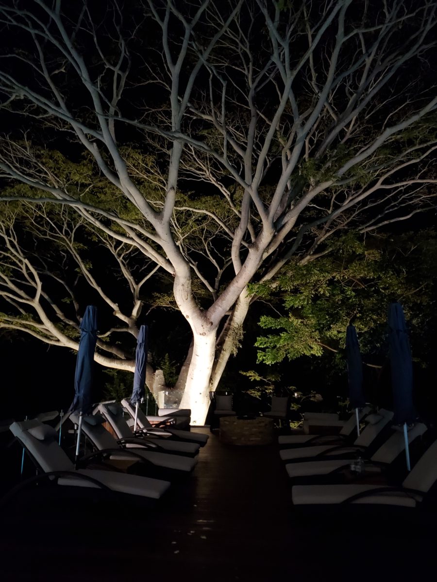
A spectacular backdrop to this seating area – the decades old tree is the focal point.At night – well lit – the same tree towers with dramatic illumination in the darkness as the rear “wall” of this seating area.
Raping acres of woods for barren subdivisions and adding back newly planted saplings the caliper of a quarter is unfortunate and takes years to satisfy. FHA requirements were the tell-tale token of bringing green back after a bulldozer’s brutal removal of all plant-life on a property. That lanky stick standing in the center of a dirt patch, that might get sod or seed…or rock, was a pitiful attempt to give back to the environment. However, in addition to broad-sweeping examples, individual decisions to saver rather than remove can prove valuable.
Years ago, when planning a patio expansion and exterior kitchen, friends brought the plans to me for a quick check before committing to the design from the design/build contractors that they had engaged. The new patio plan meandered along nearly the entire back facade of the house. With all the exciting kitchen layout and bar, seating areas and dining space, I instantly focused on the fact that their beautiful red-bud tree was gone – not in evidence on the pans! I exclaimed about it and was told that they were told it had to go. That was about 10 years ago – or more, yet it still stands today having modified the design to include a tree-well in the patio and opening in the proposed high-ceiling patio cover. The stunning multi-truck tree thrives, in the ground as it had for decades, and climbs skyward through the opening spreading widely toward the second story of the home. A wonderful, living, sculptural element, in the space. Good save!
Warmer climates invite the indoor/outdoor melding of living spaces. We all try to achieve them despite bitter cold transitions and near, if not complete shut-downs “off-season.” But in the tropics, outdoor living spaces become remarkable dimensions to expand living.
Sculptural trees are powerful elements viewed from inside and outside.
This past week, that situation came to mind as I enjoyed several examples of incorporating nature into the design scheme. Yes, landscape design is just that. Landscape architects do just that. They design exterior spaces with organic material. But what I was feeling recently was two complimentary things – one that designing in and around existing growth is so satisfying and in some cases, the living plant material becomes the architecture – not merely compliments it.
In addition to their sculptural beauty, they add balance, scale and a canopy over the exterior rooms.
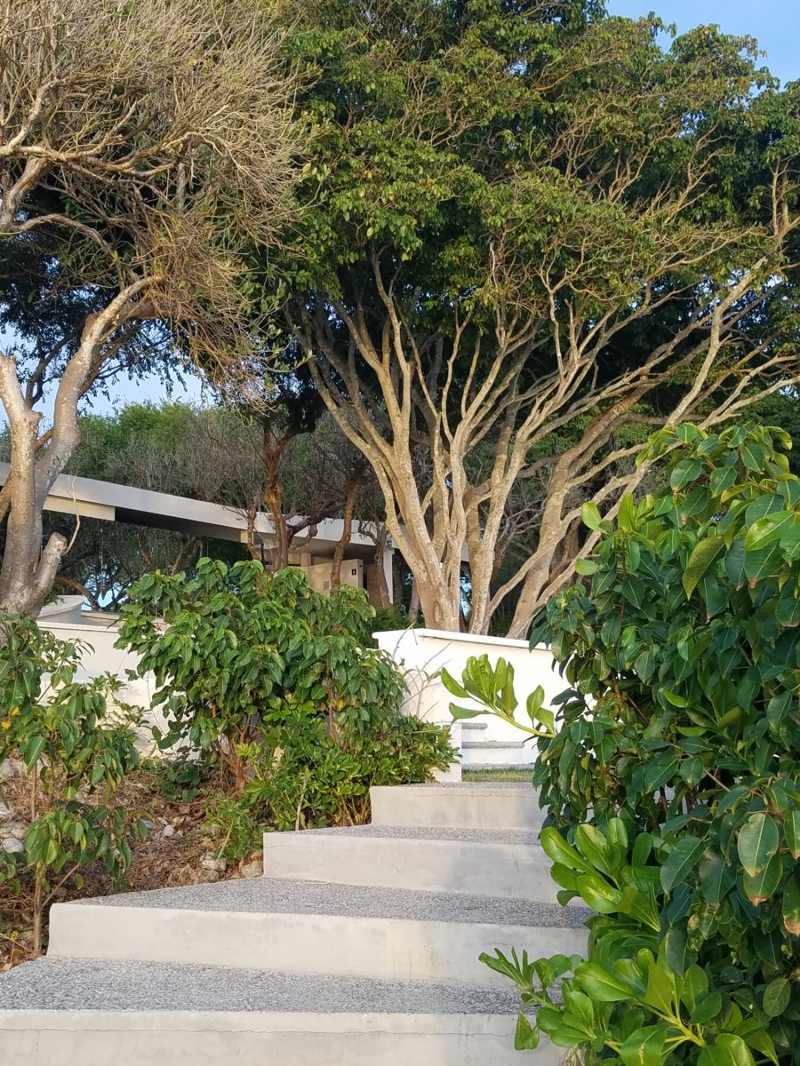
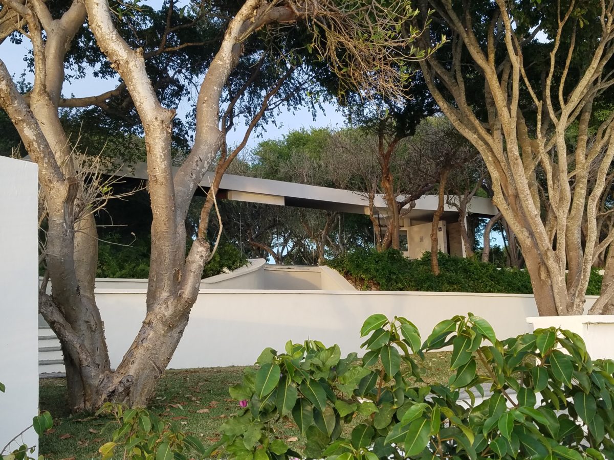
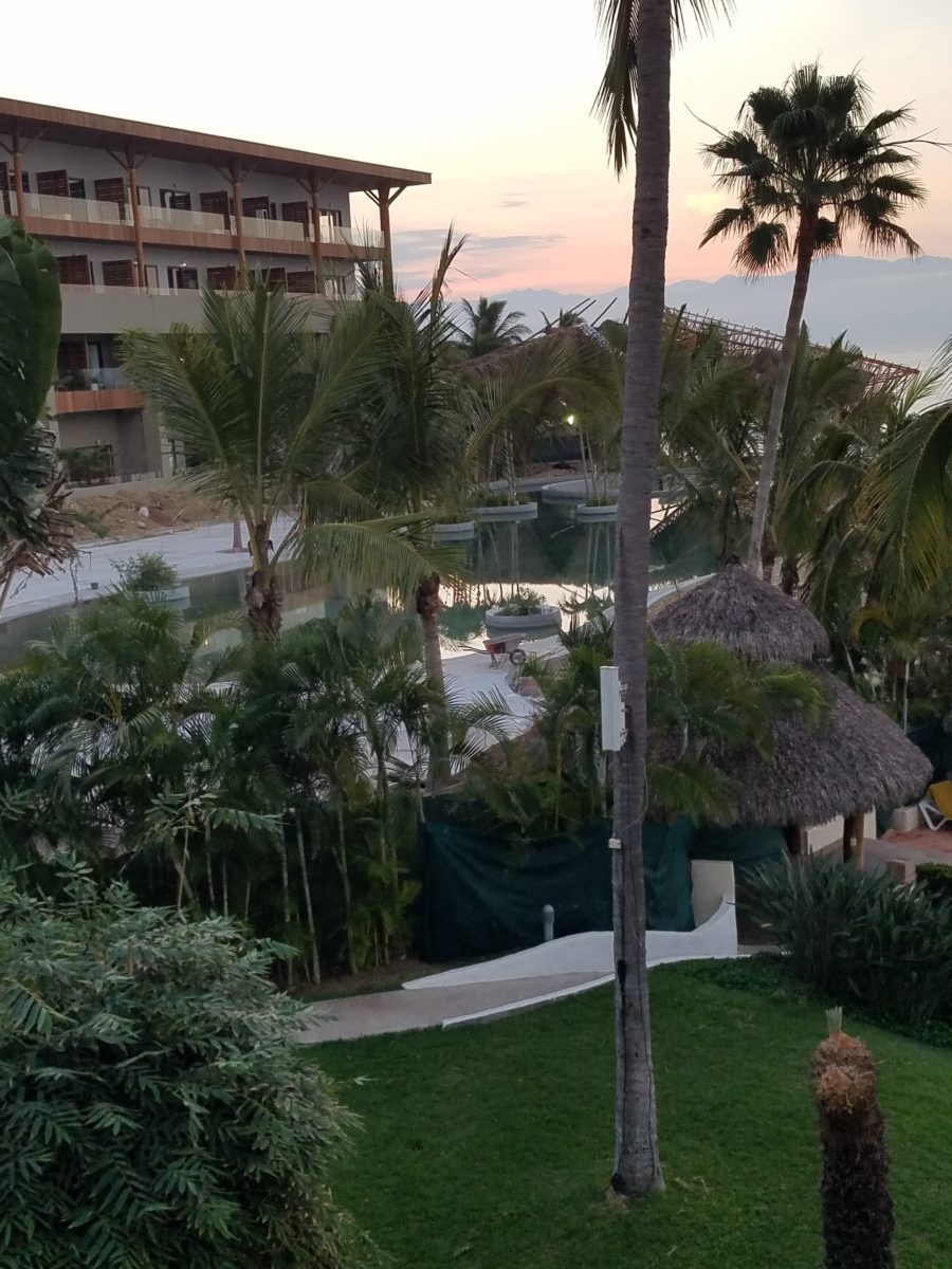
This past couple of weeks, we have see the results of 2 years of preparation and construction which transformed of a piece of partially vacant land into a seaside resort. Several key palms and a couple other key trees were saved and hundreds more were brought to the site to complete the design. The towering new trees showed signs of shock with their dried frond tips – but will surely survive.
What has been a foreground of some landscaping and virgin jungle ,with houses beyond, was bladed and terraced last year in preparation for a new project. Buildings and pools appeared, jungle growth was removed and a few key organic elements retained. The recently finished scene is dramatically different – incorporating specimen trees throughout the property into the new plan.
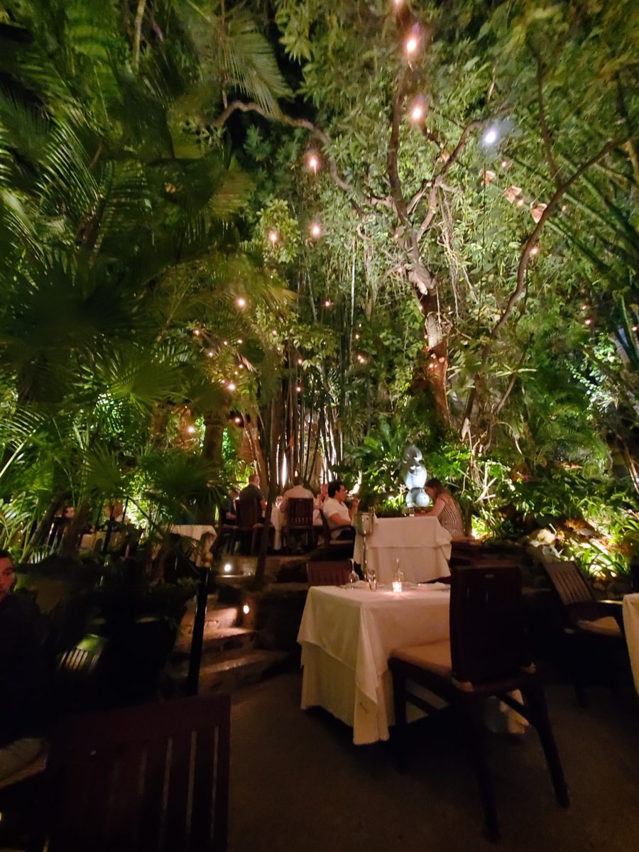
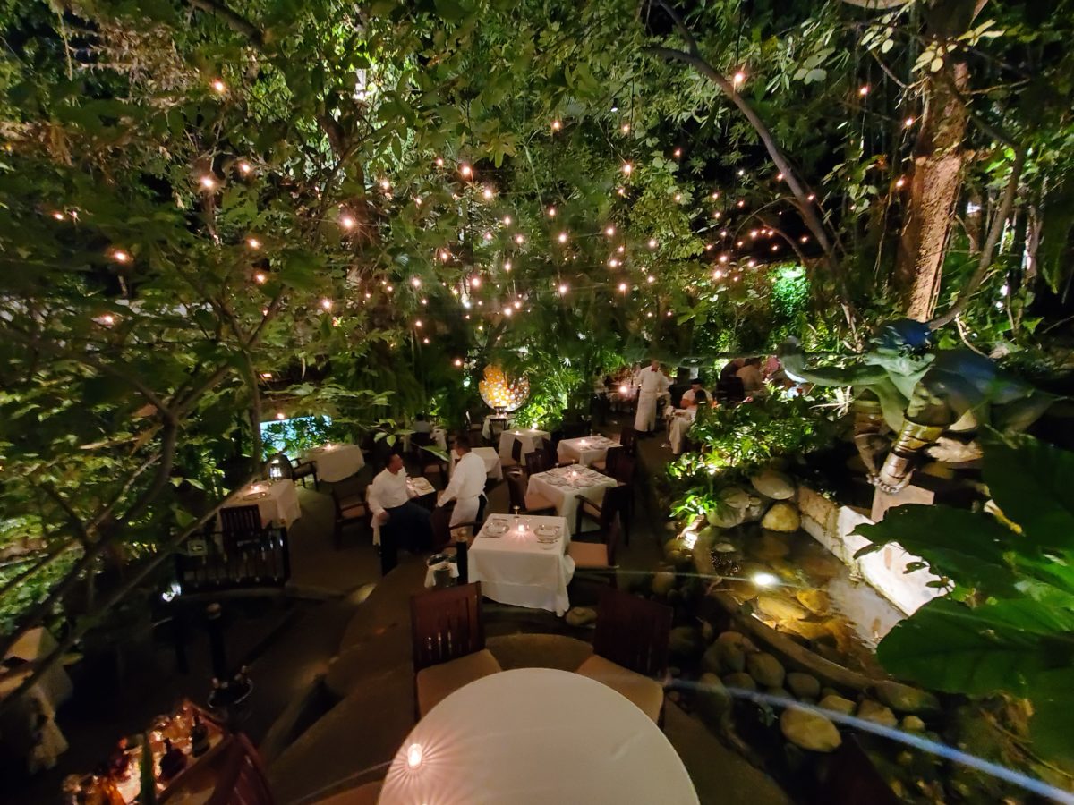
When landscaping becomes architecture you know you have crossed an exciting line. What I mean by that is to have the growth become walls – to have the vegetation read as though structural framework.
This terraced dining patio is framed by massive bamboo and other large trees and plantings. They are substantial enough to read like screens, if not walls, framing the space. From a canopy of growth, strings of LED lights are suspended as though from the ceiling – a ceiling of branches over this enchanting outside dining venue.
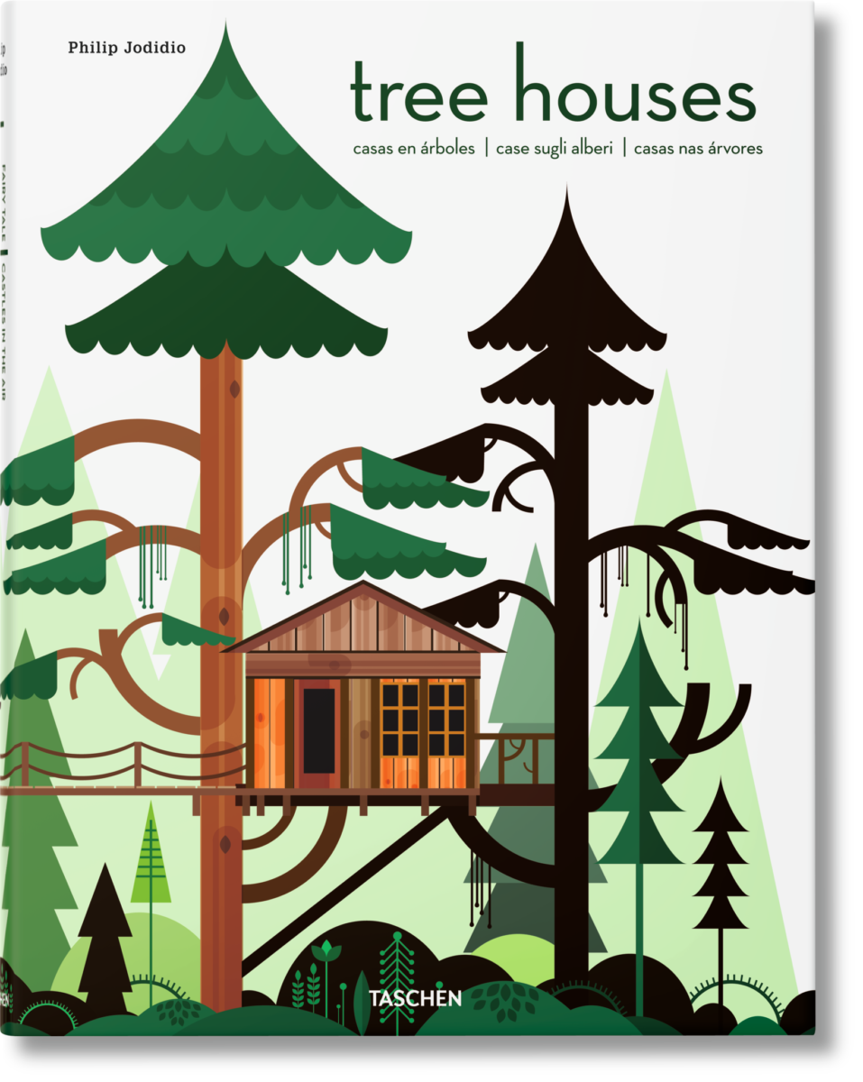
A tree house is another example. The tree is the structure – the framework to begin the additional elements that create a suspended room.
This entertaining and imagination-spurring book by Philip Jodidio is worth investigation. Here. find extraordinary examples of trees as the structure of other amazingly fanciful spaces!
By observing examples in your world, you will see, when designing around and in concert with the natural landscaping, the effects can be dramatic and of great value to the scene. On your next project, consider the possibilities of saving rather than removing – incorporating and celebrating nature’s design elements!
Wherever you may be…it’s the time of year when traditions are so much a part of everyone’s holiday experiences. And with that opening sentence – no doubt some of yours come to mind.
Traditions, of course, are not limited to holidays – but for
purposes of this season, it is the primary focus of this missive. Interestingly,
over the past few weeks, I have had a few people ask me about home decor and specifically
starting or perpetuating holiday traditions. I found it so compelling because
traditions are created from repeat practices and experiences.
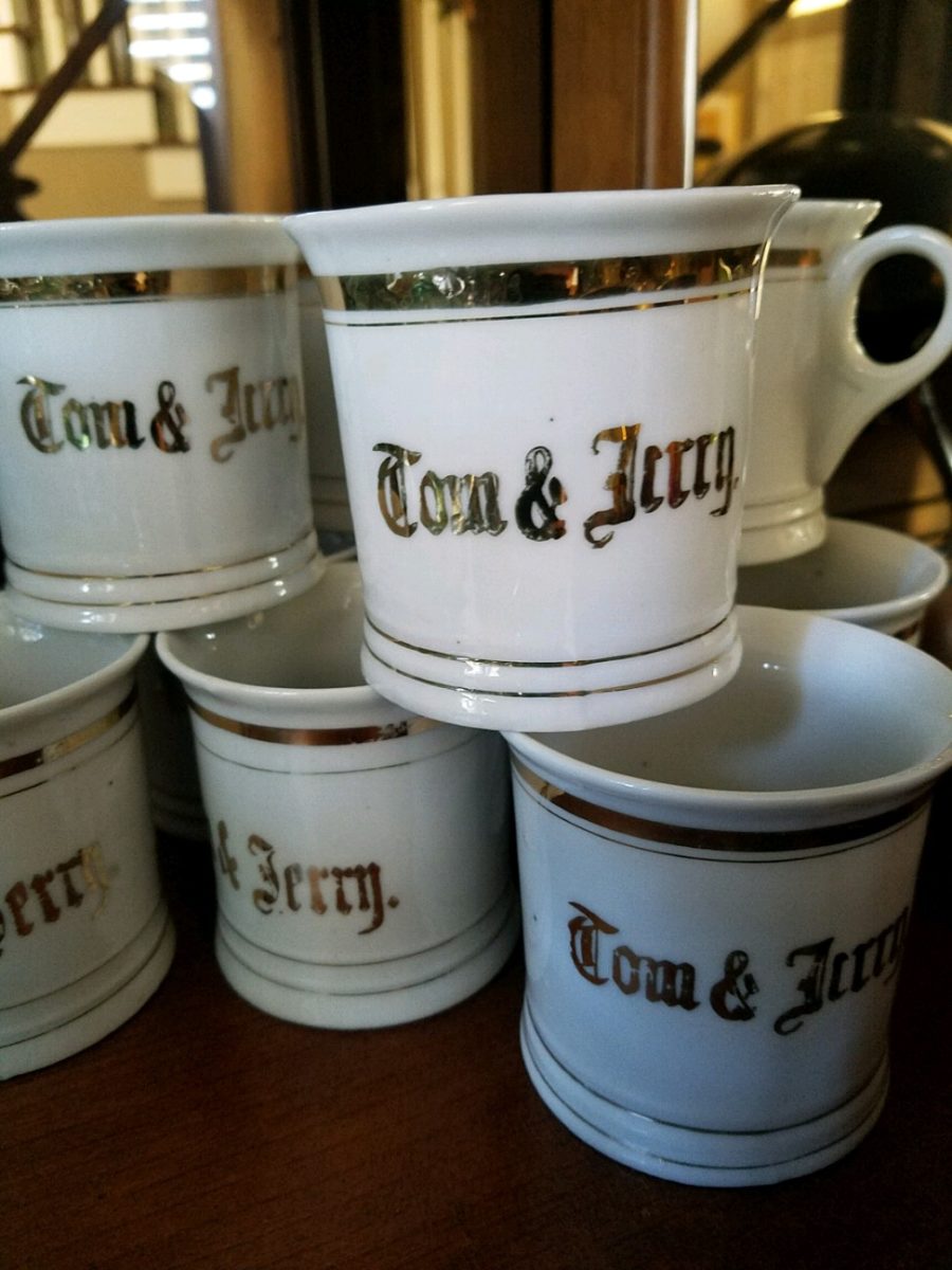
Fond memories of family friends and their annual tradition of making warm and frothy Tom and Jerrys! I found these vintage china mugs just like the ones from my memories. Have have recently seen them re-created – new – just like these! Perhaps its time to start our own tradition of Tom and Jerrys for the holidays!
You can begin to practice things that become traditions – that’s the key. Of the recent conversations, one person approached me about a week before Thanksgiving. He was single, hosting a few friends and didn’t know where to begin. Could I help? The other inquiry was from a couple of years ago as a young woman who was not from New Mexico found herself here, newly married and in a new home. How was she to create the feeling of Christmas? The answers to both of these queries are at the end …
As is true with all consultation whether it is interior design, medical, self-help, physical fitness, IT…it all begins with questions. The consultant must ask questions to establish information that will guide them to make their recommendations. Here are 4 Tips for Approaching Traditions that will begin the conversation.
Perpetuating a Tradition: Memories are personal references that are the basis for traditions. The repeat performance of these various acts establish traditions. Continuing to practice the traditions insures that they repeat as each like-kind of event unfolds. It takes effort to continue to re-create traditions, but to lose the pattern can become irretrievable. It can be an onus or a joy to perpetuate traditions. I would prefer to embrace the latter! Ideally, any tradition that you chose to perpetuate should be a joy.
This vintage set was given to me by a dear friend. It held precious memories from her grandmother having served hot cocoa from it every Christmas. My friend’s experiences dated back to the 1920s. The set preceded her memory…as her grandmother, born in the last quarter of the 1800s owned it for years prior. We enjoy hot cocoa from it nearly every Christmas morning!
Creating New Traditions: Establishing the approach that perpetuating a tradition should be a joy or the act of something that brings joy, the same is true with creating a tradition. Seems obvious that you wouldn’t want to create a traditional around something that does not bring you joy. But you might be surprised. I have recently learned that sometimes people think that they begin something that is a common practice to create a version for themselves, when in fact it is a perceived obligation rather than a joy. Don’t force it- don’t feel obliged to begin a practice just because others do it. Experience, invent or witness something that brings you joy and replicate it. You might recall it from your past, find it in a scene from a movie or experience at someone else’s home, derive it from participating in an activity or, of course, discovering internet ideas that abound. If something interests you to the extent that you want to practice it – then do it!If you enjoy it enough, you will perpetuate it and it will become a tradition.
This little Santa Doll was handmade by a friend of mine when her kids – now grown with kids of their own – were kids. Not originally intended to be a “Crazy Santa,” his accidental facial expression resulted in his name – held now for over three decades. He comes out every Christmas as an amusing family tradition.
Modifying Traditions: We all need to determine how much we want to take on, how much we want to invest (in time or money) and how we achieve the same or similar results to create the joy. If traditions become too complicated or difficult, it might be time to re-think them. Rather than discard them, modify them. The time to discard a tradition is when it no longer brings you joy. But before that might happen and if the event/activity or degree of difficulty challenge your want to perpetuate the tradition, consider modifying it to suit your changing needs, circumstances and enjoyment.
This might happen if you move away from the context in which the tradition originally occurred, change in participants – if any, change in interests, physical or financial limitations…if the tradition still brings joy – find a way to achieve that with the necessary modification. Circumstances alter cases…like where you might have lived or are living at the time. Your fondest memories might be of chilly temperatures, warm fireplaces and the scent of pine trees…then you relocate to the tropics! This provides an opportunity to retain some of the original traditions and introduce some new. Not to mention, you might move to a different country where an entirely new set of traditions will present themselves – or just the different words for familiar favorites. Even without changing languages, in England they hang stockings at the foot of each bed rather than the mantle. Father Christmas is their Santa Claus. The list of similarities and slight differences goes on…
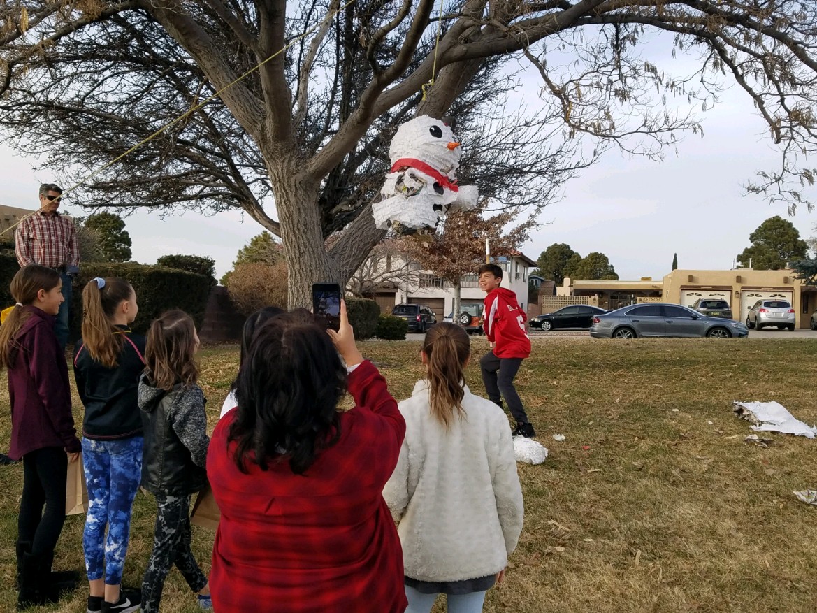
As I walked in the park last weekend, I spotted this fun, dangling snowman! So I stopped to inquire and capture a few shots. This family celebrates their son’s birthday every year with a piñata. Born on Christmas Day, they select another day close-by to have the piñata portion of the party. A family tradition.
No snowy scene for snowball fights or skiing? Toss a ball or frisbee, take a hike or bike, instead.
No enormous turkey? Roast a breast or a more manageable duck
or chicken.
Become a vegetarian? Using the same type of familiar meal
service and table dressings, modify the menu.
Not convenient to cut and haul a tree from the wild? Buy one
instead. Real tree a hassle? Become the proud owner of a magnificent fake tree-
with a bit of pine-scented room spray! In my case, I occasionally give myself a “bye”
break from putting up our tree (Although I love my tradition of collecting
silver ornaments, of which I have dozens). So the “modification” is
to have a magnificent, tall poinsettia on the entry table and several others scattered
throughout the house to punctuate the interior with splashes of red.
No formal dining room? Gather on cushions around a coffee
table – even if it means a piece of plywood from Home Depot on cinderblocks
with a paper tablecloth! Candles and a centerpiece will set the scene.
Sharing Traditions
Gifting things that represent your traditions is a wonderful way to share. Obviously, baking and sharing traditional delicacies is prime. Making or finding ornaments to gift is nice. I offer cuttings of our family’s Christmas cactus. My grandmother always kept one or more plants from the original plant that was in her family home in Youngstown, New York. She was born in 1892 and her grandmother remembered the plant and told my grandmother that it preceded her in that same house. We don’t know how far back it goes, but at least mid 1800s. I have kept cuttings and grown mature plants from the very plants that my grandmother had her entire life of over 100 years and kept all the while we were growing up in the same house for 20+ years and now my 40 years since! Gifting a traditional food or a CD you compile of favorite recordings, sharing plant cuttings, passing along a treasured possession – all are ways to share traditions.
But what if you are starting out? Memories from childhood might be the basis for beginning your own adult traditions – whatever the springboard, it should be fun to establish your own holiday traditions.
Colton’s Reindeer – A child’s artwork can be passed for generations.
Whether it is handmade decoration, food centered, activity engaging, music oriented, game playing, object collecting…each person has their focus. Even if one is alone for a holiday, there are sentimental triggers that remind of past events.
Food Centered: Main dishes, baking desserts, crafting cocktails…
Party cocktails – always a fun tradition…note here the festive cocktail coasters. Handmade by artist Rebecca Speakes, they make a wonderful gift to start a collection.
Activity Engaging: Playing games, sports – live or on TV, taking a walk, driving around to see holiday displays, theater productions…
Music Oriented: Gathering around a piano (guitar, accordion…whatever)
to sing, neighborhood caroling, participate in a choir, Karaoke games, attending
a concert, background music evoking memories for the occasion…
Decoration: Dressing your interior and exterior for the event(s)…
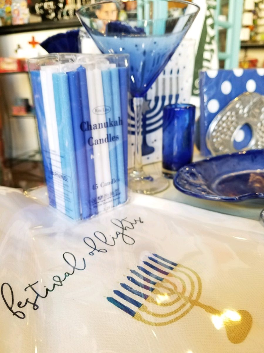
Hanukkah traditions, decorations – the brilliant blues and metallic accents…Color plays a big part in traditions and their interpretation and practices.
Collecting: Adding to collections…handmade series, vintage pieces, new releases…
Remember the guy before Thanksgiving? He had no formal dining room. He was having 7 friends gather. He wanted to do some semblance of what he regarded as a traditional Thanksgiving dinner. I asked him how he preferred to gather – standing with cocktails and appetizers grazing throughout the evening or a “sit-down” approach? He really wanted the feeling of sitting down to feast. In light of not having a formal dining area – and as it turned out, no coffee table either, I advised that he gather on cushions around a coffee table. Since he didn’t have one, I suggested that he go to Home Depot and get a 48″ square cut piece of plywood to position on top of a double stack of cinder blocks. I went in search of finding a table cloth and 8 large cushions (pillows) , votive candles and a centerpiece comprised of a bright yellow mum plant in a basket, with a few mini pumpkins and fall leaves. The scene was set. He used his own plates and utensils, white paper napkins and a package of orange cocktail napkins. He planned the meal and asked for each person to contribute an item that was special for them. After all the dishes were identified, he prepared the main dish, a casserole of boneless turkey breasts surrounded by his traditional favorite, Pepperidge Farm stuffing – baked and beautiful – and two other things that were not being contributed by his friends – canned cranberry jelly (ha ha) and a pumpkin pie that he purchased from a local bakery. Voila!
The gal entering her first Christmas as an adult was not from New Mexico nor was her young husband . They had a new home here and the local traditions were not in her realm of traditions. She wanted a large tree but did not own one single Christmas ornament. She bought a live-cut tree and we bought strings of mini white lights, a couple dozen red feathered cardinal bird ornaments, candy canes and white ribbon. She tied white bows on the tree and scattered the red birds all over it. I cannot believe that I can’t find the photo of the finished product – but it was a memorable solution for a first Christmas presentation.
This year I captured a quick shot of this tree in a friend’s house that reminded me of that young woman’s first Christmas tree. In vogue this year are the bare, stick-like trees that offer twinkly accents and an airy presentation of ornaments of choice and here featured are the very similar red cardinals!
When designing for a vacation rental property, the first order of business is to select things that are durable and easy to maintain. This means finishes to furnishings. I know this from practical life experiences and also working with commercial/hospitality interiors. To do so, one needs time to place and receive the orders with enough contingency for mishap. It is also dependent upon the housekeeping arrangements planned for on-going maintenance.
In this recent project, the work began 12 months out – plenty of time you think…but it was all about the physical remodel. We began with the drawings for floor plan re-configuration and specifications for new lighting, cabinets and finishes throughout. The decision to furnish was not made until nearly 10 months later with a deadline to complete in less than 7 weeks. The delay was partially due to an indecision over how many of the 4 units (all on one floor) were to be short-term or long-term rentals. Then a new city ordinance imposed a moratorium, of sorts, on short-term rentals and while that was tossed about over several weeks…more indecision ensued.
It’s a riot to see overnight design projects transform interiors in 24 hours. That’s due to a free-reign for design decisions, a team(s) and vehicles to pick-up/deliver, all trades on deck, a single director calling the shots and an organized chaos that results in a magical finished project – yes, like magic. Open your eyes, be stricken with awe, cry a little and exclaim repeatedly that you “just can’t believe it!!!!”
Real life is generally not like that. Real life has in-put by owners, limited schedule openings by the various trades, little spontaneous decision-making and fleeting time riddled with unwanted surprises and delays. Real life, in this case, was a theme provided by the owner, a preconceived “look” developed in the mind’s eye and scratch paper of the designer during the selection of finishes and floor plan modifications and vacillation for several reasons, of what units to furnish and when. Over the course of a year, leading up to less than the last 30 days, the project was to be fully furnished and finished – ready to rent!
The good news is that with controlled frenzy, changing
availability of products, focused efforts and teamwork, we are pleased to present
the Lobster! Completed all but hanging the TVs by the requested July 1st
deadline, it is beautifully appointed and offers a colorful and a bit
whimsical, spacious, clean and did I mention enviable location- 2 blocks from Pacific Beach
in San Diego?
This entire project, except the move-in this last week, was done long-distance with the owner in Maine, her management company SHORE on-site in California and we the design team in New Mexico. This is not at all unusual, but Maine prompted the owner’s desire to name the unit Lobster. Not your spiny lobster from the local waters, but the New England version from the Atlantic with the classic recognizable form that accompanies the imagined crustacean – including the brilliant reds of the often appreciated steamed version!!
With fond memories of her childhood helping her elders maintain this property, the owner wanted to commemorate the building with an entry plaque visible from the street on the new redwood gate (soon to be completed). In addition, we suggested an individual name/theme for each of the 4 apartments which were all initially designated as fully-furnished short-term rentals – hence the bold identity for each! I designed the new name plaques and had them fabricated by Artistic Bronze in Florida. The backing was built by our talented Enrique Jimenez, in New Mexico, and all shipped to California. Bronze was selected for its timeless presentation, handsome durability and commanding respect. Parisienne was the font I selected which may now be used to identify the property as though a logo to tie-in with the on-site signage. Subliminal cues that are recognized even slightly are effective reminders and triggers for recognition. The idea was intended to offer a fun, but lasting, introduction and identification which was to be reflected in the interiors. The Lobster was the largest unit with 2 bedrooms. It was ultimately chosen to the be one fully-furnished unit and owner’s second home when visiting the area.
For budget and availability, we sacrificed certain durable
features that would have been better long-term investments, resulting in some
knock-down furniture that was never intended for much abuse. Fragile painted
table surfaces – for example – better in laminate, wood or stone…but time
will tell.
The look is clean and fun, colorful and beachy – with a slightly up-scaled twist. Cool aquas accent a few walls in the otherwise crisp white interior. Red punctuates effectively in lobster accent pillows, decorative accessories and the full-wall mosaic glass tile treatment in the kitchen. Yes, once again, we like to treat tile on the walls as not mere back-splashes, but wall-covering full height and width!
Weathered grey toned LVT (Luxury Vinyl Tile) in the way of interlocking planks were an easy to maintain and durable floor finish. The faux wood adds warmth and is softer underfoot than other hard surfaces. Perfectly matched with all trim pieces, this flooring is fabulous!!
Lighting is key and here we added recessed directional lights to spot the walls and related artwork. Switching was also an important detail to have options for the lighted areas and accents.
The owner found a novel lobster rug with a great textural,
tufted, yarn system that brings fun and great color and warmth to the bunk-bed
room! Busy, colorful bed dressings intentionally selected (over the hospitality
white that is still trending) contrast against the bright white bed frames
stacked for space optimization and a little kid fun!
A cool find in the way of the glass vessel lamp…where
usually the stem with electrical cord feeds down through the center of the base
and of the back, this one feeds from the socket stem with a cork top that
removes allowing the vessel to be filled with treasures – in this case southern
California beach shells and fragments! And for a little more animation, I found
a carved wooden shark to insert cruising above the shells to make the lamp even
more interesting!!!
A pair of vintage photographs of a lobster shack and fishing
boat contributed by a friend in Albuquerque – taken by him in Maine in 1962 –
were enhanced with bright red mats in their original polished silver metal
frames along with a large painting on canvas of a Maine lobster/fishing boat sent
by the owner in Maine provide interest to further perpetuate the lobster theme.
The master bedroom is a comfortable retreat with another
lobster pillow for punch! To give the room the best approach and make it feel
as large as it can be, placing the bed in front of the windows was the
solution. Beds facing the entrance to the room are always preferable to
arriving into the side of them – for visual space and a more inviting
orientation.
The original bathroom layout was all one space with tiny
appointments jammed together…so we removed the tall storage cabinets and sink
vanity allowing more room for the commode beside the tub/shower and added a
privacy door. Then the new cabinets and counter have their own space with
another privacy door resulting in a two-compartment bathroom area for maximum
use and enjoyment. Red mosaic glass tiles were repeated from the kitchen to further
coordinate the theme.
The bold color scheme was thoroughly distributed throughout
the unit which is an intentional design emphasis especially effective and novel
in a short-term vacation rental – where such a thorough scheme might be too
intense for one’s primary place of residence.
Effective design both functionally and visually should be a significant asset in the marketing of rental property. When used consistency in marketing material with logos and repeated features, this and other properties with attention to detail should attract the discriminating guests. Once there, repeated stays are the key to maintaining a strong guest population – of desired visitors.
Please watch for the entire slide show of before and afters of this dramatic transformation in the commercial projects section of our website, in coming weeks, entitled Emerald Green Beach Rentals – Lobster!
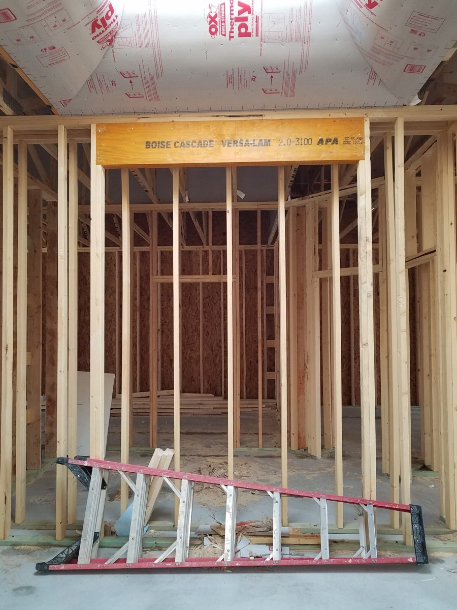
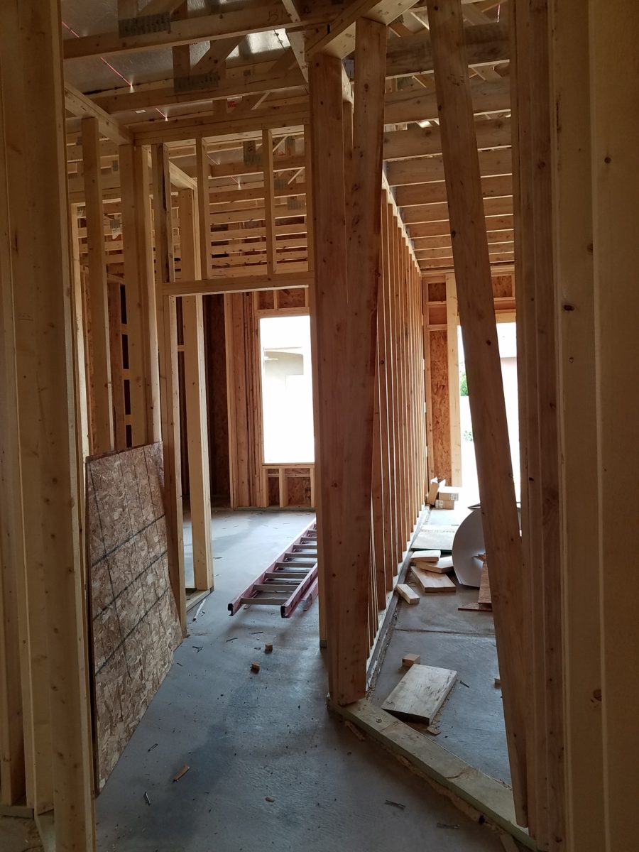
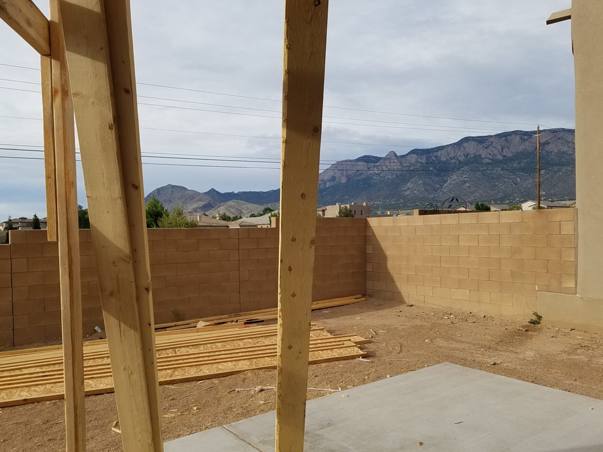
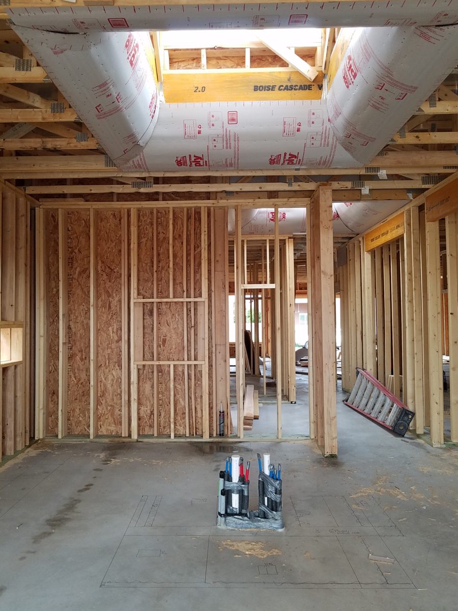
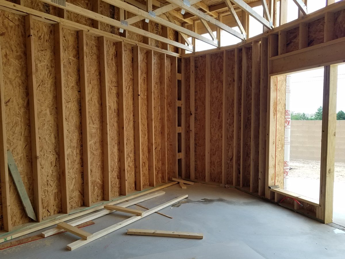
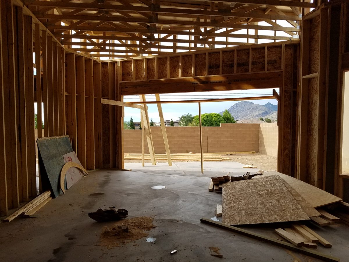
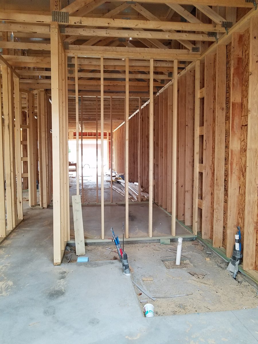
Building a new home? There are many ways to go about it. Here are a few photos of a semi-custom home, in the framing phase, that is currently under construction. Watch for a future blog featuring progress photos and finished shots!
Upon arrival, here at the entry, is a recessed niche – or as we say out here in New Mexico, a nicho! It is a perfect focal point, yet the dimensions are not illustrated in an elevation. The owners have an opportunity to have it sized for an existing piece that they own, plan for a custom piece or allow it to be framed-out by the contractor, without further specification, and find something that works.
From a tract home, with all the decisions distilled to a narrow selection featured in a model home and/or sales office…to the very custom where the owners select everything, from a world of choices with their consultants, there are commonalities that are worth noting to assist with the process .
In the tract home, a price for a finished product is presented and all standard, pre-priced details are included – within a range of narrow selections. The selections are recorded, but not often incorporated into the plans which are is usually generically pre-designed. Changes are usually not an option. It is efficient, for both contractor and owner. In full-bore custom projects, all is decided, selected, designed and recorded on the plans to the last detail prior to pricing and breaking ground. All costs are identified, yet changes are often in the mix as owners have new ideas that they have the prerogative to change. They exchange or pay for every modification – every “change order”.
In the middle is the “almost custom”, but still packaged product. This is a package that is presented with pre-established designs and details, budgets and allowances. Potential buyers are shown examples of homes – models or occupied recent completions. A cost for construction is determined based upon square footage and amenities, as illustrated in the examples. This is a great way to get a more custom home with easier to execute plans and design details.
Which process best describes your project? In any of these new home design and construction approaches, there are similarities that challenge the owners along the way. Even for the seasoned professional, circumstances alter cases (changes in availability of materials, weather delays, clients who continue to visualize, imagine and fine-tune their ideas and involvement in the details). All can challenge the schedule and alter the intended smooth progression of the project.
With the tract home approach not many, if any, of the on-going wish-list items can or will be implemented. They are not set-up to make changes, alter plans or deviate from offerings and the signed-off package, in any way.
In the very custom design-from-scratch home, with the “world is your oyster” approach, changes are welcome and accommodated – after all, that is the goal – to create the perfect home, for this client who is paying for the flexibility, world of choices and luxury of it all.
In the middle is the interesting situation where the owners perceive custom flexibility, have budgets assigned and make selections based upon those numbers. Once these numbers are created to establish the budget, examples are usually presented so the owners have an idea about what their dollars will buy during the selection process. Often that method is a bit unrealistic. As estimators know, this is a tedious process – yet presenting it, in an overview, seems easy.
After examples have been shown, floor plans drawn, finishes and other design details have been budgeted, the owners sign-off on the basic idea of the home and then set out to fill-in-the-blanks. What will the flooring be? What light fixtures? What door hardware and finish? What sinks, faucets and towel bars? What countertops? What wall tile, paint or other treatments? It is usually not until that very process of assembling all the selections that an owner will know if the budget they created will satisfy their ultimate needs and desires.
With this sense of “custom” paired with the packaged example, comes the owner’s complacency – through no fault of their own – to miss details that arise from the attempt to create a unique product, plan, design – but without having seen the actual example. It doesn’t exist – anymore than it would in the very custom home. That’s why it is unique. However, unlike the very custom home, where there are layers of design assistants from architect, interior designer, lighting consultant, A/V consultant, landscape designer, general contractor, and subcontractors who work together to best explain options, implement wishes and get it all on paper for clarity, the middle approach proceeds with pre-determined practices that don’t require recording on plans and rarely elevations, as all is based upon an expeditious course-of-conduct for the like-kind of homes presented, at the out-set. But having seen the examples/model/features, the homeowners make their plans guided by the project managers which might include a general contractor, subs and a few hours with an on-staff design consultant. Inevitably details are over-looked in the process.
Here are a few tips
for proceeding with a new home project.
Don’t be afraid to ask for sketches of design details or
photos of examples.
Walk through the floor plans, in your imagination. Start at the front door and shut your eyes and try to visualize the progression. Make notes along the way. Do the same from the garage or any other alternative entry, into the home. I will suggest you do this several times – each time with a different focus.
Be mindful of window locations…exterior fenestration and interior placement as they relate to furniture and artwork. Consider them both from inside and out! One they are framed and ordered, this is either difficult, expensive or impossible to change.
The first focus might be to walk through from each exterior entry and visualize where the light switches are located and what they operate. Do you want some of your switches to be three-way? This means, for convenience, that there are two different locations to switch on/off the same light or appliance.
Secondly, as you walk through the spaces in your mind, picture if there are things that you wish to highlight such as a piece of art on a pedestal or painting on a wall, sculpture in a niche or even a spot on a table for games or hors-d’oeuvres. Some things might be lit by free-standing lamps – depending upon where they are located. Beware the dreaded, but often necessary, floor plug!!
Light fixtures….locating the power sources – the junction boxes…will you have recessed fixtures, surface-mount, suspended, or wall mount? Consider the heights of the ceiling, what is centered or not, from where you will see the fixture, and where you want it to illuminate and how. This will help plan the location of the j-boxes.
With changes in technology, wireless systems, phone apps, etc…these details will change. Know the pros and cons of advancing technologies and select the best for your present and future needs. Consider the longest period of time you will be in this home and design accordingly – aging in place.
Consider what things are easy or cost-effective to modify later, if needed, and what makes sense to install initially, to be the best investment. This might be temporary light fixtures, in favor of more expensive ones once you recuperate your cash-flow! Perhaps you don’t need glass shower enclosures at the outset – can be added later…additional cabinets…many things can be upgraded later. While other items such as the flooring material, cabinets/countertops, wall treatments, skylights, electrical sources and others…should be considered in the first-pass.
At every turn, when you are walking through the space in your imagination, see your focal point. As you enter – what is dead ahead? As you turn to the right – what do your face? Do the same to the left and make your way through the house and see each focal point, in front of you, to determine what will be placed there, how will it be lit (with each exercise – imagine daytime and nighttime), does it require power, is there enough room to place the piece you intended to go there? Inches might count.
While walking through and around the plans or even during the early stages of construction, also look out the windows. What do you face? What do you see? Capture views and avoid what you don’t want. Should the wall be higher? Will this be a landscaping opportunity or necessity? Check patio covers and light sources. Consider the compass – what faces what? Seasonal temperature considerations are worth a nod. And think about exterior lighting.
A spectacular upgrade of over-sized sliding glass doors and flanking windows were selected to maximize this view…only to learn, after the slab was poured and framing up, that there was a massive corner column planned to support the yet-to-be erected patio cover . A modification was still possible, by sharing the load on two separate well-spaced columns and cutting back the patio cover between them to avoid a cantilever that was said to be cost prohibitive.
Check to see if things, inside and out, that should be centered ARE centered. And if they don’t, make sure from all angels that it won’t matter – or will in some advantageous, artfully, asymmetrical manner.
Per the plans, the island was not centered beneath the skylight. The cabinet-maker was doing his field dimensions and asked it this was the desired position. To which we replied – no – as it impacted the location of the pendant lights in addition to being off-center from the skylight.
Furniture layouts should be placed on the plan before you finalize the plans and certainly before you break ground. If you visualize a sectional sofa from which to watch the TV – make sure you can plan for one that exists. If it is from a sofa that you will view the TV- is there a space for an adjacent guest? Make sure some collection of desired furnishing or possibilities is realistic. If you have actual pieces you own – it is an imperative and so easy to accommodate on paper before the slab is poured and framing begins.
By not centering the bed and coordinating TV and dresser which was intended to occur on the opposite wall, the master will have a entire seating area off to the side. Had the recessed niche for the TV along with wiring and backing installed for the articulating wall-mount bracket, the bed and flanking nightstands would wither have been forced to center or been awkwardly off-center to best utilize the floor space.
As previously mentioned, beware the dreaded floor outlets – will you need them? Layout the furniture, to have the best chance of getting the location right.
Yet-to-be installed fireplace, in the far corner of the room, dictates the furniture placement. Floor plugs will allow lighting to be located, on floor or tables, away from the wall – floating in the center of the space. They were placed prior to a furniture layout having been specifically planned. This might pose a challenge.
Ask friends for their opinions. Examine their suggestions from every angle. Don’t wait to ask friends for their opinions too late, in the process!
A fun snail shower enclosure will have no door…but the placement of product niches, termination of the wall tile and transition of the floor tile are critical details.
In any approach to this process…plan. Don’t guess anything that you don’t need to guess.
In about 3 months, this patio will be in full-swing for entertaining. Hopefully all the anxiety of the process will be left behind…….
Be prepared to have new or changing ideas as things proceed – but prior, proper, planning will better serve the entire process.
Don’t be that guy like in the old joke about purchasing a vehicle…after signing the purchase agreement, you realize something is missing and mention it to the agent who replies, “Oh, you want wheels on that car?”
Is your story important? Does anyone care about your story?
And what does this have to do with interior design?
Whether you are marketing yourself or your business, your story has merit. It is about identity, branding and connecting. It is about letting people in a bit. It is about sharing history, experiences and process. It is about your unique reason for doing what you do.
For the past several months, I have been working with a
client on a combination of interior design, graphic design, exterior
design…it is all intertwined. A successful design laces together all these
design elements. And that brings me to “the story.”
Even Facebook features a section to tell “your
story.” Yet, my client resisted
presenting/using the story of this new business venture as a part of the
design. He told me that was “so seventies.” That he had read that it
was a dated concept that was no longer relevant. I begged to differ. For months
I begged to differ! We agreed to disagree.
I believe that this is similar to many interpretations of design. What might be considered “dated” is often the manner in which it is used or done – not the thing itself. Whether a color, a font, a style of furniture, a wall tile or wallpaper, an architectural detail or form…so many design elements are considered dated due to their context. Often, this is fair to observe. But, mix it up a bit and use things differently or with other different elements than the original trend presented and – Voila! You have a perfectly valid, even fabulous design – think outside the box!
The idea of a “story” is not unlike the “mission statement” which became a standard feature decades ago in every company’s presentation on printed media, lobby plaques, conference room walls, break rooms… Some say it is passe, but when something is good and has meaning – re-consider. Like “the story”, “the mission statement” identifies goals and intent…when paired with the story, it provides an overview of the who, what, why that inquiring patrons want to know.
So back to the story…about “the story.” When a business or any concept is respected or
liked, revered or praised, it is natural for people to wonder “How did
they get started?” “How did they come up with this idea?”
“What is their history in this business?” These are common questions
that clever ideas or designs invite. So why not satisfy that interest, create a
buzz…Let’s give them something to talk about!!!
In this world of disconnection, making connections seem all
the more important. What used to be a natural exchange – of communication,
ideas, sharing – is now something that has to be inserted with greater
intention.
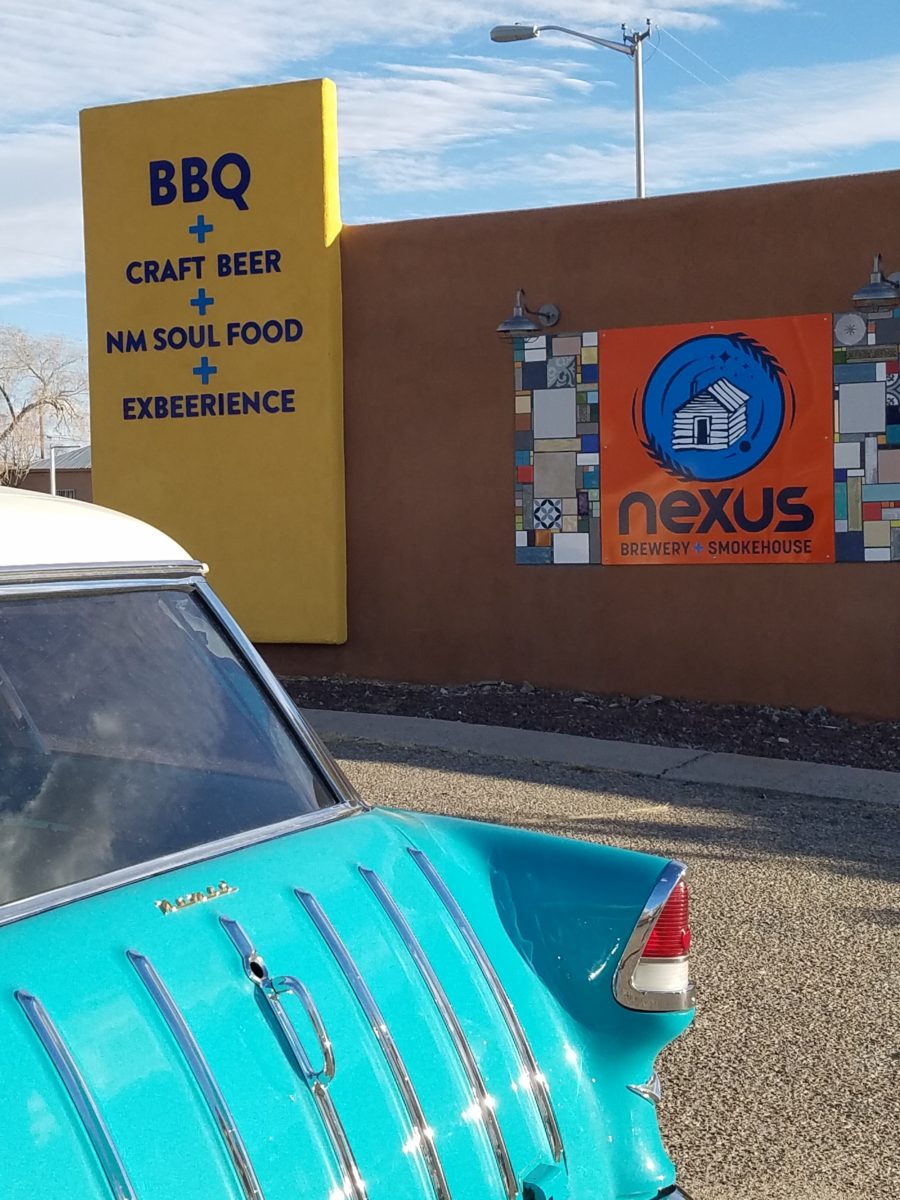
So this new business, for which I have been designing, is a barbeque establishment. There are a million. They have certain things in common. Without my enumerating them here – can you envision some common denominators that you might connect with barbeque joints? As is true with any venture, I asked: “What makes this one different? Better barbeque? Maybe. Cool interior? Hopefully. Are those the only unique traits? Is that the memorable take-away? It certainly isn’t a bad one – the idea is to have great food – and a fun environment, but what else might contribute to the experience of this barbecue being unforgettable? What might you have, to tell your friends, to spread the word?”
My opinion was a combination of an intriguing brand and “the story.” But before I go further, they coined a word to express their beer brewing prowess – exbeerience! This will enter into the story as we go along.
Now maybe my opinion about their story was so worthy of consideration because there was so much to this story. That certainly helps. It happens to be a great story with layers of interesting twists and turns – riddled with history and significance. Plus, it had a local interest angle that has the potential to create a buzz far beyond their actual location.
To begin to tell the story, I encouraged the development of
a unique logo for this specific branch of the brand. Taking the lead to design
it, and incorporating it into interior/exterior
design was part of my vision for a complete design package and presentation. Extracting
from the story to create the logo seemed natural. The private persona was
becoming public.
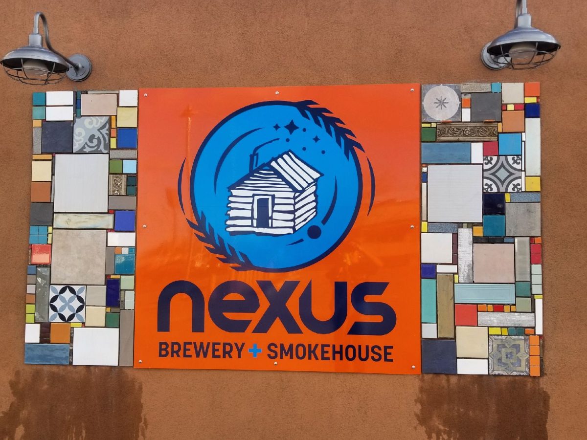
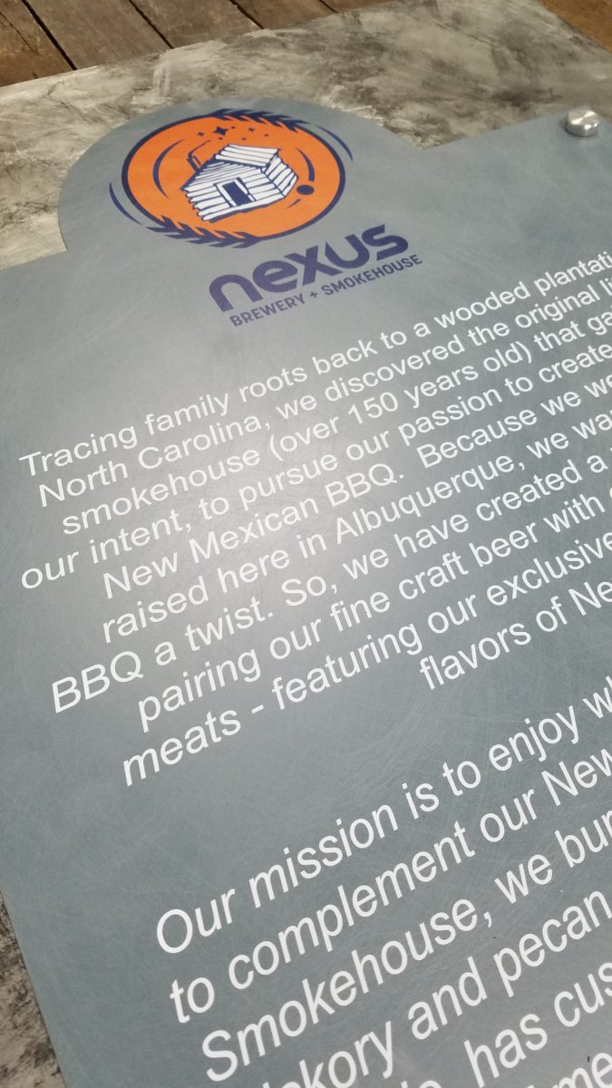
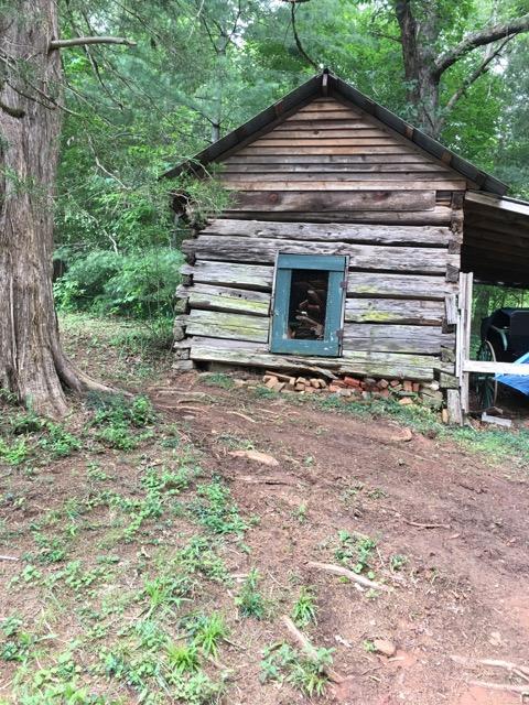
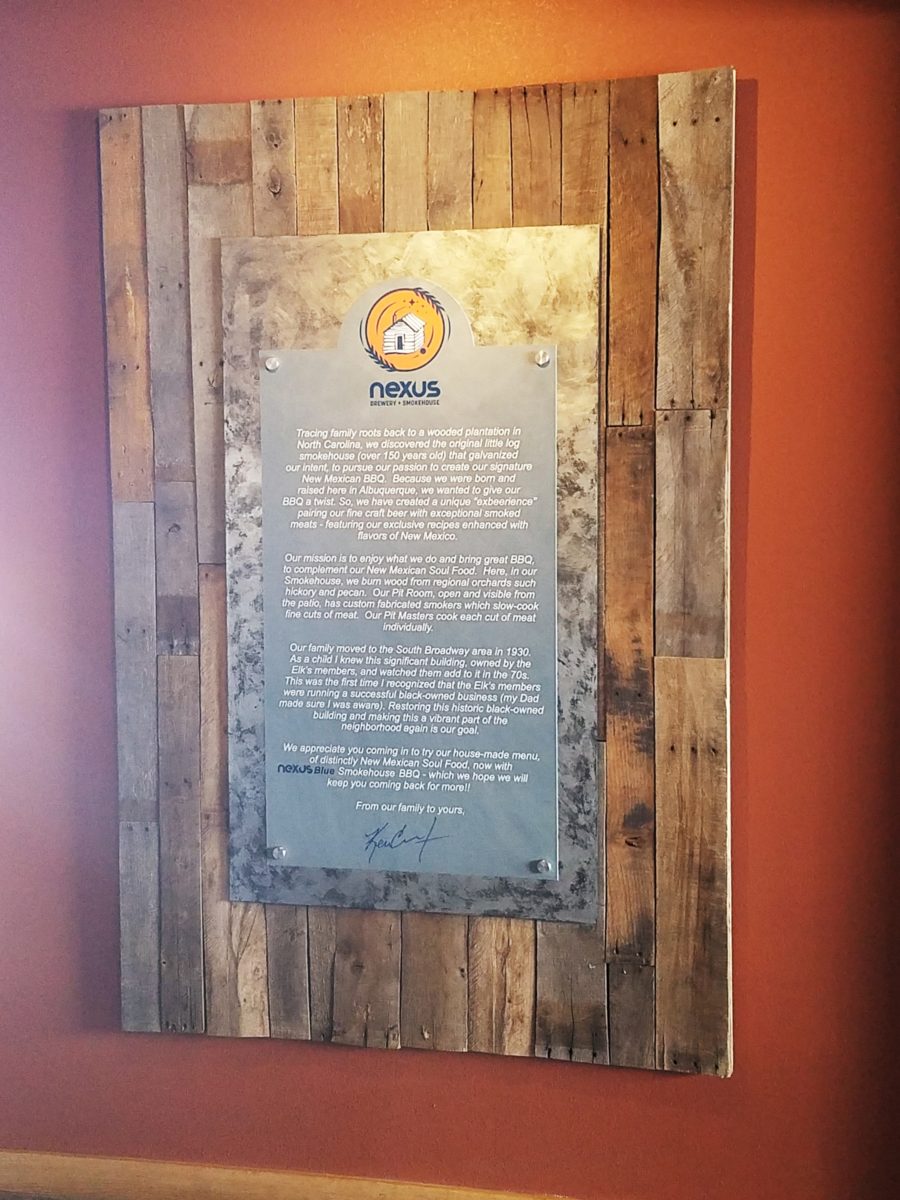
As we developed the logo, featuring a wood-carved graphic of an original log cabin/smokehouse, the story was recorded and edited down to a summarized version.
It was available for printed material, social media, and as art to be presented on walls. Yes, it was intended to become a decorative element too.
The Story became a focal piece in the interior along with authentic, original photos of the log smokehouse and an interpretation of patchwork quilts entitled Urban Piecework made from leftover ceramic and porcelain tiles, glass and clay assembled in wall-mounted panels throughout the interior and exterior spaces.
Photos of the original smokehouse in North Carolina will soon be presented to further reiterate the story on the interior walls.Urban Piecework commands the interior with bold mosaics reminiscent of patchwork quilts – an intriguing backdrop installed both inside and out.
Connecting with patrons, followers, clients, friends, family and acquaintances is valuable. As a business, it wraps who and those elements that are important to you in a familiar cocoon of context. It can instill a level of comfort and confidence in addition to sparking additional interest that might have taken longer to establish, without the introduction of your story.
The final multi-dimensional and multi-textural wall-piece featuring the story and mission is a striking 4’x6′ multi-textural panel. It offers patrons an opportunity to get a few questions answered as they enjoy their “exbeerience” at BLUE.
It was a privilege to promote, extract and produce this story and contribute such an important and valuable element to this business’s marketing and solidifying it’s new, exciting chapter of their brand.
Consider your story. Own it. Share it. Celebrate the uniqueness of your story. Design with your story in mind.
A few years ago, awesome
crept into our vernacular and took over. It stole our ability to select
options for descriptive excess or exception. Everything from accolades for a
job well done, positive reinforcement for anything, to a spectacular sunset, a
great new outfit or a startling meteor shower – everything from a tad past the
norm…to something truly fantastic – became awesome. Our language offers so many superlatives, yet
we have gotten so lazy.
At the expense of sounding like an advertisement or
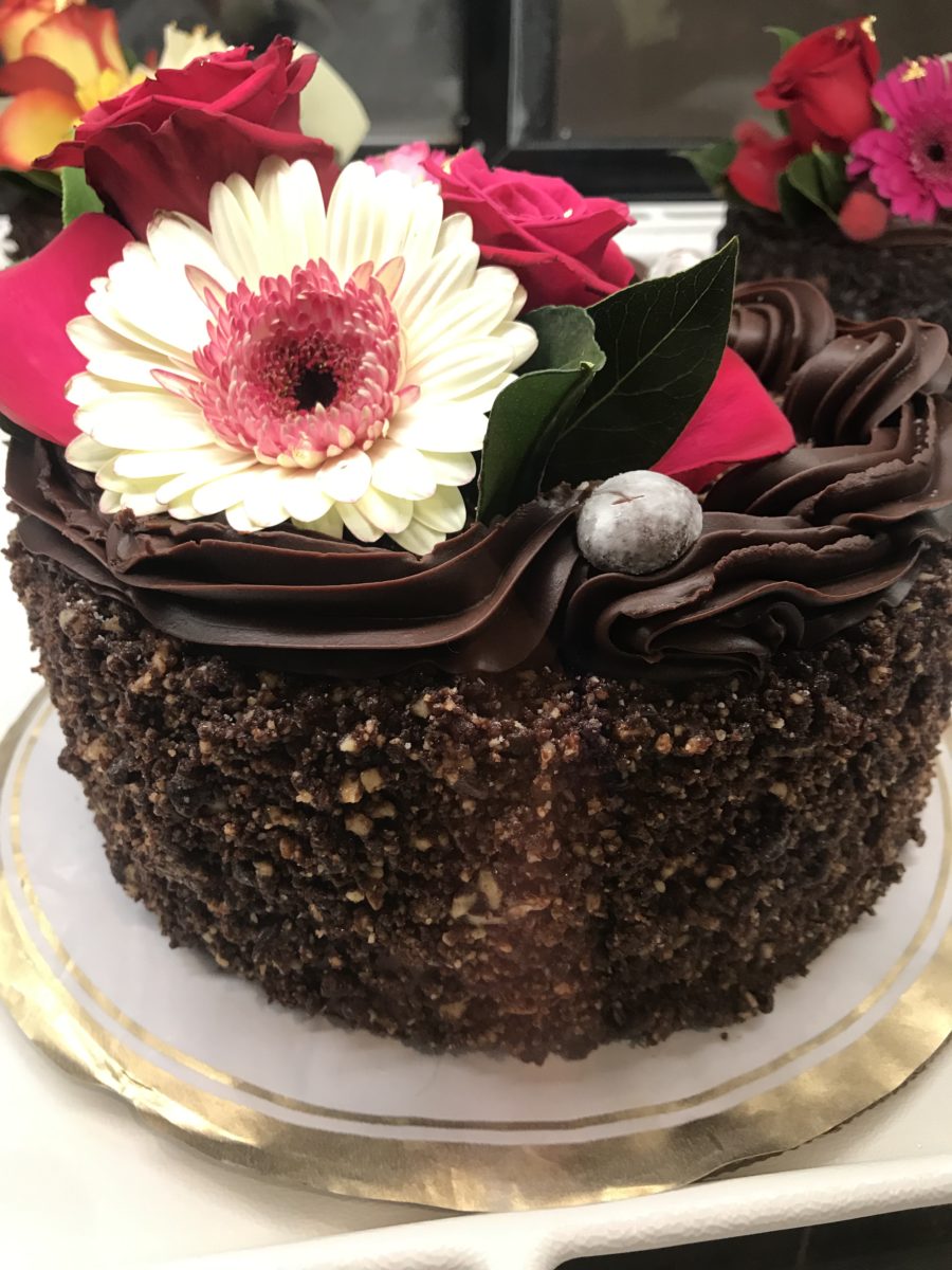
otherwise paid spokesperson, I write today of a late-night confection
experience that is truly like no other. An experience so artful that I could not
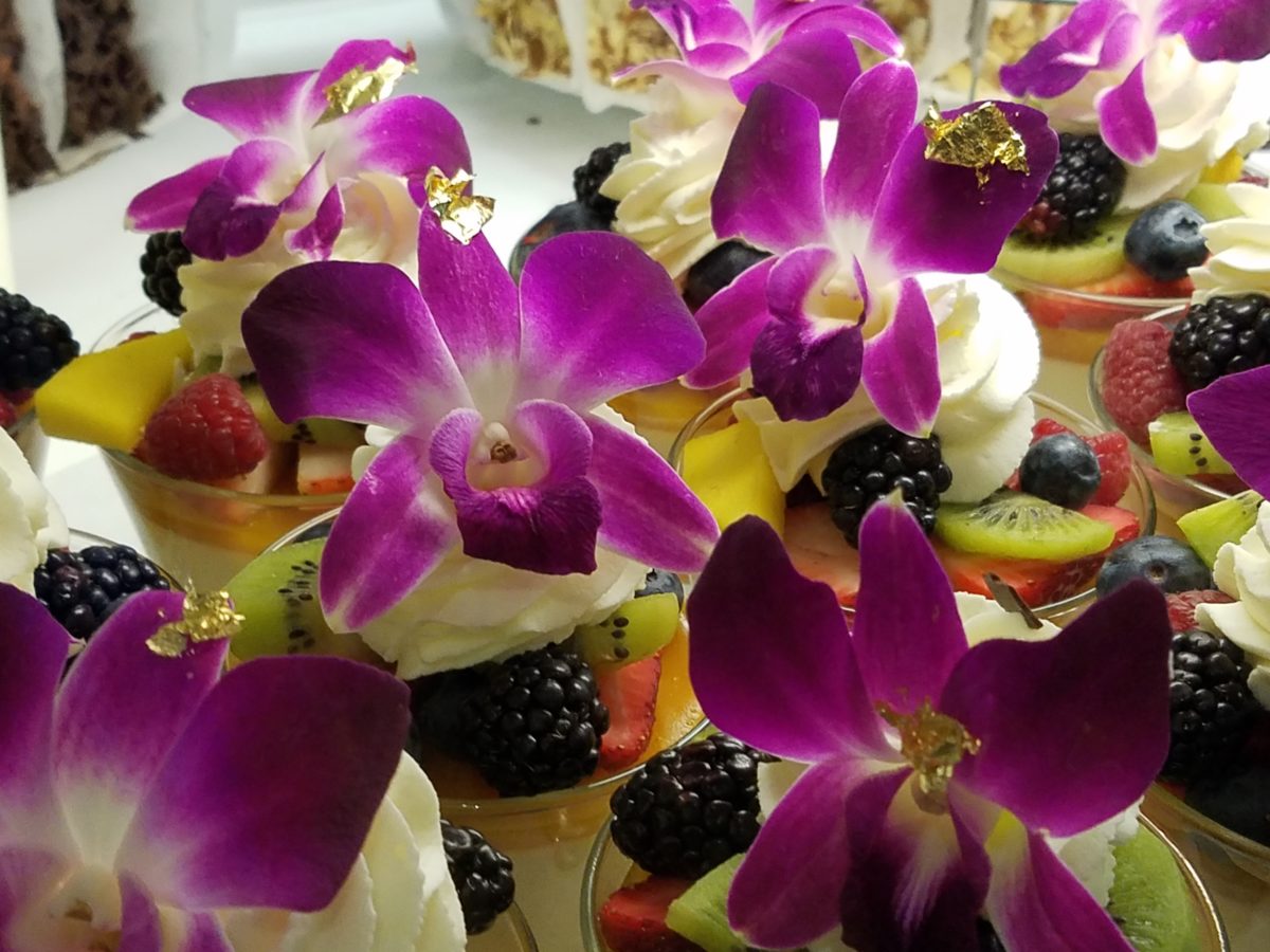
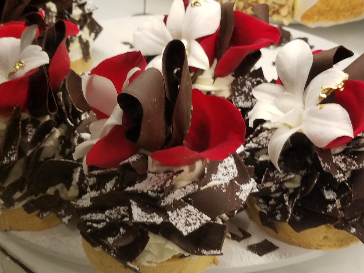
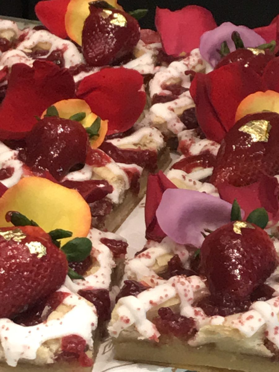
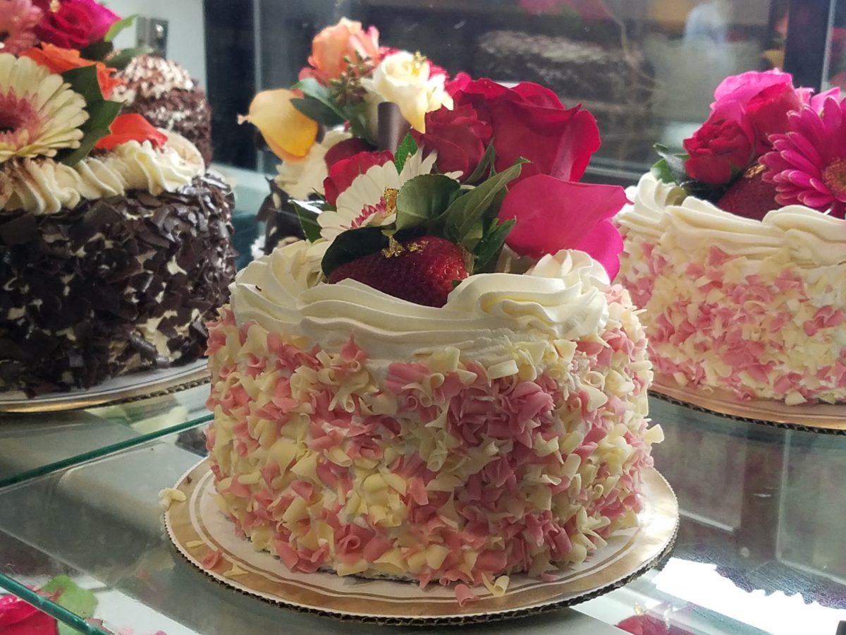
take enough photos. Artistic delights at a bustling urban eatery where flowers
and gold leaf adorn each piece of fanciful frosted awesomeness. Ha -there it is! Had to add more to the mere “awesome,”
though!
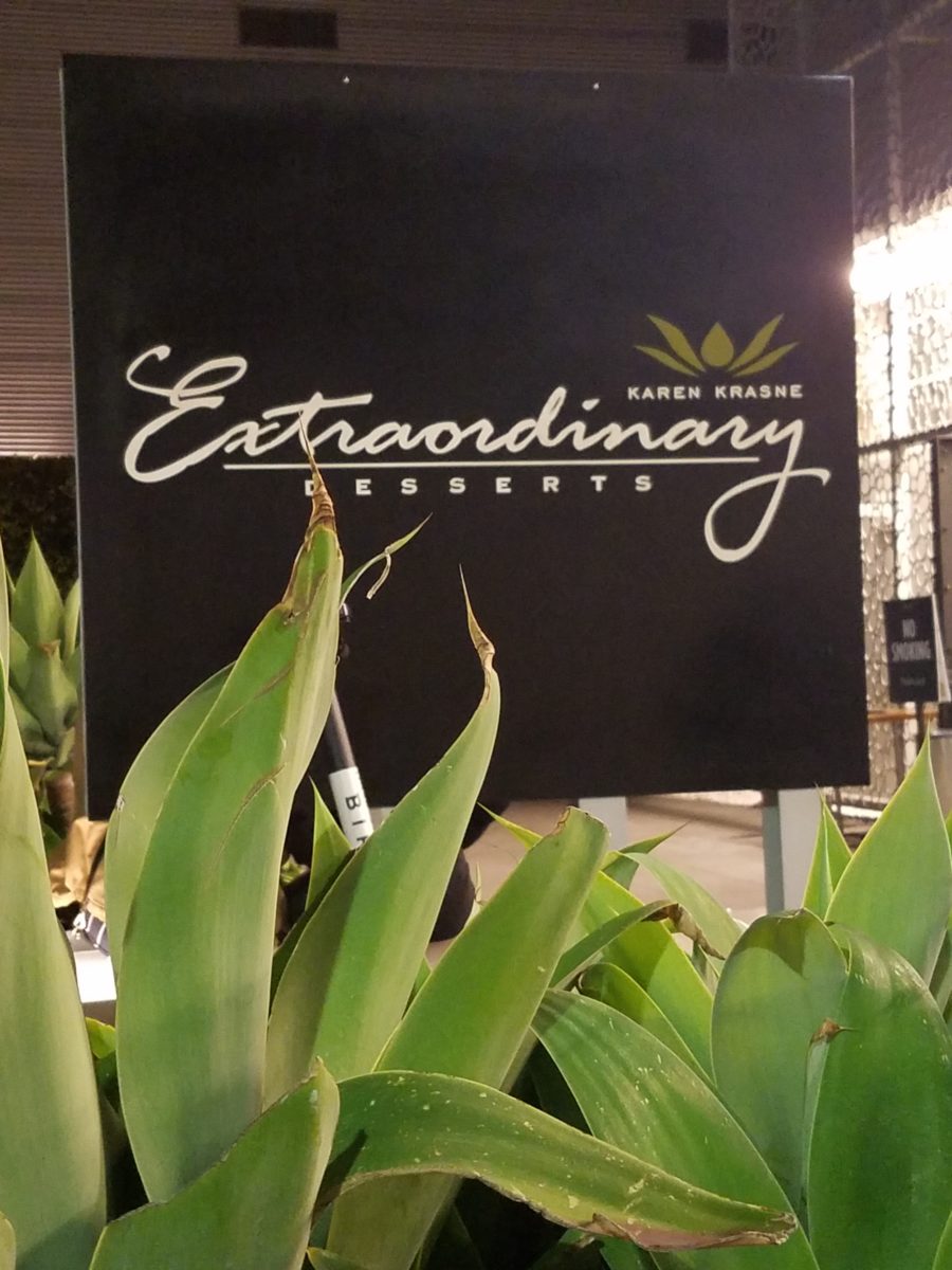
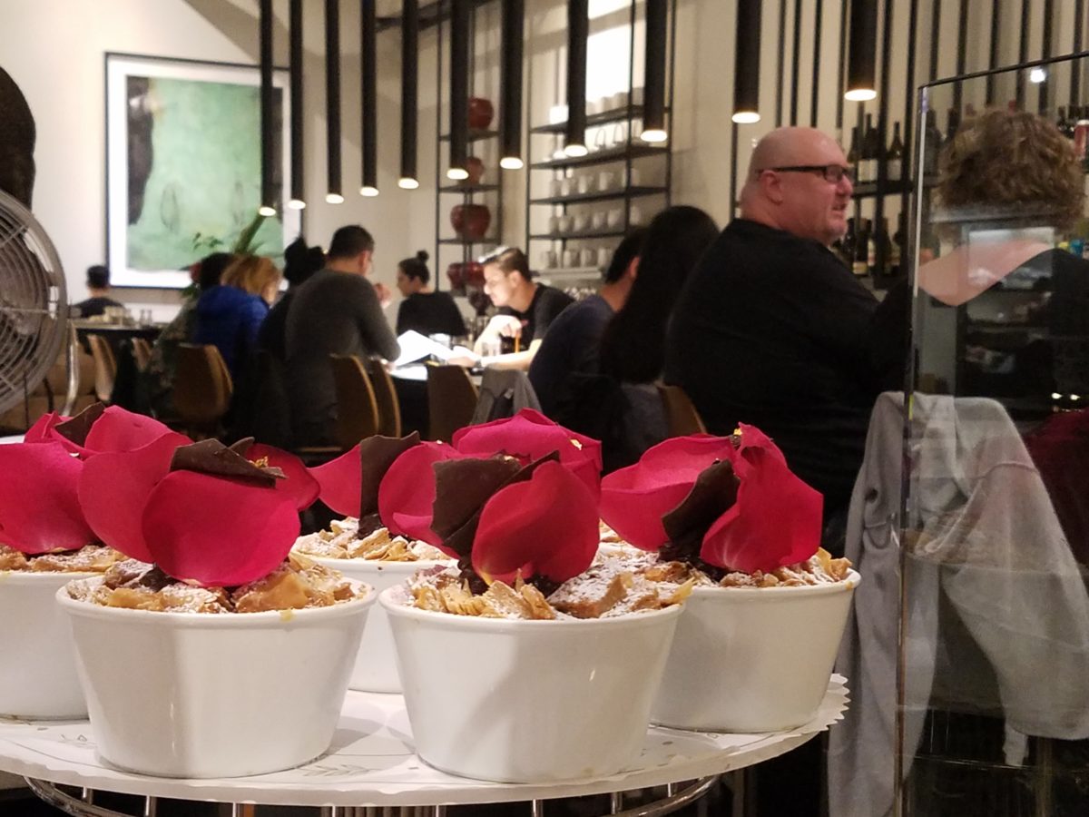
Extra ordinary – extraordinary
– beyond the norm – beyond ordinary, yes, that is an understatement for what I
am about to reveal. Yet, that is the moniker of this extraordinary establishment
– Extraordinary Desserts!
Several years ago we were treated to a late night surprise.
Not knowing our intended destination, we were taken winding through the streets
and came upon this little structure the read like an Asian garden. Twinkling
lights peeking through wooden slats softened by lush tropical vegetation – the
scene was magic. Once we realized the focus of this cozy pocket, we were
enchanted. Patrons stood in line to pass along the “extraordinary”
dessert cases displaying all manner of outrageously beautiful desserts. Once they
decided and paid for their selection, they gathered in intimate twosomes or small
groups to savor the delectable delights they had chosen.
Last night, we decided to rediscover this uniquely sweet
spot and Googled our way into downtown San Diego. What we found, by happy
accident, was a second location – an urban edifice presented on a crowded
sidewalk packed with people waiting eagerly to be seated and begin their
indulgences.
After leaving our name with the greeters at the podium, we
squeezed through the throngs to get a peek at the cases full of magical
wonders. Ok – you think I exaggerate…so now begins the photos…
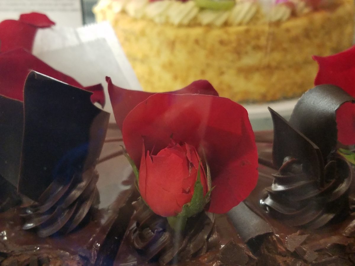
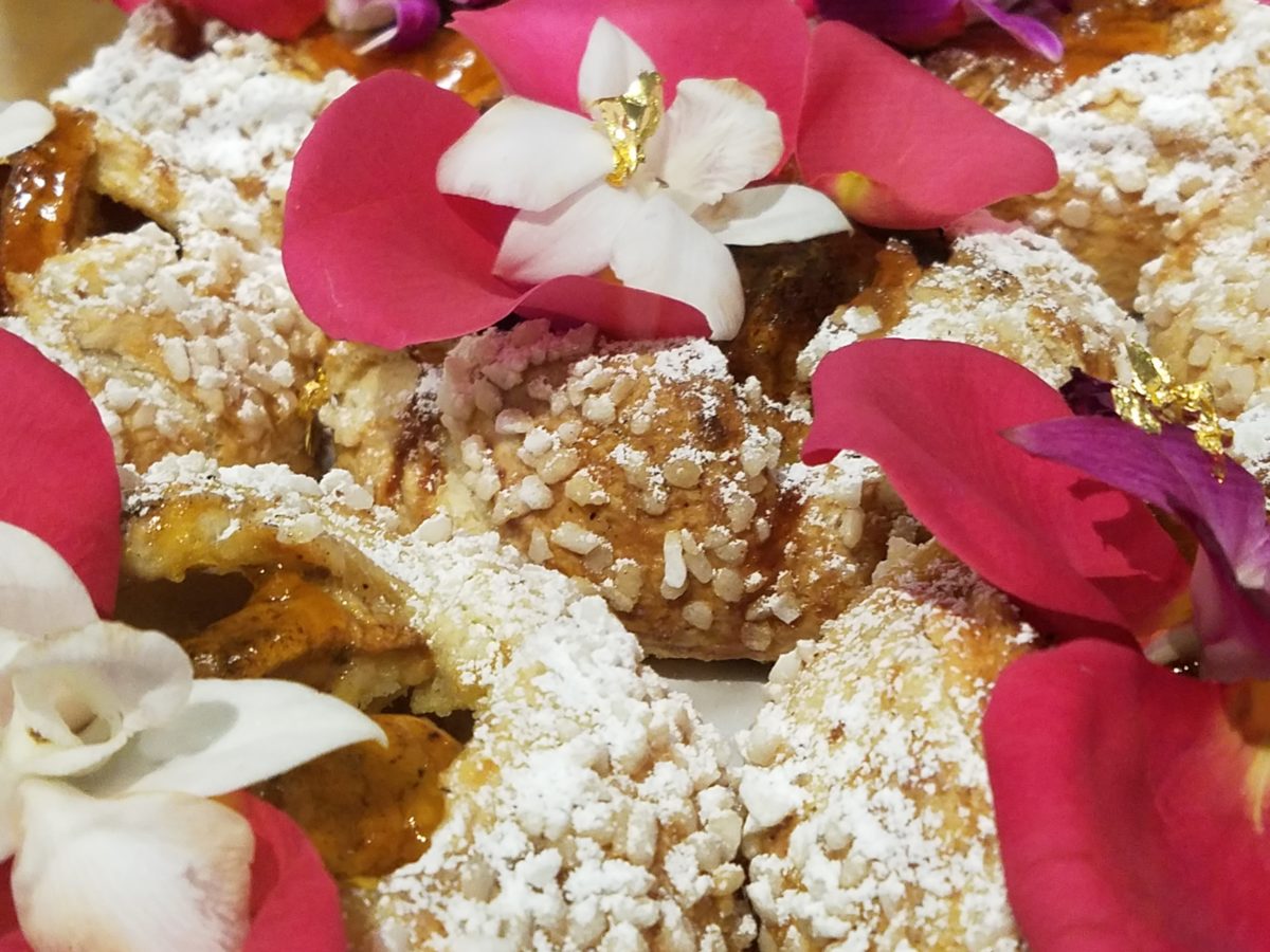
When extraordinary is an UNDERSTATEMENT, you know you are in the presence of something quite special. Maybe that’s why people invent words like splendiferous or supercalifragilisticexpialidocious!
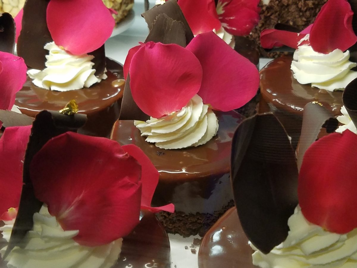
The rich velvety and textured frostings and layers of fabulous flavors awaited us as we scanned the displays.
Floribunda- yes, gilding the lilies (orchids as it were) – nothing was too over-the-top! The rich velvety and textured frostings and layers of fabulous flavors awaited us as we scanned the displays.
Seeing so many astonishingly spectacular desserts in one place all for the spontaneous taking is almost too much to bear. You mean I can HAVE that right now??? I can have a piece of many of them – RIGHT NOW?????
Emulating fine Cerelene Limoges, the would-be doilies of parchment paper rimmed with gold detailing and lettered with Extraordinary the details were dazzling! No stone left un-turned, they thought of everything to make this a tantalizing treat and patrician presentation!
The interior offers seating at the bar and tables organized
throughout. Two tops or ganged together for a crowd, everyone was so focused on
their prizes – beauty set before them – animated chatter wafted through the
sugar-spun air! Some chose to sample
several knowing that they would take a goodly portion home. Others savored a
single serving of a beautifully flavorful masterpiece.
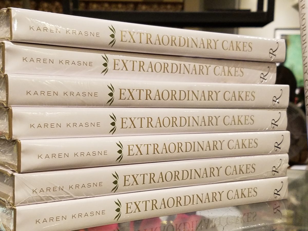
And yes, there’s a book about the cakes – Karen Krasne – appears
to be the brain behind this bounty. I look forward to meeting her. She has an
amazing machine with a well-oiled staff. Everyone was efficient and friendly
and shared in the enthusiasm that was being expressed all around.
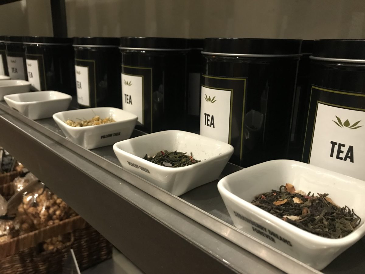
The shelves are filled with teas and other sweet
temptations, interesting vessels and serving pieces.
The lighting is dim and the structure envelopes the interior with white-washed frosting of voluminous space punctuated with dark cylindrical pendant lights and pierced bubble-like panels back-lit for added interest, subtle luminosity and dimension.
Raw, polished concrete floors, steel tables and molded wood
chairs give a nice balance of warm and cool, rigid and suave – while clean and
almost hygge in feel.
Perhaps, in the world of custom confections and TV foodie competitions, these desserts might be within some semblance of a norm – but only from the finest of creatives, in circles of which we usually do not run.
But having cavorted last night through the cheerful melee of confection connoisseurs – albeit one doesn’t have to be clubbed over the head or knighted by the cooks of the kingdom to appreciate what we experienced – we are sufficiently spoiled both visually and flavor-wise to be tough to ever satisfy again. Good design. Great design. Extraordinary design is often still an understatement!
Busy lives in a new town, he in his residency and she working
in a busy OR, they bought a house – their first house – and asked for help
making it theirs.
They have traveled the world and collected art along the
way, a disparate inventory of things that caught their eye, spoke of their
experiences and reminded them of people, places and things to savor once home.
Home, that was the task. Create HOME in this new, old house. Built mid-century, it was simple, clean with some patchy remodeling from previous owners reflecting rather common decisions, with limited funds. We needed to discuss priorities and budget, evaluate what should stay and what needed to be changed.
They both had a love of Guatemala. Their travels there left
them with dreams of color and pattern, handmade functional art and an exotic
sense of place. Having these elements ingrained in their longing, they
expressed a desire to have that sense, but with a bit of a modern twist.
Assembling the colors and materials…
We salvaged the existing natural granite slab countertop and
unfortunate surface-mounted sink. The granite was a practical save and the sink
came along for the ride. In order to integrate the granite as though
intentional, I selected a multi-colored
Talavera tile that specifically had a dollop of mustard glaze in the design
picking up that Dijon field color in the speckled granite. As is my usual
preferred mode of installation, we took it wall-to-wall as a complete wall-covering.
We also saved the cabinet boxes and doors, but needed to
give them a lift from their median caramel stain on oak. Deconstructing the
colors in the design of the Talavera, we
knew we wanted blue cabinets – so the paint shades were fanned and the color
pinned-down. To give the cabinets that wabi-sabi look of loving wear, we sanded
the edges after the painting was finished. We also added cabinets over the
stove for additional storage space and utilization of that blank wall.
We removed all the doors and drawer fronts, filled the holes from the old pulls/knobs and painted them off-site. We painted the boxes in the field. Granite was salvaged along with the sink. New paint, Saltillo flooring, Talavera tile and cabinet pulls along with new appliances gave an updated look to the scene.
In real life, when
practicality rules, certain things have to give way for the good of the
whole. The whole being the pocketbook and other elements that take precedence
at the time. So we live with the radiant heaters, keep the chandelier for now,
until they have one fabricated to their specifications, use a machined rug
instead of a handcrafted piece and know that over the years they will massage
this starting place and truly make it their home.
Continuing to dissect the colors from the new wall tile, our
colorful young couple wanted more color…we chose individual values of bold
paint colors – smoky turquoise, slightly
burnt orange and brilliant golden yellow to intersect the planes throughout the
space.
Typical mahogany doors common to that era of home interiors,
the decision to match the white trim would have been easy, but we labored over
the existing natural, tropical wood and decided to keep it in the mix.
Although the nearly immaculate, original hardwood oak floors
were revealed after removing the wall-to-wall carpeting, the kitchen floor
throughout the rear vestibule and laundry room was an inexpensive and
uninspired sheet vinyl. Saltillo clay
tiles were the answer to furthering the Guatemalan feel. More commonly
associated with Mexico, these clay tiles are historically the plebian choice.
Taking many forms, some artful enough to be the cornerstone of patrician interiors
in fine mosaic installations and other patterns and designs, clay tiles –
glazed and unglazed always add an artful, soulful human element. Speaking to
that, we inserted 2″x2″ glazed Talavera accent tiles into the floor’s
new Saltillo field in the vestibule creating
an almost area-rug-like definition.
The dated floor-plan enclosed the kitchen separating it from the rest of the living area. The very first comment made by our clients was questioning if we could open that wall – connecting with the living room and large picture window beyond.
The mottled cobalt blue light fixtures add another punctuation of color over the bar along with the parrot green barstools that our home-owners spontaneously nailed in an irresistible lust for even more color!!
Rather than trying to continue the existing “Dijon” granite, white Talavera tiles were used on the new pass-through bar counters – both high and low on the new cabinets.
The first phase of this colorful project has set the stage for an enjoyable work-in-progress for years to come as they now have a basis for design, more collectibles to come, and all they enjoy from places near and far. The upcoming annual trip to Guatemala, in April, will reinforce the joy and appreciation for this special place “home base” in their lives.
The dogs look in eagerly, but are limited to their expansive backyard, their vestibule and full run of the master suite.
Although they selected a durable denim twill fabric to reupholster their sofa and loveseat that they were gifted from a friendly neighbor, the primary living area is – for the most part – “off-limits,” but that seems to work for everyone in the family!!!