BEFORE AND AFTER for Busy Young Couple Making First House a HOME

Busy lives in a new town, he in his residency and she working in a busy OR, they bought a house – their first house – and asked for help making it theirs.

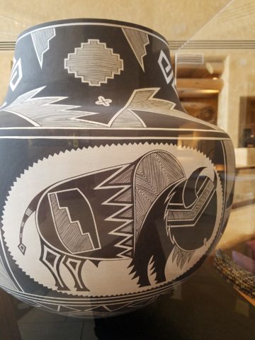
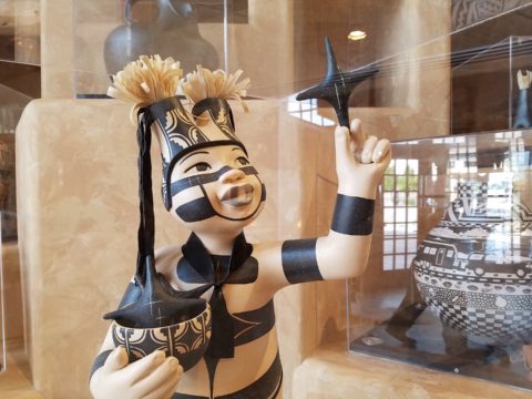
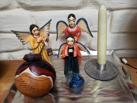
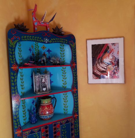
They have traveled the world and collected art along the way, a disparate inventory of things that caught their eye, spoke of their experiences and reminded them of people, places and things to savor once home.

Home, that was the task. Create HOME in this new, old house. Built mid-century, it was simple, clean with some patchy remodeling from previous owners reflecting rather common decisions, with limited funds. We needed to discuss priorities and budget, evaluate what should stay and what needed to be changed.

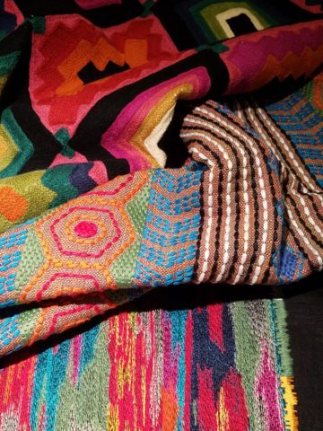
They both had a love of Guatemala. Their travels there left them with dreams of color and pattern, handmade functional art and an exotic sense of place. Having these elements ingrained in their longing, they expressed a desire to have that sense, but with a bit of a modern twist.

Assembling the colors and materials…

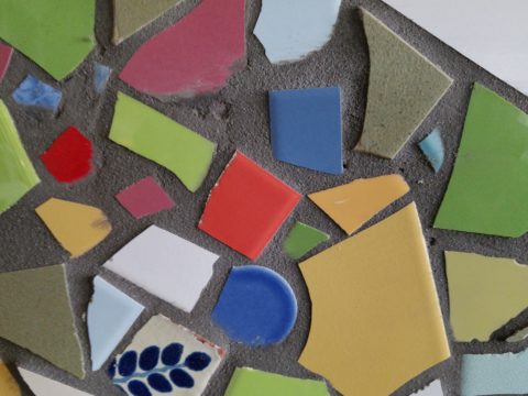
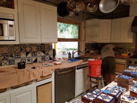
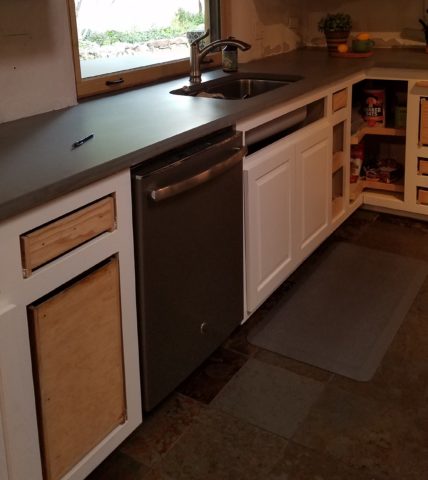
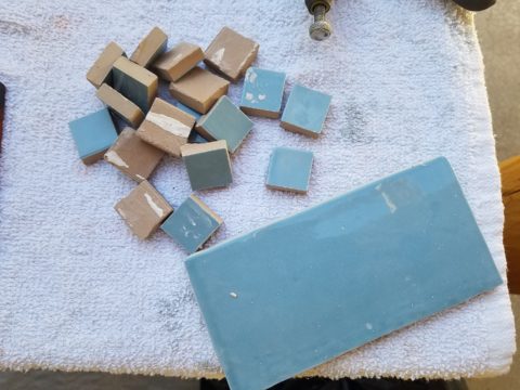
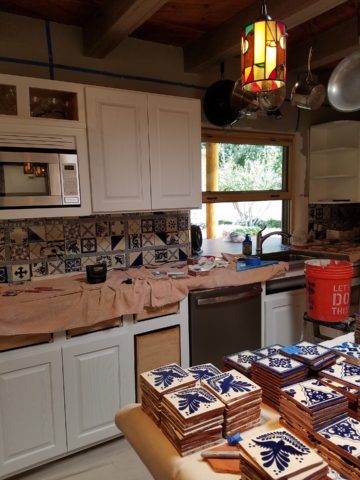
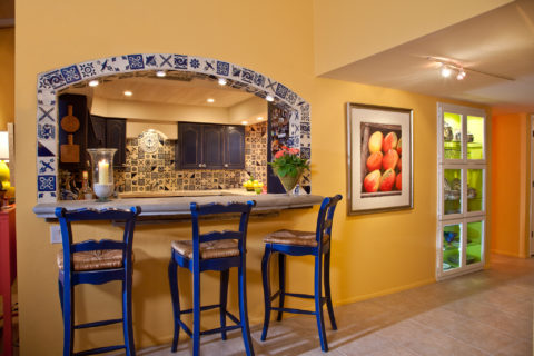
We salvaged the existing natural granite slab countertop and unfortunate surface-mounted sink. The granite was a practical save and the sink came along for the ride. In order to integrate the granite as though intentional,  I selected a multi-colored Talavera tile that specifically had a dollop of mustard glaze in the design picking up that Dijon field color in the speckled granite. As is my usual preferred mode of installation, we took it wall-to-wall as a complete wall-covering.

We also saved the cabinet boxes and doors, but needed to give them a lift from their median caramel stain on oak. Deconstructing the colors in the design of the Talavera,  we knew we wanted blue cabinets – so the paint shades were fanned and the color pinned-down. To give the cabinets that wabi-sabi look of loving wear, we sanded the edges after the painting was finished. We also added cabinets over the stove for additional storage space and utilization of that blank wall.

We removed all the doors and drawer fronts, filled the holes from the old pulls/knobs and painted them off-site. We painted the boxes in the field. Granite was salvaged along with the sink.
New paint, Saltillo flooring, Talavera tile and cabinet pulls along with new appliances gave an updated look to the scene.

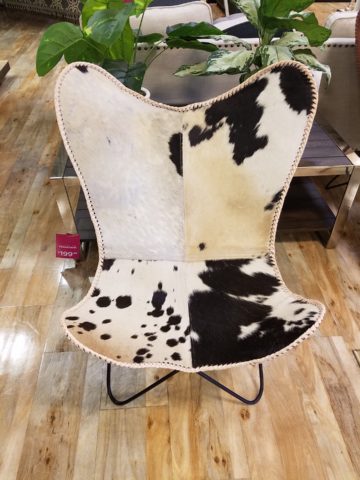
In real life, when  practicality rules, certain things have to give way for the good of the whole. The whole being the pocketbook and other elements that take precedence at the time. So we live with the radiant heaters, keep the chandelier for now, until they have one fabricated to their specifications, use a machined rug instead of a handcrafted piece and know that over the years they will massage this starting place and truly make it their home.

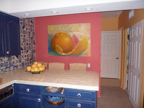
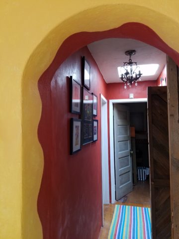
Continuing to dissect the colors from the new wall tile, our colorful young couple wanted more color…we chose individual values of bold paint colors –  smoky turquoise, slightly burnt orange and brilliant golden yellow to intersect the planes throughout the space.

Typical mahogany doors common to that era of home interiors, the decision to match the white trim would have been easy, but we labored over the existing natural, tropical wood and decided to keep it in the mix.

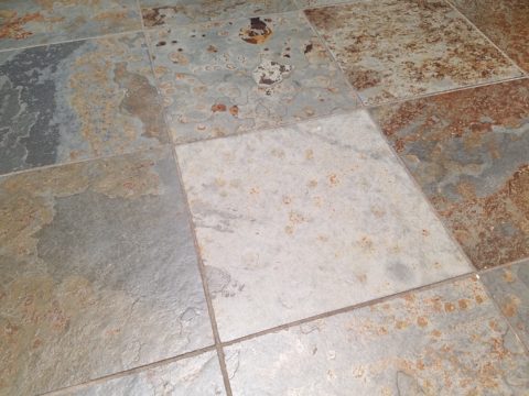
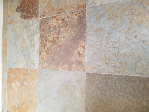
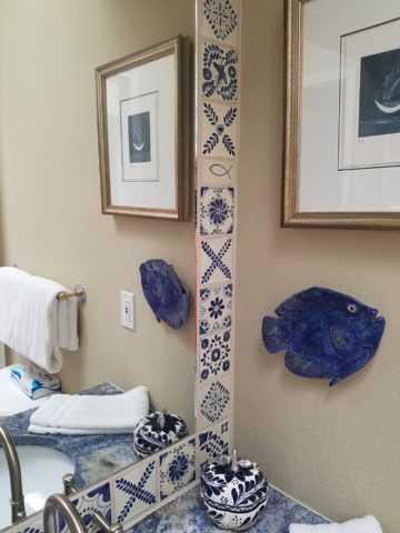
Although the nearly immaculate, original hardwood oak floors were revealed after removing the wall-to-wall carpeting, the kitchen floor throughout the rear vestibule and laundry room was an inexpensive and uninspired sheet vinyl.  Saltillo clay tiles were the answer to furthering the Guatemalan feel. More commonly associated with Mexico, these clay tiles are historically the plebian choice. Taking many forms, some artful enough to be the cornerstone of patrician interiors in fine mosaic installations and other patterns and designs, clay tiles – glazed and unglazed always add an artful, soulful human element. Speaking to that, we inserted 2″x2″ glazed Talavera accent tiles into the floor’s  new Saltillo field in the vestibule creating an almost area-rug-like definition.

The dated floor-plan enclosed the kitchen separating it from the rest of the living area. The very first comment made by our clients was questioning if we could open that wall – connecting with the living room and large picture window beyond.

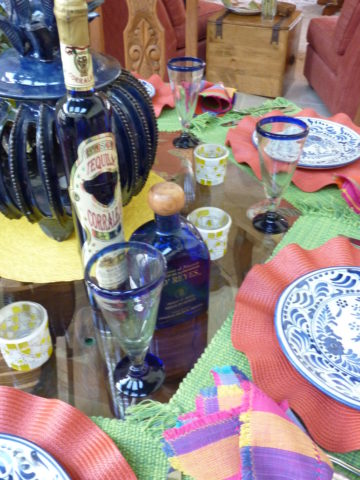
The mottled cobalt blue light fixtures add another punctuation of color over the bar along with the parrot green barstools that our home-owners spontaneously nailed in an irresistible lust for even more color!!

Rather than trying to continue the existing “Dijon” granite, white Talavera tiles were used on the new pass-through bar counters – both high and low on the new cabinets.

The first phase of this colorful project has set the stage for an enjoyable work-in-progress for years to come as they now have a basis for design, more collectibles to come, and all they enjoy from places near and far. The upcoming annual trip to Guatemala, in April, will reinforce the joy and appreciation for this special place “home base” in their lives.

The dogs look in eagerly, but are limited to their expansive backyard, their vestibule and full run of the master suite.

Although they selected a durable denim twill fabric to reupholster their sofa and loveseat that they were gifted from a friendly neighbor, the primary living area is – for the most part – “off-limits,” but that seems to work for everyone in the family!!!

Time to Remodel – Finding a Theme

Time to remodel the kitchen!! This charming little bungalow had already experienced its share of remodeling – well, not so much structural – although, many interior design transformations had occurred over the decades. In the mix, the well-used and enjoyed kitchen was feeling a quite tired and dated.

You might remember I have used this now completed project, in the last few months, during its transformation process to identify certain features and design practices. Here is the as-promised unveiling of the before and after photos for further discussion about the design process, intent and results.

We loved the mottled color and organic character of the existing slate floors and opposing green-grey beams with spanning boards of a caramel stain. These were the two elements that went well together as though intentionally planned. Yet in between, the pale, peachy pickled oak cabinets with their radius detailing and red-rose/black matrix of the tiled granite counter-tops, didn’t seem to speak at all well with the ceiling treatment and slate floor’s greens, rusts and charcoal tones. It was a dark, confused space.  

When observing and “listening to” the house, it was evident that the current kitchen, in addition to being poorly coordinated, had absolutely nothing to do with the original architectural intent. The new owners had brought a few very fine antique pieces into the home. The mid-century circa 1964 age of the house accepted them on its original hardwood floors also adorned with their fine antique rugs…but something was missing. There was no cohesive thread running through the house. Over the years finishes and decorative elements had been selected and installed without any consideration for original materials or an attempt to introduce compatible and harmonious materials for the good of the home’s overall theme.

In all fairness, had the entire interior been gutted and a contemporary interior been uniformly installed into the framework/shell of the structure, I might have considered it a success. However, this multiple decade decor was a mix of disparate trends and preferences that had no commonality.

To begin the process of bringing this home into a cohesive design last year, we had redesigned the living room. There we introduced a classic blue and white color scheme derived from the Persian rug in the adjacent dining room.

To the corner kiva fireplace, we added a sandstone hearth and mantle with just enough blue and white Talavera tile trim at the base of the hearth to subtly coordinate with the new scheme. The Talavera was an appropriate material for this New Mexican bungalow.

The original fireplace had a dark, broken brick quarry tile hearth and no cap on the mantle.
The face-lift replaced the hearth material with broken-edged sandstone slab and matching mantle cap with Talavera detailing at the bottom.

With this living room having been so successfully re-designed, the obvious thought came into the discussion to continue the vernacular of the blue and white Talavera into the kitchen. As a bit of a purist when it comes to application and termination of materials, I was not content for a mere back-splash.  No, if the tile were to be effective and commandeer the stage, it had to be used wall-to-wall as though an entire wall treatment.

Treating the Talavera tile as wall-covering, it continues from the kitchen, into the adjacent pocket-space housing a desk and laundry machines.

But wait! The addition of an earthy aqua handmade tile from Spain offered an appealing and unexpected accent woven intermittently through the Talavera. It created a coordinating thread from the colors found in the mottled slate floors and ceiling beams.  

Pre-grout shot shows the individually cut 1″ pieces inserted as mosaics into the random field of Talavera

The cabinets were in excellent condition, but the doors were sadly dated and in no way spoke to the home’s other cabinets, doors and finish carpentry.

The confused interior finishes we in need of a transformation!

With the white raised panel theme throughout the home’s original appointments, we elected to salvage the cabinet boxes and replace the doors and drawer fronts with a similar raised panel detail. The same red oak was used and, with a glossy white paint applied, the grain “read-through” with a very intentional yet subtle moiré-like pattern. The new raised panel white doors and drawers, with crowning top molding provided a crisp, timeless motif. The random patterned Talavera used as an entire wall-covering was very effective. The kitchen was quite gussied-up!!

The transformation was dramatically successful!

The existing slate floor was beautifully organic and I felt, from a design standpoint, was a must to salvage. Making it look like an intentional selection – part of the new scheme – was imperative. Therefore, selecting a counter-top that communed with the tones in the floor resulted in a selection of concrete-like engineered Italian quartz material – balancing the floor with the next horizontal plane and ultimately with the stained and green-grey boards of the existing ceiling treatment.

The new concrete-like Italian quartz counter-tops coordinate well with the other materials.

Another asset was the connection to the outdoors, however the existing window over the sink was high and small.

The window over the sink was high and small…

By bucking the warranty of the Pella people, we had a new double-hung window made to close down onto the new counter-top that passed through from inside to out. They would not fabricate the window to do what we intended, so we had the contractor remove the bottom of the new window frame, thus rendering the warranty null and void, in order to have a completely open, uninterrupted pass-through when raised.

Amusing and interesting…existing family pieces of blue and white ceramics are being discovered and used as decorative accessories in the new kitchen!

We also captured the opportunity to open the opposing wall into the hallway adding pass-through light and dimension to the space. This exponentially expanded the space and made the encapsulated kitchen feel much less confined.

Before, the kitchen felt small and dark…
Opening the wall into the hallway brought in additional light and dimension.

To add drama to the newly created dimension, we discussed having a painting commissioned to pop an accent of yellow into the blue and white scheme on the far hallway wall. Lemons, a perfect citrus for the kitchen, was decided for the theme.  

A miniature oil painting by Federico Leon de la Vega was used to Photoshop into the scene to inspire and convey the design intent.

The additional POP of yellow is a dramatically effective contribution to the overall composition. After consideration, the owners selected a local artist to paint the full-scale painting.

A local Albuquerque artist, Thomas Tomlinson rendered the lemons in acrylic with blue and white tile details.

In summary…keeping the original slate floor, existing cabinet boxes (replacing door and drawer-fronts only), with a bling of new chrome cabinet pulls, switching out the stained glass pendants, replacing the island’s surface with a handsome solid walnut top and a new coordinating concrete-like counter-tops on the periphery, with the decorative embellishment of the Talavera tile continued from the subtle introduction at the living room’s kiva fireplace, the transformation of the kitchen is stunning – not trendy – and was truly, uniquely designed for the architecture and forward, on-going contextual design conversation of the home.

Uniquely designed…

Look around and listen to the environment for and in which you are designing. What makes the best sense for the design direction considering the function and context of your project?

What’s YOUR Favorite Color? A Little Project for Fun!

Pick a color. What’s your fav? Do you HAVE a favorite color? I was asked the other day that very question and I was really at a loss…I looked at her, furrowed my brow and cocked my head.  I wanted to have an answer – a simple answer that stated a definitive preference for a color – my most favorite. Rather than producing a quick sure pick, I faltered as she stepped in and said – I’ll bet it’s purple!

Well, actually I can definitively say that purple is NOT my favorite color, but the funny thing is I can love purple, in certain context. The real answer is that I love nearly any color in a certain context.

When I ponder the question a bit more, I can assertively say bright pinks, cornflower blues, golden yellows, chartreuse and brilliant orange. But the truth is, I love so many colors that I am hard-pressed to select just one! It sounds like a Lilly Pulitzer color board.

So I thought of a little exercise. I decided to pick a color at random. Then overwhelmed with the myriad colors that might produce one random pick, I fine-tuned random and said to myself, perhaps a color of the season. To me that was currently and boldly orange. So the idea was that I would walk in and around my house today and capture things that were orange.

This screaming orange hibiscus just came in from the patio to escape the chilling temperatures that have swept down in the last couple of days…happy to transition indoors for the winter!

Try it. Pick a color – not necessarily your favorite – but certainly one you like and walk inside and outside of your house and see how many examples you can find, of that color, in your immediate world. Photograph things that have that color – all or in part, even little details – anyplace that color occurs.  It’s fun and very interesting to see what you discover!!

Autumn is loaded with vibrant colors, but orange is one of the most fiery.

So I selected orange as my color today. I dashed around the house and collected a variety of things that were orange. I was actually astonished at how many I discovered.

This dramatic Hopi – influenced kachina by Gregory Lomayesva sports stylized antlers in a flat but brilliant orange.

Festive ceramics by Ann Marie Werner Smith – here a graceful orange bowl that sits on the counter…it pops against the contrasting granite.

It is interesting because I know my world is not heavily orange, but I found so many wonderful splashes of it throughout my interior and even startling exterior, in the way of the leaves on the Bradford Pear tree.

From fresh mini pumpkins and flowers…

A succulent orange flowering Kalanchoe is our seasonal centerpiece on the kitchen table.

A variegated Croton plant has lacy veining of bright orange, pink and yellow contrasted against it dark green background.

to artwork with swaths of orange streaking through them.

A lovely little oil painting by Jeff Otis depicts a very autumnal New Mexico river scene.

At the last minute, while waiting in the Bejing airport, I found this precious little painting of birds and berries. The background is a vibrant orange. Notice the fresh blues adjacent to the orange. This is a detail of the much larger piece.

Peggy Zuris really knew color. Her bold and confident brush strokes applied in luscious swaths placed adjacent colors perfectly juxtaposed creating uplifting renditions of daily life. This little chicken is a detail of a fanciful rural scene.

The balance of color was so interesting. Where I found orange, I nearly always found blue – unless it was a stand-alone like the glass bowl of oranges – or my coral necklace with its nuggets of bright orange coral.

Fresh oranges with their intricately textured rinds fill a glass bowl on the kitchen counter.

Nuggets of coral look like candy corn tightly beaded on this delicious necklace I wore too Santa Fe today!!

Colors balance and contrast.

Even the coasters that attracted my attention last weekend at a bar. I was so taken by them that I brought them home and had them sitting on the kitchen counter. They were intriguing and offered interest and visual stimulation to my graphic art sensibilities.

I began this story earlier today, then took a break and tootled up to Santa Fe where I came across a couple more bright orange pieces…

And on the way home, I was even blinded by an orange fireball glowing beneath the stormy sky silhouetting the dark mesas and glistening off the wet pavement. It’s intense heat contrasting with the cold, damp asphalt that was a result of our first seasonal snow seen here spitting at the windshield.

Gather your collection of photos of your color today. Ponder how they and the color make you feel. Do you get joy from the color and the things you have discovered? Was this not your thought-to-be favorite color and if not, might it be one of them? How do YOU answer the question, what is your favorite color and having determined that, ask yourself:  Do I wear it a lot? Would I paint my walls that color? Do I have upholstery that color? When is a favorite color an accent? Is the joy in the little spots of punctuation? Are they intense, but small, elements of joy without over-doing it? I see a collection of abstract images, details of things – some of which can be cropped more – to create an abstract collage of wall art. Voila!

Color – an amazing facet of design and it’s most versatile component. It’s been a fun test and a compelling story. So what’s YOUR favorite color?

Adopt a Pet…Adopt a Piece of Home Decor

Are you drawn to pet adoption events? Do you wander over when you find the dog adoption people parked, out in the open, along the side of the road, in the corner of a parking lot or even at the pet stores themselves? I don’t. I avoid them like the plague. I know that given just one sweet look or mournful expression or happy eager wag, I would have a problem.

I rescued my Rockford about 30 years ago. He had been kept chained to a tree in a backyard with a choke collar that he had very much outgrown.

I absolutely cannot allow myself to be tempted knowing that my resistance would be weak and my resolve would be challenged. I don’t need a dog at this time in my busy, crazy  life. However, I would certainly go that route, if I were in the market.

Little Mini was passed from house to house until the fit was just right!

We all know that adopting a pet – dog or cat…or other…is such a wonderful gift – to them and to the lucky new owner! And I feel the same way about furniture and home decor. Yes, I see a direct correlation between “thrifting” and pet adoption. Funny?

Whether it is a early start on the garage sale circuit (not my bag, but very worthwhile) or estate sales (also not my thing as I get too emotional, about the family not wanting the treasures) or scouting consignment shops and thrift stores (less emotional because the context of the pieces are not so personal) it’s all about treasure hunting. It’s a growing trend for sure!

But like pet adoption, I see salvaging a previously owned piece, over buying new, just like giving a fresh start to a neglected, even forgotten, treasure. And, as you know, they say “One man’s trash is another man’s treasure.” and I so believe that statement! That same phrase could be said about your newly adopted pooch!  Your new “treasure.” As well as that fabulous hand carved chair – your new treasure!

Bring it home, get it cleaned up, play with it around the house and get it some new clothes – oh – am I talking about the new four legged family member or that awesome new chair??!! Interesting similarities are shared by the adopted pet and the adopted furniture find!

All dressed up and ready for a party!!!!

From Victorian through mid-century modern, reupholstering gives a fresh new outfit to that fabulous piece that has been left sporting a shabby suit.

Threadbare but still fabulous – what a great save!

See beyond the existing condition  – “You can’t tell a book by its cover.”  And you will see beyond the surface focusing on the lines, bones and details.

This Winged Victory of a sofa was ripe for re-purposing!


New suit and shoes and this was a great save!!!!!

Discovering great pieces is soulful. Eclecticism is interesting. Balance is better achieved when you have a mix of interesting things.  Buying all new is not as creative and can result in a monotonous look that is immediately dated. You’ll know what year THAT room ensemble was created!!!!! Furthermore, re-purposing, recycling, up-cycling trends provides an opportunity to employ the talents of the local upholsterers and refinishers – support local talent!

To a void that pitfall – be brave and seek your pieces. Assemble them with care and embrace unique things. If you love them – make them part of your world. Find potential and then enhance it. Context enhances. Mix new with old and give new life to old pieces. It will be a satisfying and rewarding experience.

What you see in a thrift shop is one thing – seeing beyond it to a new context that celebrates it and features it with other things you love is the personal magic that makes YOUR interior uniquely yours.

This tired but handsome piece came to us in need of a face lift!


Multiple fabrics add pizzazz! Find just the right fabrics and you have a custom masterpiece! And the lumbar pillow for this one is still on it’s way, for a third pattern providing even more interest!!!!!

Give new life to old pieces and it will be a rewarding experience. Then go out an adopt a dog!


Seasonal Shifts in Design – When Do YOU Make the Transitions Between Seasons?

I am often asked, “When should I make seasonal changes and how?” This can come from retailers debating their front window displays to individuals wondering when, to change the wreath on the front door and on into their interior decor, to reflect the seasons.

The answer is a combination of things. It’s personal – probably starting with where you live. And for me, it is more than just decorative accents, it’s food and drink and clothing for sure. Clothing though might have real, practical adjustments for temperature, but fashion design and seasonal changes are part of the fun!

So to kick-off fall, I shifted into my seasonal drinking modification  – dark drinks – moving from citrus embellishments to the delightful, succulent, marinated cherry at the bottom of a well crafted Manhattan. The perceived warmth of darker drinks is real for me. I would never select a Manhattan in the summer. But I must admit, a vodka martini with a twist is a 365 fall-back beverage for any festive situation.

The rich warmth of a well crafted Manhattan…

Clothing and the opportunity to make design statements that reflect the seasonal shift are also fun to embrace! Along with the Manhattan last Friday night, I transitioned into a felted wool tunic with a local artist’s hand-woven black chenille over-sized scarf. Still sleeveless – as the shift is still a bit of a struggle to let go of summer, it was a decidedly seasonal reality nod!

Truth be known, the wide expanse of floor to ceiling folding glass panel doors were wide open right behind us as we sat at the bar allowing a direct connection with the crowds gathered on the patio beneath the high-hat heaters. Truly a straddling of the seasonal shift – not quite ready to let go of al fresco dining???!!!

Seasonal shifts in weather will be a sure way to respond to a want to change decorative elements. And even being a bit pro-active can be a good thing – but when is too early – too early?

Most of us cringe when we hear Christmas music in October or see the merchandise out that early – combining Halloween costumes and candy corn with Christmas trees and all the ornaments. Awful!!!!!!

Across the country, we have experienced a delay in the autumnal shift this year. Summer kept clinging. Warm weather belied the calendar. But when the weather shifts…and the temperature drops…we want to hunker down and cozy up. Perhaps in addition to the decorative items, you might simmer cinnamon sticks on the stove or light candles with spicy scents. How about a hearty beef stew for dinner?

Here we are in mid-October and summer was here yesterday and gone today with the incoming storms, cool drizzle and cloudy skies.

I just got off the phone with Victoria up and over in Fairfield and she bemoaned the fact that last week she was attending classes in shorts and today she is bundled up in a Patagonia fleece jacket not wanting to leave her bed! The seasons have shifted like a slap in the face!

Color is a key element in expressing the seasons. Between summer and fall, golden yellows bridge the gap. Leaves on our red bud tree change from brilliant lime green of summer to brilliant lemon yellow as fall sets in…lime to lemon – a brilliant color statement!

From late summer sunflowers to early autumn chrysanthemums, the brilliant golden yellow satisfies the transition between seasons.

As fall proceeds, the darker tones of rust and caramels suggest the waning season…crunchy, dried leaves and final wisps of foliage going dormant for the winter.

I’m hanging my Black-eyed Susan wreath today out on the front door! I might even leap to the addition of a funky black cat that I have to welcome Halloween. But it has not been a gradual expression of acknowledging the change in seasons, it has been summer…bam – fall.

DIY – I made this and one for Mom a few years ago – they last. Get a grapevine wreath, select your favorite leaves, fruit and flowers, grab your glue gun and wire clippers – Voila!

What spurred this subject for this week’s blog was seeing my neighbor’s witch’s legs a few days ago sticking out from the elegant planter by her front door. I first thought – what a riot! Then I realized, it’s mid-October and I have yet to accept that!

I am very reluctant to release summer. I’m a warm weather one for sure. I cling to the last vestiges of sunlight as it tracks around out house…less evident, less accessible…shorter days…darker mornings and evenings… NO!!!!!!! I resist, but must succumb. There’s no escaping it. The seasons change and time marches on….The happy fuchsia and pink vinca in our front yard might not make it another day with night temperatures threatening to drop.

The happy pinks and greens of vinca out by the mailbox are about to get nipped!!!

Decorative accessories punctuate the landscape of autumnal interior design. From real pumpkins and gourds, squashes and mums, to their artificial counterparts made from many media. Glass and pottery, papier-mâché and straw-like wraps, silk flowers and faux fall leaves, the possibilities are endless.

This year some outstanding hand-built pottery figurines caught my eye. Artist Robyn Chlad of Tucson, Arizona has designed and created a collection of wonderful statuary luminarias that are an extraordinary design decree for this and all seasons! Kachina-like, these art-pieces make a fabulously functional statement!

This proud raven holds a berry in his beak!

At first I was attracted to their vertical shape and fine detailing. The characters had personality – rigid in their cylindrical forms, yet very animated of expression and fine features.

Chlad has depicted regional animals with a bit of folkloric whimsy (in the jackalope – half jack rabbit/half horned antelope) to  present a collection of irresistible characters to gather at your dining table, or greet you on your entry console, perk-up your powder room, collect on your cocktail table, grace your patio, or animate your kitchen!!! How fun are they?

A caped coyote – the masked bandit!

They each are pierced with designs, to allow the light to glow from inside, that depict the landscape or regional architecture in and around which these creatures roam. Illuminated by electrical lamps, battery bulbs, or candles, they are fantastic!


Functional art – these pottery luminarias are exciting art pieces to add a joyful glow to your shorter days and darker hours….

The raw terracotta clay contributes to their natural beauty and complimentary color with a fall palette.  It is a strong statement, yet the surfaces are smoothly burnished and have a soft read. The touches of matte glazes add just enough adornment enhancing the statues with soft earthen color accents.


Embrace the seasons and have fun selecting your personal design statements as you transform between seasons!!!

Urban “Pieced Work” – an artistic narrative

We are excited to have the opportunity to bring a design installation(s) into a new project that will serve to support the brand with a twist. A nearly completed new smokehouse is coming to Albuquerque. This home-grown eatery blends family history and southern roots with southwestern barbecue flavors including indigenous  wood and iconic chile blends. But this is not about their cooking profile. It is about how we have arrived at a design theme that will define and further the identity in this new, specialized smokehouse department of this larger local brand.

To accomplish this task, we examined the concept the owner had  to remodel an existing facility that had been a popular gathering post serving this community for decades. The fringe barrio location was of a demographic primarily comprised of Mexican/Americans. Decades past it was home to a heavily black community. The fabric of these cultural combinations suggested a mosaic of color and vibrant heritages.

The spark of cultural references lead to discussion of the popular artistic expression of urban mural painting.


When we began the dialogue, the decision to have a mural painted by local neighborhood kids, with a mentor to design and supervise the work,  seemed to be the direction we were headed. After subject matter debate and development, I veered off on another tangent that might take a less subjective approach, be weather-proof and more durable for a patio location – mosaic.

This new more impervious and durable medium still offered the opportunity to engage the community, but with less focus on a specific subject and more about geometric color and texture. We discussed the details of installation so as to keep it simple for kids to participate using whole tiles – minimize cutting, if any, for starters.

Inspiration came from several other installations such as the Albuquerque Convention Center’s on-going mosaic mural project wrapping many sections of the buildings with intricate scenes of New Mexican lifestyle and cultural diversity. The colorful mosaic is an elegant and sophisticated contribution to our city’s cultural aesthetic.

Helen Atkins, manager of consignment art at PATRICIAN DESIGN’s downtown boutique gallery and the lead on their current restaurant mural project, has worked on several phases of the Convention Center’s mural project.

We have incorporated mosaic into several of our own design projects such as last week’s blog https://patriciandesign.com/trust-and-custom-designs/about a residential kitchen installation.

Here, in another installation, a fireplace surround of mosaic adds movement, color and textural interest to the room.

Ultimately, one of Helen Atkin’s personal photographs cemented the approach. It was decided that a geometry of different sizes and disparate glazes and designs of tiles pieced together in a colorful, textural  panel would be our design theme.

Helen Atkins, a recognized artist in many media, captured this in passing while visiting New Zealand. It’s crisp, yet irregular composition was intriguing and pleasing. It became the springboard for the concept for a geometric mosaic panel to anchor the theme of this new New Mexico eating establishment.

The idea became more exciting as we began gathering material from local tile distributors and our own personal inventories of favorite treasures saved for a special project. Here it was.  It seemed such a strong design element and therefore offered a new direction for the actual brand of this establishment. We embraced the idea and brought it into the interior and distributed murals throughout the space.

Still under construction, we will not divulge the identity or locations of this project just yet. But suffice it to say, the murals are an exciting part of this interior design scheme.

As we further discussed the plans to implement this project, school started and the ease of coordinating the assistance of neighborhood kids became more difficult. Helen lead the project as primary installer, coordinator and supervisor. She enlisted the assistance of a couple of people – one experienced and the other not at all.

We have named this series, Urban Pieced Work – an artistic narrative. Here we are interpreting generations old sewing patchwork using ceramic, glass and pottery pieces rather than the traditional fabric patches. The original folk art needlework has been in the American vernacular for ages.  In these installations, this up-cycled  use of discarded or discontinued tiles is similar to patchwork fabrics, re-purposed to make clothing, wall decor, window treatments and bed dressing when times were tough – often referred to as “pieced work.”

My paternal grandmother in New Mexico made this twin quilt for my bed when I was a child in Virginia.


My same grandmother made this and was given to me by my cousin, her only other granddaughter.

Mosaic is often, like fabric patchwork, a practical art form that puts scrap, shards and fragments to good use in an artistic fashion. Note though that more sophisticated mosaics have been designed more intentionally for centuries not merely as salvaged material. These masterpieces both in contemporary work and antiquities represent many periods in history and movements in artistic expression.


This mosaic version connects with the history of the restaurant’s roots and southern heritage. The panels’ mural nature speaks to the urban murals found throughout the community.

Located strategically throughout the interior, these murals have become a strong design element and anchor for this facet of the brand.


Another shot of the spectacular cultural story murals at the Albuquerque Convention Center.

We have woven a meaningful artistic statement throughout the interior and also on the exterior of the building. In addition, we will be inserting a graphic version into the signage and logo design.


Urban Pieced Work – an artistic narrative, of a New Mexican Smokehouse, will provide pleasing design visuals throughout this new interior, provoke conversation and interaction, weave an element of history and context with the southern roots of this exciting new eatery!

Join the conversation and watch for the first succulent flavors to come out of the smokers later this year.


Trust and Custom Designs

Trust. When asking any kind of advice, you generally ask those you trust. That’s not to say that you might not question the advice. There is never only one way to accomplish something, therefore, advice can be as different as the number of advisers you ask!

From a design standpoint, to offer and create custom elements, it’s often the case that the client will say, “Can you show me an example of that?”  If something is new and different, created specifically in context and for this project, there IS no example. There might be similar things, or close approximations of the design – or not – but not the actual design. Trusting your designer to extract your wishes, taste, preferences and applicability to the space is key to creating something very special.

So, I can show examples of mixed pattern Talavera on a wall. I first did this in Tucson about 13 years ago to create a wallpaper-like full wall installation.

As I referenced this casita installation for my clients, while planning their kitchen remodel, I also came upon a restaurant in St. Louis this last spring that used a similar approach in an Italian theme…Talavera? Mexican? Italian? Oh well…another example I brought to the conversation.

For this new kitchen remodel project, we were working with existing conditions, the layout and the mottled green, rust, aqua, charcoal slate floor. All else was up for grabs. However, because I really feel strongly about context, I mentally gathered elements from other parts of the home and intentionally embraced the floor.

This fireplace was given a face lift last year to add the stone hearth and mantle with the decorative Talavera tile detailing.

I believe to abandon existing design themes reads like a designer show home – each room done by a different designer, without any cohesive design continuity. Pair the idea to make an effort to lace the rooms together, with the effort to adopt certain fixed materials and you have compelling diagram of creative remodeling guidelines.

When it is either not practical to replace an existing design element or when the existence of the that design element makes for an un-self conscious part of the composition, it can be priceless.  The slate floor was of smaller 12″ format tiles than might be more popular today, but it’s unusual color and very organic feel was worth the challenge. Turning a questionable design element into an asset is success!


Once the flooring was determined to be key in the new design, extracting features (specifically colors) from it became the next task. We had already discussed bringing the blue and white Talavera in from the living room, but my client was not feeling the joy of pairing it with this wildly mottled slate floor.

To meld the design elements together, I selected a concrete-like engineered countertop (which came in two colors both of which were seen in the mottled slate – and provides fodder for a future story). This provided a solid anchor for the design between the mottled floor and the multi-patterned Talavera.

But what might be the one more thing to make this design be even more unique and more cohesive? I set forth to find the impossible, an aqua, handmade tile that would complement the Talavera in the light irregularity and “hecho a mano” feel.

The perfect handmade aqua tile from Spain (photo reads more blue) from DAL tile was the perfect accent.

The absolutely ideal accent appeared unexpectedly as I thought I would be searching farther and wider for this perfect piece. By cutting it into 1″ pieces we would have the artistic accent woven through the patchwork of Talavera, thereby inserting the aqua and adding interest and unexpected detail.

By not planning a symmetrical grid of the accent mosaics, but by creating random lines the unexpected quality of the installation continues.

At this stage, the grout could be grey or white – specifically off white (of which there are many). Opting for the white, to allow the tile to read in its patchwork pattern, without added confusion with a grid of grout competing for attention. We then made a last minute switch on the white grout to a creamier one after seeing the many colors of off-white Talavera up on the wall – leaning more creamy than merely off-white. Could I have shown an example of this design scheme? No, this was created specifically for this project, this client and the space that deserves such attention to detail.

We’re not finished yet. Watch for this transformation to be unveiled in coming weeks complete with before and afters!

Southwest Style – What is it?

Arriving for the first time in our American Southwest, one might feel like they have entered a different country, if not a different world!! To fly from anywhere else where there are rolling green hills, or green fields or dense green wooded landscapes, not to mention tropical environs and cruise over America’s Southwest, it looks like the moon – or some barren planet. Everyone remembers their first impression. Whether exotic or scary, lonely or seemingly uninhabitable, once you get on the ground and explore the beauty and variety of what’s here, you’re bitten – even smitten.

In all fairness, this is a completely defoliated winter shot!! Many now know how lush this magnificent Sandia Mountain can be at the top, in the summer. Yes, I said lush.

No other region has the distinct architecture and tri-cultural identity of what has become the elemental design style and flavor of this magical place. From “sea to shining sea” New England to Southern California you will find nuances of regional distinction – but not to the degree that the American southwest is set apart. Architectural influences from colonization have been the standard guiding style nationwide. Yet the ancient, practical elements, of civilization that long preceded the Europeans discovering the New World, is at the roots of this enchanting design style.

Tri-cultural architecture and interior design results from the remarkable history combining Native Americans carving out of stone walls, building with mud (adobe) bricks, devising simple, practical designs to capture heat and insulate in cold while minimizing solar gain in the warm weather months, with the conquering Spaniards and their colonial influences, and finally the pioneers from the east with their colonial English influences.  Now more often replicated, with frame construction and stucco facades, this unique melding is the core of Southwestern architectural design.

When one hears the term “earth tones” setting a design trend in the 70s, it suggests the brown, tan, orange palette that was terribly limiting. Certainly to label it earth tones, it became a curse of a color scheme. Sadly to link it to a representation of southwestern design was misplaced and unfortunate. And how sad to think that it was so broadly accepted – like lemmings following blindly – everyone adopted this as a truism. So often the case with trends.   The 70’s also spawned a diametrically opposite color scheme of blues and greens to refresh that which had been so mired in the “earth-tone” movement.

However, real earth tones are limitless. Earth tones are all colors…look down…look around. Even if you confine your interpretation to the dirt beneath your feet – the colors are vastly more than the brown, tan, rust, orange that became the rage. Soft pinks and grays, pale blue and whites…look at dirt. It might be more clay, might be more peat – from soft terracotta to dark espresso – dirt is earth and the colors and tones are limitless.

Tom Glover captured the beauty of the natural landscape through his artistic photographic medium that Georgia O’Keeffe and others have depicted through their artistic media.


Georgia O’Keeffe saw it and captured it in her own enduring style.

Nature offers color. Natural dyes have riddled that art world through time. Synthetic dyes took it a level further. But nature is at the core of all we have in this world.

http://www.quilthistory.com/dye.htm

Turquoise being a natural mineral in the American Southwest became a signature accent color punctuating the soft earthen tones of the adobe design palette.

Artist Victoria Martinez Rodgers paints a valley apple orchard and the turquoise wall is the perfect backdrop.

Color was always there for those who cared to notice. The great painters of this region presented it well. Their recordings of everything from the many colors of the rugged windswept landscapes to lush green mountain forests with shimmering golden aspen groves – and bosque cottonwoods screaming with yellow brilliance capture and convey so much more.

In autumn, bosque cottonwoods explode with color sending a streak of brilliant yellow all along the Rio Grande. Federico Leon de la Vega create this commissioned oil painting from a photo provided by his clients.

There are the natural and also synthetic dyes that were woven through the magnificent textiles of the Native Americans – blankets and articles of clothing were not limited to buckskin animal hides.

Ernest Blumenschein was the founder of the Taos Society of Artists capturing the color and textures of the realities that he encountered in this Land of Enchantment.

Sunsets everywhere play a part in the imagery of the landscape – here we see vast landscapes with brilliant fiery skies and those exciting corals and lavenders, soft pink and blue wisps provide inspiration for wall colors and backdrops to our richly embellished interior designs.

Yet spare, understated neutral interpretations also offer elegant representations of southwestern style.

So what do you visualize when you think of Southwestern Design? Please don’t say a turquoise wooden cutout of a howling coyote! Death by Southwestern Style – the overdose resulting from overdone clichés and trends that have spoiled the real art and beauty.

It doesn’t have to be all about cow skulls and pelts…but these cow hide butterfly chairs are pretty  cool!!!

Perhaps you see a Mexican influence which is also part of the melding of the regional style – like food, we have a fine line sometimes with certain traditional dishes that when adopted and adapted by American Southwest kitchens took on a unique identity all its own – differing between Texas, New Mexico, Arizona and California. We all enjoy bringing art and craft from our southern neighbors into our designs.

Borrowing, sharing, combining so many design elements such as adobe architecture, colonial wood trim detailing, fired brick technology, Mexican Talavera tile and pottery,

Native American textiles and so many other handcrafts

The owners of this interior have an intimate relationship with each of the artists that they have collected down to this magnificent mount of a buffalo. They knew him and his name and why he was put down.

from punched and tooled tin, paintings and pottery – southwestern interior design is rich with color, texture, artistic detailing and true soul. The connection to the earth is undeniable and nature always plays a key role.

So how might you introduce southwestern influences into YOUR design scheme? You could tile the wall(s) of a powder room in Talavera Tile. Maybe just a mirror surround?

You might paint an accent wall – or all walls in a room or some other bold color inspired by a regional image

Mango watercolor by Susan Weeks splashes coral against the golden yellow wall with a lime green lighted cabinet showcasing old, traditional, low-fire Talavera tableware. classic Talavera blue and white tile frame the bar opening and on through out the kitchen.

and collect art pieces such a punched tin crosses, wood and straw,

landscape or still life painting, hang a blanket or drape a bed with a beautiful woven textile…introducing different styles speaks to last week’s story about eclecticism. Don’t be afraid to mix things that you like. What brings you joy?


Discovering Patterns

This week began with a juicy fabric presentation. I say juicy because it got my design juices working and I was inspired to take photos and imagine the opportunities to insert these wonderful colors, patterns and textures into upcoming projects.

Take the chicken and the egg scenario. Do YOU often find that exciting design elements invite thoughts of projects for which to use them?

A fun exercise is to take your camera and search for patterns to photo…patterns are everywhere from cast shadows to fabrics, signs and graphics to fallen leaves.

Seeing these exciting new fabrics – you had no intention of changing all your throw pillows, but these stimulating samples might make you consider changing your entire collection!

The opportunity to offer unique fabrics for clients who would otherwise never be exposed to the samples – not know of the possibilities – is exciting. Being able to make this introduction is a treat.

This first batch was of clean, sophisticated, woven, geometrics in blacks, whites and charcoal tones.

Whimsical patterns and textures, with splashes of color, offer more possibilities.

Now see these rich woven patterns and colors in this next series. An explosion of color and pattern  with a decidedly native direction – prime for New Mexico and design projects looking to evoke the elements of the southwest and other opportunities inspired by indigenous art.

With all this freshly implanted in my ever-swirling brain of design fragments waiting to be assembled, I traveled north this weekend for an enchanting New Mexico wedding that further fed the theme of indigenous art, pattern and design.

The lobby of Buffalo Thunder was riddled with magnificent pueblo pottery. The designs were wonderfully intricate and I saw them as stand-alone elements that could easily be fabric motifs. Here on pottery – but so fascinating to consider as possible inspirations for fabric patterns and designs.

Anasazi Buffalo Pot – Acoma Pueblo

Suggestive of a court jester, this expressive piece tells a figure story. The bold patterns make a powerfully beautiful statement. Who loves bold stripes? Do you wear them? Do you upholster with them?

Evening Star by Katherine Wall from the Jemez Pueblo

Cut-outs on lobby lounge chairs, with geometric upholstery, atop bold zig-zags of the area rug proves combining patterns creates a fine line between exciting juxtapositions and pairings – and risking possible disturbing disruption of order. Comedian Steven Wright uses dry wacky wit delivering hysterically funny observations to convey a sense of the obvious with a twist. I’m paraphrasing one I remember from years ago… “You know that feeling that you get when you lean way back in a chair…way back on the back legs…back so far that you are just about to fall…I feel like that all the time.” That’s like that feeling with challenging design. It goes just far enough to get your attention…designers get that feeling as they push the theoretical limits of design – all the time!

Ok- this is not perhaps THE most outrageous example of this theory – but a fun, eye-catching combination nonetheless!

Buffalo Thunder resort was the jumping off point to then venture beyond into the thrilling landscape of La Mesita Ranch.

Mixing different colors of brick make this random patterned walkway very pleasing and interesting.

The setting was natural, organic and inspired.

Simply lovely centerpieces

See a lovely, intense example blooming blue and white and much more in Nantucket on the cover of the new June 2018 issue of Architectural Digest.  http://www.theenglishroom.biz/2018/05/29/nantucket-beauty-by-markham-roberts/

So look for patterns all around. Discover exciting opportunities to mix patterns and textures.

Be brave – play with patterns!


Regional Design Fun!

So many regions, so little time!!!! All the design directions available based upon where you are and what you love – just think!! Regional design provides a strong connection to the surrounding environs. From selecting artwork to color schemes, decorative accessories and even room scents, creating regionally specific interiors is a fun way to go. Often reserved for second homes, the novelty of focusing  on the design theme specific to the region does not always reflect real life.

Real life is usually comprised of a variety  of experiences, tastes, acquired objects, interests etc…designing around a specific regional theme is more deliberately focused and therefore not as eclectic as a person’s true life experiences and resulting accumulation of possessions and reflection of varied interests.

Seaside design would incorporate decorative accessories, fabrics and colors to represent the surroundings such as nautical themes and the elements of the natural scene incorporating seashells, seascapes, etc…

Therefore, the primary place of residence in such a locale would reflect that context but not necessarily be completely designed around it. The second home would have the novelty of centering the design exclusively on that seaside theme.

Here is a stunning example of the Americana By the Sea Bungalow! A spritz or burning of Votivo’s White Ocean Sands in this scene – oh heck – why? Just open the windows and breathe in the salty sea air!!!

While in the metropolitan Washington area, one can’t help but notice the architectural influence of colonial times and the interiors which reflect the same.

Steeped in the history of our relatively young country and the pre-colonial decorative arts that came across the water to the New World, the antiques, reproductions and embellishments are telling.

This whimsical casita in Santa Fe illustrates the colorful folk-art of both old and New Mexico, bold paint colors, graphic transitions, and the enchanting architecture of adobe charm. As a second home, the extravagance of collecting and displaying in a fanciful setting is a fun, on-going project!

A corner cabinet by acclaimed folk-art painter Barbara Peabody makes a bold statement housing additional collectibles from Old and New Mexico. A giclee print of a fabulous watercolor by Susan Weeks – the art of decoratively detailed cowboy boots.

Where do YOU live? What themes from your area do you incorporate in your interior design? Get out there are soak it in, gather ideas, start collections, buy local and have fun!!!!!!