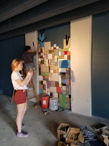
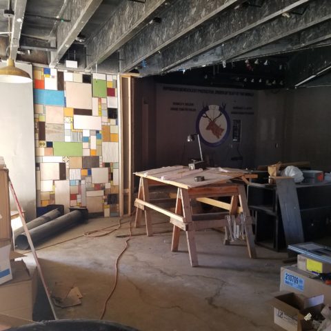
Patience. Good design requires patience. Do you have it? The design process can either take the route of “all planned before anything starts” (everything drawn and detailed, all finishes selected, all fixtures and furnishings, fabrics and accessories decided and specified, for perfect inclusion into the design) or the process of “design-as-you-go”. The “all planned” design process allows for exact pricing and budget planning. But if the process takes too long, some of the things specified might no longer be available – that has happened more than once! The other “design-as-you-go process” is more random. There can be and often is a combination of these two approaches, but the second requires more patience and less precisely scheduled time.
The luxury of time, experimentation, trial and error, wait and see, what if, all are elements of the “design-as-you-go” process. It is decidedly the more fun and more participatory process. It starts and evolves before your very eyes, with the in-the-field options, to change, modify, massage, delete, add, think and re-think, all available while the action takes place, it is like creating an art piece one stroke at a time. Artistic expression rarely progresses in a straight line.
All of the above can be said of the pre-planning process too. You can illustrate, render, draft, erase, alter and change all the while – but you are doing it prior to commitment, prior to actually seeing the actual design unfold in real time.
Changes and additions can arrest the process – whether in pre-construction planning or live-in-the-field. However, live-in-the-field is much more int-eruptive and possibly costly. Changes and additions can cause scheduling delays which can domino throughout the otherwise planned program. This can result in not only cost considerations, but disarray and a prolonged inability to use the space.
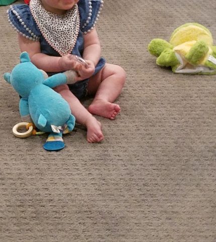
As I visited one of two parallel kitchen remodels nearing completion that I have previously mentioned, the owner mused “It’s a painful process.” But as we stand there enjoying the transformation he continues “It is almost hard to remember all the phases we’ve been through to get here. Kind of like childbirth.” We laughed at the fact that the world would be filled with “only children” as no mother in their right mind would go through that pain again!! He and I both never having experienced it for ourselves – yet, “they say” that it’s true. All very much worth it in the end!!! The ultimate reward!
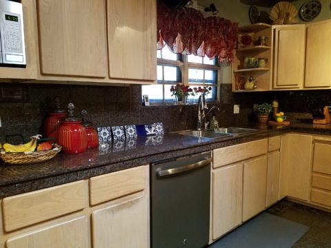
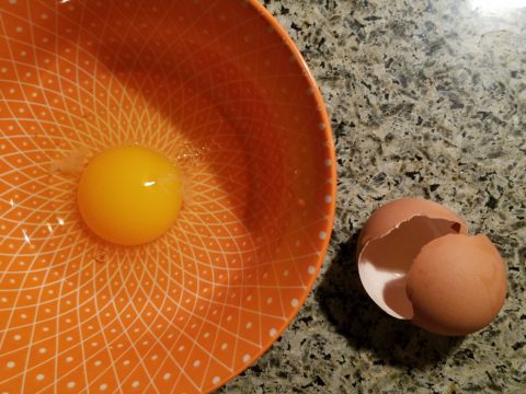
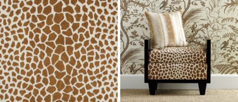
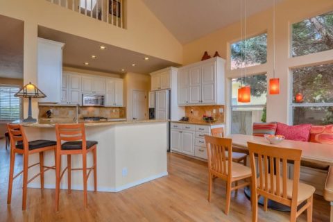
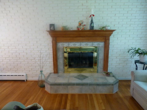
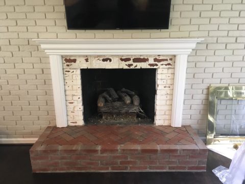
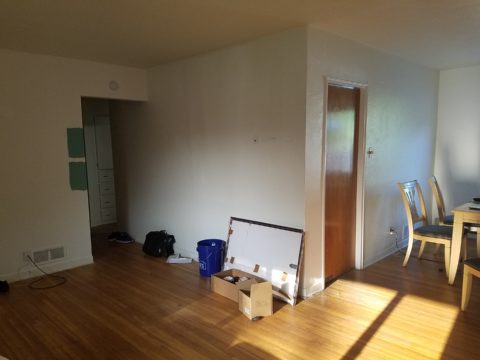
This BEFORE shot of this kitchen shows dated, anemic face-framed radius flat panel cabinets, granite tile counter-tops and back-splash.
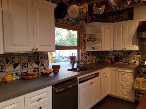
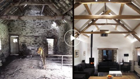
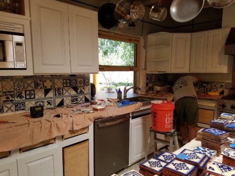
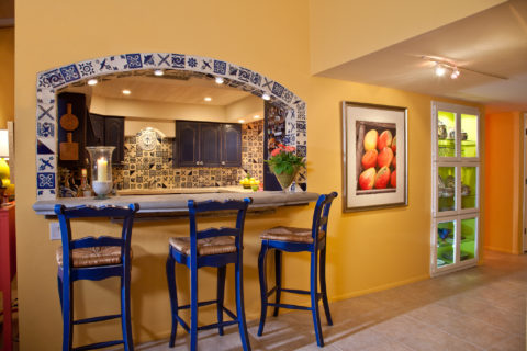
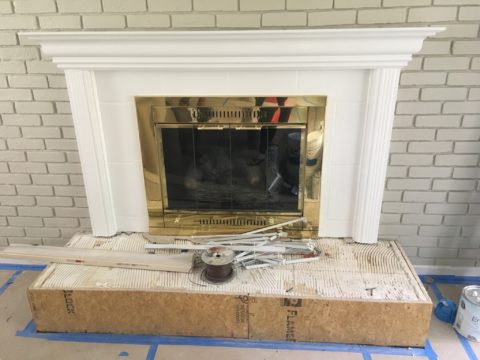
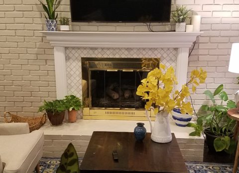
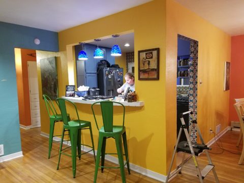
Not quite finished, cabinet pulls are being installed, final painting details are underway and the transformation is being unveiled. New cabinet doors add a classic raised panel detail painted white, with new concrete-like engineered Italian counter-tops, and striking Talavera tile back-splash punctuated with mini mosaic Spanish tile accents. A new window opens to the outside patio with the counter-top passing through and the window closing directly on the top.
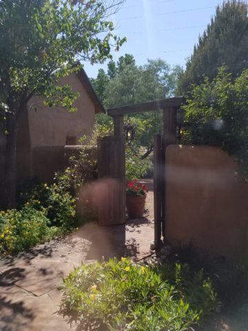
Residential design – those private, personal spaces always involve knitted brows, vacillation, additional worry and more indecision than commercial designs. Not to say that commercial designs don’t involve interested parties, if not actual owners, the investment in the personal pocketbook and personal emotion is not the same. Furthermore, there are greater personal thrills and disappointments in the residential projects.
Well, back to patience. It’s a virtue and I often struggle to practice it. I tend to be overly eager for instant gratification. But patience is very important when creating something of value and timeless appeal.
Design takes patience during the various stages of design details. We are not talking about building a rocket ship – but imagine the design and engineering required for that!. Let’s just talk about something simple, like custom drapery rods. The client thinks – fast and easy. While on vacay they experience a lovely accommodation that features hand-forged drapery rods. “Cool” they say. Filing that away among their thoughts of interesting interior details. A couple of weeks later, they are in front of an art booth and meet an iron-worker who offers all manner of custom iron work. So they recall the cool drapery rods and inquire as to whether he would do something like they described. “Sure,” he sings and whips out his portfolio of photos among which are very cool twisted iron drapery rods with swirly finials adorning the ends. They’re sold! They invite him over to see their windows and get started. At this point, their interior designer knows nothing of this idea or the contact and engagement.
Remember, they are thinking fast and easy. So they expose their idea and plan that is already underway asking their interior designer on advice for drapery fabric. With this opening, the designer asks about the rods. Come to find, they aren’t sure how far past the windows they have been measured to go, they haven’t considered that the 5/8″ solid stock might want to sag after a while spanning 8 feet and they have no idea how they are going to hang the draperies…”Oh” we need rings? So it seems that the conversation with the iron-worker has been rather cursory. Questions that needed to be asked and answered at the outset had not been thoroughly considered.
Fortunately, these details will now be addressed, issues solved and finished product all as it should be with proper extension past the actual window opening, matching rings to the iron rods, and a stout enough rod so as not to require a center support – an element to be avoided if at all possible. Whew – caught that one before it was too late!! (Watch for the installation of the hand-forged rods and custom draperies in the next few weeks).
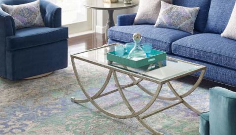
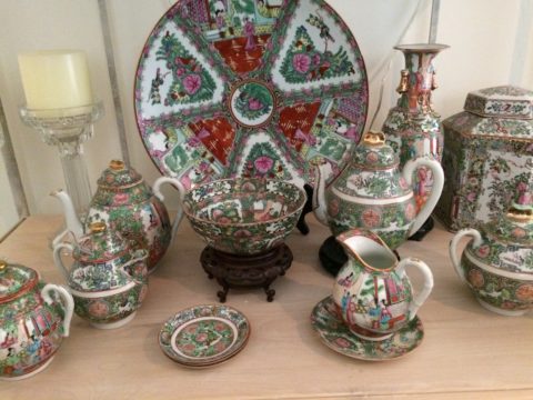
Paint colors often wait until other decisions are made. I have mentioned previously that we usually pick things that have fewer options. There are more paint colors than anything else in our design world with fewer fabrics and even fewer rugs. In that order, we might pick the rug first, fabrics to build upon it and paint colors to bring it all together. Not necessarily – but that is a pretty good example.
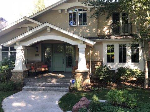
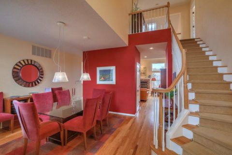
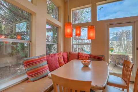
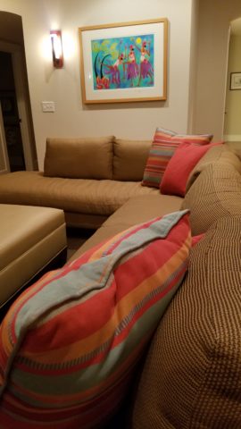
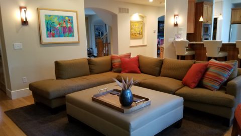
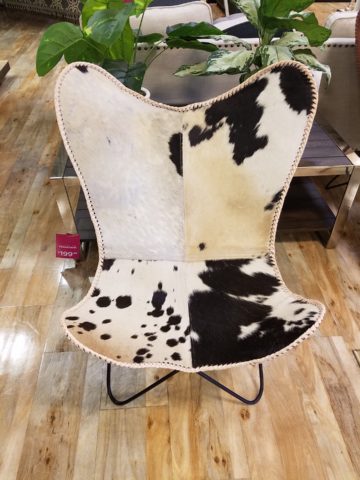
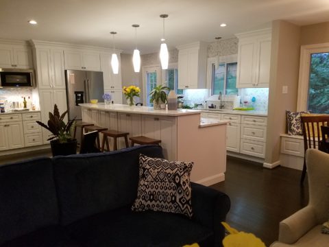
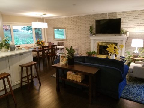
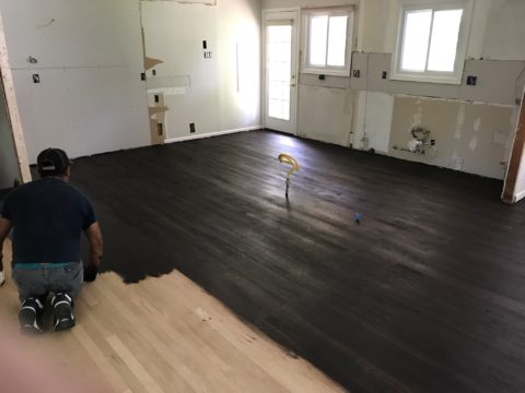
Starting with an existing hardwood floors well preserved by decades of wall-to-wall carpeting, we discussed the desire to create a colorfully transforming interior and opening of the space to better connect the kitchen with the living area.
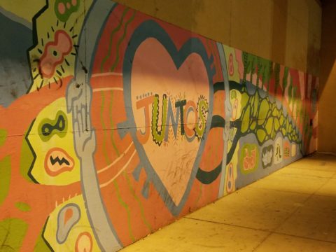
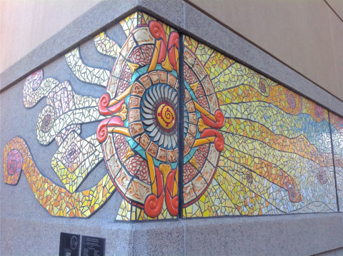
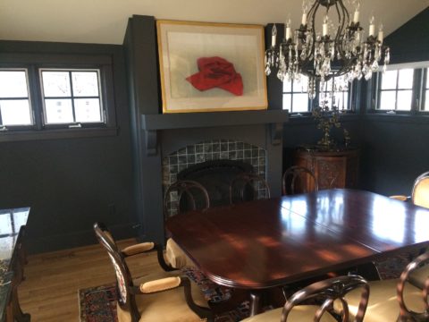
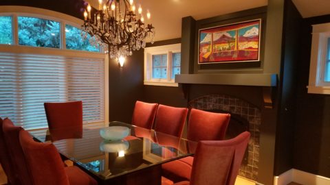
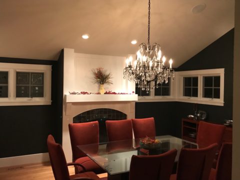
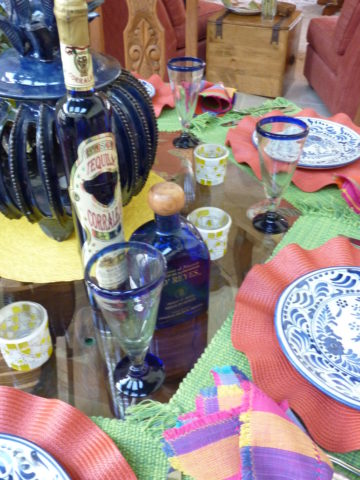
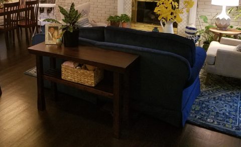
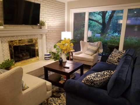
As we met to hang artwork, discuss iron drapery rods, custom chandelier and finishing touches, the clients remarked that this was so exciting to be nearing the end of this dramatically colorful transformation that so nearly has transported them back to Guatemala where so many fond memories have been established over the years.
Well, back to patience. It’s a virtue and I often struggle to practice it. I tend to be overly eager for instant gratification. But patience is very important when creating something of value and timeless appeal. Go forth and design your dreams with all the patience to make them come true!