Designing, Styling and Why – Finding Personal Style

Styling is a vague term used popularly now for many facets of artful design that come together to create a presentation (in this case) for interiors. Interior designers practice the artful tricks of “styling” while calling on their expertise with many other important professional elements regarding practical and functional design decisions, structural considerations, mechanical and electrical aspects, client collaboration, budgeting parameters, and more. Terminology can confuse the conversation because often the illusive thing that clients are seeking is finding their “style.”  This goes deeper than embracing a new trend or changing a style of furniture from Scandinavian to French. It goes deeper into the very personal places that are uniquely individual. It’s about lifestyle and personality, temperament, and taste.
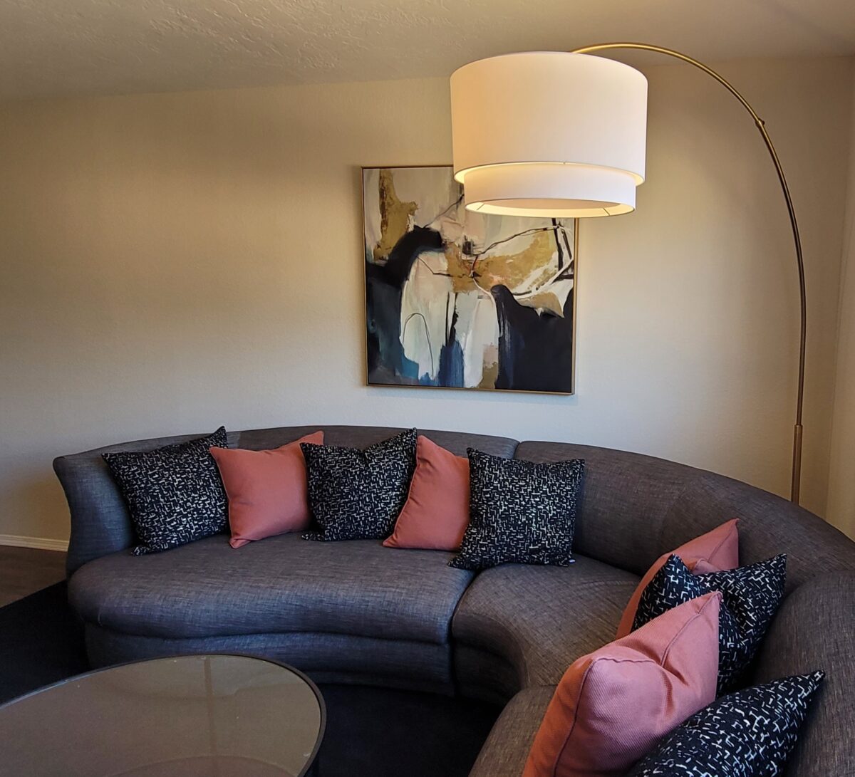
Assembling elements in your home or workplace is about lifestyle and personality, temperament, and taste. This living room is taking shape for a single man wishing to update his furnishings and fixtures throughout his home.

I was told in school that there is no such thing as bad taste – just bad design. I love that. It takes an enormous percentage of the judgement out of it and leaves the important characteristics to be critiqued such as function, form, balance, color, texture, volume, lighting…

Styling and designing both require balance – designing being the more comprehensive of the two. Each consider many of the same elements, but designing digs deeper. I often converse with clients about the opposites in their spaces. Hard/soft, smooth/rough, light/dark, warm/cool, simple/complex…finding the effective, pleasing, balance in all the elements in a space is critical to the comfortable success of the design. I seek the positive, buoyant, uplifting effect that elicits good vibes.
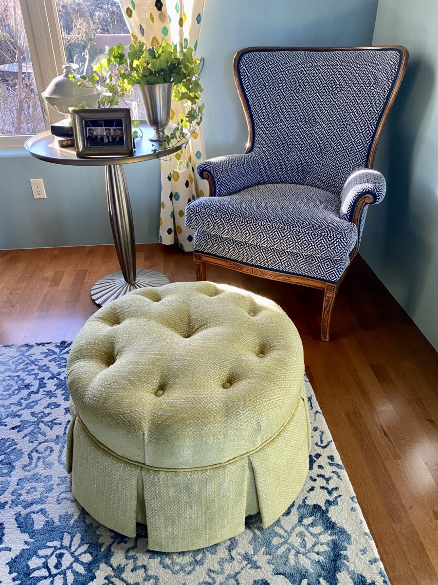
The result should be more than satisfying, it should be joyful and personal. This chair and ottoman were vintage pieces handed down in this family and here we reupholstered them to give them new life in a new context.

As an interior designer my job is to extract and decipher the wishes of my clients – commercially or residentially. Not only what they want and need, but how to achieve it. It has to do with the art of design and the practicality or reality of executing the work. The result should be more than satisfying, it should be joyful and personal – designed for the specific needs and goals of the individual(s) with whom I am working.

Discovering your personal style might be like a lightbulb turning on – it’s been there all along but wasn’t recognizable. You have it but don’t realize it. Which begs the question, what is style? It is very representative.

From my experience, there is no such thing as no style. Not having style. The very concept of that is like a reverse condition of being without style (un-styled ) – like messing up a hairdo. Yet that disheveled do is a style unto itself – albeit not in the contrived sense of order and intent. That same hairdo in a fierce wind might become similarly disheveled – but without the intent – it might be considered an organic style.
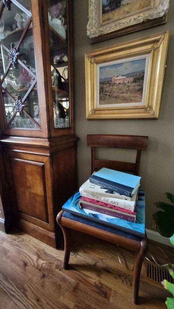
Tidy to disheveled, style is limitless. The occupant of the space is surrounded by books that never quite get put away.
Fascinating to some – unnerving to others.

Interior design can be contrived with much intent, formalized with attention to detail or a more unselfconscious approach that always appears more casual, organic and lived-in. Of course, there are happy mediums too. However, the risk of the “unselfconscious” approach is that by the very nature of the approach to create that which does not LOOK contrived – can be very contrived!!! Hence the unfortunate, if not unintended, result!!

Tidy to disheveled, style is limitless – the permutations and opportunities are endless. But when styling a “scene”, do we keep books in the bookshelves with perhaps one on an end table or nightstand for practicality and interest or do we present piles of books as though the occupant of the space is surrounded by books that never quite get put away? Fascinating to some – unnerving to others.

Some categories of interior design allow a “stylist” to express themselves – rather than focusing on the specific design needs, desires, requirements, and ultimate joy of a client. Style for the sake of imagery. These categories include product representation and promotion/branding – ads and TV commercials, and vignettes that are not intended for real life but for effect. To create appeal and promote trending marketing efforts, assembling for model homes or staging for individual homes for sale and theatrical set design are also examples of the applicability of styling. This “styling” is a very marketable talent – different from designing for and about a client’s personal wants and needs – in a residential or commercial setting.
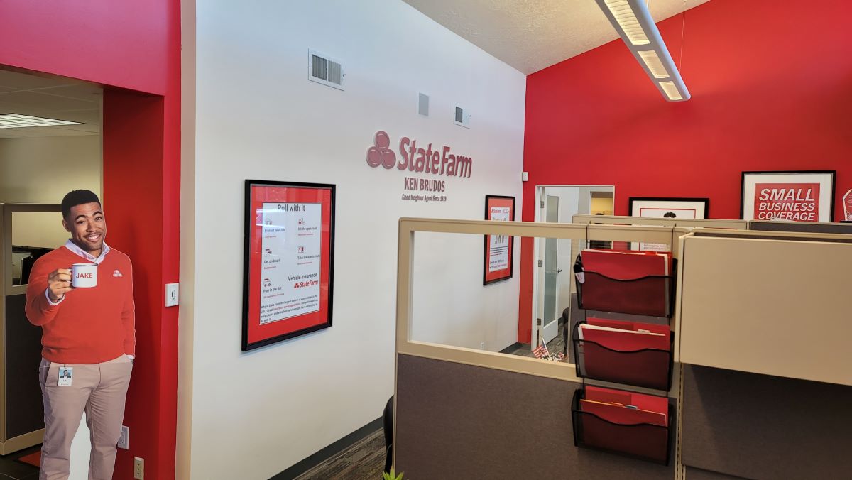
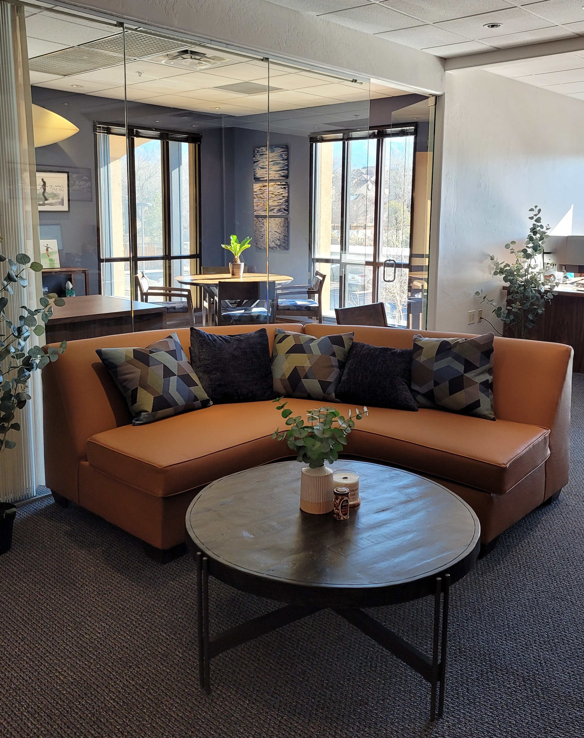
Commercial interiors combine the branding of the business as well as the personality of the occupants and the culture of the workplace. We completely redirected the focus of this insurance office by emphasizing their brand in color, imagery and graphics. Corporate marketing material was enlarged and used for artwork to further reinforce the brand and emphasize the mission for both employees and clients.

Style evolves. Styling can be an ongoing process – even daily. But that becomes a preoccupation that is not necessarily practical for everyone. Our tastes change with life experiences and with them new interests, accommodations and necessities all contribute to the evolution of personal style. But look at your own personal style and see what about it has remained constant even if your design direction has changed.

You have style. You need to try to articulate it, embrace it or change it. I often hear “I know what I like when I see it.” That’s true of all of us. But being a “creative,” a designer, we create and not merely discover, find, and assemble – through all parts of the process.  Helping clients distill the flood of inspiration, imagery and ideas presented, on the limitless platforms dedicated to interior design, new construction, remodeling, styling, and decorating, is the first stage of the job. With so many choices and directions from which to choose, navigating that circuitous path through the oh so many images and ideas is daunting, but essential to finding the right elements to combine and create the design – and set forth the style.
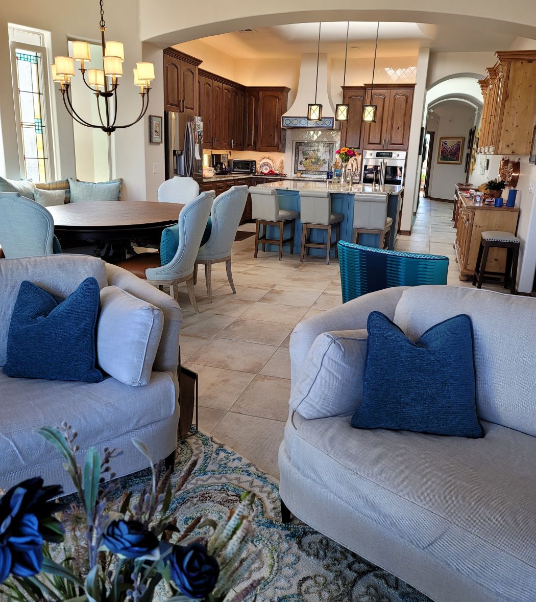
The stuff of life. This couple downsized and culled their belongings to their very favorite things. Their new interior, in their custom home, incorporated all of their treasures and added some new pieces for their next chapter.

Knowing what you like when you see it and collecting as you go is what results in what I fondly call the stuff of life. Your life is partially represented in the things you have discovered and saved – things that bring you joy that you want to see and have around you. They may change over time. Your fascination or appreciation for an object might wane…but the principle of having things collected over time and life experiences (or minimalist lack thereof) is a personal expression. Often the trick is to re-arrange what you have. The style is there, but the placement and orientation can make a significant difference. Arranging is very much a central part of effective styling and interior design. Styling is a fun way to play with options, trends, make statements, influence, and experiment. Have fun finding your style and incorporating all you love and enjoy into your interiors!

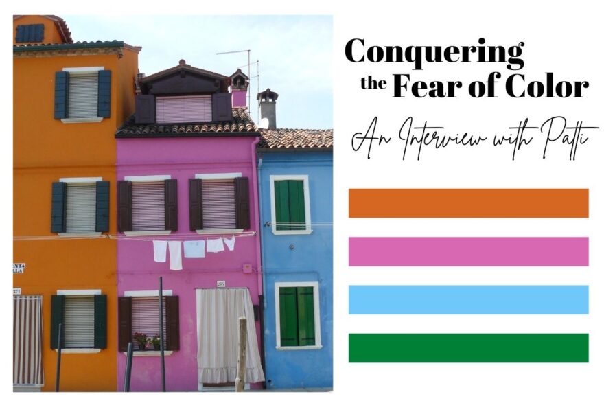
Conquering the Fear of Color – A Q&A Interview with Patti

The serenity of neutral color schemes has a significant place in interior design. However, it is more about the fear of color that I approach this article today. Committing to color arrests most people – they want it and admire it but are fearful about selecting and committing to bold colors.

Beautiful neutrals are a color all to themselves. Layers of whites, creams, grays offer sophisticated schemes.

However, that is not all that causes clients to reach out for assistance. Even if they have made a decision about taking the leap, it is how much, where and with what or to what the color is applied or occurs.

A white kitchen receives a patchwork of blue and white Talavera tile as a backdrop adding depth and interest.
In addition, upon closer inspection, we have incorporated a fine detail of an aqua glazed Spanish tile running horizontally and vertically through the patterned tiles.

I remember when architect Antoine Predock’s project for United Blood Services in Albuquerque https://bit.ly/3LBQbDv made a splash – a really RED splash when he stuccoed the entire exterior brazenly brilliant, bold, blood red! It was astonishing – astonishingly effective!!! https://bit.ly/3NNQihd If a picture speaks a thousand words, color is right there in conveying remarkable communications.

From branding to personal style, color is key.

The addition of our tongue and groove walnut wall established the theme for the rest of the furniture in this interior.


My staff recently investigated information from projects. They posed questions and gathered observations regarding my use of color. Photos, at the end illustrate some specific color decisions and why. The resulting questions and answers are as follows:

Patti Hoech‘s design practice has been and continues to be an exploration and emphasis of the subtleties and strengths of color. It is an integral part of her work. We wanted to know why and when she discovered this specialization in her design sensitivity and how it relates to her approach to effective design decisions.  We are asking clients and colleagues to pose questions to get the answers.

Why is color so important?

Patti Says: Color is power and peace. Color is important on so many levels – personal joy (or aversion), perceived temperature, brand identification, seasonal interactions, emphasis, and contrast. Color is everywhere. Understanding and harnessing it for specific purposes is key.

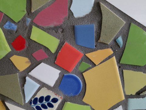
This new backsplash had a specific purpose, which was to acknowledge the existing rust-colored porcelain sink and the intensely green marble stone countertops. By pulling those two colors into the tile selection so strongly and interspersing other colors that complemented the palette, the result was an effectively unifying design detail.

How do you determine the color specifics for your projects?

Patti Says: What color brings you joy? What color tells your story? Interviewing clients about their color preferences – being an important question begins the dialog regarding what colors to incorporate and why. This can be personal preferences or aversions or specific colors relating to branding whether it is new or existing. Also, existing fixed design/architectural elements might also play a significant part in developing an effective color scheme.

Do you believe color affects the lives of your clients in their homes and workplaces?

Patti Says: Absolutely!! Color can insert many subliminal effects that impose on people’s perception of a space or graphic. Color can evoke emotion, instill comfort or agitation, rekindle memories, spur appetite, affect perceived temperature. It can embed recall for commercial brands. Color can be a clever tool.

In this interior for Boba Tea, we played with the colors of the flavors and the multi-colored tiles to correlate to the fun experience of sucking the tapioca pearls.  

How do you navigate color trends?

Patti Says: Trends are necessary to keep our market moving. Capitalism is based on consumer activity, and nothing generates purchasing frenzies like stimulating new trends in the market. However, basing design decisions on trends must take into consideration the intended longevity of the design.  Much of color trends are based upon pairings and combinations of color.  It is those combinations that can “date” a color scheme – not so much a specific color. It is how, where and with what it is used that pegs it.

A classic, well-balanced color combination of blue, white, and yellow is a comfortable warm and cool with a neutral that transcends trends. Fabrics and finishes contribute to how one updates a classic color scheme.

Do you feel you are a forecaster or influencer?

Patti Says: I believe that I have imparted and am still providing thoughtful, challenging color consultation to my commercial and residential clients.  Having prospective clients request designs based upon others that we have produced is telling and flattering. It means they have confidence in the decisions regarding long-lasting color schemes – if not timeless, in some cases. However, it must be said that design elements that present the color often determine – in many ways – how well a selected color or color scheme “holds up” over time. Considerations regrading patterns, materials, and elements can and might be either improved or modified over time while maintaining the same color scheme. Forecasting anticipates color trends. I have successfully influenced clients to make selections based upon an anticipation of future color directions in the market or merely go with classic combinations that have been proven over time. . .

What has influenced your appreciation for and interpretation of color in design?

Patti Says: It started at an early age. Observing the world around me. Nature, architecture, decorative arts (china, textiles, artwork), fashion, logos/brands, trends, regional colors, seasonal colors, cycles of color…Pinks, turquoises, yellows of buildings in the West Indies, bold color statements of Mexico…Color is profoundly important and signature in its application. From fish to birds, flowers to leaves – color captivates me and urges me to find words to express it and continue to have it a primary part of my descriptive vocabulary.  As an omnipresent element in the design process, color is unavoidable, but to enjoy it so fully and embrace the limitless range of options is an exciting artist’s pallet of possibilities which stimulates me at every turn.

The magic of color on architectural exteriors can be amazing. Here in Burano, Italy my dear friend captured the colors! Similar to what we see in Guanajuato, Mexico and the sunny islands of the West Indies.
I attribute much of my color awareness to my mother. I remember being greatly influenced by her sense of color and design. Her sensitivity and talent were innate. She selected fabrics that had unusual color and pattern combinations. When orange, avocado, brown, and gold prevailed in the 60s and 70s, she selected the olives with chartreuse and gold for the less formal areas of our lives and leaned into Lily Pulitzer’s dynamic colors and patterns for her clothing and a pastel version of soft pinks and verdant greens for our more formal areas. The master suite was primarily yellow with beautiful bits of blues. Beach scenes always emphasized blues and greens. Nothing in our world was on common trend, but an artful interpretation of color combinations, eclecticism and comfort. Pairings of orange and brown were never her happy place nor was gold and brown.  But orange and PINK – YES! Pink and green especially! And browns were recognized in context with stone shades of greys and tans.  I believe that sense was greatly influenced by richly organic, textured stone walls of the West Indies – Danish architecture in the tropics where limitless colors of greens and blues punctuated with flowers were all around.

As a result of this of this early introduction to the value of color, my personal spaces reflected similar sensitivities. Beginning with pink in the early years I graduated into blues, turquoise and greens for my teen years. The final scheme, in my room in the home in which I grew up, was a dusty pink, clay, and mocha-rose. No one in my world had that color scheme in the late 70s and it was difficult to assemble. It helped that I worked part time in a design showroom in Georgetown where handling the amazing abundance of fabulous fabrics was a daily inspiration. Throughout my life experiences color has been a constant distraction. Not in a bad way, but rather a noticeable, unavoidable interruption that causes me to pause and take note. Ask anyone who knows me – I stop and remark about color at every turn.  For better or worse, I comment on color. It is a deep appreciation that I enjoy sharing. And the most rewarding is discovering color for clients who yearn for it but don’t quite know how to find and use that which would make them feel the joy of color!

A dear friend in Mexico recently took a leap in selecting an accent color for his seaside villa. Once an all white interior, which was lovely and fresh, he wanted a new look that provided contrast and strengthened his color theme. The yellow accents made me smile when he unveiled his new look!

Color plays a major role in discovering and expressing personal style.  Fear not – color is your friend. Find your style. Live your style. Love your Style.

Color Scheme Tips

Color schemes are limitless. The permutations are endless. Color is exciting and fun. It is personal. Colors evoke feelings, memories, emotions and are key to a comfortable interior.

How often have you been asked or pondered on your own…”What is your favorite color?” Some people hesitate to answer, while others blurt-out readily with their fav.  But what color you choose to wear versus what you enjoy in your interior surroundings and how much might be quite different.

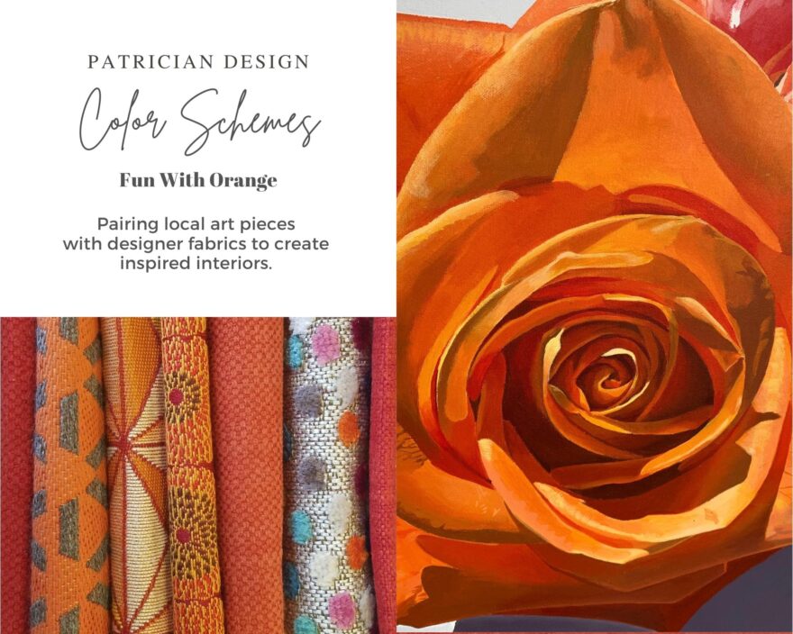
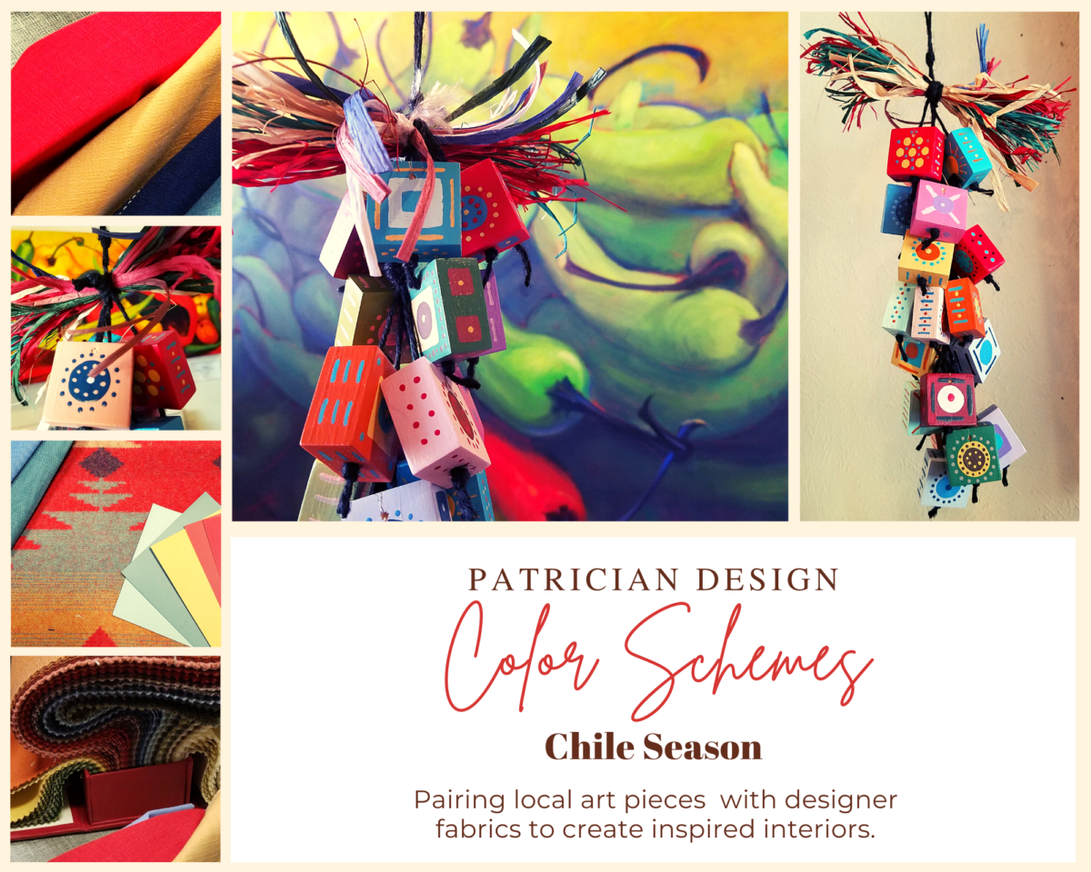
Several weeks ago, I launched a weekly post on our PATRICIAN DESIGN Facebook page called “Color Schemes.”  The idea is to inspire design ideas by pairing artwork with designer fabrics. When planning an interior there is always a focal point complimented and surrounded by supporting elements.  Whether a key painting will command the space or an expansive window with a view will direct the focus to a scene of outside colors and textures – that key element will greatly influence a successful interior color scheme.

Annette Donald creates colorful cubes in her creative take on our beloved chile ristras. A serrano chile oil painting, on canvas, by Federico Leon de la Vega is quite representational. Paired here with Romo and Ralph Lauren fabrics, Sherwin Williams paints…fresh and festive!

Here is the example of a November Scheme and you can scroll back each Monday for the past few months to enjoy a variety of the Color Schemes! https://www.facebook.com/PatricianDesignABQ/photos/a.243005986618/10157154423221619/

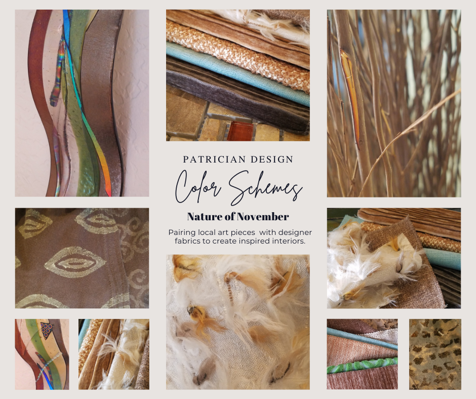
We embrace the The Nature of November with its unique colors and textures. As the air becomes chilly and the leaves fade…warm, soft colors bring us indoors. Featured here an elegant fused glass ribbon wall piece by Lisa Checnoff.

There are four primary considerations that I discuss with my clients when determining which colors to choose, emphasize, avoid, use as accents and where. To establish these selections, we evaluate personal preferences, contextual implications, seasonal influences and even trends. 

PERSONAL:  In planning an interior, I always want to know what colors make our clients happy, comfortable, stimulated, vexed or relaxed. These personal insights reveal important information for selecting types of materials too.

By examining what might be one’s favorite color, the discussion will navigate the distinctions, if any, regarding preferences for clothes versus interior furnishings. Interestingly, they are not always the same – although, by mere comfort and familiarity, they often are.  Simply asking about a favorite color is not enough.

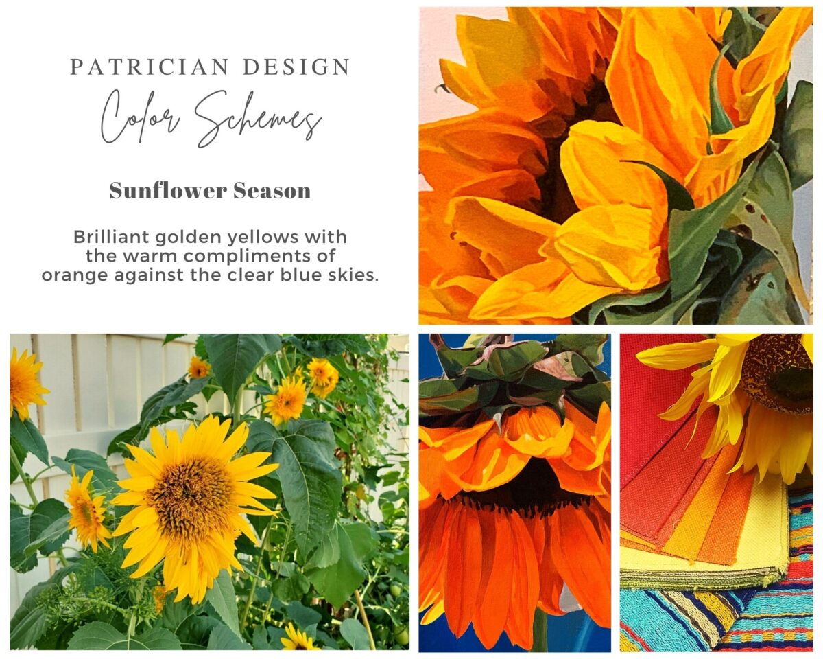
Brilliant golden yellows and blues – splash color! Featured here are fabulous photo-realistic acrylic paintings by Sheri Mays paired with amazing fabrics of the same exciting palette.

CONTEXT:  The context of the interior might dictate or at least steer the direction of the design. The luxury of having multiple personal environments offers the opportunity to have different color pleasures exercised in different places. The ski condo might be woodsy and textural with browns, greys, stone and wood punctuated with a pop of color versus the seaside retreat with its crisp whites and cool blues and greens punctuated with pastels or bold contrasts. Therefore, the location of an interior might direct the desired color palette.

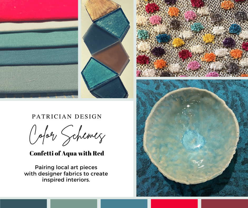
Inspired by this spa-aqua pottery bowl by Penny Roberts and the custom glass tile mosaic we recently combined to face a newly remodeled kitchen wall – the cool seaside/spa feel balanced with ambers and warm dots of color – pink, fuchsia, orange and golden yellow. Durable brushed cotton solids come in myriad colors and are perfect for pillows or upholstery.

SEASONAL:  This one is tricky because it plays on the perceived climate outside – even if the interior is maintained at a constant temperature. It takes a concerted effort to plan a color scheme – including textures and finishes in anticipation of changing seasons and relative temperatures. I previously mentioned that a window with a view might be the focal point of a room…imagine the effect the changing seasons might have on the selection of interior colors and textures versus a consistent tropical scene, for example?  

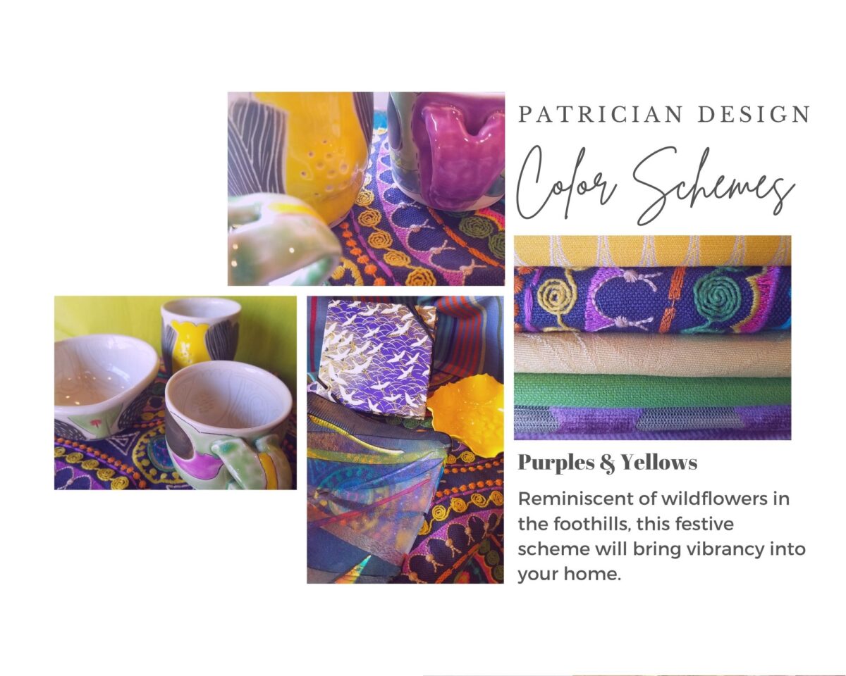
Perhaps you love purple – ever pair it with golden yellow? Here, functional, fantasy pottery designed and crafted with the most precise attention to detail by Jen DePaolo inspires our boldly brilliant scheme.

TRENDS:  Inasmuch as I avoid being steered by trends, it is impossible and not advisable – in design – to avoid them. Clients are influenced by them and bring that would-be preference to the table.  It is essential to continue to have “colors-of-the-year” and other market-driven colors change to stimulate the economy with buying and selling, replacement and updating.  It’s our socio/economic norm.  It also serves as an encouragement to re-fresh. But to limit that influence, in favor of long-term personal pleasures, is best.  The pressure of this marketing color influence contributes to our being a disposable culture. Not time here for a lecture on such things – but rather to instill an appreciation for and confidence in personal selections an decisions – in this case,  color.

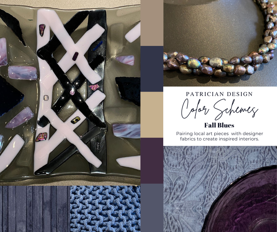
Patinaed pearls and stunning glasswork by Margaret Hidalgo Vanderheyden inspire the soft, greyed lavenders and blues of this cool scheme.

An interesting and on-going test for evaluating a successful interior is when designing in one season – it has to work in all others. For example, when I meet with clients in the heat of July with lush foliage and color, warm temperatures and long days, that same interior has to succeed when it is frigid outside, barren, and with darker, shorter days. What might the challenges be in creating a successful scheme and what might be the solutions to make it work?

Having noted all of this and knowing the different reactions people have to color, isn’t it interesting when an interior is so successful that it appeals to many, if not the majority, of those who experience it?  This is more applicable to commercial or public spaces – from doctors’ offices to hotels.  However, the challenge and success is in knowing the many things to be considered and implementing a balance of them throughout all aspects of the interior.

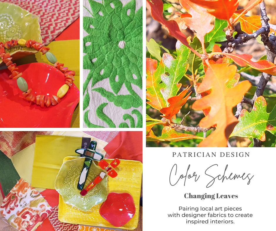
Anne Marie Werner-Smith’s brilliantly glazed pottery here with Margaret Hidalgo-Vanderheyden’s lovely fused glass crosses along with coral and dyed stone necklace and woven table runner from Chiapas reflect the changing colors of fall leaves…

Appreciating color is a gift to designers. It truly is an imperative to appreciate all colors and have the sensitivity to discern the nuances between various values and the effects of selections and combinations from the infinite choices.

I hope this has given you ideas and inspiration to move forward with YOUR color schemes! Sign-up for our weekly email of Color Schemes with classic blue and white and stunning neutral greys coming!! And follow the posts on Facebook every Monday.

Serenity and Peace in Water Features

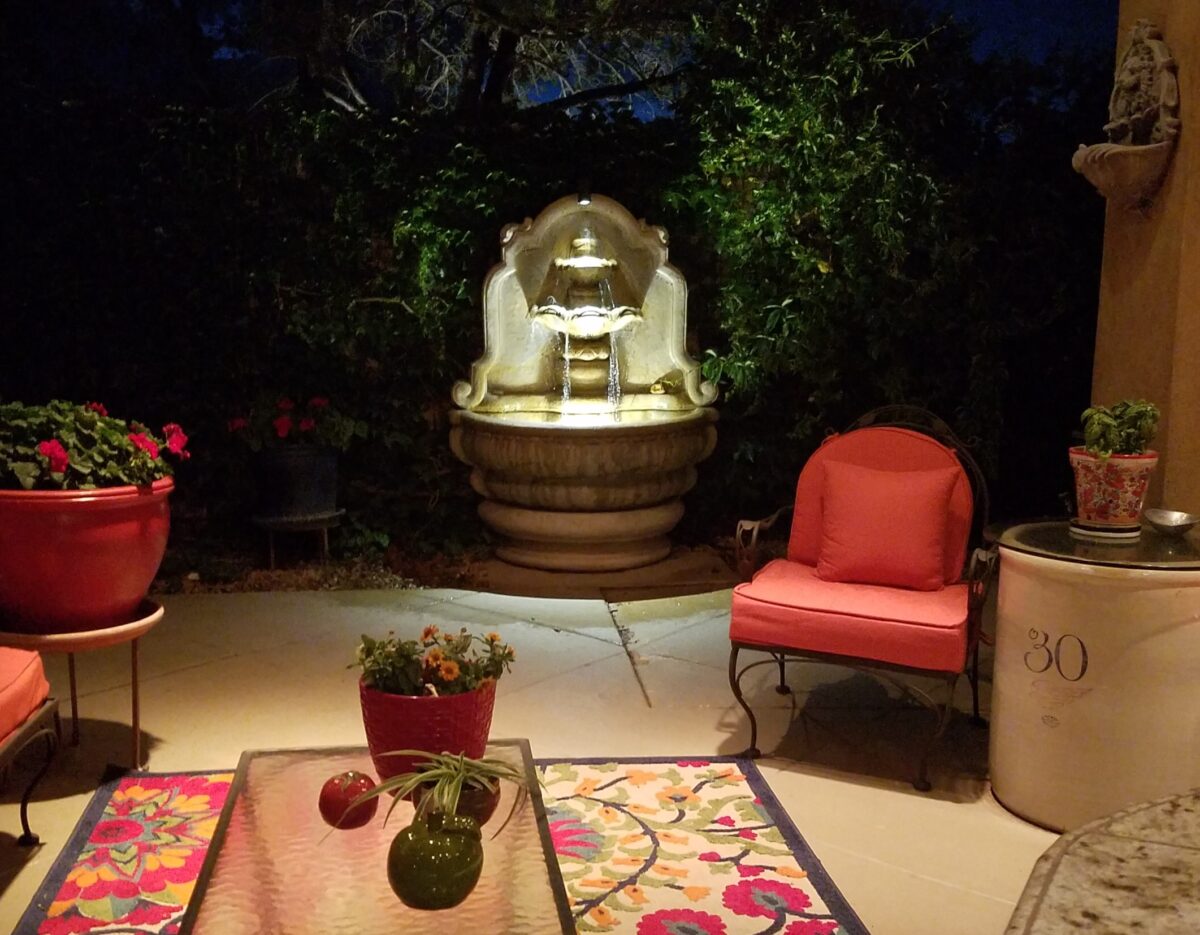
The serene sound of a fountain can provide mesmerizing relaxation. Like white noise, but better. Close your eyes, in close proximity to a little fountain, and be lulled into a wonderful respite zone. Even indoors, this is an effective relaxation element…outside the birds and breeze contribute to the joy. 

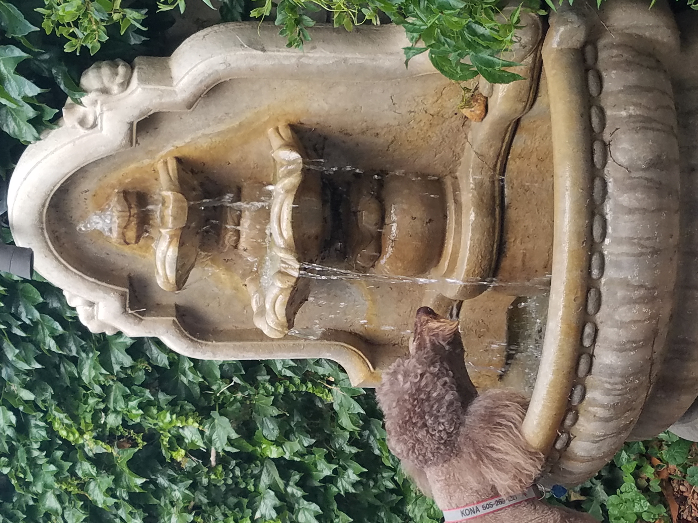
Pets reap benefits too! Kona gets a refreshing sip from the fountain!!!
At night, that same fountain offers gentle water sounds and an interesting sculptural effect.

Social distancing and isolation – these two popular terms that have defined so much of our daily living in the last several months and imparted a negative connotation. They paint a picture of living more at home – alone and even “out-of-touch” – literally.  All of my childhood I heard the phrase “ne touche pas!” My uncle’s favorite, for sure! And now I hear it in my mind all the time. Don’t touch the shopping cart, door handle, people’s hands, “ne touche pas!” and if you do – wash and sanitize to a fare-thee-well!

Yet, on a positive note, this stay safe – be safe – living at home has spawned creativity to maximize that environment and relieve stress. It means, more than ever, expanding your outdoor options from placing a pair of chairs and tiny table on a previously unused, diminutive urban balcony or adding a palatial pool in your backyard…there are many options in-between depending on your circumstances and means. 

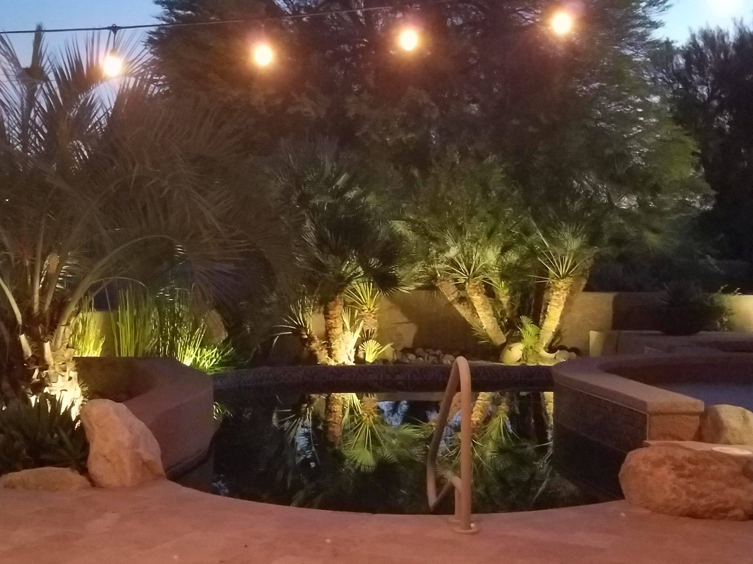
Our cousin in Tucson has created a lagoon effect with the dark bottom and mosaic trim. an oasis in the desert.

Water features are an amazingly therapeutic design element. Water suggests cleansing. It is refreshing and renewing. Water has promise. It can also suggest escape.

The Calgon add campaign of decades ago resonates today for those of us who remember…”Calgon, take me away…Lose yourself in luxury” The escape and indulgence of a relaxing soak in a tub. The gentle buoyancy relieves tension and encourages rest. It often suggests leisure. It is a luxurious, pampering exercise.

 https://www.youtube.com/watch?v=8yjGPgs0_S0  Here is a video from the 70s to take you back to “Take me away…” Come back Calgon!!! We miss your commercials now more than ever!!!

Taking that refreshing water scene outdoors is one of the most popular design projects trending today. From DIY to major construction people are discovering ways to escape without leaving home. Water features provide virtual escapes and actual refreshment for many people seeking that added dimension, diversion and sought-after pleasure in their lives.

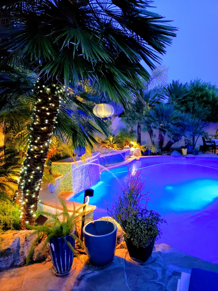
A friend in Phoenix has tricked out her pool with fabulous landscaping, spectacular iridescent glass tiles and LED lighting – the luminous colors an be changed with her mood!!!!

Swimming pools, a gorgeous grotto, lap lane, all afford the luxury of submersion and even exercise.

We’re speaking with Diamond Spas of Longmont, Colorado this week on behalf of a client who is interested in a partially above ground swim spa!! https://www.diamondspas.com/swimming-pool-spa-collection/custom-pools/stainless-steel-swimming-pools/

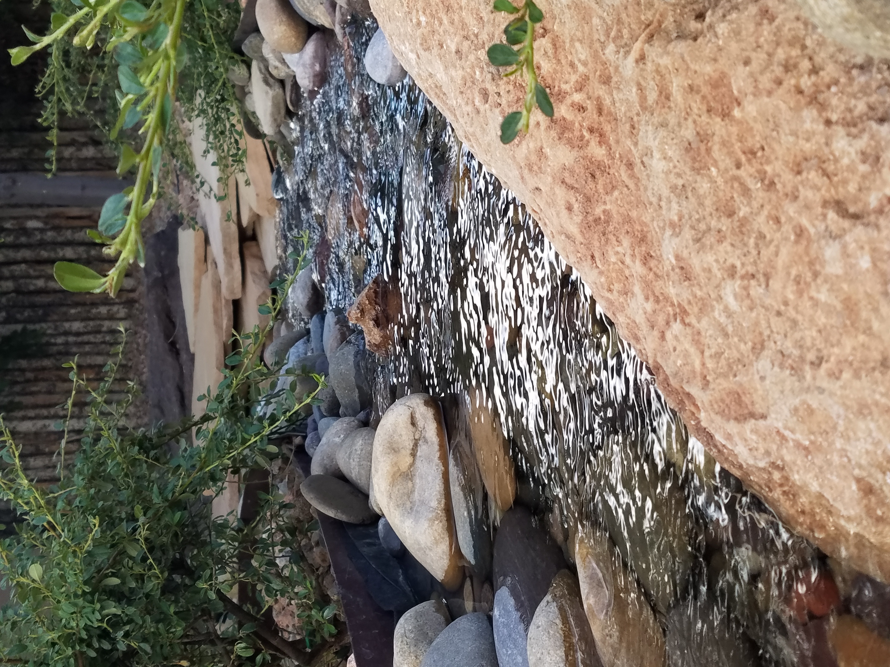
The sound of a small water feature to a creek-like landscape addition in your yard – the projects are many. This DIY guy created what he fondly calls “Covid Creek” – a project that took several weeks of focused creativity and back-breaking work all prompted by being stuck at home. The results are a magical mountain stream flowing beneath the trees in their modest-sized backyard. A creek-like water feature or pond can offer a respite to sit beside, dangle your toes and imagine scene far from the confines of our limited environs. You would be amazed at what beautiful illusions can be accomplished!!!

A babbling backyard book built as a therapeutic DIY project during the COVID confinement.

Such multi-sensory water features offering the touch and feel of water, gentle sound and visual beauty are powerful design elements to exercise the senses. Our senses suffer with redundant stimulation.  The reclusive limitations of recent months have us stagnating with sameness.  It’s the variety if stimuli we are so accustomed to experiencing that keeps things interesting and alive. Moving water is one of these exceptional sensory stimulations. 

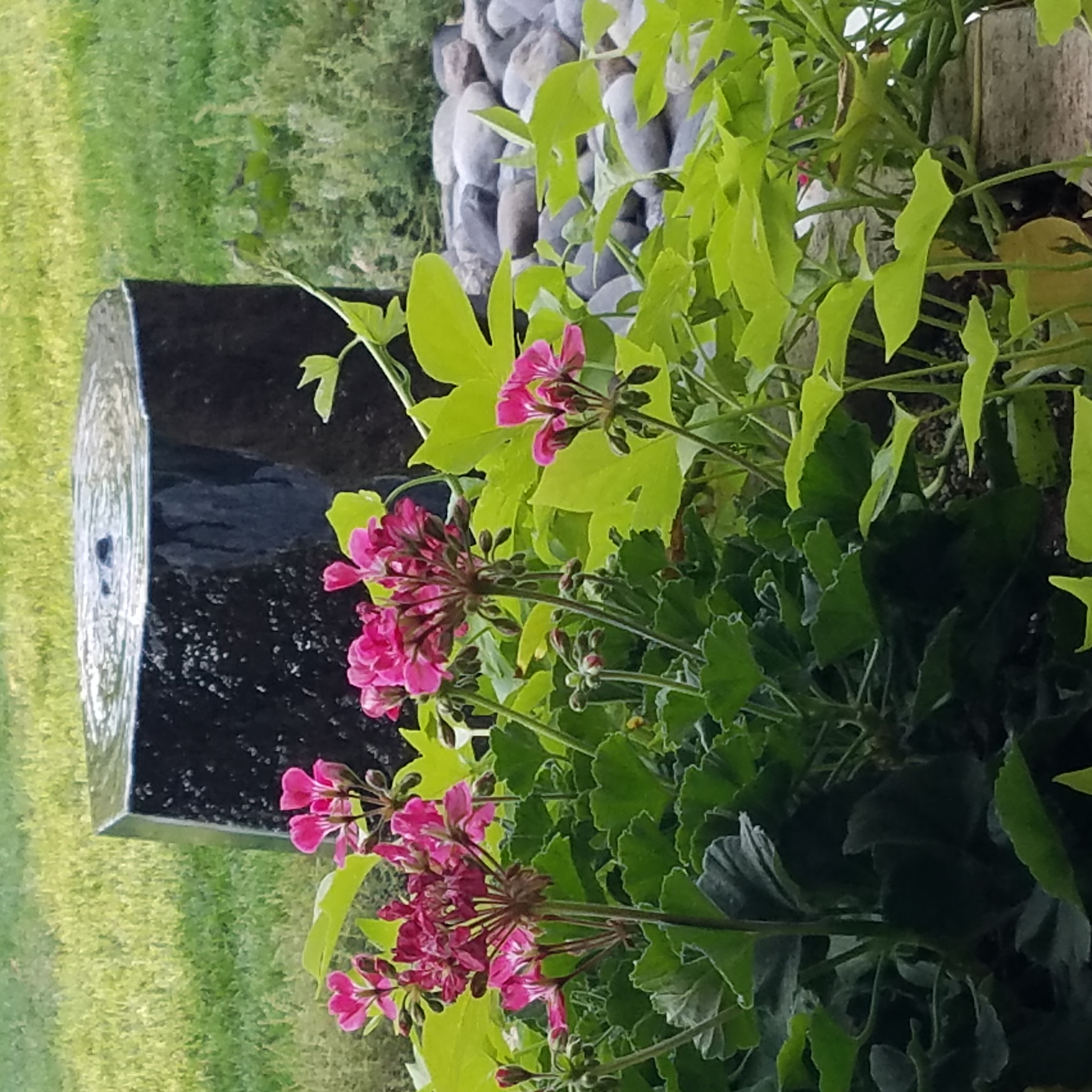
Organic garden sculptures – chiseled granite boulders with re-circulating water – meld with the landscaping.

Whether a tiny fountain or in-ground pool…even a galvanized livestock tub – investigate your options. Regard your environment and study your spaces to select the best design elements for your setting. 

Tips to Start and Maintain Joyful Traditions

Wherever you  may be…it’s the time of year when traditions are so much a part of everyone’s holiday experiences. And with that opening sentence – no doubt some of yours come to mind.

Traditions, of course, are not limited to holidays – but for purposes of this season, it is the primary focus of this missive. Interestingly, over the past few weeks, I have had a few people ask me about home decor and specifically starting or perpetuating holiday traditions. I found it so compelling because traditions are created from repeat practices and experiences.

Fond memories of family friends and their annual tradition of making warm and frothy Tom and Jerrys! I found these vintage china mugs just like the ones from my memories. Have have recently seen them re-created – new – just like these! Perhaps its time to start our own tradition of Tom and Jerrys for the holidays!

You can begin to practice things that become traditions – that’s the key. Of the recent conversations, one person approached me about a week before Thanksgiving.  He was single, hosting a few friends and didn’t know where to begin. Could I help? The other inquiry was from a couple of years ago as a young woman who was not from New Mexico found herself here, newly married and in a new home.  How was she to create the feeling of Christmas? The answers to both of these queries are at the end …

As is true with all consultation whether it is interior design, medical, self-help, physical fitness, IT…it all begins with questions. The consultant must ask questions to establish information that will guide them to make their recommendations. Here are 4 Tips for Approaching Traditions that will begin the conversation.

Perpetuating a Tradition:  Memories are personal references that are the basis for traditions. The repeat performance of these various acts establish traditions. Continuing to practice the traditions insures that they repeat as each like-kind of event unfolds. It takes effort to continue to re-create traditions, but to lose the pattern can become irretrievable. It can be an onus or a joy to perpetuate traditions. I would prefer to embrace the latter! Ideally, any tradition that you chose to perpetuate should be a joy.

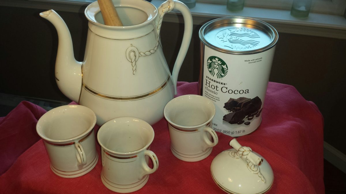
This vintage set was given to me by a dear friend. It held precious memories from her grandmother having served hot cocoa from it every Christmas. My friend’s experiences dated back to the 1920s. The set preceded her memory…as her grandmother, born in the last quarter of the 1800s owned it for years prior. We enjoy hot cocoa from it nearly every Christmas morning!

Creating New Traditions: Establishing the approach that perpetuating a tradition should be a joy or the act of something that brings joy, the same is true with creating a tradition. Seems obvious that you wouldn’t want to create a traditional around something that does not bring you joy. But you might be surprised. I have recently learned that sometimes people think that they begin something that is a common practice to create a version for themselves, when in fact it is a perceived obligation rather than a joy. Don’t force it- don’t feel obliged to begin a practice just because others do it. Experience, invent or witness something that brings you joy and replicate it. You might recall it from your past, find it in a scene from a movie or experience at someone else’s home, derive it from participating in an activity or, of course, discovering internet ideas that abound. If something interests you to the extent that you want to practice it – then do it! If you enjoy it enough, you will perpetuate it and it will become a tradition.

This little Santa Doll was handmade by a friend of mine when her kids – now grown with kids of their own – were kids. Not originally intended to be a “Crazy Santa,” his accidental facial expression resulted in his name – held now for over three decades. He comes out every Christmas as an amusing family tradition.

Modifying Traditions: We all need to determine how much we want to take on,  how much we want to invest (in time or money) and how we achieve the same or similar results to create the joy. If traditions become too complicated or difficult, it might be time to re-think them. Rather than discard them, modify them. The time to discard a tradition is when it no longer brings you joy. But before that might happen and if the event/activity or degree of difficulty challenge your want to perpetuate the tradition, consider modifying it to suit your changing needs, circumstances and enjoyment.

This might happen if you move away from the context in which the tradition originally occurred, change in participants – if any, change in interests, physical or financial limitations…if the tradition still brings joy – find a way to achieve that with the necessary modification. Circumstances alter cases…like where you might have lived or are living at the time. Your fondest memories might be of chilly temperatures, warm fireplaces and the scent of pine trees…then you relocate to the tropics! This provides an opportunity to retain some of the original traditions and introduce some new. Not to mention, you might move to a different country where an entirely new set of traditions will present themselves – or just the different words for familiar favorites. Even without changing languages, in England they hang stockings at the foot of each bed rather than the mantle. Father Christmas is their Santa Claus. The list of similarities and slight differences goes on…

As I walked in the park last weekend, I spotted this fun, dangling snowman! So I stopped to inquire and capture a few shots. This family celebrates their son’s birthday every year with a piñata. Born on Christmas Day, they select another day close-by to have the piñata portion of the party. A family tradition.

No snowy scene for snowball fights or skiing? Toss a ball or frisbee,  take a hike or bike,  instead.

No enormous turkey? Roast a breast or a more manageable duck or chicken.

Become a vegetarian? Using the same type of familiar meal service and table dressings, modify the menu.

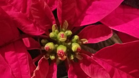
Not convenient to cut and haul a tree from the wild? Buy one instead. Real tree a hassle? Become the proud owner of a magnificent fake tree- with a bit of pine-scented room spray!  In my case, I occasionally give myself a “bye” break from putting up our tree (Although I love my tradition of collecting silver ornaments, of which I have dozens). So the “modification” is to have a magnificent, tall poinsettia on the entry table and several others scattered throughout the house to punctuate the interior with splashes of red.

No formal dining room? Gather on cushions around a coffee table – even if it means a piece of plywood from Home Depot on cinderblocks with a paper tablecloth! Candles and a centerpiece will set the scene.

Sharing Traditions

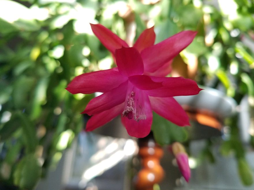
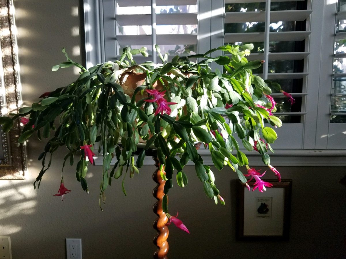
Gifting things that represent your traditions is a wonderful way to share. Obviously, baking and sharing traditional delicacies is prime. Making or finding  ornaments to gift is nice.  I offer cuttings of our family’s Christmas cactus. My grandmother always kept one or more plants from the original plant that was in her family home in Youngstown, New York.  She was born in 1892 and her grandmother remembered the plant and told my grandmother that it preceded her in that same house. We don’t know how far back it goes, but at least mid 1800s. I have kept cuttings and grown mature plants from the very plants that my grandmother had her entire life of over 100 years and kept all the while we were growing up in the same house for 20+ years and now my 40 years since!  Gifting a traditional food or a CD you compile of favorite recordings, sharing plant cuttings, passing along a treasured possession – all are ways to share traditions.

But what if you are starting out? Memories from childhood might be the basis for beginning your own adult traditions – whatever the springboard, it should be fun to establish your own holiday traditions.

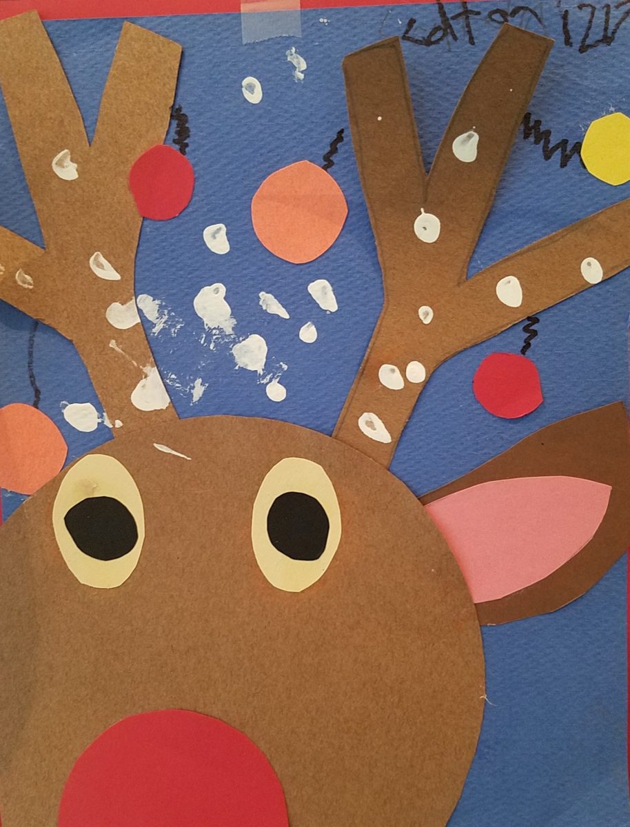
Colton’s Reindeer – A child’s artwork can be passed for generations.

Whether it is handmade decoration, food centered, activity engaging, music oriented, game playing, object collecting…each person has their focus. Even if one is alone for a holiday, there are sentimental triggers that remind of past events.

Food Centered: Main dishes, baking desserts, crafting cocktails…

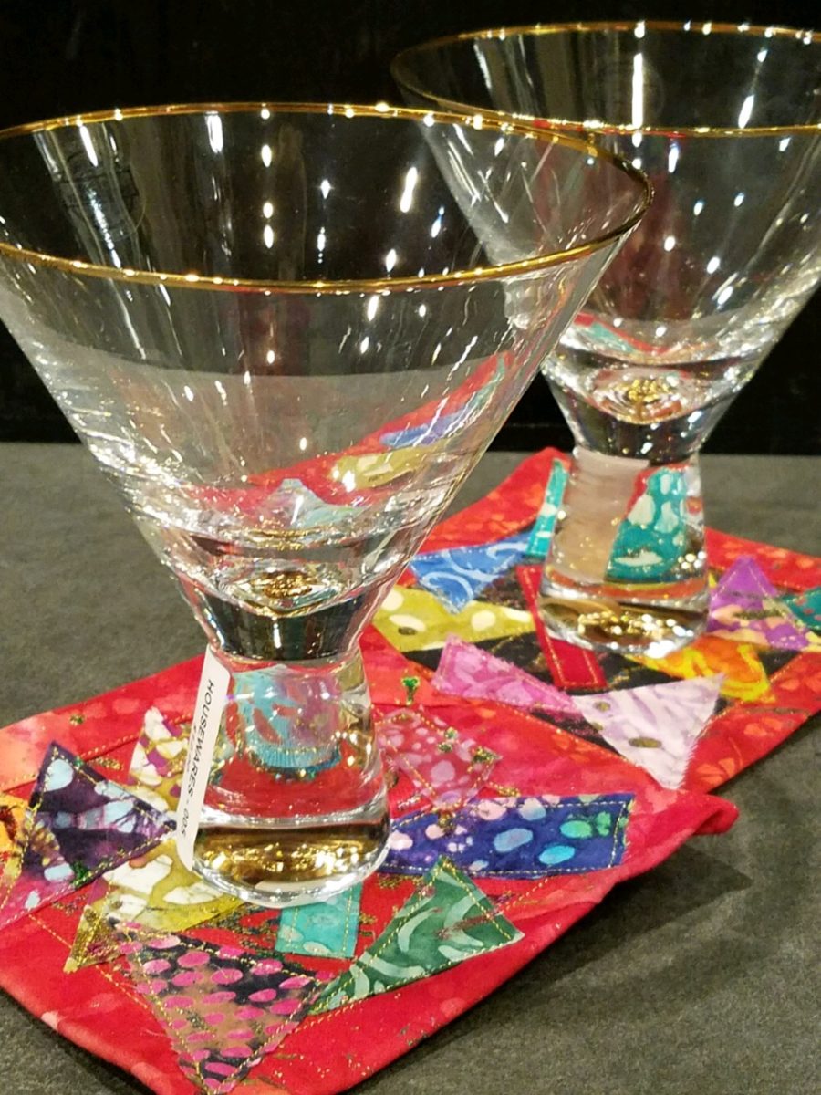
Party cocktails – always a fun  tradition…note here the festive cocktail coasters. Handmade by artist Rebecca Speakes, they make a wonderful gift to start a collection.

Activity Engaging: Playing games, sports – live or on TV, taking a walk, driving around to see holiday displays, theater productions…

Music Oriented:  Gathering around a piano (guitar, accordion…whatever) to sing, neighborhood caroling, participate in a choir, Karaoke games, attending a concert, background music evoking memories for the occasion…

Decoration: Dressing your interior and exterior for the event(s)…

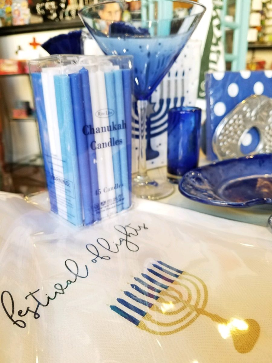
Hanukkah traditions, decorations – the brilliant blues and metallic accents…Color plays a big part in traditions and their interpretation and practices.

Collecting: Adding to collections…handmade series, vintage pieces, new releases…

Remember the guy before Thanksgiving?  He had no formal dining room. He was having 7 friends gather. He wanted to do some semblance of what he regarded as a traditional Thanksgiving dinner. I asked him how he preferred to gather – standing with cocktails and appetizers grazing throughout the evening or a “sit-down” approach? He really wanted the feeling of sitting down to feast. In light of not having a formal dining area – and as it turned out, no coffee table either,  I advised that he gather on cushions around a coffee table. Since he didn’t have one, I suggested that he go to Home Depot and get a 48″ square cut piece of plywood  to position on top of a double stack of cinder blocks. I went in search of finding a table cloth and 8 large cushions (pillows) , votive candles and a centerpiece comprised of a bright yellow mum plant in a basket, with a few mini pumpkins and fall leaves. The scene was set. He used his own plates and utensils, white paper napkins and a package of orange cocktail napkins. He planned the meal and asked for each person to contribute an item that was special for them. After all the dishes were identified, he prepared the main dish, a casserole of boneless turkey breasts surrounded by his traditional favorite, Pepperidge Farm stuffing – baked and beautiful – and two other things that were not being contributed by his friends – canned cranberry jelly (ha ha) and a pumpkin pie that he purchased from a local bakery. Voila!

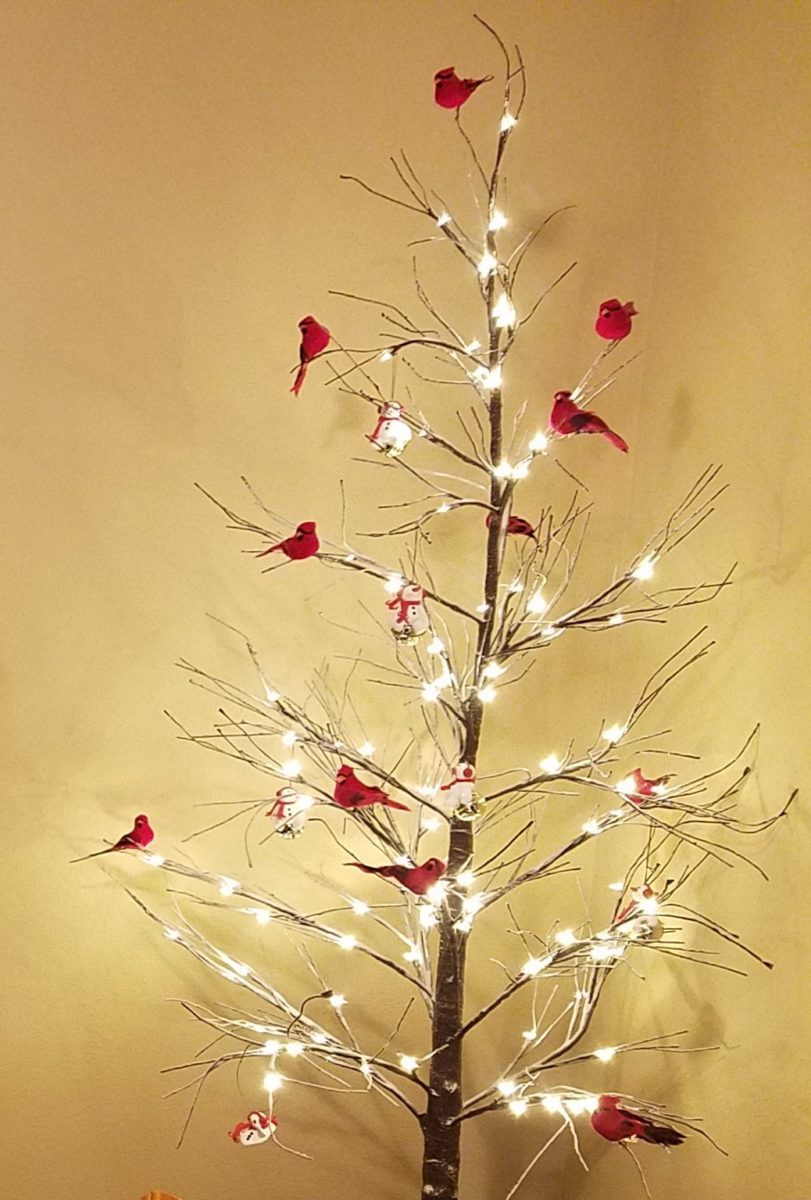
The gal entering her first Christmas as an adult was not from New Mexico nor was her young husband . They had a new home here and the local traditions were not in her realm of traditions. She wanted a large tree but did not own one single Christmas ornament. She bought a live-cut tree and we bought strings of mini white lights,  a couple dozen red feathered cardinal  bird ornaments, candy canes and white ribbon. She tied white bows on the tree and scattered the red birds all over it. I cannot believe that I can’t find the photo of the finished product – but it was a memorable solution for a first Christmas presentation.

This year I captured a quick shot of this tree in a friend’s house that reminded me of that young woman’s first Christmas tree. In vogue this year are the bare, stick-like trees that offer twinkly accents and an airy presentation of ornaments of choice and here featured are the very similar red cardinals!

Happy Traditions Near and Far!!!!

Enjoying Creativity – How Do You Exercise/Express Your Creative Juices?

Have you ever had a moment or period of time when you longed to create something just for fun? It might be to crochet a blanket or knit a scarf.  It might be to build a model plane or learn how to cast a bronze. What have you longed to create?

It seems that everyone needs a creative outlet even though they might not recognize it as creativity. When speaking to a guy  about his interest in working on cars, he didn’t consider his work “creative.” To work on a car for purposes of enhanced performance, restoration, maintenance or repair all takes a certain amount of creativity. The thought process of problem solving and taking action requires creative thinking.

Gardening, painting, sculpting, carving, pottery, collage…there are so many outlets for relaxing creativity. The idea is to not do it under pressure. Lest one defeat the purpose of the relaxing aspect – just for fun – pure joy.

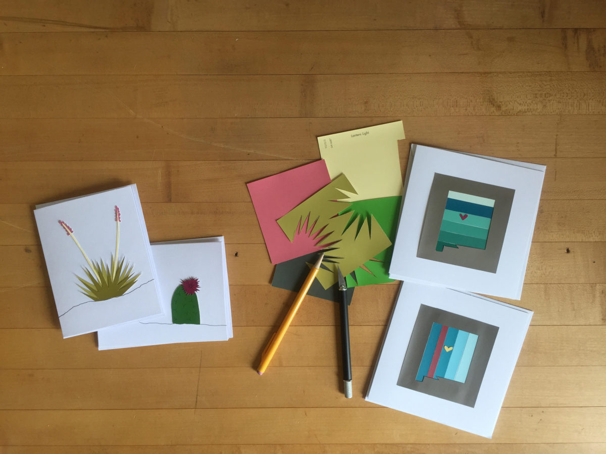
Yesterday I spoke to an architect who said that her creative juices needed exercising. Despite the fact that her daily work required lots of creative thought, it was not pure pleasure. It was not all fun. She wanted/needed another outlet. So she set forth, to do some creative design time, purely for her leisure. She started creating desert floral collages, in a size that could be shared, as greeting cards. She brought them to show me, with a modest timidity, and was most surprised and thrilled when I received her work with great enthusiasm!

Rebecca has found the medium of paper to be quite satisfying, It is clean and precise, crisp and conveys her intent. She loves flowers, lives in the high desert and communes with cacti and appreciates all flowers – and with that her exciting, yet quiet, introspective, personally satisfying, creative expression has found an outlet.

With positive feedback from several people, she wants to launch a re-sale card line! Now the creative process goes another step. She needs to establish a brand – at least a name for her card line. Will she want a logo? What about her entire experience can she list in words and cull and distill to result in the perfect identity?

There are two parts to this situation and the first is to recognize the need for and find an outlet for the relaxing exercise of expressing creative juices and the second is receiving positive reinforcement for your efforts. Inasmuch as the second might seem  unnecessary, it is a great affirmation and valid “feel good” feeling to create for the fun of it and have your work appreciated!

It need not be commercial  – but “selling” your idea or creative project is even MORE flattering.  Although, it is usually not for compliment much less profit.

Creativity can be relaxing, if it is not in a demanding framework. It’s therapeutic. In pondering this subject, I wanted to know more. Seems that this is a complex topic that deserves more investigation. So,  I did a bit of reading…I found the Handbook of Creativity edited by Robert J. Sternberg from the Cambridge University Press 1999. In the first section – The Concept of Creativity: Prospects and Paradigms by Robert J. Sternberg and Todd I. Lubart it states “If one wanted to select the best novelist, artist, entrepreneur, or even chief executive officer, one would most likely want someone who is creative.”

It is true for those of us doing hiring – looking for that spirit that can see beyond…create…are desirable traits. Yet everyone has a certain creative element in their person. It is the degree to which they have it and in what capacity or direction which might be more applicable or desirable, for consideration  in a certain position over another.

The Concept of Creativity  further states that “Creativity is the ability to produce work that is both novel (i.e., original, unexpected) and appropriate (i.e., useful, adaptive concerning task constraints) (Lubart, 1994: Ochse, 1990; Sternberg, 1988a; Sternberg & Lubart, 1991, 1995, 1996).

The aforementioned seems obvious.

So is creativity a divine gift?  One that makes it difficult to study much less quantify or discern from another? That is not the purpose of his blog…but to not mention that query would be leaving something that one might ask – out.

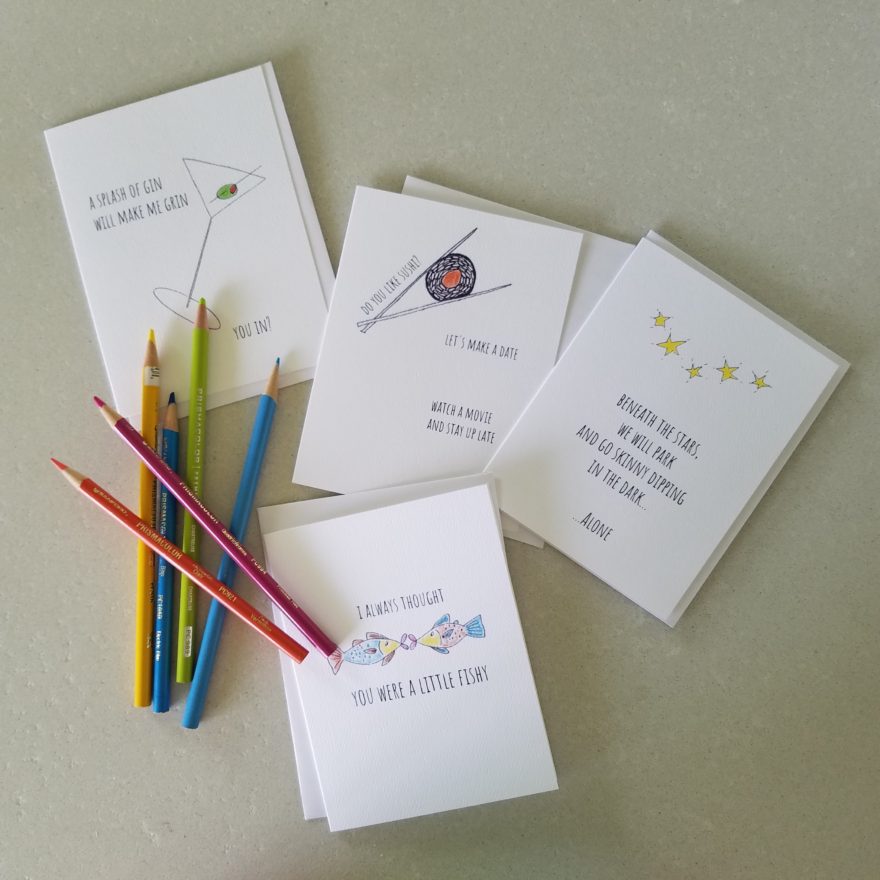
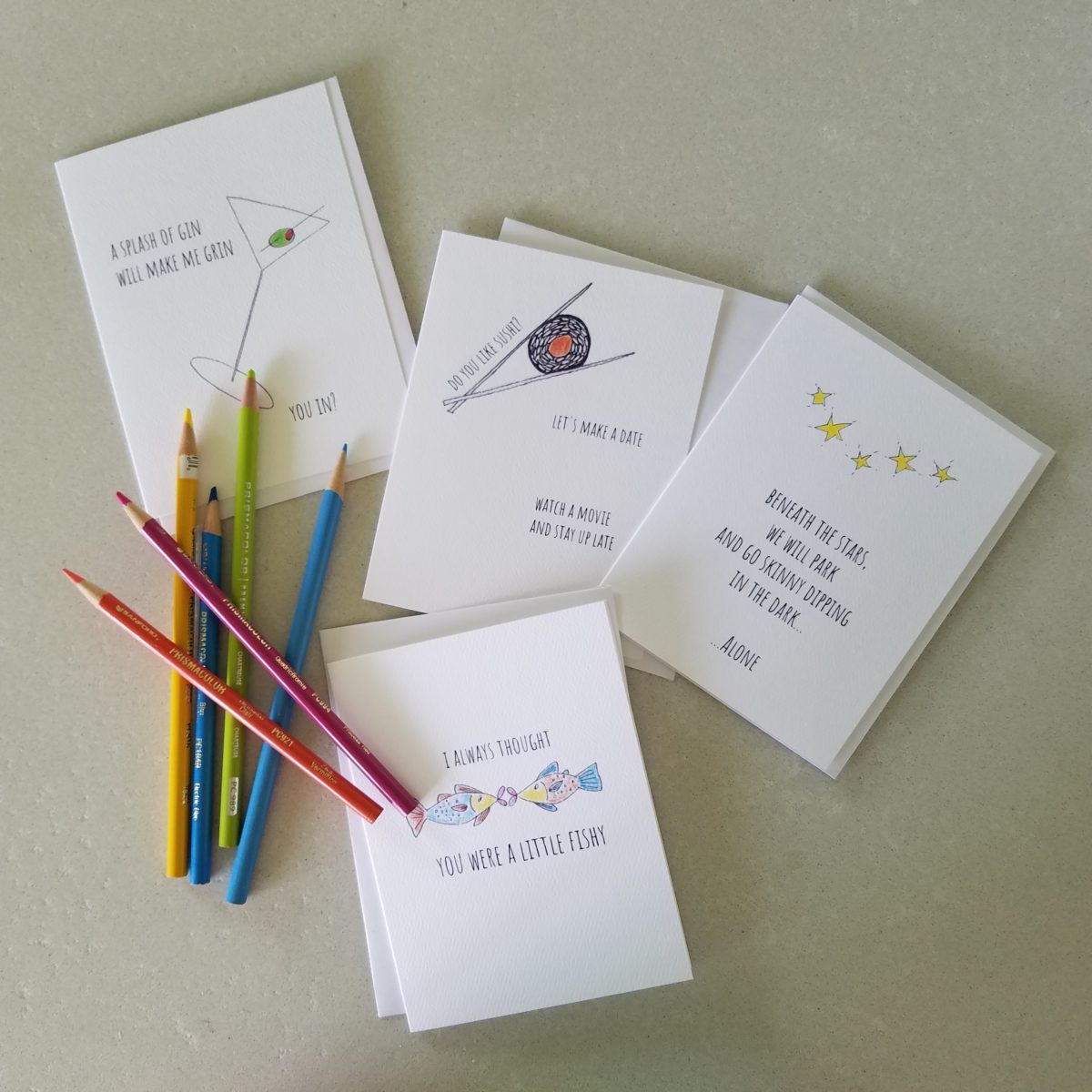
As a professional designer, creativity is part of the daily job description. Yet you will find most designer’s exercise creative outlets that are different from their work. This spring I too launched a greeting card line. It was spawned from hours on the road between San Diego and Albuquerque, with the practice of harnessing myriad ditties that continually race thorough my thoughts. A sudden lightning bolt on one of those trips suggested that I doodle to accompany my ditties. Hence, DATE NITE CARDS were born in March of this year.   Little ditties and doodles to bring a smile, start a conversation, set a date, make new friends, rekindle the spark, celebrate friends, love, anniversaries, romance…

Remodeling Process and Presenting the Same Accessories in the New Scheme

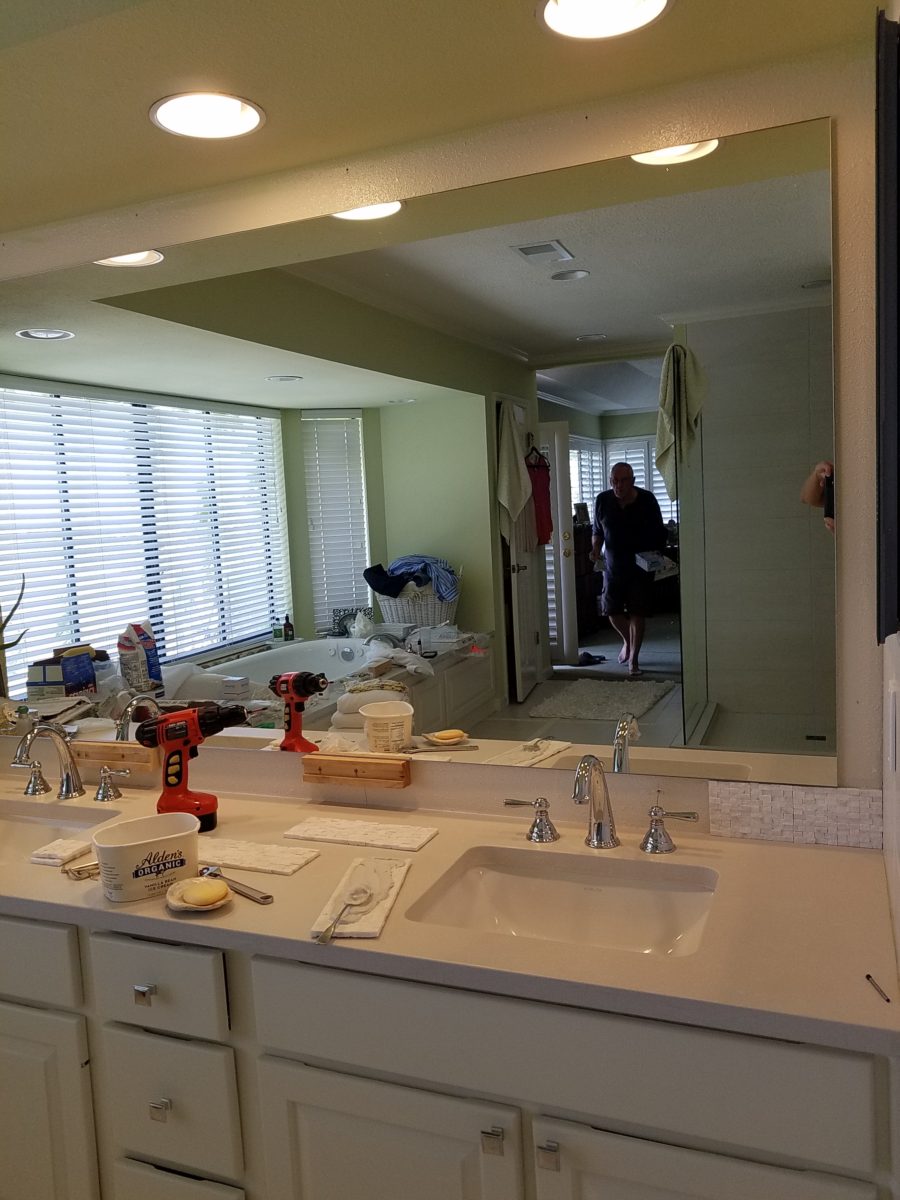
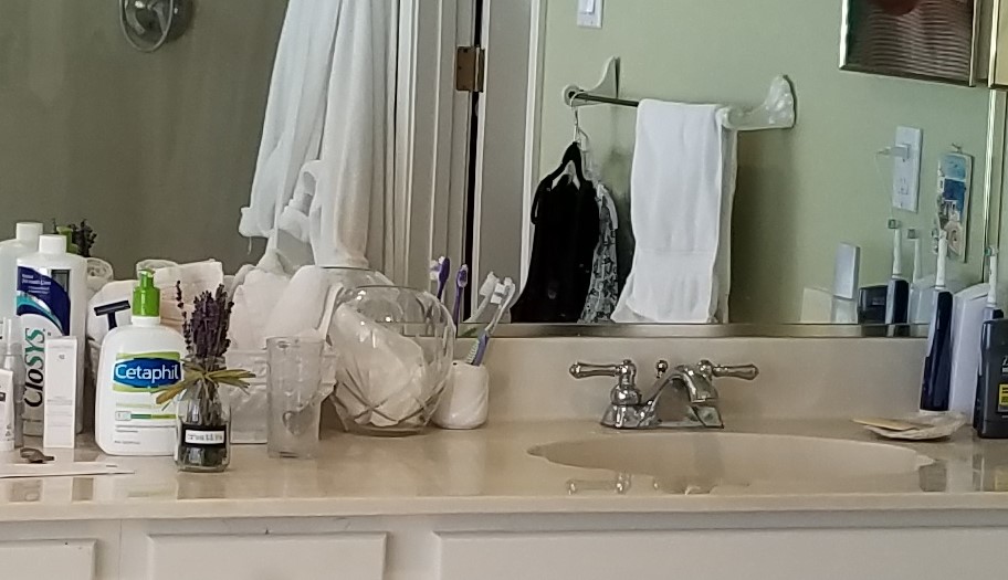
It’s true. If you think designer’s projects go more smoothly than the ones they do with and for you, you’re wrong. It’s true – they don’t! It’s about Murphy’s Law and I have been remodeling our master bath for months. Starting in November and as recently as this weekend personally installing (DIY) the stone surrounding our mirror, it is still not finished. But it’s close.

The full-wall mirror was re-used. During the removal and transportation to be cut-down, the edge cracked and had to be cut down…we lost an inch or so – no big deal EXCEPT that it then affected the dimensions of the new stone surround that had already been determined. Oh well…we now will have to cut the tile – had intended not to have to do that. One of the many little surprises and delays. We had to order more stone and will now engage the installer to cut the ones that would not fit the new and slightly non-parallel conditions .

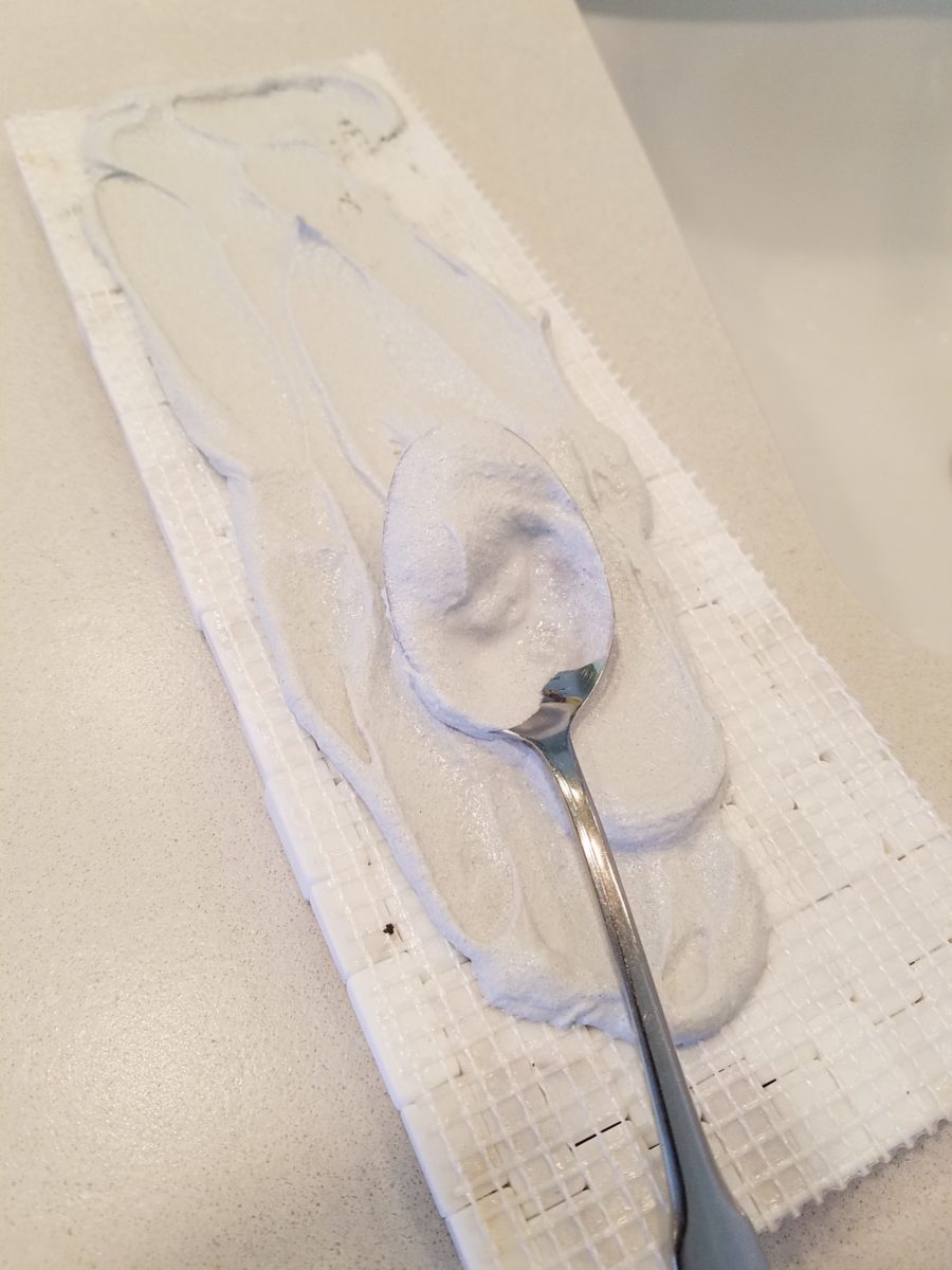
It’s actually fun to tile…until you have to cut it. It is like frosting a cookie and then pressing it onto the wall. It goes quickly and gives instant gratification. But when things are not perfectly parallel, something has to give. That’s when we cut. (Or call someone to cut!!!)

The effect, of having almost all of the mirror surround finished, gets us that much closer. The effect is great and is beginning to feel like the intended design.

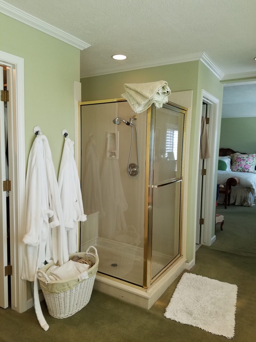
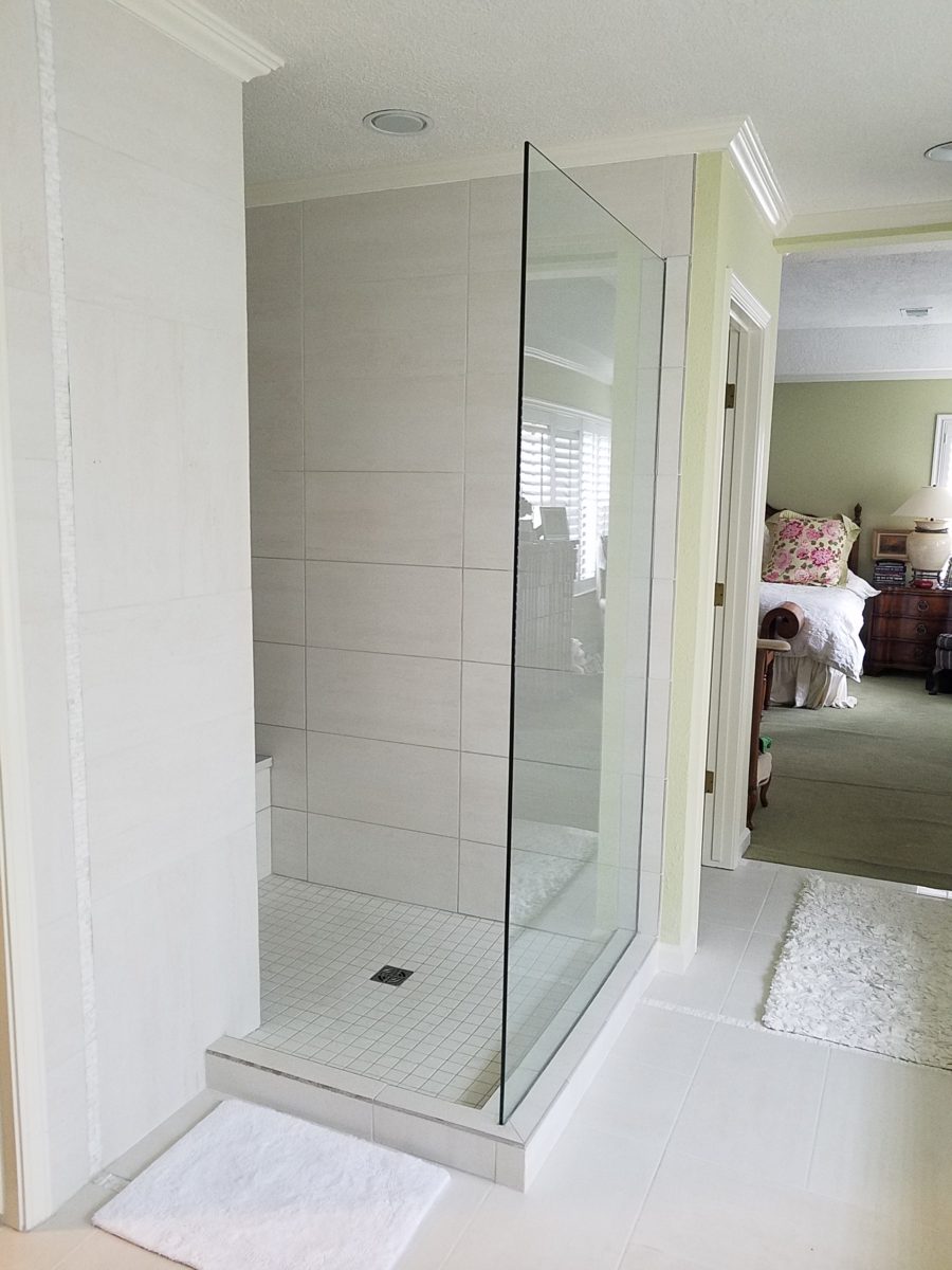
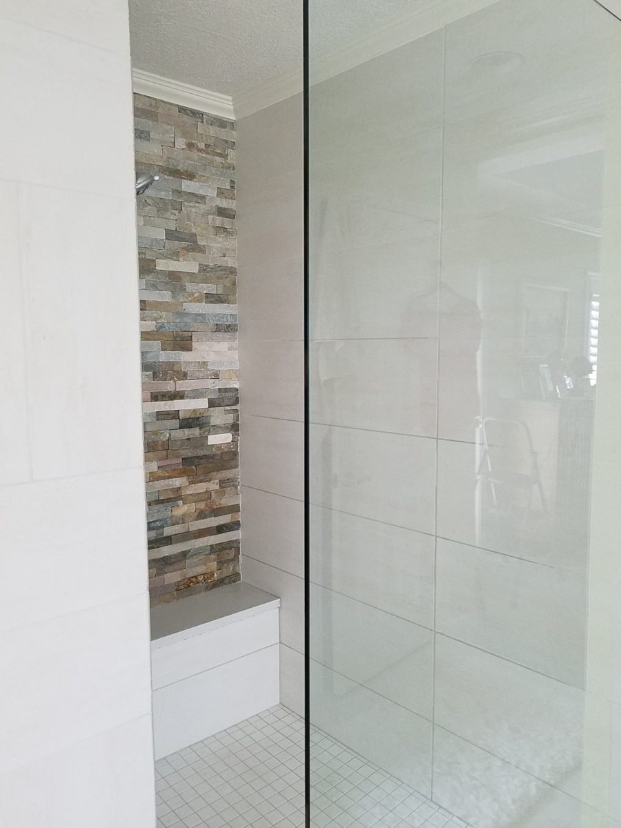
The shower before and after is providing the open expansive look that our little shower enclosure didn’t provide. Despite the facts that the footprint is nearly the same and the old enclosure was all clear glass – albeit framed in gold finished aluminum – this new single panel of 1/2″ clear glass and white-on-white floor and walls looks clean and open. Not a snail design – but, no door. Prepared to add a white shower curtain on a custom curved aluminum ceiling track once winter returns – but for now we’re enjoying the refreshing and comfortable atmosphere.

We elected to use stacked stone on the rear wall of the shower as our house sits at the base of the majestic Sandia Mountain and selecting stone seemed more grounded and contextual than other decorative options – of which there are a million from printed concrete, glass mosaic, embossed porcelains…the list goes on…

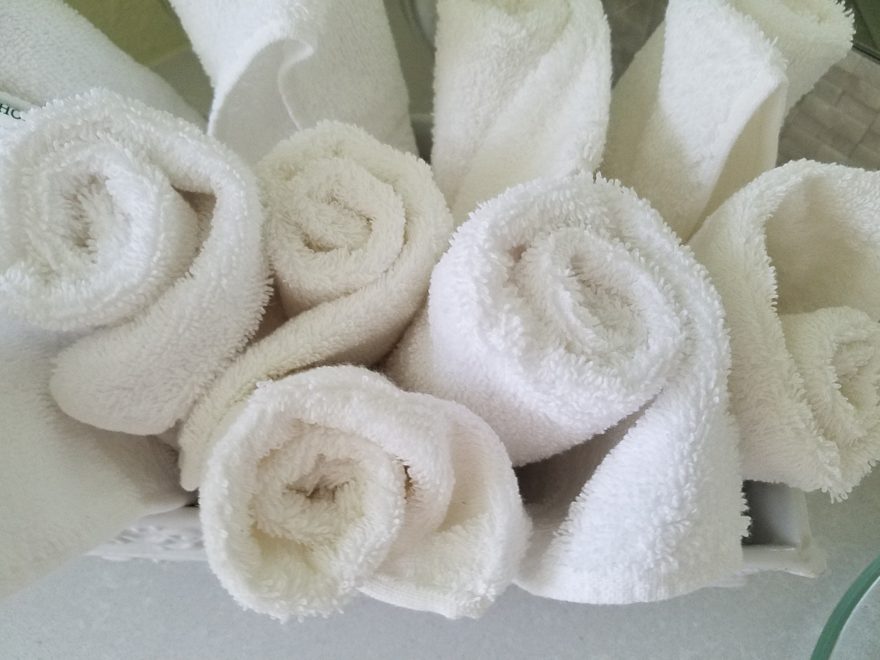
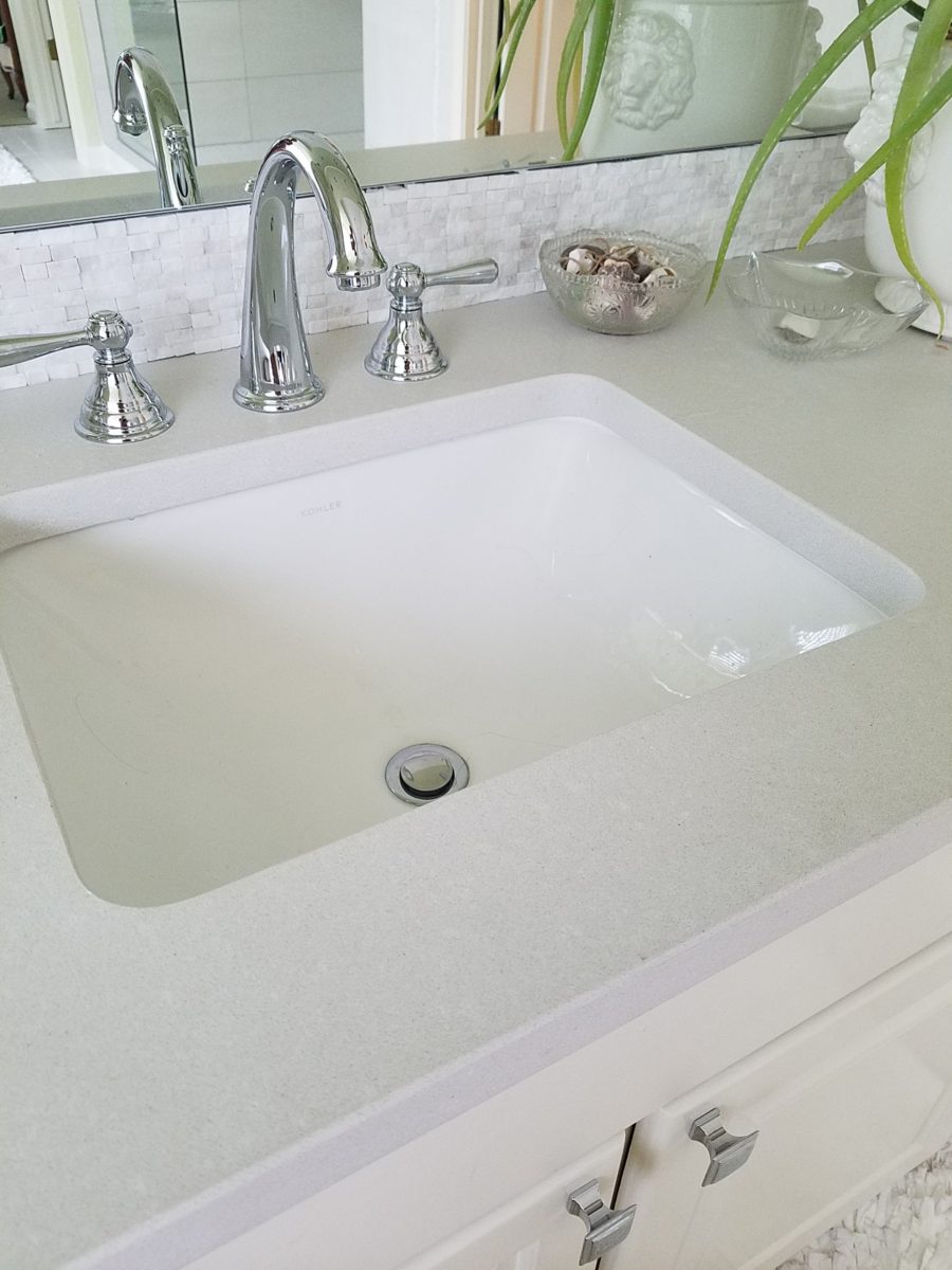
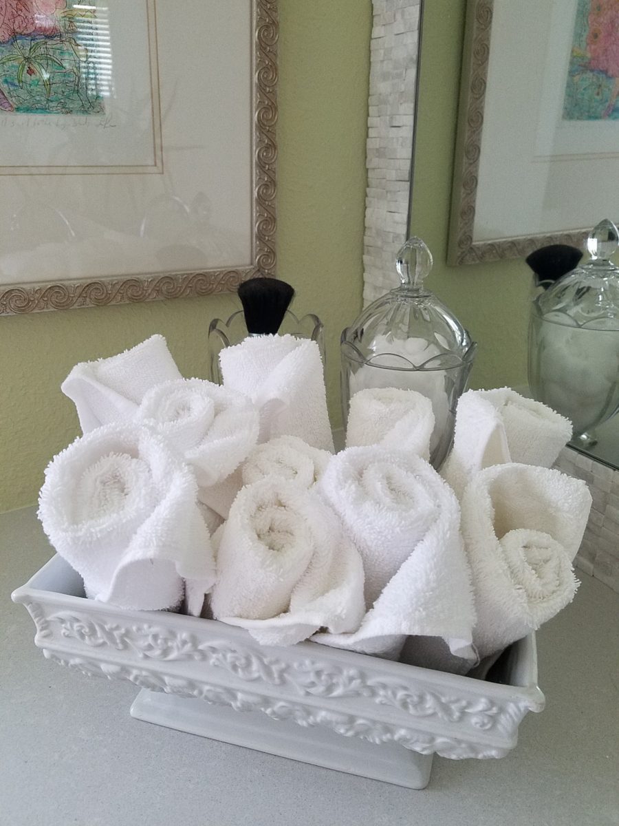
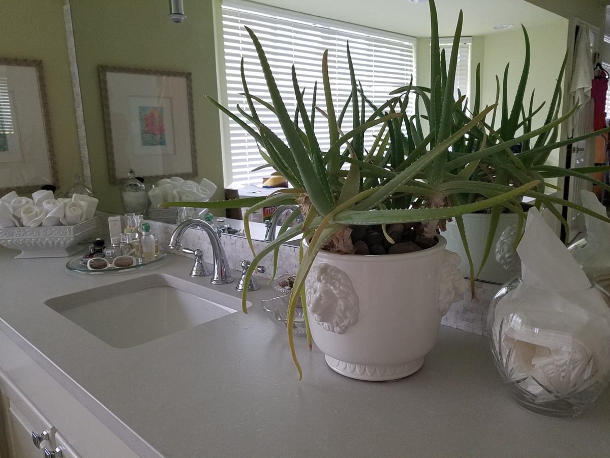
Decorative elements are beginning to “read” against the new finishes. The same Portuguese ceramic footed rectangular container holds a bouquet of white washcloths. Yes, I think that the rolled terry towels look like rosebuds and I have always enjoyed the softening effect they provide amidst all the other hard surfaces. Plus they are handy on the countertop for clean replacements.

Footed Italian porcelain has had wash cloths in it for years and stays on the new counter top in a slightly different location.

Behind the terry rosettes, notice the pair of Heisey open and lidded pair of stemmed glass vessels that I use for make-up brushes and cotton balls respectively.

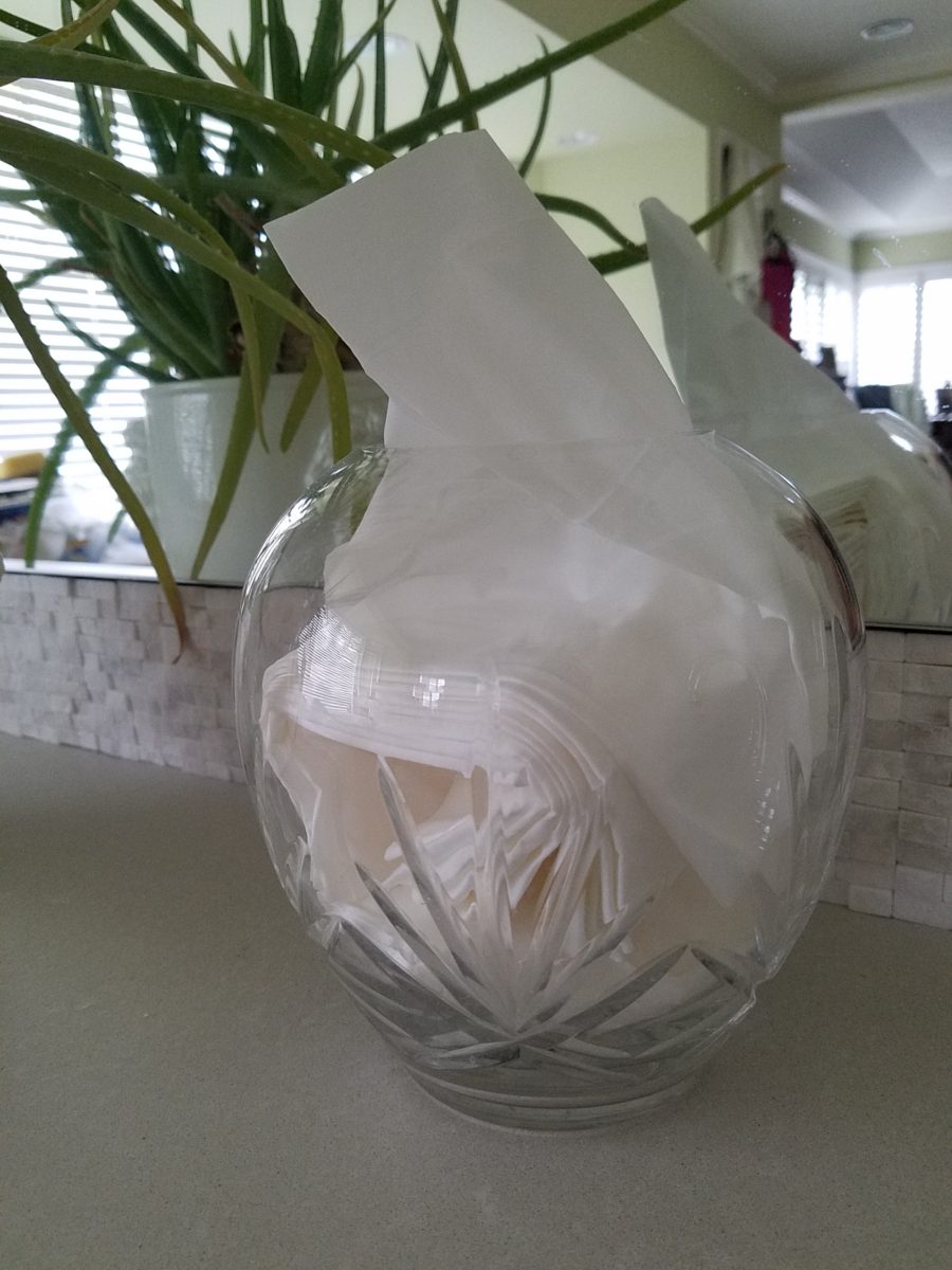
The same crystal wide-mouth vase holds and dispenses the facial tissues. I love the effect of the white-on-white coiled folds of the tissues. They are soft and read interestingly through the cut crystal.

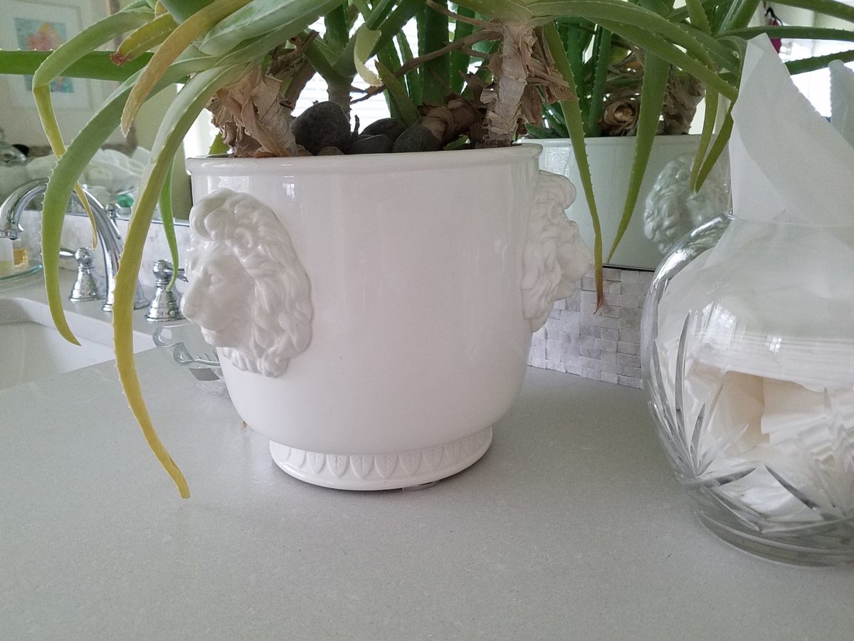
I’m a LEO and find myself discovering and enjoying subtle references to lions. Our front door knocker and this cache pot that I’ve had for over 20 years as examples.

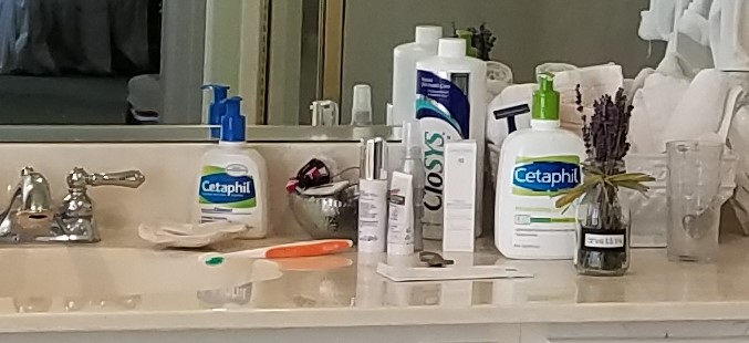
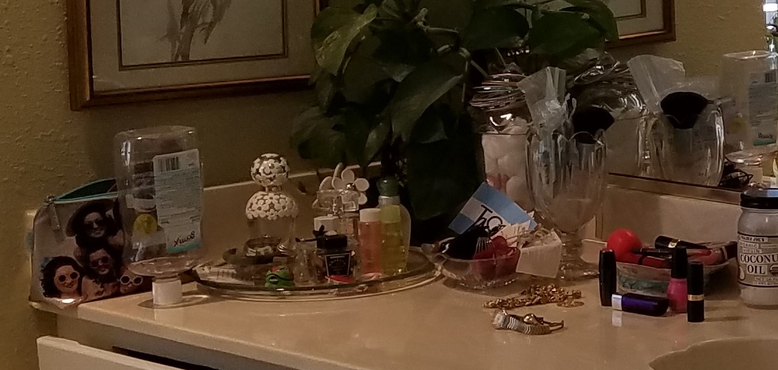
Nothing in this new scene is new. These accessories are all the exact items that were scattered on the countertop previously! Funny how the exact same decorative accessories work so well in this new interior!

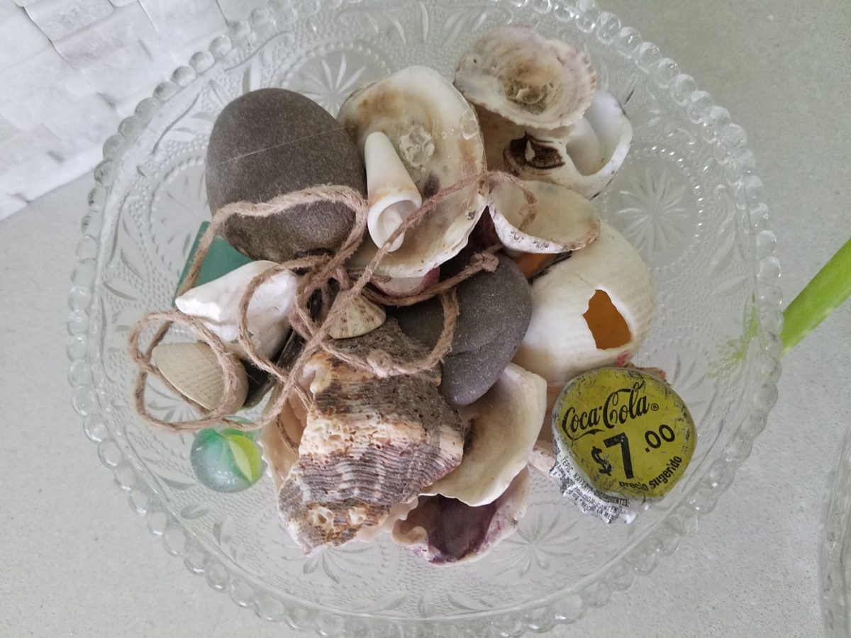
A silly little collection of found things in a family inherited vintage pressed glass bowl including a glass marble, square frosted glass coke-bottle-colored mosaic tile, various sea shells and fragments, a squashed bottle Coca Cola bottle cap from Mexico, a hemp cord DIY necklace with a shell pendant…

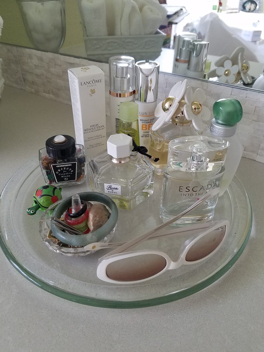
Another glass tray that was also on the previous countertop presents my fragrances, a few products, a bobble-head turtle, my Waterford ring stand stacked with costume glass rings, my tragic, yet miraculous jade bracelet (save for another story), a fossilized bone – in – stone I found as a child, my  white framed sunglasses which might seem selected for the new color scheme – when, in fact, they are a result of my love for white framed glasses and these that I bought even though I didn’t like the would-be “reader” small lenses – I kept. I don’t like the way they look on – so have relegated them to the master bath for emergency dashes to the outdoors, on the upstairs deck when my other sunglasses are downstairs!
Still to complete…the stone mirror surround, hang the glass shade for the new pendant light fixture, install the towel/robe plugs, install the polished chrome drawer bar handles to match the new square door and drawer pulls, clear all the remaining stone pieces, thin-set and grout bags and boxes from the tub deck, install the new window sills…

Re-evaluate your existing accessories (and/or furniture) before feeling the need to change everything when you remodel. Watch for the completed before and after shots of this remodel soon to come. Well, relatively soon!!

Christmas Centerpiece – Gilding the Lily of Locust Pods, Evergreen, Silver & Gold!

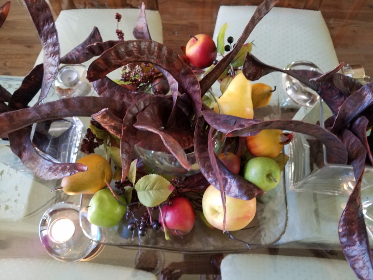
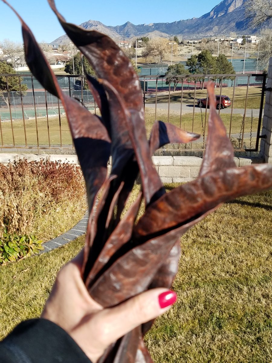
The return of the pods with a twist! Those gorgeously twisted mahogany colored Locust pods that fall every autumn and beg to be re-purposed, if not for their procreating seeds, as table dressings!!! Yes, I have embraced their raw, organic beauty for quite some time. Look back to my introduction to these handsome hulls and the first fabulous table-scape that resulted.  https://patriciandesign.com/resourceful-creative-festive-fun/

The original autumnal centerpiece using the Locust pods a couple of years ago…

There have been many bouquets since. Then yesterday, as I walked my 10,000 step trek around a nearby park, I pondered the theme for this Christmas blog and another pod piece came to mind.  One lone Locust tree there in the park had produced a blanket of pods that have been weathering these last couple of months – fortunately, not weathered too badly. I gathered 2 dozen of them and marched home with a purpose! Fists full and looking a bit curious, I passed several strollers wondering about my two unusual bouquets.

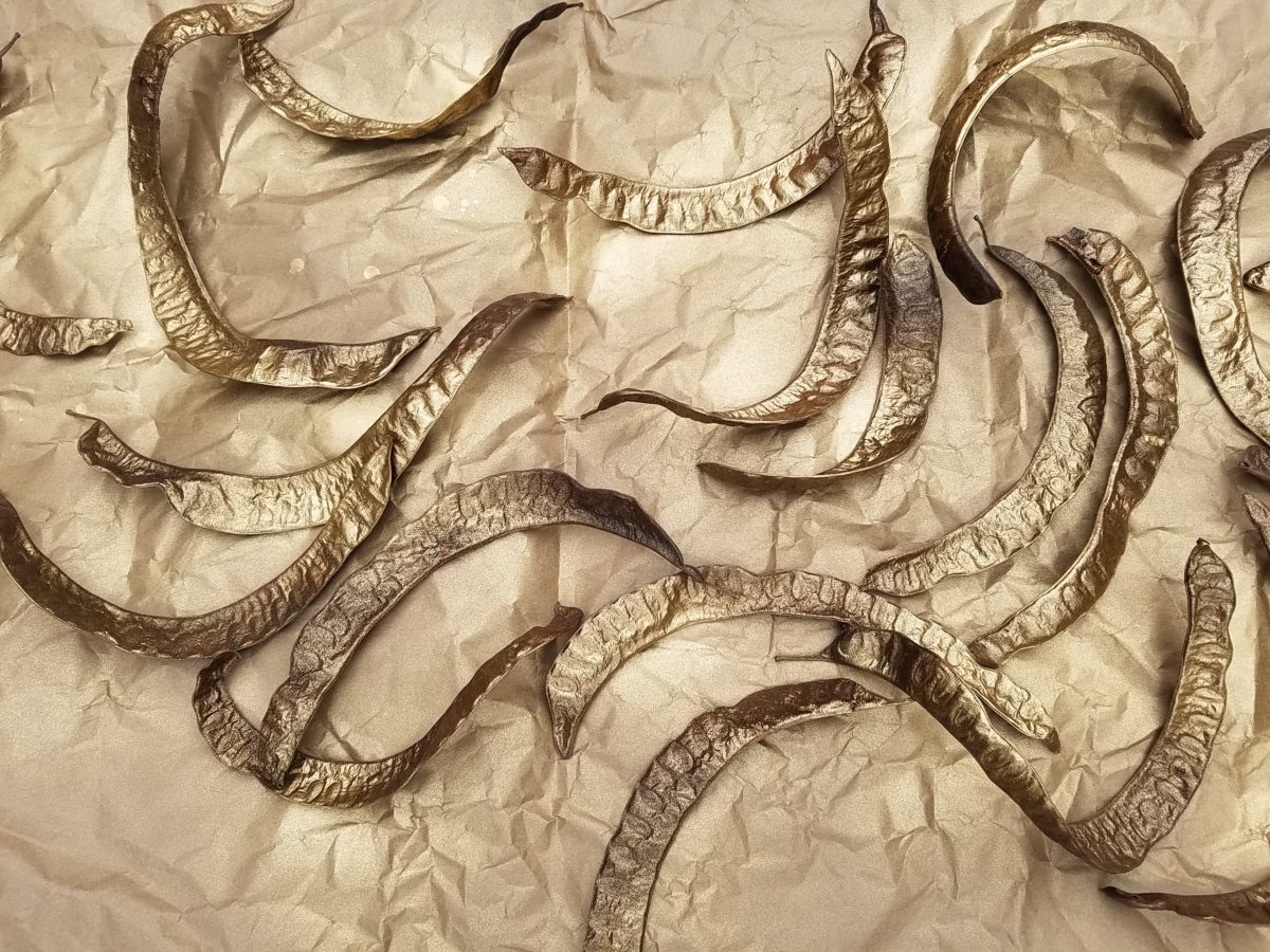
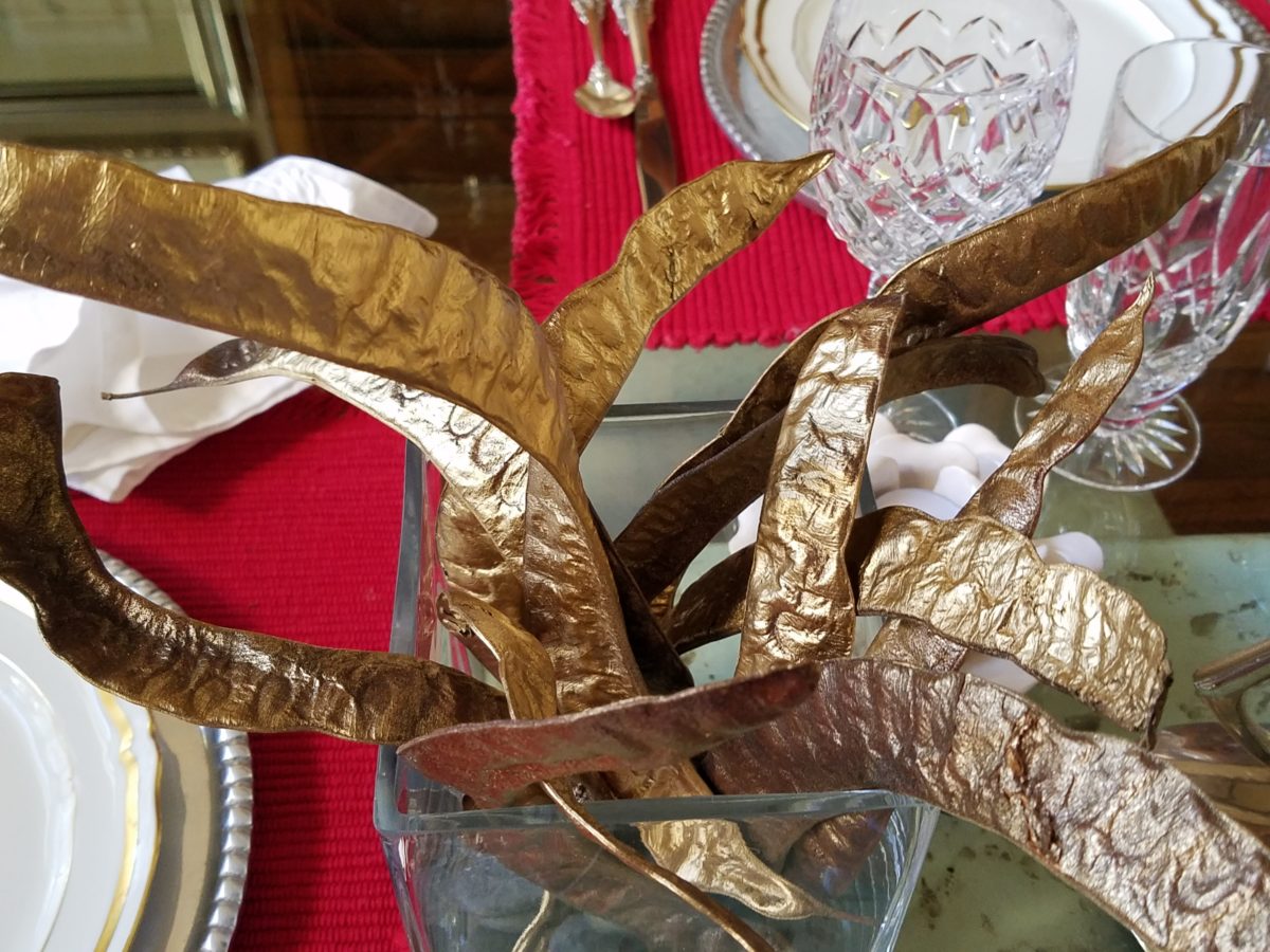
My idea was to tweak them from their natural autumnal brown to a gilded glory!

Spray painting on brown craft paper – both sides – instant transformation!

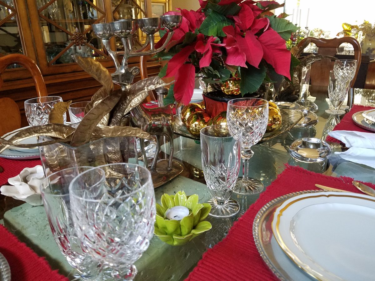
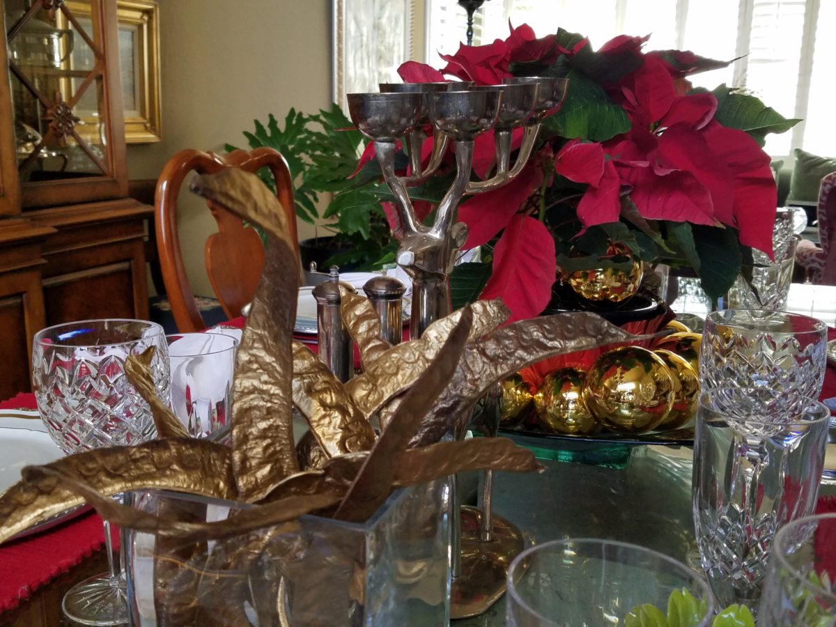
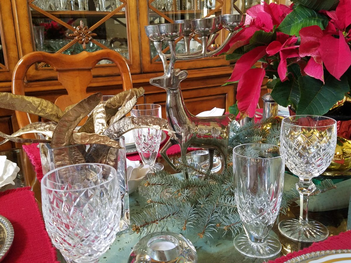
Yes, gilding the lily of lovely rich, natural pods to become wildly twisted golden spires flanking the traditional poinsettia of our Christmas table.

Building the scene as I go…

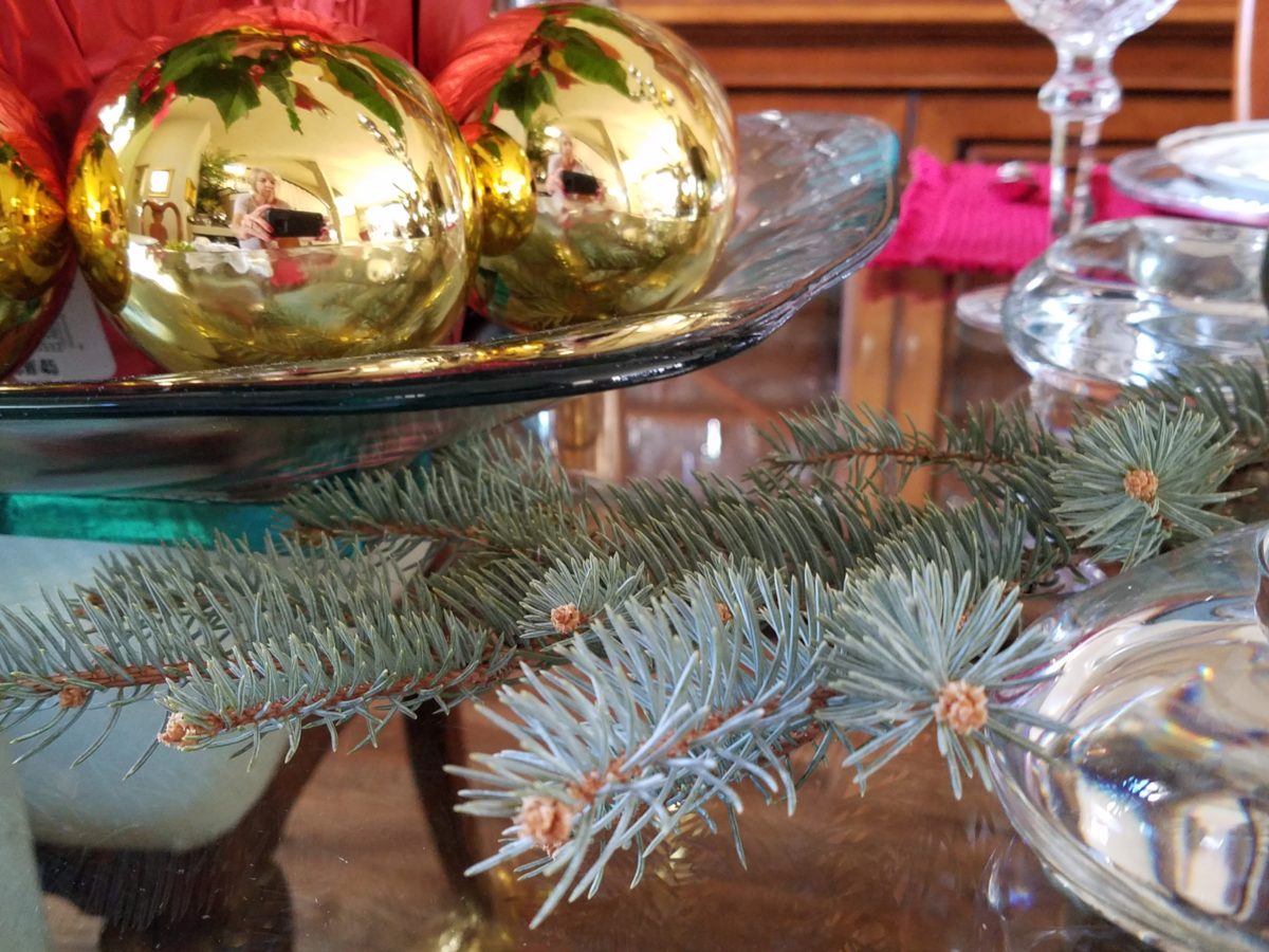
Last minute gold glass balls ringing the red poinsettia centerpiece,

Spruce sprigs from the yard.

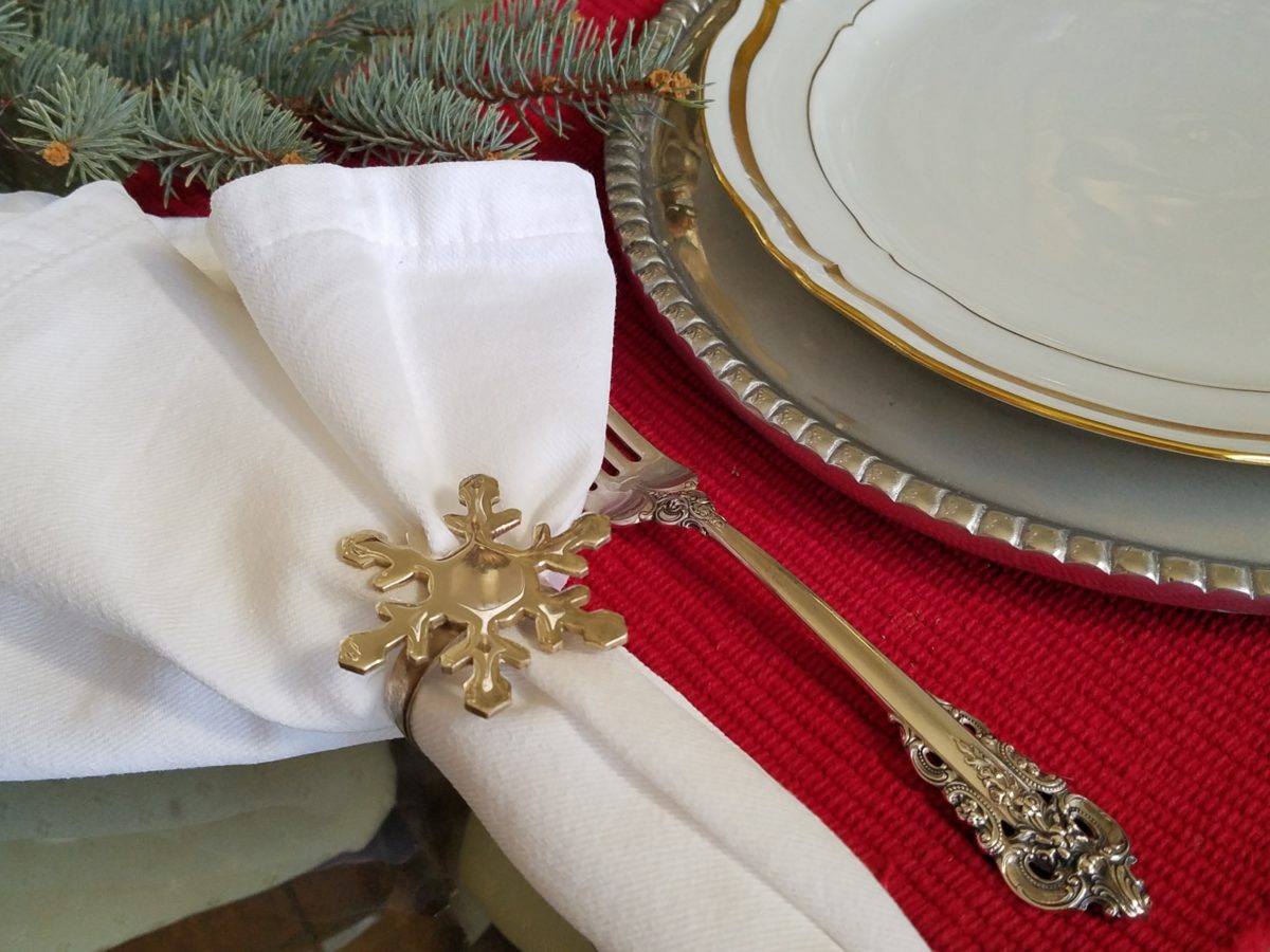
a pair of silver reindeer, silver snowflake napkin rings, blue spruce cuttings from the backyard, scattered votive holders, crystal and china for the touch of formality and we’re ready for our silver and gold, red and green, festive feast!

Mexican pewter chargers, with fine gold trimmed Limoge china, Grand Baroque sterling and aluminum snowflake napkin rings – mixes metals to the max!

MERRY CHRISTMAS!

DETAILS Found at Hillwood Estate This Christmas

The world is full of detail. From the wonders of nature and the perfection of a flower, to the man-made creations that come from inspiration of all sorts. The combined influences that result, in interesting and good design, are limitless and we now have layers of platforms upon which ideas are presented. The access to creativity is staggering.

Take Etsy and Pinterest. There the ideas abound. Everyone has access to creative ideas unlike ever before in our world. In the past, a keen eye observed and discerned. The clever managed to find inspiration in the most obscure places, analyze observations and interpret them for their own purposes. Creativity was spawned from observation paired with original thought. Yet, that observation was generally first-hand. Therefore, those that got about more, saw more and had greater exposure to more (and there you have it) were creatively stimulated more!

We (perhaps I should say I since it is from my own vantage point and experiences, from whence I speak/write), often are so busy observing that we don’t take the time to dissect and catalog the information we discover. I am so very guilty of that as I am so captivated by design and creativity that I forget to  remember!!! Ha – yes – forget to remember or record!!!!

I constantly find myself regretting to have taken a photo of something (some who know how many photos I take might want to take exception with this point), but it’s true. I regret not taking a photo or studying something which, retrospectively, I recognize as something quite special. In the rush to experience the entire scene, I fail to notice or retain the details. Have you ever felt that you were so caught-up in a new experience that afterward you feel you should have paid closer attention? I forget to remember to store the observations or I forget to take a photo – regretting it afterward.

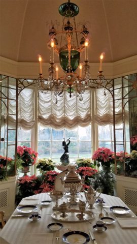
The breakfast room aat Hillwood Mansion where Marjorie Post rarely entertained, but was always set to do so. Pink poinsettias are the seasonal choice.

This can be from a class lecture to a theatrical production. I wish I had focused more closely rather than getting distracted by my own imagination which  often runs rampant with the encounter. However, the stimulation can be so great that the imagination kicks in and causes diversions, in the attention, resulting in a deficit of detail gathering. Hence a clear case of un-diagnosed ADD!!!

With all of this having been the prelude to my thoughts for the day, I have elected to pick out a few details from a recent tour of the Hillwood Estate and Gardens nestled on magnificent wooded grounds in the heart of northeast Washington, DC. And how wonderful to have had the opportunity this week to stroll through the mansion, now museum, of the late Marjorie Merriweather Post during the Christmas season.

As previously mentioned, I would have, could have, should have taken more photos, but was so enchanted at every turn by the beauty and gracious luxury that unfolded, I was too busy darting from one magnificent scene to the next to capture more than I share here. I apologize.

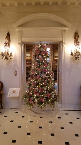
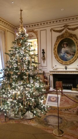
Her favorite color was pink and this tree greeting visitors upon arrival is a precious jewel among many beautiful Christmas trees and decorations displayed in the mansion.


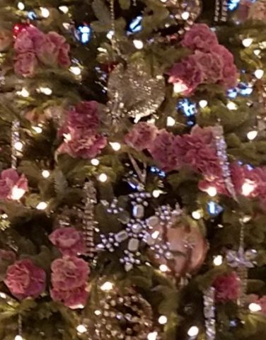
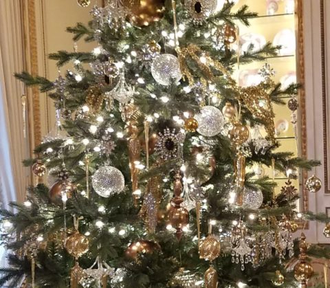
From the reflection on the polished floors of the little white lights to the shimmering crystal punctuated with pink blossoms bedecking the tree was undeniably elegant.

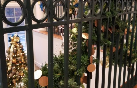
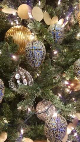
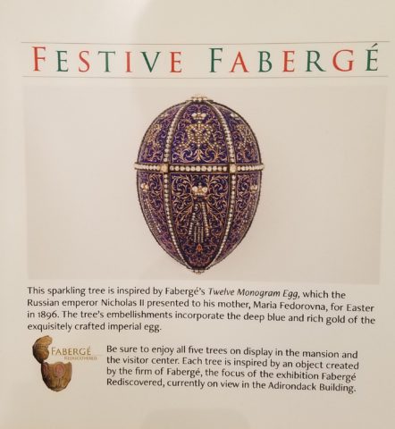
The railings ascending the staircase at the reception desk were draped with garland and strung with simple gold painted discs which were repeated in the coordinating tree which also featured a collection of blue reproduction Faberge eggs.


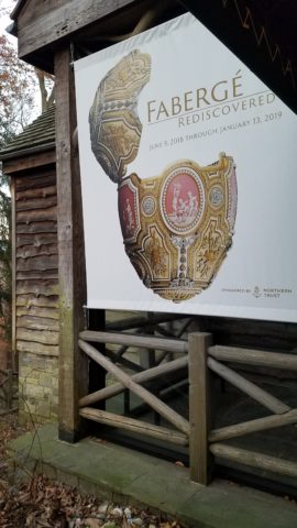
Marjorie Post was a discerning collector of all manner of artistic beauty including exceptional Russian decorative art. The actual exhibit of Faberge currently available for view on the property is nearing its end. Many dazzlingly detailed pieces from her own collection and others on loan for the exhibit are being shown.

If you are in Washington this month, please treat yourself. This exhibit of Faberge pieces is outstanding.

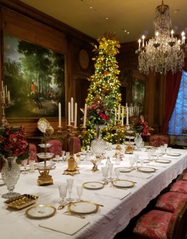
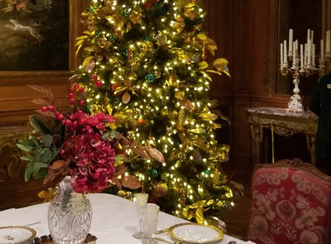
The gold leaves on this magnificent tree in the dining room would be fun to replicate. Could have easily been dipped in gold leaf. Like lime leaves – or from your garden perhaps photinia or laurel even rhododendron – maybe go faux with silk from the craft store – spray ’em gold!!! Paint magic!

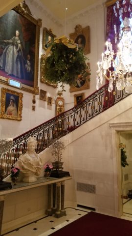
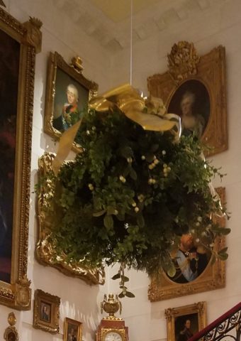
And if you have ever installed a dangle of mistletoe…check this out! This elegant bundle suspended, from the towering heights of the entry hall, puts all other sprigs to shame!!! In the opulent foyer, this grand ball of gilded ribbon-clad mistletoe invites those to tempt the fates of love and superstition, with but a kiss!
Whether it is a theme of gold or a snowy season of white, find details and enjoy the creative opportunities that present themselves to you in passing or from the depths of your imagination and create your own holiday magic!!!
Creating fantasy, festivity or seasonal celebration, gather the details every day from observing all the particulars around you.  It is amazing from where you can collect ideas and be inspired to create your own festive fantasy!!!!!! Then be sure to take some photos!!!!!!!
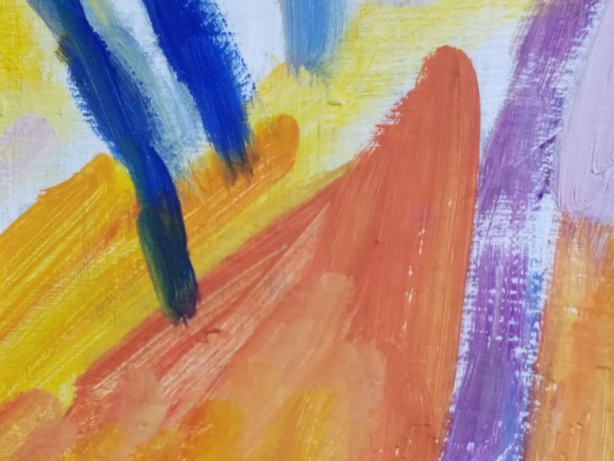
 

What’s YOUR Favorite Color? A Little Project for Fun!

Pick a color. What’s your fav? Do you HAVE a favorite color? I was asked the other day that very question and I was really at a loss…I looked at her, furrowed my brow and cocked my head.  I wanted to have an answer – a simple answer that stated a definitive preference for a color – my most favorite. Rather than producing a quick sure pick, I faltered as she stepped in and said – I’ll bet it’s purple!

Well, actually I can definitively say that purple is NOT my favorite color, but the funny thing is I can love purple, in certain context. The real answer is that I love nearly any color in a certain context.

When I ponder the question a bit more, I can assertively say bright pinks, cornflower blues, golden yellows, chartreuse and brilliant orange. But the truth is, I love so many colors that I am hard-pressed to select just one! It sounds like a Lilly Pulitzer color board.

So I thought of a little exercise. I decided to pick a color at random. Then overwhelmed with the myriad colors that might produce one random pick, I fine-tuned random and said to myself, perhaps a color of the season. To me that was currently and boldly orange. So the idea was that I would walk in and around my house today and capture things that were orange.

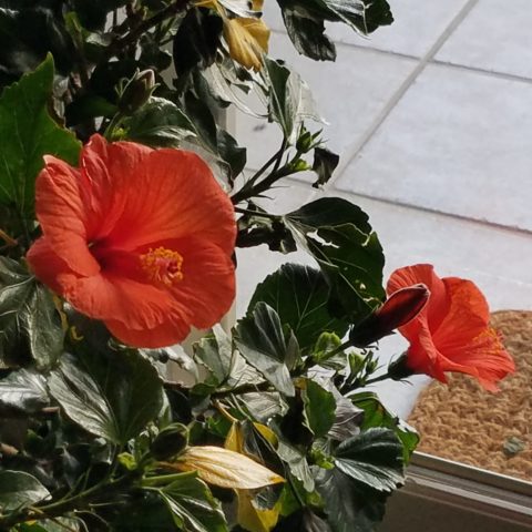
This screaming orange hibiscus just came in from the patio to escape the chilling temperatures that have swept down in the last couple of days…happy to transition indoors for the winter!

Try it. Pick a color – not necessarily your favorite – but certainly one you like and walk inside and outside of your house and see how many examples you can find, of that color, in your immediate world. Photograph things that have that color – all or in part, even little details – anyplace that color occurs.  It’s fun and very interesting to see what you discover!!

Autumn is loaded with vibrant colors, but orange is one of the most fiery.

So I selected orange as my color today. I dashed around the house and collected a variety of things that were orange. I was actually astonished at how many I discovered.

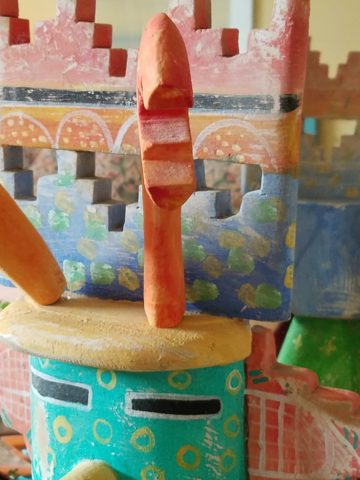
This dramatic Hopi – influenced kachina by Gregory Lomayesva sports stylized antlers in a flat but brilliant orange.

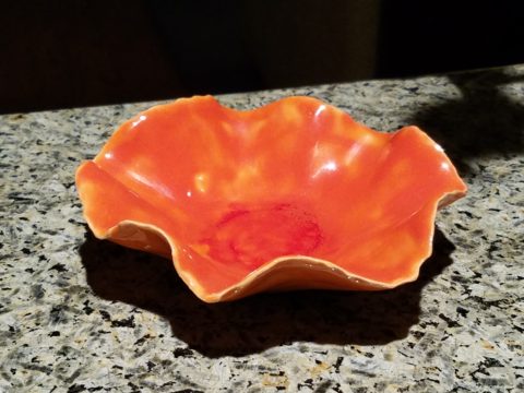
Festive ceramics by Ann Marie Werner Smith – here a graceful orange bowl that sits on the counter…it pops against the contrasting granite.

It is interesting because I know my world is not heavily orange, but I found so many wonderful splashes of it throughout my interior and even startling exterior, in the way of the leaves on the Bradford Pear tree.

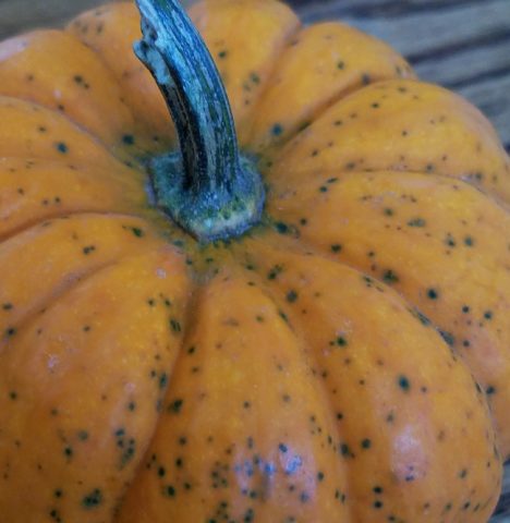
From fresh mini pumpkins and flowers…

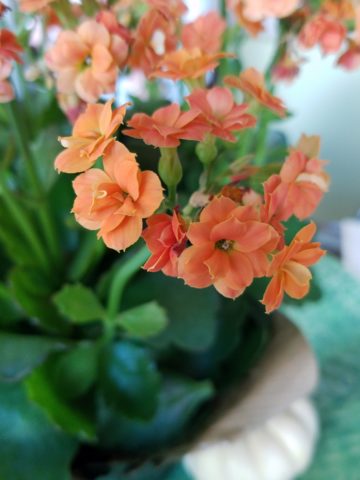
A succulent orange flowering Kalanchoe is our seasonal centerpiece on the kitchen table.

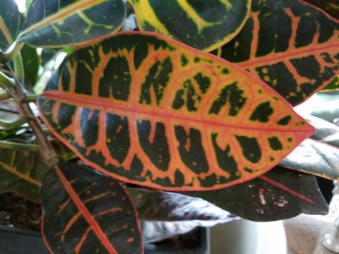
A variegated Croton plant has lacy veining of bright orange, pink and yellow contrasted against it dark green background.

to artwork with swaths of orange streaking through them.

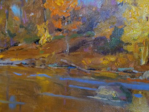
A lovely little oil painting by Jeff Otis depicts a very autumnal New Mexico river scene.

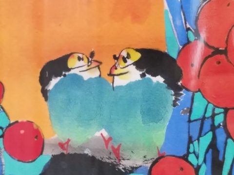
At the last minute, while waiting in the Bejing airport, I found this precious little painting of birds and berries. The background is a vibrant orange. Notice the fresh blues adjacent to the orange. This is a detail of the much larger piece.

Peggy Zuris really knew color. Her bold and confident brush strokes applied in luscious swaths placed adjacent colors perfectly juxtaposed creating uplifting renditions of daily life. This little chicken is a detail of a fanciful rural scene.

The balance of color was so interesting. Where I found orange, I nearly always found blue – unless it was a stand-alone like the glass bowl of oranges – or my coral necklace with its nuggets of bright orange coral.

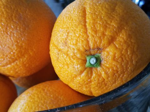
Fresh oranges with their intricately textured rinds fill a glass bowl on the kitchen counter.

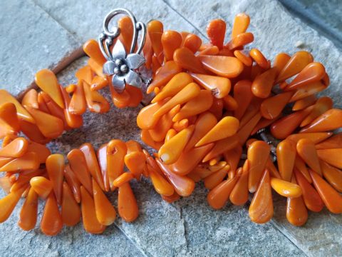
Nuggets of coral look like candy corn tightly beaded on this delicious necklace I wore too Santa Fe today!!

Colors balance and contrast.

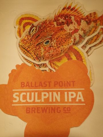
Even the coasters that attracted my attention last weekend at a bar. I was so taken by them that I brought them home and had them sitting on the kitchen counter. They were intriguing and offered interest and visual stimulation to my graphic art sensibilities.

I began this story earlier today, then took a break and tootled up to Santa Fe where I came across a couple more bright orange pieces…

And on the way home, I was even blinded by an orange fireball glowing beneath the stormy sky silhouetting the dark mesas and glistening off the wet pavement. It’s intense heat contrasting with the cold, damp asphalt that was a result of our first seasonal snow seen here spitting at the windshield.

Gather your collection of photos of your color today. Ponder how they and the color make you feel. Do you get joy from the color and the things you have discovered? Was this not your thought-to-be favorite color and if not, might it be one of them? How do YOU answer the question, what is your favorite color and having determined that, ask yourself:  Do I wear it a lot? Would I paint my walls that color? Do I have upholstery that color? When is a favorite color an accent? Is the joy in the little spots of punctuation? Are they intense, but small, elements of joy without over-doing it? I see a collection of abstract images, details of things – some of which can be cropped more – to create an abstract collage of wall art. Voila!

Color – an amazing facet of design and it’s most versatile component. It’s been a fun test and a compelling story. So what’s YOUR favorite color?