Fabrics – Texture, color, pattern, design & style – The Art of Transformation

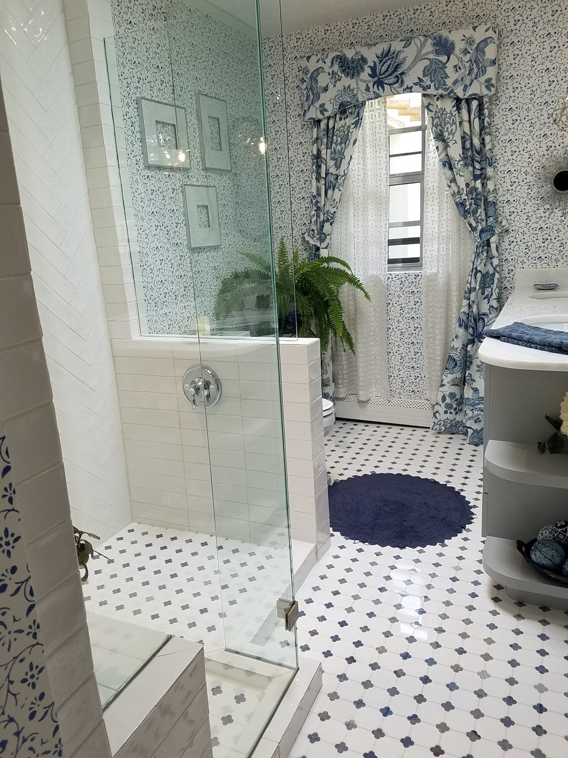
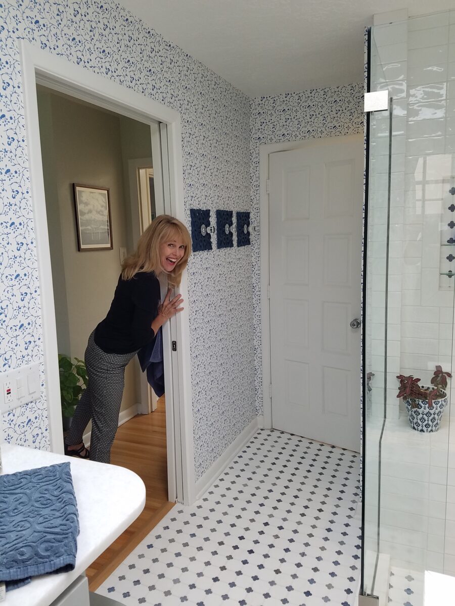
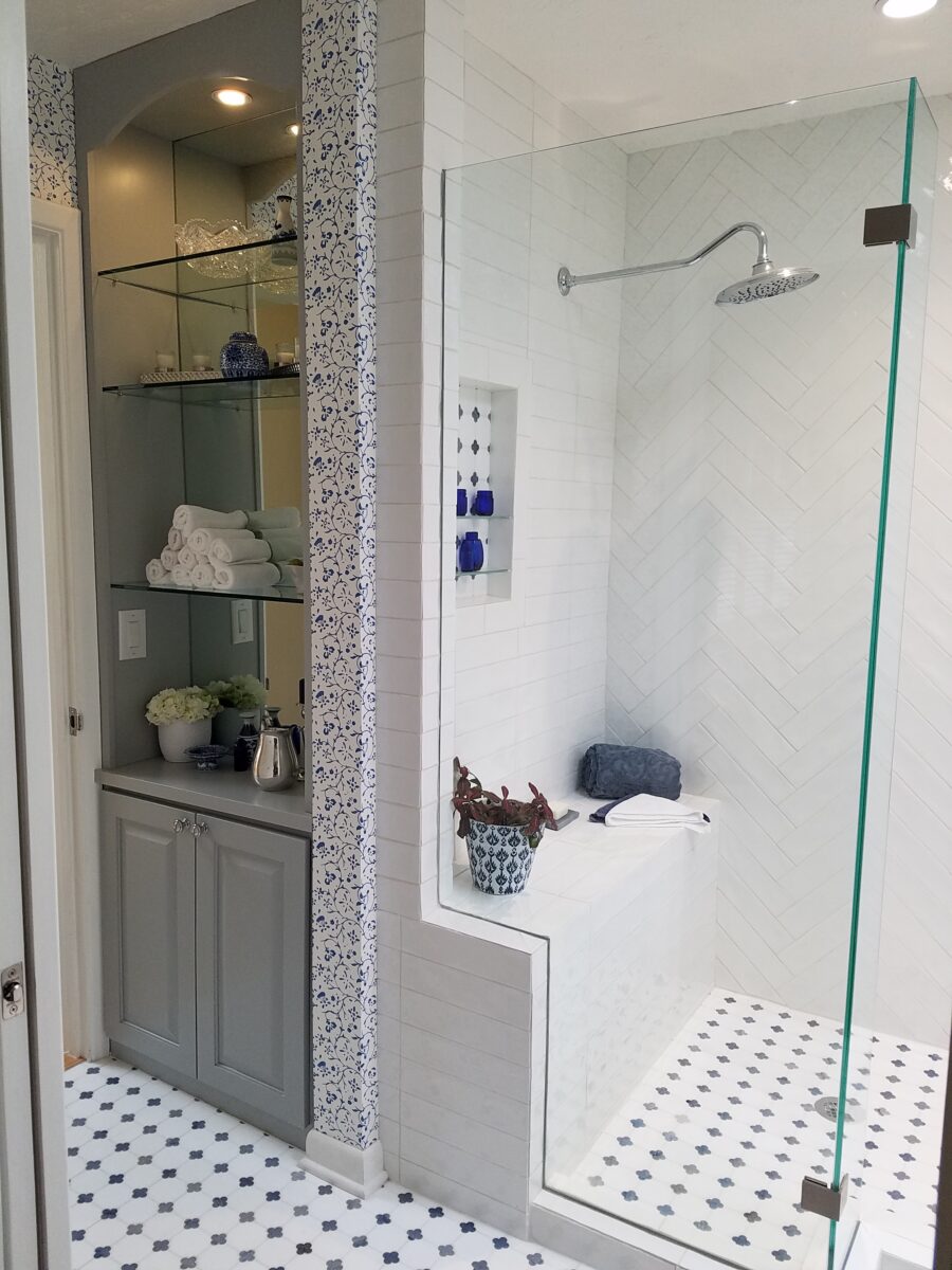
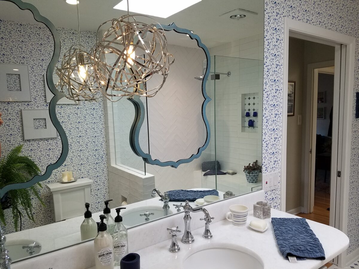
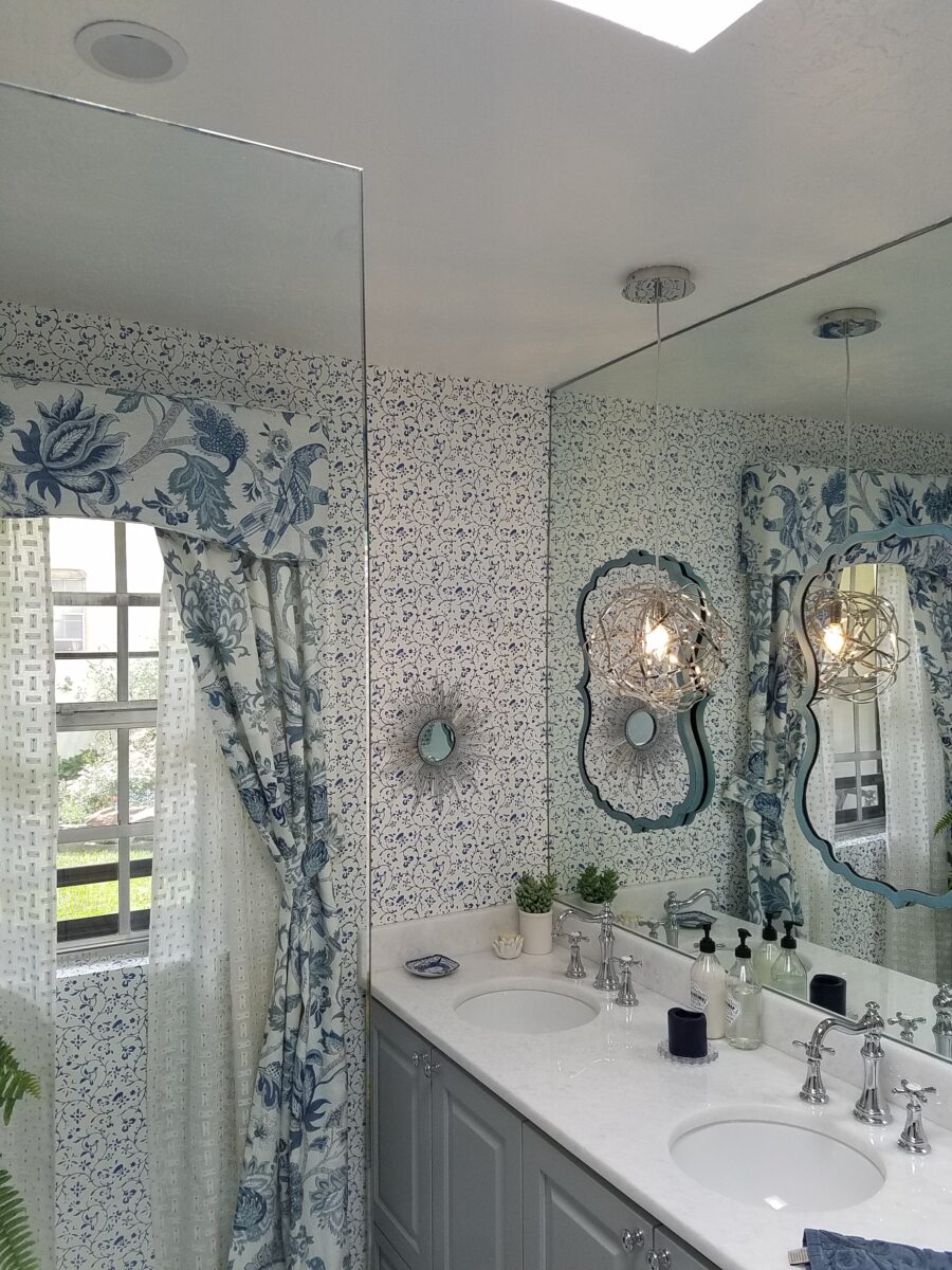
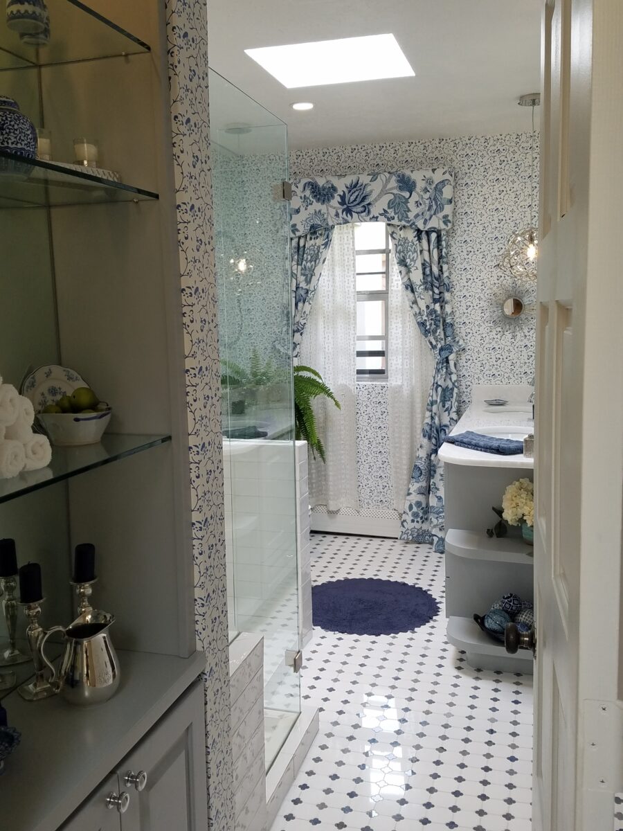
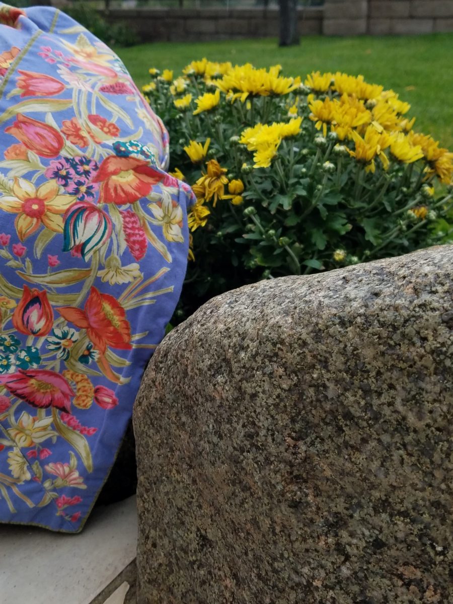
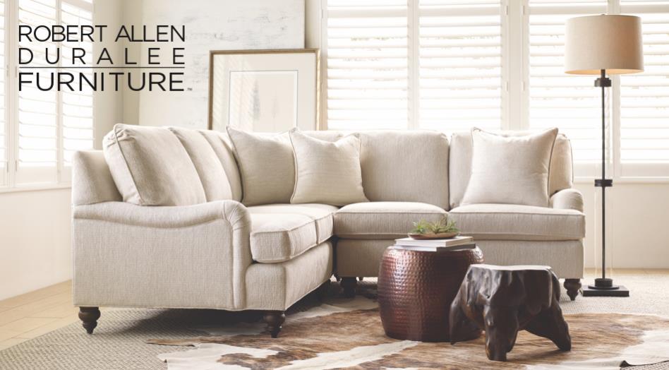
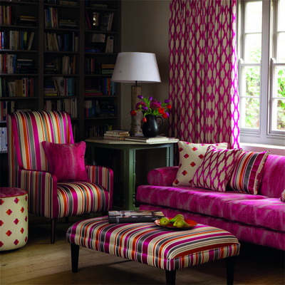
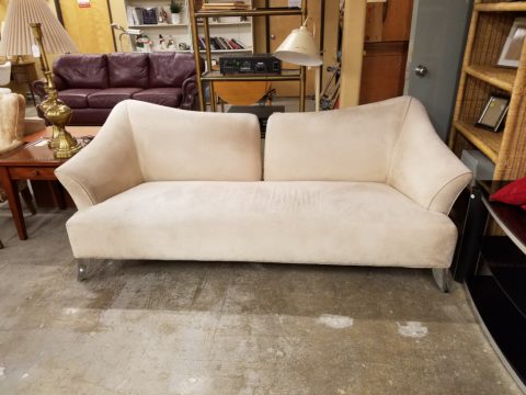
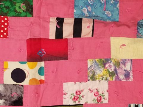
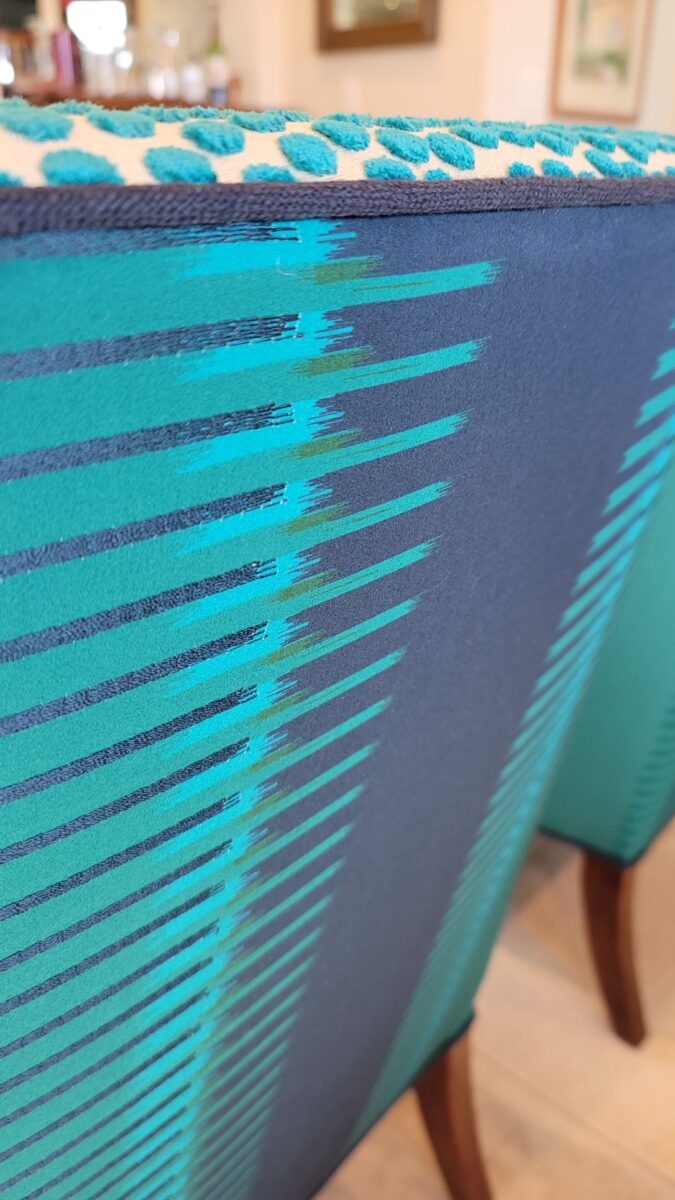
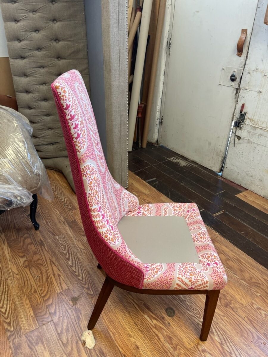
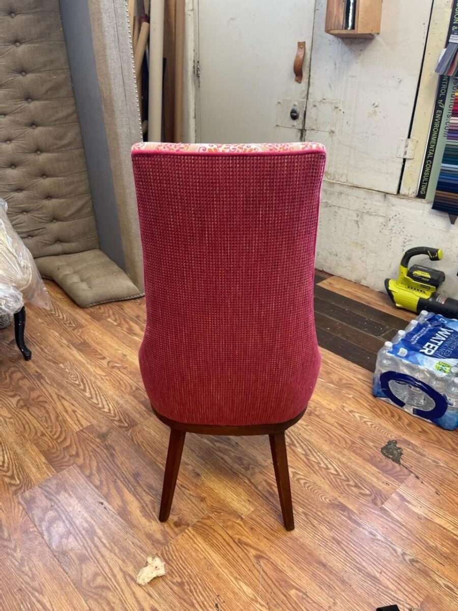
Everyone loves “Before & Afters.” The transformation of an object or a space is the magic of interior design.  One of the most valuable elements in our design wheelhouse is fabric. Fabrics have the ability to transform. Like paint – color – altering to enhance a piece or the entire environment, fabrics offer not only color, but texture, pattern, design and style.

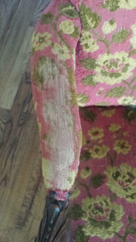
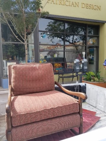
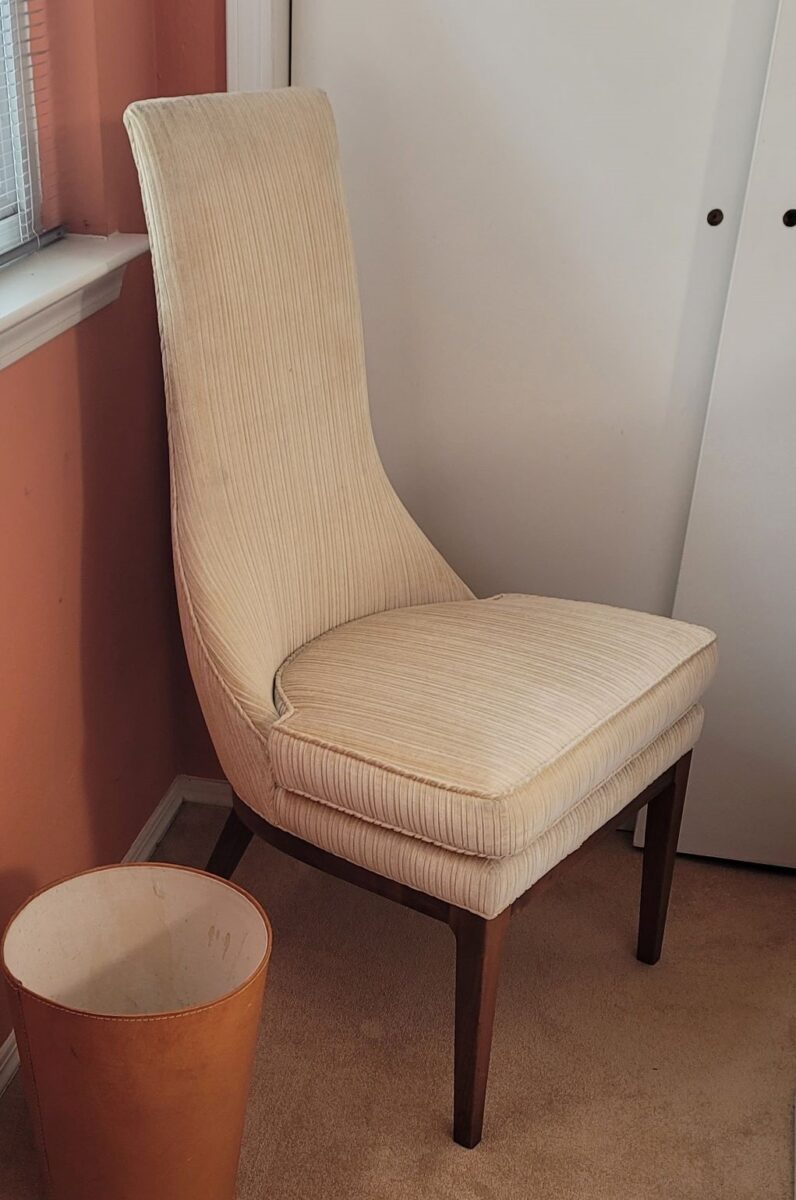
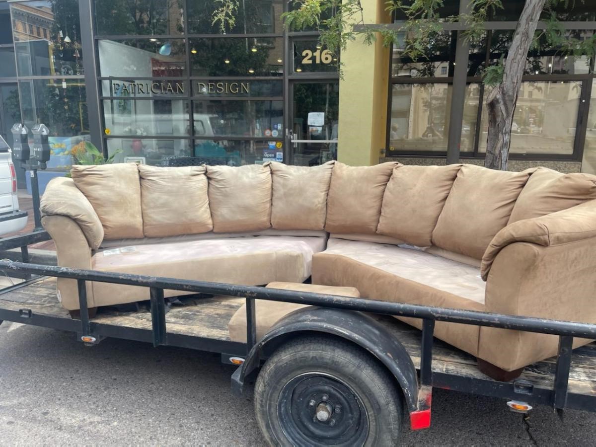
I love a good find. Call it antiquing, thrifting, scouting, treasure hunting…the hunt is the intrigue. Exploring random sources to find the perfect piece. Once found – knowing what, if anything, is needed to transform it.

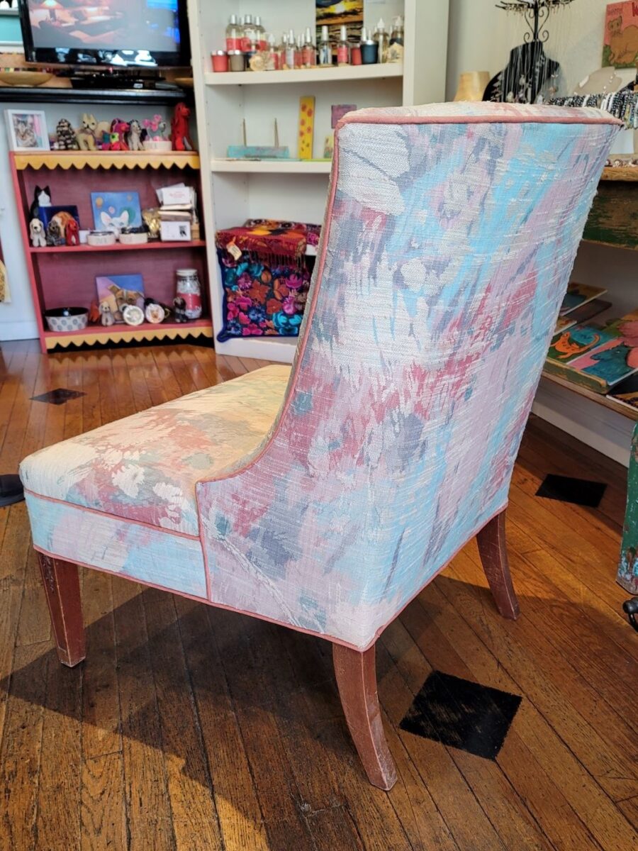
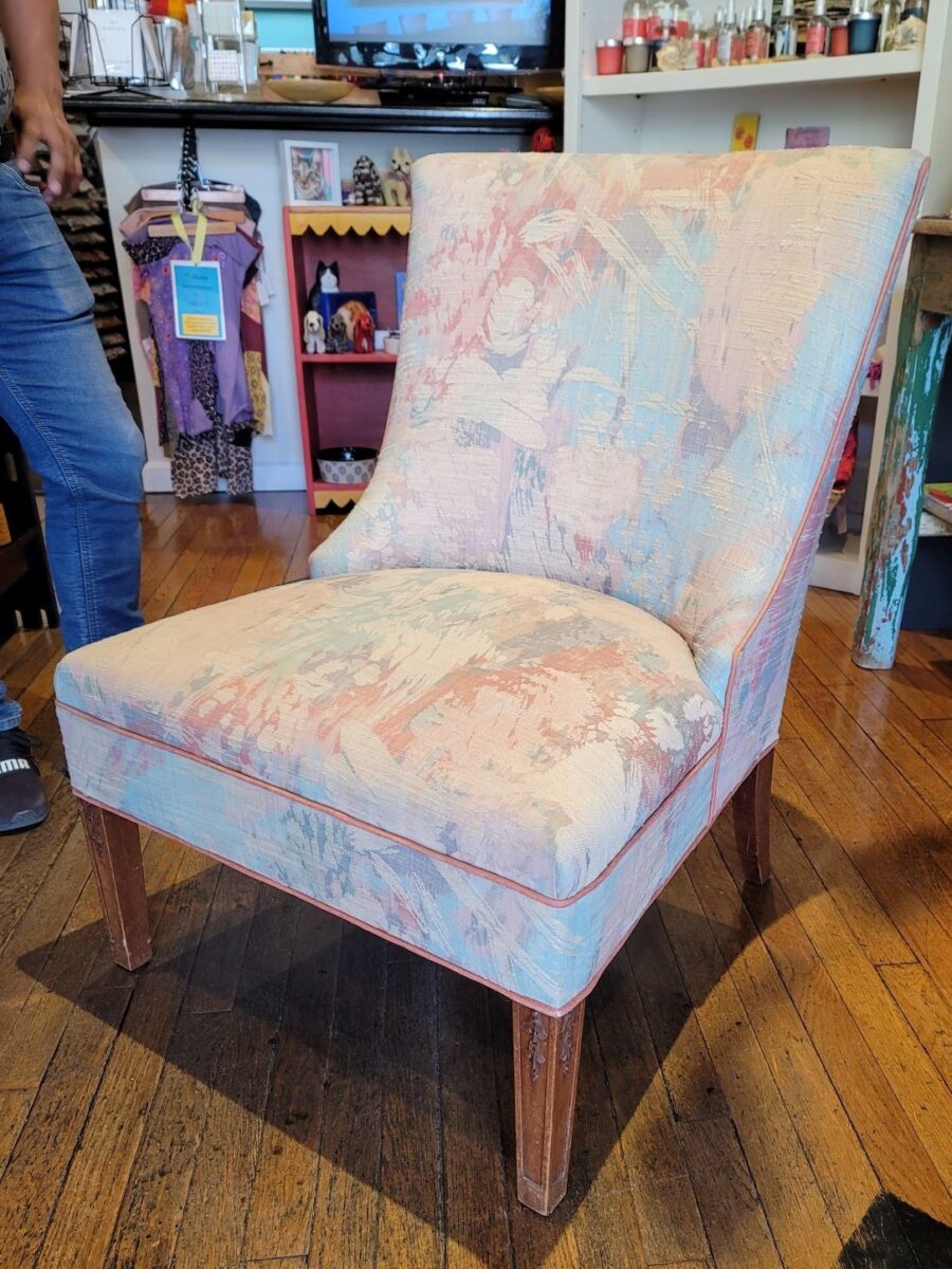
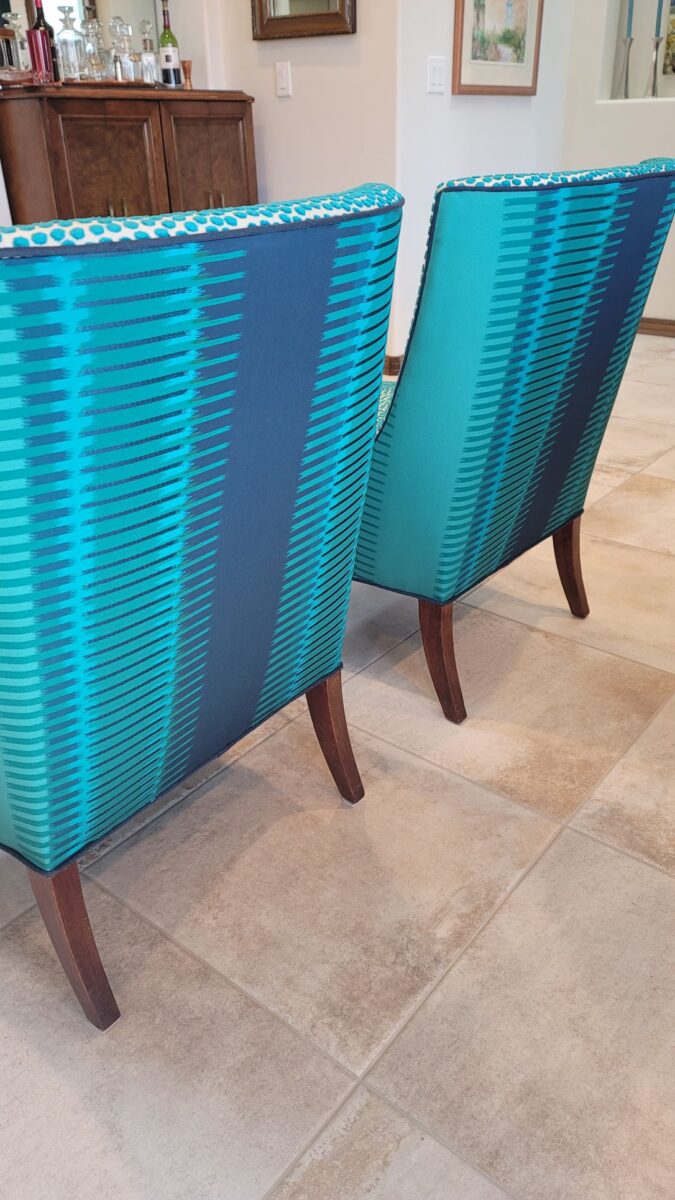
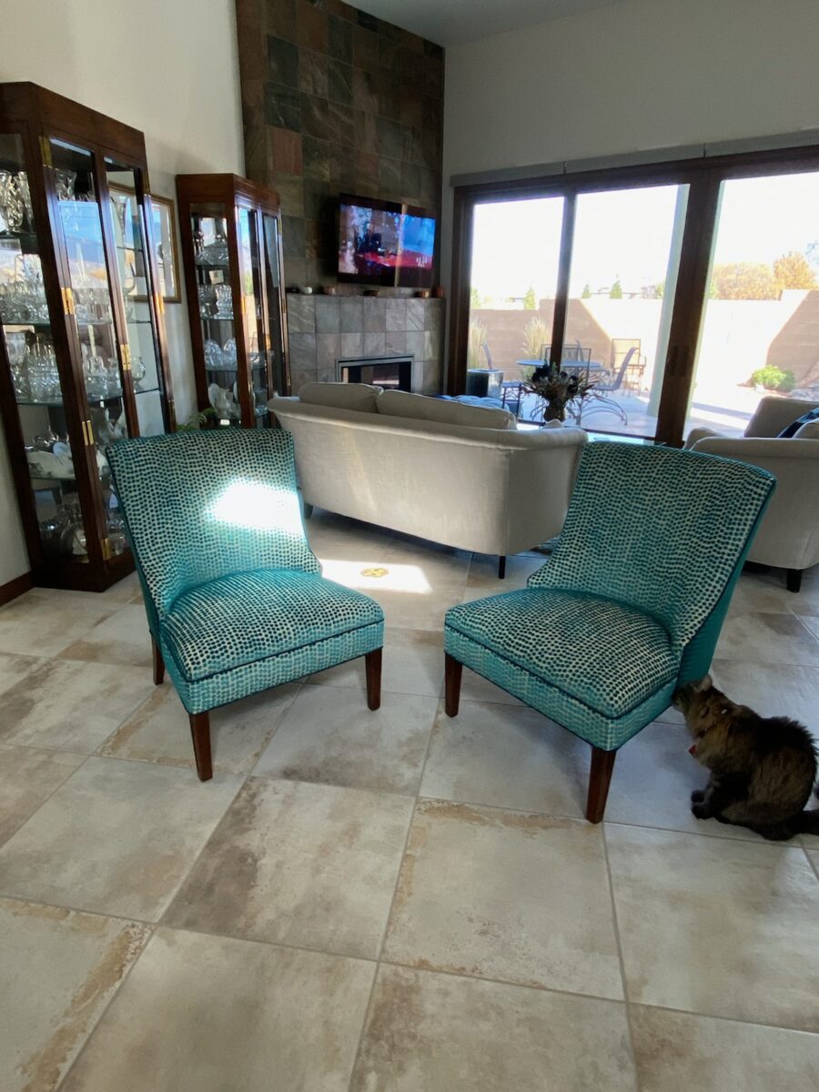
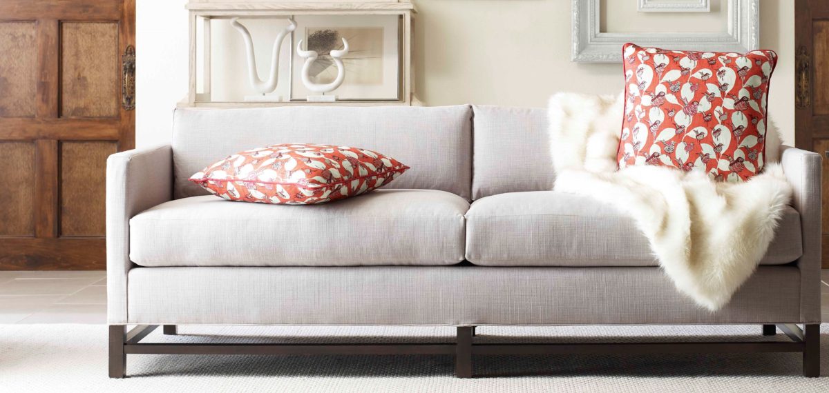
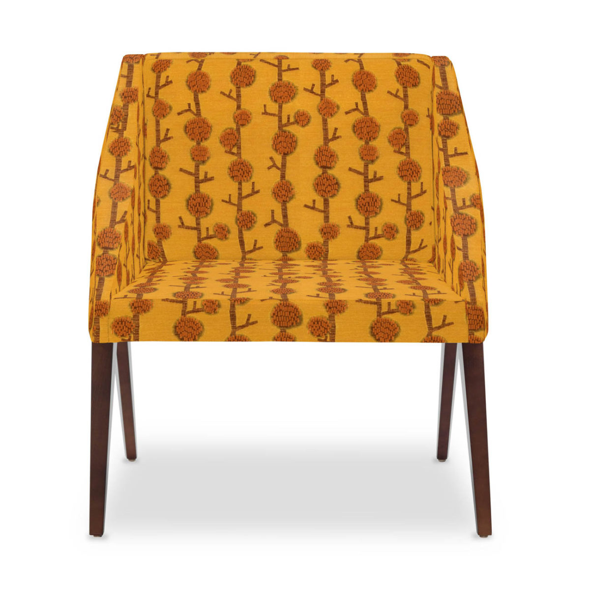
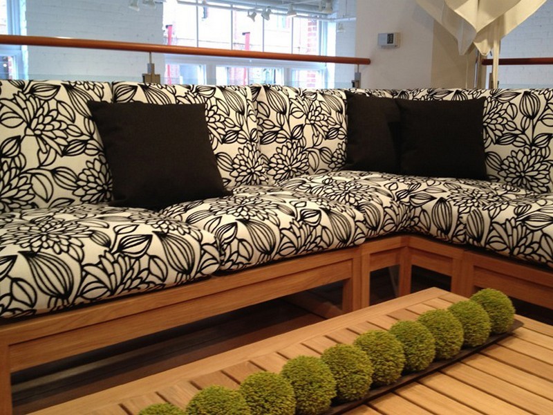
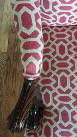
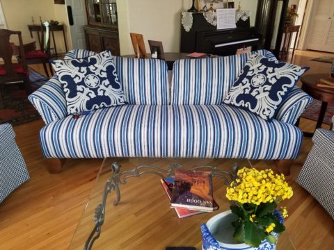
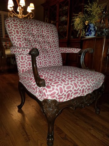
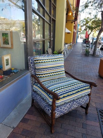
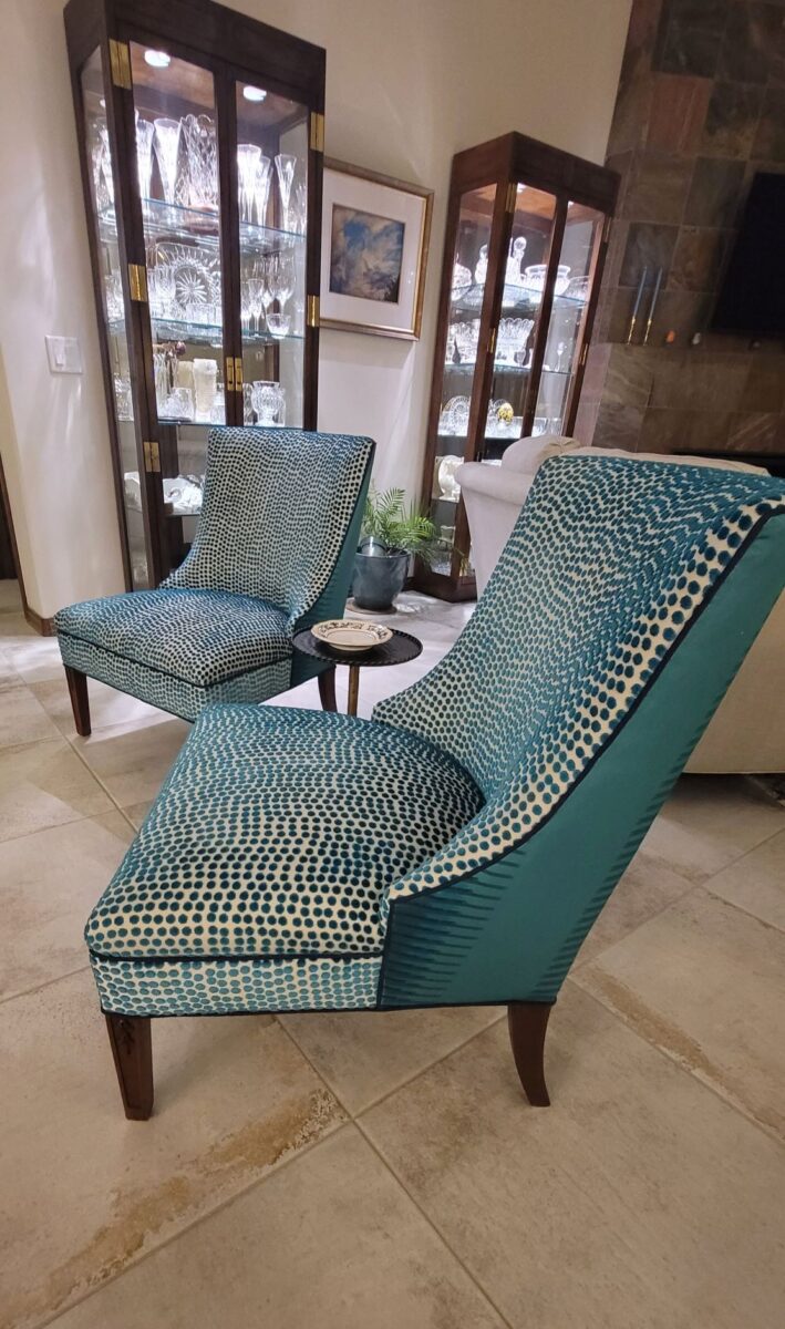
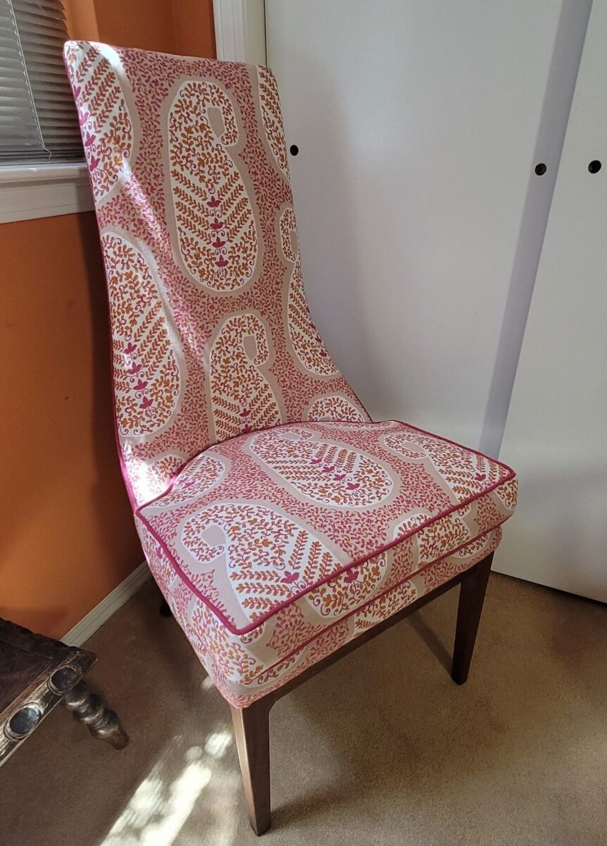
Reupholstery is a life-saving treatment. To salvage a tired piece with good bones and great lines is a service to good design. Pairing old pieces with new fabrics is rejuvenating. Inserting fabulous fabrics into a design scheme is a fine art that gives aged pieces a new life and contributes to the uniqueness of the composition of a space.

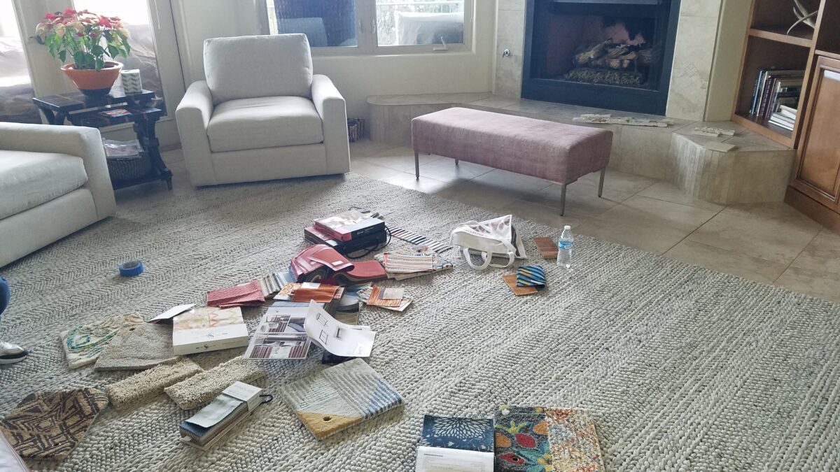
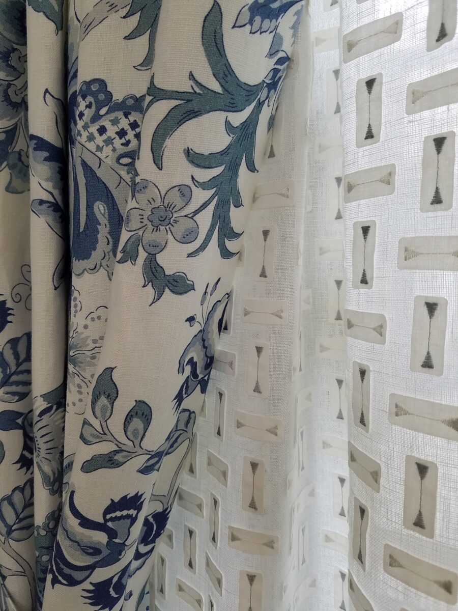
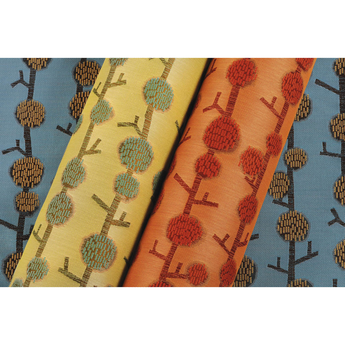
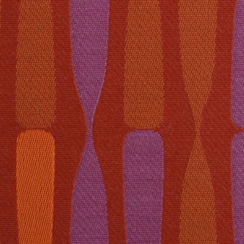
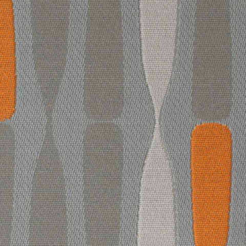
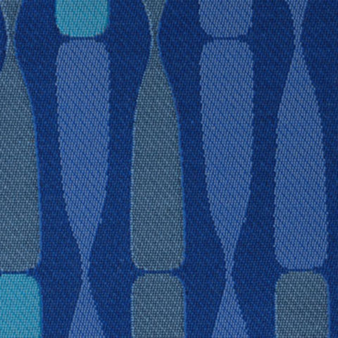
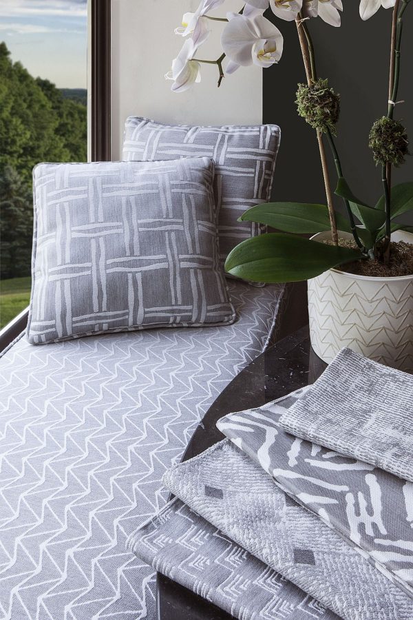
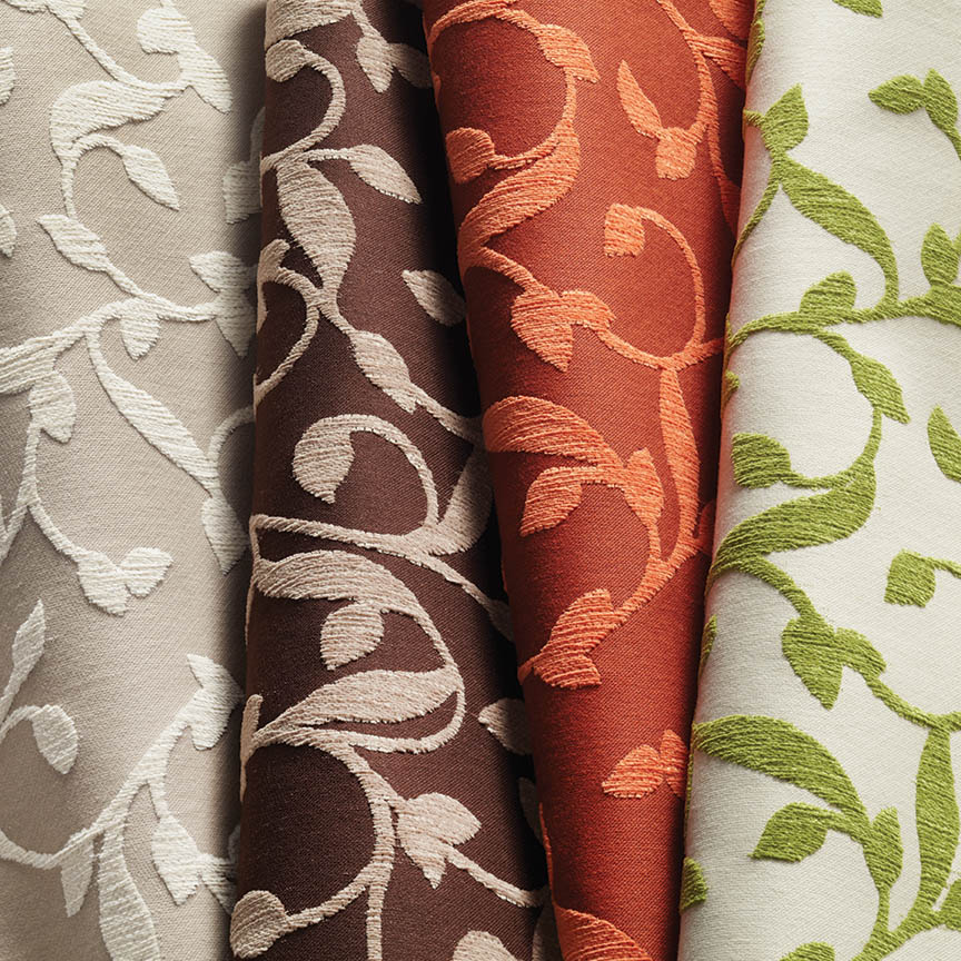
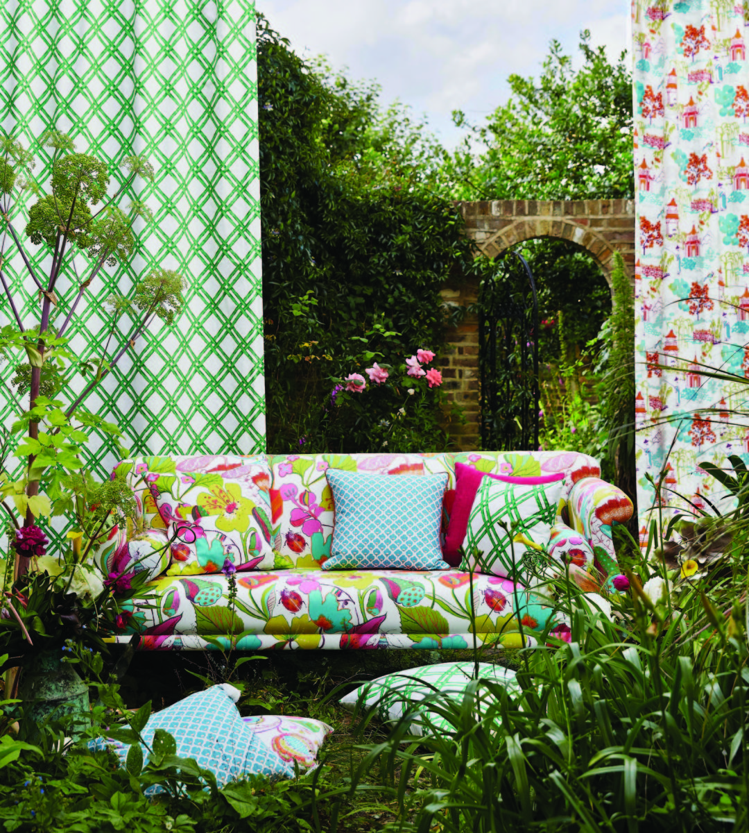
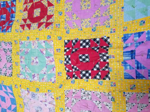
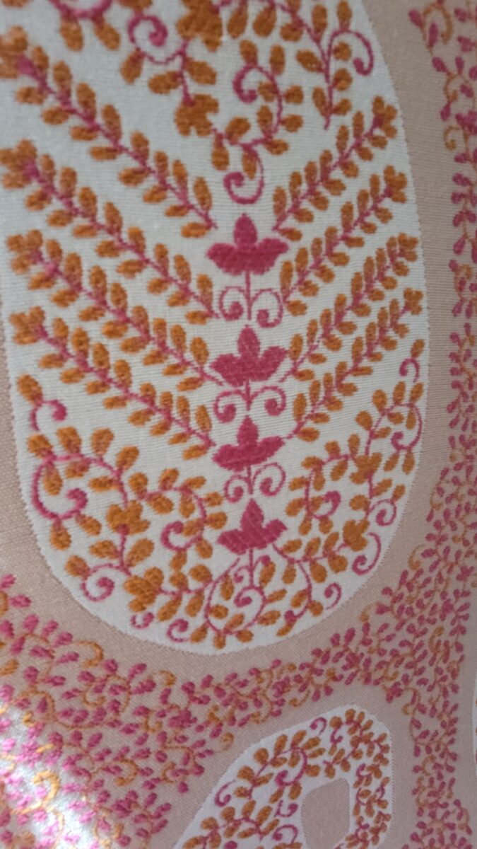
Of the design elements, paint is the one with the seemingly limitless choices. Fabrics are next. The worldwide variety of textiles, creatives, fibers and the combinations thereof are vast. Searching for just the right fabric for a specific piece is part of that treasure hunt.

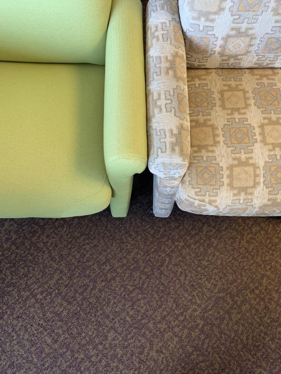
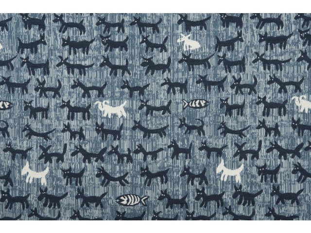
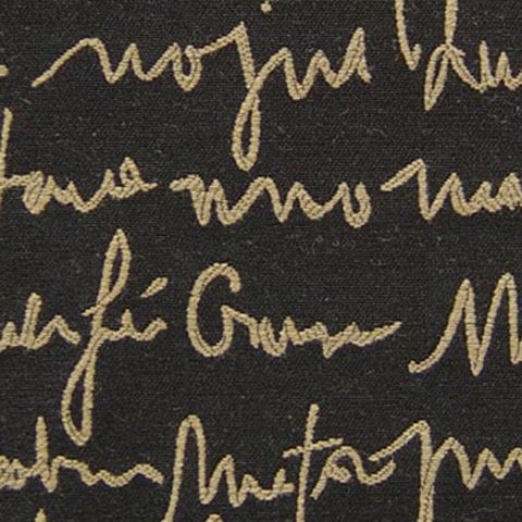
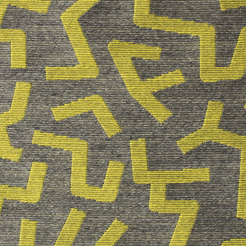
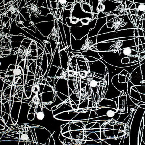
You have heard the term “run of the mill.” Even for many, having never thought of this as a fabric metaphor – this phrase is used commonly to describe the common. It means ordinary – a common, mass-produced product’s run of a manufacturing mill. Using common fabrics is a cop-out when it comes to creating unique designs – especially when there are so many incredible fabrics from which to choose.

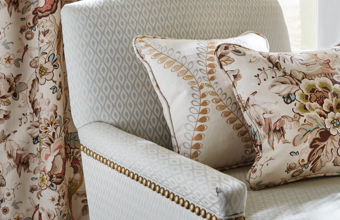
Personality comes into play when selecting a fabric. Along with function (how durable/cleanable it needs to be), the taste and preferences of the user, and the context in which it might occur – personality of the pieces plays a major role. For example, reading the personality of a chair – its lines and scale.

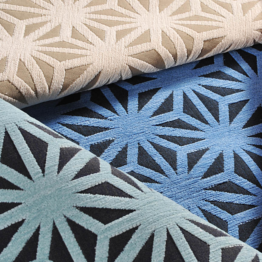
The personalities of fabrics are as endless as the textiles themselves. Fabrics evoke moods, seasons and even attitude. For commercial use, as well as heavy-use residential – workhorse fabrics have evolved. Not long ago, durable fabrics looked durable, less attractive and limited. And without turning this into a continuing education course about fiber content, it is obvious once you investigate the options, durability for wear, ultraviolet tolerance, mildew resistance, and antimicrobial properties – are all woven or applied to fabrics allowing amazing installations in commercial interiors that you would not hesitate to have on your living room sofa! 

Voila! The finished sectional is further detailed with custom throw pillows to bring together the caramel and blue tones of this color scheme. Warmly greeting guests upon arrival.

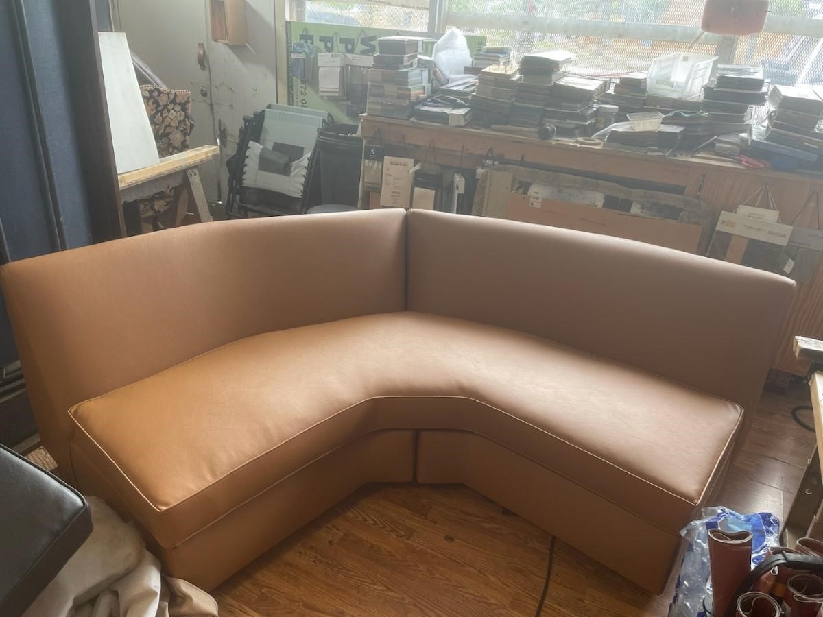
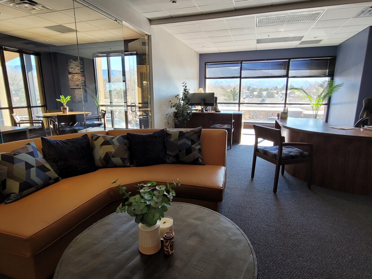
Residential interiors can now enjoy what commercial interiors have realized for years. By incorporating the durability and cleanability which allows for the wear and tear – without showing those signs of real life – residential and commercial interiors incorporate fabulous fabrics that defy their strength – beauty and style conquer!

Sustainability of the fiber sources is an increasing topic of conversation. That and the fiber contents regarding the health/safety of the materials and treatments, if any, used (Okeo Tex certification, for example).

With all this information regarding the myriad options, enhanced durability and the unique opportunities that textiles provide to dress your great pieces – treasure the history, family hand-me-downs (if not heirlooms) and give them new life!!!! Its ART!!!

Color Scheme Tips

Color schemes are limitless. The permutations are endless. Color is exciting and fun. It is personal. Colors evoke feelings, memories, emotions and are key to a comfortable interior.

How often have you been asked or pondered on your own…”What is your favorite color?” Some people hesitate to answer, while others blurt-out readily with their fav.  But what color you choose to wear versus what you enjoy in your interior surroundings and how much might be quite different.

Several weeks ago, I launched a weekly post on our PATRICIAN DESIGN Facebook page called “Color Schemes.”  The idea is to inspire design ideas by pairing artwork with designer fabrics. When planning an interior there is always a focal point complimented and surrounded by supporting elements.  Whether a key painting will command the space or an expansive window with a view will direct the focus to a scene of outside colors and textures – that key element will greatly influence a successful interior color scheme.

Annette Donald creates colorful cubes in her creative take on our beloved chile ristras. A serrano chile oil painting, on canvas, by Federico Leon de la Vega is quite representational. Paired here with Romo and Ralph Lauren fabrics, Sherwin Williams paints…fresh and festive!

Here is the example of a November Scheme and you can scroll back each Monday for the past few months to enjoy a variety of the Color Schemes! https://www.facebook.com/PatricianDesignABQ/photos/a.243005986618/10157154423221619/

We embrace the The Nature of November with its unique colors and textures. As the air becomes chilly and the leaves fade…warm, soft colors bring us indoors. Featured here an elegant fused glass ribbon wall piece by Lisa Checnoff.

There are four primary considerations that I discuss with my clients when determining which colors to choose, emphasize, avoid, use as accents and where. To establish these selections, we evaluate personal preferences, contextual implications, seasonal influences and even trends. 

PERSONAL:  In planning an interior, I always want to know what colors make our clients happy, comfortable, stimulated, vexed or relaxed. These personal insights reveal important information for selecting types of materials too.

By examining what might be one’s favorite color, the discussion will navigate the distinctions, if any, regarding preferences for clothes versus interior furnishings. Interestingly, they are not always the same – although, by mere comfort and familiarity, they often are.  Simply asking about a favorite color is not enough.

Brilliant golden yellows and blues – splash color! Featured here are fabulous photo-realistic acrylic paintings by Sheri Mays paired with amazing fabrics of the same exciting palette.

CONTEXT:  The context of the interior might dictate or at least steer the direction of the design. The luxury of having multiple personal environments offers the opportunity to have different color pleasures exercised in different places. The ski condo might be woodsy and textural with browns, greys, stone and wood punctuated with a pop of color versus the seaside retreat with its crisp whites and cool blues and greens punctuated with pastels or bold contrasts. Therefore, the location of an interior might direct the desired color palette.

Inspired by this spa-aqua pottery bowl by Penny Roberts and the custom glass tile mosaic we recently combined to face a newly remodeled kitchen wall – the cool seaside/spa feel balanced with ambers and warm dots of color – pink, fuchsia, orange and golden yellow. Durable brushed cotton solids come in myriad colors and are perfect for pillows or upholstery.

SEASONAL:  This one is tricky because it plays on the perceived climate outside – even if the interior is maintained at a constant temperature. It takes a concerted effort to plan a color scheme – including textures and finishes in anticipation of changing seasons and relative temperatures. I previously mentioned that a window with a view might be the focal point of a room…imagine the effect the changing seasons might have on the selection of interior colors and textures versus a consistent tropical scene, for example?  

Perhaps you love purple – ever pair it with golden yellow? Here, functional, fantasy pottery designed and crafted with the most precise attention to detail by Jen DePaolo inspires our boldly brilliant scheme.

TRENDS:  Inasmuch as I avoid being steered by trends, it is impossible and not advisable – in design – to avoid them. Clients are influenced by them and bring that would-be preference to the table.  It is essential to continue to have “colors-of-the-year” and other market-driven colors change to stimulate the economy with buying and selling, replacement and updating.  It’s our socio/economic norm.  It also serves as an encouragement to re-fresh. But to limit that influence, in favor of long-term personal pleasures, is best.  The pressure of this marketing color influence contributes to our being a disposable culture. Not time here for a lecture on such things – but rather to instill an appreciation for and confidence in personal selections an decisions – in this case,  color.

Patinaed pearls and stunning glasswork by Margaret Hidalgo Vanderheyden inspire the soft, greyed lavenders and blues of this cool scheme.

An interesting and on-going test for evaluating a successful interior is when designing in one season – it has to work in all others. For example, when I meet with clients in the heat of July with lush foliage and color, warm temperatures and long days, that same interior has to succeed when it is frigid outside, barren, and with darker, shorter days. What might the challenges be in creating a successful scheme and what might be the solutions to make it work?

Having noted all of this and knowing the different reactions people have to color, isn’t it interesting when an interior is so successful that it appeals to many, if not the majority, of those who experience it?  This is more applicable to commercial or public spaces – from doctors’ offices to hotels.  However, the challenge and success is in knowing the many things to be considered and implementing a balance of them throughout all aspects of the interior.

Anne Marie Werner-Smith’s brilliantly glazed pottery here with Margaret Hidalgo-Vanderheyden’s lovely fused glass crosses along with coral and dyed stone necklace and woven table runner from Chiapas reflect the changing colors of fall leaves…

Appreciating color is a gift to designers. It truly is an imperative to appreciate all colors and have the sensitivity to discern the nuances between various values and the effects of selections and combinations from the infinite choices.

I hope this has given you ideas and inspiration to move forward with YOUR color schemes! Sign-up for our weekly email of Color Schemes with classic blue and white and stunning neutral greys coming!! And follow the posts on Facebook every Monday.

CONVERSATIONS ON DESIGN – SPECIFICALLY, PRO TIPS ABOUT COLOR

This past week alone I have consulted with a commercial client about reception seating and color, a home-owner, in a mountain setting, about durable floor finishes, bathroom remodels and color, a couple in a new home downsizing from one of 20 plus years about furniture arrangement and color, a couple from Las Vegas buying a second home by their daughter and grandkids about color, and a woman stopped in the shop yesterday visiting from Santa Fe and said that she didn’t know we were also a design firm -picked up a brochure and told me inasmuch as she had “a pretty good handle on design – she always struggled with color.”

See a common thread here? The comments were from that where she admitted to always struggling with color to another wanting her seemingly tract home to feel like a woodsy cabin with color, others wanted their spaces  lighter while others wanted to make a corporate statement that would support their brand and not go out of style in the coming few years. They all had steered toward neutrals – but not in a good way – because they were uncertain about committing to COLOR.

The whites and greys are their own beautifully valid color scheme. https://patriciandesign.com/project/modern-make-over/   I have written before about when white is a color or when it is the absence of color.  https://patriciandesign.com/white-by-design/

I also continually stress that all design decisions are based upon context. Many of you reading this, with whom I have consulted, will recognize much of these observations and tips. I stress select color to compliment your context!

Interestingly, the mountain home has existing painted doors and trim. To change those elements would be costly. How can we woodsy-up this interior without those seemingly necessary key elements?

I asked her for her priorities and “comfort colors.” As a result, we will change the flooring for look and durability, building from that add color and various textures to enrich the space – stacked pebbles at the fireplace, a slab hearth, a wooden mantle and a light neutral will be the main backdrop splashed with strong elements of color (notice them on the mantle). The very vertical fireplace will be a bold golden yellow color to intentionally work with the honey tones of the pine architectural elements.

By contrast, a magnificent home (also in the mountains with great wooden details), had too much of a good thing for the owners’ other interior furnishings. In this case, the seeming sacrilege of painting the solid wood doors and trim was in order.

To paint all the solid wood doors and trim in this home was a leap of faith. But the goal was to add back stacked stone to carry a theme from the now naked fireplace to the kitchen bar and over to the entry door wall. Having it in three places will commit to an architectural theme for this finish selection. New colorful rug and fabrics for throw pillow will enliven the space and bring focus to individual accents throughout the interior.
The grey hand woven grey rug was not providing the needed backdrop for this new scheme so we gathered rug and fabric samples to “punch-up” the scene.
After the new rug arrived, we assembled the fabrics for another study of our options to detail the design.
Before, this little powder room was a bit bland. The quality, solid wood, raised panel, pine doors were too rustic for the owner’s preference – but painting was not an option – until we discussed it. What was a possible sacrilege became a beautiful solution to changing the design direction of this interior. Mirror and sconces remained while vanity, sink and colors were transformed!
The AFTER of the little powder room is still in the process, but it is clear that the transformation is startling with the newly painted doors and trim and the fresh POP of turquoise on the walls. Layers of color and emphasis changed. It is not about painting wood, it’s about creating balance. The massive, solid wood front door and antique and art pieces throughout will be emphasized as key features

Another such interior was over-burdened with stained wood and to paint it all out white was a major commitment yet, the results will make for a lighter backdrop still revealing the bones and their texture, but freeing the owners to showcase their other pieces of fine woodwork, art and furnishings.

PRO TIPS

  • The trick with design decisions is to determine and understand the primary purpose and intended “read” of the space. What is most important and where do you want your focus?
  • Once you have evaluated the space, identified its primary purpose and selected what you want to emphasize; see what is either in the way of, or competing with that emphasis, and clear all else away. Add back the things that you consider most important either for function or joy (form).
  • If the architecture is most important, determine what about it and work from there to complete the space. If a piece of art is most important – place it to its best advantage and build around it so as not to compete, but compliment. If a view is most important – the same is true – clear away and frame with the most important and/or effective pieces.  Pick your priority, yet take everything into consideration.
  • With regard to color…it can emphasize the architecture or be inserted for a bold statement(s) of art or fabric on furniture, rugs…When using color, the idea is still to have balance in the context of where you are placing it. It can be a backdrop or a foreground accent.
  • Consider existing conditions that will not be changed – such as flooring. Select colors that include the compliment to that material. Whether in direct opposition for contrast or to meld in   a way that creates a subtle transition – the consideration of existing materials is important.
  • The effect of considering existing materials can result in their appearing as though part of the plan rather than being inherited unintended.  This is generally a desirable result. Therefore, if you have a material that will not go away – make it intentionally part of the plan.

The corporate color issue was about updating their image and connecting with their clients in an intimate and comfortable manner- an environment that carried the trust of years of experience and embracing a new generation of financial management. They developed a marketing plan moving forward to identify a theme, feel of confidence and carry it through the entire experience. In a recent Facebook post you will see this project in the process and notice that the carpet was an existing condition and that it was used deliberately to make the new materials appear to all have been coordinated from the start. Long time clients and new are comfortable with the changes!   https://www.facebook.com/PatricianDesignABQ/

It’s OK to play it safe with neutrals – but in this case, it was time for a updated “brand” for this business. The unusual eggplant and chartreuse carpets inherited in the move to a different suite required some deliberate coordination, to have it all “read” as though designed afresh!

The want-to-be woodsy cabin project will have new, durable porcelain tile floors imitating variegated slate and from that palette of colors pull paint colors to add whimsy and visual impact along with other new additions of stacked pebbles at the fireplace and wood encasing the now sheet-rock mantle.

The stacked pebble stone, engineered stone, new wood mantle and splash of colors against the neutral will make a dynamic statement. Notice new color chips leaning on the mantle.

The couple downsizing and wanting more light and a less heavy southwestern feel panted their entire ceiling of beams and tongue and groove including support columns in white. The wood still “reads,” in all its hand-hewn texture and knots. The white is no less natural than the dark chocolate that had been their previous faux finish. Albeit the tongue and groove had a clear lacquer that we concealed behind the new cloak of white for a uniform backdrop.

The dark chocolate opaque stain of the pine members was no more valid than painting them an other color. We selected a white to open and refresh with a neutral backdrop to allow other elements to be more focal.
Painting currently underway!! Watch for before and afters of this refreshed interior.

The couple with the second home had history in Hawaii and wanted a beachy, fresh theme for their new desert home. The flooring was a mottled light brown glazed tile and we selected a noticeably light, subtle sand colored wall paint to contrast and POP the existing off-white doors and trim throughout the home. Accents in recessed niches and doorways will become a soft turquoise while an interior laundry room gets a splash of citrusy yellow. The layers of color will be visible from different angles and vantage points. With the golden oak kitchen cabinets being painted out to match the existing off-white trim – the scheme will be fresh and beachy! Their artwork presents these colors and will being their personal touch to the arrangements. Watch for this project in coming weeks.

Do you have ideas about certain features in your interior that do not quite seem to come together? Do you feel the need to refresh? Are you looking for a new color scheme? Please do not be afraid of color and do not be confused about current trends. White and grey is a soothing combination. Trimmed with black, you get a defined contrast. Insert organic greens and the combination is sharp and now – and yet potentially timeless. HOWEVER – colors too have their place and selecting those and their combination that will speak to today and not be out-of-style tomorrow, as certain trending combinations might – select colors to compliment your context.

Here are a few other Patti Says blogs and PATRICIAN DESIGN projects about color selection:

KEMP BEFORES  https://patriciandesign.com/rejuvenate-and-expand-your-interior-spaces-by-opening-walls/

Friends Don’t let friends pick paint colors  https://patriciandesign.com/5677-2/

Johnson’s PHX https://patriciandesign.com/spanish-style-brings-interior-spice/

Color forcasting  https://patriciandesign.com/color-schemes-and-the-complex-simplicity-of-it-all/

Bay area bungalow https://patriciandesign.com/project/bay-area-bungalow/

Celebrate the LOVE of COLOR!!!!!!!!!!

Before & After – A Startling Transformation

Last August 11, 2019, I left you hanging with a radical bathroom remodel that was in the throws of being transformed. The title of the blog was Everyone Loves Before and Afters. https://patriciandesign.com/everyone-loves-before-and-afters/  Here today, I am excited to present the finished product and a little more to the story…

Everyone DOES Love “before and afters.”  The original blog identifies the material process of the project, but as important as the material applications are the emotional aspects of design and precede the material selections.

The home is a bungalow style home from the 1950s. Charming architectural elements and traditional details set the stage, sensitivity, and the emotions behind any design decisions we were to consider. See the first phase of this home’s updating design in the primary living space at this link:  https://patriciandesign.com/project/classic-blue-white/   The kitchen was also re-finished. Maintaining the same design layout and appliances, the new finishes resulted in a startling transformation. https://patriciandesign.com/project/kitchen-transformation/

The challenge in this project was to retain the character and traditional charm that the couple so enjoyed about their home, while introducing new, modern design features and trends melding with traditional design elements. New custom cabinets for the vanity and linen storage/display unit along with the re-design of the shower – eliminating the tub and making a “doorless” access and a pocket door connecting to the adjacent guest room were the three key construction components.

Dated finishes done in the 80s, by previous owners, were common and bland. The tub and shower were enclosed with by-passing glass doors in aluminum tracks and frames.
This bathroom was the dated and fussy room that we presented last August. The tired and dull finishes needed replacing and refreshing.  It was to be a complete make-over to compliment other recent improvements in the home.

Once the general concept for the remodel is determined, the “what if” stage begins. The stage where ideas are tossed about and decisions lead to other decisions. The options are massaged giving way to different combinations and considerations.

After all the options are discussed the plan is adopted – a combination of everyone’s input. Hopefully not design by committee, but in this case the couple, in whose house we were working, and the me, the designer. After the design is determined, the input of the general contractor and/or the sub-contractors can come into play. They are generally given the opportunity to evaluate existing conditions and voice opinions and procedures or details that their expertise can bring to the project. Everything is considered until a cohesive plan is developed.

New cabinets were locally fabricated to not only insure excellent craftsmanship, but to customize the fit (left to right) and provide specific drawer configurations for the desired new height of the cabinets with an additional sink.
The tub was removed, and the new shower enclosure was clear glass and given a wider footprint to allow for a jog which eliminated the need for a door. The shower valve was relocated from beneath the shower head to the opposite “pony” wall, making it easier to operate the temperature and flow without getting wet first!

Other than the shower reconfiguration, new cabinets, and pocket doorway into the guest room all else was superficial cosmetic design features. This is where the layers of embellishment come into play.

During the process, there were certainly hesitations about the combination of patterns and finishes being proposed…however, you know you’re on the right track when the happy homeowner has fun accessorizing and creates the perfect towel/robe hooks!
DIY – finding these blue, wooden, open-work plaques, our creative homeowner bought polished chrome and glass doorknobs and attached them securely to the plaques – Voila!

In keeping with the traditional design direction previously adopted in updating the interior, the flooring was selected for its natural stone mosaic authenticity. With a warm grey selected for the custom cabinets and white herringbone patterned subway tile on the rear wall of the shower enclosure made for a fresh modern look.

A mix of patterns – a balancing act – the art of design. Do not be afraid.

But wait! These traditional elements and modern trends were further embellished with a second layer of curvy turquoise mirrors installed over the full-wall mirror – suspended between is a polished chrome sphere of open bands providing ambient light and additional task light for the vanity area.

Layer upon layer until the composition is complete!

Classic blue and white screen-print on paper with an overall pattern of vines and leaves fills in the voids creating a not-too-busy backdrop – adding further dimensions to the design.

Natural stone slab of a white crystal-like granite – looks like a stone quartz crystal.

Drapery fabric in a traditional floral on linen with whimsical, modern “martini glass” sheers soften the window and diffuse the incoming light.

The resulting completed interior is a radical transformation from the dull beige and peach of the previous scheme. Fresh and crisp – with just enough busy to be playful – the new owners claim that they smile every time they enter or even walk by.

Remember the first photo? The BEFORE & AFTER transformation is extraordinary.

A Designer’s Eye

Hidden genius can be found amidst seemingly redundant arts and crafts.  Walking by you might not notice. Passing by many beach stands, they begin to look alike – very repetitive. The colorful wares and handcraft are striking and eye-catching and full of fiesta, yet if you pay attention you will notice the nuances. Discovering the true designer/artist.

An escape to the tropics and especially to another country offer a reprieve from the cold and add an exotic element to getting out-of-town. Discovering the many indigenous art forms that come from all over Mexico is fun and exciting. Getting to know the makers and the distinctions in their work is another exciting level of appreciation.

As is true with so many things, detail and design matter. I buy a smattering of things for my gallery/gift boutique. I like to support the local vendors and makers that produce these fantasy-filled folk-art pieces.  From fabrics to stuffed animals, painted pottery to murals and mosaics, the art is abundant and deserves to be examined.

As an example, I am focusing on Victor Rivera. Victor is an artist and more so, an incredibly gifted designer.  His sense of pattern and imagery is exquisite. It reminds me of my mother’s love of Marimekko and Lily Pulitzer in the 60s and 70s. Her appreciation was a tremendous influence on me. The joy of color and pattern was a exhilarating celebration to wear and accessorize your home. Victor seems to possess a like-kind of innate sensibility and talent for devising and executing sensational color, pattern, motif and resulting design. He is currently creating, from a modest beach stand, what I believe is clearly different from others doing what might be thought to be similar work.

Like Maija Isola – a peer of my mother’s, having been born in the 20s her designs transcend the many decades in which she influenced color, pattern and bold imagery. Her work continues to live and influence the evolution of Scandinavian artistic direction and its impact on the world of design.  https://www.marimekko.com/com_en/world-of marimekko/design/designers/maija-isola

Similarily, architect Josef Frank contributed greatly to the design world through his architectural work and also his love of his limitless artistic expression through color and pattern. https://www.architecturaldigest.com/gallery/josef-frank-fabrics-london-exhibition

Watching Victor select his brushes, for the various applications and control on his designs, is fascinating and amazing.

The sense of pattern and design is a different category of artistic talent, in my observation and estimation. A master, of pattern, form, design detail and art, is an artist. However, the focus on the repetition and integral connection of patterns – for this purpose in a one-dimensional application – is an intensely different pocket of an artistic brain.

And this brings me back to Victor. I want someone in a position to embrace and promote him, in the world  of fabric design and influence, to catapult him to the level to which he can and should aspire. Shout-out to Alegreea and the fabulous designers at Pineda Colavin!!!!!!!

His hummingbirds begin with a pencil drawing and basic “fill” colors at the start.
Working on both clay and wood prefabricated bowls by other artisans, his many layers of colors and details take shape.

With myriad, mostly monotonous, Mexican street/beach artists, Victor is a beacon of light that stands out among the throngs. Once you stop to notice – the work he is creating is astonishingly  unique and beautiful. His designs are laced with meticulous detail, outstanding color combinations captivating and beautiful.

He will paint expeditiously simple works to satisfy the tourists and keep an inventory at the ready for spontaneous purchase – but when he has quiet time and is caught-up on his table of offerings, he creates amazing pieces that are truly remarkable. It is important to note though, that his more expeditious pieces still have a color combination with strokes of accents that still are above and well beyond the common.

He will paint commissions all day long – but left to  his own devices, his creativity is boundless. And, referencing back to the Scandinavian designers, his floral designs are outstanding!

Taking time to examine the world around you and the beauty of detail that awaits, is a joyful experience of great discovery and satisfaction! Not to mention great fun!!!

Fun with Victor, art and design!!!!!

Upholster a Rock?

Some fabrics are just so fabulous that they can carry a design scheme. You could wrap a rock with them and feel that they are accomplishing the design statement to set the theme, mood and encourage interest, if not confidence in comfort! Stimulating the senses is a major part of design.

Often, a throw pillow can make an effective accent. We joke often when we find exclusive fabrics in the hundreds of dollars a yard and say “Perhaps a throw pillow?” Knowing that the projects affording such luxury for miles of drapery panels are few and far between!

Duralee offers statement furniture pieces of unpretentious luxury and comfort with a collection of fine fabrics that will satisfy any budget. Birds take flight from this delightful Duralee pattern.

Sight Sound Smell Taste and Touch – you know. Colors and textures catch one’s attention. They set the mood.

Upon entering a space you take-in the colors and textures and if fabric is in play.With further tactile examination fabric contributes greatly to these two sensory perceptions – sight and touch.

This playful Donghia organic has fuzzy tactile balls sprouting from the linear twigs. From the “ground” to all the intertwining and overlaying weaves, the complexity of textiles is exciting. Come see these exceptional designer fabrics in our studio.
Many fabrics have multiple colorways. If you see an intriguing fabric that’s not “your color”, its worth asking about the entire collection.

Juxtaposition can also be an effective technique. When placing a modern pattern on a vintage piece, you breathe new life into the forgotten history – refreshing and capturing the best of both worlds!

You might not have a lot of confidence in someone who wants to wrap a rock to make a design statement. However, my point is, when you love something you want it regardless of the delivery system! Find fabrics that you love and insert them into your rooms – home or office. It’s like your favorite flavor. Sweet or savory – slather it on a piece of cardboard and you’ll be significantly satisfied. You need not struggle with how to do it – just make it happen. So to get a little taste of an exciting textile, make a table runner, simple dining chair seats, select a backing and make a throw or an accent pillow. Bring the joy of exciting textiles into your interiors.

Here are a series of fun fabrics from our source library – tools of the trade. We LOVE fabrics and must touch the texture, feel the weight and evaluate the colors. Seeing images on-line do NOT do justice to the many incredibly creative textiles are available to enhance interiors.

Cute critters march across this sophisticated yet whimsically novel woven.


Other considerations not necessarily in evidence are the wear-ability/durability of a fabric and the resistance to ultraviolet rays, mildew and other elements. Wool is inherently flame retardant, for example. And exteriors have come alive as these amazing performance textiles will often fool you in disbelief that they have the properties to withstand the radiating ultra-violet rays of the sun and damp conditions which invite mold and mildew. These incredible fabrics are truly indoor-outdoor in appearance and extraordinary performance!

High-performance luxury weaves such as jacquards, piques, tapestries, matelassé, ottomans, damasks and sheers defy their extraordinary performance properties.

Roy Hamilton a recognized designer in many media, brings fresh patterns to Chella.  Roy Hamilton, designer of exclusive ceramics, sculptural and textural interior elements and fabrics for over sixty years.

Call for an appointment to explore our source library for the most unique fabrics in the world!

Floor-to-ceiling shelves of samples await your exploration for commercial and residential application!! You can order most textiles by the yard!

Color. The Spices and Ingredients of Design

Colors for fashion, interiors or a composing a bouquet are like the many ingredients, spices and herbs selected for great food. Creating dishes with fine flavors and visual appeal, by selecting the right combination, is good culinary design. So we see the spices and ingredients of design everywhere!

Assembling the colors, textures and shapes in a bouquet…

The art is in gathering the right combinations, textures, colors, flavors,…ok – maybe edible bouquets…Well, we’re not tasting the interiors – but some are scrumptious! Ooh – good enough to eat! And the fashion – yes, we’ve seen edible fabrics…generally not attempted in draperies – but who knows? The sky is the limit in design!!!


A few years ago, Kingston University Fashion Student, Emily Crane began pioneering a new strain of edible couture created from gelatin and seaweed! Brilliant and beautiful!!

Inasmuch as edible couture and creating fabrics from edible materials is fascinating, I digress…the actual point of my story is to recognize the common denominators between gathering materials for all forms of art – the assemblages result in the creative finished products. In this instance, interiors and their color schemes which bear likenesses to beautiful foods!

Color is the most apparent ingredient of most artistic design endeavors. It is the most obvious and first to catch your eye. Assembling an interior is usually grounded by a desired color. The foundation of a room begins with deciding a direction with color. This might seem to be contrary to the concept that form follows function – but I believe that the designing for the two are often concurrent events. The vision occurs while the function is simultaneously examined. Most people visualize in color.

I often write about color. It is an ongoing fascination to discover who prefers what color(s) and why. It offers the beginning of the visualization of a concept. As the framework is discussed – such as programming a kitchen. Inevitably, in the early stages, colors and materials are discussed. They might change. They might not end up as first imagined, but color aids in the visualization and process of  design.

Look around your world and consider color. Why did you choose your interior colors? When selecting a color for the surfaces, fabrics and finish materials what would you do differently and why. Taking care not to merely react to trends, what colors will bring you joy? Trends often tempt. They are enticing and new, but they move along…It takes thorough examination to determine if a trend is truly applicable or merely a passing temptation. The validation of design is the approval of the occupants or function for whom/which it serves. Not just the feature of a new trend.

So have a little fun seeing these interiors paired with edible color schemes as dishes are correlated to interior schemes.


The spices and ingredients selected to create the flavor bursts might be hot green jalapenos, serranos, tart limes, dried red chiles balanced by the soft and warm yellow of corn tortillas.

What interior might look like a spicy platter of festivity? Perhaps bold wall colors sprinkled with myriad decorative accessories and functional art.

Spicy colors in this festive kitchen.

Imagine creating a creamy white-sauce mushroom pasta with velvety texture and soft finish. The ingredients you would reach for would be the cream, pasta, white pepper and perhaps a touch a sherry. Sautéing the mushrooms in butter for a luscious golden brown.

Invitingly divine.

An interior that captures a similar feel derived from the same palette of colors…


Mimicking the creamy mushroom palette, rich wood, copper and steel tones contrast against the creamy whites in this interior featuring one of our favorite furniture and fabric lines – Duralee/Robert Allen!
Duralee/Robert Allen has many collections providing the perfect fabrics and furnishings for so many deliciously diverse interior projects!

From creamy, soft and warm to cool and refreshing…


Cool sushi plates featuring the pink and orange tones of tender fresh fish, cilantro sprig greens, and so white rice!

An interior possessing similar colors – the perfect ingredients to create a stunning design!


Durlaee encompasses many fine collections. Here the Clarke & Clarke Oriental Garden fabrics are gathered together to present a fresh scene reminiscent of our colorfully fresh sushi plate!

Ready for reds?


A berry lovely dish with creamy whites…Our delectable raspberry tart presented on a lace-embossed white pottery piece accented with finely sliced toasted almonds sets the stage for the next interior color scheme…

Once again we are featuring Duralee’s Clarke & Clarke statement called Zanzibar a brilliant raspberry and red ethnic statement inspired by the exotic and vibrant world of Tanzania, Africa. Discovering the creativity of colors and fabrics in distant places offers a mélange of ingredients with which to create an exciting interior design!

 Mix it up. Gather the ingredients that will bring you joy and result in a deliciously creative interior!!! Come see and feel these fabulous fabrics and furnishings from Duralee/Robert Allen in our comprehensive design resource library at PATRICIAN DESIGN! Call us and we will send samples!

Kicking Off Glitz and Blitzen Merchandising

Some retailers put Christmas merchandise out with Halloween and squeeze Thanksgiving autumnal themes in between. But for sure, by Black Friday its all about Christmas merchandising and SHOPPING! The season is in full swing! After salivating over the finely “curated” collections at Sundance, peeking through the dazzling embroidery at Johnny Was, had a taste of Margaritaville at Tommy Bahama’s and elbowed through the throngs at Anthropolgie…among the myriad stores I visited – well, raced through – this weekend, Crate and Barrel is the one where I focused my camera and paused to ponder as they are one of the most prominent trend setters in world of home decor.

Upon arrival, front and center in the very first display, I was particularly drawn to this embroidered pillow announcing South for the Winter!


It caught my eye as it stated my very thoughts on the subject – although I prefer to stick around for a wintry Christmas and then head south as January sets in…it nevertheless spoke to me. But the combined selection of plaid fabric tree skirt and the cotton pillow had me puzzled. I picture the pillow being in that southerly destination expressing the sentiment but paired with the plaid, like a fish out of water. Plaid in a warm winter getaway didn’t seem to fit. Perhaps it is a pillow that you leave in your chilly, empty, abandoned house with your woolen plaid blankets and afghans as you snow-bird it south?  In which case the woolly plaid works, albeit nobody is there to get the drift – snow drift! Or a third scenario that I imagined is when you dream of going south, but are stuck in the northern climes and the pillow states your thoughts in a “wouldn’t it be nice” wishful thinking scenario??!! Three stories for this little pillow…which do you think is the best story?

There on the Christmas display is an intriguing statement of home decor. There it sits, this smart little pillow, all dressed up with the coordinating holiday plaid and exclaiming a statement that might have many connotations…

It’s nice to establish traditions for Christmas and other major holidays throughout the year. Yet like home decor in general, some people are more sentimental than others. While some treasure each year’s addition to a collection or contribution to the spirit of the season, others trade the look with each new trend.

This year an all gold tree…next year it might be jewel tones of amethyst purple, aquamarine teal and ruby accents…and of course the ever popular white on white on white!

Like personal interior design, some switch it out often, with changing fashions, while others nestle in and call it home for the duration. The compromise here is that there might be a family room tree that displays all the traditional ornaments while a more focal tree in an entry or living room makes the trending design statement.

As interior designers we wouldn’t be very busy if everyone nestled in without change for decades, however, even in this staid scenario there is the need for sprucing up the tired, updating certain elements, replacing damaged or broken items…Therefore, reupholstering, replacing of worn flooring, introducing fresh paint colors, improving lighting, opening spaces, face-lifting kitchens and bathrooms…there are many things that we as designers can do to update while not changing the essence of the place called home. Just in time for the holidays and the refresh-during-winter design blitz!!

Back to Crate and Barrel’s merchandising…

The bling that sparkles in the long dark nights of winter is a recurring and uplifting theme.

Red and green are inescapable for traditional Christmas color schemes.

Holly leaves and berries, evergreen needles, brilliant red bows and ribbony garlands.

Having previously stated my love of the traditional blue and white color schemes in so many applications and blogs I have written, Hanukah’s blue and white colors are perfect to crisply punctuate the doldrums of defoliated trees and dormant, bare bones deciduous landscapes of winter.  The cool yet refreshing theme is a perfect winter color scheme.

With their modern/retro style melding with a bit of industrial, Crate and Barrel’s stylized wing chairs with their updated lines sport a fresh take on a paisley motif cotton print.

Naughty or nice, reindeer, fir trees, twinkling lights, scented candles, silver and gold,  movies and music all stir the senses rejoicing in a healthy economy of vibrant shops, eager shoppers, anxious bargain-hunters, BOGOs and door busters, full of fresh new ideas, products, design trends, toys, gadgets and nearly anything you can imagine!

So get out there and strengthen the fiber of your community, support local artists and fabricators when you can,  shop where your neighbors work and where your local entrepreneurs invest their dollars and dreams. Try not to  overdose on all the glitz and blitzen of the merchandizing madness!!


Adopt a Pet…Adopt a Piece of Home Decor

Are you drawn to pet adoption events? Do you wander over when you find the dog adoption people parked, out in the open, along the side of the road, in the corner of a parking lot or even at the pet stores themselves? I don’t. I avoid them like the plague. I know that given just one sweet look or mournful expression or happy eager wag, I would have a problem.

I rescued my Rockford about 30 years ago. He had been kept chained to a tree in a backyard with a choke collar that he had very much outgrown.

I absolutely cannot allow myself to be tempted knowing that my resistance would be weak and my resolve would be challenged. I don’t need a dog at this time in my busy, crazy  life. However, I would certainly go that route, if I were in the market.

Little Mini was passed from house to house until the fit was just right!

We all know that adopting a pet – dog or cat…or other…is such a wonderful gift – to them and to the lucky new owner! And I feel the same way about furniture and home decor. Yes, I see a direct correlation between “thrifting” and pet adoption. Funny?

Whether it is a early start on the garage sale circuit (not my bag, but very worthwhile) or estate sales (also not my thing as I get too emotional, about the family not wanting the treasures) or scouting consignment shops and thrift stores (less emotional because the context of the pieces are not so personal) it’s all about treasure hunting. It’s a growing trend for sure!

But like pet adoption, I see salvaging a previously owned piece, over buying new, just like giving a fresh start to a neglected, even forgotten, treasure. And, as you know, they say “One man’s trash is another man’s treasure.” and I so believe that statement! That same phrase could be said about your newly adopted pooch!  Your new “treasure.” As well as that fabulous hand carved chair – your new treasure!

Bring it home, get it cleaned up, play with it around the house and get it some new clothes – oh – am I talking about the new four legged family member or that awesome new chair??!! Interesting similarities are shared by the adopted pet and the adopted furniture find!

All dressed up and ready for a party!!!!

From Victorian through mid-century modern, reupholstering gives a fresh new outfit to that fabulous piece that has been left sporting a shabby suit.

Threadbare but still fabulous – what a great save!

See beyond the existing condition  – “You can’t tell a book by its cover.”  And you will see beyond the surface focusing on the lines, bones and details.

This Winged Victory of a sofa was ripe for re-purposing!


New suit and shoes and this was a great save!!!!!

Discovering great pieces is soulful. Eclecticism is interesting. Balance is better achieved when you have a mix of interesting things.  Buying all new is not as creative and can result in a monotonous look that is immediately dated. You’ll know what year THAT room ensemble was created!!!!! Furthermore, re-purposing, recycling, up-cycling trends provides an opportunity to employ the talents of the local upholsterers and refinishers – support local talent!

To a void that pitfall – be brave and seek your pieces. Assemble them with care and embrace unique things. If you love them – make them part of your world. Find potential and then enhance it. Context enhances. Mix new with old and give new life to old pieces. It will be a satisfying and rewarding experience.

What you see in a thrift shop is one thing – seeing beyond it to a new context that celebrates it and features it with other things you love is the personal magic that makes YOUR interior uniquely yours.

This tired but handsome piece came to us in need of a face lift!


Multiple fabrics add pizzazz! Find just the right fabrics and you have a custom masterpiece! And the lumbar pillow for this one is still on it’s way, for a third pattern providing even more interest!!!!!

Give new life to old pieces and it will be a rewarding experience. Then go out an adopt a dog!


Urban “Pieced Work” – an artistic narrative

We are excited to have the opportunity to bring a design installation(s) into a new project that will serve to support the brand with a twist. A nearly completed new smokehouse is coming to Albuquerque. This home-grown eatery blends family history and southern roots with southwestern barbecue flavors including indigenous  wood and iconic chile blends. But this is not about their cooking profile. It is about how we have arrived at a design theme that will define and further the identity in this new, specialized smokehouse department of this larger local brand.

To accomplish this task, we examined the concept the owner had  to remodel an existing facility that had been a popular gathering post serving this community for decades. The fringe barrio location was of a demographic primarily comprised of Mexican/Americans. Decades past it was home to a heavily black community. The fabric of these cultural combinations suggested a mosaic of color and vibrant heritages.

The spark of cultural references lead to discussion of the popular artistic expression of urban mural painting.


When we began the dialogue, the decision to have a mural painted by local neighborhood kids, with a mentor to design and supervise the work,  seemed to be the direction we were headed. After subject matter debate and development, I veered off on another tangent that might take a less subjective approach, be weather-proof and more durable for a patio location – mosaic.

This new more impervious and durable medium still offered the opportunity to engage the community, but with less focus on a specific subject and more about geometric color and texture. We discussed the details of installation so as to keep it simple for kids to participate using whole tiles – minimize cutting, if any, for starters.

Inspiration came from several other installations such as the Albuquerque Convention Center’s on-going mosaic mural project wrapping many sections of the buildings with intricate scenes of New Mexican lifestyle and cultural diversity. The colorful mosaic is an elegant and sophisticated contribution to our city’s cultural aesthetic.

Helen Atkins, manager of consignment art at PATRICIAN DESIGN’s downtown boutique gallery and the lead on their current restaurant mural project, has worked on several phases of the Convention Center’s mural project.

We have incorporated mosaic into several of our own design projects such as last week’s blog https://patriciandesign.com/trust-and-custom-designs/about a residential kitchen installation.

Here, in another installation, a fireplace surround of mosaic adds movement, color and textural interest to the room.

Ultimately, one of Helen Atkin’s personal photographs cemented the approach. It was decided that a geometry of different sizes and disparate glazes and designs of tiles pieced together in a colorful, textural  panel would be our design theme.

Helen Atkins, a recognized artist in many media, captured this in passing while visiting New Zealand. It’s crisp, yet irregular composition was intriguing and pleasing. It became the springboard for the concept for a geometric mosaic panel to anchor the theme of this new New Mexico eating establishment.

The idea became more exciting as we began gathering material from local tile distributors and our own personal inventories of favorite treasures saved for a special project. Here it was.  It seemed such a strong design element and therefore offered a new direction for the actual brand of this establishment. We embraced the idea and brought it into the interior and distributed murals throughout the space.

Still under construction, we will not divulge the identity or locations of this project just yet. But suffice it to say, the murals are an exciting part of this interior design scheme.

As we further discussed the plans to implement this project, school started and the ease of coordinating the assistance of neighborhood kids became more difficult. Helen lead the project as primary installer, coordinator and supervisor. She enlisted the assistance of a couple of people – one experienced and the other not at all.

We have named this series, Urban Pieced Work – an artistic narrative. Here we are interpreting generations old sewing patchwork using ceramic, glass and pottery pieces rather than the traditional fabric patches. The original folk art needlework has been in the American vernacular for ages.  In these installations, this up-cycled  use of discarded or discontinued tiles is similar to patchwork fabrics, re-purposed to make clothing, wall decor, window treatments and bed dressing when times were tough – often referred to as “pieced work.”

My paternal grandmother in New Mexico made this twin quilt for my bed when I was a child in Virginia.


My same grandmother made this and was given to me by my cousin, her only other granddaughter.

Mosaic is often, like fabric patchwork, a practical art form that puts scrap, shards and fragments to good use in an artistic fashion. Note though that more sophisticated mosaics have been designed more intentionally for centuries not merely as salvaged material. These masterpieces both in contemporary work and antiquities represent many periods in history and movements in artistic expression.


This mosaic version connects with the history of the restaurant’s roots and southern heritage. The panels’ mural nature speaks to the urban murals found throughout the community.

Located strategically throughout the interior, these murals have become a strong design element and anchor for this facet of the brand.


Another shot of the spectacular cultural story murals at the Albuquerque Convention Center.

We have woven a meaningful artistic statement throughout the interior and also on the exterior of the building. In addition, we will be inserting a graphic version into the signage and logo design.


Urban Pieced Work – an artistic narrative, of a New Mexican Smokehouse, will provide pleasing design visuals throughout this new interior, provoke conversation and interaction, weave an element of history and context with the southern roots of this exciting new eatery!

Join the conversation and watch for the first succulent flavors to come out of the smokers later this year.