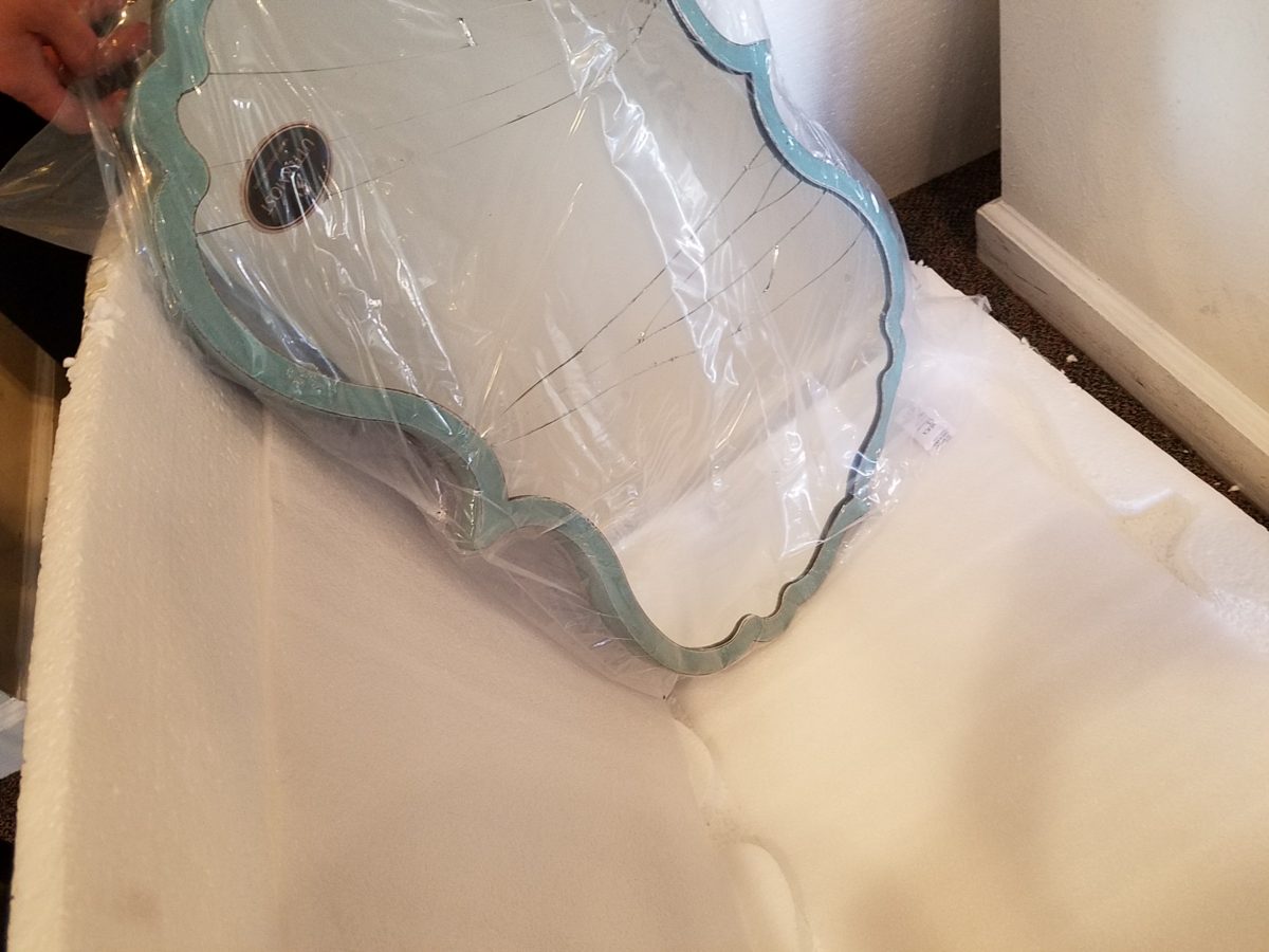
Woo Hoo – sound a tad risqué? Well, to get your attention, the title seemed apt. We continue to find hidden treasures and here are a couple examples that we have discovered and unveiled during this time of limited mobility. And a special feature piece that we had previously presented a while back – but warranted re-visiting for this blog.
Many sole-proprietor upholsterers and seamstresses work alone – all the time. So limiting their activities now is unfortunate for everyone. YOU might want to utilize this time to spruce up around the house since you have had this extraordinary time to observe and critique the function and flavor of your interior (and exterior) spaces.
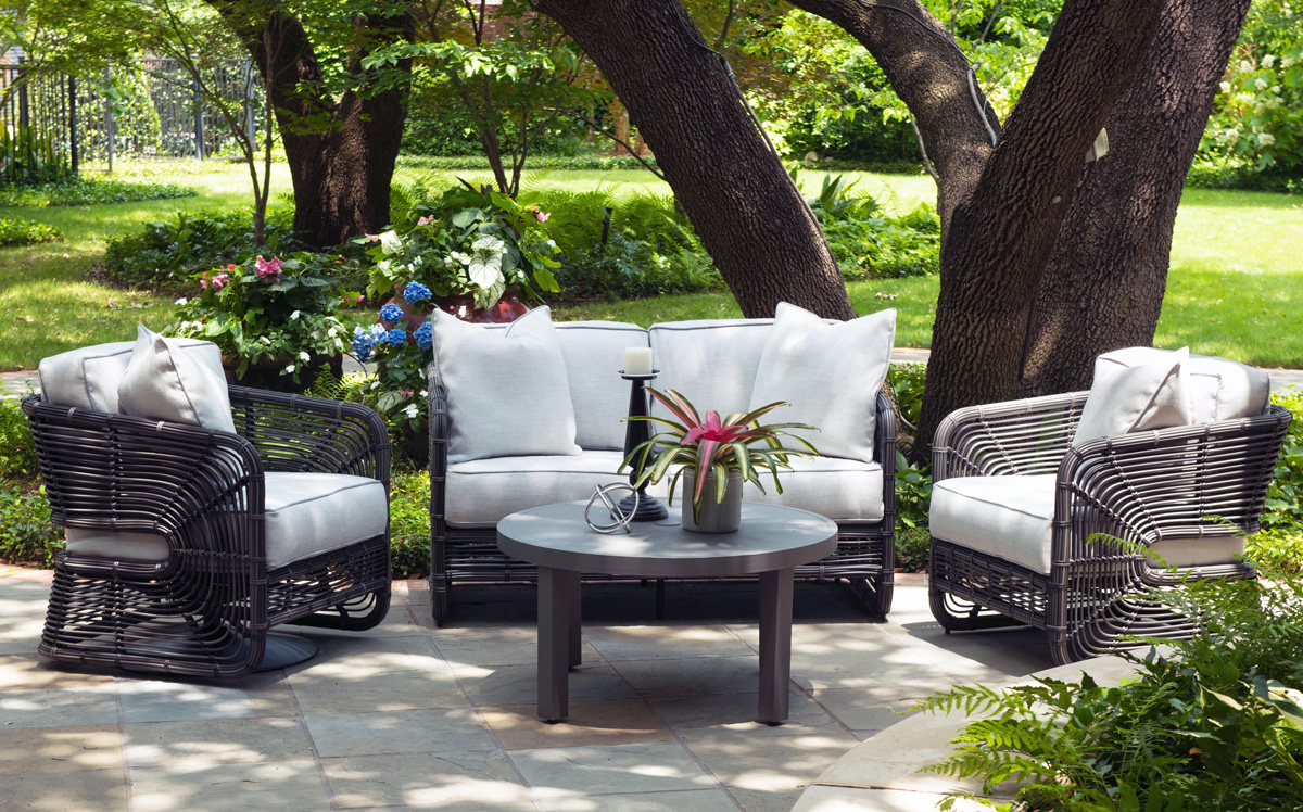
Walking through the spaces of your immediate world, in and out of sunshine penetrating the shadows of stationary units of furniture placed with purpose and function, if not a design aesthetic – pondering the possibility of why not both? Can’t we have function and a great look? Does anything you see look as though it might need a re-make? Why not enhance the function of your interior space by re-thinking how it works or at least enhance the flavor of your interior with texture, color and various values of those harmonious hues or even discordant contrasts of the same?
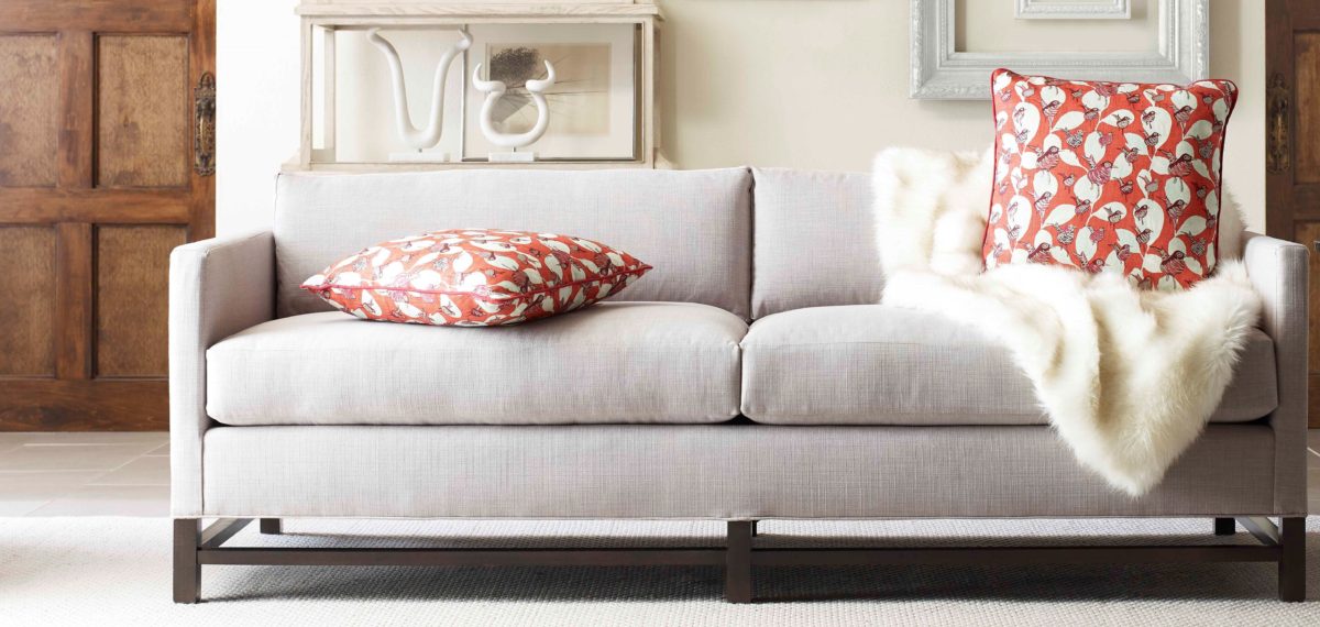
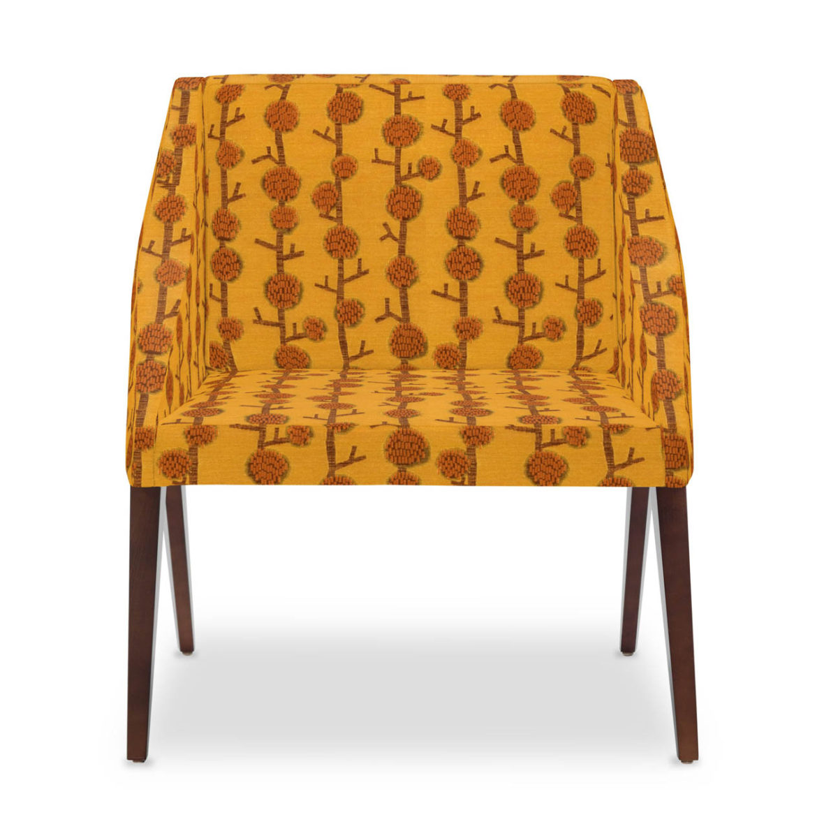
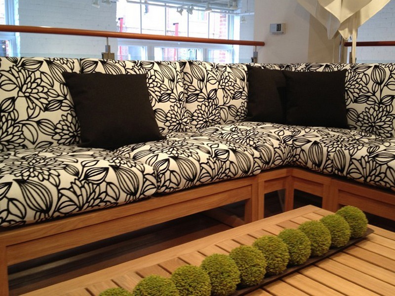
Re-upholstery is a fabulous tool to salvage good frames and have a near instant-gratification for the results of changing the entire look of a favorite piece of furniture. Often the focal point of a room arrangement, re-covering the piece can exponentially change the entire look – feel – flavor of the room.
Re-upholstery can change the personality of a piece. It can transform the attitude and express an entirely different mood. With feet already exposed and no discovery required, some pieces benefit from minor modifications as well as new fabric.
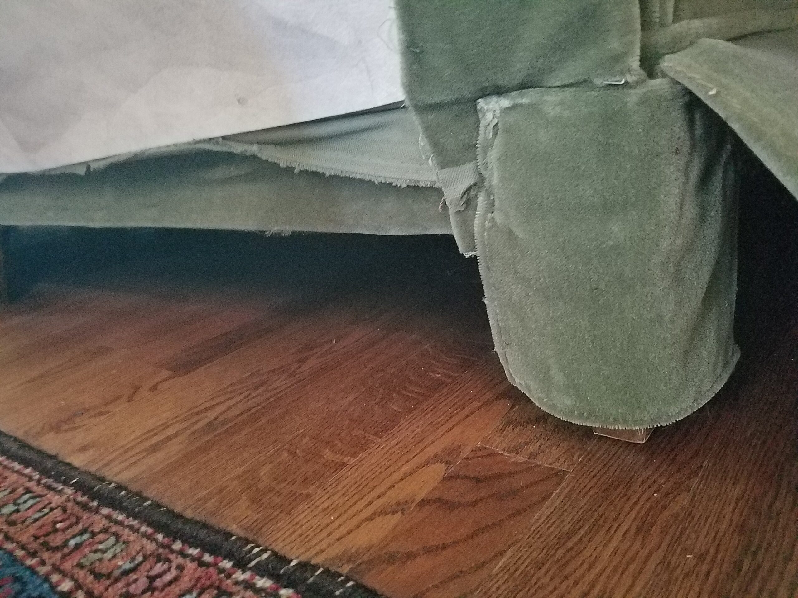
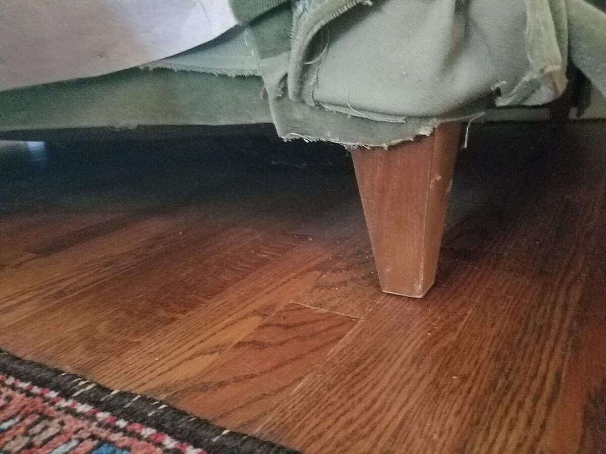
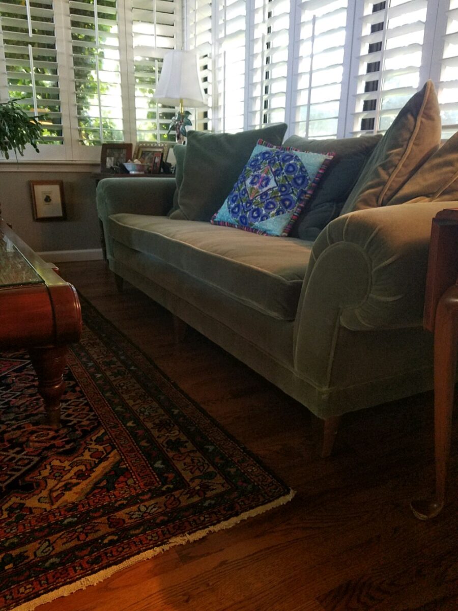
However, on the subject of great legs…it’s the discovery that there is something quite fine beneath the modesty panel that was intended originally to limit dust accumulation…the modesty of concealing that which should be celebrated, complimented and enjoyed – great legs!!!!!!
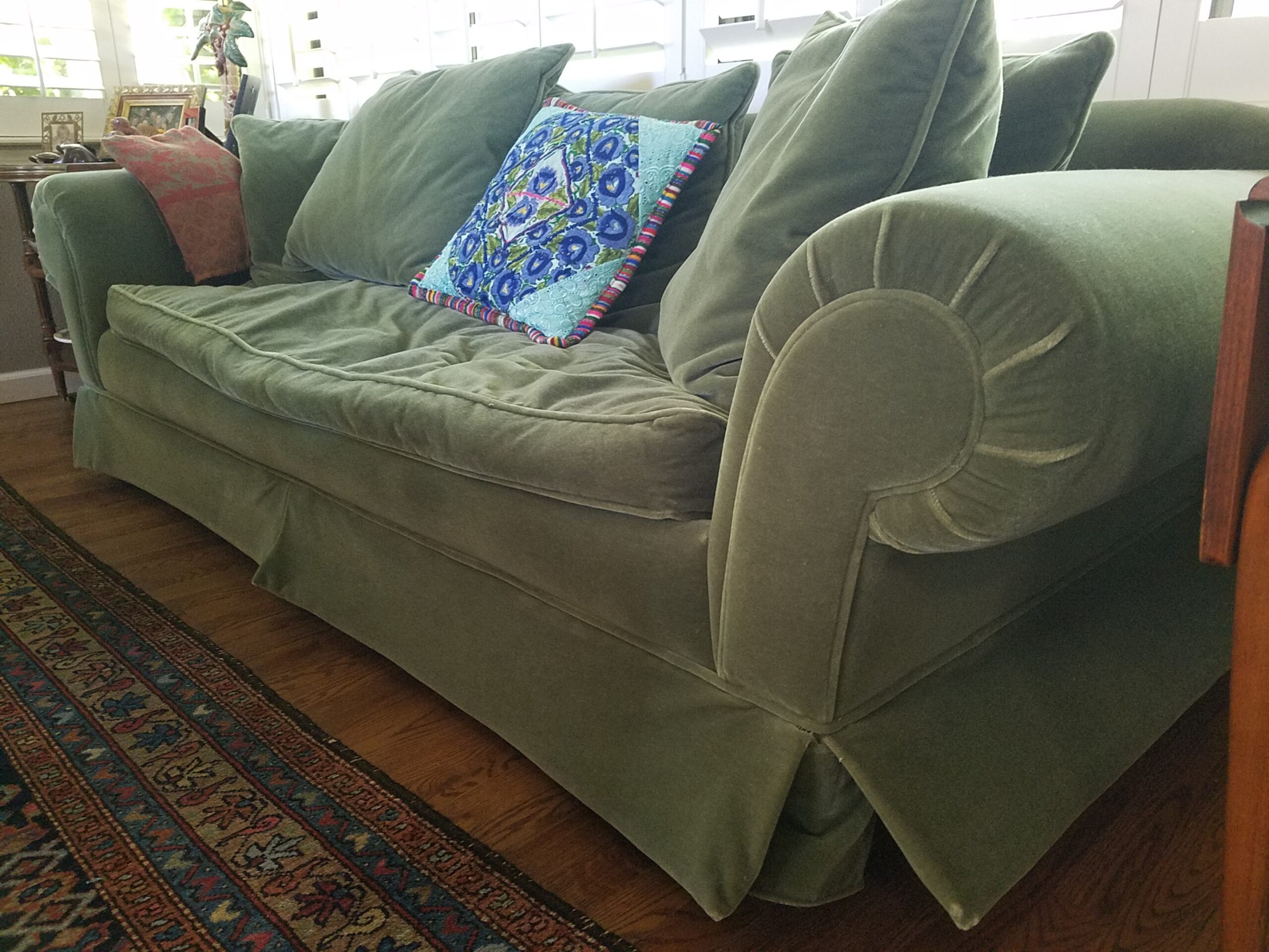
The treat here is lifting the skirt on a sofa or chair and revealing fabulous feet – legs to showcase! Yes, featuring these great legs can give a lighter look to a tired piece, elevate a bit for a clearance off the floor or rug. And the bonus is great features worth exposing!!!
Tired upholstery can so easily be replaced. The idea is to know that you have “good bones” with which to work. But even if the bones are less than stellar hardwood, lesser frames can be reinforced to create a good piece for years to come.
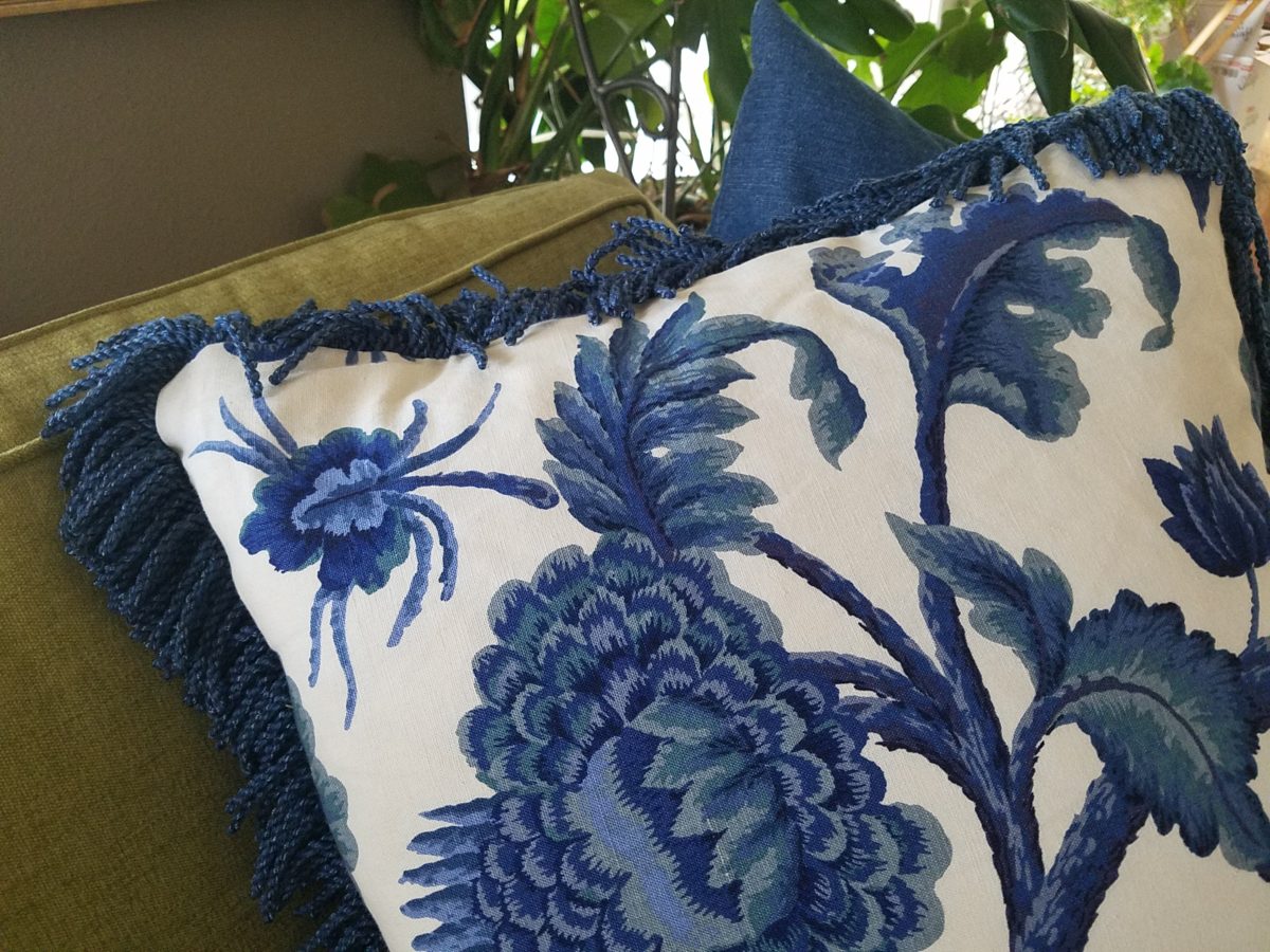
New foam, Dacron, down and other fill and wrap all are fluff upon the frame to give the desired loft, density, give, luxury, stability, comfort and over-all look. Collapsed cushions, and worn fabric come to life with new fill and fabric.
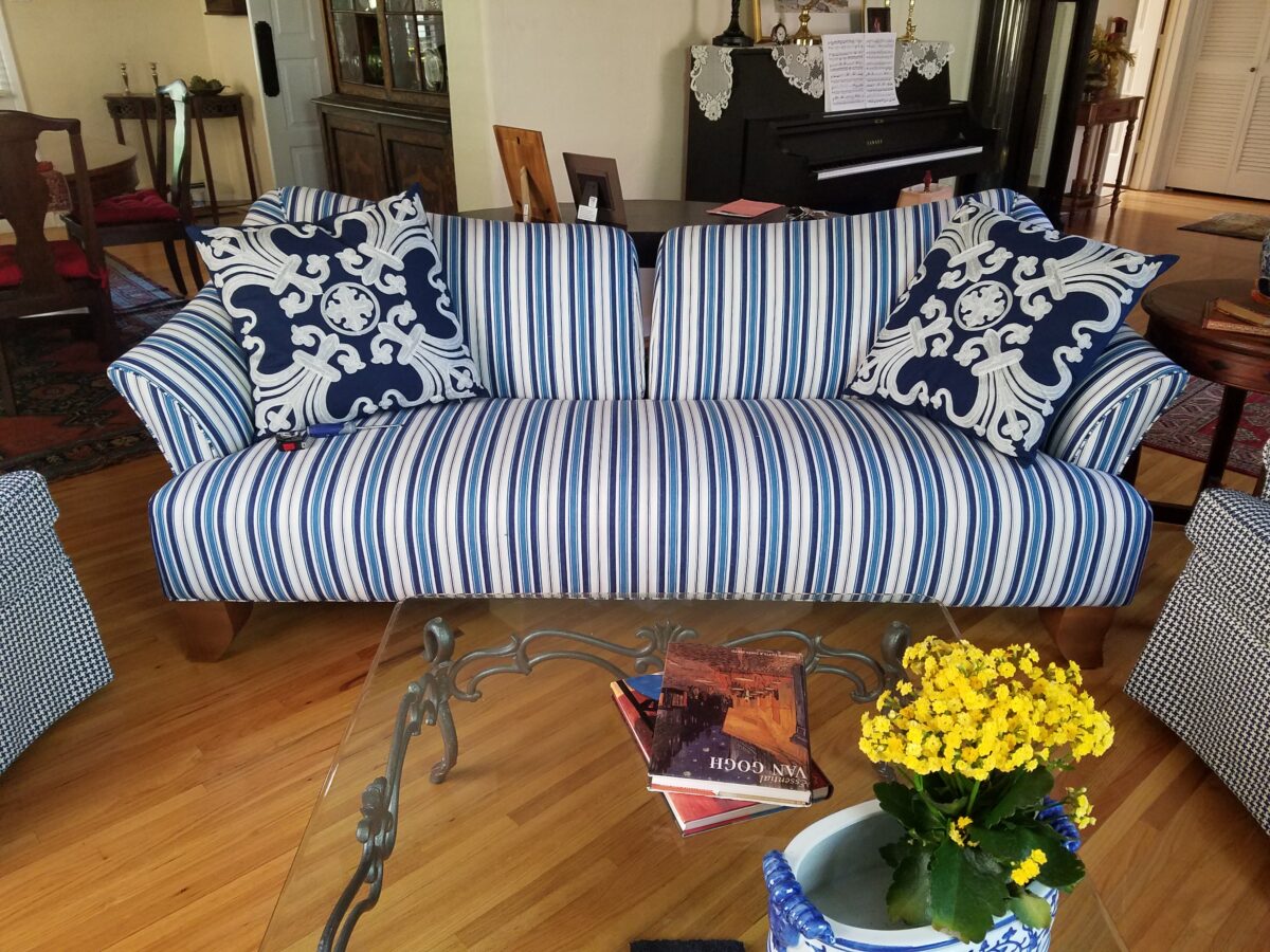
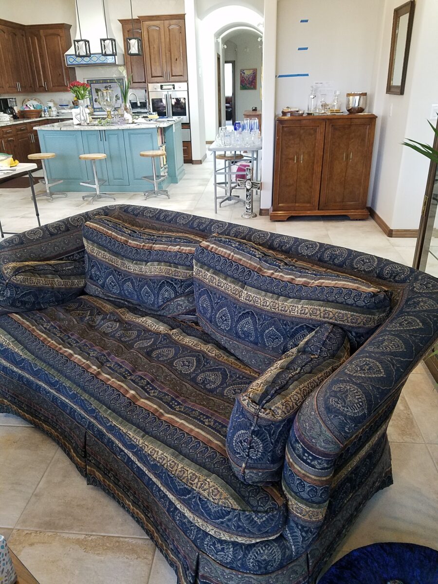
This piece was new in 1978 covered in a neutral flaxen damask. In 1997, an intentionally selected down-filled seat cushion, once a desired relaxed, shabby chic look, in a second covering of this classic piece in a luxurious mohair, now looks deflated and tired.
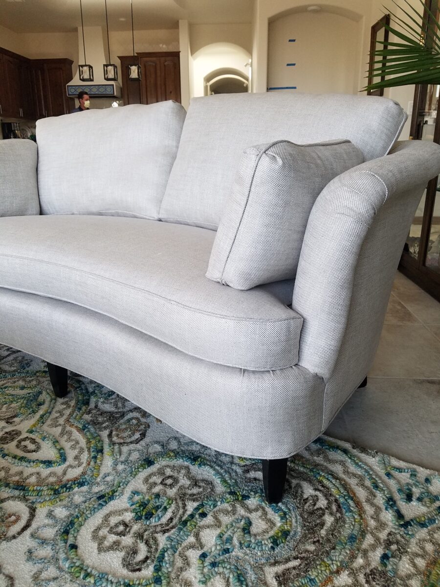
The new seat cushion fill and removal of the skirt exposing the legs is a radical transformation without completely re-covering the sofa. The classic mohair fabric is timeless.
Here, another pair of loveseats had skirts that when raised revealed fabulous legs ready to show! The project is not yet finished – move-in, unpacking and re-upholstery on-going…while new furniture pieces and rugs continue to arrive.
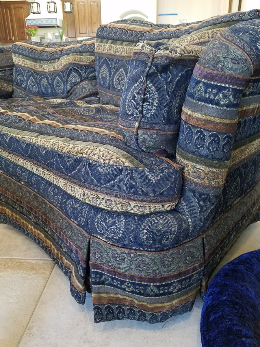
Another detail worth noting is that contours and lines read differently with different fabrics that will conceal or highlight the lines.
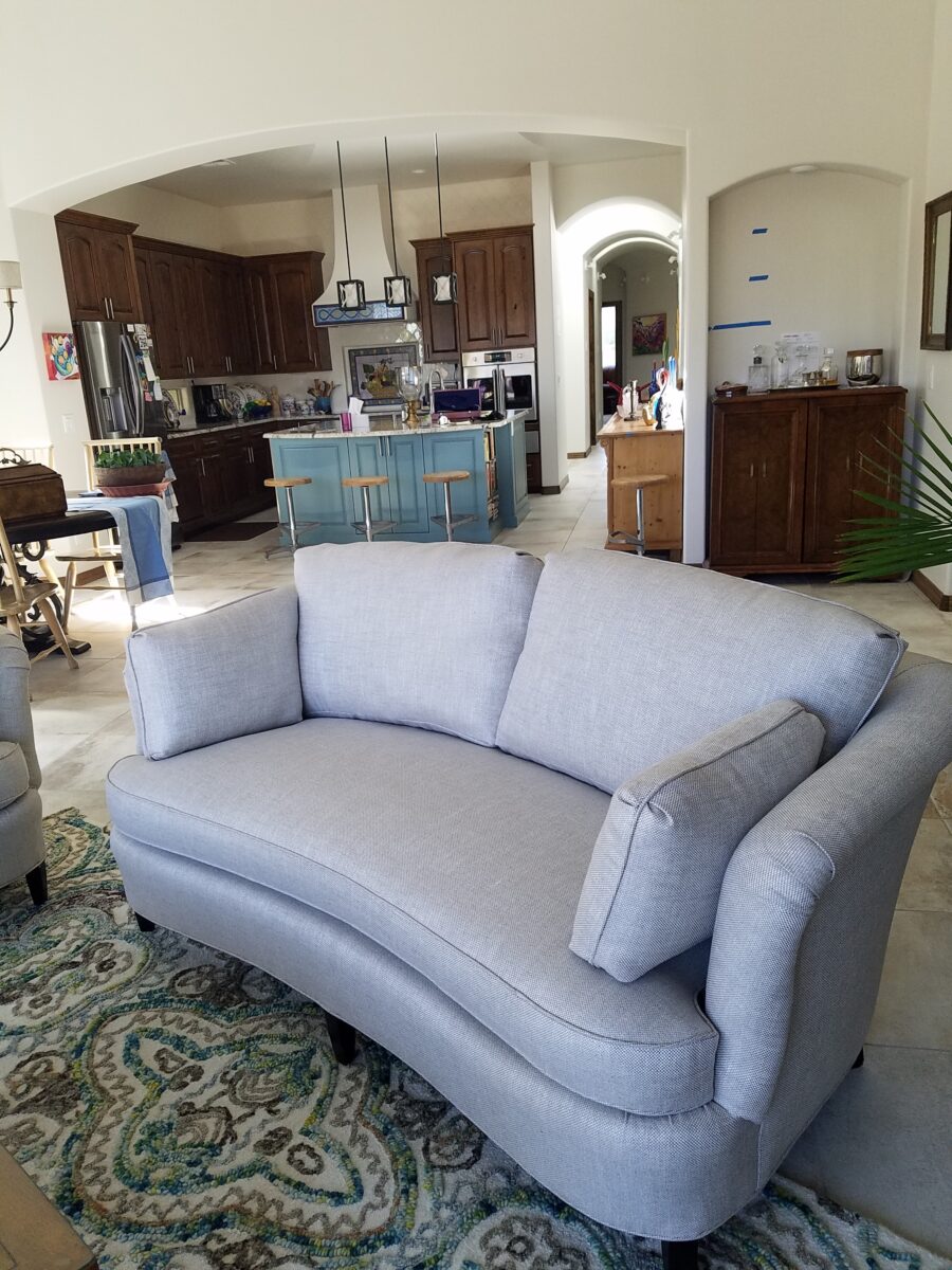
By changing the fabric and exposing the legs, these two pieces are exquisite and remarkable in their amazing transformation.
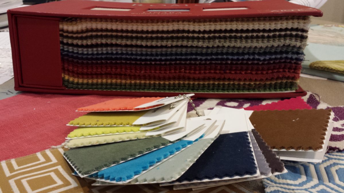
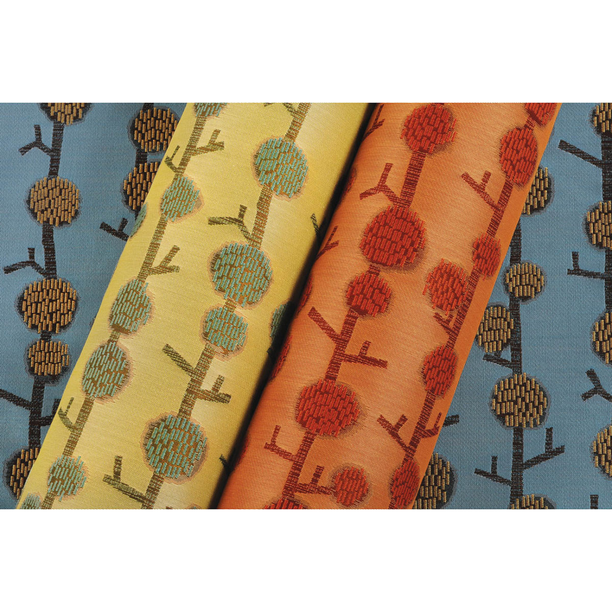
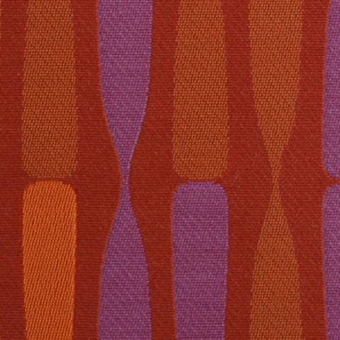
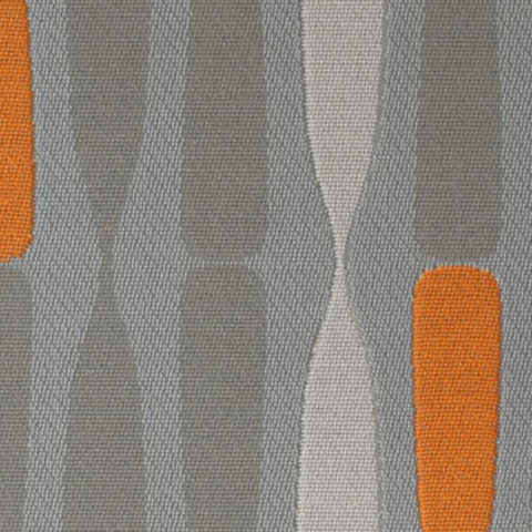
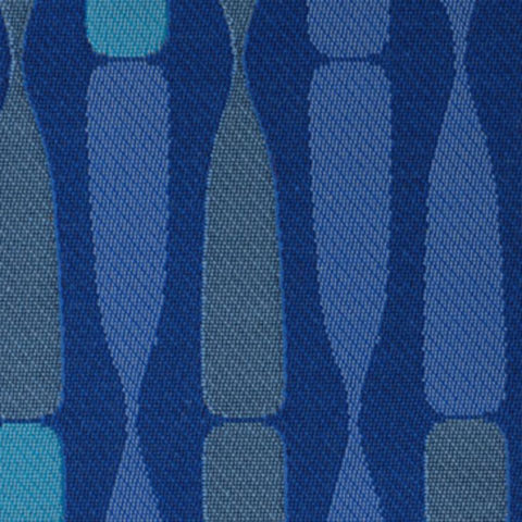
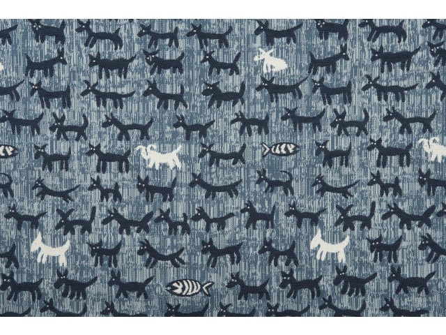
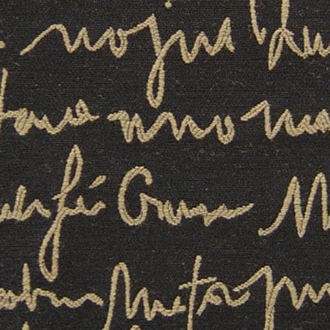
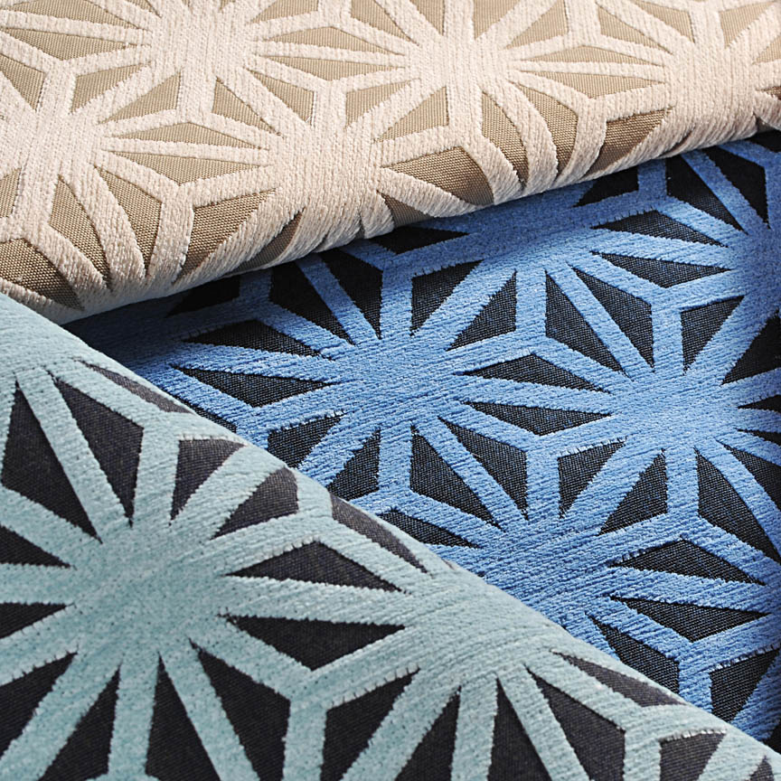
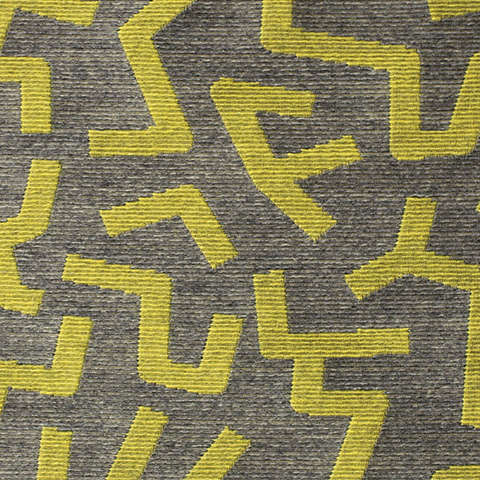
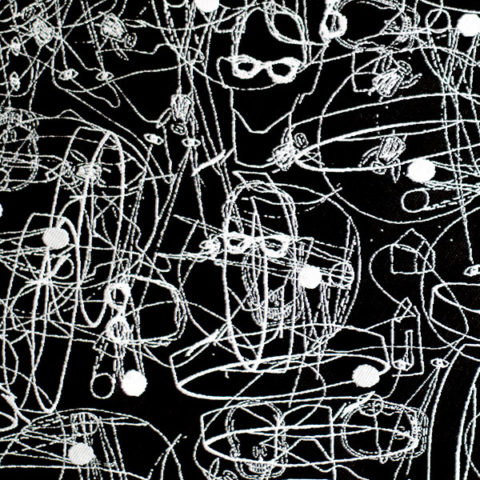
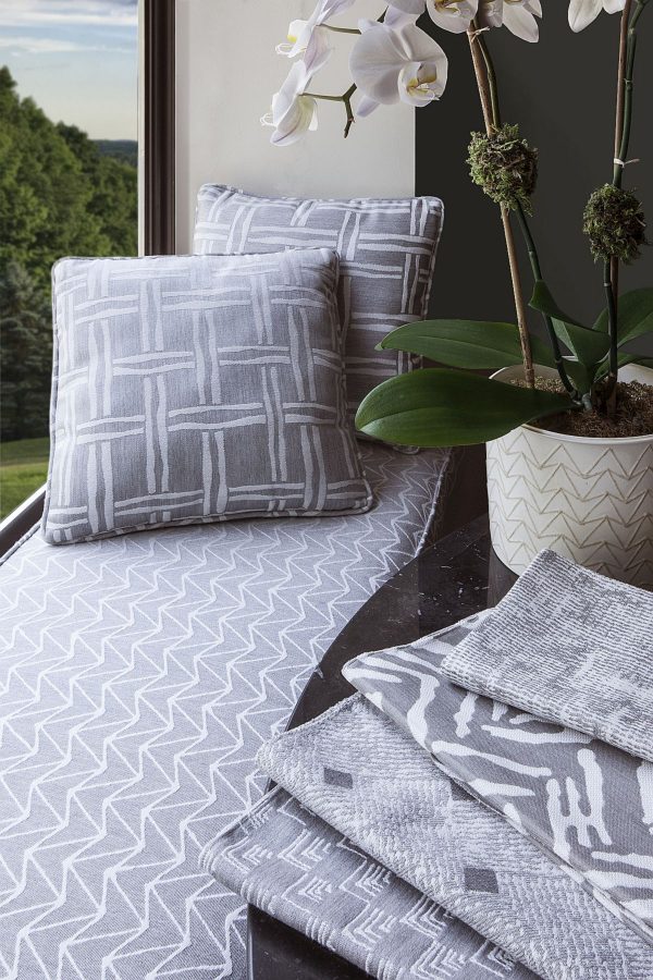
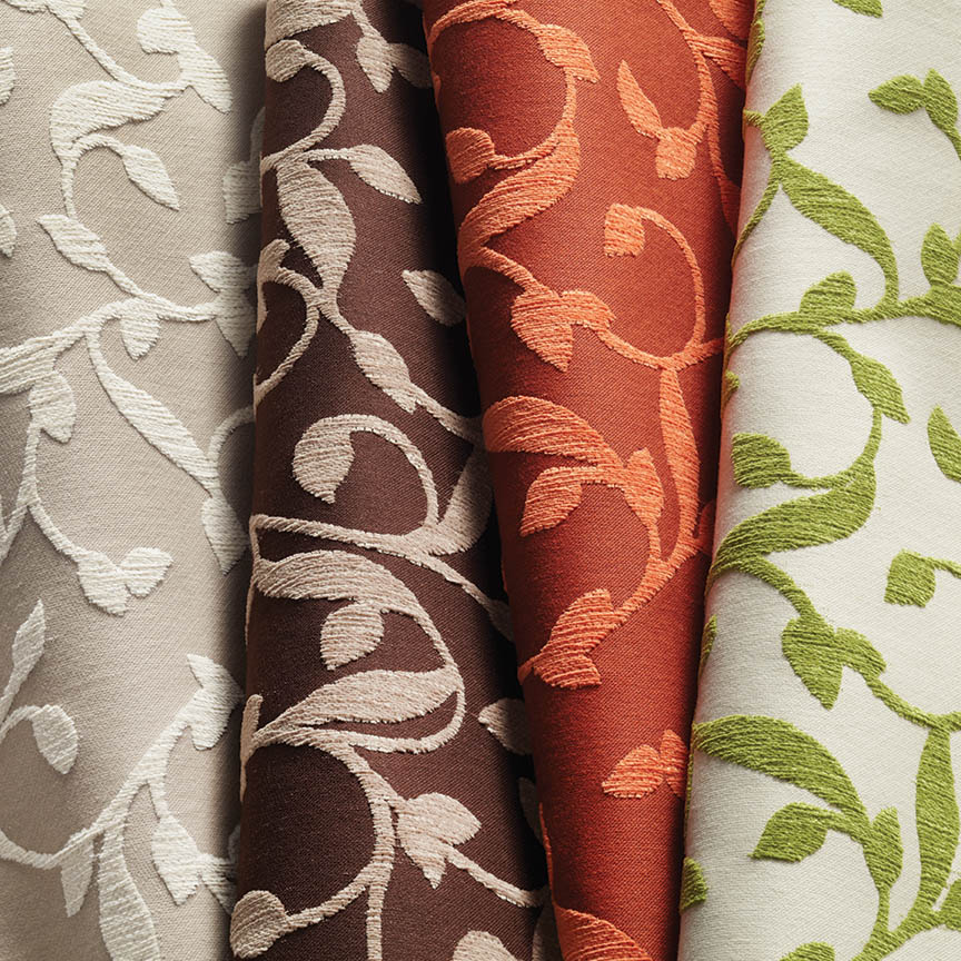
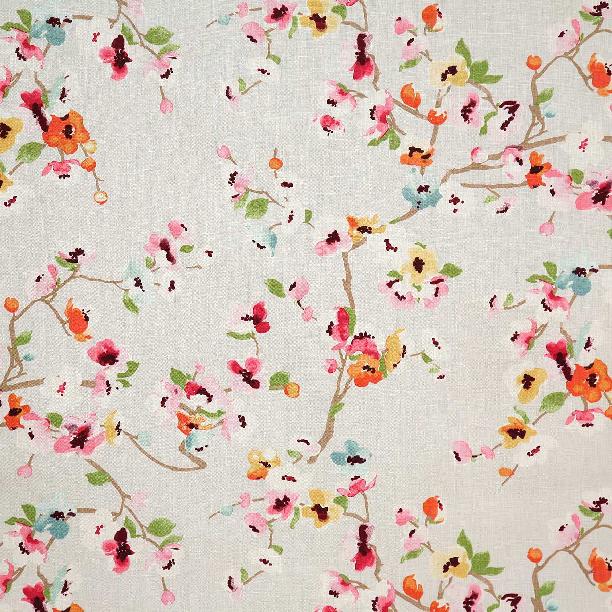
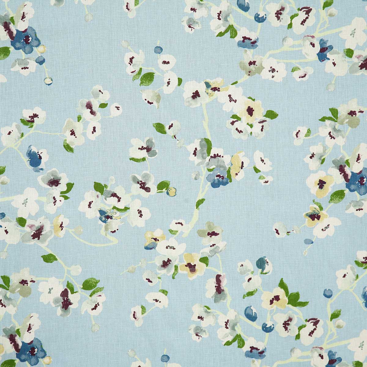
Consider re-upholstery. It provides the opportunity to select any fabric on the planet that is suitable for the purpose – resulting in an exclusively custom piece. The cost to do so is off-set due to you owning the frame. You don’t have to buy a frame and can therefore put more into the selection of the fabric. The labor and fabric are often less than purchasing a new piece. However, the custom satisfaction is personal and priceless!
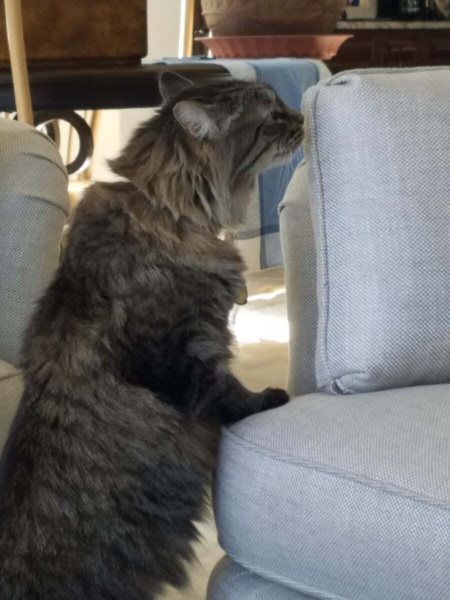
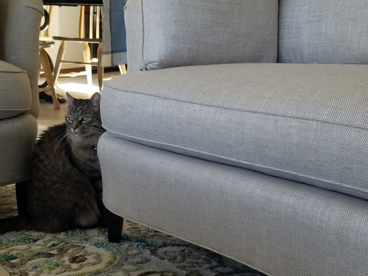
The expected wear on the piece and daily use will direct the selection process for wear-ability. Color and abrasion tolerance will be key to selecting the right fabric for the piece. Don’t pick white if you tend to enjoy red wine on a regular basis. But even that is not insurmountable. An extra piece of fabric used as a daily cover will protect the primary piece of upholstery and maintain the desired appearance. Remove for special occasions and Voila! This works too to protect from that prima donna cat who has free run of the house and finds the new upholstery to be the best place for a feline to recline. YOU know who I mean you hairy beast!