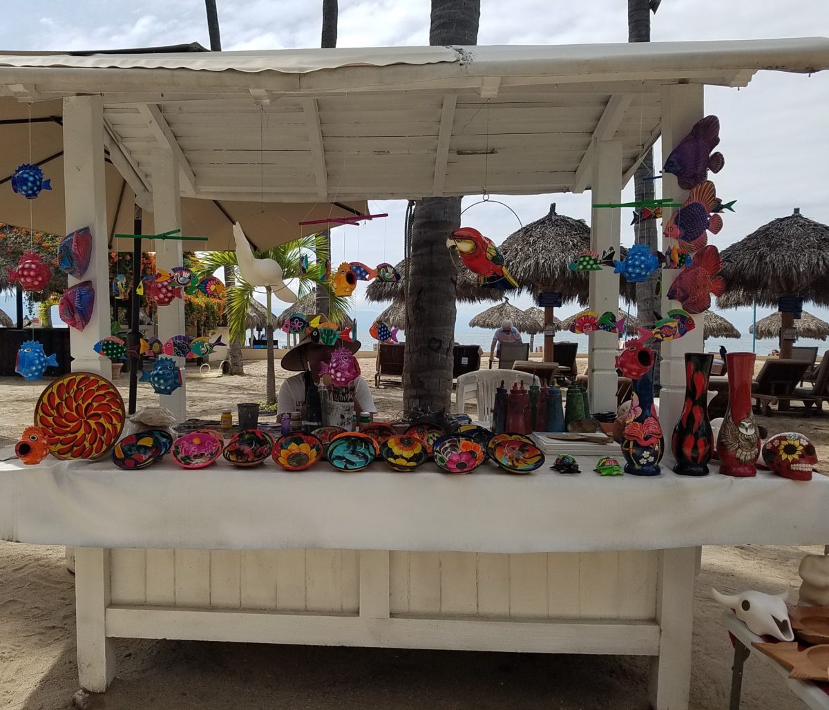
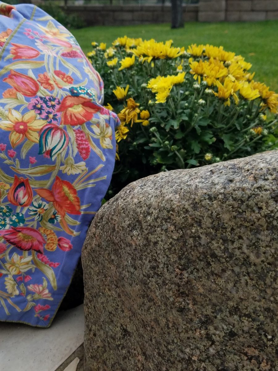
Hidden genius can be found amidst seemingly redundant arts and crafts. Walking by you might not notice. Passing by many beach stands, they begin to look alike – very repetitive. The colorful wares and handcraft are striking and eye-catching and full of fiesta, yet if you pay attention you will notice the nuances. Discovering the true designer/artist.
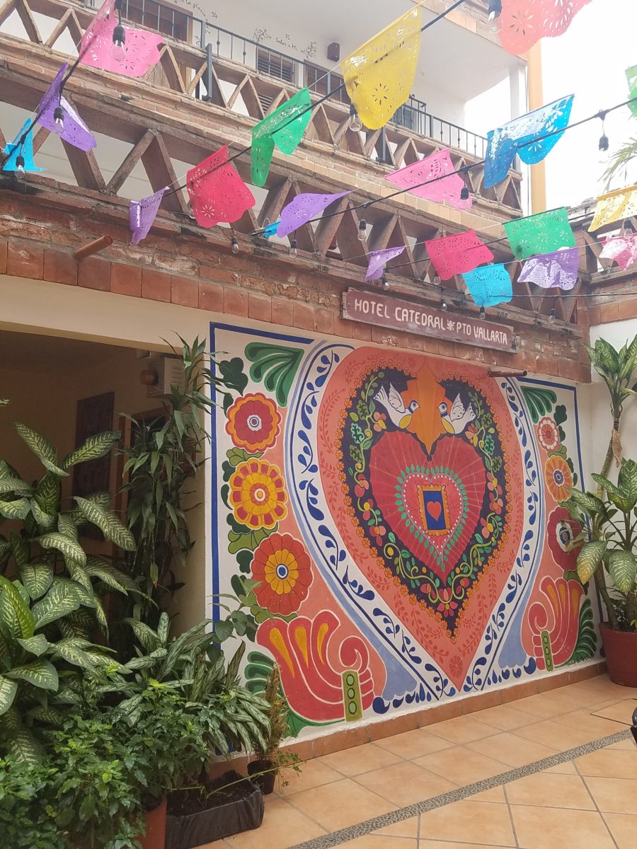
An escape to the tropics and especially to another country offer a reprieve from the cold and add an exotic element to getting out-of-town. Discovering the many indigenous art forms that come from all over Mexico is fun and exciting. Getting to know the makers and the distinctions in their work is another exciting level of appreciation.
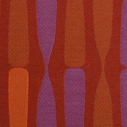
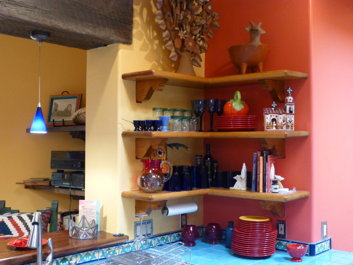
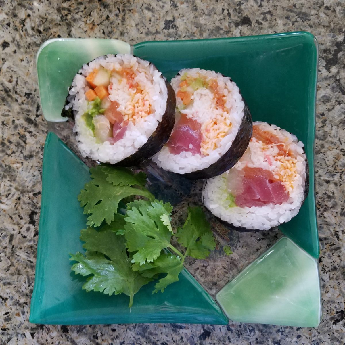
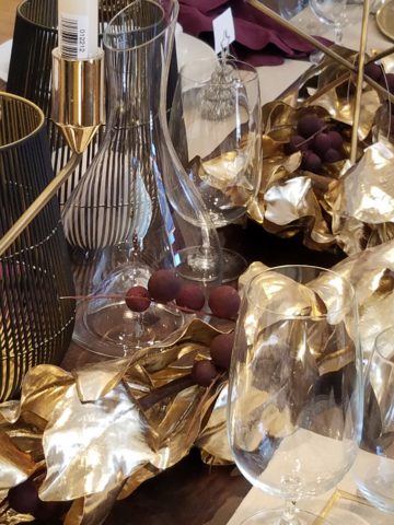
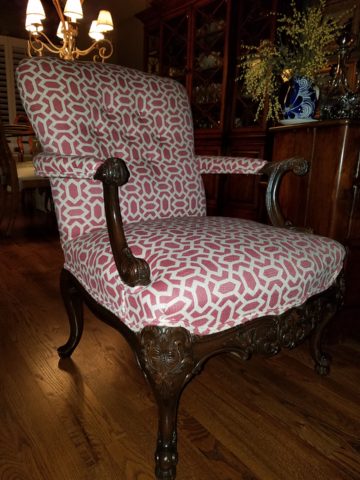
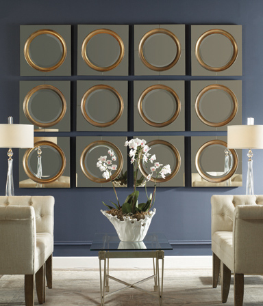
As is true with so many things, detail and design matter. I buy a smattering of things for my gallery/gift boutique. I like to support the local vendors and makers that produce these fantasy-filled folk-art pieces. From fabrics to stuffed animals, painted pottery to murals and mosaics, the art is abundant and deserves to be examined.
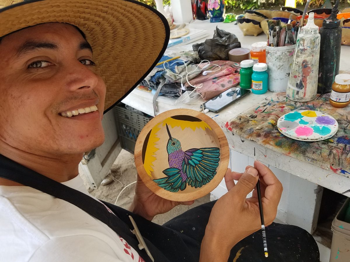
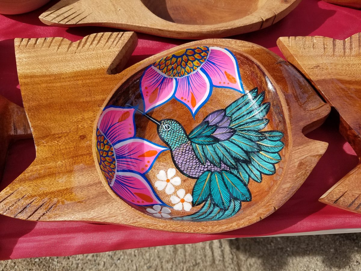
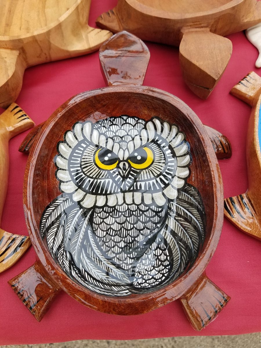
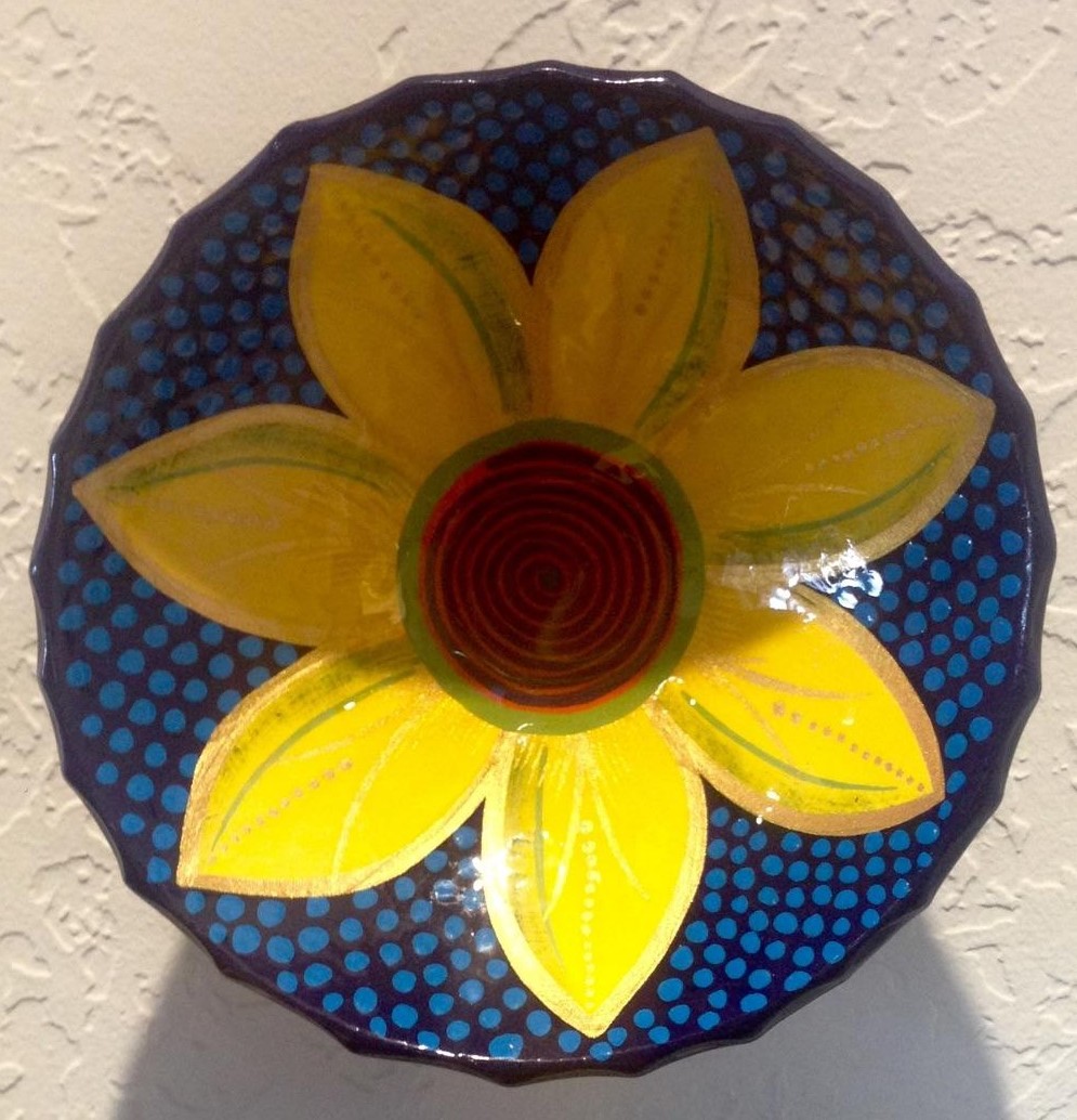
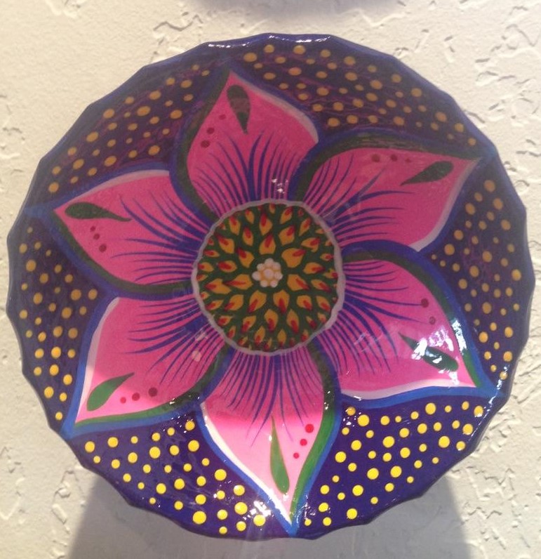
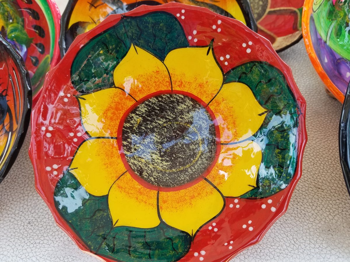
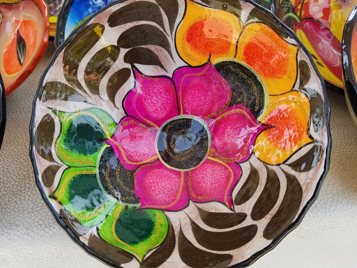
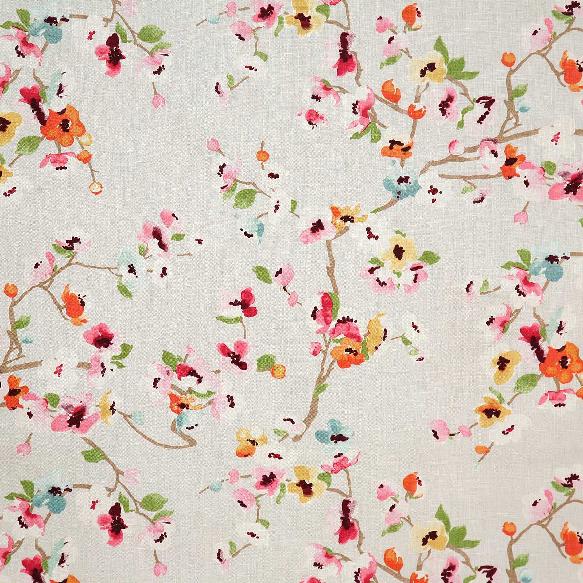
As an example, I am focusing on Victor Rivera. Victor is an artist and more so, an incredibly gifted designer. His sense of pattern and imagery is exquisite. It reminds me of my mother’s love of Marimekko and Lily Pulitzer in the 60s and 70s. Her appreciation was a tremendous influence on me. The joy of color and pattern was a exhilarating celebration to wear and accessorize your home. Victor seems to possess a like-kind of innate sensibility and talent for devising and executing sensational color, pattern, motif and resulting design. He is currently creating, from a modest beach stand, what I believe is clearly different from others doing what might be thought to be similar work.
Like Maija Isola – a peer of my mother’s, having been born in the 20s her designs transcend the many decades in which she influenced color, pattern and bold imagery. Her work continues to live and influence the evolution of Scandinavian artistic direction and its impact on the world of design. https://www.marimekko.com/com_en/world-of marimekko/design/designers/maija-isola
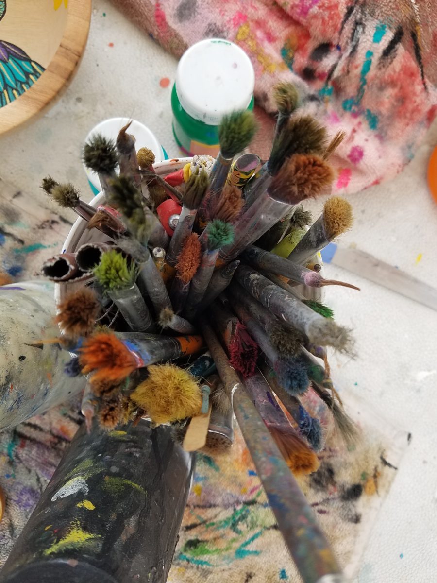
Watching Victor select his brushes, for the various applications and control on his designs, is fascinating and amazing.
The sense of pattern and design is a different category of artistic talent, in my observation and estimation. A master, of pattern, form, design detail and art, is an artist. However, the focus on the repetition and integral connection of patterns – for this purpose in a one-dimensional application – is an intensely different pocket of an artistic brain.
And this brings me back to Victor. I want someone in a position to embrace and promote him, in the world of fabric design and influence, to catapult him to the level to which he can and should aspire. Shout-out to Alegreea and the fabulous designers at Pineda Colavin!!!!!!!
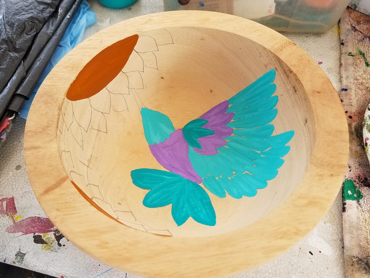
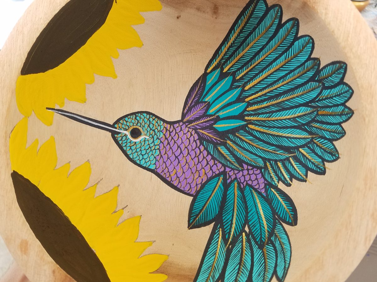
His hummingbirds begin with a pencil drawing and basic “fill” colors at the start. Working on both clay and wood prefabricated bowls by other artisans, his many layers of colors and details take shape.
With myriad, mostly monotonous, Mexican street/beach artists, Victor is a beacon of light that stands out among the throngs. Once you stop to notice – the work he is creating is astonishingly unique and beautiful. His designs are laced with meticulous detail, outstanding color combinations captivating and beautiful.
He will paint expeditiously simple works to satisfy the tourists and keep an inventory at the ready for spontaneous purchase – but when he has quiet time and is caught-up on his table of offerings, he creates amazing pieces that are truly remarkable. It is important to note though, that his more expeditious pieces still have a color combination with strokes of accents that still are above and well beyond the common.
He will paint commissions all day long – but left to his own devices, his creativity is boundless. And, referencing back to the Scandinavian designers, his floral designs are outstanding!
Taking time to examine the world around you and the beauty of detail that awaits, is a joyful experience of great discovery and satisfaction! Not to mention great fun!!!
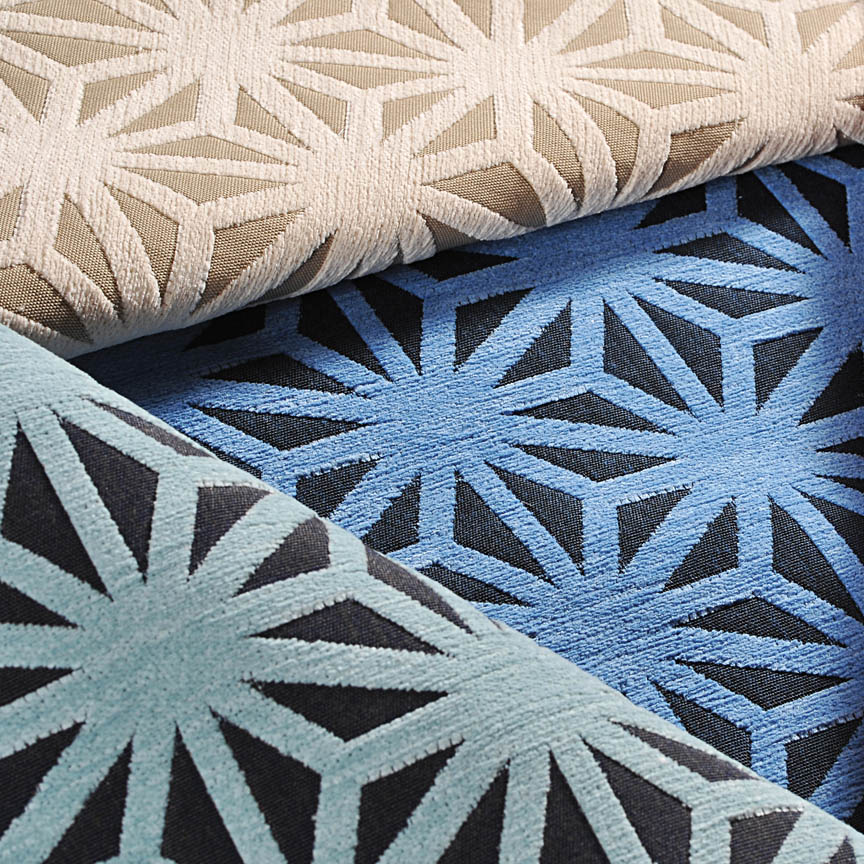
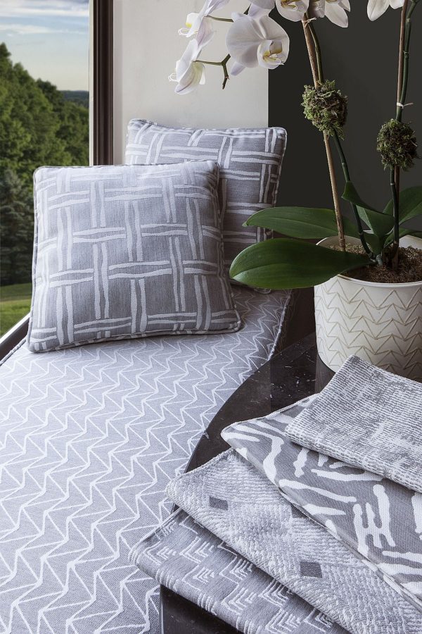
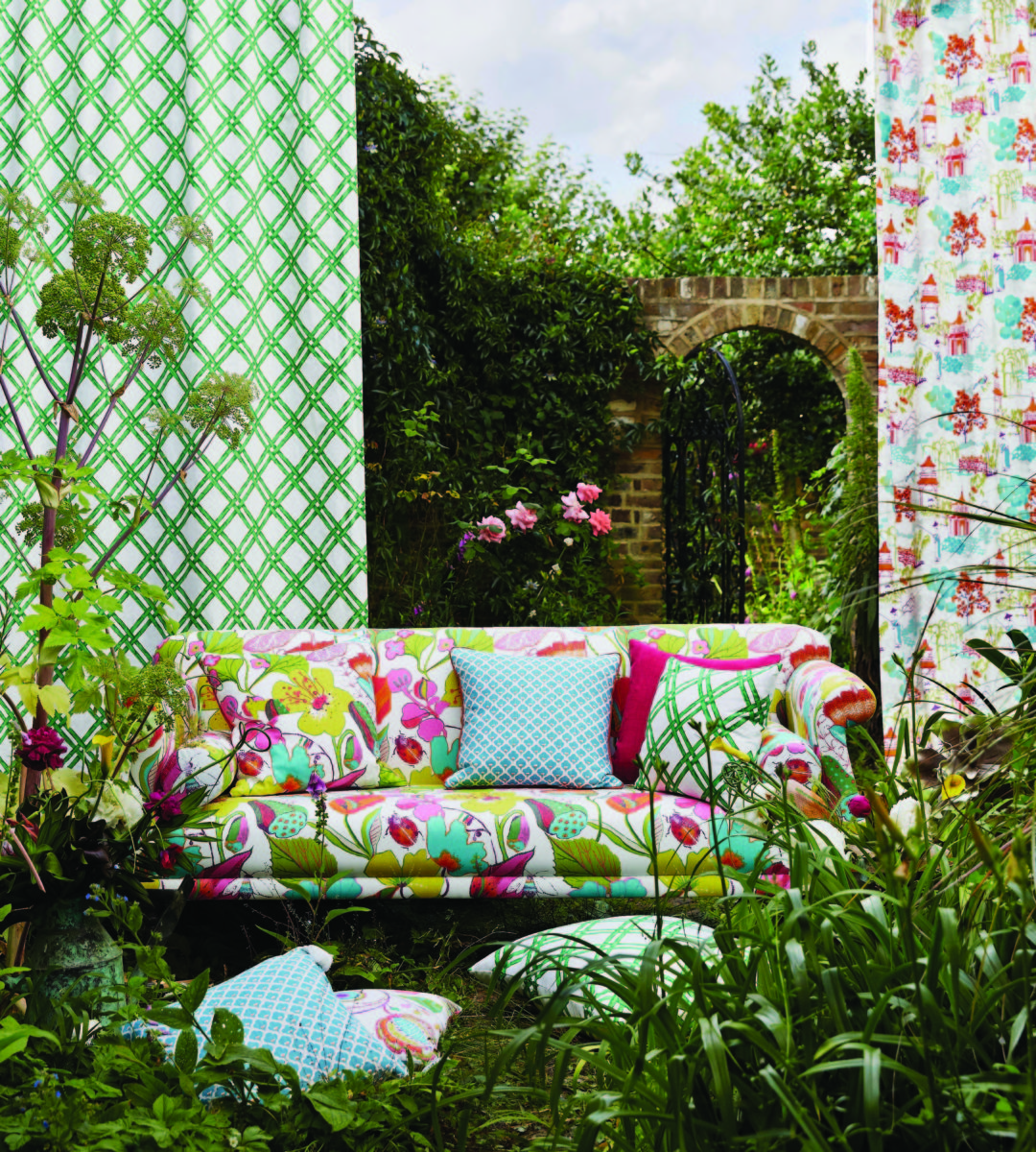
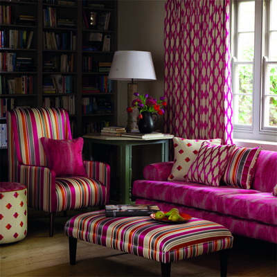
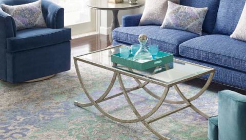
Some fabrics are just so fabulous that they can carry a design scheme. You could wrap a rock with them and feel that they are accomplishing the design statement to set the theme, mood and encourage interest, if not confidence in comfort! Stimulating the senses is a major part of design.
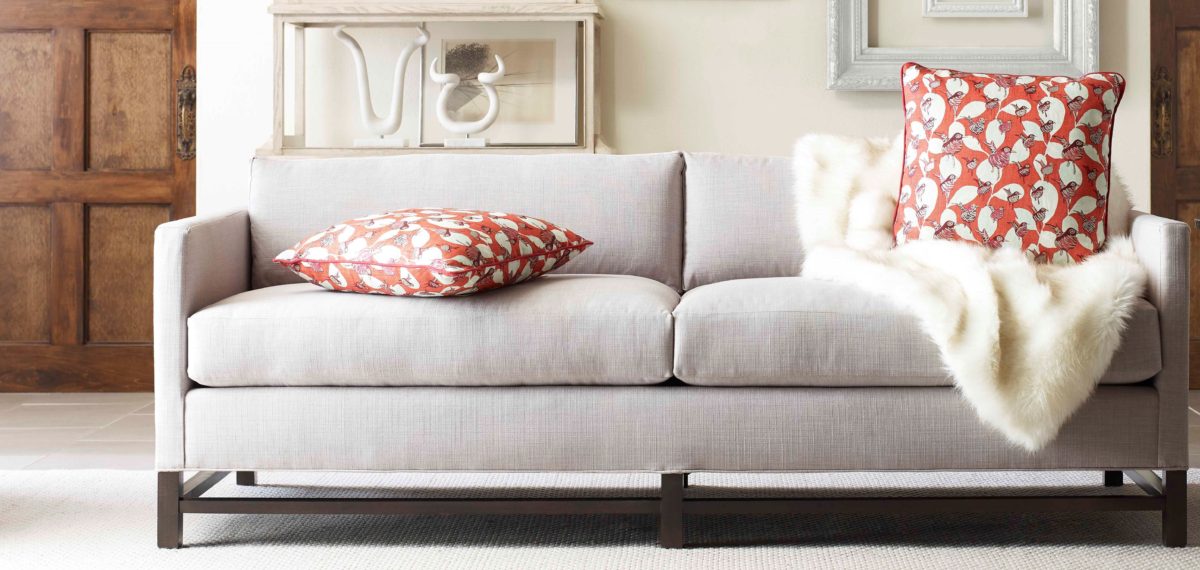
Often, a throw pillow can make an effective accent. We joke often when we find exclusive fabrics in the hundreds of dollars a yard and say “Perhaps a throw pillow?” Knowing that the projects affording such luxury for miles of drapery panels are few and far between!
Duralee offers statement furniture pieces of unpretentious luxury and comfort with a collection of fine fabrics that will satisfy any budget. Birds take flight from this delightful Duralee pattern.
Sight Sound Smell Taste and Touch – you know. Colors and textures catch one’s attention. They set the mood.
Upon entering a space you take-in the colors and textures and if fabric is in play.With further tactile examination fabric contributes greatly to these two sensory perceptions – sight and touch.
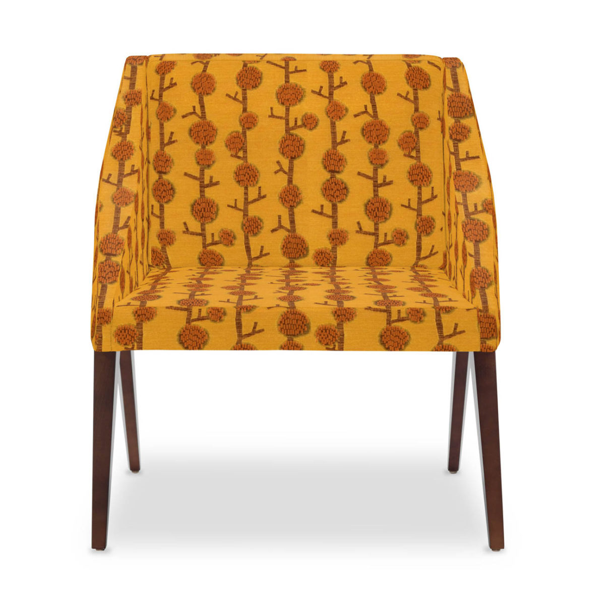
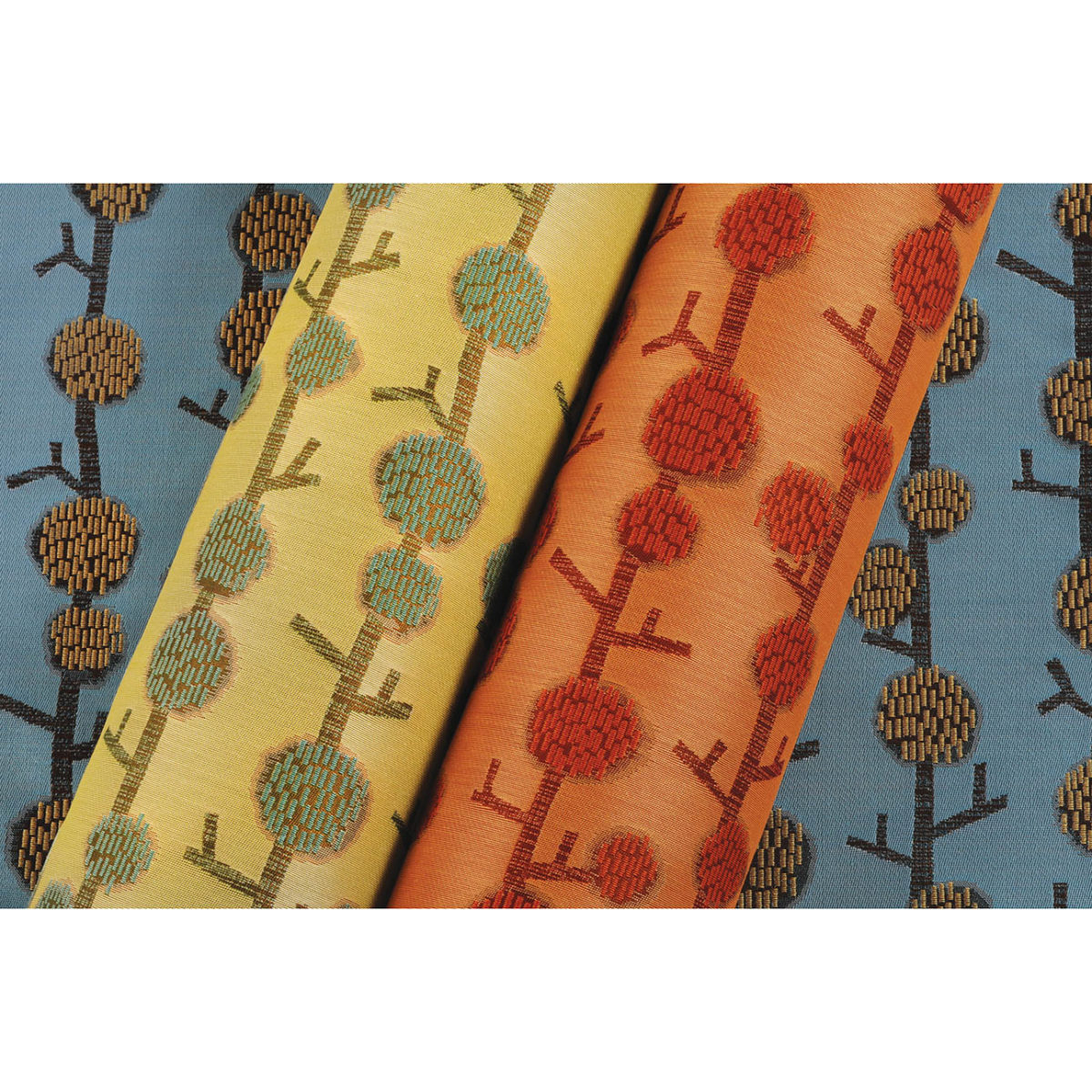
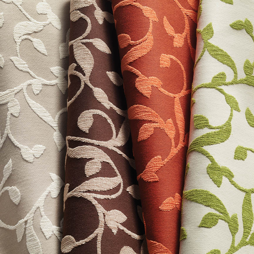
This playful Donghia organic has fuzzy tactile balls sprouting from the linear twigs. From the “ground” to all the intertwining and overlaying weaves, the complexity of textiles is exciting. Come see these exceptional designer fabrics in our studio.Many fabrics have multiple colorways. If you see an intriguing fabric that’s not “your color”, its worth asking about the entire collection.
Juxtaposition can also be an effective technique. When placing a modern pattern on a vintage piece, you breathe new life into the forgotten history – refreshing and capturing the best of both worlds!
You might not have a lot of confidence in someone who wants to wrap a rock to make a design statement. However, my point is, when you love something you want it regardless of the delivery system! Find fabrics that you love and insert them into your rooms – home or office. It’s like your favorite flavor. Sweet or savory – slather it on a piece of cardboard and you’ll be significantly satisfied. You need not struggle with how to do it – just make it happen. So to get a little taste of an exciting textile, make a table runner, simple dining chair seats, select a backing and make a throw or an accent pillow. Bring the joy of exciting textiles into your interiors.
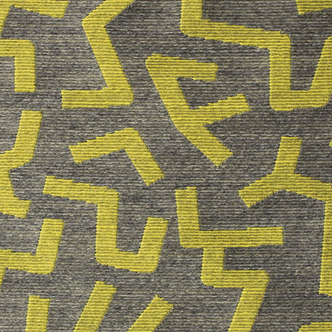
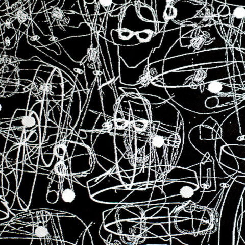
Here are a series of fun fabrics from our source library – tools of the trade. We LOVE fabrics and must touch the texture, feel the weight and evaluate the colors. Seeing images on-line do NOT do justice to the many incredibly creative textiles are available to enhance interiors.
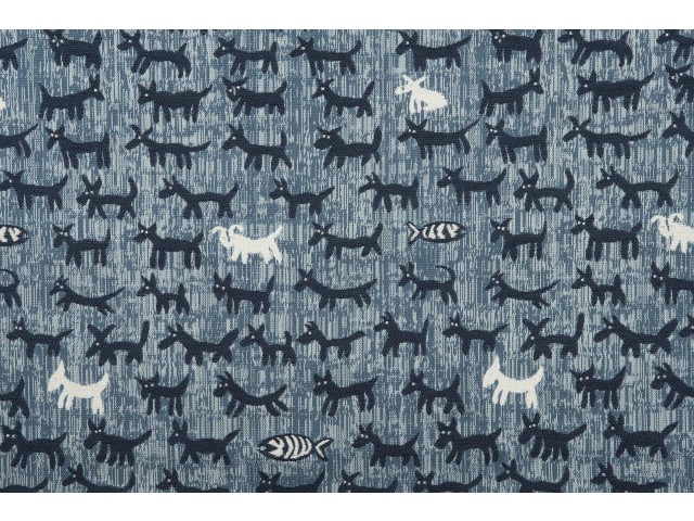
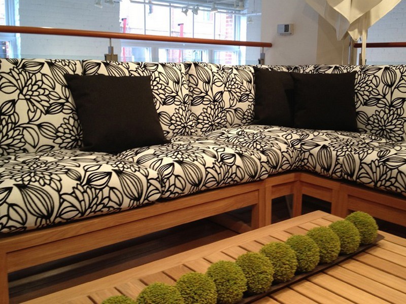
Cute critters march across this sophisticated yet whimsically novel woven.
Other considerations not necessarily in evidence are the wear-ability/durability of a fabric and the resistance to ultraviolet rays, mildew and other elements. Wool is inherently flame retardant, for example. And exteriors have come alive as these amazing performance textiles will often fool you in disbelief that they have the properties to withstand the radiating ultra-violet rays of the sun and damp conditions which invite mold and mildew. These incredible fabrics are truly indoor-outdoor in appearance and extraordinary performance!
High-performance luxury weaves such as jacquards, piques, tapestries, matelassé, ottomans, damasks and sheers defy their extraordinary performance properties.
Roy Hamilton a recognized designer in many media, brings fresh patterns to Chella. Roy Hamilton, designer of exclusive ceramics, sculptural and textural interior elements and fabrics for over sixty years.
Call for an appointment to explore our source library for the most unique fabrics in the world!
Floor-to-ceiling shelves of samples await your exploration for commercial and residential application!! You can order most textiles by the yard!
When designing for a vacation rental property, the first order of business is to select things that are durable and easy to maintain. This means finishes to furnishings. I know this from practical life experiences and also working with commercial/hospitality interiors. To do so, one needs time to place and receive the orders with enough contingency for mishap. It is also dependent upon the housekeeping arrangements planned for on-going maintenance.
In this recent project, the work began 12 months out – plenty of time you think…but it was all about the physical remodel. We began with the drawings for floor plan re-configuration and specifications for new lighting, cabinets and finishes throughout. The decision to furnish was not made until nearly 10 months later with a deadline to complete in less than 7 weeks. The delay was partially due to an indecision over how many of the 4 units (all on one floor) were to be short-term or long-term rentals. Then a new city ordinance imposed a moratorium, of sorts, on short-term rentals and while that was tossed about over several weeks…more indecision ensued.
It’s a riot to see overnight design projects transform interiors in 24 hours. That’s due to a free-reign for design decisions, a team(s) and vehicles to pick-up/deliver, all trades on deck, a single director calling the shots and an organized chaos that results in a magical finished project – yes, like magic. Open your eyes, be stricken with awe, cry a little and exclaim repeatedly that you “just can’t believe it!!!!”
Real life is generally not like that. Real life has in-put by owners, limited schedule openings by the various trades, little spontaneous decision-making and fleeting time riddled with unwanted surprises and delays. Real life, in this case, was a theme provided by the owner, a preconceived “look” developed in the mind’s eye and scratch paper of the designer during the selection of finishes and floor plan modifications and vacillation for several reasons, of what units to furnish and when. Over the course of a year, leading up to less than the last 30 days, the project was to be fully furnished and finished – ready to rent!
The good news is that with controlled frenzy, changing
availability of products, focused efforts and teamwork, we are pleased to present
the Lobster! Completed all but hanging the TVs by the requested July 1st
deadline, it is beautifully appointed and offers a colorful and a bit
whimsical, spacious, clean and did I mention enviable location- 2 blocks from Pacific Beach
in San Diego?
This entire project, except the move-in this last week, was done long-distance with the owner in Maine, her management company SHORE on-site in California and we the design team in New Mexico. This is not at all unusual, but Maine prompted the owner’s desire to name the unit Lobster. Not your spiny lobster from the local waters, but the New England version from the Atlantic with the classic recognizable form that accompanies the imagined crustacean – including the brilliant reds of the often appreciated steamed version!!
With fond memories of her childhood helping her elders maintain this property, the owner wanted to commemorate the building with an entry plaque visible from the street on the new redwood gate (soon to be completed). In addition, we suggested an individual name/theme for each of the 4 apartments which were all initially designated as fully-furnished short-term rentals – hence the bold identity for each! I designed the new name plaques and had them fabricated by Artistic Bronze in Florida. The backing was built by our talented Enrique Jimenez, in New Mexico, and all shipped to California. Bronze was selected for its timeless presentation, handsome durability and commanding respect. Parisienne was the font I selected which may now be used to identify the property as though a logo to tie-in with the on-site signage. Subliminal cues that are recognized even slightly are effective reminders and triggers for recognition. The idea was intended to offer a fun, but lasting, introduction and identification which was to be reflected in the interiors. The Lobster was the largest unit with 2 bedrooms. It was ultimately chosen to the be one fully-furnished unit and owner’s second home when visiting the area.
For budget and availability, we sacrificed certain durable
features that would have been better long-term investments, resulting in some
knock-down furniture that was never intended for much abuse. Fragile painted
table surfaces – for example – better in laminate, wood or stone…but time
will tell.
The look is clean and fun, colorful and beachy – with a slightly up-scaled twist. Cool aquas accent a few walls in the otherwise crisp white interior. Red punctuates effectively in lobster accent pillows, decorative accessories and the full-wall mosaic glass tile treatment in the kitchen. Yes, once again, we like to treat tile on the walls as not mere back-splashes, but wall-covering full height and width!
Weathered grey toned LVT (Luxury Vinyl Tile) in the way of interlocking planks were an easy to maintain and durable floor finish. The faux wood adds warmth and is softer underfoot than other hard surfaces. Perfectly matched with all trim pieces, this flooring is fabulous!!
Lighting is key and here we added recessed directional lights to spot the walls and related artwork. Switching was also an important detail to have options for the lighted areas and accents.
The owner found a novel lobster rug with a great textural,
tufted, yarn system that brings fun and great color and warmth to the bunk-bed
room! Busy, colorful bed dressings intentionally selected (over the hospitality
white that is still trending) contrast against the bright white bed frames
stacked for space optimization and a little kid fun!
A cool find in the way of the glass vessel lamp…where
usually the stem with electrical cord feeds down through the center of the base
and of the back, this one feeds from the socket stem with a cork top that
removes allowing the vessel to be filled with treasures – in this case southern
California beach shells and fragments! And for a little more animation, I found
a carved wooden shark to insert cruising above the shells to make the lamp even
more interesting!!!
A pair of vintage photographs of a lobster shack and fishing
boat contributed by a friend in Albuquerque – taken by him in Maine in 1962 –
were enhanced with bright red mats in their original polished silver metal
frames along with a large painting on canvas of a Maine lobster/fishing boat sent
by the owner in Maine provide interest to further perpetuate the lobster theme.
The master bedroom is a comfortable retreat with another
lobster pillow for punch! To give the room the best approach and make it feel
as large as it can be, placing the bed in front of the windows was the
solution. Beds facing the entrance to the room are always preferable to
arriving into the side of them – for visual space and a more inviting
orientation.
The original bathroom layout was all one space with tiny
appointments jammed together…so we removed the tall storage cabinets and sink
vanity allowing more room for the commode beside the tub/shower and added a
privacy door. Then the new cabinets and counter have their own space with
another privacy door resulting in a two-compartment bathroom area for maximum
use and enjoyment. Red mosaic glass tiles were repeated from the kitchen to further
coordinate the theme.
The bold color scheme was thoroughly distributed throughout
the unit which is an intentional design emphasis especially effective and novel
in a short-term vacation rental – where such a thorough scheme might be too
intense for one’s primary place of residence.
Effective design both functionally and visually should be a significant asset in the marketing of rental property. When used consistency in marketing material with logos and repeated features, this and other properties with attention to detail should attract the discriminating guests. Once there, repeated stays are the key to maintaining a strong guest population – of desired visitors.
Please watch for the entire slide show of before and afters of this dramatic transformation in the commercial projects section of our website, in coming weeks, entitled Emerald Green Beach Rentals – Lobster!
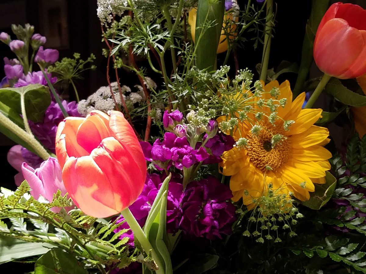
Blossoms are bursting forth and spring is near…Flowers have a decidedly feminine bent, but due to their organic nature and natural occurrence as the season begins to unfold, I truly believe that they are a gender-less element of rebirth, warmth, optimism and wonder.
In our backyard, these minis are ahead of their more attenuated cousins!
Interior designers welcome floral fabrics as contributing to the pattern mixes, accents and animated offerings amidst other geometric, stripe and solid pieces.
Floral fabrics – here on a textural ground, bring artistic accents to an interior!
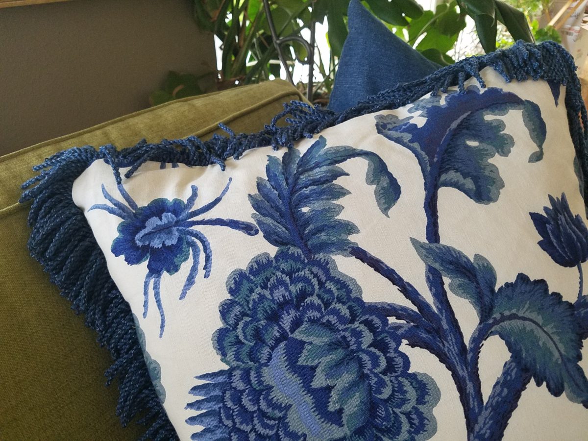
Yet, men don’t gravitate to floral fabrics unless perhaps they sport a tropical shirt in the summer – the uniform of the relaxed, vacay, free and festive escape! You might not find a floral throw pillow on their sofa when batching it. But why not? Spring is spring, flowers are flowers – who doesn’t like them? Embrace your natural instincts! Be brave! Go beyond the aloha shirt and fling a floral throw pillow on your sofa!
Ok…perhaps without the fringe? This denim-blue color on a linen texture is not too flowery – but makes a bright, fresh statement!
Ok – forget the possible gender gap on this subject…
But I did tip-toe outside on the patio tile this morning chilling my toes, to hop across the still dormant grass, in order to take these shots of the first bulbs forced through the crunchy soil to greet the season.
Our daffodils are one of the very first signs of Spring here in the high desert…not indigenous, for sure, but a happy addition to the garden!
In previous spring seasons, I have written about cutting
branches before they bloom in order to “force” the blooms for early bouquets
indoors…and inasmuch as several of the flowering trees have begun to burst,
including Bradford Pears, our is close,
but not quite there.
Bradford pears are early bloomers…go outside and find some flowering tree or bush in your yard and cut a few branches. Leave them tall, long and lanky – if you have the space. Bring them inside and stick them in a bucket of water, or the vase you ultimately intend too use, and watch them bloom practically before your very eyes! It is a fantastic way to celebrate spring in your home or office!
The forecast for the Washington DC cherry blossom peak is early April.
A bit early still, but you can monitor the progress at https://cherryblossomwatch.com/
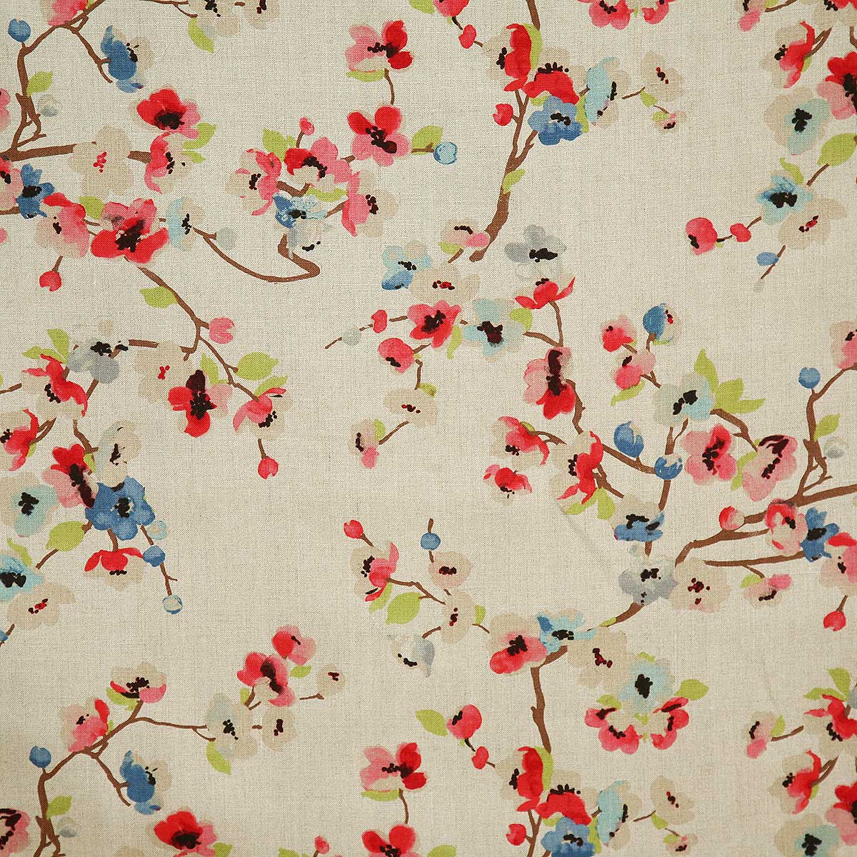
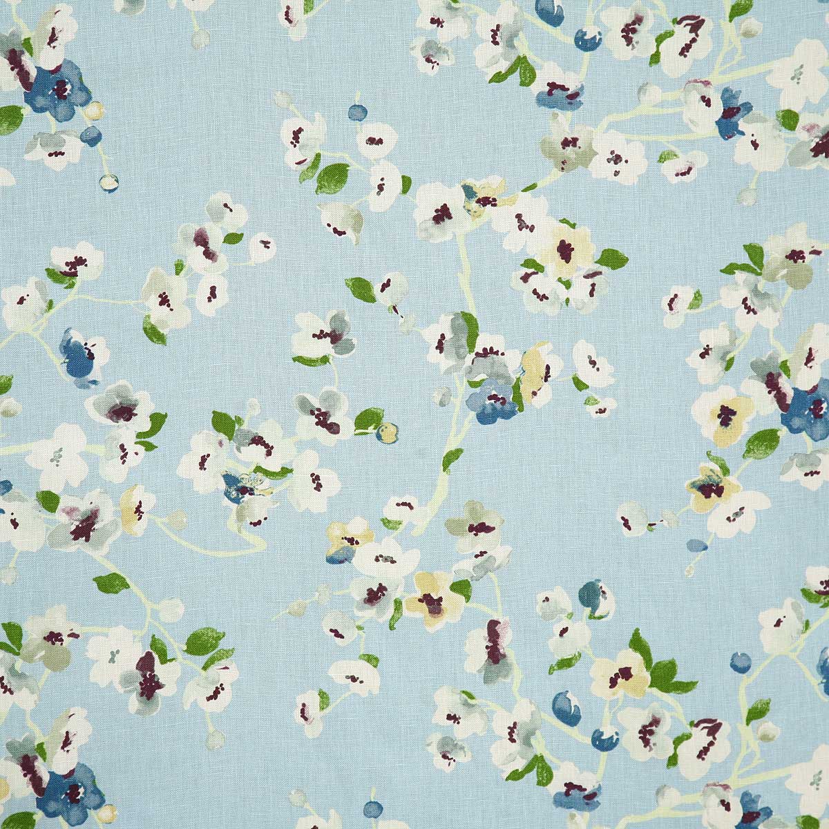
My personal pick for a fabulous floral pattern this season is Pindler’s Cherry Blossom. Floral patterns for Spring – and all year round! I like this one for its linen texture and loose watercolor style. It is relaxed and yet can be crisp – a very versatile print and fabric. It comes in 5 different color-ways and therefore offers many opportunities to incorporate in your interior schemes.
Pindler’s Cherry Blossom on linen – magentaSky, a second of the five color in the Cherry Blossom series from Pindler and Pindler
Artistic accents always a great design detail. We have samples of these fabulous finds at PATRICIAN DESIGN. Come visit our extensive design library for terrific trends, resources, ideas and inspiration!
Colors for fashion, interiors or a composing a bouquet are like the many ingredients, spices and herbs selected for great food. Creating dishes with fine flavors and visual appeal, by selecting the right combination, is good culinary design. So we see the spices and ingredients of design everywhere!
Assembling the colors, textures and shapes in a bouquet…
The art is in gathering the right combinations, textures, colors, flavors,…ok – maybe edible bouquets…Well, we’re not tasting the interiors – but some are scrumptious! Ooh – good enough to eat! And the fashion – yes, we’ve seen edible fabrics…generally not attempted in draperies – but who knows? The sky is the limit in design!!!
A few years ago, Kingston University Fashion Student, Emily Crane began pioneering a new strain of edible couture created from gelatin and seaweed! Brilliant and beautiful!!
Inasmuch as edible couture and creating fabrics from edible materials is fascinating, I digress…the actual point of my story is to recognize the common denominators between gathering materials for all forms of art – the assemblages result in the creative finished products. In this instance, interiors and their color schemes which bear likenesses to beautiful foods!
Color is the most apparent ingredient of most artistic design endeavors. It is the most obvious and first to catch your eye. Assembling an interior is usually grounded by a desired color. The foundation of a room begins with deciding a direction with color. This might seem to be contrary to the concept that form follows function – but I believe that the designing for the two are often concurrent events. The vision occurs while the function is simultaneously examined. Most people visualize in color.
I often write about color. It is an ongoing fascination to discover who prefers what color(s) and why. It offers the beginning of the visualization of a concept. As the framework is discussed – such as programming a kitchen. Inevitably, in the early stages, colors and materials are discussed. They might change. They might not end up as first imagined, but color aids in the visualization and process of design.
Look around your world and consider color. Why did you choose your interior colors? When selecting a color for the surfaces, fabrics and finish materials what would you do differently and why. Taking care not to merely react to trends, what colors will bring you joy? Trends often tempt. They are enticing and new, but they move along…It takes thorough examination to determine if a trend is truly applicable or merely a passing temptation. The validation of design is the approval of the occupants or function for whom/which it serves. Not just the feature of a new trend.
So have a little fun seeing these interiors
paired with edible color schemes as dishes are correlated to interior schemes.
The spices and ingredients selected to create the flavor bursts might be hot green jalapenos, serranos, tart limes, dried red chiles balanced by the soft and warm yellow of corn tortillas.
What interior might look like a spicy platter of festivity?
Perhaps bold wall colors sprinkled with myriad decorative accessories and
functional art.
Spicy colors in this festive kitchen.
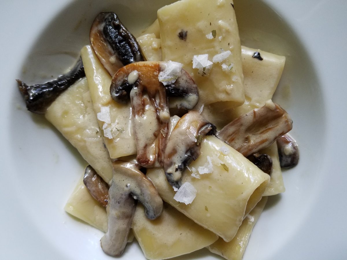
Imagine creating a creamy white-sauce mushroom pasta with
velvety texture and soft finish. The ingredients you would reach for would be
the cream, pasta, white pepper and perhaps a touch a sherry. Sautéing the
mushrooms in butter for a luscious golden brown.
Invitingly divine.
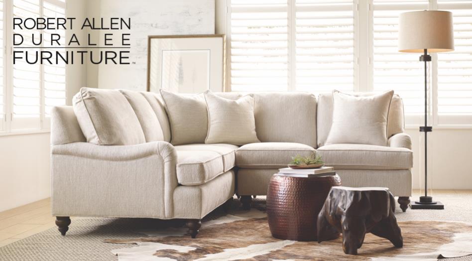
An interior that captures a similar feel derived from the same palette of colors…
Mimicking the creamy mushroom palette, rich wood, copper and steel tones contrast against the creamy whites in this interior featuring one of our favorite furniture and fabric lines – Duralee/Robert Allen! Duralee/Robert Allen has many collections providing the perfect fabrics and furnishings for so many deliciously diverse interior projects!
From creamy, soft and warm to cool and refreshing…
Cool sushi plates featuring the pink and orange tones of tender fresh fish, cilantro sprig greens, and so white rice!
An interior possessing similar colors – the perfect ingredients to create a stunning design!
Durlaee encompasses many fine collections. Here the Clarke & Clarke Oriental Garden fabrics are gathered together to present a fresh scene reminiscent of our colorfully fresh sushi plate!
Ready for reds?
A berry lovely dish with creamy whites…Our delectable raspberry tart presented on a lace-embossed white pottery piece accented with finely sliced toasted almonds sets the stage for the next interior color scheme… Once again we are featuring Duralee’s Clarke & Clarke statement called Zanzibar a brilliant raspberry and red ethnic statement inspired by the exotic and vibrant world of Tanzania, Africa. Discovering the creativity of colors and fabrics in distant places offers a mélange of ingredients with which to create an exciting interior design!
Mix it up. Gather the
ingredients that will bring you joy and result in a deliciously creative
interior!!! Come see and feel these fabulous fabrics and furnishings from
Duralee/Robert Allen in our comprehensive design resource library at PATRICIAN
DESIGN! Call us and we will send samples!
With all the New Year buzz about the new color forecasts…I started taking notice of the seeming non-color, white. It is often considered the absence of color when in fact it is a very complex color of many shades and values. Just try to select a white and you will know what I mean.
When you look at white paint samples, you will notice the nuances. There are pink whites and blue white, grey whites and yellow whites. Each white is off-set and contrasting to another. You see the differences by comparison and by context. You think you have just the right white until you place it against another sample and see that it is grey or cream and then second guess yourself again…and again…How do you know which white is right?
Dunn Edwards groups their whites and pastels in a separate section of their fan deck as do other paint companies. What is interesting here is that the background is a sheet of white copy paper. Notice how is reads against the colors in the samples…it seems to be a purple blue color. This shot was taken under a full-spectrum LED lamp. The colors should be true. The range of “white” is amazing.
To intentionally design with white is bold. To have the confidence, to decide that white IS the color and that white IS the scheme, is challenging. To effectively design with white, you not only have to select the right white(s), but you have to know just how much of anything else might be effective yet not detract.
Le Leche in Puerto Vallarta is a fabulous example of designing exclusively with white. Only with minimal punctuation with black lettering on the wall of containers and also by allowing shadows is the white interrupted. But the blacks’ minor interruptions gives depth and fine detail.
White design can be cold or warm. Depending upon the desired effect, mood or function of the space, the whites need to be carefully selected. This is true with lighting as well. Warm whites or cool whites…what gives you the desired result?
Popular white string lights add festivity and a warm glow to an evening scene.See how many lighting colors you can identify in this scene…Starting on the left, a cool pocket glows through the underbrush. The walkway has a warm pink-ish light. The very cool blues of the pool area give a dramatic read. A bold yellow accent peeks from the far left and also over on the right. The palm trees are wrapped in a warm white tube lights while the far right side illuminates the entry to the dining palapa with a cool white light source. The foam of the surf on the beach is captured with a cool white spotlight that maintains its naturally expected white color.
Knowing when to add color to a white scene to achieve an intentional POP is an art. The color itself, the amount and placement is all part of the success of a good design result. From the fine black detailing in the previous shot of La Leche to this still-life composition of a tropical cocktail that I propped the other day, the minimal punctuation of color is key.
White mosaic shards of tile in the background of this composition featuring a peeled coconut and the POP of a pretty pink party umbrella result in a white-on white scene. Yes, this shot says PARTY with a perky smile!
The bench which served as the backdrop for the coconut cocktail is a dramatic serpentine sculpture of site furniture that plays with the white-on-white of the tile and grout.
Contrasting against the organic wood decking, this white monolithic bench snakes around the periphery of this outdoor lounge area. The sunset is casting a soft pink wash over the all white glazed tile.
Beach settings using white materials compliment the white sand and greenery of the tropical plants. From wood frame platform cabanas to the sprinkling of umbrellas, white is a wonderful, fresh color for a crisp clean scene.
Whites on whites…creamy sand colors to crisp white terrycloth, the white-on-white scheme is soft, inviting and clean.Greenery compliments the white umbrellas and sunning beds on the lawn by the beach.Palm trunks and other fruit trees are often painted white to protect against insects and what insects insist on climbing the surface are easily spotted by birds who appreciate the help to capture a snack! In this case, they contribute to the white design theme.
The soft creamy off-white folds of fabric offer a soft, inviting scene.
Shadows in the creases and depths of the folds add the dimension to the luxurious feel of the cotton damask fabric.White stucco is dappled by shadows and greenery while given a warm, strong base by the brick pavers. White as an architectural finish is only successful if the context compliments it. This is true in all design.
Architectural color and texture of surfaces is a moving target. A recent discussion about a white building with black detailing would not have proved right for this particular use of white. The hard, commercial read would have been too severe for the intended effect. Yet that same project, with a warm white and an ochre accent, will be just the right combination to achieve the desired result. Watch for this project to be featured in a few months.
Architectural surfaces incorporating tones and textures of white provide interesting opportunities
Block and crumbled edge accent bands on the facade of an exterior wall.
White in design is an exciting selection. Knowing how, when and why to use it is a test of your creativity. Picking the right white is the challenge.
The limitless colors of white found in a pile of gravel…..
So the next time you think white, think a lot about it. Study the context and what you are trying to accomplish. Feel freed by the fact that white is a color to express and enjoy.
The world is full of detail. From the wonders of nature and the perfection of a flower, to the man-made creations that come from inspiration of all sorts. The combined influences that result, in interesting and good design, are limitless and we now have layers of platforms upon which ideas are presented. The access to creativity is staggering.
Take Etsy and Pinterest. There the ideas abound. Everyone has access to creative ideas unlike ever before in our world. In the past, a keen eye observed and discerned. The clever managed to find inspiration in the most obscure places, analyze observations and interpret them for their own purposes. Creativity was spawned from observation paired with original thought. Yet, that observation was generally first-hand. Therefore, those that got about more, saw more and had greater exposure to more (and there you have it) were creatively stimulated more!
We (perhaps I should say I since it is from my own vantage point and experiences, from whence I speak/write), often are so busy observing that we don’t take the time to dissect and catalog the information we discover. I am so very guilty of that as I am so captivated by design and creativity that I forget to remember!!! Ha – yes – forget to remember or record!!!!
I constantly find myself regretting to have taken a photo of something (some who know how many photos I take might want to take exception with this point), but it’s true. I regret not taking a photo or studying something which, retrospectively, I recognize as something quite special. In the rush to experience the entire scene, I fail to notice or retain the details. Have you ever felt that you were so caught-up in a new experience that afterward you feel you should have paid closer attention? I forget to remember to store the observations or I forget to take a photo – regretting it afterward.
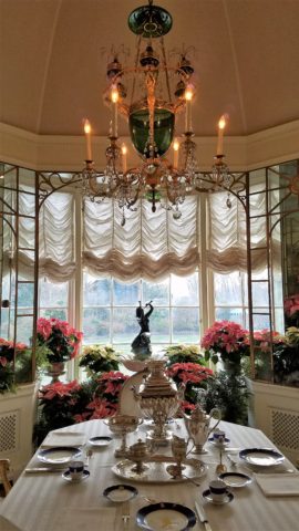
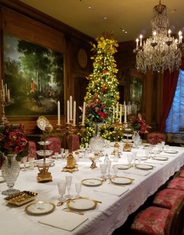
The breakfast room aat Hillwood Mansion where Marjorie Post rarely entertained, but was always set to do so. Pink poinsettias are the seasonal choice.
This can be from a class lecture to a theatrical production. I wish I had focused more closely rather than getting distracted by my own imagination which often runs rampant with the encounter. However, the stimulation can be so great that the imagination kicks in and causes diversions, in the attention, resulting in a deficit of detail gathering. Hence a clear case of un-diagnosed ADD!!!
With all of this having been the prelude to my thoughts for the day, I have elected to pick out a few details from a recent tour of the Hillwood Estate and Gardens nestled on magnificent wooded grounds in the heart of northeast Washington, DC. And how wonderful to have had the opportunity this week to stroll through the mansion, now museum, of the late Marjorie Merriweather Post during the Christmas season.
As previously mentioned, I would have, could have, should have taken more photos, but was so enchanted at every turn by the beauty and gracious luxury that unfolded, I was too busy darting from one magnificent scene to the next to capture more than I share here. I apologize.
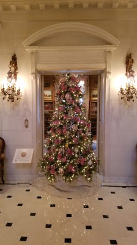
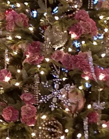
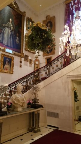
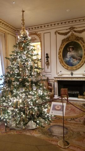
Her favorite color was pink and this tree greeting visitors upon arrival is a precious jewel among many beautiful Christmas trees and decorations displayed in the mansion.
From the reflection on the polished floors of the little white lights to the shimmering crystal punctuated with pink blossoms bedecking the tree was undeniably elegant.
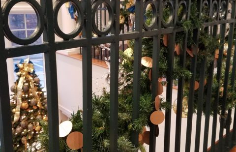
The railings ascending the staircase at the reception desk were draped with garland and strung with simple gold painted discs which were repeated in the coordinating tree which also featured a collection of blue reproduction Faberge eggs.
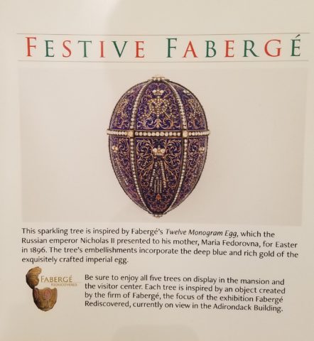
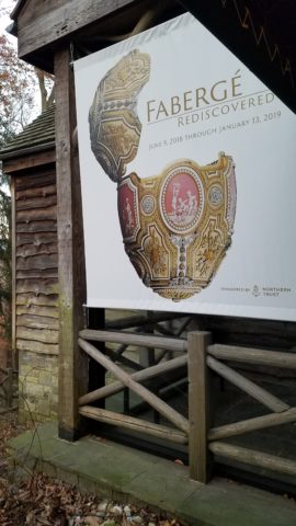
Marjorie Post was a discerning collector of all manner of artistic beauty including exceptional Russian decorative art. The actual exhibit of Faberge currently available for view on the property is nearing its end. Many dazzlingly detailed pieces from her own collection and others on loan for the exhibit are being shown.
If you are in Washington this month, please treat yourself. This exhibit of Faberge pieces is outstanding.
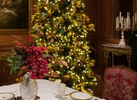
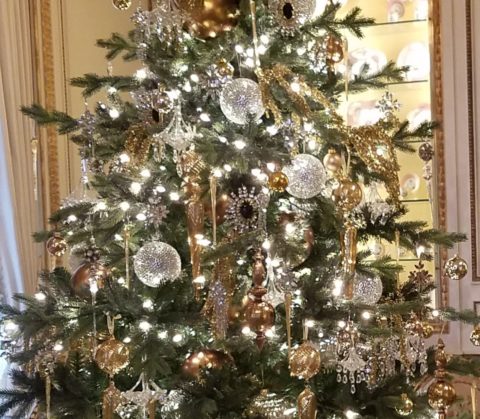
The gold leaves on this magnificent tree in the dining room would be fun to replicate. Could have easily been dipped in gold leaf. Like lime leaves – or from your garden perhaps photinia or laurel even rhododendron – maybe go faux with silk from the craft store – spray ’em gold!!! Paint magic!
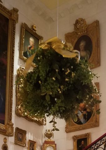
And if you have ever installed a dangle of mistletoe…check this out! This elegant bundle suspended, from the towering heights of the entry hall, puts all other sprigs to shame!!! In the opulent foyer, this grand ball of gilded ribbon-clad mistletoe invites those to tempt the fates of love and superstition, with but a kiss!
Whether it is a theme of gold or a snowy season of white, find details and enjoy the creative opportunities that present themselves to you in passing or from the depths of your imagination and create your own holiday magic!!!
Creating fantasy, festivity or seasonal celebration, gather the details every day from observing all the particulars around you. It is amazing from where you can collect ideas and be inspired to create your own festive fantasy!!!!!! Then be sure to take some photos!!!!!!!
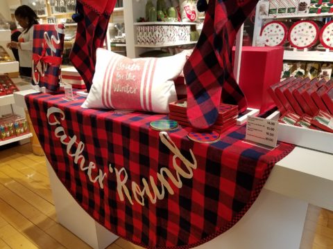
Some retailers put Christmas merchandise out with Halloween and squeeze Thanksgiving autumnal themes in between. But for sure, by Black Friday its all about Christmas merchandising and SHOPPING! The season is in full swing! After salivating over the finely “curated” collections at Sundance, peeking through the dazzling embroidery at Johnny Was, had a taste of Margaritaville at Tommy Bahama’s and elbowed through the throngs at Anthropolgie…among the myriad stores I visited – well, raced through – this weekend, Crate and Barrel is the one where I focused my camera and paused to ponder as they are one of the most prominent trend setters in world of home decor.
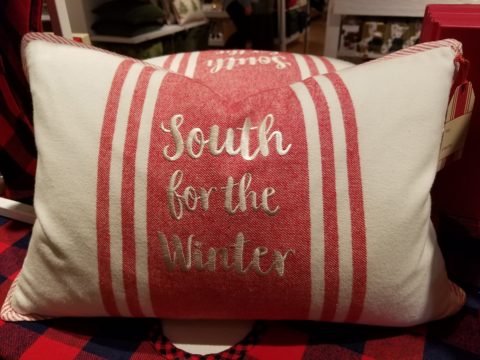
Upon arrival, front and center in the very first display, I was particularly drawn to this embroidered pillow announcing South for the Winter!
It caught my eye as it stated my very thoughts on the subject – although I prefer to stick around for a wintry Christmas and then head south as January sets in…it nevertheless spoke to me. But the combined selection of plaid fabric tree skirt and the cotton pillow had me puzzled. I picture the pillow being in that southerly destination expressing the sentiment but paired with the plaid, like a fish out of water. Plaid in a warm winter getaway didn’t seem to fit. Perhaps it is a pillow that you leave in your chilly, empty, abandoned house with your woolen plaid blankets and afghans as you snow-bird it south? In which case the woolly plaid works, albeit nobody is there to get the drift – snow drift! Or a third scenario that I imagined is when you dream of going south, but are stuck in the northern climes and the pillow states your thoughts in a “wouldn’t it be nice” wishful thinking scenario??!! Three stories for this little pillow…which do you think is the best story?
There on the Christmas display is an intriguing statement of home decor. There it sits, this smart little pillow, all dressed up with the coordinating holiday plaid and exclaiming a statement that might have many connotations…
It’s nice to establish traditions for Christmas and other major holidays throughout the year. Yet like home decor in general, some people are more sentimental than others. While some treasure each year’s addition to a collection or contribution to the spirit of the season, others trade the look with each new trend.
This year an all gold tree…next year it might be jewel tones of amethyst purple, aquamarine teal and ruby accents…and of course the ever popular white on white on white!
Like personal interior design, some switch it out often, with changing fashions, while others nestle in and call it home for the duration. The compromise here is that there might be a family room tree that displays all the traditional ornaments while a more focal tree in an entry or living room makes the trending design statement.
As interior designers we wouldn’t be very busy if everyone nestled in without change for decades, however, even in this staid scenario there is the need for sprucing up the tired, updating certain elements, replacing damaged or broken items…Therefore, reupholstering, replacing of worn flooring, introducing fresh paint colors, improving lighting, opening spaces, face-lifting kitchens and bathrooms…there are many things that we as designers can do to update while not changing the essence of the place called home. Just in time for the holidays and the refresh-during-winter design blitz!!
Back to Crate and Barrel’s merchandising…
The bling that sparkles in the long dark nights of winter is a recurring and uplifting theme.
Red and green are inescapable for traditional Christmas color schemes.
Holly leaves and berries, evergreen needles, brilliant red bows and ribbony garlands.
Having previously stated my love of the traditional blue and white color schemes in so many applications and blogs I have written, Hanukah’s blue and white colors are perfect to crisply punctuate the doldrums of defoliated trees and dormant, bare bones deciduous landscapes of winter. The cool yet refreshing theme is a perfect winter color scheme.
With their modern/retro style melding with a bit of industrial, Crate and Barrel’s stylized wing chairs with their updated lines sport a fresh take on a paisley motif cotton print.
Naughty or nice, reindeer, fir trees, twinkling lights, scented candles, silver and gold, movies and music all stir the senses rejoicing in a healthy economy of vibrant shops, eager shoppers, anxious bargain-hunters, BOGOs and door busters, full of fresh new ideas, products, design trends, toys, gadgets and nearly anything you can imagine!
So get out there and strengthen the fiber of your community, support local artists and fabricators when you can, shop where your neighbors work and where your local entrepreneurs invest their dollars and dreams. Try not to overdose on all the glitz and blitzen of the merchandizing madness!!
Are you drawn to pet adoption events? Do you wander over when you find the dog adoption people parked, out in the open, along the side of the road, in the corner of a parking lot or even at the pet stores themselves? I don’t. I avoid them like the plague. I know that given just one sweet look or mournful expression or happy eager wag, I would have a problem.
I rescued my Rockford about 30 years ago. He had been kept chained to a tree in a backyard with a choke collar that he had very much outgrown.
I absolutely cannot allow myself to be tempted knowing that my resistance would be weak and my resolve would be challenged. I don’t need a dog at this time in my busy, crazy life. However, I would certainly go that route, if I were in the market.
Little Mini was passed from house to house until the fit was just right!
We all know that adopting a pet – dog or cat…or other…is such a wonderful gift – to them and to the lucky new owner! And I feel the same way about furniture and home decor. Yes, I see a direct correlation between “thrifting” and pet adoption. Funny?
Whether it is a early start on the garage sale circuit (not my bag, but very worthwhile) or estate sales (also not my thing as I get too emotional, about the family not wanting the treasures) or scouting consignment shops and thrift stores (less emotional because the context of the pieces are not so personal) it’s all about treasure hunting. It’s a growing trend for sure!
But like pet adoption, I see salvaging a previously owned piece, over buying new, just like giving a fresh start to a neglected, even forgotten, treasure. And, as you know, they say “One man’s trash is another man’s treasure.” and I so believe that statement! That same phrase could be said about your newly adopted pooch! Your new “treasure.” As well as that fabulous hand carved chair – your new treasure!
Bring it home, get it cleaned up, play with it around the house and get it some new clothes – oh – am I talking about the new four legged family member or that awesome new chair??!! Interesting similarities are shared by the adopted pet and the adopted furniture find!
All dressed up and ready for a party!!!!
From Victorian through mid-century modern, reupholstering gives a fresh new outfit to that fabulous piece that has been left sporting a shabby suit.
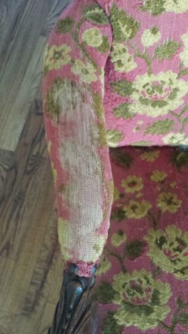
Threadbare but still fabulous – what a great save!
See beyond the existing condition – “You can’t tell a book by its cover.” And you will see beyond the surface focusing on the lines, bones and details.
This Winged Victory of a sofa was ripe for re-purposing!
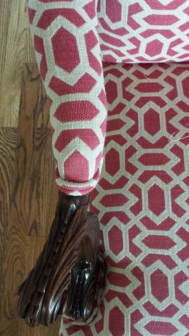
New suit and shoes and this was a great save!!!!!
Discovering great pieces is soulful. Eclecticism is interesting. Balance is better achieved when you have a mix of interesting things. Buying all new is not as creative and can result in a monotonous look that is immediately dated. You’ll know what year THAT room ensemble was created!!!!! Furthermore, re-purposing, recycling, up-cycling trends provides an opportunity to employ the talents of the local upholsterers and refinishers – support local talent!
To a void that pitfall – be brave and seek your pieces. Assemble them with care and embrace unique things. If you love them – make them part of your world. Find potential and then enhance it. Context enhances. Mix new with old and give new life to old pieces. It will be a satisfying and rewarding experience.
What you see in a thrift shop is one thing – seeing beyond it to a new context that celebrates it and features it with other things you love is the personal magic that makes YOUR interior uniquely yours.
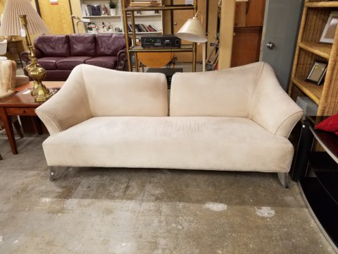
This tired but handsome piece came to us in need of a face lift!
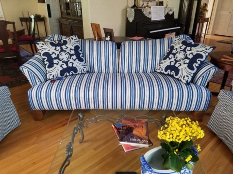
Multiple fabrics add pizzazz! Find just the right fabrics and you have a custom masterpiece! And the lumbar pillow for this one is still on it’s way, for a third pattern providing even more interest!!!!!
Give new life to old pieces and it will be a rewarding experience. Then go out an adopt a dog!
Finishing touches are always the beast to tame at the end of the hunt. Yes, you’ve hunted, you’ve searched, you’ve gathered, you’ve assembled and stood back and observed your work. What’s needed? What’s missing? When is it finished?
Just the word finish sets up a mental block for many. It’s like decisions period. Once you make a decision, you’ve lost your choices. Losing choices can be a dilemma in itself! So, from Pinterest to HGTV and the internet at your fingertips the choices and options are endless, but what do YOU want to do, to call it “done? It’s all in the details…
Schumacher offers details right down to the trim on the draperies! This bold key design makes all the difference!
And inasmuch as you can’t seem to GET it done, you WANT it done – just can’t seem to get there from here. How do you decide what you need to add for those incomplete finishing touches – to be FINISHED? Know though, that to have the feeling that it is finished is a good thing. Yet, that doesn’t mean you can’t change it – sooner or later!
We interior designers have jobs because our clients need to do things, change things, finish things. It seems that with all the options presented on TV and the internet, people are jumping in with inspired ideas, making decisions, buying things and doing things – then coming to a screeching halt! “HELP!” is the cry when everything seems to be too much – or not enough – or too uncertain and overwhelming – or not just right.
As if your own self-imposed frustrations and pressures are not enough, your partner rants…”Just finish it – will you? Be DONE with it!!!” Not everyone loves a DIY project. Most people don’t even like the disruption of a professional team coming in and tackling the job. Alas, “you have to break an egg to make an omelet,” some wise person once said.
Whether you’re changing paint colors for the third time in a month or tossing throw pillows around the room, to no satisfactory avail, there’s something missing…something is not quite right…it’s not there yet.
Have you removed everything from the walls and lined them up waiting for inspiration as to how and where they should be placed and grouped – maybe re-framed?
What about a mirror to add depth? Is it an installed mirror – the illusion of space without calling attention to the mirror itself or should I hang a framed mirror that makes the statement in its entirety? Do I lean it against the wall or is that a trendy affectation?
Uttermost is one of our favorite sources!
Studied nonchalance is an art form. How to achieve that intentionally unpretentiously naturally relaxed look is a challenge. Just writing about it here is an effort in describing that which is supposed to be effortless!!!!
Perhaps it is a monotony of height. Do you need a tall piece among other lower elements in the room? Maybe a tree in the corner is the answer or a statue of some vertical art statement, to add interest and height. Perhaps you might consider hanging something, from the ceiling – a mobile or origami bird or even a light fixture, to draw the eye up from the otherwise low furniture pieces.
Robert Allen presents perfect fabrics for colorful pillow accents…and there’s that tall plant for height!
Speaking of light fixtures…how does your almost finished, but not quite there yet, room look at night? Are there dark pockets and corners that would benefit from some concealed up-lights – indirect lighting can be quite effective and enhance a spooky, dismal space.
LOVE this before & after! Check out John Cullen Lighting for some great ideas and inspiration!! https://www.johncullenlighting.com/
Spooky is the season and, with the holidays approaching, the need to get things finished before guests arrive or you leave to visit… or just the hectic nature of the baking, gift-buying and wrapping, shipping and other communications aspects of the season are upon you – pressure you to want to get things finished!
Brunschwig and Fils by Kravet offers an amazing collection of prints – mix and match!!!
Have you consulted with a friend? Do they rise to the invitation of critiquing your present state of affairs and offer design ideas that further serve to confuse you? Better yet, ask two friends and get two different options for finishing your space and then what? Pick one and the other’s feelings are hurt that you didn’t take their advice – even if they are not aware that your decisions moving forward were offered by another friend.
From the rug (thank you Company C for your “Colorful Living!” to the table accessories and all the things, pieces, fabrics, details in-between – finishing touches FINISH the job!!!
A designer is a problem solver, a tie-breaker, a marriage counselor, a creative who extracts your needs and – evaluating all options – offers the best solutions to get your job finished!